cosmos-docusaurus-theme 1.2.1 → 1.2.3
This diff represents the content of publicly available package versions that have been released to one of the supported registries. The information contained in this diff is provided for informational purposes only and reflects changes between package versions as they appear in their respective public registries.
- package/CHANGELOG.md +15 -0
- package/README.md +69 -72
- package/package.json +1 -1
- package/src/css/theme.css +74 -0
package/CHANGELOG.md
CHANGED
|
@@ -7,6 +7,21 @@ This project adheres to [Semantic Versioning](https://semver.org/spec/v2.0.0.htm
|
|
|
7
7
|
|
|
8
8
|
---
|
|
9
9
|
|
|
10
|
+
## [1.2.2] — 2026-03-10
|
|
11
|
+
|
|
12
|
+
### Added
|
|
13
|
+
|
|
14
|
+
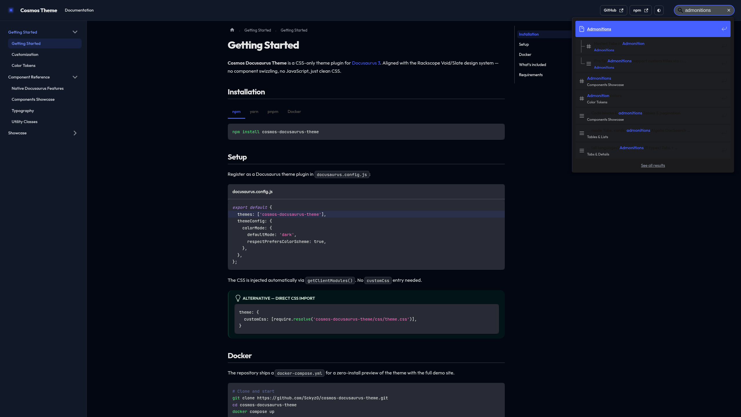
- **`@easyops-cn/docusaurus-search-local` native support** — CSS palette overrides
|
|
15
|
+
so the search dropdown matches Void (dark) / Slate (light) out of the box.
|
|
16
|
+
Set `--search-local-*` variables and `--ifm-navbar-search-input-*` for both modes.
|
|
17
|
+
Navbar search input styled as ghost button matching navbar external links.
|
|
18
|
+
- Demo site ships with `@easyops-cn/docusaurus-search-local` pre-configured
|
|
19
|
+
|
|
20
|
+
### Changed
|
|
21
|
+
|
|
22
|
+
- Screenshots updated to 2560×1440 (2K) with search bar visible
|
|
23
|
+
- New `search.png` screenshot of active search dropdown
|
|
24
|
+
|
|
10
25
|
## [1.2.0] — 2026-03-10
|
|
11
26
|
|
|
12
27
|
### Changed — Rackscope design system alignment
|
package/README.md
CHANGED
|
@@ -2,7 +2,7 @@
|
|
|
2
2
|
|
|
3
3
|
<div align="center">
|
|
4
4
|
|
|
5
|
-
**
|
|
5
|
+
**The design system behind [Rackscope](https://rackscope.dev), packaged for any Docusaurus 3 site.**
|
|
6
6
|
|
|
7
7
|
[](https://www.npmjs.com/package/cosmos-docusaurus-theme)
|
|
8
8
|
[](https://www.npmjs.com/package/cosmos-docusaurus-theme)
|
|
@@ -10,73 +10,52 @@
|
|
|
10
10
|
[](LICENSE)
|
|
11
11
|
[](https://docusaurus.io)
|
|
12
12
|
|
|
13
|
-
### [Live Demo](https://sckyzo.github.io/cosmos-docusaurus-theme/) · [
|
|
13
|
+
### [Live Demo](https://sckyzo.github.io/cosmos-docusaurus-theme/) · [Releases](https://github.com/SckyzO/cosmos-docusaurus-theme/releases) · [npm](https://www.npmjs.com/package/cosmos-docusaurus-theme)
|
|
14
14
|
|
|
15
15
|
</div>
|
|
16
16
|
|
|
17
17
|
---
|
|
18
18
|
|
|
19
|
-
|
|
19
|
+
A **CSS-only** Docusaurus theme built from the same design system that powers
|
|
20
|
+
[Rackscope](https://rackscope.dev) — a production monitoring platform for datacenters and HPC clusters.
|
|
21
|
+
Dark-first, opinionated, and refined.
|
|
20
22
|
|
|
21
|
-
- **
|
|
22
|
-
- **
|
|
23
|
-
- **
|
|
24
|
-
-
|
|
25
|
-
-
|
|
26
|
-
|
|
27
|
-
| Element | Styled |
|
|
28
|
-
|---|:---:|
|
|
29
|
-
| Navbar + sidebar | ✅ |
|
|
30
|
-
| Code blocks + inline code | ✅ |
|
|
31
|
-
| Admonitions (note/tip/warning/danger) | ✅ |
|
|
32
|
-
| Tables | ✅ |
|
|
33
|
-
| Pagination + breadcrumbs | ✅ |
|
|
34
|
-
| Footer + scrollbar | ✅ |
|
|
35
|
-
| **Tabs** | ✅ |
|
|
36
|
-
| **Cards** | ✅ |
|
|
37
|
-
| **Tags / pill badges** | ✅ |
|
|
38
|
-
| **Announcement bar** | ✅ |
|
|
39
|
-
| **Back-to-top button** | ✅ |
|
|
40
|
-
| **Progress bar** | ✅ |
|
|
41
|
-
| **Algolia DocSearch** | ✅ |
|
|
42
|
-
|
|
43
|
-
- Optional utility classes: `.method-get/post/put/delete`, `.status-ok/warn/crit/unknown`
|
|
44
|
-
- Compatible with **Docusaurus 3+**
|
|
23
|
+
- **Void** dark palette — deep neutral blacks (`#030712 / #111827`) with indigo accents
|
|
24
|
+
- **Slate** light palette — warm white surfaces with brown text tones, not cold blue-gray
|
|
25
|
+
- **Outfit** display typeface + **JetBrains Mono** for code
|
|
26
|
+
- Zero JavaScript, no swizzled components — pure CSS override of Docusaurus Infima
|
|
27
|
+
- Every element covered: admonitions, tabs, cards, tables, details, DocSearch, breadcrumbs…
|
|
28
|
+
- Smooth dark/light transition, ghost-button navbar, TOC active state, 4px scrollbar
|
|
45
29
|
|
|
46
30
|
---
|
|
47
31
|
|
|
48
32
|
## Screenshots
|
|
49
33
|
|
|
50
|
-
> Dark mode
|
|
34
|
+
> Dark mode — Void palette — with local search
|
|
51
35
|
|
|
52
|
-
|
|
53
37
|
|
|
54
|
-
>
|
|
38
|
+
> Search — dropdown styled to Void/Slate palette
|
|
55
39
|
|
|
56
|
-
|
|
57
41
|
|
|
58
|
-
>
|
|
42
|
+
> Light mode — Slate palette — admonitions AlertBanner style
|
|
59
43
|
|
|
60
|
-
|
|
61
45
|
|
|
62
|
-
> See all
|
|
46
|
+
> See all components live → **[sckyzo.github.io/cosmos-docusaurus-theme](https://sckyzo.github.io/cosmos-docusaurus-theme/)**
|
|
63
47
|
|
|
64
48
|
---
|
|
65
49
|
|
|
66
|
-
##
|
|
50
|
+
## Quick start
|
|
67
51
|
|
|
68
52
|
```bash
|
|
69
53
|
npm install cosmos-docusaurus-theme
|
|
70
54
|
```
|
|
71
55
|
|
|
72
|
-
## Usage
|
|
73
|
-
|
|
74
|
-
Register as a Docusaurus theme plugin in `docusaurus.config.js`:
|
|
75
|
-
|
|
76
56
|
```js title="docusaurus.config.js"
|
|
77
57
|
export default {
|
|
78
58
|
themes: ['cosmos-docusaurus-theme'],
|
|
79
|
-
|
|
80
59
|
themeConfig: {
|
|
81
60
|
colorMode: {
|
|
82
61
|
defaultMode: 'dark',
|
|
@@ -86,30 +65,54 @@ export default {
|
|
|
86
65
|
};
|
|
87
66
|
```
|
|
88
67
|
|
|
89
|
-
|
|
68
|
+
### Try it instantly with Docker
|
|
90
69
|
|
|
91
|
-
|
|
70
|
+
Zero npm install required — the full demo runs in a container:
|
|
92
71
|
|
|
93
|
-
```
|
|
94
|
-
|
|
95
|
-
|
|
96
|
-
|
|
97
|
-
|
|
98
|
-
|
|
99
|
-
|
|
100
|
-
|
|
101
|
-
|
|
102
|
-
|
|
72
|
+
```bash
|
|
73
|
+
git clone https://github.com/SckyzO/cosmos-docusaurus-theme.git
|
|
74
|
+
cd cosmos-docusaurus-theme
|
|
75
|
+
docker compose up
|
|
76
|
+
# → http://localhost:3000
|
|
77
|
+
```
|
|
78
|
+
|
|
79
|
+
Or pull from GitHub Container Registry:
|
|
80
|
+
|
|
81
|
+
```bash
|
|
82
|
+
docker run -p 3000:3000 ghcr.io/sckyzo/cosmos-docusaurus-theme:latest
|
|
103
83
|
```
|
|
104
84
|
|
|
105
85
|
---
|
|
106
86
|
|
|
87
|
+
## What's covered
|
|
88
|
+
|
|
89
|
+
| Element | Styled |
|
|
90
|
+
|---|:---:|
|
|
91
|
+
| Navbar + ghost buttons | ✅ |
|
|
92
|
+
| Sidebar + section labels | ✅ |
|
|
93
|
+
| Code blocks (all languages) | ✅ |
|
|
94
|
+
| Admonitions — AlertBanner style, rounded-2xl | ✅ |
|
|
95
|
+
| Tables | ✅ |
|
|
96
|
+
| Tabs + synced tabs | ✅ |
|
|
97
|
+
| Details/summary — SectionCard style | ✅ |
|
|
98
|
+
| Cards — rounded-2xl + dark shadow | ✅ |
|
|
99
|
+
| Tags + Badges | ✅ |
|
|
100
|
+
| Breadcrumbs | ✅ |
|
|
101
|
+
| TOC — H2/H3 hierarchy + active pill | ✅ |
|
|
102
|
+
| Pagination | ✅ |
|
|
103
|
+
| Announcement bar | ✅ |
|
|
104
|
+
| Back-to-top + Progress bar | ✅ |
|
|
105
|
+
| Algolia DocSearch | ✅ |
|
|
106
|
+
| Smooth dark/light transition | ✅ |
|
|
107
|
+
|
|
108
|
+
---
|
|
109
|
+
|
|
107
110
|
## Customization
|
|
108
111
|
|
|
109
|
-
Override any
|
|
112
|
+
Override any CSS variable in your own `custom.css`:
|
|
110
113
|
|
|
111
114
|
```css title="src/css/custom.css"
|
|
112
|
-
/*
|
|
115
|
+
/* Brand color */
|
|
113
116
|
:root {
|
|
114
117
|
--ifm-color-primary: #e11d48;
|
|
115
118
|
--ifm-color-primary-dark: #be123c;
|
|
@@ -120,40 +123,34 @@ Override any Infima variable in your own `custom.css` after the theme is loaded:
|
|
|
120
123
|
--ifm-color-primary-lightest:#ffe4e6;
|
|
121
124
|
}
|
|
122
125
|
|
|
123
|
-
/*
|
|
126
|
+
/* Font */
|
|
124
127
|
:root {
|
|
125
128
|
--ifm-font-family-base: 'Inter', system-ui, sans-serif;
|
|
126
129
|
}
|
|
127
130
|
```
|
|
128
131
|
|
|
132
|
+
See the [Color Tokens](https://sckyzo.github.io/cosmos-docusaurus-theme/color-tokens) page
|
|
133
|
+
for all available tokens (dark + light with visual swatches).
|
|
134
|
+
|
|
129
135
|
---
|
|
130
136
|
|
|
131
137
|
## Utility classes
|
|
132
138
|
|
|
133
|
-
| Class
|
|
134
|
-
|
|
135
|
-
| `.method-get`
|
|
136
|
-
| `.
|
|
137
|
-
| `.
|
|
138
|
-
| `.method-delete` | HTTP DELETE label (red, monospace) |
|
|
139
|
-
| `.method-patch` | HTTP PATCH label (purple, monospace)|
|
|
140
|
-
| `.status-ok` | OK state (green, bold) |
|
|
141
|
-
| `.status-warn` | WARN state (orange, bold) |
|
|
142
|
-
| `.status-crit` | CRIT state (red, bold) |
|
|
143
|
-
| `.status-unknown`| UNKNOWN state (gray, bold) |
|
|
139
|
+
| Class | Usage |
|
|
140
|
+
|---|---|
|
|
141
|
+
| `.method-get/post/put/delete/patch` | HTTP method labels (monospace, semantic color) |
|
|
142
|
+
| `.status-ok/warn/crit/unknown` | Health state labels |
|
|
143
|
+
| `.state-ok/warn/crit/unknown` | Aliases for the above |
|
|
144
144
|
|
|
145
145
|
---
|
|
146
146
|
|
|
147
147
|
## Development
|
|
148
148
|
|
|
149
149
|
```bash
|
|
150
|
-
#
|
|
151
|
-
npm
|
|
152
|
-
|
|
153
|
-
# Lint the CSS
|
|
154
|
-
npm run lint
|
|
150
|
+
npm install # stylelint devDeps
|
|
151
|
+
npm run lint # CSS lint
|
|
155
152
|
|
|
156
|
-
#
|
|
153
|
+
# Demo site
|
|
157
154
|
cd demo && npm install && npm run start
|
|
158
155
|
```
|
|
159
156
|
|
package/package.json
CHANGED
package/src/css/theme.css
CHANGED
|
@@ -881,6 +881,80 @@ details > :not(summary) {
|
|
|
881
881
|
background-color: #9cb9ff;
|
|
882
882
|
}
|
|
883
883
|
|
|
884
|
+
/* ── @easyops-cn/docusaurus-search-local ────────────────────────────────── */
|
|
885
|
+
/* Palette overrides for the local search plugin. */
|
|
886
|
+
/* https://github.com/easyops-cn/docusaurus-search-local */
|
|
887
|
+
/* All values mirror Void (dark) / Slate (light) design tokens. */
|
|
888
|
+
|
|
889
|
+
/* Light mode (Slate) */
|
|
890
|
+
:root {
|
|
891
|
+
/* Modal dropdown */
|
|
892
|
+
--search-local-modal-background: #fff;
|
|
893
|
+
--search-local-modal-shadow:
|
|
894
|
+
0 8px 24px rgb(0, 0, 0, 0.12),
|
|
895
|
+
inset 1px 1px 0 0 rgb(255, 255, 255, 0.8);
|
|
896
|
+
/* Result items */
|
|
897
|
+
--search-local-hit-background: #fff;
|
|
898
|
+
--search-local-hit-shadow: 0 1px 3px rgb(0, 0, 0, 0.08);
|
|
899
|
+
--search-local-hit-color: #1a1714;
|
|
900
|
+
/* Muted text (paths, icons) */
|
|
901
|
+
--search-local-muted-color: #8a8479;
|
|
902
|
+
/* Brand highlight */
|
|
903
|
+
--search-local-highlight-color: #465fff;
|
|
904
|
+
--search-local-input-active-border-color: #465fff;
|
|
905
|
+
/* Navbar search input */
|
|
906
|
+
--ifm-navbar-search-input-background-color: #f3f4f6;
|
|
907
|
+
--ifm-navbar-search-input-color: #1a1714;
|
|
908
|
+
--ifm-navbar-search-input-placeholder-color: #8a8479;
|
|
909
|
+
}
|
|
910
|
+
|
|
911
|
+
/* Dark mode (Void) */
|
|
912
|
+
[data-theme='dark'] {
|
|
913
|
+
--search-local-modal-background: #111827; /* Void gray-900 */
|
|
914
|
+
--search-local-modal-shadow:
|
|
915
|
+
inset 1px 1px 0 0 #2c2e40,
|
|
916
|
+
0 8px 32px rgb(0, 0, 0, 0.5);
|
|
917
|
+
--search-local-hit-background: #1f2937; /* Void gray-800 */
|
|
918
|
+
--search-local-hit-shadow: none;
|
|
919
|
+
--search-local-hit-color: #e5e5e5;
|
|
920
|
+
--search-local-muted-color: #71717a;
|
|
921
|
+
--search-local-highlight-color: #7592ff;
|
|
922
|
+
--search-local-input-active-border-color: #7592ff;
|
|
923
|
+
/* Navbar search input */
|
|
924
|
+
--ifm-navbar-search-input-background-color: #1f2937;
|
|
925
|
+
--ifm-navbar-search-input-color: #e5e5e5;
|
|
926
|
+
--ifm-navbar-search-input-placeholder-color: #a3a3a3;
|
|
927
|
+
}
|
|
928
|
+
|
|
929
|
+
/* Navbar search input — styled like Rackscope's AppSearch component */
|
|
930
|
+
/* rounded-lg, bg surface, border, focus ring — consistent with the app */
|
|
931
|
+
.navbar__search-input {
|
|
932
|
+
height: 36px;
|
|
933
|
+
min-width: 180px;
|
|
934
|
+
border-radius: 8px;
|
|
935
|
+
border: 1px solid var(--ifm-toc-border-color);
|
|
936
|
+
background-color: var(--ifm-code-background);
|
|
937
|
+
color: var(--ifm-font-color-base);
|
|
938
|
+
font-size: 0.875rem;
|
|
939
|
+
transition: border-color 0.15s, background-color 0.15s, box-shadow 0.15s;
|
|
940
|
+
}
|
|
941
|
+
|
|
942
|
+
.navbar__search-input::placeholder {
|
|
943
|
+
color: var(--ifm-font-color-secondary);
|
|
944
|
+
font-size: 0.875rem;
|
|
945
|
+
}
|
|
946
|
+
|
|
947
|
+
.navbar__search-input:focus {
|
|
948
|
+
border-color: var(--ifm-color-primary);
|
|
949
|
+
background-color: var(--ifm-background-surface-color);
|
|
950
|
+
box-shadow: 0 0 0 3px rgb(70, 95, 255, 0.10);
|
|
951
|
+
outline: none;
|
|
952
|
+
}
|
|
953
|
+
|
|
954
|
+
[data-theme='dark'] .navbar__search-input:focus {
|
|
955
|
+
box-shadow: 0 0 0 3px rgb(117, 146, 255, 0.12);
|
|
956
|
+
}
|
|
957
|
+
|
|
884
958
|
/* ── Algolia DocSearch ───────────────────────────────────────────────────── */
|
|
885
959
|
/* Applied when Algolia search is configured in themeConfig.algolia. */
|
|
886
960
|
[data-theme='light'] .DocSearch {
|