cosmos-docusaurus-theme 1.2.0 → 1.2.2
This diff represents the content of publicly available package versions that have been released to one of the supported registries. The information contained in this diff is provided for informational purposes only and reflects changes between package versions as they appear in their respective public registries.
- package/CHANGELOG.md +15 -0
- package/README.md +69 -72
- package/package.json +1 -1
- package/src/css/theme.css +111 -16
package/CHANGELOG.md
CHANGED
|
@@ -7,6 +7,21 @@ This project adheres to [Semantic Versioning](https://semver.org/spec/v2.0.0.htm
|
|
|
7
7
|
|
|
8
8
|
---
|
|
9
9
|
|
|
10
|
+
## [1.2.2] — 2026-03-10
|
|
11
|
+
|
|
12
|
+
### Added
|
|
13
|
+
|
|
14
|
+
- **`@easyops-cn/docusaurus-search-local` native support** — CSS palette overrides
|
|
15
|
+
so the search dropdown matches Void (dark) / Slate (light) out of the box.
|
|
16
|
+
Set `--search-local-*` variables and `--ifm-navbar-search-input-*` for both modes.
|
|
17
|
+
Navbar search input styled as ghost button matching navbar external links.
|
|
18
|
+
- Demo site ships with `@easyops-cn/docusaurus-search-local` pre-configured
|
|
19
|
+
|
|
20
|
+
### Changed
|
|
21
|
+
|
|
22
|
+
- Screenshots updated to 2560×1440 (2K) with search bar visible
|
|
23
|
+
- New `search.png` screenshot of active search dropdown
|
|
24
|
+
|
|
10
25
|
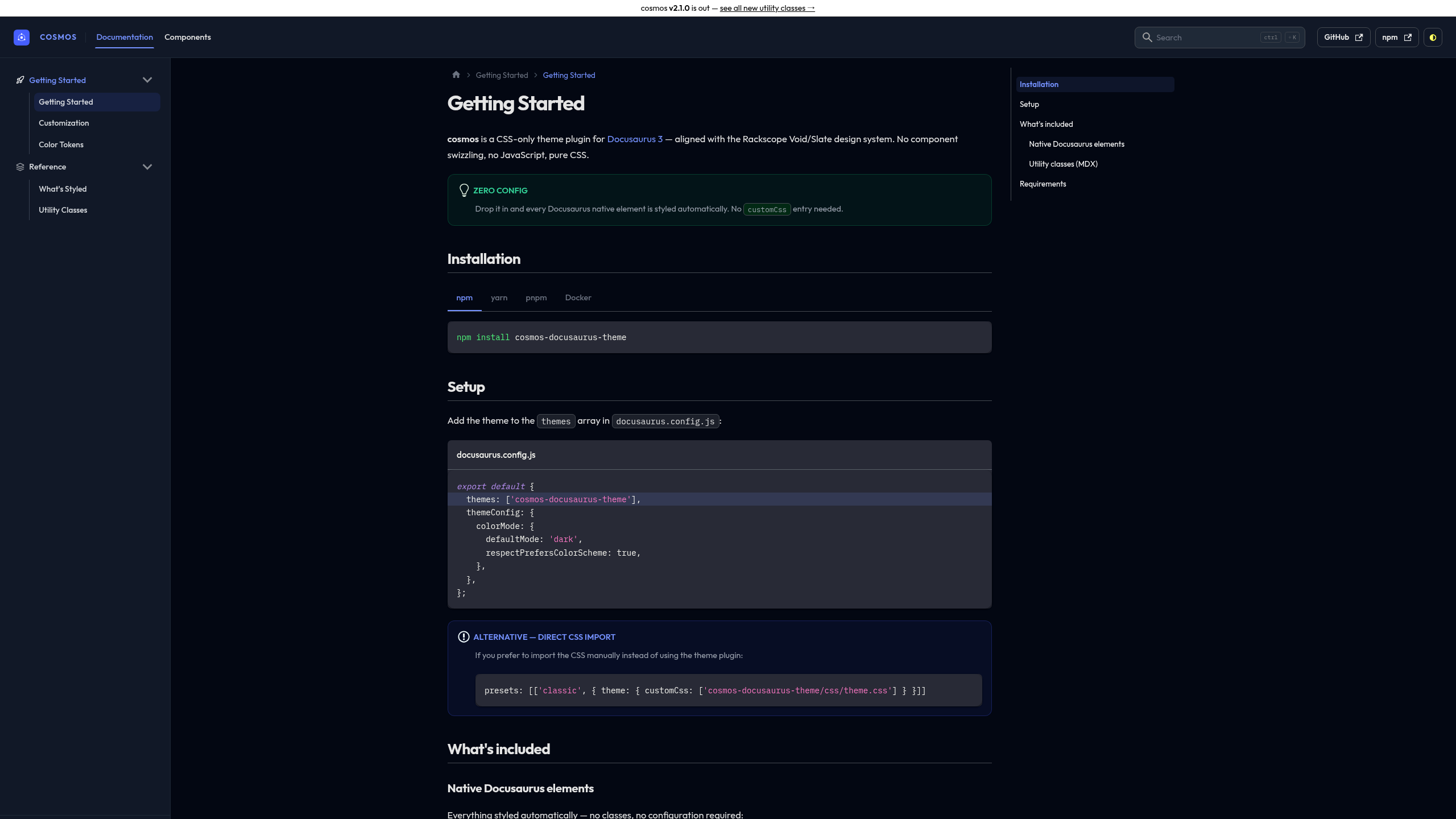
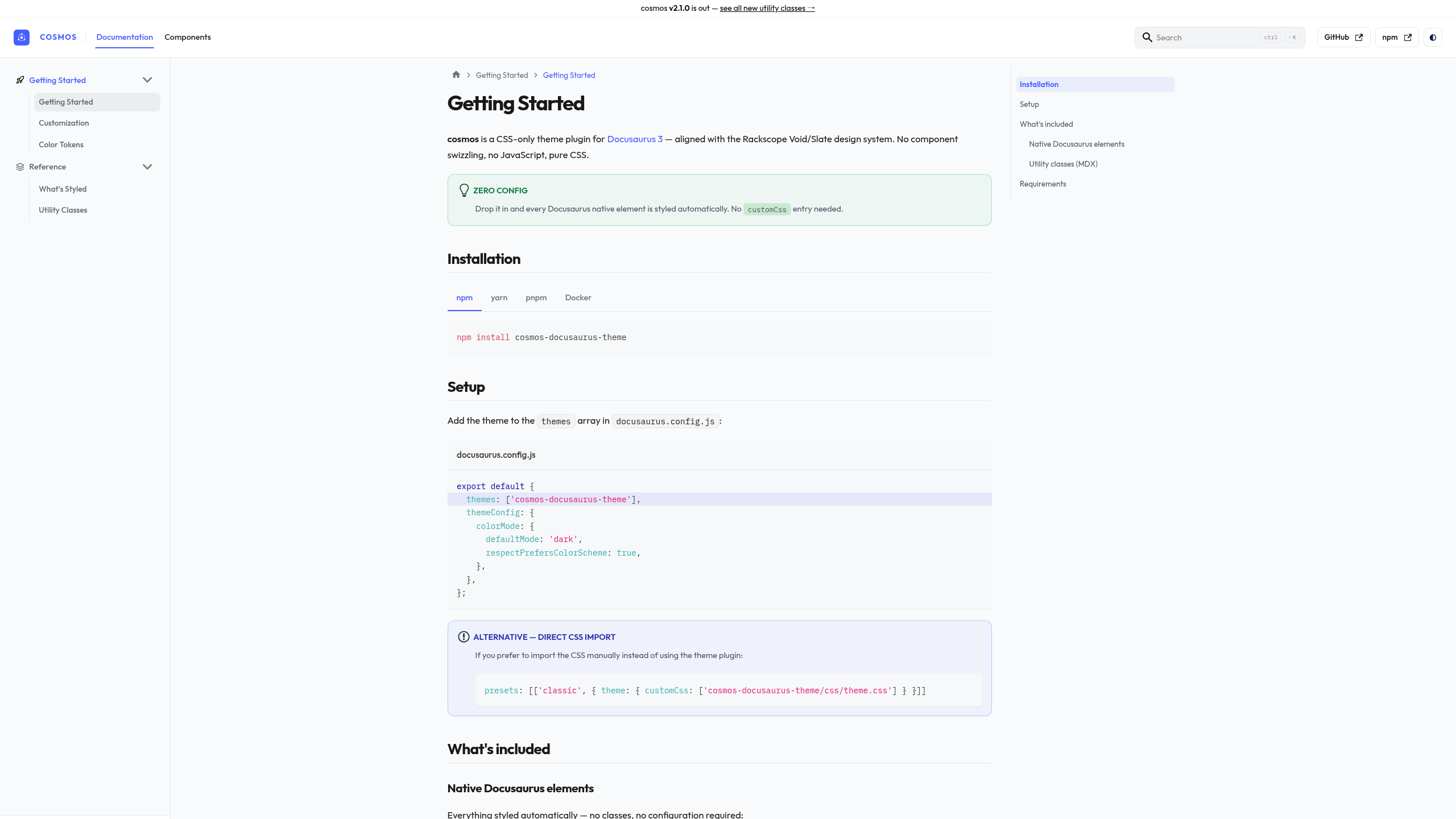
## [1.2.0] — 2026-03-10
|
|
11
26
|
|
|
12
27
|
### Changed — Rackscope design system alignment
|
package/README.md
CHANGED
|
@@ -2,7 +2,7 @@
|
|
|
2
2
|
|
|
3
3
|
<div align="center">
|
|
4
4
|
|
|
5
|
-
**
|
|
5
|
+
**The design system behind [Rackscope](https://rackscope.dev), packaged for any Docusaurus 3 site.**
|
|
6
6
|
|
|
7
7
|
[](https://www.npmjs.com/package/cosmos-docusaurus-theme)
|
|
8
8
|
[](https://www.npmjs.com/package/cosmos-docusaurus-theme)
|
|
@@ -10,73 +10,52 @@
|
|
|
10
10
|
[](LICENSE)
|
|
11
11
|
[](https://docusaurus.io)
|
|
12
12
|
|
|
13
|
-
### [Live Demo](https://sckyzo.github.io/cosmos-docusaurus-theme/) · [
|
|
13
|
+
### [Live Demo](https://sckyzo.github.io/cosmos-docusaurus-theme/) · [Releases](https://github.com/SckyzO/cosmos-docusaurus-theme/releases) · [npm](https://www.npmjs.com/package/cosmos-docusaurus-theme)
|
|
14
14
|
|
|
15
15
|
</div>
|
|
16
16
|
|
|
17
17
|
---
|
|
18
18
|
|
|
19
|
-
|
|
19
|
+
A **CSS-only** Docusaurus theme built from the same design system that powers
|
|
20
|
+
[Rackscope](https://rackscope.dev) — a production monitoring platform for datacenters and HPC clusters.
|
|
21
|
+
Dark-first, opinionated, and refined.
|
|
20
22
|
|
|
21
|
-
- **
|
|
22
|
-
- **
|
|
23
|
-
- **
|
|
24
|
-
-
|
|
25
|
-
-
|
|
26
|
-
|
|
27
|
-
| Element | Styled |
|
|
28
|
-
|---|:---:|
|
|
29
|
-
| Navbar + sidebar | ✅ |
|
|
30
|
-
| Code blocks + inline code | ✅ |
|
|
31
|
-
| Admonitions (note/tip/warning/danger) | ✅ |
|
|
32
|
-
| Tables | ✅ |
|
|
33
|
-
| Pagination + breadcrumbs | ✅ |
|
|
34
|
-
| Footer + scrollbar | ✅ |
|
|
35
|
-
| **Tabs** | ✅ |
|
|
36
|
-
| **Cards** | ✅ |
|
|
37
|
-
| **Tags / pill badges** | ✅ |
|
|
38
|
-
| **Announcement bar** | ✅ |
|
|
39
|
-
| **Back-to-top button** | ✅ |
|
|
40
|
-
| **Progress bar** | ✅ |
|
|
41
|
-
| **Algolia DocSearch** | ✅ |
|
|
42
|
-
|
|
43
|
-
- Optional utility classes: `.method-get/post/put/delete`, `.status-ok/warn/crit/unknown`
|
|
44
|
-
- Compatible with **Docusaurus 3+**
|
|
23
|
+
- **Void** dark palette — deep neutral blacks (`#030712 / #111827`) with indigo accents
|
|
24
|
+
- **Slate** light palette — warm white surfaces with brown text tones, not cold blue-gray
|
|
25
|
+
- **Outfit** display typeface + **JetBrains Mono** for code
|
|
26
|
+
- Zero JavaScript, no swizzled components — pure CSS override of Docusaurus Infima
|
|
27
|
+
- Every element covered: admonitions, tabs, cards, tables, details, DocSearch, breadcrumbs…
|
|
28
|
+
- Smooth dark/light transition, ghost-button navbar, TOC active state, 4px scrollbar
|
|
45
29
|
|
|
46
30
|
---
|
|
47
31
|
|
|
48
32
|
## Screenshots
|
|
49
33
|
|
|
50
|
-
> Dark mode
|
|
34
|
+
> Dark mode — Void palette — with local search
|
|
51
35
|
|
|
52
|
-
|
|
53
37
|
|
|
54
|
-
>
|
|
38
|
+
> Search — dropdown styled to Void/Slate palette
|
|
55
39
|
|
|
56
|
-
|
|
57
41
|
|
|
58
|
-
>
|
|
42
|
+
> Light mode — Slate palette — admonitions AlertBanner style
|
|
59
43
|
|
|
60
|
-
|
|
61
45
|
|
|
62
|
-
> See all
|
|
46
|
+
> See all components live → **[sckyzo.github.io/cosmos-docusaurus-theme](https://sckyzo.github.io/cosmos-docusaurus-theme/)**
|
|
63
47
|
|
|
64
48
|
---
|
|
65
49
|
|
|
66
|
-
##
|
|
50
|
+
## Quick start
|
|
67
51
|
|
|
68
52
|
```bash
|
|
69
53
|
npm install cosmos-docusaurus-theme
|
|
70
54
|
```
|
|
71
55
|
|
|
72
|
-
## Usage
|
|
73
|
-
|
|
74
|
-
Register as a Docusaurus theme plugin in `docusaurus.config.js`:
|
|
75
|
-
|
|
76
56
|
```js title="docusaurus.config.js"
|
|
77
57
|
export default {
|
|
78
58
|
themes: ['cosmos-docusaurus-theme'],
|
|
79
|
-
|
|
80
59
|
themeConfig: {
|
|
81
60
|
colorMode: {
|
|
82
61
|
defaultMode: 'dark',
|
|
@@ -86,30 +65,54 @@ export default {
|
|
|
86
65
|
};
|
|
87
66
|
```
|
|
88
67
|
|
|
89
|
-
|
|
68
|
+
### Try it instantly with Docker
|
|
90
69
|
|
|
91
|
-
|
|
70
|
+
Zero npm install required — the full demo runs in a container:
|
|
92
71
|
|
|
93
|
-
```
|
|
94
|
-
|
|
95
|
-
|
|
96
|
-
|
|
97
|
-
|
|
98
|
-
|
|
99
|
-
|
|
100
|
-
|
|
101
|
-
|
|
102
|
-
|
|
72
|
+
```bash
|
|
73
|
+
git clone https://github.com/SckyzO/cosmos-docusaurus-theme.git
|
|
74
|
+
cd cosmos-docusaurus-theme
|
|
75
|
+
docker compose up
|
|
76
|
+
# → http://localhost:3000
|
|
77
|
+
```
|
|
78
|
+
|
|
79
|
+
Or pull from GitHub Container Registry:
|
|
80
|
+
|
|
81
|
+
```bash
|
|
82
|
+
docker run -p 3000:3000 ghcr.io/sckyzo/cosmos-docusaurus-theme:latest
|
|
103
83
|
```
|
|
104
84
|
|
|
105
85
|
---
|
|
106
86
|
|
|
87
|
+
## What's covered
|
|
88
|
+
|
|
89
|
+
| Element | Styled |
|
|
90
|
+
|---|:---:|
|
|
91
|
+
| Navbar + ghost buttons | ✅ |
|
|
92
|
+
| Sidebar + section labels | ✅ |
|
|
93
|
+
| Code blocks (all languages) | ✅ |
|
|
94
|
+
| Admonitions — AlertBanner style, rounded-2xl | ✅ |
|
|
95
|
+
| Tables | ✅ |
|
|
96
|
+
| Tabs + synced tabs | ✅ |
|
|
97
|
+
| Details/summary — SectionCard style | ✅ |
|
|
98
|
+
| Cards — rounded-2xl + dark shadow | ✅ |
|
|
99
|
+
| Tags + Badges | ✅ |
|
|
100
|
+
| Breadcrumbs | ✅ |
|
|
101
|
+
| TOC — H2/H3 hierarchy + active pill | ✅ |
|
|
102
|
+
| Pagination | ✅ |
|
|
103
|
+
| Announcement bar | ✅ |
|
|
104
|
+
| Back-to-top + Progress bar | ✅ |
|
|
105
|
+
| Algolia DocSearch | ✅ |
|
|
106
|
+
| Smooth dark/light transition | ✅ |
|
|
107
|
+
|
|
108
|
+
---
|
|
109
|
+
|
|
107
110
|
## Customization
|
|
108
111
|
|
|
109
|
-
Override any
|
|
112
|
+
Override any CSS variable in your own `custom.css`:
|
|
110
113
|
|
|
111
114
|
```css title="src/css/custom.css"
|
|
112
|
-
/*
|
|
115
|
+
/* Brand color */
|
|
113
116
|
:root {
|
|
114
117
|
--ifm-color-primary: #e11d48;
|
|
115
118
|
--ifm-color-primary-dark: #be123c;
|
|
@@ -120,40 +123,34 @@ Override any Infima variable in your own `custom.css` after the theme is loaded:
|
|
|
120
123
|
--ifm-color-primary-lightest:#ffe4e6;
|
|
121
124
|
}
|
|
122
125
|
|
|
123
|
-
/*
|
|
126
|
+
/* Font */
|
|
124
127
|
:root {
|
|
125
128
|
--ifm-font-family-base: 'Inter', system-ui, sans-serif;
|
|
126
129
|
}
|
|
127
130
|
```
|
|
128
131
|
|
|
132
|
+
See the [Color Tokens](https://sckyzo.github.io/cosmos-docusaurus-theme/color-tokens) page
|
|
133
|
+
for all available tokens (dark + light with visual swatches).
|
|
134
|
+
|
|
129
135
|
---
|
|
130
136
|
|
|
131
137
|
## Utility classes
|
|
132
138
|
|
|
133
|
-
| Class
|
|
134
|
-
|
|
135
|
-
| `.method-get`
|
|
136
|
-
| `.
|
|
137
|
-
| `.
|
|
138
|
-
| `.method-delete` | HTTP DELETE label (red, monospace) |
|
|
139
|
-
| `.method-patch` | HTTP PATCH label (purple, monospace)|
|
|
140
|
-
| `.status-ok` | OK state (green, bold) |
|
|
141
|
-
| `.status-warn` | WARN state (orange, bold) |
|
|
142
|
-
| `.status-crit` | CRIT state (red, bold) |
|
|
143
|
-
| `.status-unknown`| UNKNOWN state (gray, bold) |
|
|
139
|
+
| Class | Usage |
|
|
140
|
+
|---|---|
|
|
141
|
+
| `.method-get/post/put/delete/patch` | HTTP method labels (monospace, semantic color) |
|
|
142
|
+
| `.status-ok/warn/crit/unknown` | Health state labels |
|
|
143
|
+
| `.state-ok/warn/crit/unknown` | Aliases for the above |
|
|
144
144
|
|
|
145
145
|
---
|
|
146
146
|
|
|
147
147
|
## Development
|
|
148
148
|
|
|
149
149
|
```bash
|
|
150
|
-
#
|
|
151
|
-
npm
|
|
152
|
-
|
|
153
|
-
# Lint the CSS
|
|
154
|
-
npm run lint
|
|
150
|
+
npm install # stylelint devDeps
|
|
151
|
+
npm run lint # CSS lint
|
|
155
152
|
|
|
156
|
-
#
|
|
153
|
+
# Demo site
|
|
157
154
|
cd demo && npm install && npm run start
|
|
158
155
|
```
|
|
159
156
|
|
package/package.json
CHANGED
package/src/css/theme.css
CHANGED
|
@@ -392,14 +392,20 @@ code {
|
|
|
392
392
|
|
|
393
393
|
/* ── Tables — direct overrides (CSS variables not reliably cascaded) ─────── */
|
|
394
394
|
|
|
395
|
-
/* Dark mode
|
|
395
|
+
/* Dark mode — Infima applies --ifm-table-head-background directly on th,
|
|
396
|
+
so we must target th explicitly (higher specificity than thead). */
|
|
396
397
|
[data-theme='dark'] table {
|
|
397
|
-
border-color: #
|
|
398
|
+
border-color: #374151; /* gray-700 — slightly more visible than gray-800 */
|
|
399
|
+
}
|
|
400
|
+
|
|
401
|
+
[data-theme='dark'] th {
|
|
402
|
+
background-color: #111827; /* Void gray-900 */
|
|
403
|
+
color: #e5e5e5;
|
|
404
|
+
border-color: #374151;
|
|
398
405
|
}
|
|
399
406
|
|
|
400
|
-
[data-theme='dark'] th,
|
|
401
407
|
[data-theme='dark'] td {
|
|
402
|
-
border-color: #
|
|
408
|
+
border-color: #374151;
|
|
403
409
|
}
|
|
404
410
|
|
|
405
411
|
[data-theme='dark'] thead,
|
|
@@ -411,12 +417,16 @@ code {
|
|
|
411
417
|
background-color: rgb(255, 255, 255, 0.03);
|
|
412
418
|
}
|
|
413
419
|
|
|
414
|
-
/* Light mode
|
|
420
|
+
/* Light mode — Slate gray-200 borders, gray-50 header */
|
|
415
421
|
[data-theme='light'] table {
|
|
416
422
|
border-color: #e5e7eb;
|
|
417
423
|
}
|
|
418
424
|
|
|
419
|
-
[data-theme='light'] th
|
|
425
|
+
[data-theme='light'] th {
|
|
426
|
+
background-color: #f9fafb;
|
|
427
|
+
border-color: #e5e7eb;
|
|
428
|
+
}
|
|
429
|
+
|
|
420
430
|
[data-theme='light'] td {
|
|
421
431
|
border-color: #e5e7eb;
|
|
422
432
|
}
|
|
@@ -436,6 +446,8 @@ code {
|
|
|
436
446
|
.breadcrumbs__link--active,
|
|
437
447
|
.breadcrumbs__item--active .breadcrumbs__link {
|
|
438
448
|
color: var(--ifm-color-primary);
|
|
449
|
+
/* No background on active breadcrumb — avoids computed #080d25 artifact */
|
|
450
|
+
background: none;
|
|
439
451
|
}
|
|
440
452
|
|
|
441
453
|
[data-theme='dark'] .breadcrumbs__item + .breadcrumbs__item::before {
|
|
@@ -443,7 +455,7 @@ code {
|
|
|
443
455
|
}
|
|
444
456
|
|
|
445
457
|
[data-theme='dark'] .breadcrumbs__link:not(.breadcrumbs__link--active) {
|
|
446
|
-
color: #
|
|
458
|
+
color: #9ca3af; /* gray-400 — readable on Void dark without being dominant */
|
|
447
459
|
}
|
|
448
460
|
|
|
449
461
|
/* ── Right navbar — unified ghost button style ───────────────────────────── */
|
|
@@ -492,32 +504,59 @@ button[aria-label*="dark and light mode"]:hover {
|
|
|
492
504
|
}
|
|
493
505
|
|
|
494
506
|
/* ── Table of contents (right panel) ─────────────────────────────────────── */
|
|
507
|
+
|
|
508
|
+
/* Left border line — matches Void gray-800 in dark, gray-200 in light */
|
|
509
|
+
.table-of-contents {
|
|
510
|
+
border-left: 1px solid var(--ifm-toc-border-color) !important;
|
|
511
|
+
}
|
|
512
|
+
|
|
495
513
|
.table-of-contents__link {
|
|
496
514
|
font-size: 0.8125rem;
|
|
497
|
-
color: var(--ifm-font-color-secondary);
|
|
498
515
|
transition: color 0.12s, background 0.12s;
|
|
499
|
-
border-radius:
|
|
516
|
+
border-radius: 5px;
|
|
500
517
|
padding: 2px 6px;
|
|
501
|
-
margin-left: -
|
|
518
|
+
margin-left: -7px;
|
|
502
519
|
display: block;
|
|
503
520
|
}
|
|
504
521
|
|
|
522
|
+
/* H2-level TOC items (direct children) — more prominent */
|
|
523
|
+
.table-of-contents > ul > li > .table-of-contents__link {
|
|
524
|
+
font-weight: 500;
|
|
525
|
+
color: var(--ifm-font-color-base);
|
|
526
|
+
font-size: 0.8125rem;
|
|
527
|
+
}
|
|
528
|
+
|
|
529
|
+
[data-theme='dark'] .table-of-contents > ul > li > .table-of-contents__link {
|
|
530
|
+
color: #d1d5db; /* gray-300 — matches Rackscope sidebar label prominence */
|
|
531
|
+
}
|
|
532
|
+
|
|
533
|
+
/* H3-level TOC items (nested) — muted secondary */
|
|
534
|
+
.table-of-contents > ul > li > ul .table-of-contents__link {
|
|
535
|
+
color: var(--ifm-font-color-secondary);
|
|
536
|
+
font-size: 0.8rem;
|
|
537
|
+
}
|
|
538
|
+
|
|
539
|
+
[data-theme='dark'] .table-of-contents > ul > li > ul .table-of-contents__link {
|
|
540
|
+
color: #71717a; /* zinc-500 — subtle */
|
|
541
|
+
}
|
|
542
|
+
|
|
543
|
+
/* Hover state */
|
|
505
544
|
.table-of-contents__link:hover {
|
|
506
545
|
color: var(--ifm-color-primary);
|
|
507
546
|
background: rgb(70, 95, 255, 0.06);
|
|
508
547
|
}
|
|
509
548
|
|
|
510
|
-
|
|
549
|
+
[data-theme='dark'] .table-of-contents__link:hover {
|
|
550
|
+
background: rgb(117, 146, 255, 0.08);
|
|
551
|
+
}
|
|
552
|
+
|
|
553
|
+
/* Active — bg pill, brand color */
|
|
511
554
|
.table-of-contents__link--active {
|
|
512
|
-
color: var(--ifm-color-primary);
|
|
555
|
+
color: var(--ifm-color-primary) !important;
|
|
513
556
|
font-weight: 600;
|
|
514
557
|
background: rgb(70, 95, 255, 0.08);
|
|
515
558
|
}
|
|
516
559
|
|
|
517
|
-
[data-theme='dark'] .table-of-contents__link:hover {
|
|
518
|
-
background: rgb(117, 146, 255, 0.08);
|
|
519
|
-
}
|
|
520
|
-
|
|
521
560
|
[data-theme='dark'] .table-of-contents__link--active {
|
|
522
561
|
background: rgb(117, 146, 255, 0.1);
|
|
523
562
|
}
|
|
@@ -842,6 +881,62 @@ details > :not(summary) {
|
|
|
842
881
|
background-color: #9cb9ff;
|
|
843
882
|
}
|
|
844
883
|
|
|
884
|
+
/* ── @easyops-cn/docusaurus-search-local ────────────────────────────────── */
|
|
885
|
+
/* Palette overrides for the local search plugin. */
|
|
886
|
+
/* https://github.com/easyops-cn/docusaurus-search-local */
|
|
887
|
+
/* All values mirror Void (dark) / Slate (light) design tokens. */
|
|
888
|
+
|
|
889
|
+
/* Light mode (Slate) */
|
|
890
|
+
:root {
|
|
891
|
+
/* Modal dropdown */
|
|
892
|
+
--search-local-modal-background: #fff;
|
|
893
|
+
--search-local-modal-shadow:
|
|
894
|
+
0 8px 24px rgb(0, 0, 0, 0.12),
|
|
895
|
+
inset 1px 1px 0 0 rgb(255, 255, 255, 0.8);
|
|
896
|
+
/* Result items */
|
|
897
|
+
--search-local-hit-background: #fff;
|
|
898
|
+
--search-local-hit-shadow: 0 1px 3px rgb(0, 0, 0, 0.08);
|
|
899
|
+
--search-local-hit-color: #1a1714;
|
|
900
|
+
/* Muted text (paths, icons) */
|
|
901
|
+
--search-local-muted-color: #8a8479;
|
|
902
|
+
/* Brand highlight */
|
|
903
|
+
--search-local-highlight-color: #465fff;
|
|
904
|
+
--search-local-input-active-border-color: #465fff;
|
|
905
|
+
/* Navbar search input */
|
|
906
|
+
--ifm-navbar-search-input-background-color: #f3f4f6;
|
|
907
|
+
--ifm-navbar-search-input-color: #1a1714;
|
|
908
|
+
--ifm-navbar-search-input-placeholder-color: #8a8479;
|
|
909
|
+
}
|
|
910
|
+
|
|
911
|
+
/* Dark mode (Void) */
|
|
912
|
+
[data-theme='dark'] {
|
|
913
|
+
--search-local-modal-background: #111827; /* Void gray-900 */
|
|
914
|
+
--search-local-modal-shadow:
|
|
915
|
+
inset 1px 1px 0 0 #2c2e40,
|
|
916
|
+
0 8px 32px rgb(0, 0, 0, 0.5);
|
|
917
|
+
--search-local-hit-background: #1f2937; /* Void gray-800 */
|
|
918
|
+
--search-local-hit-shadow: none;
|
|
919
|
+
--search-local-hit-color: #e5e5e5;
|
|
920
|
+
--search-local-muted-color: #71717a;
|
|
921
|
+
--search-local-highlight-color: #7592ff;
|
|
922
|
+
--search-local-input-active-border-color: #7592ff;
|
|
923
|
+
/* Navbar search input */
|
|
924
|
+
--ifm-navbar-search-input-background-color: #1f2937;
|
|
925
|
+
--ifm-navbar-search-input-color: #e5e5e5;
|
|
926
|
+
--ifm-navbar-search-input-placeholder-color: #a3a3a3;
|
|
927
|
+
}
|
|
928
|
+
|
|
929
|
+
/* Navbar search input — styled as ghost button to match navbar buttons */
|
|
930
|
+
.navbar__search-input {
|
|
931
|
+
border-radius: 8px;
|
|
932
|
+
border: 1px solid var(--ifm-toc-border-color);
|
|
933
|
+
transition: border-color 0.15s;
|
|
934
|
+
}
|
|
935
|
+
|
|
936
|
+
.navbar__search-input:focus {
|
|
937
|
+
border-color: var(--ifm-color-primary);
|
|
938
|
+
}
|
|
939
|
+
|
|
845
940
|
/* ── Algolia DocSearch ───────────────────────────────────────────────────── */
|
|
846
941
|
/* Applied when Algolia search is configured in themeConfig.algolia. */
|
|
847
942
|
[data-theme='light'] .DocSearch {
|