cosmos-docusaurus-theme 1.0.1 → 1.1.1
This diff represents the content of publicly available package versions that have been released to one of the supported registries. The information contained in this diff is provided for informational purposes only and reflects changes between package versions as they appear in their respective public registries.
- package/CHANGELOG.md +34 -0
- package/README.md +28 -7
- package/package.json +1 -1
- package/src/css/theme.css +208 -2
package/CHANGELOG.md
CHANGED
|
@@ -7,6 +7,40 @@ This project adheres to [Semantic Versioning](https://semver.org/spec/v2.0.0.htm
|
|
|
7
7
|
|
|
8
8
|
---
|
|
9
9
|
|
|
10
|
+
## [1.1.1] — 2026-03-09
|
|
11
|
+
|
|
12
|
+
### Fixed
|
|
13
|
+
|
|
14
|
+
- **Navbar regression**: dark mode navbar was rendering white with dark text. Root cause:
|
|
15
|
+
`--ifm-navbar-background-color` CSS variable was not reliably applied in Docusaurus 3
|
|
16
|
+
SSG/CSR builds. Fix: add direct CSS property overrides on `.navbar` and `.navbar__link`
|
|
17
|
+
instead of relying solely on CSS custom properties.
|
|
18
|
+
- Dark mode navbar: `background-color: #111827` (Void gray-900) forced directly on element
|
|
19
|
+
- Dark mode footer: `background-color: #030712` (Void gray-950) forced directly
|
|
20
|
+
- Dark mode `.main-wrapper`: `background-color: #030712` forced directly
|
|
21
|
+
- Navbar links/brand/toggle: explicit `color: #e5e5e5` in dark mode
|
|
22
|
+
|
|
23
|
+
## [1.1.0] — 2026-03-09
|
|
24
|
+
|
|
25
|
+
### Added
|
|
26
|
+
|
|
27
|
+
- **Progress bar**: `--docusaurus-progress-bar-color` → brand indigo (light + dark)
|
|
28
|
+
- **Announcement bar**: brand-colored banner with styled links and close button
|
|
29
|
+
- **Breadcrumbs**: active crumb uses brand color with subtle hover background
|
|
30
|
+
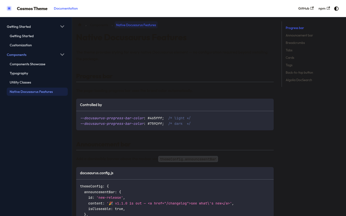
- **Tabs**: styled active tab border + color, hover state on inactive tabs
|
|
31
|
+
- **Cards**: border, rounded corners (12px), hover effect with brand border
|
|
32
|
+
- **Tags**: pill style with brand-colored background and border
|
|
33
|
+
- **Back-to-top button**: brand indigo with hover state (both modes)
|
|
34
|
+
- **Algolia DocSearch**: full `--docsearch-*` variable set for light and dark
|
|
35
|
+
- **Demo**: now loads `cosmos-docusaurus-theme` as a real npm package (`file:..`)
|
|
36
|
+
instead of a local path — exactly mirrors real consumer setup
|
|
37
|
+
- **Demo**: new "Native Features" page showcasing all newly styled elements
|
|
38
|
+
|
|
39
|
+
### Changed
|
|
40
|
+
|
|
41
|
+
- `demo/docusaurus.config.js`: `themes: ['cosmos-docusaurus-theme']` (was local path)
|
|
42
|
+
- `demo/package.json`: added `cosmos-docusaurus-theme: "file:.."` dependency
|
|
43
|
+
|
|
10
44
|
## [1.0.1] — 2026-03-09
|
|
11
45
|
|
|
12
46
|
### Fixed
|
package/README.md
CHANGED
|
@@ -19,26 +19,47 @@
|
|
|
19
19
|
## Features
|
|
20
20
|
|
|
21
21
|
- **CSS-only** — no swizzled components, no JavaScript
|
|
22
|
-
- **Dark mode first-class** (default)
|
|
22
|
+
- **Dark mode first-class** (default) with full light mode support
|
|
23
23
|
- **[Outfit](https://fonts.google.com/specimen/Outfit)** + **JetBrains Mono** typography
|
|
24
|
-
- **Indigo** brand palette (`#465fff`)
|
|
25
|
-
-
|
|
26
|
-
|
|
24
|
+
- **Indigo** brand palette (`#465fff`) — Void dark / Slate light design tokens
|
|
25
|
+
- Covers **every native Docusaurus element** out of the box:
|
|
26
|
+
|
|
27
|
+
| Element | Styled |
|
|
28
|
+
|---|:---:|
|
|
29
|
+
| Navbar + sidebar | ✅ |
|
|
30
|
+
| Code blocks + inline code | ✅ |
|
|
31
|
+
| Admonitions (note/tip/warning/danger) | ✅ |
|
|
32
|
+
| Tables | ✅ |
|
|
33
|
+
| Pagination + breadcrumbs | ✅ |
|
|
34
|
+
| Footer + scrollbar | ✅ |
|
|
35
|
+
| **Tabs** | ✅ |
|
|
36
|
+
| **Cards** | ✅ |
|
|
37
|
+
| **Tags / pill badges** | ✅ |
|
|
38
|
+
| **Announcement bar** | ✅ |
|
|
39
|
+
| **Back-to-top button** | ✅ |
|
|
40
|
+
| **Progress bar** | ✅ |
|
|
41
|
+
| **Algolia DocSearch** | ✅ |
|
|
42
|
+
|
|
43
|
+
- Optional utility classes: `.method-get/post/put/delete`, `.status-ok/warn/crit/unknown`
|
|
27
44
|
- Compatible with **Docusaurus 3+**
|
|
28
45
|
|
|
29
46
|
---
|
|
30
47
|
|
|
31
48
|
## Screenshots
|
|
32
49
|
|
|
33
|
-
> Dark mode (default) — navbar, sidebar, code blocks
|
|
50
|
+
> Dark mode (default) — Void palette: navbar, sidebar, code blocks
|
|
34
51
|
|
|
35
52
|
|
|
36
53
|
|
|
37
|
-
> Light mode
|
|
54
|
+
> Light mode — Slate palette: Components showcase
|
|
38
55
|
|
|
39
56
|
|
|
40
57
|
|
|
41
|
-
>
|
|
58
|
+
> Native features — tabs, cards, tags, breadcrumbs, DocSearch
|
|
59
|
+
|
|
60
|
+
|
|
61
|
+
|
|
62
|
+
> See all features live at **[sckyzo.github.io/cosmos-docusaurus-theme](https://sckyzo.github.io/cosmos-docusaurus-theme/)**
|
|
42
63
|
|
|
43
64
|
---
|
|
44
65
|
|
package/package.json
CHANGED
package/src/css/theme.css
CHANGED
|
@@ -176,8 +176,23 @@ html {
|
|
|
176
176
|
background: rgb(70, 95, 255, 0.08);
|
|
177
177
|
}
|
|
178
178
|
|
|
179
|
+
/* Force direct properties — CSS variables alone are not reliable for navbar
|
|
180
|
+
in all Docusaurus deployment modes (SSG, CSR, file:// local builds). */
|
|
179
181
|
[data-theme='dark'] .navbar {
|
|
180
|
-
|
|
182
|
+
background-color: #111827; /* Void gray-900 — same as AppHeader dark:bg-gray-dark */
|
|
183
|
+
border-bottom-color: #1f2937; /* Void gray-800 */
|
|
184
|
+
}
|
|
185
|
+
|
|
186
|
+
[data-theme='dark'] .navbar__link {
|
|
187
|
+
color: #e5e5e5;
|
|
188
|
+
}
|
|
189
|
+
|
|
190
|
+
[data-theme='dark'] .navbar__brand {
|
|
191
|
+
color: #e5e5e5;
|
|
192
|
+
}
|
|
193
|
+
|
|
194
|
+
[data-theme='dark'] .navbar__toggle {
|
|
195
|
+
color: #e5e5e5;
|
|
181
196
|
}
|
|
182
197
|
|
|
183
198
|
/* ── Sidebar ─────────────────────────────────────────────────────────────── */
|
|
@@ -347,7 +362,19 @@ code {
|
|
|
347
362
|
}
|
|
348
363
|
|
|
349
364
|
[data-theme='dark'] .footer {
|
|
350
|
-
|
|
365
|
+
background-color: #030712; /* Void gray-950 — AppLayout dark:bg-gray-950 */
|
|
366
|
+
border-top-color: #1f2937; /* Void gray-800 */
|
|
367
|
+
color: #a3a3a3;
|
|
368
|
+
}
|
|
369
|
+
|
|
370
|
+
/* Force dark background on main page body — mirrors AppLayout dark:bg-gray-950 */
|
|
371
|
+
[data-theme='dark'] .main-wrapper {
|
|
372
|
+
background-color: #030712;
|
|
373
|
+
}
|
|
374
|
+
|
|
375
|
+
/* Doc article area — keep surface color consistent */
|
|
376
|
+
[data-theme='dark'] article {
|
|
377
|
+
color: #e5e5e5;
|
|
351
378
|
}
|
|
352
379
|
|
|
353
380
|
/* ── Pagination nav ───────────────────────────────────────────────────────── */
|
|
@@ -362,6 +389,185 @@ code {
|
|
|
362
389
|
box-shadow: 0 0 0 3px rgb(70, 95, 255, 0.12);
|
|
363
390
|
}
|
|
364
391
|
|
|
392
|
+
/* ── Progress bar (page loading indicator) ───────────────────────────────── */
|
|
393
|
+
:root {
|
|
394
|
+
--docusaurus-progress-bar-color: #465fff;
|
|
395
|
+
}
|
|
396
|
+
|
|
397
|
+
[data-theme='dark'] {
|
|
398
|
+
--docusaurus-progress-bar-color: #7592ff;
|
|
399
|
+
}
|
|
400
|
+
|
|
401
|
+
/* ── Announcement bar ─────────────────────────────────────────────────────── */
|
|
402
|
+
.announcement {
|
|
403
|
+
background-color: #465fff;
|
|
404
|
+
color: #fff;
|
|
405
|
+
font-size: 0.875rem;
|
|
406
|
+
font-weight: 500;
|
|
407
|
+
}
|
|
408
|
+
|
|
409
|
+
.announcement a {
|
|
410
|
+
color: #dde9ff;
|
|
411
|
+
text-decoration: underline;
|
|
412
|
+
}
|
|
413
|
+
|
|
414
|
+
.announcement a:hover {
|
|
415
|
+
color: #fff;
|
|
416
|
+
}
|
|
417
|
+
|
|
418
|
+
.announcement-close {
|
|
419
|
+
color: rgb(255,255,255,0.7);
|
|
420
|
+
}
|
|
421
|
+
|
|
422
|
+
.announcement-close:hover {
|
|
423
|
+
color: #fff;
|
|
424
|
+
}
|
|
425
|
+
|
|
426
|
+
[data-theme='dark'] .announcement {
|
|
427
|
+
background-color: #3641f5;
|
|
428
|
+
}
|
|
429
|
+
|
|
430
|
+
/* ── Breadcrumbs ─────────────────────────────────────────────────────────── */
|
|
431
|
+
:root {
|
|
432
|
+
--ifm-breadcrumb-color-active: #465fff;
|
|
433
|
+
--ifm-breadcrumb-item-background-active: rgb(70, 95, 255, 0.08);
|
|
434
|
+
--ifm-breadcrumb-border-radius: 6px;
|
|
435
|
+
--ifm-breadcrumb-padding-horizontal: 8px;
|
|
436
|
+
--ifm-breadcrumb-padding-vertical: 4px;
|
|
437
|
+
--ifm-breadcrumb-separator-size-multiplier: 0.6;
|
|
438
|
+
}
|
|
439
|
+
|
|
440
|
+
.breadcrumbs__link {
|
|
441
|
+
border-radius: 6px;
|
|
442
|
+
font-size: 0.8125rem;
|
|
443
|
+
transition: background 0.12s, color 0.12s;
|
|
444
|
+
}
|
|
445
|
+
|
|
446
|
+
/* ── Tabs ────────────────────────────────────────────────────────────────── */
|
|
447
|
+
:root {
|
|
448
|
+
--ifm-tabs-color: #5c574f;
|
|
449
|
+
--ifm-tabs-color-active: #465fff;
|
|
450
|
+
--ifm-tabs-color-active-border: #465fff;
|
|
451
|
+
--ifm-tabs-padding-horizontal: 16px;
|
|
452
|
+
--ifm-tabs-padding-vertical: 10px;
|
|
453
|
+
}
|
|
454
|
+
|
|
455
|
+
[data-theme='dark'] {
|
|
456
|
+
--ifm-tabs-color: #a3a3a3;
|
|
457
|
+
}
|
|
458
|
+
|
|
459
|
+
.tabs__item {
|
|
460
|
+
border-radius: 6px 6px 0 0;
|
|
461
|
+
font-weight: 500;
|
|
462
|
+
font-size: 0.875rem;
|
|
463
|
+
transition: color 0.12s, background 0.12s;
|
|
464
|
+
}
|
|
465
|
+
|
|
466
|
+
.tabs__item:hover:not(.tabs__item--active) {
|
|
467
|
+
background: var(--ifm-breadcrumb-item-background-active);
|
|
468
|
+
color: var(--ifm-color-primary);
|
|
469
|
+
}
|
|
470
|
+
|
|
471
|
+
/* ── Cards ───────────────────────────────────────────────────────────────── */
|
|
472
|
+
:root {
|
|
473
|
+
--ifm-card-background-color: #fff;
|
|
474
|
+
--ifm-card-border-radius: 12px;
|
|
475
|
+
}
|
|
476
|
+
|
|
477
|
+
[data-theme='dark'] {
|
|
478
|
+
--ifm-card-background-color: #111827; /* Void gray-900 */
|
|
479
|
+
}
|
|
480
|
+
|
|
481
|
+
.card {
|
|
482
|
+
border: 1px solid var(--ifm-toc-border-color);
|
|
483
|
+
border-radius: var(--ifm-card-border-radius);
|
|
484
|
+
box-shadow: var(--ifm-global-shadow-lw);
|
|
485
|
+
transition: border-color 0.15s, box-shadow 0.15s;
|
|
486
|
+
}
|
|
487
|
+
|
|
488
|
+
.card:hover {
|
|
489
|
+
border-color: var(--ifm-color-primary);
|
|
490
|
+
box-shadow: var(--ifm-global-shadow-md);
|
|
491
|
+
}
|
|
492
|
+
|
|
493
|
+
/* ── Tags ────────────────────────────────────────────────────────────────── */
|
|
494
|
+
:root {
|
|
495
|
+
--ifm-tag-background: rgb(70, 95, 255, 0.08);
|
|
496
|
+
--ifm-tag-color: #465fff;
|
|
497
|
+
--ifm-tag-border-color: rgb(70, 95, 255, 0.2);
|
|
498
|
+
}
|
|
499
|
+
|
|
500
|
+
[data-theme='dark'] {
|
|
501
|
+
--ifm-tag-background: rgb(117, 146, 255, 0.1);
|
|
502
|
+
--ifm-tag-color: #7592ff;
|
|
503
|
+
--ifm-tag-border-color: rgb(117, 146, 255, 0.25);
|
|
504
|
+
}
|
|
505
|
+
|
|
506
|
+
.tag {
|
|
507
|
+
border-radius: 20px;
|
|
508
|
+
font-size: 0.75rem;
|
|
509
|
+
font-weight: 500;
|
|
510
|
+
padding: 2px 10px;
|
|
511
|
+
transition: background 0.12s, color 0.12s;
|
|
512
|
+
}
|
|
513
|
+
|
|
514
|
+
/* ── Back-to-top button ──────────────────────────────────────────────────── */
|
|
515
|
+
.theme-back-to-top-button {
|
|
516
|
+
background-color: #465fff;
|
|
517
|
+
border-radius: 8px;
|
|
518
|
+
}
|
|
519
|
+
|
|
520
|
+
.theme-back-to-top-button:hover {
|
|
521
|
+
background-color: #3641f5;
|
|
522
|
+
}
|
|
523
|
+
|
|
524
|
+
[data-theme='dark'] .theme-back-to-top-button {
|
|
525
|
+
background-color: #7592ff;
|
|
526
|
+
}
|
|
527
|
+
|
|
528
|
+
[data-theme='dark'] .theme-back-to-top-button:hover {
|
|
529
|
+
background-color: #9cb9ff;
|
|
530
|
+
}
|
|
531
|
+
|
|
532
|
+
/* ── Algolia DocSearch ───────────────────────────────────────────────────── */
|
|
533
|
+
/* Applied when Algolia search is configured in themeConfig.algolia. */
|
|
534
|
+
[data-theme='light'] .DocSearch {
|
|
535
|
+
--docsearch-primary-color: #465fff;
|
|
536
|
+
--docsearch-text-color: #1a1714;
|
|
537
|
+
--docsearch-muted-color: #5c574f;
|
|
538
|
+
--docsearch-container-background: rgb(26, 23, 20, 0.6);
|
|
539
|
+
--docsearch-modal-background: #fff;
|
|
540
|
+
--docsearch-modal-shadow: 0px 8px 24px rgb(0, 0, 0, 0.12);
|
|
541
|
+
--docsearch-searchbox-background: #f9fafb;
|
|
542
|
+
--docsearch-searchbox-focus-background:#fff;
|
|
543
|
+
--docsearch-searchbox-shadow: inset 0 0 0 2px #465fff;
|
|
544
|
+
--docsearch-hit-color: #1a1714;
|
|
545
|
+
--docsearch-hit-active-color: #fff;
|
|
546
|
+
--docsearch-hit-background: #fff;
|
|
547
|
+
--docsearch-hit-shadow: 0 1px 3px rgb(0, 0, 0, 0.08);
|
|
548
|
+
--docsearch-footer-background: #f9fafb;
|
|
549
|
+
--docsearch-logo-color: #465fff;
|
|
550
|
+
}
|
|
551
|
+
|
|
552
|
+
[data-theme='dark'] .DocSearch {
|
|
553
|
+
--docsearch-primary-color: #7592ff;
|
|
554
|
+
--docsearch-text-color: #e5e5e5;
|
|
555
|
+
--docsearch-muted-color: #a3a3a3;
|
|
556
|
+
--docsearch-container-background: rgb(3, 7, 18, 0.8);
|
|
557
|
+
--docsearch-modal-background: #111827;
|
|
558
|
+
--docsearch-modal-shadow: 0px 8px 24px rgb(0, 0, 0, 0.4);
|
|
559
|
+
--docsearch-searchbox-background: #030712;
|
|
560
|
+
--docsearch-searchbox-focus-background:#030712;
|
|
561
|
+
--docsearch-searchbox-shadow: inset 0 0 0 2px #7592ff;
|
|
562
|
+
--docsearch-hit-color: #e5e5e5;
|
|
563
|
+
--docsearch-hit-active-color: #fff;
|
|
564
|
+
--docsearch-hit-background: #1f2937;
|
|
565
|
+
--docsearch-hit-shadow: none;
|
|
566
|
+
--docsearch-footer-background: #030712;
|
|
567
|
+
--docsearch-key-gradient: linear-gradient(-26.5deg, #1f2937 0%, #111827 100%);
|
|
568
|
+
--docsearch-logo-color: #7592ff;
|
|
569
|
+
}
|
|
570
|
+
|
|
365
571
|
/* ── Scrollbar — thin, TailAdmin style ───────────────────────────────────── */
|
|
366
572
|
::-webkit-scrollbar {
|
|
367
573
|
width: 5px;
|