cosmos-docusaurus-theme 1.0.0 → 1.1.0
This diff represents the content of publicly available package versions that have been released to one of the supported registries. The information contained in this diff is provided for informational purposes only and reflects changes between package versions as they appear in their respective public registries.
- package/CHANGELOG.md +30 -0
- package/README.md +63 -35
- package/package.json +1 -1
- package/src/css/theme.css +229 -49
package/CHANGELOG.md
CHANGED
|
@@ -7,6 +7,36 @@ This project adheres to [Semantic Versioning](https://semver.org/spec/v2.0.0.htm
|
|
|
7
7
|
|
|
8
8
|
---
|
|
9
9
|
|
|
10
|
+
## [1.1.0] — 2026-03-09
|
|
11
|
+
|
|
12
|
+
### Added
|
|
13
|
+
|
|
14
|
+
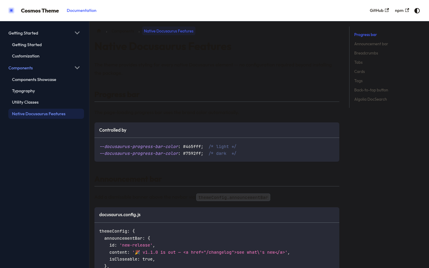
- **Progress bar**: `--docusaurus-progress-bar-color` → brand indigo (light + dark)
|
|
15
|
+
- **Announcement bar**: brand-colored banner with styled links and close button
|
|
16
|
+
- **Breadcrumbs**: active crumb uses brand color with subtle hover background
|
|
17
|
+
- **Tabs**: styled active tab border + color, hover state on inactive tabs
|
|
18
|
+
- **Cards**: border, rounded corners (12px), hover effect with brand border
|
|
19
|
+
- **Tags**: pill style with brand-colored background and border
|
|
20
|
+
- **Back-to-top button**: brand indigo with hover state (both modes)
|
|
21
|
+
- **Algolia DocSearch**: full `--docsearch-*` variable set for light and dark
|
|
22
|
+
- **Demo**: now loads `cosmos-docusaurus-theme` as a real npm package (`file:..`)
|
|
23
|
+
instead of a local path — exactly mirrors real consumer setup
|
|
24
|
+
- **Demo**: new "Native Features" page showcasing all newly styled elements
|
|
25
|
+
|
|
26
|
+
### Changed
|
|
27
|
+
|
|
28
|
+
- `demo/docusaurus.config.js`: `themes: ['cosmos-docusaurus-theme']` (was local path)
|
|
29
|
+
- `demo/package.json`: added `cosmos-docusaurus-theme: "file:.."` dependency
|
|
30
|
+
|
|
31
|
+
## [1.0.1] — 2026-03-09
|
|
32
|
+
|
|
33
|
+
### Fixed
|
|
34
|
+
|
|
35
|
+
- Aligned dark palette to **Void** (Tailwind gray-950/900/800 neutral blacks — not TailAdmin bluish-gray)
|
|
36
|
+
- Aligned light palette to **Slate** (warm brown text tones `#1a1714` / `#5c574f` — not cold blue-gray)
|
|
37
|
+
- Corrected all hardcoded color values in sidebar, navbar border, footer border, scrollbar
|
|
38
|
+
- Updated screenshots to reflect corrected palette
|
|
39
|
+
|
|
10
40
|
## [1.0.0] — 2024-03-09
|
|
11
41
|
|
|
12
42
|
### Added
|
package/README.md
CHANGED
|
@@ -1,27 +1,65 @@
|
|
|
1
1
|
# cosmos-docusaurus-theme
|
|
2
2
|
|
|
3
|
-
|
|
4
|
-
|
|
3
|
+
<div align="center">
|
|
4
|
+
|
|
5
|
+
**A clean, dark-first Docusaurus theme based on [TailAdmin](https://tailadmin.com) design system.**
|
|
6
|
+
|
|
7
|
+
[](https://www.npmjs.com/package/cosmos-docusaurus-theme)
|
|
8
|
+
[](https://www.npmjs.com/package/cosmos-docusaurus-theme)
|
|
5
9
|
[](https://github.com/SckyzO/cosmos-docusaurus-theme/actions/workflows/ci.yml)
|
|
6
|
-
[](LICENSE)
|
|
10
|
+
[](LICENSE)
|
|
11
|
+
[](https://docusaurus.io)
|
|
12
|
+
|
|
13
|
+
### [Live Demo](https://sckyzo.github.io/cosmos-docusaurus-theme/) · [Release notes](https://github.com/SckyzO/cosmos-docusaurus-theme/releases) · [npm](https://www.npmjs.com/package/cosmos-docusaurus-theme)
|
|
14
|
+
|
|
15
|
+
</div>
|
|
7
16
|
|
|
8
|
-
|
|
17
|
+
---
|
|
18
|
+
|
|
19
|
+
## Features
|
|
9
20
|
|
|
10
21
|
- **CSS-only** — no swizzled components, no JavaScript
|
|
11
|
-
- **Dark mode first-class** (default)
|
|
12
|
-
- **Outfit** + **JetBrains Mono** typography
|
|
13
|
-
- **Indigo** brand palette (`#465fff`)
|
|
22
|
+
- **Dark mode first-class** (default) with full light mode support
|
|
23
|
+
- **[Outfit](https://fonts.google.com/specimen/Outfit)** + **JetBrains Mono** typography
|
|
24
|
+
- **Indigo** brand palette (`#465fff`) — Void dark / Slate light design tokens
|
|
25
|
+
- Covers **every native Docusaurus element** out of the box:
|
|
26
|
+
|
|
27
|
+
| Element | Styled |
|
|
28
|
+
|---|:---:|
|
|
29
|
+
| Navbar + sidebar | ✅ |
|
|
30
|
+
| Code blocks + inline code | ✅ |
|
|
31
|
+
| Admonitions (note/tip/warning/danger) | ✅ |
|
|
32
|
+
| Tables | ✅ |
|
|
33
|
+
| Pagination + breadcrumbs | ✅ |
|
|
34
|
+
| Footer + scrollbar | ✅ |
|
|
35
|
+
| **Tabs** | ✅ |
|
|
36
|
+
| **Cards** | ✅ |
|
|
37
|
+
| **Tags / pill badges** | ✅ |
|
|
38
|
+
| **Announcement bar** | ✅ |
|
|
39
|
+
| **Back-to-top button** | ✅ |
|
|
40
|
+
| **Progress bar** | ✅ |
|
|
41
|
+
| **Algolia DocSearch** | ✅ |
|
|
42
|
+
|
|
43
|
+
- Optional utility classes: `.method-get/post/put/delete`, `.status-ok/warn/crit/unknown`
|
|
14
44
|
- Compatible with **Docusaurus 3+**
|
|
15
45
|
|
|
16
|
-
**[Live Demo](https://sckyzo.github.io/cosmos-docusaurus-theme)**
|
|
17
|
-
|
|
18
46
|
---
|
|
19
47
|
|
|
20
48
|
## Screenshots
|
|
21
49
|
|
|
22
|
-
>
|
|
50
|
+
> Dark mode (default) — Void palette: navbar, sidebar, code blocks
|
|
51
|
+
|
|
52
|
+
|
|
23
53
|
|
|
24
|
-
|
|
54
|
+
> Light mode — Slate palette: Components showcase
|
|
55
|
+
|
|
56
|
+
|
|
57
|
+
|
|
58
|
+
> Native features — tabs, cards, tags, breadcrumbs, DocSearch
|
|
59
|
+
|
|
60
|
+
|
|
61
|
+
|
|
62
|
+
> See all features live at **[sckyzo.github.io/cosmos-docusaurus-theme](https://sckyzo.github.io/cosmos-docusaurus-theme/)**
|
|
25
63
|
|
|
26
64
|
---
|
|
27
65
|
|
|
@@ -33,7 +71,7 @@ npm install cosmos-docusaurus-theme
|
|
|
33
71
|
|
|
34
72
|
## Usage
|
|
35
73
|
|
|
36
|
-
Register
|
|
74
|
+
Register as a Docusaurus theme plugin in `docusaurus.config.js`:
|
|
37
75
|
|
|
38
76
|
```js title="docusaurus.config.js"
|
|
39
77
|
export default {
|
|
@@ -48,12 +86,10 @@ export default {
|
|
|
48
86
|
};
|
|
49
87
|
```
|
|
50
88
|
|
|
51
|
-
The CSS is injected automatically
|
|
89
|
+
The CSS is injected automatically via `getClientModules()`. No `customCss` entry needed.
|
|
52
90
|
|
|
53
91
|
### Alternative — direct CSS import
|
|
54
92
|
|
|
55
|
-
If you prefer to control injection manually:
|
|
56
|
-
|
|
57
93
|
```js title="docusaurus.config.js"
|
|
58
94
|
export default {
|
|
59
95
|
presets: [
|
|
@@ -70,7 +106,7 @@ export default {
|
|
|
70
106
|
|
|
71
107
|
## Customization
|
|
72
108
|
|
|
73
|
-
Override any Infima variable after the theme
|
|
109
|
+
Override any Infima variable in your own `custom.css` after the theme is loaded:
|
|
74
110
|
|
|
75
111
|
```css title="src/css/custom.css"
|
|
76
112
|
/* Change brand color */
|
|
@@ -88,31 +124,23 @@ Override any Infima variable after the theme import:
|
|
|
88
124
|
:root {
|
|
89
125
|
--ifm-font-family-base: 'Inter', system-ui, sans-serif;
|
|
90
126
|
}
|
|
91
|
-
|
|
92
|
-
/* Adjust sidebar width */
|
|
93
|
-
:root {
|
|
94
|
-
--ifm-sidebar-width: 320px;
|
|
95
|
-
--doc-sidebar-width: 320px;
|
|
96
|
-
}
|
|
97
127
|
```
|
|
98
128
|
|
|
99
129
|
---
|
|
100
130
|
|
|
101
131
|
## Utility classes
|
|
102
132
|
|
|
103
|
-
|
|
104
|
-
|
|
105
|
-
|
|
|
106
|
-
|
|
107
|
-
| `.method-
|
|
108
|
-
| `.method-
|
|
109
|
-
| `.method-
|
|
110
|
-
| `.
|
|
111
|
-
| `.
|
|
112
|
-
| `.status-
|
|
113
|
-
| `.status-
|
|
114
|
-
| `.status-crit` | CRIT state (red, bold) |
|
|
115
|
-
| `.status-unknown`| UNKNOWN state (gray, bold) |
|
|
133
|
+
| Class | Usage |
|
|
134
|
+
|------------------|-------------------------------------|
|
|
135
|
+
| `.method-get` | HTTP GET label (green, monospace) |
|
|
136
|
+
| `.method-post` | HTTP POST label (blue, monospace) |
|
|
137
|
+
| `.method-put` | HTTP PUT label (orange, monospace) |
|
|
138
|
+
| `.method-delete` | HTTP DELETE label (red, monospace) |
|
|
139
|
+
| `.method-patch` | HTTP PATCH label (purple, monospace)|
|
|
140
|
+
| `.status-ok` | OK state (green, bold) |
|
|
141
|
+
| `.status-warn` | WARN state (orange, bold) |
|
|
142
|
+
| `.status-crit` | CRIT state (red, bold) |
|
|
143
|
+
| `.status-unknown`| UNKNOWN state (gray, bold) |
|
|
116
144
|
|
|
117
145
|
---
|
|
118
146
|
|
package/package.json
CHANGED
package/src/css/theme.css
CHANGED
|
@@ -1,12 +1,13 @@
|
|
|
1
1
|
/**
|
|
2
2
|
* Cosmos Docusaurus Theme
|
|
3
3
|
*
|
|
4
|
-
* A clean, dark-first Docusaurus CSS theme
|
|
5
|
-
*
|
|
6
|
-
*
|
|
4
|
+
* A clean, dark-first Docusaurus CSS theme.
|
|
5
|
+
* Palette aligned with the Rackscope design system:
|
|
6
|
+
* - Dark → "Void" : Tailwind gray-950/900/800 neutral blacks
|
|
7
|
+
* - Light → "Slate" : Tailwind gray-50/white with warm brown text tones
|
|
7
8
|
*
|
|
8
9
|
* Brand: #465fff (indigo)
|
|
9
|
-
* Font: Outfit
|
|
10
|
+
* Font: Outfit + JetBrains Mono for code
|
|
10
11
|
*
|
|
11
12
|
* Usage:
|
|
12
13
|
* In docusaurus.config.js → theme.customCss:
|
|
@@ -41,19 +42,19 @@
|
|
|
41
42
|
--ifm-h2-font-size: 1.6rem;
|
|
42
43
|
--ifm-h3-font-size: 1.25rem;
|
|
43
44
|
|
|
44
|
-
/* Background —
|
|
45
|
+
/* Background — Slate: Tailwind gray-50 / white */
|
|
45
46
|
--ifm-background-color: #f9fafb; /* gray-50 */
|
|
46
|
-
--ifm-background-surface-color: #fff;
|
|
47
|
+
--ifm-background-surface-color: #fff; /* white */
|
|
47
48
|
|
|
48
|
-
/* Text —
|
|
49
|
-
--ifm-font-color-base: #
|
|
50
|
-
--ifm-font-color-secondary: #
|
|
49
|
+
/* Text — Slate: warm brown tones (not cold blue-gray) */
|
|
50
|
+
--ifm-font-color-base: #1a1714; /* warm near-black */
|
|
51
|
+
--ifm-font-color-secondary: #5c574f; /* warm muted brown */
|
|
51
52
|
|
|
52
|
-
/* Navbar — 72px height
|
|
53
|
+
/* Navbar — 72px height */
|
|
53
54
|
--ifm-navbar-height: 72px;
|
|
54
55
|
--ifm-navbar-background-color: #fff;
|
|
55
56
|
--ifm-navbar-shadow: 0px 1px 3px 0px rgb(16,24,40,0.10), 0px 1px 2px 0px rgb(16,24,40,0.06);
|
|
56
|
-
--ifm-navbar-link-color: #
|
|
57
|
+
--ifm-navbar-link-color: #2c2822; /* warm dark text */
|
|
57
58
|
--ifm-navbar-link-hover-color: #465fff; /* brand-500 */
|
|
58
59
|
--ifm-navbar-link-active-color: #465fff;
|
|
59
60
|
|
|
@@ -61,24 +62,24 @@
|
|
|
61
62
|
--ifm-sidebar-width: 280px;
|
|
62
63
|
--doc-sidebar-width: 280px;
|
|
63
64
|
--ifm-sidebar-padding: 16px;
|
|
64
|
-
--docusaurus-collapse-button-bg-hover-color: #
|
|
65
|
+
--docusaurus-collapse-button-bg-hover-color: #f3f4f6; /* gray-100 */
|
|
65
66
|
|
|
66
67
|
/* Links */
|
|
67
68
|
--ifm-link-color: #465fff;
|
|
68
69
|
--ifm-link-hover-color: #3641f5;
|
|
69
70
|
|
|
70
|
-
/* Borders —
|
|
71
|
-
--ifm-toc-border-color: #
|
|
72
|
-
--ifm-hr-border-color: #
|
|
73
|
-
--ifm-color-emphasis-300: #
|
|
74
|
-
--ifm-color-emphasis-600: #
|
|
71
|
+
/* Borders — Slate: Tailwind gray-200 */
|
|
72
|
+
--ifm-toc-border-color: #e5e7eb;
|
|
73
|
+
--ifm-hr-border-color: #e5e7eb;
|
|
74
|
+
--ifm-color-emphasis-300: #e5e7eb;
|
|
75
|
+
--ifm-color-emphasis-600: #5c574f;
|
|
75
76
|
|
|
76
77
|
/* Code blocks */
|
|
77
|
-
--ifm-code-background: #
|
|
78
|
-
--prism-background-color:#
|
|
78
|
+
--ifm-code-background: #f3f4f6; /* Tailwind gray-100 */
|
|
79
|
+
--prism-background-color:#1f2937; /* Void gray-800 — dark code on light pages */
|
|
79
80
|
--docusaurus-highlighted-code-line-bg: rgb(70, 95, 255, 0.1);
|
|
80
81
|
|
|
81
|
-
/* Shadows
|
|
82
|
+
/* Shadows */
|
|
82
83
|
--ifm-global-shadow-md: 0px 4px 8px -2px rgb(16,24,40,0.10), 0px 2px 4px -2px rgb(16,24,40,0.06);
|
|
83
84
|
--ifm-global-shadow-lw: 0px 1px 2px 0px rgb(16,24,40,0.05);
|
|
84
85
|
|
|
@@ -87,7 +88,7 @@
|
|
|
87
88
|
--ifm-menu-link-padding-vertical: 8px;
|
|
88
89
|
|
|
89
90
|
/* Table */
|
|
90
|
-
--ifm-table-border-color: #
|
|
91
|
+
--ifm-table-border-color: #e5e7eb;
|
|
91
92
|
--ifm-table-head-background: #f9fafb;
|
|
92
93
|
}
|
|
93
94
|
|
|
@@ -103,36 +104,36 @@
|
|
|
103
104
|
--ifm-color-primary-lightest:#dde9ff; /* brand-100 */
|
|
104
105
|
--docusaurus-highlighted-code-line-bg: rgb(117, 146, 255, 0.15);
|
|
105
106
|
|
|
106
|
-
/* Background —
|
|
107
|
-
--ifm-background-color: #
|
|
108
|
-
--ifm-background-surface-color: #
|
|
109
|
-
--ifm-navbar-background-color: #
|
|
110
|
-
--ifm-footer-background-color: #
|
|
107
|
+
/* Background — Void: Tailwind gray-950 / gray-900 neutral blacks */
|
|
108
|
+
--ifm-background-color: #030712; /* gray-950 — deepest background */
|
|
109
|
+
--ifm-background-surface-color: #111827; /* gray-900 — cards, sidebar, panels */
|
|
110
|
+
--ifm-navbar-background-color: #111827; /* gray-900 */
|
|
111
|
+
--ifm-footer-background-color: #030712; /* gray-950 */
|
|
111
112
|
|
|
112
|
-
/* Text */
|
|
113
|
-
--ifm-font-color-base: #
|
|
114
|
-
--ifm-font-color-secondary: #
|
|
113
|
+
/* Text — neutral grays, no blue tint */
|
|
114
|
+
--ifm-font-color-base: #e5e5e5; /* neutral light */
|
|
115
|
+
--ifm-font-color-secondary: #a3a3a3; /* neutral muted */
|
|
115
116
|
|
|
116
|
-
/* Borders —
|
|
117
|
-
--ifm-toc-border-color: #
|
|
118
|
-
--ifm-hr-border-color: #
|
|
119
|
-
--ifm-color-emphasis-300: #
|
|
120
|
-
--ifm-color-emphasis-600: #
|
|
121
|
-
--ifm-table-border-color: #
|
|
122
|
-
--ifm-table-head-background: #
|
|
117
|
+
/* Borders — Void: Tailwind gray-800 */
|
|
118
|
+
--ifm-toc-border-color: #1f2937;
|
|
119
|
+
--ifm-hr-border-color: #1f2937;
|
|
120
|
+
--ifm-color-emphasis-300: #1f2937;
|
|
121
|
+
--ifm-color-emphasis-600: #a3a3a3;
|
|
122
|
+
--ifm-table-border-color: #1f2937;
|
|
123
|
+
--ifm-table-head-background: #111827;
|
|
123
124
|
|
|
124
125
|
/* Links */
|
|
125
126
|
--ifm-link-color: #7592ff;
|
|
126
127
|
--ifm-link-hover-color: #9cb9ff;
|
|
127
128
|
|
|
128
129
|
/* Navbar */
|
|
129
|
-
--ifm-navbar-link-color: #
|
|
130
|
+
--ifm-navbar-link-color: #e5e5e5;
|
|
130
131
|
--ifm-navbar-link-hover-color: #7592ff;
|
|
131
132
|
--ifm-navbar-link-active-color:#7592ff;
|
|
132
|
-
--ifm-navbar-shadow: 0px 1px 0px 0px #
|
|
133
|
+
--ifm-navbar-shadow: 0px 1px 0px 0px #1f2937;
|
|
133
134
|
|
|
134
135
|
/* Code */
|
|
135
|
-
--ifm-code-background: #
|
|
136
|
+
--ifm-code-background: #1f2937; /* gray-800 */
|
|
136
137
|
|
|
137
138
|
/* Sidebar collapse button */
|
|
138
139
|
--docusaurus-collapse-button-bg-hover-color: rgb(255,255,255,0.05);
|
|
@@ -176,7 +177,7 @@ html {
|
|
|
176
177
|
}
|
|
177
178
|
|
|
178
179
|
[data-theme='dark'] .navbar {
|
|
179
|
-
border-bottom-color: #
|
|
180
|
+
border-bottom-color: #1f2937; /* Void gray-800 */
|
|
180
181
|
}
|
|
181
182
|
|
|
182
183
|
/* ── Sidebar ─────────────────────────────────────────────────────────────── */
|
|
@@ -185,8 +186,8 @@ html {
|
|
|
185
186
|
}
|
|
186
187
|
|
|
187
188
|
[data-theme='dark'] .theme-doc-sidebar-container {
|
|
188
|
-
border-right-color: #
|
|
189
|
-
background: #
|
|
189
|
+
border-right-color: #1f2937 !important; /* Void gray-800 */
|
|
190
|
+
background: #111827; /* Void gray-900 */
|
|
190
191
|
}
|
|
191
192
|
|
|
192
193
|
.theme-doc-sidebar-menu {
|
|
@@ -222,20 +223,20 @@ html {
|
|
|
222
223
|
}
|
|
223
224
|
|
|
224
225
|
.menu__list-item-collapsible:hover {
|
|
225
|
-
background: #
|
|
226
|
+
background: #f3f4f6; /* Slate gray-100 */
|
|
226
227
|
}
|
|
227
228
|
|
|
228
229
|
[data-theme='dark'] .menu__list-item-collapsible:hover {
|
|
229
230
|
background: rgb(255,255,255,0.05);
|
|
230
231
|
}
|
|
231
232
|
|
|
232
|
-
/* Sidebar section separator — uppercase label
|
|
233
|
+
/* Sidebar section separator — uppercase label */
|
|
233
234
|
.sidebar_menu_section_title {
|
|
234
235
|
font-size: 0.6875rem;
|
|
235
236
|
font-weight: 700;
|
|
236
237
|
letter-spacing: 0.08em;
|
|
237
238
|
text-transform: uppercase;
|
|
238
|
-
color: #
|
|
239
|
+
color: #a3a3a3; /* neutral gray-400 */
|
|
239
240
|
padding: 12px 12px 4px;
|
|
240
241
|
}
|
|
241
242
|
|
|
@@ -346,7 +347,7 @@ code {
|
|
|
346
347
|
}
|
|
347
348
|
|
|
348
349
|
[data-theme='dark'] .footer {
|
|
349
|
-
border-top-color: #
|
|
350
|
+
border-top-color: #1f2937; /* Void gray-800 */
|
|
350
351
|
}
|
|
351
352
|
|
|
352
353
|
/* ── Pagination nav ───────────────────────────────────────────────────────── */
|
|
@@ -361,6 +362,185 @@ code {
|
|
|
361
362
|
box-shadow: 0 0 0 3px rgb(70, 95, 255, 0.12);
|
|
362
363
|
}
|
|
363
364
|
|
|
365
|
+
/* ── Progress bar (page loading indicator) ───────────────────────────────── */
|
|
366
|
+
:root {
|
|
367
|
+
--docusaurus-progress-bar-color: #465fff;
|
|
368
|
+
}
|
|
369
|
+
|
|
370
|
+
[data-theme='dark'] {
|
|
371
|
+
--docusaurus-progress-bar-color: #7592ff;
|
|
372
|
+
}
|
|
373
|
+
|
|
374
|
+
/* ── Announcement bar ─────────────────────────────────────────────────────── */
|
|
375
|
+
.announcement {
|
|
376
|
+
background-color: #465fff;
|
|
377
|
+
color: #fff;
|
|
378
|
+
font-size: 0.875rem;
|
|
379
|
+
font-weight: 500;
|
|
380
|
+
}
|
|
381
|
+
|
|
382
|
+
.announcement a {
|
|
383
|
+
color: #dde9ff;
|
|
384
|
+
text-decoration: underline;
|
|
385
|
+
}
|
|
386
|
+
|
|
387
|
+
.announcement a:hover {
|
|
388
|
+
color: #fff;
|
|
389
|
+
}
|
|
390
|
+
|
|
391
|
+
.announcement-close {
|
|
392
|
+
color: rgb(255,255,255,0.7);
|
|
393
|
+
}
|
|
394
|
+
|
|
395
|
+
.announcement-close:hover {
|
|
396
|
+
color: #fff;
|
|
397
|
+
}
|
|
398
|
+
|
|
399
|
+
[data-theme='dark'] .announcement {
|
|
400
|
+
background-color: #3641f5;
|
|
401
|
+
}
|
|
402
|
+
|
|
403
|
+
/* ── Breadcrumbs ─────────────────────────────────────────────────────────── */
|
|
404
|
+
:root {
|
|
405
|
+
--ifm-breadcrumb-color-active: #465fff;
|
|
406
|
+
--ifm-breadcrumb-item-background-active: rgb(70, 95, 255, 0.08);
|
|
407
|
+
--ifm-breadcrumb-border-radius: 6px;
|
|
408
|
+
--ifm-breadcrumb-padding-horizontal: 8px;
|
|
409
|
+
--ifm-breadcrumb-padding-vertical: 4px;
|
|
410
|
+
--ifm-breadcrumb-separator-size-multiplier: 0.6;
|
|
411
|
+
}
|
|
412
|
+
|
|
413
|
+
.breadcrumbs__link {
|
|
414
|
+
border-radius: 6px;
|
|
415
|
+
font-size: 0.8125rem;
|
|
416
|
+
transition: background 0.12s, color 0.12s;
|
|
417
|
+
}
|
|
418
|
+
|
|
419
|
+
/* ── Tabs ────────────────────────────────────────────────────────────────── */
|
|
420
|
+
:root {
|
|
421
|
+
--ifm-tabs-color: #5c574f;
|
|
422
|
+
--ifm-tabs-color-active: #465fff;
|
|
423
|
+
--ifm-tabs-color-active-border: #465fff;
|
|
424
|
+
--ifm-tabs-padding-horizontal: 16px;
|
|
425
|
+
--ifm-tabs-padding-vertical: 10px;
|
|
426
|
+
}
|
|
427
|
+
|
|
428
|
+
[data-theme='dark'] {
|
|
429
|
+
--ifm-tabs-color: #a3a3a3;
|
|
430
|
+
}
|
|
431
|
+
|
|
432
|
+
.tabs__item {
|
|
433
|
+
border-radius: 6px 6px 0 0;
|
|
434
|
+
font-weight: 500;
|
|
435
|
+
font-size: 0.875rem;
|
|
436
|
+
transition: color 0.12s, background 0.12s;
|
|
437
|
+
}
|
|
438
|
+
|
|
439
|
+
.tabs__item:hover:not(.tabs__item--active) {
|
|
440
|
+
background: var(--ifm-breadcrumb-item-background-active);
|
|
441
|
+
color: var(--ifm-color-primary);
|
|
442
|
+
}
|
|
443
|
+
|
|
444
|
+
/* ── Cards ───────────────────────────────────────────────────────────────── */
|
|
445
|
+
:root {
|
|
446
|
+
--ifm-card-background-color: #fff;
|
|
447
|
+
--ifm-card-border-radius: 12px;
|
|
448
|
+
}
|
|
449
|
+
|
|
450
|
+
[data-theme='dark'] {
|
|
451
|
+
--ifm-card-background-color: #111827; /* Void gray-900 */
|
|
452
|
+
}
|
|
453
|
+
|
|
454
|
+
.card {
|
|
455
|
+
border: 1px solid var(--ifm-toc-border-color);
|
|
456
|
+
border-radius: var(--ifm-card-border-radius);
|
|
457
|
+
box-shadow: var(--ifm-global-shadow-lw);
|
|
458
|
+
transition: border-color 0.15s, box-shadow 0.15s;
|
|
459
|
+
}
|
|
460
|
+
|
|
461
|
+
.card:hover {
|
|
462
|
+
border-color: var(--ifm-color-primary);
|
|
463
|
+
box-shadow: var(--ifm-global-shadow-md);
|
|
464
|
+
}
|
|
465
|
+
|
|
466
|
+
/* ── Tags ────────────────────────────────────────────────────────────────── */
|
|
467
|
+
:root {
|
|
468
|
+
--ifm-tag-background: rgb(70, 95, 255, 0.08);
|
|
469
|
+
--ifm-tag-color: #465fff;
|
|
470
|
+
--ifm-tag-border-color: rgb(70, 95, 255, 0.2);
|
|
471
|
+
}
|
|
472
|
+
|
|
473
|
+
[data-theme='dark'] {
|
|
474
|
+
--ifm-tag-background: rgb(117, 146, 255, 0.1);
|
|
475
|
+
--ifm-tag-color: #7592ff;
|
|
476
|
+
--ifm-tag-border-color: rgb(117, 146, 255, 0.25);
|
|
477
|
+
}
|
|
478
|
+
|
|
479
|
+
.tag {
|
|
480
|
+
border-radius: 20px;
|
|
481
|
+
font-size: 0.75rem;
|
|
482
|
+
font-weight: 500;
|
|
483
|
+
padding: 2px 10px;
|
|
484
|
+
transition: background 0.12s, color 0.12s;
|
|
485
|
+
}
|
|
486
|
+
|
|
487
|
+
/* ── Back-to-top button ──────────────────────────────────────────────────── */
|
|
488
|
+
.theme-back-to-top-button {
|
|
489
|
+
background-color: #465fff;
|
|
490
|
+
border-radius: 8px;
|
|
491
|
+
}
|
|
492
|
+
|
|
493
|
+
.theme-back-to-top-button:hover {
|
|
494
|
+
background-color: #3641f5;
|
|
495
|
+
}
|
|
496
|
+
|
|
497
|
+
[data-theme='dark'] .theme-back-to-top-button {
|
|
498
|
+
background-color: #7592ff;
|
|
499
|
+
}
|
|
500
|
+
|
|
501
|
+
[data-theme='dark'] .theme-back-to-top-button:hover {
|
|
502
|
+
background-color: #9cb9ff;
|
|
503
|
+
}
|
|
504
|
+
|
|
505
|
+
/* ── Algolia DocSearch ───────────────────────────────────────────────────── */
|
|
506
|
+
/* Applied when Algolia search is configured in themeConfig.algolia. */
|
|
507
|
+
[data-theme='light'] .DocSearch {
|
|
508
|
+
--docsearch-primary-color: #465fff;
|
|
509
|
+
--docsearch-text-color: #1a1714;
|
|
510
|
+
--docsearch-muted-color: #5c574f;
|
|
511
|
+
--docsearch-container-background: rgb(26, 23, 20, 0.6);
|
|
512
|
+
--docsearch-modal-background: #fff;
|
|
513
|
+
--docsearch-modal-shadow: 0px 8px 24px rgb(0, 0, 0, 0.12);
|
|
514
|
+
--docsearch-searchbox-background: #f9fafb;
|
|
515
|
+
--docsearch-searchbox-focus-background:#fff;
|
|
516
|
+
--docsearch-searchbox-shadow: inset 0 0 0 2px #465fff;
|
|
517
|
+
--docsearch-hit-color: #1a1714;
|
|
518
|
+
--docsearch-hit-active-color: #fff;
|
|
519
|
+
--docsearch-hit-background: #fff;
|
|
520
|
+
--docsearch-hit-shadow: 0 1px 3px rgb(0, 0, 0, 0.08);
|
|
521
|
+
--docsearch-footer-background: #f9fafb;
|
|
522
|
+
--docsearch-logo-color: #465fff;
|
|
523
|
+
}
|
|
524
|
+
|
|
525
|
+
[data-theme='dark'] .DocSearch {
|
|
526
|
+
--docsearch-primary-color: #7592ff;
|
|
527
|
+
--docsearch-text-color: #e5e5e5;
|
|
528
|
+
--docsearch-muted-color: #a3a3a3;
|
|
529
|
+
--docsearch-container-background: rgb(3, 7, 18, 0.8);
|
|
530
|
+
--docsearch-modal-background: #111827;
|
|
531
|
+
--docsearch-modal-shadow: 0px 8px 24px rgb(0, 0, 0, 0.4);
|
|
532
|
+
--docsearch-searchbox-background: #030712;
|
|
533
|
+
--docsearch-searchbox-focus-background:#030712;
|
|
534
|
+
--docsearch-searchbox-shadow: inset 0 0 0 2px #7592ff;
|
|
535
|
+
--docsearch-hit-color: #e5e5e5;
|
|
536
|
+
--docsearch-hit-active-color: #fff;
|
|
537
|
+
--docsearch-hit-background: #1f2937;
|
|
538
|
+
--docsearch-hit-shadow: none;
|
|
539
|
+
--docsearch-footer-background: #030712;
|
|
540
|
+
--docsearch-key-gradient: linear-gradient(-26.5deg, #1f2937 0%, #111827 100%);
|
|
541
|
+
--docsearch-logo-color: #7592ff;
|
|
542
|
+
}
|
|
543
|
+
|
|
364
544
|
/* ── Scrollbar — thin, TailAdmin style ───────────────────────────────────── */
|
|
365
545
|
::-webkit-scrollbar {
|
|
366
546
|
width: 5px;
|
|
@@ -377,11 +557,11 @@ code {
|
|
|
377
557
|
}
|
|
378
558
|
|
|
379
559
|
::-webkit-scrollbar-thumb:hover {
|
|
380
|
-
background: #
|
|
560
|
+
background: #a3a3a3; /* neutral gray-400 */
|
|
381
561
|
}
|
|
382
562
|
|
|
383
563
|
[data-theme='dark'] ::-webkit-scrollbar-thumb {
|
|
384
|
-
background: #
|
|
564
|
+
background: #374151; /* Void gray-700 */
|
|
385
565
|
}
|
|
386
566
|
|
|
387
567
|
[data-theme='dark'] ::-webkit-scrollbar-thumb:hover {
|
|
@@ -442,6 +622,6 @@ code {
|
|
|
442
622
|
}
|
|
443
623
|
|
|
444
624
|
.status-unknown {
|
|
445
|
-
color: #
|
|
625
|
+
color: #6b7280; /* neutral gray-500 */
|
|
446
626
|
font-weight: 600;
|
|
447
627
|
}
|