chroma-panel 0.1.1 → 0.1.3
This diff represents the content of publicly available package versions that have been released to one of the supported registries. The information contained in this diff is provided for informational purposes only and reflects changes between package versions as they appear in their respective public registries.
- package/README.md +37 -20
- package/dist/components/ChromaPanel.cjs +1 -1
- package/dist/components/ChromaPanel.js +1 -1
- package/dist/components/ColorInput.cjs +1 -1
- package/dist/components/ColorInput.js +1 -1
- package/dist/components/PanelFooter.cjs +4 -4
- package/dist/components/PanelFooter.js +4 -4
- package/dist/core/useFormControl.cjs +1 -1
- package/dist/core/useFormControl.js +1 -1
- package/dist/modes/image/index.cjs +5 -3
- package/dist/modes/image/index.js +5 -3
- package/dist/modes/palettes/index.cjs +1 -1
- package/dist/modes/palettes/index.js +1 -1
- package/dist/modes/sliders/index.cjs +1 -1
- package/dist/modes/sliders/index.js +1 -1
- package/dist/modes/wheel/index.cjs +1 -1
- package/dist/modes/wheel/index.js +1 -1
- package/dist/primitives/ColorDisc.cjs +1 -1
- package/dist/primitives/ColorDisc.js +1 -1
- package/package.json +22 -14
package/README.md
CHANGED
|
@@ -1,20 +1,22 @@
|
|
|
1
|
-
|
|
1
|
+
[](https://chroma-panel.jscrate.dev)
|
|
2
2
|
|
|
3
3
|
[](https://www.npmjs.com/package/chroma-panel)
|
|
4
|
-
[](https://www.npmjs.com/package/chroma-panel)
|
|
4
|
+
<!-- [](https://www.npmjs.com/package/chroma-panel) -->
|
|
5
5
|
[](https://www.npmjs.com/package/chroma-panel)
|
|
6
|
-
[](https://chroma-panel.jscrate.dev)
|
|
7
|
+
[](./LICENSE)
|
|
7
8
|
|
|
8
9
|
# chroma-panel
|
|
9
10
|
|
|
10
|
-
A React color picker with the look and feel of the macOS color panel.
|
|
11
|
+
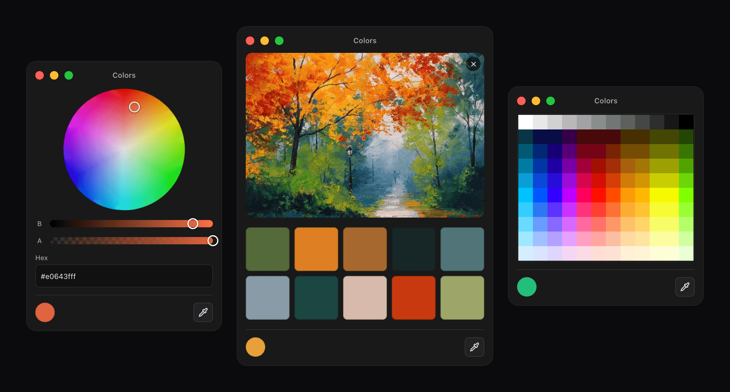
A React color picker component with the look and feel of the macOS color panel: a color wheel, sliders, palettes, color sampling from an image, and an eyedropper.
|
|
11
12
|
|
|
12
|
-
|
|
13
|
-
- An eyedropper for grabbing a color from anywhere on screen, where the browser supports it
|
|
14
|
-
- Drops into a form like an `<input>`, with `name`, `required` and `form.reset()`
|
|
15
|
-
- No runtime dependencies, TypeScript types included, ESM and CommonJS
|
|
13
|
+
**[Documentation and live demo](https://chroma-panel.jscrate.dev)** · [Quick start](https://chroma-panel.jscrate.dev/react/overview/quick-start) · [Comparison](https://chroma-panel.jscrate.dev/react/overview/comparison) · [FAQ](https://chroma-panel.jscrate.dev/react/overview/faq) · [Releases](https://chroma-panel.jscrate.dev/react/overview/releases)
|
|
16
14
|
|
|
17
|
-
|
|
15
|
+
- Five ways to pick a color: a [wheel](https://chroma-panel.jscrate.dev/react/modes/wheel), [RGB, HSL and HSB sliders](https://chroma-panel.jscrate.dev/react/modes/sliders), [palettes](https://chroma-panel.jscrate.dev/react/modes/palettes), a [120-color pencil grid](https://chroma-panel.jscrate.dev/react/modes/pencils), and [sampling from an image](https://chroma-panel.jscrate.dev/react/modes/image)
|
|
16
|
+
- An [eyedropper](https://chroma-panel.jscrate.dev/react/utils/use-eyedropper) for grabbing a color from anywhere on screen, where the browser supports it
|
|
17
|
+
- Drops into a [form](https://chroma-panel.jscrate.dev/react/handbook/forms) like an `<input>`, with `name`, `required` and `form.reset()`
|
|
18
|
+
- [Accessible](https://chroma-panel.jscrate.dev/react/overview/accessibility): every color channel is a real range input, so keyboards and screen readers work
|
|
19
|
+
- No runtime dependencies, TypeScript types included, ESM and CommonJS
|
|
18
20
|
|
|
19
21
|
## Install
|
|
20
22
|
|
|
@@ -41,13 +43,13 @@ export function Example() {
|
|
|
41
43
|
}
|
|
42
44
|
```
|
|
43
45
|
|
|
44
|
-
No CSS import and no provider. `ColorInput` renders a swatch button that opens the panel in a popover.
|
|
46
|
+
No CSS import and no provider. [`ColorInput`](https://chroma-panel.jscrate.dev/react/components/color-input) renders a swatch button that opens the panel in a popover.
|
|
45
47
|
|
|
46
|
-
`onChange` fires continuously while you drag, `onChangeComplete` once when you let go. [Which to use](
|
|
48
|
+
`onChange` fires continuously while you drag, `onChangeComplete` once when you let go. [Which to use](https://chroma-panel.jscrate.dev/react/handbook/controlled#onchange-vs-onchangecomplete).
|
|
47
49
|
|
|
48
50
|
## Inline panel
|
|
49
51
|
|
|
50
|
-
`ChromaPanel` is the same panel without the popover, for when you want it on the page:
|
|
52
|
+
[`ChromaPanel`](https://chroma-panel.jscrate.dev/react/components/chroma-panel) is the same panel without the popover, for when you want it on the page:
|
|
51
53
|
|
|
52
54
|
```tsx
|
|
53
55
|
import { ChromaPanel } from 'chroma-panel';
|
|
@@ -55,6 +57,19 @@ import { ChromaPanel } from 'chroma-panel';
|
|
|
55
57
|
<ChromaPanel defaultValue="#3366cc" modes={['wheel']} showTitleBar={false} />
|
|
56
58
|
```
|
|
57
59
|
|
|
60
|
+
## Pick colors from an image
|
|
61
|
+
|
|
62
|
+
The image mode takes a dropped or chosen file and shows its dominant colors as swatches. The sampler behind it is exported too, for when you want the palette without the panel:
|
|
63
|
+
|
|
64
|
+
```ts
|
|
65
|
+
import { extractPalette } from 'chroma-panel';
|
|
66
|
+
|
|
67
|
+
const { swatches } = await extractPalette(file, { maxColors: 8 });
|
|
68
|
+
// [{ hex: '#3e5f8a', rgb: [62, 95, 138], population: 4213 }, ...]
|
|
69
|
+
```
|
|
70
|
+
|
|
71
|
+
It takes a `File`, a `Blob` or an image URL, and downscales large images before reading them. More in the [image mode docs](https://chroma-panel.jscrate.dev/react/modes/image).
|
|
72
|
+
|
|
58
73
|
## Smaller bundle
|
|
59
74
|
|
|
60
75
|
Importing `chroma-panel` registers all five modes. If you only need one or two, import the shell and add them yourself:
|
|
@@ -66,11 +81,11 @@ import 'chroma-panel/wheel';
|
|
|
66
81
|
<ChromaPanel modes={['wheel']} />
|
|
67
82
|
```
|
|
68
83
|
|
|
69
|
-
That is 14.1 kB instead of 22.2 kB. Every mode has its own entry point — see [entry points](
|
|
84
|
+
That is 14.1 kB instead of 22.2 kB. Every mode has its own entry point — see [entry points](https://chroma-panel.jscrate.dev/react/utils/entry-points).
|
|
70
85
|
|
|
71
86
|
## Theming
|
|
72
87
|
|
|
73
|
-
|
|
88
|
+

|
|
74
89
|
|
|
75
90
|
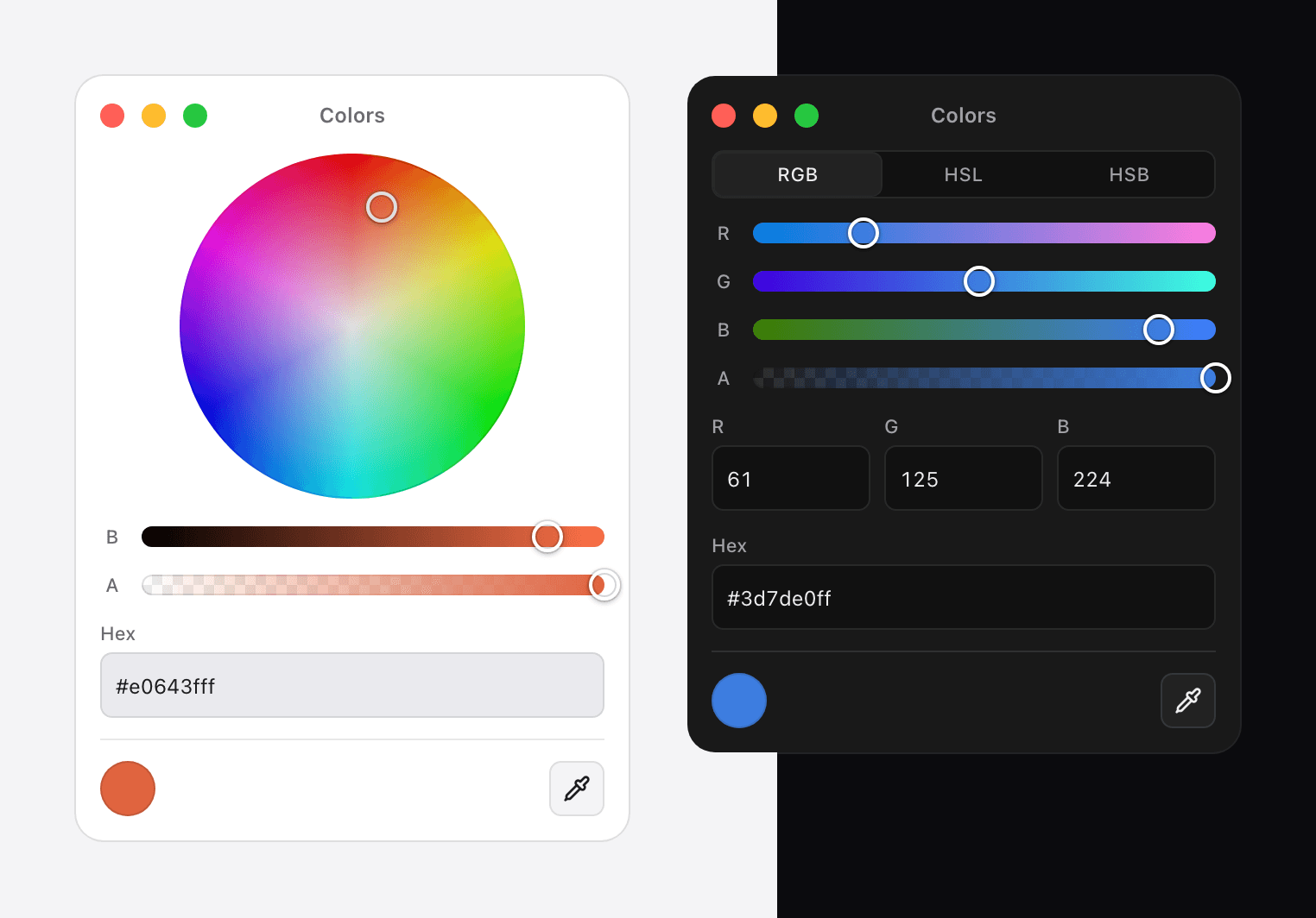
The panel follows the system color scheme. To change how it looks, override the CSS variables or pass your own class per part:
|
|
76
91
|
|
|
@@ -78,7 +93,7 @@ The panel follows the system color scheme. To change how it looks, override the
|
|
|
78
93
|
<ColorInput classNames={{ root: 'shadow-2xl', trigger: 'h-8 w-12' }} />
|
|
79
94
|
```
|
|
80
95
|
|
|
81
|
-
Full details in the [theming guide](
|
|
96
|
+
Full details in the [theming guide](https://chroma-panel.jscrate.dev/react/handbook/theming). Using Tailwind? See [styling with Tailwind](https://chroma-panel.jscrate.dev/react/handbook/tailwind).
|
|
82
97
|
|
|
83
98
|
## Why the color survives a round trip
|
|
84
99
|
|
|
@@ -106,14 +121,16 @@ Measured as the increase in a real Vite production build, gzipped, with React ex
|
|
|
106
121
|
| Browsers | Chrome 123, Firefox 120, Safari 17.5 |
|
|
107
122
|
| TypeScript | Types included, no `@types` package needed |
|
|
108
123
|
| Modules | ESM and CommonJS |
|
|
109
|
-
| Server rendering | Safe. Browser-dependent files are marked `'use client'
|
|
124
|
+
| Server rendering | Safe. Browser-dependent files are marked `'use client'`. [Next.js and SSR](https://chroma-panel.jscrate.dev/react/handbook/server-rendering) |
|
|
110
125
|
|
|
111
|
-
The browser versions come from `light-dark()`, a CSS function the stylesheet relies on. [What happens on older browsers](
|
|
126
|
+
The browser versions come from `light-dark()`, a CSS function the stylesheet relies on. [What happens on older browsers](https://chroma-panel.jscrate.dev/react/handbook/browser-support).
|
|
112
127
|
|
|
113
128
|
## Help
|
|
114
129
|
|
|
115
|
-
|
|
130
|
+
- Documentation: [chroma-panel.jscrate.dev](https://chroma-panel.jscrate.dev), including the [FAQ](https://chroma-panel.jscrate.dev/react/overview/faq) and [common mistakes](https://chroma-panel.jscrate.dev/react/handbook/common-mistakes)
|
|
131
|
+
- Reference in this repository: [API](docs/api.md) and [guides](docs/guides.md)
|
|
132
|
+
- Questions and bug reports: [github.com/re-sohail/chroma-panel/issues](https://github.com/re-sohail/chroma-panel/issues)
|
|
116
133
|
|
|
117
|
-
##
|
|
134
|
+
## License
|
|
118
135
|
|
|
119
|
-
MIT © [Sohail Khan](https://
|
|
136
|
+
MIT © [Sohail Khan](https://me.jscrate.dev)
|
|
@@ -32,7 +32,7 @@ function ChromaPanel(props) {
|
|
|
32
32
|
"palettes",
|
|
33
33
|
"image",
|
|
34
34
|
"pencils"
|
|
35
|
-
], mode, defaultMode, onModeChange, format = "hex", showAlpha = true, showEyedropper = true, showRecentColors = true, recentColors, defaultRecentColors, onRecentColorsChange, palettes, pencils, modeProps, imageOptions, disabled = false, theme, showTitleBar = true, title = "
|
|
35
|
+
], mode, defaultMode, onModeChange, format = "hex", showAlpha = true, showEyedropper = true, showRecentColors = true, recentColors, defaultRecentColors, onRecentColorsChange, palettes, pencils, modeProps, imageOptions, disabled = false, theme, showTitleBar = true, title = "Colors", onClose, collapsed, defaultCollapsed = false, onCollapsedChange, size, defaultSize = "default", onSizeChange, injectStyles: shouldInject = true, className, classNames = {}, style, store: externalStore } = props;
|
|
36
36
|
const rootRef = react.useRef(null);
|
|
37
37
|
const panelHostRef = react.useRef(null);
|
|
38
38
|
const idPrefix = require_context.useStableId("cp");
|
|
@@ -30,7 +30,7 @@ function ChromaPanel(props) {
|
|
|
30
30
|
"palettes",
|
|
31
31
|
"image",
|
|
32
32
|
"pencils"
|
|
33
|
-
], mode, defaultMode, onModeChange, format = "hex", showAlpha = true, showEyedropper = true, showRecentColors = true, recentColors, defaultRecentColors, onRecentColorsChange, palettes, pencils, modeProps, imageOptions, disabled = false, theme, showTitleBar = true, title = "
|
|
33
|
+
], mode, defaultMode, onModeChange, format = "hex", showAlpha = true, showEyedropper = true, showRecentColors = true, recentColors, defaultRecentColors, onRecentColorsChange, palettes, pencils, modeProps, imageOptions, disabled = false, theme, showTitleBar = true, title = "Colors", onClose, collapsed, defaultCollapsed = false, onCollapsedChange, size, defaultSize = "default", onSizeChange, injectStyles: shouldInject = true, className, classNames = {}, style, store: externalStore } = props;
|
|
34
34
|
const rootRef = React.useRef(null);
|
|
35
35
|
const panelHostRef = React.useRef(null);
|
|
36
36
|
const idPrefix = useStableId("cp");
|
|
@@ -15,7 +15,7 @@ react = require_runtime.__toESM(react, 1);
|
|
|
15
15
|
let react_jsx_runtime = require("react/jsx-runtime");
|
|
16
16
|
//#region src/components/ColorInput.tsx
|
|
17
17
|
function ColorInput(props) {
|
|
18
|
-
const { open, defaultOpen = false, onOpenChange, name, form, required = false, readOnly = false, autoComplete, validationBehavior = "native", id, "aria-label": ariaLabel = "Choose a
|
|
18
|
+
const { open, defaultOpen = false, onOpenChange, name, form, required = false, readOnly = false, autoComplete, validationBehavior = "native", id, "aria-label": ariaLabel = "Choose a color", triggerClassName, disabled: disabledProp = false, className, classNames = {}, format = "hex", value, defaultValue = require_ChromaPanel.DEFAULT_COLOR, store: externalStore, mode, defaultMode, onModeChange, ...panelProps } = props;
|
|
19
19
|
const triggerId = require_context.useStableId("cp-trigger-");
|
|
20
20
|
const hiddenRef = react.useRef(null);
|
|
21
21
|
const fieldsetDisabled = require_useFormControl.useFieldsetDisabled(hiddenRef);
|
|
@@ -13,7 +13,7 @@ import * as React from "react";
|
|
|
13
13
|
import { Fragment, jsx, jsxs } from "react/jsx-runtime";
|
|
14
14
|
//#region src/components/ColorInput.tsx
|
|
15
15
|
function ColorInput(props) {
|
|
16
|
-
const { open, defaultOpen = false, onOpenChange, name, form, required = false, readOnly = false, autoComplete, validationBehavior = "native", id, "aria-label": ariaLabel = "Choose a
|
|
16
|
+
const { open, defaultOpen = false, onOpenChange, name, form, required = false, readOnly = false, autoComplete, validationBehavior = "native", id, "aria-label": ariaLabel = "Choose a color", triggerClassName, disabled: disabledProp = false, className, classNames = {}, format = "hex", value, defaultValue = DEFAULT_COLOR, store: externalStore, mode, defaultMode, onModeChange, ...panelProps } = props;
|
|
17
17
|
const triggerId = useStableId("cp-trigger-");
|
|
18
18
|
const hiddenRef = React.useRef(null);
|
|
19
19
|
const fieldsetDisabled = useFieldsetDisabled(hiddenRef);
|
|
@@ -41,12 +41,12 @@ function PanelFooter() {
|
|
|
41
41
|
recents.length > 0 ? /* @__PURE__ */ (0, react_jsx_runtime.jsx)("ul", {
|
|
42
42
|
ref: recentsRef,
|
|
43
43
|
className: "cp-recents",
|
|
44
|
-
"aria-label": "Recent
|
|
44
|
+
"aria-label": "Recent colors",
|
|
45
45
|
children: recents.map((color, index) => /* @__PURE__ */ (0, react_jsx_runtime.jsx)("li", { children: /* @__PURE__ */ (0, react_jsx_runtime.jsx)("button", {
|
|
46
46
|
type: "button",
|
|
47
47
|
className: require_context.cx("cp-swatch", "cp-swatch-round", classNames.swatch),
|
|
48
48
|
style: { ["--cp-swatch-color"]: color },
|
|
49
|
-
"aria-label": `Recent
|
|
49
|
+
"aria-label": `Recent color ${color}`,
|
|
50
50
|
disabled,
|
|
51
51
|
onClick: () => {
|
|
52
52
|
const parsed = require_parse.parse(color);
|
|
@@ -59,8 +59,8 @@ function PanelFooter() {
|
|
|
59
59
|
showEyedropper && /* @__PURE__ */ (0, react_jsx_runtime.jsx)("button", {
|
|
60
60
|
type: "button",
|
|
61
61
|
className: "cp-icon-button",
|
|
62
|
-
"aria-label": "Pick a
|
|
63
|
-
title: "Pick a
|
|
62
|
+
"aria-label": "Pick a color from the screen",
|
|
63
|
+
title: "Pick a color from the screen",
|
|
64
64
|
disabled,
|
|
65
65
|
onClick: () => {
|
|
66
66
|
handlePick();
|
|
@@ -39,12 +39,12 @@ function PanelFooter() {
|
|
|
39
39
|
recents.length > 0 ? /* @__PURE__ */ jsx("ul", {
|
|
40
40
|
ref: recentsRef,
|
|
41
41
|
className: "cp-recents",
|
|
42
|
-
"aria-label": "Recent
|
|
42
|
+
"aria-label": "Recent colors",
|
|
43
43
|
children: recents.map((color, index) => /* @__PURE__ */ jsx("li", { children: /* @__PURE__ */ jsx("button", {
|
|
44
44
|
type: "button",
|
|
45
45
|
className: cx("cp-swatch", "cp-swatch-round", classNames.swatch),
|
|
46
46
|
style: { ["--cp-swatch-color"]: color },
|
|
47
|
-
"aria-label": `Recent
|
|
47
|
+
"aria-label": `Recent color ${color}`,
|
|
48
48
|
disabled,
|
|
49
49
|
onClick: () => {
|
|
50
50
|
const parsed = parse(color);
|
|
@@ -57,8 +57,8 @@ function PanelFooter() {
|
|
|
57
57
|
showEyedropper && /* @__PURE__ */ jsx("button", {
|
|
58
58
|
type: "button",
|
|
59
59
|
className: "cp-icon-button",
|
|
60
|
-
"aria-label": "Pick a
|
|
61
|
-
title: "Pick a
|
|
60
|
+
"aria-label": "Pick a color from the screen",
|
|
61
|
+
title: "Pick a color from the screen",
|
|
62
62
|
disabled,
|
|
63
63
|
onClick: () => {
|
|
64
64
|
handlePick();
|
|
@@ -50,7 +50,7 @@ function useConstraintValidation(ref, options) {
|
|
|
50
50
|
const input = ref.current;
|
|
51
51
|
if (input === null) return;
|
|
52
52
|
const { behavior, required, isEmpty } = latest.current;
|
|
53
|
-
const message = behavior === "native" && required && isEmpty ? "Please choose a
|
|
53
|
+
const message = behavior === "native" && required && isEmpty ? "Please choose a color." : "";
|
|
54
54
|
input.setCustomValidity(message);
|
|
55
55
|
if (!input.hasAttribute("title")) input.title = "";
|
|
56
56
|
});
|
|
@@ -48,7 +48,7 @@ function useConstraintValidation(ref, options) {
|
|
|
48
48
|
const input = ref.current;
|
|
49
49
|
if (input === null) return;
|
|
50
50
|
const { behavior, required, isEmpty } = latest.current;
|
|
51
|
-
const message = behavior === "native" && required && isEmpty ? "Please choose a
|
|
51
|
+
const message = behavior === "native" && required && isEmpty ? "Please choose a color." : "";
|
|
52
52
|
input.setCustomValidity(message);
|
|
53
53
|
if (!input.hasAttribute("title")) input.title = "";
|
|
54
54
|
});
|
|
@@ -123,8 +123,8 @@ function ImagePanel(props) {
|
|
|
123
123
|
"aria-live": "polite",
|
|
124
124
|
className: "cp-visually-hidden",
|
|
125
125
|
children: [
|
|
126
|
-
status === "working" ? "Extracting
|
|
127
|
-
status === "ready" ? `${swatches.length}
|
|
126
|
+
status === "working" ? "Extracting colors" : "",
|
|
127
|
+
status === "ready" ? `${swatches.length} colors extracted` : "",
|
|
128
128
|
status === "error" ? message : ""
|
|
129
129
|
]
|
|
130
130
|
}),
|
|
@@ -165,6 +165,8 @@ function ImagePanel(props) {
|
|
|
165
165
|
type: "file",
|
|
166
166
|
accept: "image/*",
|
|
167
167
|
disabled,
|
|
168
|
+
"aria-label": preview === null ? void 0 : "Choose a different image",
|
|
169
|
+
tabIndex: preview === null ? void 0 : -1,
|
|
168
170
|
onChange: (e) => onFiles(e.currentTarget.files)
|
|
169
171
|
}),
|
|
170
172
|
preview !== null && status === "error" && /* @__PURE__ */ (0, react_jsx_runtime.jsx)("p", {
|
|
@@ -176,7 +178,7 @@ function ImagePanel(props) {
|
|
|
176
178
|
color: s.hex,
|
|
177
179
|
name: s.hex
|
|
178
180
|
})),
|
|
179
|
-
label: "Extracted
|
|
181
|
+
label: "Extracted colors",
|
|
180
182
|
columns: 5
|
|
181
183
|
})
|
|
182
184
|
]
|
|
@@ -121,8 +121,8 @@ function ImagePanel(props) {
|
|
|
121
121
|
"aria-live": "polite",
|
|
122
122
|
className: "cp-visually-hidden",
|
|
123
123
|
children: [
|
|
124
|
-
status === "working" ? "Extracting
|
|
125
|
-
status === "ready" ? `${swatches.length}
|
|
124
|
+
status === "working" ? "Extracting colors" : "",
|
|
125
|
+
status === "ready" ? `${swatches.length} colors extracted` : "",
|
|
126
126
|
status === "error" ? message : ""
|
|
127
127
|
]
|
|
128
128
|
}),
|
|
@@ -163,6 +163,8 @@ function ImagePanel(props) {
|
|
|
163
163
|
type: "file",
|
|
164
164
|
accept: "image/*",
|
|
165
165
|
disabled,
|
|
166
|
+
"aria-label": preview === null ? void 0 : "Choose a different image",
|
|
167
|
+
tabIndex: preview === null ? void 0 : -1,
|
|
166
168
|
onChange: (e) => onFiles(e.currentTarget.files)
|
|
167
169
|
}),
|
|
168
170
|
preview !== null && status === "error" && /* @__PURE__ */ jsx("p", {
|
|
@@ -174,7 +176,7 @@ function ImagePanel(props) {
|
|
|
174
176
|
color: s.hex,
|
|
175
177
|
name: s.hex
|
|
176
178
|
})),
|
|
177
|
-
label: "Extracted
|
|
179
|
+
label: "Extracted colors",
|
|
178
180
|
columns: 5
|
|
179
181
|
})
|
|
180
182
|
]
|
|
@@ -64,7 +64,7 @@ function SlidersPanel() {
|
|
|
64
64
|
children: [
|
|
65
65
|
/* @__PURE__ */ (0, react_jsx_runtime.jsx)(require_SegmentedControl.SegmentedControl, {
|
|
66
66
|
size: "sm",
|
|
67
|
-
ariaLabel: "
|
|
67
|
+
ariaLabel: "Color model",
|
|
68
68
|
items: MODELS,
|
|
69
69
|
value: model,
|
|
70
70
|
onChange: (id) => setModel(id)
|
|
@@ -60,7 +60,7 @@ function ColorDisc(props) {
|
|
|
60
60
|
onPointerUp: drag.onPointerUp,
|
|
61
61
|
onLostPointerCapture: drag.onLostPointerCapture,
|
|
62
62
|
role: "group",
|
|
63
|
-
"aria-label": "
|
|
63
|
+
"aria-label": "Color wheel",
|
|
64
64
|
"aria-disabled": disabled || void 0,
|
|
65
65
|
children: [
|
|
66
66
|
/* @__PURE__ */ (0, react_jsx_runtime.jsx)(require_AxisInput.AxisInput, {
|
|
@@ -58,7 +58,7 @@ function ColorDisc(props) {
|
|
|
58
58
|
onPointerUp: drag.onPointerUp,
|
|
59
59
|
onLostPointerCapture: drag.onLostPointerCapture,
|
|
60
60
|
role: "group",
|
|
61
|
-
"aria-label": "
|
|
61
|
+
"aria-label": "Color wheel",
|
|
62
62
|
"aria-disabled": disabled || void 0,
|
|
63
63
|
children: [
|
|
64
64
|
/* @__PURE__ */ jsx(AxisInput, {
|
package/package.json
CHANGED
|
@@ -1,30 +1,37 @@
|
|
|
1
1
|
{
|
|
2
2
|
"name": "chroma-panel",
|
|
3
|
-
"version": "0.1.
|
|
4
|
-
"description": "React color picker with wheel, sliders, palettes, image sampling and an eyedropper.
|
|
3
|
+
"version": "0.1.3",
|
|
4
|
+
"description": "React color picker component with a color wheel, sliders, palettes, image sampling and an eyedropper. Accessible, zero dependencies, TypeScript included.",
|
|
5
5
|
"keywords": [
|
|
6
|
+
"react-color-picker",
|
|
7
|
+
"color-picker",
|
|
6
8
|
"react",
|
|
9
|
+
"react-component",
|
|
7
10
|
"color",
|
|
8
|
-
"color-picker",
|
|
9
11
|
"colorpicker",
|
|
10
|
-
"
|
|
11
|
-
"
|
|
12
|
-
"
|
|
12
|
+
"colour-picker",
|
|
13
|
+
"color-input",
|
|
14
|
+
"color-wheel",
|
|
15
|
+
"color-palette",
|
|
16
|
+
"image-color-picker",
|
|
13
17
|
"eyedropper",
|
|
14
18
|
"palette",
|
|
19
|
+
"swatch",
|
|
20
|
+
"hex",
|
|
21
|
+
"rgb",
|
|
22
|
+
"rgba",
|
|
23
|
+
"hsl",
|
|
24
|
+
"hsv",
|
|
25
|
+
"hsva",
|
|
15
26
|
"accessible",
|
|
16
27
|
"a11y",
|
|
17
28
|
"typescript",
|
|
18
29
|
"zero-dependency",
|
|
19
|
-
"
|
|
20
|
-
"
|
|
21
|
-
"color-wheel",
|
|
22
|
-
"swatch",
|
|
23
|
-
"macos",
|
|
24
|
-
"hsl"
|
|
30
|
+
"nextjs",
|
|
31
|
+
"macos"
|
|
25
32
|
],
|
|
26
33
|
"license": "MIT",
|
|
27
|
-
"author": "Sohail Khan (https://
|
|
34
|
+
"author": "Sohail Khan (https://me.jscrate.dev)",
|
|
28
35
|
"type": "module",
|
|
29
36
|
"sideEffects": [
|
|
30
37
|
"**/*.css",
|
|
@@ -169,6 +176,7 @@
|
|
|
169
176
|
"lint:attw": "attw --pack . --profile node16 --exclude-entrypoints styles.css style.css image-worker",
|
|
170
177
|
"verify:directives": "node scripts/verify-directives.mjs",
|
|
171
178
|
"size": "node scripts/size-report.mjs",
|
|
179
|
+
"readme:images": "node scripts/capture-readme-images.mjs",
|
|
172
180
|
"prepublishOnly": "npm run build && npm run verify:directives && npm run size",
|
|
173
181
|
"release": "changeset publish",
|
|
174
182
|
"build:fast": "tsdown && node scripts/emit-css.mjs && node scripts/strip-sourcemaps.mjs"
|
|
@@ -207,7 +215,7 @@
|
|
|
207
215
|
"type": "git",
|
|
208
216
|
"url": "git+https://github.com/re-sohail/chroma-panel.git"
|
|
209
217
|
},
|
|
210
|
-
"homepage": "https://
|
|
218
|
+
"homepage": "https://chroma-panel.jscrate.dev",
|
|
211
219
|
"bugs": {
|
|
212
220
|
"url": "https://github.com/re-sohail/chroma-panel/issues"
|
|
213
221
|
},
|