baseline-kit 3.0.2 → 5.1.0
This diff represents the content of publicly available package versions that have been released to one of the supported registries. The information contained in this diff is provided for informational purposes only and reflects changes between package versions as they appear in their respective public registries.
- package/CHANGELOG.md +235 -0
- package/README.md +226 -334
- package/dist/baseline-kit.css +7 -22
- package/dist/core.cjs +1 -0
- package/dist/core.d.ts +354 -0
- package/dist/core.mjs +2 -0
- package/dist/guide.cjs +2 -0
- package/dist/guide.cjs.map +1 -0
- package/dist/guide.css +2 -0
- package/dist/guide.d.ts +146 -0
- package/dist/guide.mjs +586 -0
- package/dist/guide.mjs.map +1 -0
- package/dist/index.cjs +2 -2
- package/dist/index.cjs.map +1 -1
- package/dist/index.d.ts +204 -30
- package/dist/index.mjs +620 -1747
- package/dist/index.mjs.map +1 -1
- package/dist/remix-server.d.ts +8 -0
- package/dist/remix-server.mjs +15 -0
- package/dist/remix-server.mjs.map +1 -0
- package/dist/remix.css +2 -0
- package/dist/remix.d.ts +177 -0
- package/dist/remix.mjs +989 -0
- package/dist/remix.mjs.map +1 -0
- package/dist/reset.css +43 -0
- package/dist/src-C-1u5WNS.cjs +2 -0
- package/dist/src-C-1u5WNS.cjs.map +1 -0
- package/dist/src-C3TICsw6.js +547 -0
- package/dist/src-C3TICsw6.js.map +1 -0
- package/dist/styles.css +1 -1
- package/dist/theme/dark.css +0 -8
- package/dist/theme/default.css +0 -10
- package/dist/theme/tokens.css +1 -11
- package/dist/theme.css +4 -19
- package/package.json +135 -46
- package/dist/README.md +0 -446
- package/dist/components/Baseline/Baseline.d.ts +0 -48
- package/dist/components/Baseline/index.d.ts +0 -6
- package/dist/components/Box/Box.d.ts +0 -73
- package/dist/components/Box/index.d.ts +0 -6
- package/dist/components/Config/Config.d.ts +0 -179
- package/dist/components/Config/defaults.d.ts +0 -25
- package/dist/components/Config/index.d.ts +0 -11
- package/dist/components/Guide/Guide.d.ts +0 -70
- package/dist/components/Guide/index.d.ts +0 -6
- package/dist/components/Guide/types.d.ts +0 -144
- package/dist/components/Guide/validation.d.ts +0 -82
- package/dist/components/Layout/Layout.d.ts +0 -73
- package/dist/components/Layout/index.d.ts +0 -10
- package/dist/components/Padder/Padder.d.ts +0 -67
- package/dist/components/Padder/index.d.ts +0 -10
- package/dist/components/Spacer/Spacer.d.ts +0 -48
- package/dist/components/Spacer/index.d.ts +0 -10
- package/dist/components/Stack/Stack.d.ts +0 -84
- package/dist/components/Stack/index.d.ts +0 -10
- package/dist/components/index.d.ts +0 -16
- package/dist/components/styles/index.d.ts +0 -11
- package/dist/components/types.d.ts +0 -102
- package/dist/hooks/index.d.ts +0 -11
- package/dist/hooks/useBaseline.d.ts +0 -55
- package/dist/hooks/useConfig.d.ts +0 -41
- package/dist/hooks/useDebug.d.ts +0 -49
- package/dist/hooks/useGuide.d.ts +0 -61
- package/dist/hooks/useIsClient.d.ts +0 -6
- package/dist/hooks/useMeasure.d.ts +0 -35
- package/dist/hooks/useVirtual.d.ts +0 -60
- package/dist/styles.d.ts +0 -6
- package/dist/theme.d.ts +0 -6
- package/dist/utils/convert.d.ts +0 -24
- package/dist/utils/grid.d.ts +0 -22
- package/dist/utils/index.d.ts +0 -15
- package/dist/utils/math.d.ts +0 -48
- package/dist/utils/merge.d.ts +0 -117
- package/dist/utils/normalize.d.ts +0 -30
- package/dist/utils/padding.d.ts +0 -11
- package/dist/utils/parse.d.ts +0 -18
- package/dist/utils/snapping.d.ts +0 -28
- package/dist/utils/ssr.d.ts +0 -26
- package/dist/utils/timing.d.ts +0 -45
package/README.md
CHANGED
|
@@ -4,442 +4,334 @@
|
|
|
4
4
|

|
|
5
5
|

|
|
6
6
|
|
|
7
|
-
Baseline Kit is a
|
|
8
|
-
|
|
9
|
-
|
|
10
|
-
|
|
11
|
-
## Table of Contents
|
|
12
|
-
- [Features](#features)
|
|
13
|
-
- [Requirements](#requirements)
|
|
14
|
-
- [Installation](#installation)
|
|
15
|
-
- [Quick Start](#quick-start)
|
|
16
|
-
- [Core Concepts](#core-concepts)
|
|
17
|
-
- [Base Unit](#base-unit)
|
|
18
|
-
- [Spacing Values](#spacing-values)
|
|
19
|
-
- [Grid Snapping](#grid-snapping)
|
|
20
|
-
- [Debugging Modes](#debugging-modes)
|
|
21
|
-
- [Components](#components)
|
|
22
|
-
- [Component Hierarchy](#component-hierarchy)
|
|
23
|
-
- [Key Components](#key-components)
|
|
24
|
-
- [Config](#config)
|
|
25
|
-
- [Baseline](#baseline)
|
|
26
|
-
- [Guide](#guide)
|
|
27
|
-
- [Box](#box)
|
|
28
|
-
- [Theme System](#theme-system)
|
|
29
|
-
- [CSS Import Options](#css-import-options)
|
|
30
|
-
- [Theme Options](#theme-options)
|
|
31
|
-
- [Theme Variables Reference](#theme-variables-reference)
|
|
32
|
-
- [Browser Support](#browser-support)
|
|
33
|
-
- [React 19 Features](#react-19-features)
|
|
34
|
-
- [Server-Side Rendering (SSR)](#server-side-rendering-ssr)
|
|
35
|
-
- [SSR-Friendly Design](#ssr-friendly-design)
|
|
36
|
-
- [SSR Mode Prop](#ssr-mode-prop)
|
|
37
|
-
- [Development](#development)
|
|
38
|
-
- [Performance Features](#performance-features)
|
|
39
|
-
- [Contributing](#contributing)
|
|
40
|
-
- [License](#license)
|
|
41
|
-
|
|
42
|
-
## Features
|
|
43
|
-
|
|
44
|
-
- 📏 **Baseline Grid:** Core system for maintaining vertical rhythm and consistent spacing across your layouts
|
|
45
|
-
- 🎯 **Column Grid Guide:** Customizable overlay system for visualizing column-based layouts and alignment
|
|
46
|
-
- 📦 **Box Component:** Basic container with configurable spacing that snaps to the baseline grid
|
|
47
|
-
- 🧩 **Layout Component:** CSS Grid-based container with automatic column calculations and baseline alignment
|
|
48
|
-
- 📐 **Stack Component:** Flex-based container that maintains consistent spacing and baseline alignment
|
|
49
|
-
- 🎨 **Theme System:** Customizable colors and debug visuals through a centralized configuration
|
|
7
|
+
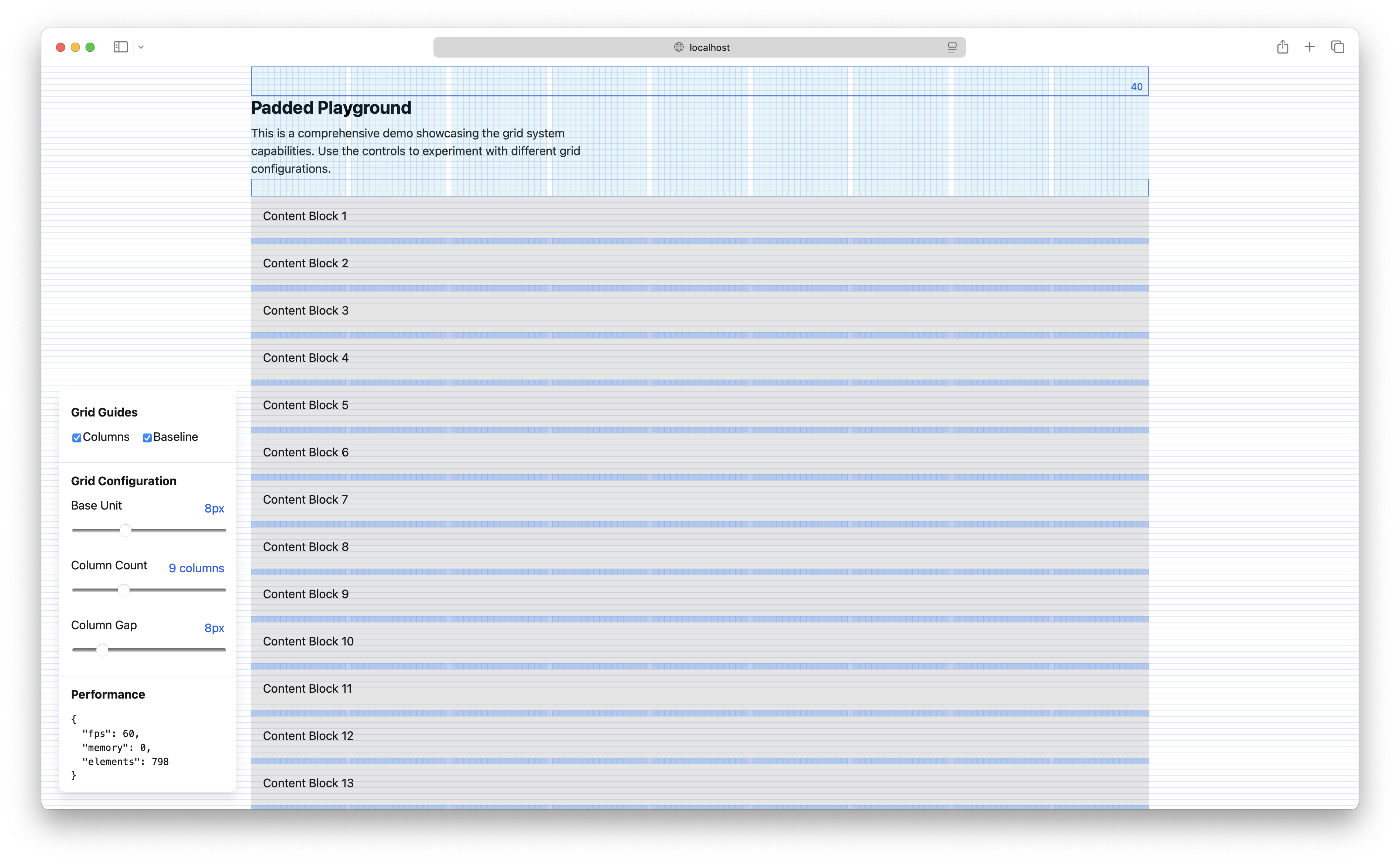
Baseline Kit is a development overlay and spacing toolkit for React 19. It
|
|
8
|
+
provides baseline and column grids, spacing primitives, scoped configuration,
|
|
9
|
+
and themeable debug visuals. It also ships a React-free adapter for the Remix 3
|
|
10
|
+
UI runtime.
|
|
50
11
|
|
|
51
|
-
|
|
52
|
-
|
|
53
|
-
- **React 19**: Baseline Kit is built for React 19 and uses the latest React features like the `use` hook
|
|
54
|
-
- **Modern Browsers**: Supporting the latest CSS features
|
|
55
|
-
|
|
56
|
-
## Installation
|
|
12
|
+
|
|
57
13
|
|
|
58
|
-
|
|
59
|
-
# Using npm
|
|
60
|
-
npm install baseline-kit
|
|
14
|
+
## What it includes
|
|
61
15
|
|
|
62
|
-
|
|
63
|
-
|
|
16
|
+
- **`Baseline`** — a horizontal baseline-grid overlay.
|
|
17
|
+
- **`Guide`** — a column-grid overlay with line, pattern, fixed, and auto modes.
|
|
18
|
+
- **`Box`**, **`Padder`**, and **`Spacer`** — spacing primitives that can align
|
|
19
|
+
content to the baseline grid.
|
|
20
|
+
- **`Config`** — scoped defaults for the base unit, colors, variants, and
|
|
21
|
+
debugging visibility.
|
|
22
|
+
- **React-free Remix support** — native `remix/ui` components with SSR,
|
|
23
|
+
hydration, measurement, and cleanup support.
|
|
64
24
|
|
|
65
|
-
|
|
66
|
-
pnpm add baseline-kit
|
|
67
|
-
```
|
|
25
|
+
## Requirements
|
|
68
26
|
|
|
69
|
-
|
|
27
|
+
- React 19 for the default and `baseline-kit/guide` entries.
|
|
28
|
+
- The React/core package declares Node.js 18+; native Remix requires
|
|
29
|
+
`remix@3.0.0-rc.2` and its Node.js 24.3+ runtime. Other Remix versions need
|
|
30
|
+
a compatibility check. Repository development requires Node.js 24.15+.
|
|
31
|
+
- TypeScript 5.8+, 6, or 7 when using TypeScript.
|
|
32
|
+
- A modern browser with CSS Grid and CSS custom property support.
|
|
70
33
|
|
|
71
|
-
|
|
72
|
-
// Import in your main entry file (e.g., index.js, App.js)
|
|
73
|
-
import 'baseline-kit/styles'; // Required core styles
|
|
74
|
-
import 'baseline-kit/theme'; // Recommended theme (or use your own)
|
|
75
|
-
```
|
|
76
|
-
|
|
77
|
-
For frameworks like Remix that use URL imports in a links function:
|
|
34
|
+
## Installation
|
|
78
35
|
|
|
79
|
-
```
|
|
80
|
-
|
|
81
|
-
|
|
82
|
-
|
|
83
|
-
];
|
|
36
|
+
```shell
|
|
37
|
+
npm install baseline-kit react@19 react-dom@19
|
|
38
|
+
# or
|
|
39
|
+
bun add baseline-kit react@19 react-dom@19
|
|
84
40
|
```
|
|
85
41
|
|
|
86
|
-
|
|
42
|
+
Choose the smallest entry point that matches the application:
|
|
87
43
|
|
|
88
|
-
|
|
89
|
-
|
|
90
|
-
|
|
91
|
-
|
|
92
|
-
|
|
93
|
-
|
|
94
|
-
|
|
95
|
-
|
|
96
|
-
```
|
|
44
|
+
| Use case | JavaScript entry | CSS entry |
|
|
45
|
+
| ------------------------------- | -------------------- | --------------------------------------------------- |
|
|
46
|
+
| React components | `baseline-kit` | `baseline-kit/styles` plus `baseline-kit/theme` |
|
|
47
|
+
| React guide only | `baseline-kit/guide` | `baseline-kit/styles/guide` |
|
|
48
|
+
| React-free Remix 3 UI | `baseline-kit/remix` | `baseline-kit/styles/remix` |
|
|
49
|
+
| Framework-independent utilities | `baseline-kit/core` | None |
|
|
50
|
+
| All React styles and theme | — | `baseline-kit/styles/full` |
|
|
51
|
+
| Optional reset | — | `baseline-kit/reset` or `baseline-kit/styles/reset` |
|
|
97
52
|
|
|
98
|
-
Baseline Kit
|
|
53
|
+
Baseline Kit includes its own TypeScript declarations. React and Remix remain
|
|
54
|
+
optional peer dependencies, so an application only installs the runtime it
|
|
55
|
+
uses.
|
|
99
56
|
|
|
100
|
-
## Quick
|
|
57
|
+
## Quick start
|
|
101
58
|
|
|
102
59
|
```tsx
|
|
103
|
-
import
|
|
104
|
-
import
|
|
105
|
-
|
|
106
|
-
function App() {
|
|
107
|
-
const isDev = process.env.NODE_ENV === 'development'
|
|
108
|
-
const debugging = isDev ? 'visible' : 'hidden'
|
|
60
|
+
import 'baseline-kit/styles'
|
|
61
|
+
import 'baseline-kit/theme'
|
|
62
|
+
import { Baseline, Box, Config, Guide } from 'baseline-kit'
|
|
109
63
|
|
|
64
|
+
export function App() {
|
|
110
65
|
return (
|
|
111
66
|
<Config
|
|
112
67
|
base={8}
|
|
113
|
-
baseline={{ debugging }}
|
|
114
|
-
|
|
115
|
-
|
|
116
|
-
spacer={{ debugging }}
|
|
68
|
+
baseline={{ debugging: 'visible' }}
|
|
69
|
+
guide={{ debugging: 'visible' }}
|
|
70
|
+
box={{ debugging: 'visible' }}
|
|
117
71
|
>
|
|
118
|
-
{
|
|
119
|
-
|
|
120
|
-
|
|
121
|
-
|
|
122
|
-
|
|
123
|
-
|
|
124
|
-
|
|
125
|
-
<Guide
|
|
126
|
-
variant="pattern"
|
|
127
|
-
columns={['100px', '200px', '100px']}
|
|
128
|
-
gap={16}
|
|
129
|
-
align="center"
|
|
130
|
-
width="1200px"
|
|
131
|
-
/>
|
|
132
|
-
|
|
133
|
-
{/* Box with baseline alignment */}
|
|
134
|
-
<Box
|
|
135
|
-
block={[2, 5]}
|
|
136
|
-
debugging="visible"
|
|
137
|
-
>
|
|
138
|
-
<h1>Content Aligned to the Grid</h1>
|
|
139
|
-
</Box>
|
|
140
|
-
|
|
141
|
-
<main>Your main content goes here...</main>
|
|
72
|
+
<main style={{ position: 'relative', height: '100vh' }}>
|
|
73
|
+
<Baseline height="100%" />
|
|
74
|
+
<Guide variant="fixed" columns={12} width="100%" />
|
|
75
|
+
<Box block={[16, 24]} snapping="height">
|
|
76
|
+
Content aligned to the grid
|
|
77
|
+
</Box>
|
|
78
|
+
</main>
|
|
142
79
|
</Config>
|
|
143
80
|
)
|
|
144
81
|
}
|
|
145
82
|
```
|
|
146
83
|
|
|
147
|
-
## Core
|
|
84
|
+
## Core concepts
|
|
148
85
|
|
|
149
|
-
### Base
|
|
86
|
+
### Base unit and sizing
|
|
150
87
|
|
|
151
|
-
|
|
152
|
-
|
|
88
|
+
`base` is the baseline interval in CSS pixels; it defaults to `8`. Numeric
|
|
89
|
+
spacing values are CSS pixel values, not multipliers. CSS dimensions such as
|
|
90
|
+
`100vh`, `50%`, `1rem`, and `calc(...)` on Baseline dimensions remain relative
|
|
91
|
+
and are resolved by the browser. Overlays are absolutely positioned: give their
|
|
92
|
+
parent `position: relative` and a definite height for percentage heights.
|
|
153
93
|
|
|
154
94
|
```tsx
|
|
155
|
-
<Config base={8}>
|
|
156
|
-
<
|
|
157
|
-
|
|
158
|
-
|
|
159
|
-
>
|
|
160
|
-
{/* Content automatically aligned to the 8px grid */}
|
|
161
|
-
</Layout>
|
|
95
|
+
<Config base={8}>
|
|
96
|
+
<Padder block={[16, 24]} inline={{ start: 8, end: 16 }}>
|
|
97
|
+
Content
|
|
98
|
+
</Padder>
|
|
162
99
|
</Config>
|
|
163
100
|
```
|
|
164
101
|
|
|
165
|
-
|
|
166
|
-
|
|
167
|
-
Spacing props (`block`, `inline`, `gap`) accept values in three formats:
|
|
168
|
-
|
|
169
|
-
```
|
|
170
|
-
// Single number (applies to both sides)
|
|
171
|
-
block={16} // 16px top and bottom
|
|
172
|
-
|
|
173
|
-
// Array [start, end]
|
|
174
|
-
block={[2, 3]} // 2px top, 3px bottom
|
|
102
|
+
Spacing props accept the following shapes:
|
|
175
103
|
|
|
176
|
-
|
|
177
|
-
|
|
178
|
-
|
|
104
|
+
- `padding={16}` — all four sides.
|
|
105
|
+
- `padding={[8, 16]}` — 8px top/bottom and 16px left/right; three- and
|
|
106
|
+
four-value arrays follow CSS padding shorthand.
|
|
107
|
+
- `block={[16, 24]}` — block-start and block-end.
|
|
108
|
+
- `inline={{ start: 8, end: 16 }}` — inline-start and inline-end.
|
|
179
109
|
|
|
180
|
-
### Grid
|
|
110
|
+
### Grid snapping
|
|
181
111
|
|
|
182
|
-
|
|
112
|
+
`Box` defaults to `snapping="clamp"`. `height` adds bottom spacing to round the
|
|
113
|
+
measured height up to the next base interval; `clamp` also reduces the top and
|
|
114
|
+
bottom spacing modulo the base. Use `snapping="none"` to keep explicit spacing.
|
|
115
|
+
Snapping happens once after the first nonzero measurement, not continuously on
|
|
116
|
+
resize. `Padder` uses height snapping in both adapters. Set `ssrMode` on Padder
|
|
117
|
+
to retain explicit padding without applying its measured snap.
|
|
183
118
|
|
|
184
|
-
|
|
185
|
-
- **Stack**: Maintains baseline alignment in flex layouts
|
|
186
|
-
- **Layout**: Ensures grid cells align with baseline
|
|
119
|
+
### Debugging modes
|
|
187
120
|
|
|
188
|
-
|
|
121
|
+
Every visual component supports one of these modes:
|
|
189
122
|
|
|
190
|
-
|
|
123
|
+
- `visible` — render and show the debug visual.
|
|
124
|
+
- `hidden` — hide debug paint while preserving content and spacing.
|
|
125
|
+
- `none` — disable debug paint and use ordinary padding instead of debug spacers.
|
|
191
126
|
|
|
192
|
-
|
|
193
|
-
|
|
194
|
-
debugging = "hidden" // Elements exist but are invisible
|
|
195
|
-
debugging = "none" // Removes debug elements entirely
|
|
196
|
-
```
|
|
127
|
+
Baseline and Guide keep an empty host in both hidden modes. They are debug
|
|
128
|
+
overlays marked `aria-hidden`; keep meaningful application content outside them.
|
|
197
129
|
|
|
198
130
|
## Components
|
|
199
131
|
|
|
200
|
-
|
|
132
|
+
| Component | Purpose |
|
|
133
|
+
| ---------- | ------------------------------------------------------------- |
|
|
134
|
+
| `Config` | Supplies scoped base, variant, color, and debugging defaults. |
|
|
135
|
+
| `Baseline` | Renders horizontal baseline rows. |
|
|
136
|
+
| `Guide` | Renders a responsive or fixed column guide. |
|
|
137
|
+
| `Box` | Wraps content and optionally snaps its measured height. |
|
|
138
|
+
| `Padder` | Adds baseline-aware padding and optional measurement spacers. |
|
|
139
|
+
| `Spacer` | Adds a fixed-size spacer with an optional debug indicator. |
|
|
201
140
|
|
|
202
|
-
|
|
141
|
+
`Box` and `Padder` use `text-box-trim: trim-both` and
|
|
142
|
+
`text-box-edge: ex alphabetic` where the browser supports them, keeping text
|
|
143
|
+
edges aligned to the x-height and alphabetic baseline. Unsupported browsers
|
|
144
|
+
retain normal text layout. Trimming does not remove child margins or change a
|
|
145
|
+
nested heading's own line-box rules.
|
|
146
|
+
For nested text, set the same properties on its text container. See the
|
|
147
|
+
[CSS text-box-edge reference](https://developer.mozilla.org/en-US/docs/Web/CSS/Reference/Properties/text-box-edge)
|
|
148
|
+
for browser compatibility and alternative metrics such as `ex alphabetic`.
|
|
203
149
|
|
|
204
|
-
|
|
205
|
-
- **`Stack`** Flex-based layouts (one-dimensional)
|
|
206
|
-
- **`Layout`** Grid-based layouts (two-dimensional)
|
|
150
|
+
## Styles and themes
|
|
207
151
|
|
|
208
|
-
|
|
152
|
+
Import styles explicitly so applications control their CSS footprint:
|
|
209
153
|
|
|
210
|
-
|
|
211
|
-
|
|
212
|
-
-
|
|
154
|
+
```tsx
|
|
155
|
+
// React component styles and the default light/dark theme
|
|
156
|
+
import 'baseline-kit/styles'
|
|
157
|
+
import 'baseline-kit/theme'
|
|
158
|
+
|
|
159
|
+
// Or one combined file
|
|
160
|
+
import 'baseline-kit/styles/full'
|
|
213
161
|
|
|
214
|
-
|
|
162
|
+
// Guide-only styles
|
|
163
|
+
import 'baseline-kit/styles/guide'
|
|
215
164
|
|
|
216
|
-
|
|
165
|
+
// Optional reset
|
|
166
|
+
import 'baseline-kit/reset'
|
|
167
|
+
```
|
|
217
168
|
|
|
218
|
-
|
|
169
|
+
The built-in theme follows `prefers-color-scheme`. For a fixed theme, import
|
|
170
|
+
`baseline-kit/theme/default` or `baseline-kit/theme/dark`. For a custom theme,
|
|
171
|
+
copy the token template from `baseline-kit/theme/tokens` and define the CSS
|
|
172
|
+
variables your application needs.
|
|
219
173
|
|
|
220
|
-
|
|
174
|
+
Use `Config` for scoped overrides:
|
|
221
175
|
|
|
222
176
|
```tsx
|
|
223
177
|
<Config
|
|
224
|
-
base={8}
|
|
225
|
-
baseline={{
|
|
226
|
-
|
|
178
|
+
base={8}
|
|
179
|
+
baseline={{
|
|
180
|
+
colors: {
|
|
181
|
+
line: 'rgba(255, 0, 0, 0.1)',
|
|
182
|
+
flat: 'rgba(255, 0, 0, 0.05)',
|
|
183
|
+
},
|
|
184
|
+
}}
|
|
227
185
|
>
|
|
228
186
|
{children}
|
|
229
187
|
</Config>
|
|
230
188
|
```
|
|
231
189
|
|
|
232
|
-
|
|
233
|
-
|
|
234
|
-
```tsx
|
|
235
|
-
<Baseline
|
|
236
|
-
height="100vh" // Overlay height
|
|
237
|
-
variant="line" // "line" or "flat"
|
|
238
|
-
debugging="visible" // Show the grid overlay
|
|
239
|
-
/>
|
|
240
|
-
```
|
|
241
|
-
|
|
242
|
-
#### Guide
|
|
243
|
-
|
|
244
|
-
```tsx
|
|
245
|
-
<Guide
|
|
246
|
-
variant="pattern" // "line", "pattern", "fixed", or "auto"
|
|
247
|
-
columns={['100px', '1fr', '100px']} // Column definition
|
|
248
|
-
gap={8} // Gap value
|
|
249
|
-
width="1200px" // Container width
|
|
250
|
-
/>
|
|
251
|
-
```
|
|
252
|
-
|
|
253
|
-
#### Box
|
|
254
|
-
|
|
255
|
-
```tsx
|
|
256
|
-
<Box
|
|
257
|
-
block={[2, 5]} // Vertical padding in base units
|
|
258
|
-
span={2} // Grid column span when used in Layout
|
|
259
|
-
snapping="height" // "none", "height", or "clamp"
|
|
260
|
-
>
|
|
261
|
-
<p>Content aligned to baseline grid</p>
|
|
262
|
-
</Box>
|
|
263
|
-
```
|
|
190
|
+
Theme variables are grouped by component:
|
|
264
191
|
|
|
265
|
-
|
|
192
|
+
| Component | Variable prefix |
|
|
193
|
+
| --------- | ----------------------- |
|
|
194
|
+
| Baseline | `--bk-baseline-color-*` |
|
|
195
|
+
| Guide | `--bk-guide-color-*` |
|
|
196
|
+
| Box | `--bk-box-color-*` |
|
|
197
|
+
| Spacer | `--bk-spacer-color-*` |
|
|
198
|
+
| Padder | `--bk-padder-color-*` |
|
|
266
199
|
|
|
267
|
-
|
|
200
|
+
See the [token template](https://github.com/dnvt/baseline-kit/blob/main/packages/react/src/components/styles/theme/tokens.css)
|
|
201
|
+
for the complete list.
|
|
268
202
|
|
|
269
|
-
|
|
270
|
-
2. `theme.css` - Contains color variables and theming with automatic dark mode support (imported via `baseline-kit/theme`)
|
|
271
|
-
3. `baseline-kit.css` - Combined file with both core and theme styles (imported via `baseline-kit/full`)
|
|
203
|
+
## Remix 3 UI runtime
|
|
272
204
|
|
|
273
|
-
|
|
205
|
+
For Node SSR, use **`baseline-kit/remix/server`**, not `remix/ui/server`.
|
|
206
|
+
The pinned Remix RC loses provider context while serializing component-valued
|
|
207
|
+
children. This server entry corrects that traversal in an isolated renderer,
|
|
208
|
+
preserving nested `Config` scopes even when app or library entries hydrate late.
|
|
209
|
+
It does not change files in `node_modules` or install process-wide module hooks.
|
|
274
210
|
|
|
275
|
-
|
|
211
|
+
This is a Node-only compatibility entry, not an edge/browser renderer. It loads
|
|
212
|
+
the installed `@remix-run/ui@0.9.0` server implementation and verifies its exact
|
|
213
|
+
SHA-256 before applying the correction in memory. Keep the installed Remix
|
|
214
|
+
runtime files available in production; do not use a standalone bundle that
|
|
215
|
+
omits them. Modified or upgraded implementations fail with an explicit error
|
|
216
|
+
until compatibility is revalidated. Import `ImportMap` from this same entry if
|
|
217
|
+
used; `Frame` and client components still come from `remix/ui`.
|
|
276
218
|
|
|
277
219
|
```tsx
|
|
278
|
-
|
|
279
|
-
import 'baseline-kit/styles';
|
|
280
|
-
import 'baseline-kit/theme';
|
|
220
|
+
import { renderToStream, ImportMap } from 'baseline-kit/remix/server'
|
|
281
221
|
|
|
282
|
-
//
|
|
283
|
-
|
|
222
|
+
// If app contains an ImportMap component, use the export above.
|
|
223
|
+
const stream = renderToStream(app, { resolveClientEntry })
|
|
224
|
+
return new Response(stream, { headers: { 'Content-Type': 'text/html' } })
|
|
284
225
|
```
|
|
285
226
|
|
|
286
|
-
|
|
227
|
+
The React-free adapter uses `remix/ui` and does not import React or React DOM:
|
|
287
228
|
|
|
288
|
-
|
|
289
|
-
|
|
290
|
-
#### 1. Use the Built-in Theme (with automatic dark mode)
|
|
291
|
-
|
|
292
|
-
```tsx
|
|
293
|
-
import 'baseline-kit/theme'; // Default theme with light/dark mode support
|
|
229
|
+
```shell
|
|
230
|
+
npm install baseline-kit remix@3.0.0-rc.2
|
|
294
231
|
```
|
|
295
232
|
|
|
296
|
-
#### 2. Use Specific Theme Variants
|
|
297
|
-
|
|
298
233
|
```tsx
|
|
299
|
-
|
|
300
|
-
import 'baseline-kit/
|
|
301
|
-
|
|
302
|
-
|
|
303
|
-
|
|
304
|
-
|
|
305
|
-
|
|
306
|
-
|
|
307
|
-
|
|
234
|
+
import 'baseline-kit/styles/remix'
|
|
235
|
+
import { Baseline, Box, Config, Guide, Spacer } from 'baseline-kit/remix'
|
|
236
|
+
import { jsx } from 'remix/ui/jsx-runtime'
|
|
237
|
+
|
|
238
|
+
export function App() {
|
|
239
|
+
return jsx(Config, {
|
|
240
|
+
base: 8,
|
|
241
|
+
baseline: { debugging: 'visible' },
|
|
242
|
+
children: [
|
|
243
|
+
jsx(Baseline, { height: '100vh' }),
|
|
244
|
+
jsx(Guide, { variant: 'fixed', columns: 12 }),
|
|
245
|
+
jsx(Box, { children: 'Native Remix content' }),
|
|
246
|
+
jsx(Spacer, { height: 16, variant: 'flat' }),
|
|
247
|
+
],
|
|
248
|
+
})
|
|
249
|
+
}
|
|
308
250
|
```
|
|
309
251
|
|
|
310
|
-
|
|
252
|
+
The `resolveClientEntry` callback needs an app-owned mapping from each entry to a **browser-served
|
|
253
|
+
JavaScript asset**. A server filesystem URL or bare npm specifier is not a
|
|
254
|
+
browser asset. The mapping must handle the app's own client entries as well.
|
|
255
|
+
See the runnable [server resolver](https://github.com/dnvt/baseline-kit/blob/main/tests/browser/remix-ssr.ts)
|
|
256
|
+
and [asset-serving fixture](https://github.com/dnvt/baseline-kit/blob/main/tests/browser/vite.config.ts).
|
|
311
257
|
|
|
312
|
-
|
|
258
|
+
Once the server supplies public URLs, load the actual module and named export:
|
|
313
259
|
|
|
314
260
|
```tsx
|
|
315
|
-
|
|
316
|
-
|
|
261
|
+
import { run } from 'remix/ui'
|
|
262
|
+
run({
|
|
263
|
+
loadModule: async (moduleUrl, exportName) => {
|
|
264
|
+
const module = await import(
|
|
265
|
+
/* @vite-ignore */ new URL(moduleUrl, document.baseURI).href
|
|
266
|
+
)
|
|
267
|
+
return module[exportName]
|
|
268
|
+
},
|
|
269
|
+
})
|
|
317
270
|
```
|
|
318
271
|
|
|
319
|
-
|
|
272
|
+
Callbacks such as `indicatorNode` must be created inside the hydrated module;
|
|
273
|
+
functions cannot cross an SSR client-entry boundary. Keep `Config` and its
|
|
274
|
+
consumers within an app-owned hydrated component for interactive config updates.
|
|
275
|
+
This adapter is separate from React-based Remix/React Router applications,
|
|
276
|
+
which use the regular React entry.
|
|
320
277
|
|
|
321
|
-
|
|
322
|
-
|
|
323
|
-
:root {
|
|
324
|
-
/* Component-specific colors */
|
|
325
|
-
--bk-baseline-color-line-theme: hsla(210, 100%, 50%, 0.15);
|
|
326
|
-
--bk-baseline-color-flat-theme: hsla(270, 100%, 60%, 0.2);
|
|
327
|
-
/* Add other component colors as needed */
|
|
328
|
-
}
|
|
329
|
-
|
|
330
|
-
/* Optional dark mode support */
|
|
331
|
-
@media (prefers-color-scheme: dark) {
|
|
332
|
-
:root {
|
|
333
|
-
--bk-baseline-color-line-theme: hsla(210, 100%, 50%, 0.2);
|
|
334
|
-
}
|
|
335
|
-
}
|
|
336
|
-
```
|
|
337
|
-
|
|
338
|
-
Then import your custom theme:
|
|
278
|
+
In a Vite-based React application with a `links()` function, import the CSS as a
|
|
279
|
+
URL; a bare package specifier in `href` will not resolve:
|
|
339
280
|
|
|
340
281
|
```tsx
|
|
341
|
-
import 'baseline-kit/styles'
|
|
342
|
-
import './path/to/yourCustomTheme.css'; // Your custom theme
|
|
343
|
-
```
|
|
344
|
-
|
|
345
|
-
#### 4. Override via Config
|
|
346
|
-
|
|
347
|
-
For minor adjustments, use the Config component:
|
|
282
|
+
import stylesheetUrl from 'baseline-kit/styles?url'
|
|
348
283
|
|
|
349
|
-
|
|
350
|
-
<Config
|
|
351
|
-
baseline={{
|
|
352
|
-
colors: {
|
|
353
|
-
line: 'rgba(255,0,0,0.1)', // Custom red baseline lines
|
|
354
|
-
flat: 'rgba(255,0,0,0.05)', // Custom red baseline backgrounds
|
|
355
|
-
}
|
|
356
|
-
}}
|
|
357
|
-
>
|
|
358
|
-
{/* Your components here */}
|
|
359
|
-
</Config>
|
|
284
|
+
export const links = () => [{ rel: 'stylesheet', href: stylesheetUrl }]
|
|
360
285
|
```
|
|
361
286
|
|
|
362
|
-
|
|
363
|
-
|
|
364
|
-
| Component | Variable Pattern | Purpose |
|
|
365
|
-
|-----------|-----------------|---------|
|
|
366
|
-
| Baseline | `--bk-baseline-color-[line/flat]-theme` | Colors for lines and backgrounds |
|
|
367
|
-
| Guide | `--bk-guide-color-[line/pattern/auto/fixed]-theme` | Colors for different guide variants |
|
|
368
|
-
| Box | `--bk-box-color-[line/flat/text]-theme` | Colors for borders, backgrounds and text |
|
|
369
|
-
| Stack | `--bk-stack-color-[line/flat/text]-theme` | Colors for borders, backgrounds and text |
|
|
370
|
-
| Layout | `--bk-layout-color-[line/flat/text]-theme` | Colors for borders, backgrounds and text |
|
|
371
|
-
| Spacer | `--bk-spacer-color-[line/flat/text]-theme` | Colors for borders, backgrounds and text |
|
|
372
|
-
|
|
373
|
-
See the [tokens file](https://github.com/dnvt/baseline-kit/blob/main/dist/theme/tokens.css) for a complete list of available variables.
|
|
374
|
-
|
|
375
|
-
## Browser Support
|
|
376
|
-
|
|
377
|
-
- Modern browsers (Chrome, Firefox, Safari, Edge)
|
|
378
|
-
- Requires CSS Grid Layout support and CSS Custom Properties
|
|
379
|
-
- Falls back gracefully in unsupported browsers
|
|
380
|
-
|
|
381
|
-
## React 19 Features
|
|
382
|
-
|
|
383
|
-
Baseline Kit leverages React 19's latest features:
|
|
384
|
-
- **`use` Hook**: Replaces `useContext` for better performance and cleaner code
|
|
385
|
-
- **Streamlined Context API**: Uses the simplified Context Provider syntax
|
|
386
|
-
- **JSX Transform**: Takes advantage of the mandatory JSX transform in React 19
|
|
387
|
-
|
|
388
|
-
These modern features allow for cleaner code and better performance, but require React 19.
|
|
389
|
-
|
|
390
|
-
## Server-Side Rendering (SSR)
|
|
287
|
+
See [Vite's explicit URL imports](https://vite.dev/guide/assets.html#explicit-url-imports).
|
|
391
288
|
|
|
392
|
-
|
|
289
|
+
## Server-side rendering
|
|
393
290
|
|
|
394
|
-
|
|
395
|
-
|
|
396
|
-
|
|
397
|
-
|
|
398
|
-
|
|
399
|
-
- Progressively enhance with client-side measurements after hydration
|
|
400
|
-
- Work with frameworks that use streaming SSR
|
|
401
|
-
|
|
402
|
-
### SSR Mode Prop
|
|
403
|
-
|
|
404
|
-
Components accept an `ssrMode` prop to explicitly optimize for server rendering:
|
|
291
|
+
React Baseline/Guide begin with a hidden fallback, then measure and paint after
|
|
292
|
+
hydration. Native Remix uses client-entry SSR and hydration through the resolver
|
|
293
|
+
above. `ssrMode` on Baseline/Guide **keeps the hidden fallback permanently** while
|
|
294
|
+
true: it disables client measurement and rows/columns. Leave it false (the
|
|
295
|
+
default) for visible, interactive overlays:
|
|
405
296
|
|
|
406
297
|
```tsx
|
|
407
|
-
<Baseline
|
|
408
|
-
height="100vh"
|
|
409
|
-
ssrMode={true}
|
|
410
|
-
debugging="visible"
|
|
411
|
-
/>
|
|
298
|
+
<Baseline height="100vh" ssrMode debugging="visible" />
|
|
412
299
|
```
|
|
413
300
|
|
|
414
|
-
With `ssrMode` enabled, components use simplified rendering during SSR and initial hydration, then enhance with full features after client-side hydration completes.
|
|
415
|
-
|
|
416
301
|
## Development
|
|
417
302
|
|
|
418
303
|
```shell
|
|
419
|
-
# Clone the repository
|
|
420
304
|
git clone https://github.com/dnvt/baseline-kit.git
|
|
305
|
+
cd baseline-kit
|
|
306
|
+
bun install --frozen-lockfile
|
|
307
|
+
|
|
308
|
+
bun run typecheck
|
|
309
|
+
bun run lint:check
|
|
310
|
+
bun run test:unit
|
|
311
|
+
bun run build
|
|
312
|
+
bun run test:integration:remix
|
|
313
|
+
```
|
|
421
314
|
|
|
422
|
-
|
|
423
|
-
bun install
|
|
424
|
-
|
|
425
|
-
# Start development server
|
|
426
|
-
bun run dev
|
|
315
|
+
Run the Chromium and WebKit browser regressions locally with:
|
|
427
316
|
|
|
428
|
-
|
|
429
|
-
bun run test
|
|
317
|
+
```shell
|
|
318
|
+
bun run test:browser -- --project=chromium --project=webkit
|
|
430
319
|
```
|
|
431
320
|
|
|
432
|
-
|
|
321
|
+
For the release-equivalent browser gate, use three zero-retry passes:
|
|
322
|
+
|
|
323
|
+
```shell
|
|
324
|
+
bun run test:browser:repeat
|
|
325
|
+
```
|
|
433
326
|
|
|
434
|
-
|
|
435
|
-
|
|
436
|
-
|
|
437
|
-
- Optimizes re-renders using React.memo and useMemo
|
|
438
|
-
- Supports tree-shaking for minimal bundle size
|
|
327
|
+
The release workflow runs that gate across Chromium, Firefox, and WebKit,
|
|
328
|
+
builds the package, verifies the packed Remix fixture three times, and
|
|
329
|
+
publishes through Changesets after all verification gates pass.
|
|
439
330
|
|
|
440
331
|
## Contributing
|
|
441
332
|
|
|
442
|
-
|
|
333
|
+
See [CONTRIBUTING.md](https://github.com/dnvt/baseline-kit/blob/main/CONTRIBUTING.md) for contribution and pull-request
|
|
334
|
+
guidelines.
|
|
443
335
|
|
|
444
336
|
## License
|
|
445
337
|
|