accessibility-plugin-react 2.0.0 → 2.0.2
This diff represents the content of publicly available package versions that have been released to one of the supported registries. The information contained in this diff is provided for informational purposes only and reflects changes between package versions as they appear in their respective public registries.
- package/README.md +225 -45
- package/dist/index.js +25 -0
- package/dist/index.js.map +1 -1
- package/dist/index.mjs +25 -0
- package/dist/index.mjs.map +1 -1
- package/docs/API.md +2 -2
- package/docs/BUILD_AND_RELEASE_PLAN.md +456 -0
- package/docs/DEVELOPMENT.md +2 -2
- package/docs/HANDOVER.md +4 -4
- package/docs/INSTALLATION.md +7 -5
- package/docs/PROJECT_STATUS.md +18 -8
- package/docs/RELEASE.md +57 -11
- package/docs/ROADMAP.md +17 -15
- package/docs/TROUBLESHOOTING.md +21 -21
- package/package.json +1 -1
package/README.md
CHANGED
|
@@ -1,26 +1,37 @@
|
|
|
1
|
-
#
|
|
1
|
+
# accessibility-plugin-react
|
|
2
2
|
|
|
3
|
-
Composable React controls for
|
|
3
|
+
Composable React controls for display preferences and reading assistance. Choose
|
|
4
|
+
the controls in JSX, keep the widget outside your application layout, and let
|
|
5
|
+
the provider own state, persistence, effects, focus behavior, and cleanup.
|
|
4
6
|
|
|
5
|
-
|
|
7
|
+
The `2.0.2` patch release adds automatic widget stylesheet injection on package
|
|
8
|
+
import while retaining the standalone stylesheet export for explicit pipelines.
|
|
9
|
+
It supports React 18.3.1 and React 19.x, ships ESM, CommonJS, TypeScript declarations,
|
|
10
|
+
and scoped plain CSS, and has no runtime dependency other than React and React DOM.
|
|
6
11
|
|
|
7
|
-
|
|
12
|
+
> This library improves the presentation of your content. It cannot repair
|
|
13
|
+
> inaccessible application markup or certify WCAG conformance. Human
|
|
14
|
+
> screen-reader, physical-device, actual-zoom, forced-colors, and host
|
|
15
|
+
> integration checks remain part of your application's accessibility process.
|
|
8
16
|
|
|
9
|
-
|
|
17
|
+
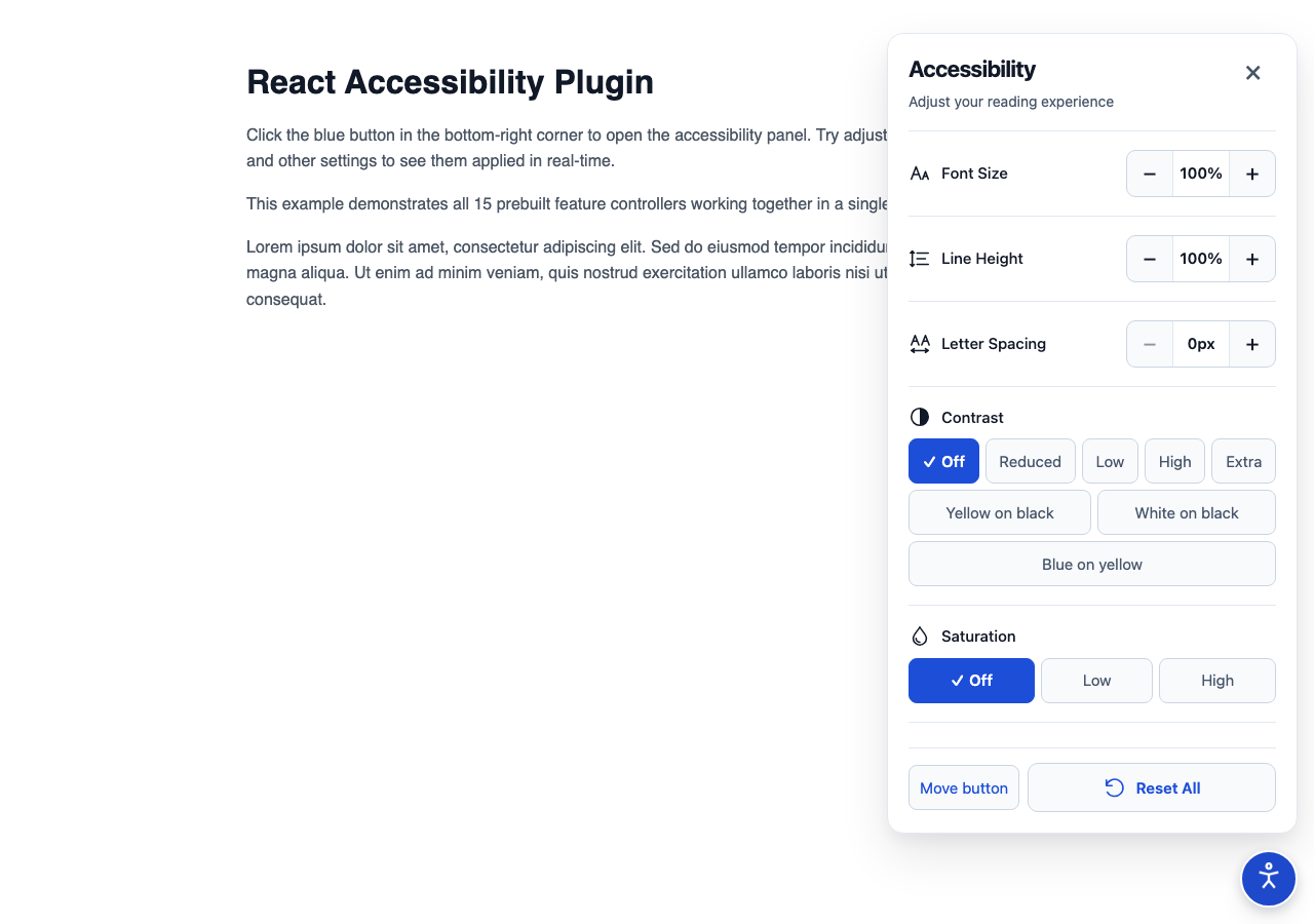
|
|
10
18
|
|
|
11
|
-
##
|
|
12
|
-
|
|
13
|
-
This update continues the owner’s existing npm package, `accessibility-plugin-react`, as a new major version. The registry currently serves 1.0.0; version 2.0.0 introduces the new design and compound API. See [migration guidance](docs/MIGRATION.md) before upgrading. To evaluate these changes, install the local tarball:
|
|
19
|
+
## Installation
|
|
14
20
|
|
|
15
21
|
```sh
|
|
16
|
-
npm
|
|
17
|
-
npm run build
|
|
18
|
-
npm pack
|
|
19
|
-
# In your React application, use the actual archive path:
|
|
20
|
-
npm install /absolute/path/to/accessibility-plugin-react-2.0.0.tgz
|
|
22
|
+
npm install accessibility-plugin-react
|
|
21
23
|
```
|
|
22
24
|
|
|
23
|
-
|
|
25
|
+
React and React DOM are peer dependencies and must use the same major/minor
|
|
26
|
+
line. The package requires Node.js 22.13 or newer for development and builds.
|
|
27
|
+
The widget itself does not require an API key, backend, environment variable,
|
|
28
|
+
Tailwind, Motion, or an icon library.
|
|
29
|
+
|
|
30
|
+
## Quick start
|
|
31
|
+
|
|
32
|
+
Import the package and mount one provider per document, preferably above route
|
|
33
|
+
changes or in the persistent application layout. The package automatically
|
|
34
|
+
injects its scoped CSS in browser environments:
|
|
24
35
|
|
|
25
36
|
```tsx
|
|
26
37
|
import {
|
|
@@ -32,70 +43,239 @@ import {
|
|
|
32
43
|
GrayscaleController,
|
|
33
44
|
ResetController,
|
|
34
45
|
} from "accessibility-plugin-react";
|
|
35
|
-
import "accessibility-plugin-react/style.css";
|
|
36
46
|
|
|
37
|
-
export
|
|
47
|
+
export function AccessibilitySettings() {
|
|
48
|
+
return (
|
|
49
|
+
<AccessibilityPlugin position="right">
|
|
50
|
+
<AccessibilityButton description="Adjust display preferences" />
|
|
51
|
+
<AccessibilityList>
|
|
52
|
+
<FontSizeController />
|
|
53
|
+
<ContrastController />
|
|
54
|
+
<GrayscaleController />
|
|
55
|
+
<ResetController />
|
|
56
|
+
</AccessibilityList>
|
|
57
|
+
</AccessibilityPlugin>
|
|
58
|
+
);
|
|
59
|
+
}
|
|
60
|
+
```
|
|
61
|
+
|
|
62
|
+
The button and panel are non-modal body portals. The application remains
|
|
63
|
+
interactive while the panel is open. Opening moves focus to the named region;
|
|
64
|
+
Escape and Close return focus to the trigger. Focus is not trapped.
|
|
65
|
+
|
|
66
|
+
`AccessibilityPlugin` can be rendered next to application content:
|
|
67
|
+
|
|
68
|
+
```tsx
|
|
69
|
+
export function App() {
|
|
38
70
|
return (
|
|
39
71
|
<>
|
|
40
|
-
<main>
|
|
41
|
-
|
|
42
|
-
<p>Your application goes here.</p>
|
|
43
|
-
</main>
|
|
44
|
-
<AccessibilityPlugin position="right">
|
|
45
|
-
<AccessibilityButton description="Adjust display preferences" />
|
|
46
|
-
<AccessibilityList>
|
|
47
|
-
<FontSizeController />
|
|
48
|
-
<ContrastController />
|
|
49
|
-
<GrayscaleController />
|
|
50
|
-
<ResetController />
|
|
51
|
-
</AccessibilityList>
|
|
52
|
-
</AccessibilityPlugin>
|
|
72
|
+
<main>{/* application routes and content */}</main>
|
|
73
|
+
<AccessibilitySettings />
|
|
53
74
|
</>
|
|
54
75
|
);
|
|
55
76
|
}
|
|
56
77
|
```
|
|
57
78
|
|
|
58
|
-
|
|
79
|
+
## Built-in controllers
|
|
80
|
+
|
|
81
|
+
Every controller is opt-in. Add only the controls that make sense for your
|
|
82
|
+
site, and choose their order in JSX.
|
|
83
|
+
|
|
84
|
+
| Controller | Effect |
|
|
85
|
+
| ------------------------- | --------------------------------------------------------------------------------- |
|
|
86
|
+
| `FontSizeController` | Scales eligible HTML text from 50% to 200%. |
|
|
87
|
+
| `LineHeightController` | Scales computed line height from 50% to 200%. |
|
|
88
|
+
| `LetterSpacingController` | Applies 0–10px letter spacing. |
|
|
89
|
+
| `ContrastController` | Turns contrast off, reduces it, increases it, or selects a named palette. |
|
|
90
|
+
| `SaturationController` | Reduces or increases saturation. |
|
|
91
|
+
| `InvertColorsController` | Inverts eligible page content. |
|
|
92
|
+
| `GrayscaleController` | Removes color while preserving the selected saturation value for later. |
|
|
93
|
+
| `LinkHighlightController` | Highlights links or selects a link palette. |
|
|
94
|
+
| `TextAlignController` | Restores the host alignment or forces left, center, right, or justified text. |
|
|
95
|
+
| `HideImagesController` | Hides images and CSS background images while retaining layout. |
|
|
96
|
+
| `HideVideosController` | Hides video elements and recognized YouTube/Vimeo embeds visually. |
|
|
97
|
+
| `BigCursorController` | Applies a larger high-contrast cursor where supported. |
|
|
98
|
+
| `ReadingMaskController` | Dims the page around a transparent reading window. |
|
|
99
|
+
| `ReadingGuideController` | Follows pointer/focus with a reading guide line. |
|
|
100
|
+
| `ResetController` | Resets display features and custom registered features without moving the widget. |
|
|
101
|
+
|
|
102
|
+
Effects compose where appropriate. For example, contrast, saturation, invert,
|
|
103
|
+
and grayscale are applied in a deterministic order. Defaults leave host styles
|
|
104
|
+
unchanged, and the provider restores host inline values and priorities when an
|
|
105
|
+
effect is disabled or the provider is removed.
|
|
59
106
|
|
|
60
107
|
## Custom features
|
|
61
108
|
|
|
62
|
-
|
|
109
|
+
Use the two-argument hook for simple state, or provide validation and a
|
|
110
|
+
provider-owned effect for a feature that changes the page:
|
|
63
111
|
|
|
64
112
|
```tsx
|
|
65
113
|
import { useAccessibility } from "accessibility-plugin-react";
|
|
66
114
|
|
|
67
115
|
export function OutlineFeature() {
|
|
68
|
-
const { value, setValue } = useAccessibility("
|
|
116
|
+
const { value, setValue } = useAccessibility("site:outline", false, {
|
|
69
117
|
apply(enabled) {
|
|
70
118
|
if (!enabled) return;
|
|
119
|
+
|
|
71
120
|
const previous = document.body.style.outline;
|
|
72
|
-
document.body.style.outline = "3px solid
|
|
121
|
+
document.body.style.outline = "3px solid #1e40af";
|
|
73
122
|
return () => {
|
|
74
123
|
document.body.style.outline = previous;
|
|
75
124
|
};
|
|
76
125
|
},
|
|
77
126
|
});
|
|
127
|
+
|
|
78
128
|
return (
|
|
79
129
|
<button type="button" aria-pressed={value} onClick={() => setValue(!value)}>
|
|
80
|
-
|
|
130
|
+
Outline page
|
|
81
131
|
</button>
|
|
82
132
|
);
|
|
83
133
|
}
|
|
84
134
|
```
|
|
85
135
|
|
|
86
|
-
Place
|
|
136
|
+
Place the feature inside `AccessibilityList`:
|
|
137
|
+
|
|
138
|
+
```tsx
|
|
139
|
+
<AccessibilityList>
|
|
140
|
+
<FontSizeController />
|
|
141
|
+
<OutlineFeature />
|
|
142
|
+
<ResetController />
|
|
143
|
+
</AccessibilityList>
|
|
144
|
+
```
|
|
145
|
+
|
|
146
|
+
The provider owns the effect lifetime, so it continues when the panel closes or
|
|
147
|
+
the control temporarily unmounts. Cleanup runs before reapplication and when
|
|
148
|
+
the provider unmounts. Custom state is JSON-compatible; supply `validate` for
|
|
149
|
+
arrays and objects. Feature keys must be stable and cannot use reserved
|
|
150
|
+
prototype names or built-in keys. See [custom feature details](docs/CUSTOM_FEATURES.md).
|
|
151
|
+
|
|
152
|
+
## Persistence and movement
|
|
153
|
+
|
|
154
|
+
Preferences are stored in a versioned local-storage record under
|
|
155
|
+
`react-accessibility-plugin:state` by default. Writes are debounced and flushed
|
|
156
|
+
when the page is hidden or the provider is removed. Invalid saved values fall
|
|
157
|
+
back to defaults; storage failures do not make the widget unusable.
|
|
158
|
+
|
|
159
|
+
```tsx
|
|
160
|
+
<AccessibilityPlugin
|
|
161
|
+
persistenceKey="my-site:accessibility"
|
|
162
|
+
persist={true}
|
|
163
|
+
position="left"
|
|
164
|
+
>
|
|
165
|
+
{/* button, list, and selected controllers */}
|
|
166
|
+
</AccessibilityPlugin>
|
|
167
|
+
```
|
|
168
|
+
|
|
169
|
+
Persistence options are fixed for the provider lifetime. Remount with a React
|
|
170
|
+
`key` when changing the storage identity. Use one provider per document.
|
|
171
|
+
|
|
172
|
+
The trigger is draggable by default. Movement also works with Alt+Arrow keys
|
|
173
|
+
and the panel's explicit corner and arrow controls. Drag activation has an
|
|
174
|
+
8px threshold, cancelled drags do not open the panel, and placement is clamped
|
|
175
|
+
on resize. `ResetController` preserves placement; the panel's separate
|
|
176
|
+
position reset removes it. Set `draggable={false}` when only the non-drag
|
|
177
|
+
controls should be available.
|
|
87
178
|
|
|
88
|
-
##
|
|
179
|
+
## Styling and framework integration
|
|
89
180
|
|
|
181
|
+
The stylesheet is scoped to `.arap-root` and does not add a global reset,
|
|
182
|
+
Tailwind preflight, or host theme variables. Load it once, then put consumer
|
|
183
|
+
overrides after it:
|
|
184
|
+
|
|
185
|
+
```css
|
|
186
|
+
.arap-root {
|
|
187
|
+
--arap-accent: #1e40af;
|
|
188
|
+
--arap-accent-hover: #1e3a8a;
|
|
189
|
+
--arap-selected: #eff6ff;
|
|
190
|
+
}
|
|
191
|
+
|
|
192
|
+
.arap-root .my-trigger {
|
|
193
|
+
border-radius: 999px;
|
|
194
|
+
}
|
|
195
|
+
```
|
|
196
|
+
|
|
197
|
+
Use `className`, `style`, `title`, `description`, and `closeLabel` to adapt
|
|
198
|
+
the widget to your product language and layout. Preserve visible focus,
|
|
199
|
+
pressed states, contrast, and the library's 44px minimum interactive targets
|
|
200
|
+
when overriding styles.
|
|
201
|
+
|
|
202
|
+
For Next.js App Router, put the provider and custom controls in a Client
|
|
203
|
+
Component, import the CSS from the root layout, and render the provider in the
|
|
204
|
+
persistent layout rather than once per route:
|
|
205
|
+
|
|
206
|
+
```tsx
|
|
207
|
+
// app/accessibility-settings.tsx
|
|
208
|
+
"use client";
|
|
209
|
+
|
|
210
|
+
import {
|
|
211
|
+
AccessibilityPlugin,
|
|
212
|
+
AccessibilityButton,
|
|
213
|
+
AccessibilityList,
|
|
214
|
+
FontSizeController,
|
|
215
|
+
ResetController,
|
|
216
|
+
} from "accessibility-plugin-react";
|
|
217
|
+
|
|
218
|
+
export function AccessibilitySettings() {
|
|
219
|
+
return (
|
|
220
|
+
<AccessibilityPlugin>
|
|
221
|
+
<AccessibilityButton />
|
|
222
|
+
<AccessibilityList>
|
|
223
|
+
<FontSizeController />
|
|
224
|
+
<ResetController />
|
|
225
|
+
</AccessibilityList>
|
|
226
|
+
</AccessibilityPlugin>
|
|
227
|
+
);
|
|
228
|
+
}
|
|
229
|
+
```
|
|
230
|
+
|
|
231
|
+
See [installation and Next.js](docs/INSTALLATION.md) for App Router and Pages
|
|
232
|
+
Router examples.
|
|
233
|
+
|
|
234
|
+
## API and limitations
|
|
235
|
+
|
|
236
|
+
- Public components, props, exported types, placement, persistence, custom
|
|
237
|
+
features, and CSS variables are documented in [API.md](docs/API.md).
|
|
238
|
+
- Detailed per-feature defaults, bounds, and host behavior are in
|
|
239
|
+
[FEATURES.md](docs/FEATURES.md).
|
|
240
|
+
- Filters can create stacking contexts and containing blocks for fixed host
|
|
241
|
+
descendants. Test sticky headers, overlays, and third-party widgets in the
|
|
242
|
+
real application.
|
|
243
|
+
- Text measurement covers the current document's eligible HTML elements.
|
|
244
|
+
Shadow DOM, iframe interiors, SVG/canvas text, pseudo-elements, and raw text
|
|
245
|
+
nodes directly under `body` are outside scope.
|
|
246
|
+
- Image/video hiding is visual; video playback is not paused or muted.
|
|
247
|
+
- Reading aids are pointer-transparent overlays and do not replace semantic
|
|
248
|
+
reading structure.
|
|
249
|
+
- There is no live cross-tab synchronization or server-side preference sync.
|
|
250
|
+
- `persist={false}` disables both display and placement persistence.
|
|
251
|
+
|
|
252
|
+
See [troubleshooting](docs/TROUBLESHOOTING.md) before filing an issue.
|
|
253
|
+
|
|
254
|
+
## Documentation and examples
|
|
255
|
+
|
|
256
|
+
- [API reference](docs/API.md)
|
|
257
|
+
- [Feature behavior and bounds](docs/FEATURES.md)
|
|
90
258
|
- [Installation and Next.js](docs/INSTALLATION.md)
|
|
91
|
-
- [
|
|
92
|
-
- [
|
|
93
|
-
- [Architecture and decisions](docs/ARCHITECTURE.md)
|
|
94
|
-
- [Development
|
|
95
|
-
- [
|
|
96
|
-
- [
|
|
97
|
-
- [
|
|
259
|
+
- [Custom features](docs/CUSTOM_FEATURES.md)
|
|
260
|
+
- [Migration from v1 and development baselines](docs/MIGRATION.md)
|
|
261
|
+
- [Architecture and lifecycle decisions](docs/ARCHITECTURE.md)
|
|
262
|
+
- [Development and testing](docs/DEVELOPMENT.md)
|
|
263
|
+
- [Design foundation](docs/DESIGN.md)
|
|
264
|
+
- [Troubleshooting](docs/TROUBLESHOOTING.md)
|
|
265
|
+
- [Project status and verification evidence](docs/PROJECT_STATUS.md)
|
|
266
|
+
- [Release procedure](docs/RELEASE.md)
|
|
267
|
+
- [Changelog](CHANGELOG.md)
|
|
268
|
+
|
|
269
|
+
Runnable package-consumer examples are in [`examples/`](examples/):
|
|
270
|
+
|
|
271
|
+
```sh
|
|
272
|
+
npm ci
|
|
273
|
+
npm run build
|
|
274
|
+
npm run example
|
|
275
|
+
```
|
|
98
276
|
|
|
99
|
-
|
|
277
|
+
## License
|
|
100
278
|
|
|
101
|
-
|
|
279
|
+
This package is available under the [ISC license](LICENSE). The original
|
|
280
|
+
vanilla JavaScript project is maintained separately at
|
|
281
|
+
[prabothcharith/accessibility-plugin](https://github.com/prabothcharith/accessibility-plugin).
|
package/dist/index.js
CHANGED
|
@@ -45,6 +45,31 @@ __export(index_exports, {
|
|
|
45
45
|
});
|
|
46
46
|
module.exports = __toCommonJS(index_exports);
|
|
47
47
|
|
|
48
|
+
// #style-inject:#style-inject
|
|
49
|
+
function styleInject(css, { insertAt } = {}) {
|
|
50
|
+
if (!css || typeof document === "undefined") return;
|
|
51
|
+
const head = document.head || document.getElementsByTagName("head")[0];
|
|
52
|
+
const style = document.createElement("style");
|
|
53
|
+
style.type = "text/css";
|
|
54
|
+
if (insertAt === "top") {
|
|
55
|
+
if (head.firstChild) {
|
|
56
|
+
head.insertBefore(style, head.firstChild);
|
|
57
|
+
} else {
|
|
58
|
+
head.appendChild(style);
|
|
59
|
+
}
|
|
60
|
+
} else {
|
|
61
|
+
head.appendChild(style);
|
|
62
|
+
}
|
|
63
|
+
if (style.styleSheet) {
|
|
64
|
+
style.styleSheet.cssText = css;
|
|
65
|
+
} else {
|
|
66
|
+
style.appendChild(document.createTextNode(css));
|
|
67
|
+
}
|
|
68
|
+
}
|
|
69
|
+
|
|
70
|
+
// src/styles/tailwind.css
|
|
71
|
+
styleInject('.arap-root {\n --arap-surface: #fff;\n --arap-text: #111827;\n --arap-muted: #475569;\n --arap-border: #cbd5e1;\n --arap-divider: #e2e8f0;\n --arap-accent: #1d4ed8;\n --arap-accent-hover: #1e40af;\n --arap-selected: #eff6ff;\n --arap-control: #f8fafc;\n color-scheme: light;\n font: 15px/1.5 system-ui, sans-serif;\n color: var(--arap-text);\n text-align: left;\n letter-spacing: normal;\n}\n.arap-root *,\n.arap-root *::before,\n.arap-root *::after {\n box-sizing: border-box;\n}\n.arap-root button {\n font: inherit;\n cursor: pointer;\n color: inherit;\n text-transform: none;\n letter-spacing: normal;\n transition: background-color 0.15s, border-color 0.15s;\n}\n.arap-root button:disabled {\n opacity: 0.45;\n cursor: not-allowed;\n}\n.arap-root button:focus-visible,\n.arap-panel:focus-visible {\n outline: 3px solid var(--arap-accent);\n outline-offset: 3px;\n}\n.arap-root .arap-btn {\n position: fixed;\n z-index: 2147483001;\n bottom: max(16px, env(safe-area-inset-bottom));\n right: max(16px, env(safe-area-inset-right));\n width: 56px;\n height: 56px;\n padding: 12px;\n display: flex;\n align-items: center;\n justify-content: center;\n border: 2px solid var(--arap-surface);\n border-radius: 50%;\n background: var(--arap-accent);\n color: #fff;\n box-shadow: 0 4px 12px #0f172a26, 0 10px 24px #0f172a14;\n}\n.arap-root .arap-btn:hover {\n background: var(--arap-accent-hover);\n}\n.arap-root .arap-btn[data-position=left] {\n right: auto;\n left: max(16px, env(safe-area-inset-left));\n}\n.arap-root .arap-btn[data-position=top] {\n bottom: auto;\n top: max(16px, env(safe-area-inset-top));\n}\n.arap-root .arap-panel {\n position: fixed;\n z-index: 2147483000;\n bottom: max(88px, calc(env(safe-area-inset-bottom) + 72px));\n right: max(16px, env(safe-area-inset-right));\n width: min(400px, calc(100vw - 32px));\n max-height: calc(100vh - 120px);\n max-height: calc(100dvh - 120px - env(safe-area-inset-bottom));\n overflow: auto;\n overscroll-behavior: contain;\n scrollbar-width: thin;\n scrollbar-color: var(--arap-border) transparent;\n padding: 20px;\n border: 1px solid var(--arap-divider);\n border-radius: 16px;\n background: var(--arap-surface);\n box-shadow: 0 8px 16px #0f172a0d, 0 20px 48px #0f172a1a;\n}\n.arap-root .arap-panel[hidden] {\n display: none !important;\n}\n.arap-root .arap-panel[data-position=left] {\n right: auto;\n left: max(16px, env(safe-area-inset-left));\n}\n.arap-root .arap-panel[data-position=top] {\n bottom: auto;\n top: max(88px, calc(env(safe-area-inset-top) + 72px));\n}\n.arap-heading {\n display: flex;\n justify-content: space-between;\n align-items: flex-start;\n gap: 8px;\n padding-bottom: 18px;\n border-bottom: 1px solid var(--arap-divider);\n}\n.arap-heading-copy {\n min-width: 0;\n}\n.arap-heading h2 {\n margin: 0;\n font: 700 22px/1.3 system-ui, sans-serif;\n letter-spacing: -0.025em;\n color: var(--arap-text);\n overflow-wrap: anywhere;\n}\n.arap-description {\n margin: 6px 0 0;\n color: var(--arap-muted);\n font: 14px/1.5 system-ui, sans-serif;\n overflow-wrap: anywhere;\n}\n.arap-heading button {\n flex: none;\n width: 44px;\n height: 44px;\n margin-top: -6px;\n border: 1px solid transparent;\n border-radius: 8px;\n background: transparent;\n color: var(--arap-muted);\n font-size: 28px;\n line-height: 1;\n}\n.arap-heading button:hover {\n background: var(--arap-control);\n border-color: var(--arap-border);\n}\n.arap-feature {\n display: grid;\n grid-template-columns: minmax(0, 1fr) auto;\n align-items: center;\n gap: 10px 12px;\n padding: 18px 0;\n border-bottom: 1px solid var(--arap-divider);\n}\n.arap-feature:last-child {\n border: 0;\n padding-bottom: 0;\n}\n.arap-label {\n display: flex;\n align-items: center;\n gap: 10px;\n font-weight: 500;\n min-width: 0;\n overflow-wrap: anywhere;\n}\n.arap-icon {\n flex: none;\n width: 22px;\n height: 22px;\n display: inline-block;\n vertical-align: middle;\n}\n.arap-controls {\n display: flex;\n align-items: stretch;\n border: 1px solid var(--arap-border);\n border-radius: 9px;\n overflow: hidden;\n background: var(--arap-control);\n}\n.arap-root .arap-btn-sm {\n flex: none;\n width: 44px;\n height: 44px;\n border: 0;\n border-radius: 0;\n background: transparent;\n font-size: 22px;\n}\n.arap-root .arap-btn-sm:hover:not(:disabled) {\n background: var(--arap-selected);\n color: var(--arap-accent);\n}\n.arap-root .arap-controls button:focus-visible {\n outline-offset: -4px;\n}\n.arap-value {\n display: flex;\n align-items: center;\n justify-content: center;\n min-width: 56px;\n padding: 0 6px;\n text-align: center;\n font-weight: 600;\n border-inline: 1px solid var(--arap-divider);\n background: var(--arap-surface);\n}\n.arap-segmented {\n grid-column: 1 / -1;\n display: flex;\n flex-wrap: wrap;\n gap: 6px;\n min-width: 0;\n}\n.arap-root .arap-segment {\n flex: 1 1 auto;\n display: inline-flex;\n align-items: center;\n justify-content: center;\n gap: 5px;\n min-width: 44px;\n min-height: 44px;\n padding: 8px 10px;\n border: 1px solid var(--arap-border);\n border-radius: 8px;\n background: var(--arap-control);\n color: var(--arap-muted);\n overflow-wrap: anywhere;\n}\n.arap-root .arap-segment:hover {\n background: var(--arap-selected);\n border-color: var(--arap-accent);\n}\n.arap-root .arap-segment-active {\n background: var(--arap-accent);\n color: #fff;\n border-color: var(--arap-accent);\n font-weight: 600;\n}\n.arap-root .arap-segment-active:hover {\n background: var(--arap-accent-hover);\n color: #fff;\n}\n.arap-check {\n flex: none;\n font-size: 15px;\n line-height: 1;\n}\n.arap-root .arap-toggle {\n position: relative;\n width: 56px;\n height: 44px;\n padding: 0;\n border: 0;\n border-radius: 10px;\n background: transparent;\n}\n.arap-toggle::before {\n content: "";\n position: absolute;\n inset: 6px 0;\n border: 2px solid #64748b;\n border-radius: 20px;\n background: #e2e8f0;\n}\n.arap-toggle-knob {\n position: absolute;\n top: 10px;\n left: 4px;\n width: 24px;\n height: 24px;\n border-radius: 50%;\n background: #475569;\n pointer-events: none;\n transition: transform 0.15s;\n}\n.arap-toggle-active::before {\n background: var(--arap-accent);\n border-color: var(--arap-accent);\n}\n.arap-toggle-active .arap-toggle-knob {\n transform: translateX(24px);\n background: #fff;\n}\n.arap-toggle-active .arap-toggle-knob::after {\n content: "\\2713";\n display: block;\n color: var(--arap-accent);\n font-size: 16px;\n font-weight: 700;\n line-height: 24px;\n text-align: center;\n}\n.arap-root .arap-toggle:hover::before {\n border-color: var(--arap-accent);\n}\n.arap-feature-reset {\n display: block;\n}\n.arap-root .arap-reset-btn {\n display: flex;\n align-items: center;\n justify-content: center;\n gap: 10px;\n width: 100%;\n min-height: 48px;\n padding: 10px;\n border: 1px solid var(--arap-border);\n border-radius: 10px;\n background: var(--arap-control);\n color: var(--arap-accent);\n font-weight: 600;\n}\n.arap-root .arap-reset-btn:hover {\n background: var(--arap-selected);\n border-color: var(--arap-accent);\n}\n@media (max-width: 380px) {\n .arap-root .arap-panel {\n padding: 16px;\n }\n .arap-heading h2 {\n font-size: 20px;\n }\n .arap-feature-stepper {\n grid-template-columns: minmax(0, 1fr);\n }\n .arap-controls {\n width: 100%;\n }\n .arap-value {\n flex: 1;\n }\n}\n@media (prefers-reduced-motion: reduce) {\n .arap-root *,\n .arap-root *::before,\n .arap-root *::after {\n transition: none !important;\n animation: none !important;\n }\n}\n@media (forced-colors: active) {\n .arap-root {\n --arap-surface: Canvas;\n --arap-text: CanvasText;\n --arap-muted: CanvasText;\n --arap-border: ButtonText;\n --arap-divider: ButtonText;\n --arap-accent: Highlight;\n --arap-control: Canvas;\n --arap-selected: Canvas;\n }\n .arap-root button[aria-pressed=true] {\n outline: 2px solid Highlight;\n outline-offset: -4px;\n }\n .arap-root .arap-segment-active {\n color: HighlightText;\n background: Highlight;\n }\n .arap-toggle::before {\n border-color: ButtonText;\n background: Canvas;\n }\n .arap-toggle-knob {\n background: ButtonText;\n }\n .arap-toggle-active .arap-toggle-knob {\n background: Highlight;\n }\n .arap-toggle-active .arap-toggle-knob::after {\n color: HighlightText;\n }\n}\n.arap-root .arap-panel {\n display: flex;\n flex-direction: column;\n overflow: visible;\n}\n.arap-heading {\n flex: none;\n}\n.arap-tools {\n flex: 1 1 auto;\n min-height: 0;\n overflow: auto;\n overscroll-behavior: contain;\n scrollbar-width: thin;\n scrollbar-color: var(--arap-border) transparent;\n padding: 0 3px;\n margin: 0 -3px;\n}\n.arap-tools:focus-visible {\n outline: 3px solid var(--arap-accent);\n outline-offset: -3px;\n}\n.arap-quick-actions {\n position: relative;\n flex: none;\n display: flex;\n align-items: center;\n gap: 8px;\n padding-top: 14px;\n margin-top: 8px;\n border-top: 1px solid var(--arap-divider);\n}\n.arap-actions {\n flex: 1;\n min-width: 0;\n}\n.arap-actions:empty {\n display: none;\n}\n.arap-actions .arap-feature-reset {\n padding: 0;\n margin: 0;\n border: 0;\n}\n.arap-root .arap-position-button,\n.arap-root .arap-position-default,\n.arap-root .arap-position-arrows button {\n min-width: 44px;\n min-height: 44px;\n padding: 8px 10px;\n border: 1px solid var(--arap-border);\n border-radius: 8px;\n background: var(--arap-control);\n color: var(--arap-accent);\n}\n.arap-root .arap-position-button:hover,\n.arap-root .arap-position-default:hover,\n.arap-root .arap-position-arrows button:hover {\n background: var(--arap-selected);\n border-color: var(--arap-accent);\n}\n.arap-position-popover {\n position: absolute;\n z-index: 1;\n bottom: calc(100% + 8px);\n left: 0;\n width: 100%;\n max-height: calc(100dvh - 160px);\n overflow: auto;\n padding: 14px;\n border: 1px solid var(--arap-border);\n border-radius: 12px;\n background: var(--arap-surface);\n box-shadow: 0 8px 24px #0f172a26;\n}\n.arap-position-popover[hidden] {\n display: none !important;\n}\n.arap-position-label {\n display: block;\n margin-bottom: 6px;\n font-weight: 600;\n}\n.arap-position-popover select {\n width: 100%;\n min-height: 44px;\n padding: 8px;\n border: 1px solid var(--arap-border);\n border-radius: 8px;\n font: inherit;\n color: var(--arap-text);\n background: var(--arap-surface);\n}\n.arap-position-popover select:focus-visible {\n outline: 3px solid var(--arap-accent);\n outline-offset: 2px;\n}\n.arap-position-arrows {\n display: flex;\n justify-content: space-between;\n gap: 6px;\n margin-top: 10px;\n}\n.arap-position-default {\n width: 100%;\n margin-top: 8px;\n}\n.arap-root .arap-btn[data-draggable=true] {\n touch-action: none;\n user-select: none;\n cursor: grab;\n}\n.arap-root .arap-btn[data-dragging=true] {\n cursor: grabbing;\n}\n.arap-root .arap-btn[data-corner$=left],\n.arap-root .arap-panel[data-corner$=left] {\n right: auto;\n left: max(16px, env(safe-area-inset-left));\n}\n.arap-root .arap-btn[data-corner$=right],\n.arap-root .arap-panel[data-corner$=right] {\n left: auto;\n right: max(16px, env(safe-area-inset-right));\n}\n.arap-root .arap-btn[data-corner^=top] {\n bottom: auto;\n top: max(16px, env(safe-area-inset-top));\n}\n.arap-root .arap-btn[data-corner^=bottom] {\n top: auto;\n bottom: max(16px, env(safe-area-inset-bottom));\n}\n.arap-root .arap-panel[data-corner^=top] {\n bottom: auto;\n top: max(88px, calc(env(safe-area-inset-top) + 72px));\n}\n.arap-root .arap-panel[data-corner^=bottom] {\n top: auto;\n bottom: max(88px, calc(env(safe-area-inset-bottom) + 72px));\n}\n.arap-sr-only {\n position: absolute;\n width: 1px;\n height: 1px;\n padding: 0;\n margin: -1px;\n overflow: hidden;\n clip-path: inset(50%);\n white-space: nowrap;\n border: 0;\n}\n.arap-root .arap-skip-actions {\n position: absolute;\n top: 12px;\n left: 20px;\n width: 44px;\n height: 44px;\n clip-path: inset(50%);\n overflow: hidden;\n pointer-events: none;\n}\n.arap-root .arap-skip-actions:focus-visible {\n right: 20px;\n width: auto;\n height: auto;\n min-height: 44px;\n clip-path: none;\n pointer-events: auto;\n z-index: 2;\n padding: 8px;\n border: 1px solid var(--arap-accent);\n border-radius: 8px;\n background: var(--arap-surface);\n color: var(--arap-accent);\n}\n@media (max-height: 480px) {\n .arap-root .arap-panel {\n top: max(16px, env(safe-area-inset-top)) !important;\n bottom: max(16px, env(safe-area-inset-bottom)) !important;\n max-height: calc(100dvh - 32px - env(safe-area-inset-top) - env(safe-area-inset-bottom)) !important;\n padding: 8px;\n }\n .arap-heading {\n padding-bottom: 8px;\n }\n .arap-heading h2 {\n font-size: 18px;\n }\n .arap-heading button {\n margin-top: 0;\n }\n .arap-description {\n display: none;\n }\n .arap-quick-actions {\n padding-top: 8px;\n margin-top: 0;\n }\n .arap-root .arap-reset-btn {\n min-height: 44px;\n }\n .arap-root .arap-btn[data-open=true] {\n visibility: hidden;\n }\n .arap-position-popover {\n max-height: calc(100dvh - 96px);\n }\n}\n');
|
|
72
|
+
|
|
48
73
|
// src/core/AccessibilityPlugin.tsx
|
|
49
74
|
var import_react4 = require("react");
|
|
50
75
|
|