accessibility-plugin-react 1.0.0 → 2.0.0
This diff represents the content of publicly available package versions that have been released to one of the supported registries. The information contained in this diff is provided for informational purposes only and reflects changes between package versions as they appear in their respective public registries.
- package/LICENSE +15 -0
- package/README.md +77 -45
- package/dist/index.d.mts +114 -0
- package/dist/index.d.ts +114 -1
- package/dist/index.js +1694 -0
- package/dist/index.js.map +1 -0
- package/dist/index.mjs +1657 -0
- package/dist/index.mjs.map +1 -0
- package/dist/style.css +593 -0
- package/docs/API.md +89 -0
- package/docs/ARCHITECTURE.md +43 -0
- package/docs/BASELINE.md +48 -0
- package/docs/CUSTOM_FEATURES.md +101 -0
- package/docs/DESIGN.md +39 -0
- package/docs/DEVELOPMENT.md +91 -0
- package/docs/FEATURES.md +49 -0
- package/docs/HANDOVER.md +143 -0
- package/docs/INSTALLATION.md +92 -0
- package/docs/MIGRATION.md +40 -0
- package/docs/PROJECT_STATUS.md +95 -0
- package/docs/RELEASE.md +107 -0
- package/docs/ROADMAP.md +29 -0
- package/docs/TROUBLESHOOTING.md +25 -0
- package/docs/assets/clean-light-desktop.png +0 -0
- package/docs/assets/clean-light-mobile.png +0 -0
- package/docs/assets/movable-desktop.png +0 -0
- package/docs/assets/position-menu.png +0 -0
- package/docs/assets/quick-actions-mobile.png +0 -0
- package/docs/assets/widget-desktop.png +0 -0
- package/docs/assets/widget-mobile.png +0 -0
- package/package.json +86 -48
- package/dist/index.es.js +0 -8354
- package/dist/index.umd.js +0 -14
package/LICENSE
ADDED
|
@@ -0,0 +1,15 @@
|
|
|
1
|
+
ISC License
|
|
2
|
+
|
|
3
|
+
Copyright (c) 2026 Praboth Charith
|
|
4
|
+
|
|
5
|
+
Permission to use, copy, modify, and/or distribute this software for any
|
|
6
|
+
purpose with or without fee is hereby granted, provided that the above
|
|
7
|
+
copyright notice and this permission notice appear in all copies.
|
|
8
|
+
|
|
9
|
+
THE SOFTWARE IS PROVIDED "AS IS" AND THE AUTHOR DISCLAIMS ALL WARRANTIES
|
|
10
|
+
WITH REGARD TO THIS SOFTWARE INCLUDING ALL IMPLIED WARRANTIES OF
|
|
11
|
+
MERCHANTABILITY AND FITNESS. IN NO EVENT SHALL THE AUTHOR BE LIABLE FOR
|
|
12
|
+
ANY SPECIAL, DIRECT, INDIRECT, OR CONSEQUENTIAL DAMAGES OR ANY DAMAGES
|
|
13
|
+
WHATSOEVER RESULTING FROM LOSS OF USE, DATA OR PROFITS, WHETHER IN AN
|
|
14
|
+
ACTION OF CONTRACT, NEGLIGENCE OR OTHER TORTIOUS ACTION, ARISING OUT OF
|
|
15
|
+
OR IN CONNECTION WITH THE USE OR PERFORMANCE OF THIS SOFTWARE.
|
package/README.md
CHANGED
|
@@ -1,69 +1,101 @@
|
|
|
1
|
-
# Accessibility Plugin
|
|
1
|
+
# Accessibility Plugin React
|
|
2
2
|
|
|
3
|
-
|
|
3
|
+
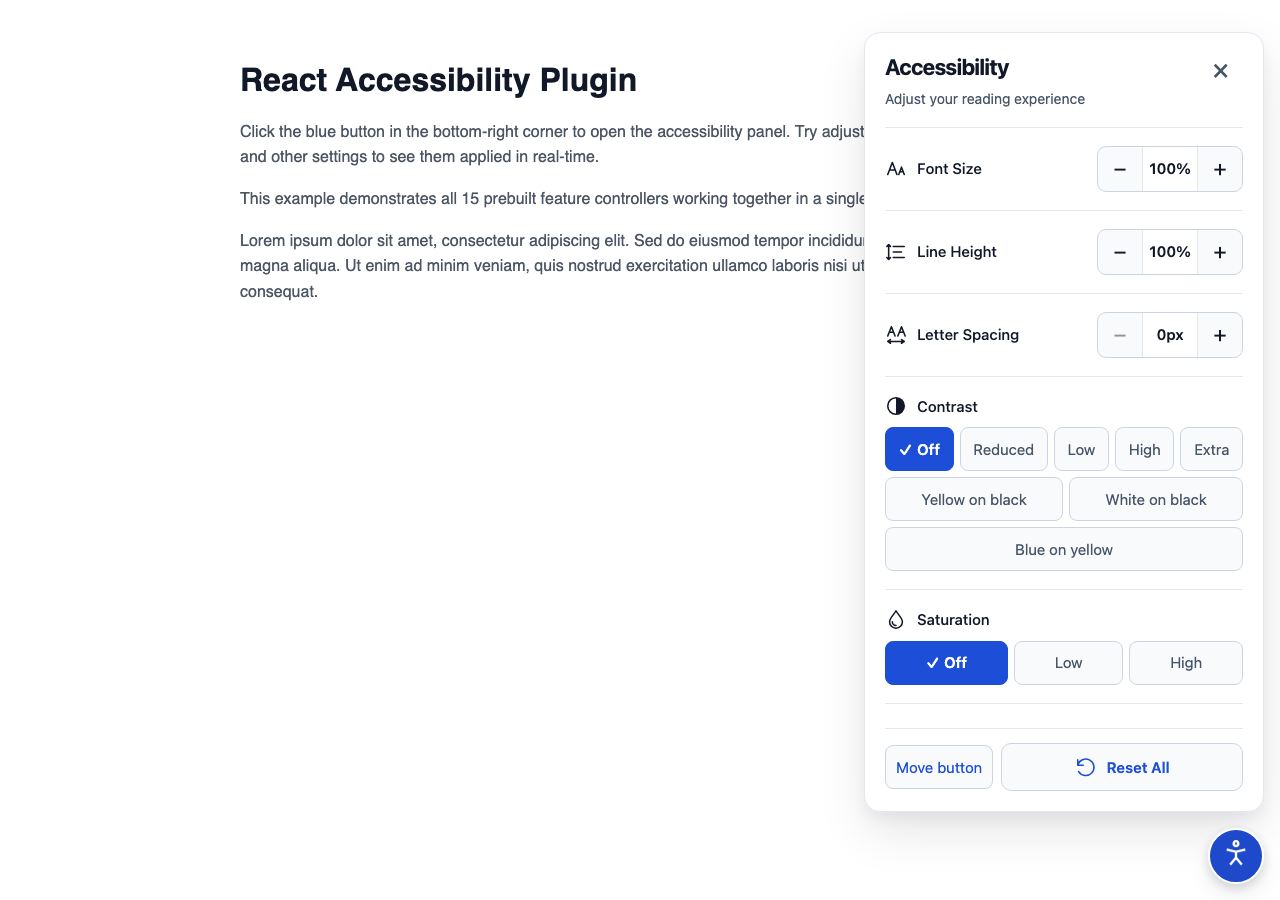
Composable React controls for website display preferences: text sizing, color adjustments, reading aids, media visibility and consumer-defined features. Choose the controls in JSX; preferences continue working when the panel closes.
|
|
4
4
|
|
|
5
|
-
|
|
5
|
+
**Version 2; manual accessibility acceptance remains pending.** See [project status](docs/PROJECT_STATUS.md) for executed checks and release gates. An accessibility widget cannot repair inaccessible application markup or establish WCAG compliance.
|
|
6
6
|
|
|
7
|
-
|
|
8
|
-
- **Text Adjustments**: Font Size, Line Height, Letter Spacing, Text Alignment.
|
|
9
|
-
- **Cursor Enhancements**: Big Cursor, Reading Guide.
|
|
10
|
-
- **Visual Toggles**: Hide Images, Highlight Links.
|
|
11
|
-
- **Drag & Drop**: Draggable trigger button.
|
|
12
|
-
- **Persistence**: Settings are saved in local storage (implementation pending/optional).
|
|
13
|
-
- **Reset**: Easily reset all settings to default.
|
|
7
|
+
|
|
14
8
|
|
|
15
|
-
|
|
9
|
+
The new look uses white surfaces, blue accents, outline icons and responsive controls. Move the trigger by dragging, Alt+arrow keys or the corner/movement controls. Settings and placement are remembered; reset stays in the fixed action bar while tools scroll. Display reset preserves the trigger position.
|
|
16
10
|
|
|
17
|
-
|
|
18
|
-
npm install accessibility-plugin
|
|
19
|
-
# or
|
|
20
|
-
yarn add accessibility-plugin
|
|
21
|
-
```
|
|
11
|
+
## Quick start
|
|
22
12
|
|
|
23
|
-
|
|
13
|
+
This update continues the owner’s existing npm package, `accessibility-plugin-react`, as a new major version. The registry currently serves 1.0.0; version 2.0.0 introduces the new design and compound API. See [migration guidance](docs/MIGRATION.md) before upgrading. To evaluate these changes, install the local tarball:
|
|
24
14
|
|
|
25
|
-
|
|
15
|
+
```sh
|
|
16
|
+
npm ci
|
|
17
|
+
npm run build
|
|
18
|
+
npm pack
|
|
19
|
+
# In your React application, use the actual archive path:
|
|
20
|
+
npm install /absolute/path/to/accessibility-plugin-react-2.0.0.tgz
|
|
21
|
+
```
|
|
26
22
|
|
|
27
|
-
|
|
23
|
+
Install version 2 with `npm install accessibility-plugin-react@2`. `npm install accessibility-plugin-react` selects the latest version after publication. React and React DOM are peers; no Tailwind, Motion, icon library or design system is required.
|
|
28
24
|
|
|
29
25
|
```tsx
|
|
30
|
-
import {
|
|
31
|
-
|
|
32
|
-
|
|
33
|
-
|
|
26
|
+
import {
|
|
27
|
+
AccessibilityPlugin,
|
|
28
|
+
AccessibilityButton,
|
|
29
|
+
AccessibilityList,
|
|
30
|
+
FontSizeController,
|
|
31
|
+
ContrastController,
|
|
32
|
+
GrayscaleController,
|
|
33
|
+
ResetController,
|
|
34
|
+
} from "accessibility-plugin-react";
|
|
35
|
+
import "accessibility-plugin-react/style.css";
|
|
36
|
+
|
|
37
|
+
export default function App() {
|
|
34
38
|
return (
|
|
35
|
-
|
|
36
|
-
<
|
|
37
|
-
|
|
39
|
+
<>
|
|
40
|
+
<main>
|
|
41
|
+
<h1>My website</h1>
|
|
42
|
+
<p>Your application goes here.</p>
|
|
43
|
+
</main>
|
|
44
|
+
<AccessibilityPlugin position="right">
|
|
45
|
+
<AccessibilityButton description="Adjust display preferences" />
|
|
46
|
+
<AccessibilityList>
|
|
47
|
+
<FontSizeController />
|
|
48
|
+
<ContrastController />
|
|
49
|
+
<GrayscaleController />
|
|
50
|
+
<ResetController />
|
|
51
|
+
</AccessibilityList>
|
|
52
|
+
</AccessibilityPlugin>
|
|
53
|
+
</>
|
|
38
54
|
);
|
|
39
55
|
}
|
|
40
|
-
|
|
41
|
-
export default App;
|
|
42
56
|
```
|
|
43
57
|
|
|
44
|
-
|
|
58
|
+
Mount one provider above route changes. The panel is a non-modal region: Enter/Space activates native controls, opening focuses the panel, Tab follows ordinary document order, and Escape or Close returns focus to the opener. The host page remains interactive.
|
|
59
|
+
|
|
60
|
+
## Custom features
|
|
45
61
|
|
|
46
|
-
|
|
62
|
+
Keep custom side effects in the provider's lifecycle, not in click handlers:
|
|
47
63
|
|
|
48
64
|
```tsx
|
|
49
|
-
|
|
50
|
-
|
|
51
|
-
|
|
52
|
-
|
|
65
|
+
import { useAccessibility } from "accessibility-plugin-react";
|
|
66
|
+
|
|
67
|
+
export function OutlineFeature() {
|
|
68
|
+
const { value, setValue } = useAccessibility("my-site:outline", false, {
|
|
69
|
+
apply(enabled) {
|
|
70
|
+
if (!enabled) return;
|
|
71
|
+
const previous = document.body.style.outline;
|
|
72
|
+
document.body.style.outline = "3px solid blue";
|
|
73
|
+
return () => {
|
|
74
|
+
document.body.style.outline = previous;
|
|
75
|
+
};
|
|
76
|
+
},
|
|
77
|
+
});
|
|
78
|
+
return (
|
|
79
|
+
<button type="button" aria-pressed={value} onClick={() => setValue(!value)}>
|
|
80
|
+
Page outline
|
|
53
81
|
</button>
|
|
54
|
-
|
|
55
|
-
|
|
56
|
-
<YourAppContent />
|
|
57
|
-
</AccessibilityPlugin>
|
|
82
|
+
);
|
|
83
|
+
}
|
|
58
84
|
```
|
|
59
85
|
|
|
60
|
-
|
|
86
|
+
Place `<OutlineFeature />` inside `<AccessibilityList>`. Its state restores from localStorage, global reset returns it to `false`, and cleanup runs before reapplication and on provider removal. Definitions are immutable for a provider lifetime. [Full custom feature contract](docs/CUSTOM_FEATURES.md).
|
|
87
|
+
|
|
88
|
+
## Documentation
|
|
61
89
|
|
|
62
|
-
|
|
63
|
-
|
|
64
|
-
|
|
65
|
-
|
|
90
|
+
- [Installation and Next.js](docs/INSTALLATION.md)
|
|
91
|
+
- [Feature behavior and original parity](docs/FEATURES.md)
|
|
92
|
+
- [Public API and customization](docs/API.md)
|
|
93
|
+
- [Architecture and decisions](docs/ARCHITECTURE.md)
|
|
94
|
+
- [Development, testing and release procedure](docs/DEVELOPMENT.md)
|
|
95
|
+
- [Troubleshooting and limitations](docs/TROUBLESHOOTING.md)
|
|
96
|
+
- [Migration](docs/MIGRATION.md), [changelog](CHANGELOG.md), [npm release candidate](docs/RELEASE.md)
|
|
97
|
+
- [Status](docs/PROJECT_STATUS.md), [roadmap](docs/ROADMAP.md), [baseline](docs/BASELINE.md)
|
|
66
98
|
|
|
67
|
-
|
|
99
|
+
The original [vanilla JavaScript project](https://github.com/prabothcharith/accessibility-plugin) remains a separate repository. This version uses the [ISC license](LICENSE). On 2026-10-13 the owner confirmed authority to license all included code under ISC, resolving the prior GPL/ISC/MIT metadata conflict for this release.
|
|
68
100
|
|
|
69
|
-
|
|
101
|
+
The default visual foundation is [Clean light](docs/DESIGN.md): scoped plain CSS, reusable palette variables, outline icons and responsive control rows. See the design guide for actual desktop/mobile screenshots.
|
package/dist/index.d.mts
ADDED
|
@@ -0,0 +1,114 @@
|
|
|
1
|
+
import * as react from 'react';
|
|
2
|
+
import { ReactNode, CSSProperties } from 'react';
|
|
3
|
+
|
|
4
|
+
interface AccessibilityState {
|
|
5
|
+
isOpen: boolean;
|
|
6
|
+
features: Record<string, unknown>;
|
|
7
|
+
}
|
|
8
|
+
interface FeatureOptions<T> {
|
|
9
|
+
/** Validate restored and programmatic values. Required for structured custom state. */
|
|
10
|
+
validate?: (value: unknown) => value is T;
|
|
11
|
+
/** Owned by the provider, including while the control is unmounted. Return cleanup. */
|
|
12
|
+
apply?: (value: T) => void | (() => void);
|
|
13
|
+
}
|
|
14
|
+
interface FeatureRegistration extends FeatureOptions<unknown> {
|
|
15
|
+
defaultValue: unknown;
|
|
16
|
+
}
|
|
17
|
+
interface AccessibilityContextValue {
|
|
18
|
+
state: AccessibilityState;
|
|
19
|
+
isOpen: boolean;
|
|
20
|
+
panelId: string;
|
|
21
|
+
position: PluginPosition;
|
|
22
|
+
widgetPlacement: WidgetPlacement | null;
|
|
23
|
+
setWidgetPlacement: (next: WidgetPlacement | null) => void;
|
|
24
|
+
toggleOpen: () => void;
|
|
25
|
+
closeMenu: () => void;
|
|
26
|
+
getFeatureState: <T>(key: string, defaultValue: T) => T;
|
|
27
|
+
setFeatureState: <T>(key: string, value: T) => void;
|
|
28
|
+
registerFeature: (key: string, definition: FeatureRegistration) => void;
|
|
29
|
+
resetAll: () => void;
|
|
30
|
+
registerReset: (key: string, resetFn: () => void) => void;
|
|
31
|
+
unregisterReset: (key: string) => void;
|
|
32
|
+
}
|
|
33
|
+
type WidgetPlacement = {
|
|
34
|
+
kind: "corner";
|
|
35
|
+
corner: "bottom-right" | "bottom-left" | "top-right" | "top-left";
|
|
36
|
+
} | {
|
|
37
|
+
kind: "point";
|
|
38
|
+
x: number;
|
|
39
|
+
y: number;
|
|
40
|
+
};
|
|
41
|
+
type PluginPosition = "left" | "right" | "top" | "bottom";
|
|
42
|
+
interface AccessibilityPluginProps {
|
|
43
|
+
children: ReactNode;
|
|
44
|
+
position?: PluginPosition;
|
|
45
|
+
persistenceKey?: string;
|
|
46
|
+
/** Disable storage completely. */
|
|
47
|
+
persist?: boolean;
|
|
48
|
+
}
|
|
49
|
+
interface AccessibilityButtonProps {
|
|
50
|
+
/** Pointer dragging and Alt+Arrow movement. Defaults to true. */
|
|
51
|
+
draggable?: boolean;
|
|
52
|
+
icon?: ReactNode;
|
|
53
|
+
title?: string;
|
|
54
|
+
description?: string;
|
|
55
|
+
className?: string;
|
|
56
|
+
style?: CSSProperties;
|
|
57
|
+
}
|
|
58
|
+
interface AccessibilityListProps {
|
|
59
|
+
/** Additional always-visible actions next to ResetController. */
|
|
60
|
+
footer?: ReactNode;
|
|
61
|
+
/** Supporting panel text. Pass an empty string to omit it. */
|
|
62
|
+
description?: string;
|
|
63
|
+
children: ReactNode;
|
|
64
|
+
className?: string;
|
|
65
|
+
style?: CSSProperties;
|
|
66
|
+
title?: string;
|
|
67
|
+
closeLabel?: string;
|
|
68
|
+
}
|
|
69
|
+
|
|
70
|
+
declare function AccessibilityPlugin({ children, position, persistenceKey, persist, }: AccessibilityPluginProps): react.JSX.Element;
|
|
71
|
+
|
|
72
|
+
declare function AccessibilityButton({ icon, draggable, title, description, className, style, }: AccessibilityButtonProps): react.JSX.Element;
|
|
73
|
+
|
|
74
|
+
declare function AccessibilityList(props: AccessibilityListProps): react.JSX.Element;
|
|
75
|
+
|
|
76
|
+
declare function useAccessibility<T>(featureKey: string, defaultValue: T, options?: FeatureOptions<T>): {
|
|
77
|
+
value: T;
|
|
78
|
+
setValue: (next: T) => void;
|
|
79
|
+
reset: () => void;
|
|
80
|
+
};
|
|
81
|
+
|
|
82
|
+
declare const AccessibilityContext: react.Context<AccessibilityContextValue | null>;
|
|
83
|
+
|
|
84
|
+
declare function FontSizeController(): react.JSX.Element;
|
|
85
|
+
|
|
86
|
+
declare function LineHeightController(): react.JSX.Element;
|
|
87
|
+
|
|
88
|
+
declare function LetterSpacingController(): react.JSX.Element;
|
|
89
|
+
|
|
90
|
+
declare function ContrastController(): react.JSX.Element;
|
|
91
|
+
|
|
92
|
+
declare function SaturationController(): react.JSX.Element;
|
|
93
|
+
|
|
94
|
+
declare function InvertColorsController(): react.JSX.Element;
|
|
95
|
+
|
|
96
|
+
declare function GrayscaleController(): react.JSX.Element;
|
|
97
|
+
|
|
98
|
+
declare function LinkHighlightController(): react.JSX.Element;
|
|
99
|
+
|
|
100
|
+
declare function TextAlignController(): react.JSX.Element;
|
|
101
|
+
|
|
102
|
+
declare function HideImagesController(): react.JSX.Element;
|
|
103
|
+
|
|
104
|
+
declare function HideVideosController(): react.JSX.Element;
|
|
105
|
+
|
|
106
|
+
declare function BigCursorController(): react.JSX.Element;
|
|
107
|
+
|
|
108
|
+
declare function ReadingMaskController(): react.JSX.Element;
|
|
109
|
+
|
|
110
|
+
declare function ReadingGuideController(): react.JSX.Element;
|
|
111
|
+
|
|
112
|
+
declare function ResetController(): react.JSX.Element;
|
|
113
|
+
|
|
114
|
+
export { AccessibilityButton, type AccessibilityButtonProps, AccessibilityContext, type AccessibilityContextValue, AccessibilityList, type AccessibilityListProps, AccessibilityPlugin, type AccessibilityPluginProps, type AccessibilityState, BigCursorController, ContrastController, type FeatureOptions, type FeatureRegistration, FontSizeController, GrayscaleController, HideImagesController, HideVideosController, InvertColorsController, LetterSpacingController, LineHeightController, LinkHighlightController, type PluginPosition, ReadingGuideController, ReadingMaskController, ResetController, SaturationController, TextAlignController, type WidgetPlacement, useAccessibility };
|
package/dist/index.d.ts
CHANGED
|
@@ -1 +1,114 @@
|
|
|
1
|
-
|
|
1
|
+
import * as react from 'react';
|
|
2
|
+
import { ReactNode, CSSProperties } from 'react';
|
|
3
|
+
|
|
4
|
+
interface AccessibilityState {
|
|
5
|
+
isOpen: boolean;
|
|
6
|
+
features: Record<string, unknown>;
|
|
7
|
+
}
|
|
8
|
+
interface FeatureOptions<T> {
|
|
9
|
+
/** Validate restored and programmatic values. Required for structured custom state. */
|
|
10
|
+
validate?: (value: unknown) => value is T;
|
|
11
|
+
/** Owned by the provider, including while the control is unmounted. Return cleanup. */
|
|
12
|
+
apply?: (value: T) => void | (() => void);
|
|
13
|
+
}
|
|
14
|
+
interface FeatureRegistration extends FeatureOptions<unknown> {
|
|
15
|
+
defaultValue: unknown;
|
|
16
|
+
}
|
|
17
|
+
interface AccessibilityContextValue {
|
|
18
|
+
state: AccessibilityState;
|
|
19
|
+
isOpen: boolean;
|
|
20
|
+
panelId: string;
|
|
21
|
+
position: PluginPosition;
|
|
22
|
+
widgetPlacement: WidgetPlacement | null;
|
|
23
|
+
setWidgetPlacement: (next: WidgetPlacement | null) => void;
|
|
24
|
+
toggleOpen: () => void;
|
|
25
|
+
closeMenu: () => void;
|
|
26
|
+
getFeatureState: <T>(key: string, defaultValue: T) => T;
|
|
27
|
+
setFeatureState: <T>(key: string, value: T) => void;
|
|
28
|
+
registerFeature: (key: string, definition: FeatureRegistration) => void;
|
|
29
|
+
resetAll: () => void;
|
|
30
|
+
registerReset: (key: string, resetFn: () => void) => void;
|
|
31
|
+
unregisterReset: (key: string) => void;
|
|
32
|
+
}
|
|
33
|
+
type WidgetPlacement = {
|
|
34
|
+
kind: "corner";
|
|
35
|
+
corner: "bottom-right" | "bottom-left" | "top-right" | "top-left";
|
|
36
|
+
} | {
|
|
37
|
+
kind: "point";
|
|
38
|
+
x: number;
|
|
39
|
+
y: number;
|
|
40
|
+
};
|
|
41
|
+
type PluginPosition = "left" | "right" | "top" | "bottom";
|
|
42
|
+
interface AccessibilityPluginProps {
|
|
43
|
+
children: ReactNode;
|
|
44
|
+
position?: PluginPosition;
|
|
45
|
+
persistenceKey?: string;
|
|
46
|
+
/** Disable storage completely. */
|
|
47
|
+
persist?: boolean;
|
|
48
|
+
}
|
|
49
|
+
interface AccessibilityButtonProps {
|
|
50
|
+
/** Pointer dragging and Alt+Arrow movement. Defaults to true. */
|
|
51
|
+
draggable?: boolean;
|
|
52
|
+
icon?: ReactNode;
|
|
53
|
+
title?: string;
|
|
54
|
+
description?: string;
|
|
55
|
+
className?: string;
|
|
56
|
+
style?: CSSProperties;
|
|
57
|
+
}
|
|
58
|
+
interface AccessibilityListProps {
|
|
59
|
+
/** Additional always-visible actions next to ResetController. */
|
|
60
|
+
footer?: ReactNode;
|
|
61
|
+
/** Supporting panel text. Pass an empty string to omit it. */
|
|
62
|
+
description?: string;
|
|
63
|
+
children: ReactNode;
|
|
64
|
+
className?: string;
|
|
65
|
+
style?: CSSProperties;
|
|
66
|
+
title?: string;
|
|
67
|
+
closeLabel?: string;
|
|
68
|
+
}
|
|
69
|
+
|
|
70
|
+
declare function AccessibilityPlugin({ children, position, persistenceKey, persist, }: AccessibilityPluginProps): react.JSX.Element;
|
|
71
|
+
|
|
72
|
+
declare function AccessibilityButton({ icon, draggable, title, description, className, style, }: AccessibilityButtonProps): react.JSX.Element;
|
|
73
|
+
|
|
74
|
+
declare function AccessibilityList(props: AccessibilityListProps): react.JSX.Element;
|
|
75
|
+
|
|
76
|
+
declare function useAccessibility<T>(featureKey: string, defaultValue: T, options?: FeatureOptions<T>): {
|
|
77
|
+
value: T;
|
|
78
|
+
setValue: (next: T) => void;
|
|
79
|
+
reset: () => void;
|
|
80
|
+
};
|
|
81
|
+
|
|
82
|
+
declare const AccessibilityContext: react.Context<AccessibilityContextValue | null>;
|
|
83
|
+
|
|
84
|
+
declare function FontSizeController(): react.JSX.Element;
|
|
85
|
+
|
|
86
|
+
declare function LineHeightController(): react.JSX.Element;
|
|
87
|
+
|
|
88
|
+
declare function LetterSpacingController(): react.JSX.Element;
|
|
89
|
+
|
|
90
|
+
declare function ContrastController(): react.JSX.Element;
|
|
91
|
+
|
|
92
|
+
declare function SaturationController(): react.JSX.Element;
|
|
93
|
+
|
|
94
|
+
declare function InvertColorsController(): react.JSX.Element;
|
|
95
|
+
|
|
96
|
+
declare function GrayscaleController(): react.JSX.Element;
|
|
97
|
+
|
|
98
|
+
declare function LinkHighlightController(): react.JSX.Element;
|
|
99
|
+
|
|
100
|
+
declare function TextAlignController(): react.JSX.Element;
|
|
101
|
+
|
|
102
|
+
declare function HideImagesController(): react.JSX.Element;
|
|
103
|
+
|
|
104
|
+
declare function HideVideosController(): react.JSX.Element;
|
|
105
|
+
|
|
106
|
+
declare function BigCursorController(): react.JSX.Element;
|
|
107
|
+
|
|
108
|
+
declare function ReadingMaskController(): react.JSX.Element;
|
|
109
|
+
|
|
110
|
+
declare function ReadingGuideController(): react.JSX.Element;
|
|
111
|
+
|
|
112
|
+
declare function ResetController(): react.JSX.Element;
|
|
113
|
+
|
|
114
|
+
export { AccessibilityButton, type AccessibilityButtonProps, AccessibilityContext, type AccessibilityContextValue, AccessibilityList, type AccessibilityListProps, AccessibilityPlugin, type AccessibilityPluginProps, type AccessibilityState, BigCursorController, ContrastController, type FeatureOptions, type FeatureRegistration, FontSizeController, GrayscaleController, HideImagesController, HideVideosController, InvertColorsController, LetterSpacingController, LineHeightController, LinkHighlightController, type PluginPosition, ReadingGuideController, ReadingMaskController, ResetController, SaturationController, TextAlignController, type WidgetPlacement, useAccessibility };
|