@xtdev/xt-miniprogram-ui 1.2.60 → 1.2.61
This diff represents the content of publicly available package versions that have been released to one of the supported registries. The information contained in this diff is provided for informational purposes only and reflects changes between package versions as they appear in their respective public registries.
- package/libs/package.json +1 -0
- package/libs/xt-button/README.md +60 -0
- package/libs/xt-button/index.js +116 -0
- package/libs/xt-button/index.json +7 -0
- package/libs/xt-button/index.wxml +31 -0
- package/libs/xt-button/index.wxss +70 -0
- package/libs/xt-card-cell/README.md +67 -0
- package/libs/xt-card-cell/index.js +43 -0
- package/libs/xt-card-cell/index.json +6 -0
- package/libs/xt-card-cell/index.wxml +34 -0
- package/libs/xt-card-cell/index.wxss +89 -0
- package/libs/xt-cell/README.md +41 -0
- package/libs/xt-cell/index.js +42 -0
- package/libs/xt-cell/index.json +7 -0
- package/libs/xt-cell/index.wxml +12 -0
- package/libs/xt-cell/index.wxss +50 -0
- package/libs/xt-date-picker/README.md +77 -0
- package/libs/xt-date-picker/index.js +443 -0
- package/libs/xt-date-picker/index.json +7 -0
- package/libs/xt-date-picker/index.wxml +58 -0
- package/libs/xt-date-picker/index.wxss +118 -0
- package/libs/xt-date-picker-loop/README.md +77 -0
- package/libs/xt-date-picker-loop/index.js +684 -0
- package/libs/xt-date-picker-loop/index.json +8 -0
- package/libs/xt-date-picker-loop/index.wxml +61 -0
- package/libs/xt-date-picker-loop/index.wxss +117 -0
- package/libs/xt-dialog/README.md +157 -0
- package/libs/xt-dialog/index.js +142 -0
- package/libs/xt-dialog/index.json +5 -0
- package/libs/xt-dialog/index.wxml +64 -0
- package/libs/xt-dialog/index.wxss +129 -0
- package/libs/xt-form/index.js +83 -0
- package/libs/xt-form/index.json +5 -0
- package/libs/xt-form/index.wxml +67 -0
- package/libs/xt-form/index.wxss +141 -0
- package/libs/xt-icon/README.md +39 -0
- package/libs/xt-icon/index.js +25 -0
- package/libs/xt-icon/index.json +5 -0
- package/libs/xt-icon/index.wxml +2 -0
- package/libs/xt-icon/index.wxss +159 -0
- package/libs/xt-popover/README.md +71 -0
- package/libs/xt-popover/index.js +209 -0
- package/libs/xt-popover/index.json +7 -0
- package/libs/xt-popover/index.wxml +43 -0
- package/libs/xt-popover/index.wxss +135 -0
- package/libs/xt-preview-image/README.md +46 -0
- package/libs/xt-preview-image/index.js +111 -0
- package/libs/xt-preview-image/index.json +4 -0
- package/libs/xt-preview-image/index.wxml +25 -0
- package/libs/xt-preview-image/index.wxss +82 -0
- package/libs/xt-search/README.md +55 -0
- package/libs/xt-search/index.js +88 -0
- package/libs/xt-search/index.json +7 -0
- package/libs/xt-search/index.wxml +17 -0
- package/libs/xt-search/index.wxss +82 -0
- package/libs/xt-stepper/README.md +52 -0
- package/libs/xt-stepper/index.js +158 -0
- package/libs/xt-stepper/index.json +5 -0
- package/libs/xt-stepper/index.wxml +11 -0
- package/libs/xt-stepper/index.wxss +77 -0
- package/libs/xt-steps/README.md +79 -0
- package/libs/xt-steps/index.js +37 -0
- package/libs/xt-steps/index.json +7 -0
- package/libs/xt-steps/index.wxml +34 -0
- package/libs/xt-steps/index.wxss +186 -0
- package/libs/xt-tabs/README.md +98 -0
- package/libs/xt-tabs/index.js +35 -0
- package/libs/xt-tabs/index.json +6 -0
- package/libs/xt-tabs/index.wxml +10 -0
- package/libs/xt-tabs/index.wxss +76 -0
- package/libs/xt-tag/README.md +65 -0
- package/libs/xt-tag/index.js +38 -0
- package/libs/xt-tag/index.json +7 -0
- package/libs/xt-tag/index.wxml +5 -0
- package/libs/xt-tag/index.wxss +36 -0
- package/libs/xt-toast/README.md +65 -0
- package/libs/xt-toast/index.js +85 -0
- package/libs/xt-toast/index.json +7 -0
- package/libs/xt-toast/index.wxml +6 -0
- package/libs/xt-toast/index.wxss +27 -0
- package/libs/xt-uploader/README.md +46 -0
- package/libs/xt-uploader/index.js +233 -0
- package/libs/xt-uploader/index.json +7 -0
- package/libs/xt-uploader/index.wxml +15 -0
- package/libs/xt-uploader/index.wxss +68 -0
- package/libs/xt-uploader/utils.js +69 -0
- package/package.json +1 -1
|
@@ -0,0 +1,34 @@
|
|
|
1
|
+
<view wx:if="{{direction === 'horizontal'}}" class="xt-steps">
|
|
2
|
+
<view wx:for="{{steps}}" wx:key="index" class="{{ active > index ? 'finished xt-step' : (active === index ? 'xt-step active' : 'xt-step')}}">
|
|
3
|
+
<view wx:if="{{type === 'static'}}" class="step-dot">
|
|
4
|
+
<xt-icon wx:if="{{active > index}}" icon="zhengque"></xt-icon>
|
|
5
|
+
<view wx:else>{{index+1}}</view>
|
|
6
|
+
</view>
|
|
7
|
+
<view wx:if="{{type === 'brief'}}" class="step-dot-brief">
|
|
8
|
+
<view wx:if="{{index === active}}" class="center-box"></view>
|
|
9
|
+
</view>
|
|
10
|
+
<view class="step-title">{{item.title}}</view>
|
|
11
|
+
<view class="step-desc">
|
|
12
|
+
<slot wx:if="{{item.slot}}" name="slot-{{index}}" list-index="{{ index }}" item="{{ item }}" />
|
|
13
|
+
<rich-text wx:else nodes="{{item.desc}}"></rich-text>
|
|
14
|
+
</view>
|
|
15
|
+
<view wx:if="{{index < steps.length - 1}}" class="{{type === 'brief' ? 'step-line-brief' : 'step-line'}}"></view>
|
|
16
|
+
</view>
|
|
17
|
+
</view>
|
|
18
|
+
<view wx:if="{{direction === 'vertical'}}" class="{{type === 'brief' ? 'xt-steps xt-steps-column xt-steps-column-brief' : 'xt-steps xt-steps-column'}}">
|
|
19
|
+
<view wx:for="{{steps}}" wx:key="index" class="{{ active > index ? 'finished xt-step' : (active === index ? 'xt-step active' : 'xt-step')}}">
|
|
20
|
+
<view wx:if="{{type === 'static'}}" class="step-dot">
|
|
21
|
+
<xt-icon wx:if="{{active > index}}" icon="zhengque"></xt-icon>
|
|
22
|
+
<view wx:else>{{index+1}}</view>
|
|
23
|
+
</view>
|
|
24
|
+
<view wx:if="{{type === 'brief'}}" class="step-dot-brief"></view>
|
|
25
|
+
<view class="text-box">
|
|
26
|
+
<view class="step-title">{{item.title}}</view>
|
|
27
|
+
<view class="step-desc">
|
|
28
|
+
<slot wx:if="{{item.slot}}" name="slot-{{index}}" list-index="{{ index }}" item="{{ item }}" />
|
|
29
|
+
<rich-text wx:else nodes="{{item.desc}}"></rich-text>
|
|
30
|
+
</view>
|
|
31
|
+
</view>
|
|
32
|
+
<view wx:if="{{index < steps.length - 1}}" class="{{type === 'brief' ? 'step-line-brief' : 'step-line'}}"></view>
|
|
33
|
+
</view>
|
|
34
|
+
</view>
|
|
@@ -0,0 +1,186 @@
|
|
|
1
|
+
.xt-steps {
|
|
2
|
+
display: flex;
|
|
3
|
+
}
|
|
4
|
+
|
|
5
|
+
.xt-steps-column {
|
|
6
|
+
flex-direction: column;
|
|
7
|
+
}
|
|
8
|
+
|
|
9
|
+
.xt-steps-column .xt-step {
|
|
10
|
+
flex-grow: 0;
|
|
11
|
+
flex-direction: row;
|
|
12
|
+
}
|
|
13
|
+
|
|
14
|
+
.xt-step {
|
|
15
|
+
display: flex;
|
|
16
|
+
flex-direction: column;
|
|
17
|
+
align-items: center;
|
|
18
|
+
position: relative;
|
|
19
|
+
flex: 1;
|
|
20
|
+
}
|
|
21
|
+
|
|
22
|
+
.xt-step.active {
|
|
23
|
+
color: #6622aa;
|
|
24
|
+
}
|
|
25
|
+
|
|
26
|
+
.step-dot {
|
|
27
|
+
width: 48rpx;
|
|
28
|
+
height: 48rpx;
|
|
29
|
+
min-width: 48rpx;
|
|
30
|
+
border-radius: 24rpx;
|
|
31
|
+
background-color: #ededed;
|
|
32
|
+
text-align: center;
|
|
33
|
+
line-height: 48rpx;
|
|
34
|
+
font-size: 34rpx;
|
|
35
|
+
font-family: FengTan-Regular, FengTan;
|
|
36
|
+
font-weight: 400;
|
|
37
|
+
color: #b8b8b8;
|
|
38
|
+
}
|
|
39
|
+
|
|
40
|
+
.active .step-title {
|
|
41
|
+
font-weight: 600;
|
|
42
|
+
}
|
|
43
|
+
|
|
44
|
+
.active .step-title,
|
|
45
|
+
.active .step-desc {
|
|
46
|
+
color: #6622aa;
|
|
47
|
+
}
|
|
48
|
+
|
|
49
|
+
.active .step-dot {
|
|
50
|
+
background-color: #6622aa;
|
|
51
|
+
color: #fff;
|
|
52
|
+
}
|
|
53
|
+
|
|
54
|
+
.finished .step-dot {
|
|
55
|
+
background-color: #30bf67;
|
|
56
|
+
color: #fff;
|
|
57
|
+
}
|
|
58
|
+
|
|
59
|
+
.finished .step-title {
|
|
60
|
+
font-weight: 600;
|
|
61
|
+
}
|
|
62
|
+
|
|
63
|
+
.finished .step-title,
|
|
64
|
+
.finished .step-desc {
|
|
65
|
+
color: #000000;
|
|
66
|
+
}
|
|
67
|
+
|
|
68
|
+
.finished .step-line {
|
|
69
|
+
border-bottom: 4rpx solid #30bf67;
|
|
70
|
+
border-color: #30bf67;
|
|
71
|
+
}
|
|
72
|
+
|
|
73
|
+
.step-title {
|
|
74
|
+
font-size: 34rpx;
|
|
75
|
+
font-family: PingFang SC-Regular, PingFang SC;
|
|
76
|
+
font-weight: 400;
|
|
77
|
+
color: #999999;
|
|
78
|
+
line-height: 48rpx;
|
|
79
|
+
margin-top: 16rpx;
|
|
80
|
+
}
|
|
81
|
+
|
|
82
|
+
.step-desc {
|
|
83
|
+
font-size: 28rpx;
|
|
84
|
+
font-family: PingFang SC-Regular, PingFang SC;
|
|
85
|
+
font-weight: 400;
|
|
86
|
+
color: #999999;
|
|
87
|
+
line-height: 40rpx;
|
|
88
|
+
margin-top: 8rpx;
|
|
89
|
+
text-align: center;
|
|
90
|
+
}
|
|
91
|
+
|
|
92
|
+
.step-line,
|
|
93
|
+
.step-line-brief {
|
|
94
|
+
border-bottom: 4rpx dotted #b8b8b8;
|
|
95
|
+
flex-grow: 1;
|
|
96
|
+
position: absolute;
|
|
97
|
+
width: calc(100% - 24rpx);
|
|
98
|
+
top: 24rpx;
|
|
99
|
+
left: calc(50% + 24rpx);
|
|
100
|
+
}
|
|
101
|
+
|
|
102
|
+
.step-line-brief {
|
|
103
|
+
top: 16rpx;
|
|
104
|
+
left: calc(50% + 16rpx);
|
|
105
|
+
}
|
|
106
|
+
|
|
107
|
+
.step-dot-brief {
|
|
108
|
+
width: 32rpx;
|
|
109
|
+
height: 32rpx;
|
|
110
|
+
border-radius: 50%;
|
|
111
|
+
background-color: #ededed;
|
|
112
|
+
}
|
|
113
|
+
|
|
114
|
+
.active .step-dot-brief {
|
|
115
|
+
background-color: #fff;
|
|
116
|
+
border: 8rpx solid #6722ab;
|
|
117
|
+
width: 16rpx;
|
|
118
|
+
height: 16rpx;
|
|
119
|
+
}
|
|
120
|
+
|
|
121
|
+
.finished .step-dot-brief {
|
|
122
|
+
background-color: #6722ab;
|
|
123
|
+
}
|
|
124
|
+
|
|
125
|
+
.text-box {
|
|
126
|
+
margin-left: 24rpx;
|
|
127
|
+
}
|
|
128
|
+
|
|
129
|
+
.xt-steps-column .xt-step {
|
|
130
|
+
align-items: start;
|
|
131
|
+
}
|
|
132
|
+
|
|
133
|
+
.xt-steps-column .step-title {
|
|
134
|
+
margin-top: 0;
|
|
135
|
+
}
|
|
136
|
+
|
|
137
|
+
.xt-steps-column .xt-step:nth-of-type(n + 2) {
|
|
138
|
+
margin-top: 60rpx;
|
|
139
|
+
}
|
|
140
|
+
|
|
141
|
+
.xt-steps-column-brief .xt-step:nth-of-type(n + 2) {
|
|
142
|
+
margin-top: 48rpx;
|
|
143
|
+
}
|
|
144
|
+
|
|
145
|
+
.xt-steps-column .step-line,
|
|
146
|
+
.xt-steps-column .step-line-brief {
|
|
147
|
+
border-left: 4rpx dotted #b8b8b8;
|
|
148
|
+
width: 0rpx;
|
|
149
|
+
height: calc(100% + 24rpx);
|
|
150
|
+
left: 22rpx;
|
|
151
|
+
top: 48rpx;
|
|
152
|
+
}
|
|
153
|
+
|
|
154
|
+
.xt-steps-column .finished .step-line {
|
|
155
|
+
border-left: 4rpx solid #30bf67;
|
|
156
|
+
}
|
|
157
|
+
|
|
158
|
+
.xt-steps-column .step-dot-brief {
|
|
159
|
+
width: 16rpx;
|
|
160
|
+
height: 16rpx;
|
|
161
|
+
border-radius: 50%;
|
|
162
|
+
flex-shrink: 0;
|
|
163
|
+
flex-grow: 0;
|
|
164
|
+
}
|
|
165
|
+
|
|
166
|
+
.xt-steps-column .active .step-dot-brief {
|
|
167
|
+
width: 12rpx;
|
|
168
|
+
height: 12rpx;
|
|
169
|
+
background-color: #fff;
|
|
170
|
+
border: 2rpx solid #6722ab;
|
|
171
|
+
}
|
|
172
|
+
|
|
173
|
+
.xt-steps-column .step-line-brief {
|
|
174
|
+
left: 6rpx;
|
|
175
|
+
top: 16rpx;
|
|
176
|
+
height: calc(100% + 32rpx);
|
|
177
|
+
}
|
|
178
|
+
|
|
179
|
+
.xt-steps-column-brief .xt-step:nth-of-type(n + 2) {
|
|
180
|
+
margin-top: 48rpx;
|
|
181
|
+
}
|
|
182
|
+
|
|
183
|
+
.xt-steps-column-brief .text-box {
|
|
184
|
+
margin-left: 16rpx;
|
|
185
|
+
margin-top: -12rpx;
|
|
186
|
+
}
|
|
@@ -0,0 +1,98 @@
|
|
|
1
|
+
# Icon图标
|
|
2
|
+
|
|
3
|
+
### 介绍
|
|
4
|
+
选项卡组件,用于在不同的内容区域之间进行切换
|
|
5
|
+
|
|
6
|
+
###效果图
|
|
7
|
+

|
|
8
|
+
|
|
9
|
+
### 引入
|
|
10
|
+
在app.json或页面配置json中引入
|
|
11
|
+
```
|
|
12
|
+
"usingComponents": {
|
|
13
|
+
"xt-tabs": "@xtdev/xt-miniprogram-ui/xt-tabs",
|
|
14
|
+
}
|
|
15
|
+
```
|
|
16
|
+
|
|
17
|
+
## 代码演示
|
|
18
|
+
|
|
19
|
+
### 基础用法
|
|
20
|
+
|
|
21
|
+
```
|
|
22
|
+
<xt-tabs list="{{list}}"></xt-tabs>
|
|
23
|
+
```
|
|
24
|
+
```
|
|
25
|
+
data: {
|
|
26
|
+
list: [
|
|
27
|
+
{
|
|
28
|
+
title: '标签一'
|
|
29
|
+
},
|
|
30
|
+
{
|
|
31
|
+
title: '标签二'
|
|
32
|
+
},
|
|
33
|
+
],
|
|
34
|
+
}
|
|
35
|
+
```
|
|
36
|
+
|
|
37
|
+
### 带副标题
|
|
38
|
+
```
|
|
39
|
+
<xt-tabs list="{{subTitlelist}}"></xt-tabs>
|
|
40
|
+
```
|
|
41
|
+
```
|
|
42
|
+
data: {
|
|
43
|
+
subTitlelist: [
|
|
44
|
+
{
|
|
45
|
+
title: '标签一',
|
|
46
|
+
subTitle: '副标题'
|
|
47
|
+
},
|
|
48
|
+
{
|
|
49
|
+
title: '标签二',
|
|
50
|
+
subTitle: '副标题'
|
|
51
|
+
},
|
|
52
|
+
],
|
|
53
|
+
}
|
|
54
|
+
```
|
|
55
|
+
|
|
56
|
+
### 卡片模式
|
|
57
|
+
支持两种样式风格:line和card,默认为line样式,可以通过type属性修改样式风格
|
|
58
|
+
```
|
|
59
|
+
<xt-tabs type="card" list="{{list}}"></xt-tabs>
|
|
60
|
+
```
|
|
61
|
+
```
|
|
62
|
+
data: {
|
|
63
|
+
list: [
|
|
64
|
+
{
|
|
65
|
+
title: '标签一'
|
|
66
|
+
},
|
|
67
|
+
{
|
|
68
|
+
title: '标签二'
|
|
69
|
+
},
|
|
70
|
+
],
|
|
71
|
+
}
|
|
72
|
+
```
|
|
73
|
+
|
|
74
|
+
##API
|
|
75
|
+
|
|
76
|
+
####xt-tabs props
|
|
77
|
+
|
|
78
|
+
| 参数 | 说明 | 类型 |
|
|
79
|
+
| ----------- | ----------- | ---------- |
|
|
80
|
+
| type | 样式风格,可选值`card`、`line`,默认值为`line` | `String` |
|
|
81
|
+
| active | 当前选中标签的标识符,默认值0 | `Number` |
|
|
82
|
+
| list | 数据源数组 | `ItemProps` |
|
|
83
|
+
| cardBgColor | tab背景色 | `String` |
|
|
84
|
+
| borderColor | tab边框颜色 | `String` |
|
|
85
|
+
|
|
86
|
+
#### ItemProps
|
|
87
|
+
|
|
88
|
+
| 参数 | 说明 | 类型 |
|
|
89
|
+
| ----------- | ----------- | ----------- |
|
|
90
|
+
| title | 卡片标题 | `String` |
|
|
91
|
+
| subTitle | 卡片副标题 | `String` |
|
|
92
|
+
| titleColor | 标题颜色 | `String` |
|
|
93
|
+
|
|
94
|
+
#### Tabs Event
|
|
95
|
+
|
|
96
|
+
| 事件名 | 说明 | 参数 |
|
|
97
|
+
| ----------- | ----------- | ----------- |
|
|
98
|
+
| bind:change | tab点击事件 | 当前激活项数据以及索引 |
|
|
@@ -0,0 +1,35 @@
|
|
|
1
|
+
// path/to/custom-ul.js
|
|
2
|
+
Component({
|
|
3
|
+
properties: {
|
|
4
|
+
type: {
|
|
5
|
+
type: String,
|
|
6
|
+
value: 'line'
|
|
7
|
+
},
|
|
8
|
+
active: {
|
|
9
|
+
type: Number,
|
|
10
|
+
value: 0
|
|
11
|
+
},
|
|
12
|
+
list: {
|
|
13
|
+
type: Array,
|
|
14
|
+
},
|
|
15
|
+
cardBgColor: {
|
|
16
|
+
type: String,
|
|
17
|
+
},
|
|
18
|
+
borderColor: {
|
|
19
|
+
type: String,
|
|
20
|
+
},
|
|
21
|
+
},
|
|
22
|
+
methods: {
|
|
23
|
+
tabClick(e) {
|
|
24
|
+
const _index = e.currentTarget.dataset.index;
|
|
25
|
+
const _item = e.currentTarget.dataset.item;
|
|
26
|
+
this.setData({
|
|
27
|
+
active: _index
|
|
28
|
+
})
|
|
29
|
+
this.triggerEvent('change', {
|
|
30
|
+
..._item,
|
|
31
|
+
index: _index
|
|
32
|
+
});
|
|
33
|
+
}
|
|
34
|
+
},
|
|
35
|
+
})
|
|
@@ -0,0 +1,10 @@
|
|
|
1
|
+
<view style="background-color: {{cardBgColor}};border-color:{{type === 'card' ? borderColor : ''}}" class="{{type === 'card' ? 'xt-tabs xt-tabs-card' : 'xt-tabs'}}">
|
|
2
|
+
<view bind:tap="tabClick" data-index="{{index}}" data-item="{{item}}" wx:for="{{list}}" wx:if="{{type === 'line'}}" class="{{active === index ? 'xt-tab active' : 'xt-tab'}}">
|
|
3
|
+
<view class="xt-tab-title">{{item.title}}</view>
|
|
4
|
+
<view wx:if="{{item.subTitle}}" class="xt-tab-sub-title">{{item.subTitle}}</view>
|
|
5
|
+
<view wx:if="{{active === index}}" class="{{item.subTitle ? 'bottom-line sub-bottom-line' : 'bottom-line'}}"></view>
|
|
6
|
+
</view>
|
|
7
|
+
<view bind:tap="tabClick" data-index="{{index}}" wx:for="{{list}}" data-item="{{item}}" wx:if="{{type === 'card'}}" class="{{active === index ? 'xt-tab xt-tab-card active' : 'xt-tab xt-tab-card'}}">
|
|
8
|
+
<view style="color: {{active === index ? '' : item.titleColor}};" class="xt-tab-title">{{item.title}}</view>
|
|
9
|
+
</view>
|
|
10
|
+
</view>
|
|
@@ -0,0 +1,76 @@
|
|
|
1
|
+
.xt-tabs {
|
|
2
|
+
display: flex;
|
|
3
|
+
}
|
|
4
|
+
|
|
5
|
+
.xt-tabs.xt-tabs-card {
|
|
6
|
+
border-radius: 60rpx;
|
|
7
|
+
padding: 6rpx;
|
|
8
|
+
background-color: #f5f5f5;
|
|
9
|
+
border: 2rpx solid #DDDDDD;
|
|
10
|
+
}
|
|
11
|
+
|
|
12
|
+
.xt-tab {
|
|
13
|
+
display: flex;
|
|
14
|
+
flex-direction: column;
|
|
15
|
+
align-items: center;
|
|
16
|
+
font-size: 40rpx;
|
|
17
|
+
flex-grow: 1;
|
|
18
|
+
font-family: PingFang SC-Regular, PingFang SC;
|
|
19
|
+
font-weight: 400;
|
|
20
|
+
color: #000000;
|
|
21
|
+
/* width: 100%; */
|
|
22
|
+
}
|
|
23
|
+
|
|
24
|
+
.xt-tab-title {
|
|
25
|
+
height: 56rpx;
|
|
26
|
+
}
|
|
27
|
+
|
|
28
|
+
.xt-tab-sub-title {
|
|
29
|
+
height: 44rpx;
|
|
30
|
+
font-size: 32rpx;
|
|
31
|
+
font-family: PingFang SC-Regular, PingFang SC;
|
|
32
|
+
font-weight: 400;
|
|
33
|
+
color: #000000;
|
|
34
|
+
}
|
|
35
|
+
|
|
36
|
+
.active .xt-tab-sub-title {
|
|
37
|
+
height: 44rpx;
|
|
38
|
+
font-size: 32rpx;
|
|
39
|
+
font-family: PingFang SC-Semibold, PingFang SC;
|
|
40
|
+
font-weight: 600;
|
|
41
|
+
color: #6722AB;
|
|
42
|
+
}
|
|
43
|
+
|
|
44
|
+
.xt-tab.active {
|
|
45
|
+
font-weight: 600;
|
|
46
|
+
color: #6722AB;
|
|
47
|
+
}
|
|
48
|
+
|
|
49
|
+
.bottom-line {
|
|
50
|
+
width: 64rpx;
|
|
51
|
+
height: 8rpx;
|
|
52
|
+
background-color: #6722AB;
|
|
53
|
+
border-radius: 4rpx;
|
|
54
|
+
margin-top: 4rpx;
|
|
55
|
+
}
|
|
56
|
+
|
|
57
|
+
.bottom-line.sub-bottom-line {
|
|
58
|
+
width: 56rpx;
|
|
59
|
+
height: 6rpx;
|
|
60
|
+
}
|
|
61
|
+
|
|
62
|
+
.xt-tab-card.xt-tab {
|
|
63
|
+
height: 72rpx;
|
|
64
|
+
justify-content: center;
|
|
65
|
+
font-size: 34rpx;
|
|
66
|
+
}
|
|
67
|
+
|
|
68
|
+
.xt-tab-card.active {
|
|
69
|
+
background-color: #FFFFFF;
|
|
70
|
+
border-radius: 60rpx;
|
|
71
|
+
}
|
|
72
|
+
|
|
73
|
+
.xt-tab-card .xt-tab-title {
|
|
74
|
+
line-height: 72rpx;
|
|
75
|
+
height: 72rpx;
|
|
76
|
+
}
|
|
@@ -0,0 +1,65 @@
|
|
|
1
|
+
# Icon图标
|
|
2
|
+
|
|
3
|
+
### 介绍
|
|
4
|
+
用于标记关键词或用于筛选
|
|
5
|
+
|
|
6
|
+
###效果图
|
|
7
|
+

|
|
8
|
+
|
|
9
|
+
### 引入
|
|
10
|
+
在app.json或页面配置json中引入
|
|
11
|
+
```
|
|
12
|
+
"usingComponents": {
|
|
13
|
+
"xt-tag": "@xtdev/xt-miniprogram-ui/xt-tag",
|
|
14
|
+
}
|
|
15
|
+
```
|
|
16
|
+
|
|
17
|
+
## 代码演示
|
|
18
|
+
|
|
19
|
+
### 基础用法
|
|
20
|
+
|
|
21
|
+
```
|
|
22
|
+
<xt-tag>
|
|
23
|
+
标签一
|
|
24
|
+
</xt-tag>
|
|
25
|
+
```
|
|
26
|
+
|
|
27
|
+
### 状态
|
|
28
|
+
设置 `isChoosed` 属性标记选中状态
|
|
29
|
+
```
|
|
30
|
+
<xt-tag isChoosed="{{true}}">
|
|
31
|
+
选中了
|
|
32
|
+
</xt-tag>
|
|
33
|
+
```
|
|
34
|
+
|
|
35
|
+
### 带关闭功能
|
|
36
|
+
设置 `closeable` 属性控制是否展示关闭图标
|
|
37
|
+
```
|
|
38
|
+
<xt-tag closeable="{{true}}">
|
|
39
|
+
可关闭
|
|
40
|
+
</xt-tag>
|
|
41
|
+
```
|
|
42
|
+
|
|
43
|
+
### 带数字
|
|
44
|
+
设置 `number` 属性展示
|
|
45
|
+
```
|
|
46
|
+
<xt-tag number="{{2}}">
|
|
47
|
+
带数字
|
|
48
|
+
</xt-tag>
|
|
49
|
+
```
|
|
50
|
+
|
|
51
|
+
##API
|
|
52
|
+
|
|
53
|
+
####xt-tag props
|
|
54
|
+
|
|
55
|
+
| 参数 | 说明 | 类型 |
|
|
56
|
+
| ----------- | ----------- | ---------- |
|
|
57
|
+
| number | 对应的数字 | `Number` |
|
|
58
|
+
| isChoosed | 是否选中 | `Boolean` |
|
|
59
|
+
| closeable | 是否展示关闭图标 | `Boolean` |
|
|
60
|
+
|
|
61
|
+
####Events
|
|
62
|
+
|
|
63
|
+
| 事件名 | 说明 | 回调参数 |
|
|
64
|
+
| ----------- | ----------- | ---------- |
|
|
65
|
+
| bind:close | 关闭标签时触发 | - |
|
|
@@ -0,0 +1,38 @@
|
|
|
1
|
+
// pages/components/xt-icon.js
|
|
2
|
+
Component({
|
|
3
|
+
/**
|
|
4
|
+
* 组件的属性列表
|
|
5
|
+
*/
|
|
6
|
+
properties: {
|
|
7
|
+
// 是否带数字
|
|
8
|
+
number: {
|
|
9
|
+
type: Number | null,
|
|
10
|
+
default: null
|
|
11
|
+
},
|
|
12
|
+
// 是否选中
|
|
13
|
+
isChoosed: {
|
|
14
|
+
type: Boolean,
|
|
15
|
+
},
|
|
16
|
+
// 是否可关闭
|
|
17
|
+
closeable: {
|
|
18
|
+
type: Boolean,
|
|
19
|
+
},
|
|
20
|
+
},
|
|
21
|
+
|
|
22
|
+
/**
|
|
23
|
+
* 组件的初始数据
|
|
24
|
+
*/
|
|
25
|
+
data: {},
|
|
26
|
+
|
|
27
|
+
/**
|
|
28
|
+
* 组件的方法列表
|
|
29
|
+
*/
|
|
30
|
+
methods: {
|
|
31
|
+
close() {
|
|
32
|
+
this.triggerEvent('close');
|
|
33
|
+
},
|
|
34
|
+
onClick() {
|
|
35
|
+
this.triggerEvent('click');
|
|
36
|
+
},
|
|
37
|
+
},
|
|
38
|
+
});
|
|
@@ -0,0 +1,5 @@
|
|
|
1
|
+
<view catchtap="onClick" class="{{ isChoosed ? 'xt-tag is-active' : 'xt-tag' }}">
|
|
2
|
+
<slot></slot>
|
|
3
|
+
<view wx:if="{{number || number === 0}}" class="icon-number">{{number}}</view>
|
|
4
|
+
<xt-icon catchtap="close" class="close-icon" wx:if="{{closeable}}" size="32" icon="a-3"></xt-icon>
|
|
5
|
+
</view>
|
|
@@ -0,0 +1,36 @@
|
|
|
1
|
+
.xt-tag {
|
|
2
|
+
padding: 0 32rpx;
|
|
3
|
+
height: 80rpx;
|
|
4
|
+
border: 2rpx solid #DDDDDD;
|
|
5
|
+
border-radius: 60rpx;
|
|
6
|
+
align-items: center;
|
|
7
|
+
justify-content: center;
|
|
8
|
+
display: inline-flex;
|
|
9
|
+
font-size: 34rpx;
|
|
10
|
+
font-family: PingFang SC-Regular, PingFang SC;
|
|
11
|
+
font-weight: 400;
|
|
12
|
+
color: #000000;
|
|
13
|
+
}
|
|
14
|
+
|
|
15
|
+
.is-active {
|
|
16
|
+
border: 2rpx solid #6722AB;
|
|
17
|
+
background-color: #F6EDFF;
|
|
18
|
+
color: #6722AB;
|
|
19
|
+
font-weight: 600;
|
|
20
|
+
}
|
|
21
|
+
|
|
22
|
+
.close-icon {
|
|
23
|
+
margin-left: 20rpx;
|
|
24
|
+
}
|
|
25
|
+
|
|
26
|
+
.icon-number {
|
|
27
|
+
font-size: 34rpx;
|
|
28
|
+
font-family: PingFang SC-Regular, PingFang SC;
|
|
29
|
+
font-weight: 400;
|
|
30
|
+
color: #FF4D4D;
|
|
31
|
+
margin-left: 20rpx;
|
|
32
|
+
}
|
|
33
|
+
|
|
34
|
+
.is-active .icon-number {
|
|
35
|
+
font-weight: 600;
|
|
36
|
+
}
|
|
@@ -0,0 +1,65 @@
|
|
|
1
|
+
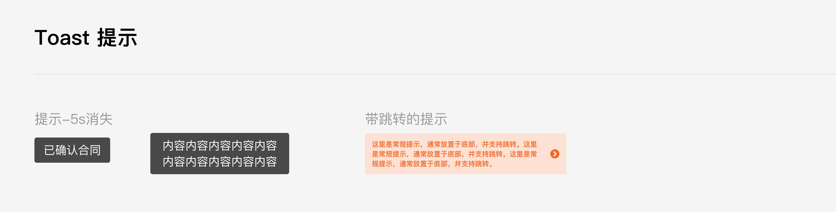
# Toast
|
|
2
|
+
|
|
3
|
+
## 介绍
|
|
4
|
+
|
|
5
|
+
在页面中间弹出黑色半透明提示,用于消息通知、加载提示、操作结果提示等场景。
|
|
6
|
+
|
|
7
|
+
## 效果图
|
|
8
|
+
|
|
9
|
+
|
|
10
|
+
|
|
11
|
+
## 引入
|
|
12
|
+
|
|
13
|
+
在app.json或页面配置json中引入
|
|
14
|
+
|
|
15
|
+
```json
|
|
16
|
+
"usingComponents": {
|
|
17
|
+
"xt-toast": "@xtdev/xt-miniprogram-ui/xt-toast",
|
|
18
|
+
}
|
|
19
|
+
```
|
|
20
|
+
|
|
21
|
+
## 代码演示
|
|
22
|
+
|
|
23
|
+
### 1)默认模式
|
|
24
|
+
|
|
25
|
+

|
|
26
|
+
|
|
27
|
+
```html
|
|
28
|
+
<xt-toast type="nomal" show="{{true}}" duration="{{5000}}" message="已确认合同"></xt-toast>
|
|
29
|
+
```
|
|
30
|
+
|
|
31
|
+
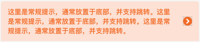
### 2)带跳转的提示
|
|
32
|
+
|
|
33
|
+
|
|
34
|
+
|
|
35
|
+
```html
|
|
36
|
+
<xt-toast type="navToast" message="哈喽早上好!支持跳转指定页面。哈喽早上好!支持跳转指定页面" navUrl="/template/list/index"></xt-toast>
|
|
37
|
+
```
|
|
38
|
+
|
|
39
|
+
## API
|
|
40
|
+
|
|
41
|
+
### xt-toast props
|
|
42
|
+
|
|
43
|
+
| 参数 | 说明 | 类型 | 默认值 |
|
|
44
|
+
| ----------- | ------------------------------------------------------------ | ------- | ------ |
|
|
45
|
+
| show | 用于触发组件显示,仅当type为'nomal'时有用 | Boolean | false |
|
|
46
|
+
| type | 指定组件的类型,可选值为`nomal` `navToast` | String | nomal |
|
|
47
|
+
| duration | 展示时长(ms),仅当type为'nomal'时有用 | Number | 5000 |
|
|
48
|
+
| message | 内容 | String | '' |
|
|
49
|
+
| navDuration | 展示时长(ms),仅当type为'navToast'时有用,(若不设置,则永远不会消失,直到用户点击跳转到指定页面) | Number | null |
|
|
50
|
+
| navUrl | 指定跳转的页面路径(相对路径),仅当type为'navToast'时有用 | String | null |
|
|
51
|
+
|
|
52
|
+
|
|
53
|
+
|
|
54
|
+
|
|
55
|
+
|
|
56
|
+
|
|
57
|
+
|
|
58
|
+
|
|
59
|
+
|
|
60
|
+
|
|
61
|
+
|
|
62
|
+
|
|
63
|
+
|
|
64
|
+
|
|
65
|
+
|