@xtdev/xt-miniprogram-ui 1.2.59 → 1.2.60
This diff represents the content of publicly available package versions that have been released to one of the supported registries. The information contained in this diff is provided for informational purposes only and reflects changes between package versions as they appear in their respective public registries.
- package/package.json +1 -1
- package/libs/package.json +0 -1
- package/libs/xt-button/README.md +0 -60
- package/libs/xt-button/index.js +0 -116
- package/libs/xt-button/index.json +0 -7
- package/libs/xt-button/index.wxml +0 -31
- package/libs/xt-button/index.wxss +0 -70
- package/libs/xt-card-cell/README.md +0 -67
- package/libs/xt-card-cell/index.js +0 -43
- package/libs/xt-card-cell/index.json +0 -6
- package/libs/xt-card-cell/index.wxml +0 -34
- package/libs/xt-card-cell/index.wxss +0 -89
- package/libs/xt-cell/README.md +0 -41
- package/libs/xt-cell/index.js +0 -42
- package/libs/xt-cell/index.json +0 -7
- package/libs/xt-cell/index.wxml +0 -12
- package/libs/xt-cell/index.wxss +0 -50
- package/libs/xt-date-picker/README.md +0 -77
- package/libs/xt-date-picker/index.js +0 -443
- package/libs/xt-date-picker/index.json +0 -7
- package/libs/xt-date-picker/index.wxml +0 -58
- package/libs/xt-date-picker/index.wxss +0 -118
- package/libs/xt-date-picker-loop/README.md +0 -77
- package/libs/xt-date-picker-loop/index.js +0 -684
- package/libs/xt-date-picker-loop/index.json +0 -8
- package/libs/xt-date-picker-loop/index.wxml +0 -61
- package/libs/xt-date-picker-loop/index.wxss +0 -117
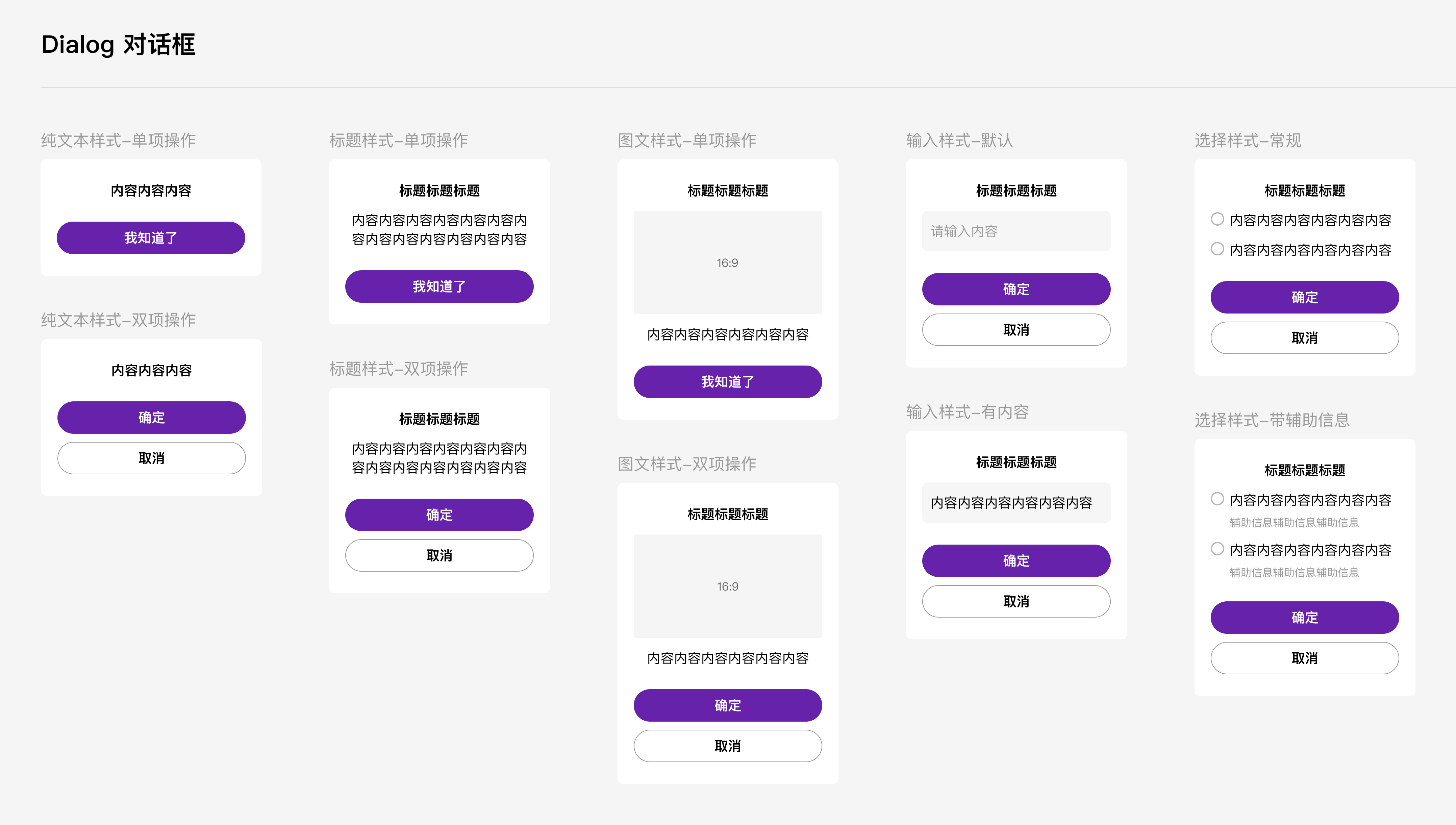
- package/libs/xt-dialog/README.md +0 -157
- package/libs/xt-dialog/index.js +0 -142
- package/libs/xt-dialog/index.json +0 -5
- package/libs/xt-dialog/index.wxml +0 -64
- package/libs/xt-dialog/index.wxss +0 -129
- package/libs/xt-form/index.js +0 -83
- package/libs/xt-form/index.json +0 -5
- package/libs/xt-form/index.wxml +0 -67
- package/libs/xt-form/index.wxss +0 -141
- package/libs/xt-icon/README.md +0 -39
- package/libs/xt-icon/index.js +0 -25
- package/libs/xt-icon/index.json +0 -5
- package/libs/xt-icon/index.wxml +0 -2
- package/libs/xt-icon/index.wxss +0 -159
- package/libs/xt-popover/README.md +0 -71
- package/libs/xt-popover/index.js +0 -209
- package/libs/xt-popover/index.json +0 -7
- package/libs/xt-popover/index.wxml +0 -43
- package/libs/xt-popover/index.wxss +0 -135
- package/libs/xt-search/README.md +0 -55
- package/libs/xt-search/index.js +0 -88
- package/libs/xt-search/index.json +0 -7
- package/libs/xt-search/index.wxml +0 -17
- package/libs/xt-search/index.wxss +0 -82
- package/libs/xt-stepper/README.md +0 -52
- package/libs/xt-stepper/index.js +0 -158
- package/libs/xt-stepper/index.json +0 -5
- package/libs/xt-stepper/index.wxml +0 -11
- package/libs/xt-stepper/index.wxss +0 -77
- package/libs/xt-steps/README.md +0 -79
- package/libs/xt-steps/index.js +0 -37
- package/libs/xt-steps/index.json +0 -7
- package/libs/xt-steps/index.wxml +0 -34
- package/libs/xt-steps/index.wxss +0 -186
- package/libs/xt-tabs/README.md +0 -98
- package/libs/xt-tabs/index.js +0 -35
- package/libs/xt-tabs/index.json +0 -6
- package/libs/xt-tabs/index.wxml +0 -10
- package/libs/xt-tabs/index.wxss +0 -76
- package/libs/xt-tag/README.md +0 -65
- package/libs/xt-tag/index.js +0 -38
- package/libs/xt-tag/index.json +0 -7
- package/libs/xt-tag/index.wxml +0 -5
- package/libs/xt-tag/index.wxss +0 -36
- package/libs/xt-toast/README.md +0 -65
- package/libs/xt-toast/index.js +0 -85
- package/libs/xt-toast/index.json +0 -7
- package/libs/xt-toast/index.wxml +0 -6
- package/libs/xt-toast/index.wxss +0 -27
- package/libs/xt-uploader/README.md +0 -46
- package/libs/xt-uploader/index.js +0 -233
- package/libs/xt-uploader/index.json +0 -7
- package/libs/xt-uploader/index.wxml +0 -15
- package/libs/xt-uploader/index.wxss +0 -68
- package/libs/xt-uploader/utils.js +0 -69
|
@@ -1,61 +0,0 @@
|
|
|
1
|
-
<view wx:if="{{show}}" class="container">
|
|
2
|
-
<view class="xt-mask"></view>
|
|
3
|
-
<view class="xt-popup">
|
|
4
|
-
<!-- 顶部标题+关闭按钮 -->
|
|
5
|
-
<view class="xt-popup-head">
|
|
6
|
-
<view class="xt-popup-head-text">{{title}}</view>
|
|
7
|
-
<xt-icon catchtap="onClose" icon="shibai-xiao" class="shibai-xiao" size="48"/>
|
|
8
|
-
</view>
|
|
9
|
-
<!-- 分割线 -->
|
|
10
|
-
<view class="head-border"></view>
|
|
11
|
-
<!-- 切换选择类型按钮 -->
|
|
12
|
-
<view wx:if="{{showChangeTab}}" class="filter-btn" catchtap="changeFiltType">
|
|
13
|
-
<view>{{typeEnums[filtType]}}</view>
|
|
14
|
-
<xt-icon icon="shaixuan" class="shaixuan" size="32"/>
|
|
15
|
-
</view>
|
|
16
|
-
<!-- 选中日期 -->
|
|
17
|
-
<view class="date-sel">
|
|
18
|
-
<view wx:if="{{filtType === 'date' || filtType === 'yearMonth'}}" class="sel-sigle actived">{{dateStr}}</view>
|
|
19
|
-
<view wx:else class="sel-range">
|
|
20
|
-
<view catchtap="switchDateType" data-type="start" class="sel-start {{checkedType == 'start' ? 'actived' : ''}}">
|
|
21
|
-
{{startDateStr}}
|
|
22
|
-
</view>
|
|
23
|
-
<view>至</view>
|
|
24
|
-
<view catchtap="switchDateType" data-type="end" class="sel-end {{checkedType == 'end' ? 'actived' : ''}}">
|
|
25
|
-
{{ endDateStr || '结束时间'}}
|
|
26
|
-
</view>
|
|
27
|
-
</view>
|
|
28
|
-
</view>
|
|
29
|
-
<!-- 选择器 -->
|
|
30
|
-
<picker-view
|
|
31
|
-
class="picker-box"
|
|
32
|
-
value="{{dateArr}}"
|
|
33
|
-
indicator-style="{{indicatorSyle}}"
|
|
34
|
-
immediate-change="{{true}}"
|
|
35
|
-
mask-class="picker-mask"
|
|
36
|
-
bindchange="bindChange"
|
|
37
|
-
bindpickstart="bindPickstart"
|
|
38
|
-
bindpickend="bindPickend">
|
|
39
|
-
<picker-view-column>
|
|
40
|
-
<view wx:for="{{years}}" wx:key="index" class="picker-item {{dateArr[0] === index ? 'picker-select' : ''}}">
|
|
41
|
-
{{item}}年
|
|
42
|
-
</view>
|
|
43
|
-
</picker-view-column>
|
|
44
|
-
<picker-view-column>
|
|
45
|
-
<view wx:for="{{months}}" wx:key="index" class="picker-item {{dateArr[1] === index ? 'picker-select' : ''}}">
|
|
46
|
-
{{item}}月
|
|
47
|
-
</view>
|
|
48
|
-
</picker-view-column>
|
|
49
|
-
<picker-view-column wx:if="{{filtType !== 'yearMonth'}}">
|
|
50
|
-
<view wx:for="{{days}}" wx:key="index" class="picker-item {{dateArr[2] === index ? 'picker-select' : ''}}">
|
|
51
|
-
{{item}}日
|
|
52
|
-
</view>
|
|
53
|
-
</picker-view-column>
|
|
54
|
-
</picker-view>
|
|
55
|
-
<!-- 按钮组 -->
|
|
56
|
-
<view class="btns-group">
|
|
57
|
-
<xt-button catchtap="onReset" class="btn-reset">{{cancelButtonText}}</xt-button>
|
|
58
|
-
<xt-button catchtap="onConfirm" disabled="{{btnDisabled}}" type="main" class="btn-confirm">{{confirmButtonText}}</xt-button>
|
|
59
|
-
</view>
|
|
60
|
-
</view>
|
|
61
|
-
</view>
|
|
@@ -1,117 +0,0 @@
|
|
|
1
|
-
.btns-group {
|
|
2
|
-
display: flex;
|
|
3
|
-
}
|
|
4
|
-
.btn-reset, .btn-confirm {
|
|
5
|
-
width: 328rpx;
|
|
6
|
-
}
|
|
7
|
-
.xt-mask {
|
|
8
|
-
position: fixed;
|
|
9
|
-
top: 0;
|
|
10
|
-
left: 0;
|
|
11
|
-
width: 100%;
|
|
12
|
-
height: 100%;
|
|
13
|
-
z-index: 99;
|
|
14
|
-
background: rgba(0, 0, 0, 0.7);
|
|
15
|
-
}
|
|
16
|
-
.xt-popup {
|
|
17
|
-
position: fixed;
|
|
18
|
-
bottom: 0;
|
|
19
|
-
left: 0;
|
|
20
|
-
width: 100%;
|
|
21
|
-
height: 1204rpx;
|
|
22
|
-
padding: 32rpx;
|
|
23
|
-
border-radius: 24rpx 24rpx 0 0;
|
|
24
|
-
box-sizing: border-box;
|
|
25
|
-
background: #fff;
|
|
26
|
-
z-index: 999;
|
|
27
|
-
}
|
|
28
|
-
.xt-popup-head {
|
|
29
|
-
display: flex;
|
|
30
|
-
align-items: center;
|
|
31
|
-
justify-content: space-between;
|
|
32
|
-
padding-bottom: 32rpx;
|
|
33
|
-
}
|
|
34
|
-
.xt-popup-head .xt-popup-head-text {
|
|
35
|
-
line-height: 56rpx;
|
|
36
|
-
font-size: 40rpx;
|
|
37
|
-
font-weight: 800;
|
|
38
|
-
color: #000;
|
|
39
|
-
}
|
|
40
|
-
.xt-popup-head .shibai-xiao {
|
|
41
|
-
color: #B8B8B8;
|
|
42
|
-
}
|
|
43
|
-
.head-border {
|
|
44
|
-
width: 100%;
|
|
45
|
-
height: 2rpx;
|
|
46
|
-
background: #F5F5F5;
|
|
47
|
-
}
|
|
48
|
-
.filter-btn {
|
|
49
|
-
display: flex;
|
|
50
|
-
align-items: center;
|
|
51
|
-
width: 226rpx;
|
|
52
|
-
height: 80rpx;
|
|
53
|
-
margin-top: 32rpx;
|
|
54
|
-
padding: 16rpx 24rpx;
|
|
55
|
-
font-size: 34rpx;
|
|
56
|
-
border-radius: 60rpx;
|
|
57
|
-
box-sizing: border-box;
|
|
58
|
-
background: #E5E5E5;
|
|
59
|
-
}
|
|
60
|
-
.filter-btn .shaixuan {
|
|
61
|
-
margin-left: 8rpx;
|
|
62
|
-
}
|
|
63
|
-
.date-sel {
|
|
64
|
-
margin-top: 48rpx;
|
|
65
|
-
}
|
|
66
|
-
.sel-sigle, .sel-start, .sel-end {
|
|
67
|
-
display: flex;
|
|
68
|
-
align-items: center;
|
|
69
|
-
justify-content: center;
|
|
70
|
-
height: 80rpx;
|
|
71
|
-
border-radius: 60rpx;
|
|
72
|
-
font-weight: 800;
|
|
73
|
-
color: #666666;
|
|
74
|
-
border: 2rpx solid #E5E5E5;
|
|
75
|
-
}
|
|
76
|
-
.date-sel .sel-range {
|
|
77
|
-
display: flex;
|
|
78
|
-
align-items: center;
|
|
79
|
-
justify-content: space-between;
|
|
80
|
-
}
|
|
81
|
-
.date-sel .sel-start, .date-sel .sel-end {
|
|
82
|
-
width: 296rpx;
|
|
83
|
-
}
|
|
84
|
-
.date-sel .actived {
|
|
85
|
-
color: #6722AB;
|
|
86
|
-
border: 2rpx solid #6722AB;
|
|
87
|
-
}
|
|
88
|
-
.picker-box {
|
|
89
|
-
width: 100%;
|
|
90
|
-
height: 600rpx;
|
|
91
|
-
margin-top: 32rpx;
|
|
92
|
-
}
|
|
93
|
-
.btns-group {
|
|
94
|
-
position: fixed;
|
|
95
|
-
left: 0;
|
|
96
|
-
bottom: 0;
|
|
97
|
-
padding: 32rpx;
|
|
98
|
-
width: 100%;
|
|
99
|
-
display: flex;
|
|
100
|
-
justify-content: space-between;
|
|
101
|
-
box-sizing: border-box;
|
|
102
|
-
padding-bottom: calc(constant(safe-area-inset-bottom) + 32rpx);
|
|
103
|
-
padding-bottom: calc(env(safe-area-inset-bottom) + 32rpx);
|
|
104
|
-
}
|
|
105
|
-
.picker-item {
|
|
106
|
-
display: flex;
|
|
107
|
-
align-items: center;
|
|
108
|
-
justify-content: center;
|
|
109
|
-
height: 120rpx;
|
|
110
|
-
font-size: 40rpx;
|
|
111
|
-
color: #000000;
|
|
112
|
-
text-align: center;
|
|
113
|
-
}
|
|
114
|
-
.picker-select {
|
|
115
|
-
font-size: 40rpx;
|
|
116
|
-
font-weight: 800;
|
|
117
|
-
}
|
package/libs/xt-dialog/README.md
DELETED
|
@@ -1,157 +0,0 @@
|
|
|
1
|
-
# Dialog弹出框
|
|
2
|
-
|
|
3
|
-
## 介绍
|
|
4
|
-
|
|
5
|
-
弹出模态框,常用于消息提示、消息确认,或在当前页面内完成特定的交互操作。
|
|
6
|
-
|
|
7
|
-
## 效果图
|
|
8
|
-
|
|
9
|
-
|
|
10
|
-
|
|
11
|
-
## 引入
|
|
12
|
-
|
|
13
|
-
在app.json或页面配置json中引入
|
|
14
|
-
|
|
15
|
-
```json
|
|
16
|
-
"usingComponents": {
|
|
17
|
-
"xt-dialog": "@xtdev/xt-miniprogram-ui/xt-dialog",
|
|
18
|
-
}
|
|
19
|
-
```
|
|
20
|
-
|
|
21
|
-
## 代码演示
|
|
22
|
-
|
|
23
|
-
### 1 纯文本样式
|
|
24
|
-
|
|
25
|
-
<img src="https://img.tanjiu.cn/home/PWGNtJ6hkZebE48ZACEsPHkcesfxSKEj.png" alt="纯文本样式" style="zoom: 50%;" />
|
|
26
|
-
|
|
27
|
-
#### 1)单项操作
|
|
28
|
-
|
|
29
|
-
```html
|
|
30
|
-
<xt-dialog show="{{true}}" type="nomal" message="内容内容内容" confirmButtonText="我知道了" bind:confirm="onConfirm"></xt-dialog>
|
|
31
|
-
```
|
|
32
|
-
|
|
33
|
-
#### 2)双向操作
|
|
34
|
-
|
|
35
|
-
```html
|
|
36
|
-
<xt-dialog show="{{true}}" type="nomal" message="内容内容内容" confirmButtonText="确定" showCancelButton="{{true}}" cancelButtonText="取消" bind:confirm="onConfirm" bind:cancel="onCancel"></xt-dialog>
|
|
37
|
-
```
|
|
38
|
-
|
|
39
|
-
### 2 标题样式
|
|
40
|
-
|
|
41
|
-
<img src="https://img.tanjiu.cn/home/22paHdnC7hPhTEBRRT7pfdkGECybNFzD.png" alt="标题样式" style="zoom:50%;" />
|
|
42
|
-
|
|
43
|
-
#### 1)单项操作
|
|
44
|
-
|
|
45
|
-
```html
|
|
46
|
-
<xt-dialog show="{{true}}" type="nomal" title="标题标题标题" message="内容内容内容" confirmButtonText="我知道了" bind:confirm="onConfirm"></xt-dialog>
|
|
47
|
-
```
|
|
48
|
-
|
|
49
|
-
#### 2)双向操作
|
|
50
|
-
|
|
51
|
-
```html
|
|
52
|
-
<xt-dialog show="{{true}}" type="nomal" title="标题标题标题" message="内容内容内容" confirmButtonText="确定" showCancelButton="{{true}}" cancelButtonText="取消" bind:confirm="onConfirm" bind:cancel="onCancel"></xt-dialog>
|
|
53
|
-
```
|
|
54
|
-
|
|
55
|
-
### 3 图文样式
|
|
56
|
-
|
|
57
|
-
<img src="https://img.tanjiu.cn/home/5xpzpCFA62TFn5DWjFQK4GmyiBbxEGiC.png" alt="图文样式" style="zoom: 80%;" />
|
|
58
|
-
|
|
59
|
-
#### 1)单项操作
|
|
60
|
-
|
|
61
|
-
```html
|
|
62
|
-
<xt-dialog type="imageText" show="{{true}}" title="标题标题标题" message="内容内容内容内容内容" imageUrl="https://img.tanjiu.cn/home/CdrcxcSwjinKwJwaSadAzMYpnZtTj4WK.webp" confirmButtonText="我知道了" showCancelButton="{{false}}" bind:confirm="onImgTextConfirm"></xt-dialog>
|
|
63
|
-
```
|
|
64
|
-
|
|
65
|
-
#### 2)双项操作
|
|
66
|
-
|
|
67
|
-
```html
|
|
68
|
-
<xt-dialog type="imageText" show="{{true}}" title="标题标题标题" message="内容内容内容内容内容" imageUrl="https://img.tanjiu.cn/home/CdrcxcSwjinKwJwaSadAzMYpnZtTj4WK.webp" confirmButtonText="确定" showCancelButton="{{true}}" cancelButtonText="取消" bind:confirm="onImgTextConfirm" bind:cancel="onImgTextCancel"></xt-dialog>
|
|
69
|
-
```
|
|
70
|
-
|
|
71
|
-
### 4 输入样式
|
|
72
|
-
|
|
73
|
-
<img src="https://img.tanjiu.cn/home/X2bAjz2FQc6mNewfhbNBQfHm6zTmfYzd.png" alt="输入样式" style="zoom:50%;" />
|
|
74
|
-
|
|
75
|
-
```html
|
|
76
|
-
<xt-dialog type="inputText" show="{{showInputDialog}}" title="标题标题标题" message="" placeholder="请输入内容" confirmButtonText="确定" showCancelButton="{{true}}" cancelButtonText="取消" bind:confirm="onInputConfirm" bind:cancel="onInputCancel"></xt-dialog>
|
|
77
|
-
```
|
|
78
|
-
|
|
79
|
-
### 5 选择器样式
|
|
80
|
-
|
|
81
|
-
<img src="https://img.tanjiu.cn/home/yKrCY5MnGFS3FcjJ6pJRz5fXmJEHrSay.png" alt="选择器样式" style="zoom:50%;" />
|
|
82
|
-
|
|
83
|
-
```html
|
|
84
|
-
<xt-dialog type="choose" show="{{true}}" title="标题标题标题" chooiceItems="{{chooiceItems}}" confirmButtonText="确定" showCancelButton="{{true}}" cancelButtonText="取消" bind:confirm="onChooseConfirm" bind:cancel="onChooseCancel"></xt-dialog>
|
|
85
|
-
```
|
|
86
|
-
|
|
87
|
-
#### 1)常规情况下的 chooiceItems 参数
|
|
88
|
-
|
|
89
|
-
```json
|
|
90
|
-
chooiceItems:[
|
|
91
|
-
{
|
|
92
|
-
value:0,
|
|
93
|
-
label:'内容内容内容内容内容内容'
|
|
94
|
-
},
|
|
95
|
-
{
|
|
96
|
-
value:1,
|
|
97
|
-
label:'内容内容内容内容内容内容'
|
|
98
|
-
}
|
|
99
|
-
]
|
|
100
|
-
```
|
|
101
|
-
|
|
102
|
-
#### 2)带辅助信息情况下的 chooiceItems 参数
|
|
103
|
-
|
|
104
|
-
```json
|
|
105
|
-
chooiceItems:[
|
|
106
|
-
{
|
|
107
|
-
value:0,
|
|
108
|
-
label:'内容内容内容内容内容内容',
|
|
109
|
-
remark:'辅助信息辅助信息辅助信息'
|
|
110
|
-
},
|
|
111
|
-
{
|
|
112
|
-
value:1,
|
|
113
|
-
label:'内容内容内容内容内容内容',
|
|
114
|
-
remark:'辅助信息辅助信息辅助信息'
|
|
115
|
-
}
|
|
116
|
-
]
|
|
117
|
-
```
|
|
118
|
-
|
|
119
|
-
## API
|
|
120
|
-
|
|
121
|
-
### xt-dialog props
|
|
122
|
-
|
|
123
|
-
| 参数 | 说明 | 类型 | 默认值 |
|
|
124
|
-
| ----------------- | ---------------------------------------------------------- | ------- | ---------- |
|
|
125
|
-
| show | 是否显示 | Boolean | true |
|
|
126
|
-
| type | 弹窗类型,可选值为`nomal` `imageText` `inputText` `choose` | String | nomal |
|
|
127
|
-
| title | 标题 | String | null |
|
|
128
|
-
| message | 内容 | String | '' |
|
|
129
|
-
| showConfirmButton | 是否展示确认按钮 | Boolean | true |
|
|
130
|
-
| showCancelButton | 是否展示取消按钮 | Boolean | false |
|
|
131
|
-
| confirmButtonText | 确认按钮的文案 | String | 确认 |
|
|
132
|
-
| cancelButtonText | 取消按钮的文案 | String | 取消 |
|
|
133
|
-
| placeholder | 输入框占位符,仅当type为'inputText'时有用 | String | 请输入内容 |
|
|
134
|
-
| imageUrl | 图片链接,仅当type为'imageText'时有用 | String | null |
|
|
135
|
-
| chooiceItems | 选项内容,仅当type为'choose'时有用 | Array | null |
|
|
136
|
-
|
|
137
|
-
### chooiceItems props []
|
|
138
|
-
|
|
139
|
-
| 参数 | 说明 | 类型 |
|
|
140
|
-
| ------ | -------------- | ----------------------- |
|
|
141
|
-
| value | 选项的value值 | Number\|String\|Boolean |
|
|
142
|
-
| label | 选项的文本描述 | String |
|
|
143
|
-
| remark | 选项的辅助信息 | String |
|
|
144
|
-
|
|
145
|
-
### Events
|
|
146
|
-
|
|
147
|
-
| 事件 | 说明 | 回调参数 |
|
|
148
|
-
| ------------ | ------------------ | ------------ |
|
|
149
|
-
| bind:confirm | 点击确认按钮时触发 | event.detail |
|
|
150
|
-
| bind:ccancel | 点击取消按钮时触发 | - |
|
|
151
|
-
|
|
152
|
-
|
|
153
|
-
|
|
154
|
-
|
|
155
|
-
|
|
156
|
-
|
|
157
|
-
|
package/libs/xt-dialog/index.js
DELETED
|
@@ -1,142 +0,0 @@
|
|
|
1
|
-
// src/xt-dialog/index.js
|
|
2
|
-
Component({
|
|
3
|
-
/**
|
|
4
|
-
* 组件的属性列表
|
|
5
|
-
*/
|
|
6
|
-
properties: {
|
|
7
|
-
show:{
|
|
8
|
-
type:Boolean,
|
|
9
|
-
value:true
|
|
10
|
-
},
|
|
11
|
-
showCloseIcon:{
|
|
12
|
-
type:Boolean,
|
|
13
|
-
value:false
|
|
14
|
-
},
|
|
15
|
-
type:{
|
|
16
|
-
type:String,
|
|
17
|
-
value:'nomal'
|
|
18
|
-
},
|
|
19
|
-
title:{
|
|
20
|
-
type:String,
|
|
21
|
-
value:null
|
|
22
|
-
},
|
|
23
|
-
message:{
|
|
24
|
-
type:String,
|
|
25
|
-
value:''
|
|
26
|
-
},
|
|
27
|
-
showConfirmButton:{
|
|
28
|
-
type:Boolean,
|
|
29
|
-
value:true
|
|
30
|
-
},
|
|
31
|
-
showCancelButton:{
|
|
32
|
-
type:Boolean,
|
|
33
|
-
value:false
|
|
34
|
-
},
|
|
35
|
-
confirmButtonText:{
|
|
36
|
-
type:String,
|
|
37
|
-
value:'我知道了'
|
|
38
|
-
},
|
|
39
|
-
cancelButtonText:{
|
|
40
|
-
type:String,
|
|
41
|
-
value:'取消'
|
|
42
|
-
},
|
|
43
|
-
placeholder:{
|
|
44
|
-
type:String,
|
|
45
|
-
value:'请输入内容'
|
|
46
|
-
},
|
|
47
|
-
imageUrl:{
|
|
48
|
-
type:String,
|
|
49
|
-
value:null
|
|
50
|
-
},
|
|
51
|
-
chooiceItems:{
|
|
52
|
-
type:Array,
|
|
53
|
-
value:[]
|
|
54
|
-
},
|
|
55
|
-
maxlength: {
|
|
56
|
-
type: Number,
|
|
57
|
-
value: -1
|
|
58
|
-
},
|
|
59
|
-
minHeight: {
|
|
60
|
-
type: Number,
|
|
61
|
-
value: 0
|
|
62
|
-
}
|
|
63
|
-
},
|
|
64
|
-
|
|
65
|
-
/**
|
|
66
|
-
* 组件的初始数据
|
|
67
|
-
*/
|
|
68
|
-
data: {
|
|
69
|
-
// 输入框的值
|
|
70
|
-
inpVal:'',
|
|
71
|
-
// 单选框选定的值
|
|
72
|
-
curChoosedItemVal: null,
|
|
73
|
-
},
|
|
74
|
-
|
|
75
|
-
lifetimes: {
|
|
76
|
-
attached(){
|
|
77
|
-
if(this.properties.type == 'inputText'){
|
|
78
|
-
this.setData({
|
|
79
|
-
inpVal: this.properties.message
|
|
80
|
-
})
|
|
81
|
-
}
|
|
82
|
-
}
|
|
83
|
-
},
|
|
84
|
-
|
|
85
|
-
/**
|
|
86
|
-
* 组件的方法列表
|
|
87
|
-
*/
|
|
88
|
-
methods: {
|
|
89
|
-
// 输入样式 - 输入框输入
|
|
90
|
-
onInput(e){
|
|
91
|
-
console.log('输入值',e);
|
|
92
|
-
this.setData({
|
|
93
|
-
inpVal: e.detail.value
|
|
94
|
-
})
|
|
95
|
-
},
|
|
96
|
-
|
|
97
|
-
// 选择样式 - 选择某一项
|
|
98
|
-
chooseItem(e){
|
|
99
|
-
let { chooseitem } = e.currentTarget.dataset;
|
|
100
|
-
this.setData({
|
|
101
|
-
curChoosedItemVal: chooseitem.value
|
|
102
|
-
})
|
|
103
|
-
console.log('触发选择',this.data.curChoosedItemVal);
|
|
104
|
-
},
|
|
105
|
-
// 点击右上角确认按钮
|
|
106
|
-
closeDialog() {
|
|
107
|
-
this.triggerEvent('close',{})
|
|
108
|
-
},
|
|
109
|
-
|
|
110
|
-
|
|
111
|
-
|
|
112
|
-
|
|
113
|
-
// 点击确认按钮
|
|
114
|
-
confirmBtn(e){
|
|
115
|
-
let { confirmtype } = e.currentTarget.dataset;
|
|
116
|
-
// 常规样式&&图文样式
|
|
117
|
-
if(['nomalDialog','imageTextDialog'].includes(confirmtype)){
|
|
118
|
-
this.triggerEvent('confirm',{})
|
|
119
|
-
}
|
|
120
|
-
// 输入样式
|
|
121
|
-
if(confirmtype == 'inputDialog'){
|
|
122
|
-
this.triggerEvent('confirm', this.data.inpVal)
|
|
123
|
-
}
|
|
124
|
-
// 选择样式
|
|
125
|
-
if(confirmtype == 'chooseDialog'){
|
|
126
|
-
if(this.data.curChoosedItemVal===null){
|
|
127
|
-
wx.showToast({
|
|
128
|
-
title: '请选择~',
|
|
129
|
-
icon:'none',
|
|
130
|
-
duration:3000
|
|
131
|
-
})
|
|
132
|
-
return
|
|
133
|
-
}
|
|
134
|
-
this.triggerEvent('confirm', this.data.curChoosedItemVal)
|
|
135
|
-
}
|
|
136
|
-
},
|
|
137
|
-
// 点击取消按钮
|
|
138
|
-
cancelBtn(){
|
|
139
|
-
this.triggerEvent('cancel',{})
|
|
140
|
-
}
|
|
141
|
-
}
|
|
142
|
-
})
|
|
@@ -1,64 +0,0 @@
|
|
|
1
|
-
<!--src/xt-dialog/index.wxml-->
|
|
2
|
-
<block wx:if="{{show}}">
|
|
3
|
-
<!-- 纯文本样式 && 标题样式 -->
|
|
4
|
-
<view class="dialog_mask" wx:if="{{type=='nomal'}}">
|
|
5
|
-
<view class="dialog_box">
|
|
6
|
-
<view class="title" wx:if="{{title}}">{{title}}</view>
|
|
7
|
-
<image catch:tap="closeDialog" src="https://img.tanjiu.cn/home/z8CZkrd2Cm4xyfmMTFbjQpFcdSXQTEk6.png" class="close_icon" wx:if="{{showCloseIcon}}"></image>
|
|
8
|
-
<view class="content" style="font-weight:{{title?400:800}};">{{message}}
|
|
9
|
-
<slot />
|
|
10
|
-
</view>
|
|
11
|
-
<slot name="btn"></slot>
|
|
12
|
-
<view class="default_btn" catchtap="confirmBtn" data-confirmtype="nomalDialog" wx:if="{{showConfirmButton}}">{{confirmButtonText}}</view>
|
|
13
|
-
<view class="cancel_btn" catchtap="cancelBtn" wx:if="{{showCancelButton}}">{{cancelButtonText}}</view>
|
|
14
|
-
</view>
|
|
15
|
-
</view>
|
|
16
|
-
<!-- 图文样式 -->
|
|
17
|
-
<view class="dialog_mask" wx:if="{{type=='imageText'}}">
|
|
18
|
-
<view class="dialog_box">
|
|
19
|
-
<view class="title" wx:if="{{title}}">{{title}}</view>
|
|
20
|
-
<image catch:tap="closeDialog" src="https://img.tanjiu.cn/home/z8CZkrd2Cm4xyfmMTFbjQpFcdSXQTEk6.png" class="close_icon" wx:if="{{showCloseIcon}}"></image>
|
|
21
|
-
<image class="image" wx:if="{{imageUrl}}" src="{{imageUrl}}"></image>
|
|
22
|
-
<view class="content">{{message}}
|
|
23
|
-
<slot />
|
|
24
|
-
</view>
|
|
25
|
-
<slot name="btn"></slot>
|
|
26
|
-
<view class="default_btn" catchtap="confirmBtn" data-confirmtype="imageTextDialog" wx:if="{{showConfirmButton}}">{{confirmButtonText}}</view>
|
|
27
|
-
<view class="cancel_btn" catchtap="cancelBtn" wx:if="{{showCancelButton}}">{{cancelButtonText}}</view>
|
|
28
|
-
</view>
|
|
29
|
-
</view>
|
|
30
|
-
<!-- 输入样式 -->
|
|
31
|
-
<view class="dialog_mask" wx:if="{{type=='inputText'}}">
|
|
32
|
-
<view class="dialog_box">
|
|
33
|
-
<view class="title" winp_boxx:if="{{title}}">{{title}}</view>
|
|
34
|
-
<image catch:tap="closeDialog" src="https://img.tanjiu.cn/home/z8CZkrd2Cm4xyfmMTFbjQpFcdSXQTEk6.png" class="close_icon" wx:if="{{showCloseIcon}}"></image>
|
|
35
|
-
<view class="inp_wrapper">
|
|
36
|
-
<textarea class="inp_content" value="{{inpVal}}" maxlength="{{maxlength}}" disable-default-padding adjust-position auto-height auto-focus placeholder="{{placeholder}}" style="min-height: {{minHeight}}rpx" placeholder-style="color: #999;" bindinput="onInput" />
|
|
37
|
-
</view>
|
|
38
|
-
<slot />
|
|
39
|
-
<slot name="btn"></slot>
|
|
40
|
-
<view class="default_btn" catchtap="confirmBtn" data-confirmtype="inputDialog" wx:if="{{showConfirmButton}}">{{confirmButtonText}}</view>
|
|
41
|
-
<view class="cancel_btn" catchtap="cancelBtn" wx:if="{{showCancelButton}}">{{cancelButtonText}}</view>
|
|
42
|
-
</view>
|
|
43
|
-
</view>
|
|
44
|
-
<!-- 选择样式 -->
|
|
45
|
-
<view class="dialog_mask" wx:if="{{type=='choose'}}">
|
|
46
|
-
<view class="dialog_box">
|
|
47
|
-
<view class="title" wx:if="{{title}}">{{title}}</view>
|
|
48
|
-
<image catch:tap="closeDialog" src="https://img.tanjiu.cn/home/z8CZkrd2Cm4xyfmMTFbjQpFcdSXQTEk6.png" class="close_icon" wx:if="{{showCloseIcon}}"></image>
|
|
49
|
-
<view class="radio_box">
|
|
50
|
-
<view class="radio_item" wx:for="{{chooiceItems}}" wx:key="index" catchtap="chooseItem" data-chooseitem="{{item}}">
|
|
51
|
-
<image class="radio_icon" src="{{item.value!==curChoosedItemVal?'https://img.tanjiu.cn/home/SBaYKEs2iJiF3564zwRPtHAfB2Hfy7ZW.png':'https://img.tanjiu.cn/home/AD3tpDYJiGjGimY25sCSanJsEYXnEHFk.png'}}"></image>
|
|
52
|
-
<view class="radio_content">
|
|
53
|
-
<view class="radio_text">{{item.label}}</view>
|
|
54
|
-
<view class="radio_remark" wx:if="{{item.remark}}">{{item.remark}}</view>
|
|
55
|
-
</view>
|
|
56
|
-
</view>
|
|
57
|
-
</view>
|
|
58
|
-
<slot />
|
|
59
|
-
<slot name="btn"></slot>
|
|
60
|
-
<view class="default_btn" catchtap="confirmBtn" data-confirmtype="chooseDialog" wx:if="{{showConfirmButton}}">{{confirmButtonText}}</view>
|
|
61
|
-
<view class="cancel_btn" catchtap="cancelBtn" wx:if="{{showCancelButton}}">{{cancelButtonText}}</view>
|
|
62
|
-
</view>
|
|
63
|
-
</view>
|
|
64
|
-
</block>
|
|
@@ -1,129 +0,0 @@
|
|
|
1
|
-
/* src/xt-dialog/index.wxss */
|
|
2
|
-
|
|
3
|
-
.dialog_mask{
|
|
4
|
-
position: fixed;
|
|
5
|
-
top: 0;
|
|
6
|
-
left: 0;
|
|
7
|
-
z-index: 9999;
|
|
8
|
-
width: 100vw;
|
|
9
|
-
height: 100vh;
|
|
10
|
-
background-color: rgba(0, 0, 0, 0.6);
|
|
11
|
-
display: flex;
|
|
12
|
-
justify-content: center;
|
|
13
|
-
align-items: center;
|
|
14
|
-
}
|
|
15
|
-
.dialog_box{
|
|
16
|
-
padding: 64rpx 48rpx;
|
|
17
|
-
box-sizing: border-box;
|
|
18
|
-
border-radius: 16rpx;
|
|
19
|
-
text-align: center;
|
|
20
|
-
width: 654rpx;
|
|
21
|
-
/* margin: 100rpx auto; */
|
|
22
|
-
background-color: rgba(255, 255, 255);
|
|
23
|
-
position: relative;
|
|
24
|
-
}
|
|
25
|
-
.close_icon {
|
|
26
|
-
position: absolute;
|
|
27
|
-
right: 20rpx;
|
|
28
|
-
top: 20rpx;
|
|
29
|
-
width: 40rpx;
|
|
30
|
-
height: 40rpx;
|
|
31
|
-
}
|
|
32
|
-
.title{
|
|
33
|
-
line-height: 56rpx;
|
|
34
|
-
font-size: 40rpx;
|
|
35
|
-
font-family: PingFang SC-Semibold, PingFang SC;
|
|
36
|
-
font-weight: 800;
|
|
37
|
-
color: #000000;
|
|
38
|
-
margin-bottom: 32rpx;
|
|
39
|
-
}
|
|
40
|
-
.content{
|
|
41
|
-
line-height: 56rpx;
|
|
42
|
-
font-size: 40rpx;
|
|
43
|
-
font-family: PingFang SC-Regular, PingFang SC;
|
|
44
|
-
font-weight: 400;
|
|
45
|
-
color: #000000;
|
|
46
|
-
margin-bottom: 64rpx;
|
|
47
|
-
}
|
|
48
|
-
.image{
|
|
49
|
-
width: 558rpx;
|
|
50
|
-
height: 306rpx;
|
|
51
|
-
border-radius: 2rpx;
|
|
52
|
-
margin-bottom: 32rpx;
|
|
53
|
-
border-radius: 2rpx;
|
|
54
|
-
}
|
|
55
|
-
.default_btn{
|
|
56
|
-
width: 558rpx;
|
|
57
|
-
height: 96rpx;
|
|
58
|
-
line-height: 96rpx;
|
|
59
|
-
background: #6722AB;
|
|
60
|
-
border-radius: 120rpx;
|
|
61
|
-
color:#fff;
|
|
62
|
-
font-size: 40rpx;
|
|
63
|
-
font-family: PingFang SC-Semibold, PingFang SC;
|
|
64
|
-
font-weight: 800;
|
|
65
|
-
}
|
|
66
|
-
.cancel_btn{
|
|
67
|
-
margin-top: 24rpx;
|
|
68
|
-
width: 558rpx;
|
|
69
|
-
height: 94rpx;
|
|
70
|
-
border-radius: 120rpx;
|
|
71
|
-
border: 2rpx solid #999999;
|
|
72
|
-
line-height: 94rpx;
|
|
73
|
-
color:#000;
|
|
74
|
-
font-size: 40rpx;
|
|
75
|
-
font-family: PingFang SC-Semibold, PingFang SC;
|
|
76
|
-
font-weight: 800;
|
|
77
|
-
}
|
|
78
|
-
.inp_wrapper{
|
|
79
|
-
border-radius: 16rpx;
|
|
80
|
-
width: 558rpx;
|
|
81
|
-
box-sizing: border-box;
|
|
82
|
-
margin-bottom: 64rpx;
|
|
83
|
-
padding: 32rpx 24rpx;
|
|
84
|
-
background-color: #f5f5f5;
|
|
85
|
-
}
|
|
86
|
-
.inp_content{
|
|
87
|
-
box-sizing: border-box;
|
|
88
|
-
text-align: left;
|
|
89
|
-
width: 510rpx;
|
|
90
|
-
background-color: #f6f6f6;
|
|
91
|
-
font-size: 40rpx;
|
|
92
|
-
color: #000000;
|
|
93
|
-
}
|
|
94
|
-
.radio_box{
|
|
95
|
-
margin-bottom: 64rpx;
|
|
96
|
-
}
|
|
97
|
-
.radio_item{
|
|
98
|
-
display: flex;
|
|
99
|
-
align-items: baseline;
|
|
100
|
-
/* justify-content: space-between; */
|
|
101
|
-
margin-bottom: 32rpx;
|
|
102
|
-
}
|
|
103
|
-
.radio_item:last-child{
|
|
104
|
-
margin-bottom: 0;
|
|
105
|
-
}
|
|
106
|
-
.radio_icon{
|
|
107
|
-
margin-right: 16rpx;
|
|
108
|
-
width: 40rpx;
|
|
109
|
-
height: 40rpx;
|
|
110
|
-
}
|
|
111
|
-
.radio_content{
|
|
112
|
-
width: 502rpx;
|
|
113
|
-
text-align: left;
|
|
114
|
-
}
|
|
115
|
-
.radio_text{
|
|
116
|
-
line-height: 56rpx;
|
|
117
|
-
font-size: 40rpx;
|
|
118
|
-
font-family: PingFang SC-Regular, PingFang SC;
|
|
119
|
-
font-weight: 400;
|
|
120
|
-
color: #000000;
|
|
121
|
-
}
|
|
122
|
-
.radio_remark{
|
|
123
|
-
line-height: 44rpx;
|
|
124
|
-
font-size: 32rpx;
|
|
125
|
-
font-family: PingFang SC-Regular, PingFang SC;
|
|
126
|
-
font-weight: 400;
|
|
127
|
-
color: #999999;
|
|
128
|
-
margin-top: 16rpx;
|
|
129
|
-
}
|