@xtdev/xt-miniprogram-ui 1.0.16 → 1.0.19
This diff represents the content of publicly available package versions that have been released to one of the supported registries. The information contained in this diff is provided for informational purposes only and reflects changes between package versions as they appear in their respective public registries.
- package/README.md +14 -1
- package/libs/xt-cell/README.md +41 -0
- package/libs/xt-cell/index.js +42 -0
- package/libs/xt-cell/index.json +7 -0
- package/libs/xt-cell/index.wxml +12 -0
- package/libs/xt-cell/index.wxss +50 -0
- package/libs/xt-popover/README.md +71 -0
- package/libs/xt-popover/index.js +209 -0
- package/libs/xt-popover/index.json +6 -0
- package/libs/xt-popover/index.wxml +42 -0
- package/libs/xt-popover/index.wxss +135 -0
- package/libs/xt-stepper/index.wxss +2 -8
- package/libs/xt-tabs/README.md +98 -0
- package/libs/xt-tabs/index.js +35 -0
- package/libs/xt-tabs/index.json +5 -0
- package/libs/xt-tabs/index.wxml +10 -0
- package/libs/xt-tabs/index.wxss +76 -0
- package/package.json +1 -1
package/README.md
CHANGED
|
@@ -65,4 +65,17 @@ import组件:
|
|
|
65
65
|
| suffix | node | | 后缀图标节点 |
|
|
66
66
|
| onChange| (event) => {} | | 输入框值改变时的回调函数 | -->
|
|
67
67
|
|
|
68
|
-
# 开发
|
|
68
|
+
# 开发
|
|
69
|
+
## 安装
|
|
70
|
+
|
|
71
|
+
```
|
|
72
|
+
npm install
|
|
73
|
+
```
|
|
74
|
+
## 构建
|
|
75
|
+
|
|
76
|
+
```
|
|
77
|
+
npm run dev
|
|
78
|
+
```
|
|
79
|
+
## 预览
|
|
80
|
+
打开小程序开发工具,导入项目。
|
|
81
|
+
更改src中源文件,实时更新预览。
|
|
@@ -0,0 +1,41 @@
|
|
|
1
|
+
# cell
|
|
2
|
+
|
|
3
|
+
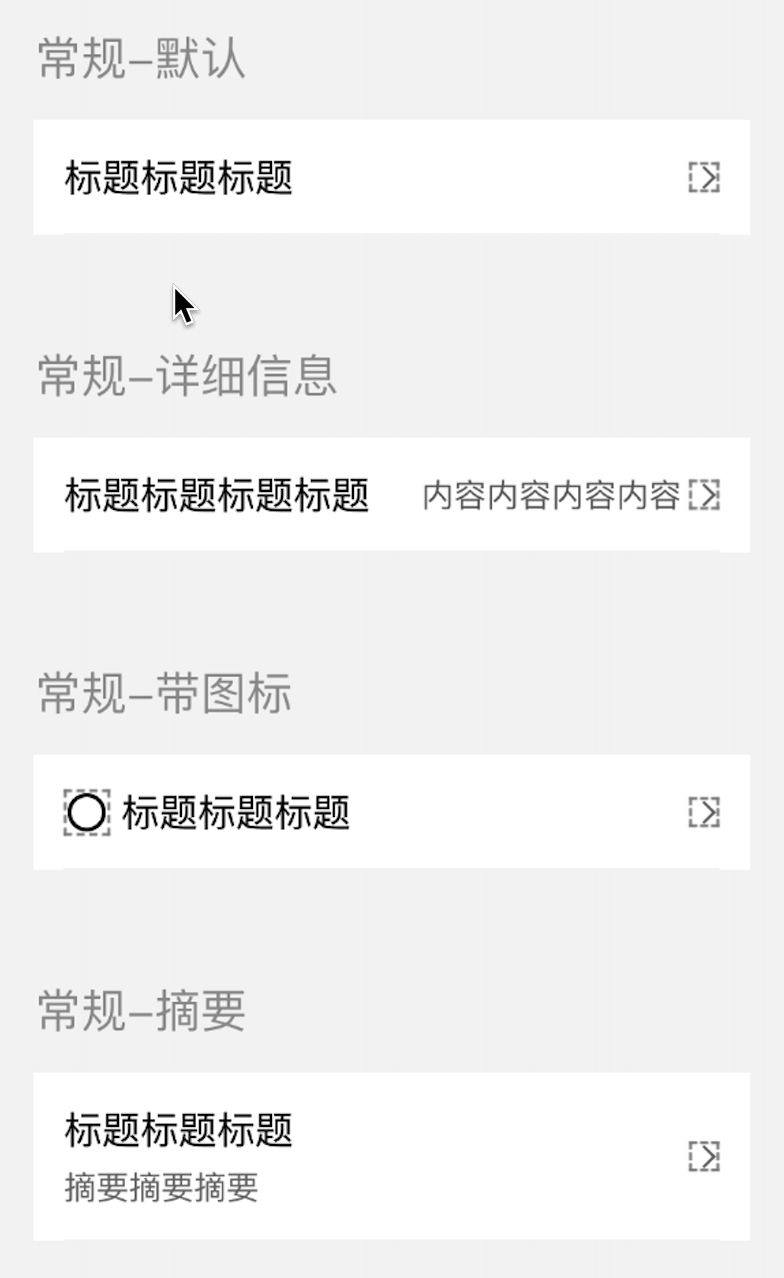
### 介绍
|
|
4
|
+
常用于数据展示
|
|
5
|
+
|
|
6
|
+
### 效果图
|
|
7
|
+
|
|
8
|
+
|
|
9
|
+
### 引入
|
|
10
|
+
在app.json或页面配置json中引入
|
|
11
|
+
```
|
|
12
|
+
"usingComponents": {
|
|
13
|
+
"xt-cell": "@xtdev/xt-miniprogram-ui/xt-cell",
|
|
14
|
+
}
|
|
15
|
+
```
|
|
16
|
+
|
|
17
|
+
## 代码演示
|
|
18
|
+
|
|
19
|
+
### 默认模式,
|
|
20
|
+
```
|
|
21
|
+
<xt-cell></xt-cell>
|
|
22
|
+
```
|
|
23
|
+
|
|
24
|
+
|
|
25
|
+
## API
|
|
26
|
+
|
|
27
|
+
#### xt-cell props
|
|
28
|
+
|
|
29
|
+
| 参数 | 说明 | 类型 | 默认值 |
|
|
30
|
+
| ----------- | ----------- | ---------- | ---------- |
|
|
31
|
+
| title | 标题 | `string` ||
|
|
32
|
+
| detailsMessage | 详细信息 | `string` ||
|
|
33
|
+
| abstract | 摘要 | `string` ||
|
|
34
|
+
| leftIcon | icon | `string` ||
|
|
35
|
+
| leftIconSize | icond大小 | `string` |40|
|
|
36
|
+
| | | ||
|
|
37
|
+
| | | ||
|
|
38
|
+
|
|
39
|
+
#### 事件
|
|
40
|
+
|
|
41
|
+
无
|
|
@@ -0,0 +1,42 @@
|
|
|
1
|
+
Component({
|
|
2
|
+
options: {
|
|
3
|
+
multipleSlots: true
|
|
4
|
+
},
|
|
5
|
+
properties: {
|
|
6
|
+
title: {
|
|
7
|
+
type: String,
|
|
8
|
+
value: ""
|
|
9
|
+
},
|
|
10
|
+
detailsMessage: {
|
|
11
|
+
type: String,
|
|
12
|
+
value: ""
|
|
13
|
+
},
|
|
14
|
+
abstract: {
|
|
15
|
+
type: String,
|
|
16
|
+
value: ""
|
|
17
|
+
},
|
|
18
|
+
leftIcon: {
|
|
19
|
+
type: String,
|
|
20
|
+
value: ""
|
|
21
|
+
},
|
|
22
|
+
leftIconSize:{
|
|
23
|
+
type: String,
|
|
24
|
+
value: "40"
|
|
25
|
+
}
|
|
26
|
+
},
|
|
27
|
+
|
|
28
|
+
/**
|
|
29
|
+
* 组件的初始数据
|
|
30
|
+
*/
|
|
31
|
+
data: {
|
|
32
|
+
},
|
|
33
|
+
attached: function () {
|
|
34
|
+
},
|
|
35
|
+
|
|
36
|
+
/**
|
|
37
|
+
* 组件的方法列表
|
|
38
|
+
*/
|
|
39
|
+
methods: {
|
|
40
|
+
|
|
41
|
+
}
|
|
42
|
+
});
|
|
@@ -0,0 +1,12 @@
|
|
|
1
|
+
<!--src/xt-cell/index.wxml-->
|
|
2
|
+
<view class="xt-cell">
|
|
3
|
+
<xt-icon wx:if="{{leftIcon}}" class="xt-cell-left-icon" slot="left-icon" icon="{{leftIcon}}" size="{{leftIconSize}}"></xt-icon>
|
|
4
|
+
<view class="xt-cell-main">
|
|
5
|
+
<view class="xt-cell-main-top">
|
|
6
|
+
<view class="xt-cell-title">{{title}}</view>
|
|
7
|
+
<view class="xt-cell-subhead">{{detailsMessage}}</view>
|
|
8
|
+
</view>
|
|
9
|
+
<view wx:if="{{abstract}}" class="xt-cell-main-bottom">{{abstract}}</view>
|
|
10
|
+
</view>
|
|
11
|
+
<xt-icon class="xt-cell-right-icon" slot="right-icon" icon="youjiantou" size="32"></xt-icon>
|
|
12
|
+
</view>
|
|
@@ -0,0 +1,50 @@
|
|
|
1
|
+
/* src/xt-cell/index.wxss */
|
|
2
|
+
.xt-cell {
|
|
3
|
+
background-color: #fff;
|
|
4
|
+
padding: 32rpx;
|
|
5
|
+
display: flex;
|
|
6
|
+
justify-content: space-between;
|
|
7
|
+
align-items: center;
|
|
8
|
+
font-family: PingFang SC-Regular, PingFang SC;
|
|
9
|
+
}
|
|
10
|
+
|
|
11
|
+
.xt-cell-title {
|
|
12
|
+
line-height: 56rpx;
|
|
13
|
+
font-size: 40rpx;
|
|
14
|
+
font-weight: 400;
|
|
15
|
+
flex-grow: 1;
|
|
16
|
+
}
|
|
17
|
+
|
|
18
|
+
.xt-cell-subhead {
|
|
19
|
+
line-height: 48rpx;
|
|
20
|
+
font-size: 34rpx;
|
|
21
|
+
font-weight: 400;
|
|
22
|
+
color: #666666;
|
|
23
|
+
flex-grow: 1;
|
|
24
|
+
text-align: right;
|
|
25
|
+
}
|
|
26
|
+
|
|
27
|
+
.xt-cell-left-icon {
|
|
28
|
+
margin-right: 24rpx;
|
|
29
|
+
}
|
|
30
|
+
|
|
31
|
+
.xt-cell-right-icon {
|
|
32
|
+
margin-left: 8rpx;
|
|
33
|
+
}
|
|
34
|
+
|
|
35
|
+
.xt-cell-main {
|
|
36
|
+
flex-grow: 1;
|
|
37
|
+
}
|
|
38
|
+
|
|
39
|
+
.xt-cell-main-top {
|
|
40
|
+
display: flex;
|
|
41
|
+
align-items: center;
|
|
42
|
+
}
|
|
43
|
+
|
|
44
|
+
.xt-cell-main-bottom {
|
|
45
|
+
line-height: 48rpx;
|
|
46
|
+
font-size: 34rpx;
|
|
47
|
+
font-weight: 400;
|
|
48
|
+
color: #666666;
|
|
49
|
+
margin-top: 8rpx;
|
|
50
|
+
}
|
|
@@ -0,0 +1,71 @@
|
|
|
1
|
+
# Popover 底部弹窗
|
|
2
|
+
|
|
3
|
+
### 介绍
|
|
4
|
+
底部操作弹窗
|
|
5
|
+
|
|
6
|
+
###效果图
|
|
7
|
+

|
|
8
|
+
|
|
9
|
+
### 引入
|
|
10
|
+
在app.json或页面配置json中引入
|
|
11
|
+
```
|
|
12
|
+
"usingComponents": {
|
|
13
|
+
"xt-popover": "@xtdev/xt-miniprogram-ui/xt-popover",
|
|
14
|
+
}
|
|
15
|
+
```
|
|
16
|
+
|
|
17
|
+
## 代码演示
|
|
18
|
+
|
|
19
|
+
### 基础用法
|
|
20
|
+
|
|
21
|
+
#### 操作样式
|
|
22
|
+
|
|
23
|
+
```
|
|
24
|
+
<xt-popover show="{{isShow1}}" itemTextKey="name" operates="{{operates}}" type="{{type}}" bind:onChooseItemClick="chooseItemClick" bind:onClose="closePopover"></xt-popover>
|
|
25
|
+
```
|
|
26
|
+
|
|
27
|
+
#### 文本样式
|
|
28
|
+
|
|
29
|
+
```
|
|
30
|
+
<xt-popover title="Popover 弹出框-文本样式" show="{{isShow2}}" type="{{type}}" textContent="{{textContent}}" bind:onClose="closePopover" bind:onConfirm="confirm"></xt-popover>
|
|
31
|
+
```
|
|
32
|
+
|
|
33
|
+
#### 选择样式-单选
|
|
34
|
+
|
|
35
|
+
```
|
|
36
|
+
<xt-popover title="Popover 弹出框-选择样式-单选" show="{{isShow3}}" type="{{type}}" itemTextKey="areaName" contrastId="areaId" bind:onConfirm="confirm" sourceData="{{sourceData}}" selectData="{{selectData}}" bind:onChooseItemClick="chooseItemClick" bind:onClose="closePopover"></xt-popover>
|
|
37
|
+
```
|
|
38
|
+
|
|
39
|
+
#### 选择样式-多选
|
|
40
|
+
|
|
41
|
+
```
|
|
42
|
+
<xt-popover title=" Popover 弹出框-选择样式-多选" show="{{isShow4}}" type="{{type}}" itemTextKey="areaName" contrastId="areaId" bind:onConfirm="confirm" sourceData="{{sourceData}}" selectData="{{selectData}}" bind:onChooseItemClick="chooseItemClick" bind:onClose="closePopover"></xt-popover>
|
|
43
|
+
```
|
|
44
|
+
|
|
45
|
+
## API
|
|
46
|
+
|
|
47
|
+
#### xt-popover props
|
|
48
|
+
|
|
49
|
+
| 参数 | 说明 | 类型 | 默认值 |
|
|
50
|
+
| ----------- | ----------- | ---------- | ------------ |
|
|
51
|
+
| type | 弹窗类型,可选值为 `operate` `text` `single` `multiple` | string | `operate`
|
|
52
|
+
| zIndx | z-index 层级 | number | `999`
|
|
53
|
+
| title | 弹窗标题 | string | `无`
|
|
54
|
+
| show | 是否展示弹窗 | boolean | `false`
|
|
55
|
+
| showCloseIcon | 是否展示弹窗关闭图标 | boolean | `true`
|
|
56
|
+
| textContent | 弹窗类型为 `text` 的文本内容 | string | `无`
|
|
57
|
+
| itemTextKey | 弹窗类型为 `operate` `single` `multiple` 的文本内容的 key | string | `无`
|
|
58
|
+
| operates | 弹窗类型为 `operate` 时的操作数组 | array | `无`
|
|
59
|
+
| sourceData | 总的数据 | array | `[]`
|
|
60
|
+
| selectData | 选中的数据 | array | `[]`
|
|
61
|
+
| contrastId | 用于是否选中数据对比的依据 | string | `无`
|
|
62
|
+
|
|
63
|
+
|
|
64
|
+
|
|
65
|
+
####Events
|
|
66
|
+
|
|
67
|
+
| 事件名 | 说明 | 回调参数 |
|
|
68
|
+
| ---------------- | ------------- | ---------------------- |
|
|
69
|
+
| bind:onChooseItemClick | 弹窗类型为 `operate` `single` `multiple` 点击没有项触发的事件 | event.detail.chooseItem 为选择的数据
|
|
70
|
+
| bind:onClose | 点击关闭icon触发的事件
|
|
71
|
+
bind:onConfirm | 弹窗类型为 `text` `multiple` 时点击确定触发的事件 | event.detail.chooseData
|
|
@@ -0,0 +1,209 @@
|
|
|
1
|
+
Component({
|
|
2
|
+
behaviors: [],
|
|
3
|
+
observers: {},
|
|
4
|
+
properties: {
|
|
5
|
+
zIndx: {
|
|
6
|
+
type: Number,
|
|
7
|
+
value: 999,
|
|
8
|
+
observer: function () {},
|
|
9
|
+
},
|
|
10
|
+
// 弹窗标题
|
|
11
|
+
title: {
|
|
12
|
+
type: String,
|
|
13
|
+
value: "",
|
|
14
|
+
observer: function () {},
|
|
15
|
+
},
|
|
16
|
+
// 弹窗类型
|
|
17
|
+
type: {
|
|
18
|
+
type: String,
|
|
19
|
+
value: "operate",
|
|
20
|
+
observer: function () {},
|
|
21
|
+
},
|
|
22
|
+
show: {
|
|
23
|
+
type: Boolean,
|
|
24
|
+
value: false,
|
|
25
|
+
observer: async function (val) {
|
|
26
|
+
if (val) {
|
|
27
|
+
const res = await this.findIntersection();
|
|
28
|
+
this.setData({
|
|
29
|
+
sourceData: res,
|
|
30
|
+
});
|
|
31
|
+
}
|
|
32
|
+
},
|
|
33
|
+
},
|
|
34
|
+
showCloseIcon: {
|
|
35
|
+
type: Boolean,
|
|
36
|
+
value: true,
|
|
37
|
+
observer: function (val) {},
|
|
38
|
+
},
|
|
39
|
+
|
|
40
|
+
// 文本内容
|
|
41
|
+
textContent: {
|
|
42
|
+
type: String,
|
|
43
|
+
value: "",
|
|
44
|
+
observer: function () {},
|
|
45
|
+
},
|
|
46
|
+
// 列表每一项标题内容
|
|
47
|
+
itemTextKey: {
|
|
48
|
+
type: String,
|
|
49
|
+
value: "",
|
|
50
|
+
observer: function () {},
|
|
51
|
+
},
|
|
52
|
+
// 操作
|
|
53
|
+
operates: {
|
|
54
|
+
type: Array,
|
|
55
|
+
value: [],
|
|
56
|
+
observer: function () {},
|
|
57
|
+
},
|
|
58
|
+
// 源数据
|
|
59
|
+
sourceData: {
|
|
60
|
+
type: Array,
|
|
61
|
+
value: [],
|
|
62
|
+
observer: function (val) {},
|
|
63
|
+
},
|
|
64
|
+
// 选中数据
|
|
65
|
+
selectData: {
|
|
66
|
+
type: Array,
|
|
67
|
+
value: [],
|
|
68
|
+
observer: async function () {},
|
|
69
|
+
},
|
|
70
|
+
// 数据对比字段,用于找出选中的数据
|
|
71
|
+
contrastId: {
|
|
72
|
+
type: String,
|
|
73
|
+
value: "",
|
|
74
|
+
observer: function () {},
|
|
75
|
+
},
|
|
76
|
+
},
|
|
77
|
+
data: {
|
|
78
|
+
sourceData: [],
|
|
79
|
+
multipleChooseData: [],
|
|
80
|
+
},
|
|
81
|
+
methods: {
|
|
82
|
+
closePopover() {
|
|
83
|
+
this.triggerEvent("onClose");
|
|
84
|
+
this.resetSourceData();
|
|
85
|
+
},
|
|
86
|
+
|
|
87
|
+
async findIntersection() {
|
|
88
|
+
const { sourceData, selectData, contrastId, type } = this.data;
|
|
89
|
+
|
|
90
|
+
for (const selectItem of selectData) {
|
|
91
|
+
for (const sourceItem of sourceData) {
|
|
92
|
+
if (type === "multiple") {
|
|
93
|
+
if (selectItem[contrastId] == sourceItem[contrastId]) {
|
|
94
|
+
sourceItem.selected = true;
|
|
95
|
+
}
|
|
96
|
+
} else {
|
|
97
|
+
if (selectItem[contrastId] == sourceItem[contrastId]) {
|
|
98
|
+
sourceItem.selected = true;
|
|
99
|
+
} else {
|
|
100
|
+
sourceItem.selected = false;
|
|
101
|
+
}
|
|
102
|
+
}
|
|
103
|
+
}
|
|
104
|
+
}
|
|
105
|
+
return this.deepClone(sourceData);
|
|
106
|
+
},
|
|
107
|
+
// 重置数据
|
|
108
|
+
async resetSourceData() {
|
|
109
|
+
const { sourceData } = this.data;
|
|
110
|
+
for (const sourceItem of sourceData) {
|
|
111
|
+
delete sourceItem.selected;
|
|
112
|
+
}
|
|
113
|
+
|
|
114
|
+
this.setData({
|
|
115
|
+
sourceData: this.deepClone(sourceData),
|
|
116
|
+
});
|
|
117
|
+
},
|
|
118
|
+
|
|
119
|
+
async formatSourceData(chooseItem) {
|
|
120
|
+
const { sourceData, contrastId } = this.data;
|
|
121
|
+
for (const sourceItem of sourceData) {
|
|
122
|
+
if (
|
|
123
|
+
chooseItem[contrastId] == sourceItem[contrastId] &&
|
|
124
|
+
sourceItem.selected
|
|
125
|
+
) {
|
|
126
|
+
sourceItem.selected = false;
|
|
127
|
+
} else if (
|
|
128
|
+
chooseItem[contrastId] == sourceItem[contrastId] &&
|
|
129
|
+
!sourceItem.selected
|
|
130
|
+
) {
|
|
131
|
+
sourceItem.selected = true;
|
|
132
|
+
}
|
|
133
|
+
}
|
|
134
|
+
return sourceData;
|
|
135
|
+
},
|
|
136
|
+
|
|
137
|
+
confirm() {
|
|
138
|
+
const { sourceData } = this.data;
|
|
139
|
+
const chooseData = sourceData.filter((item) => item.selected);
|
|
140
|
+
|
|
141
|
+
const deleteSelected = chooseData.map((item) => {
|
|
142
|
+
delete item.selected;
|
|
143
|
+
return item;
|
|
144
|
+
});
|
|
145
|
+
this.triggerEvent("onConfirm", { chooseData: deleteSelected });
|
|
146
|
+
},
|
|
147
|
+
|
|
148
|
+
async chooseItemClick(event) {
|
|
149
|
+
const chooseItem = event.currentTarget.dataset.item;
|
|
150
|
+
const { type } = this.data;
|
|
151
|
+
|
|
152
|
+
if (type == "single") {
|
|
153
|
+
delete chooseItem.selected;
|
|
154
|
+
this.triggerEvent("onChooseItemClick", { chooseItem });
|
|
155
|
+
} else if (type == "multiple") {
|
|
156
|
+
const res = await this.formatSourceData(chooseItem);
|
|
157
|
+
|
|
158
|
+
this.setData({
|
|
159
|
+
sourceData: this.deepClone(res),
|
|
160
|
+
});
|
|
161
|
+
} else {
|
|
162
|
+
this.triggerEvent("onChooseItemClick", { chooseItem });
|
|
163
|
+
}
|
|
164
|
+
},
|
|
165
|
+
|
|
166
|
+
deepClone(target, map = new Map()) {
|
|
167
|
+
if (typeof target === "object") {
|
|
168
|
+
const isArray = Array.isArray(target);
|
|
169
|
+
let cloneTarget = isArray ? [] : {};
|
|
170
|
+
|
|
171
|
+
if (map.get(target)) {
|
|
172
|
+
return map.get(target);
|
|
173
|
+
}
|
|
174
|
+
map.set(target, cloneTarget);
|
|
175
|
+
|
|
176
|
+
const keys = isArray ? undefined : Object.keys(target);
|
|
177
|
+
this.forEach(keys || target, (value, key) => {
|
|
178
|
+
if (keys) {
|
|
179
|
+
key = value;
|
|
180
|
+
}
|
|
181
|
+
cloneTarget[key] = this.deepClone(target[key], map);
|
|
182
|
+
});
|
|
183
|
+
|
|
184
|
+
return cloneTarget;
|
|
185
|
+
} else {
|
|
186
|
+
return target;
|
|
187
|
+
}
|
|
188
|
+
},
|
|
189
|
+
forEach(array, iteratee) {
|
|
190
|
+
let index = -1;
|
|
191
|
+
const length = array.length;
|
|
192
|
+
while (++index < length) {
|
|
193
|
+
iteratee(array[index], index);
|
|
194
|
+
}
|
|
195
|
+
return array;
|
|
196
|
+
},
|
|
197
|
+
},
|
|
198
|
+
pageLifetimes: {
|
|
199
|
+
// 组件所在页面的生命周期函数
|
|
200
|
+
show: function () {},
|
|
201
|
+
hide: function () {},
|
|
202
|
+
resize: function () {},
|
|
203
|
+
},
|
|
204
|
+
created: function () {},
|
|
205
|
+
attached: function () {},
|
|
206
|
+
ready: function () {},
|
|
207
|
+
moved: function () {},
|
|
208
|
+
detached: function () {},
|
|
209
|
+
});
|
|
@@ -0,0 +1,42 @@
|
|
|
1
|
+
<view wx:if="{{show}}" class="xt-popover-popup" style="z-index:{{zIndx}}">
|
|
2
|
+
<view class="xt-popover">
|
|
3
|
+
<view wx:if="{{ type == 'operate'}}" class="operate-wrapper">
|
|
4
|
+
<view class="operate-content font40rpx">
|
|
5
|
+
<block wx:for="{{operates}}" wx:for-item="operate" wx:for-index="idx" wx:key="idx">
|
|
6
|
+
<view bindtap="chooseItemClick" data-item="{{operate}}" class="flex-center operate">
|
|
7
|
+
{{operate[itemTextKey]}}
|
|
8
|
+
</view>
|
|
9
|
+
</block>
|
|
10
|
+
</view>
|
|
11
|
+
<view bindtap="closePopover" class="font40rpx flex-center cancel">取消</view>
|
|
12
|
+
</view>
|
|
13
|
+
<view wx:else class="content-wrapper">
|
|
14
|
+
<view class="header">
|
|
15
|
+
<view class="header-title">{{title}}</view>
|
|
16
|
+
<image wx:if="{{showCloseIcon}}" bindtap="closePopover" class="close-icon" src="https://img.tanjiu.cn/home/zGMfEx8iJBb6JewsFrYXNWs8R8KRwjzD.png" mode="widthFix"></image>
|
|
17
|
+
</view>
|
|
18
|
+
<scroll-view scroll-y="true" class="content font40rpx {{ type == 'single' ? 'spec-content':''}}">
|
|
19
|
+
<view class="content-info">
|
|
20
|
+
<block wx:if="{{type == 'text'}}">{{textContent}}</block>
|
|
21
|
+
<view wx:else class="list">
|
|
22
|
+
<block wx:for="{{sourceData}}" wx:for-item="listItem" wx:for-index="idx" wx:key="idx">
|
|
23
|
+
<view class="list-item" bindtap="chooseItemClick" data-item="{{listItem}}">
|
|
24
|
+
<view class="list-item-label">{{listItem[itemTextKey]}}</view>
|
|
25
|
+
<block wx:if="{{type == 'multiple'}}">
|
|
26
|
+
<xt-icon wx:if="{{listItem.selected}}" icon="tongguo" size="44" style="color:#30BF67"></xt-icon>
|
|
27
|
+
<xt-icon wx:else icon="weixuanzhong1" size="44" style="color:#999999"></xt-icon>
|
|
28
|
+
</block>
|
|
29
|
+
<block wx:if="{{type == 'single'}}">
|
|
30
|
+
<xt-icon wx:if="{{listItem.selected}}" icon="zhengque" size="44" style="color:#30BF67"></xt-icon>
|
|
31
|
+
</block>
|
|
32
|
+
</view>
|
|
33
|
+
</block>
|
|
34
|
+
</view>
|
|
35
|
+
</view>
|
|
36
|
+
</scroll-view>
|
|
37
|
+
<view wx:if="{{type == 'text' || type == 'multiple'}}" class="btn-wrapper">
|
|
38
|
+
<view bindtap="confirm" class="confirm flex-center">确定</view>
|
|
39
|
+
</view>
|
|
40
|
+
</view>
|
|
41
|
+
</view>
|
|
42
|
+
</view>
|
|
@@ -0,0 +1,135 @@
|
|
|
1
|
+
.xt-popover-popup {
|
|
2
|
+
position: fixed;
|
|
3
|
+
top: 0;
|
|
4
|
+
left: 0;
|
|
5
|
+
width: 100vw;
|
|
6
|
+
height: 100vh;
|
|
7
|
+
background: rgba(0, 0, 0, 0.7);
|
|
8
|
+
|
|
9
|
+
transition-property: opacity;
|
|
10
|
+
transition-timing-function: ease;
|
|
11
|
+
}
|
|
12
|
+
.xt-popover-popup .xt-popover {
|
|
13
|
+
position: absolute;
|
|
14
|
+
bottom: 0;
|
|
15
|
+
width: 100%;
|
|
16
|
+
background-color: #ffffff;
|
|
17
|
+
border-radius: 20rpx 20rpx 0 0;
|
|
18
|
+
overflow: hidden;
|
|
19
|
+
box-sizing: border-box;
|
|
20
|
+
|
|
21
|
+
padding-bottom: calc(constant(safe-area-inset-bottom) + 0rpx);
|
|
22
|
+
padding-bottom: calc(env(safe-area-inset-bottom) + 0rpx);
|
|
23
|
+
|
|
24
|
+
transition: all 0.5s ease-in;
|
|
25
|
+
}
|
|
26
|
+
|
|
27
|
+
.xt-popover .operate-wrapper {
|
|
28
|
+
overflow: hidden;
|
|
29
|
+
background: #ededed;
|
|
30
|
+
}
|
|
31
|
+
|
|
32
|
+
.xt-popover .operate-content {
|
|
33
|
+
background-color: #ffffff;
|
|
34
|
+
margin-bottom: 16rpx;
|
|
35
|
+
box-sizing: border-box;
|
|
36
|
+
}
|
|
37
|
+
|
|
38
|
+
.xt-popover .operate {
|
|
39
|
+
box-sizing: border-box;
|
|
40
|
+
width: 100%;
|
|
41
|
+
height: 120rpx;
|
|
42
|
+
box-shadow: inset 0px -2rpx 0rpx 0rpx #ededed;
|
|
43
|
+
}
|
|
44
|
+
|
|
45
|
+
.xt-popover .cancel {
|
|
46
|
+
width: 100%;
|
|
47
|
+
min-height: 120rpx;
|
|
48
|
+
background-color: #ffffff;
|
|
49
|
+
}
|
|
50
|
+
|
|
51
|
+
.xt-popover .flex-center {
|
|
52
|
+
display: flex;
|
|
53
|
+
align-items: center;
|
|
54
|
+
justify-content: center;
|
|
55
|
+
}
|
|
56
|
+
|
|
57
|
+
.xt-popover .font40rpx {
|
|
58
|
+
font-size: 40rpx;
|
|
59
|
+
font-weight: 400;
|
|
60
|
+
color: #000000;
|
|
61
|
+
}
|
|
62
|
+
|
|
63
|
+
.content-wrapper {
|
|
64
|
+
box-sizing: border-box;
|
|
65
|
+
background-color: #ffffff;
|
|
66
|
+
}
|
|
67
|
+
|
|
68
|
+
.xt-popover-popup .header {
|
|
69
|
+
display: flex;
|
|
70
|
+
flex-direction: row;
|
|
71
|
+
align-items: center;
|
|
72
|
+
justify-content: space-between;
|
|
73
|
+
box-sizing: border-box;
|
|
74
|
+
padding: 0 32rpx;
|
|
75
|
+
|
|
76
|
+
width: 100%;
|
|
77
|
+
height: 120rpx;
|
|
78
|
+
background: #ffffff;
|
|
79
|
+
box-shadow: inset 0px -2rpx 0rpx 0rpx #f5f5f5;
|
|
80
|
+
font-size: 40rpx;
|
|
81
|
+
font-weight: 600;
|
|
82
|
+
color: #222222;
|
|
83
|
+
}
|
|
84
|
+
|
|
85
|
+
.xt-popover-popup .content {
|
|
86
|
+
box-sizing: border-box;
|
|
87
|
+
height: 924rpx;
|
|
88
|
+
}
|
|
89
|
+
|
|
90
|
+
.xt-popover-popup .spec-content {
|
|
91
|
+
height: 1084rpx;
|
|
92
|
+
}
|
|
93
|
+
|
|
94
|
+
.xt-popover-popup .content-info {
|
|
95
|
+
box-sizing: border-box;
|
|
96
|
+
padding: 32rpx;
|
|
97
|
+
text-align: justify;
|
|
98
|
+
}
|
|
99
|
+
|
|
100
|
+
.xt-popover-popup .close-icon {
|
|
101
|
+
width: 48rpx;
|
|
102
|
+
height: 48rpx;
|
|
103
|
+
}
|
|
104
|
+
|
|
105
|
+
.xt-popover-popup .btn-wrapper {
|
|
106
|
+
box-sizing: border-box;
|
|
107
|
+
width: 100%;
|
|
108
|
+
padding: 32rpx;
|
|
109
|
+
height: 160rpx;
|
|
110
|
+
background: #ffffff;
|
|
111
|
+
box-shadow: inset 0px 2rpx 0rpx 0rpx #ededed;
|
|
112
|
+
}
|
|
113
|
+
|
|
114
|
+
.xt-popover-popup .confirm {
|
|
115
|
+
width: 100%;
|
|
116
|
+
height: 100%;
|
|
117
|
+
background: #6722ab;
|
|
118
|
+
border-radius: 120rpx;
|
|
119
|
+
|
|
120
|
+
font-size: 40rpx;
|
|
121
|
+
font-weight: 600;
|
|
122
|
+
color: #ffffff;
|
|
123
|
+
}
|
|
124
|
+
|
|
125
|
+
.xt-popover-popup .list-item {
|
|
126
|
+
display: flex;
|
|
127
|
+
flex-direction: row;
|
|
128
|
+
justify-content: space-between;
|
|
129
|
+
padding: 32rpx 0;
|
|
130
|
+
}
|
|
131
|
+
|
|
132
|
+
.xt-popover-popup .list-item-label {
|
|
133
|
+
flex: 1;
|
|
134
|
+
margin-right: 20rpx;
|
|
135
|
+
}
|
|
@@ -58,14 +58,8 @@
|
|
|
58
58
|
border: 2rpx solid #dddddd;
|
|
59
59
|
}
|
|
60
60
|
|
|
61
|
-
.uni-numbox__minus {
|
|
62
|
-
border-
|
|
63
|
-
border-bottom-left-radius: 64rpx;
|
|
64
|
-
}
|
|
65
|
-
|
|
66
|
-
.uni-numbox__plus {
|
|
67
|
-
border-top-right-radius: 64rpx;
|
|
68
|
-
border-bottom-right-radius: 64rpx;
|
|
61
|
+
.uni-numbox__minus, .uni-numbox__plus {
|
|
62
|
+
border-radius: 64rpx;
|
|
69
63
|
}
|
|
70
64
|
|
|
71
65
|
.uni-numbox--text {
|
|
@@ -0,0 +1,98 @@
|
|
|
1
|
+
# Icon图标
|
|
2
|
+
|
|
3
|
+
### 介绍
|
|
4
|
+
选项卡组件,用于在不同的内容区域之间进行切换
|
|
5
|
+
|
|
6
|
+
###效果图
|
|
7
|
+

|
|
8
|
+
|
|
9
|
+
### 引入
|
|
10
|
+
在app.json或页面配置json中引入
|
|
11
|
+
```
|
|
12
|
+
"usingComponents": {
|
|
13
|
+
"xt-tabs": "@xtdev/xt-miniprogram-ui/xt-tabs",
|
|
14
|
+
}
|
|
15
|
+
```
|
|
16
|
+
|
|
17
|
+
## 代码演示
|
|
18
|
+
|
|
19
|
+
### 基础用法
|
|
20
|
+
|
|
21
|
+
```
|
|
22
|
+
<xt-tabs list="{{list}}"></xt-tabs>
|
|
23
|
+
```
|
|
24
|
+
```
|
|
25
|
+
data: {
|
|
26
|
+
list: [
|
|
27
|
+
{
|
|
28
|
+
title: '标签一'
|
|
29
|
+
},
|
|
30
|
+
{
|
|
31
|
+
title: '标签二'
|
|
32
|
+
},
|
|
33
|
+
],
|
|
34
|
+
}
|
|
35
|
+
```
|
|
36
|
+
|
|
37
|
+
### 带副标题
|
|
38
|
+
```
|
|
39
|
+
<xt-tabs list="{{subTitlelist}}"></xt-tabs>
|
|
40
|
+
```
|
|
41
|
+
```
|
|
42
|
+
data: {
|
|
43
|
+
subTitlelist: [
|
|
44
|
+
{
|
|
45
|
+
title: '标签一',
|
|
46
|
+
subTitle: '副标题'
|
|
47
|
+
},
|
|
48
|
+
{
|
|
49
|
+
title: '标签二',
|
|
50
|
+
subTitle: '副标题'
|
|
51
|
+
},
|
|
52
|
+
],
|
|
53
|
+
}
|
|
54
|
+
```
|
|
55
|
+
|
|
56
|
+
### 卡片模式
|
|
57
|
+
支持两种样式风格:line和card,默认为line样式,可以通过type属性修改样式风格
|
|
58
|
+
```
|
|
59
|
+
<xt-tabs type="card" list="{{list}}"></xt-tabs>
|
|
60
|
+
```
|
|
61
|
+
```
|
|
62
|
+
data: {
|
|
63
|
+
list: [
|
|
64
|
+
{
|
|
65
|
+
title: '标签一'
|
|
66
|
+
},
|
|
67
|
+
{
|
|
68
|
+
title: '标签二'
|
|
69
|
+
},
|
|
70
|
+
],
|
|
71
|
+
}
|
|
72
|
+
```
|
|
73
|
+
|
|
74
|
+
##API
|
|
75
|
+
|
|
76
|
+
####xt-tabs props
|
|
77
|
+
|
|
78
|
+
| 参数 | 说明 | 类型 |
|
|
79
|
+
| ----------- | ----------- | ---------- |
|
|
80
|
+
| type | 样式风格,可选值`card`、`line`,默认值为`line` | `String` |
|
|
81
|
+
| active | 当前选中标签的标识符,默认值0 | `Number` |
|
|
82
|
+
| list | 数据源数组 | `ItemProps` |
|
|
83
|
+
| cardBgColor | tab背景色 | `String` |
|
|
84
|
+
| borderColor | tab边框颜色 | `String` |
|
|
85
|
+
|
|
86
|
+
#### ItemProps
|
|
87
|
+
|
|
88
|
+
| 参数 | 说明 | 类型 |
|
|
89
|
+
| ----------- | ----------- | ----------- |
|
|
90
|
+
| title | 卡片标题 | `String` |
|
|
91
|
+
| subTitle | 卡片副标题 | `String` |
|
|
92
|
+
| titleColor | 标题颜色 | `String` |
|
|
93
|
+
|
|
94
|
+
#### Tabs Event
|
|
95
|
+
|
|
96
|
+
| 事件名 | 说明 | 参数 |
|
|
97
|
+
| ----------- | ----------- | ----------- |
|
|
98
|
+
| bind:change | tab点击事件 | 当前激活项数据以及索引 |
|
|
@@ -0,0 +1,35 @@
|
|
|
1
|
+
// path/to/custom-ul.js
|
|
2
|
+
Component({
|
|
3
|
+
properties: {
|
|
4
|
+
type: {
|
|
5
|
+
type: String,
|
|
6
|
+
value: 'line'
|
|
7
|
+
},
|
|
8
|
+
active: {
|
|
9
|
+
type: Number,
|
|
10
|
+
value: 0
|
|
11
|
+
},
|
|
12
|
+
list: {
|
|
13
|
+
type: Array,
|
|
14
|
+
},
|
|
15
|
+
cardBgColor: {
|
|
16
|
+
type: String,
|
|
17
|
+
},
|
|
18
|
+
borderColor: {
|
|
19
|
+
type: String,
|
|
20
|
+
},
|
|
21
|
+
},
|
|
22
|
+
methods: {
|
|
23
|
+
tabClick(e) {
|
|
24
|
+
const _index = e.currentTarget.dataset.index;
|
|
25
|
+
const _item = e.currentTarget.dataset.item;
|
|
26
|
+
this.setData({
|
|
27
|
+
active: _index
|
|
28
|
+
})
|
|
29
|
+
this.triggerEvent('change', {
|
|
30
|
+
..._item,
|
|
31
|
+
index: _index
|
|
32
|
+
});
|
|
33
|
+
}
|
|
34
|
+
},
|
|
35
|
+
})
|
|
@@ -0,0 +1,10 @@
|
|
|
1
|
+
<view style="background-color: {{cardBgColor}};border-color:{{type === 'card' ? borderColor : ''}}" class="{{type === 'card' ? 'xt-tabs xt-tabs-card' : 'xt-tabs'}}">
|
|
2
|
+
<view bind:tap="tabClick" data-index="{{index}}" data-item="{{item}}" wx:for="{{list}}" wx:if="{{type === 'line'}}" class="{{active === index ? 'xt-tab active' : 'xt-tab'}}">
|
|
3
|
+
<view class="title">{{item.title}}</view>
|
|
4
|
+
<view wx:if="{{item.subTitle}}" class="sub-title">{{item.subTitle}}</view>
|
|
5
|
+
<view wx:if="{{active === index}}" class="{{item.subTitle ? 'bottom-line sub-bottom-line' : 'bottom-line'}}"></view>
|
|
6
|
+
</view>
|
|
7
|
+
<view bind:tap="tabClick" data-index="{{index}}" wx:for="{{list}}" data-item="{{item}}" wx:if="{{type === 'card'}}" class="{{active === index ? 'xt-tab xt-tab-card active' : 'xt-tab xt-tab-card'}}">
|
|
8
|
+
<view style="color: {{active === index ? '' : item.titleColor}};" class="title">{{item.title}}</view>
|
|
9
|
+
</view>
|
|
10
|
+
</view>
|
|
@@ -0,0 +1,76 @@
|
|
|
1
|
+
.xt-tabs {
|
|
2
|
+
display: flex;
|
|
3
|
+
}
|
|
4
|
+
|
|
5
|
+
.xt-tabs.xt-tabs-card {
|
|
6
|
+
border-radius: 60rpx;
|
|
7
|
+
padding: 6rpx;
|
|
8
|
+
background-color: #f5f5f5;
|
|
9
|
+
border: 2rpx solid #DDDDDD;
|
|
10
|
+
}
|
|
11
|
+
|
|
12
|
+
.xt-tab {
|
|
13
|
+
display: flex;
|
|
14
|
+
flex-direction: column;
|
|
15
|
+
align-items: center;
|
|
16
|
+
font-size: 40rpx;
|
|
17
|
+
flex-grow: 1;
|
|
18
|
+
font-family: PingFang SC-Regular, PingFang SC;
|
|
19
|
+
font-weight: 400;
|
|
20
|
+
color: #000000;
|
|
21
|
+
/* width: 100%; */
|
|
22
|
+
}
|
|
23
|
+
|
|
24
|
+
.title {
|
|
25
|
+
height: 56rpx;
|
|
26
|
+
}
|
|
27
|
+
|
|
28
|
+
.sub-title {
|
|
29
|
+
height: 44rpx;
|
|
30
|
+
font-size: 32rpx;
|
|
31
|
+
font-family: PingFang SC-Regular, PingFang SC;
|
|
32
|
+
font-weight: 400;
|
|
33
|
+
color: #000000;
|
|
34
|
+
}
|
|
35
|
+
|
|
36
|
+
.active .sub-title {
|
|
37
|
+
height: 44rpx;
|
|
38
|
+
font-size: 32rpx;
|
|
39
|
+
font-family: PingFang SC-Semibold, PingFang SC;
|
|
40
|
+
font-weight: 600;
|
|
41
|
+
color: #6722AB;
|
|
42
|
+
}
|
|
43
|
+
|
|
44
|
+
.xt-tab.active {
|
|
45
|
+
font-weight: 600;
|
|
46
|
+
color: #6722AB;
|
|
47
|
+
}
|
|
48
|
+
|
|
49
|
+
.bottom-line {
|
|
50
|
+
width: 64rpx;
|
|
51
|
+
height: 8rpx;
|
|
52
|
+
background-color: #6722AB;
|
|
53
|
+
border-radius: 4rpx;
|
|
54
|
+
margin-top: 4rpx;
|
|
55
|
+
}
|
|
56
|
+
|
|
57
|
+
.bottom-line.sub-bottom-line {
|
|
58
|
+
width: 56rpx;
|
|
59
|
+
height: 6rpx;
|
|
60
|
+
}
|
|
61
|
+
|
|
62
|
+
.xt-tab-card.xt-tab {
|
|
63
|
+
height: 72rpx;
|
|
64
|
+
justify-content: center;
|
|
65
|
+
font-size: 34rpx;
|
|
66
|
+
}
|
|
67
|
+
|
|
68
|
+
.xt-tab-card.active {
|
|
69
|
+
background-color: #FFFFFF;
|
|
70
|
+
border-radius: 60rpx;
|
|
71
|
+
}
|
|
72
|
+
|
|
73
|
+
.xt-tab-card .title {
|
|
74
|
+
line-height: 72rpx;
|
|
75
|
+
height: 72rpx;
|
|
76
|
+
}
|