@xtdev/xt-miniprogram-ui 1.0.10 → 1.0.13
This diff represents the content of publicly available package versions that have been released to one of the supported registries. The information contained in this diff is provided for informational purposes only and reflects changes between package versions as they appear in their respective public registries.
- package/libs/xt-button/README.md +60 -0
- package/libs/xt-button/index.js +116 -0
- package/libs/xt-button/index.json +6 -0
- package/libs/xt-button/index.wxml +31 -0
- package/libs/xt-button/index.wxss +70 -0
- package/libs/xt-card-cell/README.md +65 -0
- package/libs/xt-card-cell/index.wxss +1 -0
- package/libs/xt-dialog/README.md +152 -0
- package/libs/xt-dialog/index.js +126 -0
- package/libs/xt-dialog/index.json +4 -0
- package/libs/xt-dialog/index.wxml +51 -0
- package/libs/xt-dialog/index.wxss +121 -0
- package/libs/xt-icon/README.md +39 -0
- package/libs/xt-icon/index.wxss +25 -46
- package/libs/xt-search/README.md +55 -0
- package/libs/xt-search/index.js +0 -37
- package/libs/xt-search/index.wxml +7 -7
- package/libs/xt-search/index.wxss +3 -3
- package/libs/xt-stepper/README.md +52 -0
- package/libs/xt-stepper/index.js +158 -0
- package/libs/xt-stepper/index.json +4 -0
- package/libs/xt-stepper/index.wxml +11 -0
- package/libs/xt-stepper/index.wxss +83 -0
- package/libs/xt-steps/README.md +61 -0
- package/libs/xt-steps/index.js +37 -0
- package/libs/xt-steps/index.json +7 -0
- package/libs/xt-steps/index.wxml +32 -0
- package/libs/xt-steps/index.wxss +180 -0
- package/libs/xt-tag/README.md +65 -0
- package/libs/xt-tag/index.js +38 -0
- package/libs/xt-tag/index.json +6 -0
- package/libs/xt-tag/index.wxml +5 -0
- package/libs/xt-tag/index.wxss +36 -0
- package/libs/xt-toast/README.md +65 -0
- package/libs/xt-toast/index.js +85 -0
- package/libs/xt-toast/index.json +6 -0
- package/libs/xt-toast/index.wxml +6 -0
- package/libs/xt-toast/index.wxss +27 -0
- package/libs/xt-uploader/README.md +44 -0
- package/libs/xt-uploader/index.js +150 -0
- package/libs/xt-uploader/index.json +7 -0
- package/libs/xt-uploader/index.wxml +15 -0
- package/libs/xt-uploader/index.wxss +67 -0
- package/libs/xt-uploader/utils.js +73 -0
- package/package.json +1 -1
|
@@ -0,0 +1,60 @@
|
|
|
1
|
+
# Icon图标
|
|
2
|
+
|
|
3
|
+
### 介绍
|
|
4
|
+
按钮用于触发一个操作
|
|
5
|
+
|
|
6
|
+
###效果图
|
|
7
|
+

|
|
8
|
+
|
|
9
|
+
### 引入
|
|
10
|
+
在app.json或页面配置json中引入
|
|
11
|
+
```
|
|
12
|
+
"usingComponents": {
|
|
13
|
+
"xt-button": "@xtdev/xt-miniprogram-ui/xt-button",
|
|
14
|
+
}
|
|
15
|
+
```
|
|
16
|
+
|
|
17
|
+
## 代码演示
|
|
18
|
+
|
|
19
|
+
### 基础用法
|
|
20
|
+
|
|
21
|
+
```
|
|
22
|
+
<xt-button type="main">默认状态</xt-button>
|
|
23
|
+
```
|
|
24
|
+
|
|
25
|
+
##API
|
|
26
|
+
|
|
27
|
+
####xt-button props
|
|
28
|
+
|
|
29
|
+
| 参数 | 说明 | 类型 | 默认值 |
|
|
30
|
+
| ----------- | ----------- | ---------- | ------------ |
|
|
31
|
+
| type | 按钮类型,可选值为 `main` `secondary` | string | `secondary`
|
|
32
|
+
| size | 按钮尺寸,可选值为 `normal` `large` `small` | string | `normal`
|
|
33
|
+
| icon | 左侧图标名称 | string |
|
|
34
|
+
| disabled | 是否禁用按钮 | boolean | `false`
|
|
35
|
+
| open-type | 微信开放能力,具体支持可参考[微信官方文档](https://developers.weixin.qq.com/miniprogram/dev/component/button.html) | string |
|
|
36
|
+
| app-parameter | 打开 APP 时,向 APP 传递的参数 | string |
|
|
37
|
+
| lang | 指定返回用户信息的语言,zh_CN 简体中文,zh_TW 繁体中文,en 英文 | string | `en`
|
|
38
|
+
| session-from | 会话来源 | string |
|
|
39
|
+
| business-id | 客服消息子商户 id | number |
|
|
40
|
+
| send-message-title | 会话内消息卡片标题 | string | 当前标题
|
|
41
|
+
| send-message-path | 会话内消息卡片点击跳转小程序路径 | string | 当前分享路径
|
|
42
|
+
| send-message-img | sendMessageImg | string | 截图
|
|
43
|
+
| show-message-card | 显示会话内消息卡片 | string | `false`
|
|
44
|
+
| dataset | 按钮 dataset,open-type 为 share 时,可在 onShareAppMessage 事件的 `event.target.dataset.detail` 中看到传入的值 | any |
|
|
45
|
+
|
|
46
|
+
|
|
47
|
+
|
|
48
|
+
####Events
|
|
49
|
+
|
|
50
|
+
| 事件名 | 说明 | 回调参数 |
|
|
51
|
+
| ---------------- | ------------- | ---------------------- |
|
|
52
|
+
| bind:click | 点击按钮,且按钮状态不为加载或禁用时触发 |
|
|
53
|
+
| bind:getuserinfo | 用户点击该按钮时,会返回获取到的用户信息,
|
|
54
|
+
从返回参数的 detail 中获取到的值同 wx.getUserInfo |
|
|
55
|
+
| bind:contact | 客服消息回调 |
|
|
56
|
+
| bind:getphonenumber | 获取用户手机号回调 |
|
|
57
|
+
| bind:getrealtimephonenumber | 获取手机号实时验证回调,open-type=getRealtimePhoneNumber 时有效 |
|
|
58
|
+
| bind:error | 当使用开放能力时,发生错误的回调 |
|
|
59
|
+
| bind:opensetting | 在打开授权设置页后回调 |
|
|
60
|
+
| bind:chooseavatar | 当 open-type 的值为 chooseAvatar 时,选择头像之后的回调 |
|
|
@@ -0,0 +1,116 @@
|
|
|
1
|
+
// src/xt-button/index.js
|
|
2
|
+
Component({
|
|
3
|
+
/**
|
|
4
|
+
* 组件的属性列表
|
|
5
|
+
*/
|
|
6
|
+
properties: {
|
|
7
|
+
// 左侧图标名称
|
|
8
|
+
icon: {
|
|
9
|
+
type: String,
|
|
10
|
+
},
|
|
11
|
+
// 按钮尺寸,可选值为 normal large small
|
|
12
|
+
size: {
|
|
13
|
+
type: String,
|
|
14
|
+
value: "normal",
|
|
15
|
+
},
|
|
16
|
+
// 按钮类型,可选值为 main secondary
|
|
17
|
+
type: {
|
|
18
|
+
type: String,
|
|
19
|
+
value: "secondary",
|
|
20
|
+
},
|
|
21
|
+
disabled: {
|
|
22
|
+
type: Boolean,
|
|
23
|
+
value: false,
|
|
24
|
+
},
|
|
25
|
+
dataset: null,
|
|
26
|
+
openType: {
|
|
27
|
+
type: String,
|
|
28
|
+
value: "",
|
|
29
|
+
},
|
|
30
|
+
appParameter: {
|
|
31
|
+
type: String,
|
|
32
|
+
value: "",
|
|
33
|
+
},
|
|
34
|
+
showMessageCard: {
|
|
35
|
+
type: String,
|
|
36
|
+
value: "",
|
|
37
|
+
},
|
|
38
|
+
sendMessagePath: {
|
|
39
|
+
type: String,
|
|
40
|
+
value: "",
|
|
41
|
+
},
|
|
42
|
+
sendMessageTitle: {
|
|
43
|
+
type: String,
|
|
44
|
+
value: "",
|
|
45
|
+
},
|
|
46
|
+
lang: {
|
|
47
|
+
type: String,
|
|
48
|
+
value: "en",
|
|
49
|
+
},
|
|
50
|
+
appParameter: {
|
|
51
|
+
type: String,
|
|
52
|
+
value: "",
|
|
53
|
+
},
|
|
54
|
+
appParameter: {
|
|
55
|
+
type: String,
|
|
56
|
+
value: "",
|
|
57
|
+
},
|
|
58
|
+
appParameter: {
|
|
59
|
+
type: String,
|
|
60
|
+
value: "",
|
|
61
|
+
},
|
|
62
|
+
},
|
|
63
|
+
|
|
64
|
+
/**
|
|
65
|
+
* 组件的初始数据
|
|
66
|
+
*/
|
|
67
|
+
data: {
|
|
68
|
+
iconSizeObj: {
|
|
69
|
+
small: { main: 40, secondary: 32 },
|
|
70
|
+
normal: { main: 48, secondary: 40 },
|
|
71
|
+
large: { main: 48, secondary: 48 },
|
|
72
|
+
},
|
|
73
|
+
iconRightObj: {
|
|
74
|
+
small: { main: 8, secondary: 4 },
|
|
75
|
+
normal: { main: 16, secondary: 8 },
|
|
76
|
+
large: { main: 16, secondary: 16 },
|
|
77
|
+
},
|
|
78
|
+
},
|
|
79
|
+
|
|
80
|
+
/**
|
|
81
|
+
* 组件的方法列表
|
|
82
|
+
*/
|
|
83
|
+
methods: {
|
|
84
|
+
onClick(event) {
|
|
85
|
+
const { disabled } = this.properties;
|
|
86
|
+
if (disabled) {
|
|
87
|
+
return;
|
|
88
|
+
}
|
|
89
|
+
this.triggerEvent("click", event);
|
|
90
|
+
},
|
|
91
|
+
onGetUserInfo(event) {
|
|
92
|
+
this.triggerEvent("getuserinfo", event.detail);
|
|
93
|
+
},
|
|
94
|
+
onContact(event) {
|
|
95
|
+
this.triggerEvent("contract", event.detail);
|
|
96
|
+
},
|
|
97
|
+
onGetPhoneNumber(event) {
|
|
98
|
+
this.triggerEvent("getphonenumber", event.detail);
|
|
99
|
+
},
|
|
100
|
+
onGetrealtimephonenumber(event) {
|
|
101
|
+
this.triggerEvent("getphonenumber", event.detail);
|
|
102
|
+
},
|
|
103
|
+
onError(event) {
|
|
104
|
+
this.triggerEvent("error", event.detail);
|
|
105
|
+
},
|
|
106
|
+
onLaunchApp(event) {
|
|
107
|
+
this.triggerEvent("launchapp", event.detail);
|
|
108
|
+
},
|
|
109
|
+
onOpenSetting(event) {
|
|
110
|
+
this.triggerEvent("opensetting", event.detail);
|
|
111
|
+
},
|
|
112
|
+
onChooseAvatar(event) {
|
|
113
|
+
this.triggerEvent("chooseavatar", event.detail);
|
|
114
|
+
},
|
|
115
|
+
},
|
|
116
|
+
});
|
|
@@ -0,0 +1,31 @@
|
|
|
1
|
+
<!-- src/xt-button/index.wxml -->
|
|
2
|
+
<view class="xt-button">
|
|
3
|
+
<button
|
|
4
|
+
disabled="{{ disabled }}"
|
|
5
|
+
bindtap="onClick"
|
|
6
|
+
class="xt-button-{{size}} xt-button-{{type}} {{disabled ? 'xt-button-disabled-'+type : ''}}"
|
|
7
|
+
hover-class="xt-button-{{type}}-clicked"
|
|
8
|
+
open-type="{{ openType }}"
|
|
9
|
+
business-id="{{ businessId }}"
|
|
10
|
+
session-from="{{ sessionFrom }}"
|
|
11
|
+
send-message-title="{{ sendMessageTitle }}"
|
|
12
|
+
send-message-path="{{ sendMessagePath }}"
|
|
13
|
+
send-message-img="{{ sendMessageImg }}"
|
|
14
|
+
show-message-card="{{ showMessageCard }}"
|
|
15
|
+
app-parameter="{{ appParameter }}"
|
|
16
|
+
data-detail="{{ dataset }}"
|
|
17
|
+
bindgetuserinfo="onGetUserInfo"
|
|
18
|
+
bindcontact="onContact"
|
|
19
|
+
bindgetphonenumber="onGetPhoneNumber"
|
|
20
|
+
bindgetrealtimephonenumber="getrealtimephonenumber"
|
|
21
|
+
binderror="onError"
|
|
22
|
+
bindlaunchapp="onLaunchApp"
|
|
23
|
+
bindopensetting="onOpenSetting"
|
|
24
|
+
bindchooseavatar="onChooseAvatar"
|
|
25
|
+
>
|
|
26
|
+
<xt-icon wx:if="{{icon}}" icon="{{icon}}" size="{{iconSizeObj[size][type]}}" style="margin-right: {{iconRightObj[size][type]}}rpx"></xt-icon>
|
|
27
|
+
<view>
|
|
28
|
+
<slot />
|
|
29
|
+
</view>
|
|
30
|
+
</button>
|
|
31
|
+
</view>
|
|
@@ -0,0 +1,70 @@
|
|
|
1
|
+
/* src/xt-button/index.wxss */
|
|
2
|
+
.xt-button button {
|
|
3
|
+
display : flex;
|
|
4
|
+
align-items : center;
|
|
5
|
+
justify-content: center;
|
|
6
|
+
text-align: center;
|
|
7
|
+
border-radius : 120rpx;
|
|
8
|
+
box-sizing : border-box !important;
|
|
9
|
+
font-family : PingFang SC-Semibold,
|
|
10
|
+
PingFang SC;
|
|
11
|
+
font-weight: 800;
|
|
12
|
+
margin : 0 !important;
|
|
13
|
+
width : auto !important;
|
|
14
|
+
}
|
|
15
|
+
|
|
16
|
+
.xt-button-small {
|
|
17
|
+
padding : 0 32rpx;
|
|
18
|
+
font-size : 34rpx;
|
|
19
|
+
line-height: 48rpx;
|
|
20
|
+
height: 80rpx;
|
|
21
|
+
}
|
|
22
|
+
|
|
23
|
+
.xt-button-normal {
|
|
24
|
+
/* padding : 20rpx 48rpx; */
|
|
25
|
+
padding : 0 48rpx;
|
|
26
|
+
font-size : 40rpx;
|
|
27
|
+
line-height: 56rpx;
|
|
28
|
+
height: 96rpx;
|
|
29
|
+
}
|
|
30
|
+
|
|
31
|
+
.xt-button-large {
|
|
32
|
+
/* padding : 24rpx 64rpx; */
|
|
33
|
+
padding : 0 64rpx;
|
|
34
|
+
font-size : 48rpx;
|
|
35
|
+
line-height: 68rpx;
|
|
36
|
+
height: 116rpx;
|
|
37
|
+
}
|
|
38
|
+
|
|
39
|
+
.xt-button-main {
|
|
40
|
+
background-color: #6722AB;
|
|
41
|
+
color : #FFFFFF;
|
|
42
|
+
}
|
|
43
|
+
|
|
44
|
+
.xt-button-disabled-main {
|
|
45
|
+
background-color: #DDDDDD !important;
|
|
46
|
+
color : #fff !important
|
|
47
|
+
}
|
|
48
|
+
|
|
49
|
+
/* hover-class需要放在class之后,否则background会被本身class的css覆盖 */
|
|
50
|
+
.xt-button-main-clicked {
|
|
51
|
+
background-color: #3D1466;
|
|
52
|
+
}
|
|
53
|
+
|
|
54
|
+
.xt-button-secondary {
|
|
55
|
+
background-color: #fff;
|
|
56
|
+
border : 2rpx #959595 solid;
|
|
57
|
+
color : #222222
|
|
58
|
+
}
|
|
59
|
+
|
|
60
|
+
.xt-button-disabled-secondary {
|
|
61
|
+
background-color: #F5F5F5 !important;
|
|
62
|
+
border : 2rpx #DDDDDD solid;
|
|
63
|
+
color : #DDDDDD !important;
|
|
64
|
+
}
|
|
65
|
+
|
|
66
|
+
/* hover-class需要放在class之后,否则background会被本身class的css覆盖 */
|
|
67
|
+
.xt-button-secondary-clicked {
|
|
68
|
+
background-color: #DDDDDD;
|
|
69
|
+
border : 2rpx #DDDDDD solid;
|
|
70
|
+
}
|
|
@@ -0,0 +1,65 @@
|
|
|
1
|
+
# 列表卡片
|
|
2
|
+
|
|
3
|
+
### 介绍
|
|
4
|
+
列表中的单个展示项
|
|
5
|
+
|
|
6
|
+
###效果图
|
|
7
|
+

|
|
8
|
+
|
|
9
|
+
### 引入
|
|
10
|
+
在app.json或页面配置json中引入
|
|
11
|
+
```
|
|
12
|
+
"usingComponents": {
|
|
13
|
+
"xt-card-cell": "@xtdev/xt-miniprogram-ui/xt-card-cell",
|
|
14
|
+
}
|
|
15
|
+
```
|
|
16
|
+
|
|
17
|
+
## 代码演示
|
|
18
|
+
|
|
19
|
+
### 基础用法
|
|
20
|
+
|
|
21
|
+
```
|
|
22
|
+
<xt-card-cell item="{{item}}">
|
|
23
|
+
</xt-card-cell>
|
|
24
|
+
```
|
|
25
|
+
|
|
26
|
+
### 使用插槽
|
|
27
|
+
使用插槽替换卡片底部内容
|
|
28
|
+
```
|
|
29
|
+
<xt-card-cell item="{{item}}">
|
|
30
|
+
<view slot="card-footer">
|
|
31
|
+
<!-- 列表按钮 -->
|
|
32
|
+
<view class="footer">
|
|
33
|
+
<view class="default-btn">
|
|
34
|
+
查看详情
|
|
35
|
+
</view>
|
|
36
|
+
</view>
|
|
37
|
+
</view>
|
|
38
|
+
</xt-card-cell>
|
|
39
|
+
```
|
|
40
|
+
|
|
41
|
+
##API
|
|
42
|
+
|
|
43
|
+
#### xt-card-cell props
|
|
44
|
+
|
|
45
|
+
| 参数 | 说明 | 类型 |
|
|
46
|
+
| ----------- | ----------- | ---------- |
|
|
47
|
+
| item | 卡片内容 | `ItemProps` |
|
|
48
|
+
| contentSlot | 卡片底部插槽 | `slot` |
|
|
49
|
+
|
|
50
|
+
#### ItemProps
|
|
51
|
+
|
|
52
|
+
| 参数 | 说明 | 类型 |
|
|
53
|
+
| ----------- | ----------- | ----------- |
|
|
54
|
+
| title | 卡片标题 | `String` |
|
|
55
|
+
| subTitle | 卡片副标题 | `String` |
|
|
56
|
+
| subTitleColor | 卡片副标题颜色 | `String` |
|
|
57
|
+
| dataList | 卡片内容 | `datalistItem[]` |
|
|
58
|
+
|
|
59
|
+
#### datalistItem
|
|
60
|
+
|
|
61
|
+
| 参数 | 说明 | 类型 |
|
|
62
|
+
| ----------- | ----------- | ----------- |
|
|
63
|
+
| value | 值 | `String` \| `Number` |
|
|
64
|
+
| valueType | 值类型,可选值为 `text` `tel` | `String` |
|
|
65
|
+
| label | 字段描述 | `String` |
|
|
@@ -0,0 +1,152 @@
|
|
|
1
|
+
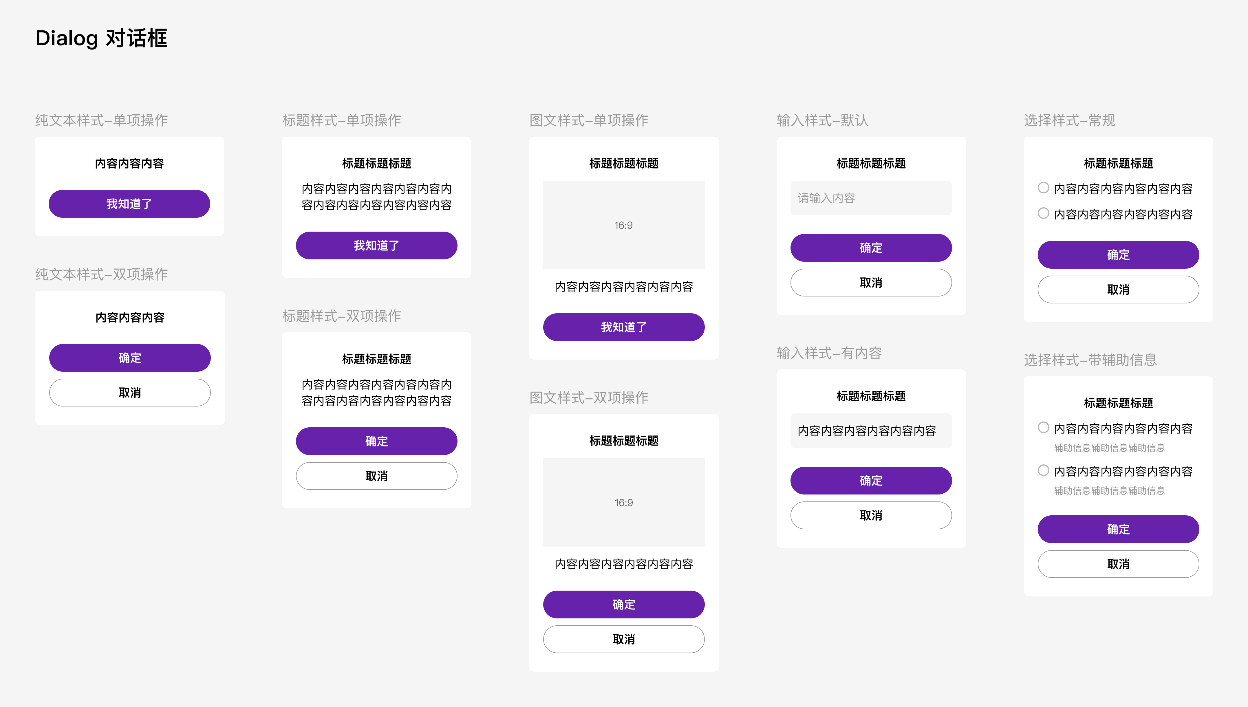
# Dialog弹出框
|
|
2
|
+
|
|
3
|
+
## 介绍
|
|
4
|
+
|
|
5
|
+
弹出模态框,常用于消息提示、消息确认,或在当前页面内完成特定的交互操作。
|
|
6
|
+
|
|
7
|
+
## 效果图
|
|
8
|
+
|
|
9
|
+
|
|
10
|
+
|
|
11
|
+
## 引入
|
|
12
|
+
|
|
13
|
+
在app.json或页面配置json中引入
|
|
14
|
+
|
|
15
|
+
```json
|
|
16
|
+
"usingComponents": {
|
|
17
|
+
"xt-dialog": "@xtdev/xt-miniprogram-ui/xt-dialog",
|
|
18
|
+
}
|
|
19
|
+
```
|
|
20
|
+
|
|
21
|
+
## 代码演示
|
|
22
|
+
|
|
23
|
+
### 1 纯文本样式
|
|
24
|
+
|
|
25
|
+
<img src="https://img.tanjiu.cn/home/PWGNtJ6hkZebE48ZACEsPHkcesfxSKEj.png" alt="纯文本样式" style="zoom: 50%;" />
|
|
26
|
+
|
|
27
|
+
#### 1)单项操作
|
|
28
|
+
|
|
29
|
+
```html
|
|
30
|
+
<xt-dialog show="{{true}}" type="nomal" message="内容内容内容" confirmButtonText="我知道了" bind:confirm="onConfirm"></xt-dialog>
|
|
31
|
+
```
|
|
32
|
+
|
|
33
|
+
#### 2)双向操作
|
|
34
|
+
|
|
35
|
+
```html
|
|
36
|
+
<xt-dialog show="{{true}}" type="nomal" message="内容内容内容" confirmButtonText="确定" showCancelButton="{{true}}" cancelButtonText="取消" bind:confirm="onConfirm" bind:cancel="onCancel"></xt-dialog>
|
|
37
|
+
```
|
|
38
|
+
|
|
39
|
+
### 2 标题样式
|
|
40
|
+
|
|
41
|
+
<img src="https://img.tanjiu.cn/home/22paHdnC7hPhTEBRRT7pfdkGECybNFzD.png" alt="标题样式" style="zoom:50%;" />
|
|
42
|
+
|
|
43
|
+
#### 1)单项操作
|
|
44
|
+
|
|
45
|
+
```html
|
|
46
|
+
<xt-dialog show="{{true}}" type="nomal" title="标题标题标题" message="内容内容内容" confirmButtonText="我知道了" bind:confirm="onConfirm"></xt-dialog>
|
|
47
|
+
```
|
|
48
|
+
|
|
49
|
+
#### 2)双向操作
|
|
50
|
+
|
|
51
|
+
```html
|
|
52
|
+
<xt-dialog show="{{true}}" type="nomal" title="标题标题标题" message="内容内容内容" confirmButtonText="确定" showCancelButton="{{true}}" cancelButtonText="取消" bind:confirm="onConfirm" bind:cancel="onCancel"></xt-dialog>
|
|
53
|
+
```
|
|
54
|
+
|
|
55
|
+
### 3 图文样式
|
|
56
|
+
|
|
57
|
+
<img src="https://img.tanjiu.cn/home/5xpzpCFA62TFn5DWjFQK4GmyiBbxEGiC.png" alt="图文样式" style="zoom: 80%;" />
|
|
58
|
+
|
|
59
|
+
#### 1)单项操作
|
|
60
|
+
|
|
61
|
+
```html
|
|
62
|
+
<xt-dialog type="imageText" show="{{true}}" title="标题标题标题" message="内容内容内容内容内容" imageUrl="https://img.tanjiu.cn/home/CdrcxcSwjinKwJwaSadAzMYpnZtTj4WK.webp" confirmButtonText="我知道了" showCancelButton="{{false}}" bind:confirm="onImgTextConfirm"></xt-dialog>
|
|
63
|
+
```
|
|
64
|
+
|
|
65
|
+
#### 2)双项操作
|
|
66
|
+
|
|
67
|
+
```html
|
|
68
|
+
<xt-dialog type="imageText" show="{{true}}" title="标题标题标题" message="内容内容内容内容内容" imageUrl="https://img.tanjiu.cn/home/CdrcxcSwjinKwJwaSadAzMYpnZtTj4WK.webp" confirmButtonText="确定" showCancelButton="{{true}}" cancelButtonText="取消" bind:confirm="onImgTextConfirm" bind:cancel="onImgTextCancel"></xt-dialog>
|
|
69
|
+
```
|
|
70
|
+
|
|
71
|
+
### 4 输入样式
|
|
72
|
+
|
|
73
|
+
<img src="https://img.tanjiu.cn/home/X2bAjz2FQc6mNewfhbNBQfHm6zTmfYzd.png" alt="输入样式" style="zoom:50%;" />
|
|
74
|
+
|
|
75
|
+
```html
|
|
76
|
+
<xt-dialog type="inputText" show="{{showInputDialog}}" title="标题标题标题" message="" placeholder="请输入内容" confirmButtonText="确定" showCancelButton="{{true}}" cancelButtonText="取消" bind:inputConfirm="onInputConfirm" bind:cancel="onInputCancel"></xt-dialog>
|
|
77
|
+
```
|
|
78
|
+
|
|
79
|
+
### 5 选择器样式
|
|
80
|
+
|
|
81
|
+
<img src="https://img.tanjiu.cn/home/yKrCY5MnGFS3FcjJ6pJRz5fXmJEHrSay.png" alt="选择器样式" style="zoom:50%;" />
|
|
82
|
+
|
|
83
|
+
```html
|
|
84
|
+
<xt-dialog type="choose" show="{{true}}" title="标题标题标题" chooiceItems="{{chooiceItems}}" confirmButtonText="确定" showCancelButton="{{true}}" cancelButtonText="取消" bind:chooseConfirm="onChooseConfirm" bind:cancel="onChooseCancel"></xt-dialog>
|
|
85
|
+
```
|
|
86
|
+
|
|
87
|
+
#### 1)常规情况下的 chooiceItems 参数
|
|
88
|
+
|
|
89
|
+
```json
|
|
90
|
+
chooiceItems:[
|
|
91
|
+
{
|
|
92
|
+
value:0,
|
|
93
|
+
label:'内容内容内容内容内容内容'
|
|
94
|
+
},
|
|
95
|
+
{
|
|
96
|
+
value:1,
|
|
97
|
+
label:'内容内容内容内容内容内容'
|
|
98
|
+
}
|
|
99
|
+
]
|
|
100
|
+
```
|
|
101
|
+
|
|
102
|
+
#### 2)带辅助信息情况下的 chooiceItems 参数
|
|
103
|
+
|
|
104
|
+
```json
|
|
105
|
+
chooiceItems:[
|
|
106
|
+
{
|
|
107
|
+
value:0,
|
|
108
|
+
label:'内容内容内容内容内容内容',
|
|
109
|
+
remark:'辅助信息辅助信息辅助信息'
|
|
110
|
+
},
|
|
111
|
+
{
|
|
112
|
+
value:1,
|
|
113
|
+
label:'内容内容内容内容内容内容',
|
|
114
|
+
remark:'辅助信息辅助信息辅助信息'
|
|
115
|
+
}
|
|
116
|
+
]
|
|
117
|
+
```
|
|
118
|
+
|
|
119
|
+
## API
|
|
120
|
+
|
|
121
|
+
### xt-dialog props
|
|
122
|
+
|
|
123
|
+
| 参数 | 说明 | 类型 | 默认值 |
|
|
124
|
+
| ----------------- | ---------------------------------------------------------- | ------- | ---------- |
|
|
125
|
+
| show | 是否显示 | Boolean | true |
|
|
126
|
+
| type | 弹窗类型,可选值为`nomal` `imageText` `inputText` `choose` | String | nomal |
|
|
127
|
+
| title | 标题 | String | null |
|
|
128
|
+
| message | 内容 | String | '' |
|
|
129
|
+
| showConfirmButton | 是否展示确认按钮 | Boolean | true |
|
|
130
|
+
| showCancelButton | 是否展示取消按钮 | Boolean | false |
|
|
131
|
+
| confirmButtonText | 确认按钮的文案 | String | 确认 |
|
|
132
|
+
| cancelButtonText | 取消按钮的文案 | String | 取消 |
|
|
133
|
+
| placeholder | 输入框占位符,仅当type为'inputText'时有用 | String | 请输入内容 |
|
|
134
|
+
| imageUrl | 图片链接,仅当type为'imageText'时有用 | String | null |
|
|
135
|
+
| chooiceItems | 选项内容,仅当type为'choose'时有用 | Array | null |
|
|
136
|
+
|
|
137
|
+
### chooiceItems props []
|
|
138
|
+
|
|
139
|
+
| 参数 | 说明 | 类型 |
|
|
140
|
+
| ------ | -------------- | ----------------------- |
|
|
141
|
+
| value | 选项的value值 | Number\|String\|Boolean |
|
|
142
|
+
| label | 选项的文本描述 | String |
|
|
143
|
+
| remark | 选项的辅助信息 | String |
|
|
144
|
+
|
|
145
|
+
|
|
146
|
+
|
|
147
|
+
|
|
148
|
+
|
|
149
|
+
|
|
150
|
+
|
|
151
|
+
|
|
152
|
+
|
|
@@ -0,0 +1,126 @@
|
|
|
1
|
+
// src/xt-dialog/index.js
|
|
2
|
+
Component({
|
|
3
|
+
/**
|
|
4
|
+
* 组件的属性列表
|
|
5
|
+
*/
|
|
6
|
+
properties: {
|
|
7
|
+
show:{
|
|
8
|
+
type:Boolean,
|
|
9
|
+
value:true
|
|
10
|
+
},
|
|
11
|
+
type:{
|
|
12
|
+
type:String,
|
|
13
|
+
value:'nomal'
|
|
14
|
+
},
|
|
15
|
+
title:{
|
|
16
|
+
type:String,
|
|
17
|
+
value:null
|
|
18
|
+
},
|
|
19
|
+
message:{
|
|
20
|
+
type:String,
|
|
21
|
+
value:''
|
|
22
|
+
},
|
|
23
|
+
showConfirmButton:{
|
|
24
|
+
type:Boolean,
|
|
25
|
+
value:true
|
|
26
|
+
},
|
|
27
|
+
showCancelButton:{
|
|
28
|
+
type:Boolean,
|
|
29
|
+
value:false
|
|
30
|
+
},
|
|
31
|
+
confirmButtonText:{
|
|
32
|
+
type:String,
|
|
33
|
+
value:'我知道了'
|
|
34
|
+
},
|
|
35
|
+
cancelButtonText:{
|
|
36
|
+
type:String,
|
|
37
|
+
value:'取消'
|
|
38
|
+
},
|
|
39
|
+
placeholder:{
|
|
40
|
+
type:String,
|
|
41
|
+
value:'请输入内容'
|
|
42
|
+
},
|
|
43
|
+
imageUrl:{
|
|
44
|
+
type:String,
|
|
45
|
+
value:null
|
|
46
|
+
},
|
|
47
|
+
chooiceItems:{
|
|
48
|
+
type:Array,
|
|
49
|
+
value:[]
|
|
50
|
+
}
|
|
51
|
+
},
|
|
52
|
+
|
|
53
|
+
/**
|
|
54
|
+
* 组件的初始数据
|
|
55
|
+
*/
|
|
56
|
+
data: {
|
|
57
|
+
// 输入框的值
|
|
58
|
+
inpVal:'',
|
|
59
|
+
// 单选框选定的值
|
|
60
|
+
curChoosedItemVal: null,
|
|
61
|
+
},
|
|
62
|
+
|
|
63
|
+
lifetimes: {
|
|
64
|
+
attached(){
|
|
65
|
+
if(this.properties.type == 'inputText'){
|
|
66
|
+
this.setData({
|
|
67
|
+
inpVal: this.properties.message
|
|
68
|
+
})
|
|
69
|
+
}
|
|
70
|
+
}
|
|
71
|
+
},
|
|
72
|
+
|
|
73
|
+
/**
|
|
74
|
+
* 组件的方法列表
|
|
75
|
+
*/
|
|
76
|
+
methods: {
|
|
77
|
+
// 输入样式 - 输入框失焦
|
|
78
|
+
onInputBlur(e){
|
|
79
|
+
console.log('输入值',e);
|
|
80
|
+
this.setData({
|
|
81
|
+
inpVal: e.detail.value
|
|
82
|
+
})
|
|
83
|
+
},
|
|
84
|
+
|
|
85
|
+
// 选择样式 - 选择某一项
|
|
86
|
+
chooseItem(e){
|
|
87
|
+
let { chooseitem } = e.currentTarget.dataset;
|
|
88
|
+
this.setData({
|
|
89
|
+
curChoosedItemVal: chooseitem.value
|
|
90
|
+
})
|
|
91
|
+
console.log('触发选择',this.data.curChoosedItemVal);
|
|
92
|
+
},
|
|
93
|
+
|
|
94
|
+
|
|
95
|
+
|
|
96
|
+
|
|
97
|
+
// 点击确认按钮
|
|
98
|
+
confirmBtn(e){
|
|
99
|
+
let { confirmtype } = e.currentTarget.dataset;
|
|
100
|
+
// 常规样式&&图文样式
|
|
101
|
+
if(['nomalDialog','imageTextDialog'].includes(confirmtype)){
|
|
102
|
+
this.triggerEvent('confirm',{})
|
|
103
|
+
}
|
|
104
|
+
// 输入样式
|
|
105
|
+
if(confirmtype == 'inputDialog'){
|
|
106
|
+
this.triggerEvent('inputConfirm', this.data.inpVal)
|
|
107
|
+
}
|
|
108
|
+
// 选择样式
|
|
109
|
+
if(confirmtype == 'chooseDialog'){
|
|
110
|
+
if(this.data.curChoosedItemVal===null){
|
|
111
|
+
wx.showToast({
|
|
112
|
+
title: '请选择~',
|
|
113
|
+
icon:'none',
|
|
114
|
+
duration:3000
|
|
115
|
+
})
|
|
116
|
+
return
|
|
117
|
+
}
|
|
118
|
+
this.triggerEvent('chooseConfirm', this.data.curChoosedItemVal)
|
|
119
|
+
}
|
|
120
|
+
},
|
|
121
|
+
// 点击取消按钮
|
|
122
|
+
cancelBtn(){
|
|
123
|
+
this.triggerEvent('cancel',{})
|
|
124
|
+
}
|
|
125
|
+
}
|
|
126
|
+
})
|
|
@@ -0,0 +1,51 @@
|
|
|
1
|
+
<!--src/xt-dialog/index.wxml-->
|
|
2
|
+
<block wx:if="{{show}}">
|
|
3
|
+
<!-- 纯文本样式 && 标题样式 -->
|
|
4
|
+
<view class="dialog_mask" wx:if="{{type=='nomal'}}">
|
|
5
|
+
<view class="dialog_box">
|
|
6
|
+
<view class="title" wx:if="{{title}}">{{title}}</view>
|
|
7
|
+
<view class="content" style="font-weight:{{title?400:800}};">{{message}}</view>
|
|
8
|
+
<view class="default_btn" catchtap="confirmBtn" data-confirmtype="nomalDialog" wx:if="{{showConfirmButton}}">{{confirmButtonText}}</view>
|
|
9
|
+
<view class="cancel_btn" catchtap="cancelBtn" wx:if="{{showCancelButton}}">{{cancelButtonText}}</view>
|
|
10
|
+
</view>
|
|
11
|
+
</view>
|
|
12
|
+
<!-- 图文样式 -->
|
|
13
|
+
<view class="dialog_mask" wx:if="{{type=='imageText'}}">
|
|
14
|
+
<view class="dialog_box">
|
|
15
|
+
<view class="title" wx:if="{{title}}">{{title}}</view>
|
|
16
|
+
<image class="image" wx:if="{{imageUrl}}" src="{{imageUrl}}"></image>
|
|
17
|
+
<view class="content">{{message}}</view>
|
|
18
|
+
<view class="default_btn" catchtap="confirmBtn" data-confirmtype="imageTextDialog" wx:if="{{showConfirmButton}}">{{confirmButtonText}}</view>
|
|
19
|
+
<view class="cancel_btn" catchtap="cancelBtn" wx:if="{{showCancelButton}}">{{cancelButtonText}}</view>
|
|
20
|
+
</view>
|
|
21
|
+
</view>
|
|
22
|
+
<!-- 输入样式 -->
|
|
23
|
+
<view class="dialog_mask" wx:if="{{type=='inputText'}}">
|
|
24
|
+
<view class="dialog_box">
|
|
25
|
+
<view class="title" winp_boxx:if="{{title}}">{{title}}</view>
|
|
26
|
+
<view class="inp_wrapper">
|
|
27
|
+
<textarea class="inp_content" value="{{inpVal}}" maxlength="{{48}}" disable-default-padding adjust-position auto-height auto-focus placeholder="{{placeholder}}" placeholder-style="color: #999;" bindblur="onInputBlur"/>
|
|
28
|
+
</view>
|
|
29
|
+
<view class="default_btn" catchtap="confirmBtn" data-confirmtype="inputDialog" wx:if="{{showConfirmButton}}">{{confirmButtonText}}</view>
|
|
30
|
+
<view class="cancel_btn" catchtap="cancelBtn" wx:if="{{showCancelButton}}">{{cancelButtonText}}</view>
|
|
31
|
+
</view>
|
|
32
|
+
</view>
|
|
33
|
+
<!-- 选择样式 -->
|
|
34
|
+
<view class="dialog_mask" wx:if="{{type=='choose'}}">
|
|
35
|
+
<view class="dialog_box">
|
|
36
|
+
<view class="title" wx:if="{{title}}">{{title}}</view>
|
|
37
|
+
<view class="radio_box">
|
|
38
|
+
<view class="radio_item" wx:for="{{chooiceItems}}" wx:key="index" catchtap="chooseItem" data-chooseitem="{{item}}">
|
|
39
|
+
<image class="radio_icon" src="{{item.value!==curChoosedItemVal?'https://img.tanjiu.cn/home/SBaYKEs2iJiF3564zwRPtHAfB2Hfy7ZW.png':'https://img.tanjiu.cn/home/AD3tpDYJiGjGimY25sCSanJsEYXnEHFk.png'}}"></image>
|
|
40
|
+
<view class="radio_content">
|
|
41
|
+
<view class="radio_text">{{item.label}}</view>
|
|
42
|
+
<view class="radio_remark" wx:if="{{item.remark}}">{{item.remark}}</view>
|
|
43
|
+
</view>
|
|
44
|
+
</view>
|
|
45
|
+
</view>
|
|
46
|
+
<view class="default_btn" catchtap="confirmBtn" data-confirmtype="chooseDialog" wx:if="{{showConfirmButton}}">{{confirmButtonText}}</view>
|
|
47
|
+
<view class="cancel_btn" catchtap="cancelBtn" wx:if="{{showCancelButton}}">{{cancelButtonText}}</view>
|
|
48
|
+
</view>
|
|
49
|
+
</view>
|
|
50
|
+
</block>
|
|
51
|
+
|