@whitekiwi/tokens 0.1.0 → 0.2.0
This diff represents the content of publicly available package versions that have been released to one of the supported registries. The information contained in this diff is provided for informational purposes only and reflects changes between package versions as they appear in their respective public registries.
- package/README.md +84 -15
- package/package.json +1 -1
package/README.md
CHANGED
|
@@ -1,38 +1,107 @@
|
|
|
1
|
+
|
|
2
|
+
|
|
1
3
|
# @whitekiwi/tokens
|
|
2
4
|
|
|
3
|
-
|
|
4
|
-
|
|
5
|
+
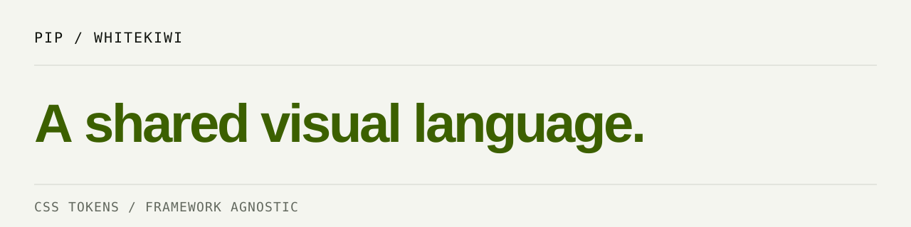
**One visual language. Your framework.**
|
|
6
|
+
|
|
7
|
+
PIP's semantic CSS tokens for warm neutral surfaces, clear typography, and a single
|
|
8
|
+
kiwi accent. Use them on their own or as the foundation for `@whitekiwi/ui`.
|
|
9
|
+
|
|
10
|
+
[Explore PIP](https://design.whitekiwi.link/) · [Source](https://github.com/WhiteKiwi/kiwi-design-system/tree/main/packages/tokens) · [Release guide](https://github.com/WhiteKiwi/kiwi-design-system/blob/main/docs/npm-release.md)
|
|
11
|
+
|
|
12
|
+
## Choose your starting point
|
|
13
|
+
|
|
14
|
+
| Package | What it owns | Use it when |
|
|
15
|
+
| --- | --- | --- |
|
|
16
|
+
| **@whitekiwi/tokens** | Palette, semantic colors, spacing, radii, font stacks, themes | You write the UI in CSS, React, Vue, Svelte, or plain HTML |
|
|
17
|
+
| [@whitekiwi/ui](https://github.com/WhiteKiwi/kiwi-design-system/tree/main/packages/ui) | React components and their interaction styles | You want ready-made PIP building blocks |
|
|
5
18
|
|
|
6
|
-
|
|
19
|
+
This package has no JavaScript runtime or React dependency. Tailwind is optional.
|
|
7
20
|
|
|
8
|
-
|
|
21
|
+
## Start with a surface
|
|
22
|
+
|
|
23
|
+
Install the token package:
|
|
9
24
|
|
|
10
25
|
```sh
|
|
11
26
|
npm install @whitekiwi/tokens
|
|
12
27
|
```
|
|
13
28
|
|
|
14
|
-
Import the
|
|
29
|
+
Import at the top of your global stylesheet with a package-aware bundler:
|
|
15
30
|
|
|
16
31
|
```css
|
|
17
32
|
@import "@whitekiwi/tokens/theme.css";
|
|
18
33
|
|
|
19
|
-
|
|
34
|
+
body {
|
|
35
|
+
margin: 0;
|
|
20
36
|
color: var(--kiwi-color-text);
|
|
21
37
|
background: var(--kiwi-color-canvas);
|
|
22
|
-
|
|
38
|
+
font-family: var(--kiwi-font-sans);
|
|
39
|
+
}
|
|
40
|
+
|
|
41
|
+
.panel {
|
|
42
|
+
padding: var(--kiwi-space-6);
|
|
43
|
+
background: var(--kiwi-color-surface);
|
|
44
|
+
border: 1px solid var(--kiwi-color-border);
|
|
45
|
+
border-radius: var(--kiwi-radius-md);
|
|
23
46
|
}
|
|
24
47
|
```
|
|
25
48
|
|
|
26
|
-
|
|
27
|
-
|
|
49
|
+
For an unbundled page, copy the exported CSS to your public assets and load it
|
|
50
|
+
with a stylesheet link. Browsers do not resolve npm package names themselves.
|
|
51
|
+
|
|
52
|
+
## Light, dark, or the system
|
|
53
|
+
|
|
54
|
+
Set the theme on the root `<html>` element:
|
|
55
|
+
|
|
56
|
+
| Preference | Root markup |
|
|
57
|
+
| --- | --- |
|
|
58
|
+
| Light | `<html data-theme="light">` |
|
|
59
|
+
| Dark | `<html data-theme="dark">` |
|
|
60
|
+
| System | `<html>` with no `data-theme` attribute |
|
|
61
|
+
|
|
62
|
+
For system mode, remove the attribute; `data-theme="auto"` does **not** enable
|
|
63
|
+
system detection. Theme colors follow `prefers-color-scheme` only when the
|
|
64
|
+
attribute is absent. Apply a saved explicit preference before first paint to
|
|
65
|
+
avoid a light/dark flash. Theme storage and switching belong to your app.
|
|
66
|
+
|
|
67
|
+
## Use roles, not raw colors
|
|
68
|
+
|
|
69
|
+
| Need | Token |
|
|
70
|
+
| --- | --- |
|
|
71
|
+
| Page / readable text | `--kiwi-color-canvas` / `--kiwi-color-text` |
|
|
72
|
+
| Secondary copy | `--kiwi-color-text-muted` |
|
|
73
|
+
| Decorative divider | `--kiwi-color-border` |
|
|
74
|
+
| Form-control boundary | `--kiwi-color-control-border` |
|
|
75
|
+
| Brand surface / its text | `--kiwi-color-brand-field` / `--kiwi-color-on-brand` |
|
|
76
|
+
| Interactive text / focus | `--kiwi-color-interactive` / `--kiwi-color-focus` |
|
|
77
|
+
|
|
78
|
+
Keep foreground/background pairs together when overriding colors. Fonts are
|
|
79
|
+
stack names, not bundled font files. Load your fonts separately or use the
|
|
80
|
+
system fallbacks. Tokens do not apply a reset, component styles, or a page layout.
|
|
81
|
+
|
|
82
|
+
The stylesheet includes an optional Tailwind CSS v4 `@theme inline` bridge for
|
|
83
|
+
utilities and breakpoints. Plain CSS consumers use the `--kiwi-*` custom
|
|
84
|
+
properties; browsers ignore that Tailwind-only at-rule. Use a toolchain/browser
|
|
85
|
+
that supports CSS custom properties and `color-mix()`.
|
|
86
|
+
|
|
87
|
+
## Public surface
|
|
88
|
+
|
|
89
|
+
- `@whitekiwi/tokens/theme.css` is the only export
|
|
90
|
+
- No root JavaScript import, theme-switching script, or JSON token API
|
|
91
|
+
- Install matching token/UI versions when using both packages
|
|
92
|
+
- Package contents: CSS, this README, package metadata, and MIT license
|
|
93
|
+
|
|
94
|
+
The repository checks defined theme contrast pairs. Custom colors, opacity,
|
|
95
|
+
backgrounds, and application composition still need accessibility review.
|
|
28
96
|
|
|
29
|
-
|
|
30
|
-
there is no JavaScript default export and no Tailwind runtime dependency.
|
|
97
|
+
## Improve PIP through use
|
|
31
98
|
|
|
32
|
-
|
|
33
|
-
|
|
99
|
+
Found a missing role, theme problem, or unclear contract? Bring the real use case
|
|
100
|
+
back to [PIP](https://github.com/WhiteKiwi/kiwi-design-system/issues/new?template=improvement.yml).
|
|
101
|
+
One product example is enough. The [contribution guide](https://github.com/WhiteKiwi/kiwi-design-system/blob/main/CONTRIBUTING.md)
|
|
102
|
+
explains how to turn it into a focused issue or PR and verify it in your product.
|
|
34
103
|
|
|
35
104
|
## License
|
|
36
105
|
|
|
37
|
-
[MIT](LICENSE), copyright WhiteKiwi.
|
|
38
|
-
|
|
106
|
+
[MIT](https://github.com/WhiteKiwi/kiwi-design-system/blob/main/packages/tokens/LICENSE), copyright WhiteKiwi.
|
|
107
|
+
Third-party dependencies and separately licensed material retain their own licenses.
|