@uicopilot/storybook-addon 0.9.6 → 0.9.7
This diff represents the content of publicly available package versions that have been released to one of the supported registries. The information contained in this diff is provided for informational purposes only and reflects changes between package versions as they appear in their respective public registries.
- package/README.md +12 -17
- package/dist/manager.mjs +3 -3
- package/package.json +1 -1
package/README.md
CHANGED
|
@@ -1,13 +1,13 @@
|
|
|
1
1
|
# UI Parity for Storybook
|
|
2
2
|
|
|
3
|
-
**Catch design drift between Figma and Storybook before it ships.** A
|
|
3
|
+
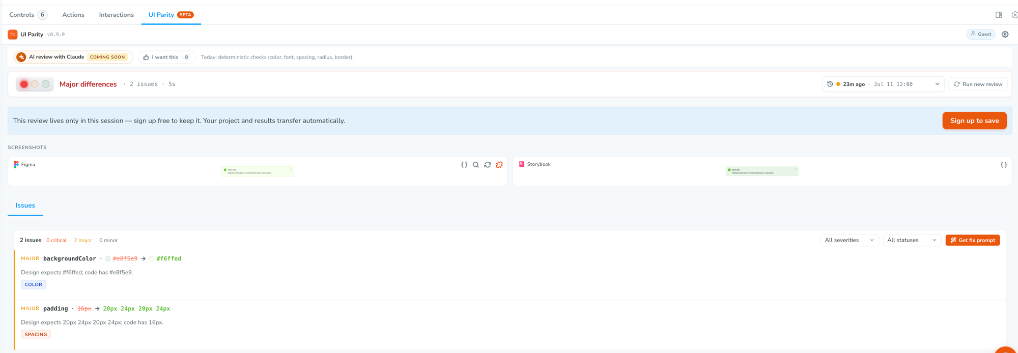
**Catch design drift between Figma and Storybook before it ships.** A clear traffic-light verdict per component — right inside the Storybook you already have.
|
|
4
4
|
|
|
5
5
|
[](https://www.npmjs.com/package/@uicopilot/storybook-addon)
|
|
6
6
|
[](https://www.npmjs.com/package/@uicopilot/storybook-addon)
|
|
7
7
|
[](https://www.npmjs.com/package/@uicopilot/storybook-addon)
|
|
8
8
|

|
|
9
9
|
|
|
10
|
-
|
|
11
11
|
|
|
12
12
|
---
|
|
13
13
|
|
|
@@ -15,7 +15,7 @@
|
|
|
15
15
|
|
|
16
16
|
Your design system is the contract. When a button ships with the wrong brand color or 4px too much padding, nobody notices until it's in production — or a designer files a ticket weeks later. UI Parity checks each component against its Figma frame **inside Storybook**, so drift shows up while you're still in the story.
|
|
17
17
|
|
|
18
|
-
You get a **
|
|
18
|
+
You get a **traffic-light verdict and an exact list of what's off** (Expected vs. Actual, per property) — not a fuzzy pixel diff you have to eyeball.
|
|
19
19
|
|
|
20
20
|
## Install
|
|
21
21
|
|
|
@@ -37,7 +37,7 @@ That's it — no other config. Restart Storybook and you'll see a **UI Parity**
|
|
|
37
37
|
|
|
38
38
|
1. **Open the UI Parity panel** on any story and sign in with Google — or hit **"Try without signing in"** to start a guest session.
|
|
39
39
|
2. **Map the story to its Figma frame** (one click, "Map to Figma"). This tells UI Parity what the component is _supposed_ to look like.
|
|
40
|
-
3. **Click "Compare to design."** You get a traffic-light verdict
|
|
40
|
+
3. **Click "Compare to design."** You get a **traffic-light verdict** — `Matches design` · `Minor differences` · `Major differences` — and a list of exactly which properties drifted (Expected vs. Actual).
|
|
41
41
|
|
|
42
42
|
## What it checks
|
|
43
43
|
|
|
@@ -53,22 +53,17 @@ That's it — no other config. Restart Storybook and you'll see a **UI Parity**
|
|
|
53
53
|
|
|
54
54
|
> **AI visual review** — catching layout, shadows, missing elements, and icon drift from a screenshot comparison — is rolling out next. Today the deterministic spec-diff is what everyone gets, free.
|
|
55
55
|
|
|
56
|
-
## The
|
|
56
|
+
## The verdict
|
|
57
57
|
|
|
58
|
-
Every review
|
|
58
|
+
Every review resolves to a single **traffic light** — the _worst_ difference found sets the color, so it can never hide a real failure behind a bunch of clean checks:
|
|
59
59
|
|
|
60
|
-
|
|
61
|
-
|
|
62
|
-
|
|
63
|
-
|
|
64
|
-
|
|
|
65
|
-
| ----- | -------------------- | --------- |
|
|
66
|
-
| **A** | Clean — no issues | 100 |
|
|
67
|
-
| **B** | Minor issues only | 99 |
|
|
68
|
-
| **C** | Has a major issue | 89 |
|
|
69
|
-
| **D** | Has a critical issue | 69 |
|
|
60
|
+
| Light | Verdict | What it means |
|
|
61
|
+
| ----- | -------------------------------- | ---------------------------------------------------------------------------- |
|
|
62
|
+
| 🟢 | **Matches design** | No differences — or only sub-pixel sizes / near-identical colors |
|
|
63
|
+
| 🟡 | **Minor differences** | Cosmetic only — barely-visible color or spacing drift, nothing visibly off |
|
|
64
|
+
| 🔴 | **Major / critical differences** | At least one clearly-wrong value — wrong brand color, font, size, or spacing |
|
|
70
65
|
|
|
71
|
-
|
|
66
|
+
Severities are **perceptually adjusted first** — color diffs by ΔE2000, dimension diffs by pixel distance — so a barely-visible shift stays a minor, and only a real, visible problem turns the light red.
|
|
72
67
|
|
|
73
68
|
## Requirements
|
|
74
69
|
|