@uicopilot/storybook-addon 0.9.3 → 0.9.4
This diff represents the content of publicly available package versions that have been released to one of the supported registries. The information contained in this diff is provided for informational purposes only and reflects changes between package versions as they appear in their respective public registries.
- package/README.md +15 -44
- package/dist/manager.mjs +3 -3
- package/package.json +1 -1
package/README.md
CHANGED
|
@@ -1,34 +1,13 @@
|
|
|
1
|
-
|
|
2
|
-
|
|
3
|
-
|
|
4
|
-
|
|
5
|
-
|
|
6
|
-
|
|
7
|
-
|
|
8
|
-
|
|
9
|
-
|
|
10
|
-
|
|
11
|
-
<img src="https://app.uiparity.com/logos/logo-v3-a.png" alt="UI Parity" width="96" height="96" />
|
|
12
|
-
</p>
|
|
13
|
-
|
|
14
|
-
<h1 align="center">UI Parity for Storybook</h1>
|
|
15
|
-
|
|
16
|
-
<p align="center">
|
|
17
|
-
<strong>Catch design drift between Figma and Storybook before it ships.</strong><br/>
|
|
18
|
-
A compliance score per component — right inside the Storybook you already have.
|
|
19
|
-
</p>
|
|
20
|
-
|
|
21
|
-
<p align="center">
|
|
22
|
-
<a href="https://www.npmjs.com/package/@uicopilot/storybook-addon"><img src="https://img.shields.io/npm/v/@uicopilot/storybook-addon?color=ea580c&label=npm" alt="npm version" /></a>
|
|
23
|
-
<a href="https://www.npmjs.com/package/@uicopilot/storybook-addon"><img src="https://img.shields.io/npm/dw/@uicopilot/storybook-addon?color=ea580c&label=downloads" alt="weekly downloads" /></a>
|
|
24
|
-
<a href="https://www.npmjs.com/package/@uicopilot/storybook-addon"><img src="https://img.shields.io/npm/l/@uicopilot/storybook-addon?color=ea580c" alt="license" /></a>
|
|
25
|
-
<img src="https://img.shields.io/badge/storybook-%E2%89%A59.0-ff4785" alt="Storybook 9+" />
|
|
26
|
-
</p>
|
|
27
|
-
|
|
28
|
-
<p align="center">
|
|
29
|
-
<!-- Hero screenshot: the panel catching a drift (wrong color) with the compliance score. -->
|
|
30
|
-
<img src="https://app.uiparity.com/readme/hero.png" alt="UI Parity panel showing a color mismatch and a 69 · D compliance score" width="820" />
|
|
31
|
-
</p>
|
|
1
|
+
# UI Parity for Storybook
|
|
2
|
+
|
|
3
|
+
**Catch design drift between Figma and Storybook before it ships.** A compliance score per component — right inside the Storybook you already have.
|
|
4
|
+
|
|
5
|
+
[](https://www.npmjs.com/package/@uicopilot/storybook-addon)
|
|
6
|
+
[](https://www.npmjs.com/package/@uicopilot/storybook-addon)
|
|
7
|
+
[](https://www.npmjs.com/package/@uicopilot/storybook-addon)
|
|
8
|
+

|
|
9
|
+
|
|
10
|
+
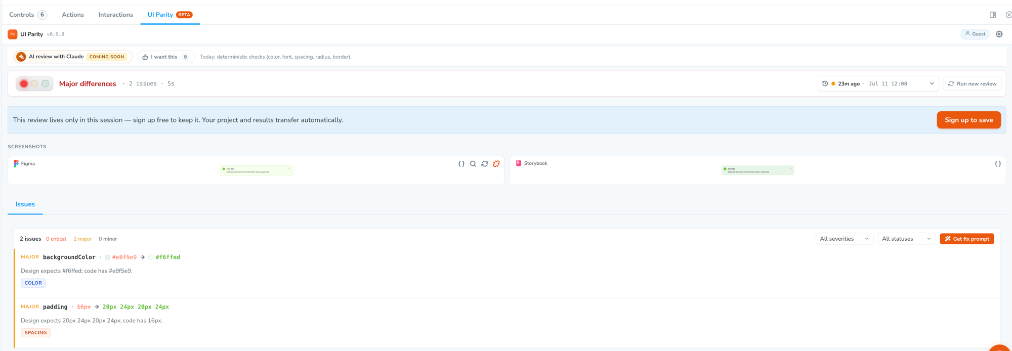
|
|
32
11
|
|
|
33
12
|
---
|
|
34
13
|
|
|
@@ -60,19 +39,11 @@ That's it — no other config. Restart Storybook and you'll see a **UI Parity**
|
|
|
60
39
|
2. **Map the story to its Figma frame** (one click, "Map to Figma"). This tells UI Parity what the component is _supposed_ to look like.
|
|
61
40
|
3. **Click "Compare to design."** You get a traffic-light verdict, a compliance score (e.g. `69 · D`), and a list of exactly which properties drifted.
|
|
62
41
|
|
|
63
|
-
<!--
|
|
64
|
-
Demo GIF slot — uncomment once demo.gif is uploaded to app.uiparity.com/readme/.
|
|
65
|
-
Should show: map a story → Compare to design → score + issues appear.
|
|
66
|
-
<p align="center">
|
|
67
|
-
<img src="https://app.uiparity.com/readme/demo.gif" alt="Mapping a story to Figma and running Compare to design" width="820" />
|
|
68
|
-
</p>
|
|
69
|
-
-->
|
|
70
|
-
|
|
71
42
|
## What it checks
|
|
72
43
|
|
|
73
44
|
**Compare to design** is the free, deterministic check. It diffs the story's _computed_ styles against the Figma spec — no screenshots, no AI, no credits:
|
|
74
45
|
|
|
75
|
-
|
|
|
46
|
+
| Catches today | Property |
|
|
76
47
|
| -------------------------- | ----------------------------------------------------------------------------------------------------------------- |
|
|
77
48
|
| Wrong brand / token colors | `color`, fill, background (banded by ΔE, so a barely-visible shift is a minor, a wrong brand color is a critical) |
|
|
78
49
|
| Off typography | `font-family`, size, weight |
|
|
@@ -87,7 +58,7 @@ That's it — no other config. Restart Storybook and you'll see a **UI Parity**
|
|
|
87
58
|
Every review returns a score `0–100` and a severity band `A–D`, MQM-style:
|
|
88
59
|
|
|
89
60
|
```
|
|
90
|
-
score = 100
|
|
61
|
+
score = 100 - (minor x 1) - (major x 3) - (critical x 10) capped by band
|
|
91
62
|
```
|
|
92
63
|
|
|
93
64
|
| Band | Meaning | Score cap |
|
|
@@ -121,9 +92,9 @@ export default {
|
|
|
121
92
|
|
|
122
93
|
## Links
|
|
123
94
|
|
|
124
|
-
-
|
|
125
|
-
-
|
|
126
|
-
-
|
|
95
|
+
- **[uiparity.com](https://uiparity.com)** — product & sign-up
|
|
96
|
+
- **[app.uiparity.com](https://app.uiparity.com)** — the dashboard
|
|
97
|
+
- **feedback@uiparity.com** — questions, bugs, feature requests
|
|
127
98
|
|
|
128
99
|
## License
|
|
129
100
|
|