@uicopilot/storybook-addon 0.19.0 → 0.20.1
This diff represents the content of publicly available package versions that have been released to one of the supported registries. The information contained in this diff is provided for informational purposes only and reflects changes between package versions as they appear in their respective public registries.
- package/README.md +38 -15
- package/dist/manager.mjs +113 -113
- package/dist/preset.js +3 -3
- package/dist/preset.mjs +3 -3
- package/package.json +9 -6
package/README.md
CHANGED
|
@@ -1,23 +1,29 @@
|
|
|
1
1
|
# UI Parity for Storybook
|
|
2
2
|
|
|
3
|
-
**
|
|
3
|
+
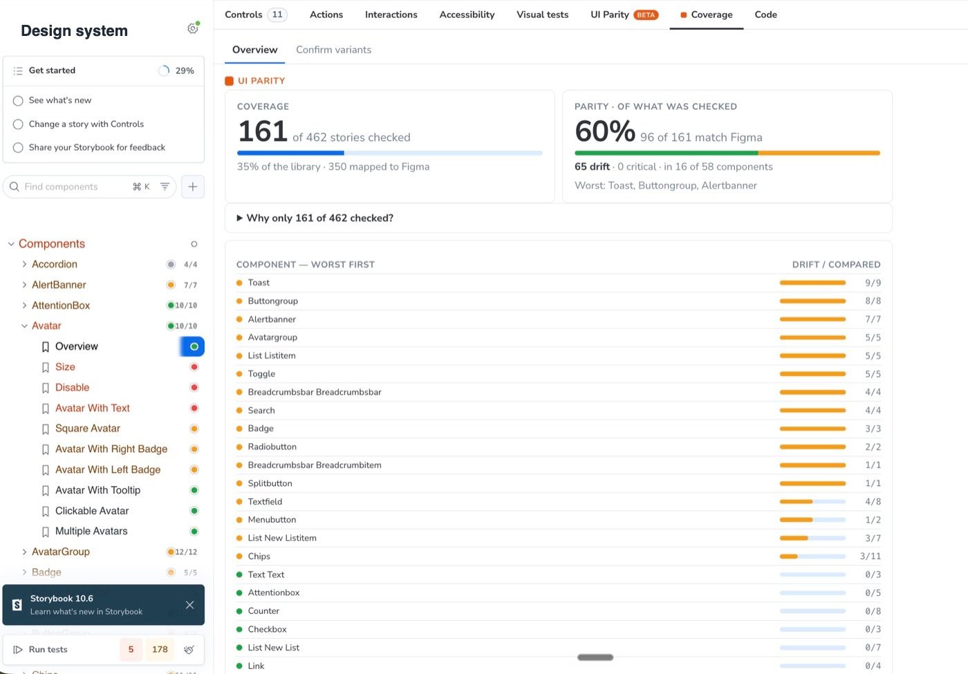
**How much of your design system is actually in code, and does it match Figma?** UI Parity measures it from what renders, story by story, inside the Storybook you already have: **coverage, parity and drift** for the whole library, with what it didn't check stated.
|
|
4
4
|
|
|
5
5
|
[](https://www.npmjs.com/package/@uicopilot/storybook-addon)
|
|
6
6
|
[](https://www.npmjs.com/package/@uicopilot/storybook-addon)
|
|
7
7
|
[](https://www.npmjs.com/package/@uicopilot/storybook-addon)
|
|
8
8
|

|
|
9
9
|
|
|
10
|
-
|
|
11
11
|
|
|
12
12
|
---
|
|
13
13
|
|
|
14
14
|
## Why
|
|
15
15
|
|
|
16
|
-
Your design system is the contract. When a button ships with the wrong brand color or 4px too much padding, nobody notices until it's in production
|
|
16
|
+
Your design system is the contract. When a button ships with the wrong brand color or 4px too much padding, nobody notices until it's in production, or a designer files a ticket weeks later. UI Parity checks every story against its Figma variant **inside Storybook** and answers three questions:
|
|
17
17
|
|
|
18
|
-
|
|
18
|
+
| Number | Question | Example from a real run |
|
|
19
|
+
| ------------ | ------------------------------------------------- | ---------------------------------------------- |
|
|
20
|
+
| **Coverage** | How much of the library was checked? | 161 of 462 stories |
|
|
21
|
+
| **Parity** | Of what was checked, how much matches the design? | 96 of 161 (60%) |
|
|
22
|
+
| **Drift** | Where, and by how much? | 65 stories in 16 of 58 components, worst first |
|
|
19
23
|
|
|
20
|
-
|
|
24
|
+
Every difference is a named property with **Expected vs. Actual**, not a pixel diff to eyeball. No baselines to approve, no snapshots to maintain.
|
|
25
|
+
|
|
26
|
+
**It won't guess.** When a story could be several Figma variants, or none, it says **"not compared"** and why, instead of producing findings against the wrong design.
|
|
21
27
|
|
|
22
28
|
## Install
|
|
23
29
|
|
|
@@ -61,12 +67,13 @@ Templates also exist for Ant Design, Mantine, Carbon (IBM), Chakra UI, and Paste
|
|
|
61
67
|
|
|
62
68
|
## Quick start
|
|
63
69
|
|
|
64
|
-
1. **Open the UI Parity panel** on any story and sign in with Google
|
|
65
|
-
2. **Connect Figma and pick the pages to index.** The setup wizard walks you through it: connect Figma, paste your file URL, choose which pages to sync, and it indexes the
|
|
66
|
-
3. **
|
|
67
|
-
4. **
|
|
70
|
+
1. **Open the UI Parity panel** on any story and sign in with Google, or hit **"Try without signing in"** to start a guest session.
|
|
71
|
+
2. **Connect Figma and pick the pages to index.** The setup wizard walks you through it: connect Figma, paste your file URL, choose which pages to sync, and it indexes the components on those pages.
|
|
72
|
+
3. **Auto-map.** UI Parity links every story to its Figma variant. Stories it isn't sure about are flagged, never guessed.
|
|
73
|
+
4. **Confirm the unsure ones.** The **Confirm variants** tab shows the story beside the Figma variant it might be, with the variant's properties as controls. One look, one click, and it sticks.
|
|
74
|
+
5. **Review all.** One run checks every mapped story. The **Coverage** tab shows coverage, parity and the drifting components; each row opens its stories.
|
|
68
75
|
|
|
69
|
-
|
|
76
|
+
You can still map and check a single story from the panel (**Map to Figma**, then **Compare to design**).
|
|
70
77
|
|
|
71
78
|
## What it checks
|
|
72
79
|
|
|
@@ -79,10 +86,16 @@ Mapping is a one-time cost per component. After that, every re-check is one clic
|
|
|
79
86
|
| Spacing drift | padding, gap, margins (sub-10px diffs are downgraded a severity level) |
|
|
80
87
|
| Corner radius | `border-radius` |
|
|
81
88
|
| Borders | width, color, style |
|
|
89
|
+
| Part sizes | icons, avatars, segments and fixed widths |
|
|
90
|
+
| Part gaps | the distance between the parts of a component |
|
|
82
91
|
|
|
83
92
|
Because it reads the **computed** styles off the rendered DOM, it doesn't care how you wrote them. Tailwind classes, CSS Modules, styled-components, vanilla-extract, plain CSS, inline styles — all produce the same computed values, and that's what gets compared.
|
|
84
93
|
|
|
85
|
-
|
|
94
|
+
**Not drift:** the same box built differently (padding on a child instead of the parent), 1–2 px rounding, and hover or focus states.
|
|
95
|
+
|
|
96
|
+
**Not checked yet:** which parts are present (icons, buttons, avatars) and content insets. A passing story says so instead of a bare green "matches".
|
|
97
|
+
|
|
98
|
+
> **On the roadmap, not shipped:** coverage per Figma variant axis, every instance in a multi-instance story checked against its own variant, a drift check in CI, and an AI review as a second opinion on top of the deterministic check.
|
|
86
99
|
|
|
87
100
|
## The verdict
|
|
88
101
|
|
|
@@ -108,9 +121,16 @@ The result isn't buried in one panel. Once a story has been checked, you see it
|
|
|
108
121
|
|
|
109
122
|
## Review every story at once
|
|
110
123
|
|
|
111
|
-
|
|
124
|
+
Hit **Review all** in the Coverage tab, or **Run** in Storybook's Testing module (UI Parity registers a test provider there). It checks every mapped story in one pass and streams results into the sidebar as each one lands.
|
|
112
125
|
|
|
113
|
-
|
|
126
|
+
The **Coverage** tab then shows the library-wide answer:
|
|
127
|
+
|
|
128
|
+
- **Coverage:** stories checked, out of all your stories.
|
|
129
|
+
- **Parity:** of the stories checked, how many match.
|
|
130
|
+
- **Why only N checked?** Every story that wasn't checked is listed with its reason: not mapped, several variants fit, no Figma variant, or not run yet.
|
|
131
|
+
- **Drift by component:** worst first. Each row expands to its stories; click one to open it.
|
|
132
|
+
|
|
133
|
+
Run it after a design-system bump, a token change or a dependency upgrade. Results persist across reloads; results from an older run are labelled as such.
|
|
114
134
|
|
|
115
135
|
## Works with any Storybook framework
|
|
116
136
|
|
|
@@ -129,7 +149,7 @@ Both are useful, and they answer different questions.
|
|
|
129
149
|
| Compares against | **The last approved screenshot** of your own component | **The Figma frame** — the design source of truth |
|
|
130
150
|
| Catches | Any change from the previous build | Divergence from what the design says, even if it's been wrong for months |
|
|
131
151
|
| Output | A pixel diff image to eyeball | Named properties with Expected vs. Actual values |
|
|
132
|
-
| Needs | Baselines to approve and re-approve |
|
|
152
|
+
| Needs | Baselines to approve and re-approve | Auto-mapping, plus one click for each story it is unsure about |
|
|
133
153
|
| Blind spot | A component that never matched the design still passes forever | Anything not expressed as a comparable style property |
|
|
134
154
|
|
|
135
155
|
Snapshot tools tell you **something changed**. UI Parity tells you **it doesn't match the design** — which is the question that comes up in design review, not code review. Teams run both.
|
|
@@ -185,7 +205,10 @@ Worth knowing before you point it at a private design system:
|
|
|
185
205
|
Confirm the addon is in the `addons` array of `.storybook/main.ts` and restart Storybook. If you've changed the addon version, clear the cache: `rm -rf node_modules/.cache .cache storybook-static`.
|
|
186
206
|
|
|
187
207
|
**"Compare to design" is disabled.**
|
|
188
|
-
The story isn't mapped to a Figma
|
|
208
|
+
The story isn't mapped to a Figma variant yet. Run auto-map from the Coverage tab, or map it from the panel.
|
|
209
|
+
|
|
210
|
+
**A story says "not compared".**
|
|
211
|
+
Several Figma variants fit it, or none does. Open **Confirm variants**, pick the right one, and it is checked from the next run on.
|
|
189
212
|
|
|
190
213
|
**Figma won't connect / no frames show up after sync.**
|
|
191
214
|
Two usual causes: a Figma **Viewer or free seat** (a Dev or Full seat is required for design-read access), or the frames live on a page you didn't select during setup. Re-run the Figma step and include the page.
|