@ugurdemirel/landcraft 0.1.19 → 0.1.20
This diff represents the content of publicly available package versions that have been released to one of the supported registries. The information contained in this diff is provided for informational purposes only and reflects changes between package versions as they appear in their respective public registries.
- package/README.md +109 -31
- package/dist/styles.css +0 -10
- package/package.json +2 -1
package/README.md
CHANGED
|
@@ -1,14 +1,31 @@
|
|
|
1
|
-
#
|
|
1
|
+
# Landcraft
|
|
2
2
|
|
|
3
|
-
|
|
4
|
-
|
|
5
|
-
|
|
3
|
+
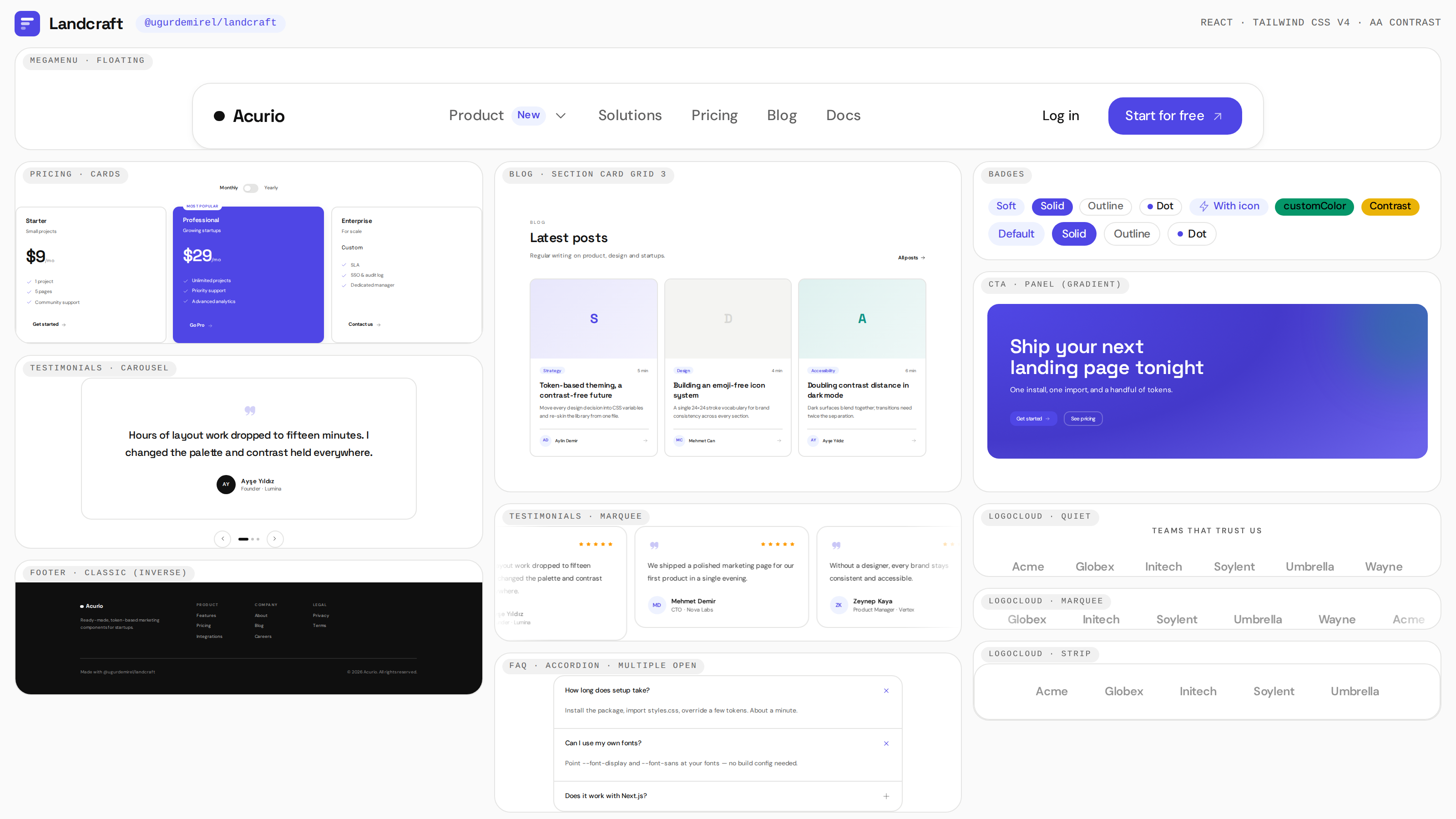
|
|
4
|
+
|
|
5
|
+
A marketing / landing-page React component library — `@ugurdemirel/landcraft` —
|
|
6
|
+
built on Tailwind CSS 4 with token-based theming and automatic WCAG contrast,
|
|
7
|
+
plus a Storybook playground for previewing and customizing every component.
|
|
8
|
+
|
|
9
|
+
## Structure
|
|
10
|
+
|
|
11
|
+
```
|
|
12
|
+
landcraft/
|
|
13
|
+
├─ packages/ui/ @ugurdemirel/landcraft — component library
|
|
14
|
+
│ ├─ src/components/ Button, Badge, Card, Section, Navbar, MegaMenu, Hero,
|
|
15
|
+
│ │ LogoCloud, FeatureGrid, FeatureShowcase, Stats, Pricing,
|
|
16
|
+
│ │ Testimonials, CTA, FAQ, AccordionShowcase, Footer,
|
|
17
|
+
│ │ Newsletter, Blog, Prose, Modal, LanguageSwitcher,
|
|
18
|
+
│ │ Container, Stack
|
|
19
|
+
│ ├─ src/styles/ CSS variables (tokens) + Tailwind entry point
|
|
20
|
+
│ └─ src/styles/theme.css Tailwind v4 theme (CSS) for consumer projects
|
|
21
|
+
└─ apps/storybook/ Storybook (React + Vite) — preview & customize
|
|
22
|
+
```
|
|
6
23
|
|
|
7
24
|
## Install
|
|
8
25
|
|
|
9
26
|
```bash
|
|
10
27
|
pnpm add @ugurdemirel/landcraft
|
|
11
|
-
# peers: react >=18, tailwindcss ^4
|
|
28
|
+
# peers: react >=18, react-dom >=18, tailwindcss ^4
|
|
12
29
|
```
|
|
13
30
|
|
|
14
31
|
```tsx
|
|
@@ -16,18 +33,17 @@ import { Button, Hero } from "@ugurdemirel/landcraft";
|
|
|
16
33
|
import "@ugurdemirel/landcraft/styles.css";
|
|
17
34
|
```
|
|
18
35
|
|
|
19
|
-
|
|
20
|
-
|
|
36
|
+
Or reuse the theme in your own Tailwind v4 project by importing the CSS theme
|
|
37
|
+
file — no JS config or preset needed:
|
|
21
38
|
|
|
22
39
|
```css
|
|
23
|
-
/* app.css */
|
|
40
|
+
/* app.css — wire it up with @tailwindcss/vite, @tailwindcss/postcss or the CLI */
|
|
24
41
|
@import "tailwindcss";
|
|
25
42
|
@import "@ugurdemirel/landcraft/theme.css";
|
|
26
43
|
```
|
|
27
44
|
|
|
28
|
-
|
|
29
|
-
|
|
30
|
-
typography plugin automatically.
|
|
45
|
+
The theme registers every color/font/radius/shadow token and the typography
|
|
46
|
+
plugin automatically.
|
|
31
47
|
|
|
32
48
|
> Tailwind v4 auto-detects classes in your own source but skips `node_modules`.
|
|
33
49
|
> If you build the library's components from your own CSS (instead of importing
|
|
@@ -43,25 +59,32 @@ Every component accepts an `option` / `variant` prop — same API, different loo
|
|
|
43
59
|
|
|
44
60
|
| Component | Options |
|
|
45
61
|
| --- | --- |
|
|
62
|
+
| Button | `primary` · `dark` · `outline` · `ghost` · `link` |
|
|
63
|
+
| Badge | `soft` · `solid` · `outline` · `dot` |
|
|
64
|
+
| Card | `outlined` · `elevated` · `inset` |
|
|
46
65
|
| Navbar | `classic` · `floating` · `inverse` |
|
|
47
|
-
|
|
|
66
|
+
| MegaMenu | `classic` · `floating` · `inverse` |
|
|
67
|
+
| Hero | `split` · `centered` · `statement` · `parallax` |
|
|
48
68
|
| LogoCloud | `quiet` · `marquee` · `strip` |
|
|
49
69
|
| FeatureGrid | `columns` · `bento` · `editorialRows` |
|
|
70
|
+
| FeatureShowcase | `mediaSide`: `left` · `right` |
|
|
50
71
|
| Stats | `editorial` · `hairline` · `cells` · `ticker` |
|
|
51
72
|
| Pricing | `cards` · `bento` · `compact` |
|
|
52
73
|
| Testimonials | `grid` · `carousel` · `marquee` |
|
|
53
74
|
| CTA | `panel` · `surface` · `inverse` |
|
|
54
|
-
| FAQ | `accordion` · `split` · `cards` |
|
|
75
|
+
| FAQ | `accordion` · `split` · `cards` (`allowMultiple`, `defaultOpen`) |
|
|
55
76
|
| Footer | `classic` · `minimal` · `editorial` |
|
|
56
77
|
| Newsletter | `inline` · `card` · `underline` |
|
|
57
78
|
| Blog (BlogSection/BlogCard) | `card` · `row` (`limit` shows the latest N posts) |
|
|
79
|
+
| Modal | `size`: `sm` · `md` · `lg` |
|
|
80
|
+
| LanguageSwitcher | `dropdown` · `modal` |
|
|
58
81
|
|
|
59
|
-
**Brand mark.** `Navbar` and `Footer` accept a custom logo in place
|
|
60
|
-
wordmark: pass any node to `logo` (SVG, `<img>`, component…), or use
|
|
82
|
+
**Brand mark.** `Navbar`, `MegaMenu` and `Footer` accept a custom logo in place
|
|
83
|
+
of the wordmark: pass any node to `logo` (SVG, `<img>`, component…), or use
|
|
61
84
|
`logoSrc`/`logoAlt` for a quick image (`logoClassName` tunes its size, defaults
|
|
62
85
|
to `h-7 w-auto`).
|
|
63
86
|
|
|
64
|
-
## Theme
|
|
87
|
+
## Theme & customization
|
|
65
88
|
|
|
66
89
|
Every design decision lives on CSS custom properties on `:root` and can be
|
|
67
90
|
**overridden from outside** — color, type, radii and shadows. Override any token
|
|
@@ -154,22 +177,23 @@ dark-mode variants.
|
|
|
154
177
|
|
|
155
178
|
### Contrast guarantees
|
|
156
179
|
|
|
157
|
-
1. **Paired tokens.** Every surface color ships with a matching `--color-on-*`
|
|
158
|
-
themes change together.
|
|
159
|
-
2. **Dynamic surfaces.**
|
|
160
|
-
the CSS `contrast-color()` function to pick the
|
|
161
|
-
dark palette
|
|
180
|
+
1. **Paired tokens.** Every surface color ships with a matching `--color-on-*`
|
|
181
|
+
text color, so readability is preserved as themes change together.
|
|
182
|
+
2. **Dynamic surfaces.** `customColor` props, gradient Hero/CTA panels and
|
|
183
|
+
highlighted pricing cards use the CSS `contrast-color()` function to pick the
|
|
184
|
+
most readable text color. Switch to a dark palette and the text flips
|
|
185
|
+
automatically.
|
|
162
186
|
|
|
163
187
|
### Icons
|
|
164
188
|
|
|
165
189
|
No emojis. The library ships one consistent 24×24 stroke icon set (Lucide-style):
|
|
166
|
-
`ArrowRight`, `Check`, `Zap`, `ShieldCheck`, `Layers`, `Rocket`, `Mail`, … —
|
|
167
|
-
them from the package.
|
|
190
|
+
`ArrowRight`, `Check`, `Zap`, `ShieldCheck`, `Layers`, `Rocket`, `Mail`, … —
|
|
191
|
+
import them from the package.
|
|
168
192
|
|
|
169
193
|
## Layout
|
|
170
194
|
|
|
171
|
-
`Container` and `Stack` are the single source of the container + gutter rules
|
|
172
|
-
across Section, Footer, CTA and BlogSection (`mx-auto w-full max-w-* px-5 sm:px-8`):
|
|
195
|
+
`Container` and `Stack` are the single source of the container + gutter rules
|
|
196
|
+
used across Section, Footer, CTA and BlogSection (`mx-auto w-full max-w-* px-5 sm:px-8`):
|
|
173
197
|
|
|
174
198
|
```tsx
|
|
175
199
|
import { Container, Stack } from "@ugurdemirel/landcraft";
|
|
@@ -185,9 +209,9 @@ import { Container, Stack } from "@ugurdemirel/landcraft";
|
|
|
185
209
|
|
|
186
210
|
## Content
|
|
187
211
|
|
|
188
|
-
`Prose` wraps `@tailwindcss/typography` and re-skins its colors and type through
|
|
189
|
-
same tokens (headings use `--font-display`, `<pre>` uses the ink surface,
|
|
190
|
-
and `prose-neutral` adapt to the palette):
|
|
212
|
+
`Prose` wraps `@tailwindcss/typography` and re-skins its colors and type through
|
|
213
|
+
the same tokens (headings use `--font-display`, `<pre>` uses the ink surface,
|
|
214
|
+
both `prose` and `prose-neutral` adapt to the palette):
|
|
191
215
|
|
|
192
216
|
```bash
|
|
193
217
|
pnpm add @ugurdemirel/landcraft @tailwindcss/typography
|
|
@@ -210,6 +234,60 @@ Projects using the theme need `@tailwindcss/typography` (optional peer; the
|
|
|
210
234
|
|
|
211
235
|
## Components
|
|
212
236
|
|
|
213
|
-
Button, Badge, Card (+Header/Title/Content/Footer), Section (+Header),
|
|
214
|
-
|
|
215
|
-
|
|
237
|
+
Button, Badge, Card (+Header/Title/Description/Content/Footer), Section (+Header),
|
|
238
|
+
Navbar, MegaMenu, Hero, LogoCloud, FeatureGrid/FeatureCard, FeatureShowcase,
|
|
239
|
+
Stats, Pricing, Testimonials/TestimonialCard, CTA, FAQ, AccordionShowcase,
|
|
240
|
+
Footer, Newsletter, Blog (BlogSection/BlogCard), Modal, LanguageSwitcher,
|
|
241
|
+
Prose (+ProseLead), Container, Stack, Slot, plus the icon set.
|
|
242
|
+
|
|
243
|
+
## What you can do in Storybook
|
|
244
|
+
|
|
245
|
+
- **Preview** every component and its stories from the left panel.
|
|
246
|
+
- **Customize** props live via the **Controls** panel (variant, size, customColor, text…).
|
|
247
|
+
- **Re-theme** from the **Palette** toolbar (indigo / forest / crimson / midnight-dark).
|
|
248
|
+
Every component restyles instantly through `--color-*` tokens — a live demo of
|
|
249
|
+
"design from the outside".
|
|
250
|
+
- **Audit accessibility** via the a11y panel (AA/AAA contrast results).
|
|
251
|
+
|
|
252
|
+
## Framework-aware links
|
|
253
|
+
|
|
254
|
+
Landcraft renders plain `<a>` tags by default so it works anywhere. When you use
|
|
255
|
+
a router (Next.js, Remix, React Router…), pass your framework's `<Link>` so
|
|
256
|
+
navigation stays client-side and server-side correct.
|
|
257
|
+
|
|
258
|
+
**Single links — `asChild` on `Button`** (the button styles are applied to the
|
|
259
|
+
child element instead of a `<button>`):
|
|
260
|
+
|
|
261
|
+
```tsx
|
|
262
|
+
import { Button } from "@ugurdemirel/landcraft";
|
|
263
|
+
import Link from "next/link";
|
|
264
|
+
|
|
265
|
+
<Button asChild>
|
|
266
|
+
<Link href="/pricing">Get started</Link>
|
|
267
|
+
</Button>
|
|
268
|
+
```
|
|
269
|
+
|
|
270
|
+
**Link lists — `LinkComponent` prop** on `Navbar`, `MegaMenu`, `Footer`, and
|
|
271
|
+
`BlogSection`/`BlogCard` (defaults to `<a>`):
|
|
272
|
+
|
|
273
|
+
```tsx
|
|
274
|
+
import { Navbar, Footer } from "@ugurdemirel/landcraft";
|
|
275
|
+
import Link from "next/link";
|
|
276
|
+
|
|
277
|
+
<Navbar links={links} LinkComponent={Link} />
|
|
278
|
+
<Footer columns={columns} LinkComponent={Link} />
|
|
279
|
+
```
|
|
280
|
+
|
|
281
|
+
The low-level `Slot` used to implement `asChild` is also exported if you want to
|
|
282
|
+
compose it yourself.
|
|
283
|
+
|
|
284
|
+
## Commands
|
|
285
|
+
|
|
286
|
+
```bash
|
|
287
|
+
pnpm install # install dependencies
|
|
288
|
+
pnpm build # builds @ugurdemirel/landcraft (JS + CSS + types)
|
|
289
|
+
pnpm storybook # starts Storybook (http://localhost:6006)
|
|
290
|
+
pnpm build:storybook # produces a static Storybook build (storybook-static/)
|
|
291
|
+
pnpm typecheck # typechecks all packages
|
|
292
|
+
pnpm --filter @ugurdemirel/landcraft test # run the component/unit tests
|
|
293
|
+
```
|
package/dist/styles.css
CHANGED
|
@@ -63,7 +63,6 @@
|
|
|
63
63
|
--radius-lg: 0.875rem;
|
|
64
64
|
--radius-xl: 1.125rem;
|
|
65
65
|
--radius-2xl: 1.5rem;
|
|
66
|
-
--radius-3xl: 2rem;
|
|
67
66
|
--ease-out: cubic-bezier(0, 0, 0.2, 1);
|
|
68
67
|
--ease-in-out: cubic-bezier(0.4, 0, 0.2, 1);
|
|
69
68
|
--blur-md: 12px;
|
|
@@ -92,9 +91,6 @@
|
|
|
92
91
|
--color-danger: rgb(var(--color-danger));
|
|
93
92
|
--color-danger-soft: rgb(var(--color-danger-soft));
|
|
94
93
|
--font-display: "Space Grotesk", ui-sans-serif, system-ui, -apple-system, "Segoe UI", sans-serif;
|
|
95
|
-
--shadow-soft: 0 1px 2px rgb(17 17 17 / 0.04), 0 2px 8px rgb(17 17 17 / 0.04);
|
|
96
|
-
--shadow-raised: 0 2px 4px rgb(17 17 17 / 0.05), 0 12px 32px rgb(17 17 17 / 0.08);
|
|
97
|
-
--shadow-overlay: 0 24px 64px -12px rgb(17 17 17 / 0.18);
|
|
98
94
|
--animate-marquee: marquee 38s linear infinite;
|
|
99
95
|
}
|
|
100
96
|
}
|
|
@@ -2238,12 +2234,6 @@
|
|
|
2238
2234
|
background-color: color-mix(in oklab, rgb(var(--color-primary-soft)) 60%, transparent);
|
|
2239
2235
|
}
|
|
2240
2236
|
}
|
|
2241
|
-
.bg-primary\/50 {
|
|
2242
|
-
background-color: color-mix(in srgb, rgb(rgb(var(--color-primary))) 50%, transparent);
|
|
2243
|
-
@supports (color: color-mix(in lab, red, red)) {
|
|
2244
|
-
background-color: color-mix(in oklab, rgb(var(--color-primary)) 50%, transparent);
|
|
2245
|
-
}
|
|
2246
|
-
}
|
|
2247
2237
|
.bg-secondary {
|
|
2248
2238
|
background-color: rgb(var(--color-secondary));
|
|
2249
2239
|
}
|
package/package.json
CHANGED
|
@@ -1,6 +1,6 @@
|
|
|
1
1
|
{
|
|
2
2
|
"name": "@ugurdemirel/landcraft",
|
|
3
|
-
"version": "0.1.
|
|
3
|
+
"version": "0.1.20",
|
|
4
4
|
"publishConfig": {
|
|
5
5
|
"access": "public"
|
|
6
6
|
},
|
|
@@ -38,6 +38,7 @@
|
|
|
38
38
|
"test": "vitest run",
|
|
39
39
|
"test:watch": "vitest",
|
|
40
40
|
"clean": "rimraf dist",
|
|
41
|
+
"prepack": "cp ../../README.md ./README.md",
|
|
41
42
|
"prepublishOnly": "pnpm run build"
|
|
42
43
|
},
|
|
43
44
|
"peerDependencies": {
|