@udixio/mcp 0.3.2
This diff represents the content of publicly available package versions that have been released to one of the supported registries. The information contained in this diff is provided for informational purposes only and reflects changes between package versions as they appear in their respective public registries.
- package/README.md +127 -0
- package/dist/bundled/components-index.json +369 -0
- package/dist/bundled/doc-src/components/Code.astro +14 -0
- package/dist/bundled/doc-src/components/ComponentPreview.astro +218 -0
- package/dist/bundled/doc-src/data/components/button.overview.mdx +152 -0
- package/dist/bundled/doc-src/data/components/card.overview.mdx +91 -0
- package/dist/bundled/doc-src/data/components/carousel.overview.mdx +108 -0
- package/dist/bundled/doc-src/data/components/checkbox.overview.mdx +172 -0
- package/dist/bundled/doc-src/data/components/chip.overview.mdx +216 -0
- package/dist/bundled/doc-src/data/components/date-picker.overview.mdx +102 -0
- package/dist/bundled/doc-src/data/components/divider.overview.mdx +54 -0
- package/dist/bundled/doc-src/data/components/fab-menu.overview.mdx +69 -0
- package/dist/bundled/doc-src/data/components/fab.overview.mdx +80 -0
- package/dist/bundled/doc-src/data/components/icon-button.overview.mdx +155 -0
- package/dist/bundled/doc-src/data/components/navigation-rail.overview.mdx +142 -0
- package/dist/bundled/doc-src/data/components/progress-indicator.overview.mdx +49 -0
- package/dist/bundled/doc-src/data/components/slider.overview.mdx +64 -0
- package/dist/bundled/doc-src/data/components/snackbar.overview.mdx +37 -0
- package/dist/bundled/doc-src/data/components/switch.overview.mdx +41 -0
- package/dist/bundled/doc-src/data/components/tabs.overview.mdx +171 -0
- package/dist/bundled/doc-src/data/components/temp.md +506 -0
- package/dist/bundled/doc-src/data/components/text-field.overview.mdx +90 -0
- package/dist/bundled/doc-src/data/components/tooltip.overview.mdx +159 -0
- package/dist/bundled/doc-src/data/pages/mcp.mdx +92 -0
- package/dist/bundled/doc-src/layouts/components.astro +87 -0
- package/dist/bundled/doc-src/layouts/layout.astro +55 -0
- package/dist/bundled/doc-src/pages/404.astro +18 -0
- package/dist/bundled/doc-src/pages/[...url].astro +34 -0
- package/dist/bundled/doc-src/pages/animations.astro +322 -0
- package/dist/bundled/doc-src/pages/components/[component]/api.astro +89 -0
- package/dist/bundled/doc-src/pages/components/[component]/index.astro +5 -0
- package/dist/bundled/doc-src/pages/components/[component]/overview.astro +37 -0
- package/dist/bundled/doc-src/pages/components/index.astro +130 -0
- package/dist/bundled/doc-src/pages/index.astro +5 -0
- package/dist/bundled/doc-src/pages/search.astro +12 -0
- package/dist/bundled/doc-src/pages/themes.astro +86 -0
- package/dist/bundled/theme.json +359 -0
- package/dist/cli.mjs +450 -0
- package/dist/index.d.ts +4 -0
- package/dist/index.d.ts.map +1 -0
- package/dist/index.mjs +5 -0
- package/dist/lib/cli.d.ts +3 -0
- package/dist/lib/cli.d.ts.map +1 -0
- package/dist/lib/loaders/components.d.ts +6 -0
- package/dist/lib/loaders/components.d.ts.map +1 -0
- package/dist/lib/loaders/docs.d.ts +11 -0
- package/dist/lib/loaders/docs.d.ts.map +1 -0
- package/dist/lib/loaders/theme.d.ts +37 -0
- package/dist/lib/loaders/theme.d.ts.map +1 -0
- package/dist/lib/main.d.ts +3 -0
- package/dist/lib/main.d.ts.map +1 -0
- package/dist/lib/mcp.d.ts +3 -0
- package/dist/lib/mcp.d.ts.map +1 -0
- package/package.json +61 -0
|
@@ -0,0 +1,506 @@
|
|
|
1
|
+
Anatomy
|
|
2
|
+
-------
|
|
3
|
+
|
|
4
|
+
link
|
|
5
|
+
|
|
6
|
+
Copy link
|
|
7
|
+
|
|
8
|
+

|
|
9
|
+
|
|
10
|
+
1. Container
|
|
11
|
+
2. Label text
|
|
12
|
+
3. Leading icon or image (optional)
|
|
13
|
+
4. Trailing icon (required for input chips, optional for filter chips)
|
|
14
|
+
|
|
15
|
+
link
|
|
16
|
+
|
|
17
|
+
Copy link
|
|
18
|
+
|
|
19
|
+
### Container
|
|
20
|
+
|
|
21
|
+
All chips are slightly rounded with an 8dp corner.
|
|
22
|
+
|
|
23
|
+

|
|
24
|
+
|
|
25
|
+
Chips have rounded corners
|
|
26
|
+
|
|
27
|
+
link
|
|
28
|
+
|
|
29
|
+
Copy link
|
|
30
|
+
|
|
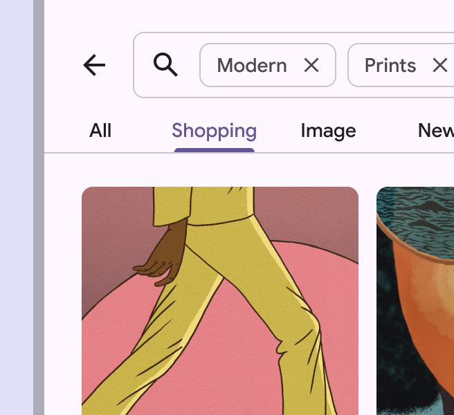
31
|
+
#### Shadows & elevation
|
|
32
|
+
|
|
33
|
+
Chip containers can be elevated if placed on top of an image or dynamic background.
|
|
34
|
+
|
|
35
|
+

|
|
36
|
+
|
|
37
|
+
When on complicated backgrounds, chip containers can be elevated
|
|
38
|
+
|
|
39
|
+
link
|
|
40
|
+
|
|
41
|
+
Copy link
|
|
42
|
+
|
|
43
|
+
|
|
44
|
+
|
|
45
|
+
checkDo
|
|
46
|
+
|
|
47
|
+
Use an outline to define the edge of the chip's container on regular backgrounds
|
|
48
|
+
|
|
49
|
+
|
|
50
|
+
|
|
51
|
+
checkDo
|
|
52
|
+
|
|
53
|
+
Chips may use elevation when placed on an image
|
|
54
|
+
|
|
55
|
+
link
|
|
56
|
+
|
|
57
|
+
Copy link
|
|
58
|
+
|
|
59
|
+

|
|
60
|
+
|
|
61
|
+
closeDon’t
|
|
62
|
+
|
|
63
|
+
Chips shouldn't be elevated when placed directly on the page
|
|
64
|
+
|
|
65
|
+
|
|
66
|
+
|
|
67
|
+
closeDon’t
|
|
68
|
+
|
|
69
|
+
Avoid using elevation to indicate a chip's pressed state. Instead, use the visual ripple effect.
|
|
70
|
+
|
|
71
|
+
link
|
|
72
|
+
|
|
73
|
+
Copy link
|
|
74
|
+
|
|
75
|
+
### Label text
|
|
76
|
+
|
|
77
|
+
Chip label text should be 20 characters or fewer, and have the same typography style as buttons.
|
|
78
|
+
|
|
79
|
+
Chip labels should remain brief for the limited space available. Skip conventional grammar rules, such as articles (take "a" walk), to save space.
|
|
80
|
+
|
|
81
|
+
|
|
82
|
+
|
|
83
|
+
checkDo
|
|
84
|
+
|
|
85
|
+
Keep chip labels short
|
|
86
|
+
|
|
87
|
+
|
|
88
|
+
|
|
89
|
+
closeDon’t
|
|
90
|
+
|
|
91
|
+
Avoid chip labels longer than 20 characters
|
|
92
|
+
|
|
93
|
+
link
|
|
94
|
+
|
|
95
|
+
Copy link
|
|
96
|
+
|
|
97
|
+
### Leading icon or image (optional)
|
|
98
|
+
|
|
99
|
+
Chips can contain a leading icon, logo, or circular image. Use a system icon to help identify a chip's category.
|
|
100
|
+
|
|
101
|
+

|
|
102
|
+
|
|
103
|
+
Chips can contain a logo, icon, or circular image
|
|
104
|
+
|
|
105
|
+
link
|
|
106
|
+
|
|
107
|
+
Copy link
|
|
108
|
+
|
|
109
|
+
The leading icon color for unselected chips can be customized through theming. While the default color role is **primary**, the **on surface variant** color role is a good alternative when the icon style requires less emphasis.
|
|
110
|
+
|
|
111
|
+
|
|
112
|
+
|
|
113
|
+
**Primary** color (left) and **on surface variant** color (right)
|
|
114
|
+
|
|
115
|
+
link
|
|
116
|
+
|
|
117
|
+
Copy link
|
|
118
|
+
|
|
119
|
+
Leading circular images are sized larger than leading icons to provide more space for detail. Icons are designed to be legible at small sizes.
|
|
120
|
+
|
|
121
|
+
See the [Specs tab](https://m3.material.io/m3/pages/chips/specs/) for precise measurement values.
|
|
122
|
+
|
|
123
|
+

|
|
124
|
+
|
|
125
|
+
Leading images, such as avatars, are sized larger than leading icons or logos
|
|
126
|
+
|
|
127
|
+
link
|
|
128
|
+
|
|
129
|
+
Copy link
|
|
130
|
+
|
|
131
|
+
### Trailing icon (optional, input and filter chips only)
|
|
132
|
+
|
|
133
|
+
The trailing icon is present for input and filter chips.
|
|
134
|
+
|
|
135
|
+
On input chips, it's required and must be used to remove the chip. On filter chips, it's optional, and can be used to open a menu or remove the chip.
|
|
136
|
+
|
|
137
|
+
Secondary actions (such as a trailing icon button for **Remove**) must have a 48x48dp interaction target that doesn’t interfere with the chip's primary action (such as **Edit** or **Drag**). To achieve this, apply a minimum width of 88dp to the chip, or 42dp to the label text.
|
|
138
|
+
|
|
139
|
+

|
|
140
|
+
|
|
141
|
+
Interaction targets for actions like **Edit** or **Close** have a size of 48x48. This can be achieved by setting the minimum container width to 88dp.
|
|
142
|
+
|
|
143
|
+
link
|
|
144
|
+
|
|
145
|
+
Copy link
|
|
146
|
+
|
|
147
|
+
Assist chips
|
|
148
|
+
------------
|
|
149
|
+
|
|
150
|
+
link
|
|
151
|
+
|
|
152
|
+
Copy link
|
|
153
|
+
|
|
154
|
+
Assist chips represent smart or automated actions that can span multiple apps, such as opening a calendar event from the home screen. Assist chips function as though the person asked an assistant to complete the action. They should appear dynamically and contextually in a UI.
|
|
155
|
+
|
|
156
|
+
An alternative to assist chips are buttons, which should appear persistently and consistently.
|
|
157
|
+
|
|
158
|
+

|
|
159
|
+
|
|
160
|
+
The text in most assist chips begins with a short verb, like **Get** or **Add**
|
|
161
|
+
|
|
162
|
+
link
|
|
163
|
+
|
|
164
|
+
Copy link
|
|
165
|
+
|
|
166
|
+
|
|
167
|
+
|
|
168
|
+
An assist chip can surface supplemental information like a calendar event, as well as provide contextual actions
|
|
169
|
+
|
|
170
|
+
|
|
171
|
+
|
|
172
|
+
During an interaction, assist chips can transform into modals, transition into full-screen views of new content, or readjust to display more results inline
|
|
173
|
+
|
|
174
|
+
link
|
|
175
|
+
|
|
176
|
+
Copy link
|
|
177
|
+
|
|
178
|
+
Assist chips can trigger an action or show progress and confirmation.
|
|
179
|
+
|
|
180
|
+
Write assist chips like buttons: start with a verb. Adjust text dynamically if the state changes, like **Save** to **Saved**.
|
|
181
|
+
|
|
182
|
+
pause
|
|
183
|
+
|
|
184
|
+
Tapping an assist chip triggers a contextual action
|
|
185
|
+
|
|
186
|
+
pause
|
|
187
|
+
|
|
188
|
+
Assist chips can show progress and confirmation feedback
|
|
189
|
+
|
|
190
|
+
link
|
|
191
|
+
|
|
192
|
+
Copy link
|
|
193
|
+
|
|
194
|
+
Assist chips are displayed after primary content, such as below a card or persistently at the bottom of a screen.
|
|
195
|
+
|
|
196
|
+

|
|
197
|
+
|
|
198
|
+
Assist chips should be shown underneath primary content
|
|
199
|
+
|
|
200
|
+
link
|
|
201
|
+
|
|
202
|
+
Copy link
|
|
203
|
+
|
|
204
|
+
Filter chips
|
|
205
|
+
------------
|
|
206
|
+
|
|
207
|
+
link
|
|
208
|
+
|
|
209
|
+
Copy link
|
|
210
|
+
|
|
211
|
+
Filter chips use tags or descriptive words to filter content. They can be a good alternative to segmented buttons or checkboxes when viewing a list or search results.
|
|
212
|
+
|
|
213
|
+
Tapping on a filter chip activates it and appends a leading checkmark icon to the starting edge of the chip label.
|
|
214
|
+
|
|
215
|
+
Write filter chips with nouns that describe the category to **include** in the results. Avoid negative phrases like **Exclude images**.
|
|
216
|
+
|
|
217
|
+

|
|
218
|
+
|
|
219
|
+
Filter chips rely on tags or descriptive words to filter content
|
|
220
|
+
|
|
221
|
+
link
|
|
222
|
+
|
|
223
|
+
Copy link
|
|
224
|
+
|
|
225
|
+
|
|
226
|
+
|
|
227
|
+
Filter chips in a shopping app
|
|
228
|
+
|
|
229
|
+
|
|
230
|
+
|
|
231
|
+
Filter chips in a real estate app
|
|
232
|
+
|
|
233
|
+
link
|
|
234
|
+
|
|
235
|
+
Copy link
|
|
236
|
+
|
|
237
|
+
Tap a chip to select it. Multiple chips can be selected or unselected.
|
|
238
|
+
|
|
239
|
+
|
|
240
|
+
|
|
241
|
+
An icon can be added to indicate when a filter chip is selected
|
|
242
|
+
|
|
243
|
+
|
|
244
|
+
|
|
245
|
+
Filter chip suggestions can dynamically change as a person starts to select filters
|
|
246
|
+
|
|
247
|
+
link
|
|
248
|
+
|
|
249
|
+
Copy link
|
|
250
|
+
|
|
251
|
+
Alternatively, a single chip can be selected. This offers an alternative to segmented buttons, radio buttons, or single select menus.
|
|
252
|
+
|
|
253
|
+
However, avoid mixing chip set behaviors. All chip sets on a page should be either single-select or multi-select.
|
|
254
|
+
|
|
255
|
+
pause
|
|
256
|
+
|
|
257
|
+
Filter chips can be set so that selecting a single chip automatically deselects all other chips in the set
|
|
258
|
+
|
|
259
|
+
link
|
|
260
|
+
|
|
261
|
+
Copy link
|
|
262
|
+
|
|
263
|
+
In medium and expanded window sizes, filter chips may contain a trailing icon to directly remove the chip or open a menu of options.
|
|
264
|
+
|
|
265
|
+
In compact windows, the trailing icon's target area is too small to be accessible on its own. However, if the whole chip can be selected to accomplish the action, the chip is likely still accessible.
|
|
266
|
+
|
|
267
|
+

|
|
268
|
+
|
|
269
|
+
The remove icon helps users remove the filter
|
|
270
|
+
|
|
271
|
+

|
|
272
|
+
|
|
273
|
+
Filter chips can open a menu for more filtering options
|
|
274
|
+
|
|
275
|
+
link
|
|
276
|
+
|
|
277
|
+
Copy link
|
|
278
|
+
|
|
279
|
+
When combined with a menu, the filter chip opens a list of selectable options.
|
|
280
|
+
|
|
281
|
+
pause
|
|
282
|
+
|
|
283
|
+
exclamationCaution
|
|
284
|
+
|
|
285
|
+
In compact windows, make sure the whole chip opens the menu. Otherwise, the target area is likely too small to be accessible.
|
|
286
|
+
|
|
287
|
+
link
|
|
288
|
+
|
|
289
|
+
Copy link
|
|
290
|
+
|
|
291
|
+
Filter chips can be used with other components, such as search fields and sheets.
|
|
292
|
+
|
|
293
|
+

|
|
294
|
+
|
|
295
|
+
Filter chips can be shown underneath a search field
|
|
296
|
+
|
|
297
|
+
link
|
|
298
|
+
|
|
299
|
+
Copy link
|
|
300
|
+
|
|
301
|
+
|
|
302
|
+
|
|
303
|
+
Use a side sheet to organize many filter chips
|
|
304
|
+
|
|
305
|
+
link
|
|
306
|
+
|
|
307
|
+
Copy link
|
|
308
|
+
|
|
309
|
+
|
|
310
|
+
|
|
311
|
+
Filter chips can wrap to a new row. If there are more than two rows, consider using horizontal scrolling to access them all.
|
|
312
|
+
|
|
313
|
+
|
|
314
|
+
|
|
315
|
+
Filter chips can scroll horizontally to show many options
|
|
316
|
+
|
|
317
|
+
link
|
|
318
|
+
|
|
319
|
+
Copy link
|
|
320
|
+
|
|
321
|
+
|
|
322
|
+
|
|
323
|
+
closeDon’t
|
|
324
|
+
|
|
325
|
+
Filter chips should not present only a single option
|
|
326
|
+
|
|
327
|
+
link
|
|
328
|
+
|
|
329
|
+
Copy link
|
|
330
|
+
|
|
331
|
+
Input chips
|
|
332
|
+
-----------
|
|
333
|
+
|
|
334
|
+
link
|
|
335
|
+
|
|
336
|
+
Copy link
|
|
337
|
+
|
|
338
|
+
Input chips represent discrete pieces of information entered by a person, such as Gmail contacts or filter options within a search field.
|
|
339
|
+
|
|
340
|
+
They enable user input and verify that input by converting text into chips.
|
|
341
|
+
|
|
342
|
+

|
|
343
|
+
|
|
344
|
+
Input chips transform text based on a person's input
|
|
345
|
+
|
|
346
|
+
link
|
|
347
|
+
|
|
348
|
+
Copy link
|
|
349
|
+
|
|
350
|
+
Input chips can support editing to change their contents, such as correcting an email address. In edit mode, the chip reverts back to a text string. Editing can be triggered by interacting with the chip, either by selecting it or by a second interaction after selection.
|
|
351
|
+
|
|
352
|
+
pause
|
|
353
|
+
|
|
354
|
+
Input chips converted from email addresses are editable
|
|
355
|
+
|
|
356
|
+
link
|
|
357
|
+
|
|
358
|
+
Copy link
|
|
359
|
+
|
|
360
|
+
pause
|
|
361
|
+
|
|
362
|
+
Using the backspace key with the cursor before a chip selects the entire chip. The chip can then be deleted when the user taps the backspace key again.
|
|
363
|
+
|
|
364
|
+
link
|
|
365
|
+
|
|
366
|
+
Copy link
|
|
367
|
+
|
|
368
|
+
A single field can contain multiple input chips. These chips can be reordered or moved into other fields.
|
|
369
|
+
|
|
370
|
+

|
|
371
|
+
|
|
372
|
+
Multiple input chips in one field
|
|
373
|
+
|
|
374
|
+

|
|
375
|
+
|
|
376
|
+
Input chips being moved from one field to another
|
|
377
|
+
|
|
378
|
+
link
|
|
379
|
+
|
|
380
|
+
Copy link
|
|
381
|
+
|
|
382
|
+
Input chips can expand to show more information or options. A container transform transition pattern is used to reveal additional content.
|
|
383
|
+
|
|
384
|
+
pause
|
|
385
|
+
|
|
386
|
+
Input chips can expand
|
|
387
|
+
|
|
388
|
+
link
|
|
389
|
+
|
|
390
|
+
Copy link
|
|
391
|
+
|
|
392
|
+
### Placement
|
|
393
|
+
|
|
394
|
+
Input chips can be integrated with other components.
|
|
395
|
+
|
|
396
|
+
They can appear:
|
|
397
|
+
|
|
398
|
+
* Inline with the cursor in a text field
|
|
399
|
+
* In a stacked list
|
|
400
|
+
* In a list that can be horizontally scrolled
|
|
401
|
+
|
|
402
|
+

|
|
403
|
+
|
|
404
|
+
Input chips can wrap to a new row if all chips need to be visible
|
|
405
|
+
|
|
406
|
+
pause
|
|
407
|
+
|
|
408
|
+
Input chips can scroll horizontally
|
|
409
|
+
|
|
410
|
+
link
|
|
411
|
+
|
|
412
|
+
Copy link
|
|
413
|
+
|
|
414
|
+
### Icons & images
|
|
415
|
+
|
|
416
|
+
The leading icon of input chips can be an icon, logo, or circular image.
|
|
417
|
+
|
|
418
|
+
|
|
419
|
+
|
|
420
|
+
Input chips can contain an icon, logo, or circular image
|
|
421
|
+
|
|
422
|
+
link
|
|
423
|
+
|
|
424
|
+
Copy link
|
|
425
|
+
|
|
426
|
+
The trailing icon is always aligned to the end side of the container. It’s placed:
|
|
427
|
+
|
|
428
|
+
* On the right for left-to-right (LTR) languages, such as English
|
|
429
|
+
* On the left for right-to-left (RTL) languages, such as Farsi
|
|
430
|
+
|
|
431
|
+
|
|
432
|
+
|
|
433
|
+
Input chips can be a more flexible way to filter search results, compared to filter chips
|
|
434
|
+
|
|
435
|
+

|
|
436
|
+
|
|
437
|
+
Input chips make it easier to add and remove contacts
|
|
438
|
+
|
|
439
|
+
link
|
|
440
|
+
|
|
441
|
+
Copy link
|
|
442
|
+
|
|
443
|
+
pause
|
|
444
|
+
|
|
445
|
+
Overflowed chips in a text field should follow the same behavior as regular text. An unfocused text field with overflowed content should display the beginning of the input. Tapping the field snaps the user to the end of the input with the cursor and keyboard active.
|
|
446
|
+
|
|
447
|
+
link
|
|
448
|
+
|
|
449
|
+
Copy link
|
|
450
|
+
|
|
451
|
+
Suggestion chips
|
|
452
|
+
----------------
|
|
453
|
+
|
|
454
|
+
link
|
|
455
|
+
|
|
456
|
+
Copy link
|
|
457
|
+
|
|
458
|
+
Suggestion chips help narrow a user’s intent by presenting dynamically generated suggestions, such as possible responses or search filters.
|
|
459
|
+
|
|
460
|
+
Write suggestion chips as nouns or short phrases, depending on context. Avoid exceeding 20 characters when possible.
|
|
461
|
+
|
|
462
|
+
|
|
463
|
+
|
|
464
|
+
The text labels within suggestion chips are most often nouns or short phrases
|
|
465
|
+
|
|
466
|
+
link
|
|
467
|
+
|
|
468
|
+
Copy link
|
|
469
|
+
|
|
470
|
+
|
|
471
|
+
|
|
472
|
+
Suggestion chips can offer quick-reply options in a chat or email app
|
|
473
|
+
|
|
474
|
+
|
|
475
|
+
|
|
476
|
+
A suggestion chip can help the user start a search
|
|
477
|
+
|
|
478
|
+
link
|
|
479
|
+
|
|
480
|
+
Copy link
|
|
481
|
+
|
|
482
|
+
### Placement
|
|
483
|
+
|
|
484
|
+
link
|
|
485
|
+
|
|
486
|
+
Copy link
|
|
487
|
+
|
|
488
|
+
When displaying multiple chips together, place them inline as a row of options, not listed vertically. Overflowing chips should break to the next line.
|
|
489
|
+
|
|
490
|
+
If the field is only one row high, chip sets can scroll horizontally instead.
|
|
491
|
+
|
|
492
|
+
Keep an 8dp minimum space between chips. Chips must also have a minimum 48dp target size, regardless of placement or density. If required, the target can extend beyond the visible container of the chip.
|
|
493
|
+
|
|
494
|
+
Text labels for chips should be concise. Chip labels will truncate when in a wrapped layout, and when they are wider than the full width of the window.
|
|
495
|
+
|
|
496
|
+
|
|
497
|
+
|
|
498
|
+
1. Margins between chips
|
|
499
|
+
2. Margin between each line
|
|
500
|
+
|
|
501
|
+
[
|
|
502
|
+
|
|
503
|
+
|
|
504
|
+
|
|
505
|
+
|
|
506
|
+
](https://m3.material.io/components/chips/specs)
|
|
@@ -0,0 +1,90 @@
|
|
|
1
|
+
---
|
|
2
|
+
---
|
|
3
|
+
|
|
4
|
+
|
|
5
|
+
|
|
6
|
+
|
|
7
|
+
|
|
8
|
+
import { CodePreview } from '@/components/CodePreview.js';
|
|
9
|
+
import { faMagnifyingGlass } from '@fortawesome/free-solid-svg-icons';
|
|
10
|
+
|
|
11
|
+
## Usage
|
|
12
|
+
|
|
13
|
+
TextField allows users to enter and edit text. It supports both controlled
|
|
14
|
+
(`value`) and uncontrolled (`defaultValue`) usage.
|
|
15
|
+
|
|
16
|
+
```bash
|
|
17
|
+
import { TextField } from "@udixio/ui-react"
|
|
18
|
+
```
|
|
19
|
+
|
|
20
|
+
```tsx
|
|
21
|
+
<TextField label="Email" name="email" type="email" placeholder="you@company.com" />
|
|
22
|
+
```
|
|
23
|
+
|
|
24
|
+
## Variants
|
|
25
|
+
|
|
26
|
+
- filled (default)
|
|
27
|
+
- outlined
|
|
28
|
+
|
|
29
|
+
```jsx
|
|
30
|
+
<div className="flex items-end gap-6">
|
|
31
|
+
<TextField label="Name" name="name" variant="filled" />
|
|
32
|
+
<TextField label="Name" name="name2" variant="outlined" />
|
|
33
|
+
</div>
|
|
34
|
+
```
|
|
35
|
+
|
|
36
|
+
## Leading/trailing icon and suffix
|
|
37
|
+
|
|
38
|
+
Use `leadingIcon`, `trailingIcon`, or `suffix` for extra affordances.
|
|
39
|
+
|
|
40
|
+
<CodePreview client:load
|
|
41
|
+
code={`
|
|
42
|
+
<div className="flex flex-col gap-4">
|
|
43
|
+
<TextField label="Search" name="q" leadingIcon={faMagnifyingGlass} />
|
|
44
|
+
<TextField label="Amount" name="amount" suffix="kg" />
|
|
45
|
+
<TextField label="Search" name="q2" trailingIcon={<button aria-label="clear"><i className="fa-solid fa-xmark" /></button>} />
|
|
46
|
+
</div>
|
|
47
|
+
`}
|
|
48
|
+
scope={{ faMagnifyingGlass }}
|
|
49
|
+
/>
|
|
50
|
+
|
|
51
|
+
## Multi-line
|
|
52
|
+
|
|
53
|
+
Set `multiline` for an auto-growing textarea.
|
|
54
|
+
|
|
55
|
+
```jsx
|
|
56
|
+
<div className="space-y-4">
|
|
57
|
+
<TextField label="Description" name="desc1" multiline />
|
|
58
|
+
<TextField label="Notes" name="desc2" multiline defaultValue="Initial content" />
|
|
59
|
+
</div>
|
|
60
|
+
```
|
|
61
|
+
|
|
62
|
+
## Error and supporting text
|
|
63
|
+
|
|
64
|
+
Show validation and helper text with `errorText` and `supportingText`.
|
|
65
|
+
|
|
66
|
+
```jsx
|
|
67
|
+
<div className="space-y-2">
|
|
68
|
+
<TextField label="Username" name="u1" supportingText="Use 3–16 characters" />
|
|
69
|
+
<TextField label="Password" name="p1" errorText="Password is too short" />
|
|
70
|
+
</div>
|
|
71
|
+
```
|
|
72
|
+
|
|
73
|
+
## Controlled vs uncontrolled
|
|
74
|
+
|
|
75
|
+
```jsx
|
|
76
|
+
function Example() {
|
|
77
|
+
const [value, setValue] = React.useState('hello');
|
|
78
|
+
return (
|
|
79
|
+
<div className="space-y-3">
|
|
80
|
+
<TextField
|
|
81
|
+
label="Controlled"
|
|
82
|
+
name="c1"
|
|
83
|
+
value={value}
|
|
84
|
+
onChange={(event) => setValue(event.target.value)}
|
|
85
|
+
/>
|
|
86
|
+
<TextField label="Uncontrolled" name="u2" defaultValue="Initial value" />
|
|
87
|
+
</div>
|
|
88
|
+
);
|
|
89
|
+
}
|
|
90
|
+
```
|