@typed-grid-areas/svelte 0.1.0 → 0.1.2
This diff represents the content of publicly available package versions that have been released to one of the supported registries. The information contained in this diff is provided for informational purposes only and reflects changes between package versions as they appear in their respective public registries.
- package/README.md +91 -1316
- package/REFERENCE.md +1406 -0
- package/package.json +14 -6
package/README.md
CHANGED
|
@@ -1,1009 +1,66 @@
|
|
|
1
1
|
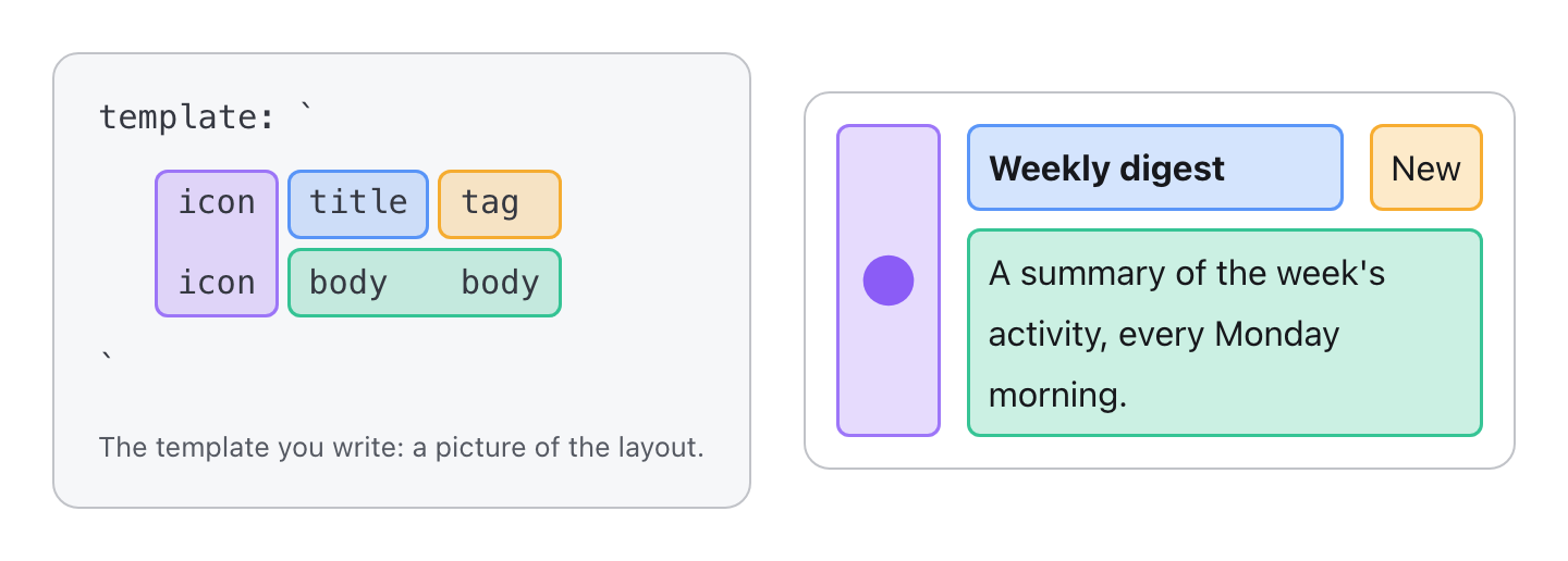
# typed-grid-areas
|
|
2
2
|
|
|
3
|
-
|
|
4
|
-
|
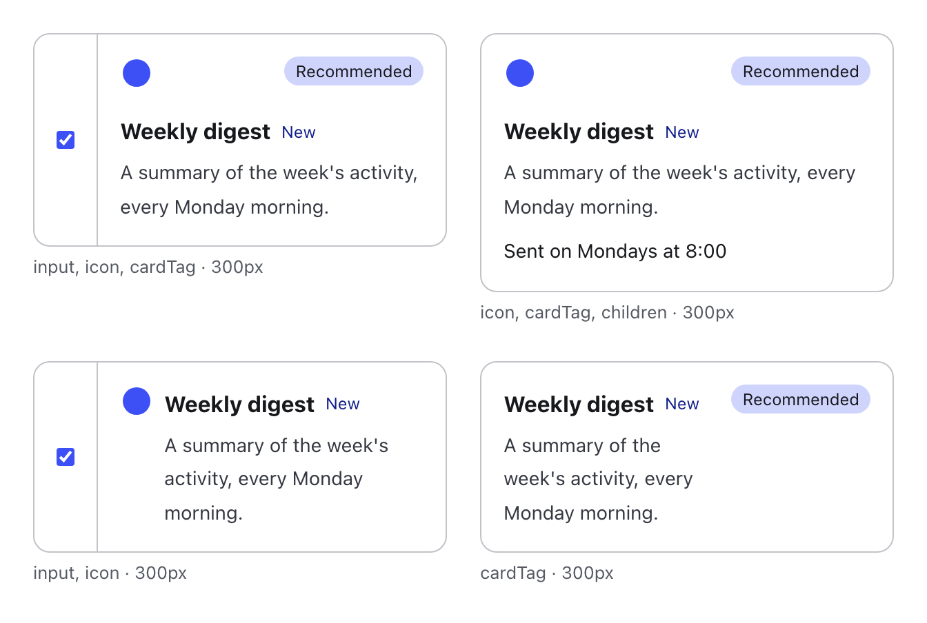
|
5
|
-
|
|
6
|
-
|
|
7
|
-
|
|
3
|
+
[](https://michaelbuss.github.io/typed-grid-areas/)
|
|
4
|
+
[](https://michaelbuss.github.io/typed-grid-areas/try-it/)
|
|
5
|
+
[](https://www.npmjs.com/package/typed-grid-areas)
|
|
6
|
+
[](https://bundlejs.com/?q=typed-grid-areas)
|
|
7
|
+
[](https://github.com/MichaelBuss/typed-grid-areas/blob/main/LICENSE)
|
|
8
8
|
|
|
9
|
-
|
|
10
|
-
is a package of its own. The React adapter, `@typed-grid-areas/react`,
|
|
11
|
-
renders a definition as typed slot components (`<Card>`, `<Card.icon>`).
|
|
9
|
+
**Describe a grid once. Every combination of slots lays itself out.**
|
|
12
10
|
|
|
13
|
-
|
|
14
|
-
|
|
15
|
-
```sh
|
|
16
|
-
npm i typed-grid-areas @typed-grid-areas/react
|
|
17
|
-
```
|
|
18
|
-
|
|
19
|
-
`@typed-grid-areas/react` needs `react` 19 or later. The core on its own
|
|
20
|
-
(`npm i typed-grid-areas`) has no framework dependency.
|
|
21
|
-
|
|
22
|
-
Moving from `typed-grid-areas/react` (0.1)? Install `@typed-grid-areas/react`
|
|
23
|
-
and import `createGridComponent` from it instead; nothing else changes.
|
|
24
|
-
|
|
25
|
-
## At a glance
|
|
26
|
-
|
|
27
|
-
```tsx
|
|
28
|
-
import { defineLayout } from "typed-grid-areas";
|
|
29
|
-
import { createGridComponent } from "@typed-grid-areas/react";
|
|
30
|
-
|
|
31
|
-
const Card = createGridComponent(
|
|
32
|
-
defineLayout({
|
|
33
|
-
areas: ["icon?", "information", "cardTag?"],
|
|
34
|
-
layouts: [
|
|
35
|
-
{
|
|
36
|
-
template: "icon information cardTag",
|
|
37
|
-
columns: "min-content minmax(0, 1fr) auto",
|
|
38
|
-
},
|
|
39
|
-
],
|
|
40
|
-
}),
|
|
41
|
-
);
|
|
42
|
-
|
|
43
|
-
function Example({ tag }: { tag?: string }) {
|
|
44
|
-
return (
|
|
45
|
-
<Card className="gap-2">
|
|
46
|
-
<Card.icon>★</Card.icon>
|
|
47
|
-
<Card.information>Weekly digest</Card.information>
|
|
48
|
-
{tag && <Card.cardTag>{tag}</Card.cardTag>}
|
|
49
|
-
</Card>
|
|
50
|
-
);
|
|
51
|
-
}
|
|
52
|
-
```
|
|
53
|
-
|
|
54
|
-
Without a tag, the library's derived layout for "no `cardTag`" applies:
|
|
55
|
-
`icon information`, with the tag's column gone. See
|
|
56
|
-
[the examples](#examples-preferencecard-and-id-card) for complete cards.
|
|
57
|
-
|
|
58
|
-
## Defining a grid: `defineLayout()`
|
|
59
|
-
|
|
60
|
-
Describe a grid once: its areas, and the layouts that arrange them, drawn as
|
|
61
|
-
text templates. Everything that names an area is checked against `areas` at
|
|
62
|
-
the type level.
|
|
63
|
-
|
|
64
|
-
```ts
|
|
65
|
-
import { defineLayout } from "typed-grid-areas";
|
|
66
|
-
|
|
67
|
-
const cardGrid = defineLayout({
|
|
68
|
-
areas: ["icon?", "information", "cardTag?"],
|
|
69
|
-
layouts: [
|
|
70
|
-
{
|
|
71
|
-
template: `
|
|
72
|
-
icon cardTag
|
|
73
|
-
information information`,
|
|
74
|
-
columns: "min-content minmax(0, 1fr)",
|
|
75
|
-
align: { cardTag: { justify: "end" } },
|
|
76
|
-
breakpoints: {
|
|
77
|
-
"@sm": {
|
|
78
|
-
template: "icon information cardTag",
|
|
79
|
-
columns: "min-content minmax(0, 1fr) auto",
|
|
80
|
-
},
|
|
81
|
-
},
|
|
82
|
-
},
|
|
83
|
-
{ unless: ["cardTag"], template: "icon information" },
|
|
84
|
-
],
|
|
85
|
-
});
|
|
86
|
-
```
|
|
87
|
-
|
|
88
|
-
- **Areas:** a trailing `?` marks an area optional (its slot may be absent);
|
|
89
|
-
the area is still called `icon`.
|
|
90
|
-
- **Templates:** rows are separated by newlines or `/`, cells by whitespace.
|
|
91
|
-
`.` is an empty cell, and `base+layer` draws `layer` over `base`.
|
|
92
|
-
- **Track lists:** `rows` and `columns` are one CSS track list each.
|
|
93
|
-
Whitespace inside parentheses doesn't split a track, so
|
|
94
|
-
`"min-content minmax(0, 1fr)"` is two tracks.
|
|
11
|
+
**Zero-dependency core** · **a few kB gzipped** · **built on web standards**: CSS grid, `:has()`, container queries and cascade layers
|
|
95
12
|
|
|
96
|
-
|
|
13
|
+
|
|
97
14
|
|
|
98
|
-
|
|
99
|
-
on `template`
|
|
100
|
-
- rows with different cell counts:
|
|
101
|
-
`{ _raggedRow: { row: 2; cells: 1; expected: 2 } }` on `template`
|
|
102
|
-
- a track count that doesn't match the template:
|
|
103
|
-
`{ _columnCountError: { expected: 2; got: 3 } }` on `columns` (and
|
|
104
|
-
`_rowCountError` on `rows`); skipped for `repeat(` and non-literal strings
|
|
105
|
-
- unknown `align` keys and unknown `when`/`unless` values
|
|
15
|
+
## Grid template areas, in one picture
|
|
106
16
|
|
|
107
|
-
|
|
108
|
-
|
|
17
|
+
CSS can draw a layout as text. With
|
|
18
|
+
[`grid-template-areas`](https://developer.mozilla.org/en-US/docs/Web/CSS/grid-template-areas)
|
|
19
|
+
you name a grid's regions and write the names down the way the regions sit
|
|
20
|
+
on screen; each child then takes its region by name. The template is a
|
|
21
|
+
picture of the component:
|
|
109
22
|
|
|
110
|
-
|
|
111
|
-
definition and logs what types can't check: areas and layers that aren't
|
|
112
|
-
rectangles, and malformed cells. `validateGridConfig()` returns those
|
|
113
|
-
warnings as strings, so it is also useful for definitions assembled
|
|
114
|
-
dynamically.
|
|
23
|
+
|
|
115
24
|
|
|
116
|
-
##
|
|
25
|
+
## Simple on paper, hard in practice
|
|
117
26
|
|
|
118
|
-
|
|
119
|
-
|
|
120
|
-
|
|
121
|
-
|
|
122
|
-
|
|
123
|
-
|
|
124
|
-
```ts
|
|
125
|
-
defineLayout({
|
|
126
|
-
areas: ["icon?", "information", "cardTag?", "children?"],
|
|
127
|
-
layouts: [
|
|
128
|
-
{
|
|
129
|
-
template: `
|
|
130
|
-
icon cardTag
|
|
131
|
-
information information
|
|
132
|
-
children children`,
|
|
133
|
-
},
|
|
134
|
-
],
|
|
135
|
-
});
|
|
136
|
-
// without children: icon cardTag / information information
|
|
137
|
-
// without cardTag: icon / information / children
|
|
138
|
-
```
|
|
139
|
-
|
|
140
|
-
A derived layout is the authored one (and each of its breakpoint
|
|
141
|
-
arrangements) with the absent areas taken out:
|
|
142
|
-
|
|
143
|
-
1. A row or column is dropped, with its track size, when it held an absent
|
|
144
|
-
area and everything else in it is also absent or continues into a
|
|
145
|
-
neighbouring track (a spanning area just gets one track shorter).
|
|
146
|
-
2. A hole that can't be dropped is filled by a neighbouring area (left, then
|
|
147
|
-
right, up, down) if that area stays a rectangle; otherwise it stays empty.
|
|
148
|
-
3. Cells written as `"."` are never dropped or filled.
|
|
149
|
-
|
|
150
|
-
The generated CSS grows with the number of combinations (2ⁿ for n optional
|
|
151
|
-
areas in one grid), so it is deduplicated, and nesting grids keeps n small
|
|
152
|
-
per grid: the two-grid PreferenceCard below stays under 10 KB.
|
|
153
|
-
|
|
154
|
-
## Overrides: `when` and `unless`
|
|
155
|
-
|
|
156
|
-
Where a derived layout isn't what you want, write an **override**: a layout
|
|
157
|
-
with a **condition**, declared after the layout it replaces. A condition is
|
|
158
|
-
`when` (areas that must be present) plus `unless` (areas that must be
|
|
159
|
-
absent); areas named in neither don't affect it. A layout without a
|
|
160
|
-
condition is a **base** layout, which always applies.
|
|
161
|
-
|
|
162
|
-
```ts
|
|
163
|
-
defineLayout({
|
|
164
|
-
areas: ["icon?", "information", "cardTag?", "children?"],
|
|
165
|
-
layouts: [
|
|
166
|
-
{
|
|
167
|
-
template: `
|
|
168
|
-
icon cardTag
|
|
169
|
-
information information
|
|
170
|
-
children children`,
|
|
171
|
-
columns: "min-content minmax(0, 1fr)",
|
|
172
|
-
},
|
|
173
|
-
// The derived layout without a tag would stack icon and information in
|
|
174
|
-
// the min-content column; put them side by side instead.
|
|
175
|
-
{ unless: ["cardTag"], template: "icon information / children children" },
|
|
176
|
-
],
|
|
177
|
-
});
|
|
178
|
-
```
|
|
179
|
-
|
|
180
|
-
Conditions are checked with `:has()` / `:not(:has())` on the grid's direct
|
|
181
|
-
children, so layouts react to which slots are actually rendered, without any
|
|
182
|
-
layout JavaScript. When several layouts match, the one declared **last**
|
|
183
|
-
wins, however many areas each one mentions. An override gets derived layouts
|
|
184
|
-
of its own for the optional areas its condition doesn't mention.
|
|
185
|
-
|
|
186
|
-
Every layout is self-contained: while it applies it sets the tracks, the
|
|
187
|
-
placement and the alignment (`justify` / `align`: `start`, `center`, `end`,
|
|
188
|
-
`stretch`, `baseline`) of every area, so nothing leaks in from another
|
|
189
|
-
matching layout:
|
|
190
|
-
|
|
191
|
-
```ts
|
|
192
|
-
defineLayout({
|
|
193
|
-
areas: ["icon", "info", "tag"],
|
|
194
|
-
layouts: [
|
|
195
|
-
{ template: "info tag", align: { tag: { justify: "end" } } },
|
|
196
|
-
{
|
|
197
|
-
when: ["icon"],
|
|
198
|
-
unless: ["tag"],
|
|
199
|
-
template: "icon info",
|
|
200
|
-
align: { icon: { justify: "center", align: "start" } },
|
|
201
|
-
},
|
|
202
|
-
],
|
|
203
|
-
});
|
|
204
|
-
```
|
|
205
|
-
|
|
206
|
-
An area a layout's template leaves out is **hidden** (`display: none
|
|
207
|
-
!important`) while that layout applies.
|
|
208
|
-
|
|
209
|
-
All generated CSS sits in the `typed-grid-areas` cascade layer, so your own
|
|
210
|
-
unlayered classes on the grid or a slot (say `justify-self`) always win. The
|
|
211
|
-
one exception is hiding: it is `!important`, so a `display` class on a slot
|
|
212
|
-
can't bring back an area the current layout leaves out
|
|
213
|
-
([ADR 0003](docs/adr/0003-hidden-areas-are-important.md)).
|
|
214
|
-
|
|
215
|
-
## Breakpoints
|
|
216
|
-
|
|
217
|
-
`breakpoints` give a layout different arrangements once the grid is given
|
|
218
|
-
at least a certain width. Keys are Tailwind's default `@container` sizes
|
|
219
|
-
(`@xs` through `@7xl`) or an arbitrary length in Tailwind's arbitrary-value
|
|
220
|
-
syntax (`"@[40rem]"`):
|
|
221
|
-
|
|
222
|
-
```ts
|
|
223
|
-
defineLayout({
|
|
224
|
-
areas: ["icon", "info"],
|
|
225
|
-
layouts: [
|
|
226
|
-
{
|
|
227
|
-
template: "info",
|
|
228
|
-
breakpoints: {
|
|
229
|
-
"@sm": { template: "icon info" },
|
|
230
|
-
"@[40rem]": { template: "info icon", columns: "1fr auto" },
|
|
231
|
-
},
|
|
232
|
-
},
|
|
233
|
-
],
|
|
234
|
-
});
|
|
235
|
-
```
|
|
236
|
-
|
|
237
|
-
A breakpoint arrangement beats its own layout's base arrangement, but a
|
|
238
|
-
later layout still beats an earlier layout's breakpoints. Breakpoint
|
|
239
|
-
arrangements take their own `rows`, `columns` and `align`; nothing is
|
|
240
|
-
inherited from the layout. Derived layouts apply to each breakpoint
|
|
241
|
-
arrangement too.
|
|
242
|
-
|
|
243
|
-
**A breakpoint measures the space the grid itself is given**, never the
|
|
244
|
-
viewport or a container somewhere above it, so a grid behaves the same
|
|
245
|
-
wherever it's placed. A container query can't measure the element it
|
|
246
|
-
styles, so a grid with breakpoints renders inside its own size container: a
|
|
247
|
-
wrapper `div` with `container-type: inline-size` and a container name unique
|
|
248
|
-
to the definition, which its `@container` queries target by name (see
|
|
249
|
-
[ADR 0002](docs/adr/0002-grid-owns-its-size-container.md)). Grids without
|
|
250
|
-
breakpoints get no wrapper and are not size containers.
|
|
251
|
-
|
|
252
|
-
Inline-size containment has a cost: **a grid with breakpoints can't size to
|
|
253
|
-
its content.** That's fine in a `1fr`, `minmax(0, 1fr)` or stretched track,
|
|
254
|
-
but in an `auto` or `min-content` track of a parent grid it collapses to zero
|
|
255
|
-
width. A nested grid with breakpoints also switches at a wider outer width
|
|
256
|
-
than a flat one would, since it measures only its own area.
|
|
257
|
-
|
|
258
|
-
## Layers: `base+layer`
|
|
259
|
-
|
|
260
|
-
A cell written `base+layer` (or `base+layer+layer…`) is owned by `base` as
|
|
261
|
-
usual, and also has `layer` drawn on top of it. A layer covers the bounding
|
|
262
|
-
rectangle of the cells it appears in and is drawn above its base, whatever
|
|
263
|
-
their order in the DOM. Several layers can share a host, each in its own
|
|
264
|
-
cells, and an area can be a layer in one layout and own cells in another:
|
|
265
|
-
|
|
266
|
-
```ts
|
|
267
|
-
defineLayout({
|
|
268
|
-
areas: ["photo", "identity", "details", "logo?", "qr?", "badge?"],
|
|
269
|
-
layouts: [
|
|
270
|
-
{
|
|
271
|
-
template: `
|
|
272
|
-
photo+logo photo photo+badge
|
|
273
|
-
photo photo photo
|
|
274
|
-
photo+identity photo+identity photo+identity
|
|
275
|
-
details details qr`,
|
|
276
|
-
rows: "40px 80px 40px 60px",
|
|
277
|
-
columns: "60px 1fr 60px",
|
|
278
|
-
breakpoints: {
|
|
279
|
-
"@md": {
|
|
280
|
-
template: `
|
|
281
|
-
photo photo+badge identity logo
|
|
282
|
-
photo photo details qr`,
|
|
283
|
-
rows: "40px 120px",
|
|
284
|
-
columns: "100px 40px 1fr 80px",
|
|
285
|
-
},
|
|
286
|
-
},
|
|
287
|
-
},
|
|
288
|
-
],
|
|
289
|
-
});
|
|
290
|
-
```
|
|
291
|
-
|
|
292
|
-
On narrow cards `logo`, `badge` and `identity` sit in the photo's corners;
|
|
293
|
-
from `@md` the photo is a column of its own and only `badge` stays on it.
|
|
294
|
-
Use `align` to pin a layer within its cells.
|
|
295
|
-
|
|
296
|
-
In derived layouts, a missing optional layer just disappears from its cells:
|
|
297
|
-
it never leaves a hole for a neighbour to fill. A row or column is only
|
|
298
|
-
dropped if every layer in it also continues into a neighbouring track.
|
|
299
|
-
|
|
300
|
-
**Track sizing.** Layers sit in grid tracks, so their content takes part in
|
|
301
|
-
sizing those tracks just like the base's does. Give the host area's tracks
|
|
302
|
-
fixed or `minmax()` sizes, or a large layer can stretch the area it sits on.
|
|
303
|
-
|
|
304
|
-
### Restyling layered content: `--tga-over`
|
|
305
|
-
|
|
306
|
-
Every layered slot gets the custom property `--tga-over`, set to the name of
|
|
307
|
-
the area underneath it (the one owning its top-left cell); every other slot
|
|
308
|
-
gets `none`. Content inside a slot can restyle itself with a container style
|
|
309
|
-
query, for example white text while it sits over a photo:
|
|
27
|
+
- **The names are unchecked strings.** A typo, in the template or on a
|
|
28
|
+
child, quietly puts the child somewhere else. Nothing reports it.
|
|
29
|
+
- **One picture fits one set of children.** Leave out the tag and its cells
|
|
30
|
+
stay behind as an empty column. Every combination of optional slots needs
|
|
31
|
+
its own picture behind a `:has()` rule, and every breakpoint multiplies
|
|
32
|
+
them. For a card with an optional icon and tag:
|
|
310
33
|
|
|
311
34
|
```css
|
|
312
|
-
|
|
313
|
-
|
|
314
|
-
|
|
315
|
-
|
|
35
|
+
.card {
|
|
36
|
+
display: grid;
|
|
37
|
+
grid-template-areas: "icon information cardTag";
|
|
38
|
+
grid-template-columns: min-content minmax(0, 1fr) auto;
|
|
316
39
|
}
|
|
317
|
-
|
|
318
|
-
|
|
319
|
-
|
|
320
|
-
ancestor's value: put the rule on the slot's content, not the slot itself.
|
|
321
|
-
|
|
322
|
-
Browser support for style queries on custom properties
|
|
323
|
-
([MDN browser-compat-data](https://github.com/mdn/browser-compat-data/blob/main/css/at-rules/container.json)
|
|
324
|
-
`css.at-rules.container.style_queries_for_custom_properties`, and
|
|
325
|
-
[caniuse](https://caniuse.com/css-container-queries-style), checked
|
|
326
|
-
2026-10-31):
|
|
327
|
-
|
|
328
|
-
| Browser | Supported since |
|
|
329
|
-
| ------- | --------------- |
|
|
330
|
-
| Chrome | 111 |
|
|
331
|
-
| Safari | 18 |
|
|
332
|
-
| Firefox | 151 |
|
|
333
|
-
|
|
334
|
-
All on by default. Only custom-property queries are supported (which is all
|
|
335
|
-
`--tga-over` needs); the range syntax (`style(--x > 1)`) isn't in Safari.
|
|
336
|
-
The library's own tests only run in Chromium. In older browsers the query
|
|
337
|
-
simply never matches, so write the unlayered look as the default and the
|
|
338
|
-
layered look inside the query.
|
|
339
|
-
|
|
340
|
-
## Rendering with React: grid components
|
|
341
|
-
|
|
342
|
-
`createGridComponent(definition)` turns a definition into the component it
|
|
343
|
-
renders as. Create it once, at module level:
|
|
344
|
-
|
|
345
|
-
```tsx
|
|
346
|
-
import { defineLayout } from "typed-grid-areas";
|
|
347
|
-
import { createGridComponent } from "@typed-grid-areas/react";
|
|
348
|
-
|
|
349
|
-
const Card = createGridComponent(
|
|
350
|
-
defineLayout({
|
|
351
|
-
areas: ["icon", "info"],
|
|
352
|
-
layouts: [{ template: "icon info", columns: "48px 1fr" }],
|
|
353
|
-
}),
|
|
354
|
-
);
|
|
355
|
-
|
|
356
|
-
function Example() {
|
|
357
|
-
return (
|
|
358
|
-
<Card className="gap-4" aria-label="Card">
|
|
359
|
-
<Card.icon>★</Card.icon>
|
|
360
|
-
<Card.info className="truncate">Information</Card.info>
|
|
361
|
-
</Card>
|
|
362
|
-
);
|
|
40
|
+
.card:not(:has(> .icon)) {
|
|
41
|
+
grid-template-areas: "information cardTag";
|
|
42
|
+
grid-template-columns: minmax(0, 1fr) auto;
|
|
363
43
|
}
|
|
364
|
-
|
|
365
|
-
|
|
366
|
-
-
|
|
367
|
-
`data-grid-id`, which the generated CSS gives `display: grid` (layered, so
|
|
368
|
-
your own class can change it), taking `className`, `style`, `ref`,
|
|
369
|
-
`children` and any other `div` props. When the definition has breakpoints
|
|
370
|
-
the grid sits inside its own size container (a wrapper `div`); your props
|
|
371
|
-
still go on the grid itself.
|
|
372
|
-
- **`<Card.icon>`** is the slot for the `icon` area: a static component per
|
|
373
|
-
area, named exactly like the area, so `<Card.iconn>` is a type error. It
|
|
374
|
-
takes the same props and renders a `div` marked `data-area="icon"`.
|
|
375
|
-
Placement lives in the generated CSS, not on the slot.
|
|
376
|
-
- **`asChild`** (on slots and on the grid) renders your own single child
|
|
377
|
-
element instead of a `div`, with the props merged onto it (Radix `Slot`),
|
|
378
|
-
so it needs no extra wrapper:
|
|
379
|
-
|
|
380
|
-
```tsx
|
|
381
|
-
import { defineLayout } from "typed-grid-areas";
|
|
382
|
-
import { createGridComponent } from "@typed-grid-areas/react";
|
|
383
|
-
|
|
384
|
-
const Row = createGridComponent(
|
|
385
|
-
defineLayout({ areas: ["input", "content"], layouts: [{ template: "input content" }] }),
|
|
386
|
-
);
|
|
387
|
-
|
|
388
|
-
function Example() {
|
|
389
|
-
return (
|
|
390
|
-
<Row>
|
|
391
|
-
<Row.input asChild>
|
|
392
|
-
<label htmlFor="notify">
|
|
393
|
-
<input id="notify" type="checkbox" />
|
|
394
|
-
</label>
|
|
395
|
-
</Row.input>
|
|
396
|
-
<Row.content>Notify me</Row.content>
|
|
397
|
-
</Row>
|
|
398
|
-
);
|
|
44
|
+
.card:not(:has(> .cardTag)) {
|
|
45
|
+
grid-template-areas: "icon information";
|
|
46
|
+
grid-template-columns: min-content minmax(0, 1fr);
|
|
399
47
|
}
|
|
400
|
-
|
|
401
|
-
|
|
402
|
-
|
|
403
|
-
are fine). Render an area's slot even while the current layout hides it;
|
|
404
|
-
leave it out only to make an optional area absent.
|
|
405
|
-
|
|
406
|
-
### Nesting: `nest`
|
|
407
|
-
|
|
408
|
-
A grid can fill another grid's area. `nest` makes the area's slot the root
|
|
409
|
-
of the nested grid, and reaches that grid's slots through it:
|
|
410
|
-
|
|
411
|
-
```tsx
|
|
412
|
-
import { defineLayout } from "typed-grid-areas";
|
|
413
|
-
import { createGridComponent } from "@typed-grid-areas/react";
|
|
414
|
-
|
|
415
|
-
const Content = createGridComponent(
|
|
416
|
-
defineLayout({ areas: ["icon?", "title"], layouts: [{ template: "icon title" }] }),
|
|
417
|
-
);
|
|
418
|
-
|
|
419
|
-
const Card = createGridComponent(
|
|
420
|
-
defineLayout({ areas: ["input?", "content"], layouts: [{ template: "input content" }] }),
|
|
421
|
-
{ nest: { content: Content } },
|
|
422
|
-
);
|
|
423
|
-
|
|
424
|
-
function Example() {
|
|
425
|
-
return (
|
|
426
|
-
<Card>
|
|
427
|
-
<Card.content className="p-4">
|
|
428
|
-
<Card.content.icon>★</Card.content.icon>
|
|
429
|
-
<Card.content.title>Title</Card.content.title>
|
|
430
|
-
</Card.content>
|
|
431
|
-
</Card>
|
|
432
|
-
);
|
|
48
|
+
.card:not(:has(> .icon, > .cardTag)) {
|
|
49
|
+
grid-template-areas: "information";
|
|
50
|
+
grid-template-columns: minmax(0, 1fr);
|
|
433
51
|
}
|
|
52
|
+
/* …and a grid-area rule for each slot */
|
|
434
53
|
```
|
|
435
54
|
|
|
436
|
-
|
|
437
|
-
`Content`. If the nested grid has breakpoints, the outer grid's area goes on
|
|
438
|
-
its size container, the outermost element. Nest where the design has panels
|
|
439
|
-
of their own (padding, background, border): it also keeps each grid's
|
|
440
|
-
optional areas, and so its CSS, small.
|
|
441
|
-
|
|
442
|
-
### CSS and development warnings
|
|
443
|
-
|
|
444
|
-
Each definition's CSS goes into a `<style href precedence>` element, which
|
|
445
|
-
React 19 hoists into `<head>` and emits once, however many instances render.
|
|
446
|
-
|
|
447
|
-
In development (`process.env.NODE_ENV === "development"`), a grid warns on
|
|
448
|
-
the console when:
|
|
449
|
-
|
|
450
|
-
- a required area's slot isn't rendered, or
|
|
451
|
-
- it has a direct child that isn't one of its slots.
|
|
452
|
-
|
|
453
|
-
`defineLayout` also warns, once per definition, about areas and layers that
|
|
454
|
-
aren't rectangles.
|
|
455
|
-
|
|
456
|
-
## Examples: PreferenceCard and ID card
|
|
55
|
+
## With typed-grid-areas
|
|
457
56
|
|
|
458
|
-
|
|
459
|
-
|
|
460
|
-
grid of an optional icon, the information, an optional tag and optional
|
|
461
|
-
children. With both an icon and a tag, the two share the top row above
|
|
462
|
-
the information on narrow cards, and from `@sm` all three share one row.
|
|
463
|
-
With only one of them, it sits beside the information at every width (the
|
|
464
|
-
second override: the derived layout without an icon would stack the tag
|
|
465
|
-
above the information). Children always take a full-width last row. The
|
|
466
|
-
library's browser acceptance tests render this design in every combination.
|
|
57
|
+
Draw the picture once, with every slot present. The library derives the
|
|
58
|
+
other three, checks every area name at compile time, and writes the CSS:
|
|
467
59
|
|
|
468
60
|
```tsx
|
|
469
|
-
import type { ReactNode } from "react";
|
|
470
61
|
import { defineLayout } from "typed-grid-areas";
|
|
471
62
|
import { createGridComponent } from "@typed-grid-areas/react";
|
|
472
63
|
|
|
473
|
-
const PreferenceContent = createGridComponent(
|
|
474
|
-
defineLayout({
|
|
475
|
-
areas: ["icon?", "information", "cardTag?", "children?"],
|
|
476
|
-
layouts: [
|
|
477
|
-
{
|
|
478
|
-
template: `
|
|
479
|
-
icon cardTag
|
|
480
|
-
information information
|
|
481
|
-
children children`,
|
|
482
|
-
columns: "min-content minmax(0, 1fr)",
|
|
483
|
-
align: { cardTag: { justify: "end" } },
|
|
484
|
-
breakpoints: {
|
|
485
|
-
"@sm": {
|
|
486
|
-
template: "icon information cardTag / children children children",
|
|
487
|
-
columns: "min-content minmax(0, 1fr) auto",
|
|
488
|
-
},
|
|
489
|
-
},
|
|
490
|
-
},
|
|
491
|
-
{ unless: ["cardTag"], template: "icon information / children children" },
|
|
492
|
-
{
|
|
493
|
-
when: ["cardTag"],
|
|
494
|
-
unless: ["icon"],
|
|
495
|
-
template: "information cardTag / children children",
|
|
496
|
-
columns: "minmax(0, 1fr) auto",
|
|
497
|
-
},
|
|
498
|
-
],
|
|
499
|
-
}),
|
|
500
|
-
);
|
|
501
|
-
|
|
502
|
-
const Card = createGridComponent(
|
|
503
|
-
defineLayout({
|
|
504
|
-
areas: ["input?", "content"],
|
|
505
|
-
// `content` has breakpoints, so it needs a `minmax(0, 1fr)` track, not `auto`.
|
|
506
|
-
layouts: [{ template: "input content", columns: "auto minmax(0, 1fr)" }],
|
|
507
|
-
}),
|
|
508
|
-
{ nest: { content: PreferenceContent } },
|
|
509
|
-
);
|
|
510
|
-
|
|
511
|
-
type PreferenceCardProps = {
|
|
512
|
-
input?: ReactNode;
|
|
513
|
-
icon?: ReactNode;
|
|
514
|
-
title: ReactNode;
|
|
515
|
-
tag?: ReactNode;
|
|
516
|
-
children?: ReactNode;
|
|
517
|
-
};
|
|
518
|
-
|
|
519
|
-
export function PreferenceCard({ input, icon, title, tag, children }: PreferenceCardProps) {
|
|
520
|
-
return (
|
|
521
|
-
<Card className="rounded-lg border">
|
|
522
|
-
{input && (
|
|
523
|
-
<Card.input asChild className="border-r p-4">
|
|
524
|
-
<label>{input}</label>
|
|
525
|
-
</Card.input>
|
|
526
|
-
)}
|
|
527
|
-
<Card.content className="gap-2 p-4">
|
|
528
|
-
{icon && <Card.content.icon>{icon}</Card.content.icon>}
|
|
529
|
-
<Card.content.information>{title}</Card.content.information>
|
|
530
|
-
{tag && <Card.content.cardTag>{tag}</Card.content.cardTag>}
|
|
531
|
-
{children && <Card.content.children>{children}</Card.content.children>}
|
|
532
|
-
</Card.content>
|
|
533
|
-
</Card>
|
|
534
|
-
);
|
|
535
|
-
}
|
|
536
|
-
```
|
|
537
|
-
|
|
538
|
-
**ID card:** the layered card from [Layers](#layers-baselayer). On narrow
|
|
539
|
-
cards the logo, badge and identity sit in the photo's corners, and the name
|
|
540
|
-
turns white over the photo; from `@md` the photo is a column of its own and
|
|
541
|
-
everything else moves beside it.
|
|
542
|
-
|
|
543
|
-
```tsx
|
|
544
|
-
import { defineLayout } from "typed-grid-areas";
|
|
545
|
-
import { createGridComponent } from "@typed-grid-areas/react";
|
|
546
|
-
|
|
547
|
-
const Card = createGridComponent(
|
|
548
|
-
defineLayout({
|
|
549
|
-
areas: ["photo", "identity", "details", "logo?", "qr?", "badge?"],
|
|
550
|
-
layouts: [
|
|
551
|
-
{
|
|
552
|
-
template: `
|
|
553
|
-
photo+logo photo photo+badge
|
|
554
|
-
photo photo photo
|
|
555
|
-
photo+identity photo+identity photo+identity
|
|
556
|
-
details details qr`,
|
|
557
|
-
rows: "40px 80px 40px 60px",
|
|
558
|
-
columns: "60px 1fr 60px",
|
|
559
|
-
breakpoints: {
|
|
560
|
-
"@md": {
|
|
561
|
-
template: `
|
|
562
|
-
photo photo+badge identity logo
|
|
563
|
-
photo photo details qr`,
|
|
564
|
-
rows: "40px 120px",
|
|
565
|
-
columns: "100px 40px 1fr 80px",
|
|
566
|
-
},
|
|
567
|
-
},
|
|
568
|
-
},
|
|
569
|
-
],
|
|
570
|
-
}),
|
|
571
|
-
);
|
|
572
|
-
|
|
573
|
-
type Person = { name: string; role: string; photoUrl: string; verified?: boolean };
|
|
574
|
-
|
|
575
|
-
export function IdCard({ person, qrUrl }: { person: Person; qrUrl?: string }) {
|
|
576
|
-
return (
|
|
577
|
-
<Card className="overflow-hidden rounded-xl">
|
|
578
|
-
<Card.photo asChild>
|
|
579
|
-
<img src={person.photoUrl} alt="" className="h-full w-full object-cover" />
|
|
580
|
-
</Card.photo>
|
|
581
|
-
<Card.logo>ACME</Card.logo>
|
|
582
|
-
{person.verified && <Card.badge>✓</Card.badge>}
|
|
583
|
-
<Card.identity>
|
|
584
|
-
{/* White over the photo, through `@container style(--tga-over: photo)`. */}
|
|
585
|
-
<span className="identity-name">{person.name}</span>
|
|
586
|
-
</Card.identity>
|
|
587
|
-
<Card.details>{person.role}</Card.details>
|
|
588
|
-
{qrUrl && (
|
|
589
|
-
<Card.qr asChild>
|
|
590
|
-
<img src={qrUrl} alt="QR code" />
|
|
591
|
-
</Card.qr>
|
|
592
|
-
)}
|
|
593
|
-
</Card>
|
|
594
|
-
);
|
|
595
|
-
}
|
|
596
|
-
```
|
|
597
|
-
|
|
598
|
-
## Rendering with Angular: grid directives
|
|
599
|
-
|
|
600
|
-
```sh
|
|
601
|
-
npm i typed-grid-areas @typed-grid-areas/angular
|
|
602
|
-
```
|
|
603
|
-
|
|
604
|
-
`@typed-grid-areas/angular` supports Angular 22 (`@angular/core`
|
|
605
|
-
`^22.0.0`). Instead of components, it gives you three standalone attribute
|
|
606
|
-
directives that go on your own elements, and a typed reference per
|
|
607
|
-
definition that the template names grids and areas through:
|
|
608
|
-
|
|
609
|
-
```ts angular
|
|
610
|
-
import { Component, input } from "@angular/core";
|
|
611
|
-
import { defineLayout } from "typed-grid-areas";
|
|
612
|
-
import { createGrid, TgaArea, TgaGrid, TgaSizeContainer } from "@typed-grid-areas/angular";
|
|
613
|
-
|
|
614
|
-
const Content = createGrid(
|
|
615
|
-
defineLayout({
|
|
616
|
-
areas: ["icon?", "title"],
|
|
617
|
-
layouts: [{ template: "title", breakpoints: { "@sm": { template: "icon title" } } }],
|
|
618
|
-
}),
|
|
619
|
-
);
|
|
620
|
-
|
|
621
|
-
const Card = createGrid(
|
|
622
|
-
defineLayout({ areas: ["input?", "content"], layouts: [{ template: "input content" }] }),
|
|
623
|
-
{ nest: { content: Content } },
|
|
624
|
-
);
|
|
625
|
-
|
|
626
|
-
@Component({
|
|
627
|
-
selector: "app-card",
|
|
628
|
-
imports: [TgaGrid, TgaArea, TgaSizeContainer],
|
|
629
|
-
template: `
|
|
630
|
-
<div [tgaGrid]="Card" class="gap-2">
|
|
631
|
-
@if (selectable()) {
|
|
632
|
-
<label [tgaArea]="Card.input"><input type="checkbox" /></label>
|
|
633
|
-
}
|
|
634
|
-
<div tgaSizeContainer>
|
|
635
|
-
<div [tgaGrid]="Card.content" class="p-4">
|
|
636
|
-
<span [tgaArea]="Card.content.icon">★</span>
|
|
637
|
-
<h2 [tgaArea]="Card.content.title">Title</h2>
|
|
638
|
-
</div>
|
|
639
|
-
</div>
|
|
640
|
-
</div>
|
|
641
|
-
`,
|
|
642
|
-
})
|
|
643
|
-
export class CardComponent {
|
|
644
|
-
protected readonly Card = Card;
|
|
645
|
-
readonly selectable = input(false);
|
|
646
|
-
}
|
|
647
|
-
```
|
|
648
|
-
|
|
649
|
-
- **`createGrid(definition, { nest })`** returns the definition's reference:
|
|
650
|
-
the grid itself, with one property per area (`Card.input`). An area nested
|
|
651
|
-
through `nest` is the nested grid's reference (`Card.content`), whose
|
|
652
|
-
properties are its areas (`Card.content.icon`). Create references at module
|
|
653
|
-
level and expose them to the template from the component
|
|
654
|
-
(`protected readonly Card = Card`).
|
|
655
|
-
- **`[tgaGrid]="Card"`** makes the element it's on the grid. It takes a grid
|
|
656
|
-
reference, so with `strictTemplates`, `[tgaGrid]="Card.input"` doesn't
|
|
657
|
-
compile.
|
|
658
|
-
- **`[tgaArea]="Card.input"`** makes the element it's on the slot that fills
|
|
659
|
-
an area. It takes an area reference, not a string, so a misspelled area
|
|
660
|
-
(`Card.inputt`, `Card.content.iconn`), a plain string or a grid reference
|
|
661
|
-
doesn't compile. Slots must be direct children of their grid's element;
|
|
662
|
-
make an optional area absent with `@if`.
|
|
663
|
-
- **`tgaSizeContainer`** marks the element around a grid with breakpoints as
|
|
664
|
-
its size container (a directive can't wrap its own element). It gets the
|
|
665
|
-
container styles, and when the grid is nested, the outer grid's
|
|
666
|
-
`data-area`. Leave it out for grids without breakpoints.
|
|
667
|
-
|
|
668
|
-
**Your own element as a slot** needs nothing extra: put `[tgaArea]` (or
|
|
669
|
-
`[tgaGrid]`) on any element, including a component's host element
|
|
670
|
-
(`<app-avatar [tgaArea]="Card.content.icon" />`). Your classes and
|
|
671
|
-
attributes stay where you wrote them.
|
|
672
|
-
|
|
673
|
-
**CSS.** Each definition's CSS goes into a
|
|
674
|
-
`<style data-typed-grid-areas="…">` in the `<head>` of Angular's `DOCUMENT`,
|
|
675
|
-
once, however many instances render, carrying the `CSP_NONCE` value when
|
|
676
|
-
your app provides one. Without server rendering it's inserted when the
|
|
677
|
-
first grid of a definition renders. With server rendering (`@angular/ssr`)
|
|
678
|
-
it's in the rendered `<head>`, and client hydration reuses it rather than
|
|
679
|
-
adding a second copy. Nothing to set up either way.
|
|
680
|
-
|
|
681
|
-
**Development warnings.** In development mode (`isDevMode()`), in the
|
|
682
|
-
browser, a grid warns on the console after every render when a required
|
|
683
|
-
area's slot is missing, when it has a direct child that isn't one of its
|
|
684
|
-
slots, or when it has breakpoints but its parent isn't its size container.
|
|
685
|
-
Production builds and server rendering log nothing.
|
|
686
|
-
|
|
687
|
-
## Rendering with Vue: `@typed-grid-areas/vue`
|
|
688
|
-
|
|
689
|
-
```sh
|
|
690
|
-
npm i typed-grid-areas @typed-grid-areas/vue
|
|
691
|
-
```
|
|
692
|
-
|
|
693
|
-
`@typed-grid-areas/vue` needs `vue` 3.5 or later. It has the React
|
|
694
|
-
adapter's shape: `createGridComponent(definition, { nest })` returns the
|
|
695
|
-
grid's component, with a member component per area that templates use as a
|
|
696
|
-
tag (`<Card.input>`):
|
|
697
|
-
|
|
698
|
-
```vue
|
|
699
|
-
<script setup lang="ts">
|
|
700
|
-
import { defineLayout } from "typed-grid-areas";
|
|
701
|
-
import { createGridComponent } from "@typed-grid-areas/vue";
|
|
702
|
-
|
|
703
|
-
defineProps<{ selectable: boolean }>();
|
|
704
|
-
|
|
705
|
-
const Content = createGridComponent(
|
|
706
|
-
defineLayout({ areas: ["icon?", "title"], layouts: [{ template: "icon title" }] }),
|
|
707
|
-
);
|
|
708
|
-
const Card = createGridComponent(
|
|
709
|
-
defineLayout({ areas: ["input?", "content"], layouts: [{ template: "input content" }] }),
|
|
710
|
-
{ nest: { content: Content } },
|
|
711
|
-
);
|
|
712
|
-
</script>
|
|
713
|
-
|
|
714
|
-
<template>
|
|
715
|
-
<Card class="gap-4" aria-label="Card">
|
|
716
|
-
<Card.input v-if="selectable" as-child>
|
|
717
|
-
<label><input type="checkbox" /></label>
|
|
718
|
-
</Card.input>
|
|
719
|
-
<Card.content class="p-4">
|
|
720
|
-
<Card.content.icon>★</Card.content.icon>
|
|
721
|
-
<Card.content.title>Title</Card.content.title>
|
|
722
|
-
</Card.content>
|
|
723
|
-
</Card>
|
|
724
|
-
</template>
|
|
725
|
-
```
|
|
726
|
-
|
|
727
|
-
- **`<Card>`** renders the grid, a `div` taking `class`, `style` and any other
|
|
728
|
-
attribute (inside its own size container when the definition has
|
|
729
|
-
breakpoints; your attributes still go on the grid). **`<Card.input>`** is
|
|
730
|
-
the slot for the `input` area, a `div` marked `data-area="input"`.
|
|
731
|
-
**`<Card.content>`** is both the `content` slot and the nested grid, so
|
|
732
|
-
`<Card.content.icon>` is one of its slots. Leave an optional area out with
|
|
733
|
-
`v-if`; slots must be direct children of their grid.
|
|
734
|
-
- **Bind grid components in `<script setup>`** (or return them from
|
|
735
|
-
`setup()`): Vue resolves member tags like `<Card.input>` only from there.
|
|
736
|
-
Registering them under `components:` (Options API) and in-DOM templates
|
|
737
|
-
aren't supported. Run `vue-tsc` to type-check templates: `<Card.inputt>`
|
|
738
|
-
and `<Card.content.iconn>` are type errors.
|
|
739
|
-
- **`as-child`** (on slots and on the grid) renders your own single child
|
|
740
|
-
element instead of a `div`, the way Reka UI's `as-child` does: the slot's
|
|
741
|
-
attributes are merged into the child's (the child's own win, classes and
|
|
742
|
-
styles combine, event handlers both run), it always gets the slot's
|
|
743
|
-
`data-area` (or the grid's `data-grid-id`), and its own `ref` still
|
|
744
|
-
reaches it.
|
|
745
|
-
- **Area names Vue reserves** on a component (`length`, `props`, `emits`,
|
|
746
|
-
`slots`, `inheritAttrs`, `displayName`, `compatConfig`, and any starting
|
|
747
|
-
with `__`) can't be members: `createGridComponent` rejects them, as a type
|
|
748
|
-
error and at runtime.
|
|
749
|
-
|
|
750
|
-
**CSS.** In the browser, each grid puts its definition's CSS into `<head>`
|
|
751
|
-
once (a `<style data-typed-grid-areas>`), however many instances render, and
|
|
752
|
-
leaves it there. Vue has no API for `<head>` on the server, so when you
|
|
753
|
-
server-render, add the grids' style tags to your page's `<head>` in your
|
|
754
|
-
server entry with `renderGridStyles`:
|
|
755
|
-
|
|
756
|
-
```js
|
|
757
|
-
import { renderToString } from "vue/server-renderer";
|
|
758
|
-
import { renderGridStyles } from "@typed-grid-areas/vue";
|
|
759
|
-
|
|
760
|
-
/** @param {import("vue").App} app the app from `createSSRApp` */
|
|
761
|
-
export async function render(app) {
|
|
762
|
-
const ctx = {};
|
|
763
|
-
const html = await renderToString(app, ctx);
|
|
764
|
-
return { html, head: renderGridStyles(ctx) };
|
|
765
|
-
}
|
|
766
|
-
```
|
|
767
|
-
|
|
768
|
-
It returns one tag per definition rendered with that `ctx`, and hydration
|
|
769
|
-
reuses them instead of adding a second. Without it, server-rendered grids
|
|
770
|
-
still work: their CSS is inserted on hydration, so the page lays out once
|
|
771
|
-
the app's script runs.
|
|
772
|
-
|
|
773
|
-
**Development warnings.** In development (`process.env.NODE_ENV ===
|
|
774
|
-
"development"`), a grid warns on the console after it mounts and after each
|
|
775
|
-
update when a required area's slot isn't rendered, or when it has a direct
|
|
776
|
-
child that isn't one of its slots. Production builds and server rendering
|
|
777
|
-
log nothing.
|
|
778
|
-
|
|
779
|
-
## Rendering with Solid: `@typed-grid-areas/solid`
|
|
780
|
-
|
|
781
|
-
```sh
|
|
782
|
-
npm i typed-grid-areas @typed-grid-areas/solid
|
|
783
|
-
```
|
|
784
|
-
|
|
785
|
-
`@typed-grid-areas/solid` supports Solid 1.x: it needs `solid-js` 1.9 or
|
|
786
|
-
later within 1.x. Solid 2 will be supported by a new major of the adapter.
|
|
787
|
-
|
|
788
|
-
The API is the React adapter's: `createGridComponent(definition, { nest })`
|
|
789
|
-
returns the grid component, with a slot component per area (`<Card.icon>`),
|
|
790
|
-
and a nested grid's slots reached through its area (`<Card.content.icon>`).
|
|
791
|
-
Create it once, at module level. Slots and the grid take `class`, `style`,
|
|
792
|
-
`ref`, `children` and any other attribute of the element they render.
|
|
793
|
-
|
|
794
|
-
```tsx solid
|
|
795
|
-
import { createSignal, Show } from "solid-js";
|
|
796
|
-
import { defineLayout } from "typed-grid-areas";
|
|
797
|
-
import { createGridComponent } from "@typed-grid-areas/solid";
|
|
798
|
-
|
|
799
|
-
const Content = createGridComponent(
|
|
800
|
-
defineLayout({ areas: ["icon?", "title", "tag?"], layouts: [{ template: "icon title tag" }] }),
|
|
801
|
-
);
|
|
802
|
-
|
|
803
|
-
const Card = createGridComponent(
|
|
804
|
-
defineLayout({ areas: ["input?", "content"], layouts: [{ template: "input content" }] }),
|
|
805
|
-
{ nest: { content: Content } },
|
|
806
|
-
);
|
|
807
|
-
|
|
808
|
-
function Example(props: { tag?: string }) {
|
|
809
|
-
const [hasIcon, setHasIcon] = createSignal(true);
|
|
810
|
-
return (
|
|
811
|
-
<Card class="gap-4" aria-label="Card">
|
|
812
|
-
<Card.input as="label" for="notify">
|
|
813
|
-
<input id="notify" type="checkbox" onChange={() => setHasIcon(!hasIcon())} />
|
|
814
|
-
</Card.input>
|
|
815
|
-
<Card.content class="p-4">
|
|
816
|
-
<Show when={hasIcon()}>
|
|
817
|
-
<Card.content.icon>★</Card.content.icon>
|
|
818
|
-
</Show>
|
|
819
|
-
<Card.content.title>Weekly digest</Card.content.title>
|
|
820
|
-
<Show when={props.tag}>
|
|
821
|
-
<Card.content.tag>{props.tag}</Card.content.tag>
|
|
822
|
-
</Show>
|
|
823
|
-
</Card.content>
|
|
824
|
-
</Card>
|
|
825
|
-
);
|
|
826
|
-
}
|
|
827
|
-
```
|
|
828
|
-
|
|
829
|
-
- **Optional areas** are absent when their slot isn't rendered: use Solid's
|
|
830
|
-
own `<Show>` (or any conditional). Slots stay reactive, through a nested
|
|
831
|
-
grid's root too, and so does the layout.
|
|
832
|
-
- **Your own element as a slot: `as`.** Solid's JSX creates real DOM nodes,
|
|
833
|
-
so there's no `asChild`; instead `as` (on slots and the grid) renders the
|
|
834
|
-
slot as a tag name, a component or a render function, with no wrapper.
|
|
835
|
-
The other props are typed from `as`: with `as="label"`, `for` type-checks
|
|
836
|
-
and `ref` gets an `HTMLLabelElement`, and an attribute a label doesn't take
|
|
837
|
-
is an error. A component (or render function) gets the slot's props,
|
|
838
|
-
including its `data-area`, and must spread them onto its root element.
|
|
839
|
-
Annotate a render function's `props` for the slot to take that element's
|
|
840
|
-
attributes:
|
|
841
|
-
|
|
842
|
-
```tsx solid
|
|
843
|
-
import type { JSX } from "solid-js";
|
|
844
|
-
import { defineLayout } from "typed-grid-areas";
|
|
845
|
-
import { createGridComponent } from "@typed-grid-areas/solid";
|
|
846
|
-
|
|
847
|
-
const Row = createGridComponent(
|
|
848
|
-
defineLayout({ areas: ["icon", "input"], layouts: [{ template: "icon input" }] }),
|
|
849
|
-
);
|
|
850
|
-
|
|
851
|
-
function Icon(props: JSX.SvgSVGAttributes<SVGSVGElement> & { size: number }) {
|
|
852
|
-
return <svg {...props} width={props.size} height={props.size} />;
|
|
853
|
-
}
|
|
854
|
-
|
|
855
|
-
function Example() {
|
|
856
|
-
return (
|
|
857
|
-
<Row as="section">
|
|
858
|
-
<Row.icon as={Icon} size={16} />
|
|
859
|
-
<Row.input
|
|
860
|
-
as={(props: JSX.LabelHTMLAttributes<HTMLLabelElement>) => <label {...props} />}
|
|
861
|
-
for="notify"
|
|
862
|
-
>
|
|
863
|
-
<input id="notify" type="checkbox" />
|
|
864
|
-
</Row.input>
|
|
865
|
-
</Row>
|
|
866
|
-
);
|
|
867
|
-
}
|
|
868
|
-
```
|
|
869
|
-
|
|
870
|
-
- **CSS.** Each definition's CSS goes on the page once, however many
|
|
871
|
-
instances render. In the browser, the grid puts its style tag in `<head>`
|
|
872
|
-
as it's created, reusing one the server rendered, so hydration adds no
|
|
873
|
-
second copy. On the server, the grid registers its style tag with Solid's
|
|
874
|
-
`useAssets`, once per definition per render, and `renderToString`,
|
|
875
|
-
`renderToStringAsync` and `renderToStream` put it before `</head>` when the
|
|
876
|
-
app renders the whole document (as SolidStart does). If your app renders
|
|
877
|
-
only part of the page, put `getAssets()` from `solid-js/web` in the
|
|
878
|
-
`<head>` you render around it. Nothing else is needed: no `@solidjs/meta`.
|
|
879
|
-
- **Development warnings** are React's: in development
|
|
880
|
-
(`process.env.NODE_ENV === "development"`), after mount and after every
|
|
881
|
-
change to its slots, a grid warns about a missing required slot or a
|
|
882
|
-
direct child that isn't a slot, once per distinct set of problems. Never on
|
|
883
|
-
the server, never in production.
|
|
884
|
-
- **Builds.** The package's `solid` export is Solid JSX for your bundler's
|
|
885
|
-
Solid plugin (`vite-plugin-solid` and the like) to compile, for the browser
|
|
886
|
-
or the server; its `import` export is compiled for the browser.
|
|
887
|
-
- **Server rendering needs a Solid-aware bundler.** Only the `solid` export
|
|
888
|
-
renders on the server, so the server build must resolve the `solid`
|
|
889
|
-
export condition, as `vite-plugin-solid` (and SolidStart) does. Without
|
|
890
|
-
that condition, plain Node loads the browser build, and importing it
|
|
891
|
-
throws Solid's "Client-only API called on the server side".
|
|
892
|
-
|
|
893
|
-
## Rendering with Svelte: `@typed-grid-areas/svelte`
|
|
894
|
-
|
|
895
|
-
```sh
|
|
896
|
-
npm i typed-grid-areas @typed-grid-areas/svelte
|
|
897
|
-
```
|
|
898
|
-
|
|
899
|
-
Needs Svelte 5.57.0 or later, in runes mode. The package ships `.svelte`
|
|
900
|
-
files under the `svelte` export condition, so build with a Svelte-aware
|
|
901
|
-
bundler (Vite with `@sveltejs/vite-plugin-svelte`, or SvelteKit).
|
|
902
|
-
|
|
903
|
-
`createGridComponent(definition, { nest })` turns a definition into a
|
|
904
|
-
component with one member per area, like the React adapter. A `.svelte`
|
|
905
|
-
file can't be a generic factory, so create grid components in a module: a
|
|
906
|
-
`.ts` file, or a component's `<script module>`:
|
|
907
|
-
|
|
908
|
-
```svelte
|
|
909
|
-
<script module lang="ts">
|
|
910
|
-
import { defineLayout } from "typed-grid-areas";
|
|
911
|
-
import { createGridComponent } from "@typed-grid-areas/svelte";
|
|
912
|
-
|
|
913
|
-
const Content = createGridComponent(
|
|
914
|
-
defineLayout({
|
|
915
|
-
areas: ["icon?", "information", "cardTag?"],
|
|
916
|
-
layouts: [
|
|
917
|
-
{
|
|
918
|
-
template: "icon information cardTag",
|
|
919
|
-
columns: "min-content minmax(0, 1fr) auto",
|
|
920
|
-
},
|
|
921
|
-
],
|
|
922
|
-
}),
|
|
923
|
-
);
|
|
924
|
-
|
|
925
|
-
const Card = createGridComponent(
|
|
926
|
-
defineLayout({
|
|
927
|
-
areas: ["input?", "content"],
|
|
928
|
-
layouts: [{ template: "input content", columns: "auto minmax(0, 1fr)" }],
|
|
929
|
-
}),
|
|
930
|
-
{ nest: { content: Content } },
|
|
931
|
-
);
|
|
932
|
-
</script>
|
|
933
|
-
|
|
934
|
-
<script lang="ts">
|
|
935
|
-
let { selectable = false, tag }: { selectable?: boolean; tag?: string } = $props();
|
|
936
|
-
</script>
|
|
937
|
-
|
|
938
|
-
<Card class="gap-2" aria-label="Card">
|
|
939
|
-
{#if selectable}
|
|
940
|
-
<Card.input>
|
|
941
|
-
{#snippet child({ props })}
|
|
942
|
-
<label {...props}><input type="checkbox" /></label>
|
|
943
|
-
{/snippet}
|
|
944
|
-
</Card.input>
|
|
945
|
-
{/if}
|
|
946
|
-
<Card.content class="p-4">
|
|
947
|
-
<Card.content.icon>★</Card.content.icon>
|
|
948
|
-
<Card.content.information>Weekly digest</Card.content.information>
|
|
949
|
-
{#if tag}
|
|
950
|
-
<Card.content.cardTag>{tag}</Card.content.cardTag>
|
|
951
|
-
{/if}
|
|
952
|
-
</Card.content>
|
|
953
|
-
</Card>
|
|
954
|
-
```
|
|
955
|
-
|
|
956
|
-
- **`<Card>`** renders the grid, and **`<Card.icon>`** the slot for the
|
|
957
|
-
`icon` area, exactly as in React: the same DOM, the same size container
|
|
958
|
-
for a definition with breakpoints (your attributes still go on the grid),
|
|
959
|
-
and `<Card.iconn>` is an error in `svelte-check`. Both take any attribute
|
|
960
|
-
a `div` takes (`class`, `style`, `aria-*`, event handlers) and children.
|
|
961
|
-
- **Optional areas:** leave a slot out with an ordinary `{#if}`; the
|
|
962
|
-
derived layout for its absence applies. Slots must be direct children of
|
|
963
|
-
their grid (`{#if}`, `{#each}` and snippets rendered in place are fine).
|
|
964
|
-
- **Your own element as a slot (or the grid):** pass a `child` snippet
|
|
965
|
-
instead of children, and spread its `props` onto your element, Bits UI's
|
|
966
|
-
convention: `{#snippet child({ props })}<label {...props}>…</label>{/snippet}`.
|
|
967
|
-
`props` carries the slot's `data-area` (or the grid's attributes) and
|
|
968
|
-
every attribute you gave the component.
|
|
969
|
-
- **Nesting:** `nest: { content: Content }` makes `<Card.content>` both the
|
|
970
|
-
`content` slot and the `Content` grid, reaching its slots as
|
|
971
|
-
`<Card.content.icon>`.
|
|
972
|
-
|
|
973
|
-
**Where the CSS goes.** Each definition's CSS is a
|
|
974
|
-
`<style data-typed-grid-areas="<grid id>">` in `<svelte:head>`, rendered by
|
|
975
|
-
exactly one instance of the definition, however many render:
|
|
976
|
-
|
|
977
|
-
- **With server rendering**, `render()` from `svelte/server` puts it in
|
|
978
|
-
`head` once per render; SvelteKit puts `head` into the page for you, and
|
|
979
|
-
with plain `svelte/server` you put it in your HTML's `<head>`. Hydration
|
|
980
|
-
reuses the server's tag.
|
|
981
|
-
- **Without server rendering**, the first mounted instance adds it to
|
|
982
|
-
`document.head`; when that instance unmounts another one takes it over,
|
|
983
|
-
and it goes away with the last instance.
|
|
984
|
-
|
|
985
|
-
**Development warnings.** Under the `development` export condition (Vite's
|
|
986
|
-
dev server, Vitest), a grid warns on the console when a required area's
|
|
987
|
-
slot isn't rendered or it has a direct child that isn't one of its slots,
|
|
988
|
-
once per distinct set of problems, after mount and after each update.
|
|
989
|
-
Production builds and server rendering log nothing.
|
|
990
|
-
|
|
991
|
-
## Rendering with Preact: `@typed-grid-areas/preact`
|
|
992
|
-
|
|
993
|
-
```sh
|
|
994
|
-
npm i typed-grid-areas @typed-grid-areas/preact
|
|
995
|
-
```
|
|
996
|
-
|
|
997
|
-
`@typed-grid-areas/preact` is a native Preact adapter (no `preact/compat`)
|
|
998
|
-
for Preact 11 (`preact` `^11.0.0`; checked with 11.1). Its API is the React
|
|
999
|
-
adapter's: `createGridComponent(definition, { nest })` returns `<Card>`,
|
|
1000
|
-
with a slot component per area (`<Card.icon>`), each taking anything a
|
|
1001
|
-
`div` takes (`class` or `className`, `style`, `ref`, …):
|
|
1002
|
-
|
|
1003
|
-
```tsx preact
|
|
1004
|
-
import { defineLayout } from "typed-grid-areas";
|
|
1005
|
-
import { createGridComponent } from "@typed-grid-areas/preact";
|
|
1006
|
-
|
|
1007
64
|
const Card = createGridComponent(
|
|
1008
65
|
defineLayout({
|
|
1009
66
|
areas: ["icon?", "information", "cardTag?"],
|
|
@@ -1018,7 +75,7 @@ const Card = createGridComponent(
|
|
|
1018
75
|
|
|
1019
76
|
function Example({ tag }: { tag?: string }) {
|
|
1020
77
|
return (
|
|
1021
|
-
<Card
|
|
78
|
+
<Card className="gap-2">
|
|
1022
79
|
<Card.icon>★</Card.icon>
|
|
1023
80
|
<Card.information>Weekly digest</Card.information>
|
|
1024
81
|
{tag && <Card.cardTag>{tag}</Card.cardTag>}
|
|
@@ -1027,348 +84,66 @@ function Example({ tag }: { tag?: string }) {
|
|
|
1027
84
|
}
|
|
1028
85
|
```
|
|
1029
86
|
|
|
1030
|
-
|
|
1031
|
-
|
|
1032
|
-
|
|
1033
|
-
|
|
1034
|
-
|
|
1035
|
-
|
|
1036
|
-
|
|
1037
|
-
|
|
1038
|
-
|
|
1039
|
-
|
|
1040
|
-
|
|
1041
|
-
|
|
1042
|
-
|
|
1043
|
-
|
|
1044
|
-
|
|
1045
|
-
|
|
1046
|
-
|
|
1047
|
-
|
|
1048
|
-
|
|
1049
|
-
|
|
1050
|
-
|
|
1051
|
-
|
|
1052
|
-
|
|
1053
|
-
|
|
1054
|
-
|
|
1055
|
-
|
|
1056
|
-
|
|
1057
|
-
|
|
1058
|
-
|
|
1059
|
-
|
|
1060
|
-
|
|
1061
|
-
|
|
1062
|
-
|
|
1063
|
-
|
|
1064
|
-
|
|
1065
|
-
|
|
1066
|
-
collects it with `createGridStyleSheet()`, a new one per request, and puts
|
|
1067
|
-
it in `<head>` itself:
|
|
1068
|
-
|
|
1069
|
-
```tsx preact
|
|
1070
|
-
import { renderToString } from "preact-render-to-string";
|
|
1071
|
-
import { createGridStyleSheet } from "@typed-grid-areas/preact";
|
|
1072
|
-
|
|
1073
|
-
function App() {
|
|
1074
|
-
return <main>…</main>;
|
|
1075
|
-
}
|
|
1076
|
-
|
|
1077
|
-
const sheet = createGridStyleSheet();
|
|
1078
|
-
const body = renderToString(sheet.collect(<App />));
|
|
1079
|
-
const html = `<!doctype html><html><head>${sheet}</head><body>${body}</body></html>`;
|
|
1080
|
-
```
|
|
1081
|
-
|
|
1082
|
-
When the page hydrates, the grids reuse the server's style tags. In
|
|
1083
|
-
development, a grid rendered on the server outside a sheet warns that its
|
|
1084
|
-
CSS is missing.
|
|
1085
|
-
|
|
1086
|
-
## Rendering with Lit: grid template functions
|
|
1087
|
-
|
|
1088
|
-
```sh
|
|
1089
|
-
npm i typed-grid-areas @typed-grid-areas/lit
|
|
1090
|
-
```
|
|
1091
|
-
|
|
1092
|
-
`@typed-grid-areas/lit` needs `lit` 3. `createGrid(definition)` turns a
|
|
1093
|
-
definition into a template function; each area is a member of it, typed as
|
|
1094
|
-
the area's name. Create grids at module level, once per definition:
|
|
1095
|
-
|
|
1096
|
-
```ts lit
|
|
1097
|
-
import { css, html, LitElement, nothing } from "lit";
|
|
1098
|
-
import { defineLayout } from "typed-grid-areas";
|
|
1099
|
-
import { createGrid, gridStyles } from "@typed-grid-areas/lit";
|
|
1100
|
-
|
|
1101
|
-
const Content = createGrid(
|
|
1102
|
-
defineLayout({
|
|
1103
|
-
areas: ["icon?", "title"],
|
|
1104
|
-
layouts: [{ template: "icon title", columns: "min-content minmax(0, 1fr)" }],
|
|
1105
|
-
}),
|
|
1106
|
-
);
|
|
1107
|
-
|
|
1108
|
-
const Card = createGrid(
|
|
1109
|
-
defineLayout({
|
|
1110
|
-
areas: ["input?", "content"],
|
|
1111
|
-
layouts: [{ template: "input content", columns: "auto minmax(0, 1fr)" }],
|
|
1112
|
-
}),
|
|
1113
|
-
{ nest: { content: Content } },
|
|
1114
|
-
);
|
|
1115
|
-
|
|
1116
|
-
class PreferenceCard extends LitElement {
|
|
1117
|
-
static styles = [
|
|
1118
|
-
gridStyles(Card),
|
|
1119
|
-
css`
|
|
1120
|
-
.gap {
|
|
1121
|
-
gap: 1rem;
|
|
1122
|
-
}
|
|
1123
|
-
`,
|
|
1124
|
-
];
|
|
1125
|
-
static properties = { selectable: { type: Boolean } };
|
|
1126
|
-
declare selectable: boolean;
|
|
1127
|
-
|
|
1128
|
-
constructor() {
|
|
1129
|
-
super();
|
|
1130
|
-
this.selectable = false;
|
|
1131
|
-
}
|
|
1132
|
-
|
|
1133
|
-
render() {
|
|
1134
|
-
return Card(
|
|
1135
|
-
html`
|
|
1136
|
-
${
|
|
1137
|
-
this.selectable
|
|
1138
|
-
? html`<label data-area=${Card.input}><input type="checkbox" /></label>`
|
|
1139
|
-
: nothing
|
|
1140
|
-
}
|
|
1141
|
-
${Card.content(
|
|
1142
|
-
html`
|
|
1143
|
-
<span data-area=${Card.content.icon}>★</span>
|
|
1144
|
-
<div data-area=${Card.content.title}>Weekly digest</div>
|
|
1145
|
-
`,
|
|
1146
|
-
{ class: "p-4" },
|
|
1147
|
-
)}
|
|
1148
|
-
`,
|
|
1149
|
-
{ class: "gap" },
|
|
1150
|
-
);
|
|
1151
|
-
}
|
|
1152
|
-
}
|
|
1153
|
-
|
|
1154
|
-
customElements.define("preference-card", PreferenceCard);
|
|
1155
|
-
```
|
|
1156
|
-
|
|
1157
|
-
- **`Card(content, { class, style, ref })`** renders the grid: a `div` with
|
|
1158
|
-
the definition's `data-grid-id`, with `content` as its slots. When the
|
|
1159
|
-
definition has breakpoints the grid sits inside its own size container;
|
|
1160
|
-
the options still go on the grid. Lit can't spread arbitrary attributes,
|
|
1161
|
-
so the grid takes only `class`, `style` (text, or an object as `styleMap`
|
|
1162
|
-
takes it) and `ref` (as Lit's `ref` directive takes it): for other
|
|
1163
|
-
attributes or event listeners on the grid, use `ref`.
|
|
1164
|
-
- **`Card.input`** is the area's name, `"input"`, typed as that literal.
|
|
1165
|
-
A slot is any element with `data-area=${Card.input}`: your own `<label>`,
|
|
1166
|
-
`<img>` or `<button>` is the slot itself, with nothing to opt into and no
|
|
1167
|
-
wrapper. `Card.inptu` is a type error. A slot here is an element with
|
|
1168
|
-
`data-area`, never a `<slot>`.
|
|
1169
|
-
- **`nest`** makes the area's member the nested grid's template function:
|
|
1170
|
-
`Card.content(…)` renders `Content` as the `content` slot of `Card`, and
|
|
1171
|
-
`Card.content.icon` reaches its areas.
|
|
1172
|
-
|
|
1173
|
-
Slots must be **direct children** of their grid, in the grid's own DOM:
|
|
1174
|
-
grids render in light DOM, wherever your template is (usually your
|
|
1175
|
-
component's shadow root), since the generated CSS's child selectors can't see
|
|
1176
|
-
through a shadow boundary into `<slot>`ted children. Leave an optional
|
|
1177
|
-
area's slot out with an ordinary conditional (`nothing`) to make it absent.
|
|
1178
|
-
|
|
1179
|
-
### CSS, server rendering and development warnings
|
|
1180
|
-
|
|
1181
|
-
Each grid puts its definition's CSS in the root it renders in, after each
|
|
1182
|
-
update:
|
|
1183
|
-
|
|
1184
|
-
- **In a shadow root**, one shared constructable style sheet per definition
|
|
1185
|
-
is adopted into it, once per shadow root rather than once per page. Your
|
|
1186
|
-
component's own `static styles` still beat the grid's layered CSS, and an
|
|
1187
|
-
area its layout leaves out stays hidden whatever `display` its slot sets.
|
|
1188
|
-
- **In the document**, a `<style data-typed-grid-areas>` goes into `<head>`,
|
|
1189
|
-
once per definition.
|
|
1190
|
-
|
|
1191
|
-
`gridStyles(Card)` returns the CSS of `Card` and the grids nested in it, as a
|
|
1192
|
-
`CSSResult` for `static styles`. In the browser it's optional (a grid already
|
|
1193
|
-
there isn't adopted again). **Server rendering needs it**: with
|
|
1194
|
-
`@lit-labs/ssr`, Lit's server renderer, the CSS reaches each component's
|
|
1195
|
-
declarative shadow root only through `static styles`, and hydration with
|
|
1196
|
-
`@lit-labs/ssr-client` takes over from there. Grids rendered on the server
|
|
1197
|
-
outside any shadow root need their style tags in `<head>`: see
|
|
1198
|
-
`gridStyleTags` [below](#without-react-typed-grid-areasadapter).
|
|
87
|
+
Without a tag, the card lays out as `icon information`; nothing in your code
|
|
88
|
+
handles that case. A misspelled area or a ragged row is a compile error.
|
|
89
|
+
|
|
90
|
+
## Why one grid, not nested flexboxes
|
|
91
|
+
|
|
92
|
+
- **One flat grid.** Every slot is a direct child, placed by name: no
|
|
93
|
+
wrapper divs that only exist to group things for one layout. A new
|
|
94
|
+
arrangement is a new picture, not new markup.
|
|
95
|
+
- **It follows what's actually rendered.** `:has()` sees which slots are in
|
|
96
|
+
the page. No `hasIcon` or `compact` props to keep your state and your
|
|
97
|
+
classes in step.
|
|
98
|
+
- **Hard to break by accident.** Every area name is type-checked, every
|
|
99
|
+
combination of slots has a layout, even the one nobody tried, and the
|
|
100
|
+
generated CSS has zero specificity, so your own classes always win.
|
|
101
|
+
- **Breakpoints follow the grid's own width**, not the viewport's, so a grid
|
|
102
|
+
behaves the same wherever it's placed.
|
|
103
|
+
- **Easy to read, for people and agents.** The template is the layout. Type
|
|
104
|
+
errors name the problem where you wrote it, and an agent skill ships with
|
|
105
|
+
the package.
|
|
106
|
+
- **Pure CSS at runtime, in any framework.** No JavaScript lays anything
|
|
107
|
+
out. Adapters for React, Vue, Svelte, Solid, Preact, Angular, Lit and
|
|
108
|
+
Octane, and a framework-free core.
|
|
109
|
+
|
|
110
|
+
## Frameworks
|
|
111
|
+
|
|
112
|
+
| Framework | Install | Reference |
|
|
113
|
+
| --------------------- | -------------------------------------------------- | --------------------------------------------------------------------------------------------------------------------------------------------------------- |
|
|
114
|
+
| React | `npm i typed-grid-areas @typed-grid-areas/react` | [Rendering with React](https://github.com/MichaelBuss/typed-grid-areas/blob/main/REFERENCE.md#rendering-with-react-grid-components) |
|
|
115
|
+
| Vue | `npm i typed-grid-areas @typed-grid-areas/vue` | [Rendering with Vue](https://github.com/MichaelBuss/typed-grid-areas/blob/main/REFERENCE.md#rendering-with-vue-typed-grid-areasvue) |
|
|
116
|
+
| Svelte | `npm i typed-grid-areas @typed-grid-areas/svelte` | [Rendering with Svelte](https://github.com/MichaelBuss/typed-grid-areas/blob/main/REFERENCE.md#rendering-with-svelte-typed-grid-areassvelte) |
|
|
117
|
+
| Solid | `npm i typed-grid-areas @typed-grid-areas/solid` | [Rendering with Solid](https://github.com/MichaelBuss/typed-grid-areas/blob/main/REFERENCE.md#rendering-with-solid-typed-grid-areassolid) |
|
|
118
|
+
| Preact | `npm i typed-grid-areas @typed-grid-areas/preact` | [Rendering with Preact](https://github.com/MichaelBuss/typed-grid-areas/blob/main/REFERENCE.md#rendering-with-preact-typed-grid-areaspreact) |
|
|
119
|
+
| Angular | `npm i typed-grid-areas @typed-grid-areas/angular` | [Rendering with Angular](https://github.com/MichaelBuss/typed-grid-areas/blob/main/REFERENCE.md#rendering-with-angular-grid-directives) |
|
|
120
|
+
| Lit | `npm i typed-grid-areas @typed-grid-areas/lit` | [Rendering with Lit](https://github.com/MichaelBuss/typed-grid-areas/blob/main/REFERENCE.md#rendering-with-lit-grid-template-functions) |
|
|
121
|
+
| Octane (experimental) | `npm i typed-grid-areas @typed-grid-areas/octane` | [Rendering with Octane](https://github.com/MichaelBuss/typed-grid-areas/blob/main/REFERENCE.md#rendering-with-octane-typed-grid-areasoctane-experimental) |
|
|
122
|
+
| No framework | `npm i typed-grid-areas` | [Without React](https://github.com/MichaelBuss/typed-grid-areas/blob/main/REFERENCE.md#without-react-typed-grid-areasadapter) |
|
|
1199
123
|
|
|
1200
|
-
|
|
1201
|
-
the console after an update when a required area's slot isn't rendered, or
|
|
1202
|
-
when it has a direct child that isn't one of its slots, once per distinct
|
|
1203
|
-
set of problems.
|
|
1204
|
-
|
|
1205
|
-
Supported: Lit 3, and `@lit-labs/ssr` 4 (still labelled pre-release by the
|
|
1206
|
-
Lit team) for server rendering.
|
|
1207
|
-
|
|
1208
|
-
## Rendering with Octane: `@typed-grid-areas/octane` (experimental)
|
|
124
|
+
## Install
|
|
1209
125
|
|
|
1210
126
|
```sh
|
|
1211
|
-
npm i typed-grid-areas @typed-grid-areas/
|
|
1212
|
-
```
|
|
1213
|
-
|
|
1214
|
-
`@typed-grid-areas/octane` renders a definition as typed slot components in
|
|
1215
|
-
[Octane](https://octanejs.dev), natively (not through Octane's React
|
|
1216
|
-
compatibility layer). It is **experimental until Octane 1.0**: it supports
|
|
1217
|
-
the current Octane minor only, **Octane 0.16** (`octane@^0.16.0`), and each
|
|
1218
|
-
new Octane minor needs a release of the adapter.
|
|
1219
|
-
|
|
1220
|
-
The package ships its source (`.tsx`), not a build: your app's Octane
|
|
1221
|
-
bundler plugin (`@octanejs/vite-plugin`, Rspack, Rsbuild) compiles it like
|
|
1222
|
-
your own components, and plain `tsc` type-checks it.
|
|
1223
|
-
|
|
1224
|
-
```tsrx
|
|
1225
|
-
import { defineLayout } from "typed-grid-areas";
|
|
1226
|
-
import { createGridComponent } from "@typed-grid-areas/octane";
|
|
1227
|
-
|
|
1228
|
-
const Content = createGridComponent(
|
|
1229
|
-
defineLayout({ areas: ["icon?", "title"], layouts: [{ template: "icon title" }] }),
|
|
1230
|
-
);
|
|
1231
|
-
|
|
1232
|
-
const Card = createGridComponent(
|
|
1233
|
-
defineLayout({ areas: ["input?", "content"], layouts: [{ template: "input content" }] }),
|
|
1234
|
-
{ nest: { content: Content } },
|
|
1235
|
-
);
|
|
1236
|
-
|
|
1237
|
-
export function Example(props: { selectable: boolean }) @{
|
|
1238
|
-
<Card class="gap-4" render={<section />}>
|
|
1239
|
-
@if (props.selectable) {
|
|
1240
|
-
<Card.input render={<label for="notify" />}><input id="notify" type="checkbox" /></Card.input>
|
|
1241
|
-
}
|
|
1242
|
-
<Card.content>
|
|
1243
|
-
<Card.content.icon>{'★'}</Card.content.icon>
|
|
1244
|
-
<Card.content.title>{'Notify me'}</Card.content.title>
|
|
1245
|
-
</Card.content>
|
|
1246
|
-
</Card>
|
|
1247
|
-
}
|
|
1248
|
-
```
|
|
1249
|
-
|
|
1250
|
-
- **The API is React's** (see [Rendering with React](#rendering-with-react-grid-components)):
|
|
1251
|
-
`createGridComponent(definition, { nest })`, `<Card>` for the grid, a
|
|
1252
|
-
static slot component per area (`<Card.input>`, and `<Card.content.icon>`
|
|
1253
|
-
through `nest`), each taking `class`, `style`, `ref`, `children` and any
|
|
1254
|
-
other `div` props. Member tags work in `.tsx` and `.tsrx`, including
|
|
1255
|
-
inside `@if`; a misspelled area is a type error (`tsrx-tsc` checks
|
|
1256
|
-
`.tsrx`).
|
|
1257
|
-
- **Your own element as a slot: `render={<el />}`**, on slots and on the
|
|
1258
|
-
grid, instead of React's `asChild` (Octane's `.tsrx` compiles children to
|
|
1259
|
-
functions, which can't be cloned). The element is rendered with the
|
|
1260
|
-
slot's props merged in: the adapter's `data-area` / `data-grid-id` always
|
|
1261
|
-
win; otherwise the element's own props win; classes compose, styles merge,
|
|
1262
|
-
event handlers chain (the element's first), both refs attach; the slot's
|
|
1263
|
-
children become the element's children.
|
|
1264
|
-
- **Optional areas:** leave a slot out with Octane's ordinary conditional
|
|
1265
|
-
(`@if` in `.tsrx`, `{cond && …}` in `.tsx`); the derived layout applies.
|
|
1266
|
-
- **CSS:** each definition's CSS goes on the page once, through Octane's
|
|
1267
|
-
`injectStyle`: one `<style data-octane>` tag per definition in `<head>`,
|
|
1268
|
-
however many instances render. Without server rendering there is nothing
|
|
1269
|
-
to do. With it, `renderToString` (and `prerender`) return the CSS in
|
|
1270
|
-
`css`, separate from `html`: put `result.css` before your markup (in
|
|
1271
|
-
`<head>`), as Octane's scoped styles require. A stream
|
|
1272
|
-
(`renderToReadableStream`, `renderToPipeableStream`) leads its shell with
|
|
1273
|
-
it. Hydration adopts the server's tags instead of adding second copies.
|
|
1274
|
-
- **Development warnings** are React's: a missing required slot or a stray
|
|
1275
|
-
direct child warns once (after mount, and after an update that introduces
|
|
1276
|
-
it); production and server rendering log nothing.
|
|
1277
|
-
|
|
1278
|
-
```ts octane
|
|
1279
|
-
// entry-server.ts
|
|
1280
|
-
import { renderToString } from "octane/server";
|
|
1281
|
-
import { App } from "./App.tsrx";
|
|
1282
|
-
|
|
1283
|
-
const { html, css } = renderToString(App);
|
|
1284
|
-
const page = `<!doctype html><html><head>${css}</head><body><div id="root">${html}</div></body></html>`;
|
|
1285
|
-
```
|
|
1286
|
-
|
|
1287
|
-
## Without React: `typed-grid-areas/adapter`
|
|
1288
|
-
|
|
1289
|
-
The core has no React dependency. To render grids in another framework, build
|
|
1290
|
-
on `typed-grid-areas/adapter`: it says exactly what to render for a
|
|
1291
|
-
definition, so your adapter renders the same DOM the React one does.
|
|
1292
|
-
|
|
1293
|
-
```ts
|
|
1294
|
-
import { defineLayout } from "typed-grid-areas";
|
|
1295
|
-
import {
|
|
1296
|
-
createSlotCheck,
|
|
1297
|
-
gridMarkup,
|
|
1298
|
-
gridStyleTags,
|
|
1299
|
-
insertGridStyle,
|
|
1300
|
-
isDevelopment,
|
|
1301
|
-
} from "typed-grid-areas/adapter";
|
|
1302
|
-
|
|
1303
|
-
const cardGrid = defineLayout({
|
|
1304
|
-
areas: ["icon?", "info"],
|
|
1305
|
-
layouts: [{ template: "icon info", breakpoints: { "@sm": { template: "info icon" } } }],
|
|
1306
|
-
});
|
|
1307
|
-
|
|
1308
|
-
// Once per definition.
|
|
1309
|
-
const markup = gridMarkup(cardGrid);
|
|
1310
|
-
|
|
1311
|
-
// Per instance. Pass the outer grid's area when this grid fills one.
|
|
1312
|
-
const { sizeContainer, grid } = markup.elements("content");
|
|
1313
|
-
// sizeContainer: undefined without breakpoints; otherwise the element that
|
|
1314
|
-
// wraps the grid: { attributes: { "data-area": "content" }, style, styleText }
|
|
1315
|
-
// grid.attributes: { "data-grid-id": markup.id }, plus the outer "data-area"
|
|
1316
|
-
// when there's no size container
|
|
1317
|
-
|
|
1318
|
-
markup.slot("info"); // { "data-area": "info" }, for each direct child of the grid
|
|
1319
|
-
|
|
1320
|
-
// The CSS, once per page: in the browser...
|
|
1321
|
-
insertGridStyle(document, cardGrid);
|
|
1322
|
-
// ...or in server-rendered <head>.
|
|
1323
|
-
const head = gridStyleTags([cardGrid]);
|
|
1324
|
-
|
|
1325
|
-
// In development, after each render: what to warn about the grid's slots.
|
|
1326
|
-
const checkSlots = createSlotCheck(cardGrid, {
|
|
1327
|
-
strayChildRemedy: "make it a slot with asChild",
|
|
1328
|
-
});
|
|
1329
|
-
const gridElement = document.querySelector(`[data-grid-id="${markup.id}"]`);
|
|
1330
|
-
if (isDevelopment() && gridElement !== null) {
|
|
1331
|
-
checkSlots(gridElement).forEach(warning => console.warn(warning));
|
|
1332
|
-
}
|
|
127
|
+
npm i typed-grid-areas @typed-grid-areas/react
|
|
1333
128
|
```
|
|
1334
129
|
|
|
1335
|
-
|
|
1336
|
-
attributes and style, the grid inside it with its attributes, and each slot
|
|
1337
|
-
as a direct child of the grid with its attributes. The CSS makes the grid a
|
|
1338
|
-
grid and places the slots (see [Breakpoints](#breakpoints) for why a grid
|
|
1339
|
-
with breakpoints has its own size container).
|
|
1340
|
-
- **CSS.** `markup.css` belongs on the page once per definition, before its
|
|
1341
|
-
grids lay out. `insertGridStyle` puts a `<style data-typed-grid-areas="<grid
|
|
1342
|
-
id>">` in `<head>` (ahead of the page's other styles, reusing a tag the
|
|
1343
|
-
server rendered), and `gridStyleTags` renders those tags as an HTML string.
|
|
1344
|
-
A framework with its own way to emit a style once can key it by
|
|
1345
|
-
`markup.cssKey` instead.
|
|
1346
|
-
- **Slot check.** One check per grid instance; it reports a set of problems
|
|
1347
|
-
once. `strayChildRemedy` says how your framework makes an element a slot.
|
|
1348
|
-
Gate it on your framework's development flag, or on `isDevelopment()`.
|
|
1349
|
-
|
|
1350
|
-
The main entry's `createSlots`, `generateCss` and `gridId` remain for
|
|
1351
|
-
rendering by hand.
|
|
130
|
+
Swap `react` for your framework's package from the table above.
|
|
1352
131
|
|
|
1353
|
-
##
|
|
132
|
+
## Agent skill
|
|
1354
133
|
|
|
1355
|
-
|
|
1356
|
-
|
|
1357
|
-
private `acceptance` holds the browser acceptance tests every adapter runs).
|
|
1358
|
-
`npm install` at the root sets them all up.
|
|
134
|
+
The core ships a skill that walks coding agents through writing, converting
|
|
135
|
+
and debugging layouts. Enable it with [TanStack Intent](https://tanstack.com/intent):
|
|
1359
136
|
|
|
1360
137
|
```sh
|
|
1361
|
-
|
|
1362
|
-
just test-browser # in-browser layout tests (Chromium via Playwright)
|
|
1363
|
-
just typecheck # tsc --noEmit, including the type tests
|
|
1364
|
-
just build # compile each package's src/ into its dist/, as npm pack does
|
|
138
|
+
npx @tanstack/intent@latest install
|
|
1365
139
|
```
|
|
1366
140
|
|
|
1367
|
-
|
|
1368
|
-
`npm test`, `npm run typecheck`, `npm run build`). Each package owns its
|
|
1369
|
-
toolchain, down to its TypeScript version; see
|
|
1370
|
-
[docs/agents/workspaces.md](docs/agents/workspaces.md) for adding an adapter
|
|
1371
|
-
and pinning its own TypeScript.
|
|
141
|
+
## Learn more
|
|
1372
142
|
|
|
1373
|
-
|
|
1374
|
-
|
|
143
|
+
- [Docs](https://michaelbuss.github.io/typed-grid-areas/): how it works,
|
|
144
|
+
the concepts, and live examples.
|
|
145
|
+
- [Try it in your browser](https://michaelbuss.github.io/typed-grid-areas/try-it/):
|
|
146
|
+
a playground, and an example app per framework.
|
|
147
|
+
- [The full API reference](https://github.com/MichaelBuss/typed-grid-areas/blob/main/REFERENCE.md):
|
|
148
|
+
every option and every adapter. It also ships in every package, matching
|
|
149
|
+
the version you installed: `node_modules/typed-grid-areas/REFERENCE.md`.
|