@typed-grid-areas/solid 0.1.2 → 0.1.3
This diff represents the content of publicly available package versions that have been released to one of the supported registries. The information contained in this diff is provided for informational purposes only and reflects changes between package versions as they appear in their respective public registries.
- package/README.md +5 -5
- package/REFERENCE.md +59 -1
- package/package.json +2 -2
package/README.md
CHANGED
|
@@ -20,7 +20,9 @@ you name a grid's regions and write the names down the way the regions sit
|
|
|
20
20
|
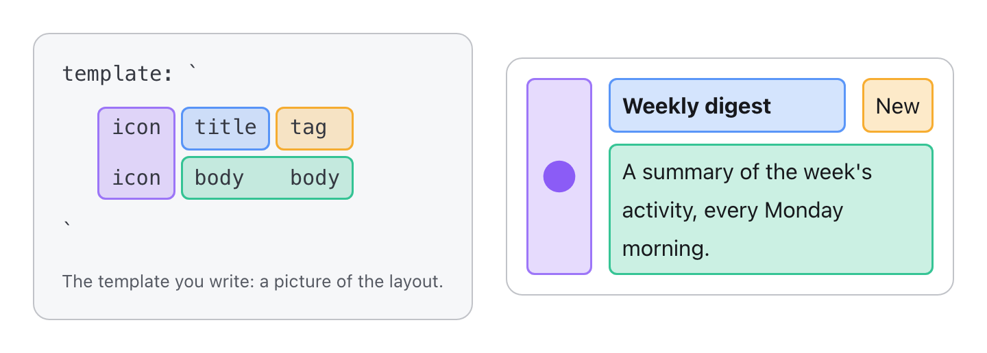
on screen; each child then takes its region by name. The template is a
|
|
21
21
|
picture of the component:
|
|
22
22
|
|
|
23
|
-
|
|
23
|
+
[](https://michaelbuss.github.io/typed-grid-areas/#grid-template-areas-in-one-picture)
|
|
24
|
+
|
|
25
|
+
[Try it live](https://michaelbuss.github.io/typed-grid-areas/#grid-template-areas-in-one-picture): hover an area to find it in both, or untick a slot to watch the picture redraw.
|
|
24
26
|
|
|
25
27
|
## Simple on paper, hard in practice
|
|
26
28
|
|
|
@@ -140,10 +142,8 @@ npx @tanstack/intent@latest install
|
|
|
140
142
|
|
|
141
143
|
## Learn more
|
|
142
144
|
|
|
143
|
-
- [Docs](https://michaelbuss.github.io/typed-grid-areas/): how it works,
|
|
144
|
-
|
|
145
|
-
- [Try it in your browser](https://michaelbuss.github.io/typed-grid-areas/try-it/):
|
|
146
|
-
a playground, and an example app per framework.
|
|
145
|
+
- [Docs](https://michaelbuss.github.io/typed-grid-areas/): how it works, the concepts, and live examples.
|
|
146
|
+
- [Try it in your browser](https://michaelbuss.github.io/typed-grid-areas/try-it/): a playground, and an example app per framework.
|
|
147
147
|
- [The full API reference](https://github.com/MichaelBuss/typed-grid-areas/blob/main/REFERENCE.md):
|
|
148
148
|
every option and every adapter. It also ships in every package, matching
|
|
149
149
|
the version you installed: `node_modules/typed-grid-areas/REFERENCE.md`.
|
package/REFERENCE.md
CHANGED
|
@@ -124,13 +124,18 @@ Compile-time checks, each reported on the offending property:
|
|
|
124
124
|
`{ _columnCountError: { expected: 2; got: 3 } }` on `columns` (and
|
|
125
125
|
`_rowCountError` on `rows`); skipped for `repeat(` and non-literal strings
|
|
126
126
|
- unknown `align` keys and unknown `when`/`unless` values
|
|
127
|
+
- a breakpoint key that isn't allowed: `{ _unsupportedBreakpoint: "@[50%]" }`
|
|
128
|
+
on the key, and breakpoints in more than one unit:
|
|
129
|
+
`{ _mixedBreakpointUnits: "…: ch is mixed with rem" }` on every key (see
|
|
130
|
+
[Breakpoints](#breakpoints)); skipped for keys that aren't literals
|
|
127
131
|
|
|
128
132
|
There is no autocomplete inside a template string, and each template reports
|
|
129
133
|
one problem at a time.
|
|
130
134
|
|
|
131
135
|
In development, `defineLayout` also runs `validateGridConfig()` once per
|
|
132
136
|
definition and logs what types can't check: areas and layers that aren't
|
|
133
|
-
rectangles,
|
|
137
|
+
rectangles, malformed cells, and breakpoint keys that aren't allowed or
|
|
138
|
+
mix units (also when the keys aren't literals). `validateGridConfig()` returns those
|
|
134
139
|
warnings as strings, so it is also useful for definitions assembled
|
|
135
140
|
dynamically.
|
|
136
141
|
|
|
@@ -255,6 +260,16 @@ defineLayout({
|
|
|
255
260
|
});
|
|
256
261
|
```
|
|
257
262
|
|
|
263
|
+
**Every breakpoint of a definition uses one unit**, across all its layouts,
|
|
264
|
+
and the named sizes count as `rem`. An arbitrary key is a plain,
|
|
265
|
+
non-negative number and one of `px`, `rem`, `em`, `ch`, `ex`, `vw`, `vh`,
|
|
266
|
+
`vi` or `vb`: `"@[27.5rem]"`, `"@[40ch]"`. The generated CSS relies on
|
|
267
|
+
breakpoints being ordered by width, and breakpoints in different units can't
|
|
268
|
+
be ordered when it's generated, because how they compare depends on font
|
|
269
|
+
sizes and the viewport. So `"@[20ch]"` next to `"@sm"` is a type error.
|
|
270
|
+
Percentages, `calc()` and container query units (`cqw`, `cqi`, …, which in
|
|
271
|
+
a query measure a container above the grid) aren't allowed either.
|
|
272
|
+
|
|
258
273
|
A breakpoint arrangement beats its own layout's base arrangement, but a
|
|
259
274
|
later layout still beats an earlier layout's breakpoints. Breakpoint
|
|
260
275
|
arrangements take their own `rows`, `columns` and `align`; nothing is
|
|
@@ -358,6 +373,49 @@ The library's own tests only run in Chromium. In older browsers the query
|
|
|
358
373
|
simply never matches, so write the unlayered look as the default and the
|
|
359
374
|
layered look inside the query.
|
|
360
375
|
|
|
376
|
+
## Accessibility: reading order
|
|
377
|
+
|
|
378
|
+
Each layout, and each of its breakpoints, can put the areas in a different
|
|
379
|
+
visual order, but keyboard focus follows the DOM: the order the slots are
|
|
380
|
+
rendered in. One DOM order can't match every layout.
|
|
381
|
+
|
|
382
|
+
`reading-flow` on the grid makes keyboard focus follow the layout that
|
|
383
|
+
currently applies instead, at every breakpoint. The library doesn't set it:
|
|
384
|
+
give the grid a class of your own.
|
|
385
|
+
|
|
386
|
+
```css
|
|
387
|
+
.card {
|
|
388
|
+
reading-flow: grid-rows;
|
|
389
|
+
}
|
|
390
|
+
```
|
|
391
|
+
|
|
392
|
+
`grid-rows` reads the grid row by row; use `grid-columns` when the design
|
|
393
|
+
reads down its columns first. Put the class on the grid like any other:
|
|
394
|
+
`className` in React, `class` (or `className`) in Preact, `class` in Vue,
|
|
395
|
+
Svelte, Solid and Octane and on the element carrying `[tgaGrid]` in Angular,
|
|
396
|
+
and the grid's `class` option in Lit. With Tailwind, the arbitrary property
|
|
397
|
+
`[reading-flow:grid-rows]` does the same.
|
|
398
|
+
|
|
399
|
+
- **A progressive enhancement.** Supported in Chrome and Edge 137+; other
|
|
400
|
+
browsers keep DOM order. So still render the slots in the order that makes
|
|
401
|
+
sense for the most important layout
|
|
402
|
+
([WCAG 1.3.2, Meaningful Sequence](https://www.w3.org/WAI/WCAG22/Understanding/meaningful-sequence.html)),
|
|
403
|
+
and let `reading-flow` follow the others where it's supported.
|
|
404
|
+
- **Layers.** Slots are read in the order of the cell each starts in. A
|
|
405
|
+
layer that starts in the same cell as its base ties with it, and a tie
|
|
406
|
+
falls back to DOM order: render whichever of the two should be read first
|
|
407
|
+
earlier.
|
|
408
|
+
- **Not `order`.** `order` only moves auto-placed elements, and every slot
|
|
409
|
+
is placed by its area name, so it moves nothing. It doesn't change focus
|
|
410
|
+
order either.
|
|
411
|
+
- **Why it isn't built in.** Setting `reading-flow` in the generated CSS
|
|
412
|
+
would override a DOM order you chose on purpose.
|
|
413
|
+
|
|
414
|
+
What this gives you is keyboard focus that follows the layout. The CSS
|
|
415
|
+
specification applies `reading-flow` to the reading order passed to
|
|
416
|
+
assistive technology too, but it has been checked for keyboard focus in
|
|
417
|
+
Chromium only, not with screen readers.
|
|
418
|
+
|
|
361
419
|
## Rendering with React: grid components
|
|
362
420
|
|
|
363
421
|
`createGridComponent(definition)` turns a definition into the component it
|
package/package.json
CHANGED
|
@@ -1,6 +1,6 @@
|
|
|
1
1
|
{
|
|
2
2
|
"name": "@typed-grid-areas/solid",
|
|
3
|
-
"version": "0.1.
|
|
3
|
+
"version": "0.1.3",
|
|
4
4
|
"description": "Solid adapter for typed-grid-areas: render a grid definition as typed slot components.",
|
|
5
5
|
"keywords": [
|
|
6
6
|
"css-grid",
|
|
@@ -43,7 +43,7 @@
|
|
|
43
43
|
"solid-js": "^1.9.0"
|
|
44
44
|
},
|
|
45
45
|
"dependencies": {
|
|
46
|
-
"typed-grid-areas": "^0.
|
|
46
|
+
"typed-grid-areas": "^0.4.0"
|
|
47
47
|
},
|
|
48
48
|
"devDependencies": {
|
|
49
49
|
"@typed-grid-areas/acceptance": "*",
|