@tronweb3/tronwallet-adapter-react-ui 1.0.1
This diff represents the content of publicly available package versions that have been released to one of the supported registries. The information contained in this diff is provided for informational purposes only and reflects changes between package versions as they appear in their respective public registries.
- package/LICENSE +20 -0
- package/README.md +142 -0
- package/package.json +65 -0
- package/src/Button.tsx +37 -0
- package/src/Collapse.tsx +68 -0
- package/src/Modal/ReactPortal.tsx +42 -0
- package/src/Modal/WalletSelectModal.tsx +92 -0
- package/src/WalletActionButton.tsx +99 -0
- package/src/WalletConnectButton.tsx +41 -0
- package/src/WalletDisconnectButton.tsx +37 -0
- package/src/WalletItem.tsx +21 -0
- package/src/WalletModalProvider.tsx +18 -0
- package/src/WalletSelectButton.tsx +23 -0
- package/src/index.ts +10 -0
- package/src/useWalletModal.tsx +30 -0
- package/src/utils.tsx +11 -0
- package/style.css +214 -0
package/LICENSE
ADDED
|
@@ -0,0 +1,20 @@
|
|
|
1
|
+
The MIT License (MIT)
|
|
2
|
+
Copyright (c) 2022-Present, tronprotocol
|
|
3
|
+
|
|
4
|
+
Permission is hereby granted, free of charge, to any person obtaining a copy
|
|
5
|
+
of this software and associated documentation files (the "Software"), to deal
|
|
6
|
+
in the Software without restriction, including without limitation the rights
|
|
7
|
+
to use, copy, modify, merge, publish, distribute, sublicense, and/or sell
|
|
8
|
+
copies of the Software, and to permit persons to whom the Software is
|
|
9
|
+
furnished to do so, subject to the following conditions:
|
|
10
|
+
|
|
11
|
+
The above copyright notice and this permission notice shall be included in all
|
|
12
|
+
copies or substantial portions of the Software.
|
|
13
|
+
|
|
14
|
+
THE SOFTWARE IS PROVIDED "AS IS", WITHOUT WARRANTY OF ANY KIND, EXPRESS OR
|
|
15
|
+
IMPLIED, INCLUDING BUT NOT LIMITED TO THE WARRANTIES OF MERCHANTABILITY,
|
|
16
|
+
FITNESS FOR A PARTICULAR PURPOSE AND NONINFRINGEMENT. IN NO EVENT SHALL THE
|
|
17
|
+
AUTHORS OR COPYRIGHT HOLDERS BE LIABLE FOR ANY CLAIM, DAMAGES OR OTHER
|
|
18
|
+
LIABILITY, WHETHER IN AN ACTION OF CONTRACT, TORT OR OTHERWISE, ARISING FROM,
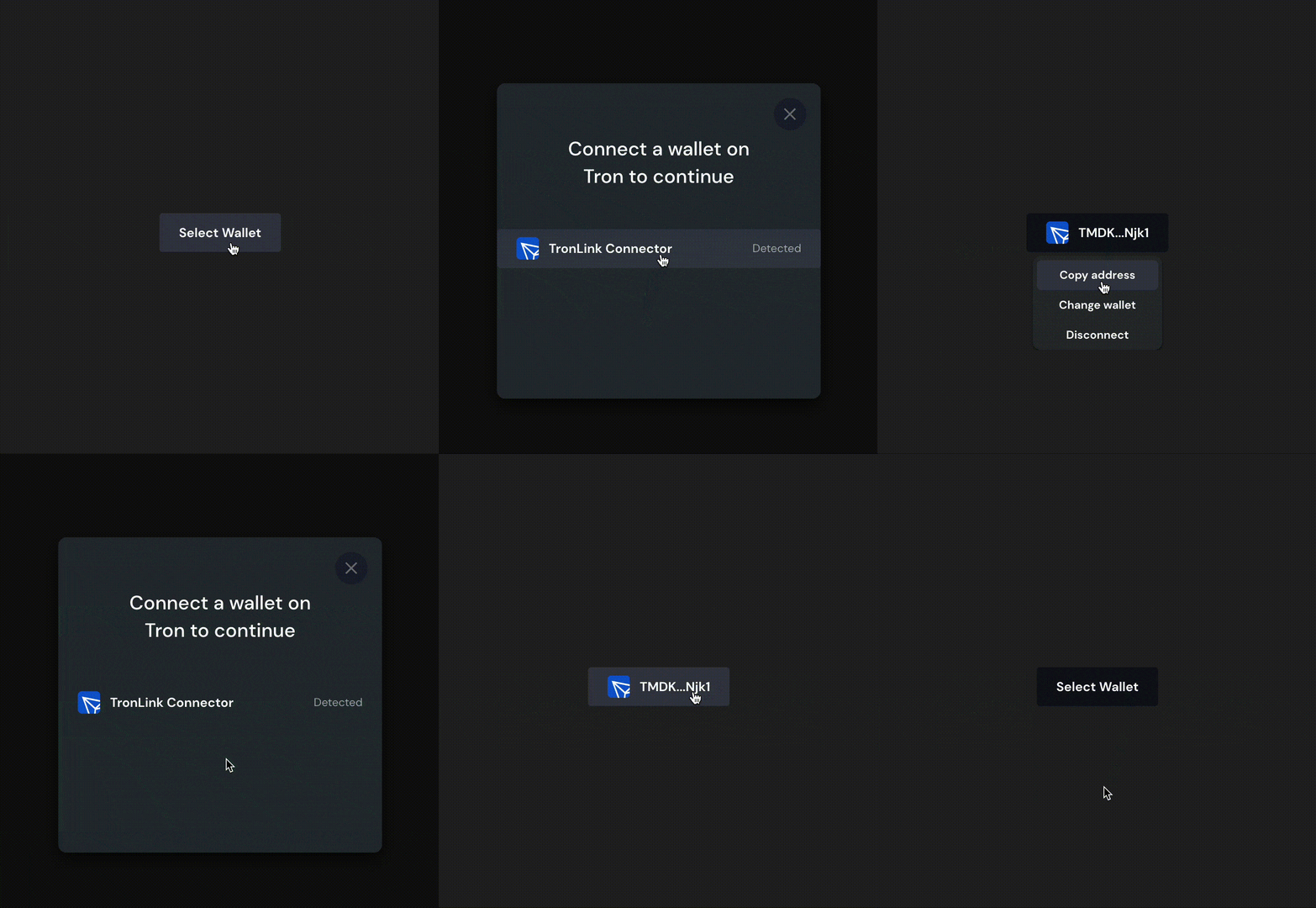
|
|
19
|
+
OUT OF OR IN CONNECTION WITH THE SOFTWARE OR THE USE OR OTHER DEALINGS IN THE
|
|
20
|
+
SOFTWARE.
|
package/README.md
ADDED
|
@@ -0,0 +1,142 @@
|
|
|
1
|
+
# @tronweb3/tronwallet-adapter-react-ui
|
|
2
|
+
|
|
3
|
+
`@tronweb3/tronwallet-adapter-react-ui` provides a set of out-of-the-box components to make it easy to select, change, connect and disconnect wallet.
|
|
4
|
+
|
|
5
|
+
`@tronweb3/tronwallet-adapter-react-ui` depends `@tronweb3/tronwallet-adapter-react-hooks` to work. So developers must wrap `App` content within the `WalletProvider`.
|
|
6
|
+
|
|
7
|
+
## Installation
|
|
8
|
+
|
|
9
|
+
```bash
|
|
10
|
+
npm install @tronweb3/tronwallet-adapter-react-ui @tronweb3/tronwallet-adapter-react-hooks @tronweb3/tronwallet-abstract-adapter @tronweb3/tronwallet-adapters
|
|
11
|
+
|
|
12
|
+
# or pnpm install @tronweb3/tronwallet-adapter-react-ui @tronweb3/tronwallet-adapter-react-hooks @tronweb3/tronwallet-abstract-adapter @tronweb3/tronwallet-adapters
|
|
13
|
+
|
|
14
|
+
# or yarn install @tronweb3/tronwallet-adapter-react-ui @tronweb3/tronwallet-adapter-react-hooks @tronweb3/tronwallet-abstract-adapter @tronweb3/tronwallet-adapters
|
|
15
|
+
```
|
|
16
|
+
|
|
17
|
+
## Usage
|
|
18
|
+
|
|
19
|
+
`@tronweb3/tronwallet-adapter-react-ui` provide a `Select Wallet Modal` by `Context.Provider`. So developers must wrap `App` content within the `WalletProvider` and `WalletModalProvider`.
|
|
20
|
+
|
|
21
|
+
```jsx
|
|
22
|
+
import { useWallet, WalletProvider } from '@tronweb3/tronwallet-adapter-react-hooks';
|
|
23
|
+
import { WalletModalProvider, WalletActionButton } from '@tronweb3/tronwallet-adapter-react-ui';
|
|
24
|
+
import { WalletDisconnectedError, WalletError, WalletNotFoundError } from '@tronweb3/tronwallet-abstract-adapter';
|
|
25
|
+
import toast, { Toaster } from 'react-hot-toast';
|
|
26
|
+
|
|
27
|
+
function App() {
|
|
28
|
+
// here use `react-hot-toast` npm package to notify user what happened
|
|
29
|
+
function onError(e: WalletError) {
|
|
30
|
+
if (e instanceof WalletNotFoundError) {
|
|
31
|
+
toast.error(e.message);
|
|
32
|
+
} else if (e instanceof WalletDisconnectedError) {
|
|
33
|
+
toast.error(e.message);
|
|
34
|
+
} else toast.error(e.message);
|
|
35
|
+
}
|
|
36
|
+
return (
|
|
37
|
+
<WalletProvider onError={onError}>
|
|
38
|
+
<WalletModalProvider>
|
|
39
|
+
<ConnectComponent></ConnectComponent>
|
|
40
|
+
<Profile></Profile>
|
|
41
|
+
</WalletModalProvider>
|
|
42
|
+
</WalletProvider>
|
|
43
|
+
);
|
|
44
|
+
}
|
|
45
|
+
function ConnectComponent() {
|
|
46
|
+
const { connect, disconnect, select, connected } = useWallet();
|
|
47
|
+
return <WalletActionButton></WalletActionButton>;
|
|
48
|
+
}
|
|
49
|
+
function Profile() {
|
|
50
|
+
const { address, connected, wallet } = useWallet();
|
|
51
|
+
return (
|
|
52
|
+
<div>
|
|
53
|
+
<p>
|
|
54
|
+
<span>Connection Status:</span> {connected ? 'Connected' : 'Disconnected'}
|
|
55
|
+
</p>
|
|
56
|
+
<p>
|
|
57
|
+
<span>Your selected Wallet:</span> {wallet?.adapter.name}
|
|
58
|
+
</p>
|
|
59
|
+
<p>
|
|
60
|
+
<span>Your Address:</span> {address}
|
|
61
|
+
</p>
|
|
62
|
+
</div>
|
|
63
|
+
);
|
|
64
|
+
}
|
|
65
|
+
```
|
|
66
|
+
|
|
67
|
+
## `WalletModalProvider` and `useWalletModal`
|
|
68
|
+
|
|
69
|
+
`WalletModalProvider` provide a `Select Wallet Modal` by `Context.Provider`. The modal can be controled by `useWalletModal`.
|
|
70
|
+
|
|
71
|
+
```jsx
|
|
72
|
+
function App() {
|
|
73
|
+
const { visible, setVisible } = useWalletModal();
|
|
74
|
+
function toggle() {
|
|
75
|
+
setVisible((visible) => !visible);
|
|
76
|
+
}
|
|
77
|
+
return (
|
|
78
|
+
<div>
|
|
79
|
+
<button onClick={toggle}>{visible ? 'Close Modal' : 'Open Modal'}</button>
|
|
80
|
+
</div>
|
|
81
|
+
);
|
|
82
|
+
}
|
|
83
|
+
```
|
|
84
|
+
|
|
85
|
+
## `WalletConnectButton`
|
|
86
|
+
|
|
87
|
+
Button to connect to the selected wallet. The button is disabled when:
|
|
88
|
+
|
|
89
|
+
- no wallet is selected
|
|
90
|
+
- is connecting to wallet
|
|
91
|
+
- is connected
|
|
92
|
+
- disabled by props
|
|
93
|
+
|
|
94
|
+
### Props
|
|
95
|
+
|
|
96
|
+
```jsx
|
|
97
|
+
type ButtonProps = PropsWithChildren<{
|
|
98
|
+
className?: string,
|
|
99
|
+
disabled?: boolean,
|
|
100
|
+
onClick?: (e: MouseEvent<HTMLButtonElement>) => void,
|
|
101
|
+
style?: CSSProperties,
|
|
102
|
+
tabIndex?: number,
|
|
103
|
+
icon?: string,
|
|
104
|
+
}>;
|
|
105
|
+
```
|
|
106
|
+
|
|
107
|
+
## `WalletDisconnectButton`
|
|
108
|
+
|
|
109
|
+
Button to connect to the selected wallet. The button is disabled when:
|
|
110
|
+
|
|
111
|
+
- no wallet is selected
|
|
112
|
+
- is connecting to wallet
|
|
113
|
+
- disabled by props
|
|
114
|
+
|
|
115
|
+
### Props
|
|
116
|
+
|
|
117
|
+
Same as `WalletConnectButton`.
|
|
118
|
+
|
|
119
|
+
## `WalletSelectButton`
|
|
120
|
+
|
|
121
|
+
Button to open `Select Wallet Modal`.
|
|
122
|
+
|
|
123
|
+
### Props
|
|
124
|
+
|
|
125
|
+
Same as `WalletConnectButton`.
|
|
126
|
+
|
|
127
|
+
## `WalletActionButton`
|
|
128
|
+
|
|
129
|
+
Button with multiple functions including:
|
|
130
|
+
|
|
131
|
+
- Select wallet
|
|
132
|
+
- Connect to wallet
|
|
133
|
+
- Disconnect from wallet
|
|
134
|
+
- Show current selected wallet and address
|
|
135
|
+
- Copy address
|
|
136
|
+
|
|
137
|
+
It's recommended to use this component to connect wallet easily.
|
|
138
|
+
|
|
139
|
+
|
|
140
|
+
### Props
|
|
141
|
+
|
|
142
|
+
Same as `WalletConnectButton`.
|
package/package.json
ADDED
|
@@ -0,0 +1,65 @@
|
|
|
1
|
+
{
|
|
2
|
+
"name": "@tronweb3/tronwallet-adapter-react-ui",
|
|
3
|
+
"version": "1.0.1",
|
|
4
|
+
"author": "tronprotocol",
|
|
5
|
+
"repository": {
|
|
6
|
+
"type": "git",
|
|
7
|
+
"url": "https://github.com/tronprotocol/tronwallet-adapter"
|
|
8
|
+
},
|
|
9
|
+
"license": "MIT",
|
|
10
|
+
"type": "module",
|
|
11
|
+
"sideEffects": false,
|
|
12
|
+
"engines": {
|
|
13
|
+
"node": ">=16",
|
|
14
|
+
"pnpm": ">=7"
|
|
15
|
+
},
|
|
16
|
+
"main": "./lib/cjs/index.js",
|
|
17
|
+
"module": "./lib/esm/index.js",
|
|
18
|
+
"types": "./lib/types/index.d.ts",
|
|
19
|
+
"exports": {
|
|
20
|
+
".": {
|
|
21
|
+
"import": "./lib/esm/index.js",
|
|
22
|
+
"require": "./lib/cjs/index.js",
|
|
23
|
+
"types": "./lib/types/index.d.ts"
|
|
24
|
+
},
|
|
25
|
+
"./style.css": "./style.css"
|
|
26
|
+
},
|
|
27
|
+
"files": [
|
|
28
|
+
"lib",
|
|
29
|
+
"src",
|
|
30
|
+
"LICENSE",
|
|
31
|
+
"style.css"
|
|
32
|
+
],
|
|
33
|
+
"publishConfig": {
|
|
34
|
+
"access": "public"
|
|
35
|
+
},
|
|
36
|
+
"scripts": {
|
|
37
|
+
"clean": "shx mkdir -p lib && shx rm -rf lib",
|
|
38
|
+
"package": "shx echo '{ \"type\": \"commonjs\" }' > lib/cjs/package.json",
|
|
39
|
+
"test": "jest"
|
|
40
|
+
},
|
|
41
|
+
"peerDependencies": {
|
|
42
|
+
"react": "*",
|
|
43
|
+
"react-dom": "*"
|
|
44
|
+
},
|
|
45
|
+
"dependencies": {
|
|
46
|
+
"@tronweb3/tronwallet-abstract-adapter": "^1.0.0",
|
|
47
|
+
"@tronweb3/tronwallet-adapter-react-hooks": "^1.0.0"
|
|
48
|
+
},
|
|
49
|
+
"devDependencies": {
|
|
50
|
+
"@testing-library/jest-dom": "^5.16.5",
|
|
51
|
+
"@testing-library/react": "^13.4.0",
|
|
52
|
+
"@testing-library/user-event": "^13.5.0",
|
|
53
|
+
"@tronweb3/tronwallet-adapter-tronlink": "^1.0.0",
|
|
54
|
+
"@types/jest": "^27.5.2",
|
|
55
|
+
"@types/react": "^18.0.26",
|
|
56
|
+
"@types/react-dom": "^18.0.0",
|
|
57
|
+
"@types/testing-library__jest-dom": "^5.14.5",
|
|
58
|
+
"jest": "^29.3.1",
|
|
59
|
+
"jest-environment-jsdom": "^29.3.1",
|
|
60
|
+
"jest-localstorage-mock": "^2.4.22",
|
|
61
|
+
"react": "^18.0.0",
|
|
62
|
+
"react-dom": "^18.0.0",
|
|
63
|
+
"shx": "^0.3.4"
|
|
64
|
+
}
|
|
65
|
+
}
|
package/src/Button.tsx
ADDED
|
@@ -0,0 +1,37 @@
|
|
|
1
|
+
import React, { useRef } from 'react';
|
|
2
|
+
import type { CSSProperties, FC, MouseEvent, PropsWithChildren } from 'react';
|
|
3
|
+
|
|
4
|
+
export type ButtonProps = PropsWithChildren<{
|
|
5
|
+
className?: string;
|
|
6
|
+
disabled?: boolean;
|
|
7
|
+
onClick?: (e: MouseEvent<HTMLButtonElement>) => void;
|
|
8
|
+
style?: CSSProperties;
|
|
9
|
+
tabIndex?: number;
|
|
10
|
+
icon?: string;
|
|
11
|
+
}>;
|
|
12
|
+
|
|
13
|
+
export const Button: FC<ButtonProps> = ({ children, onClick, className = '', tabIndex = 0, icon, ...rest }) => {
|
|
14
|
+
const ref = useRef<HTMLButtonElement>(null);
|
|
15
|
+
function handleClick(event: MouseEvent<HTMLButtonElement>) {
|
|
16
|
+
onClick?.(event);
|
|
17
|
+
setTimeout(() => {
|
|
18
|
+
ref.current?.blur();
|
|
19
|
+
}, 300);
|
|
20
|
+
}
|
|
21
|
+
return (
|
|
22
|
+
<button
|
|
23
|
+
ref={ref}
|
|
24
|
+
onClick={handleClick}
|
|
25
|
+
className={`adapter-react-button ${className}`}
|
|
26
|
+
tabIndex={tabIndex}
|
|
27
|
+
{...rest}
|
|
28
|
+
>
|
|
29
|
+
{icon && (
|
|
30
|
+
<i className="button-icon">
|
|
31
|
+
<img src={icon} />
|
|
32
|
+
</i>
|
|
33
|
+
)}
|
|
34
|
+
{children}
|
|
35
|
+
</button>
|
|
36
|
+
);
|
|
37
|
+
};
|
package/src/Collapse.tsx
ADDED
|
@@ -0,0 +1,68 @@
|
|
|
1
|
+
import type { FC, PropsWithChildren } from 'react';
|
|
2
|
+
import React, { useLayoutEffect, useRef, useEffect, useState } from 'react';
|
|
3
|
+
|
|
4
|
+
export type CollapseProps = PropsWithChildren<{
|
|
5
|
+
isOpen: boolean;
|
|
6
|
+
id?: string;
|
|
7
|
+
className?: string;
|
|
8
|
+
transition?: string;
|
|
9
|
+
}>;
|
|
10
|
+
|
|
11
|
+
export const Collapse: FC<CollapseProps> = function ({
|
|
12
|
+
children,
|
|
13
|
+
className,
|
|
14
|
+
transition = 'height 250ms ease-out',
|
|
15
|
+
isOpen,
|
|
16
|
+
}) {
|
|
17
|
+
const initialState = { height: '0px', transition };
|
|
18
|
+
const wrapRef = useRef<HTMLDivElement>(null);
|
|
19
|
+
const [style, setStyle] = useState(initialState);
|
|
20
|
+
|
|
21
|
+
useEffect(
|
|
22
|
+
function () {
|
|
23
|
+
setStyle((style) => ({ ...style, transition }));
|
|
24
|
+
},
|
|
25
|
+
[transition]
|
|
26
|
+
);
|
|
27
|
+
|
|
28
|
+
function open() {
|
|
29
|
+
if (!wrapRef.current) {
|
|
30
|
+
return;
|
|
31
|
+
}
|
|
32
|
+
setStyle((style) => ({
|
|
33
|
+
...style,
|
|
34
|
+
height: wrapRef.current?.scrollHeight + 'px',
|
|
35
|
+
}));
|
|
36
|
+
}
|
|
37
|
+
|
|
38
|
+
function close() {
|
|
39
|
+
if (!wrapRef.current) {
|
|
40
|
+
return;
|
|
41
|
+
}
|
|
42
|
+
setStyle((style) => ({
|
|
43
|
+
...style,
|
|
44
|
+
height: '0px',
|
|
45
|
+
}));
|
|
46
|
+
}
|
|
47
|
+
|
|
48
|
+
useLayoutEffect(() => {
|
|
49
|
+
if (isOpen) {
|
|
50
|
+
open();
|
|
51
|
+
} else {
|
|
52
|
+
close();
|
|
53
|
+
}
|
|
54
|
+
}, [isOpen]);
|
|
55
|
+
|
|
56
|
+
return (
|
|
57
|
+
<div
|
|
58
|
+
ref={wrapRef}
|
|
59
|
+
className={'react-collapse ' + className}
|
|
60
|
+
style={{
|
|
61
|
+
overflow: 'hidden',
|
|
62
|
+
...style,
|
|
63
|
+
}}
|
|
64
|
+
>
|
|
65
|
+
{children}
|
|
66
|
+
</div>
|
|
67
|
+
);
|
|
68
|
+
};
|
|
@@ -0,0 +1,42 @@
|
|
|
1
|
+
import { useState, useLayoutEffect } from 'react';
|
|
2
|
+
import type { PropsWithChildren, FC } from 'react';
|
|
3
|
+
import { createPortal } from 'react-dom';
|
|
4
|
+
|
|
5
|
+
function createWrapperAndAppendToBody(wrapperId: string) {
|
|
6
|
+
const wrapperElement = document.createElement('div');
|
|
7
|
+
wrapperElement.setAttribute('id', wrapperId);
|
|
8
|
+
wrapperElement.style.position = 'relative';
|
|
9
|
+
document.body.appendChild(wrapperElement);
|
|
10
|
+
return wrapperElement;
|
|
11
|
+
}
|
|
12
|
+
|
|
13
|
+
type ReactPortalProps = PropsWithChildren<{
|
|
14
|
+
wrapperId: string;
|
|
15
|
+
}>;
|
|
16
|
+
export const ReactPortal: FC<ReactPortalProps> = function ({ children, wrapperId = 'react-portal-wrapper' }) {
|
|
17
|
+
const [wrapperElement, setWrapperElement] = useState<HTMLElement | null>(null);
|
|
18
|
+
|
|
19
|
+
useLayoutEffect(() => {
|
|
20
|
+
let element: HTMLElement | null = document.getElementById(wrapperId);
|
|
21
|
+
let systemCreated = false;
|
|
22
|
+
// if element is not found with wrapperId or wrapperId is not provided,
|
|
23
|
+
// create and append to body
|
|
24
|
+
if (!element) {
|
|
25
|
+
systemCreated = true;
|
|
26
|
+
element = createWrapperAndAppendToBody(wrapperId);
|
|
27
|
+
}
|
|
28
|
+
setWrapperElement(element);
|
|
29
|
+
|
|
30
|
+
return () => {
|
|
31
|
+
// delete the programatically created element
|
|
32
|
+
if (systemCreated && element?.parentNode) {
|
|
33
|
+
element.parentNode.removeChild(element);
|
|
34
|
+
}
|
|
35
|
+
};
|
|
36
|
+
}, [wrapperId]);
|
|
37
|
+
|
|
38
|
+
// wrapperElement state will be null on very first render.
|
|
39
|
+
if (wrapperElement === null) return null;
|
|
40
|
+
|
|
41
|
+
return createPortal(children, wrapperElement);
|
|
42
|
+
};
|
|
@@ -0,0 +1,92 @@
|
|
|
1
|
+
import { useWallet } from '@tronweb3/tronwallet-adapter-react-hooks';
|
|
2
|
+
import type { Wallet } from '@tronweb3/tronwallet-adapter-react-hooks';
|
|
3
|
+
import React, { useCallback, useEffect, useMemo, useRef, useState } from 'react';
|
|
4
|
+
import type { FC, PropsWithChildren } from 'react';
|
|
5
|
+
import { AdapterState } from '@tronweb3/tronwallet-abstract-adapter';
|
|
6
|
+
import { ReactPortal } from './ReactPortal.js';
|
|
7
|
+
import { WalletItem } from '../WalletItem.js';
|
|
8
|
+
|
|
9
|
+
type ModalProps = PropsWithChildren<{
|
|
10
|
+
visible: boolean;
|
|
11
|
+
onClose: () => void;
|
|
12
|
+
}>;
|
|
13
|
+
export const WalletSelectModal: FC<ModalProps> = function ({ visible, onClose }) {
|
|
14
|
+
const nodeRef = useRef(null);
|
|
15
|
+
const { wallets, select } = useWallet();
|
|
16
|
+
const [fadeIn, setFadeIn] = useState(false);
|
|
17
|
+
const [render, setRender] = useState(false);
|
|
18
|
+
|
|
19
|
+
const walletsList = useMemo(
|
|
20
|
+
() => [
|
|
21
|
+
...wallets.filter((a: any) => a.state !== AdapterState.NotFound),
|
|
22
|
+
...wallets.filter((a: any) => a.state === AdapterState.NotFound),
|
|
23
|
+
],
|
|
24
|
+
[wallets]
|
|
25
|
+
);
|
|
26
|
+
|
|
27
|
+
const onWalletClick = useCallback(
|
|
28
|
+
(wallet: Wallet) => {
|
|
29
|
+
select(wallet.adapter.name);
|
|
30
|
+
onClose();
|
|
31
|
+
},
|
|
32
|
+
[select, onClose]
|
|
33
|
+
);
|
|
34
|
+
function show() {
|
|
35
|
+
setRender(true);
|
|
36
|
+
setFadeIn(true);
|
|
37
|
+
}
|
|
38
|
+
function close() {
|
|
39
|
+
setFadeIn(false);
|
|
40
|
+
// setRender(false)
|
|
41
|
+
setTimeout(() => setRender(false), 200);
|
|
42
|
+
}
|
|
43
|
+
|
|
44
|
+
useEffect(
|
|
45
|
+
function () {
|
|
46
|
+
if (visible) {
|
|
47
|
+
show();
|
|
48
|
+
} else {
|
|
49
|
+
close();
|
|
50
|
+
}
|
|
51
|
+
},
|
|
52
|
+
[visible]
|
|
53
|
+
);
|
|
54
|
+
useEffect(() => {
|
|
55
|
+
const closeOnEscapeKey = (e: any) => (e.key === 'Escape' ? onClose() : null);
|
|
56
|
+
document.body.addEventListener('keydown', closeOnEscapeKey);
|
|
57
|
+
return () => {
|
|
58
|
+
document.body.removeEventListener('keydown', closeOnEscapeKey);
|
|
59
|
+
};
|
|
60
|
+
}, [onClose]);
|
|
61
|
+
|
|
62
|
+
return render ? (
|
|
63
|
+
<ReactPortal wrapperId="react-portal-modal-container">
|
|
64
|
+
<div
|
|
65
|
+
data-testid="wallet-select-modal"
|
|
66
|
+
ref={nodeRef}
|
|
67
|
+
className={`adapter-modal ${fadeIn && 'adapter-modal-fade-in'}`}
|
|
68
|
+
>
|
|
69
|
+
<div className="adapter-modal-wrapper">
|
|
70
|
+
<div className="adapter-modal-header">
|
|
71
|
+
<button onClick={onClose} className="close-button" tabIndex={0}></button>
|
|
72
|
+
<div className="adapter-modal-title">
|
|
73
|
+
Connect a wallet on
|
|
74
|
+
<br />
|
|
75
|
+
Tron to continue
|
|
76
|
+
</div>
|
|
77
|
+
</div>
|
|
78
|
+
|
|
79
|
+
<div className="adapter-list">
|
|
80
|
+
{walletsList.map((wallet) => (
|
|
81
|
+
<WalletItem
|
|
82
|
+
key={wallet.adapter.name}
|
|
83
|
+
wallet={wallet}
|
|
84
|
+
onClick={() => onWalletClick(wallet)}
|
|
85
|
+
></WalletItem>
|
|
86
|
+
))}
|
|
87
|
+
</div>
|
|
88
|
+
</div>
|
|
89
|
+
</div>
|
|
90
|
+
</ReactPortal>
|
|
91
|
+
) : null;
|
|
92
|
+
};
|
|
@@ -0,0 +1,99 @@
|
|
|
1
|
+
import { useWallet } from '@tronweb3/tronwallet-adapter-react-hooks';
|
|
2
|
+
import { useEffect, useRef, useState } from 'react';
|
|
3
|
+
import type { FC } from 'react';
|
|
4
|
+
import React, { useCallback, useMemo } from 'react';
|
|
5
|
+
import type { ButtonProps } from './Button.js';
|
|
6
|
+
import { Button } from './Button.js';
|
|
7
|
+
import { WalletSelectButton } from './WalletSelectButton.js';
|
|
8
|
+
import { WalletConnectButton } from './WalletConnectButton.js';
|
|
9
|
+
import { Collapse } from './Collapse.js';
|
|
10
|
+
import { useWalletModal } from './useWalletModal.js';
|
|
11
|
+
import { copyData } from './utils.js';
|
|
12
|
+
export const WalletActionButton: FC<ButtonProps> = ({ children, ...props }) => {
|
|
13
|
+
const { address, wallet, disconnect } = useWallet();
|
|
14
|
+
const { setVisible } = useWalletModal();
|
|
15
|
+
const [dropdownVisible, setDropdownVisible] = useState(false);
|
|
16
|
+
const [copied, setCopied] = useState(false);
|
|
17
|
+
const ref = useRef<HTMLUListElement>(null);
|
|
18
|
+
|
|
19
|
+
const content = useMemo(() => {
|
|
20
|
+
if (children) return children;
|
|
21
|
+
if (!wallet || !address) return null;
|
|
22
|
+
return address.slice(0, 4) + '...' + address.slice(-4);
|
|
23
|
+
}, [children, wallet, address]);
|
|
24
|
+
|
|
25
|
+
const copyAddress = () => {
|
|
26
|
+
if (address) {
|
|
27
|
+
copyData(address);
|
|
28
|
+
setCopied(true);
|
|
29
|
+
setTimeout(() => {
|
|
30
|
+
setCopied(false);
|
|
31
|
+
hideDropdown();
|
|
32
|
+
}, 400);
|
|
33
|
+
}
|
|
34
|
+
};
|
|
35
|
+
function changeWallet() {
|
|
36
|
+
setVisible(true);
|
|
37
|
+
hideDropdown();
|
|
38
|
+
}
|
|
39
|
+
|
|
40
|
+
const openDropdown = useCallback(function () {
|
|
41
|
+
setDropdownVisible(true);
|
|
42
|
+
}, []);
|
|
43
|
+
|
|
44
|
+
const hideDropdown = useCallback(function () {
|
|
45
|
+
setDropdownVisible(false);
|
|
46
|
+
}, []);
|
|
47
|
+
const handleDisconnect = useCallback(
|
|
48
|
+
async function () {
|
|
49
|
+
await disconnect();
|
|
50
|
+
hideDropdown();
|
|
51
|
+
},
|
|
52
|
+
[disconnect, hideDropdown]
|
|
53
|
+
);
|
|
54
|
+
|
|
55
|
+
useEffect(() => {
|
|
56
|
+
const listener = (event: Event) => {
|
|
57
|
+
const node = ref.current;
|
|
58
|
+
if (!node || node.contains(event.target as Node)) return;
|
|
59
|
+
hideDropdown();
|
|
60
|
+
};
|
|
61
|
+
|
|
62
|
+
document.addEventListener('mousedown', listener);
|
|
63
|
+
document.addEventListener('touchstart', listener);
|
|
64
|
+
|
|
65
|
+
return () => {
|
|
66
|
+
document.removeEventListener('mousedown', listener);
|
|
67
|
+
document.removeEventListener('touchstart', listener);
|
|
68
|
+
};
|
|
69
|
+
}, [ref, hideDropdown]);
|
|
70
|
+
|
|
71
|
+
if (!wallet) return <WalletSelectButton {...props}>{children}</WalletSelectButton>;
|
|
72
|
+
if (!address) return <WalletConnectButton {...props}>{children}</WalletConnectButton>;
|
|
73
|
+
|
|
74
|
+
return (
|
|
75
|
+
<div data-testid="wallet-action-button" className="adapter-dropdown">
|
|
76
|
+
<Button
|
|
77
|
+
onClick={openDropdown}
|
|
78
|
+
style={{ pointerEvents: dropdownVisible ? 'none' : 'auto', ...props.style }}
|
|
79
|
+
icon={wallet ? wallet.adapter.icon : ''}
|
|
80
|
+
{...props}
|
|
81
|
+
>
|
|
82
|
+
{content}
|
|
83
|
+
</Button>
|
|
84
|
+
<Collapse className="adapter-dropdown-collapse" isOpen={dropdownVisible}>
|
|
85
|
+
<ul ref={ref} className="adapter-dropdown-list" role="menu">
|
|
86
|
+
<li onClick={copyAddress} className="adapter-dropdown-list-item" role="menuitem">
|
|
87
|
+
{copied ? 'Copied' : 'Copy address'}
|
|
88
|
+
</li>
|
|
89
|
+
<li onClick={changeWallet} className="adapter-dropdown-list-item" role="menuitem">
|
|
90
|
+
Change wallet
|
|
91
|
+
</li>
|
|
92
|
+
<li onClick={handleDisconnect} className="adapter-dropdown-list-item" role="menuitem">
|
|
93
|
+
Disconnect
|
|
94
|
+
</li>
|
|
95
|
+
</ul>
|
|
96
|
+
</Collapse>
|
|
97
|
+
</div>
|
|
98
|
+
);
|
|
99
|
+
};
|
|
@@ -0,0 +1,41 @@
|
|
|
1
|
+
import { useWallet } from '@tronweb3/tronwallet-adapter-react-hooks';
|
|
2
|
+
import type { FC, MouseEvent } from 'react';
|
|
3
|
+
import React, { useCallback, useMemo } from 'react';
|
|
4
|
+
import type { ButtonProps } from './Button.js';
|
|
5
|
+
import { Button } from './Button.js';
|
|
6
|
+
|
|
7
|
+
export const WalletConnectButton: FC<ButtonProps> = ({ children, disabled, onClick, ...props }) => {
|
|
8
|
+
const { wallet, connect, connecting, connected } = useWallet();
|
|
9
|
+
|
|
10
|
+
const handleClick = useCallback(
|
|
11
|
+
async (event: MouseEvent<HTMLButtonElement>) => {
|
|
12
|
+
if (onClick) onClick(event);
|
|
13
|
+
// eslint-disable-next-line @typescript-eslint/no-empty-function
|
|
14
|
+
if (!event.defaultPrevented) {
|
|
15
|
+
await connect();
|
|
16
|
+
}
|
|
17
|
+
},
|
|
18
|
+
[onClick, connect]
|
|
19
|
+
);
|
|
20
|
+
|
|
21
|
+
const content = useMemo(() => {
|
|
22
|
+
if (children) return children;
|
|
23
|
+
if (connecting) return 'Connecting ...';
|
|
24
|
+
if (connected) return 'Connected';
|
|
25
|
+
if (wallet) return 'Connect';
|
|
26
|
+
return 'Connect Wallet';
|
|
27
|
+
}, [children, connecting, connected, wallet]);
|
|
28
|
+
|
|
29
|
+
return (
|
|
30
|
+
<Button
|
|
31
|
+
data-testid="wallet-connect-button"
|
|
32
|
+
className="wallet-button"
|
|
33
|
+
disabled={disabled || !wallet || connecting || connected}
|
|
34
|
+
onClick={handleClick}
|
|
35
|
+
icon={wallet ? wallet.adapter.icon : ''}
|
|
36
|
+
{...props}
|
|
37
|
+
>
|
|
38
|
+
{content}
|
|
39
|
+
</Button>
|
|
40
|
+
);
|
|
41
|
+
};
|
|
@@ -0,0 +1,37 @@
|
|
|
1
|
+
import { useWallet } from '@tronweb3/tronwallet-adapter-react-hooks';
|
|
2
|
+
import type { FC, MouseEventHandler } from 'react';
|
|
3
|
+
import React, { useCallback, useMemo } from 'react';
|
|
4
|
+
import type { ButtonProps } from './Button.js';
|
|
5
|
+
import { Button } from './Button.js';
|
|
6
|
+
|
|
7
|
+
export const WalletDisconnectButton: FC<ButtonProps> = ({ children, disabled, onClick, ...props }) => {
|
|
8
|
+
const { wallet, disconnect, disconnecting, connected } = useWallet();
|
|
9
|
+
|
|
10
|
+
const handleClick: MouseEventHandler<HTMLButtonElement> = useCallback(
|
|
11
|
+
(event) => {
|
|
12
|
+
if (onClick) onClick(event);
|
|
13
|
+
// eslint-disable-next-line @typescript-eslint/no-empty-function
|
|
14
|
+
if (!event.defaultPrevented) disconnect().catch(() => {});
|
|
15
|
+
},
|
|
16
|
+
[onClick, disconnect]
|
|
17
|
+
);
|
|
18
|
+
|
|
19
|
+
const content = useMemo(() => {
|
|
20
|
+
if (children) return children;
|
|
21
|
+
if (disconnecting) return 'Disconnecting ...';
|
|
22
|
+
if (wallet) return 'Disconnect';
|
|
23
|
+
return 'Disconnect Wallet';
|
|
24
|
+
}, [children, disconnecting, wallet]);
|
|
25
|
+
|
|
26
|
+
return (
|
|
27
|
+
<Button
|
|
28
|
+
data-testid="wallet-disconnect-button"
|
|
29
|
+
disabled={disabled || !wallet || !connected}
|
|
30
|
+
icon={wallet ? wallet.adapter.icon : ''}
|
|
31
|
+
onClick={handleClick}
|
|
32
|
+
{...props}
|
|
33
|
+
>
|
|
34
|
+
{content}
|
|
35
|
+
</Button>
|
|
36
|
+
);
|
|
37
|
+
};
|
|
@@ -0,0 +1,21 @@
|
|
|
1
|
+
import { AdapterState } from '@tronweb3/tronwallet-abstract-adapter';
|
|
2
|
+
import type { Wallet } from '@tronweb3/tronwallet-adapter-react-hooks';
|
|
3
|
+
import type { FC } from 'react';
|
|
4
|
+
import React from 'react';
|
|
5
|
+
import { Button } from './Button.js';
|
|
6
|
+
|
|
7
|
+
export interface WalletItemProps {
|
|
8
|
+
onClick: () => void;
|
|
9
|
+
wallet: Wallet;
|
|
10
|
+
}
|
|
11
|
+
|
|
12
|
+
export const WalletItem: FC<WalletItemProps> = ({ onClick, wallet }) => {
|
|
13
|
+
return (
|
|
14
|
+
<div className="adapter-wallet-item">
|
|
15
|
+
<Button onClick={onClick} icon={wallet.adapter.icon} tabIndex={0}>
|
|
16
|
+
{wallet.adapter.name}
|
|
17
|
+
<span className="status-text">{wallet.state !== AdapterState.NotFound ? 'Detected' : 'NotFound'}</span>
|
|
18
|
+
</Button>
|
|
19
|
+
</div>
|
|
20
|
+
);
|
|
21
|
+
};
|
|
@@ -0,0 +1,18 @@
|
|
|
1
|
+
import React, { useState } from 'react';
|
|
2
|
+
import { WalletSelectModal } from './Modal/WalletSelectModal.js';
|
|
3
|
+
import { WalletModalContext } from './useWalletModal.js';
|
|
4
|
+
|
|
5
|
+
export function WalletModalProvider({ children, ...props }: any) {
|
|
6
|
+
const [visible, setVisible] = useState(false);
|
|
7
|
+
return (
|
|
8
|
+
<WalletModalContext.Provider
|
|
9
|
+
value={{
|
|
10
|
+
visible,
|
|
11
|
+
setVisible,
|
|
12
|
+
}}
|
|
13
|
+
>
|
|
14
|
+
{children}
|
|
15
|
+
{<WalletSelectModal visible={visible} onClose={() => setVisible(false)} {...props} />}
|
|
16
|
+
</WalletModalContext.Provider>
|
|
17
|
+
);
|
|
18
|
+
}
|
|
@@ -0,0 +1,23 @@
|
|
|
1
|
+
import React, { useCallback } from 'react';
|
|
2
|
+
import type { MouseEvent, FC } from 'react';
|
|
3
|
+
import { Button } from './Button.js';
|
|
4
|
+
import type { ButtonProps } from './Button.js';
|
|
5
|
+
import { useWalletModal } from './useWalletModal.js';
|
|
6
|
+
|
|
7
|
+
export const WalletSelectButton: FC<ButtonProps> = function ({ children = 'Select Wallet', onClick, ...props }) {
|
|
8
|
+
const { visible, setVisible } = useWalletModal();
|
|
9
|
+
|
|
10
|
+
const handleClick = useCallback(
|
|
11
|
+
(event: MouseEvent<HTMLButtonElement>) => {
|
|
12
|
+
if (onClick) onClick(event);
|
|
13
|
+
if (!event.defaultPrevented) setVisible(!visible);
|
|
14
|
+
},
|
|
15
|
+
[onClick, setVisible, visible]
|
|
16
|
+
);
|
|
17
|
+
|
|
18
|
+
return (
|
|
19
|
+
<Button data-testid="wallet-select-button" onClick={handleClick} {...props}>
|
|
20
|
+
{children}
|
|
21
|
+
</Button>
|
|
22
|
+
);
|
|
23
|
+
};
|
package/src/index.ts
ADDED
|
@@ -0,0 +1,10 @@
|
|
|
1
|
+
export * from './Collapse.js';
|
|
2
|
+
export * from './Button.js';
|
|
3
|
+
export * from './Modal/WalletSelectModal.js';
|
|
4
|
+
export * from './WalletConnectButton.js';
|
|
5
|
+
export * from './WalletDisconnectButton.js';
|
|
6
|
+
export * from './WalletItem.js';
|
|
7
|
+
export * from './WalletActionButton.js';
|
|
8
|
+
export * from './WalletSelectButton.js';
|
|
9
|
+
export * from './useWalletModal.js';
|
|
10
|
+
export * from './WalletModalProvider.js';
|
|
@@ -0,0 +1,30 @@
|
|
|
1
|
+
import { createContext, useContext } from 'react';
|
|
2
|
+
|
|
3
|
+
export interface WalletModalContextProps {
|
|
4
|
+
visible: boolean;
|
|
5
|
+
setVisible: (open: boolean) => void;
|
|
6
|
+
}
|
|
7
|
+
|
|
8
|
+
const DEFAULT_VALUE = {
|
|
9
|
+
// eslint-disable-next-line @typescript-eslint/no-unused-vars
|
|
10
|
+
setVisible(_open: boolean) {
|
|
11
|
+
printError();
|
|
12
|
+
},
|
|
13
|
+
visible: false,
|
|
14
|
+
};
|
|
15
|
+
Object.defineProperty(DEFAULT_VALUE, 'visible', {
|
|
16
|
+
get() {
|
|
17
|
+
printError();
|
|
18
|
+
return false;
|
|
19
|
+
},
|
|
20
|
+
});
|
|
21
|
+
|
|
22
|
+
function printError() {
|
|
23
|
+
console.error('WalletModalProvider is not provided.' + 'Please wrap your components with WalletModalProvider.');
|
|
24
|
+
}
|
|
25
|
+
|
|
26
|
+
export const WalletModalContext = createContext<WalletModalContextProps>(DEFAULT_VALUE as any);
|
|
27
|
+
|
|
28
|
+
export function useWalletModal(): WalletModalContextProps {
|
|
29
|
+
return useContext(WalletModalContext);
|
|
30
|
+
}
|
package/src/utils.tsx
ADDED
|
@@ -0,0 +1,11 @@
|
|
|
1
|
+
export function copyData(copyText: string) {
|
|
2
|
+
const textArea = document.createElement('textarea');
|
|
3
|
+
textArea.value = copyText;
|
|
4
|
+
document.body.appendChild(textArea);
|
|
5
|
+
textArea.select();
|
|
6
|
+
textArea.style.position = 'fixed';
|
|
7
|
+
textArea.style.top = '-9999px';
|
|
8
|
+
textArea.style.left = '-9999px';
|
|
9
|
+
document.execCommand('copy');
|
|
10
|
+
textArea.blur();
|
|
11
|
+
}
|
package/style.css
ADDED
|
@@ -0,0 +1,214 @@
|
|
|
1
|
+
@import url('https://fonts.googleapis.com/css2?family=DM+Sans:wght@400;500;700&display=swap');
|
|
2
|
+
|
|
3
|
+
/** button **/
|
|
4
|
+
.adapter-react-button {
|
|
5
|
+
display: inline-flex;
|
|
6
|
+
color: #fff;
|
|
7
|
+
cursor: pointer;
|
|
8
|
+
height: 48px;
|
|
9
|
+
background-color: #0f111a;
|
|
10
|
+
border: none;
|
|
11
|
+
border-radius: 4px;
|
|
12
|
+
align-items: center;
|
|
13
|
+
padding: 0 24px;
|
|
14
|
+
font-family: DM Sans, Roboto, Helvetica Neue, Helvetica, Arial, sans-serif;
|
|
15
|
+
font-size: 16px;
|
|
16
|
+
font-weight: 600;
|
|
17
|
+
line-height: 48px;
|
|
18
|
+
user-select: none;
|
|
19
|
+
-webkit-tap-highlight-color: transparent;
|
|
20
|
+
}
|
|
21
|
+
.adapter-react-button:focus {
|
|
22
|
+
outline: none;
|
|
23
|
+
}
|
|
24
|
+
.adapter-react-button:focus-visible {
|
|
25
|
+
outline: 2px solid white;
|
|
26
|
+
}
|
|
27
|
+
.adapter-react-button:not([disabled]):hover {
|
|
28
|
+
background-color: #373c47;
|
|
29
|
+
}
|
|
30
|
+
.adapter-react-button[disabled] {
|
|
31
|
+
background: #404144;
|
|
32
|
+
color: #999;
|
|
33
|
+
cursor: not-allowed;
|
|
34
|
+
}
|
|
35
|
+
.adapter-react-button .button-icon {
|
|
36
|
+
margin-right: 12px;
|
|
37
|
+
}
|
|
38
|
+
.adapter-react-button .button-icon,
|
|
39
|
+
.adapter-react-button .button-icon img {
|
|
40
|
+
display: block;
|
|
41
|
+
width: 28px;
|
|
42
|
+
height: 28px;
|
|
43
|
+
}
|
|
44
|
+
|
|
45
|
+
/* modal */
|
|
46
|
+
.adapter-modal {
|
|
47
|
+
position: fixed;
|
|
48
|
+
left: 0;
|
|
49
|
+
top: 0;
|
|
50
|
+
box-sizing: border-box;
|
|
51
|
+
width: 100vw;
|
|
52
|
+
height: 100vh;
|
|
53
|
+
inset: 0; /* inset sets all 4 values (top right bottom left) much like how we set padding, margin etc., */
|
|
54
|
+
background-color: rgba(0, 0, 0, 0.6);
|
|
55
|
+
display: flex;
|
|
56
|
+
flex-direction: column;
|
|
57
|
+
align-items: center;
|
|
58
|
+
justify-content: center;
|
|
59
|
+
transition: all 0.2s ease-in-out;
|
|
60
|
+
overflow: hidden;
|
|
61
|
+
z-index: 999;
|
|
62
|
+
padding: 40px 20px 20px;
|
|
63
|
+
opacity: 0;
|
|
64
|
+
pointer-events: none;
|
|
65
|
+
}
|
|
66
|
+
|
|
67
|
+
.adapter-modal-fade-in {
|
|
68
|
+
opacity: 1;
|
|
69
|
+
pointer-events: auto;
|
|
70
|
+
transform: scale(1);
|
|
71
|
+
}
|
|
72
|
+
|
|
73
|
+
.adapter-modal-wrapper {
|
|
74
|
+
width: 100%;
|
|
75
|
+
max-width: 400px;
|
|
76
|
+
max-width: 400px;
|
|
77
|
+
background-color: #282c34;
|
|
78
|
+
border-radius: 10px;
|
|
79
|
+
color: #fff;
|
|
80
|
+
display: flex;
|
|
81
|
+
flex-direction: column;
|
|
82
|
+
font-size: 2rem;
|
|
83
|
+
box-shadow: 0px 8px 20px rgba(0, 0, 0, 0.6);
|
|
84
|
+
font-family: 'DM Sans', 'Roboto', 'Helvetica Neue', Helvetica, Arial, sans-serif;
|
|
85
|
+
}
|
|
86
|
+
.adapter-modal-wrapper .adapter-list {
|
|
87
|
+
padding-bottom: 48px;
|
|
88
|
+
}
|
|
89
|
+
.adapter-modal-header {
|
|
90
|
+
position: relative;
|
|
91
|
+
padding: 64px 48px 48px;
|
|
92
|
+
}
|
|
93
|
+
.adapter-modal-header .adapter-modal-title {
|
|
94
|
+
font-size: 24px;
|
|
95
|
+
font-weight: 500;
|
|
96
|
+
line-height: 34px;
|
|
97
|
+
text-align: center;
|
|
98
|
+
}
|
|
99
|
+
@media (max-width: 374px) {
|
|
100
|
+
.adapter-modal-header .adapter-modal-title {
|
|
101
|
+
font-size: 18px;
|
|
102
|
+
}
|
|
103
|
+
}
|
|
104
|
+
.adapter-modal-header .close-button {
|
|
105
|
+
width: 40px;
|
|
106
|
+
height: 40px;
|
|
107
|
+
position: absolute;
|
|
108
|
+
cursor: pointer;
|
|
109
|
+
background: #1a1f2e;
|
|
110
|
+
border: none;
|
|
111
|
+
border-radius: 50%;
|
|
112
|
+
justify-content: center;
|
|
113
|
+
align-items: center;
|
|
114
|
+
padding: 12px;
|
|
115
|
+
display: flex;
|
|
116
|
+
top: 18px;
|
|
117
|
+
right: 18px;
|
|
118
|
+
-webkit-tap-highlight-color: transparent;
|
|
119
|
+
}
|
|
120
|
+
|
|
121
|
+
.adapter-modal-header .close-button:focus {
|
|
122
|
+
outline: none;
|
|
123
|
+
}
|
|
124
|
+
.adapter-modal-header .close-button:focus-visible {
|
|
125
|
+
outline: 2px solid white;
|
|
126
|
+
}
|
|
127
|
+
.adapter-modal-header .close-button::before,
|
|
128
|
+
.adapter-modal-header .close-button::after {
|
|
129
|
+
content: '';
|
|
130
|
+
display: block;
|
|
131
|
+
width: 19px;
|
|
132
|
+
height: 2px;
|
|
133
|
+
background-color: #777;
|
|
134
|
+
position: absolute;
|
|
135
|
+
top: 0;
|
|
136
|
+
bottom: 0;
|
|
137
|
+
left: 0;
|
|
138
|
+
right: 0;
|
|
139
|
+
margin: auto;
|
|
140
|
+
}
|
|
141
|
+
.adapter-modal-header .close-button::before {
|
|
142
|
+
transform: rotate(45deg);
|
|
143
|
+
}
|
|
144
|
+
.adapter-modal-header .close-button::after {
|
|
145
|
+
transform: rotate(-45deg);
|
|
146
|
+
}
|
|
147
|
+
.adapter-modal-header .close-button:hover::before,
|
|
148
|
+
.adapter-modal-header .close-button:hover::after {
|
|
149
|
+
background-color: antiquewhite;
|
|
150
|
+
}
|
|
151
|
+
|
|
152
|
+
/** WalletItem */
|
|
153
|
+
.adapter-wallet-item .adapter-react-button {
|
|
154
|
+
width: 100%;
|
|
155
|
+
background-color: transparent;
|
|
156
|
+
}
|
|
157
|
+
|
|
158
|
+
.adapter-wallet-item .status-text {
|
|
159
|
+
opacity: 0.6;
|
|
160
|
+
margin-left: auto;
|
|
161
|
+
font-size: 14px;
|
|
162
|
+
font-weight: 400;
|
|
163
|
+
}
|
|
164
|
+
|
|
165
|
+
/** dropdown */
|
|
166
|
+
.adapter-dropdown {
|
|
167
|
+
position: relative;
|
|
168
|
+
z-index: 99;
|
|
169
|
+
display: inline-block;
|
|
170
|
+
}
|
|
171
|
+
.adapter-dropdown-collapse {
|
|
172
|
+
position: absolute;
|
|
173
|
+
top: 0;
|
|
174
|
+
margin: auto;
|
|
175
|
+
top: calc(100% + 5px);
|
|
176
|
+
right: 0;
|
|
177
|
+
left: 0;
|
|
178
|
+
display: inline-flex;
|
|
179
|
+
}
|
|
180
|
+
.adapter-dropdown-list {
|
|
181
|
+
margin: 0 auto;
|
|
182
|
+
width: 150px;
|
|
183
|
+
list-style-type: none;
|
|
184
|
+
border-radius: 10px;
|
|
185
|
+
font-family: DM Sans, Roboto, Helvetica Neue, Helvetica, Arial, sans-serif;
|
|
186
|
+
box-shadow: 0 2px 3px #0009;
|
|
187
|
+
flex-direction: column;
|
|
188
|
+
padding: 5px;
|
|
189
|
+
background: #2c2d30;
|
|
190
|
+
}
|
|
191
|
+
.adapter-dropdown-list li {
|
|
192
|
+
display: block;
|
|
193
|
+
margin: auto;
|
|
194
|
+
color: white;
|
|
195
|
+
cursor: pointer;
|
|
196
|
+
white-space: nowrap;
|
|
197
|
+
box-sizing: border-box;
|
|
198
|
+
width: 100%;
|
|
199
|
+
height: 37px;
|
|
200
|
+
border: none;
|
|
201
|
+
border-radius: 6px;
|
|
202
|
+
outline: none;
|
|
203
|
+
flex-direction: row;
|
|
204
|
+
justify-content: center;
|
|
205
|
+
align-items: center;
|
|
206
|
+
padding: 0 20px;
|
|
207
|
+
font-size: 14px;
|
|
208
|
+
font-weight: 600;
|
|
209
|
+
display: flex;
|
|
210
|
+
}
|
|
211
|
+
|
|
212
|
+
.adapter-dropdown-list li:not([disabled]):hover {
|
|
213
|
+
background-color: #373c47;
|
|
214
|
+
}
|