@theengineeringmind/auto-skeleton 0.1.0
This diff represents the content of publicly available package versions that have been released to one of the supported registries. The information contained in this diff is provided for informational purposes only and reflects changes between package versions as they appear in their respective public registries.
- package/LICENSE +21 -0
- package/README.md +286 -0
- package/dist/cache-BEybr_z-.d.cts +154 -0
- package/dist/cache-BEybr_z-.d.ts +154 -0
- package/dist/chunk-VI2M6DZS.js +439 -0
- package/dist/chunk-VI2M6DZS.js.map +1 -0
- package/dist/chunk-VTA53XYO.cjs +470 -0
- package/dist/chunk-VTA53XYO.cjs.map +1 -0
- package/dist/index.cjs +128 -0
- package/dist/index.cjs.map +1 -0
- package/dist/index.d.cts +95 -0
- package/dist/index.d.ts +95 -0
- package/dist/index.js +3 -0
- package/dist/index.js.map +1 -0
- package/dist/react.cjs +244 -0
- package/dist/react.cjs.map +1 -0
- package/dist/react.d.cts +86 -0
- package/dist/react.d.ts +86 -0
- package/dist/react.js +228 -0
- package/dist/react.js.map +1 -0
- package/package.json +142 -0
package/LICENSE
ADDED
|
@@ -0,0 +1,21 @@
|
|
|
1
|
+
MIT License
|
|
2
|
+
|
|
3
|
+
Copyright (c) 2026 Midhun
|
|
4
|
+
|
|
5
|
+
Permission is hereby granted, free of charge, to any person obtaining a copy
|
|
6
|
+
of this software and associated documentation files (the "Software"), to deal
|
|
7
|
+
in the Software without restriction, including without limitation the rights
|
|
8
|
+
to use, copy, modify, merge, publish, distribute, sublicense, and/or sell
|
|
9
|
+
copies of the Software, and to permit persons to whom the Software is
|
|
10
|
+
furnished to do so, subject to the following conditions:
|
|
11
|
+
|
|
12
|
+
The above copyright notice and this permission notice shall be included in all
|
|
13
|
+
copies or substantial portions of the Software.
|
|
14
|
+
|
|
15
|
+
THE SOFTWARE IS PROVIDED "AS IS", WITHOUT WARRANTY OF ANY KIND, EXPRESS OR
|
|
16
|
+
IMPLIED, INCLUDING BUT NOT LIMITED TO THE WARRANTIES OF MERCHANTABILITY,
|
|
17
|
+
FITNESS FOR A PARTICULAR PURPOSE AND NONINFRINGEMENT. IN NO EVENT SHALL THE
|
|
18
|
+
AUTHORS OR COPYRIGHT HOLDERS BE LIABLE FOR ANY CLAIM, DAMAGES OR OTHER
|
|
19
|
+
LIABILITY, WHETHER IN AN ACTION OF CONTRACT, TORT OR OTHERWISE, ARISING FROM,
|
|
20
|
+
OUT OF OR IN CONNECTION WITH THE SOFTWARE OR THE USE OR OTHER DEALINGS IN THE
|
|
21
|
+
SOFTWARE.
|
package/README.md
ADDED
|
@@ -0,0 +1,286 @@
|
|
|
1
|
+
# auto-skeleton
|
|
2
|
+
|
|
3
|
+
**Automatic skeleton loading screens for React and vanilla JavaScript.** auto-skeleton measures your real component and generates a pixel-accurate skeleton loader with shimmer. No hand-written skeleton components, no drift when your design changes, server-side rendering and Next.js ready, under 3 kB.
|
|
4
|
+
|
|
5
|
+
[](https://www.npmjs.com/package/@theengineeringmind/auto-skeleton)
|
|
6
|
+
[](https://www.npmjs.com/package/@theengineeringmind/auto-skeleton)
|
|
7
|
+
[](https://bundlephobia.com/package/@theengineeringmind/auto-skeleton)
|
|
8
|
+
[](https://github.com/theengineeringmind/auto-skeleton/actions/workflows/ci.yml)
|
|
9
|
+
[](https://www.npmjs.com/package/@theengineeringmind/auto-skeleton)
|
|
10
|
+
[](./LICENSE)
|
|
11
|
+
|
|
12
|
+
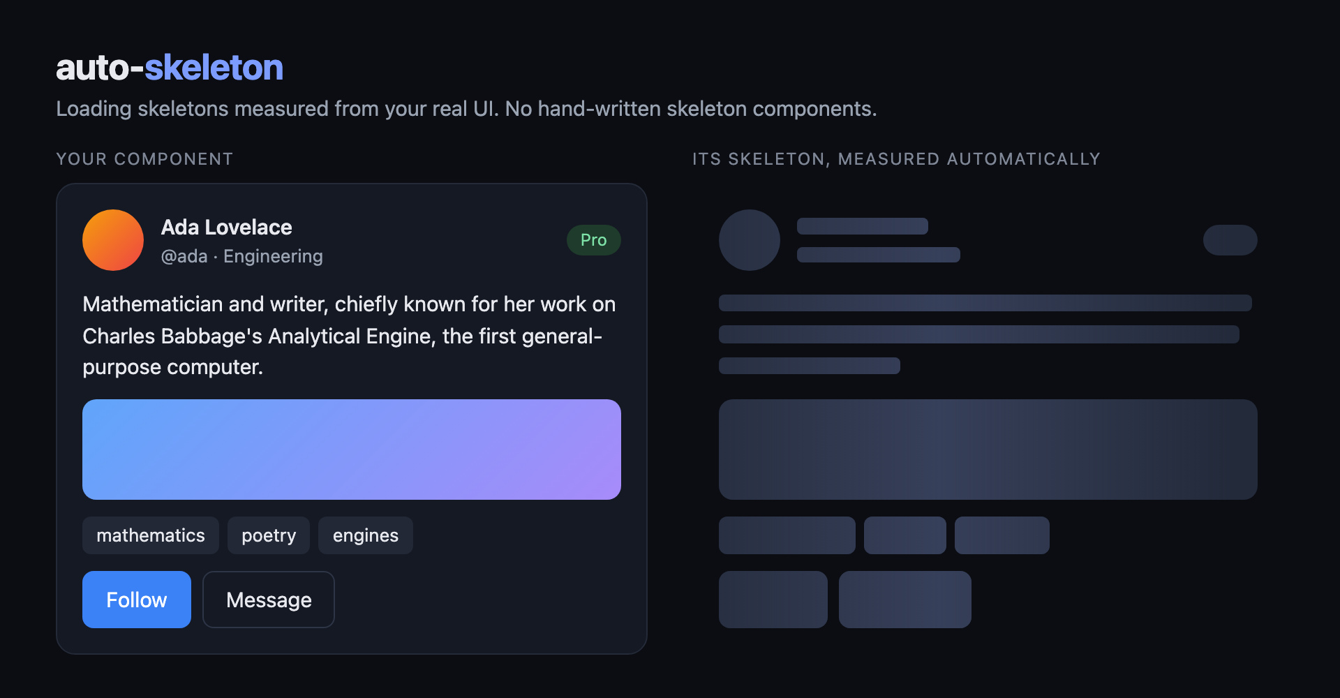
|
|
13
|
+
|
|
14
|
+
```tsx
|
|
15
|
+
import { AutoSkeleton } from '@theengineeringmind/auto-skeleton/react';
|
|
16
|
+
|
|
17
|
+
<AutoSkeleton loading={isLoading}>
|
|
18
|
+
<ProfileCard user={user} />
|
|
19
|
+
</AutoSkeleton>;
|
|
20
|
+
```
|
|
21
|
+
|
|
22
|
+
That is the whole integration. Text lines, avatars, images, buttons, badges and chips are detected from the rendered DOM and turned into shimmer blocks in exactly the right place.
|
|
23
|
+
|
|
24
|
+
## Why auto-skeleton
|
|
25
|
+
|
|
26
|
+
- **Zero skeleton components to write or maintain.** Every other skeleton library makes you compose grey boxes by hand. auto-skeleton measures the real thing.
|
|
27
|
+
- **Never drifts.** Change a font size, padding or layout and the skeleton follows, because it is measured, not drawn.
|
|
28
|
+
- **Server-side rendering and React Server Components.** Ship precomputed layouts and the server renders real blocks with zero layout shift. The React entry is a `'use client'` boundary.
|
|
29
|
+
- **No measurable runtime cost.** One measurement per component per width, cached across mounts. The shimmer is a compositor-only transform. Core is 3 kB brotlied, React entry 4 kB.
|
|
30
|
+
- **Framework agnostic.** A plain DOM core with a React wrapper today. Use the core from Vue, Svelte, Angular, Web Components or plain JavaScript.
|
|
31
|
+
- **Accessible by default.** `role="status"`, `aria-busy`, a screen-reader label, and `prefers-reduced-motion` support.
|
|
32
|
+
- **Enterprise details handled.** App-wide provider, theme props, CSP nonce, error fallback, block cap, correct types for CommonJS and ESM.
|
|
33
|
+
|
|
34
|
+
## Install
|
|
35
|
+
|
|
36
|
+
```bash
|
|
37
|
+
npm install @theengineeringmind/auto-skeleton
|
|
38
|
+
```
|
|
39
|
+
|
|
40
|
+
```bash
|
|
41
|
+
pnpm add @theengineeringmind/auto-skeleton
|
|
42
|
+
```
|
|
43
|
+
|
|
44
|
+
```bash
|
|
45
|
+
yarn add @theengineeringmind/auto-skeleton
|
|
46
|
+
```
|
|
47
|
+
|
|
48
|
+
React 18 or 19 is an optional peer dependency, only needed for `@theengineeringmind/auto-skeleton/react`.
|
|
49
|
+
|
|
50
|
+
## Quick start with React
|
|
51
|
+
|
|
52
|
+
```tsx
|
|
53
|
+
import { AutoSkeleton, AutoSkeletonProvider } from '@theengineeringmind/auto-skeleton/react';
|
|
54
|
+
|
|
55
|
+
// Once, near the root of the app. Every prop is optional.
|
|
56
|
+
export function App() {
|
|
57
|
+
return (
|
|
58
|
+
<AutoSkeletonProvider color="rgba(120, 120, 120, 0.2)" highlight="rgba(120, 120, 120, 0.4)">
|
|
59
|
+
<Routes />
|
|
60
|
+
</AutoSkeletonProvider>
|
|
61
|
+
);
|
|
62
|
+
}
|
|
63
|
+
|
|
64
|
+
// Anywhere below. Works with TanStack Query, SWR, RTK Query, Apollo, fetch, anything with a loading flag.
|
|
65
|
+
function Profile({ userId }) {
|
|
66
|
+
const { data, isLoading } = useQuery({ queryKey: ['user', userId], queryFn: () => fetchUser(userId) });
|
|
67
|
+
return (
|
|
68
|
+
<AutoSkeleton loading={isLoading} cacheKey="profile" placeholder={<ProfileCard user={sampleUser} />}>
|
|
69
|
+
<ProfileCard user={data} />
|
|
70
|
+
</AutoSkeleton>
|
|
71
|
+
);
|
|
72
|
+
}
|
|
73
|
+
```
|
|
74
|
+
|
|
75
|
+
While `loading` is true the component paints the best layout it already knows (a `layout` prop, a provider layout, or a cached one). If none exists for the current width it mounts the measurement source (the `placeholder` if given, otherwise `children`) into a hidden inert layer, measures it once, unmounts it, and stores the result. When `loading` flips to false the real children render and the skeleton fades out on top of them.
|
|
76
|
+
|
|
77
|
+
### With React Suspense
|
|
78
|
+
|
|
79
|
+
```tsx
|
|
80
|
+
<Suspense
|
|
81
|
+
fallback={<AutoSkeleton loading placeholder={<ProfileCard user={sampleUser} />} cacheKey="profile" />}
|
|
82
|
+
>
|
|
83
|
+
<Profile userId={id} />
|
|
84
|
+
</Suspense>
|
|
85
|
+
```
|
|
86
|
+
|
|
87
|
+
### With Next.js App Router
|
|
88
|
+
|
|
89
|
+
`@theengineeringmind/auto-skeleton/react` is a client component boundary, so it can be imported directly from a Server Component. Use it in `loading.tsx` or around any client data fetch:
|
|
90
|
+
|
|
91
|
+
```tsx
|
|
92
|
+
// app/profile/[id]/loading.tsx
|
|
93
|
+
import { AutoSkeleton } from '@theengineeringmind/auto-skeleton/react';
|
|
94
|
+
import { ProfileCard } from '@/components/profile-card';
|
|
95
|
+
import layouts from '@/skeleton-layouts.json';
|
|
96
|
+
|
|
97
|
+
export default function Loading() {
|
|
98
|
+
return <AutoSkeleton loading layout={layouts.profile} />;
|
|
99
|
+
}
|
|
100
|
+
```
|
|
101
|
+
|
|
102
|
+
With a `layout` the server renders the actual blocks, so the skeleton is in the HTML stream and there is no client measurement at all. See [Server rendering](#server-rendering) for how to generate layouts.
|
|
103
|
+
|
|
104
|
+
## Quick start with vanilla JavaScript
|
|
105
|
+
|
|
106
|
+
```ts
|
|
107
|
+
import { createSkeleton, measure, renderSkeleton } from '@theengineeringmind/auto-skeleton';
|
|
108
|
+
|
|
109
|
+
const handle = createSkeleton(document.querySelector('.card'), { color: '#e5e7eb', highlight: '#f3f4f6' });
|
|
110
|
+
container.replaceChildren(handle.element);
|
|
111
|
+
handle.update(); // re-measure after a resize
|
|
112
|
+
handle.destroy();
|
|
113
|
+
|
|
114
|
+
// Or separately. Layouts are plain JSON, so you can precompute and ship them.
|
|
115
|
+
const layout = measure(element);
|
|
116
|
+
const el = renderSkeleton(layout, { animate: false });
|
|
117
|
+
```
|
|
118
|
+
|
|
119
|
+
`measure()` needs a laid-out element attached to the document. It may be hidden with `visibility: hidden` or `clip-path`, but not `display: none`.
|
|
120
|
+
|
|
121
|
+
## How it compares
|
|
122
|
+
|
|
123
|
+
| | auto-skeleton | react-loading-skeleton | react-content-loader | MUI / Chakra Skeleton |
|
|
124
|
+
| ------------------------------------- | -------------------------------------------------------- | --------------------------------------------------- | ------------------------------- | ---------------------------------------------------------- |
|
|
125
|
+
| How the skeleton is defined | Measured from your real component | You place `<Skeleton count={3} />` per line by hand | You draw SVG rectangles by hand | You compose `variant="text"` / `"circular"` blocks by hand |
|
|
126
|
+
| Matches the real layout | Pixel-accurate, including wrapped lines and border radii | Approximate | As accurate as your drawing | Approximate |
|
|
127
|
+
| Stays in sync when the design changes | Yes, automatically | No, edit the skeleton | No, redraw | No, edit the skeleton |
|
|
128
|
+
| Server-rendered blocks | Yes, from precomputed layouts | Yes | Yes | Yes |
|
|
129
|
+
| Framework support | Any (DOM core) + React | React | React, Vue, Svelte, Angular | React |
|
|
130
|
+
| Size (brotli) | 3 kB core, 4 kB React | ~2 kB | ~2 kB | Part of the UI kit |
|
|
131
|
+
|
|
132
|
+
Those libraries are good at what they do. auto-skeleton exists because the hand-composition step is the part that goes stale, and it is the part you no longer do.
|
|
133
|
+
|
|
134
|
+
## Component props
|
|
135
|
+
|
|
136
|
+
| Prop | Type | Default | Description |
|
|
137
|
+
| -------------------- | ---------------------------------- | ---------- | -------------------------------------------------------------------------------------------------------------------------------- |
|
|
138
|
+
| `loading` | `boolean` | required | Show the skeleton instead of `children`. |
|
|
139
|
+
| `placeholder` | `ReactNode` | `children` | What to measure. Pass a version rendered with sample data if `children` cannot render without data. `null` disables measurement. |
|
|
140
|
+
| `layout` | `SkeletonLayout` | | A precomputed layout. Rendered as-is on server and client, never measured. |
|
|
141
|
+
| `cacheKey` | `string` | | Reuse layouts across mounts and loading cycles, and look up provider `layouts`. Keyed by name and container width. |
|
|
142
|
+
| `minHeight` | `number \| string` | `0` | Height before the first measurement and during SSR without a layout. |
|
|
143
|
+
| `as` | `ElementType` | `'div'` | Wrapper element. A `ref` is forwarded to it. |
|
|
144
|
+
| `className`, `style` | | | Applied to the wrapper. |
|
|
145
|
+
| `skeletonClassName` | `string` | | Extra classes on the skeleton container. |
|
|
146
|
+
| `onLayout` | `(layout: SkeletonLayout) => void` | | Called once per distinct layout used. |
|
|
147
|
+
|
|
148
|
+
Every [configuration option](#configuration) below is also accepted as a prop and overrides the provider.
|
|
149
|
+
|
|
150
|
+
## Configuration
|
|
151
|
+
|
|
152
|
+
Set once on `<AutoSkeletonProvider>` or per component. Providers nest and merge.
|
|
153
|
+
|
|
154
|
+
| Option | Type | Default | Description |
|
|
155
|
+
| -------------------- | ----------------------------------------------------- | --------------------------- | --------------------------------------------------------------------------------------------------------------------------------------- |
|
|
156
|
+
| `color` | `string` | `rgba(128, 128, 128, 0.18)` | Block colour. Any CSS colour, so it can be a token like `var(--surface-muted)`. |
|
|
157
|
+
| `highlight` | `string` | `rgba(128, 128, 128, 0.34)` | Shimmer highlight colour. |
|
|
158
|
+
| `duration` | `number \| string` | `1600` | One shimmer sweep, in ms or a CSS time. |
|
|
159
|
+
| `fade` | `number \| string` | `200` | CSS fade-out duration when content arrives. |
|
|
160
|
+
| `fadeDuration` | `number` | `200` | How long the fading skeleton stays mounted, in ms. Keep equal to `fade`. `0` disables the fade. |
|
|
161
|
+
| `animate` | `boolean` | `true` | Shimmer on or off. Reduced-motion users never see it either way. |
|
|
162
|
+
| `label` | `string` | `'Loading'` | Accessible label announced by screen readers. |
|
|
163
|
+
| `injectStyles` | `boolean` | `true` | Inject the default stylesheet. Set `false` and include `autoskeletonCSS` yourself under strict CSP. |
|
|
164
|
+
| `nonce` | `string` | | CSP nonce for the injected `<style>`. |
|
|
165
|
+
| `cache` | `LayoutCache` | shared | Cache instance. Use one per micro-frontend if they must not share. |
|
|
166
|
+
| `layouts` | `Record<string, SkeletonLayout>` | | Precomputed layouts by `cacheKey`. See [Server rendering](#server-rendering). |
|
|
167
|
+
| `onError` | `(error: unknown) => void` | | Measurement threw. The component shows `minHeight` and the app keeps running. |
|
|
168
|
+
| `textScale` | `number` | `0.7` | Vertical scale of each text line box. Produces the thin-bar look. |
|
|
169
|
+
| `minSize` | `number` | `2` | Blocks smaller than this in either dimension are dropped. |
|
|
170
|
+
| `maxBackgroundBlock` | `number` | `64` | Size threshold for treating decorated elements as one block: avatars, icons, badges, chips. Empty decorated elements are always blocks. |
|
|
171
|
+
| `mergeGap` | `number` | `4` | Text fragments on the same line closer than this merge into one bar. |
|
|
172
|
+
| `textRadius` | `string` | `'4px'` | Border radius for text bars. Other blocks copy the source element's radius. |
|
|
173
|
+
| `maxBlocks` | `number` | `400` | Hard cap on blocks. Measurement stops early once reached. |
|
|
174
|
+
| `classify` | `(el) => 'skip' \| 'block' \| 'descend' \| undefined` | | Override the built-in rules per element. |
|
|
175
|
+
|
|
176
|
+
### Controlling what gets measured
|
|
177
|
+
|
|
178
|
+
Add `data-auto-skeleton` to any element:
|
|
179
|
+
|
|
180
|
+
```html
|
|
181
|
+
<div data-auto-skeleton="skip">not part of the skeleton</div>
|
|
182
|
+
<div data-auto-skeleton="block">painted as one rectangle</div>
|
|
183
|
+
<img data-auto-skeleton="descend" />
|
|
184
|
+
```
|
|
185
|
+
|
|
186
|
+
Built-in rules, in order: your `classify` callback, the data attribute, hidden elements are skipped, media and form controls are blocks, decorated elements that are small, text-only and short, or empty are blocks, everything else is descended into and its text is measured line by line.
|
|
187
|
+
|
|
188
|
+
## Server rendering
|
|
189
|
+
|
|
190
|
+
`<AutoSkeleton>` is safe to render on the server in any mode. Three levels, from simplest to best:
|
|
191
|
+
|
|
192
|
+
1. **Nothing extra.** The server renders a status region of `minHeight`; the client measures after hydration. Give `minHeight` a sensible value to avoid layout shift.
|
|
193
|
+
2. **A `layout` prop.** The server renders real blocks. No measurement ever runs on the client.
|
|
194
|
+
3. **Provider `layouts`.** Generate layouts once in CI and pass them to the provider. Every component with a matching `cacheKey` renders real blocks on the server and paints them on the first client frame. If the container width differs at runtime the component re-measures once and caches the result.
|
|
195
|
+
|
|
196
|
+
Generating layouts is a few lines of Playwright against your Storybook or a route that renders the components with sample data:
|
|
197
|
+
|
|
198
|
+
```ts
|
|
199
|
+
import { chromium } from 'playwright';
|
|
200
|
+
|
|
201
|
+
const browser = await chromium.launch();
|
|
202
|
+
const page = await browser.newPage({ viewport: { width: 1280, height: 800 } });
|
|
203
|
+
await page.goto('http://localhost:6006/iframe.html?id=profile-card--default');
|
|
204
|
+
const layouts = await page.evaluate(async () => {
|
|
205
|
+
const { measure } = await import('@theengineeringmind/auto-skeleton');
|
|
206
|
+
return { profile: measure(document.querySelector('.profile-card')) };
|
|
207
|
+
});
|
|
208
|
+
await fs.writeFile('src/skeleton-layouts.json', JSON.stringify(layouts));
|
|
209
|
+
```
|
|
210
|
+
|
|
211
|
+
Layouts are plain JSON: `{ width, height, blocks: [{ x, y, width, height, radius, kind }] }`.
|
|
212
|
+
|
|
213
|
+
## Performance
|
|
214
|
+
|
|
215
|
+
- **Measurement is one read pass.** Each element is classified with one `getComputedStyle` call and text is measured with `Range.getClientRects()`. No writes are interleaved, so there is no layout thrash.
|
|
216
|
+
- **It runs once per component per width.** Results are cached by `cacheKey` and width. A cached or provided layout is painted on the first frame and the measurement source is never mounted.
|
|
217
|
+
- **The source is unmounted after measuring.** While loading, the DOM holds only the skeleton blocks.
|
|
218
|
+
- **The shimmer is a compositor transform.** Each block has one pseudo-element animating `translateX`, offset so all blocks show a single coherent sweep. No style recalculation or layout runs per frame. The container uses `contain: layout style paint`.
|
|
219
|
+
- **Bounded output.** `maxBlocks` stops measurement early, so a giant table produces at most 400 blocks by default.
|
|
220
|
+
- **Resize is debounced** to one measurement per animation frame.
|
|
221
|
+
|
|
222
|
+
## Styling and dark mode
|
|
223
|
+
|
|
224
|
+
Props set CSS custom properties on the container, and the same variables can be set on any ancestor for theming. The defaults are translucent greys that work on light and dark backgrounds without configuration.
|
|
225
|
+
|
|
226
|
+
```css
|
|
227
|
+
:root {
|
|
228
|
+
--auto-skeleton-color: rgba(128, 128, 128, 0.18);
|
|
229
|
+
--auto-skeleton-highlight: rgba(128, 128, 128, 0.34);
|
|
230
|
+
--auto-skeleton-duration: 1.6s;
|
|
231
|
+
--auto-skeleton-fade: 200ms;
|
|
232
|
+
}
|
|
233
|
+
```
|
|
234
|
+
|
|
235
|
+
Blocks carry `.auto-skeleton__block--text`, `--media`, `--control` and `--box` for finer styling. Works alongside Tailwind CSS, shadcn/ui, CSS Modules, styled-components or any other styling approach, since it never touches your component's styles. The default stylesheet is exported as `autoskeletonCSS` if you would rather ship it in your own bundle.
|
|
236
|
+
|
|
237
|
+
## Accessibility
|
|
238
|
+
|
|
239
|
+
The skeleton container has `role="status"`, `aria-busy="true"` and an `aria-label` (default "Loading"), so screen readers announce the loading state once and ignore the individual blocks. The hidden measurement layer is `inert` and `aria-hidden`. The shimmer is disabled under `prefers-reduced-motion: reduce`.
|
|
240
|
+
|
|
241
|
+
## FAQ
|
|
242
|
+
|
|
243
|
+
### How do I add a skeleton loader to a React component?
|
|
244
|
+
|
|
245
|
+
Wrap it: `<AutoSkeleton loading={isLoading}>{children}</AutoSkeleton>`. If the component cannot render without data, pass a `placeholder` rendered with sample data. That is the entire setup.
|
|
246
|
+
|
|
247
|
+
### Does it work with Next.js App Router and React Server Components?
|
|
248
|
+
|
|
249
|
+
Yes. The React entry carries a `'use client'` directive and can be imported from Server Components. For skeletons in the server HTML stream, pass a precomputed `layout` or provider `layouts`.
|
|
250
|
+
|
|
251
|
+
### How is this different from react-loading-skeleton or react-content-loader?
|
|
252
|
+
|
|
253
|
+
Those libraries give you building blocks and you compose the skeleton by hand, then keep it in sync with the real component forever. auto-skeleton measures the real component, so there is nothing to compose and nothing to keep in sync.
|
|
254
|
+
|
|
255
|
+
### Does it cause layout shift (CLS)?
|
|
256
|
+
|
|
257
|
+
Not when a layout is known. A `layout` prop, provider `layouts`, or a cache hit paints the skeleton at the exact final height on the first frame. With client-only measurement, set `minHeight` close to the expected height.
|
|
258
|
+
|
|
259
|
+
### Does it support dark mode?
|
|
260
|
+
|
|
261
|
+
Yes. The default colours are translucent greys that read well on any background. Override with the `color` and `highlight` props or the CSS variables.
|
|
262
|
+
|
|
263
|
+
### Can I use it with Vue, Svelte, Angular or plain HTML?
|
|
264
|
+
|
|
265
|
+
Yes. The core package has no framework dependency: `createSkeleton(element)` returns a DOM element you can insert anywhere. Dedicated Vue and Svelte wrappers are planned.
|
|
266
|
+
|
|
267
|
+
### What browsers are supported?
|
|
268
|
+
|
|
269
|
+
Any browser with `ResizeObserver`, `clip-path` and CSS custom properties: Chrome, Edge, Firefox, Safari 15.4 and later. The core degrades to a static skeleton where `prefers-reduced-motion` is set.
|
|
270
|
+
|
|
271
|
+
### Is it typed?
|
|
272
|
+
|
|
273
|
+
Fully. TypeScript declarations ship for both ESM and CommonJS and pass `arethetypeswrong` on every resolution mode.
|
|
274
|
+
|
|
275
|
+
## Development
|
|
276
|
+
|
|
277
|
+
```bash
|
|
278
|
+
pnpm install
|
|
279
|
+
pnpm exec playwright install chromium
|
|
280
|
+
pnpm check # typecheck, lint, format, unit + browser tests, build, size
|
|
281
|
+
pnpm playground # demo app on http://localhost:5174
|
|
282
|
+
```
|
|
283
|
+
|
|
284
|
+
## License
|
|
285
|
+
|
|
286
|
+
MIT © [Midhun](https://github.com/theengineeringmind)
|
|
@@ -0,0 +1,154 @@
|
|
|
1
|
+
/**
|
|
2
|
+
* The visual role of a skeleton block. Drives the CSS modifier class and
|
|
3
|
+
* lets consumers style text bars differently from media or controls.
|
|
4
|
+
*/
|
|
5
|
+
type BlockKind = 'text' | 'media' | 'control' | 'box';
|
|
6
|
+
/** One shimmer rectangle, positioned relative to the measured root. */
|
|
7
|
+
interface SkeletonBlock {
|
|
8
|
+
x: number;
|
|
9
|
+
y: number;
|
|
10
|
+
width: number;
|
|
11
|
+
height: number;
|
|
12
|
+
/** A CSS `border-radius` value copied from the source element. */
|
|
13
|
+
radius: string;
|
|
14
|
+
kind: BlockKind;
|
|
15
|
+
}
|
|
16
|
+
/** The full result of measuring a subtree. Serializable and cacheable. */
|
|
17
|
+
interface SkeletonLayout {
|
|
18
|
+
width: number;
|
|
19
|
+
height: number;
|
|
20
|
+
blocks: SkeletonBlock[];
|
|
21
|
+
}
|
|
22
|
+
/**
|
|
23
|
+
* How the walker should treat an element.
|
|
24
|
+
* - `skip`: ignore this element and everything inside it.
|
|
25
|
+
* - `block`: paint one rectangle covering the element and do not descend.
|
|
26
|
+
* - `descend`: ignore the element's own box and walk its children.
|
|
27
|
+
*/
|
|
28
|
+
type Classification = 'skip' | 'block' | 'descend';
|
|
29
|
+
interface MeasureOptions {
|
|
30
|
+
/**
|
|
31
|
+
* Vertical scale applied to each text line box, centred on the line.
|
|
32
|
+
* A value below 1 produces the familiar "thin bar" look. Default `0.7`.
|
|
33
|
+
*/
|
|
34
|
+
textScale?: number;
|
|
35
|
+
/** Blocks smaller than this in either dimension (px) are dropped. Default `2`. */
|
|
36
|
+
minSize?: number;
|
|
37
|
+
/**
|
|
38
|
+
* Size threshold (px) for treating a decorated element (visible background
|
|
39
|
+
* or border) as one block instead of a container. Elements at most this
|
|
40
|
+
* size in both dimensions are blocks (avatars, icons); text-only elements
|
|
41
|
+
* at most this tall and four times this wide are blocks (badges, chips,
|
|
42
|
+
* pills); empty decorated elements are blocks at any size (CSS images,
|
|
43
|
+
* dividers). Everything else is descended into. Default `64`.
|
|
44
|
+
*/
|
|
45
|
+
maxBackgroundBlock?: number;
|
|
46
|
+
/**
|
|
47
|
+
* Adjacent text fragments on the same line closer than this (px) are
|
|
48
|
+
* merged into one bar. Default `4`.
|
|
49
|
+
*/
|
|
50
|
+
mergeGap?: number;
|
|
51
|
+
/** Border radius applied to text bars. Default `'4px'`. */
|
|
52
|
+
textRadius?: string;
|
|
53
|
+
/**
|
|
54
|
+
* Hard cap on the number of blocks produced. Measurement stops early once
|
|
55
|
+
* it is reached, so a runaway tree (a 10,000 row table) cannot stall the
|
|
56
|
+
* main thread or flood the DOM. Default `400`.
|
|
57
|
+
*/
|
|
58
|
+
maxBlocks?: number;
|
|
59
|
+
/**
|
|
60
|
+
* Override classification per element. Return `undefined` to fall back to
|
|
61
|
+
* the built-in rules and `data-auto-skeleton` attributes.
|
|
62
|
+
*/
|
|
63
|
+
classify?: (element: Element) => Classification | undefined;
|
|
64
|
+
}
|
|
65
|
+
/** Visual configuration. Every value maps to a CSS custom property on the container. */
|
|
66
|
+
interface SkeletonTheme {
|
|
67
|
+
/** Block colour. Any CSS colour. Default `rgba(128, 128, 128, 0.18)`. */
|
|
68
|
+
color?: string;
|
|
69
|
+
/** Shimmer highlight colour. Default `rgba(128, 128, 128, 0.34)`. */
|
|
70
|
+
highlight?: string;
|
|
71
|
+
/** Duration of one shimmer sweep, in ms or any CSS time. Default `1600`. */
|
|
72
|
+
duration?: number | string;
|
|
73
|
+
/** Fade-out duration when content arrives, in ms or any CSS time. Default `200`. */
|
|
74
|
+
fade?: number | string;
|
|
75
|
+
}
|
|
76
|
+
interface RenderOptions extends SkeletonTheme {
|
|
77
|
+
/** Run the shimmer animation. Default `true`. Reduced-motion users never see it. */
|
|
78
|
+
animate?: boolean;
|
|
79
|
+
/** Extra class names for the container. */
|
|
80
|
+
className?: string;
|
|
81
|
+
/** Accessible label announced by screen readers. Default `'Loading'`. */
|
|
82
|
+
label?: string;
|
|
83
|
+
/** Document to create elements in. Defaults to the global `document`. */
|
|
84
|
+
document?: Document;
|
|
85
|
+
/** Inject the default stylesheet into the document. Default `true`. */
|
|
86
|
+
injectStyles?: boolean;
|
|
87
|
+
/** CSP nonce applied to the injected `<style>` tag. */
|
|
88
|
+
nonce?: string;
|
|
89
|
+
}
|
|
90
|
+
type ResolvedMeasureOptions = Required<Omit<MeasureOptions, 'classify'>> & Pick<MeasureOptions, 'classify'>;
|
|
91
|
+
|
|
92
|
+
declare const DEFAULT_MEASURE_OPTIONS: ResolvedMeasureOptions;
|
|
93
|
+
declare function resolveMeasureOptions(options?: MeasureOptions): ResolvedMeasureOptions;
|
|
94
|
+
/**
|
|
95
|
+
* Measure a rendered DOM subtree and describe it as a list of skeleton blocks.
|
|
96
|
+
*
|
|
97
|
+
* The root must be attached to a document and laid out (it may be
|
|
98
|
+
* `visibility: hidden`, but not `display: none`). Coordinates in the result
|
|
99
|
+
* are relative to the root's border box.
|
|
100
|
+
*/
|
|
101
|
+
declare function measure(root: Element, options?: MeasureOptions): SkeletonLayout;
|
|
102
|
+
|
|
103
|
+
declare const STYLE_ID = "auto-skeleton-styles";
|
|
104
|
+
/**
|
|
105
|
+
* The default stylesheet. Exported so apps with a strict CSP can ship it in
|
|
106
|
+
* their own CSS and pass `injectStyles: false`.
|
|
107
|
+
*
|
|
108
|
+
* Customise with CSS variables on any ancestor, or per instance through
|
|
109
|
+
* the `color`, `highlight`, `duration` and `fade` options:
|
|
110
|
+
* - `--auto-skeleton-color` base block colour
|
|
111
|
+
* - `--auto-skeleton-highlight` shimmer highlight colour
|
|
112
|
+
* - `--auto-skeleton-duration` one shimmer sweep
|
|
113
|
+
* - `--auto-skeleton-fade` fade-out duration when content arrives
|
|
114
|
+
*
|
|
115
|
+
* The shimmer is a single `transform` animation per block pseudo-element,
|
|
116
|
+
* offset so every block shows the same sweep. Transforms run on the
|
|
117
|
+
* compositor, so an animating skeleton causes no style or layout work on
|
|
118
|
+
* the main thread.
|
|
119
|
+
*/
|
|
120
|
+
declare const autoskeletonCSS: string;
|
|
121
|
+
/**
|
|
122
|
+
* Insert the stylesheet into `doc` once. Safe to call repeatedly and from
|
|
123
|
+
* multiple bundles: the tag is looked up by id. Returns the style element.
|
|
124
|
+
*/
|
|
125
|
+
declare function ensureStyles(doc?: Document, nonce?: string): HTMLStyleElement;
|
|
126
|
+
|
|
127
|
+
/**
|
|
128
|
+
* A small LRU cache for layouts. Keyed by whatever the caller chooses;
|
|
129
|
+
* `layoutCacheKey` builds a key from a name and a container width, which is
|
|
130
|
+
* what determines a layout in practice.
|
|
131
|
+
*/
|
|
132
|
+
declare class LayoutCache {
|
|
133
|
+
private readonly max;
|
|
134
|
+
private readonly map;
|
|
135
|
+
constructor(max?: number);
|
|
136
|
+
get size(): number;
|
|
137
|
+
has(key: string): boolean;
|
|
138
|
+
get(key: string): SkeletonLayout | undefined;
|
|
139
|
+
set(key: string, layout: SkeletonLayout): void;
|
|
140
|
+
/**
|
|
141
|
+
* The most recently stored layout whose key was built with
|
|
142
|
+
* `layoutCacheKey(name, …)`, regardless of width. Lets a wrapper paint
|
|
143
|
+
* something plausible on the very first frame and only re-measure when
|
|
144
|
+
* the width turns out to differ.
|
|
145
|
+
*/
|
|
146
|
+
latest(name: string): SkeletonLayout | undefined;
|
|
147
|
+
delete(key: string): boolean;
|
|
148
|
+
clear(): void;
|
|
149
|
+
}
|
|
150
|
+
declare function layoutCacheKey(name: string, width: number): string;
|
|
151
|
+
/** Shared default cache used by framework wrappers when no cache is supplied. */
|
|
152
|
+
declare const defaultLayoutCache: LayoutCache;
|
|
153
|
+
|
|
154
|
+
export { type BlockKind as B, type Classification as C, DEFAULT_MEASURE_OPTIONS as D, LayoutCache as L, type MeasureOptions as M, type RenderOptions as R, type SkeletonBlock as S, type SkeletonLayout as a, type SkeletonTheme as b, type ResolvedMeasureOptions as c, STYLE_ID as d, autoskeletonCSS as e, defaultLayoutCache as f, ensureStyles as g, layoutCacheKey as l, measure as m, resolveMeasureOptions as r };
|
|
@@ -0,0 +1,154 @@
|
|
|
1
|
+
/**
|
|
2
|
+
* The visual role of a skeleton block. Drives the CSS modifier class and
|
|
3
|
+
* lets consumers style text bars differently from media or controls.
|
|
4
|
+
*/
|
|
5
|
+
type BlockKind = 'text' | 'media' | 'control' | 'box';
|
|
6
|
+
/** One shimmer rectangle, positioned relative to the measured root. */
|
|
7
|
+
interface SkeletonBlock {
|
|
8
|
+
x: number;
|
|
9
|
+
y: number;
|
|
10
|
+
width: number;
|
|
11
|
+
height: number;
|
|
12
|
+
/** A CSS `border-radius` value copied from the source element. */
|
|
13
|
+
radius: string;
|
|
14
|
+
kind: BlockKind;
|
|
15
|
+
}
|
|
16
|
+
/** The full result of measuring a subtree. Serializable and cacheable. */
|
|
17
|
+
interface SkeletonLayout {
|
|
18
|
+
width: number;
|
|
19
|
+
height: number;
|
|
20
|
+
blocks: SkeletonBlock[];
|
|
21
|
+
}
|
|
22
|
+
/**
|
|
23
|
+
* How the walker should treat an element.
|
|
24
|
+
* - `skip`: ignore this element and everything inside it.
|
|
25
|
+
* - `block`: paint one rectangle covering the element and do not descend.
|
|
26
|
+
* - `descend`: ignore the element's own box and walk its children.
|
|
27
|
+
*/
|
|
28
|
+
type Classification = 'skip' | 'block' | 'descend';
|
|
29
|
+
interface MeasureOptions {
|
|
30
|
+
/**
|
|
31
|
+
* Vertical scale applied to each text line box, centred on the line.
|
|
32
|
+
* A value below 1 produces the familiar "thin bar" look. Default `0.7`.
|
|
33
|
+
*/
|
|
34
|
+
textScale?: number;
|
|
35
|
+
/** Blocks smaller than this in either dimension (px) are dropped. Default `2`. */
|
|
36
|
+
minSize?: number;
|
|
37
|
+
/**
|
|
38
|
+
* Size threshold (px) for treating a decorated element (visible background
|
|
39
|
+
* or border) as one block instead of a container. Elements at most this
|
|
40
|
+
* size in both dimensions are blocks (avatars, icons); text-only elements
|
|
41
|
+
* at most this tall and four times this wide are blocks (badges, chips,
|
|
42
|
+
* pills); empty decorated elements are blocks at any size (CSS images,
|
|
43
|
+
* dividers). Everything else is descended into. Default `64`.
|
|
44
|
+
*/
|
|
45
|
+
maxBackgroundBlock?: number;
|
|
46
|
+
/**
|
|
47
|
+
* Adjacent text fragments on the same line closer than this (px) are
|
|
48
|
+
* merged into one bar. Default `4`.
|
|
49
|
+
*/
|
|
50
|
+
mergeGap?: number;
|
|
51
|
+
/** Border radius applied to text bars. Default `'4px'`. */
|
|
52
|
+
textRadius?: string;
|
|
53
|
+
/**
|
|
54
|
+
* Hard cap on the number of blocks produced. Measurement stops early once
|
|
55
|
+
* it is reached, so a runaway tree (a 10,000 row table) cannot stall the
|
|
56
|
+
* main thread or flood the DOM. Default `400`.
|
|
57
|
+
*/
|
|
58
|
+
maxBlocks?: number;
|
|
59
|
+
/**
|
|
60
|
+
* Override classification per element. Return `undefined` to fall back to
|
|
61
|
+
* the built-in rules and `data-auto-skeleton` attributes.
|
|
62
|
+
*/
|
|
63
|
+
classify?: (element: Element) => Classification | undefined;
|
|
64
|
+
}
|
|
65
|
+
/** Visual configuration. Every value maps to a CSS custom property on the container. */
|
|
66
|
+
interface SkeletonTheme {
|
|
67
|
+
/** Block colour. Any CSS colour. Default `rgba(128, 128, 128, 0.18)`. */
|
|
68
|
+
color?: string;
|
|
69
|
+
/** Shimmer highlight colour. Default `rgba(128, 128, 128, 0.34)`. */
|
|
70
|
+
highlight?: string;
|
|
71
|
+
/** Duration of one shimmer sweep, in ms or any CSS time. Default `1600`. */
|
|
72
|
+
duration?: number | string;
|
|
73
|
+
/** Fade-out duration when content arrives, in ms or any CSS time. Default `200`. */
|
|
74
|
+
fade?: number | string;
|
|
75
|
+
}
|
|
76
|
+
interface RenderOptions extends SkeletonTheme {
|
|
77
|
+
/** Run the shimmer animation. Default `true`. Reduced-motion users never see it. */
|
|
78
|
+
animate?: boolean;
|
|
79
|
+
/** Extra class names for the container. */
|
|
80
|
+
className?: string;
|
|
81
|
+
/** Accessible label announced by screen readers. Default `'Loading'`. */
|
|
82
|
+
label?: string;
|
|
83
|
+
/** Document to create elements in. Defaults to the global `document`. */
|
|
84
|
+
document?: Document;
|
|
85
|
+
/** Inject the default stylesheet into the document. Default `true`. */
|
|
86
|
+
injectStyles?: boolean;
|
|
87
|
+
/** CSP nonce applied to the injected `<style>` tag. */
|
|
88
|
+
nonce?: string;
|
|
89
|
+
}
|
|
90
|
+
type ResolvedMeasureOptions = Required<Omit<MeasureOptions, 'classify'>> & Pick<MeasureOptions, 'classify'>;
|
|
91
|
+
|
|
92
|
+
declare const DEFAULT_MEASURE_OPTIONS: ResolvedMeasureOptions;
|
|
93
|
+
declare function resolveMeasureOptions(options?: MeasureOptions): ResolvedMeasureOptions;
|
|
94
|
+
/**
|
|
95
|
+
* Measure a rendered DOM subtree and describe it as a list of skeleton blocks.
|
|
96
|
+
*
|
|
97
|
+
* The root must be attached to a document and laid out (it may be
|
|
98
|
+
* `visibility: hidden`, but not `display: none`). Coordinates in the result
|
|
99
|
+
* are relative to the root's border box.
|
|
100
|
+
*/
|
|
101
|
+
declare function measure(root: Element, options?: MeasureOptions): SkeletonLayout;
|
|
102
|
+
|
|
103
|
+
declare const STYLE_ID = "auto-skeleton-styles";
|
|
104
|
+
/**
|
|
105
|
+
* The default stylesheet. Exported so apps with a strict CSP can ship it in
|
|
106
|
+
* their own CSS and pass `injectStyles: false`.
|
|
107
|
+
*
|
|
108
|
+
* Customise with CSS variables on any ancestor, or per instance through
|
|
109
|
+
* the `color`, `highlight`, `duration` and `fade` options:
|
|
110
|
+
* - `--auto-skeleton-color` base block colour
|
|
111
|
+
* - `--auto-skeleton-highlight` shimmer highlight colour
|
|
112
|
+
* - `--auto-skeleton-duration` one shimmer sweep
|
|
113
|
+
* - `--auto-skeleton-fade` fade-out duration when content arrives
|
|
114
|
+
*
|
|
115
|
+
* The shimmer is a single `transform` animation per block pseudo-element,
|
|
116
|
+
* offset so every block shows the same sweep. Transforms run on the
|
|
117
|
+
* compositor, so an animating skeleton causes no style or layout work on
|
|
118
|
+
* the main thread.
|
|
119
|
+
*/
|
|
120
|
+
declare const autoskeletonCSS: string;
|
|
121
|
+
/**
|
|
122
|
+
* Insert the stylesheet into `doc` once. Safe to call repeatedly and from
|
|
123
|
+
* multiple bundles: the tag is looked up by id. Returns the style element.
|
|
124
|
+
*/
|
|
125
|
+
declare function ensureStyles(doc?: Document, nonce?: string): HTMLStyleElement;
|
|
126
|
+
|
|
127
|
+
/**
|
|
128
|
+
* A small LRU cache for layouts. Keyed by whatever the caller chooses;
|
|
129
|
+
* `layoutCacheKey` builds a key from a name and a container width, which is
|
|
130
|
+
* what determines a layout in practice.
|
|
131
|
+
*/
|
|
132
|
+
declare class LayoutCache {
|
|
133
|
+
private readonly max;
|
|
134
|
+
private readonly map;
|
|
135
|
+
constructor(max?: number);
|
|
136
|
+
get size(): number;
|
|
137
|
+
has(key: string): boolean;
|
|
138
|
+
get(key: string): SkeletonLayout | undefined;
|
|
139
|
+
set(key: string, layout: SkeletonLayout): void;
|
|
140
|
+
/**
|
|
141
|
+
* The most recently stored layout whose key was built with
|
|
142
|
+
* `layoutCacheKey(name, …)`, regardless of width. Lets a wrapper paint
|
|
143
|
+
* something plausible on the very first frame and only re-measure when
|
|
144
|
+
* the width turns out to differ.
|
|
145
|
+
*/
|
|
146
|
+
latest(name: string): SkeletonLayout | undefined;
|
|
147
|
+
delete(key: string): boolean;
|
|
148
|
+
clear(): void;
|
|
149
|
+
}
|
|
150
|
+
declare function layoutCacheKey(name: string, width: number): string;
|
|
151
|
+
/** Shared default cache used by framework wrappers when no cache is supplied. */
|
|
152
|
+
declare const defaultLayoutCache: LayoutCache;
|
|
153
|
+
|
|
154
|
+
export { type BlockKind as B, type Classification as C, DEFAULT_MEASURE_OPTIONS as D, LayoutCache as L, type MeasureOptions as M, type RenderOptions as R, type SkeletonBlock as S, type SkeletonLayout as a, type SkeletonTheme as b, type ResolvedMeasureOptions as c, STYLE_ID as d, autoskeletonCSS as e, defaultLayoutCache as f, ensureStyles as g, layoutCacheKey as l, measure as m, resolveMeasureOptions as r };
|