@storybook/react-native 6.5.4-alpha.0 → 6.5.4
This diff represents the content of publicly available package versions that have been released to one of the supported registries. The information contained in this diff is provided for informational purposes only and reflects changes between package versions as they appear in their respective public registries.
- package/dist/preview/start.js +1 -1
- package/package.json +2 -2
- package/readme.md +97 -55
package/dist/preview/start.js
CHANGED
package/package.json
CHANGED
|
@@ -1,6 +1,6 @@
|
|
|
1
1
|
{
|
|
2
2
|
"name": "@storybook/react-native",
|
|
3
|
-
"version": "6.5.4
|
|
3
|
+
"version": "6.5.4",
|
|
4
4
|
"description": "A better way to develop React Native Components for your app",
|
|
5
5
|
"keywords": [
|
|
6
6
|
"react",
|
|
@@ -88,5 +88,5 @@
|
|
|
88
88
|
"publishConfig": {
|
|
89
89
|
"access": "public"
|
|
90
90
|
},
|
|
91
|
-
"gitHead": "
|
|
91
|
+
"gitHead": "e0c6fd72976b228d0f97aceb69967cd707fad8ff"
|
|
92
92
|
}
|
package/readme.md
CHANGED
|
@@ -2,19 +2,19 @@
|
|
|
2
2
|
|
|
3
3
|
With Storybook for React Native you can design and develop individual React Native components without running your app.
|
|
4
4
|
|
|
5
|
-
This readme is for the 6.5 version [find the 5.3 readme here](https://github.com/storybookjs/react-native/tree/v5.3.25#readme)
|
|
5
|
+
This readme is for the 6.5 version, [find the 5.3 readme here](https://github.com/storybookjs/react-native/tree/v5.3.25#readme)
|
|
6
6
|
|
|
7
7
|
For more information about storybook visit: [storybook.js.org](https://storybook.js.org)
|
|
8
8
|
|
|
9
9
|
> NOTE: `@storybook/react-native` requires atleast 6.5.14, please set other storybook packages (like @storybook/addons) to `^6.5.14` or newer
|
|
10
10
|
|
|
11
|
-
If you want to help out or are just curious then check out the [project board](https://github.com/orgs/storybookjs/projects/12)
|
|
11
|
+
If you want to help out or are just curious then check out the [project board](https://github.com/orgs/storybookjs/projects/12) to see the open issues related to v6+.
|
|
12
12
|
|
|
13
13
|
|
|
14
14
|
|
|
15
|
-
|
|
15
|
+
_Pictured is from the template mentioned in [getting started](#getting-started)_
|
|
16
16
|
|
|
17
|
-
|
|
17
|
+
## Table of contents
|
|
18
18
|
|
|
19
19
|
- 🚀 [Getting Started](#getting-started)
|
|
20
20
|
- 📒 [Writing stories](#writing-stories)
|
|
@@ -24,11 +24,11 @@ Pictured is from the template mentioned in [getting started](#getting-started)
|
|
|
24
24
|
- 🤝 [Contributing](#contributing)
|
|
25
25
|
- ✨ [Examples](#examples)
|
|
26
26
|
|
|
27
|
-
|
|
27
|
+
## Getting Started
|
|
28
28
|
|
|
29
|
-
|
|
29
|
+
### New project
|
|
30
30
|
|
|
31
|
-
There is some project boilerplate with
|
|
31
|
+
There is some project boilerplate with `@storybook/react-native` and `@storybook/addons-react-native-web` both already configured with a simple example.
|
|
32
32
|
|
|
33
33
|
For expo you can use this [template](https://github.com/dannyhw/expo-template-storybook) with the following command
|
|
34
34
|
|
|
@@ -49,61 +49,96 @@ For react native cli you can use this [template](https://github.com/dannyhw/reac
|
|
|
49
49
|
npx react-native init MyApp --template react-native-template-storybook
|
|
50
50
|
```
|
|
51
51
|
|
|
52
|
-
|
|
52
|
+
### Existing project
|
|
53
53
|
|
|
54
|
-
Run init to setup your project with all the dependencies and configuration files:
|
|
55
|
-
|
|
56
|
-
`npx sb@next init --type react_native`
|
|
54
|
+
Run init to setup your project with all the dependencies and configuration files:
|
|
57
55
|
|
|
56
|
+
```sh
|
|
57
|
+
npx sb init --type react_native
|
|
58
|
+
```
|
|
58
59
|
|
|
59
60
|
The only thing left to do is return Storybook's UI in your app entry point (such as `App.js`) like this:
|
|
60
61
|
|
|
61
62
|
```jsx
|
|
62
|
-
export {default} from './.storybook'
|
|
63
|
+
export { default } from './.storybook';
|
|
63
64
|
```
|
|
64
65
|
|
|
65
66
|
If you want to be able to swap easily between storybook and your app, have a look at this [blog post](https://dev.to/dannyhw/how-to-swap-between-react-native-storybook-and-your-app-p3o)
|
|
66
67
|
|
|
67
|
-
If you want to add everything yourself check out the the manual guide [here](MANUAL_SETUP.md).
|
|
68
|
+
If you want to add everything yourself check out the the manual guide [here](https://github.com/storybookjs/react-native/blob/next/MANUAL_SETUP.md).
|
|
69
|
+
|
|
70
|
+
### Additional steps: Update your metro config
|
|
71
|
+
|
|
72
|
+
We use the sbmodern resolver field in order to resolve the modern version of storybook packages. Doing this removes the polyfills that ship in commonjs modules and fixes multiple long standing issues such as the promises never resolving bug and more (caused by corejs promises polyfill).
|
|
73
|
+
|
|
74
|
+
**Expo**
|
|
75
|
+
|
|
76
|
+
First create metro config file if you don't have it yet.
|
|
77
|
+
|
|
78
|
+
```sh
|
|
79
|
+
npx expo customize metro.config.js
|
|
80
|
+
```
|
|
81
|
+
|
|
82
|
+
Then add sbmodern to the start of the `resolver.resolverMainFields` list.
|
|
83
|
+
|
|
84
|
+
```diff
|
|
85
|
+
// metro.config.js
|
|
86
|
+
|
|
87
|
+
const { getDefaultConfig } = require('expo/metro-config');
|
|
88
|
+
|
|
89
|
+
--module.exports = getDefaultConfig(__dirname);
|
|
90
|
+
++const defaultConfig = getDefaultConfig(__dirname);
|
|
91
|
+
|
|
92
|
+
++defaultConfig.resolver.resolverMainFields.unshift('sbmodern');
|
|
93
|
+
|
|
94
|
+
++module.exports = defaultConfig;
|
|
95
|
+
```
|
|
96
|
+
|
|
97
|
+
**React native**
|
|
68
98
|
|
|
99
|
+
```js
|
|
100
|
+
module.exports = {
|
|
101
|
+
/* existing config */
|
|
102
|
+
resolver: {
|
|
103
|
+
resolverMainFields: ['sbmodern', 'react-native', 'browser', 'main'],
|
|
104
|
+
},
|
|
105
|
+
};
|
|
106
|
+
```
|
|
69
107
|
|
|
70
|
-
|
|
108
|
+
## Writing stories
|
|
71
109
|
|
|
72
110
|
In v6 you can use the CSF syntax that looks like this:
|
|
73
111
|
|
|
74
112
|
```jsx
|
|
75
|
-
import {MyButton} from './Button';
|
|
113
|
+
import { MyButton } from './Button';
|
|
76
114
|
|
|
77
115
|
export default {
|
|
78
116
|
title: 'components/MyButton',
|
|
79
117
|
component: MyButton,
|
|
80
118
|
};
|
|
81
119
|
|
|
82
|
-
export const Basic = args =>
|
|
83
|
-
<MyButton {...args} />
|
|
84
|
-
);
|
|
120
|
+
export const Basic = (args) => <MyButton {...args} />;
|
|
85
121
|
|
|
86
122
|
Basic.args = {
|
|
87
123
|
text: 'Hello World',
|
|
88
124
|
color: 'purple',
|
|
89
125
|
};
|
|
90
|
-
|
|
91
126
|
```
|
|
92
127
|
|
|
93
|
-
You should configure the path to your story files in the main.js config file from the
|
|
128
|
+
You should configure the path to your story files in the `main.js` config file from the `.storybook` folder.
|
|
94
129
|
|
|
95
130
|
```js
|
|
131
|
+
// .storybook/main.js
|
|
132
|
+
|
|
96
133
|
module.exports = {
|
|
97
|
-
stories: [
|
|
98
|
-
|
|
99
|
-
|
|
100
|
-
addons: []
|
|
101
|
-
}
|
|
134
|
+
stories: ['../components/**/*.stories.?(ts|tsx|js|jsx)'],
|
|
135
|
+
addons: [],
|
|
136
|
+
};
|
|
102
137
|
```
|
|
103
138
|
|
|
104
|
-
|
|
139
|
+
### Decorators and Parameters
|
|
105
140
|
|
|
106
|
-
For stories you can add decorators and parameters on the default export or on a specifc story
|
|
141
|
+
For stories you can add decorators and parameters on the default export or on a specifc story.
|
|
107
142
|
|
|
108
143
|
```jsx
|
|
109
144
|
export default {
|
|
@@ -111,7 +146,7 @@ export default {
|
|
|
111
146
|
component: Button,
|
|
112
147
|
decorators: [
|
|
113
148
|
(Story) => (
|
|
114
|
-
<View style={{ alignItems:
|
|
149
|
+
<View style={{ alignItems: 'center', justifyContent: 'center', flex: 1 }}>
|
|
115
150
|
<Story />
|
|
116
151
|
</View>
|
|
117
152
|
),
|
|
@@ -128,39 +163,49 @@ export default {
|
|
|
128
163
|
};
|
|
129
164
|
```
|
|
130
165
|
|
|
131
|
-
For global decorators and parameters you can add them to preview.js inside your
|
|
166
|
+
For global decorators and parameters, you can add them to `preview.js` inside your `.storybook` folder.
|
|
132
167
|
|
|
133
168
|
```jsx
|
|
134
|
-
|
|
135
|
-
|
|
169
|
+
// .storybook/preview.js
|
|
170
|
+
|
|
171
|
+
import { withBackgrounds } from '@storybook/addon-ondevice-backgrounds';
|
|
172
|
+
export const decorators = [
|
|
173
|
+
withBackgrounds,
|
|
174
|
+
(Story) => (
|
|
175
|
+
<View style={{ flex: 1, color: 'blue' }}>
|
|
176
|
+
<Story />
|
|
177
|
+
</View>
|
|
178
|
+
),
|
|
179
|
+
];
|
|
136
180
|
export const parameters = {
|
|
137
181
|
backgrounds: {
|
|
138
182
|
default: 'plain',
|
|
139
183
|
values: [
|
|
140
|
-
{name: 'plain', value: 'white'},
|
|
141
|
-
{name: 'warm', value: 'hotpink'},
|
|
142
|
-
{name: 'cool', value: 'deepskyblue'},
|
|
143
|
-
]
|
|
184
|
+
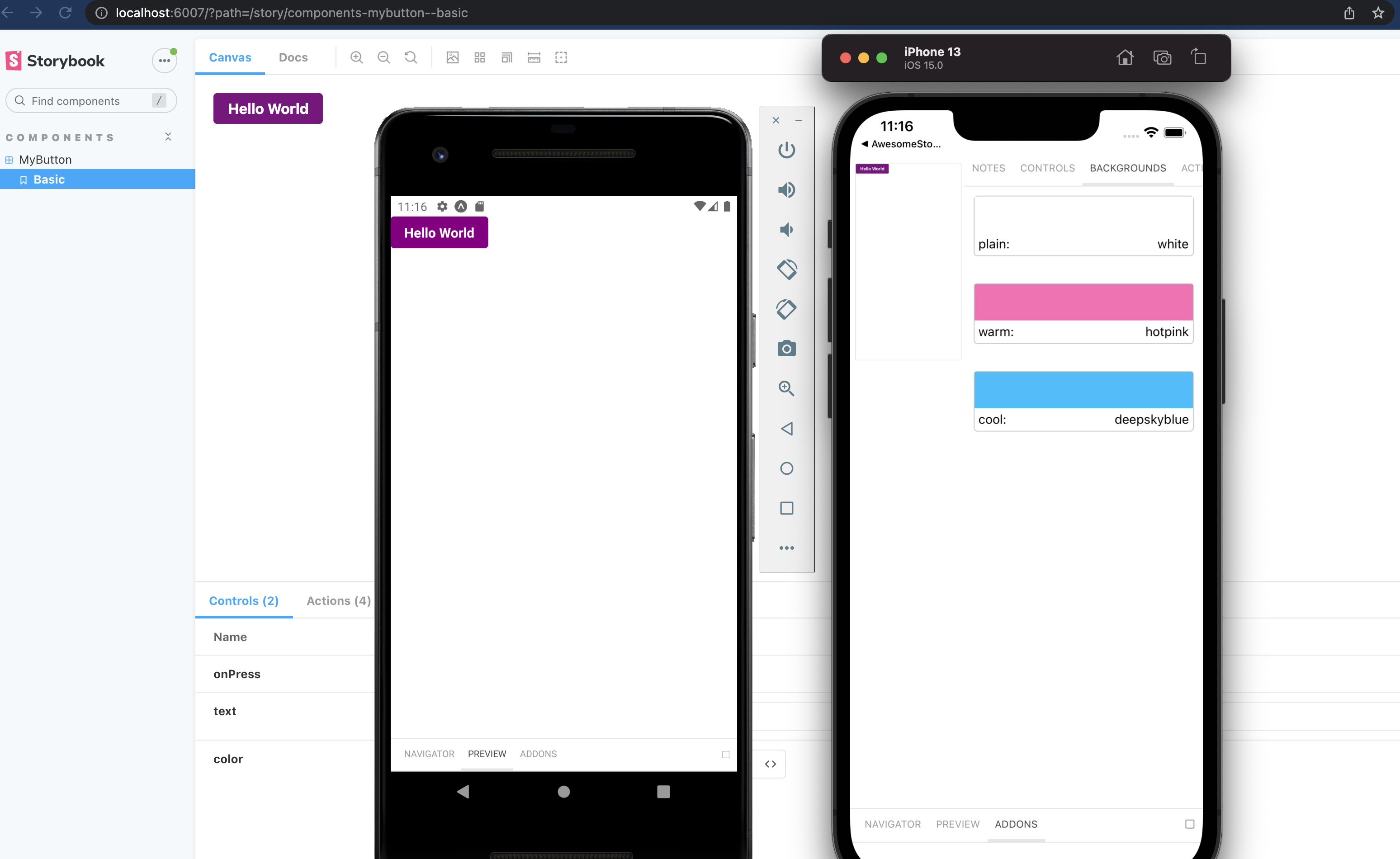
{ name: 'plain', value: 'white' },
|
|
185
|
+
{ name: 'warm', value: 'hotpink' },
|
|
186
|
+
{ name: 'cool', value: 'deepskyblue' },
|
|
187
|
+
],
|
|
144
188
|
},
|
|
145
189
|
};
|
|
146
|
-
|
|
147
190
|
```
|
|
148
191
|
|
|
149
|
-
|
|
192
|
+
## Addons
|
|
150
193
|
|
|
151
194
|
The cli will install some basic addons for you such as controls and actions.
|
|
152
195
|
Ondevice addons are addons that can render with the device ui that you see on the phone.
|
|
153
196
|
|
|
154
197
|
Currently the addons available are:
|
|
155
198
|
|
|
156
|
-
-
|
|
157
|
-
-
|
|
158
|
-
-
|
|
159
|
-
-
|
|
199
|
+
- [`@storybook/addon-ondevice-controls`](https://storybook.js.org/addons/@storybook/addon-ondevice-controls): adjust your components props in realtime
|
|
200
|
+
- [`@storybook/addon-ondevice-actions`](https://storybook.js.org/addons/@storybook/addon-ondevice-actions): mock onPress calls with actions that will log information in the actions tab
|
|
201
|
+
- [`@storybook/addon-ondevice-notes`](https://storybook.js.org/addons/@storybook/addon-ondevice-notes): Add some markdown to your stories to help document their usage
|
|
202
|
+
- [`@storybook/addon-ondevice-backgrounds`](https://storybook.js.org/addons/@storybook/addon-ondevice-backgrounds): change the background of storybook to compare the look of your component against different backgrounds
|
|
160
203
|
|
|
161
|
-
Install each one you want to use and add them to the main.js addons list as follows:
|
|
204
|
+
Install each one you want to use and add them to the `main.js` addons list as follows:
|
|
162
205
|
|
|
163
206
|
```js
|
|
207
|
+
// .storybook/main.js
|
|
208
|
+
|
|
164
209
|
addons: [
|
|
165
210
|
'@storybook/addon-ondevice-notes',
|
|
166
211
|
'@storybook/addon-ondevice-controls',
|
|
@@ -169,17 +214,16 @@ addons: [
|
|
|
169
214
|
],
|
|
170
215
|
```
|
|
171
216
|
|
|
172
|
-
|
|
173
217
|
### Using the addons in your story
|
|
174
218
|
|
|
175
219
|
For details of each ondevice addon you can see the readme:
|
|
176
220
|
|
|
177
|
-
- [actions](
|
|
178
|
-
- [backgrounds](
|
|
179
|
-
- [controls](
|
|
180
|
-
- [notes](
|
|
221
|
+
- [actions](https://github.com/storybookjs/react-native/tree/next/packages/ondevice-actions#readme)
|
|
222
|
+
- [backgrounds](https://github.com/storybookjs/react-native/tree/next/packages/ondevice-backgrounds#readme)
|
|
223
|
+
- [controls](https://github.com/storybookjs/react-native/tree/next/packages/ondevice-controls#readme)
|
|
224
|
+
- [notes](https://github.com/storybookjs/react-native/tree/next/packages/ondevice-notes#readme)
|
|
181
225
|
|
|
182
|
-
|
|
226
|
+
## Hide/Show storybook
|
|
183
227
|
|
|
184
228
|
Storybook on react native is a normal React Native component that can be used or hidden anywhere in your RN application based on your own logic.
|
|
185
229
|
|
|
@@ -189,17 +233,14 @@ Some have opted to toggle the storybook component by using a custom option in th
|
|
|
189
233
|
- [Heres an approach for react native cli](https://dev.to/dannyhw/multiple-entry-points-for-react-native-storybook-4dkp)
|
|
190
234
|
- [Heres an article about how you can do it in expo](https://dev.to/dannyhw/how-to-swap-between-react-native-storybook-and-your-app-p3o)
|
|
191
235
|
|
|
192
|
-
|
|
193
|
-
|
|
194
|
-
# getStorybookUI options
|
|
195
|
-
|
|
236
|
+
## getStorybookUI options
|
|
196
237
|
|
|
197
238
|
You can pass these parameters to getStorybookUI call in your storybook entry point:
|
|
198
239
|
|
|
199
240
|
```
|
|
200
241
|
{
|
|
201
242
|
tabOpen: Number (0)
|
|
202
|
-
-- which tab should be open. -1
|
|
243
|
+
-- which tab should be open. -1 Sidebar, 0 Canvas, 1 Addons
|
|
203
244
|
initialSelection: string | Object (undefined)
|
|
204
245
|
-- initialize storybook with a specific story. eg: `mybutton--largebutton` or `{ kind: 'MyButton', name: 'LargeButton' }`
|
|
205
246
|
shouldDisableKeyboardAvoidingView: Boolean (false)
|
|
@@ -209,7 +250,7 @@ You can pass these parameters to getStorybookUI call in your storybook entry poi
|
|
|
209
250
|
}
|
|
210
251
|
```
|
|
211
252
|
|
|
212
|
-
|
|
253
|
+
## Contributing
|
|
213
254
|
|
|
214
255
|
We welcome contributions to Storybook!
|
|
215
256
|
|
|
@@ -222,11 +263,12 @@ Looking for a first issue to tackle?
|
|
|
222
263
|
- We tag issues with [Good First Issue](https://github.com/storybookjs/react-native/issues?q=is%3Aopen+is%3Aissue+label%3A%22good+first+issue%22) when we think they are well suited for people who are new to the codebase or OSS in general.
|
|
223
264
|
- [Talk to us](https://discord.gg/sMFvFsG), we'll find something to suits your skills and learning interest.
|
|
224
265
|
|
|
225
|
-
|
|
266
|
+
## Examples
|
|
226
267
|
|
|
227
268
|
Here are some example projects to help you get started
|
|
228
269
|
|
|
229
270
|
- A mono repo setup by @axeldelafosse https://github.com/axeldelafosse/storybook-rnw-monorepo
|
|
230
271
|
- Expo setup https://github.com/dannyhw/expo-storybook-starter
|
|
231
272
|
- React native cli setup https://github.com/dannyhw/react-native-storybook-starter
|
|
273
|
+
- Adding a separate entry point and dev menu item in native files for RN CLI project: https://github.com/zubko/react-native-storybook-with-dev-menu
|
|
232
274
|
- Want to showcase your own project? open a PR and add it to the list!
|