@storybook/react-native 6.5.0-rc.4 → 6.5.0-rc.6
This diff represents the content of publicly available package versions that have been released to one of the supported registries. The information contained in this diff is provided for informational purposes only and reflects changes between package versions as they appear in their respective public registries.
package/dist/index.js
CHANGED
|
@@ -1,3 +1,4 @@
|
|
|
1
|
+
var _a;
|
|
1
2
|
import { start } from './preview/start';
|
|
2
3
|
const { clientApi, configure, view } = start();
|
|
3
4
|
export { configure };
|
|
@@ -15,3 +16,7 @@ export const storiesOf = (kind, _module) => rawStoriesOf(kind, { hot: () => { }
|
|
|
15
16
|
});
|
|
16
17
|
export const getStorybookUI = view.getStorybookUI;
|
|
17
18
|
export * from './types/types-6.0';
|
|
19
|
+
// @storybook/addon-storyshots v6 needs global.__STORYBOOK_STORY_STORE__.initializationPromise
|
|
20
|
+
global.__STORYBOOK_STORY_STORE__ = {
|
|
21
|
+
initializationPromise: (_a = clientApi.storyStore) === null || _a === void 0 ? void 0 : _a.initializationPromise,
|
|
22
|
+
};
|
|
@@ -128,7 +128,7 @@ const StoryListView = ({ storyIndex }) => {
|
|
|
128
128
|
const renderItem = React.useCallback(({ item, index, section }) => {
|
|
129
129
|
return (React.createElement(ListItem, { storyId: item.id, title: item.name, kind: item.title, isLastItem: index === section.data.length - 1, onPress: () => changeStory(item.id) }));
|
|
130
130
|
}, []);
|
|
131
|
-
const renderSectionHeader = React.useCallback(({ section: { title, data } }) => (React.createElement(SectionHeader, { title: title, onPress: () => changeStory(
|
|
131
|
+
const renderSectionHeader = React.useCallback(({ section: { title, data: sectionData } }) => (React.createElement(SectionHeader, { title: title, onPress: () => changeStory(sectionData[0].id) })), []);
|
|
132
132
|
return (React.createElement(Box, { flex: true },
|
|
133
133
|
React.createElement(SearchBar, { testID: "Storybook.ListView.SearchBar", onChangeText: handleChangeSearchText, placeholder: "Find by name" }),
|
|
134
134
|
React.createElement(SectionList, { style: styles.sectionList, contentContainerStyle: [
|
|
@@ -1,16 +1,28 @@
|
|
|
1
1
|
import React from 'react';
|
|
2
|
-
import { Text,
|
|
2
|
+
import { Text, Keyboard } from 'react-native';
|
|
3
3
|
import { useStoryContext } from '../../../hooks';
|
|
4
4
|
import { Box } from '../Shared/layout';
|
|
5
|
+
/**
|
|
6
|
+
* This is a handler for `onStartShouldSetResponder`, which dismisses the
|
|
7
|
+
* keyboard as a side effect but then responds with `false` to the responder
|
|
8
|
+
* system, so as not to start actually handling the touch.
|
|
9
|
+
*
|
|
10
|
+
* The objective here is to dismiss the keyboard when the story view is tapped,
|
|
11
|
+
* but in a way that won't interfere with presses or swipes. Using a
|
|
12
|
+
* `Touchable...` component as a wrapper will start to handle the touch, which
|
|
13
|
+
* will swallow swipe gestures that should have gone on to a child view, such
|
|
14
|
+
* as `ScrollView`.
|
|
15
|
+
*/
|
|
16
|
+
function dismissOnStartResponder() {
|
|
17
|
+
Keyboard.dismiss();
|
|
18
|
+
return false;
|
|
19
|
+
}
|
|
5
20
|
const StoryView = () => {
|
|
6
21
|
const context = useStoryContext();
|
|
7
22
|
const id = context === null || context === void 0 ? void 0 : context.id;
|
|
8
23
|
if (context && context.unboundStoryFn) {
|
|
9
24
|
const { unboundStoryFn: StoryComponent } = context;
|
|
10
|
-
|
|
11
|
-
// outside of something that handles the press, will dismiss the keyboard.
|
|
12
|
-
return (React.createElement(TouchableWithoutFeedback, { onPress: Keyboard.dismiss },
|
|
13
|
-
React.createElement(Box, { flex: true, key: id, testID: id }, StoryComponent && React.createElement(StoryComponent, Object.assign({}, context)))));
|
|
25
|
+
return (React.createElement(Box, { flex: true, key: id, testID: id, onStartShouldSetResponder: dismissOnStartResponder }, StoryComponent && React.createElement(StoryComponent, Object.assign({}, context))));
|
|
14
26
|
}
|
|
15
27
|
return (React.createElement(Box, { flex: true, padding: 16, alignItems: "center", justifyContent: "center" },
|
|
16
28
|
React.createElement(Text, null, "Please open navigator and select a story to preview.")));
|
package/package.json
CHANGED
|
@@ -1,6 +1,6 @@
|
|
|
1
1
|
{
|
|
2
2
|
"name": "@storybook/react-native",
|
|
3
|
-
"version": "6.5.0-rc.
|
|
3
|
+
"version": "6.5.0-rc.6",
|
|
4
4
|
"description": "A better way to develop React Native Components for your app",
|
|
5
5
|
"keywords": [
|
|
6
6
|
"react",
|
|
@@ -87,5 +87,5 @@
|
|
|
87
87
|
"publishConfig": {
|
|
88
88
|
"access": "public"
|
|
89
89
|
},
|
|
90
|
-
"gitHead": "
|
|
90
|
+
"gitHead": "8ca0ce128a1c74d64e5cd10442e1fc93813bad9f"
|
|
91
91
|
}
|
package/readme.md
CHANGED
|
@@ -2,239 +2,206 @@
|
|
|
2
2
|
|
|
3
3
|
With Storybook for React Native you can design and develop individual React Native components without running your app.
|
|
4
4
|
|
|
5
|
-
|
|
5
|
+
This readme is for the 6.5 release candidate, [find the 5.3 readme here](https://github.com/storybookjs/react-native/tree/v5.3.25#readme)
|
|
6
6
|
|
|
7
|
-
|
|
7
|
+
For more information about storybook visit: [storybook.js.org](https://storybook.js.org)
|
|
8
8
|
|
|
9
|
-
|
|
9
|
+
> NOTE: `@storybook/react-native` requires atleast 6.5.14, please set other storybook packages (like @storybook/addons) to `^6.5.14` or newer
|
|
10
|
+
|
|
11
|
+
Version v6.5 should be coming out soon and the release candidate is ready for you to test. If you want to help out or are just curious then check out the [project board](https://github.com/orgs/storybookjs/projects/12) to see the open issues related to v6+.
|
|
12
|
+
|
|
13
|
+
|
|
14
|
+
|
|
15
|
+
Pictured is from the template mentioned in [getting started](#getting-started)
|
|
10
16
|
|
|
11
17
|
# Table of contents
|
|
12
18
|
|
|
13
19
|
- 🚀 [Getting Started](#getting-started)
|
|
14
|
-
- 📒 [
|
|
15
|
-
- 🔌 [
|
|
16
|
-
- 📱 [
|
|
17
|
-
- 🔧 [getStorybookUI
|
|
20
|
+
- 📒 [Writing stories](#writing-stories)
|
|
21
|
+
- 🔌 [Addons](#addons)
|
|
22
|
+
- 📱 [Hide/Show Storybook](#hideshow-storybook)
|
|
23
|
+
- 🔧 [getStorybookUI](#getstorybookui-options)
|
|
18
24
|
- 🤝 [Contributing](#contributing)
|
|
25
|
+
- ✨ [Examples](#examples)
|
|
19
26
|
|
|
20
27
|
# Getting Started
|
|
21
28
|
|
|
22
|
-
|
|
29
|
+
## New project
|
|
23
30
|
|
|
24
|
-
|
|
25
|
-
|
|
26
|
-
|
|
31
|
+
There is some project boilerplate with @storybook/react-native and @storybook/addons-react-native-web both already configured with a simple example.
|
|
32
|
+
|
|
33
|
+
For expo you can use this [template](https://github.com/dannyhw/expo-template-storybook) with the following command
|
|
27
34
|
|
|
28
|
-
|
|
35
|
+
```sh
|
|
36
|
+
# With NPM
|
|
37
|
+
npx create-expo-app --template expo-template-storybook AwesomeStorybook
|
|
29
38
|
|
|
30
|
-
|
|
39
|
+
# With Yarn
|
|
40
|
+
yarn create expo-app --template expo-template-storybook AwesomeStorybook
|
|
31
41
|
|
|
42
|
+
# With pnpm
|
|
43
|
+
pnpm create expo-app --template expo-template-storybook AwesomeStorybook
|
|
32
44
|
```
|
|
33
|
-
|
|
45
|
+
|
|
46
|
+
For react native cli you can use this [template](https://github.com/dannyhw/react-native-template-storybook)
|
|
47
|
+
|
|
48
|
+
```sh
|
|
49
|
+
npx react-native init MyApp --template react-native-template-storybook
|
|
34
50
|
```
|
|
35
51
|
|
|
36
|
-
|
|
52
|
+
## Existing project
|
|
53
|
+
|
|
54
|
+
Run init to setup your project with all the dependencies and configuration files:
|
|
37
55
|
|
|
38
|
-
|
|
56
|
+
`npx sb@next init --type react_native`
|
|
39
57
|
|
|
40
|
-
If you prefer to set things up yourself you can follow the [manual setup](https://github.com/storybookjs/react-native/blob/master/app/react-native/docs/manual-setup.md)
|
|
41
58
|
|
|
42
|
-
|
|
59
|
+
The only thing left to do is return Storybook's UI in your app entry point (such as `App.js`) like this:
|
|
43
60
|
|
|
44
|
-
|
|
61
|
+
```jsx
|
|
62
|
+
export {default} from './.storybook'
|
|
63
|
+
```
|
|
45
64
|
|
|
46
|
-
|
|
65
|
+
If you want to be able to swap easily between storybook and your app, have a look at this [blog post](https://dev.to/dannyhw/how-to-swap-between-react-native-storybook-and-your-app-p3o)
|
|
47
66
|
|
|
48
|
-
|
|
67
|
+
If you want to add everything yourself check out the the manual guide [here](MANUAL_SETUP.md).
|
|
49
68
|
|
|
50
|
-
# Making stories
|
|
51
69
|
|
|
52
|
-
|
|
70
|
+
# Writing stories
|
|
53
71
|
|
|
54
|
-
|
|
72
|
+
In v6 you can use the CSF syntax that looks like this:
|
|
55
73
|
|
|
56
|
-
|
|
57
|
-
|
|
74
|
+
```jsx
|
|
75
|
+
import {MyButton} from './Button';
|
|
58
76
|
|
|
59
|
-
|
|
60
|
-
|
|
77
|
+
export default {
|
|
78
|
+
title: 'components/MyButton',
|
|
79
|
+
component: MyButton,
|
|
80
|
+
};
|
|
61
81
|
|
|
62
|
-
|
|
63
|
-
|
|
82
|
+
export const Basic = args => (
|
|
83
|
+
<MyButton {...args} />
|
|
84
|
+
);
|
|
64
85
|
|
|
65
|
-
|
|
86
|
+
Basic.args = {
|
|
87
|
+
text: 'Hello World',
|
|
88
|
+
color: 'purple',
|
|
89
|
+
};
|
|
66
90
|
|
|
67
|
-
// then I add a story with the name default view, I can add multiple stories to button stories
|
|
68
|
-
buttonStories.add('default view', () => (<CustomButton onPress={() => null} />));
|
|
69
91
|
```
|
|
70
92
|
|
|
71
|
-
You
|
|
93
|
+
You should configure the path to your story files in the main.js config file from the .storybook folder.
|
|
72
94
|
|
|
73
|
-
|
|
95
|
+
```js
|
|
96
|
+
module.exports = {
|
|
97
|
+
stories: [
|
|
98
|
+
'../components/**/*.stories.?(ts|tsx|js|jsx)'
|
|
99
|
+
],
|
|
100
|
+
addons: []
|
|
101
|
+
}
|
|
102
|
+
```
|
|
74
103
|
|
|
75
|
-
|
|
104
|
+
## Decorators and Parameters
|
|
105
|
+
|
|
106
|
+
For stories you can add decorators and parameters on the default export or on a specifc story
|
|
107
|
+
|
|
108
|
+
```jsx
|
|
109
|
+
export default {
|
|
110
|
+
title: 'Button',
|
|
111
|
+
component: Button,
|
|
112
|
+
decorators: [
|
|
113
|
+
(Story) => (
|
|
114
|
+
<View style={{ alignItems: "center", justifyContent: "center", flex: 1 }}>
|
|
115
|
+
<Story />
|
|
116
|
+
</View>
|
|
117
|
+
),
|
|
118
|
+
],
|
|
119
|
+
parameters: {
|
|
120
|
+
backgrounds: {
|
|
121
|
+
values: [
|
|
122
|
+
{ name: 'red', value: '#f00' },
|
|
123
|
+
{ name: 'green', value: '#0f0' },
|
|
124
|
+
{ name: 'blue', value: '#00f' },
|
|
125
|
+
],
|
|
126
|
+
},
|
|
127
|
+
},
|
|
128
|
+
};
|
|
129
|
+
```
|
|
130
|
+
|
|
131
|
+
For global decorators and parameters you can add them to preview.js inside your .storybook folder.
|
|
132
|
+
|
|
133
|
+
```jsx
|
|
134
|
+
import {withBackgrounds} from '@storybook/addon-ondevice-backgrounds';
|
|
135
|
+
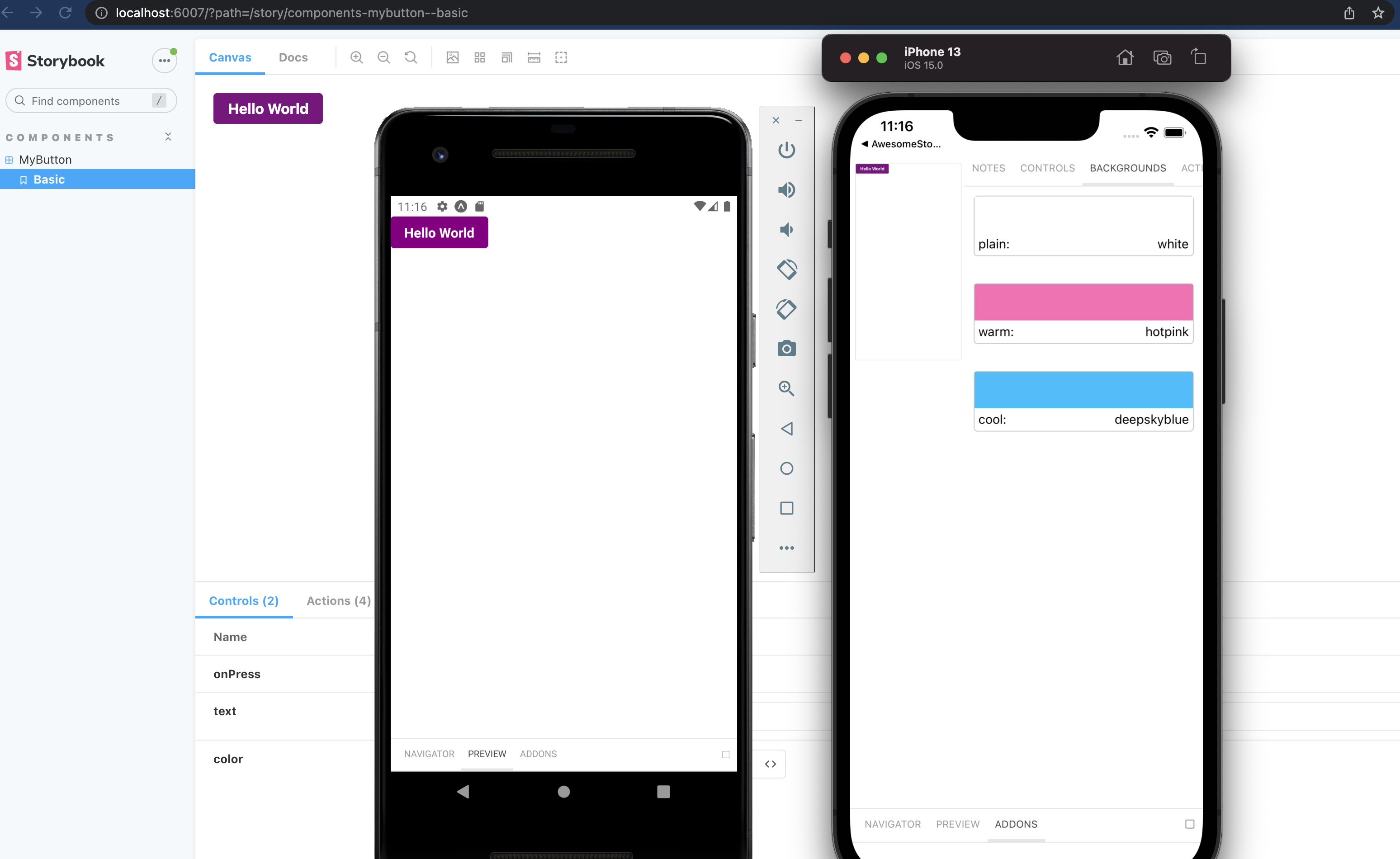
export const decorators = [withBackgrounds, (Story)=> <View style={{flex: 1, color: 'blue'}}><Story/></View>];
|
|
136
|
+
export const parameters = {
|
|
137
|
+
backgrounds: {
|
|
138
|
+
default: 'plain',
|
|
139
|
+
values: [
|
|
140
|
+
{name: 'plain', value: 'white'},
|
|
141
|
+
{name: 'warm', value: 'hotpink'},
|
|
142
|
+
{name: 'cool', value: 'deepskyblue'},
|
|
143
|
+
]
|
|
144
|
+
},
|
|
145
|
+
};
|
|
146
|
+
|
|
147
|
+
```
|
|
148
|
+
|
|
149
|
+
# Addons
|
|
150
|
+
|
|
151
|
+
The cli will install some basic addons for you such as controls and actions.
|
|
76
152
|
Ondevice addons are addons that can render with the device ui that you see on the phone.
|
|
77
153
|
|
|
78
154
|
Currently the addons available are:
|
|
79
155
|
|
|
80
|
-
- @storybook/addon-ondevice-
|
|
156
|
+
- @storybook/addon-ondevice-controls: adjust your components props in realtime
|
|
81
157
|
- @storybook/addon-ondevice-actions: mock onPress calls with actions that will log information in the actions tab
|
|
82
158
|
- @storybook/addon-ondevice-notes: Add some markdown to your stories to help document their usage
|
|
83
159
|
- @storybook/addon-ondevice-backgrounds: change the background of storybook to compare the look of your component against different backgrounds
|
|
84
160
|
|
|
85
|
-
|
|
86
|
-
|
|
87
|
-
```
|
|
88
|
-
import '@storybook/addon-ondevice-actions/register';
|
|
89
|
-
```
|
|
90
|
-
|
|
91
|
-
Make sure to import the rn-addons.js file in the storybook entrypoint (index.js in the storybook folder by default):
|
|
92
|
-
|
|
93
|
-
```
|
|
94
|
-
import './rn-addons';
|
|
95
|
-
```
|
|
96
|
-
|
|
97
|
-
### Using the addons in your story
|
|
98
|
-
|
|
99
|
-
Based on the previous example heres how you could extend it to use addons.
|
|
100
|
-
|
|
101
|
-
```
|
|
102
|
-
import React from 'react';
|
|
103
|
-
import { storiesOf } from '@storybook/react-native';
|
|
104
|
-
import CustomButton from './CustomButton';
|
|
105
|
-
import { View } from 'react-native';
|
|
106
|
-
|
|
107
|
-
// the action function has one argument which is the name of the action,
|
|
108
|
-
// this will be displayed in the actions tab in the addons panel
|
|
109
|
-
// action("name here")
|
|
110
|
-
import { action } from '@storybook/addon-actions';
|
|
111
|
-
|
|
112
|
-
// the boolean knob renders a switch which lets you toggle a value between true or false
|
|
113
|
-
// you call it like boolean("name here", default_value)
|
|
114
|
-
import { boolean, withKnobs } from '@storybook/addon-knobs';
|
|
115
|
-
|
|
116
|
-
const buttonStories = storiesOf('CustomButton', module);
|
|
117
|
-
|
|
118
|
-
// lets storybook know to show the knobs addon for this story
|
|
119
|
-
buttonStories.addDecorator(withKnobs);
|
|
120
|
-
|
|
121
|
-
// I use to boolean knob to set the disabled prop based on the knob state
|
|
122
|
-
// I use the action function to log every time the button gets called
|
|
123
|
-
buttonStories.add('default view', () => (
|
|
124
|
-
<View style={{ flex: 1, alignItems: 'center', justifyContent: 'center' }}>
|
|
125
|
-
<CustomButton onPress={action('Button Press!')} disabled={boolean('Disabled', false)} />
|
|
126
|
-
</View>
|
|
127
|
-
));
|
|
128
|
-
```
|
|
129
|
-
|
|
130
|
-
# Other ways to render storybook
|
|
131
|
-
|
|
132
|
-
In the getting started guide we suggest that you override you change the default export to be the storybook UI, this might not be what you want depending on how you are using storybook.
|
|
133
|
-
|
|
134
|
-
There are a few options on how you can make the storybook render in your app so it's up to you to decide which works best for your project.
|
|
135
|
-
|
|
136
|
-
## Run storybook as a separate app/component library
|
|
137
|
-
|
|
138
|
-
Using the approach from the getting started setup you can make an app that just displays your storybook and then you could use this app to share your component library. Then you can export all your components from somewhere within the project and use the project as a component library/package.
|
|
139
|
-
|
|
140
|
-
## Optionally run storybook or your app
|
|
141
|
-
|
|
142
|
-
You could do something like this if you want to run storybook in dev mode and your app in release mode.
|
|
161
|
+
Install each one you want to use and add them to the main.js addons list as follows:
|
|
143
162
|
|
|
144
163
|
```js
|
|
145
|
-
|
|
146
|
-
|
|
147
|
-
|
|
148
|
-
|
|
149
|
-
|
|
164
|
+
addons: [
|
|
165
|
+
'@storybook/addon-ondevice-notes',
|
|
166
|
+
'@storybook/addon-ondevice-controls',
|
|
167
|
+
'@storybook/addon-ondevice-backgrounds',
|
|
168
|
+
'@storybook/addon-ondevice-actions',
|
|
169
|
+
],
|
|
150
170
|
```
|
|
151
171
|
|
|
152
|
-
Or you could use some kind of setting/environment variable to define what renders.
|
|
153
|
-
|
|
154
|
-
## React Native Navigation, or other custom approaches
|
|
155
|
-
|
|
156
|
-
`StorybookUI` is a RN `View` component that can be embedded anywhere in your RN application, e.g. on a tab or within an admin screen.
|
|
157
|
-
|
|
158
|
-
You could also create a separate app just for storybook that also works as a package for your visual components.
|
|
159
|
-
|
|
160
|
-
# Storybook server (optional)
|
|
161
172
|
|
|
162
|
-
|
|
173
|
+
### Using the addons in your story
|
|
163
174
|
|
|
164
|
-
|
|
175
|
+
For details of each ondevice addon you can see the readme:
|
|
165
176
|
|
|
166
|
-
|
|
177
|
+
- [actions](addons/ondevice-actions)
|
|
178
|
+
- [backgrounds](addons/ondevice-backgrounds)
|
|
179
|
+
- [controls](addons/ondevice-controls)
|
|
180
|
+
- [notes](addons/ondevice-notes)
|
|
167
181
|
|
|
168
|
-
|
|
182
|
+
# Hide/Show storybook
|
|
169
183
|
|
|
170
|
-
|
|
171
|
-
or add a script to your package.json like
|
|
184
|
+
Storybook on react native is a normal React Native component that can be used or hidden anywhere in your RN application based on your own logic.
|
|
172
185
|
|
|
173
|
-
|
|
174
|
-
|
|
175
|
-
```
|
|
186
|
+
You can also create a separate app just for storybook that also works as a package for your visual components.
|
|
187
|
+
Some have opted to toggle the storybook component by using a custom option in the react native developer menu.
|
|
176
188
|
|
|
177
|
-
|
|
189
|
+
- [Heres an approach for react native cli](https://dev.to/dannyhw/multiple-entry-points-for-react-native-storybook-4dkp)
|
|
190
|
+
- [Heres an article about how you can do it in expo](https://dev.to/dannyhw/how-to-swap-between-react-native-storybook-and-your-app-p3o)
|
|
178
191
|
|
|
179
|
-
This will open the server web client, you will need to open storybook on the device for the stories to appear in the sidebar.
|
|
180
192
|
|
|
181
|
-
To enable addons for react native server add a folder `storybook/` in the root of the project with a addons.js file inside. The server will detect this file and import it. The file should contain the addon imports similar to the rn-addons.js file but using the regular storybook (for web) addons. For example:
|
|
182
193
|
|
|
183
|
-
|
|
184
|
-
// storybook/addons.js
|
|
185
|
-
require('@storybook/addon-knobs/register');
|
|
186
|
-
require('@storybook/addon-actions/register');
|
|
187
|
-
```
|
|
188
|
-
|
|
189
|
-
If you get the error `Can't resolve 'babel-loader'` install babel-loader from npm and it should fix it.
|
|
194
|
+
# getStorybookUI options
|
|
190
195
|
|
|
191
|
-
### Server cli options
|
|
192
|
-
|
|
193
|
-
```
|
|
194
|
-
-h, --host <host>
|
|
195
|
-
host to listen on
|
|
196
|
-
-p, --port <port>
|
|
197
|
-
port to listen on
|
|
198
|
-
--https
|
|
199
|
-
whether server is running on https
|
|
200
|
-
-c, --config-dir [dir-name]
|
|
201
|
-
storybook config directory
|
|
202
|
-
-e, --environment [environment]
|
|
203
|
-
DEVELOPMENT/PRODUCTION environment for webpack
|
|
204
|
-
-i, --manual-id
|
|
205
|
-
allow multiple users to work with same storybook
|
|
206
|
-
--smoke-test
|
|
207
|
-
Exit after successful start
|
|
208
|
-
```
|
|
209
|
-
|
|
210
|
-
# getStorybookUI Options
|
|
211
196
|
|
|
212
197
|
You can pass these parameters to getStorybookUI call in your storybook entry point:
|
|
213
198
|
|
|
214
199
|
```
|
|
215
200
|
{
|
|
216
|
-
onDeviceUI: Boolean (true)
|
|
217
|
-
-- display navigator and addons on the device
|
|
218
|
-
disableWebsockets: Boolean (false)
|
|
219
|
-
-- allows to display stories without running storybook server. Should be used with onDeviceUI
|
|
220
|
-
secured: Boolean (false)
|
|
221
|
-
-- use wss/https instead of ws/http
|
|
222
|
-
host: String (NativeModules.SourceCode.scriptURL)
|
|
223
|
-
-- host to use
|
|
224
|
-
port: Number (7007)
|
|
225
|
-
-- port to use
|
|
226
|
-
query: String ("")
|
|
227
|
-
-- additional query string to pass to websockets
|
|
228
|
-
isUIHidden: Boolean (false)
|
|
229
|
-
-- should the ui be closed initially.
|
|
230
|
-
isSplitPanelVisible: Boolean (false)
|
|
231
|
-
-- should the split panel (addons on the bottom) be visible initially.
|
|
232
201
|
tabOpen: Number (0)
|
|
233
202
|
-- which tab should be open. -1 Navigator, 0 Preview, 1 Addons
|
|
234
|
-
initialSelection: Object (
|
|
235
|
-
-- initialize storybook with a specific story.
|
|
236
|
-
shouldPersistSelection: Boolean (true)
|
|
237
|
-
-- initialize storybook with the last selected story.
|
|
203
|
+
initialSelection: string | Object (undefined)
|
|
204
|
+
-- initialize storybook with a specific story. eg: `mybutton--largebutton` or `{ kind: 'MyButton', name: 'LargeButton' }`
|
|
238
205
|
shouldDisableKeyboardAvoidingView: Boolean (false)
|
|
239
206
|
-- Disable KeyboardAvoidingView wrapping Storybook's view
|
|
240
207
|
keyboardAvoidingViewVerticalOffset: Number (0)
|
|
@@ -247,10 +214,19 @@ You can pass these parameters to getStorybookUI call in your storybook entry poi
|
|
|
247
214
|
We welcome contributions to Storybook!
|
|
248
215
|
|
|
249
216
|
- 📥 Pull requests and 🌟 Stars are always welcome.
|
|
250
|
-
- Read our [contributing guide](
|
|
217
|
+
- Read our [contributing guide](CONTRIBUTING.md) to get started,
|
|
251
218
|
or find us on [Discord](https://discord.gg/sMFvFsG) and look for the react-native channel.
|
|
252
219
|
|
|
253
220
|
Looking for a first issue to tackle?
|
|
254
221
|
|
|
255
222
|
- We tag issues with [Good First Issue](https://github.com/storybookjs/react-native/issues?q=is%3Aopen+is%3Aissue+label%3A%22good+first+issue%22) when we think they are well suited for people who are new to the codebase or OSS in general.
|
|
256
223
|
- [Talk to us](https://discord.gg/sMFvFsG), we'll find something to suits your skills and learning interest.
|
|
224
|
+
|
|
225
|
+
# Examples
|
|
226
|
+
|
|
227
|
+
Here are some example projects to help you get started
|
|
228
|
+
|
|
229
|
+
- A mono repo setup by @axeldelafosse https://github.com/axeldelafosse/storybook-rnw-monorepo
|
|
230
|
+
- Expo setup https://github.com/dannyhw/expo-storybook-starter
|
|
231
|
+
- React native cli setup https://github.com/dannyhw/react-native-storybook-starter
|
|
232
|
+
- Want to showcase your own project? open a PR and add it to the list!
|