@storybook/addon-controls 0.0.0-pr-23609-sha-f47ef339
This diff represents the content of publicly available package versions that have been released to one of the supported registries. The information contained in this diff is provided for informational purposes only and reflects changes between package versions as they appear in their respective public registries.
- package/README.md +213 -0
- package/dist/chunk-I36WBKUI.mjs +3 -0
- package/dist/index.d.ts +3 -0
- package/dist/index.js +1 -0
- package/dist/index.mjs +1 -0
- package/dist/manager.d.ts +2 -0
- package/dist/manager.js +1 -0
- package/dist/manager.mjs +7 -0
- package/jest.config.js +7 -0
- package/manager.js +1 -0
- package/package.json +117 -0
package/README.md
ADDED
|
@@ -0,0 +1,213 @@
|
|
|
1
|
+
# Storybook Controls Addon
|
|
2
|
+
|
|
3
|
+
[Storybook](https://storybook.js.org) Controls gives you a graphical UI to interact with a component's arguments dynamically, without needing to code. It creates an addon panel next to your component examples ("stories"), so you can edit them live.
|
|
4
|
+
|
|
5
|
+
[Framework Support](https://storybook.js.org/docs/react/api/frameworks-feature-support)
|
|
6
|
+
|
|
7
|
+
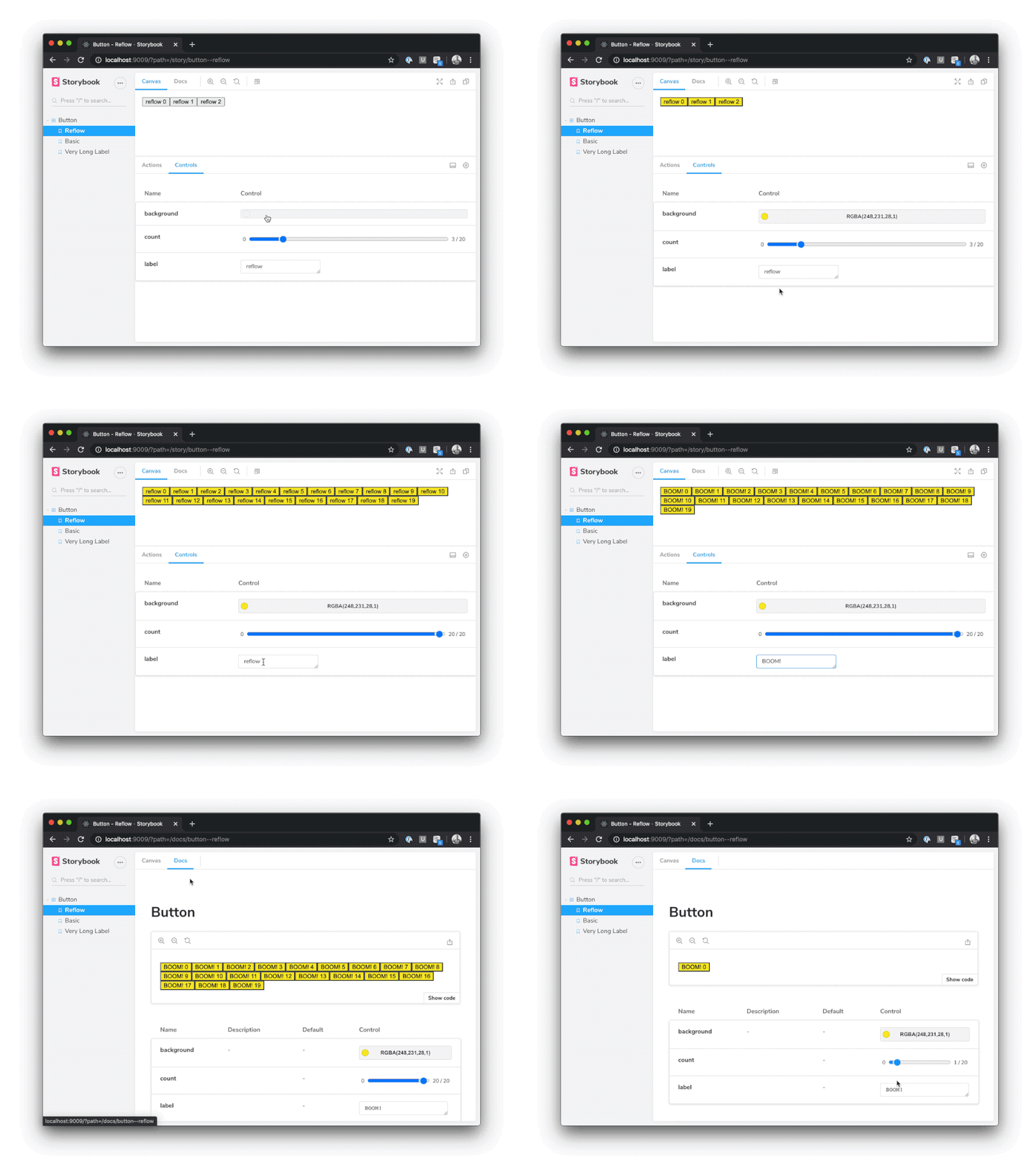
|
|
8
|
+
|
|
9
|
+
## Installation
|
|
10
|
+
|
|
11
|
+
Controls is part of [essentials](https://storybook.js.org/docs/react/essentials/introduction) and so is installed in all new Storybooks by default. If you need to add it to your Storybook, you can run:
|
|
12
|
+
|
|
13
|
+
```sh
|
|
14
|
+
npm i -D @storybook/addon-controls
|
|
15
|
+
```
|
|
16
|
+
|
|
17
|
+
Then, add following content to [`.storybook/main.js`](https://storybook.js.org/docs/react/configure/overview#configure-your-storybook-project):
|
|
18
|
+
|
|
19
|
+
```js
|
|
20
|
+
export default {
|
|
21
|
+
addons: ['@storybook/addon-controls'],
|
|
22
|
+
};
|
|
23
|
+
```
|
|
24
|
+
|
|
25
|
+
## Usage
|
|
26
|
+
|
|
27
|
+
The usage is documented in the [documentation](https://storybook.js.org/docs/react/essentials/controls).
|
|
28
|
+
|
|
29
|
+
## FAQs
|
|
30
|
+
|
|
31
|
+
- [Storybook Controls Addon](#storybook-controls-addon)
|
|
32
|
+
- [Installation](#installation)
|
|
33
|
+
- [Usage](#usage)
|
|
34
|
+
- [FAQs](#faqs)
|
|
35
|
+
- [How will this replace addon-knobs?](#how-will-this-replace-addon-knobs)
|
|
36
|
+
- [How do I migrate from addon-knobs?](#how-do-i-migrate-from-addon-knobs)
|
|
37
|
+
- [My controls aren't being auto-generated. What should I do?](#my-controls-arent-being-auto-generated-what-should-i-do)
|
|
38
|
+
- [How can I disable controls for certain fields on a particular story?](#how-can-i-disable-controls-for-certain-fields-on-a-particular-story)
|
|
39
|
+
- [How do controls work with MDX?](#how-do-controls-work-with-mdx)
|
|
40
|
+
|
|
41
|
+
### How will this replace addon-knobs?
|
|
42
|
+
|
|
43
|
+
Addon-knobs is one of Storybook's most popular addons with over 1M weekly downloads, so we know lots of users will be affected by this change. Knobs is also a mature addon, with various options that are not available in addon-controls.
|
|
44
|
+
|
|
45
|
+
Therefore, rather than deprecating addon-knobs immediately, we will continue to release knobs with the Storybook core distribution until 7.0. This will give us time to improve Controls based on user feedback, and also give knobs users ample time to migrate.
|
|
46
|
+
|
|
47
|
+
If you are somehow tied to knobs or prefer the knobs interface, we are happy to take on maintainers for the knobs project. If this interests you, hop on our [Discord](https://discord.gg/storybook).
|
|
48
|
+
|
|
49
|
+
### How do I migrate from addon-knobs?
|
|
50
|
+
|
|
51
|
+
If you're already using [Storybook Knobs](https://github.com/storybookjs/addon-knobs) you should consider migrating to Controls.
|
|
52
|
+
|
|
53
|
+
You're probably using it for something that can be satisfied by one of the cases [described above](#writing-stories).
|
|
54
|
+
|
|
55
|
+
Let's walk through two examples: migrating [knobs to auto-generated args](#knobs-to-custom-args) and [knobs to custom args](#knobs-to-custom-args).
|
|
56
|
+
|
|
57
|
+
<h4>Knobs to auto-generated args</h4>
|
|
58
|
+
|
|
59
|
+
First, let's consider a knobs version of a basic story that fills in the props for a component:
|
|
60
|
+
|
|
61
|
+
```jsx
|
|
62
|
+
import { text } from '@storybook/addon-knobs';
|
|
63
|
+
import { Button } from './Button';
|
|
64
|
+
|
|
65
|
+
export const Basic = () => <Button label={text('Label', 'hello')} />;
|
|
66
|
+
```
|
|
67
|
+
|
|
68
|
+
This fills in the Button's label based on a knob, which is exactly the [auto-generated](#auto-generated-args) use case above. So we can rewrite it using auto-generated args:
|
|
69
|
+
|
|
70
|
+
```jsx
|
|
71
|
+
export const Basic = (args) => <Button {...args} />;
|
|
72
|
+
Basic.args = { label: 'hello' };
|
|
73
|
+
```
|
|
74
|
+
|
|
75
|
+
<h4>Knobs to manually-configured args</h4>
|
|
76
|
+
|
|
77
|
+
Similarly, we can also consider a story that uses knob inputs to change its behavior:
|
|
78
|
+
|
|
79
|
+
```jsx
|
|
80
|
+
import { number, text } from '@storybook/addon-knobs';
|
|
81
|
+
|
|
82
|
+
export const Reflow = () => {
|
|
83
|
+
const count = number('Count', 10, { min: 0, max: 100, range: true });
|
|
84
|
+
const label = text('Label', 'reflow');
|
|
85
|
+
return (
|
|
86
|
+
<>
|
|
87
|
+
{[...Array(count)].map((_, i) => (
|
|
88
|
+
<Button key={i} label={`button ${i}`} />
|
|
89
|
+
))}
|
|
90
|
+
</>
|
|
91
|
+
);
|
|
92
|
+
};
|
|
93
|
+
```
|
|
94
|
+
|
|
95
|
+
And again, as above, this can be rewritten using [fully custom args](https://storybook.js.org/docs/react/essentials/controls#fully-custom-args):
|
|
96
|
+
|
|
97
|
+
```jsx
|
|
98
|
+
export const Reflow = ({ count, label, ...args }) => (
|
|
99
|
+
<>
|
|
100
|
+
{[...Array(count)].map((_, i) => (
|
|
101
|
+
<Button key={i} label={`${label} ${i}`} {...args} />
|
|
102
|
+
))}
|
|
103
|
+
</>
|
|
104
|
+
);
|
|
105
|
+
|
|
106
|
+
Reflow.args = {
|
|
107
|
+
count: 3,
|
|
108
|
+
label: 'reflow',
|
|
109
|
+
};
|
|
110
|
+
|
|
111
|
+
Reflow.argTypes = {
|
|
112
|
+
count: {
|
|
113
|
+
control: {
|
|
114
|
+
type: 'range',
|
|
115
|
+
min: 0,
|
|
116
|
+
max: 20,
|
|
117
|
+
},
|
|
118
|
+
},
|
|
119
|
+
};
|
|
120
|
+
```
|
|
121
|
+
|
|
122
|
+
### My controls aren't being auto-generated. What should I do?
|
|
123
|
+
|
|
124
|
+
There are a few known cases where controls can't be auto-generated:
|
|
125
|
+
|
|
126
|
+
- You're using a framework for which automatic generation [isn't supported](https://storybook.js.org/docs/react/api/frameworks-feature-support)
|
|
127
|
+
- You're trying to generate controls for a component defined in an external library
|
|
128
|
+
|
|
129
|
+
With a little manual work you can still use controls in such cases. Consider the following example:
|
|
130
|
+
|
|
131
|
+
```js
|
|
132
|
+
import { Button } from 'some-external-library';
|
|
133
|
+
|
|
134
|
+
export default {
|
|
135
|
+
title: 'Button',
|
|
136
|
+
argTypes: {
|
|
137
|
+
label: { control: 'text' },
|
|
138
|
+
borderWidth: { control: { type: 'number', min: 0, max: 10 } },
|
|
139
|
+
},
|
|
140
|
+
};
|
|
141
|
+
|
|
142
|
+
export const Basic = (args) => <Button {...args} />;
|
|
143
|
+
|
|
144
|
+
Basic.args = {
|
|
145
|
+
label: 'hello',
|
|
146
|
+
borderWidth: 1,
|
|
147
|
+
};
|
|
148
|
+
```
|
|
149
|
+
|
|
150
|
+
The `argTypes` annotation (which can also be applied to individual stories if needed), gives Storybook the hints it needs to generate controls in these unsupported cases. See [control annotations](https://storybook.js.org/docs/react/essentials/controls#annotation) for a full list of control types.
|
|
151
|
+
|
|
152
|
+
It's also possible that your Storybook is misconfigured. If you think this might be the case, please search through Storybook's [Github issues](https://github.com/storybookjs/storybook/issues), and file a new issue if you don't find one that matches your use case.
|
|
153
|
+
|
|
154
|
+
### How can I disable controls for certain fields on a particular story?
|
|
155
|
+
|
|
156
|
+
The `argTypes` annotation can be used to hide controls for a particular row, or even hide rows.
|
|
157
|
+
|
|
158
|
+
Suppose you have a `Button` component with `borderWidth` and `label` properties (auto-generated or otherwise) and you want to hide the `borderWidth` row completely and disable controls for the `label` row on a specific story. Here's how you'd do that:
|
|
159
|
+
|
|
160
|
+
```js
|
|
161
|
+
import { Button } from 'button';
|
|
162
|
+
|
|
163
|
+
export default {
|
|
164
|
+
title: 'Button',
|
|
165
|
+
component: Button,
|
|
166
|
+
};
|
|
167
|
+
|
|
168
|
+
export const CustomControls = (args) => <Button {...args} />;
|
|
169
|
+
CustomControls.argTypes = {
|
|
170
|
+
borderWidth: { table: { disable: true } },
|
|
171
|
+
label: { control: { disable: true } },
|
|
172
|
+
};
|
|
173
|
+
```
|
|
174
|
+
|
|
175
|
+
Like [story parameters](https://storybook.js.org/docs/react/writing-stories/parameters), `args` and `argTypes` annotations are hierarchically merged, so story-level annotations overwrite component-level annotations.
|
|
176
|
+
|
|
177
|
+
### How do controls work with MDX?
|
|
178
|
+
|
|
179
|
+
MDX compiles to component story format (CSF) under the hood, so there's a direct mapping for every example above using the `args` and `argTypes` props.
|
|
180
|
+
|
|
181
|
+
Consider this example in CSF:
|
|
182
|
+
|
|
183
|
+
```js
|
|
184
|
+
import { Button } from './Button';
|
|
185
|
+
export default {
|
|
186
|
+
title: 'Button',
|
|
187
|
+
component: Button,
|
|
188
|
+
argTypes: {
|
|
189
|
+
background: { control: 'color' },
|
|
190
|
+
},
|
|
191
|
+
};
|
|
192
|
+
|
|
193
|
+
const Template = (args) => <Button {...args} />;
|
|
194
|
+
export const Basic = Template.bind({});
|
|
195
|
+
Basic.args = { label: 'hello', background: '#ff0' };
|
|
196
|
+
```
|
|
197
|
+
|
|
198
|
+
Here's the MDX equivalent:
|
|
199
|
+
|
|
200
|
+
```jsx
|
|
201
|
+
import { Meta, Story } from '@storybook/addon-docs';
|
|
202
|
+
import { Button } from './Button';
|
|
203
|
+
|
|
204
|
+
<Meta title="Button" component={Button} argTypes={{ background: { control: 'color' } }} />
|
|
205
|
+
|
|
206
|
+
export const Template = (args) => <Button {...args} />
|
|
207
|
+
|
|
208
|
+
<Story name="Basic" args={{ label: 'hello', background: '#ff0' }}>
|
|
209
|
+
{Template.bind({})}
|
|
210
|
+
</Story>
|
|
211
|
+
```
|
|
212
|
+
|
|
213
|
+
For more info, see a full [Controls example in MDX for Vue](https://raw.githubusercontent.com/storybookjs/storybook/next/code/examples/vue-kitchen-sink/src/stories/addon-controls.stories.mdx).
|
package/dist/index.d.ts
ADDED
package/dist/index.js
ADDED
|
@@ -0,0 +1 @@
|
|
|
1
|
+
"use strict";var __defProp=Object.defineProperty;var __getOwnPropDesc=Object.getOwnPropertyDescriptor;var __getOwnPropNames=Object.getOwnPropertyNames;var __hasOwnProp=Object.prototype.hasOwnProperty;var __export=(target,all)=>{for(var name in all)__defProp(target,name,{get:all[name],enumerable:!0})},__copyProps=(to,from,except,desc)=>{if(from&&typeof from=="object"||typeof from=="function")for(let key of __getOwnPropNames(from))!__hasOwnProp.call(to,key)&&key!==except&&__defProp(to,key,{get:()=>from[key],enumerable:!(desc=__getOwnPropDesc(from,key))||desc.enumerable});return to};var __toCommonJS=mod=>__copyProps(__defProp({},"__esModule",{value:!0}),mod);var src_exports={};__export(src_exports,{PARAM_KEY:()=>PARAM_KEY});module.exports=__toCommonJS(src_exports);var PARAM_KEY="controls";0&&(module.exports={PARAM_KEY});
|
package/dist/index.mjs
ADDED
|
@@ -0,0 +1 @@
|
|
|
1
|
+
export { PARAM_KEY } from './chunk-I36WBKUI.mjs';
|
package/dist/manager.js
ADDED
|
@@ -0,0 +1 @@
|
|
|
1
|
+
"use strict";var __create=Object.create;var __defProp=Object.defineProperty;var __getOwnPropDesc=Object.getOwnPropertyDescriptor;var __getOwnPropNames=Object.getOwnPropertyNames;var __getProtoOf=Object.getPrototypeOf,__hasOwnProp=Object.prototype.hasOwnProperty;var __copyProps=(to,from,except,desc)=>{if(from&&typeof from=="object"||typeof from=="function")for(let key of __getOwnPropNames(from))!__hasOwnProp.call(to,key)&&key!==except&&__defProp(to,key,{get:()=>from[key],enumerable:!(desc=__getOwnPropDesc(from,key))||desc.enumerable});return to};var __toESM=(mod,isNodeMode,target)=>(target=mod!=null?__create(__getProtoOf(mod)):{},__copyProps(isNodeMode||!mod||!mod.__esModule?__defProp(target,"default",{value:mod,enumerable:!0}):target,mod));var import_react2=__toESM(require("react")),import_manager_api2=require("@storybook/manager-api"),import_components=require("@storybook/components");var import_react=__toESM(require("react")),import_manager_api=require("@storybook/manager-api"),import_blocks=require("@storybook/blocks");var ADDON_ID="addon-controls",PARAM_KEY="controls";var ControlsPanel=()=>{let[args,updateArgs,resetArgs]=(0,import_manager_api.useArgs)(),[globals]=(0,import_manager_api.useGlobals)(),rows=(0,import_manager_api.useArgTypes)(),isArgsStory=(0,import_manager_api.useParameter)("__isArgsStory",!1),{expanded,sort,presetColors,hideNoControlsWarning=!1}=(0,import_manager_api.useParameter)(PARAM_KEY,{}),{path}=(0,import_manager_api.useStorybookState)(),hasControls=Object.values(rows).some(arg=>arg==null?void 0:arg.control),showWarning=!(hasControls&&isArgsStory)&&!hideNoControlsWarning,withPresetColors=Object.entries(rows).reduce((acc,[key,arg])=>{var _a,_b;return((_a=arg==null?void 0:arg.control)==null?void 0:_a.type)!=="color"||(_b=arg==null?void 0:arg.control)!=null&&_b.presetColors?acc[key]=arg:acc[key]={...arg,control:{...arg.control,presetColors}},acc},{});return import_react.default.createElement(import_react.default.Fragment,null,showWarning&&import_react.default.createElement(import_blocks.NoControlsWarning,null),import_react.default.createElement(import_blocks.PureArgsTable,{key:path,compact:!expanded&&hasControls,rows:withPresetColors,args,globals,updateArgs,resetArgs,inAddonPanel:!0,sort}))};function Title(){let rows=(0,import_manager_api2.useArgTypes)(),controlsCount=Object.values(rows).filter(argType=>{var _a;return(argType==null?void 0:argType.control)&&!((_a=argType==null?void 0:argType.table)!=null&&_a.disable)}).length;return import_react2.default.createElement("div",null,import_react2.default.createElement(import_components.Spaced,{col:1},import_react2.default.createElement("span",{style:{display:"inline-block",verticalAlign:"middle"}},"Controls"),controlsCount===0?"":import_react2.default.createElement(import_components.Badge,{status:"neutral"},controlsCount)))}import_manager_api2.addons.register(ADDON_ID,api=>{import_manager_api2.addons.add(ADDON_ID,{title:Title,type:import_manager_api2.types.PANEL,paramKey:PARAM_KEY,render:({active})=>!active||!api.getCurrentStoryData()?null:import_react2.default.createElement(import_components.AddonPanel,{active},import_react2.default.createElement(ControlsPanel,null))})});
|
package/dist/manager.mjs
ADDED
|
@@ -0,0 +1,7 @@
|
|
|
1
|
+
import { ADDON_ID, PARAM_KEY } from './chunk-I36WBKUI.mjs';
|
|
2
|
+
import React2 from 'react';
|
|
3
|
+
import { addons, types, useArgs, useGlobals, useArgTypes, useParameter, useStorybookState } from '@storybook/manager-api';
|
|
4
|
+
import { AddonPanel, Spaced, Badge } from '@storybook/components';
|
|
5
|
+
import { NoControlsWarning, PureArgsTable } from '@storybook/blocks';
|
|
6
|
+
|
|
7
|
+
var ControlsPanel=()=>{let[args,updateArgs,resetArgs]=useArgs(),[globals]=useGlobals(),rows=useArgTypes(),isArgsStory=useParameter("__isArgsStory",!1),{expanded,sort,presetColors,hideNoControlsWarning=!1}=useParameter(PARAM_KEY,{}),{path}=useStorybookState(),hasControls=Object.values(rows).some(arg=>arg?.control),showWarning=!(hasControls&&isArgsStory)&&!hideNoControlsWarning,withPresetColors=Object.entries(rows).reduce((acc,[key,arg])=>(arg?.control?.type!=="color"||arg?.control?.presetColors?acc[key]=arg:acc[key]={...arg,control:{...arg.control,presetColors}},acc),{});return React2.createElement(React2.Fragment,null,showWarning&&React2.createElement(NoControlsWarning,null),React2.createElement(PureArgsTable,{key:path,compact:!expanded&&hasControls,rows:withPresetColors,args,globals,updateArgs,resetArgs,inAddonPanel:!0,sort}))};function Title(){let rows=useArgTypes(),controlsCount=Object.values(rows).filter(argType=>argType?.control&&!argType?.table?.disable).length;return React2.createElement("div",null,React2.createElement(Spaced,{col:1},React2.createElement("span",{style:{display:"inline-block",verticalAlign:"middle"}},"Controls"),controlsCount===0?"":React2.createElement(Badge,{status:"neutral"},controlsCount)))}addons.register(ADDON_ID,api=>{addons.add(ADDON_ID,{title:Title,type:types.PANEL,paramKey:PARAM_KEY,render:({active})=>!active||!api.getCurrentStoryData()?null:React2.createElement(AddonPanel,{active},React2.createElement(ControlsPanel,null))});});
|
package/jest.config.js
ADDED
package/manager.js
ADDED
|
@@ -0,0 +1 @@
|
|
|
1
|
+
import './dist/manager';
|
package/package.json
ADDED
|
@@ -0,0 +1,117 @@
|
|
|
1
|
+
{
|
|
2
|
+
"name": "@storybook/addon-controls",
|
|
3
|
+
"version": "0.0.0-pr-23609-sha-f47ef339",
|
|
4
|
+
"description": "Interact with component inputs dynamically in the Storybook UI",
|
|
5
|
+
"keywords": [
|
|
6
|
+
"addon",
|
|
7
|
+
"storybook",
|
|
8
|
+
"knobs",
|
|
9
|
+
"controls",
|
|
10
|
+
"properties",
|
|
11
|
+
"essentials",
|
|
12
|
+
"data-state"
|
|
13
|
+
],
|
|
14
|
+
"homepage": "https://github.com/storybookjs/storybook/tree/next/code/addons/controls",
|
|
15
|
+
"bugs": {
|
|
16
|
+
"url": "https://github.com/storybookjs/storybook/issues"
|
|
17
|
+
},
|
|
18
|
+
"repository": {
|
|
19
|
+
"type": "git",
|
|
20
|
+
"url": "https://github.com/storybookjs/storybook.git",
|
|
21
|
+
"directory": "code/addons/controls"
|
|
22
|
+
},
|
|
23
|
+
"funding": {
|
|
24
|
+
"type": "opencollective",
|
|
25
|
+
"url": "https://opencollective.com/storybook"
|
|
26
|
+
},
|
|
27
|
+
"license": "MIT",
|
|
28
|
+
"exports": {
|
|
29
|
+
".": {
|
|
30
|
+
"types": "./dist/index.d.ts",
|
|
31
|
+
"node": "./dist/index.js",
|
|
32
|
+
"require": "./dist/index.js",
|
|
33
|
+
"import": "./dist/index.mjs"
|
|
34
|
+
},
|
|
35
|
+
"./manager": {
|
|
36
|
+
"types": "./dist/manager.d.ts",
|
|
37
|
+
"require": "./dist/manager.js",
|
|
38
|
+
"import": "./dist/manager.mjs"
|
|
39
|
+
},
|
|
40
|
+
"./register": {
|
|
41
|
+
"types": "./dist/manager.d.ts",
|
|
42
|
+
"require": "./dist/manager.js",
|
|
43
|
+
"import": "./dist/manager.mjs"
|
|
44
|
+
},
|
|
45
|
+
"./package.json": "./package.json"
|
|
46
|
+
},
|
|
47
|
+
"main": "dist/index.js",
|
|
48
|
+
"module": "dist/index.mjs",
|
|
49
|
+
"types": "dist/index.d.ts",
|
|
50
|
+
"typesVersions": {
|
|
51
|
+
"*": {
|
|
52
|
+
"*": [
|
|
53
|
+
"dist/index.d.ts"
|
|
54
|
+
],
|
|
55
|
+
"manager": [
|
|
56
|
+
"dist/manager.d.ts"
|
|
57
|
+
]
|
|
58
|
+
}
|
|
59
|
+
},
|
|
60
|
+
"files": [
|
|
61
|
+
"dist/**/*",
|
|
62
|
+
"README.md",
|
|
63
|
+
"*.js",
|
|
64
|
+
"*.d.ts"
|
|
65
|
+
],
|
|
66
|
+
"scripts": {
|
|
67
|
+
"check": "../../../scripts/prepare/check.ts",
|
|
68
|
+
"prep": "../../../scripts/prepare/bundle.ts"
|
|
69
|
+
},
|
|
70
|
+
"dependencies": {
|
|
71
|
+
"@storybook/blocks": "0.0.0-pr-23609-sha-f47ef339",
|
|
72
|
+
"@storybook/client-logger": "0.0.0-pr-23609-sha-f47ef339",
|
|
73
|
+
"@storybook/components": "0.0.0-pr-23609-sha-f47ef339",
|
|
74
|
+
"@storybook/core-common": "0.0.0-pr-23609-sha-f47ef339",
|
|
75
|
+
"@storybook/manager-api": "0.0.0-pr-23609-sha-f47ef339",
|
|
76
|
+
"@storybook/node-logger": "0.0.0-pr-23609-sha-f47ef339",
|
|
77
|
+
"@storybook/preview-api": "0.0.0-pr-23609-sha-f47ef339",
|
|
78
|
+
"@storybook/theming": "0.0.0-pr-23609-sha-f47ef339",
|
|
79
|
+
"@storybook/types": "0.0.0-pr-23609-sha-f47ef339",
|
|
80
|
+
"lodash": "^4.17.21",
|
|
81
|
+
"ts-dedent": "^2.0.0"
|
|
82
|
+
},
|
|
83
|
+
"peerDependencies": {
|
|
84
|
+
"react": "^16.8.0 || ^17.0.0 || ^18.0.0",
|
|
85
|
+
"react-dom": "^16.8.0 || ^17.0.0 || ^18.0.0"
|
|
86
|
+
},
|
|
87
|
+
"peerDependenciesMeta": {
|
|
88
|
+
"react": {
|
|
89
|
+
"optional": true
|
|
90
|
+
},
|
|
91
|
+
"react-dom": {
|
|
92
|
+
"optional": true
|
|
93
|
+
}
|
|
94
|
+
},
|
|
95
|
+
"publishConfig": {
|
|
96
|
+
"access": "public"
|
|
97
|
+
},
|
|
98
|
+
"bundler": {
|
|
99
|
+
"entries": [
|
|
100
|
+
"./src/index.ts",
|
|
101
|
+
"./src/manager.tsx"
|
|
102
|
+
],
|
|
103
|
+
"platform": "browser"
|
|
104
|
+
},
|
|
105
|
+
"gitHead": "e6a7fd8a655c69780bc20b9749c2699e44beae17",
|
|
106
|
+
"storybook": {
|
|
107
|
+
"displayName": "Controls",
|
|
108
|
+
"icon": "https://user-images.githubusercontent.com/263385/101991669-479cc600-3c7c-11eb-93d9-38b67e8371f2.png",
|
|
109
|
+
"supportedFrameworks": [
|
|
110
|
+
"react",
|
|
111
|
+
"vue",
|
|
112
|
+
"angular",
|
|
113
|
+
"web-components",
|
|
114
|
+
"ember"
|
|
115
|
+
]
|
|
116
|
+
}
|
|
117
|
+
}
|