@storybook/addon-backgrounds 8.4.0-alpha.7 → 8.4.0-beta.0
This diff represents the content of publicly available package versions that have been released to one of the supported registries. The information contained in this diff is provided for informational purposes only and reflects changes between package versions as they appear in their respective public registries.
- package/README.md +4 -4
- package/package.json +3 -3
package/README.md
CHANGED
|
@@ -2,13 +2,13 @@
|
|
|
2
2
|
|
|
3
3
|
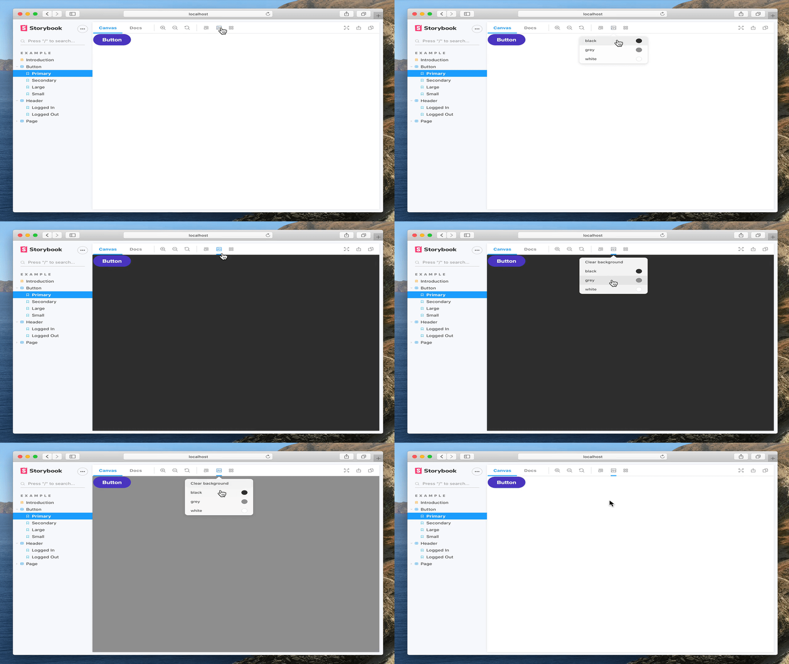
Storybook Addon Backgrounds can be used to change background colors inside the preview in [Storybook](https://storybook.js.org).
|
|
4
4
|
|
|
5
|
-
[Framework Support](https://storybook.js.org/docs/
|
|
5
|
+
[Framework Support](https://storybook.js.org/docs/configure/integration/frameworks-feature-support)
|
|
6
6
|
|
|
7
7
|
|
|
8
8
|
|
|
9
9
|
## Installation
|
|
10
10
|
|
|
11
|
-
Backgrounds is part of [essentials](https://storybook.js.org/docs/
|
|
11
|
+
Backgrounds is part of [essentials](https://storybook.js.org/docs/essentials) and so is installed in all new Storybooks by default. If you need to add it to your Storybook, you can run:
|
|
12
12
|
|
|
13
13
|
```sh
|
|
14
14
|
npm i -D @storybook/addon-backgrounds
|
|
@@ -16,7 +16,7 @@ npm i -D @storybook/addon-backgrounds
|
|
|
16
16
|
|
|
17
17
|
## Configuration
|
|
18
18
|
|
|
19
|
-
Then, add following content to [`.storybook/main.js`](https://storybook.js.org/docs/
|
|
19
|
+
Then, add following content to [`.storybook/main.js`](https://storybook.js.org/docs/configure#configure-your-storybook-project):
|
|
20
20
|
|
|
21
21
|
```js
|
|
22
22
|
export default {
|
|
@@ -26,4 +26,4 @@ export default {
|
|
|
26
26
|
|
|
27
27
|
## Usage
|
|
28
28
|
|
|
29
|
-
The usage is documented in the [documentation](https://storybook.js.org/docs/
|
|
29
|
+
The usage is documented in the [documentation](https://storybook.js.org/docs/essentials/backgrounds).
|
package/package.json
CHANGED
|
@@ -1,6 +1,6 @@
|
|
|
1
1
|
{
|
|
2
2
|
"name": "@storybook/addon-backgrounds",
|
|
3
|
-
"version": "8.4.0-
|
|
3
|
+
"version": "8.4.0-beta.0",
|
|
4
4
|
"description": "Switch backgrounds to view components in different settings",
|
|
5
5
|
"keywords": [
|
|
6
6
|
"addon",
|
|
@@ -60,13 +60,13 @@
|
|
|
60
60
|
"ts-dedent": "^2.0.0"
|
|
61
61
|
},
|
|
62
62
|
"devDependencies": {
|
|
63
|
-
"@storybook/icons": "^1.2.
|
|
63
|
+
"@storybook/icons": "^1.2.12",
|
|
64
64
|
"react": "^18.2.0",
|
|
65
65
|
"react-dom": "^18.2.0",
|
|
66
66
|
"typescript": "^5.3.2"
|
|
67
67
|
},
|
|
68
68
|
"peerDependencies": {
|
|
69
|
-
"storybook": "^8.4.0-
|
|
69
|
+
"storybook": "^8.4.0-beta.0"
|
|
70
70
|
},
|
|
71
71
|
"publishConfig": {
|
|
72
72
|
"access": "public"
|