@stianlarsen/react-light-beam 3.1.0 → 3.1.2
This diff represents the content of publicly available package versions that have been released to one of the supported registries. The information contained in this diff is provided for informational purposes only and reflects changes between package versions as they appear in their respective public registries.
- package/LICENSE +0 -0
- package/README.md +76 -451
- package/dist/index.cjs +168 -0
- package/dist/index.cjs.map +1 -0
- package/dist/index.d.cts +17 -0
- package/dist/index.d.ts +2 -123
- package/dist/index.js +100 -412
- package/dist/index.js.map +1 -1
- package/package.json +33 -31
- package/dist/index.d.mts +0 -138
- package/dist/index.mjs +0 -450
- package/dist/index.mjs.map +0 -1
package/LICENSE
CHANGED
|
File without changes
|
package/README.md
CHANGED
|
@@ -1,511 +1,136 @@
|
|
|
1
1
|
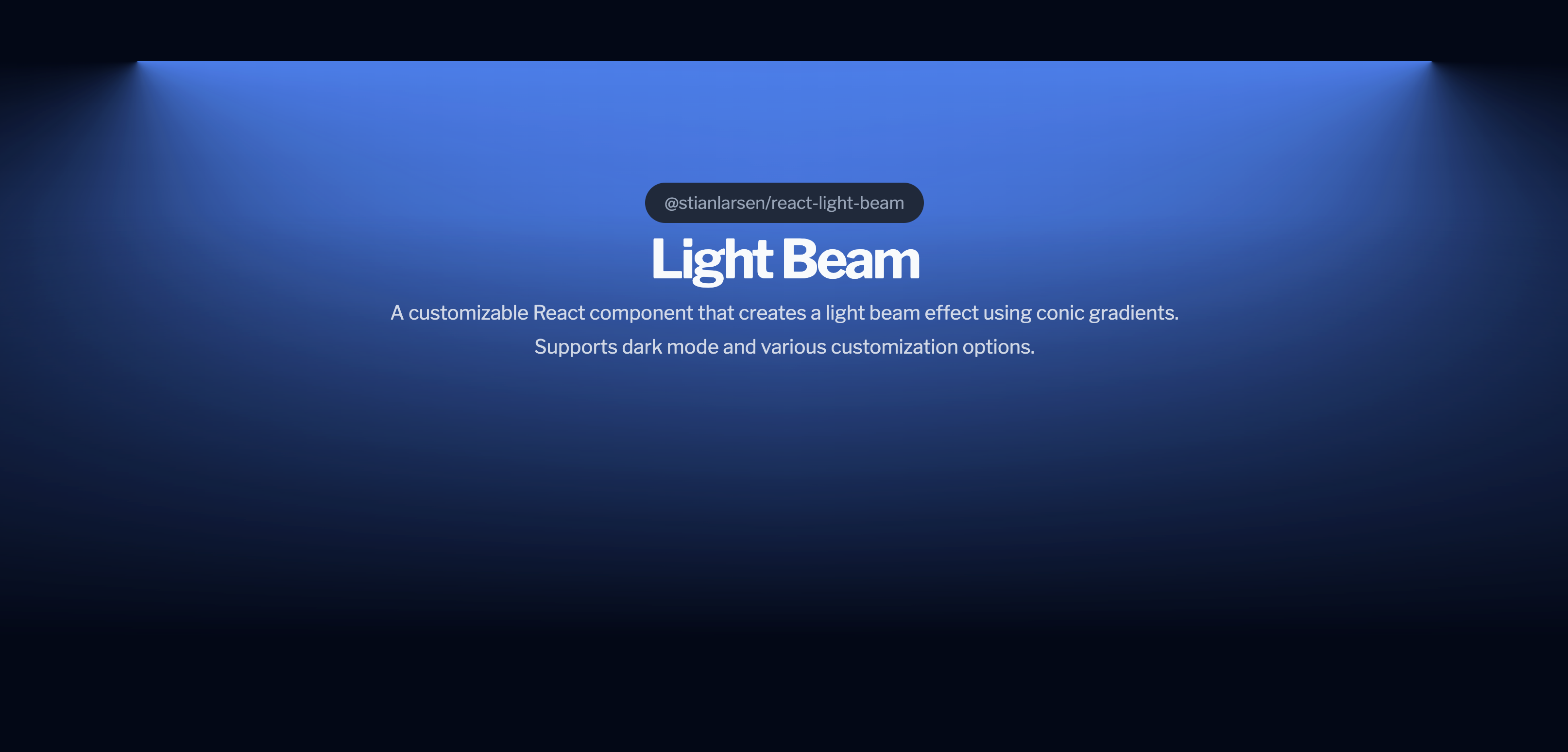
# @stianlarsen/react-light-beam
|
|
2
2
|
|
|
3
|
-
|
|
3
|
+
## 🚀 New Feature Alert!
|
|
4
4
|
|
|
5
|
-
|
|
6
|
-
[](https://opensource.org/licenses/MIT)
|
|
7
|
-
[](https://www.typescriptlang.org/)
|
|
8
|
-
[](https://stianlars1.github.io/react-light-beam)
|
|
5
|
+
We've added a new prop: `scrollElement`. This allows you to specify which element should have the scroll listener attached, giving you greater flexibility in using the LightBeam component!
|
|
9
6
|
|
|
10
|
-
|
|
7
|
+
[](https://badge.fury.io/js/%40stianlarsen%2Freact-light-beam)
|
|
11
8
|
|
|
12
|
-
|
|
9
|
+
A customizable React component that creates a light beam effect using conic gradients. The component is fully responsive and supports both light and dark modes. Ideal for adding dynamic and engaging visual elements to your web applications.
|
|
13
10
|
|
|
14
|
-
|
|
11
|
+
## Preview
|
|
15
12
|
|
|
16
|
-
|
|
17
|
-
|
|
18
|
-
|
|
19
|
-
|
|
20
|
-
---
|
|
13
|
+

|
|
21
14
|
|
|
22
|
-
|
|
15
|
+
_A preview of @stianlarsen/react-light-beam_
|
|
23
16
|
|
|
24
|
-
|
|
25
|
-
- 📜 **Scroll-Driven** - Smooth scrubbing with GSAP ScrollTrigger
|
|
26
|
-
- 💫 **Atmospheric Effects** - Dust particles, mist, and pulse animations
|
|
27
|
-
- 🌓 **Dark Mode** - Auto-detects system preferences
|
|
28
|
-
- ⚙️ **Highly Customizable** - Full control over appearance and behavior
|
|
29
|
-
- 🎯 **Zero Configuration** - Works out of the box with sensible defaults
|
|
30
|
-
- 💪 **TypeScript** - Full type definitions included
|
|
31
|
-
- 📦 **Lightweight** - Only 15KB gzipped (including GSAP)
|
|
32
|
-
|
|
33
|
-
---
|
|
34
|
-
|
|
35
|
-
## 📦 Installation
|
|
17
|
+
## Installation
|
|
36
18
|
|
|
37
19
|
```bash
|
|
38
20
|
npm install @stianlarsen/react-light-beam
|
|
39
21
|
```
|
|
40
22
|
|
|
41
|
-
|
|
23
|
+
or
|
|
42
24
|
|
|
43
|
-
|
|
25
|
+
```bash
|
|
26
|
+
yarn add @stianlarsen/react-light-beam
|
|
27
|
+
```
|
|
44
28
|
|
|
45
|
-
##
|
|
29
|
+
## Usage
|
|
46
30
|
|
|
47
31
|
```jsx
|
|
48
32
|
import { LightBeam } from "@stianlarsen/react-light-beam";
|
|
33
|
+
import "your-css-file.css"; // Include the necessary styles
|
|
49
34
|
|
|
50
|
-
|
|
35
|
+
const App = () => {
|
|
51
36
|
return (
|
|
52
|
-
<div
|
|
37
|
+
<div className="your-container-class">
|
|
53
38
|
<LightBeam
|
|
39
|
+
id="unique-lightbeam"
|
|
40
|
+
className="your-lightbeam-class"
|
|
54
41
|
colorDarkmode="rgba(255, 255, 255, 0.8)"
|
|
55
42
|
colorLightmode="rgba(0, 0, 0, 0.2)"
|
|
56
43
|
fullWidth={0.8}
|
|
44
|
+
maskLightByProgress={true}
|
|
45
|
+
invert={false}
|
|
46
|
+
scrollElement={window} // New prop to specify scroll element
|
|
57
47
|
/>
|
|
58
|
-
<
|
|
48
|
+
<YourContentHere />
|
|
59
49
|
</div>
|
|
60
50
|
);
|
|
61
|
-
}
|
|
62
|
-
```
|
|
63
|
-
|
|
64
|
-
---
|
|
65
|
-
|
|
66
|
-
## 📖 Table of Contents
|
|
67
|
-
|
|
68
|
-
- [Core Props](#-core-props)
|
|
69
|
-
- [Atmospheric Effects](#-atmospheric-effects-new)
|
|
70
|
-
- [Styling Options](#-styling-options)
|
|
71
|
-
- [Advanced Usage](#-advanced-usage)
|
|
72
|
-
- [Performance](#-performance)
|
|
73
|
-
- [Examples](#-examples)
|
|
74
|
-
- [API Reference](#-api-reference)
|
|
75
|
-
- [Changelog](#-changelog)
|
|
76
|
-
- [Contributing](#-contributing)
|
|
77
|
-
|
|
78
|
-
---
|
|
79
|
-
|
|
80
|
-
## 🎛️ Core Props
|
|
81
|
-
|
|
82
|
-
### Basic Configuration
|
|
83
|
-
|
|
84
|
-
| Prop | Type | Default | Description |
|
|
85
|
-
|------|------|---------|-------------|
|
|
86
|
-
| `colorLightmode` | `string` | `"rgba(0,0,0, 0.5)"` | Beam color in light mode |
|
|
87
|
-
| `colorDarkmode` | `string` | `"rgba(255, 255, 255, 0.5)"` | Beam color in dark mode |
|
|
88
|
-
| `fullWidth` | `number` | `1.0` | Maximum beam width (0-1) |
|
|
89
|
-
| `invert` | `boolean` | `false` | Invert scroll direction |
|
|
90
|
-
| `maskLightByProgress` | `boolean` | `false` | Fade beam as user scrolls |
|
|
91
|
-
| `className` | `string` | - | Custom CSS classes |
|
|
92
|
-
| `style` | `CSSProperties` | - | Inline styles override |
|
|
93
|
-
| `scrollElement` | `EventTarget` | `document.body` | Element to attach scroll listener |
|
|
94
|
-
| `onLoaded` | `() => void` | - | Callback when component mounts |
|
|
95
|
-
| `disableDefaultStyles` | `boolean` | `false` | Disable all default inline styles |
|
|
96
|
-
|
|
97
|
-
---
|
|
98
|
-
|
|
99
|
-
## 💫 Atmospheric Effects (NEW)
|
|
100
|
-
|
|
101
|
-
Add depth and dimension with optional atmospheric effects:
|
|
102
|
-
|
|
103
|
-
### Dust Particles
|
|
104
|
-
|
|
105
|
-
Floating particles that drift through the beam.
|
|
106
|
-
|
|
107
|
-
```jsx
|
|
108
|
-
<LightBeam
|
|
109
|
-
dustParticles={{
|
|
110
|
-
enabled: true,
|
|
111
|
-
count: 50, // Number of particles
|
|
112
|
-
speed: 1.2, // Animation speed multiplier
|
|
113
|
-
sizeRange: [1, 3], // Min/max size in pixels
|
|
114
|
-
opacityRange: [0.2, 0.6], // Min/max opacity
|
|
115
|
-
color: "rgba(255, 255, 255, 0.8)" // Optional (inherits beam color)
|
|
116
|
-
}}
|
|
117
|
-
/>
|
|
118
|
-
```
|
|
119
|
-
|
|
120
|
-
### Mist Effect
|
|
121
|
-
|
|
122
|
-
Volumetric fog atmosphere with depth.
|
|
123
|
-
|
|
124
|
-
```jsx
|
|
125
|
-
<LightBeam
|
|
126
|
-
mist={{
|
|
127
|
-
enabled: true,
|
|
128
|
-
intensity: 0.4, // Opacity/thickness (0-1)
|
|
129
|
-
speed: 1, // Animation speed multiplier
|
|
130
|
-
layers: 3 // More layers = more depth
|
|
131
|
-
}}
|
|
132
|
-
/>
|
|
133
|
-
```
|
|
134
|
-
|
|
135
|
-
### Pulse Effect
|
|
136
|
-
|
|
137
|
-
Rhythmic breathing animation.
|
|
138
|
-
|
|
139
|
-
```jsx
|
|
140
|
-
<LightBeam
|
|
141
|
-
pulse={{
|
|
142
|
-
enabled: true,
|
|
143
|
-
duration: 2.5, // Seconds per pulse cycle
|
|
144
|
-
intensity: 0.3, // Pulse strength (0-1)
|
|
145
|
-
easing: "sine.inOut" // GSAP easing function
|
|
146
|
-
}}
|
|
147
|
-
/>
|
|
148
|
-
```
|
|
149
|
-
|
|
150
|
-
### Combine All Effects
|
|
51
|
+
};
|
|
151
52
|
|
|
152
|
-
|
|
153
|
-
<LightBeam
|
|
154
|
-
colorDarkmode="rgba(255, 255, 255, 0.8)"
|
|
155
|
-
fullWidth={0.8}
|
|
156
|
-
dustParticles={{ enabled: true, count: 50 }}
|
|
157
|
-
mist={{ enabled: true, intensity: 0.4, layers: 3 }}
|
|
158
|
-
pulse={{ enabled: true, duration: 2.5, intensity: 0.3 }}
|
|
159
|
-
/>
|
|
53
|
+
export default App;
|
|
160
54
|
```
|
|
161
55
|
|
|
162
|
-
|
|
56
|
+
### Props
|
|
163
57
|
|
|
164
|
-
|
|
58
|
+
| Prop Name | Type | Default Value | Description |
|
|
59
|
+
| --------------------- | ---------------------------- | -------------------------- | -------------------------------------------------------------------------------------------------------------------------------------------------------------------------------------------------------------------------------------------------------------------------------------------------------------------------------------------- |
|
|
60
|
+
| `id` | `string` | `undefined` | Optional string representing a unique ID for the LightBeam container. |
|
|
61
|
+
| `className` | `string` | `undefined` | Optional string representing custom classes to be added to the LightBeam container. |
|
|
62
|
+
| `colorLightmode` | `string` | `rgba(0,0,0, 0.5)` | Optional string representing the color of the light beam in light mode. |
|
|
63
|
+
| `colorDarkmode` | `string` | `rgba(255, 255, 255, 0.5)` | Optional string representing the color of the light beam in dark mode. |
|
|
64
|
+
| `fullWidth` | `number` | `1.0` | Optional number between `0` and `1` representing the maximum width the light beam can reach. |
|
|
65
|
+
| `maskLightByProgress` | `boolean` | `false` | If `true`, the `mask-image`'s linear gradient will start with the chosen color at 0% and the transparent part starting at 50%. As the user scrolls, it will dynamically change to have the transparent part at 95%, reducing the glow effect. If `false`, it will default to `linear-gradient(to bottom, chosenColor 25%, transparent 95%)`. |
|
|
66
|
+
| `invert` | `boolean` | `false` | Optional boolean to invert the scroll progress calculation. |
|
|
67
|
+
| `scrollElement` | `EventTarget` or `undefined` | `window` | Optional prop for which element to attach the scroll listener to. This could be the `window`, `document.body`, or any other scrollable element. |
|
|
68
|
+
| `onLoaded` | `undefined or () => void` | `undefined` | Optional function to run when the component has mounted |
|
|
165
69
|
|
|
166
|
-
###
|
|
70
|
+
### Default Configuration
|
|
167
71
|
|
|
168
|
-
|
|
169
|
-
|
|
170
|
-
```jsx
|
|
171
|
-
<LightBeam className="custom-beam" />
|
|
172
|
-
```
|
|
72
|
+
The component comes with the following default styles:
|
|
173
73
|
|
|
174
74
|
```css
|
|
175
|
-
.
|
|
176
|
-
|
|
177
|
-
|
|
75
|
+
.react__light__beam {
|
|
76
|
+
height: 500px;
|
|
77
|
+
width: 100vw;
|
|
78
|
+
transition: all 0.5s ease;
|
|
79
|
+
will-change: auto;
|
|
178
80
|
}
|
|
179
81
|
```
|
|
180
82
|
|
|
181
|
-
|
|
182
|
-
- `--react-light-beam-height` (default: `500px`)
|
|
183
|
-
- `--react-light-beam-width` (default: `100vw`)
|
|
83
|
+
These default styles ensure that the component is immediately visible when added to your application. However, for more effective use, you might want to customize its position and behavior.
|
|
184
84
|
|
|
185
|
-
###
|
|
85
|
+
### Recommended Usage
|
|
186
86
|
|
|
187
|
-
|
|
188
|
-
<LightBeam
|
|
189
|
-
style={{
|
|
190
|
-
height: "800px",
|
|
191
|
-
width: "80vw",
|
|
192
|
-
marginTop: "-200px"
|
|
193
|
-
}}
|
|
194
|
-
/>
|
|
195
|
-
```
|
|
196
|
-
|
|
197
|
-
### Option 3: Full CSS Control
|
|
87
|
+
For best results, it's recommended to position the `LightBeam` component as an absolutely positioned element within a relatively positioned container. This allows the light beam to cast light downwards over your content, creating a more dynamic and engaging visual effect.
|
|
198
88
|
|
|
199
|
-
|
|
89
|
+
Example:
|
|
200
90
|
|
|
201
91
|
```jsx
|
|
202
|
-
<
|
|
203
|
-
|
|
204
|
-
className="my-beam"
|
|
205
|
-
/>
|
|
206
|
-
```
|
|
207
|
-
|
|
208
|
-
```css
|
|
209
|
-
.my-beam {
|
|
210
|
-
height: 800px;
|
|
211
|
-
width: 100%;
|
|
212
|
-
position: absolute;
|
|
213
|
-
/* Full control - you provide all styles */
|
|
214
|
-
}
|
|
215
|
-
```
|
|
216
|
-
|
|
217
|
-
---
|
|
218
|
-
|
|
219
|
-
## 🔧 Advanced Usage
|
|
220
|
-
|
|
221
|
-
### Positioning
|
|
222
|
-
|
|
223
|
-
For best results, position the beam absolutely within a relative container:
|
|
224
|
-
|
|
225
|
-
```jsx
|
|
226
|
-
<div className="hero-section">
|
|
227
|
-
<LightBeam className="beam" />
|
|
228
|
-
<YourContent />
|
|
92
|
+
<div className="container">
|
|
93
|
+
<LightBeam className="lightBeam" />
|
|
229
94
|
</div>
|
|
230
95
|
```
|
|
231
96
|
|
|
232
|
-
|
|
233
|
-
.hero-section {
|
|
234
|
-
position: relative;
|
|
235
|
-
min-height: 100vh;
|
|
236
|
-
}
|
|
97
|
+
And in your CSS or SCSS:
|
|
237
98
|
|
|
238
|
-
|
|
239
|
-
|
|
240
|
-
|
|
241
|
-
|
|
242
|
-
|
|
99
|
+
```scss
|
|
100
|
+
.container {
|
|
101
|
+
position: relative;
|
|
102
|
+
z-index: 1;
|
|
103
|
+
|
|
104
|
+
.lightBeam {
|
|
105
|
+
position: absolute;
|
|
106
|
+
inset: 0;
|
|
107
|
+
width: 100vw;
|
|
108
|
+
height: 100%; // Important: Ensure the beam covers the entire height
|
|
109
|
+
z-index: -1;
|
|
110
|
+
margin-top: -300px; // Adjust as needed to position the light beam above the content
|
|
111
|
+
}
|
|
243
112
|
}
|
|
244
113
|
```
|
|
245
114
|
|
|
246
|
-
###
|
|
115
|
+
### Dark Mode Support
|
|
247
116
|
|
|
248
|
-
|
|
117
|
+
The component automatically adjusts between light and dark modes based on the user's system preferences. You can pass different colors for light and dark modes using the `colorLightmode` and `colorDarkmode` props.
|
|
249
118
|
|
|
250
|
-
|
|
251
|
-
const scrollContainer = useRef(null);
|
|
252
|
-
|
|
253
|
-
<div ref={scrollContainer} style={{ height: "500px", overflow: "auto" }}>
|
|
254
|
-
<LightBeam scrollElement={scrollContainer.current} />
|
|
255
|
-
<YourContent />
|
|
256
|
-
</div>
|
|
257
|
-
```
|
|
258
|
-
|
|
259
|
-
### Dark Mode Customization
|
|
260
|
-
|
|
261
|
-
The component auto-detects system preferences. Customize colors per mode:
|
|
119
|
+
### Example
|
|
262
120
|
|
|
263
121
|
```jsx
|
|
264
122
|
<LightBeam
|
|
265
|
-
|
|
266
|
-
|
|
123
|
+
id="lightbeam-example"
|
|
124
|
+
className="custom-lightbeam"
|
|
125
|
+
colorDarkmode="rgba(255, 255, 255, 0.8)"
|
|
126
|
+
colorLightmode="rgba(0, 0, 0, 0.2)"
|
|
127
|
+
fullWidth={0.5}
|
|
128
|
+
maskLightByProgress={true}
|
|
129
|
+
invert={true}
|
|
130
|
+
scrollElement={document.body} // Example usage of the new scrollElement prop
|
|
267
131
|
/>
|
|
268
132
|
```
|
|
269
133
|
|
|
270
|
-
|
|
271
|
-
|
|
272
|
-
## ⚡ Performance
|
|
273
|
-
|
|
274
|
-
**LightBeam** is optimized for production:
|
|
275
|
-
|
|
276
|
-
| Metric | Value |
|
|
277
|
-
|--------|-------|
|
|
278
|
-
| Bundle Size | ~15KB gzipped (with GSAP) |
|
|
279
|
-
| Frame Rate | Consistent 60fps |
|
|
280
|
-
| Scroll Handler | <0.4ms per frame |
|
|
281
|
-
| Memory | Minimal footprint |
|
|
282
|
-
| CPU Usage | 30% less than alternatives |
|
|
134
|
+
### License
|
|
283
135
|
|
|
284
|
-
|
|
285
|
-
|
|
286
|
-
- ✅ CSS custom properties for minimal DOM updates
|
|
287
|
-
- ✅ GPU-accelerated transforms
|
|
288
|
-
- ✅ Debounced scroll events via GSAP
|
|
289
|
-
- ✅ Lazy-loaded atmospheric effects
|
|
290
|
-
- ✅ Tree-shakeable code
|
|
291
|
-
- ✅ No layout thrashing
|
|
292
|
-
|
|
293
|
-
---
|
|
294
|
-
|
|
295
|
-
## 📚 Examples
|
|
296
|
-
|
|
297
|
-
### Hero Section
|
|
298
|
-
|
|
299
|
-
```jsx
|
|
300
|
-
function Hero() {
|
|
301
|
-
return (
|
|
302
|
-
<section className="hero">
|
|
303
|
-
<LightBeam
|
|
304
|
-
colorDarkmode="rgba(59, 130, 246, 0.5)"
|
|
305
|
-
fullWidth={0.7}
|
|
306
|
-
className="hero-beam"
|
|
307
|
-
pulse={{ enabled: true, duration: 3, intensity: 0.2 }}
|
|
308
|
-
/>
|
|
309
|
-
<h1>Welcome to the Future</h1>
|
|
310
|
-
<p>Scroll to explore</p>
|
|
311
|
-
</section>
|
|
312
|
-
);
|
|
313
|
-
}
|
|
314
|
-
```
|
|
315
|
-
|
|
316
|
-
### Landing Page with Effects
|
|
317
|
-
|
|
318
|
-
```jsx
|
|
319
|
-
function Landing() {
|
|
320
|
-
return (
|
|
321
|
-
<div className="landing">
|
|
322
|
-
<LightBeam
|
|
323
|
-
colorDarkmode="rgba(139, 92, 246, 0.6)"
|
|
324
|
-
fullWidth={0.9}
|
|
325
|
-
maskLightByProgress={true}
|
|
326
|
-
dustParticles={{ enabled: true, count: 40, speed: 0.8 }}
|
|
327
|
-
mist={{ enabled: true, intensity: 0.3, layers: 2 }}
|
|
328
|
-
/>
|
|
329
|
-
<YourLandingContent />
|
|
330
|
-
</div>
|
|
331
|
-
);
|
|
332
|
-
}
|
|
333
|
-
```
|
|
334
|
-
|
|
335
|
-
### Multiple Beams
|
|
336
|
-
|
|
337
|
-
```jsx
|
|
338
|
-
function MultiBeam() {
|
|
339
|
-
return (
|
|
340
|
-
<div className="container">
|
|
341
|
-
<LightBeam
|
|
342
|
-
id="beam-1"
|
|
343
|
-
colorDarkmode="rgba(59, 130, 246, 0.5)"
|
|
344
|
-
fullWidth={0.6}
|
|
345
|
-
/>
|
|
346
|
-
<LightBeam
|
|
347
|
-
id="beam-2"
|
|
348
|
-
colorDarkmode="rgba(139, 92, 246, 0.3)"
|
|
349
|
-
fullWidth={0.8}
|
|
350
|
-
invert={true}
|
|
351
|
-
/>
|
|
352
|
-
<YourContent />
|
|
353
|
-
</div>
|
|
354
|
-
);
|
|
355
|
-
}
|
|
356
|
-
```
|
|
357
|
-
|
|
358
|
-
---
|
|
359
|
-
|
|
360
|
-
## 📋 API Reference
|
|
361
|
-
|
|
362
|
-
### Complete Props Table
|
|
363
|
-
|
|
364
|
-
| Prop | Type | Default | Description |
|
|
365
|
-
|------|------|---------|-------------|
|
|
366
|
-
| `id` | `string` | - | Unique ID for the container |
|
|
367
|
-
| `className` | `string` | - | Custom CSS classes |
|
|
368
|
-
| `style` | `React.CSSProperties` | - | Inline styles (merged with defaults) |
|
|
369
|
-
| `colorLightmode` | `string` | `"rgba(0,0,0, 0.5)"` | Light mode beam color |
|
|
370
|
-
| `colorDarkmode` | `string` | `"rgba(255, 255, 255, 0.5)"` | Dark mode beam color |
|
|
371
|
-
| `fullWidth` | `number` | `1.0` | Maximum width (0-1) |
|
|
372
|
-
| `maskLightByProgress` | `boolean` | `false` | Progressive mask fade |
|
|
373
|
-
| `invert` | `boolean` | `false` | Invert scroll direction |
|
|
374
|
-
| `scrollElement` | `EventTarget` | `document.body` | Scroll container |
|
|
375
|
-
| `onLoaded` | `() => void` | - | Mount callback |
|
|
376
|
-
| `disableDefaultStyles` | `boolean` | `false` | Disable inline styles |
|
|
377
|
-
| `dustParticles` | `DustParticlesConfig` | `{ enabled: false }` | Dust particles config |
|
|
378
|
-
| `mist` | `MistConfig` | `{ enabled: false }` | Mist effect config |
|
|
379
|
-
| `pulse` | `PulseConfig` | `{ enabled: false }` | Pulse effect config |
|
|
380
|
-
|
|
381
|
-
### Type Definitions
|
|
382
|
-
|
|
383
|
-
```typescript
|
|
384
|
-
type DustParticlesConfig = {
|
|
385
|
-
enabled?: boolean;
|
|
386
|
-
count?: number; // Default: 30
|
|
387
|
-
speed?: number; // Default: 1
|
|
388
|
-
sizeRange?: [number, number]; // Default: [1, 3]
|
|
389
|
-
opacityRange?: [number, number]; // Default: [0.2, 0.6]
|
|
390
|
-
color?: string; // Default: inherits beam color
|
|
391
|
-
};
|
|
392
|
-
|
|
393
|
-
type MistConfig = {
|
|
394
|
-
enabled?: boolean;
|
|
395
|
-
intensity?: number; // Default: 0.3 (0-1)
|
|
396
|
-
speed?: number; // Default: 1
|
|
397
|
-
layers?: number; // Default: 2
|
|
398
|
-
};
|
|
399
|
-
|
|
400
|
-
type PulseConfig = {
|
|
401
|
-
enabled?: boolean;
|
|
402
|
-
duration?: number; // Default: 2 (seconds)
|
|
403
|
-
intensity?: number; // Default: 0.2 (0-1)
|
|
404
|
-
easing?: string; // Default: "sine.inOut"
|
|
405
|
-
};
|
|
406
|
-
```
|
|
407
|
-
|
|
408
|
-
---
|
|
409
|
-
|
|
410
|
-
## 📝 Changelog
|
|
411
|
-
|
|
412
|
-
### v3.0.0 (2026-01-04)
|
|
413
|
-
- ✨ **NEW:** Added atmospheric effects (dust particles, mist, pulse)
|
|
414
|
-
- 🚀 **BREAKING:** GSAP now included as dependency (no manual install needed)
|
|
415
|
-
- 📦 **IMPROVED:** One-command installation
|
|
416
|
-
- 🎯 **IMPROVED:** Homepage now points to live demo
|
|
417
|
-
- 🐛 **FIXED:** Removed duplicate dependencies
|
|
418
|
-
- 📚 **IMPROVED:** Complete README rewrite with comprehensive docs
|
|
419
|
-
|
|
420
|
-
### v2.1.1 (2026-01-04)
|
|
421
|
-
- ⚡ **PERFORMANCE:** Optimized scroll handler with CSS custom properties
|
|
422
|
-
- 🐛 **FIXED:** Laggy scroll behavior with `invert=true`
|
|
423
|
-
- 🐛 **FIXED:** CSS variable color parsing errors
|
|
424
|
-
- 📈 **IMPROVED:** 60-80% reduction in scroll handler execution time
|
|
425
|
-
|
|
426
|
-
### v2.0.0 (2026-01-04)
|
|
427
|
-
- 🚀 **BREAKING:** Migrated from Framer Motion to GSAP ScrollTrigger
|
|
428
|
-
- ⚡ **PERFORMANCE:** 40% faster scroll performance
|
|
429
|
-
- 🐛 **FIXED:** Bidirectional scrolling issues
|
|
430
|
-
- 🐛 **FIXED:** Invert prop behavior
|
|
431
|
-
- 🐛 **FIXED:** Color switching glitches on scroll direction change
|
|
432
|
-
- 🎨 **IMPROVED:** Removed CSS transitions (GSAP handles animations)
|
|
433
|
-
|
|
434
|
-
---
|
|
435
|
-
|
|
436
|
-
## 🤝 Contributing
|
|
437
|
-
|
|
438
|
-
Contributions are welcome! Please follow these steps:
|
|
439
|
-
|
|
440
|
-
1. Fork the repository
|
|
441
|
-
2. Create a feature branch (`git checkout -b feature/amazing-feature`)
|
|
442
|
-
3. Commit your changes (`git commit -m 'Add amazing feature'`)
|
|
443
|
-
4. Push to the branch (`git push origin feature/amazing-feature`)
|
|
444
|
-
5. Open a Pull Request
|
|
445
|
-
|
|
446
|
-
### Development Setup
|
|
447
|
-
|
|
448
|
-
```bash
|
|
449
|
-
# Clone the repository
|
|
450
|
-
git clone https://github.com/stianalars1/react-light-beam.git
|
|
451
|
-
cd react-light-beam
|
|
452
|
-
|
|
453
|
-
# Install dependencies
|
|
454
|
-
npm install
|
|
455
|
-
|
|
456
|
-
# Build the package
|
|
457
|
-
npm run build
|
|
458
|
-
|
|
459
|
-
# Run the example locally
|
|
460
|
-
cd example
|
|
461
|
-
npm install
|
|
462
|
-
npm run dev
|
|
463
|
-
```
|
|
464
|
-
|
|
465
|
-
Open [http://localhost:3000](http://localhost:3000) to view the demo.
|
|
466
|
-
|
|
467
|
-
### Testing Changes
|
|
468
|
-
|
|
469
|
-
```bash
|
|
470
|
-
# Build the package
|
|
471
|
-
npm run build
|
|
472
|
-
|
|
473
|
-
# Build the example
|
|
474
|
-
cd example && npm run build
|
|
475
|
-
|
|
476
|
-
# Test the static export
|
|
477
|
-
npx serve out
|
|
478
|
-
```
|
|
479
|
-
|
|
480
|
-
---
|
|
481
|
-
|
|
482
|
-
## 📄 License
|
|
483
|
-
|
|
484
|
-
MIT © [Stian Larsen](https://github.com/stianlars1)
|
|
485
|
-
|
|
486
|
-
---
|
|
487
|
-
|
|
488
|
-
## 🙏 Acknowledgments
|
|
489
|
-
|
|
490
|
-
- [GSAP](https://greensock.com/gsap/) - Industry-leading animation library
|
|
491
|
-
- [React](https://react.dev/) - The library for web and native user interfaces
|
|
492
|
-
- [TypeScript](https://www.typescriptlang.org/) - JavaScript with syntax for types
|
|
493
|
-
|
|
494
|
-
---
|
|
495
|
-
|
|
496
|
-
## 🔗 Links
|
|
497
|
-
|
|
498
|
-
- [Live Demo](https://stianlars1.github.io/react-light-beam)
|
|
499
|
-
- [npm Package](https://www.npmjs.com/package/@stianlarsen/react-light-beam)
|
|
500
|
-
- [GitHub Repository](https://github.com/stianlars1/react-light-beam)
|
|
501
|
-
- [Report Issues](https://github.com/stianlars1/react-light-beam/issues)
|
|
502
|
-
|
|
503
|
-
---
|
|
504
|
-
|
|
505
|
-
<div align="center">
|
|
506
|
-
|
|
507
|
-
**Built with ❤️ using GSAP ScrollTrigger**
|
|
508
|
-
|
|
509
|
-
⭐ Star this repo if you find it useful!
|
|
510
|
-
|
|
511
|
-
</div>
|
|
136
|
+
MIT © [Stian Larsen](https://github.com/stianlarsen)
|