@soroush.tech/markdown 1.2.1 → 1.2.2
This diff represents the content of publicly available package versions that have been released to one of the supported registries. The information contained in this diff is provided for informational purposes only and reflects changes between package versions as they appear in their respective public registries.
- package/README.md +27 -27
- package/dist/CodeBlock.d.cts +1 -1
- package/dist/CodeBlock.d.mts +1 -1
- package/dist/Control.cjs +1 -1
- package/dist/Control.d.cts +2 -2
- package/dist/Control.d.mts +2 -2
- package/dist/Control.mjs +1 -1
- package/dist/Editor.cjs +1 -1
- package/dist/Editor.d.cts +8 -8
- package/dist/Editor.d.mts +8 -8
- package/dist/Editor.mjs +1 -1
- package/dist/{LiveEdit-KDKu7Yvn.mjs → LiveEdit-CaMZLJCs.mjs} +8 -8
- package/dist/{LiveEdit-DmM35H99.cjs → LiveEdit-CbRkmd43.cjs} +8 -8
- package/dist/LiveEdit.cjs +1 -1
- package/dist/LiveEdit.d.cts +5 -5
- package/dist/LiveEdit.d.mts +5 -5
- package/dist/LiveEdit.mjs +1 -1
- package/dist/MarkdownContext.d.cts +1 -1
- package/dist/MarkdownContext.d.mts +1 -1
- package/dist/{Mermaid-BclI9A7e.mjs → Mermaid-B7vDwGQG.mjs} +3 -3
- package/dist/{Mermaid-DqP2Q0bt.cjs → Mermaid-CkUan4z-.cjs} +3 -3
- package/dist/Mermaid.cjs +1 -1
- package/dist/Mermaid.d.cts +1 -1
- package/dist/Mermaid.d.mts +1 -1
- package/dist/Mermaid.mjs +1 -1
- package/dist/{Preview-nvh2sGBQ.mjs → Preview-BFyaPHjw.mjs} +1 -1
- package/dist/{Preview-YtIipm0z.cjs → Preview-CnMWUtU2.cjs} +1 -1
- package/dist/Preview.cjs +1 -1
- package/dist/Preview.d.cts +1 -1
- package/dist/Preview.d.mts +1 -1
- package/dist/Preview.mjs +1 -1
- package/dist/{Toolbar-C0SNI-JK.mjs → Toolbar-BoEuAIiw.mjs} +3 -3
- package/dist/{Toolbar-Ba3l-oBU.cjs → Toolbar-CRlLqvj9.cjs} +3 -3
- package/dist/Toolbar.cjs +1 -1
- package/dist/Toolbar.mjs +1 -1
- package/dist/{index-BO0LyUUG.d.cts → index-Bd3yPDn_.d.cts} +5 -5
- package/dist/{index-BO0LyUUG.d.mts → index-Bd3yPDn_.d.mts} +5 -5
- package/dist/{index-CPWcFD6T.d.mts → index-CBKWWR5Q.d.mts} +4 -4
- package/dist/{index-rGZIhUgj.d.mts → index-Cre2ivJn.d.cts} +8 -8
- package/dist/{index-rGZIhUgj.d.cts → index-Cre2ivJn.d.mts} +8 -8
- package/dist/{index-BtMTBOcM.d.cts → index-D1rI6OgO.d.cts} +4 -4
- package/dist/{index-BtMTBOcM.d.mts → index-D1rI6OgO.d.mts} +4 -4
- package/dist/{index-CxdJ1SgP.d.cts → index-TT9-Qjsh.d.cts} +4 -4
- package/dist/index.cjs +4 -4
- package/dist/index.d.cts +6 -6
- package/dist/index.d.mts +6 -6
- package/dist/index.mjs +4 -4
- package/package.json +5 -5
package/README.md
CHANGED
|
@@ -7,27 +7,27 @@
|
|
|
7
7
|
|
|
8
8
|
## A **headless markdown editor and preview**.
|
|
9
9
|
|
|
10
|
-
Compose a toolbar, a source editor, and a live preview however your UI needs
|
|
10
|
+
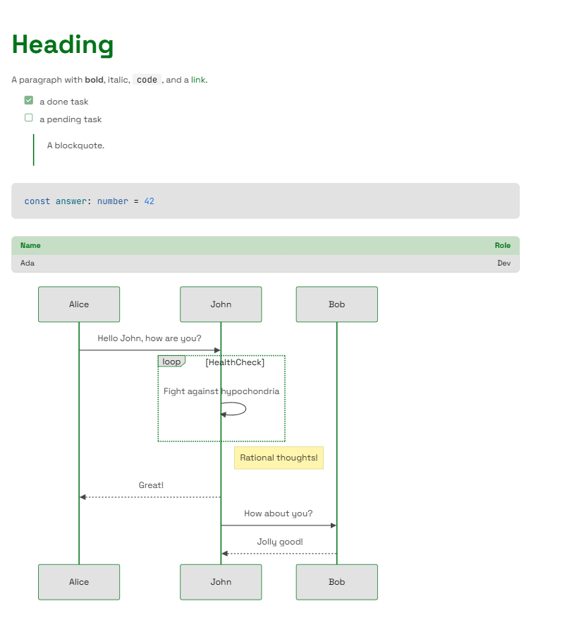
Compose a toolbar, a source editor, and a live preview however your UI needs - and every element is styled by your theme. The renderer works standalone too, turning any markdown string into themed components, with support for tables, task lists, strikethrough, autolinks, syntax-highlighted code, and mermaid diagrams.
|
|
11
11
|
|
|
12
|
-
|
|
13
13
|
|
|
14
14
|
## Why headless?
|
|
15
15
|
|
|
16
|
-
Most markdown editors hand you a fixed widget
|
|
16
|
+
Most markdown editors hand you a fixed widget - a bordered box with a toolbar bolted on top and an Edit/Preview toggle you can't move. This one gives you the **pieces** instead:
|
|
17
17
|
|
|
18
|
-
- **You own the layout.** Put the preview beside the editor, below it, in a modal, or drop it entirely
|
|
18
|
+
- **You own the layout.** Put the preview beside the editor, below it, in a modal, or drop it entirely - the parts don't care.
|
|
19
19
|
- **You own the state.** The value is yours (`useState`, a form, a store); the editor just reads and writes it.
|
|
20
|
-
- **It looks like your app.** Output is themed components
|
|
20
|
+
- **It looks like your app.** Output is themed components - `Typography`, `Link`, `Table`, and its own `CodeBlock` - not unstyled HTML, so it inherits your theme with zero extra CSS.
|
|
21
21
|
|
|
22
22
|
## Features
|
|
23
23
|
|
|
24
|
-
- **GitHub-Flavored Markdown**
|
|
25
|
-
- **Syntax-highlighted code**
|
|
26
|
-
- **Mermaid diagrams**
|
|
27
|
-
- **A real editing surface**
|
|
28
|
-
- **Composable parts**
|
|
29
|
-
- **Themeable to the slot**
|
|
30
|
-
- **Typed and SSR-safe**
|
|
24
|
+
- **GitHub-Flavored Markdown** - tables, task lists, strikethrough, and autolinks.
|
|
25
|
+
- **Syntax-highlighted code** - fenced blocks are highlighted automatically; unknown languages degrade gracefully.
|
|
26
|
+
- **Mermaid diagrams** - a ` ```mermaid ` fence renders as a themed diagram with built-in zoom and pan controls, loaded lazily on the client and falling back to the source until it does.
|
|
27
|
+
- **A real editing surface** - Tab-to-indent, selection tracking, caret restoration, formatting buttons, heading and code-language selects, a hover-grid table picker, and a diagram picker that inserts starter templates for 23 mermaid diagram types.
|
|
28
|
+
- **Composable parts** - `Control`, `Toolbar`, `Editor`, and `Preview`, coordinated through React context.
|
|
29
|
+
- **Themeable to the slot** - restyle the editor, toolbar, and preview through your theme, no forking required.
|
|
30
|
+
- **Typed and SSR-safe** - first-class TypeScript, 100% test coverage, no browser globals at module scope.
|
|
31
31
|
|
|
32
32
|
## Install
|
|
33
33
|
|
|
@@ -61,7 +61,7 @@ export function App() {
|
|
|
61
61
|
<ThemeProvider>
|
|
62
62
|
<Preview>
|
|
63
63
|
{
|
|
64
|
-
'# Hello\n\nRendered through your **theme**
|
|
64
|
+
'# Hello\n\nRendered through your **theme** - tables, `code`, and [links](https://soroush.tech) included.'
|
|
65
65
|
}
|
|
66
66
|
</Preview>
|
|
67
67
|
</ThemeProvider>
|
|
@@ -73,7 +73,7 @@ That's the whole renderer. To let people _write_ markdown, add the editing parts
|
|
|
73
73
|
|
|
74
74
|
## Editor
|
|
75
75
|
|
|
76
|
-
The `Editor` works standalone via `value`/`onChange`
|
|
76
|
+
The `Editor` works standalone via `value`/`onChange` - no `Control` needed:
|
|
77
77
|
|
|
78
78
|
```tsx
|
|
79
79
|
import { useState } from 'react'
|
|
@@ -81,7 +81,7 @@ import { Editor } from '@soroush.tech/markdown'
|
|
|
81
81
|
import { ThemeProvider } from '@soroush.tech/design-system/theme'
|
|
82
82
|
|
|
83
83
|
function MarkdownField() {
|
|
84
|
-
const [value, setValue] = useState('# Start writing\n\nJust the source editor
|
|
84
|
+
const [value, setValue] = useState('# Start writing\n\nJust the source editor - no preview.')
|
|
85
85
|
|
|
86
86
|
return (
|
|
87
87
|
<ThemeProvider>
|
|
@@ -117,26 +117,26 @@ function MarkdownField() {
|
|
|
117
117
|
}
|
|
118
118
|
```
|
|
119
119
|
|
|
120
|
-
There is intentionally **no Edit·Split·Preview switch**
|
|
120
|
+
There is intentionally **no Edit·Split·Preview switch** - which panes to show, and when, is your call.
|
|
121
121
|
|
|
122
122
|
## The parts
|
|
123
123
|
|
|
124
124
|
| Part | Role |
|
|
125
125
|
| --------- | --------------------------------------------------------------------------------- |
|
|
126
|
-
| `Control` | Headless provider
|
|
126
|
+
| `Control` | Headless provider - owns the `value`/selection state. Takes `value` + `onChange`. |
|
|
127
127
|
| `Toolbar` | Formatting buttons, heading/code-language selects, and the table picker. |
|
|
128
|
-
| `Editor` | The source `<textarea>`
|
|
128
|
+
| `Editor` | The source `<textarea>` - Tab-to-indent, selection, caret restore. |
|
|
129
129
|
| `Preview` | Renders a markdown string (its child) to themed components. |
|
|
130
130
|
|
|
131
|
-
`Toolbar` and `Editor` must be rendered inside `Control`; `Preview` works anywhere. Import each directly from the package
|
|
131
|
+
`Toolbar` and `Editor` must be rendered inside `Control`; `Preview` works anywhere. Import each directly from the package - there is no `Markdown.*` namespace. Full prop references live in the [source on GitHub](https://github.com/soroush-tech/core/tree/main/packages/markdown/src).
|
|
132
132
|
|
|
133
133
|
## Customizing the look
|
|
134
134
|
|
|
135
|
-
Everything is styled through the design system's theme, and there are two levels to reach for
|
|
135
|
+
Everything is styled through the design system's theme, and there are two levels to reach for - a shared theme for the whole look, and per-component slots for the markdown parts specifically.
|
|
136
136
|
|
|
137
|
-
### Customize the theme
|
|
137
|
+
### Customize the theme - restyle everything
|
|
138
138
|
|
|
139
|
-
`Preview` renders design-system components that read theme tokens, so your theme already governs how markdown looks. Build one with `createTheme`
|
|
139
|
+
`Preview` renders design-system components that read theme tokens, so your theme already governs how markdown looks. Build one with `createTheme` - palette, spacing, type scale, radii - and pass it to `ThemeProvider`; the markdown output changes along with the rest of your UI, no markdown-specific setup. See the [design system's theming guide](https://www.npmjs.com/package/@soroush.tech/design-system) for the full token set.
|
|
140
140
|
|
|
141
141
|
```tsx
|
|
142
142
|
import { ThemeProvider, createTheme, baseTheme } from '@soroush.tech/design-system/theme'
|
|
@@ -152,12 +152,12 @@ const theme = createTheme(baseTheme, {
|
|
|
152
152
|
},
|
|
153
153
|
})
|
|
154
154
|
|
|
155
|
-
// <ThemeProvider theme={theme}>
|
|
155
|
+
// <ThemeProvider theme={theme}> ... </ThemeProvider>
|
|
156
156
|
```
|
|
157
157
|
|
|
158
|
-
### Customize the components
|
|
158
|
+
### Customize the components - target the markdown parts
|
|
159
159
|
|
|
160
|
-
For tweaks specific to the editor, toolbar, or preview, this package registers three themeable slots under `theme.components`
|
|
160
|
+
For tweaks specific to the editor, toolbar, or preview, this package registers three themeable slots under `theme.components` - `MarkdownEditor`, `MarkdownPreview`, and `MarkdownToolbar`:
|
|
161
161
|
|
|
162
162
|
```tsx
|
|
163
163
|
const theme = createTheme(baseTheme, {
|
|
@@ -168,11 +168,11 @@ const theme = createTheme(baseTheme, {
|
|
|
168
168
|
})
|
|
169
169
|
```
|
|
170
170
|
|
|
171
|
-
The overrides are fully typed
|
|
171
|
+
The overrides are fully typed - importing the package registers the slots on the theme automatically.
|
|
172
172
|
|
|
173
173
|
## Building your own parts
|
|
174
174
|
|
|
175
|
-
Need a custom control or a word count? `useMarkdownContext()` exposes the same value, selection, and `dispatch` the built-in parts use
|
|
175
|
+
Need a custom control or a word count? `useMarkdownContext()` exposes the same value, selection, and `dispatch` the built-in parts use - call it from any component inside `Control`.
|
|
176
176
|
|
|
177
177
|
## License
|
|
178
178
|
|
package/dist/CodeBlock.d.cts
CHANGED
|
@@ -1,2 +1,2 @@
|
|
|
1
|
-
import { a as CodeBlockProps, i as CodeBlock, n as syntaxDark, r as syntaxLight, t as ThemeSyntax } from "./index-
|
|
1
|
+
import { a as CodeBlockProps, i as CodeBlock, n as syntaxDark, r as syntaxLight, t as ThemeSyntax } from "./index-D1rI6OgO.cjs";
|
|
2
2
|
export { CodeBlock, CodeBlockProps, ThemeSyntax, syntaxDark, syntaxLight };
|
package/dist/CodeBlock.d.mts
CHANGED
|
@@ -1,2 +1,2 @@
|
|
|
1
|
-
import { a as CodeBlockProps, i as CodeBlock, n as syntaxDark, r as syntaxLight, t as ThemeSyntax } from "./index-
|
|
1
|
+
import { a as CodeBlockProps, i as CodeBlock, n as syntaxDark, r as syntaxLight, t as ThemeSyntax } from "./index-D1rI6OgO.mjs";
|
|
2
2
|
export { CodeBlock, CodeBlockProps, ThemeSyntax, syntaxDark, syntaxLight };
|
package/dist/Control.cjs
CHANGED
|
@@ -6,7 +6,7 @@ let react_jsx_runtime = require("react/jsx-runtime");
|
|
|
6
6
|
//#region src/Control/Control.tsx
|
|
7
7
|
/**
|
|
8
8
|
* The headless root of the Markdown compound: owns the shared value/selection state and exposes
|
|
9
|
-
* it (plus a `dispatch` for toolbar actions) via context. It renders no UI of its own
|
|
9
|
+
* it (plus a `dispatch` for toolbar actions) via context. It renders no UI of its own - the
|
|
10
10
|
* consumer arranges the parts and decides which panes to show.
|
|
11
11
|
*/
|
|
12
12
|
function Control({ value, onChange, children }) {
|
package/dist/Control.d.cts
CHANGED
|
@@ -5,12 +5,12 @@ interface ControlProps {
|
|
|
5
5
|
value: string;
|
|
6
6
|
/** Called with the next source on edit or a toolbar action. */
|
|
7
7
|
onChange: (value: string) => void;
|
|
8
|
-
/** The composed parts
|
|
8
|
+
/** The composed parts - `Markdown.Toolbar`, `Markdown.Editor`, `Markdown.Preview`, ... */
|
|
9
9
|
children: ReactNode;
|
|
10
10
|
}
|
|
11
11
|
/**
|
|
12
12
|
* The headless root of the Markdown compound: owns the shared value/selection state and exposes
|
|
13
|
-
* it (plus a `dispatch` for toolbar actions) via context. It renders no UI of its own
|
|
13
|
+
* it (plus a `dispatch` for toolbar actions) via context. It renders no UI of its own - the
|
|
14
14
|
* consumer arranges the parts and decides which panes to show.
|
|
15
15
|
*/
|
|
16
16
|
declare function Control({ value, onChange, children }: Readonly<ControlProps>): import("react").JSX.Element;
|
package/dist/Control.d.mts
CHANGED
|
@@ -5,12 +5,12 @@ interface ControlProps {
|
|
|
5
5
|
value: string;
|
|
6
6
|
/** Called with the next source on edit or a toolbar action. */
|
|
7
7
|
onChange: (value: string) => void;
|
|
8
|
-
/** The composed parts
|
|
8
|
+
/** The composed parts - `Markdown.Toolbar`, `Markdown.Editor`, `Markdown.Preview`, ... */
|
|
9
9
|
children: ReactNode;
|
|
10
10
|
}
|
|
11
11
|
/**
|
|
12
12
|
* The headless root of the Markdown compound: owns the shared value/selection state and exposes
|
|
13
|
-
* it (plus a `dispatch` for toolbar actions) via context. It renders no UI of its own
|
|
13
|
+
* it (plus a `dispatch` for toolbar actions) via context. It renders no UI of its own - the
|
|
14
14
|
* consumer arranges the parts and decides which panes to show.
|
|
15
15
|
*/
|
|
16
16
|
declare function Control({ value, onChange, children }: Readonly<ControlProps>): import("react").JSX.Element;
|
package/dist/Control.mjs
CHANGED
|
@@ -5,7 +5,7 @@ import { jsx } from "react/jsx-runtime";
|
|
|
5
5
|
//#region src/Control/Control.tsx
|
|
6
6
|
/**
|
|
7
7
|
* The headless root of the Markdown compound: owns the shared value/selection state and exposes
|
|
8
|
-
* it (plus a `dispatch` for toolbar actions) via context. It renders no UI of its own
|
|
8
|
+
* it (plus a `dispatch` for toolbar actions) via context. It renders no UI of its own - the
|
|
9
9
|
* consumer arranges the parts and decides which panes to show.
|
|
10
10
|
*/
|
|
11
11
|
function Control({ value, onChange, children }) {
|
package/dist/Editor.cjs
CHANGED
|
@@ -26,7 +26,7 @@ const noop = () => {};
|
|
|
26
26
|
* driven by context (so the `Toolbar` can act on it); on its own it is a plain controlled field
|
|
27
27
|
* via `value`/`onChange`.
|
|
28
28
|
*/
|
|
29
|
-
function Editor({ value: valueProp, onChange: onChangeProp, placeholder = "Write your article in Markdown
|
|
29
|
+
function Editor({ value: valueProp, onChange: onChangeProp, placeholder = "Write your article in Markdown...", minRows = 16, maxRows, variant, color, textColor: textColorProp, size, name, id, error, required, disabled, showShortcutHint = true }) {
|
|
30
30
|
const context = (0, react.useContext)(require_MarkdownContext.MarkdownContext);
|
|
31
31
|
const theme = (0, _soroush_tech_design_system_theme.useTheme)();
|
|
32
32
|
const textColor = textColorProp ?? (0, _soroush_tech_design_system_theme.themeDefault)(theme, "textColor", "initial");
|
package/dist/Editor.d.cts
CHANGED
|
@@ -1,9 +1,9 @@
|
|
|
1
1
|
import { TextInputColor, TextInputSize, TextInputTextColor, TextInputVariant } from "@soroush.tech/design-system/TextInput";
|
|
2
2
|
//#region src/Editor/Editor.d.ts
|
|
3
3
|
interface EditorProps {
|
|
4
|
-
/** Standalone source value
|
|
4
|
+
/** Standalone source value - used when rendered outside a `Control`. Ignored inside one. */
|
|
5
5
|
value?: string;
|
|
6
|
-
/** Standalone change handler
|
|
6
|
+
/** Standalone change handler - used when rendered outside a `Control`. Ignored inside one. */
|
|
7
7
|
onChange?: (value: string) => void;
|
|
8
8
|
/** Placeholder shown while the source is empty. */
|
|
9
9
|
placeholder?: string;
|
|
@@ -11,18 +11,18 @@ interface EditorProps {
|
|
|
11
11
|
minRows?: number;
|
|
12
12
|
/**
|
|
13
13
|
* Maximum rows before the auto-grow textarea stops growing and scrolls
|
|
14
|
-
* internally
|
|
14
|
+
* internally - keeps its border box visible inside height-bound panes.
|
|
15
15
|
*/
|
|
16
16
|
maxRows?: number;
|
|
17
|
-
/** Visual style of the source input
|
|
17
|
+
/** Visual style of the source input - forwarded to `TextInput`. Default: `'default'`. */
|
|
18
18
|
variant?: TextInputVariant;
|
|
19
|
-
/** Focus/active border colour
|
|
19
|
+
/** Focus/active border colour - forwarded to `TextInput`. */
|
|
20
20
|
color?: TextInputColor;
|
|
21
|
-
/** Text colour of the typed source
|
|
21
|
+
/** Text colour of the typed source - forwarded to `TextInput`. Default: `'initial'`. */
|
|
22
22
|
textColor?: TextInputTextColor;
|
|
23
|
-
/** Padding/font-size density
|
|
23
|
+
/** Padding/font-size density - forwarded to `TextInput`. */
|
|
24
24
|
size?: TextInputSize;
|
|
25
|
-
/** Native `name` on the textarea
|
|
25
|
+
/** Native `name` on the textarea - set it for native `<form>` submission / FormData. */
|
|
26
26
|
name?: string;
|
|
27
27
|
/** `id` for label association. Falls back to the enclosing `FormControl`. */
|
|
28
28
|
id?: string;
|
package/dist/Editor.d.mts
CHANGED
|
@@ -1,9 +1,9 @@
|
|
|
1
1
|
import { TextInputColor, TextInputSize, TextInputTextColor, TextInputVariant } from "@soroush.tech/design-system/TextInput";
|
|
2
2
|
//#region src/Editor/Editor.d.ts
|
|
3
3
|
interface EditorProps {
|
|
4
|
-
/** Standalone source value
|
|
4
|
+
/** Standalone source value - used when rendered outside a `Control`. Ignored inside one. */
|
|
5
5
|
value?: string;
|
|
6
|
-
/** Standalone change handler
|
|
6
|
+
/** Standalone change handler - used when rendered outside a `Control`. Ignored inside one. */
|
|
7
7
|
onChange?: (value: string) => void;
|
|
8
8
|
/** Placeholder shown while the source is empty. */
|
|
9
9
|
placeholder?: string;
|
|
@@ -11,18 +11,18 @@ interface EditorProps {
|
|
|
11
11
|
minRows?: number;
|
|
12
12
|
/**
|
|
13
13
|
* Maximum rows before the auto-grow textarea stops growing and scrolls
|
|
14
|
-
* internally
|
|
14
|
+
* internally - keeps its border box visible inside height-bound panes.
|
|
15
15
|
*/
|
|
16
16
|
maxRows?: number;
|
|
17
|
-
/** Visual style of the source input
|
|
17
|
+
/** Visual style of the source input - forwarded to `TextInput`. Default: `'default'`. */
|
|
18
18
|
variant?: TextInputVariant;
|
|
19
|
-
/** Focus/active border colour
|
|
19
|
+
/** Focus/active border colour - forwarded to `TextInput`. */
|
|
20
20
|
color?: TextInputColor;
|
|
21
|
-
/** Text colour of the typed source
|
|
21
|
+
/** Text colour of the typed source - forwarded to `TextInput`. Default: `'initial'`. */
|
|
22
22
|
textColor?: TextInputTextColor;
|
|
23
|
-
/** Padding/font-size density
|
|
23
|
+
/** Padding/font-size density - forwarded to `TextInput`. */
|
|
24
24
|
size?: TextInputSize;
|
|
25
|
-
/** Native `name` on the textarea
|
|
25
|
+
/** Native `name` on the textarea - set it for native `<form>` submission / FormData. */
|
|
26
26
|
name?: string;
|
|
27
27
|
/** `id` for label association. Falls back to the enclosing `FormControl`. */
|
|
28
28
|
id?: string;
|
package/dist/Editor.mjs
CHANGED
|
@@ -25,7 +25,7 @@ const noop = () => {};
|
|
|
25
25
|
* driven by context (so the `Toolbar` can act on it); on its own it is a plain controlled field
|
|
26
26
|
* via `value`/`onChange`.
|
|
27
27
|
*/
|
|
28
|
-
function Editor({ value: valueProp, onChange: onChangeProp, placeholder = "Write your article in Markdown
|
|
28
|
+
function Editor({ value: valueProp, onChange: onChangeProp, placeholder = "Write your article in Markdown...", minRows = 16, maxRows, variant, color, textColor: textColorProp, size, name, id, error, required, disabled, showShortcutHint = true }) {
|
|
29
29
|
const context = useContext(MarkdownContext);
|
|
30
30
|
const theme = useTheme();
|
|
31
31
|
const textColor = textColorProp ?? themeDefault(theme, "textColor", "initial");
|
|
@@ -1,5 +1,5 @@
|
|
|
1
1
|
import { MarkdownContext } from "./MarkdownContext.mjs";
|
|
2
|
-
import { t as Preview } from "./Preview-
|
|
2
|
+
import { t as Preview } from "./Preview-BFyaPHjw.mjs";
|
|
3
3
|
import { useContext, useRef, useState } from "react";
|
|
4
4
|
import { jsx } from "react/jsx-runtime";
|
|
5
5
|
import { styled } from "@soroush.tech/design-system";
|
|
@@ -17,7 +17,7 @@ const processor = unified().use(rehypeParse, { fragment: true }).use(rehypeRemar
|
|
|
17
17
|
});
|
|
18
18
|
/**
|
|
19
19
|
* Serializes an edited block's live DOM back to markdown. The preview renders
|
|
20
|
-
* non-content UI inside a block (the code-copy control, decorative SVGs)
|
|
20
|
+
* non-content UI inside a block (the code-copy control, decorative SVGs) -
|
|
21
21
|
* those are stripped from a clone first so only real content round-trips.
|
|
22
22
|
*/
|
|
23
23
|
function blockToMarkdown(element) {
|
|
@@ -33,7 +33,7 @@ const FENCE = /^[ \t]{0,3}(`{3,}|~{3,})/;
|
|
|
33
33
|
* marker itself when one opens a block, and `null` when one closes it.
|
|
34
34
|
*
|
|
35
35
|
* A closing marker must use the same character, be at least as long, and carry
|
|
36
|
-
* nothing after it. The info string is what separates the two roles
|
|
36
|
+
* nothing after it. The info string is what separates the two roles - a
|
|
37
37
|
* ```` ```ts ```` line inside an open ```` ``` ```` block opens nothing and closes
|
|
38
38
|
* nothing, it is content. Without that check the block would end early and its
|
|
39
39
|
* remaining blank lines would split it into further blocks.
|
|
@@ -47,7 +47,7 @@ const nextFence = (line, fence) => {
|
|
|
47
47
|
};
|
|
48
48
|
/**
|
|
49
49
|
* Splits markdown into top-level blocks separated by blank lines, keeping
|
|
50
|
-
* fenced code blocks whole
|
|
50
|
+
* fenced code blocks whole - blank lines inside a ``` / ~~~ fence never split.
|
|
51
51
|
* Offsets index the original string, so an edited block's source can be
|
|
52
52
|
* spliced back losslessly.
|
|
53
53
|
*/
|
|
@@ -118,7 +118,7 @@ const toBlocks = (value) => {
|
|
|
118
118
|
}];
|
|
119
119
|
};
|
|
120
120
|
/**
|
|
121
|
-
* One contentEditable block. The preview element is created once per mount
|
|
121
|
+
* One contentEditable block. The preview element is created once per mount -
|
|
122
122
|
* while the browser owns the DOM during typing, React must never reconcile
|
|
123
123
|
* the subtree under the caret. The parent remounts the block (source-derived
|
|
124
124
|
* key) whenever its markdown actually changes.
|
|
@@ -147,15 +147,15 @@ function EditableBlock({ index, source, isEditable, placeholder, slotProps, onEd
|
|
|
147
147
|
}
|
|
148
148
|
/**
|
|
149
149
|
* A preview you write on directly: the document renders exactly like
|
|
150
|
-
* `Preview`, split into blocks, and every block is `contentEditable`
|
|
150
|
+
* `Preview`, split into blocks, and every block is `contentEditable` - no
|
|
151
151
|
* textarea. While a block is being typed in, the browser owns its DOM; each
|
|
152
152
|
* input serializes that block back to markdown and splices it into `value`,
|
|
153
153
|
* so `onChange` stays live and untouched blocks keep their exact source.
|
|
154
|
-
* Blur (or Escape) re-splits the document. Mermaid blocks are read-only
|
|
154
|
+
* Blur (or Escape) re-splits the document. Mermaid blocks are read-only -
|
|
155
155
|
* a diagram has no text to edit in place. Inside a `Control` it is driven by
|
|
156
156
|
* context; standalone it is a plain controlled component.
|
|
157
157
|
*/
|
|
158
|
-
function LiveEdit({ value: valueProp, onChange: onChangeProp, placeholder = "Click to start writing
|
|
158
|
+
function LiveEdit({ value: valueProp, onChange: onChangeProp, placeholder = "Click to start writing...", slotProps }) {
|
|
159
159
|
const context = useContext(MarkdownContext);
|
|
160
160
|
const value = context?.value ?? valueProp ?? "";
|
|
161
161
|
const onChange = context?.onChange ?? onChangeProp ?? noop;
|
|
@@ -1,4 +1,4 @@
|
|
|
1
|
-
const require_Preview = require("./Preview-
|
|
1
|
+
const require_Preview = require("./Preview-CnMWUtU2.cjs");
|
|
2
2
|
const require_MarkdownContext = require("./MarkdownContext.cjs");
|
|
3
3
|
let react = require("react");
|
|
4
4
|
let react_jsx_runtime = require("react/jsx-runtime");
|
|
@@ -20,7 +20,7 @@ const processor = (0, require("unified").unified)().use(rehype_parse.default, {
|
|
|
20
20
|
});
|
|
21
21
|
/**
|
|
22
22
|
* Serializes an edited block's live DOM back to markdown. The preview renders
|
|
23
|
-
* non-content UI inside a block (the code-copy control, decorative SVGs)
|
|
23
|
+
* non-content UI inside a block (the code-copy control, decorative SVGs) -
|
|
24
24
|
* those are stripped from a clone first so only real content round-trips.
|
|
25
25
|
*/
|
|
26
26
|
function blockToMarkdown(element) {
|
|
@@ -36,7 +36,7 @@ const FENCE = /^[ \t]{0,3}(`{3,}|~{3,})/;
|
|
|
36
36
|
* marker itself when one opens a block, and `null` when one closes it.
|
|
37
37
|
*
|
|
38
38
|
* A closing marker must use the same character, be at least as long, and carry
|
|
39
|
-
* nothing after it. The info string is what separates the two roles
|
|
39
|
+
* nothing after it. The info string is what separates the two roles - a
|
|
40
40
|
* ```` ```ts ```` line inside an open ```` ``` ```` block opens nothing and closes
|
|
41
41
|
* nothing, it is content. Without that check the block would end early and its
|
|
42
42
|
* remaining blank lines would split it into further blocks.
|
|
@@ -50,7 +50,7 @@ const nextFence = (line, fence) => {
|
|
|
50
50
|
};
|
|
51
51
|
/**
|
|
52
52
|
* Splits markdown into top-level blocks separated by blank lines, keeping
|
|
53
|
-
* fenced code blocks whole
|
|
53
|
+
* fenced code blocks whole - blank lines inside a ``` / ~~~ fence never split.
|
|
54
54
|
* Offsets index the original string, so an edited block's source can be
|
|
55
55
|
* spliced back losslessly.
|
|
56
56
|
*/
|
|
@@ -121,7 +121,7 @@ const toBlocks = (value) => {
|
|
|
121
121
|
}];
|
|
122
122
|
};
|
|
123
123
|
/**
|
|
124
|
-
* One contentEditable block. The preview element is created once per mount
|
|
124
|
+
* One contentEditable block. The preview element is created once per mount -
|
|
125
125
|
* while the browser owns the DOM during typing, React must never reconcile
|
|
126
126
|
* the subtree under the caret. The parent remounts the block (source-derived
|
|
127
127
|
* key) whenever its markdown actually changes.
|
|
@@ -150,15 +150,15 @@ function EditableBlock({ index, source, isEditable, placeholder, slotProps, onEd
|
|
|
150
150
|
}
|
|
151
151
|
/**
|
|
152
152
|
* A preview you write on directly: the document renders exactly like
|
|
153
|
-
* `Preview`, split into blocks, and every block is `contentEditable`
|
|
153
|
+
* `Preview`, split into blocks, and every block is `contentEditable` - no
|
|
154
154
|
* textarea. While a block is being typed in, the browser owns its DOM; each
|
|
155
155
|
* input serializes that block back to markdown and splices it into `value`,
|
|
156
156
|
* so `onChange` stays live and untouched blocks keep their exact source.
|
|
157
|
-
* Blur (or Escape) re-splits the document. Mermaid blocks are read-only
|
|
157
|
+
* Blur (or Escape) re-splits the document. Mermaid blocks are read-only -
|
|
158
158
|
* a diagram has no text to edit in place. Inside a `Control` it is driven by
|
|
159
159
|
* context; standalone it is a plain controlled component.
|
|
160
160
|
*/
|
|
161
|
-
function LiveEdit({ value: valueProp, onChange: onChangeProp, placeholder = "Click to start writing
|
|
161
|
+
function LiveEdit({ value: valueProp, onChange: onChangeProp, placeholder = "Click to start writing...", slotProps }) {
|
|
162
162
|
const context = (0, react.useContext)(require_MarkdownContext.MarkdownContext);
|
|
163
163
|
const value = context?.value ?? valueProp ?? "";
|
|
164
164
|
const onChange = context?.onChange ?? onChangeProp ?? noop;
|
package/dist/LiveEdit.cjs
CHANGED
package/dist/LiveEdit.d.cts
CHANGED
|
@@ -1,9 +1,9 @@
|
|
|
1
|
-
import { r as PreviewSlotProps } from "./index-
|
|
1
|
+
import { r as PreviewSlotProps } from "./index-TT9-Qjsh.cjs";
|
|
2
2
|
//#region src/LiveEdit/LiveEdit.d.ts
|
|
3
3
|
interface LiveEditProps {
|
|
4
|
-
/** Standalone source value
|
|
4
|
+
/** Standalone source value - used when rendered outside a `Control`. Ignored inside one. */
|
|
5
5
|
value?: string;
|
|
6
|
-
/** Standalone change handler
|
|
6
|
+
/** Standalone change handler - used when rendered outside a `Control`. Ignored inside one. */
|
|
7
7
|
onChange?: (value: string) => void;
|
|
8
8
|
/** Shown inside the (empty) document's first block until something is typed. */
|
|
9
9
|
placeholder?: string;
|
|
@@ -12,11 +12,11 @@ interface LiveEditProps {
|
|
|
12
12
|
}
|
|
13
13
|
/**
|
|
14
14
|
* A preview you write on directly: the document renders exactly like
|
|
15
|
-
* `Preview`, split into blocks, and every block is `contentEditable`
|
|
15
|
+
* `Preview`, split into blocks, and every block is `contentEditable` - no
|
|
16
16
|
* textarea. While a block is being typed in, the browser owns its DOM; each
|
|
17
17
|
* input serializes that block back to markdown and splices it into `value`,
|
|
18
18
|
* so `onChange` stays live and untouched blocks keep their exact source.
|
|
19
|
-
* Blur (or Escape) re-splits the document. Mermaid blocks are read-only
|
|
19
|
+
* Blur (or Escape) re-splits the document. Mermaid blocks are read-only -
|
|
20
20
|
* a diagram has no text to edit in place. Inside a `Control` it is driven by
|
|
21
21
|
* context; standalone it is a plain controlled component.
|
|
22
22
|
*/
|
package/dist/LiveEdit.d.mts
CHANGED
|
@@ -1,9 +1,9 @@
|
|
|
1
|
-
import { r as PreviewSlotProps } from "./index-
|
|
1
|
+
import { r as PreviewSlotProps } from "./index-CBKWWR5Q.mjs";
|
|
2
2
|
//#region src/LiveEdit/LiveEdit.d.ts
|
|
3
3
|
interface LiveEditProps {
|
|
4
|
-
/** Standalone source value
|
|
4
|
+
/** Standalone source value - used when rendered outside a `Control`. Ignored inside one. */
|
|
5
5
|
value?: string;
|
|
6
|
-
/** Standalone change handler
|
|
6
|
+
/** Standalone change handler - used when rendered outside a `Control`. Ignored inside one. */
|
|
7
7
|
onChange?: (value: string) => void;
|
|
8
8
|
/** Shown inside the (empty) document's first block until something is typed. */
|
|
9
9
|
placeholder?: string;
|
|
@@ -12,11 +12,11 @@ interface LiveEditProps {
|
|
|
12
12
|
}
|
|
13
13
|
/**
|
|
14
14
|
* A preview you write on directly: the document renders exactly like
|
|
15
|
-
* `Preview`, split into blocks, and every block is `contentEditable`
|
|
15
|
+
* `Preview`, split into blocks, and every block is `contentEditable` - no
|
|
16
16
|
* textarea. While a block is being typed in, the browser owns its DOM; each
|
|
17
17
|
* input serializes that block back to markdown and splices it into `value`,
|
|
18
18
|
* so `onChange` stays live and untouched blocks keep their exact source.
|
|
19
|
-
* Blur (or Escape) re-splits the document. Mermaid blocks are read-only
|
|
19
|
+
* Blur (or Escape) re-splits the document. Mermaid blocks are read-only -
|
|
20
20
|
* a diagram has no text to edit in place. Inside a `Control` it is driven by
|
|
21
21
|
* context; standalone it is a plain controlled component.
|
|
22
22
|
*/
|
package/dist/LiveEdit.mjs
CHANGED
|
@@ -1,2 +1,2 @@
|
|
|
1
|
-
import { t as LiveEdit } from "./LiveEdit-
|
|
1
|
+
import { t as LiveEdit } from "./LiveEdit-CaMZLJCs.mjs";
|
|
2
2
|
export { LiveEdit };
|
|
@@ -1,2 +1,2 @@
|
|
|
1
|
-
import { i as useMarkdownContext, n as MarkdownContextValue, r as MarkdownSelection, t as MarkdownContext } from "./index-
|
|
1
|
+
import { i as useMarkdownContext, n as MarkdownContextValue, r as MarkdownSelection, t as MarkdownContext } from "./index-Cre2ivJn.cjs";
|
|
2
2
|
export { MarkdownContext, MarkdownContextValue, MarkdownSelection, useMarkdownContext };
|
|
@@ -1,2 +1,2 @@
|
|
|
1
|
-
import { i as useMarkdownContext, n as MarkdownContextValue, r as MarkdownSelection, t as MarkdownContext } from "./index-
|
|
1
|
+
import { i as useMarkdownContext, n as MarkdownContextValue, r as MarkdownSelection, t as MarkdownContext } from "./index-Cre2ivJn.mjs";
|
|
2
2
|
export { MarkdownContext, MarkdownContextValue, MarkdownSelection, useMarkdownContext };
|
|
@@ -21,7 +21,7 @@ const clamp = (value, min, max) => Math.min(max, Math.max(min, value));
|
|
|
21
21
|
* (bottom-right: a pan d-pad around a reset, plus zoom in/out) and an expand control
|
|
22
22
|
* (top-right) that opens the diagram in a fullscreen dialog. Drag-to-pan and wheel-to-zoom
|
|
23
23
|
* work too. Only the diagram layer clips; the controls sit above it, so a short diagram never
|
|
24
|
-
* hides them. Everything is a CSS transform
|
|
24
|
+
* hides them. Everything is a CSS transform - no dependency.
|
|
25
25
|
*/
|
|
26
26
|
function DiagramViewer({ svg, expandable = true, fill = false }) {
|
|
27
27
|
const [scale, setScale] = useState(1);
|
|
@@ -198,8 +198,8 @@ async function toSvg(id, chart, theme) {
|
|
|
198
198
|
return svg;
|
|
199
199
|
}
|
|
200
200
|
/**
|
|
201
|
-
* Renders a mermaid diagram. Until the client renders the SVG
|
|
202
|
-
* invalid
|
|
201
|
+
* Renders a mermaid diagram. Until the client renders the SVG - and if the source is
|
|
202
|
+
* invalid - it falls back to the diagram source in a `CodeBlock`, so server output and
|
|
203
203
|
* no-JS readers still show something useful and hydration stays stable.
|
|
204
204
|
*/
|
|
205
205
|
function Mermaid({ chart, diagram }) {
|
|
@@ -21,7 +21,7 @@ const clamp = (value, min, max) => Math.min(max, Math.max(min, value));
|
|
|
21
21
|
* (bottom-right: a pan d-pad around a reset, plus zoom in/out) and an expand control
|
|
22
22
|
* (top-right) that opens the diagram in a fullscreen dialog. Drag-to-pan and wheel-to-zoom
|
|
23
23
|
* work too. Only the diagram layer clips; the controls sit above it, so a short diagram never
|
|
24
|
-
* hides them. Everything is a CSS transform
|
|
24
|
+
* hides them. Everything is a CSS transform - no dependency.
|
|
25
25
|
*/
|
|
26
26
|
function DiagramViewer({ svg, expandable = true, fill = false }) {
|
|
27
27
|
const [scale, setScale] = (0, react.useState)(1);
|
|
@@ -198,8 +198,8 @@ async function toSvg(id, chart, theme) {
|
|
|
198
198
|
return svg;
|
|
199
199
|
}
|
|
200
200
|
/**
|
|
201
|
-
* Renders a mermaid diagram. Until the client renders the SVG
|
|
202
|
-
* invalid
|
|
201
|
+
* Renders a mermaid diagram. Until the client renders the SVG - and if the source is
|
|
202
|
+
* invalid - it falls back to the diagram source in a `CodeBlock`, so server output and
|
|
203
203
|
* no-JS readers still show something useful and hydration stays stable.
|
|
204
204
|
*/
|
|
205
205
|
function Mermaid({ chart, diagram }) {
|
package/dist/Mermaid.cjs
CHANGED
package/dist/Mermaid.d.cts
CHANGED
|
@@ -1,2 +1,2 @@
|
|
|
1
|
-
import { n as Mermaid, r as MermaidProps, t as DiagramProps } from "./index-
|
|
1
|
+
import { n as Mermaid, r as MermaidProps, t as DiagramProps } from "./index-Bd3yPDn_.cjs";
|
|
2
2
|
export { DiagramProps, Mermaid, MermaidProps };
|
package/dist/Mermaid.d.mts
CHANGED
|
@@ -1,2 +1,2 @@
|
|
|
1
|
-
import { n as Mermaid, r as MermaidProps, t as DiagramProps } from "./index-
|
|
1
|
+
import { n as Mermaid, r as MermaidProps, t as DiagramProps } from "./index-Bd3yPDn_.mjs";
|
|
2
2
|
export { DiagramProps, Mermaid, MermaidProps };
|
package/dist/Mermaid.mjs
CHANGED
|
@@ -1,2 +1,2 @@
|
|
|
1
|
-
import { t as Mermaid } from "./Mermaid-
|
|
1
|
+
import { t as Mermaid } from "./Mermaid-B7vDwGQG.mjs";
|
|
2
2
|
export { Mermaid };
|
|
@@ -1,5 +1,5 @@
|
|
|
1
1
|
import { r as CodeBlock } from "./CodeBlock-CVlrvVPP.mjs";
|
|
2
|
-
import { t as Mermaid } from "./Mermaid-
|
|
2
|
+
import { t as Mermaid } from "./Mermaid-B7vDwGQG.mjs";
|
|
3
3
|
import { createContext, isValidElement, useContext } from "react";
|
|
4
4
|
import { jsx } from "react/jsx-runtime";
|
|
5
5
|
import { Typography } from "@soroush.tech/design-system/Typography";
|
|
@@ -21,7 +21,7 @@ var __toESM = (mod, isNodeMode, target) => (target = mod != null ? __create(__ge
|
|
|
21
21
|
}) : target, mod));
|
|
22
22
|
//#endregion
|
|
23
23
|
const require_CodeBlock = require("./CodeBlock-Cymx1ZAY.cjs");
|
|
24
|
-
const require_Mermaid = require("./Mermaid-
|
|
24
|
+
const require_Mermaid = require("./Mermaid-CkUan4z-.cjs");
|
|
25
25
|
let react = require("react");
|
|
26
26
|
let react_jsx_runtime = require("react/jsx-runtime");
|
|
27
27
|
let _soroush_tech_design_system_Typography = require("@soroush.tech/design-system/Typography");
|
package/dist/Preview.cjs
CHANGED
package/dist/Preview.d.cts
CHANGED
|
@@ -1,2 +1,2 @@
|
|
|
1
|
-
import { n as PreviewProps, r as PreviewSlotProps, t as Preview } from "./index-
|
|
1
|
+
import { n as PreviewProps, r as PreviewSlotProps, t as Preview } from "./index-TT9-Qjsh.cjs";
|
|
2
2
|
export { Preview, PreviewProps, PreviewSlotProps };
|
package/dist/Preview.d.mts
CHANGED
|
@@ -1,2 +1,2 @@
|
|
|
1
|
-
import { n as PreviewProps, r as PreviewSlotProps, t as Preview } from "./index-
|
|
1
|
+
import { n as PreviewProps, r as PreviewSlotProps, t as Preview } from "./index-CBKWWR5Q.mjs";
|
|
2
2
|
export { Preview, PreviewProps, PreviewSlotProps };
|
package/dist/Preview.mjs
CHANGED
|
@@ -1,2 +1,2 @@
|
|
|
1
|
-
import { t as Preview } from "./Preview-
|
|
1
|
+
import { t as Preview } from "./Preview-BFyaPHjw.mjs";
|
|
2
2
|
export { Preview };
|
|
@@ -42,7 +42,7 @@ function groupToolbarActions(actions) {
|
|
|
42
42
|
//#region src/const.ts
|
|
43
43
|
const LIST_MARKER = /^(?:- \[[ xX]\] |- |\d+\. )/;
|
|
44
44
|
/**
|
|
45
|
-
* Every formatting action the toolbar exposes
|
|
45
|
+
* Every formatting action the toolbar exposes - one per markdown feature the `Markdown`
|
|
46
46
|
* renderer supports (GFM + the component map in `Markdown.Preview`). Data-driven so the
|
|
47
47
|
* toolbar and the transform logic stay in sync.
|
|
48
48
|
*/
|
|
@@ -186,7 +186,7 @@ const CODE_LANGUAGES = [
|
|
|
186
186
|
value: "md"
|
|
187
187
|
}
|
|
188
188
|
];
|
|
189
|
-
/** Inline `code`
|
|
189
|
+
/** Inline `code` - rendered next to the code-block select so both code controls sit together. */
|
|
190
190
|
const INLINE_CODE_ACTION = {
|
|
191
191
|
id: "inline-code",
|
|
192
192
|
label: "Code",
|
|
@@ -218,7 +218,7 @@ const headingAction = (level) => ({
|
|
|
218
218
|
family: HEADING_MARKER,
|
|
219
219
|
toggle: false
|
|
220
220
|
});
|
|
221
|
-
/** Every heading level the `Markdown` renderer supports (h1
|
|
221
|
+
/** Every heading level the `Markdown` renderer supports (h1-h6) - offered via the toolbar select. */
|
|
222
222
|
const HEADING_ACTIONS = [
|
|
223
223
|
1,
|
|
224
224
|
2,
|
|
@@ -42,7 +42,7 @@ function groupToolbarActions(actions) {
|
|
|
42
42
|
//#region src/const.ts
|
|
43
43
|
const LIST_MARKER = /^(?:- \[[ xX]\] |- |\d+\. )/;
|
|
44
44
|
/**
|
|
45
|
-
* Every formatting action the toolbar exposes
|
|
45
|
+
* Every formatting action the toolbar exposes - one per markdown feature the `Markdown`
|
|
46
46
|
* renderer supports (GFM + the component map in `Markdown.Preview`). Data-driven so the
|
|
47
47
|
* toolbar and the transform logic stay in sync.
|
|
48
48
|
*/
|
|
@@ -186,7 +186,7 @@ const CODE_LANGUAGES = [
|
|
|
186
186
|
value: "md"
|
|
187
187
|
}
|
|
188
188
|
];
|
|
189
|
-
/** Inline `code`
|
|
189
|
+
/** Inline `code` - rendered next to the code-block select so both code controls sit together. */
|
|
190
190
|
const INLINE_CODE_ACTION = {
|
|
191
191
|
id: "inline-code",
|
|
192
192
|
label: "Code",
|
|
@@ -218,7 +218,7 @@ const headingAction = (level) => ({
|
|
|
218
218
|
family: HEADING_MARKER,
|
|
219
219
|
toggle: false
|
|
220
220
|
});
|
|
221
|
-
/** Every heading level the `Markdown` renderer supports (h1
|
|
221
|
+
/** Every heading level the `Markdown` renderer supports (h1-h6) - offered via the toolbar select. */
|
|
222
222
|
const HEADING_ACTIONS = [
|
|
223
223
|
1,
|
|
224
224
|
2,
|
package/dist/Toolbar.cjs
CHANGED
|
@@ -1,4 +1,4 @@
|
|
|
1
1
|
Object.defineProperty(exports, Symbol.toStringTag, { value: "Module" });
|
|
2
|
-
const require_Toolbar = require("./Toolbar-
|
|
2
|
+
const require_Toolbar = require("./Toolbar-CRlLqvj9.cjs");
|
|
3
3
|
exports.TablePicker = require_Toolbar.TablePicker;
|
|
4
4
|
exports.Toolbar = require_Toolbar.Toolbar;
|
package/dist/Toolbar.mjs
CHANGED
|
@@ -1,2 +1,2 @@
|
|
|
1
|
-
import { n as TablePicker, t as Toolbar } from "./Toolbar-
|
|
1
|
+
import { n as TablePicker, t as Toolbar } from "./Toolbar-BoEuAIiw.mjs";
|
|
2
2
|
export { TablePicker, Toolbar };
|
|
@@ -4,22 +4,22 @@ interface DiagramViewerProps {
|
|
|
4
4
|
svg: string;
|
|
5
5
|
/** Show the expand-to-fullscreen control and dialog. Off for the nested (in-dialog) viewer. */
|
|
6
6
|
expandable?: boolean;
|
|
7
|
-
/** Fill the parent's height
|
|
7
|
+
/** Fill the parent's height - used by the viewer inside the fullscreen dialog. */
|
|
8
8
|
fill?: boolean;
|
|
9
9
|
}
|
|
10
10
|
//#endregion
|
|
11
11
|
//#region src/Mermaid/Mermaid.d.ts
|
|
12
|
-
/** DiagramViewer props a consumer may set
|
|
12
|
+
/** DiagramViewer props a consumer may set - `svg` and `fill` are managed internally. */
|
|
13
13
|
type DiagramProps = Omit<DiagramViewerProps, 'svg' | 'fill'>;
|
|
14
14
|
interface MermaidProps {
|
|
15
|
-
/** The mermaid diagram source
|
|
15
|
+
/** The mermaid diagram source - the body of a ` ```mermaid ` fenced block. */
|
|
16
16
|
chart: string;
|
|
17
17
|
/** Props forwarded to the diagram's zoom/pan viewer (e.g. `expandable`). */
|
|
18
18
|
diagram?: DiagramProps;
|
|
19
19
|
}
|
|
20
20
|
/**
|
|
21
|
-
* Renders a mermaid diagram. Until the client renders the SVG
|
|
22
|
-
* invalid
|
|
21
|
+
* Renders a mermaid diagram. Until the client renders the SVG - and if the source is
|
|
22
|
+
* invalid - it falls back to the diagram source in a `CodeBlock`, so server output and
|
|
23
23
|
* no-JS readers still show something useful and hydration stays stable.
|
|
24
24
|
*/
|
|
25
25
|
declare function Mermaid({ chart, diagram }: Readonly<MermaidProps>): import("react").JSX.Element;
|
|
@@ -1,5 +1,5 @@
|
|
|
1
|
-
import { a as CodeBlockProps } from "./index-
|
|
2
|
-
import { r as MermaidProps } from "./index-
|
|
1
|
+
import { a as CodeBlockProps } from "./index-D1rI6OgO.mjs";
|
|
2
|
+
import { r as MermaidProps } from "./index-Bd3yPDn_.mjs";
|
|
3
3
|
import { TypographyProps } from "@soroush.tech/design-system/Typography";
|
|
4
4
|
import { ViewProps } from "@soroush.tech/design-system/View";
|
|
5
5
|
import { QuoteProps } from "@soroush.tech/design-system/Quote";
|
|
@@ -10,7 +10,7 @@ import { TableBodyProps, TableCellProps, TableHeadProps, TableProps, TableRowPro
|
|
|
10
10
|
//#region src/Preview/Preview.d.ts
|
|
11
11
|
/**
|
|
12
12
|
* Per-element prop overrides, merged over the design-system defaults (the caller's props win).
|
|
13
|
-
* Keyed by markdown element
|
|
13
|
+
* Keyed by markdown element - e.g. `slotProps={{ p: { color: 'primary' }, h1: { variant: 'h2' } }}`.
|
|
14
14
|
*/
|
|
15
15
|
interface PreviewSlotProps {
|
|
16
16
|
h1?: TypographyProps;
|
|
@@ -38,7 +38,7 @@ interface PreviewSlotProps {
|
|
|
38
38
|
thead?: TableHeadProps;
|
|
39
39
|
tbody?: TableBodyProps;
|
|
40
40
|
tr?: TableRowProps;
|
|
41
|
-
/** Props for a ` ```mermaid ` fence's `Mermaid` renderer
|
|
41
|
+
/** Props for a ` ```mermaid ` fence's `Mermaid` renderer - including `diagram` (viewer) props. */
|
|
42
42
|
mermaid?: Omit<MermaidProps, 'chart'>;
|
|
43
43
|
}
|
|
44
44
|
interface PreviewProps {
|
|
@@ -1,13 +1,13 @@
|
|
|
1
1
|
import { IconName } from "@soroush.tech/design-system/Icon";
|
|
2
2
|
//#region src/const.d.ts
|
|
3
|
-
/** How a text label is rendered
|
|
3
|
+
/** How a text label is rendered - mirrors the mark it inserts. */
|
|
4
4
|
type ToolbarLabelEmphasis = 'bold' | 'italic' | 'strike';
|
|
5
5
|
/** Shared presentation for a toolbar control. */
|
|
6
6
|
interface BaseAction {
|
|
7
7
|
id: string;
|
|
8
8
|
/** Text label shown when no `icon` is set. */
|
|
9
9
|
label: string;
|
|
10
|
-
/** Accessible name
|
|
10
|
+
/** Accessible name - always the control's aria-label. */
|
|
11
11
|
ariaLabel: string;
|
|
12
12
|
/** Registry icon shown instead of the text label. */
|
|
13
13
|
icon?: IconName;
|
|
@@ -16,7 +16,7 @@ interface BaseAction {
|
|
|
16
16
|
/** Consecutive actions sharing a group id render as one joined button cluster. */
|
|
17
17
|
group?: string;
|
|
18
18
|
}
|
|
19
|
-
/** Wraps the selection (or a placeholder) in a leading/trailing marker
|
|
19
|
+
/** Wraps the selection (or a placeholder) in a leading/trailing marker - bold, links, code blocks. */
|
|
20
20
|
interface WrapAction extends BaseAction {
|
|
21
21
|
kind: 'wrap';
|
|
22
22
|
prefix: string;
|
|
@@ -25,14 +25,14 @@ interface WrapAction extends BaseAction {
|
|
|
25
25
|
/** Block-level fence (e.g. code block): separated by newlines and never toggled off. */
|
|
26
26
|
block?: boolean;
|
|
27
27
|
}
|
|
28
|
-
/** Prepends a marker to every line the selection touches
|
|
28
|
+
/** Prepends a marker to every line the selection touches - headings, quotes, lists. */
|
|
29
29
|
interface LinePrefixAction extends BaseAction {
|
|
30
30
|
kind: 'linePrefix';
|
|
31
31
|
linePrefix: string;
|
|
32
32
|
/**
|
|
33
33
|
* Line-start pattern for a family of mutually-exclusive markers (e.g. all list types). When
|
|
34
34
|
* set, applying the action strips any matching marker first, then toggles its own off or
|
|
35
|
-
* replaces a sibling's
|
|
35
|
+
* replaces a sibling's - so the list/ordered/task buttons swap and toggle instead of stacking.
|
|
36
36
|
*/
|
|
37
37
|
family?: RegExp;
|
|
38
38
|
/**
|
|
@@ -42,7 +42,7 @@ interface LinePrefixAction extends BaseAction {
|
|
|
42
42
|
*/
|
|
43
43
|
toggle?: boolean;
|
|
44
44
|
}
|
|
45
|
-
/** Inserts a standalone snippet at the caret, ignoring the selection
|
|
45
|
+
/** Inserts a standalone snippet at the caret, ignoring the selection - tables, rules. */
|
|
46
46
|
interface InsertAction extends BaseAction {
|
|
47
47
|
kind: 'insert';
|
|
48
48
|
snippet: string;
|
|
@@ -62,11 +62,11 @@ interface MarkdownContextValue {
|
|
|
62
62
|
onChange: (value: string) => void;
|
|
63
63
|
/** Applies a toolbar action at the last remembered selection and queues the caret to restore. */
|
|
64
64
|
dispatch: (action: ToolbarAction) => void;
|
|
65
|
-
/** Records the current textarea selection
|
|
65
|
+
/** Records the current textarea selection - the Editor calls this on select/blur. */
|
|
66
66
|
rememberSelection: (selection: MarkdownSelection) => void;
|
|
67
67
|
/** Queues a selection to restore after the next value change (e.g. after Tab). */
|
|
68
68
|
queueSelection: (selection: MarkdownSelection) => void;
|
|
69
|
-
/** Returns and clears the queued selection
|
|
69
|
+
/** Returns and clears the queued selection - the Editor's effect calls this to restore focus. */
|
|
70
70
|
takeQueuedSelection: () => MarkdownSelection | null;
|
|
71
71
|
}
|
|
72
72
|
declare const MarkdownContext: import("react").Context<MarkdownContextValue | null>;
|
|
@@ -12,14 +12,14 @@ declare function CodeBlock({ children, ...rest }: Readonly<CodeBlockProps>): imp
|
|
|
12
12
|
//#endregion
|
|
13
13
|
//#region src/CodeBlock/CodeBlock.data.d.ts
|
|
14
14
|
/**
|
|
15
|
-
* Syntax-highlighting tokens for `CodeBlock`
|
|
15
|
+
* Syntax-highlighting tokens for `CodeBlock` - mapped onto highlight.js token classes.
|
|
16
16
|
* Not part of design-system's own scales; `../index.ts` augments
|
|
17
17
|
* `@soroush.tech/design-system/theme` so `theme.syntax` is available wherever this
|
|
18
18
|
* package is imported. Merge one of the presets below into your theme via
|
|
19
19
|
* `createTheme(baseTheme, { syntax: syntaxDark })`, or supply your own.
|
|
20
20
|
*/
|
|
21
21
|
interface ThemeSyntax {
|
|
22
|
-
/** Default code text
|
|
22
|
+
/** Default code text - plain identifiers, operators, punctuation. */
|
|
23
23
|
base: string;
|
|
24
24
|
/** Keywords, built-ins, types, literals, selector tags. */
|
|
25
25
|
keyword: string;
|
|
@@ -33,11 +33,11 @@ interface ThemeSyntax {
|
|
|
33
33
|
constant: string;
|
|
34
34
|
/** Type and class names. */
|
|
35
35
|
type: string;
|
|
36
|
-
/** Comments and quotes
|
|
36
|
+
/** Comments and quotes - rendered dimmed and italic. */
|
|
37
37
|
comment: string;
|
|
38
38
|
/** Markup tags/names, meta, variables, deletions. */
|
|
39
39
|
tag: string;
|
|
40
|
-
/** Font family for the code surface
|
|
40
|
+
/** Font family for the code surface - independent of `theme.fonts.mono`. */
|
|
41
41
|
font: string;
|
|
42
42
|
}
|
|
43
43
|
/** Matched to the JetBrains "Islands Dark" editor scheme. */
|
|
@@ -1,5 +1,5 @@
|
|
|
1
|
-
import { a as CodeBlockProps } from "./index-
|
|
2
|
-
import { r as MermaidProps } from "./index-
|
|
1
|
+
import { a as CodeBlockProps } from "./index-D1rI6OgO.cjs";
|
|
2
|
+
import { r as MermaidProps } from "./index-Bd3yPDn_.cjs";
|
|
3
3
|
import { ViewProps } from "@soroush.tech/design-system/View";
|
|
4
4
|
import { QuoteProps } from "@soroush.tech/design-system/Quote";
|
|
5
5
|
import { CheckboxProps } from "@soroush.tech/design-system/Checkbox";
|
|
@@ -10,7 +10,7 @@ import { TypographyProps } from "@soroush.tech/design-system/Typography";
|
|
|
10
10
|
//#region src/Preview/Preview.d.ts
|
|
11
11
|
/**
|
|
12
12
|
* Per-element prop overrides, merged over the design-system defaults (the caller's props win).
|
|
13
|
-
* Keyed by markdown element
|
|
13
|
+
* Keyed by markdown element - e.g. `slotProps={{ p: { color: 'primary' }, h1: { variant: 'h2' } }}`.
|
|
14
14
|
*/
|
|
15
15
|
interface PreviewSlotProps {
|
|
16
16
|
h1?: TypographyProps;
|
|
@@ -38,7 +38,7 @@ interface PreviewSlotProps {
|
|
|
38
38
|
thead?: TableHeadProps;
|
|
39
39
|
tbody?: TableBodyProps;
|
|
40
40
|
tr?: TableRowProps;
|
|
41
|
-
/** Props for a ` ```mermaid ` fence's `Mermaid` renderer
|
|
41
|
+
/** Props for a ` ```mermaid ` fence's `Mermaid` renderer - including `diagram` (viewer) props. */
|
|
42
42
|
mermaid?: Omit<MermaidProps, 'chart'>;
|
|
43
43
|
}
|
|
44
44
|
interface PreviewProps {
|
package/dist/index.cjs
CHANGED
|
@@ -1,12 +1,12 @@
|
|
|
1
1
|
Object.defineProperty(exports, Symbol.toStringTag, { value: "Module" });
|
|
2
|
-
const require_Preview = require("./Preview-
|
|
2
|
+
const require_Preview = require("./Preview-CnMWUtU2.cjs");
|
|
3
3
|
const require_MarkdownContext = require("./MarkdownContext.cjs");
|
|
4
4
|
const require_Control = require("./Control.cjs");
|
|
5
|
-
const require_Toolbar = require("./Toolbar-
|
|
5
|
+
const require_Toolbar = require("./Toolbar-CRlLqvj9.cjs");
|
|
6
6
|
const require_Editor = require("./Editor.cjs");
|
|
7
7
|
const require_CodeBlock = require("./CodeBlock-Cymx1ZAY.cjs");
|
|
8
|
-
const require_Mermaid = require("./Mermaid-
|
|
9
|
-
const require_LiveEdit = require("./LiveEdit-
|
|
8
|
+
const require_Mermaid = require("./Mermaid-CkUan4z-.cjs");
|
|
9
|
+
const require_LiveEdit = require("./LiveEdit-CbRkmd43.cjs");
|
|
10
10
|
exports.CodeBlock = require_CodeBlock.CodeBlock;
|
|
11
11
|
exports.Control = require_Control.Control;
|
|
12
12
|
exports.Editor = require_Editor.Editor;
|
package/dist/index.d.cts
CHANGED
|
@@ -1,16 +1,16 @@
|
|
|
1
|
-
import { a as CodeBlockProps, i as CodeBlock, n as syntaxDark, r as syntaxLight, t as ThemeSyntax } from "./index-
|
|
1
|
+
import { a as CodeBlockProps, i as CodeBlock, n as syntaxDark, r as syntaxLight, t as ThemeSyntax } from "./index-D1rI6OgO.cjs";
|
|
2
2
|
import { Control, ControlProps } from "./Control.cjs";
|
|
3
3
|
import { Editor, EditorProps } from "./Editor.cjs";
|
|
4
|
-
import { n as Mermaid, r as MermaidProps, t as DiagramProps } from "./index-
|
|
5
|
-
import { n as PreviewProps, r as PreviewSlotProps, t as Preview } from "./index-
|
|
4
|
+
import { n as Mermaid, r as MermaidProps, t as DiagramProps } from "./index-Bd3yPDn_.cjs";
|
|
5
|
+
import { n as PreviewProps, r as PreviewSlotProps, t as Preview } from "./index-TT9-Qjsh.cjs";
|
|
6
6
|
import { LiveEdit, LiveEditProps } from "./LiveEdit.cjs";
|
|
7
|
-
import { i as useMarkdownContext, n as MarkdownContextValue, r as MarkdownSelection, t as MarkdownContext } from "./index-
|
|
7
|
+
import { i as useMarkdownContext, n as MarkdownContextValue, r as MarkdownSelection, t as MarkdownContext } from "./index-Cre2ivJn.cjs";
|
|
8
8
|
import { TablePicker, TablePickerProps, Toolbar } from "./Toolbar.cjs";
|
|
9
9
|
//#region src/index.d.ts
|
|
10
10
|
/**
|
|
11
11
|
* Per-theme overrides for the `Mermaid` renderer, merged over (and winning against) its default
|
|
12
12
|
* mermaid `themeVariables`. Common variables are listed for autocomplete; any other mermaid theme
|
|
13
|
-
* variable is accepted. Set via `theme.mermaid` (e.g. `createTheme(baseTheme, { mermaid:
|
|
13
|
+
* variable is accepted. Set via `theme.mermaid` (e.g. `createTheme(baseTheme, { mermaid: ... })`).
|
|
14
14
|
*/
|
|
15
15
|
interface MermaidThemeVariables {
|
|
16
16
|
darkMode?: boolean;
|
|
@@ -41,7 +41,7 @@ declare module '@soroush.tech/design-system/theme' {
|
|
|
41
41
|
/** Per-theme overrides for the `Mermaid` renderer's mermaid `themeVariables`. */
|
|
42
42
|
mermaid?: MermaidThemeVariables;
|
|
43
43
|
/**
|
|
44
|
-
* Syntax-highlighting tokens for `CodeBlock`
|
|
44
|
+
* Syntax-highlighting tokens for `CodeBlock` - see `syntaxDark`/`syntaxLight`. Optional
|
|
45
45
|
* only so `design-system`'s own `baseTheme` literal still satisfies `Theme` in this
|
|
46
46
|
* monorepo's source-consuming builds; `CodeBlock` requires it in practice (no fallback).
|
|
47
47
|
*/
|
package/dist/index.d.mts
CHANGED
|
@@ -1,16 +1,16 @@
|
|
|
1
|
-
import { a as CodeBlockProps, i as CodeBlock, n as syntaxDark, r as syntaxLight, t as ThemeSyntax } from "./index-
|
|
1
|
+
import { a as CodeBlockProps, i as CodeBlock, n as syntaxDark, r as syntaxLight, t as ThemeSyntax } from "./index-D1rI6OgO.mjs";
|
|
2
2
|
import { Control, ControlProps } from "./Control.mjs";
|
|
3
3
|
import { Editor, EditorProps } from "./Editor.mjs";
|
|
4
|
-
import { n as Mermaid, r as MermaidProps, t as DiagramProps } from "./index-
|
|
5
|
-
import { n as PreviewProps, r as PreviewSlotProps, t as Preview } from "./index-
|
|
4
|
+
import { n as Mermaid, r as MermaidProps, t as DiagramProps } from "./index-Bd3yPDn_.mjs";
|
|
5
|
+
import { n as PreviewProps, r as PreviewSlotProps, t as Preview } from "./index-CBKWWR5Q.mjs";
|
|
6
6
|
import { LiveEdit, LiveEditProps } from "./LiveEdit.mjs";
|
|
7
|
-
import { i as useMarkdownContext, n as MarkdownContextValue, r as MarkdownSelection, t as MarkdownContext } from "./index-
|
|
7
|
+
import { i as useMarkdownContext, n as MarkdownContextValue, r as MarkdownSelection, t as MarkdownContext } from "./index-Cre2ivJn.mjs";
|
|
8
8
|
import { TablePicker, TablePickerProps, Toolbar } from "./Toolbar.mjs";
|
|
9
9
|
//#region src/index.d.ts
|
|
10
10
|
/**
|
|
11
11
|
* Per-theme overrides for the `Mermaid` renderer, merged over (and winning against) its default
|
|
12
12
|
* mermaid `themeVariables`. Common variables are listed for autocomplete; any other mermaid theme
|
|
13
|
-
* variable is accepted. Set via `theme.mermaid` (e.g. `createTheme(baseTheme, { mermaid:
|
|
13
|
+
* variable is accepted. Set via `theme.mermaid` (e.g. `createTheme(baseTheme, { mermaid: ... })`).
|
|
14
14
|
*/
|
|
15
15
|
interface MermaidThemeVariables {
|
|
16
16
|
darkMode?: boolean;
|
|
@@ -41,7 +41,7 @@ declare module '@soroush.tech/design-system/theme' {
|
|
|
41
41
|
/** Per-theme overrides for the `Mermaid` renderer's mermaid `themeVariables`. */
|
|
42
42
|
mermaid?: MermaidThemeVariables;
|
|
43
43
|
/**
|
|
44
|
-
* Syntax-highlighting tokens for `CodeBlock`
|
|
44
|
+
* Syntax-highlighting tokens for `CodeBlock` - see `syntaxDark`/`syntaxLight`. Optional
|
|
45
45
|
* only so `design-system`'s own `baseTheme` literal still satisfies `Theme` in this
|
|
46
46
|
* monorepo's source-consuming builds; `CodeBlock` requires it in practice (no fallback).
|
|
47
47
|
*/
|
package/dist/index.mjs
CHANGED
|
@@ -1,9 +1,9 @@
|
|
|
1
1
|
import { MarkdownContext, useMarkdownContext } from "./MarkdownContext.mjs";
|
|
2
2
|
import { Control } from "./Control.mjs";
|
|
3
|
-
import { n as TablePicker, t as Toolbar } from "./Toolbar-
|
|
3
|
+
import { n as TablePicker, t as Toolbar } from "./Toolbar-BoEuAIiw.mjs";
|
|
4
4
|
import { Editor } from "./Editor.mjs";
|
|
5
5
|
import { n as syntaxLight, r as CodeBlock, t as syntaxDark } from "./CodeBlock-CVlrvVPP.mjs";
|
|
6
|
-
import { t as Mermaid } from "./Mermaid-
|
|
7
|
-
import { t as Preview } from "./Preview-
|
|
8
|
-
import { t as LiveEdit } from "./LiveEdit-
|
|
6
|
+
import { t as Mermaid } from "./Mermaid-B7vDwGQG.mjs";
|
|
7
|
+
import { t as Preview } from "./Preview-BFyaPHjw.mjs";
|
|
8
|
+
import { t as LiveEdit } from "./LiveEdit-CaMZLJCs.mjs";
|
|
9
9
|
export { CodeBlock, Control, Editor, LiveEdit, MarkdownContext, Mermaid, Preview, TablePicker, Toolbar, syntaxDark, syntaxLight, useMarkdownContext };
|
package/package.json
CHANGED
|
@@ -1,7 +1,7 @@
|
|
|
1
1
|
{
|
|
2
2
|
"name": "@soroush.tech/markdown",
|
|
3
|
-
"version": "1.2.
|
|
4
|
-
"description": "Headless, composable markdown editor + renderer for @soroush.tech/design-system
|
|
3
|
+
"version": "1.2.2",
|
|
4
|
+
"description": "Headless, composable markdown editor + renderer for @soroush.tech/design-system - Control, Toolbar, Editor, and Preview built on react-markdown, remark-gfm, and rehype-highlight.",
|
|
5
5
|
"keywords": [
|
|
6
6
|
"markdown",
|
|
7
7
|
"editor",
|
|
@@ -67,7 +67,7 @@
|
|
|
67
67
|
"peerDependencies": {
|
|
68
68
|
"react": "^19.2.8",
|
|
69
69
|
"react-dom": "^19.2.8",
|
|
70
|
-
"@soroush.tech/design-system": "^1.3.
|
|
70
|
+
"@soroush.tech/design-system": "^1.3.3"
|
|
71
71
|
},
|
|
72
72
|
"devDependencies": {
|
|
73
73
|
"@storybook/react-vite": "^10.5.8",
|
|
@@ -85,9 +85,9 @@
|
|
|
85
85
|
"tsdown": "^0.22.14",
|
|
86
86
|
"typescript": "~7.0.2",
|
|
87
87
|
"vitest": "^4.1.10",
|
|
88
|
+
"@soroush.tech/design-system": "1.3.3",
|
|
88
89
|
"@soroush.tech/eslint-config": "0.0.0",
|
|
89
|
-
"@soroush.tech/hooks": "0.1.0"
|
|
90
|
-
"@soroush.tech/design-system": "1.3.2"
|
|
90
|
+
"@soroush.tech/hooks": "0.1.0"
|
|
91
91
|
},
|
|
92
92
|
"scripts": {
|
|
93
93
|
"build": "tsdown",
|