@schlenkr/quassel 0.0.0-stage → 0.5.0
This diff represents the content of publicly available package versions that have been released to one of the supported registries. The information contained in this diff is provided for informational purposes only and reflects changes between package versions as they appear in their respective public registries.
- package/ChatActionDock.d.ts +2 -0
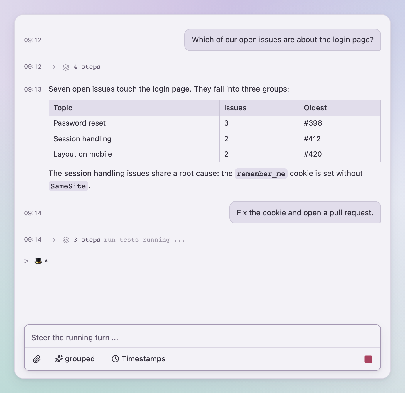
- package/ChatInputToolbar.d.ts +61 -0
- package/ChatMessages.d.ts +51 -0
- package/ChatPanel.d.ts +17 -0
- package/ChatSendContext.d.ts +7 -0
- package/DetailModeSwitch.d.ts +16 -0
- package/LICENSE +21 -0
- package/Markdown.d.ts +19 -0
- package/MessageActions.d.ts +8 -0
- package/PendingActionCard.d.ts +13 -0
- package/QuasselProvider.d.ts +89 -0
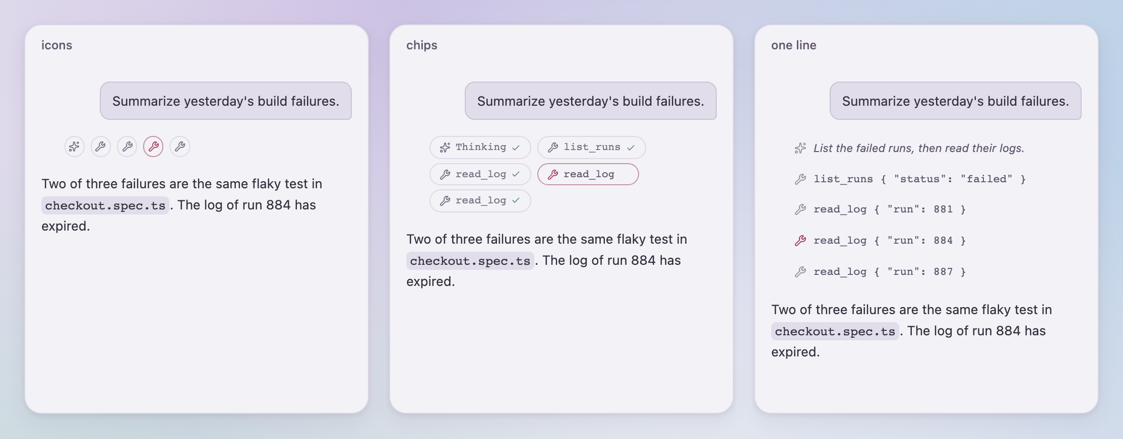
- package/README.md +127 -2
- package/StepPopover.d.ts +16 -0
- package/TimestampSwitch.d.ts +7 -0
- package/TranscriptModeSwitch.d.ts +8 -0
- package/WorkingScenes.d.ts +12 -0
- package/announce.d.ts +2 -0
- package/attachments.d.ts +24 -0
- package/chat-attachments.d.ts +6 -0
- package/chat-scroll.d.ts +12 -0
- package/chat.css +2072 -0
- package/chunk-3VEL4HEO.js +183 -0
- package/chunk-3VEL4HEO.js.map +7 -0
- package/elapsed.d.ts +16 -0
- package/events.d.ts +145 -0
- package/events.js +21 -0
- package/events.js.map +7 -0
- package/index.d.ts +25 -0
- package/index.js +2565 -0
- package/index.js.map +7 -0
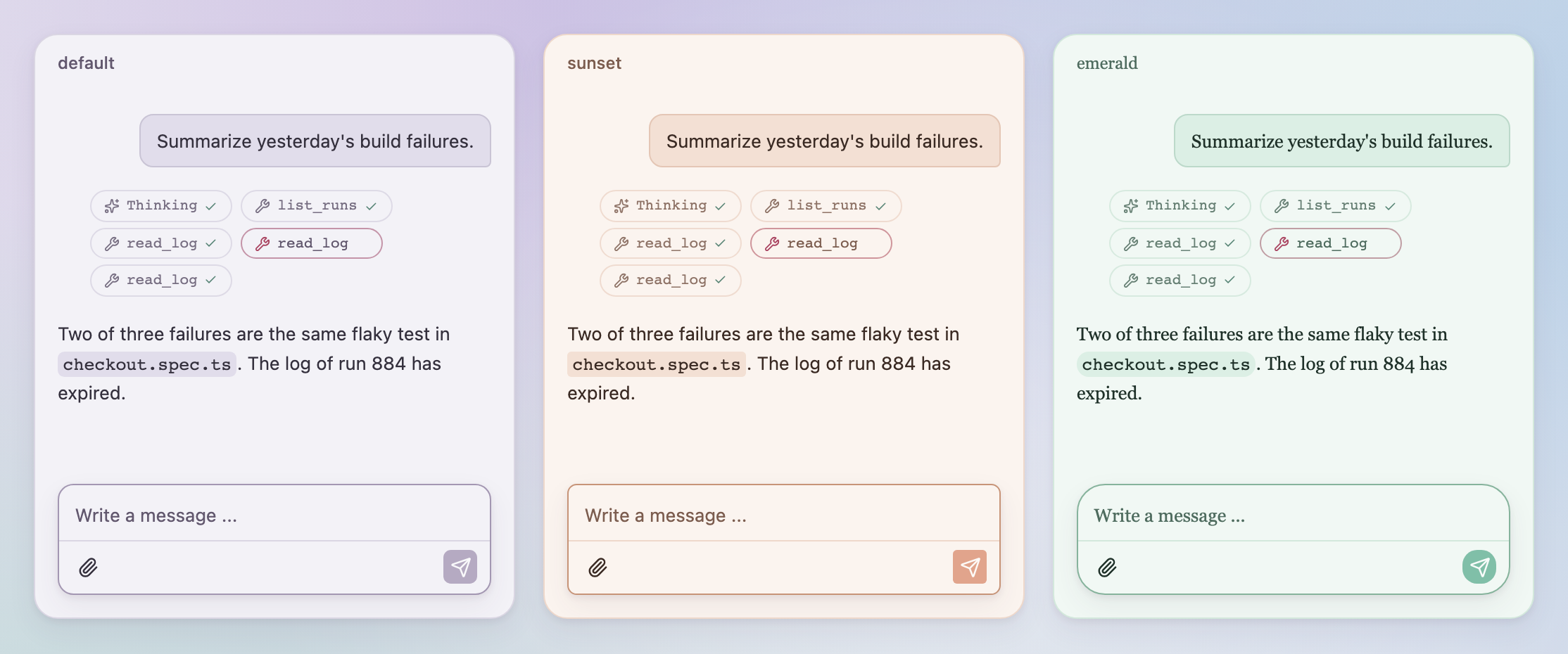
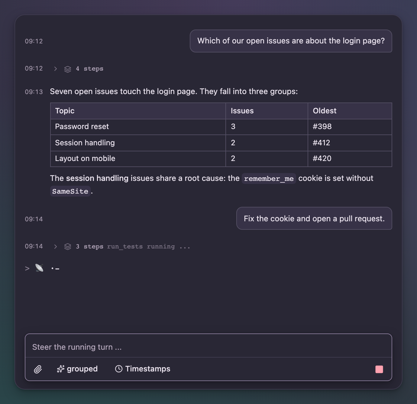
- package/options.d.ts +42 -0
- package/package.json +53 -4
- package/texts.d.ts +71 -0
- package/timestamps.d.ts +7 -0
- package/types.d.ts +23 -0
- package/ui/button.d.ts +8 -0
- package/ui/card.d.ts +5 -0
- package/ui/cn.d.ts +2 -0
- package/ui/popover.d.ts +6 -0
- package/ui/spinner.d.ts +2 -0
- package/ui/stop-button.d.ts +10 -0
- package/ui/toggle.d.ts +8 -0
- package/ui/useFileInput.d.ts +20 -0
- package/useChatAction.d.ts +6 -0
|
@@ -0,0 +1,61 @@
|
|
|
1
|
+
import { ReactNode, Ref } from "react";
|
|
2
|
+
import { ChatTexts } from "./texts";
|
|
3
|
+
import type { ChatAttachmentInput } from "./events";
|
|
4
|
+
import type { SendShortcut } from "./options";
|
|
5
|
+
/** A toolbar button, declarative: icon, text or both - plus click handler. */
|
|
6
|
+
export interface ToolbarAction {
|
|
7
|
+
icon?: ReactNode;
|
|
8
|
+
label?: string;
|
|
9
|
+
title?: string;
|
|
10
|
+
disabled?: boolean;
|
|
11
|
+
active?: boolean;
|
|
12
|
+
onClick: () => void;
|
|
13
|
+
}
|
|
14
|
+
/** Hosts control the draft from outside, e.g. to insert a template for editing. */
|
|
15
|
+
export interface ChatInputHandle {
|
|
16
|
+
/** Replaces the draft, focuses the input and puts the caret at the end. */
|
|
17
|
+
insert: (text: string) => void;
|
|
18
|
+
focus: () => void;
|
|
19
|
+
reset: () => void;
|
|
20
|
+
submit: (onSubmit?: (text: string, attachments?: ChatAttachmentInput[]) => void | Promise<void>, options?: {
|
|
21
|
+
allowEmpty?: boolean;
|
|
22
|
+
}) => Promise<void>;
|
|
23
|
+
}
|
|
24
|
+
/**
|
|
25
|
+
* The input card: borderless textarea on top, toolbar below a hairline. Custom buttons come
|
|
26
|
+
* declaratively through `actions` or freely through the left/right slots; while work is running
|
|
27
|
+
* the stop button stays visible, and typing shows the send button next to it, which then
|
|
28
|
+
* interjects. `rows` sets the initial height; with `maxRows` the textarea grows with its content
|
|
29
|
+
* up to that number of rows and scrolls after that. `inline` starts with one row and grows the same way.
|
|
30
|
+
*/
|
|
31
|
+
export declare function ChatInputToolbar({ onSend, onStop, running, disabled, sendDisabled, layout, detailsContainer, onErrorChange, inputAriaControls, rows, maxRows, actions, toolbarLeft, toolbarRight, texts, handleRef, attachments: attachmentsEnabled, attachmentCapabilities, attachmentCapabilitiesError, onAttachmentsChange, initialValue, onDraftChange, sendShortcut, autoFocus, onAutoFocusSettled, }: {
|
|
32
|
+
onSend: (text: string, attachments?: ChatAttachmentInput[]) => void | Promise<void>;
|
|
33
|
+
onStop?: () => void;
|
|
34
|
+
running?: boolean;
|
|
35
|
+
disabled?: boolean;
|
|
36
|
+
sendDisabled?: boolean;
|
|
37
|
+
layout?: "card" | "toolbar" | "inline";
|
|
38
|
+
detailsContainer?: HTMLElement | null;
|
|
39
|
+
onErrorChange?: (error: string | undefined) => void;
|
|
40
|
+
inputAriaControls?: string;
|
|
41
|
+
rows?: number;
|
|
42
|
+
maxRows?: number;
|
|
43
|
+
actions?: ToolbarAction[];
|
|
44
|
+
toolbarLeft?: ReactNode;
|
|
45
|
+
toolbarRight?: ReactNode;
|
|
46
|
+
texts?: Partial<ChatTexts>;
|
|
47
|
+
handleRef?: Ref<ChatInputHandle>;
|
|
48
|
+
/** false = no attaching: neither button nor dropping or pasting files. */
|
|
49
|
+
attachments?: boolean;
|
|
50
|
+
attachmentCapabilities?: {
|
|
51
|
+
input: readonly string[];
|
|
52
|
+
model: string;
|
|
53
|
+
};
|
|
54
|
+
attachmentCapabilitiesError?: string;
|
|
55
|
+
onAttachmentsChange?: (hasAttachments: boolean) => void;
|
|
56
|
+
initialValue?: string;
|
|
57
|
+
onDraftChange?: (text: string) => void;
|
|
58
|
+
sendShortcut?: SendShortcut;
|
|
59
|
+
autoFocus?: boolean;
|
|
60
|
+
onAutoFocusSettled?: () => void;
|
|
61
|
+
}): import("react").JSX.Element;
|
|
@@ -0,0 +1,51 @@
|
|
|
1
|
+
import { type CSSProperties, ReactNode } from "react";
|
|
2
|
+
import { ChatAnnouncement, DetailMode, Message, PendingAction, ToolInfo, TranscriptMode } from "./types";
|
|
3
|
+
import { ChatTexts } from "./texts";
|
|
4
|
+
import { type LinkClickHandler } from "./Markdown";
|
|
5
|
+
import { type ChatAppearance, type TimestampOptions, type CodeBlockOptions, type BubbleOptions, type MessageActionsOptions } from "./options";
|
|
6
|
+
/**
|
|
7
|
+
* The transcript: its own scroll container with autoscroll while you are at the bottom, and a
|
|
8
|
+
* jump-to-end button as soon as you are reading. Usable read-only without a composer.
|
|
9
|
+
*/
|
|
10
|
+
export declare function ChatMessages({ messages, owner, detailMode, transcriptMode, running, working, stepsExpandable, groupsExpandable, texts, toolArgumentsText, renderTool, renderAction, onDismissAction, onLinkClick, emptyState, className, scrollerClassName, showTimestamps, announce, scrollerRef, maxWidth, horizontalPadding, jumpToEndThreshold, appearance, timestampOptions, codeBlockOptions, bubbleOptions, messageActions, toolElapsedThreshold, }: {
|
|
11
|
+
messages: Message[];
|
|
12
|
+
/** Contributions with this Message.sender appear without a speech bubble; null keeps the message defaults. */
|
|
13
|
+
owner?: string | null;
|
|
14
|
+
detailMode?: DetailMode;
|
|
15
|
+
transcriptMode?: TranscriptMode;
|
|
16
|
+
running?: boolean;
|
|
17
|
+
working?: ReactNode;
|
|
18
|
+
/** false = thinking and tool steps cannot be expanded (no popover). */
|
|
19
|
+
stepsExpandable?: boolean;
|
|
20
|
+
/** false = step groups in grouped mode stay collapsed (header without toggle). */
|
|
21
|
+
groupsExpandable?: boolean;
|
|
22
|
+
texts?: Partial<ChatTexts>;
|
|
23
|
+
toolArgumentsText?: (tool: ToolInfo) => string;
|
|
24
|
+
/** Custom rendering for single tools; undefined = default rendering. */
|
|
25
|
+
renderTool?: (tool: ToolInfo) => ReactNode | undefined;
|
|
26
|
+
/** Rendering of a pending action by its owner; undefined = generic card. */
|
|
27
|
+
renderAction?: (action: PendingAction, text: string) => ReactNode | undefined;
|
|
28
|
+
onDismissAction?: (actionId: string) => void;
|
|
29
|
+
/** Intercepts clicks on Markdown links; true = handled, the browser does not follow. */
|
|
30
|
+
onLinkClick?: LinkClickHandler;
|
|
31
|
+
emptyState?: ReactNode;
|
|
32
|
+
className?: string;
|
|
33
|
+
/** Host classes for the scroll container (data-quassel-transcript). */
|
|
34
|
+
scrollerClassName?: string;
|
|
35
|
+
/** true = subtle HH:MM column to the left of each block (Message.at). */
|
|
36
|
+
showTimestamps?: boolean;
|
|
37
|
+
/** Screen reader announcement of finished answers and new actions; false = the host announces itself. */
|
|
38
|
+
announce?: false | ((announcement: ChatAnnouncement) => string | undefined);
|
|
39
|
+
/** Exposes the scroll container so hosts can scroll without querying the DOM. */
|
|
40
|
+
scrollerRef?: (element: HTMLDivElement | null) => void;
|
|
41
|
+
maxWidth?: CSSProperties["maxWidth"];
|
|
42
|
+
horizontalPadding?: CSSProperties["paddingInline"];
|
|
43
|
+
jumpToEndThreshold?: number;
|
|
44
|
+
appearance?: ChatAppearance;
|
|
45
|
+
timestampOptions?: TimestampOptions;
|
|
46
|
+
codeBlockOptions?: CodeBlockOptions;
|
|
47
|
+
bubbleOptions?: BubbleOptions;
|
|
48
|
+
messageActions?: MessageActionsOptions;
|
|
49
|
+
/** Milliseconds before a running tool call shows its elapsed time (from Message.at) while running; false = never. */
|
|
50
|
+
toolElapsedThreshold?: number | false;
|
|
51
|
+
}): import("react").JSX.Element;
|
package/ChatPanel.d.ts
ADDED
|
@@ -0,0 +1,17 @@
|
|
|
1
|
+
import { type CSSProperties, type ReactNode, type Ref } from "react";
|
|
2
|
+
import { type ChatAppearance } from "./options";
|
|
3
|
+
/**
|
|
4
|
+
* Transcript with an overlaid composer. The frame measures the composer itself and gives the
|
|
5
|
+
* transcript the footer space it needs, so no host has to set inner dimensions.
|
|
6
|
+
*/
|
|
7
|
+
export declare function ChatPanel({ children, composer, className, nodeRef, maxWidth, horizontalPadding, appearance, scrollOnSend, }: {
|
|
8
|
+
children: ReactNode;
|
|
9
|
+
/** The composer; it lies over the transcript, not below it. */
|
|
10
|
+
composer?: ReactNode;
|
|
11
|
+
className?: string;
|
|
12
|
+
nodeRef?: Ref<HTMLDivElement>;
|
|
13
|
+
maxWidth?: CSSProperties["maxWidth"];
|
|
14
|
+
horizontalPadding?: CSSProperties["paddingInline"];
|
|
15
|
+
appearance?: ChatAppearance;
|
|
16
|
+
scrollOnSend?: boolean;
|
|
17
|
+
}): import("react").JSX.Element;
|
|
@@ -0,0 +1,7 @@
|
|
|
1
|
+
import { type RefObject } from "react";
|
|
2
|
+
export interface ChatSendScope {
|
|
3
|
+
notify: () => void;
|
|
4
|
+
subscribe: (listener: () => void) => () => void;
|
|
5
|
+
}
|
|
6
|
+
export declare const ChatSendContext: import("react").Context<ChatSendScope | undefined>;
|
|
7
|
+
export declare function createChatSendScope(enabled: RefObject<boolean>): ChatSendScope;
|
|
@@ -0,0 +1,16 @@
|
|
|
1
|
+
import { DetailMode } from "./types";
|
|
2
|
+
import { ChatTexts } from "./texts";
|
|
3
|
+
export declare const DETAIL_MODES: readonly DetailMode[];
|
|
4
|
+
export declare const detailModeLabel: (mode: DetailMode, texts?: Partial<ChatTexts>) => string;
|
|
5
|
+
/**
|
|
6
|
+
* An icon button that cycles the detail level of the thinking and tool steps. The order comes
|
|
7
|
+
* from `modes`, the current value shows in the icon and in the tooltip.
|
|
8
|
+
*/
|
|
9
|
+
export declare function DetailModeSwitch({ mode, onChange, modes, texts, className, }: {
|
|
10
|
+
mode: DetailMode;
|
|
11
|
+
onChange: (mode: DetailMode) => void;
|
|
12
|
+
/** Selection and order of cycling; the default is all modes. */
|
|
13
|
+
modes?: readonly DetailMode[];
|
|
14
|
+
texts?: Partial<ChatTexts>;
|
|
15
|
+
className?: string;
|
|
16
|
+
}): import("react").JSX.Element;
|
package/LICENSE
ADDED
|
@@ -0,0 +1,21 @@
|
|
|
1
|
+
MIT License
|
|
2
|
+
|
|
3
|
+
Copyright (c) 2026 Ronald Schlenker
|
|
4
|
+
|
|
5
|
+
Permission is hereby granted, free of charge, to any person obtaining a copy
|
|
6
|
+
of this software and associated documentation files (the "Software"), to deal
|
|
7
|
+
in the Software without restriction, including without limitation the rights
|
|
8
|
+
to use, copy, modify, merge, publish, distribute, sublicense, and/or sell
|
|
9
|
+
copies of the Software, and to permit persons to whom the Software is
|
|
10
|
+
furnished to do so, subject to the following conditions:
|
|
11
|
+
|
|
12
|
+
The above copyright notice and this permission notice shall be included in all
|
|
13
|
+
copies or substantial portions of the Software.
|
|
14
|
+
|
|
15
|
+
THE SOFTWARE IS PROVIDED "AS IS", WITHOUT WARRANTY OF ANY KIND, EXPRESS OR
|
|
16
|
+
IMPLIED, INCLUDING BUT NOT LIMITED TO THE WARRANTIES OF MERCHANTABILITY,
|
|
17
|
+
FITNESS FOR A PARTICULAR PURPOSE AND NONINFRINGEMENT. IN NO EVENT SHALL THE
|
|
18
|
+
AUTHORS OR COPYRIGHT HOLDERS BE LIABLE FOR ANY CLAIM, DAMAGES OR OTHER
|
|
19
|
+
LIABILITY, WHETHER IN AN ACTION OF CONTRACT, TORT OR OTHERWISE, ARISING FROM,
|
|
20
|
+
OUT OF OR IN CONNECTION WITH THE SOFTWARE OR THE USE OR OTHER DEALINGS IN THE
|
|
21
|
+
SOFTWARE.
|
package/Markdown.d.ts
ADDED
|
@@ -0,0 +1,19 @@
|
|
|
1
|
+
import { ReactNode } from "react";
|
|
2
|
+
import type { CodeBlockOptions } from "./options";
|
|
3
|
+
import { type ChatTexts } from "./texts";
|
|
4
|
+
export type LinkClickHandler = (href: string, label: string) => boolean;
|
|
5
|
+
export declare function MarkdownCodeBlocks({ children, options, texts }: {
|
|
6
|
+
children: ReactNode;
|
|
7
|
+
options?: CodeBlockOptions;
|
|
8
|
+
texts: ChatTexts;
|
|
9
|
+
}): import("react").JSX.Element;
|
|
10
|
+
export declare function MarkdownLinks({ children, onLinkClick }: {
|
|
11
|
+
children: ReactNode;
|
|
12
|
+
onLinkClick?: LinkClickHandler;
|
|
13
|
+
}): import("react").JSX.Element;
|
|
14
|
+
export declare function Markdown({ text, streaming }: {
|
|
15
|
+
text: string;
|
|
16
|
+
streaming?: boolean;
|
|
17
|
+
}): import("react").JSX.Element;
|
|
18
|
+
/** The same syntax as the renderer, as plain text without markup, e.g. for screen reader announcements. */
|
|
19
|
+
export declare function markdownPlainText(text: string): string;
|
|
@@ -0,0 +1,8 @@
|
|
|
1
|
+
import type { MessageActionsOptions } from "./options";
|
|
2
|
+
import type { ChatTexts } from "./texts";
|
|
3
|
+
import type { Message } from "./types";
|
|
4
|
+
export declare function MessageActions({ message, options, texts }: {
|
|
5
|
+
message: Message;
|
|
6
|
+
options?: MessageActionsOptions;
|
|
7
|
+
texts: ChatTexts;
|
|
8
|
+
}): import("react").JSX.Element;
|
|
@@ -0,0 +1,13 @@
|
|
|
1
|
+
import type { PendingAction } from "./types";
|
|
2
|
+
/**
|
|
3
|
+
* The rendering of a pending action without a contribution from its owner: title, the hint
|
|
4
|
+
* that input is expected, and dismissing. Only the plugin knows the form.
|
|
5
|
+
*/
|
|
6
|
+
export declare function PendingActionCard({ text, action, waitingLabel, dismissLabel, dismissedLabel, onDismiss, }: {
|
|
7
|
+
text: string;
|
|
8
|
+
action: PendingAction;
|
|
9
|
+
waitingLabel: string;
|
|
10
|
+
dismissLabel: string;
|
|
11
|
+
dismissedLabel: string;
|
|
12
|
+
onDismiss?: () => void;
|
|
13
|
+
}): import("react").JSX.Element;
|
|
@@ -0,0 +1,89 @@
|
|
|
1
|
+
import { type ComponentType, type CSSProperties, type ReactNode, type RefObject } from "react";
|
|
2
|
+
export type QuasselButtonVariant = "default" | "outline" | "secondary" | "ghost" | "destructive" | "link";
|
|
3
|
+
export type QuasselButtonSize = "default" | "xs" | "sm" | "lg" | "icon" | "icon-xs" | "icon-sm" | "icon-lg";
|
|
4
|
+
export interface QuasselButtonProps {
|
|
5
|
+
variant?: QuasselButtonVariant;
|
|
6
|
+
size?: QuasselButtonSize;
|
|
7
|
+
className?: string;
|
|
8
|
+
disabled?: boolean;
|
|
9
|
+
title?: string;
|
|
10
|
+
"aria-label"?: string;
|
|
11
|
+
"aria-pressed"?: boolean;
|
|
12
|
+
onClick?: () => void;
|
|
13
|
+
children?: ReactNode;
|
|
14
|
+
}
|
|
15
|
+
export interface QuasselToggleProps {
|
|
16
|
+
variant?: "default" | "outline";
|
|
17
|
+
size?: "default" | "sm" | "lg";
|
|
18
|
+
className?: string;
|
|
19
|
+
disabled?: boolean;
|
|
20
|
+
title?: string;
|
|
21
|
+
pressed?: boolean;
|
|
22
|
+
onPressedChange?: (pressed: boolean) => void;
|
|
23
|
+
children?: ReactNode;
|
|
24
|
+
}
|
|
25
|
+
export interface QuasselCardProps {
|
|
26
|
+
size?: "default" | "sm";
|
|
27
|
+
className?: string;
|
|
28
|
+
children?: ReactNode;
|
|
29
|
+
}
|
|
30
|
+
export interface QuasselStopButtonProps {
|
|
31
|
+
label: string;
|
|
32
|
+
busy?: boolean;
|
|
33
|
+
size?: QuasselButtonSize;
|
|
34
|
+
className?: string;
|
|
35
|
+
disabled?: boolean;
|
|
36
|
+
title?: string;
|
|
37
|
+
onClick?: () => void;
|
|
38
|
+
}
|
|
39
|
+
export interface QuasselPopoverProps {
|
|
40
|
+
open?: boolean;
|
|
41
|
+
onOpenChange?: (open: boolean) => void;
|
|
42
|
+
children?: ReactNode;
|
|
43
|
+
}
|
|
44
|
+
export interface QuasselPopoverAnchor {
|
|
45
|
+
getBoundingClientRect: () => DOMRect;
|
|
46
|
+
contextElement?: Element;
|
|
47
|
+
}
|
|
48
|
+
/** Where popovers mount: an element, a ref or a getter; resolved when the popover opens. */
|
|
49
|
+
export type QuasselPortalTarget = HTMLElement | ShadowRoot;
|
|
50
|
+
export type QuasselPortalContainer = QuasselPortalTarget | RefObject<QuasselPortalTarget | null> | (() => QuasselPortalTarget | null | undefined);
|
|
51
|
+
export interface QuasselPopoverContentProps {
|
|
52
|
+
anchor?: QuasselPopoverAnchor;
|
|
53
|
+
align?: "start" | "center" | "end";
|
|
54
|
+
side?: "top" | "bottom" | "left" | "right" | "inline-start" | "inline-end";
|
|
55
|
+
sideOffset?: number;
|
|
56
|
+
collisionPadding?: number;
|
|
57
|
+
className?: string;
|
|
58
|
+
/** Carries --qsl-base, the text size of the chat that opened the popover; pass it on to the popup. */
|
|
59
|
+
style?: CSSProperties;
|
|
60
|
+
"aria-label"?: string;
|
|
61
|
+
/** The resolved portalContainer of QuasselProvider; undefined = document.body. */
|
|
62
|
+
portalContainer?: QuasselPortalTarget;
|
|
63
|
+
children?: ReactNode;
|
|
64
|
+
}
|
|
65
|
+
/** The primitives quassel renders; a host replaces any of them through QuasselProvider. */
|
|
66
|
+
export interface QuasselComponents {
|
|
67
|
+
Button: ComponentType<QuasselButtonProps>;
|
|
68
|
+
Toggle: ComponentType<QuasselToggleProps>;
|
|
69
|
+
Card: ComponentType<QuasselCardProps>;
|
|
70
|
+
StopButton: ComponentType<QuasselStopButtonProps>;
|
|
71
|
+
Popover: ComponentType<QuasselPopoverProps>;
|
|
72
|
+
PopoverContent: ComponentType<QuasselPopoverContentProps>;
|
|
73
|
+
}
|
|
74
|
+
export declare const defaultComponents: QuasselComponents;
|
|
75
|
+
export declare function QuasselProvider({ components, allowUrl, resolveUrl, portalContainer, children }: {
|
|
76
|
+
/** Replaces single primitives; the rest stay the built-in ones or those of an outer provider. */
|
|
77
|
+
components?: Partial<QuasselComponents>;
|
|
78
|
+
/** Keeps Markdown link and image URLs that the default policy (http, https, mailto, tel, ftp, irc, xmpp, relative) would drop. */
|
|
79
|
+
allowUrl?: (url: string) => boolean;
|
|
80
|
+
/** Maps every Markdown link and image URL before the link policy applies, e.g. relative paths onto the host's file route. */
|
|
81
|
+
resolveUrl?: (url: string) => string;
|
|
82
|
+
/** Mounts quassel's popovers inside this element instead of document.body, e.g. within the host's theme wrapper. */
|
|
83
|
+
portalContainer?: QuasselPortalContainer;
|
|
84
|
+
children: ReactNode;
|
|
85
|
+
}): import("react").JSX.Element;
|
|
86
|
+
export declare const useQuasselComponents: () => QuasselComponents;
|
|
87
|
+
export declare const useAllowUrl: () => ((url: string) => boolean) | undefined;
|
|
88
|
+
export declare const useResolveUrl: () => ((url: string) => string) | undefined;
|
|
89
|
+
export declare function useQuasselPortalContainer(): QuasselPortalTarget | undefined;
|
package/README.md
CHANGED
|
@@ -1,3 +1,128 @@
|
|
|
1
|
-
#
|
|
1
|
+
# quassel
|
|
2
2
|
|
|
3
|
-
|
|
3
|
+
Chat building blocks for React: a streaming transcript with thinking and tool steps, pending
|
|
4
|
+
actions, an input card with attachments and steering, and a small event contract that works
|
|
5
|
+
on the server as well. quassel is the chat of [RAgents](https://github.com/SchlenkR/RAgents),
|
|
6
|
+
published as a library. It ships a compiled stylesheet, so hosts need no Tailwind, and every
|
|
7
|
+
color, radius, font and font size is a `--qsl-*` variable, and the text size follows the host by default.
|
|
8
|
+
|
|
9
|
+
|
|
10
|
+
|
|
11
|
+
## What you can build
|
|
12
|
+
|
|
13
|
+
**Agent chats that show their work.** Thinking and tool calls appear as steps. Pick how much
|
|
14
|
+
of them the user sees - only the current step, icons, chips, a collapsible group, single lines
|
|
15
|
+
or everything - and let them switch at runtime. A tool call that runs longer than a few seconds
|
|
16
|
+
shows how long it has been running, on its row and on the collapsed group header, so a slow step
|
|
17
|
+
does not look like a hung one.
|
|
18
|
+
|
|
19
|
+
|
|
20
|
+
|
|
21
|
+
**Pending actions.** The agent waits for input: a generic card with dismiss, or the host's own
|
|
22
|
+
rendering per action owner. Open actions sit right above the input, like a question in a terminal
|
|
23
|
+
agent; resolved actions stay in the transcript as a record.
|
|
24
|
+
|
|
25
|
+
**Multi-party conversations.** Colored bubbles with labels for agents that talk to each other.
|
|
26
|
+
|
|
27
|
+
<p>
|
|
28
|
+
<img src="docs/images/questions.png" alt="Pending actions: a host-rendered choice and the generic card" width="49%">
|
|
29
|
+
<img src="docs/images/party.png" alt="Planner and reviewer as labeled bubbles" width="49%">
|
|
30
|
+
</p>
|
|
31
|
+
|
|
32
|
+
**Your look, not a fork.** Override `--qsl-*` variables on any wrapper, switch light and dark
|
|
33
|
+
with `data-theme`, or hand quassel your own Button, Toggle, Card and Popover components. With
|
|
34
|
+
`portalContainer` on `QuasselProvider`, popovers render inside your wrapper and pick up its
|
|
35
|
+
variables too.
|
|
36
|
+
|
|
37
|
+
|
|
38
|
+
|
|
39
|
+
|
|
40
|
+
|
|
41
|
+
## Highlights
|
|
42
|
+
|
|
43
|
+
- Streaming-safe Markdown (tables, code with copy button, lists) via Streamdown.
|
|
44
|
+
- Steering: typing while a turn runs sends into it; stop, retry and failed-send recovery built in.
|
|
45
|
+
- Attachments by button, drag and drop or paste, with previews and size limits.
|
|
46
|
+
- Condensed conversation: all user inputs and the latest answer between them, independently of tool/thinking detail.
|
|
47
|
+
- Timestamps, day separators, message actions, configurable bubbles and appearance.
|
|
48
|
+
- Screen reader friendly: the transcript is not a live region; finished replies and new
|
|
49
|
+
actions are announced once, with the host in control of the wording.
|
|
50
|
+
- Complete English and German UI labels through `englishTexts` / `germanTexts`; `texts` can override any label (English by default).
|
|
51
|
+
- Grouped steps show their error count even while collapsed.
|
|
52
|
+
- Text size follows the host: no overrides needed to fit in (see below).
|
|
53
|
+
|
|
54
|
+
## Install
|
|
55
|
+
|
|
56
|
+
```sh
|
|
57
|
+
npm install @schlenkr/quassel
|
|
58
|
+
```
|
|
59
|
+
|
|
60
|
+
Up to 0.4.9 the package was published without scope as `quassel`; from 0.5.0 on it is `@schlenkr/quassel` with the same API.
|
|
61
|
+
|
|
62
|
+
| Import | Contents |
|
|
63
|
+
|---|---|
|
|
64
|
+
| `@schlenkr/quassel` | React components, `QuasselProvider`, types, texts, `announce`, `markdownPlainText` |
|
|
65
|
+
| `@schlenkr/quassel/events` | The event contract, the pure reducer `applyEvent` and the attachment limits, without React |
|
|
66
|
+
| `@schlenkr/quassel/chat.css` | The compiled stylesheet: theme variables, scoped reset and all utilities quassel uses |
|
|
67
|
+
|
|
68
|
+
```tsx
|
|
69
|
+
import { useReducer, useState } from "react";
|
|
70
|
+
import { applyEvent, ChatInputToolbar, ChatMessages, ChatPanel, type Message } from "@schlenkr/quassel";
|
|
71
|
+
import "@schlenkr/quassel/chat.css";
|
|
72
|
+
|
|
73
|
+
export function Chat({ send, stop }: { send: (text: string) => Promise<void>; stop: () => void }) {
|
|
74
|
+
const [messages, dispatch] = useReducer(applyEvent, [] as Message[]);
|
|
75
|
+
const [running, setRunning] = useState(false);
|
|
76
|
+
// feed your backend's ChatEvent stream into dispatch(event) and setRunning(event.running) on "status"
|
|
77
|
+
return (
|
|
78
|
+
<ChatPanel composer={<ChatInputToolbar onSend={send} onStop={stop} running={running} rows={1} />}>
|
|
79
|
+
<ChatMessages messages={messages} running={running} detailMode="grouped" />
|
|
80
|
+
</ChatPanel>
|
|
81
|
+
);
|
|
82
|
+
}
|
|
83
|
+
```
|
|
84
|
+
|
|
85
|
+
```css
|
|
86
|
+
.my-chat {
|
|
87
|
+
--qsl-primary: #11855c;
|
|
88
|
+
--qsl-radius: 0.9rem;
|
|
89
|
+
}
|
|
90
|
+
```
|
|
91
|
+
|
|
92
|
+
Any backend that emits the `@schlenkr/quassel/events` stream works with the same components.
|
|
93
|
+
|
|
94
|
+
## Text size
|
|
95
|
+
|
|
96
|
+
quassel inherits the font size of the place it is mounted in. Chat text and the input use that
|
|
97
|
+
size, meta lines, step rows and labels are derived from it as smaller steps, and nothing
|
|
98
|
+
compounds when elements nest. One variable changes it for a chat:
|
|
99
|
+
|
|
100
|
+
```css
|
|
101
|
+
.my-chat {
|
|
102
|
+
--qsl-font-size: 15px;
|
|
103
|
+
}
|
|
104
|
+
```
|
|
105
|
+
|
|
106
|
+
`--qsl-chat-font-size` and `--qsl-text-meta` (and `-trace`, `-label`, `-xs` to `-xl`) override
|
|
107
|
+
single steps. Up to 0.4.9 the root was fixed at 14px and the chat text at 13px, so hosts had to
|
|
108
|
+
override sizes by hand; from 0.5.0 on that is no longer needed. Details in the
|
|
109
|
+
[guide](https://github.com/SchlenkR/quassel/blob/main/docs/guide.md#text-size).
|
|
110
|
+
|
|
111
|
+
## Development
|
|
112
|
+
|
|
113
|
+
```sh
|
|
114
|
+
pnpm install
|
|
115
|
+
pnpm dev # stylesheet in watch mode plus the gallery on http://localhost:3210
|
|
116
|
+
pnpm check # type check package and gallery
|
|
117
|
+
pnpm test # package tests (node:test with happy-dom)
|
|
118
|
+
pnpm build # stylesheet and gallery build
|
|
119
|
+
pnpm release --dry-run
|
|
120
|
+
```
|
|
121
|
+
|
|
122
|
+
The full guide - every prop, the event contract, theming, slots, dark mode and publishing -
|
|
123
|
+
is in [docs/guide.md](https://github.com/SchlenkR/quassel/blob/main/docs/guide.md). It is written so that an AI assistant can build
|
|
124
|
+
an application with quassel from it.
|
|
125
|
+
|
|
126
|
+
## License
|
|
127
|
+
|
|
128
|
+
[MIT](https://github.com/SchlenkR/quassel/blob/main/LICENSE)
|
package/StepPopover.d.ts
ADDED
|
@@ -0,0 +1,16 @@
|
|
|
1
|
+
import { type MouseEvent } from "react";
|
|
2
|
+
import { Message } from "./types";
|
|
3
|
+
import { ChatTexts } from "./texts";
|
|
4
|
+
export type StepPopoverOrigin = {
|
|
5
|
+
x: number;
|
|
6
|
+
y: number;
|
|
7
|
+
base: string;
|
|
8
|
+
};
|
|
9
|
+
export declare const stepPopoverOrigin: (event: MouseEvent<HTMLElement>) => StepPopoverOrigin;
|
|
10
|
+
export declare function StepPopover({ message, position, texts, toolArgumentsText, onClose, }: {
|
|
11
|
+
message: Message;
|
|
12
|
+
position: StepPopoverOrigin;
|
|
13
|
+
texts: ChatTexts;
|
|
14
|
+
toolArgumentsText: (tool: NonNullable<Message["tool"]>) => string;
|
|
15
|
+
onClose: () => void;
|
|
16
|
+
}): import("react").JSX.Element;
|
|
@@ -0,0 +1,7 @@
|
|
|
1
|
+
import { type ChatTexts } from "./texts";
|
|
2
|
+
export declare function TimestampSwitch({ showTimestamps, onChange, texts, className }: {
|
|
3
|
+
showTimestamps: boolean;
|
|
4
|
+
onChange: (showTimestamps: boolean) => void;
|
|
5
|
+
texts?: Partial<ChatTexts>;
|
|
6
|
+
className?: string;
|
|
7
|
+
}): import("react").JSX.Element;
|
|
@@ -0,0 +1,8 @@
|
|
|
1
|
+
import { type TranscriptMode } from "./types";
|
|
2
|
+
import { type ChatTexts } from "./texts";
|
|
3
|
+
export declare function TranscriptModeSwitch({ mode, onChange, texts, className }: {
|
|
4
|
+
mode: TranscriptMode;
|
|
5
|
+
onChange: (mode: TranscriptMode) => void;
|
|
6
|
+
texts?: Partial<ChatTexts>;
|
|
7
|
+
className?: string;
|
|
8
|
+
}): import("react").JSX.Element;
|
|
@@ -0,0 +1,12 @@
|
|
|
1
|
+
export interface WorkingScenesProps {
|
|
2
|
+
/** Limits scenes to one or two visible characters for small status fields. */
|
|
3
|
+
compact?: boolean;
|
|
4
|
+
/** Text for screen readers, default "Working ...". */
|
|
5
|
+
label?: string;
|
|
6
|
+
}
|
|
7
|
+
/**
|
|
8
|
+
* The default working indicator: randomly rotating mini scenes. Random order and start phase,
|
|
9
|
+
* so the same scenes never feel like a loop. The working prop of ChatMessages replaces it
|
|
10
|
+
* completely.
|
|
11
|
+
*/
|
|
12
|
+
export declare function WorkingScenes({ label, compact }: WorkingScenesProps): import("react").JSX.Element;
|
package/announce.d.ts
ADDED
package/attachments.d.ts
ADDED
|
@@ -0,0 +1,24 @@
|
|
|
1
|
+
import type { ChatAttachmentInput } from "./events";
|
|
2
|
+
import { MAX_CHAT_ATTACHMENTS, MAX_CHAT_ATTACHMENT_BYTES } from "./chat-attachments";
|
|
3
|
+
import { type ChatTexts } from "./texts";
|
|
4
|
+
export { MAX_CHAT_ATTACHMENTS, MAX_CHAT_ATTACHMENT_BYTES };
|
|
5
|
+
export declare const maxAttachmentSizeLabel = "20 MiB";
|
|
6
|
+
export declare function attachmentMediaType(file: {
|
|
7
|
+
name: string;
|
|
8
|
+
type: string;
|
|
9
|
+
}): string;
|
|
10
|
+
export declare function attachmentCapabilityError(files: readonly {
|
|
11
|
+
name: string;
|
|
12
|
+
mediaType: string;
|
|
13
|
+
}[], capabilities: {
|
|
14
|
+
input: readonly string[];
|
|
15
|
+
model: string;
|
|
16
|
+
}, texts?: ChatTexts): string | undefined;
|
|
17
|
+
export declare function validateAttachmentSelection(existing: readonly {
|
|
18
|
+
size: number;
|
|
19
|
+
}[], incoming: readonly {
|
|
20
|
+
size: number;
|
|
21
|
+
}[], texts?: ChatTexts): void;
|
|
22
|
+
export declare function encodeAttachment(file: File): Promise<ChatAttachmentInput>;
|
|
23
|
+
export declare function formatAttachmentSize(bytes: number): string;
|
|
24
|
+
export declare function attachmentDownloadUrl(url: string): string;
|
|
@@ -0,0 +1,6 @@
|
|
|
1
|
+
import type { ChatAttachmentInput } from "./events";
|
|
2
|
+
export declare const MAX_CHAT_ATTACHMENTS = 8;
|
|
3
|
+
export declare const MAX_CHAT_ATTACHMENT_BYTES: number;
|
|
4
|
+
export declare const MAX_CHAT_REQUEST_BYTES: number;
|
|
5
|
+
export declare const chatAttachmentMediaType: (name: string, mediaType: string) => string;
|
|
6
|
+
export declare const parseChatAttachments: (value: unknown) => ChatAttachmentInput[];
|
package/chat-scroll.d.ts
ADDED
|
@@ -0,0 +1,12 @@
|
|
|
1
|
+
interface ScrollViewport {
|
|
2
|
+
scrollTop: number;
|
|
3
|
+
readonly scrollHeight: number;
|
|
4
|
+
readonly clientHeight: number;
|
|
5
|
+
}
|
|
6
|
+
export declare function createChatScroll(onFollowChange?: (following: boolean) => void): {
|
|
7
|
+
layout: (viewport: ScrollViewport, dragging?: boolean) => void;
|
|
8
|
+
pause(viewport: ScrollViewport): void;
|
|
9
|
+
scroll(viewport: ScrollViewport, dragging?: boolean): void;
|
|
10
|
+
jump(viewport: ScrollViewport): void;
|
|
11
|
+
};
|
|
12
|
+
export {};
|