@rinzai/zen 0.4.0 → 0.4.2
This diff represents the content of publicly available package versions that have been released to one of the supported registries. The information contained in this diff is provided for informational purposes only and reflects changes between package versions as they appear in their respective public registries.
- package/LICENSE +21 -0
- package/README.md +99 -0
- package/dist/backdrop/index.d.ts.map +1 -1
- package/dist/spinner/index.d.ts +8 -2
- package/dist/spinner/index.d.ts.map +1 -1
- package/dist/zen.js +9 -6
- package/package.json +31 -2
package/LICENSE
ADDED
|
@@ -0,0 +1,21 @@
|
|
|
1
|
+
MIT License
|
|
2
|
+
|
|
3
|
+
Copyright (c) 2026 rinzai
|
|
4
|
+
|
|
5
|
+
Permission is hereby granted, free of charge, to any person obtaining a copy
|
|
6
|
+
of this software and associated documentation files (the "Software"), to deal
|
|
7
|
+
in the Software without restriction, including without limitation the rights
|
|
8
|
+
to use, copy, modify, merge, publish, distribute, sublicense, and/or sell
|
|
9
|
+
copies of the Software, and to permit persons to whom the Software is
|
|
10
|
+
furnished to do so, subject to the following conditions:
|
|
11
|
+
|
|
12
|
+
The above copyright notice and this permission notice shall be included in all
|
|
13
|
+
copies or substantial portions of the Software.
|
|
14
|
+
|
|
15
|
+
THE SOFTWARE IS PROVIDED "AS IS", WITHOUT WARRANTY OF ANY KIND, EXPRESS OR
|
|
16
|
+
IMPLIED, INCLUDING BUT NOT LIMITED TO THE WARRANTIES OF MERCHANTABILITY,
|
|
17
|
+
FITNESS FOR A PARTICULAR PURPOSE AND NONINFRINGEMENT. IN NO EVENT SHALL THE
|
|
18
|
+
AUTHORS OR COPYRIGHT HOLDERS BE LIABLE FOR ANY CLAIM, DAMAGES OR OTHER
|
|
19
|
+
LIABILITY, WHETHER IN AN ACTION OF CONTRACT, TORT OR OTHERWISE, ARISING FROM,
|
|
20
|
+
OUT OF OR IN CONNECTION WITH THE SOFTWARE OR THE USE OR OTHER DEALINGS IN THE
|
|
21
|
+
SOFTWARE.
|
package/README.md
ADDED
|
@@ -0,0 +1,99 @@
|
|
|
1
|
+
# Zen
|
|
2
|
+
|
|
3
|
+
[](https://www.npmjs.com/package/@rinzai/zen)
|
|
4
|
+
|
|
5
|
+
|
|
6
|
+
|
|
7
|
+
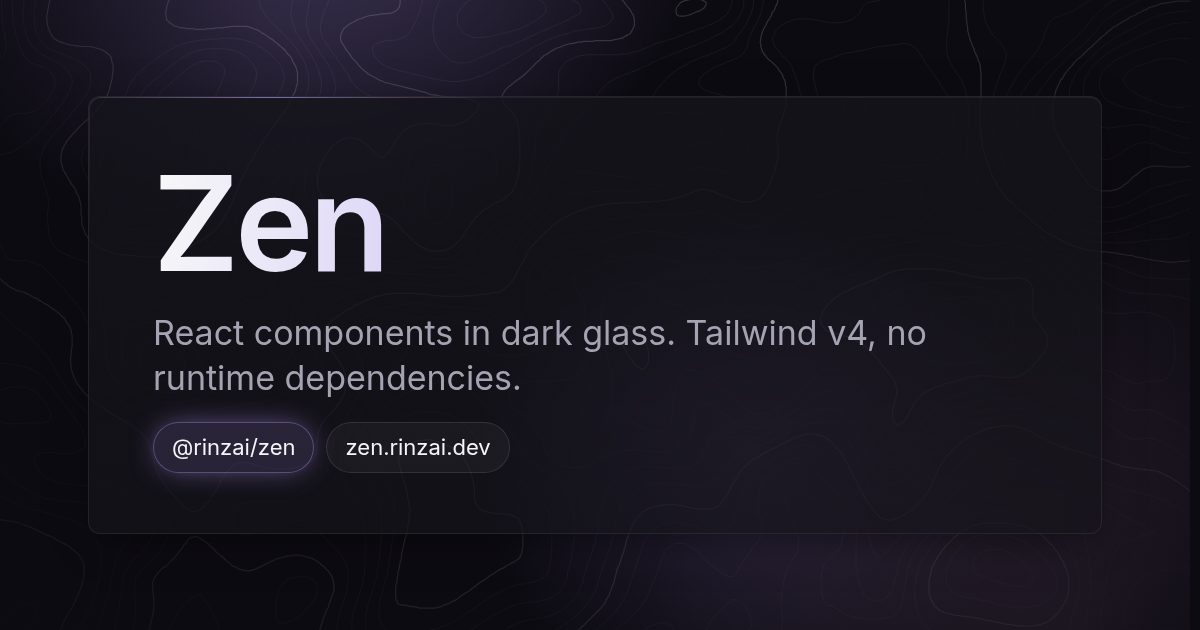
React components in dark glass: translucent surfaces, hairline borders that catch a pointer light, and one accent colour carrying the UI. Built on native platform features (`<dialog>`, the Popover API, CSS anchor positioning, radio inputs) with **no runtime dependencies**.
|
|
8
|
+
|
|
9
|
+
**[Documentation](https://zen.rinzai.dev)** · **[Showcase app](https://zen.rinzai.dev/showcase/)** · **[Storybook](https://zen.rinzai.dev/storybook/)**
|
|
10
|
+
|
|
11
|
+
## Installation
|
|
12
|
+
|
|
13
|
+
```sh
|
|
14
|
+
pnpm add @rinzai/zen
|
|
15
|
+
```
|
|
16
|
+
|
|
17
|
+
React 19 is the only peer dependency.
|
|
18
|
+
|
|
19
|
+
**Using Tailwind CSS v4?** Add Zen's theme after Tailwind in your stylesheet. Your one Tailwind build then generates everything Zen's components use:
|
|
20
|
+
|
|
21
|
+
```css
|
|
22
|
+
@import 'tailwindcss';
|
|
23
|
+
@import '@rinzai/zen/tailwind.css';
|
|
24
|
+
```
|
|
25
|
+
|
|
26
|
+
**Not using Tailwind?** Import the complete stylesheet once, near the root of your app. It includes the default theme:
|
|
27
|
+
|
|
28
|
+
```js
|
|
29
|
+
import '@rinzai/zen/css';
|
|
30
|
+
```
|
|
31
|
+
|
|
32
|
+
Zen never styles your own elements. For its page setup (the background showing through), heading scale, inline code and quiet scrollbars, also add the optional base:
|
|
33
|
+
|
|
34
|
+
```css
|
|
35
|
+
@import '@rinzai/zen/base.css';
|
|
36
|
+
```
|
|
37
|
+
|
|
38
|
+
The look is set in [Inter](https://rsms.me/inter/); load it however you like.
|
|
39
|
+
|
|
40
|
+
## Usage
|
|
41
|
+
|
|
42
|
+
```tsx
|
|
43
|
+
import { Backdrop, Button, Card } from '@rinzai/zen';
|
|
44
|
+
|
|
45
|
+
export default function App() {
|
|
46
|
+
return (
|
|
47
|
+
<>
|
|
48
|
+
<Backdrop />
|
|
49
|
+
<Card title="Budget">
|
|
50
|
+
<Button>Save changes</Button>
|
|
51
|
+
</Card>
|
|
52
|
+
</>
|
|
53
|
+
);
|
|
54
|
+
}
|
|
55
|
+
```
|
|
56
|
+
|
|
57
|
+
## What's inside
|
|
58
|
+
|
|
59
|
+
- **Surfaces:** Card, Stat, Dialog, ConfirmDialog, Popover, Toast, Backdrop (aurora, contours or dots, and a pointer light)
|
|
60
|
+
- **Inputs:** Button, Input, TextArea, InputGroup, MoneyInput, Select, Dropdown, MonthPicker, Segmented, Slider, Toggle, Field
|
|
61
|
+
- **Data:** composable Table with sticky edges and sorting, tree rows, editable cells, virtual rows, Meter, ProgressRing, AnimatedNumber
|
|
62
|
+
- **Navigation:** Header, NavPills, Tabs, TabBar, SideNav, TableOfContents, ActionsMenu
|
|
63
|
+
- **Theming:** dark and light, OKLCH tokens, and a theme generator (presets or any hue) that keeps contrast readable
|
|
64
|
+
- **Hooks and utilities:** `useAnchoredPopup`, `useVirtualList`, `useTree`, `useSort`, money and month helpers, `cx` (Tailwind-aware class merging), `cva`
|
|
65
|
+
|
|
66
|
+
Every component takes `className`, and a class you pass always overrides the component's default.
|
|
67
|
+
|
|
68
|
+
## Theming
|
|
69
|
+
|
|
70
|
+
Dark is the default. Add the `light` class (or `data-theme="light"`) for the light palette. Colours are OKLCH `L C H` triplets; override any token in your own CSS:
|
|
71
|
+
|
|
72
|
+
```css
|
|
73
|
+
:root {
|
|
74
|
+
--primary: 0.72 0.13 200; /* teal instead of violet */
|
|
75
|
+
--glow: 0.7 0.13 200;
|
|
76
|
+
}
|
|
77
|
+
```
|
|
78
|
+
|
|
79
|
+
Or generate a whole theme at runtime:
|
|
80
|
+
|
|
81
|
+
```ts
|
|
82
|
+
import { applyPreset, applyTheme, DEFAULT_THEME } from '@rinzai/zen';
|
|
83
|
+
|
|
84
|
+
applyTheme(applyPreset(DEFAULT_THEME, 'ocean'));
|
|
85
|
+
```
|
|
86
|
+
|
|
87
|
+
## Development
|
|
88
|
+
|
|
89
|
+
```sh
|
|
90
|
+
pnpm install
|
|
91
|
+
pnpm dev # Storybook
|
|
92
|
+
pnpm docs:dev # docs site
|
|
93
|
+
pnpm test
|
|
94
|
+
pnpm build
|
|
95
|
+
```
|
|
96
|
+
|
|
97
|
+
## License
|
|
98
|
+
|
|
99
|
+
[MIT](LICENSE)
|
|
@@ -1 +1 @@
|
|
|
1
|
-
{"version":3,"file":"index.d.ts","sourceRoot":"","sources":["../../packages/backdrop/index.tsx"],"names":[],"mappings":"AAGA;;;;;GAKG;AACH,MAAM,CAAC,OAAO,UAAU,QAAQ,CAAC,EAAE,OAAO,EAAE,OAAO,EAAE,EAAE,aAAa,+
|
|
1
|
+
{"version":3,"file":"index.d.ts","sourceRoot":"","sources":["../../packages/backdrop/index.tsx"],"names":[],"mappings":"AAGA;;;;;GAKG;AACH,MAAM,CAAC,OAAO,UAAU,QAAQ,CAAC,EAAE,OAAO,EAAE,OAAO,EAAE,EAAE,aAAa,+BA2LnE;AAED,MAAM,WAAW,aAAa;IAC1B,wFAAwF;IACxF,OAAO,CAAC,EAAE,UAAU,GAAG,MAAM,CAAC;IAC9B,4EAA4E;IAC5E,OAAO,CAAC,EAAE,MAAM,CAAC;CACpB"}
|
package/dist/spinner/index.d.ts
CHANGED
|
@@ -1,6 +1,12 @@
|
|
|
1
|
-
/**
|
|
2
|
-
|
|
1
|
+
/**
|
|
2
|
+
* Small circular spinner in the current text colour; size it with className
|
|
3
|
+
* (default size-4). Decorative by default (e.g. inside a loading Button). Give
|
|
4
|
+
* it a `label` when it stands on its own, and screen readers announce it.
|
|
5
|
+
*/
|
|
6
|
+
export default function Spinner({ label, className }: SpinnerProps): import('react').JSX.Element;
|
|
3
7
|
export interface SpinnerProps {
|
|
8
|
+
/** What is loading, e.g. "Loading entries". Makes the spinner announce itself. */
|
|
9
|
+
label?: string;
|
|
4
10
|
className?: string;
|
|
5
11
|
}
|
|
6
12
|
//# sourceMappingURL=index.d.ts.map
|
|
@@ -1 +1 @@
|
|
|
1
|
-
{"version":3,"file":"index.d.ts","sourceRoot":"","sources":["../../packages/spinner/index.tsx"],"names":[],"mappings":"AAEA
|
|
1
|
+
{"version":3,"file":"index.d.ts","sourceRoot":"","sources":["../../packages/spinner/index.tsx"],"names":[],"mappings":"AAEA;;;;GAIG;AACH,MAAM,CAAC,OAAO,UAAU,OAAO,CAAC,EAAE,KAAK,EAAE,SAAS,EAAE,EAAE,YAAY,+BAYjE;AAED,MAAM,WAAW,YAAY;IACzB,kFAAkF;IAClF,KAAK,CAAC,EAAE,MAAM,CAAC;IACf,SAAS,CAAC,EAAE,MAAM,CAAC;CACtB"}
|
package/dist/zen.js
CHANGED
|
@@ -586,13 +586,14 @@ function Se({ pattern: e, topoSrc: t }) {
|
|
|
586
586
|
let a = t + " " + n;
|
|
587
587
|
c.get(e) !== a && (c.set(e, a), e.style.setProperty(r, t), e.style.setProperty(i, n));
|
|
588
588
|
}, u = () => {
|
|
589
|
-
|
|
589
|
+
n = 0;
|
|
590
|
+
let e = Array.from(document.querySelectorAll(".glow-edge")), r = e.map((e) => e.getBoundingClientRect()), c = t?.getBoundingClientRect();
|
|
591
|
+
if (t && c) {
|
|
590
592
|
let e = s ? "out" : "in";
|
|
591
593
|
t.dataset.pointer !== e && (t.dataset.pointer = e);
|
|
592
594
|
let n = t.querySelector(".zen-light");
|
|
593
|
-
n && !s && l(n, `${i}px`, `${a}px`, "left", "top");
|
|
595
|
+
n && !s && l(n, `${Math.round(i - c.left)}px`, `${Math.round(a - c.top)}px`, "left", "top");
|
|
594
596
|
}
|
|
595
|
-
let e = Array.from(document.querySelectorAll(".glow-edge")), r = e.map((e) => e.getBoundingClientRect());
|
|
596
597
|
e.forEach((e, t) => {
|
|
597
598
|
let n = r[t];
|
|
598
599
|
i > n.left - 400 && i < n.right + 400 && a > n.top - 400 && a < n.bottom + 400 ? (l(e, `${Math.round(i - n.left)}px`, `${Math.round(a - n.top)}px`), o.delete(e)) : o.has(e) || (l(e, "-9999px", "-9999px"), o.add(e));
|
|
@@ -708,10 +709,12 @@ var Te = we("zen__badge inline-flex items-center rounded-md border px-1.5 py-0.5
|
|
|
708
709
|
});
|
|
709
710
|
//#endregion
|
|
710
711
|
//#region packages/spinner/index.tsx
|
|
711
|
-
function Ee({
|
|
712
|
+
function Ee({ label: e, className: t }) {
|
|
712
713
|
return /* @__PURE__ */ m("span", {
|
|
713
|
-
"
|
|
714
|
-
|
|
714
|
+
role: e ? "status" : void 0,
|
|
715
|
+
"aria-label": e,
|
|
716
|
+
"aria-hidden": !e || void 0,
|
|
717
|
+
className: k("zen__spinner inline-block size-4 shrink-0 animate-spin rounded-full border-2 border-current border-t-transparent", t)
|
|
715
718
|
});
|
|
716
719
|
}
|
|
717
720
|
//#endregion
|
package/package.json
CHANGED
|
@@ -1,6 +1,35 @@
|
|
|
1
1
|
{
|
|
2
2
|
"name": "@rinzai/zen",
|
|
3
|
-
"version": "0.4.
|
|
3
|
+
"version": "0.4.2",
|
|
4
|
+
"description": "React components in dark glass: translucent surfaces, hairline borders that catch a pointer light, one accent colour. Tailwind v4, no runtime dependencies.",
|
|
5
|
+
"keywords": [
|
|
6
|
+
"react",
|
|
7
|
+
"react-components",
|
|
8
|
+
"component-library",
|
|
9
|
+
"ui",
|
|
10
|
+
"design-system",
|
|
11
|
+
"tailwind",
|
|
12
|
+
"tailwindcss",
|
|
13
|
+
"tailwind-v4",
|
|
14
|
+
"glassmorphism",
|
|
15
|
+
"dark-mode",
|
|
16
|
+
"oklch",
|
|
17
|
+
"popover-api",
|
|
18
|
+
"dialog",
|
|
19
|
+
"table",
|
|
20
|
+
"virtualized",
|
|
21
|
+
"typescript"
|
|
22
|
+
],
|
|
23
|
+
"homepage": "https://zen.rinzai.dev",
|
|
24
|
+
"repository": {
|
|
25
|
+
"type": "git",
|
|
26
|
+
"url": "git+https://github.com/r1nzai/Zen.git"
|
|
27
|
+
},
|
|
28
|
+
"bugs": {
|
|
29
|
+
"url": "https://github.com/r1nzai/Zen/issues"
|
|
30
|
+
},
|
|
31
|
+
"author": "rinzai (https://github.com/r1nzai)",
|
|
32
|
+
"license": "MIT",
|
|
4
33
|
"type": "module",
|
|
5
34
|
"types": "./dist/index.d.ts",
|
|
6
35
|
"module": "./dist/zen.js",
|
|
@@ -86,6 +115,6 @@
|
|
|
86
115
|
"build-storybook": "storybook build",
|
|
87
116
|
"chromatic": "npx chromatic --project-token $CHROMATIC_PROJECT_TOKEN",
|
|
88
117
|
"docs:dev": "pnpm --filter zen-docs dev",
|
|
89
|
-
"docs:build": "pnpm --filter zen-docs build && cp docs/build/client/
|
|
118
|
+
"docs:build": "pnpm --filter zen-docs build && cp docs/build/client/404/index.html docs/build/client/404.html && storybook build --output-dir docs/build/client/storybook"
|
|
90
119
|
}
|
|
91
120
|
}
|