@riebel/react-native-multiple-select 0.6.0
This diff represents the content of publicly available package versions that have been released to one of the supported registries. The information contained in this diff is provided for informational purposes only and reflects changes between package versions as they appear in their respective public registries.
- package/.github/issue_template.md +46 -0
- package/.prettierrc +9 -0
- package/CONTRIBUTORS.md +9 -0
- package/LICENSE +21 -0
- package/README.md +273 -0
- package/babel.config.js +3 -0
- package/dist/MultiSelect.d.ts +9 -0
- package/dist/MultiSelect.js +278 -0
- package/dist/index.d.ts +7 -0
- package/dist/index.js +6 -0
- package/dist/styles.d.ts +162 -0
- package/dist/styles.js +163 -0
- package/dist/types.d.ts +82 -0
- package/dist/types.js +1 -0
- package/eslint.config.mjs +65 -0
- package/jest.config.ts +22 -0
- package/jest.setup.ts +1 -0
- package/package.json +56 -0
- package/src/MultiSelect.tsx +591 -0
- package/src/__tests__/MultiSelect.test.tsx +370 -0
- package/src/index.ts +14 -0
- package/src/styles.ts +168 -0
- package/src/types.ts +94 -0
- package/tsconfig.json +25 -0
- package/tsconfig.test.json +11 -0
|
@@ -0,0 +1,46 @@
|
|
|
1
|
+
## Issue summary
|
|
2
|
+
Add a short description of issue, preferably, a sentence.
|
|
3
|
+
|
|
4
|
+
|
|
5
|
+
### Library versions
|
|
6
|
+
|
|
7
|
+
<!--
|
|
8
|
+
List the version of react-native and multi-select in use as below
|
|
9
|
+
|
|
10
|
+
react-native: 0.48.1
|
|
11
|
+
react-native-multiple-select: 0.2.1
|
|
12
|
+
-->
|
|
13
|
+
|
|
14
|
+
|
|
15
|
+
### Steps to Reproduce
|
|
16
|
+
|
|
17
|
+
(Write your steps here:)
|
|
18
|
+
|
|
19
|
+
1.
|
|
20
|
+
2.
|
|
21
|
+
3.
|
|
22
|
+
|
|
23
|
+
### Expected Behavior
|
|
24
|
+
|
|
25
|
+
<!--
|
|
26
|
+
How did you expect your project to behave?
|
|
27
|
+
It’s fine if you’re not sure your understanding is correct.
|
|
28
|
+
Just write down what you thought would happen.
|
|
29
|
+
-->
|
|
30
|
+
|
|
31
|
+
(Write what you thought would happen.)
|
|
32
|
+
|
|
33
|
+
### Actual Behavior
|
|
34
|
+
|
|
35
|
+
<!--
|
|
36
|
+
Did something go wrong?
|
|
37
|
+
Is something broken, or not behaving as you expected?
|
|
38
|
+
Describe this section in detail, and attach screenshots if possible.
|
|
39
|
+
Don't just say "it doesn't work"!
|
|
40
|
+
-->
|
|
41
|
+
|
|
42
|
+
(Write what happened. Add screenshots!)
|
|
43
|
+
|
|
44
|
+
### Reproducible Code
|
|
45
|
+
|
|
46
|
+
(Paste exact code snippet and instructions to reproduce the issue.)
|
package/.prettierrc
ADDED
package/CONTRIBUTORS.md
ADDED
|
@@ -0,0 +1,9 @@
|
|
|
1
|
+
[<img alt="enieber" src="https://avatars3.githubusercontent.com/u/7907068?v=4&s=117" width="117">](https://github.com/enieber)[<img alt="arslbbt" src="https://avatars0.githubusercontent.com/u/12788132?v=4&s=117" width="117">](https://github.com/arslbbt)[<img alt="ziyafenn" src="https://avatars0.githubusercontent.com/u/314302?v=4&s=117" width="117">](https://github.com/ziyafenn)[<img alt="SushilShrestha" src="https://avatars2.githubusercontent.com/u/3480695?v=4&s=117" width="117">](https://github.com/SushilShrestha)[<img alt="remeryAGS" src="https://avatars0.githubusercontent.com/u/4663476?v=4&s=117" width="117">](https://github.com/remeryAGS)[<img alt="MartinCamen" src="https://avatars3.githubusercontent.com/u/8720813?v=4&s=117" width="117">](https://github.com/MartinCamen)
|
|
2
|
+
|
|
3
|
+
[<img alt="mikaello" src="https://avatars3.githubusercontent.com/u/2505178?v=4&s=117" width="117">](https://github.com/mikaello)[<img alt="pwoltman" src="https://avatars3.githubusercontent.com/u/1881769?v=4&s=117" width="117">](https://github.com/pwoltman)[<img alt="easyhrworld" src="https://avatars3.githubusercontent.com/u/22884806?v=4&s=117" width="117">](https://github.com/easyhrworld)[<img alt="creedmangrum" src="https://avatars0.githubusercontent.com/u/16233247?v=4&s=117" width="117">](https://github.com/creedmangrum)[<img alt="donedgardo" src="https://avatars2.githubusercontent.com/u/2483536?v=4&s=117" width="117">](https://github.com/donedgardo)[<img alt="toystars" src="https://avatars0.githubusercontent.com/u/16062709?v=4&s=117" width="117">](https://github.com/toystars)
|
|
4
|
+
|
|
5
|
+
[<img alt="augustoalegon" src="https://avatars3.githubusercontent.com/u/14319083?s=117&v=4" width="117">](https://github.com/augustoalegon)[<img alt="riebel" src="https://avatars.githubusercontent.com/riebel?s=117&v=4" width="117">](https://github.com/riebel)
|
|
6
|
+
|
|
7
|
+
|
|
8
|
+
|
|
9
|
+
|
package/LICENSE
ADDED
|
@@ -0,0 +1,21 @@
|
|
|
1
|
+
MIT License
|
|
2
|
+
|
|
3
|
+
Copyright (c) 2017 Mustapha Babatunde
|
|
4
|
+
|
|
5
|
+
Permission is hereby granted, free of charge, to any person obtaining a copy
|
|
6
|
+
of this software and associated documentation files (the "Software"), to deal
|
|
7
|
+
in the Software without restriction, including without limitation the rights
|
|
8
|
+
to use, copy, modify, merge, publish, distribute, sublicense, and/or sell
|
|
9
|
+
copies of the Software, and to permit persons to whom the Software is
|
|
10
|
+
furnished to do so, subject to the following conditions:
|
|
11
|
+
|
|
12
|
+
The above copyright notice and this permission notice shall be included in all
|
|
13
|
+
copies or substantial portions of the Software.
|
|
14
|
+
|
|
15
|
+
THE SOFTWARE IS PROVIDED "AS IS", WITHOUT WARRANTY OF ANY KIND, EXPRESS OR
|
|
16
|
+
IMPLIED, INCLUDING BUT NOT LIMITED TO THE WARRANTIES OF MERCHANTABILITY,
|
|
17
|
+
FITNESS FOR A PARTICULAR PURPOSE AND NONINFRINGEMENT. IN NO EVENT SHALL THE
|
|
18
|
+
AUTHORS OR COPYRIGHT HOLDERS BE LIABLE FOR ANY CLAIM, DAMAGES OR OTHER
|
|
19
|
+
LIABILITY, WHETHER IN AN ACTION OF CONTRACT, TORT OR OTHERWISE, ARISING FROM,
|
|
20
|
+
OUT OF OR IN CONNECTION WITH THE SOFTWARE OR THE USE OR OTHER DEALINGS IN THE
|
|
21
|
+
SOFTWARE.
|
package/README.md
ADDED
|
@@ -0,0 +1,273 @@
|
|
|
1
|
+
# react-native-multiple-select
|
|
2
|
+
|
|
3
|
+
[](https://www.npmjs.com/package/react-native-multiple-select) [](https://www.npmjs.com/package/react-native-multiple-select) [](https://www.npmjs.com/package/react-native-multiple-select)
|
|
4
|
+
|
|
5
|
+
> Simple multi-select component for React Native, written in TypeScript.
|
|
6
|
+
|
|
7
|
+
|
|
8
|
+
|
|
9
|
+
## Installation
|
|
10
|
+
|
|
11
|
+
```bash
|
|
12
|
+
npm install react-native-multiple-select
|
|
13
|
+
```
|
|
14
|
+
|
|
15
|
+
or with yarn:
|
|
16
|
+
|
|
17
|
+
```bash
|
|
18
|
+
yarn add react-native-multiple-select
|
|
19
|
+
```
|
|
20
|
+
|
|
21
|
+
### Peer dependencies
|
|
22
|
+
|
|
23
|
+
- `react` >= 16.8.0
|
|
24
|
+
- `react-native` >= 0.60.0
|
|
25
|
+
|
|
26
|
+
### Icon library
|
|
27
|
+
|
|
28
|
+
This component does **not** bundle an icon library. You provide your own via the `iconComponent` prop. The component you pass must accept `name`, `size?`, `color?`, `style?`, and `onPress?` props.
|
|
29
|
+
|
|
30
|
+
Icon names default to **MaterialCommunityIcons** names. Use the `iconNames` prop to remap them for other icon sets:
|
|
31
|
+
|
|
32
|
+
| Key | Default | Purpose |
|
|
33
|
+
|-----|---------|---------|
|
|
34
|
+
| `search` | `magnify` | Search input icon |
|
|
35
|
+
| `close` | `close-circle` | Tag remove icon |
|
|
36
|
+
| `check` | `check` | Selected item checkmark |
|
|
37
|
+
| `arrowDown` | `menu-down` | Dropdown indicator |
|
|
38
|
+
| `arrowRight` | `menu-right` | Dropdown indicator (hideSubmitButton) |
|
|
39
|
+
| `arrowLeft` | `arrow-left` | Back / close dropdown |
|
|
40
|
+
|
|
41
|
+
**MaterialCommunityIcons** (defaults work out of the box):
|
|
42
|
+
|
|
43
|
+
```tsx
|
|
44
|
+
import { MaterialDesignIcons } from '@react-native-vector-icons/material-design-icons'
|
|
45
|
+
// or
|
|
46
|
+
import MaterialCommunityIcons from '@expo/vector-icons/MaterialCommunityIcons'
|
|
47
|
+
|
|
48
|
+
<MultiSelect iconComponent={MaterialCommunityIcons} items={items} ... />
|
|
49
|
+
```
|
|
50
|
+
|
|
51
|
+
**Ionicons:**
|
|
52
|
+
|
|
53
|
+
```tsx
|
|
54
|
+
import Ionicons from '@expo/vector-icons/Ionicons'
|
|
55
|
+
|
|
56
|
+
<MultiSelect
|
|
57
|
+
iconComponent={Ionicons}
|
|
58
|
+
iconNames={{
|
|
59
|
+
search: 'search',
|
|
60
|
+
close: 'close-circle',
|
|
61
|
+
check: 'checkmark',
|
|
62
|
+
arrowDown: 'chevron-down',
|
|
63
|
+
arrowRight: 'chevron-forward',
|
|
64
|
+
arrowLeft: 'arrow-back'
|
|
65
|
+
}}
|
|
66
|
+
items={items}
|
|
67
|
+
...
|
|
68
|
+
/>
|
|
69
|
+
```
|
|
70
|
+
|
|
71
|
+
**FontAwesome 6:**
|
|
72
|
+
|
|
73
|
+
```tsx
|
|
74
|
+
import FontAwesome6 from '@expo/vector-icons/FontAwesome6'
|
|
75
|
+
|
|
76
|
+
<MultiSelect
|
|
77
|
+
iconComponent={FontAwesome6}
|
|
78
|
+
iconNames={{
|
|
79
|
+
search: 'magnifying-glass',
|
|
80
|
+
close: 'circle-xmark',
|
|
81
|
+
check: 'check',
|
|
82
|
+
arrowDown: 'chevron-down',
|
|
83
|
+
arrowRight: 'chevron-right',
|
|
84
|
+
arrowLeft: 'arrow-left'
|
|
85
|
+
}}
|
|
86
|
+
items={items}
|
|
87
|
+
...
|
|
88
|
+
/>
|
|
89
|
+
```
|
|
90
|
+
|
|
91
|
+
## Usage
|
|
92
|
+
|
|
93
|
+
```tsx
|
|
94
|
+
import React, { useRef, useState } from 'react'
|
|
95
|
+
import { View } from 'react-native'
|
|
96
|
+
import MultiSelect from 'react-native-multiple-select'
|
|
97
|
+
import type { MultiSelectRef } from 'react-native-multiple-select'
|
|
98
|
+
import MaterialCommunityIcons from '@expo/vector-icons/MaterialCommunityIcons'
|
|
99
|
+
|
|
100
|
+
const items = [
|
|
101
|
+
{ id: '92iijs7yta', name: 'Ondo' },
|
|
102
|
+
{ id: 'a0s0a8ssbsd', name: 'Ogun' },
|
|
103
|
+
{ id: '16hbajsabsd', name: 'Calabar' },
|
|
104
|
+
{ id: 'nahs75a5sg', name: 'Lagos' },
|
|
105
|
+
{ id: '667atsas', name: 'Maiduguri' },
|
|
106
|
+
{ id: 'hsyasajs', name: 'Anambra' },
|
|
107
|
+
{ id: 'djsjudksjd', name: 'Benue' },
|
|
108
|
+
{ id: 'sdhyaysdj', name: 'Kaduna' },
|
|
109
|
+
{ id: 'suudydjsjd', name: 'Abuja' }
|
|
110
|
+
]
|
|
111
|
+
|
|
112
|
+
const MultiSelectExample = () => {
|
|
113
|
+
const [selectedItems, setSelectedItems] = useState<string[]>([])
|
|
114
|
+
const multiSelectRef = useRef<MultiSelectRef>(null)
|
|
115
|
+
|
|
116
|
+
return (
|
|
117
|
+
<View style={{ flex: 1 }}>
|
|
118
|
+
<MultiSelect
|
|
119
|
+
hideTags
|
|
120
|
+
items={items}
|
|
121
|
+
iconComponent={MaterialCommunityIcons}
|
|
122
|
+
uniqueKey="id"
|
|
123
|
+
ref={multiSelectRef}
|
|
124
|
+
onSelectedItemsChange={setSelectedItems}
|
|
125
|
+
selectedItems={selectedItems}
|
|
126
|
+
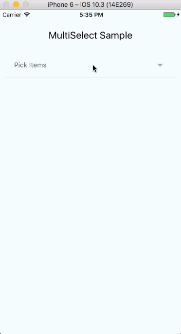
selectText="Pick Items"
|
|
127
|
+
searchInputPlaceholderText="Search Items..."
|
|
128
|
+
onChangeInput={(text) => console.log(text)}
|
|
129
|
+
tagRemoveIconColor="#CCC"
|
|
130
|
+
tagBorderColor="#CCC"
|
|
131
|
+
tagTextColor="#CCC"
|
|
132
|
+
selectedItemTextColor="#CCC"
|
|
133
|
+
selectedItemIconColor="#CCC"
|
|
134
|
+
itemTextColor="#000"
|
|
135
|
+
displayKey="name"
|
|
136
|
+
searchInputStyle={{ color: '#CCC' }}
|
|
137
|
+
submitButtonColor="#CCC"
|
|
138
|
+
submitButtonText="Submit"
|
|
139
|
+
/>
|
|
140
|
+
<View>
|
|
141
|
+
{multiSelectRef.current?.getSelectedItemsExt(selectedItems)}
|
|
142
|
+
</View>
|
|
143
|
+
</View>
|
|
144
|
+
)
|
|
145
|
+
}
|
|
146
|
+
```
|
|
147
|
+
|
|
148
|
+
## Props
|
|
149
|
+
|
|
150
|
+
### Required
|
|
151
|
+
|
|
152
|
+
| Prop | Type | Purpose |
|
|
153
|
+
|------|------|---------|
|
|
154
|
+
| `items` | `MultiSelectItem[]` | Array of objects to display. Each object must contain a name and unique identifier |
|
|
155
|
+
| `iconComponent` | `IconComponentType` | Icon component to render icons (e.g. `MaterialCommunityIcons`) |
|
|
156
|
+
| `onSelectedItemsChange` | `(items: string[]) => void` | Called when selection changes |
|
|
157
|
+
|
|
158
|
+
### Optional
|
|
159
|
+
|
|
160
|
+
| Prop | Type | Default | Purpose |
|
|
161
|
+
|------|------|---------|---------|
|
|
162
|
+
| `iconNames` | `Partial<IconNames>` | MaterialCommunityIcons defaults | Override icon names for other icon libraries (see above) |
|
|
163
|
+
| `single` | `boolean` | `false` | Toggle between single and multi select mode |
|
|
164
|
+
| `selectedItems` | `string[]` | `[]` | Array of selected item keys |
|
|
165
|
+
| `uniqueKey` | `string` | `'_id'` | Key used to uniquely identify each item |
|
|
166
|
+
| `displayKey` | `string` | `'name'` | Key used to display item label |
|
|
167
|
+
| `selectText` | `string` | `'Select'` | Text displayed on the main component |
|
|
168
|
+
| `selectedText` | `string` | `'selected'` | Text appended to selection count |
|
|
169
|
+
| `searchInputPlaceholderText` | `string` | `'Search'` | Placeholder for the search input |
|
|
170
|
+
| `searchIcon` | `ReactNode` | magnify icon | Custom search icon element |
|
|
171
|
+
| `noItemsText` | `string` | `'No items to display.'` | Text shown when no items match |
|
|
172
|
+
| `filterMethod` | `'partial' \| 'full'` | `'partial'` | Search matching strategy |
|
|
173
|
+
| `canAddItems` | `boolean` | `false` | Allow users to add new items via the search input |
|
|
174
|
+
| `removeSelected` | `boolean` | `false` | Hide already-selected items from the dropdown |
|
|
175
|
+
| `hideTags` | `boolean` | `false` | Hide tokenized selected items below the selector |
|
|
176
|
+
| `hideSubmitButton` | `boolean` | `false` | Hide the submit button in the dropdown |
|
|
177
|
+
| `hideDropdown` | `boolean` | `false` | Hide dropdown cancel, show back arrow instead |
|
|
178
|
+
| `fixedHeight` | `boolean` | `false` | Use fixed height with scroll instead of auto height |
|
|
179
|
+
| `fontSize` | `number` | `14` | Font size for the dropdown label |
|
|
180
|
+
| `itemFontSize` | `number` | `16` | Font size for each item in the dropdown |
|
|
181
|
+
| `fontFamily` | `string` | `''` | Custom font family for the component |
|
|
182
|
+
| `altFontFamily` | `string` | `''` | Font family for the placeholder text |
|
|
183
|
+
| `itemFontFamily` | `string` | `''` | Font family for non-selected items |
|
|
184
|
+
| `selectedItemFontFamily` | `string` | `''` | Font family for selected items |
|
|
185
|
+
| `textColor` | `string` | `'#525966'` | Color for the dropdown label |
|
|
186
|
+
| `itemTextColor` | `string` | `'#525966'` | Text color for non-selected items |
|
|
187
|
+
| `selectedItemTextColor` | `string` | `'#00A5FF'` | Text color for selected items |
|
|
188
|
+
| `selectedItemIconColor` | `string` | `'#00A5FF'` | Check icon color for selected items |
|
|
189
|
+
| `tagBorderColor` | `string` | `'#00A5FF'` | Border color for selected item tags |
|
|
190
|
+
| `tagTextColor` | `string` | `'#00A5FF'` | Text color for selected item tags |
|
|
191
|
+
| `tagRemoveIconColor` | `string` | `'#C62828'` | Color for the tag remove icon |
|
|
192
|
+
| `submitButtonColor` | `string` | `'#CCC'` | Background color for the submit button |
|
|
193
|
+
| `submitButtonText` | `string` | `'Submit'` | Text on the submit button |
|
|
194
|
+
| `searchInputStyle` | `StyleProp<TextStyle>` | | Style for the search input |
|
|
195
|
+
| `tagContainerStyle` | `StyleProp<ViewStyle>` | | Style for tag containers |
|
|
196
|
+
| `styleMainWrapper` | `StyleProp<ViewStyle>` | | Style for the outermost wrapper |
|
|
197
|
+
| `styleDropdownMenu` | `StyleProp<ViewStyle>` | | Style for the dropdown menu view |
|
|
198
|
+
| `styleDropdownMenuSubsection` | `StyleProp<ViewStyle>` | | Style for the inner dropdown view |
|
|
199
|
+
| `styleInputGroup` | `StyleProp<ViewStyle>` | | Style for the search input group |
|
|
200
|
+
| `styleItemsContainer` | `StyleProp<ViewStyle>` | | Style for the items container |
|
|
201
|
+
| `styleListContainer` | `StyleProp<ViewStyle>` | | Style for the list container |
|
|
202
|
+
| `styleRowList` | `StyleProp<ViewStyle>` | | Style for each item row |
|
|
203
|
+
| `styleSelectorContainer` | `StyleProp<ViewStyle>` | | Style for the open selector container |
|
|
204
|
+
| `styleTextDropdown` | `StyleProp<TextStyle>` | | Style for dropdown text |
|
|
205
|
+
| `styleTextDropdownSelected` | `StyleProp<TextStyle>` | | Style for dropdown text when items are selected |
|
|
206
|
+
| `styleTextTag` | `StyleProp<TextStyle>` | | Style for tag text |
|
|
207
|
+
| `styleIndicator` | `StyleProp<ViewStyle>` | | Style for the dropdown indicator icon |
|
|
208
|
+
| `textInputProps` | `TextInputProps` | | Additional props for the TextInput |
|
|
209
|
+
| `flatListProps` | `Partial<FlatListProps>` | | Additional props for the FlatList |
|
|
210
|
+
|
|
211
|
+
### Callbacks
|
|
212
|
+
|
|
213
|
+
| Prop | Type | Purpose |
|
|
214
|
+
|------|------|---------|
|
|
215
|
+
| `onAddItem` | `(newItems: MultiSelectItem[]) => void` | Called when a new item is added |
|
|
216
|
+
| `onChangeInput` | `(text: string) => void` | Called when the search input changes |
|
|
217
|
+
| `onClearSelector` | `() => void` | Called when the back button is pressed |
|
|
218
|
+
| `onToggleList` | `() => void` | Called when the selector is toggled |
|
|
219
|
+
|
|
220
|
+
## Notes
|
|
221
|
+
|
|
222
|
+
- **Displaying tags elsewhere:** Use a ref to call `getSelectedItemsExt(selectedItems)` and render tags in a different part of your view.
|
|
223
|
+
|
|
224
|
+
- **Disabled items:** Set `disabled: true` on an item object to render it in gray and make it non-interactive.
|
|
225
|
+
|
|
226
|
+
- **Single mode:** `selectedItems` should still be passed as an array. The selected item is returned as a single-element array.
|
|
227
|
+
|
|
228
|
+
- **Display key:** By default the component uses the `name` key to display items. Use `displayKey` to change this.
|
|
229
|
+
|
|
230
|
+
- **Filter methods:**
|
|
231
|
+
- `partial`: "University of New" matches "University of New York" but also "University of Columbia" and "New England Tech" (individual word matches)
|
|
232
|
+
- `full`: "University of New" only matches items containing the full substring "University of New"
|
|
233
|
+
|
|
234
|
+
## TypeScript
|
|
235
|
+
|
|
236
|
+
This package is written in TypeScript and ships type declarations. Exported types:
|
|
237
|
+
|
|
238
|
+
```tsx
|
|
239
|
+
import type {
|
|
240
|
+
MultiSelectProps,
|
|
241
|
+
MultiSelectItem,
|
|
242
|
+
MultiSelectRef,
|
|
243
|
+
IconProps,
|
|
244
|
+
IconComponentType,
|
|
245
|
+
IconNames
|
|
246
|
+
} from 'react-native-multiple-select'
|
|
247
|
+
```
|
|
248
|
+
|
|
249
|
+
## Contributing
|
|
250
|
+
|
|
251
|
+
Contributions are **welcome** and will be fully **credited**.
|
|
252
|
+
|
|
253
|
+
Contributions are accepted via Pull Requests on [Github](https://github.com/toystars/react-native-multiple-select).
|
|
254
|
+
|
|
255
|
+
### Pull Requests
|
|
256
|
+
|
|
257
|
+
- **Document changes in behaviour** - Keep the README and relevant docs up-to-date.
|
|
258
|
+
- **Follow SemVer** - We follow [SemVer v2.0.0](http://semver.org/).
|
|
259
|
+
- **Create feature branches** - Don't ask us to pull from your master branch.
|
|
260
|
+
- **One pull request per feature** - If you want to do more than one thing, send multiple pull requests.
|
|
261
|
+
- **Squash commits** - Make sure each commit in your PR is meaningful.
|
|
262
|
+
|
|
263
|
+
## Issues
|
|
264
|
+
|
|
265
|
+
Check [issues](https://github.com/toystars/react-native-multiple-select/issues) for current issues.
|
|
266
|
+
|
|
267
|
+
## Contributors
|
|
268
|
+
|
|
269
|
+
See [CONTRIBUTORS](CONTRIBUTORS.md)
|
|
270
|
+
|
|
271
|
+
## License
|
|
272
|
+
|
|
273
|
+
The MIT License (MIT). See [LICENSE](LICENSE) for more information.
|
package/babel.config.js
ADDED
|
@@ -0,0 +1,9 @@
|
|
|
1
|
+
/*!
|
|
2
|
+
* react-native-multi-select
|
|
3
|
+
* Copyright(c) 2017 Mustapha Babatunde Oluwaleke
|
|
4
|
+
* MIT Licensed
|
|
5
|
+
*/
|
|
6
|
+
import React from 'react';
|
|
7
|
+
import type { MultiSelectProps, MultiSelectRef } from './types';
|
|
8
|
+
declare const MultiSelect: React.ForwardRefExoticComponent<MultiSelectProps & React.RefAttributes<MultiSelectRef>>;
|
|
9
|
+
export default MultiSelect;
|
|
@@ -0,0 +1,278 @@
|
|
|
1
|
+
import { jsx as _jsx, jsxs as _jsxs } from "react/jsx-runtime";
|
|
2
|
+
/*!
|
|
3
|
+
* react-native-multi-select
|
|
4
|
+
* Copyright(c) 2017 Mustapha Babatunde Oluwaleke
|
|
5
|
+
* MIT Licensed
|
|
6
|
+
*/
|
|
7
|
+
import React, { useState, useCallback, useImperativeHandle, forwardRef } from 'react';
|
|
8
|
+
import { Text, View, TextInput, TouchableWithoutFeedback, TouchableOpacity, FlatList, UIManager } from 'react-native';
|
|
9
|
+
import styles, { colorPack, selectorViewStyle } from './styles';
|
|
10
|
+
// set UIManager LayoutAnimationEnabledExperimental
|
|
11
|
+
if (UIManager.setLayoutAnimationEnabledExperimental) {
|
|
12
|
+
UIManager.setLayoutAnimationEnabledExperimental(true);
|
|
13
|
+
}
|
|
14
|
+
const getDisplayValue = (item, key) => {
|
|
15
|
+
const val = item[key];
|
|
16
|
+
if (val == null)
|
|
17
|
+
return '';
|
|
18
|
+
if (typeof val === 'string')
|
|
19
|
+
return val;
|
|
20
|
+
if (typeof val === 'number' || typeof val === 'boolean')
|
|
21
|
+
return String(val);
|
|
22
|
+
return '';
|
|
23
|
+
};
|
|
24
|
+
const MultiSelect = forwardRef(({ single = false, selectedItems = [], items, iconComponent: Icon, iconNames, uniqueKey = '_id', displayKey = 'name', tagBorderColor = colorPack.primary, tagTextColor = colorPack.primary, tagRemoveIconColor = colorPack.danger, tagContainerStyle, fontFamily = '', selectedItemFontFamily = '', selectedItemTextColor = colorPack.primary, selectedItemIconColor = colorPack.primary, itemFontFamily = '', itemTextColor = colorPack.textPrimary, itemFontSize = 16, searchIcon, searchInputPlaceholderText = 'Search', searchInputStyle = { color: colorPack.textPrimary }, selectText = 'Select', selectedText = 'selected', altFontFamily = '', fontSize = 14, textColor = colorPack.textPrimary, fixedHeight = false, hideTags = false, hideSubmitButton = false, hideDropdown = false, submitButtonColor = '#CCC', submitButtonText = 'Submit', canAddItems = false, removeSelected = false, noItemsText = 'No items to display.', filterMethod = 'partial', onSelectedItemsChange, onAddItem, onChangeInput, onClearSelector: onClearSelectorProp, onToggleList, textInputProps, flatListProps, styleDropdownMenu, styleDropdownMenuSubsection, styleInputGroup, styleItemsContainer, styleListContainer, styleMainWrapper, styleRowList, styleSelectorContainer, styleTextDropdown, styleTextDropdownSelected, styleTextTag, styleIndicator }, ref) => {
|
|
25
|
+
const [selector, setSelector] = useState(false);
|
|
26
|
+
const [searchTerm, setSearchTerm] = useState('');
|
|
27
|
+
const names = React.useMemo(() => ({
|
|
28
|
+
search: iconNames?.search ?? 'magnify',
|
|
29
|
+
close: iconNames?.close ?? 'close-circle',
|
|
30
|
+
check: iconNames?.check ?? 'check',
|
|
31
|
+
arrowDown: iconNames?.arrowDown ?? 'menu-down',
|
|
32
|
+
arrowRight: iconNames?.arrowRight ?? 'menu-right',
|
|
33
|
+
arrowLeft: iconNames?.arrowLeft ?? 'arrow-left'
|
|
34
|
+
}), [iconNames]);
|
|
35
|
+
const resolvedSearchIcon = searchIcon ?? (_jsx(Icon, { name: names.search, size: 20, color: colorPack.placeholderTextColor, style: styles.searchIconMargin }));
|
|
36
|
+
const getItemKey = useCallback((item) => getDisplayValue(item, uniqueKey), [uniqueKey]);
|
|
37
|
+
const findItem = useCallback((itemKey) => items.find((singleItem) => singleItem[uniqueKey] === itemKey) ?? {}, [items, uniqueKey]);
|
|
38
|
+
const itemSelected = useCallback((item) => selectedItems.indexOf(getItemKey(item)) !== -1, [selectedItems, getItemKey]);
|
|
39
|
+
const handleChangeInput = useCallback((value) => {
|
|
40
|
+
onChangeInput?.(value);
|
|
41
|
+
setSearchTerm(value);
|
|
42
|
+
}, [onChangeInput]);
|
|
43
|
+
const getSelectLabel = useCallback(() => {
|
|
44
|
+
if (selectedItems.length === 0) {
|
|
45
|
+
return selectText;
|
|
46
|
+
}
|
|
47
|
+
if (single) {
|
|
48
|
+
const foundItem = findItem(selectedItems[0]);
|
|
49
|
+
return getDisplayValue(foundItem, displayKey) || selectText;
|
|
50
|
+
}
|
|
51
|
+
return `${selectText} (${String(selectedItems.length)} ${selectedText})`;
|
|
52
|
+
}, [selectedItems, selectText, single, findItem, displayKey, selectedText]);
|
|
53
|
+
const clearSearchTerm = useCallback(() => {
|
|
54
|
+
setSearchTerm('');
|
|
55
|
+
}, []);
|
|
56
|
+
const toggleSelector = useCallback(() => {
|
|
57
|
+
setSelector((prev) => !prev);
|
|
58
|
+
onToggleList?.();
|
|
59
|
+
}, [onToggleList]);
|
|
60
|
+
const submitSelection = useCallback(() => {
|
|
61
|
+
toggleSelector();
|
|
62
|
+
clearSearchTerm();
|
|
63
|
+
}, [toggleSelector, clearSearchTerm]);
|
|
64
|
+
const clearSelectorCallback = useCallback(() => {
|
|
65
|
+
setSelector(false);
|
|
66
|
+
onClearSelectorProp?.();
|
|
67
|
+
}, [onClearSelectorProp]);
|
|
68
|
+
const removeItem = useCallback((item) => {
|
|
69
|
+
const key = getItemKey(item);
|
|
70
|
+
const newItems = selectedItems.filter((singleItem) => key !== singleItem);
|
|
71
|
+
onSelectedItemsChange(newItems);
|
|
72
|
+
}, [selectedItems, getItemKey, onSelectedItemsChange]);
|
|
73
|
+
const toggleItem = useCallback((item) => {
|
|
74
|
+
const key = getItemKey(item);
|
|
75
|
+
if (single) {
|
|
76
|
+
submitSelection();
|
|
77
|
+
onSelectedItemsChange([key]);
|
|
78
|
+
}
|
|
79
|
+
else {
|
|
80
|
+
const isSelected = itemSelected(item);
|
|
81
|
+
const newItems = isSelected
|
|
82
|
+
? selectedItems.filter((singleItem) => key !== singleItem)
|
|
83
|
+
: [...selectedItems, key];
|
|
84
|
+
onSelectedItemsChange(newItems);
|
|
85
|
+
}
|
|
86
|
+
}, [
|
|
87
|
+
single,
|
|
88
|
+
getItemKey,
|
|
89
|
+
selectedItems,
|
|
90
|
+
onSelectedItemsChange,
|
|
91
|
+
itemSelected,
|
|
92
|
+
submitSelection
|
|
93
|
+
]);
|
|
94
|
+
const addItem = useCallback(() => {
|
|
95
|
+
const newItemName = searchTerm;
|
|
96
|
+
if (newItemName) {
|
|
97
|
+
const newItemId = newItemName
|
|
98
|
+
.split(' ')
|
|
99
|
+
.filter((word) => word.length)
|
|
100
|
+
.join('-');
|
|
101
|
+
const newItems = [...items, { [uniqueKey]: newItemId, name: newItemName }];
|
|
102
|
+
const newSelectedItems = [...selectedItems, newItemId];
|
|
103
|
+
onAddItem?.(newItems);
|
|
104
|
+
onSelectedItemsChange(newSelectedItems);
|
|
105
|
+
clearSearchTerm();
|
|
106
|
+
}
|
|
107
|
+
}, [
|
|
108
|
+
searchTerm,
|
|
109
|
+
items,
|
|
110
|
+
uniqueKey,
|
|
111
|
+
selectedItems,
|
|
112
|
+
onAddItem,
|
|
113
|
+
onSelectedItemsChange,
|
|
114
|
+
clearSearchTerm
|
|
115
|
+
]);
|
|
116
|
+
const itemStyle = useCallback((item) => {
|
|
117
|
+
const isSelected = itemSelected(item);
|
|
118
|
+
const ff = {};
|
|
119
|
+
if (isSelected && selectedItemFontFamily) {
|
|
120
|
+
ff.fontFamily = selectedItemFontFamily;
|
|
121
|
+
}
|
|
122
|
+
else if (!isSelected && itemFontFamily) {
|
|
123
|
+
ff.fontFamily = itemFontFamily;
|
|
124
|
+
}
|
|
125
|
+
const color = isSelected
|
|
126
|
+
? { color: selectedItemTextColor }
|
|
127
|
+
: { color: itemTextColor };
|
|
128
|
+
return { ...ff, ...color, fontSize: itemFontSize };
|
|
129
|
+
}, [
|
|
130
|
+
itemSelected,
|
|
131
|
+
selectedItemFontFamily,
|
|
132
|
+
itemFontFamily,
|
|
133
|
+
selectedItemTextColor,
|
|
134
|
+
itemTextColor,
|
|
135
|
+
itemFontSize
|
|
136
|
+
]);
|
|
137
|
+
const displaySelectedItems = useCallback((optionalSelectedItems) => {
|
|
138
|
+
const actualSelectedItems = optionalSelectedItems ?? selectedItems;
|
|
139
|
+
return actualSelectedItems.map((singleSelectedItem) => {
|
|
140
|
+
const item = findItem(singleSelectedItem);
|
|
141
|
+
const label = getDisplayValue(item, displayKey);
|
|
142
|
+
if (!label)
|
|
143
|
+
return null;
|
|
144
|
+
return (_jsxs(View, { style: [
|
|
145
|
+
styles.selectedItem,
|
|
146
|
+
styles.selectedItemLayout,
|
|
147
|
+
{
|
|
148
|
+
width: label.length * 8 + 60,
|
|
149
|
+
borderColor: tagBorderColor
|
|
150
|
+
},
|
|
151
|
+
tagContainerStyle ?? {}
|
|
152
|
+
], children: [_jsx(Text, { style: [
|
|
153
|
+
styles.tagLabel,
|
|
154
|
+
{ color: tagTextColor },
|
|
155
|
+
styleTextTag ?? {},
|
|
156
|
+
fontFamily ? { fontFamily } : {}
|
|
157
|
+
], numberOfLines: 1, children: label }), _jsx(TouchableOpacity, { onPress: () => {
|
|
158
|
+
removeItem(item);
|
|
159
|
+
}, children: _jsx(Icon, { name: names.close, style: [styles.tagRemoveIcon, { color: tagRemoveIconColor }] }) })] }, getItemKey(item)));
|
|
160
|
+
});
|
|
161
|
+
}, [
|
|
162
|
+
Icon,
|
|
163
|
+
names,
|
|
164
|
+
selectedItems,
|
|
165
|
+
findItem,
|
|
166
|
+
displayKey,
|
|
167
|
+
getItemKey,
|
|
168
|
+
tagBorderColor,
|
|
169
|
+
tagTextColor,
|
|
170
|
+
tagRemoveIconColor,
|
|
171
|
+
tagContainerStyle,
|
|
172
|
+
styleTextTag,
|
|
173
|
+
fontFamily,
|
|
174
|
+
removeItem
|
|
175
|
+
]);
|
|
176
|
+
useImperativeHandle(ref, () => ({
|
|
177
|
+
getSelectedItemsExt: (optionalItems) => (_jsx(View, { style: styles.rowWrap, children: displaySelectedItems(optionalItems) }))
|
|
178
|
+
}), [displaySelectedItems]);
|
|
179
|
+
const filterItemsPartial = useCallback((term) => {
|
|
180
|
+
const parts = term.trim().split(/[ \-:]+/);
|
|
181
|
+
const regex = new RegExp(`(${parts.join('|')})`, 'ig');
|
|
182
|
+
return items.filter((item) => regex.test(getDisplayValue(item, displayKey)));
|
|
183
|
+
}, [items, displayKey]);
|
|
184
|
+
const filterItemsFull = useCallback((term) => {
|
|
185
|
+
const lower = term.trim().toLowerCase();
|
|
186
|
+
return items.filter((item) => getDisplayValue(item, displayKey).toLowerCase().indexOf(lower) >= 0);
|
|
187
|
+
}, [items, displayKey]);
|
|
188
|
+
const filterItems = useCallback((term) => {
|
|
189
|
+
if (filterMethod === 'full')
|
|
190
|
+
return filterItemsFull(term);
|
|
191
|
+
return filterItemsPartial(term);
|
|
192
|
+
}, [filterMethod, filterItemsFull, filterItemsPartial]);
|
|
193
|
+
const getRow = useCallback((item) => (_jsx(TouchableOpacity, { disabled: Boolean(item.disabled), onPress: () => {
|
|
194
|
+
toggleItem(item);
|
|
195
|
+
}, style: [styleRowList, styles.rowPadding], children: _jsx(View, { children: _jsxs(View, { style: styles.rowAlignCenter, children: [_jsx(Text, { style: [
|
|
196
|
+
styles.rowItemText,
|
|
197
|
+
itemStyle(item),
|
|
198
|
+
item.disabled ? styles.disabledText : {}
|
|
199
|
+
], children: getDisplayValue(item, displayKey) }), itemSelected(item) ? (_jsx(Icon, { name: names.check, style: [styles.checkIcon, { color: selectedItemIconColor }] })) : null] }) }) })), [
|
|
200
|
+
Icon,
|
|
201
|
+
names,
|
|
202
|
+
toggleItem,
|
|
203
|
+
styleRowList,
|
|
204
|
+
itemStyle,
|
|
205
|
+
displayKey,
|
|
206
|
+
itemSelected,
|
|
207
|
+
selectedItemIconColor
|
|
208
|
+
]);
|
|
209
|
+
const getRowNew = useCallback((item) => (_jsx(TouchableOpacity, { disabled: Boolean(item.disabled), onPress: () => {
|
|
210
|
+
addItem();
|
|
211
|
+
}, style: styles.rowPadding, children: _jsx(View, { children: _jsx(View, { style: styles.rowAlignCenter, children: _jsxs(Text, { style: [
|
|
212
|
+
styles.rowItemText,
|
|
213
|
+
itemStyle(item),
|
|
214
|
+
item.disabled ? styles.disabledText : {}
|
|
215
|
+
], children: ["Add ", getDisplayValue(item, 'name'), " (tap or press return)"] }) }) }) })), [addItem, itemStyle]);
|
|
216
|
+
const renderItems = useCallback(() => {
|
|
217
|
+
let renderList = searchTerm ? filterItems(searchTerm) : items;
|
|
218
|
+
if (removeSelected) {
|
|
219
|
+
renderList = renderList.filter((item) => !selectedItems.includes(getItemKey(item)));
|
|
220
|
+
}
|
|
221
|
+
let itemList = null;
|
|
222
|
+
let searchTermMatch = false;
|
|
223
|
+
if (renderList.length) {
|
|
224
|
+
itemList = (_jsx(FlatList, { data: renderList, extraData: selectedItems, keyExtractor: (_item, index) => index.toString(), renderItem: (rowData) => getRow(rowData.item), ...flatListProps, nestedScrollEnabled: true }));
|
|
225
|
+
searchTermMatch = renderList.some((item) => item.name === searchTerm);
|
|
226
|
+
}
|
|
227
|
+
else if (!canAddItems) {
|
|
228
|
+
itemList = (_jsx(View, { style: styles.noItemsRow, children: _jsx(Text, { style: [styles.noItemsText, fontFamily ? { fontFamily } : {}], children: noItemsText }) }));
|
|
229
|
+
}
|
|
230
|
+
let addItemRow = null;
|
|
231
|
+
if (canAddItems && !searchTermMatch && searchTerm.length) {
|
|
232
|
+
addItemRow = getRowNew({ name: searchTerm });
|
|
233
|
+
}
|
|
234
|
+
return (_jsxs(View, { style: styleListContainer, children: [itemList, addItemRow] }));
|
|
235
|
+
}, [
|
|
236
|
+
searchTerm,
|
|
237
|
+
filterItems,
|
|
238
|
+
items,
|
|
239
|
+
removeSelected,
|
|
240
|
+
selectedItems,
|
|
241
|
+
getItemKey,
|
|
242
|
+
getRow,
|
|
243
|
+
flatListProps,
|
|
244
|
+
canAddItems,
|
|
245
|
+
fontFamily,
|
|
246
|
+
noItemsText,
|
|
247
|
+
getRowNew,
|
|
248
|
+
styleListContainer
|
|
249
|
+
]);
|
|
250
|
+
return (_jsx(View, { style: styleMainWrapper, children: selector ? (_jsxs(View, { style: [selectorViewStyle(fixedHeight), styleSelectorContainer], children: [_jsxs(View, { style: [styles.inputGroup, styleInputGroup], children: [resolvedSearchIcon, _jsx(TextInput, { autoFocus: true, onChangeText: handleChangeInput, onSubmitEditing: addItem, placeholder: searchInputPlaceholderText, placeholderTextColor: colorPack.placeholderTextColor, underlineColorAndroid: "transparent", style: [searchInputStyle, styles.searchInputFlex], value: searchTerm, ...textInputProps }), hideSubmitButton && (_jsx(TouchableOpacity, { onPress: submitSelection, children: _jsx(Icon, { name: names.arrowDown, style: [styles.indicator, styles.indicatorPadded, styleIndicator] }) })), !hideDropdown && (_jsx(Icon, { name: names.arrowLeft, size: 20, onPress: clearSelectorCallback, color: colorPack.placeholderTextColor, style: styles.backArrowMargin }))] }), _jsxs(View, { style: styles.selectorContent, children: [_jsx(View, { style: styleItemsContainer, children: renderItems() }), !single && !hideSubmitButton && (_jsx(TouchableOpacity, { onPress: submitSelection, style: [styles.button, { backgroundColor: submitButtonColor }], children: _jsx(Text, { style: [styles.buttonText, fontFamily ? { fontFamily } : {}], children: submitButtonText }) }))] })] })) : (_jsxs(View, { children: [_jsx(View, { style: [styles.dropdownView, styleDropdownMenu], children: _jsx(View, { style: [
|
|
251
|
+
styles.subSection,
|
|
252
|
+
styles.subSectionPadded,
|
|
253
|
+
styleDropdownMenuSubsection
|
|
254
|
+
], children: _jsx(TouchableWithoutFeedback, { onPress: toggleSelector, children: _jsxs(View, { style: styles.dropdownTouchable, children: [_jsx(Text, { style: selectedItems.length === 0
|
|
255
|
+
? [
|
|
256
|
+
styles.dropdownLabelBase,
|
|
257
|
+
{
|
|
258
|
+
fontSize,
|
|
259
|
+
color: textColor || colorPack.placeholderTextColor
|
|
260
|
+
},
|
|
261
|
+
styleTextDropdown,
|
|
262
|
+
altFontFamily
|
|
263
|
+
? { fontFamily: altFontFamily }
|
|
264
|
+
: fontFamily
|
|
265
|
+
? { fontFamily }
|
|
266
|
+
: {}
|
|
267
|
+
]
|
|
268
|
+
: [
|
|
269
|
+
styles.dropdownLabelBase,
|
|
270
|
+
{
|
|
271
|
+
fontSize,
|
|
272
|
+
color: textColor || colorPack.placeholderTextColor
|
|
273
|
+
},
|
|
274
|
+
styleTextDropdownSelected
|
|
275
|
+
], numberOfLines: 1, children: getSelectLabel() }), _jsx(Icon, { name: hideSubmitButton ? names.arrowRight : names.arrowDown, style: [styles.indicator, styleIndicator] })] }) }) }) }), !single && !hideTags && selectedItems.length ? (_jsx(View, { style: styles.rowWrap, children: displaySelectedItems() })) : null] })) }));
|
|
276
|
+
});
|
|
277
|
+
MultiSelect.displayName = 'MultiSelect';
|
|
278
|
+
export default MultiSelect;
|
package/dist/index.d.ts
ADDED
|
@@ -0,0 +1,7 @@
|
|
|
1
|
+
/*!
|
|
2
|
+
* react-native-multi-select
|
|
3
|
+
* Copyright(c) 2017 Mustapha Babatunde Oluwaleke
|
|
4
|
+
* MIT Licensed
|
|
5
|
+
*/
|
|
6
|
+
export { default } from './MultiSelect';
|
|
7
|
+
export type { MultiSelectProps, MultiSelectItem, MultiSelectRef, IconProps, IconComponentType, IconNames } from './types';
|