@revolist/ui 4.0.2-rc → 4.0.2
This diff represents the content of publicly available package versions that have been released to one of the supported registries. The information contained in this diff is provided for informational purposes only and reflects changes between package versions as they appear in their respective public registries.
- package/LICENSE +21 -0
- package/MIGRATION.md +36 -0
- package/OWNERSHIP.md +32 -32
- package/README.md +405 -265
- package/_button.scss +6 -2
- package/_chunks/arrow-up-Cw8hW9vp.js +4 -0
- package/_chunks/calculator-CDWOuAcp.js +4 -0
- package/_chunks/{calendar-CpaUK7w1.js → calendar-CgXQgkga.js} +28 -18
- package/_chunks/chart-frame-hcOlnQ1K.js +145 -0
- package/_chunks/{chevron-right-sxHQMSkq.js → check-BwI7iCAm.js} +2 -2
- package/_chunks/{chevron-left-D0nc4Z5S.js → chevron-right-CM3ljziP.js} +2 -2
- package/_chunks/choice-chips-SkllS5Kl.js +126 -0
- package/_chunks/clock-BOhPNlW3.js +4 -0
- package/_chunks/{color-palette-BBMFmUNA.js → color-palette-DMJUChWC.js} +20 -22
- package/_chunks/{color-picker-D90Jg-M8.js → color-picker-BpCTuIdm.js} +77 -72
- package/_chunks/{component-YDcfoOLz.js → component-CfeHXgIw.js} +301 -282
- package/_chunks/{component-metadata-BENbgTjU.js → component-metadata-BKd7U8OW.js} +0 -12
- package/_chunks/configurator-actions-DnStE6Yl.js +155 -0
- package/_chunks/configurator-field-icon-CmcM_sPs.js +53 -0
- package/_chunks/control-Dcrjsunl.js +118 -0
- package/_chunks/{controls-DIum-E66.js → controls-B_6NJarZ.js} +217 -182
- package/_chunks/{date-control-BJSzu79z.js → date-control-C4h4m75W.js} +1 -1
- package/_chunks/{date-time-BxPJusp9.js → date-time-CTOSbzb0.js} +344 -307
- package/_chunks/{delete-button-Bblyah10.js → delete-button-CW9vjLnk.js} +6 -6
- package/_chunks/dialog.parts-3w5FR06n.js +131 -0
- package/_chunks/{duration-87U2EoMS.js → duration-Bf2OS1V5.js} +19 -18
- package/_chunks/editor-popup-ByU7qiub.js +82 -0
- package/_chunks/field-configurator-D5dZRhDe.js +288 -0
- package/_chunks/field-context-D57PnBbH.js +5 -0
- package/_chunks/{framework-mount-C-Zwm44H.js → framework-mount-Bk4O_T7T.js} +1 -1
- package/_chunks/icon-toolbar-DSjOdwM7.js +134 -0
- package/_chunks/magnifying-glass-CvrTDSkB.js +4 -0
- package/_chunks/minus-BOAR3A1C.js +4 -0
- package/_chunks/mount-BRdcG60g.js +267 -0
- package/_chunks/{native.view-ByyZ1CT5.js → native-Blr3byjO.js} +1 -1
- package/_chunks/native-control-B_fVA5bL.js +649 -0
- package/_chunks/{number-input-BeIadZuL.js → number-input-CmM6_2vR.js} +7 -7
- package/_chunks/{picker-DpP7iQLA.js → picker-DTqET-2W.js} +2 -2
- package/_chunks/plus-CbGRkIGl.js +4 -0
- package/_chunks/popover-controller-D-AvKQ7B.js +102 -0
- package/_chunks/popup-C35Isk7p.js +378 -0
- package/_chunks/{rating-choice-Ca8ZBty3.js → rating-choice-C-6wcb9U.js} +1 -1
- package/_chunks/render-m5eMMwFR.js +83 -0
- package/_chunks/{reorder-list-Cc3KmfAN.js → reorder-list-DIl1gkV6.js} +1 -1
- package/_chunks/request-trail-DrhdpWiH.js +762 -0
- package/_chunks/rich-text-BnilBbhU.js +842 -0
- package/_chunks/rotate-left-BF6G883o.js +4 -0
- package/_chunks/rotate-right-Iha5ScJ1.js +4 -0
- package/_chunks/selection-list-tooltips-C5oMJe26.js +42 -0
- package/_chunks/title-tooltip-Cw6LOZhb.js +11 -0
- package/_chunks/tooltip-D4xkio5G.js +54 -0
- package/_chunks/tooltip-owner-DjdvqKzz.js +19 -0
- package/_chunks/tooltip-session-B6X6x8G_.js +110 -0
- package/_chunks/tooltip-text-BXsUEmBH.js +12 -0
- package/_chunks/top-layer-popup-CNSDdfJV.js +59 -0
- package/_dialog.scss +55 -21
- package/_form.scss +71 -21
- package/_legend.scss +25 -7
- package/_shared/data-query/index.d.ts +2 -2
- package/_shared/data-query/load-options.d.ts +2 -2
- package/_variables.scss +34 -32
- package/_view-switcher.scss +6 -0
- package/activity-message.d.ts +1 -1
- package/ai/_chat.scss +227 -0
- package/ai/_style.scss +170 -39
- package/ai/chat.d.ts +65 -0
- package/ai/components.d.ts +34 -5
- package/ai/index.d.ts +3 -0
- package/ai/index.js +3 -3
- package/ai/mount.d.ts +59 -6
- package/ai/prompt-history.d.ts +13 -0
- package/ai/request-trail.d.ts +9 -3
- package/ai/results/_style.scss +83 -0
- package/ai/results/index.d.ts +11 -0
- package/ai/results/metrics.d.ts +5 -0
- package/ai/results/table.d.ts +5 -0
- package/ai/results/text.d.ts +5 -0
- package/ai/results/types.d.ts +29 -0
- package/ai/transcript.d.ts +27 -0
- package/ai/translations.d.ts +1 -1
- package/angular/angular.d.ts +1 -1
- package/angular/angular.js +13 -10
- package/assignee/assignee.scss +28 -6
- package/assignee/index.js +34 -35
- package/avatar/avatar.style.scss +23 -6
- package/avatar/index.d.ts +25 -2
- package/avatar/index.js +33 -32
- package/badge.d.ts +1 -1
- package/badge.view.d.ts +8 -0
- package/brush-range/_brush-range.scss +55 -49
- package/brush-range/component.d.ts +1 -3
- package/brush-range/component.js +27 -27
- package/buttons/delete-button.d.ts +2 -1
- package/buttons/delete-button.js +1 -1
- package/buttons/delete-button.style.scss +6 -2
- package/buttons/remove-button.d.ts +1 -1
- package/buttons/remove-button.js +1 -1
- package/buttons/remove-button.style.scss +1 -1
- package/buttons/svg-button.d.ts +2 -1
- package/buttons/svg-button.js +19 -19
- package/calendar/_calendar.scss +27 -26
- package/calendar/calendar.js +1 -1
- package/calendar/header.js +1 -2
- package/calendar/index.js +2 -2
- package/cell-input.scss +3 -7
- package/cell-visuals/badge.style.scss +6 -3
- package/cell-visuals/bar-chart.style.scss +2 -1
- package/cell-visuals/column-type.style.css +12 -0
- package/cell-visuals/progress-line-value.renderer.style.scss +4 -2
- package/cell-visuals/progress-line.style.scss +1 -4
- package/cell-visuals/sparkline.style.scss +2 -1
- package/cell-visuals/timeline.style.css +4 -2
- package/checkbox/checkbox.scss +6 -24
- package/choice-chips/index.d.ts +3 -1
- package/choice-chips/index.js +1 -1
- package/color-palette/color-palette.js +1 -1
- package/color-palette/color-palette.style.scss +88 -25
- package/color-palette/color-picker.js +2 -2
- package/color-palette/color-picker.style.scss +23 -10
- package/color-palette/common-palettes.d.ts +1 -1
- package/color-palette/common-palettes.js +1 -1
- package/color-palette/native.d.ts +15 -2
- package/component-catalog.d.ts +24 -11
- package/configurator-actions.d.ts +67 -0
- package/configurator-actions.js +1 -0
- package/configurator-aggregation-list.d.ts +14 -0
- package/configurator-aggregation-list.js +63 -0
- package/configurator-drop-zone.d.ts +39 -0
- package/configurator-drop-zone.js +66 -0
- package/configurator-field-icon.d.ts +10 -0
- package/configurator-field-icon.js +1 -0
- package/configurator-focus.d.ts +4 -0
- package/configurator-focus.js +39 -0
- package/configurator-sections.d.ts +42 -0
- package/configurator-sections.js +71 -0
- package/control-attributes.js +7 -7
- package/control-presentation.d.ts +8 -2
- package/control-presentation.js +25 -20
- package/controls.d.ts +19 -7
- package/controls.js +4 -3
- package/core/editor-popup-position.d.ts +6 -2
- package/core/editor-popup.d.ts +4 -0
- package/core/editor-popup.js +1 -1
- package/core/popover-controller.d.ts +35 -0
- package/core/popup-ownership.d.ts +2 -0
- package/core/selection-list-tooltips.d.ts +2 -0
- package/core/title-tooltip.d.ts +2 -0
- package/core/tooltip-session.d.ts +29 -0
- package/core/tooltip-surface.d.ts +13 -0
- package/core/tooltip-text.d.ts +6 -0
- package/core/tooltip.d.ts +35 -0
- package/core/top-layer-popup.d.ts +4 -0
- package/core/top-layer-popup.js +1 -23
- package/date-time/attach.d.ts +1 -1
- package/date-time/date-control.d.ts +1 -1
- package/date-time/field.d.ts +3 -2
- package/date-time/index.js +1 -1
- package/date-time/style.scss +242 -39
- package/date-time/time-selection.d.ts +3 -1
- package/date-time/types.d.ts +5 -1
- package/dialog/dialog-action-footer.d.ts +17 -2
- package/dialog/dialog.dom.d.ts +15 -2
- package/dialog/dialog.dom.js +3 -3
- package/dialog/dialog.parts.d.ts +1 -1
- package/dialog/dialog.parts.js +1 -1
- package/distribution-chart/_distribution-chart.scss +113 -77
- package/distribution-chart/area-chart.js +1 -1
- package/distribution-chart/bar-chart.d.ts +5 -2
- package/distribution-chart/bar-chart.js +7 -3
- package/distribution-chart/chart-frame.d.ts +2 -1
- package/distribution-chart/index.d.ts +1 -1
- package/distribution-chart/line-chart.js +1 -1
- package/dropdown/content.d.ts +2 -1
- package/dropdown/content.js +1 -142
- package/dropdown/control.d.ts +14 -0
- package/dropdown/control.js +1 -0
- package/dropdown/control.view.d.ts +6 -0
- package/dropdown/dropdown.types.d.ts +5 -1
- package/dropdown/editor-dropdown.style.scss +54 -16
- package/dropdown/index.d.ts +1 -1
- package/dropdown/index.js +3 -4
- package/dropdown/lookup-field.d.ts +5 -0
- package/dropdown/lookup-field.js +2 -1
- package/dropdown/popup.d.ts +2 -2
- package/dropdown/popup.js +1 -141
- package/duration/index.js +1 -1
- package/duration/style.scss +1 -1
- package/editor-actions.js +1 -1
- package/editor-layout/index.d.ts +4 -4
- package/editor-layout/index.js +39 -34
- package/editor-layout/style.scss +82 -18
- package/field-configurator.d.ts +39 -1
- package/field-configurator.js +4 -170
- package/field-expansion.d.ts +9 -0
- package/fieldset.d.ts +3 -0
- package/filter/filters/slider/_single-slider.scss +57 -38
- package/filter/filters/slider/_slider.scss +41 -33
- package/filter/filters/slider/control.js +2 -0
- package/filter/filters/slider/runtime.js +49 -22
- package/filter/filters/slider/single.js +1 -1
- package/filter-badge.js +1 -1
- package/filter-controls.d.ts +0 -1
- package/filter-controls.js +9 -10
- package/form-controls/field-context.d.ts +5 -0
- package/form-controls/index.d.ts +10 -2
- package/form-controls/index.js +4 -9
- package/form-controls/presentation.d.ts +1 -1
- package/form-controls/presentation.js +53 -45
- package/formatting/index.d.ts +1 -1
- package/formatting/index.js +40 -35
- package/formatting/styles.scss +14 -57
- package/framework.js +237 -226
- package/history-controls.d.ts +14 -0
- package/history-controls.js +27 -0
- package/icon-toolbar.d.ts +62 -0
- package/icon-toolbar.js +1 -0
- package/icons/icon.d.ts +1 -1
- package/legend.d.ts +1 -1
- package/masked-input/index.js +1 -1
- package/native-control.d.ts +6 -5
- package/native-control.js +3 -26
- package/native-controls.d.ts +54 -2
- package/native-styles.css +1 -1
- package/native-styles.scss +6 -2
- package/native.d.ts +3 -3
- package/native.js +41 -37
- package/number-input/index.d.ts +1 -1
- package/number-input/index.js +1 -1
- package/package.json +88 -14
- package/pagination.d.ts +3 -0
- package/pagination.js +50 -40
- package/pdf-viewer/header.d.ts +1 -1
- package/pdf-viewer/index.d.ts +2 -2
- package/pdf-viewer/index.js +1 -1
- package/pdf-viewer/search-bar.d.ts +1 -1
- package/pdf-viewer/status.d.ts +1 -1
- package/pdf-viewer/style.scss +205 -45
- package/pickers.d.ts +5 -1
- package/preact-mount.js +1 -1
- package/preact.d.ts +15 -10
- package/preact.js +109 -64
- package/progress/_bar.scss +9 -3
- package/progress/_circular.scss +2 -1
- package/rating-choice.js +1 -1
- package/react-adapter.d.ts +4 -2
- package/react-control.d.ts +1 -0
- package/react.d.ts +20 -11
- package/react.js +72 -88
- package/reorder-list.d.ts +1 -1
- package/reorder-list.js +1 -1
- package/reorder-list.scss +59 -17
- package/resource-picker/resource-picker-popup.js +1 -1
- package/resource-picker/resource-picker.js +73 -71
- package/resource-picker/resource-picker.scss +66 -35
- package/rich-text/engine.d.ts +17 -19
- package/rich-text/format-html.d.ts +2 -0
- package/rich-text/index.d.ts +11 -7
- package/rich-text/index.js +1 -1
- package/rich-text/model.d.ts +6 -3
- package/rich-text/render-model.d.ts +4 -5
- package/rich-text/style.scss +295 -55
- package/rich-text/syntax.d.ts +5 -2
- package/rich-text/toolbar.d.ts +6 -6
- package/rich-text/translations.d.ts +5 -15
- package/search-input/index.js +1 -1
- package/search-input/native.d.ts +21 -2
- package/select.d.ts +22 -0
- package/select.js +1 -0
- package/selection-list.d.ts +1 -0
- package/selection-list.js +3 -1
- package/status-feedback/exit-snapshot.js +1 -1
- package/status-feedback/index.js +2 -2
- package/status-feedback/popover.js +9 -9
- package/status-feedback/render.js +3 -44
- package/status-feedback/status-feedback.scss +130 -34
- package/status-feedback/types.d.ts +4 -0
- package/status-feedback/use-auto-dismiss.d.ts +3 -0
- package/styles/_activity-message.scss +24 -7
- package/styles/_alert.scss +78 -17
- package/styles/_cell-editor-frame.scss +11 -0
- package/styles/_compositions.scss +404 -82
- package/styles/_control.scss +42 -12
- package/styles/_disclosure.scss +15 -5
- package/styles/_editor-counter.scss +16 -6
- package/styles/_editor-slider.scss +8 -4
- package/styles/_field-configurator.scss +321 -23
- package/styles/_fields-grid.scss +49 -0
- package/styles/_filter-controls.scss +10 -2
- package/styles/_icon-action.scss +48 -15
- package/styles/_loading.scss +12 -3
- package/styles/_motion.scss +32 -9
- package/styles/_palette.scss +0 -24
- package/styles/_primitives.scss +376 -116
- package/styles/_theme.scss +130 -86
- package/styles/_thresholds.scss +28 -25
- package/styles/_time-grid.scss +8 -3
- package/styles/_tokens.scss +6 -1
- package/styles/configurator-actions.scss +241 -0
- package/styles/pagination.css +213 -0
- package/styles/{legacy-rating.css → rating.css} +8 -3
- package/styles.css +1 -1
- package/styles.scss +3 -5
- package/surfaces.d.ts +38 -2
- package/surfaces.js +37 -134
- package/svelte/UiComponent.server.js +1 -48
- package/svelte/UiComponent.svelte +44 -32
- package/svelte.d.ts +1 -1
- package/svelte.js +33 -68
- package/switch/index.js +15 -14
- package/time-grid.d.ts +0 -1
- package/time-grid.js +38 -37
- package/timeline-track/_style.scss +96 -24
- package/timeline-track/component.d.ts +5 -1
- package/timeline-track/index.js +71 -54
- package/timeline-track/model.d.ts +9 -0
- package/timeline-track/model.js +10 -1
- package/ui.css +1 -1
- package/view-switcher.d.ts +23 -0
- package/vue.d.ts +51 -35
- package/vue.js +149 -178
- package/_chunks/chart-frame-BC99KjGa.js +0 -127
- package/_chunks/choice-chips-Cs4D-3nH.js +0 -110
- package/_chunks/compat.module-DDB2pm9O.js +0 -229
- package/_chunks/control-tooltip-ztgmsG7H.js +0 -100
- package/_chunks/dialog.parts-DBqo3Qwb.js +0 -134
- package/_chunks/dropdown-voWqmwAe.js +0 -357
- package/_chunks/editor-popup-D3JdS8l3.js +0 -81
- package/_chunks/mount-DZe_6VtR.js +0 -90
- package/_chunks/request-trail-IdNiFvKH.js +0 -347
- package/_chunks/rich-text-BzI1DyfF.js +0 -477
- package/avatar/index.view.d.ts +0 -25
- package/color-palette/native.view.d.ts +0 -15
- package/control-presentation.view.d.ts +0 -8
- package/dialog/dialog-action-footer.view.d.ts +0 -20
- package/dialog/dialog.dom.view.d.ts +0 -15
- package/form-controls/index.view.d.ts +0 -12
- package/formatting/control-tooltip.d.ts +0 -27
- package/native-controls.view.d.ts +0 -54
- package/react-native-select.d.ts +0 -6
- package/search-input/native.view.d.ts +0 -21
- package/styles/legacy-pagination.css +0 -112
- package/surfaces.view.d.ts +0 -63
- package/vue-native-select.d.ts +0 -9
package/README.md
CHANGED
|
@@ -1,346 +1,486 @@
|
|
|
1
|
-
#
|
|
1
|
+
# Revo UI
|
|
2
2
|
|
|
3
|
-
|
|
3
|
+
**RevoGrid's UI component library for financial apps, reporting dashboards, and project management.**
|
|
4
4
|
|
|
5
|
-
|
|
5
|
+
Compose data-rich workspaces with shared controls, pickers, charts, timelines, dialogs, and feedback. Use React, Vue, Angular, Svelte, Preact, or vanilla TypeScript. Revo UI is published as the public npm package **[`@revolist/ui`](https://www.npmjs.com/package/@revolist/ui)** and is MIT licensed for personal and commercial projects.
|
|
6
|
+
|
|
7
|
+
[GitHub repository](https://github.com/revolist/revo-ui) · [npm package](https://www.npmjs.com/package/@revolist/ui) · [Live components](https://ui.rv-grid.com/components/buttons/) · [Interactive overview](https://ui.rv-grid.com/) · [Framework guides](https://ui.rv-grid.com/frameworks/) · [RevoGrid](https://rv-grid.com/) · [Pro documentation](https://pro.rv-grid.com/)
|
|
8
|
+
|
|
9
|
+
[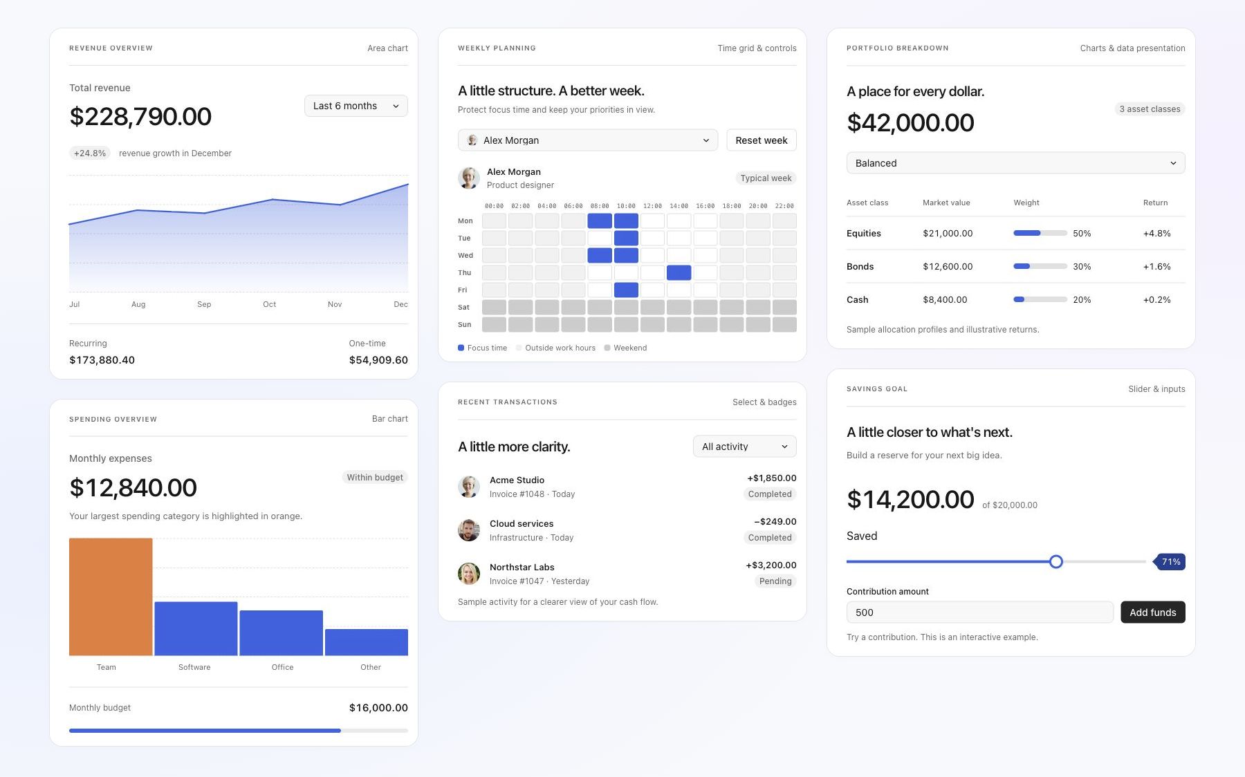](https://ui.rv-grid.com/)
|
|
10
|
+
|
|
11
|
+
Explore the [Revo UI gallery](https://ui.rv-grid.com/) for live previews, component variants, and expandable code examples. The [gallery repository](https://github.com/revolist/revo-ui) contains the gallery app and generated component API documentation.
|
|
12
|
+
|
|
13
|
+
## Contents
|
|
14
|
+
|
|
15
|
+
- [Getting started](#getting-started)
|
|
16
|
+
- [Framework integrations](#framework-integrations)
|
|
17
|
+
- [Components](#components)
|
|
18
|
+
- [Complete component reference](#complete-component-reference)
|
|
19
|
+
- [Usage contracts](#usage-contracts)
|
|
20
|
+
- [Buttons and navigation](#buttons-and-navigation)
|
|
21
|
+
- [Dropdowns with user images](#dropdowns-with-user-images)
|
|
22
|
+
- [Advanced slider](#advanced-slider)
|
|
23
|
+
- [Conditional chart colors](#conditional-chart-colors)
|
|
24
|
+
- [Interactive timeline](#interactive-timeline)
|
|
25
|
+
- [Theming, sizing, and motion](#theming-sizing-and-motion)
|
|
26
|
+
- [Accessibility and localization](#accessibility-and-localization)
|
|
27
|
+
- [RevoGrid products](#revogrid-products)
|
|
28
|
+
- [Repository and support](#repository-and-support)
|
|
29
|
+
- [Licensing](#licensing)
|
|
30
|
+
|
|
31
|
+
## Getting started
|
|
32
|
+
|
|
33
|
+
Release publishing sends `@revolist/ui` to both npm and GitHub Packages. npm is the default for public installation. To install the GitHub Packages copy, configure `@revolist:registry=https://npm.pkg.github.com` and authenticate with a token that has package read access. GitHub package visibility is managed separately in GitHub's package settings.
|
|
34
|
+
|
|
35
|
+
Install the public package from npm. The published package bundles its Preact rendering runtime; install your application's host framework separately. React adapters require both `react` and `react-dom`. Install `preact` separately when using Preact in your own application code.
|
|
36
|
+
|
|
37
|
+
```sh
|
|
38
|
+
pnpm add @revolist/ui
|
|
39
|
+
```
|
|
40
|
+
|
|
41
|
+
Import the shared stylesheet once in your application entry point:
|
|
6
42
|
|
|
7
43
|
```ts
|
|
8
|
-
|
|
9
|
-
// Preact is the required shared rendering peer.
|
|
10
|
-
import {
|
|
11
|
-
DialogController,
|
|
12
|
-
PopoverController,
|
|
13
|
-
attachMenuKeyboard,
|
|
14
|
-
} from '@revolist/ui/native';
|
|
15
|
-
|
|
16
|
-
// Optional Preact rendering adapters.
|
|
17
|
-
import { Button, Switch, Calendar, DateRangePicker } from '@revolist/ui/preact';
|
|
18
|
-
|
|
19
|
-
// Import once in a product's styles entry.
|
|
20
|
-
import '@revolist/ui/styles.scss';
|
|
44
|
+
import '@revolist/ui/styles.css';
|
|
21
45
|
```
|
|
22
46
|
|
|
23
|
-
|
|
47
|
+
A controlled React example:
|
|
24
48
|
|
|
25
|
-
|
|
49
|
+
```tsx
|
|
50
|
+
import { useState } from 'react';
|
|
51
|
+
import { Button, TextInput } from '@revolist/ui/react';
|
|
52
|
+
|
|
53
|
+
export function ReportName() {
|
|
54
|
+
const [name, setName] = useState('Monthly revenue');
|
|
55
|
+
return (
|
|
56
|
+
<>
|
|
57
|
+
<TextInput
|
|
58
|
+
aria-label="Report name"
|
|
59
|
+
value={name}
|
|
60
|
+
onValueChange={setName}
|
|
61
|
+
/>
|
|
62
|
+
<Button rounded variant="primary" onClick={() => console.log(name)}>
|
|
63
|
+
Create report
|
|
64
|
+
</Button>
|
|
65
|
+
</>
|
|
66
|
+
);
|
|
67
|
+
}
|
|
68
|
+
```
|
|
26
69
|
|
|
27
|
-
|
|
28
|
-
`@revolist/ui/vue-badge`. Both accept `variant="neutral"` for inactive counts,
|
|
29
|
-
`variant="accent"` for blue selected states, and `shape="pill"` (default) or
|
|
30
|
-
`shape="rounded"`. The default `solid` variant preserves existing badge tokens.
|
|
31
|
-
Vue renders the default slot and forwards native attributes and classes.
|
|
70
|
+
Controls can be used without a RevoGrid instance. Grid cell templates, providers, row data, and product-specific scheduling logic stay in their owning product packages.
|
|
32
71
|
|
|
33
|
-
##
|
|
72
|
+
## Popover dismissal
|
|
34
73
|
|
|
35
|
-
|
|
36
|
-
| ----------------- | ----------------------------------------------------------------------------------------------------------------------- |
|
|
37
|
-
| Actions | Button, IconButton, ToggleButton, ButtonGroup, Icon |
|
|
38
|
-
| Binary and choice | Checkbox, Switch, RadioGroup, ChoiceChips |
|
|
39
|
-
| Navigation | SegmentedControl, Tabs, TabPanel, Listbox, ListboxOption |
|
|
40
|
-
| Fields | TextInput, Textarea, SearchInput, NumberInput, NumberStepper, NativeSelect |
|
|
41
|
-
| Selection | Dropdown, Combobox, MultiSelect, Chip, RemovableChip, ResourcePicker |
|
|
42
|
-
| Numeric ranges | TimelineTrack, Slider, RangeSlider; native scalar-slider/counter adapters |
|
|
43
|
-
| Dates | Calendar and its header/day/month/year parts, DateInput, TimeInput, DateTimeInput, DatePicker, DateRangePicker |
|
|
44
|
-
| Appearance | ColorPalette, ColorPicker, Avatar |
|
|
45
|
-
| Forms | FormField, FieldHint, FieldError, FormSection, Disclosure, DisclosureSummary |
|
|
46
|
-
| Surfaces | Dialog, DialogHeader, DialogBody, DialogFooter, ConfirmDialog, Popover, Tooltip, Menu, MenuItem, MenuSeparator, Submenu |
|
|
47
|
-
| Composition | Toolbar, ToolbarGroup, ToolbarSeparator, SplitLayout, Pane, Panel, ResizeHandle |
|
|
48
|
-
| Feedback | Badge, CountBadge, StatusBadge, Alert, FeedbackPanel, Spinner, LoadingOverlay, EmptyState |
|
|
49
|
-
| Indicators | Pagination, ProgressBar, CircularProgress, Rating |
|
|
74
|
+
`Popover` accepts `closeOnOutside` and `closeOnEscape`, both enabled by default, matching `PopoverController`. Set either to `false` independently; changes also apply while open. `open` remains controlled: update it in `onClose` (Vue: `@close`), or close it directly from an action.
|
|
50
75
|
|
|
51
|
-
|
|
76
|
+
```vue
|
|
77
|
+
<Popover
|
|
78
|
+
:open="open"
|
|
79
|
+
:anchor="anchor"
|
|
80
|
+
:close-on-outside="false"
|
|
81
|
+
:close-on-escape="false"
|
|
82
|
+
@close="open = false"
|
|
83
|
+
>
|
|
84
|
+
<button @click="open = false">Done</button>
|
|
85
|
+
</Popover>
|
|
86
|
+
```
|
|
52
87
|
|
|
53
|
-
|
|
88
|
+
## Framework integrations
|
|
54
89
|
|
|
55
|
-
|
|
90
|
+
| Framework | Entry point | Integration | Guide |
|
|
91
|
+
| ------------------ | ------------------------ | ------------------------------------------------------------------------------------------------------------ | ---------------------------------------------------------------------- |
|
|
92
|
+
| React | `@revolist/ui/react` | Named React components; controlled props, callbacks, children, and custom content. | [React usage](https://ui.rv-grid.com/frameworks/react/) |
|
|
93
|
+
| Vue | `@revolist/ui/vue` | Named Vue components, events and slots; declared value models support `v-model`. | [Vue usage](https://ui.rv-grid.com/frameworks/vue/) |
|
|
94
|
+
| Angular | `@revolist/ui/angular` | Standalone `UiComponent` host with `component`, `props`, `uiEvent`, `valueChange`, and `rvUiSlot` templates. | [Angular usage](https://ui.rv-grid.com/frameworks/angular/) |
|
|
95
|
+
| Svelte 5 | `@revolist/ui/svelte` | `UiComponent` host with reactive props, callbacks, and content snippets. | [Svelte usage](https://ui.rv-grid.com/frameworks/svelte/) |
|
|
96
|
+
| Preact | `@revolist/ui/preact` | Direct components with Preact state, hooks, and render callbacks. | [Preact usage](https://ui.rv-grid.com/frameworks/preact/) |
|
|
97
|
+
| Vanilla TypeScript | `@revolist/ui/framework` | `createFrameworkMount` and `uiComponents`; call `render` to update and `destroy` on disposal. | [Vanilla usage](https://ui.rv-grid.com/frameworks/vanilla-typescript/) |
|
|
56
98
|
|
|
57
|
-
|
|
58
|
-
- Existing Pro exports and leaf modules forward to the shared owner. Grid edit events, focus preservation, popup coordination, remote loading and cell/column types stay in Pro adapters.
|
|
59
|
-
- Task/card/event editors, working-calendar editors, Pivot configurators and chart inspectors remain product compositions.
|
|
60
|
-
- Controlled inputs receive values and callbacks. Date controls use civil date/native input strings; products retain timezone conversion, storage and validation policy.
|
|
61
|
-
- Sliders distinguish live input and commit callbacks. Popup/dialog handles have explicit teardown, and returned cleanup functions release listeners.
|
|
62
|
-
- `--rv-ui-*` variables define semantic surfaces, text, focus and control tokens. Existing classes and legacy feature variable overrides remain supported.
|
|
63
|
-
- Use the separate native entry in Charts. Importing the Preact barrel in Charts would violate the dependency boundary.
|
|
99
|
+
Additional entries include `@revolist/ui/native` for DOM controllers and presentation helpers, `@revolist/ui/react-control` / `vue-control` / `angular-control` / `svelte-control` for framework-owned controls, and dedicated entries such as `@revolist/ui/select`, `@revolist/ui/timeline-track`, and `@revolist/ui/pdf-viewer`. Use the installed package's TypeScript declarations for exact prop types.
|
|
64
100
|
|
|
65
|
-
##
|
|
101
|
+
## Components
|
|
66
102
|
|
|
67
|
-
|
|
103
|
+
Browse the same component families as the public gallery. Each page includes live previews, variants, and usage examples.
|
|
68
104
|
|
|
69
|
-
|
|
70
|
-
|
|
71
|
-
|
|
72
|
-
|
|
73
|
-
|
|
74
|
-
|
|
75
|
-
|
|
105
|
+
| Component family | What you can build |
|
|
106
|
+
| ---------------------------------------------------------------------------------------- | -------------------------------------------------------------------------------------------------------- |
|
|
107
|
+
| [Buttons](https://ui.rv-grid.com/components/buttons/) | Actions, icon buttons, toggles, and button groups. |
|
|
108
|
+
| [Inputs and forms](https://ui.rv-grid.com/components/inputs-and-forms/) | Text, search, numbers, validation, and field layouts. |
|
|
109
|
+
| [Selects and pickers](https://ui.rv-grid.com/components/selects-chips-and-resources/) | Searchable dropdowns, multiple selections, user images, and assignees. |
|
|
110
|
+
| [Selection controls](https://ui.rv-grid.com/components/selection-controls/) | Checkboxes, switches, radio buttons, and choice chips. |
|
|
111
|
+
| [Tabs and lists](https://ui.rv-grid.com/components/tabs-and-lists/) | Tabs, segmented controls, and selectable lists. |
|
|
112
|
+
| [Sliders](https://ui.rv-grid.com/components/sliders/) | Single values and ranges with labels and value badges. |
|
|
113
|
+
| [Timeline](https://ui.rv-grid.com/components/timeline-track/) | Draggable, resizable events with colors and tooltips. |
|
|
114
|
+
| [Calendars and dates](https://ui.rv-grid.com/components/calendar-and-dates/) | Date and time pickers, ranges, and weekly planning. |
|
|
115
|
+
| [Charts](https://ui.rv-grid.com/components/charts-and-range-selection/) | Bar, line, and area charts with tooltips and range selection. |
|
|
116
|
+
| [Dialogs and tooltips](https://ui.rv-grid.com/components/dialogs-and-floating-surfaces/) | Dialogs, confirmations, popovers, and tooltips. |
|
|
117
|
+
| [Menus and toolbars](https://ui.rv-grid.com/components/menus-and-toolbars/) | Dropdown menus, nested commands, and toolbar actions. |
|
|
118
|
+
| [Status and feedback](https://ui.rv-grid.com/components/status-and-feedback/) | Badges, alerts, loading indicators, and empty states. |
|
|
119
|
+
| [Layout](https://ui.rv-grid.com/components/layout/) | Panels, resizable split views, and expandable sections. |
|
|
120
|
+
| [Pagination](https://ui.rv-grid.com/components/pagination/) | Page navigation for tables and lists. |
|
|
121
|
+
| [Progress and rating](https://ui.rv-grid.com/components/progress-and-rating/) | Progress bars, circular indicators, and star ratings. |
|
|
122
|
+
| [Activity messages](https://ui.rv-grid.com/components/activity-messages/) | Updates with avatars, timestamps, and actions. |
|
|
123
|
+
| [AI assistant](https://ui.rv-grid.com/components/ai-assistant/) | Chat messages, prompts, suggestions, and task states. |
|
|
124
|
+
| [PDF viewer](https://ui.rv-grid.com/components/pdf-viewer/) | PDF navigation, search, zoom, and download controls. |
|
|
125
|
+
| [Color](https://ui.rv-grid.com/components/color/) | Palettes, color pickers, and shared semantic interface colors. |
|
|
126
|
+
| [Field configurators](https://ui.rv-grid.com/components/field-configurators/) | Field libraries, selected-field lists, ordering, summaries, actions, and drop feedback. |
|
|
127
|
+
| [Formatting controls](https://ui.rv-grid.com/components/formatting-controls/) | Typography choices, icon choices, inspector sections, preview comparisons, and contextual filter badges. |
|
|
76
128
|
|
|
77
|
-
|
|
129
|
+
## Complete component reference
|
|
78
130
|
|
|
79
|
-
|
|
131
|
+
Every component in the shared adapter catalog is listed below. Each name links to a generated prop/API reference, followed by its live example page, where variants and expandable, formatted usage examples are grouped together. Composition helpers are documented alongside their parent control; not every helper has an isolated specimen.
|
|
80
132
|
|
|
81
|
-
|
|
133
|
+
### Buttons
|
|
82
134
|
|
|
83
|
-
|
|
135
|
+
Actions, grouped commands, toggled state, icons, compact sizing, busy states and pill corners.
|
|
84
136
|
|
|
85
|
-
|
|
137
|
+
[Button](https://github.com/revolist/revo-ui/blob/main/docs/api/Button.md) ([examples](https://ui.rv-grid.com/components/buttons/)) | [IconButton](https://github.com/revolist/revo-ui/blob/main/docs/api/IconButton.md) ([examples](https://ui.rv-grid.com/components/buttons/)) | [SvgButton](https://github.com/revolist/revo-ui/blob/main/docs/api/SvgButton.md) ([examples](https://ui.rv-grid.com/components/buttons/)) | [ToggleButton](https://github.com/revolist/revo-ui/blob/main/docs/api/ToggleButton.md) ([examples](https://ui.rv-grid.com/components/buttons/)) | [ButtonGroup](https://github.com/revolist/revo-ui/blob/main/docs/api/ButtonGroup.md) ([examples](https://ui.rv-grid.com/components/buttons/)) | [DeleteButton](https://github.com/revolist/revo-ui/blob/main/docs/api/DeleteButton.md) ([examples](https://ui.rv-grid.com/components/buttons/)) | [RemoveButton](https://github.com/revolist/revo-ui/blob/main/docs/api/RemoveButton.md) ([examples](https://ui.rv-grid.com/components/buttons/)) | [SvgIcon](https://github.com/revolist/revo-ui/blob/main/docs/api/SvgIcon.md) ([examples](https://ui.rv-grid.com/components/buttons/))
|
|
86
138
|
|
|
87
|
-
|
|
139
|
+
### Selection controls
|
|
88
140
|
|
|
89
|
-
|
|
141
|
+
Checkboxes, switches, radio groups, choice chips and option rows for independent or exclusive choices.
|
|
90
142
|
|
|
91
|
-
|
|
143
|
+
[Checkbox](https://github.com/revolist/revo-ui/blob/main/docs/api/Checkbox.md) ([examples](https://ui.rv-grid.com/components/selection-controls/)) | [Switch](https://github.com/revolist/revo-ui/blob/main/docs/api/Switch.md) ([examples](https://ui.rv-grid.com/components/selection-controls/)) | [RadioGroup](https://github.com/revolist/revo-ui/blob/main/docs/api/RadioGroup.md) ([examples](https://ui.rv-grid.com/components/selection-controls/)) | [ChoiceChips](https://github.com/revolist/revo-ui/blob/main/docs/api/ChoiceChips.md) ([examples](https://ui.rv-grid.com/components/selection-controls/)) | [ChoiceChip](https://github.com/revolist/revo-ui/blob/main/docs/api/ChoiceChip.md) ([examples](https://ui.rv-grid.com/components/selection-controls/)) | [ChoiceChipInfoButton](https://github.com/revolist/revo-ui/blob/main/docs/api/ChoiceChipInfoButton.md) ([examples](https://ui.rv-grid.com/components/selection-controls/)) | [OptionButton](https://github.com/revolist/revo-ui/blob/main/docs/api/OptionButton.md) ([examples](https://ui.rv-grid.com/components/selection-controls/))
|
|
92
144
|
|
|
93
|
-
###
|
|
145
|
+
### Tabs and lists
|
|
94
146
|
|
|
95
|
-
|
|
147
|
+
Switch content, group options and present plain, icon or descriptive selection rows.
|
|
96
148
|
|
|
97
|
-
|
|
149
|
+
[SegmentedControl](https://github.com/revolist/revo-ui/blob/main/docs/api/SegmentedControl.md) ([examples](https://ui.rv-grid.com/components/tabs-and-lists/)) | [SegmentedSwitch](https://github.com/revolist/revo-ui/blob/main/docs/api/SegmentedSwitch.md) ([examples](https://ui.rv-grid.com/components/tabs-and-lists/)) | [Tabs](https://github.com/revolist/revo-ui/blob/main/docs/api/Tabs.md) ([examples](https://ui.rv-grid.com/components/tabs-and-lists/)) | [TabPanel](https://github.com/revolist/revo-ui/blob/main/docs/api/TabPanel.md) ([examples](https://ui.rv-grid.com/components/tabs-and-lists/)) | [Listbox](https://github.com/revolist/revo-ui/blob/main/docs/api/Listbox.md) ([examples](https://ui.rv-grid.com/components/tabs-and-lists/)) | [ListboxOption](https://github.com/revolist/revo-ui/blob/main/docs/api/ListboxOption.md) ([examples](https://ui.rv-grid.com/components/tabs-and-lists/)) | [ListboxGroup](https://github.com/revolist/revo-ui/blob/main/docs/api/ListboxGroup.md) ([examples](https://ui.rv-grid.com/components/tabs-and-lists/)) | [ListboxOptionContent](https://github.com/revolist/revo-ui/blob/main/docs/api/ListboxOptionContent.md) ([examples](https://ui.rv-grid.com/components/tabs-and-lists/)) | [EditorList](https://github.com/revolist/revo-ui/blob/main/docs/api/EditorList.md) ([examples](https://ui.rv-grid.com/components/tabs-and-lists/)) | [EditorListItem](https://github.com/revolist/revo-ui/blob/main/docs/api/EditorListItem.md) ([examples](https://ui.rv-grid.com/components/tabs-and-lists/)) | [EditorListItemContent](https://github.com/revolist/revo-ui/blob/main/docs/api/EditorListItemContent.md) ([examples](https://ui.rv-grid.com/components/tabs-and-lists/)) | [EditorListGroup](https://github.com/revolist/revo-ui/blob/main/docs/api/EditorListGroup.md) ([examples](https://ui.rv-grid.com/components/tabs-and-lists/))
|
|
98
150
|
|
|
99
|
-
|
|
151
|
+
### Inputs and forms
|
|
100
152
|
|
|
101
|
-
|
|
153
|
+
Text, search and numeric entry; field labels, validation, inline layouts and editor drafts.
|
|
102
154
|
|
|
103
|
-
|
|
155
|
+
[Input](https://github.com/revolist/revo-ui/blob/main/docs/api/Input.md) ([examples](https://ui.rv-grid.com/components/inputs-and-forms/)) | [TextInput](https://github.com/revolist/revo-ui/blob/main/docs/api/TextInput.md) ([examples](https://ui.rv-grid.com/components/inputs-and-forms/)) | [Textarea](https://github.com/revolist/revo-ui/blob/main/docs/api/Textarea.md) ([examples](https://ui.rv-grid.com/components/inputs-and-forms/)) | [SearchInput](https://github.com/revolist/revo-ui/blob/main/docs/api/SearchInput.md) ([examples](https://ui.rv-grid.com/components/inputs-and-forms/)) | [NumberInput](https://github.com/revolist/revo-ui/blob/main/docs/api/NumberInput.md) ([examples](https://ui.rv-grid.com/components/inputs-and-forms/)) | [NumberStepper](https://github.com/revolist/revo-ui/blob/main/docs/api/NumberStepper.md) ([examples](https://ui.rv-grid.com/components/inputs-and-forms/)) | [DateInput](https://github.com/revolist/revo-ui/blob/main/docs/api/DateInput.md) ([examples](https://ui.rv-grid.com/components/inputs-and-forms/)) | [TimeInput](https://github.com/revolist/revo-ui/blob/main/docs/api/TimeInput.md) ([examples](https://ui.rv-grid.com/components/inputs-and-forms/)) | [DateTimeInput](https://github.com/revolist/revo-ui/blob/main/docs/api/DateTimeInput.md) ([examples](https://ui.rv-grid.com/components/inputs-and-forms/)) | [FormField](https://github.com/revolist/revo-ui/blob/main/docs/api/FormField.md) ([examples](https://ui.rv-grid.com/components/inputs-and-forms/)) | [FieldHint](https://github.com/revolist/revo-ui/blob/main/docs/api/FieldHint.md) ([examples](https://ui.rv-grid.com/components/inputs-and-forms/)) | [FieldError](https://github.com/revolist/revo-ui/blob/main/docs/api/FieldError.md) ([examples](https://ui.rv-grid.com/components/inputs-and-forms/)) | [FormSection](https://github.com/revolist/revo-ui/blob/main/docs/api/FormSection.md) ([examples](https://ui.rv-grid.com/components/inputs-and-forms/)) | [HighlightedTextInput](https://github.com/revolist/revo-ui/blob/main/docs/api/HighlightedTextInput.md) ([examples](https://ui.rv-grid.com/components/inputs-and-forms/)) | [InlineFieldGroup](https://github.com/revolist/revo-ui/blob/main/docs/api/InlineFieldGroup.md) ([examples](https://ui.rv-grid.com/components/inputs-and-forms/)) | [NumberDraft](https://github.com/revolist/revo-ui/blob/main/docs/api/NumberDraft.md) ([examples](https://ui.rv-grid.com/components/inputs-and-forms/)) | [MaskedDraft](https://github.com/revolist/revo-ui/blob/main/docs/api/MaskedDraft.md) ([examples](https://ui.rv-grid.com/components/inputs-and-forms/)) | [HtmlEditor](https://github.com/revolist/revo-ui/blob/main/docs/api/HtmlEditor.md) ([examples](https://ui.rv-grid.com/components/inputs-and-forms/))
|
|
104
156
|
|
|
105
|
-
###
|
|
157
|
+
### Selects, chips and resources
|
|
106
158
|
|
|
107
|
-
|
|
159
|
+
Single or multiple selections, searchable options, selected-value templates, avatars, resource lists and assignee fields.
|
|
108
160
|
|
|
109
|
-
|
|
161
|
+
[Dropdown](https://github.com/revolist/revo-ui/blob/main/docs/api/Dropdown.md) ([examples](https://ui.rv-grid.com/components/selects-chips-and-resources/)) | [DropdownPopup](https://github.com/revolist/revo-ui/blob/main/docs/api/DropdownPopup.md) ([examples](https://ui.rv-grid.com/components/selects-chips-and-resources/)) | [DropdownPopupContent](https://github.com/revolist/revo-ui/blob/main/docs/api/DropdownPopupContent.md) ([examples](https://ui.rv-grid.com/components/selects-chips-and-resources/)) | [Combobox](https://github.com/revolist/revo-ui/blob/main/docs/api/Combobox.md) ([examples](https://ui.rv-grid.com/components/selects-chips-and-resources/)) | [MultiSelect](https://github.com/revolist/revo-ui/blob/main/docs/api/MultiSelect.md) ([examples](https://ui.rv-grid.com/components/selects-chips-and-resources/)) | [Chip](https://github.com/revolist/revo-ui/blob/main/docs/api/Chip.md) ([examples](https://ui.rv-grid.com/components/selects-chips-and-resources/)) | [FilterChip](https://github.com/revolist/revo-ui/blob/main/docs/api/FilterChip.md) ([examples](https://ui.rv-grid.com/components/selects-chips-and-resources/)) | [Avatar](https://github.com/revolist/revo-ui/blob/main/docs/api/Avatar.md) ([examples](https://ui.rv-grid.com/components/selects-chips-and-resources/)) | [SharedResourcePicker](https://github.com/revolist/revo-ui/blob/main/docs/api/SharedResourcePicker.md) ([examples](https://ui.rv-grid.com/components/selects-chips-and-resources/)) | [ResourcePickerAvatar](https://github.com/revolist/revo-ui/blob/main/docs/api/ResourcePickerAvatar.md) ([examples](https://ui.rv-grid.com/components/selects-chips-and-resources/)) | [AssigneePicker](https://github.com/revolist/revo-ui/blob/main/docs/api/AssigneePicker.md) ([examples](https://ui.rv-grid.com/components/selects-chips-and-resources/)) | [AssigneeField](https://github.com/revolist/revo-ui/blob/main/docs/api/AssigneeField.md) ([examples](https://ui.rv-grid.com/components/selects-chips-and-resources/)) | [AssigneePickerLayout](https://github.com/revolist/revo-ui/blob/main/docs/api/AssigneePickerLayout.md) ([examples](https://ui.rv-grid.com/components/selects-chips-and-resources/))
|
|
110
162
|
|
|
111
|
-
|
|
163
|
+
### Sliders
|
|
112
164
|
|
|
113
|
-
|
|
165
|
+
Scalar and interval controls with labels, value badges, thumb values, ticks and units.
|
|
114
166
|
|
|
115
|
-
|
|
167
|
+
[SingleValueSlider](https://github.com/revolist/revo-ui/blob/main/docs/api/SingleValueSlider.md) ([examples](https://ui.rv-grid.com/components/sliders/)) | [PreactRangeSlider](https://github.com/revolist/revo-ui/blob/main/docs/api/PreactRangeSlider.md) ([examples](https://ui.rv-grid.com/components/sliders/)) | [SliderField](https://github.com/revolist/revo-ui/blob/main/docs/api/SliderField.md) ([examples](https://ui.rv-grid.com/components/sliders/))
|
|
116
168
|
|
|
117
|
-
|
|
169
|
+
### Timeline track
|
|
118
170
|
|
|
119
|
-
|
|
171
|
+
Controlled timeline events with move/resize interactions, event colors, weighted phases and tooltips.
|
|
120
172
|
|
|
121
|
-
|
|
173
|
+
[TimelineTrack](https://github.com/revolist/revo-ui/blob/main/docs/api/TimelineTrack.md) ([examples](https://ui.rv-grid.com/components/timeline-track/))
|
|
122
174
|
|
|
123
|
-
|
|
124
|
-
<Button variant="primary" busy={saving} onClick={save}>Save changes</Button>
|
|
125
|
-
```
|
|
175
|
+
### Calendar and dates
|
|
126
176
|
|
|
127
|
-
|
|
177
|
+
Calendar views and date/time fields, ranges, duration drafts, weekly availability and descriptive legends.
|
|
128
178
|
|
|
129
|
-
|
|
179
|
+
[Calendar](https://github.com/revolist/revo-ui/blob/main/docs/api/Calendar.md) ([examples](https://ui.rv-grid.com/components/calendar-and-dates/)) | [CalendarHeader](https://github.com/revolist/revo-ui/blob/main/docs/api/CalendarHeader.md) ([examples](https://ui.rv-grid.com/components/calendar-and-dates/)) | [CalendarWeekdays](https://github.com/revolist/revo-ui/blob/main/docs/api/CalendarWeekdays.md) ([examples](https://ui.rv-grid.com/components/calendar-and-dates/)) | [CalendarDay](https://github.com/revolist/revo-ui/blob/main/docs/api/CalendarDay.md) ([examples](https://ui.rv-grid.com/components/calendar-and-dates/)) | [CalendarMonthGrid](https://github.com/revolist/revo-ui/blob/main/docs/api/CalendarMonthGrid.md) ([examples](https://ui.rv-grid.com/components/calendar-and-dates/)) | [CalendarYearGrid](https://github.com/revolist/revo-ui/blob/main/docs/api/CalendarYearGrid.md) ([examples](https://ui.rv-grid.com/components/calendar-and-dates/)) | [CalendarPicker](https://github.com/revolist/revo-ui/blob/main/docs/api/CalendarPicker.md) ([examples](https://ui.rv-grid.com/components/calendar-and-dates/)) | [DatePicker](https://github.com/revolist/revo-ui/blob/main/docs/api/DatePicker.md) ([examples](https://ui.rv-grid.com/components/calendar-and-dates/)) | [DateRangePicker](https://github.com/revolist/revo-ui/blob/main/docs/api/DateRangePicker.md) ([examples](https://ui.rv-grid.com/components/calendar-and-dates/)) | [DurationField](https://github.com/revolist/revo-ui/blob/main/docs/api/DurationField.md) ([examples](https://ui.rv-grid.com/components/calendar-and-dates/)) | [DurationDraft](https://github.com/revolist/revo-ui/blob/main/docs/api/DurationDraft.md) ([examples](https://ui.rv-grid.com/components/calendar-and-dates/)) | [TemporalPicker](https://github.com/revolist/revo-ui/blob/main/docs/api/TemporalPicker.md) ([examples](https://ui.rv-grid.com/components/calendar-and-dates/)) | [TemporalDraft](https://github.com/revolist/revo-ui/blob/main/docs/api/TemporalDraft.md) ([examples](https://ui.rv-grid.com/components/calendar-and-dates/)) | [DateTimeField](https://github.com/revolist/revo-ui/blob/main/docs/api/DateTimeField.md) ([examples](https://ui.rv-grid.com/components/calendar-and-dates/)) | [TimeGrid](https://github.com/revolist/revo-ui/blob/main/docs/api/TimeGrid.md) ([examples](https://ui.rv-grid.com/components/calendar-and-dates/)) | [Legend](https://github.com/revolist/revo-ui/blob/main/docs/api/Legend.md) ([examples](https://ui.rv-grid.com/components/calendar-and-dates/))
|
|
130
180
|
|
|
131
|
-
|
|
181
|
+
### Color
|
|
132
182
|
|
|
133
|
-
|
|
134
|
-
import { createControl, applyControlPresentation } from '@revolist/ui';
|
|
135
|
-
import { ButtonControl, Input, Select, TextArea } from '@revolist/ui/react-control';
|
|
136
|
-
import { vRvControl } from '@revolist/ui/vue-control'; // <button v-rv-control>
|
|
137
|
-
import { UiControlDirective } from '@revolist/ui/angular-control'; // standalone imports; <button rvControl>
|
|
138
|
-
import { rvControl } from '@revolist/ui/svelte-control'; // <button use:rvControl>
|
|
139
|
-
import '@revolist/ui/styles.css';
|
|
140
|
-
```
|
|
183
|
+
Choose a color from a palette or picker and apply shared semantic interface colors.
|
|
141
184
|
|
|
142
|
-
|
|
185
|
+
[ColorPicker](https://github.com/revolist/revo-ui/blob/main/docs/api/ColorPicker.md) ([examples](https://ui.rv-grid.com/components/color/)) | [ColorPalette](https://github.com/revolist/revo-ui/blob/main/docs/api/ColorPalette.md) ([examples](https://ui.rv-grid.com/components/color/))
|
|
143
186
|
|
|
144
|
-
|
|
187
|
+
### Field configurators
|
|
145
188
|
|
|
146
|
-
|
|
189
|
+
Compose field libraries, selected-field lists, ordering, summaries, actions and drop feedback from shared pieces.
|
|
147
190
|
|
|
148
|
-
|
|
191
|
+
[FieldIcon](https://github.com/revolist/revo-ui/blob/main/docs/api/FieldIcon.md) ([examples](https://ui.rv-grid.com/components/field-configurators/)) | [FieldSummary](https://github.com/revolist/revo-ui/blob/main/docs/api/FieldSummary.md) ([examples](https://ui.rv-grid.com/components/field-configurators/)) | [FieldLibrary](https://github.com/revolist/revo-ui/blob/main/docs/api/FieldLibrary.md) ([examples](https://ui.rv-grid.com/components/field-configurators/)) | [FieldGroupHeading](https://github.com/revolist/revo-ui/blob/main/docs/api/FieldGroupHeading.md) ([examples](https://ui.rv-grid.com/components/field-configurators/)) | [FieldGroup](https://github.com/revolist/revo-ui/blob/main/docs/api/FieldGroup.md) ([examples](https://ui.rv-grid.com/components/field-configurators/)) | [FieldList](https://github.com/revolist/revo-ui/blob/main/docs/api/FieldList.md) ([examples](https://ui.rv-grid.com/components/field-configurators/)) | [FieldRow](https://github.com/revolist/revo-ui/blob/main/docs/api/FieldRow.md) ([examples](https://ui.rv-grid.com/components/field-configurators/)) | [FieldContent](https://github.com/revolist/revo-ui/blob/main/docs/api/FieldContent.md) ([examples](https://ui.rv-grid.com/components/field-configurators/)) | [FieldItem](https://github.com/revolist/revo-ui/blob/main/docs/api/FieldItem.md) ([examples](https://ui.rv-grid.com/components/field-configurators/)) | [FieldLibraryList](https://github.com/revolist/revo-ui/blob/main/docs/api/FieldLibraryList.md) ([examples](https://ui.rv-grid.com/components/field-configurators/)) | [SelectedField](https://github.com/revolist/revo-ui/blob/main/docs/api/SelectedField.md) ([examples](https://ui.rv-grid.com/components/field-configurators/)) | [FieldActions](https://github.com/revolist/revo-ui/blob/main/docs/api/FieldActions.md) ([examples](https://ui.rv-grid.com/components/field-configurators/)) | [FieldStatusBadge](https://github.com/revolist/revo-ui/blob/main/docs/api/FieldStatusBadge.md) ([examples](https://ui.rv-grid.com/components/field-configurators/)) | [FieldRemoveButton](https://github.com/revolist/revo-ui/blob/main/docs/api/FieldRemoveButton.md) ([examples](https://ui.rv-grid.com/components/field-configurators/)) | [FieldRemoveIcon](https://github.com/revolist/revo-ui/blob/main/docs/api/FieldRemoveIcon.md) ([examples](https://ui.rv-grid.com/components/field-configurators/)) | [FieldDropIndicator](https://github.com/revolist/revo-ui/blob/main/docs/api/FieldDropIndicator.md) ([examples](https://ui.rv-grid.com/components/field-configurators/)) | [ReorderList](https://github.com/revolist/revo-ui/blob/main/docs/api/ReorderList.md) ([examples](https://ui.rv-grid.com/components/field-configurators/)) | [ReorderHandle](https://github.com/revolist/revo-ui/blob/main/docs/api/ReorderHandle.md) ([examples](https://ui.rv-grid.com/components/field-configurators/))
|
|
149
192
|
|
|
150
|
-
|
|
193
|
+
### Formatting controls
|
|
151
194
|
|
|
152
|
-
|
|
195
|
+
Typography choices, icon choices, inspector sections, preview comparisons and contextual filter badges.
|
|
153
196
|
|
|
154
|
-
|
|
155
|
-
standalone number, mask, duration, temporal, assignee and Markdown editors.
|
|
156
|
-
These wrappers retain the existing Preact implementation, bundled in the public
|
|
157
|
-
distribution, and require Vue. Use `vue-control` for native HTML controls that
|
|
158
|
-
only need presentation;
|
|
159
|
-
its runtime presentation helpers do not import Preact.
|
|
197
|
+
[InspectorSection](https://github.com/revolist/revo-ui/blob/main/docs/api/InspectorSection.md) ([examples](https://ui.rv-grid.com/components/formatting-controls/)) | [IconChoiceGroup](https://github.com/revolist/revo-ui/blob/main/docs/api/IconChoiceGroup.md) ([examples](https://ui.rv-grid.com/components/formatting-controls/)) | [IconToggleButton](https://github.com/revolist/revo-ui/blob/main/docs/api/IconToggleButton.md) ([examples](https://ui.rv-grid.com/components/formatting-controls/)) | [TypographyControls](https://github.com/revolist/revo-ui/blob/main/docs/api/TypographyControls.md) ([examples](https://ui.rv-grid.com/components/formatting-controls/)) | [ComparisonPreview](https://github.com/revolist/revo-ui/blob/main/docs/api/ComparisonPreview.md) ([examples](https://ui.rv-grid.com/components/formatting-controls/)) | [FilterBadgeInfoButton](https://github.com/revolist/revo-ui/blob/main/docs/api/FilterBadgeInfoButton.md) ([examples](https://ui.rv-grid.com/components/formatting-controls/)) | [FilterBadge](https://github.com/revolist/revo-ui/blob/main/docs/api/FilterBadge.md) ([examples](https://ui.rv-grid.com/components/formatting-controls/))
|
|
160
198
|
|
|
161
|
-
|
|
162
|
-
<script setup lang="ts">
|
|
163
|
-
import { ref } from 'vue';
|
|
164
|
-
import { Dropdown, DatePicker, Dialog } from '@revolist/ui/vue';
|
|
165
|
-
import '@revolist/ui/styles.css';
|
|
199
|
+
### Charts and range selection
|
|
166
200
|
|
|
167
|
-
|
|
168
|
-
const source = [
|
|
169
|
-
{ value: 'open', label: 'Open' },
|
|
170
|
-
{ value: 'closed', label: 'Closed' },
|
|
171
|
-
];
|
|
172
|
-
</script>
|
|
173
|
-
|
|
174
|
-
<template>
|
|
175
|
-
<Dropdown v-model="status" :source="source">
|
|
176
|
-
<template #option="{ option, selected }">
|
|
177
|
-
<strong>{{ option.label }}</strong>
|
|
178
|
-
<span v-if="selected"> Selected</span>
|
|
179
|
-
</template>
|
|
180
|
-
</Dropdown>
|
|
181
|
-
</template>
|
|
182
|
-
```
|
|
201
|
+
Compact bar, line and area charts with values, labels, tooltips and a composed range brush.
|
|
183
202
|
|
|
184
|
-
-
|
|
185
|
-
`v-model` additionally connects Dropdown/Combobox/MultiSelect, the scalar
|
|
186
|
-
inputs, Switch/Checkbox, choice controls, rating, color and date pickers.
|
|
187
|
-
ResourcePicker uses `selectedResourceIds`; CalendarPicker uses `selected`.
|
|
188
|
-
RangeSlider keeps `fromValue`, `toValue`, `onRangeChange` and `onRangeCommit`;
|
|
189
|
-
it does not flatten a two-handle range into a scalar model.
|
|
190
|
-
- Default slots supply `children`; named content slots supply the matching
|
|
191
|
-
component prop (for example Dialog's `footer` and Switch's `label`). Dropdown
|
|
192
|
-
has scoped `option` (`option`, `selected`), `value` (`option`), `content`
|
|
193
|
-
(`content.id`, `content.close`) and `noResults` slots. ReorderList has `item`
|
|
194
|
-
and `handle` slots (`item`, `index`). Use Vue slots for Vue VNodes, rather than
|
|
195
|
-
returning them from a Preact render callback.
|
|
196
|
-
- Vue owns slot content via Teleport, preserving injection and reactive updates.
|
|
197
|
-
Preact owns the surrounding control. Mount and slot boundaries add elements
|
|
198
|
-
styled with `display: contents`; DOM code depending on direct-child selectors
|
|
199
|
-
must account for these boundaries. Supply explicit accessible labels and input
|
|
200
|
-
associations instead of relying on Preact inspecting Vue slot VNodes.
|
|
201
|
-
- The exposed `element` ref is the mount boundary, not the component's internal
|
|
202
|
-
input. Existing explicit `inputRef` callback props remain available.
|
|
203
|
-
- Wrappers render empty boundaries on the server and mount interactive UI on the
|
|
204
|
-
client. They do not provide server-rendered component content.
|
|
205
|
-
- Unmounting disposes the Preact root and its effects, portals and controllers.
|
|
206
|
-
|
|
207
|
-
`createVueAdapter` is exported for application-owned Preact compositions using the
|
|
208
|
-
same lifecycle. The catalog's wrapper factory calls are marked pure for consumer
|
|
209
|
-
bundle tree shaking.
|
|
210
|
-
|
|
211
|
-
The focused browser check runs against its own framework fixture, independently of the
|
|
212
|
-
Preact gallery:
|
|
203
|
+
[DistributionChart](https://github.com/revolist/revo-ui/blob/main/docs/api/DistributionChart.md) ([examples](https://ui.rv-grid.com/components/charts-and-range-selection/)) | [BarChart](https://github.com/revolist/revo-ui/blob/main/docs/api/BarChart.md) ([examples](https://ui.rv-grid.com/components/charts-and-range-selection/)) | [LineChart](https://github.com/revolist/revo-ui/blob/main/docs/api/LineChart.md) ([examples](https://ui.rv-grid.com/components/charts-and-range-selection/)) | [AreaChart](https://github.com/revolist/revo-ui/blob/main/docs/api/AreaChart.md) ([examples](https://ui.rv-grid.com/components/charts-and-range-selection/)) | [BrushRange](https://github.com/revolist/revo-ui/blob/main/docs/api/BrushRange.md) ([examples](https://ui.rv-grid.com/components/charts-and-range-selection/))
|
|
213
204
|
|
|
214
|
-
|
|
215
|
-
|
|
205
|
+
### Dialogs and floating surfaces
|
|
206
|
+
|
|
207
|
+
Dialogs, confirmations, contextual surfaces and editable dialog sections with shared actions.
|
|
208
|
+
|
|
209
|
+
[Dialog](https://github.com/revolist/revo-ui/blob/main/docs/api/Dialog.md) ([examples](https://ui.rv-grid.com/components/dialogs-and-floating-surfaces/)) | [ConfirmDialog](https://github.com/revolist/revo-ui/blob/main/docs/api/ConfirmDialog.md) ([examples](https://ui.rv-grid.com/components/dialogs-and-floating-surfaces/)) | [Popover](https://github.com/revolist/revo-ui/blob/main/docs/api/Popover.md) ([examples](https://ui.rv-grid.com/components/dialogs-and-floating-surfaces/)) | [Tooltip](https://github.com/revolist/revo-ui/blob/main/docs/api/Tooltip.md) ([examples](https://ui.rv-grid.com/components/dialogs-and-floating-surfaces/)) | [ControlTooltip](https://github.com/revolist/revo-ui/blob/main/docs/api/ControlTooltip.md) ([examples](https://ui.rv-grid.com/components/dialogs-and-floating-surfaces/)) | [DialogHeader](https://github.com/revolist/revo-ui/blob/main/docs/api/DialogHeader.md) ([examples](https://ui.rv-grid.com/components/dialogs-and-floating-surfaces/)) | [DialogBody](https://github.com/revolist/revo-ui/blob/main/docs/api/DialogBody.md) ([examples](https://ui.rv-grid.com/components/dialogs-and-floating-surfaces/)) | [DialogFooter](https://github.com/revolist/revo-ui/blob/main/docs/api/DialogFooter.md) ([examples](https://ui.rv-grid.com/components/dialogs-and-floating-surfaces/)) | [DialogForm](https://github.com/revolist/revo-ui/blob/main/docs/api/DialogForm.md) ([examples](https://ui.rv-grid.com/components/dialogs-and-floating-surfaces/)) | [DialogCloseButton](https://github.com/revolist/revo-ui/blob/main/docs/api/DialogCloseButton.md) ([examples](https://ui.rv-grid.com/components/dialogs-and-floating-surfaces/)) | [DialogActionFooter](https://github.com/revolist/revo-ui/blob/main/docs/api/DialogActionFooter.md) ([examples](https://ui.rv-grid.com/components/dialogs-and-floating-surfaces/)) | [DialogActions](https://github.com/revolist/revo-ui/blob/main/docs/api/DialogActions.md) ([examples](https://ui.rv-grid.com/components/dialogs-and-floating-surfaces/)) | [DialogTitleInput](https://github.com/revolist/revo-ui/blob/main/docs/api/DialogTitleInput.md) ([examples](https://ui.rv-grid.com/components/dialogs-and-floating-surfaces/)) | [EditableDialogHeader](https://github.com/revolist/revo-ui/blob/main/docs/api/EditableDialogHeader.md) ([examples](https://ui.rv-grid.com/components/dialogs-and-floating-surfaces/))
|
|
210
|
+
|
|
211
|
+
### Menus and toolbars
|
|
212
|
+
|
|
213
|
+
Command menus, nested commands, separators and grouped toolbar actions.
|
|
214
|
+
|
|
215
|
+
[Menu](https://github.com/revolist/revo-ui/blob/main/docs/api/Menu.md) ([examples](https://ui.rv-grid.com/components/menus-and-toolbars/)) | [MenuItem](https://github.com/revolist/revo-ui/blob/main/docs/api/MenuItem.md) ([examples](https://ui.rv-grid.com/components/menus-and-toolbars/)) | [MenuSeparator](https://github.com/revolist/revo-ui/blob/main/docs/api/MenuSeparator.md) ([examples](https://ui.rv-grid.com/components/menus-and-toolbars/)) | [Submenu](https://github.com/revolist/revo-ui/blob/main/docs/api/Submenu.md) ([examples](https://ui.rv-grid.com/components/menus-and-toolbars/)) | [Toolbar](https://github.com/revolist/revo-ui/blob/main/docs/api/Toolbar.md) ([examples](https://ui.rv-grid.com/components/menus-and-toolbars/)) | [ToolbarGroup](https://github.com/revolist/revo-ui/blob/main/docs/api/ToolbarGroup.md) ([examples](https://ui.rv-grid.com/components/menus-and-toolbars/)) | [ToolbarSeparator](https://github.com/revolist/revo-ui/blob/main/docs/api/ToolbarSeparator.md) ([examples](https://ui.rv-grid.com/components/menus-and-toolbars/))
|
|
216
|
+
|
|
217
|
+
### Status and feedback
|
|
218
|
+
|
|
219
|
+
Semantic badges, counters, alerts, progress indicators, loading surfaces, empty states and feedback panels.
|
|
220
|
+
|
|
221
|
+
[Badge](https://github.com/revolist/revo-ui/blob/main/docs/api/Badge.md) ([examples](https://ui.rv-grid.com/components/status-and-feedback/)) | [CountBadge](https://github.com/revolist/revo-ui/blob/main/docs/api/CountBadge.md) ([examples](https://ui.rv-grid.com/components/status-and-feedback/)) | [Alert](https://github.com/revolist/revo-ui/blob/main/docs/api/Alert.md) ([examples](https://ui.rv-grid.com/components/status-and-feedback/)) | [Spinner](https://github.com/revolist/revo-ui/blob/main/docs/api/Spinner.md) ([examples](https://ui.rv-grid.com/components/status-and-feedback/)) | [LoadingOverlay](https://github.com/revolist/revo-ui/blob/main/docs/api/LoadingOverlay.md) ([examples](https://ui.rv-grid.com/components/status-and-feedback/)) | [EmptyState](https://github.com/revolist/revo-ui/blob/main/docs/api/EmptyState.md) ([examples](https://ui.rv-grid.com/components/status-and-feedback/)) | [StatusFeedbackPanel](https://github.com/revolist/revo-ui/blob/main/docs/api/StatusFeedbackPanel.md) ([examples](https://ui.rv-grid.com/components/status-and-feedback/)) | [StatusBadge](https://github.com/revolist/revo-ui/blob/main/docs/api/StatusBadge.md) ([examples](https://ui.rv-grid.com/components/status-and-feedback/))
|
|
222
|
+
|
|
223
|
+
### Layout
|
|
224
|
+
|
|
225
|
+
Compose panes, split layouts, panels and disclosures with an interactive resize divider.
|
|
226
|
+
|
|
227
|
+
[Panel](https://github.com/revolist/revo-ui/blob/main/docs/api/Panel.md) ([examples](https://ui.rv-grid.com/components/layout/)) | [Pane](https://github.com/revolist/revo-ui/blob/main/docs/api/Pane.md) ([examples](https://ui.rv-grid.com/components/layout/)) | [SplitLayout](https://github.com/revolist/revo-ui/blob/main/docs/api/SplitLayout.md) ([examples](https://ui.rv-grid.com/components/layout/)) | [EditorPane](https://github.com/revolist/revo-ui/blob/main/docs/api/EditorPane.md) ([examples](https://ui.rv-grid.com/components/layout/)) | [EditorSplitLayout](https://github.com/revolist/revo-ui/blob/main/docs/api/EditorSplitLayout.md) ([examples](https://ui.rv-grid.com/components/layout/)) | [ResizeHandle](https://github.com/revolist/revo-ui/blob/main/docs/api/ResizeHandle.md) ([examples](https://ui.rv-grid.com/components/layout/)) | [Disclosure](https://github.com/revolist/revo-ui/blob/main/docs/api/Disclosure.md) ([examples](https://ui.rv-grid.com/components/layout/)) | [DisclosureSummary](https://github.com/revolist/revo-ui/blob/main/docs/api/DisclosureSummary.md) ([examples](https://ui.rv-grid.com/components/layout/))
|
|
228
|
+
|
|
229
|
+
### Pagination
|
|
230
|
+
|
|
231
|
+
Page selection and compact or numbered navigation.
|
|
232
|
+
|
|
233
|
+
[Pagination](https://github.com/revolist/revo-ui/blob/main/docs/api/Pagination.md) ([examples](https://ui.rv-grid.com/components/pagination/))
|
|
234
|
+
|
|
235
|
+
### Progress and rating
|
|
236
|
+
|
|
237
|
+
Linear/circular completion and star-based rating controls.
|
|
238
|
+
|
|
239
|
+
[ProgressBar](https://github.com/revolist/revo-ui/blob/main/docs/api/ProgressBar.md) ([examples](https://ui.rv-grid.com/components/progress-and-rating/)) | [CircularProgress](https://github.com/revolist/revo-ui/blob/main/docs/api/CircularProgress.md) ([examples](https://ui.rv-grid.com/components/progress-and-rating/)) | [Rating](https://github.com/revolist/revo-ui/blob/main/docs/api/Rating.md) ([examples](https://ui.rv-grid.com/components/progress-and-rating/)) | [RatingStar](https://github.com/revolist/revo-ui/blob/main/docs/api/RatingStar.md) ([examples](https://ui.rv-grid.com/components/progress-and-rating/)) | [RatingChoice](https://github.com/revolist/revo-ui/blob/main/docs/api/RatingChoice.md) ([examples](https://ui.rv-grid.com/components/progress-and-rating/))
|
|
240
|
+
|
|
241
|
+
### Activity messages
|
|
242
|
+
|
|
243
|
+
Compose an activity entry from an avatar, timestamp, header, body, details and actions.
|
|
244
|
+
|
|
245
|
+
[ActivityMessage](https://github.com/revolist/revo-ui/blob/main/docs/api/ActivityMessage.md) ([examples](https://ui.rv-grid.com/components/activity-messages/))
|
|
246
|
+
|
|
247
|
+
### AI assistant
|
|
248
|
+
|
|
249
|
+
Presentation for messages, prompts, suggestions, reasoning, tasks, action state and result summaries. Applications provide the model and tools.
|
|
250
|
+
|
|
251
|
+
[AiChat](https://github.com/revolist/revo-ui/blob/main/docs/api/AiChat.md) ([examples](https://ui.rv-grid.com/components/ai-assistant/)) | [AiChatContent](https://github.com/revolist/revo-ui/blob/main/docs/api/AiChatContent.md) ([examples](https://ui.rv-grid.com/components/ai-assistant/)) | [AiChatComposer](https://github.com/revolist/revo-ui/blob/main/docs/api/AiChatComposer.md) ([examples](https://ui.rv-grid.com/components/ai-assistant/)) | [AiChatEmptyState](https://github.com/revolist/revo-ui/blob/main/docs/api/AiChatEmptyState.md) ([examples](https://ui.rv-grid.com/components/ai-assistant/)) | [AiMessage](https://github.com/revolist/revo-ui/blob/main/docs/api/AiMessage.md) ([examples](https://ui.rv-grid.com/components/ai-assistant/)) | [AiMessageContent](https://github.com/revolist/revo-ui/blob/main/docs/api/AiMessageContent.md) ([examples](https://ui.rv-grid.com/components/ai-assistant/)) | [AiMessageActions](https://github.com/revolist/revo-ui/blob/main/docs/api/AiMessageActions.md) ([examples](https://ui.rv-grid.com/components/ai-assistant/)) | [AiReasoning](https://github.com/revolist/revo-ui/blob/main/docs/api/AiReasoning.md) ([examples](https://ui.rv-grid.com/components/ai-assistant/)) | [AiTask](https://github.com/revolist/revo-ui/blob/main/docs/api/AiTask.md) ([examples](https://ui.rv-grid.com/components/ai-assistant/)) | [AiTaskItem](https://github.com/revolist/revo-ui/blob/main/docs/api/AiTaskItem.md) ([examples](https://ui.rv-grid.com/components/ai-assistant/)) | [AiPromptInput](https://github.com/revolist/revo-ui/blob/main/docs/api/AiPromptInput.md) ([examples](https://ui.rv-grid.com/components/ai-assistant/)) | [AiSuggestions](https://github.com/revolist/revo-ui/blob/main/docs/api/AiSuggestions.md) ([examples](https://ui.rv-grid.com/components/ai-assistant/)) | [AiActionStatus](https://github.com/revolist/revo-ui/blob/main/docs/api/AiActionStatus.md) ([examples](https://ui.rv-grid.com/components/ai-assistant/)) | [AiResult](https://github.com/revolist/revo-ui/blob/main/docs/api/AiResult.md) ([examples](https://ui.rv-grid.com/components/ai-assistant/)) | [AiChangePreview](https://github.com/revolist/revo-ui/blob/main/docs/api/AiChangePreview.md) ([examples](https://ui.rv-grid.com/components/ai-assistant/)) | [AiAssistant](https://github.com/revolist/revo-ui/blob/main/docs/api/AiAssistant.md) ([examples](https://ui.rv-grid.com/components/ai-assistant/)) | [AiRequestTrail](https://github.com/revolist/revo-ui/blob/main/docs/api/AiRequestTrail.md) ([examples](https://ui.rv-grid.com/components/ai-assistant/))
|
|
252
|
+
|
|
253
|
+
### PDF viewer
|
|
254
|
+
|
|
255
|
+
Display local or remote PDFs with navigation, search, zoom, rotation, print/download actions and a composable toolbar.
|
|
256
|
+
|
|
257
|
+
[PdfViewer](https://github.com/revolist/revo-ui/blob/main/docs/api/PdfViewer.md) ([examples](https://ui.rv-grid.com/components/pdf-viewer/)) | [PdfViewerToolbar](https://github.com/revolist/revo-ui/blob/main/docs/api/PdfViewerToolbar.md) ([examples](https://ui.rv-grid.com/components/pdf-viewer/))
|
|
258
|
+
|
|
259
|
+
### JSX select adapter
|
|
260
|
+
|
|
261
|
+
[**Select**](https://github.com/revolist/revo-ui/blob/main/docs/api/Select.md) ([examples](https://ui.rv-grid.com/components/selects-chips-and-resources/)) is an additional direct Preact adapter exported from `@revolist/ui/select`. Its JSX `<option>` children are data descriptors for the shared dropdown, not mounted native select elements. Use `value` / `onValueChange` for controlled state, `defaultValue` for uncontrolled state, and `multiple` for an array of selected strings. React/Vue applications can use their named `Combobox`, `MultiSelect`, or `Dropdown` adapters.
|
|
262
|
+
|
|
263
|
+
```tsx
|
|
264
|
+
import { Select } from '@revolist/ui/select';
|
|
265
|
+
|
|
266
|
+
<Select aria-label="View" value={view} onValueChange={setView}>
|
|
267
|
+
<option value="table">Table</option>
|
|
268
|
+
<option value="board">Board</option>
|
|
269
|
+
<option value="calendar" disabled>
|
|
270
|
+
Calendar
|
|
271
|
+
</option>
|
|
272
|
+
</Select>;
|
|
216
273
|
```
|
|
217
274
|
|
|
218
|
-
##
|
|
275
|
+
## Usage contracts
|
|
219
276
|
|
|
220
|
-
|
|
221
|
-
|
|
222
|
-
|
|
223
|
-
|
|
277
|
+
| Concern | Contract |
|
|
278
|
+
| ----------------------- | ------------------------------------------------------------------------------------------------------------------------------------------------------------------------------------------------------------------------------------------------------------ |
|
|
279
|
+
| Controlled state | Keep values in the application and pass the matching callback. `TextInput` uses `onValueChange`; many pickers/sliders use `onChange`; verify the component's typed contract. |
|
|
280
|
+
| Dropdown data | `source` is an array of `{ value, label, ...metadata }` descriptors. `disabled` options remain visible and are skipped by keyboard selection. |
|
|
281
|
+
| Custom dropdown content | `renderOption` changes option content; `renderValue` changes the selected value. Preact receives `(h, option, selected)` / `(h, option)`. React callbacks omit the element-factory argument; Vue uses named slots. |
|
|
282
|
+
| Angular/Svelte hosts | Use names from the component catalog. `valueChange` / `onValueChange` is tied to the component's declared value model, not every callback. For a generic callback such as `onClick`, supply that callback in `props` so the host can forward it. |
|
|
283
|
+
| Forms | Associate inputs with a visible label or an accessible name. Use shared field hint/error presentation and pass disabled/invalid state explicitly. |
|
|
284
|
+
| Overlays | Use the shared popup lifecycle. Dropdowns inside top-layer dialogs/calendars can opt into `config.topLayer`. Standalone selects dismiss and advance focus on Tab/Shift+Tab. |
|
|
285
|
+
| Lifecycle | Framework adapters clean up their mounts. Manual framework mounts and native controllers must be destroyed when their view is removed. |
|
|
286
|
+
| AI components | These render chat, prompt, task and result UI. Your application provides model access, data, authorization and tool execution. |
|
|
287
|
+
| PDF viewer | Supply a PDF source and compatible PDF.js worker configuration. Remote files require appropriate CORS access. Tool groups, text and toolbar/status rendering are configurable. See the [PDF viewer examples](https://ui.rv-grid.com/components/pdf-viewer/). |
|
|
288
|
+
| Charts | Revo UI includes compact bar/line/area primitives and a range brush. The separate [RevoGrid Charts product](https://rv-grid.com/charts/) provides the larger charting surface. |
|
|
224
289
|
|
|
225
|
-
|
|
290
|
+
The following snippets use the direct Preact APIs; the framework guides show their equivalent integration patterns. Values and callbacks such as `saved` / `setSaved` are application-owned state inside your component; the linked live examples include the complete surrounding setup.
|
|
226
291
|
|
|
227
|
-
|
|
228
|
-
standalone editors. Props and controlled callbacks keep their shared names.
|
|
229
|
-
React owns children and custom content through portals, preserving React context
|
|
230
|
-
and state. `renderPlaceholder` receives only placeholder text; `renderSelectedValue`
|
|
231
|
-
receives only selected options. Built-in Preact child VNodes are not passed to React. Dropdown render callbacks omit the Preact element-factory argument:
|
|
292
|
+
## Buttons and navigation
|
|
232
293
|
|
|
233
294
|
```tsx
|
|
234
|
-
import {
|
|
295
|
+
import { Button, IconButton, ToggleButton } from '@revolist/ui/preact';
|
|
296
|
+
|
|
297
|
+
<Button variant="primary" rounded onClick={save}>Save report</Button>
|
|
298
|
+
<Button rounded href="https://rv-grid.com/">Explore RevoGrid</Button>
|
|
299
|
+
<Button size="compact" disabled>Unavailable</Button>
|
|
300
|
+
<Button variant="solid" busy={saving}>Saving</Button>
|
|
301
|
+
<ToggleButton pressed={pinned} onPressedChange={setPinned}>Pin</ToggleButton>
|
|
302
|
+
```
|
|
303
|
+
|
|
304
|
+
`Button` variants: `default`, `solid`, `primary`, `secondary`, `danger`, `danger-outline`, `ghost`, and `link`. `size` is `default` or `compact`. `rounded` applies pill corners, including icon controls. `href` renders native anchor navigation. `busy` blocks activation while preserving the variant's appearance.
|
|
305
|
+
|
|
306
|
+
## Dropdowns with user images
|
|
307
|
+
|
|
308
|
+
```tsx
|
|
309
|
+
import { Avatar, Dropdown } from '@revolist/ui/preact';
|
|
310
|
+
|
|
311
|
+
const people = [
|
|
312
|
+
{ value: 'alex', label: 'Alex Morgan', photo: '/people/alex.jpg' },
|
|
313
|
+
{ value: 'sam', label: 'Sam Rivera', photo: '/people/sam.jpg' },
|
|
314
|
+
];
|
|
315
|
+
const personContent = (
|
|
316
|
+
_h: unknown,
|
|
317
|
+
person: { label: string; photo?: string },
|
|
318
|
+
) => (
|
|
319
|
+
<span style={{ display: 'inline-flex', alignItems: 'center', gap: 8 }}>
|
|
320
|
+
<Avatar
|
|
321
|
+
value={person.photo}
|
|
322
|
+
label=""
|
|
323
|
+
initials={person.label[0]}
|
|
324
|
+
size={16}
|
|
325
|
+
/>
|
|
326
|
+
<span>{person.label}</span>
|
|
327
|
+
</span>
|
|
328
|
+
);
|
|
235
329
|
|
|
236
330
|
<Dropdown
|
|
237
|
-
|
|
238
|
-
|
|
239
|
-
|
|
240
|
-
|
|
241
|
-
|
|
242
|
-
|
|
243
|
-
|
|
244
|
-
|
|
245
|
-
|
|
246
|
-
|
|
247
|
-
|
|
248
|
-
|
|
331
|
+
className="rv-select"
|
|
332
|
+
source={people}
|
|
333
|
+
value={personId}
|
|
334
|
+
onChange={(next) => setPersonId(String(next))}
|
|
335
|
+
config={{
|
|
336
|
+
ariaLabel: 'Team member',
|
|
337
|
+
topLayer: true,
|
|
338
|
+
nativeTabNavigation: true,
|
|
339
|
+
}}
|
|
340
|
+
renderOption={personContent}
|
|
341
|
+
renderValue={personContent}
|
|
342
|
+
/>;
|
|
249
343
|
```
|
|
250
344
|
|
|
251
|
-
|
|
252
|
-
|
|
253
|
-
|
|
254
|
-
|
|
255
|
-
|
|
256
|
-
|
|
257
|
-
|
|
258
|
-
|
|
259
|
-
|
|
260
|
-
|
|
261
|
-
|
|
262
|
-
|
|
263
|
-
|
|
264
|
-
|
|
265
|
-
|
|
266
|
-
|
|
267
|
-
|
|
268
|
-
|
|
269
|
-
|
|
270
|
-
<strong>{{ option.label }}</strong>
|
|
271
|
-
</ng-template>
|
|
272
|
-
</rv-ui>
|
|
345
|
+
Use `Combobox` for search and `MultiSelect` for multiple values. See [user images, search and resource examples](https://ui.rv-grid.com/components/selects-chips-and-resources/).
|
|
346
|
+
|
|
347
|
+
## Advanced slider
|
|
348
|
+
|
|
349
|
+
```tsx
|
|
350
|
+
import { SliderField } from '@revolist/ui/filter/filters/slider/single';
|
|
351
|
+
|
|
352
|
+
<SliderField
|
|
353
|
+
label="Saved"
|
|
354
|
+
ariaLabel="Savings goal completion"
|
|
355
|
+
layout="stacked"
|
|
356
|
+
min={0}
|
|
357
|
+
max={20000}
|
|
358
|
+
step={50}
|
|
359
|
+
value={saved}
|
|
360
|
+
valuePlacement="end"
|
|
361
|
+
formatValue={(value) => `${Math.round((value / 20000) * 100)}%`}
|
|
362
|
+
onChange={setSaved}
|
|
363
|
+
/>;
|
|
273
364
|
```
|
|
274
365
|
|
|
275
|
-
|
|
276
|
-
|
|
277
|
-
|
|
278
|
-
|
|
279
|
-
|
|
280
|
-
|
|
281
|
-
|
|
282
|
-
|
|
283
|
-
|
|
284
|
-
|
|
285
|
-
|
|
286
|
-
|
|
287
|
-
|
|
288
|
-
|
|
289
|
-
|
|
290
|
-
|
|
291
|
-
|
|
292
|
-
|
|
293
|
-
let selected = $state('open');
|
|
294
|
-
const source = [{ value: 'open', label: 'Open' }];
|
|
295
|
-
</script>
|
|
296
|
-
|
|
297
|
-
<UiComponent component="Dropdown" props={{ source, value: selected }}
|
|
298
|
-
onValueChange={value => selected = value as string} slots={{ option }} />
|
|
299
|
-
|
|
300
|
-
{#snippet option(scope: Record<string, any>)}
|
|
301
|
-
<strong>{scope.option.label}</strong>
|
|
302
|
-
{/snippet}
|
|
366
|
+
`layout="stacked"` gives the slider a full-width row; `valuePlacement="end"` puts the formatted value beside the label. Optional accent colors, ticks and thumb callouts are shown on the [Sliders page](https://ui.rv-grid.com/components/sliders/).
|
|
367
|
+
|
|
368
|
+
## Conditional chart colors
|
|
369
|
+
|
|
370
|
+
```tsx
|
|
371
|
+
import { BarChart } from '@revolist/ui/preact';
|
|
372
|
+
|
|
373
|
+
const largestExpense = Math.max(...expenses.map((item) => item.value));
|
|
374
|
+
|
|
375
|
+
<BarChart
|
|
376
|
+
data={expenses}
|
|
377
|
+
ariaLabel="Expenses by category"
|
|
378
|
+
height={170}
|
|
379
|
+
showGrid
|
|
380
|
+
showLabels
|
|
381
|
+
tooltipIndicator="dot"
|
|
382
|
+
barColor={(datum) => (datum.value === largestExpense ? '#f97316' : undefined)}
|
|
383
|
+
/>;
|
|
303
384
|
```
|
|
304
385
|
|
|
305
|
-
|
|
306
|
-
context and reactive updates. NativeSelect renders options directly in Svelte.
|
|
307
|
-
The public package supplies a Svelte source condition plus precompiled browser
|
|
308
|
-
and server entry points, so server imports do not execute client mounting code.
|
|
386
|
+
Each datum has `key`, `value`, and `tooltip: { title, details? }`; optional `selected` controls emphasis. `barColor` accepts a CSS color or `(datum, index) => color | undefined`. Returning `undefined` retains the theme color. Tooltip markers use the resolved bar color. See [Charts and range selection](https://ui.rv-grid.com/components/charts-and-range-selection/).
|
|
309
387
|
|
|
310
|
-
|
|
388
|
+
## Interactive timeline
|
|
311
389
|
|
|
312
|
-
|
|
313
|
-
|
|
314
|
-
|
|
315
|
-
|
|
316
|
-
|
|
317
|
-
|
|
318
|
-
|
|
319
|
-
|
|
390
|
+
```tsx
|
|
391
|
+
import { TimelineTrack } from '@revolist/ui/timeline-track';
|
|
392
|
+
|
|
393
|
+
// Application-owned rows; retain these metadata fields when committing changes.
|
|
394
|
+
const initialRows = [
|
|
395
|
+
{
|
|
396
|
+
id: 'build',
|
|
397
|
+
event: {
|
|
398
|
+
start: 8,
|
|
399
|
+
end: 12,
|
|
400
|
+
label: 'Build',
|
|
401
|
+
color: '#2563eb',
|
|
402
|
+
textColor: '#ffffff',
|
|
403
|
+
},
|
|
404
|
+
},
|
|
405
|
+
{
|
|
406
|
+
id: 'review',
|
|
407
|
+
event: {
|
|
408
|
+
start: 14,
|
|
409
|
+
end: 18,
|
|
410
|
+
label: 'Review',
|
|
411
|
+
color: '#7c3aed',
|
|
412
|
+
textColor: '#ffffff',
|
|
413
|
+
segments: [
|
|
414
|
+
{ color: '#7c3aed', weight: 3 },
|
|
415
|
+
{ color: '#c2410c', weight: 1 },
|
|
416
|
+
],
|
|
417
|
+
},
|
|
418
|
+
},
|
|
419
|
+
];
|
|
320
420
|
|
|
321
|
-
|
|
322
|
-
|
|
323
|
-
|
|
421
|
+
<TimelineTrack
|
|
422
|
+
rows={rows}
|
|
423
|
+
selected={selected}
|
|
424
|
+
range={{ start: 0, end: 24 }}
|
|
425
|
+
onSelect={setSelected}
|
|
426
|
+
onEventChange={(id, event) =>
|
|
427
|
+
setRows((current) =>
|
|
428
|
+
current.map((row) => (row.id === id ? { ...row, event } : row)),
|
|
429
|
+
)
|
|
430
|
+
}
|
|
431
|
+
formatValue={(value) => `${String(value).padStart(2, '0')}:00`}
|
|
432
|
+
/>;
|
|
433
|
+
```
|
|
324
434
|
|
|
325
|
-
|
|
326
|
-
|
|
327
|
-
|
|
435
|
+
Events support single colors or weighted color segments. Moving/resizing preserves metadata and scales phase proportions. Hover/focus tooltips show the event name and range; use `getTooltip` for custom text or `tooltip={false}` to disable them. Pointer dragging and Left/Right keyboard controls are demonstrated on [Timeline track](https://ui.rv-grid.com/components/timeline-track/).
|
|
436
|
+
|
|
437
|
+
`TimeGrid` is the separate weekly-availability surface. Compose it with `useTimeGridInteraction` for painting and keyboard movement; provide cells, focus state, day/hour labels, weekends and working hours. See [weekly planning and calendar examples](https://ui.rv-grid.com/components/calendar-and-dates/).
|
|
438
|
+
|
|
439
|
+
## Theming, sizing, and motion
|
|
440
|
+
|
|
441
|
+
Load shared styles once, then configure semantic tokens rather than duplicating control styles. The gallery demonstrates light/dark themes and right-to-left layouts. [Explore interface colors](https://ui.rv-grid.com/colors/).
|
|
442
|
+
|
|
443
|
+
```css
|
|
444
|
+
.my-workspace {
|
|
445
|
+
--rv-ui-accent: #2563eb;
|
|
446
|
+
--rv-control-height: 32px;
|
|
447
|
+
--rv-control-font-size: 0.875rem;
|
|
448
|
+
}
|
|
328
449
|
```
|
|
329
450
|
|
|
330
|
-
|
|
451
|
+
Standard single-line inputs, dropdowns and buttons use matching 32px minimum height and 14px text at the default root font size. Explicit compact controls, multiline editors, editable titles and grid scene controls have their own sizing. Use `rv-control--compact` where the compact field presentation is needed.
|
|
452
|
+
|
|
453
|
+
Motion follows the system's reduced-motion preference. `data-rv-ui-motion="off"` on the document root disables shared UI motion; removing it restores system behavior. Do not force animations on for users who requested reduced motion.
|
|
454
|
+
|
|
455
|
+
## Accessibility and localization
|
|
456
|
+
|
|
457
|
+
- Give icon-only actions and controls meaningful accessible names; connect visible labels, hints and errors to their fields.
|
|
458
|
+
- Preserve keyboard focus and use the shared dropdown, dialog and tooltip lifecycles. Disabled options remain announced but cannot be chosen.
|
|
459
|
+
- Provide localized labels through each component's `text`, `labels`, or related typed configuration. Use the date/calendar APIs for locale and calendar-system choices.
|
|
460
|
+
- Keep application state and authorization in the host application. A visual disabled or readonly state does not replace server-side permissions.
|
|
461
|
+
- Test your composed workflow with keyboard, reduced motion, light/dark themes and RTL. Accessibility of an application depends on its content and composition, not only the controls.
|
|
462
|
+
|
|
463
|
+
## RevoGrid products
|
|
464
|
+
|
|
465
|
+
| Product | Website | Documentation |
|
|
466
|
+
| --------- | ------------------------------------------------------- | ---------------------------------------------------------- |
|
|
467
|
+
| RevoGrid | [rv-grid.com](https://rv-grid.com/) | [Core docs](https://rv-grid.com/guide/) |
|
|
468
|
+
| Grid Pro | [RevoGrid Pro](https://pro.rv-grid.com/) | [Pro guides](https://pro.rv-grid.com/guides/installation/) |
|
|
469
|
+
| Pivot | [Pivot tables](https://rv-grid.com/pivot/) | [Pivot guide](https://pro.rv-grid.com/guides/pivot/) |
|
|
470
|
+
| Charts | [JavaScript charts](https://rv-grid.com/charts/) | [Pro documentation](https://pro.rv-grid.com/) |
|
|
471
|
+
| Gantt | [Gantt charts](https://rv-grid.com/gantt/) | [Gantt guide](https://pro.rv-grid.com/guides/gantt/) |
|
|
472
|
+
| Scheduler | [Resource scheduling](https://rv-grid.com/jsscheduler/) | [Pro documentation](https://pro.rv-grid.com/) |
|
|
473
|
+
| Kanban | [Kanban boards](https://rv-grid.com/kanban/) | [Pro documentation](https://pro.rv-grid.com/) |
|
|
474
|
+
|
|
475
|
+
## Repository and support
|
|
331
476
|
|
|
332
|
-
|
|
333
|
-
|
|
334
|
-
|
|
335
|
-
|
|
336
|
-
[`src/pdf-viewer/README.md`](src/pdf-viewer/README.md) for setup, API and lifecycle.
|
|
477
|
+
- [Revo UI on GitHub](https://github.com/revolist/revo-ui): gallery app, documentation, and project information.
|
|
478
|
+
- [Component API reference](https://github.com/revolist/revo-ui/blob/main/docs/component-reference.md#complete-component-reference): individual component props and API details.
|
|
479
|
+
- [Issues](https://github.com/revolist/revo-ui/issues): report bugs or request improvements; include your framework, package version, and a minimal reproduction.
|
|
480
|
+
- [npm package](https://www.npmjs.com/package/@revolist/ui): published versions and installation information.
|
|
337
481
|
|
|
482
|
+
## Licensing
|
|
338
483
|
|
|
339
|
-
|
|
340
|
-
The native `PaginationPanel` (and Pro pagination) defaults to `true`; the framework
|
|
341
|
-
`Pagination` component defaults to `false` to preserve its existing appearance.
|
|
342
|
-
Set `boundaryButtons={false}` to keep only previous/next controls. With
|
|
343
|
-
`navigation={false}`, all navigation buttons are hidden. Framework `Pagination`
|
|
344
|
-
also accepts localized `firstLabel`/`lastLabel` and children for a page field or selector.
|
|
484
|
+
Revo UI is [MIT licensed](LICENSE). Anyone can use, modify, and distribute it, including in commercial projects.
|
|
345
485
|
|
|
346
|
-
|
|
486
|
+
See [Current UI APIs](MIGRATION.md) for removed compatibility names and consumer migrations.
|