@rbxts/react-clean-ui 1.2.9 → 1.4.0
This diff represents the content of publicly available package versions that have been released to one of the supported registries. The information contained in this diff is provided for informational purposes only and reflects changes between package versions as they appear in their respective public registries.
- package/LICENSE +15 -0
- package/README.md +111 -1
- package/out/Components/Chart/Pie.luau +13 -20
- package/out/Components/Input/Button.d.ts +3 -1
- package/out/Components/Input/Button.luau +4 -0
- package/out/Components/Interaction/Tooltip.d.ts +2 -0
- package/out/Components/Interaction/Tooltip.luau +62 -34
- package/out/Components/Layout/Accordion.d.ts +14 -3
- package/out/Components/Layout/Accordion.luau +76 -10
- package/out/Components/Layout/Draggable.d.ts +7 -4
- package/out/Components/Layout/Draggable.luau +191 -98
- package/out/Components/Layout/Droppable.d.ts +5 -2
- package/out/Components/Layout/Droppable.luau +50 -10
- package/out/Components/Layout/FadeGroup.d.ts +6 -0
- package/out/Components/Layout/FadeGroup.luau +58 -0
- package/out/Components/Layout/Group.d.ts +2 -2
- package/out/Components/Layout/Tabs.d.ts +1 -0
- package/out/Components/Layout/Tabs.luau +1 -0
- package/out/Components/Layout/index.d.ts +1 -0
- package/out/Components/Layout/init.luau +3 -0
- package/out/Components/Surface/Card.d.ts +1 -3
- package/out/Components/Surface/Icon.luau +1 -0
- package/out/Components/Typography/Text.luau +2 -2
- package/out/Contexts/draggable.context.d.ts +11 -0
- package/out/Contexts/draggable.context.luau +5 -0
- package/out/Helpers/create-ui-story.d.ts +1 -1
- package/out/Helpers/element.helper.d.ts +8 -0
- package/out/Helpers/element.helper.luau +77 -0
- package/out/Helpers/gui.helper.d.ts +6 -0
- package/out/Helpers/gui.helper.luau +141 -7
- package/out/Helpers/index.d.ts +1 -0
- package/out/Helpers/init.luau +3 -0
- package/out/Helpers/size.helper.luau +2 -10
- package/out/Providers/registry.provider.d.ts +7 -3
- package/out/Providers/registry.provider.luau +15 -15
- package/out/Theme/themes/wooden.theme.luau +9 -0
- package/package.json +1 -1
package/LICENSE
ADDED
|
@@ -0,0 +1,15 @@
|
|
|
1
|
+
ISC License
|
|
2
|
+
|
|
3
|
+
Copyright (c) 2026 ShaderCloud
|
|
4
|
+
|
|
5
|
+
Permission to use, copy, modify, and/or distribute this software for any
|
|
6
|
+
purpose with or without fee is hereby granted, provided that the above
|
|
7
|
+
copyright notice and this permission notice appear in all copies.
|
|
8
|
+
|
|
9
|
+
THE SOFTWARE IS PROVIDED "AS IS" AND THE AUTHOR DISCLAIMS ALL WARRANTIES
|
|
10
|
+
WITH REGARD TO THIS SOFTWARE INCLUDING ALL IMPLIED WARRANTIES OF
|
|
11
|
+
MERCHANTABILITY AND FITNESS. IN NO EVENT SHALL THE AUTHOR BE LIABLE FOR
|
|
12
|
+
ANY SPECIAL, DIRECT, INDIRECT, OR CONSEQUENTIAL DAMAGES OR ANY DAMAGES
|
|
13
|
+
WHATSOEVER RESULTING FROM LOSS OF USE, DATA OR PROFITS, WHETHER IN AN
|
|
14
|
+
ACTION OF CONTRACT, NEGLIGENCE OR OTHER TORTIOUS ACTION, ARISING OUT OF
|
|
15
|
+
OR IN CONNECTION WITH THE USE OR PERFORMANCE OF THIS SOFTWARE.
|
package/README.md
CHANGED
|
@@ -1,3 +1,113 @@
|
|
|
1
1
|
# React Clean UI
|
|
2
2
|
|
|
3
|
-
|
|
3
|
+
An easy-to-use, theme-aware React component library for building polished Roblox interfaces with [`roblox-ts`](https://roblox-ts.com/) and [`@rbxts/react`](https://www.npmjs.com/package/@rbxts/react).
|
|
4
|
+
|
|
5
|
+
Stop hand-rolling sizes, spacing, colours, and layout on every screen — compose your UI from reusable, styled components instead.
|
|
6
|
+
|
|
7
|
+
[**📖 Read the full docs**](https://shadercloud.github.io/rbxts-react-clean-ui/) · [**📦 npm package**](https://www.npmjs.com/package/@rbxts/react-clean-ui)
|
|
8
|
+
|
|
9
|
+
## Install
|
|
10
|
+
|
|
11
|
+
```bash
|
|
12
|
+
npm install @rbxts/react-clean-ui
|
|
13
|
+
```
|
|
14
|
+
|
|
15
|
+
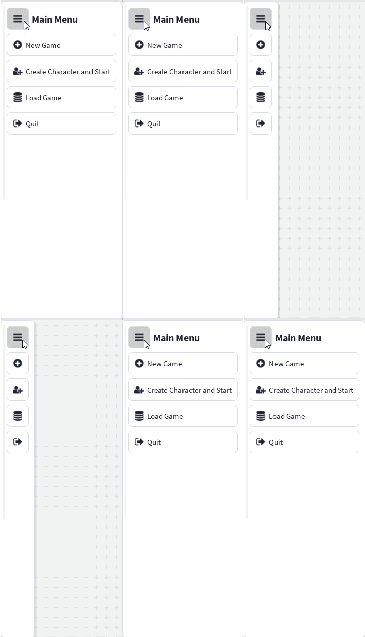
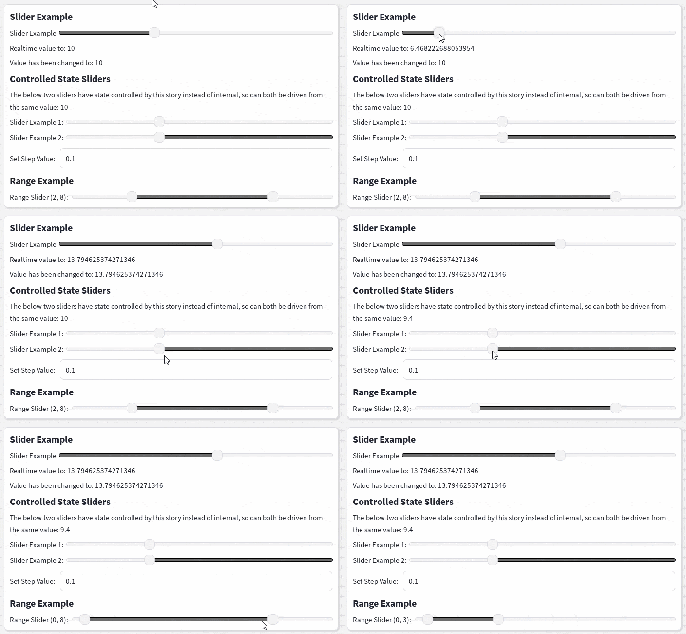
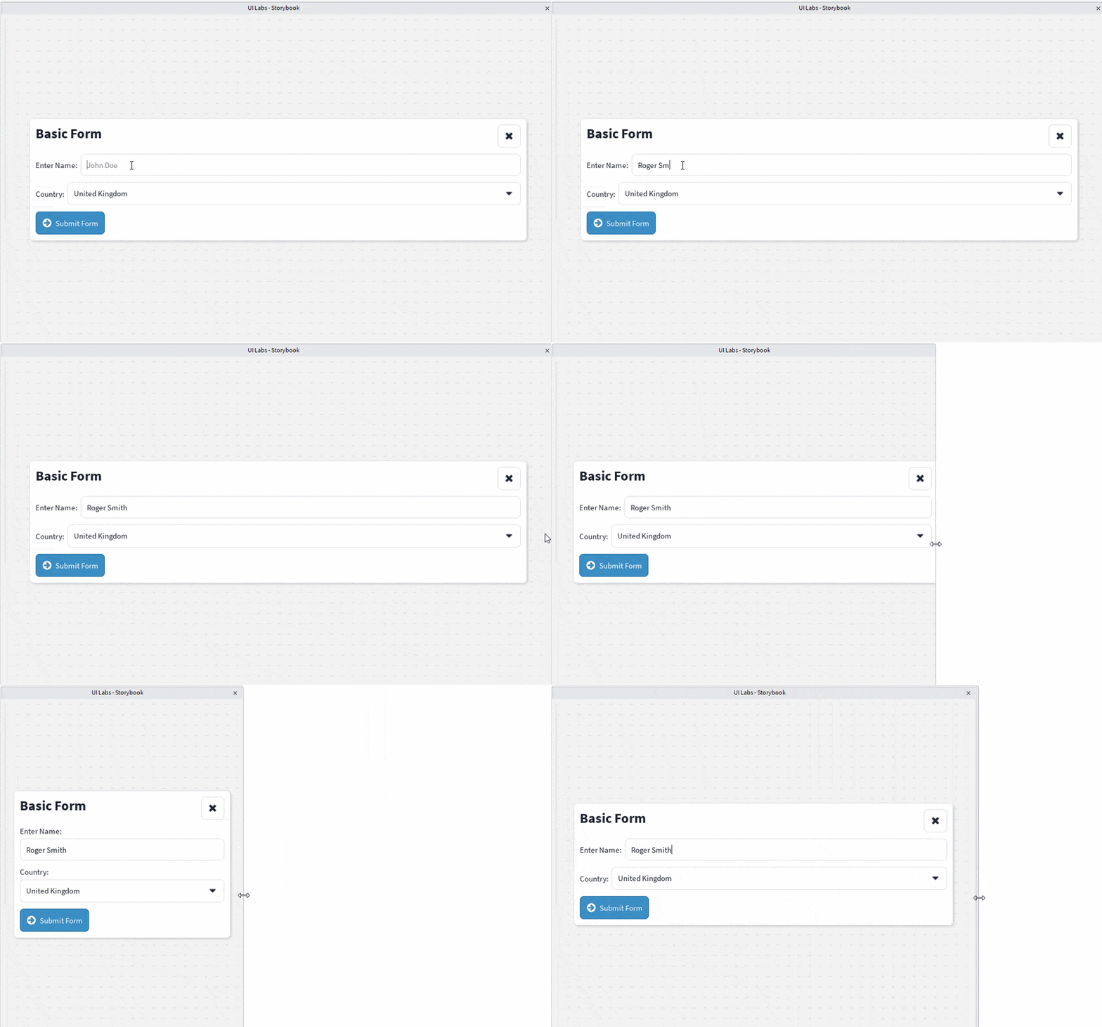
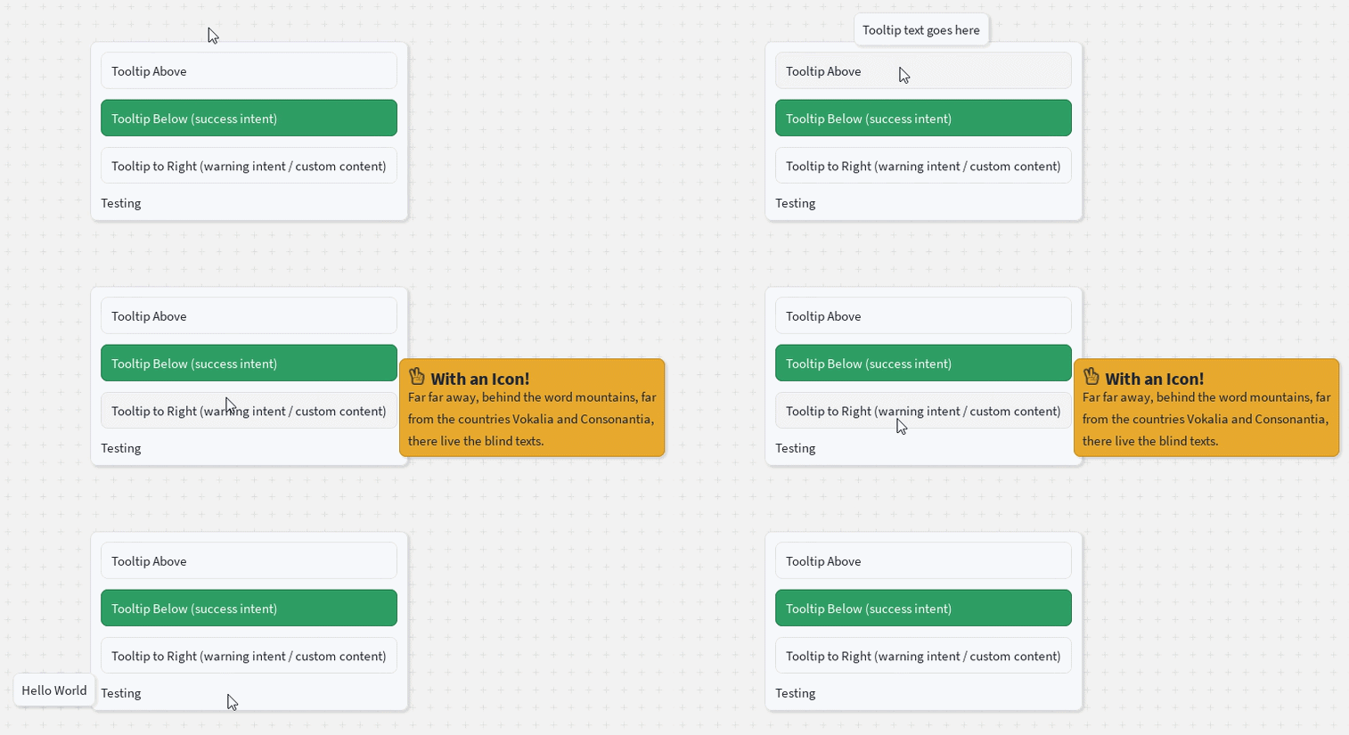
## Preview
|
|
16
|
+
|
|
17
|
+
| | | |
|
|
18
|
+
|---|---|---|
|
|
19
|
+
| 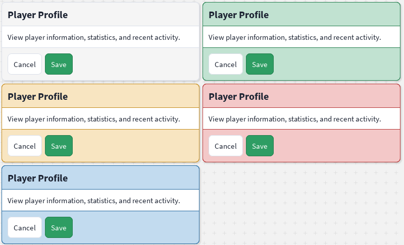 | 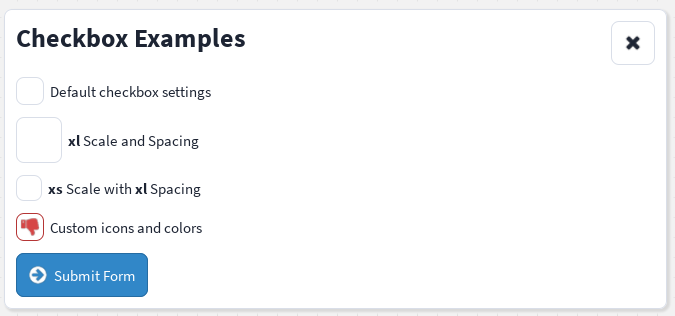 | 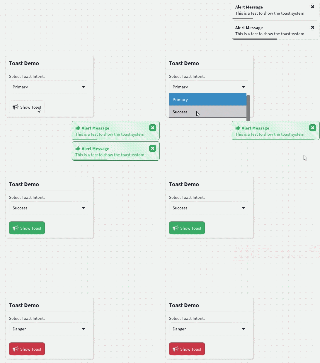 |
|
|
20
|
+
| 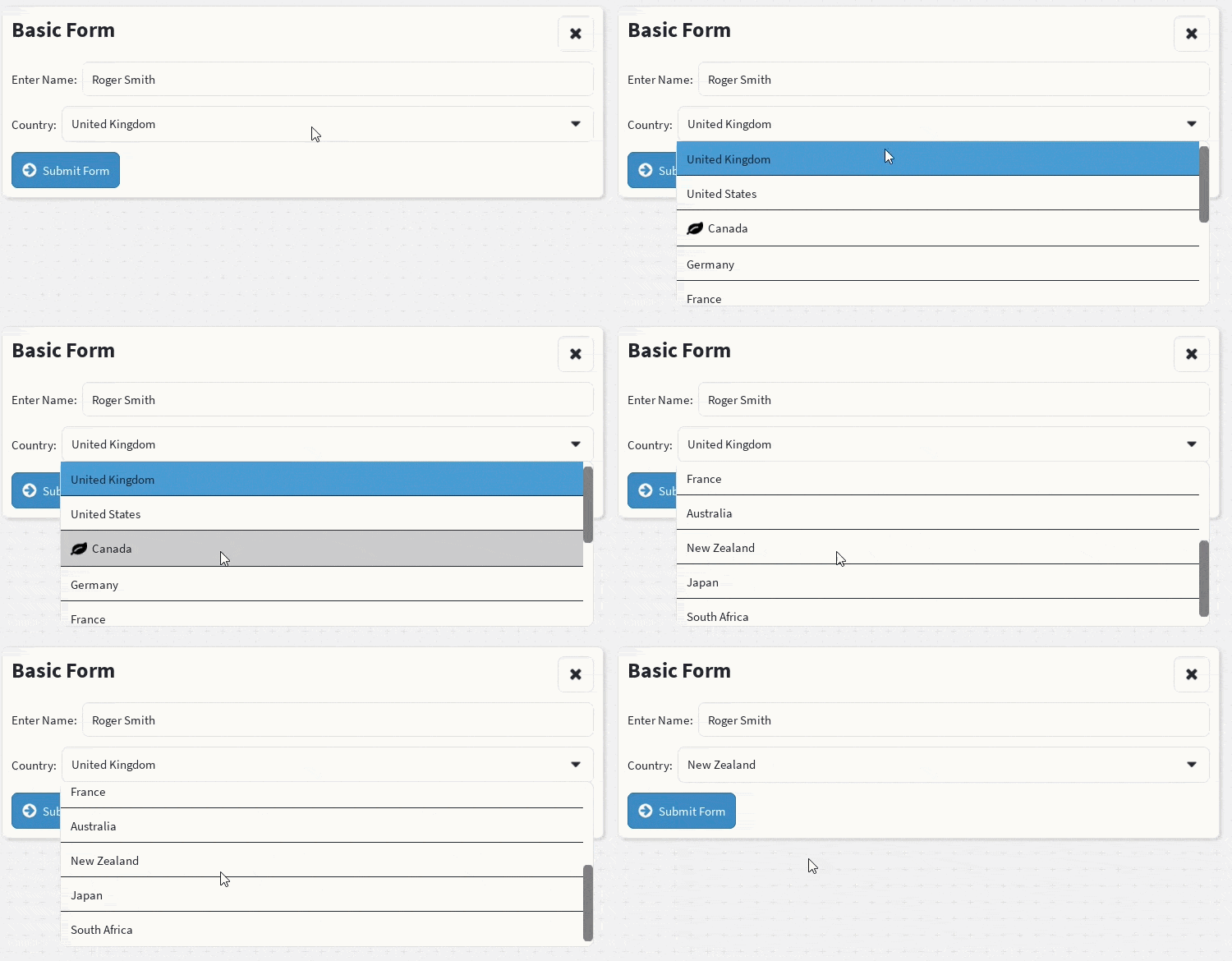 |  |  |
|
|
21
|
+
|  |  | 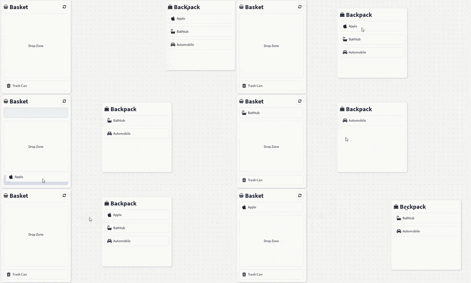 |
|
|
22
|
+
|
|
23
|
+
More components, including layouts, forms, charts, and navigation, are in the [docs](https://shadercloud.github.io/rbxts-react-clean-ui/).
|
|
24
|
+
|
|
25
|
+
## Why React Clean UI?
|
|
26
|
+
|
|
27
|
+
Roblox gives you powerful low-level UI instances, but every screen ends up repeating the same work: calculating sizes and positions, configuring layout and spacing, applying colours/typography/corners/shadows, and keeping it all visually consistent.
|
|
28
|
+
|
|
29
|
+
React Clean UI moves that repeated work into reusable components, helpers, and theme definitions — you describe **what** the interface should contain, the library handles **how** it's presented.
|
|
30
|
+
|
|
31
|
+
## Features
|
|
32
|
+
|
|
33
|
+
- 🧩 **Composable components** — containers, stacks, boxes, buttons, text, fieldsets, inputs, selects, and more
|
|
34
|
+
- 🎨 **Theme-driven design** — colours, spacing, typography, radii, and semantic intent colours (`primary`, `info`, `success`, `danger`) defined centrally; light/dark and custom themes supported
|
|
35
|
+
- 📐 **Familiar sizing & spacing** — concise, CSS-like props translated into native Roblox `UDim`/`UDim2`
|
|
36
|
+
- 📱 **Responsive layouts** — breakpoint-aware components for phone, tablet, desktop, and console
|
|
37
|
+
- ⚛️ **Built for Roblox React** — renders ordinary Roblox GUI instances through `@rbxts/react`; plays nicely with hooks, contexts, Rojo, and UI Labs stories
|
|
38
|
+
|
|
39
|
+
## Quick start
|
|
40
|
+
|
|
41
|
+
First set up a roblox-ts project (`npm init roblox-ts`), then:
|
|
42
|
+
|
|
43
|
+
```bash
|
|
44
|
+
npm install @rbxts/react-clean-ui
|
|
45
|
+
```
|
|
46
|
+
|
|
47
|
+
```tsx
|
|
48
|
+
// src/client/demo.client.tsx
|
|
49
|
+
import React from "@rbxts/react";
|
|
50
|
+
import ReactRoblox from "@rbxts/react-roblox";
|
|
51
|
+
import { CleanUiProvider, DefaultTheme, Container, Box, VStack, HStack, FlexItem, Text, Button, Fieldset, Input, Select } from "@rbxts/react-clean-ui";
|
|
52
|
+
|
|
53
|
+
const playerGui = game.GetService("Players").LocalPlayer.WaitForChild("PlayerGui") as PlayerGui;
|
|
54
|
+
|
|
55
|
+
const screenGui = new Instance("ScreenGui");
|
|
56
|
+
screenGui.ResetOnSpawn = false;
|
|
57
|
+
screenGui.IgnoreGuiInset = true;
|
|
58
|
+
screenGui.Parent = playerGui;
|
|
59
|
+
|
|
60
|
+
const root = ReactRoblox.createRoot(screenGui);
|
|
61
|
+
|
|
62
|
+
root.render(
|
|
63
|
+
<CleanUiProvider theme={DefaultTheme}>
|
|
64
|
+
<Container width="90%" center>
|
|
65
|
+
<Box>
|
|
66
|
+
<VStack>
|
|
67
|
+
<Container>
|
|
68
|
+
<HStack>
|
|
69
|
+
<FlexItem>
|
|
70
|
+
<Text text="Basic Form" variant="title" />
|
|
71
|
+
</FlexItem>
|
|
72
|
+
<Button icon="times" />
|
|
73
|
+
</HStack>
|
|
74
|
+
</Container>
|
|
75
|
+
<Fieldset>
|
|
76
|
+
<Fieldset.Label>
|
|
77
|
+
<Text text="Enter Name:" />
|
|
78
|
+
</Fieldset.Label>
|
|
79
|
+
<Fieldset.Control>
|
|
80
|
+
<Input placeholder="John Doe" value="" />
|
|
81
|
+
</Fieldset.Control>
|
|
82
|
+
</Fieldset>
|
|
83
|
+
<Fieldset>
|
|
84
|
+
<Fieldset.Label>
|
|
85
|
+
<Text text="Country:" />
|
|
86
|
+
</Fieldset.Label>
|
|
87
|
+
<Fieldset.Control>
|
|
88
|
+
<Select>
|
|
89
|
+
<Select.Option text="United Kingdom" />
|
|
90
|
+
<Select.Option text="United States" />
|
|
91
|
+
<Select.Option text="Canada" />
|
|
92
|
+
</Select>
|
|
93
|
+
</Fieldset.Control>
|
|
94
|
+
</Fieldset>
|
|
95
|
+
<Container>
|
|
96
|
+
<Button text="Submit Form" intent="info" icon="arrow-circle-right" />
|
|
97
|
+
</Container>
|
|
98
|
+
</VStack>
|
|
99
|
+
</Box>
|
|
100
|
+
</Container>
|
|
101
|
+
</CleanUiProvider>
|
|
102
|
+
);
|
|
103
|
+
```
|
|
104
|
+
|
|
105
|
+
See the [Quick Start docs](https://shadercloud.github.io/rbxts-react-clean-ui/quickstart) for the full walkthrough (including `default.project.json` setup), and the [`Stories`](./Stories) directory for live UI Labs examples you can open directly in Roblox Studio.
|
|
106
|
+
|
|
107
|
+
## Project status
|
|
108
|
+
|
|
109
|
+
React Clean UI is under active development and being built in public. APIs, component props, and installation details may still change before a first stable release. Feedback, issues, and contributions are welcome.
|
|
110
|
+
|
|
111
|
+
## License
|
|
112
|
+
|
|
113
|
+
[ISC](./LICENSE)
|
|
@@ -132,14 +132,7 @@ local function Pie(props)
|
|
|
132
132
|
end
|
|
133
133
|
sectionRemaining = 1 + sectionRemaining
|
|
134
134
|
end
|
|
135
|
-
|
|
136
|
-
if _condition then
|
|
137
|
-
_condition = v.label
|
|
138
|
-
if _condition ~= "" and _condition then
|
|
139
|
-
_condition = (not props["label-hover"] or state.hover == index)
|
|
140
|
-
end
|
|
141
|
-
end
|
|
142
|
-
if _condition ~= "" and _condition then
|
|
135
|
+
if not props["Label-hidden"] and v.label ~= nil and v.label ~= "" and (not props["label-hover"] or state.hover == index) then
|
|
143
136
|
local label = v.label
|
|
144
137
|
local isTextLabel = type(label) == "string" or label.text ~= nil
|
|
145
138
|
local position = if #props.values == 1 then UDim2.fromScale(0.5, 0.5) else getCirclePosition(totalPercent, props["label-distance"])
|
|
@@ -157,31 +150,31 @@ local function Pie(props)
|
|
|
157
150
|
BackgroundColor3 = background,
|
|
158
151
|
BorderSizePixel = 0,
|
|
159
152
|
}
|
|
160
|
-
local
|
|
161
|
-
if
|
|
162
|
-
|
|
153
|
+
local _condition = theme.components.charts.pie.labels.backgroundTransparency
|
|
154
|
+
if _condition == nil then
|
|
155
|
+
_condition = theme.components.box.backgroundTransparency
|
|
163
156
|
end
|
|
164
|
-
_attributes.BackgroundTransparency =
|
|
157
|
+
_attributes.BackgroundTransparency = _condition
|
|
165
158
|
local _exp_2 = React.createElement(Text, {
|
|
166
159
|
name = "PieLabelText",
|
|
167
160
|
text = text,
|
|
168
161
|
typography = TypographyHelper:getTypography(theme, "md", theme.components.charts.pie.labels.typography),
|
|
169
162
|
})
|
|
170
163
|
local _attributes_1 = {}
|
|
171
|
-
local
|
|
172
|
-
if
|
|
173
|
-
|
|
164
|
+
local _condition_1 = theme.components.charts.pie.labels.cornerRadius
|
|
165
|
+
if _condition_1 == nil then
|
|
166
|
+
_condition_1 = theme.components.box.cornerRadius
|
|
174
167
|
end
|
|
175
|
-
_attributes_1.radius =
|
|
168
|
+
_attributes_1.radius = _condition_1
|
|
176
169
|
local _exp_3 = React.createElement(Corners, _attributes_1)
|
|
177
170
|
local _attributes_2 = {
|
|
178
171
|
key = "Stroke",
|
|
179
172
|
}
|
|
180
|
-
local
|
|
181
|
-
if
|
|
182
|
-
|
|
173
|
+
local _condition_2 = theme.components.charts.pie.labels.borderThickness
|
|
174
|
+
if _condition_2 == nil then
|
|
175
|
+
_condition_2 = theme.components.box.borderThickness
|
|
183
176
|
end
|
|
184
|
-
_attributes_2.Thickness =
|
|
177
|
+
_attributes_2.Thickness = _condition_2
|
|
185
178
|
_attributes_2.BorderStrokePosition = Enum.BorderStrokePosition.Inner
|
|
186
179
|
_attributes_2.Color = border
|
|
187
180
|
local _arg0_1 = React.createElement("frame", _attributes, _exp_2, _exp_3, React.createElement("uistroke", _attributes_2), React.createElement(Padding, {
|
|
@@ -1,5 +1,5 @@
|
|
|
1
1
|
import React from "@rbxts/react";
|
|
2
|
-
import { BackgroundElementProps, IconElementProps, IntentElementProps, ScalableElementProps, ShadowElementProps, SpacedElementProps, ZIndexElementProps } from "../../Interfaces/";
|
|
2
|
+
import { BackgroundElementProps, CssPadding, IconElementProps, IntentElementProps, ScalableElementProps, ShadowElementProps, SpacedElementProps, ZIndexElementProps } from "../../Interfaces/";
|
|
3
3
|
import { IconProps } from "../Surface";
|
|
4
4
|
import { ThemeTemplate } from "../../Theme/theme.template";
|
|
5
5
|
export type ButtonStyleOverride = Partial<ThemeTemplate["components"]["button"]>;
|
|
@@ -14,12 +14,14 @@ export interface ButtonProps extends SpacedElementProps, ShadowElementProps, ZIn
|
|
|
14
14
|
LayoutOrder?: number;
|
|
15
15
|
styleOverride?: ButtonStyleOverride;
|
|
16
16
|
name?: string;
|
|
17
|
+
padding?: CssPadding;
|
|
17
18
|
}
|
|
18
19
|
export interface ButtonTextProps extends ScalableElementProps, IntentElementProps {
|
|
19
20
|
children?: string;
|
|
20
21
|
text: string;
|
|
21
22
|
disabled?: boolean;
|
|
22
23
|
styleOverride?: ButtonStyleOverride;
|
|
24
|
+
LayoutOrder?: number;
|
|
23
25
|
}
|
|
24
26
|
declare function ButtonText(props: ButtonTextProps): React.JSX.Element;
|
|
25
27
|
export interface ButtonIconProps extends IconProps, IntentElementProps {
|
|
@@ -71,6 +71,7 @@ local function ButtonText(props)
|
|
|
71
71
|
end
|
|
72
72
|
end
|
|
73
73
|
_attributes.typography = TypographyHelper:getTypography(theme, _exp, _object)
|
|
74
|
+
_attributes.LayoutOrder = props.LayoutOrder
|
|
74
75
|
local _exp_1 = props.intent
|
|
75
76
|
local _exp_2 = if props.disabled then "disabled" else "default"
|
|
76
77
|
local _exp_3 = theme.components.button.intents
|
|
@@ -93,6 +94,7 @@ local function ButtonIcon(props)
|
|
|
93
94
|
_attributes.icon = props.icon
|
|
94
95
|
_attributes.spinning = props.spinning
|
|
95
96
|
_attributes.speed = props.speed
|
|
97
|
+
_attributes.LayoutOrder = props.LayoutOrder
|
|
96
98
|
local _exp = props.intent
|
|
97
99
|
local _exp_1 = if props.disabled then "disabled" else "default"
|
|
98
100
|
local _exp_2 = theme.components.button.intents
|
|
@@ -284,6 +286,7 @@ local Button = React.forwardRef(function(props, ref)
|
|
|
284
286
|
spacing = props.spacing,
|
|
285
287
|
Wraps = false,
|
|
286
288
|
}, props.icon ~= nil and React.createElement(ButtonIcon, {
|
|
289
|
+
LayoutOrder = 1,
|
|
287
290
|
scale = props.scale,
|
|
288
291
|
intent = props.intent,
|
|
289
292
|
disabled = props.disabled,
|
|
@@ -291,6 +294,7 @@ local Button = React.forwardRef(function(props, ref)
|
|
|
291
294
|
spinning = props.spinning,
|
|
292
295
|
styleOverride = props.styleOverride,
|
|
293
296
|
}), props.text ~= nil and React.createElement(ButtonText, {
|
|
297
|
+
LayoutOrder = 2,
|
|
294
298
|
text = props.text,
|
|
295
299
|
intent = props.intent,
|
|
296
300
|
disabled = props.disabled,
|
|
@@ -6,6 +6,8 @@ interface TooltipProps extends BoxProps, IntentElementProps {
|
|
|
6
6
|
content: React.ReactNode | string;
|
|
7
7
|
children: React.ReactElement<React.InstanceProps<GuiObject>>;
|
|
8
8
|
placement?: TooltipPlacement;
|
|
9
|
+
disabled?: boolean;
|
|
10
|
+
open?: boolean;
|
|
9
11
|
}
|
|
10
12
|
export declare function Tooltip(props: TooltipProps): React.JSX.Element;
|
|
11
13
|
export {};
|
|
@@ -3,6 +3,7 @@ local TS = _G[script]
|
|
|
3
3
|
local React = TS.import(script, TS.getModule(script, "@rbxts", "react"))
|
|
4
4
|
local _Contexts = TS.import(script, script.Parent.Parent.Parent, "Contexts")
|
|
5
5
|
local CleanThemeContext = _Contexts.CleanThemeContext
|
|
6
|
+
local DragStateContext = _Contexts.DragStateContext
|
|
6
7
|
local OverlayConsumer = _Contexts.OverlayConsumer
|
|
7
8
|
local Text = TS.import(script, script.Parent.Parent, "Typography").Text
|
|
8
9
|
local ReactRoblox = TS.import(script, TS.getModule(script, "@rbxts", "react-roblox"))
|
|
@@ -13,6 +14,7 @@ local Padding = _Decorator.Padding
|
|
|
13
14
|
local _Helpers = TS.import(script, script.Parent.Parent.Parent, "Helpers")
|
|
14
15
|
local ColorHelper = _Helpers.ColorHelper
|
|
15
16
|
local CssHelper = _Helpers.CssHelper
|
|
17
|
+
local ElementHelper = _Helpers.ElementHelper
|
|
16
18
|
local SpacingHelper = _Helpers.SpacingHelper
|
|
17
19
|
local useTween = TS.import(script, TS.getModule(script, "@rbxts", "react-ripple").src).useTween
|
|
18
20
|
local function TooltipPopup(props)
|
|
@@ -30,8 +32,7 @@ local function TooltipPopup(props)
|
|
|
30
32
|
left = 0,
|
|
31
33
|
right = 0,
|
|
32
34
|
}
|
|
33
|
-
local
|
|
34
|
-
local shadow = if _value ~= 0 and _value == _value and _value ~= "" and _value then CssHelper:parseCssShadow(theme.components.tooltip.boxShadow) else nil
|
|
35
|
+
local shadow = if theme.components.tooltip.boxShadow ~= nil and theme.components.tooltip.boxShadow ~= 0 then CssHelper:parseCssShadow(theme.components.tooltip.boxShadow) else nil
|
|
35
36
|
if shadow ~= nil then
|
|
36
37
|
resolvedPadding.top += shadow.blurRadius.Offset + shadow.spread.Y.Offset - shadow.offset.Y.Offset
|
|
37
38
|
resolvedPadding.bottom += shadow.blurRadius.Offset + shadow.spread.Y.Offset + shadow.offset.Y.Offset
|
|
@@ -178,12 +179,20 @@ end
|
|
|
178
179
|
local function Tooltip(props)
|
|
179
180
|
local targetRef = React.useRef()
|
|
180
181
|
local hideRequest = React.useRef(0)
|
|
182
|
+
local hoveredRef = React.useRef(false)
|
|
183
|
+
local shownRef = React.useRef(false)
|
|
181
184
|
local target, setTarget = React.useState()
|
|
182
185
|
local visible, setVisible = React.useState(false)
|
|
183
186
|
local theme = React.useContext(CleanThemeContext)
|
|
187
|
+
local dragState = React.useContext(DragStateContext)
|
|
184
188
|
local fadeDuration = theme.components.tooltip.fadeDuration
|
|
185
|
-
local
|
|
186
|
-
|
|
189
|
+
local suppressed = props.disabled == true or dragState.preview or dragState.dragging
|
|
190
|
+
local suppressedRef = React.useRef(suppressed)
|
|
191
|
+
suppressedRef.current = suppressed
|
|
192
|
+
local controlled = props.open ~= nil
|
|
193
|
+
local controlledRef = React.useRef(controlled)
|
|
194
|
+
controlledRef.current = controlled
|
|
195
|
+
local captureTarget = function()
|
|
187
196
|
local _result = targetRef.current
|
|
188
197
|
if _result ~= nil then
|
|
189
198
|
_result = _result.AbsolutePosition
|
|
@@ -204,9 +213,15 @@ local function Tooltip(props)
|
|
|
204
213
|
_object[_left_1] = _result_2
|
|
205
214
|
setTarget(_object)
|
|
206
215
|
end
|
|
216
|
+
end
|
|
217
|
+
local show = function()
|
|
218
|
+
shownRef.current = true
|
|
219
|
+
hideRequest.current += 1
|
|
220
|
+
captureTarget()
|
|
207
221
|
setVisible(true)
|
|
208
222
|
end
|
|
209
223
|
local hide = function()
|
|
224
|
+
shownRef.current = false
|
|
210
225
|
setVisible(false)
|
|
211
226
|
local request = hideRequest.current + 1
|
|
212
227
|
hideRequest.current = request
|
|
@@ -220,40 +235,53 @@ local function Tooltip(props)
|
|
|
220
235
|
end
|
|
221
236
|
end)
|
|
222
237
|
end
|
|
223
|
-
|
|
224
|
-
|
|
225
|
-
|
|
226
|
-
}
|
|
227
|
-
local _left = "Event"
|
|
228
|
-
local _object_1 = {}
|
|
229
|
-
local _spread = props.children.props.Event
|
|
230
|
-
if _spread then
|
|
231
|
-
for _k, _v in _spread do
|
|
232
|
-
_object_1[_k] = _v
|
|
238
|
+
React.useEffect(function()
|
|
239
|
+
if suppressed then
|
|
240
|
+
hoveredRef.current = false
|
|
233
241
|
end
|
|
234
|
-
|
|
235
|
-
|
|
236
|
-
|
|
237
|
-
|
|
238
|
-
|
|
239
|
-
if _result ~= nil then
|
|
240
|
-
_result(guiObject, x, y)
|
|
242
|
+
local _condition = not suppressed
|
|
243
|
+
if _condition then
|
|
244
|
+
local _condition_1 = props.open
|
|
245
|
+
if _condition_1 == nil then
|
|
246
|
+
_condition_1 = hoveredRef.current
|
|
241
247
|
end
|
|
248
|
+
_condition = _condition_1
|
|
242
249
|
end
|
|
243
|
-
|
|
244
|
-
|
|
245
|
-
|
|
246
|
-
|
|
247
|
-
|
|
248
|
-
_result = _result.MouseLeave
|
|
249
|
-
if _result ~= nil then
|
|
250
|
-
_result(guiObject, x, y)
|
|
251
|
-
end
|
|
250
|
+
local wanted = _condition
|
|
251
|
+
if wanted and not shownRef.current then
|
|
252
|
+
show()
|
|
253
|
+
elseif not wanted and shownRef.current then
|
|
254
|
+
hide()
|
|
252
255
|
end
|
|
253
|
-
|
|
254
|
-
|
|
255
|
-
|
|
256
|
-
|
|
256
|
+
end, { suppressed, props.open })
|
|
257
|
+
React.useEffect(function()
|
|
258
|
+
local instance = targetRef.current
|
|
259
|
+
if not visible or instance == nil then
|
|
260
|
+
return nil
|
|
261
|
+
end
|
|
262
|
+
local positionChanged = instance:GetPropertyChangedSignal("AbsolutePosition"):Connect(captureTarget)
|
|
263
|
+
local sizeChanged = instance:GetPropertyChangedSignal("AbsoluteSize"):Connect(captureTarget)
|
|
264
|
+
return function()
|
|
265
|
+
positionChanged:Disconnect()
|
|
266
|
+
sizeChanged:Disconnect()
|
|
267
|
+
end
|
|
268
|
+
end, { visible })
|
|
269
|
+
local child = ElementHelper:cloneWithEvents(props.children, {
|
|
270
|
+
ref = targetRef,
|
|
271
|
+
}, {
|
|
272
|
+
MouseEnter = function()
|
|
273
|
+
hoveredRef.current = true
|
|
274
|
+
if not controlledRef.current and not suppressedRef.current then
|
|
275
|
+
show()
|
|
276
|
+
end
|
|
277
|
+
end,
|
|
278
|
+
MouseLeave = function()
|
|
279
|
+
hoveredRef.current = false
|
|
280
|
+
if not controlledRef.current then
|
|
281
|
+
hide()
|
|
282
|
+
end
|
|
283
|
+
end,
|
|
284
|
+
})
|
|
257
285
|
return React.createElement(React.Fragment, nil, child, target ~= nil and (React.createElement(OverlayConsumer, {
|
|
258
286
|
render = function(overlay)
|
|
259
287
|
if overlay == nil then
|
|
@@ -17,16 +17,27 @@ interface AccordionContentProps extends PaddingProps {
|
|
|
17
17
|
text?: string;
|
|
18
18
|
}
|
|
19
19
|
declare function AccordionContent(_props: AccordionContentProps): undefined;
|
|
20
|
-
|
|
20
|
+
interface AccordionBaseProps extends ScalableElementProps {
|
|
21
21
|
children?: React.ReactNode;
|
|
22
22
|
collapsible?: boolean;
|
|
23
23
|
animationDuration?: number;
|
|
24
|
+
autoSize?: boolean;
|
|
25
|
+
keepMounted?: boolean;
|
|
26
|
+
name?: string;
|
|
27
|
+
}
|
|
28
|
+
export interface AccordionProps extends AccordionBaseProps {
|
|
29
|
+
multiple?: false;
|
|
24
30
|
defaultValue?: string;
|
|
25
31
|
value?: string;
|
|
26
32
|
onValueChange?: (value: string | undefined) => void;
|
|
27
|
-
name?: string;
|
|
28
33
|
}
|
|
29
|
-
|
|
34
|
+
export interface AccordionMultipleProps extends AccordionBaseProps {
|
|
35
|
+
multiple: true;
|
|
36
|
+
defaultValue?: string[];
|
|
37
|
+
value?: string[];
|
|
38
|
+
onValueChange?: (value: string[]) => void;
|
|
39
|
+
}
|
|
40
|
+
type AccordionComponent = React.ForwardRefExoticComponent<(AccordionProps | AccordionMultipleProps) & React.RefAttributes<ImageLabel>> & {
|
|
30
41
|
Item: typeof AccordionItem;
|
|
31
42
|
Header: typeof AccordionHeader;
|
|
32
43
|
Content: typeof AccordionContent;
|
|
@@ -119,15 +119,33 @@ local function AccordionHeaderVisual(props)
|
|
|
119
119
|
Rotation = rotation,
|
|
120
120
|
}))))
|
|
121
121
|
end
|
|
122
|
+
local function toValues(value)
|
|
123
|
+
if value == nil then
|
|
124
|
+
return {}
|
|
125
|
+
end
|
|
126
|
+
local _value = value
|
|
127
|
+
return if type(_value) == "string" then { value } else value
|
|
128
|
+
end
|
|
122
129
|
local function RenderedAccordionItem(props)
|
|
123
130
|
local theme = React.useContext(CleanThemeContext)
|
|
124
131
|
local mounted, setMounted = React.useState(props.open)
|
|
125
132
|
local height, heightTween = useTween(0, {
|
|
126
133
|
duration = props.duration,
|
|
127
134
|
})
|
|
135
|
+
local contentRef = React.useRef()
|
|
128
136
|
React.useEffect(function()
|
|
129
137
|
if props.open then
|
|
130
138
|
setMounted(true)
|
|
139
|
+
local content = contentRef.current
|
|
140
|
+
if content ~= nil then
|
|
141
|
+
heightTween:setGoal(content.AbsoluteSize.Y, {
|
|
142
|
+
duration = props.duration,
|
|
143
|
+
})
|
|
144
|
+
if props.duration == 0 then
|
|
145
|
+
heightTween:setPosition(content.AbsoluteSize.Y)
|
|
146
|
+
end
|
|
147
|
+
heightTween:start()
|
|
148
|
+
end
|
|
131
149
|
else
|
|
132
150
|
heightTween:setGoal(0, {
|
|
133
151
|
duration = props.duration,
|
|
@@ -252,11 +270,12 @@ local function RenderedAccordionItem(props)
|
|
|
252
270
|
disabled = props.disabled,
|
|
253
271
|
duration = props.duration,
|
|
254
272
|
open = props.open,
|
|
255
|
-
})), mounted and (React.createElement("frame", {
|
|
273
|
+
})), (mounted or props.keepMounted) and (React.createElement("frame", {
|
|
256
274
|
key = "ContentClip",
|
|
257
275
|
BackgroundTransparency = 1,
|
|
258
276
|
BorderSizePixel = 0,
|
|
259
277
|
ClipsDescendants = true,
|
|
278
|
+
Visible = mounted,
|
|
260
279
|
Size = height:map(function(value)
|
|
261
280
|
local _exp = UDim2.fromScale(1, 0)
|
|
262
281
|
local _arg0 = UDim2.fromOffset(0, value)
|
|
@@ -264,6 +283,7 @@ local function RenderedAccordionItem(props)
|
|
|
264
283
|
end),
|
|
265
284
|
}, React.createElement("frame", {
|
|
266
285
|
key = "Content",
|
|
286
|
+
ref = contentRef,
|
|
267
287
|
BackgroundColor3 = theme.components.accordion.content.backgroundColor,
|
|
268
288
|
BackgroundTransparency = theme.components.accordion.content.backgroundTransparency,
|
|
269
289
|
BorderSizePixel = 0,
|
|
@@ -341,9 +361,10 @@ local Accordion = React.forwardRef(function(props, ref)
|
|
|
341
361
|
end)
|
|
342
362
|
return parsed
|
|
343
363
|
end, { props.children })
|
|
344
|
-
local
|
|
345
|
-
|
|
346
|
-
|
|
364
|
+
local uncontrolled, setUncontrolled = React.useState(function()
|
|
365
|
+
return toValues(props.defaultValue)
|
|
366
|
+
end)
|
|
367
|
+
local supplied = if props.value ~= nil then toValues(props.value) else uncontrolled
|
|
347
368
|
local _set = {}
|
|
348
369
|
-- ▼ ReadonlyArray.map ▼
|
|
349
370
|
local _newValue = table.create(#items)
|
|
@@ -372,7 +393,8 @@ local Accordion = React.forwardRef(function(props, ref)
|
|
|
372
393
|
end
|
|
373
394
|
end
|
|
374
395
|
-- ▲ ReadonlyArray.filter ▲
|
|
375
|
-
local
|
|
396
|
+
local filtered = _newValue_1
|
|
397
|
+
local openValues = if props.multiple or #filtered <= 1 then filtered else { filtered[1] }
|
|
376
398
|
React.useEffect(function()
|
|
377
399
|
local _condition = props.value == nil
|
|
378
400
|
if _condition then
|
|
@@ -406,7 +428,38 @@ local Accordion = React.forwardRef(function(props, ref)
|
|
|
406
428
|
local _value = item.value
|
|
407
429
|
local isOpen = table.find(openValues, _value) ~= nil
|
|
408
430
|
local nextValues
|
|
409
|
-
if
|
|
431
|
+
if props.multiple then
|
|
432
|
+
-- ▼ ReadonlyArray.map ▼
|
|
433
|
+
local _newValue_2 = table.create(#items)
|
|
434
|
+
local _callback_2 = function(other)
|
|
435
|
+
return other.value
|
|
436
|
+
end
|
|
437
|
+
for _k, _v in items do
|
|
438
|
+
_newValue_2[_k] = _callback_2(_v, _k - 1, items)
|
|
439
|
+
end
|
|
440
|
+
-- ▲ ReadonlyArray.map ▲
|
|
441
|
+
-- ▼ ReadonlyArray.filter ▼
|
|
442
|
+
local _newValue_3 = {}
|
|
443
|
+
local _callback_3 = function(value)
|
|
444
|
+
local _result
|
|
445
|
+
if value == item.value then
|
|
446
|
+
_result = not isOpen
|
|
447
|
+
else
|
|
448
|
+
local _value_1 = value
|
|
449
|
+
_result = table.find(openValues, _value_1) ~= nil
|
|
450
|
+
end
|
|
451
|
+
return _result
|
|
452
|
+
end
|
|
453
|
+
local _length_1 = 0
|
|
454
|
+
for _k, _v in _newValue_2 do
|
|
455
|
+
if _callback_3(_v, _k - 1, _newValue_2) == true then
|
|
456
|
+
_length_1 += 1
|
|
457
|
+
_newValue_3[_length_1] = _v
|
|
458
|
+
end
|
|
459
|
+
end
|
|
460
|
+
-- ▲ ReadonlyArray.filter ▲
|
|
461
|
+
nextValues = _newValue_3
|
|
462
|
+
elseif isOpen then
|
|
410
463
|
if not props.collapsible then
|
|
411
464
|
return nil
|
|
412
465
|
end
|
|
@@ -417,9 +470,16 @@ local Accordion = React.forwardRef(function(props, ref)
|
|
|
417
470
|
if props.value == nil then
|
|
418
471
|
setUncontrolled(nextValues)
|
|
419
472
|
end
|
|
420
|
-
|
|
421
|
-
|
|
422
|
-
_result
|
|
473
|
+
if props.multiple then
|
|
474
|
+
local _result = props.onValueChange
|
|
475
|
+
if _result ~= nil then
|
|
476
|
+
_result(nextValues)
|
|
477
|
+
end
|
|
478
|
+
else
|
|
479
|
+
local _result = props.onValueChange
|
|
480
|
+
if _result ~= nil then
|
|
481
|
+
_result(nextValues[1])
|
|
482
|
+
end
|
|
423
483
|
end
|
|
424
484
|
end
|
|
425
485
|
local _attributes = {
|
|
@@ -431,7 +491,8 @@ local Accordion = React.forwardRef(function(props, ref)
|
|
|
431
491
|
end
|
|
432
492
|
_attributes.name = _condition
|
|
433
493
|
_attributes.width = "100%"
|
|
434
|
-
_attributes.height = "100%"
|
|
494
|
+
_attributes.height = if props.autoSize then nil else "100%"
|
|
495
|
+
_attributes.AutomaticSize = if props.autoSize then Enum.AutomaticSize.Y else nil
|
|
435
496
|
_attributes.ClipsDescendants = true
|
|
436
497
|
local _exp = React.createElement(Corners, {
|
|
437
498
|
radius = theme.components.accordion.cornerRadius,
|
|
@@ -459,6 +520,11 @@ local Accordion = React.forwardRef(function(props, ref)
|
|
|
459
520
|
_condition_1 = theme.components.accordion.animation.duration
|
|
460
521
|
end
|
|
461
522
|
_attributes_1.duration = _condition_1
|
|
523
|
+
local _condition_2 = props.keepMounted
|
|
524
|
+
if _condition_2 == nil then
|
|
525
|
+
_condition_2 = false
|
|
526
|
+
end
|
|
527
|
+
_attributes_1.keepMounted = _condition_2
|
|
462
528
|
_attributes_1.onActivate = function()
|
|
463
529
|
return activate(item)
|
|
464
530
|
end
|
|
@@ -1,15 +1,18 @@
|
|
|
1
1
|
import React from "@rbxts/react";
|
|
2
2
|
import { DroppableRegistration } from "../../Providers";
|
|
3
|
+
import { DragEventInfo } from "../../Contexts";
|
|
3
4
|
type GuiObjectProps = React.InstanceProps<GuiObject>;
|
|
4
5
|
type GuiElement = React.ReactElement<GuiObjectProps>;
|
|
5
6
|
interface DragHandleProps {
|
|
6
7
|
children: GuiElement;
|
|
7
8
|
}
|
|
8
9
|
declare function DragHandle({ children }: DragHandleProps): React.ReactElement<GuiObjectProps, string | React.JSXElementConstructor<any>>;
|
|
9
|
-
interface DraggableProps {
|
|
10
|
-
onDropped?: (droppable
|
|
11
|
-
onDragged?: (droppable
|
|
12
|
-
onStartDrag?: () => void;
|
|
10
|
+
export interface DraggableProps {
|
|
11
|
+
onDropped?: (droppable: DroppableRegistration | undefined, info: DragEventInfo) => void;
|
|
12
|
+
onDragged?: (droppable: DroppableRegistration | undefined, info: DragEventInfo) => void;
|
|
13
|
+
onStartDrag?: (info: DragEventInfo) => void;
|
|
14
|
+
inputTypes?: Enum.UserInputType[];
|
|
15
|
+
renderOverlay?: () => React.ReactNode;
|
|
13
16
|
placeholder?: boolean;
|
|
14
17
|
retainPosition?: boolean;
|
|
15
18
|
children: GuiElement;
|