@rbxts/react-clean-ui 1.2.8 → 1.3.0
This diff represents the content of publicly available package versions that have been released to one of the supported registries. The information contained in this diff is provided for informational purposes only and reflects changes between package versions as they appear in their respective public registries.
- package/LICENSE +15 -0
- package/README.md +111 -1
- package/out/Components/Chart/Pie.luau +4 -0
- package/out/Components/Input/Button.d.ts +1 -0
- package/out/Components/Input/Button.luau +4 -0
- package/out/Components/Input/Checkbox.luau +1 -0
- package/out/Components/Input/HoverButton.luau +1 -1
- package/out/Components/Input/Input.luau +2 -1
- package/out/Components/Input/Select.luau +4 -0
- package/out/Components/Input/Slider.luau +4 -1
- package/out/Components/Input/Switch.luau +1 -0
- package/out/Components/Interaction/Modal.luau +3 -0
- package/out/Components/Interaction/Toast.luau +1 -0
- package/out/Components/Interaction/Tooltip.luau +3 -0
- package/out/Components/Layout/Accordion.luau +2 -0
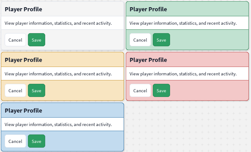
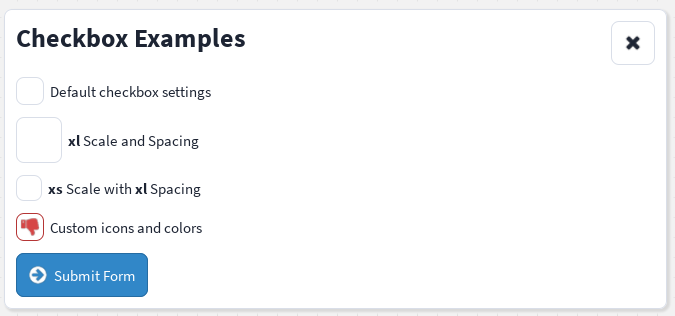
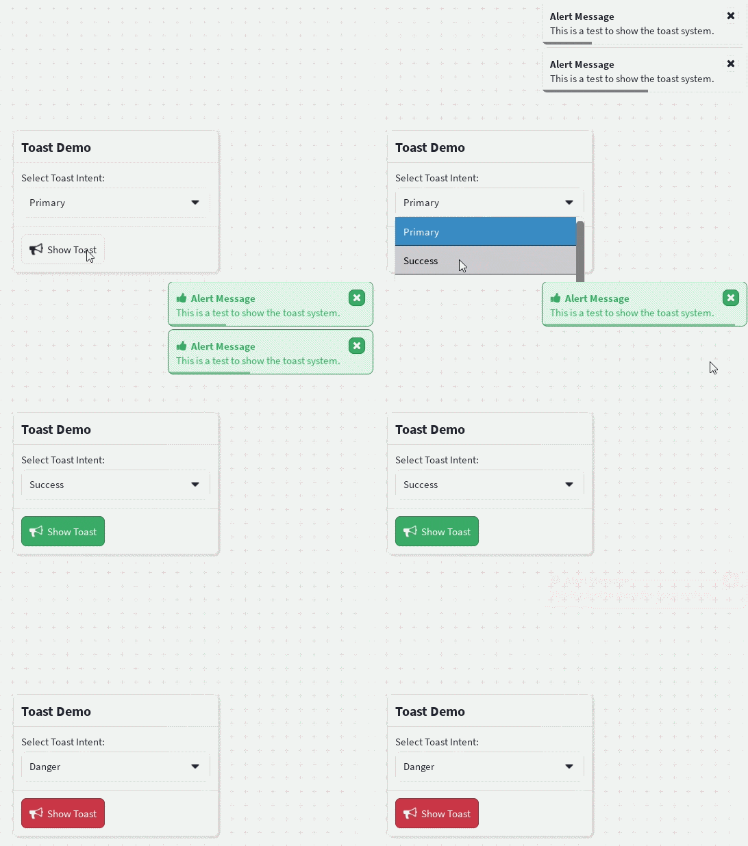
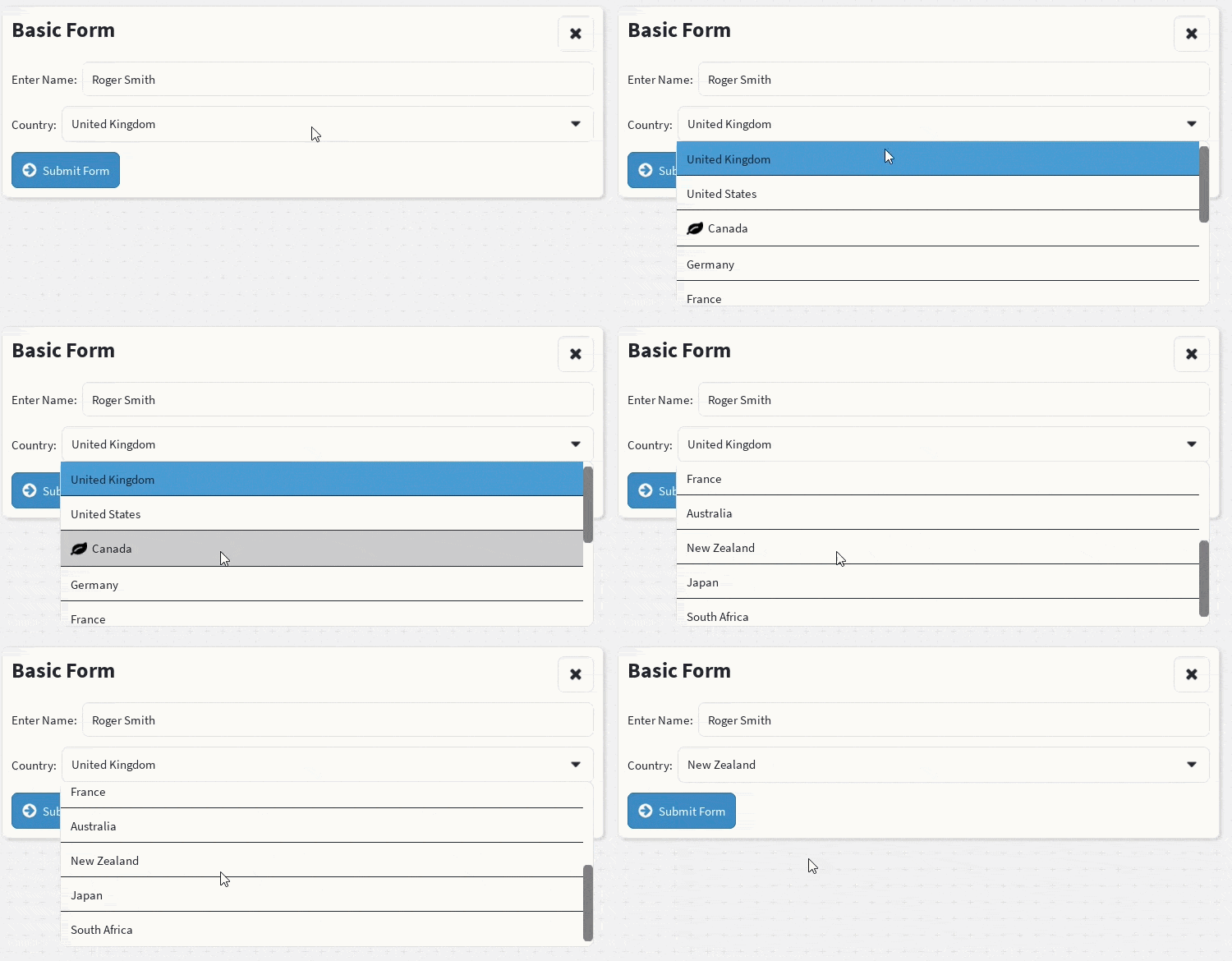
- package/out/Components/Layout/BreakpointProvider.luau +1 -0
- package/out/Components/Layout/Column.luau +1 -0
- package/out/Components/Layout/Container.luau +2 -1
- package/out/Components/Layout/Draggable.luau +1 -0
- package/out/Components/Layout/Fieldset.luau +1 -0
- package/out/Components/Layout/Grid.luau +2 -0
- package/out/Components/Layout/Group.d.ts +2 -2
- package/out/Components/Layout/Group.luau +1 -0
- package/out/Components/Layout/Pagination.luau +11 -7
- package/out/Components/Layout/Row.luau +1 -0
- package/out/Components/Layout/Scroller.luau +1 -0
- package/out/Components/Layout/Table.luau +1 -0
- package/out/Components/Surface/Card.luau +1 -0
- package/out/Components/Surface/Icon.luau +2 -1
- package/out/Components/Surface/ProgressBar.luau +3 -0
- package/out/Components/Typography/Text.luau +3 -1
- package/out/Providers/overlay.provider.luau +1 -0
- package/package.json +1 -1
package/LICENSE
ADDED
|
@@ -0,0 +1,15 @@
|
|
|
1
|
+
ISC License
|
|
2
|
+
|
|
3
|
+
Copyright (c) 2026 ShaderCloud
|
|
4
|
+
|
|
5
|
+
Permission to use, copy, modify, and/or distribute this software for any
|
|
6
|
+
purpose with or without fee is hereby granted, provided that the above
|
|
7
|
+
copyright notice and this permission notice appear in all copies.
|
|
8
|
+
|
|
9
|
+
THE SOFTWARE IS PROVIDED "AS IS" AND THE AUTHOR DISCLAIMS ALL WARRANTIES
|
|
10
|
+
WITH REGARD TO THIS SOFTWARE INCLUDING ALL IMPLIED WARRANTIES OF
|
|
11
|
+
MERCHANTABILITY AND FITNESS. IN NO EVENT SHALL THE AUTHOR BE LIABLE FOR
|
|
12
|
+
ANY SPECIAL, DIRECT, INDIRECT, OR CONSEQUENTIAL DAMAGES OR ANY DAMAGES
|
|
13
|
+
WHATSOEVER RESULTING FROM LOSS OF USE, DATA OR PROFITS, WHETHER IN AN
|
|
14
|
+
ACTION OF CONTRACT, NEGLIGENCE OR OTHER TORTIOUS ACTION, ARISING OUT OF
|
|
15
|
+
OR IN CONNECTION WITH THE USE OR PERFORMANCE OF THIS SOFTWARE.
|
package/README.md
CHANGED
|
@@ -1,3 +1,113 @@
|
|
|
1
1
|
# React Clean UI
|
|
2
2
|
|
|
3
|
-
|
|
3
|
+
An easy-to-use, theme-aware React component library for building polished Roblox interfaces with [`roblox-ts`](https://roblox-ts.com/) and [`@rbxts/react`](https://www.npmjs.com/package/@rbxts/react).
|
|
4
|
+
|
|
5
|
+
Stop hand-rolling sizes, spacing, colours, and layout on every screen — compose your UI from reusable, styled components instead.
|
|
6
|
+
|
|
7
|
+
[**📖 Read the full docs**](https://shadercloud.github.io/rbxts-react-clean-ui/) · [**📦 npm package**](https://www.npmjs.com/package/@rbxts/react-clean-ui)
|
|
8
|
+
|
|
9
|
+
## Install
|
|
10
|
+
|
|
11
|
+
```bash
|
|
12
|
+
npm install @rbxts/react-clean-ui
|
|
13
|
+
```
|
|
14
|
+
|
|
15
|
+
## Preview
|
|
16
|
+
|
|
17
|
+
| | | |
|
|
18
|
+
|---|---|---|
|
|
19
|
+
|  |  |  |
|
|
20
|
+
|  | 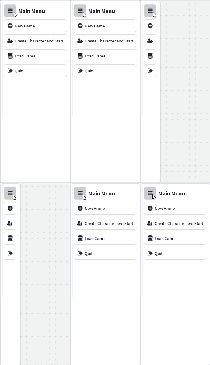 | 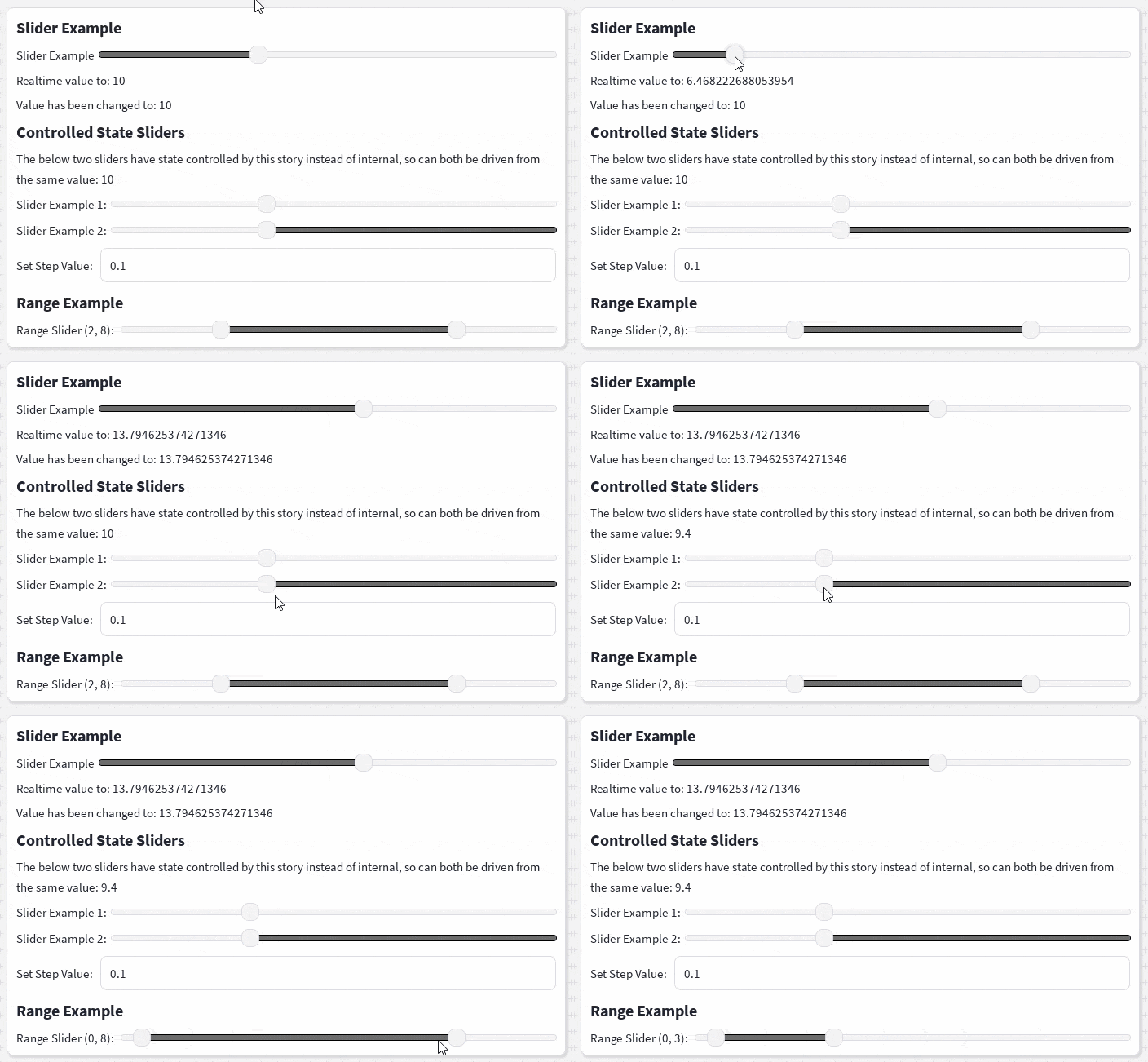 |
|
|
21
|
+
| 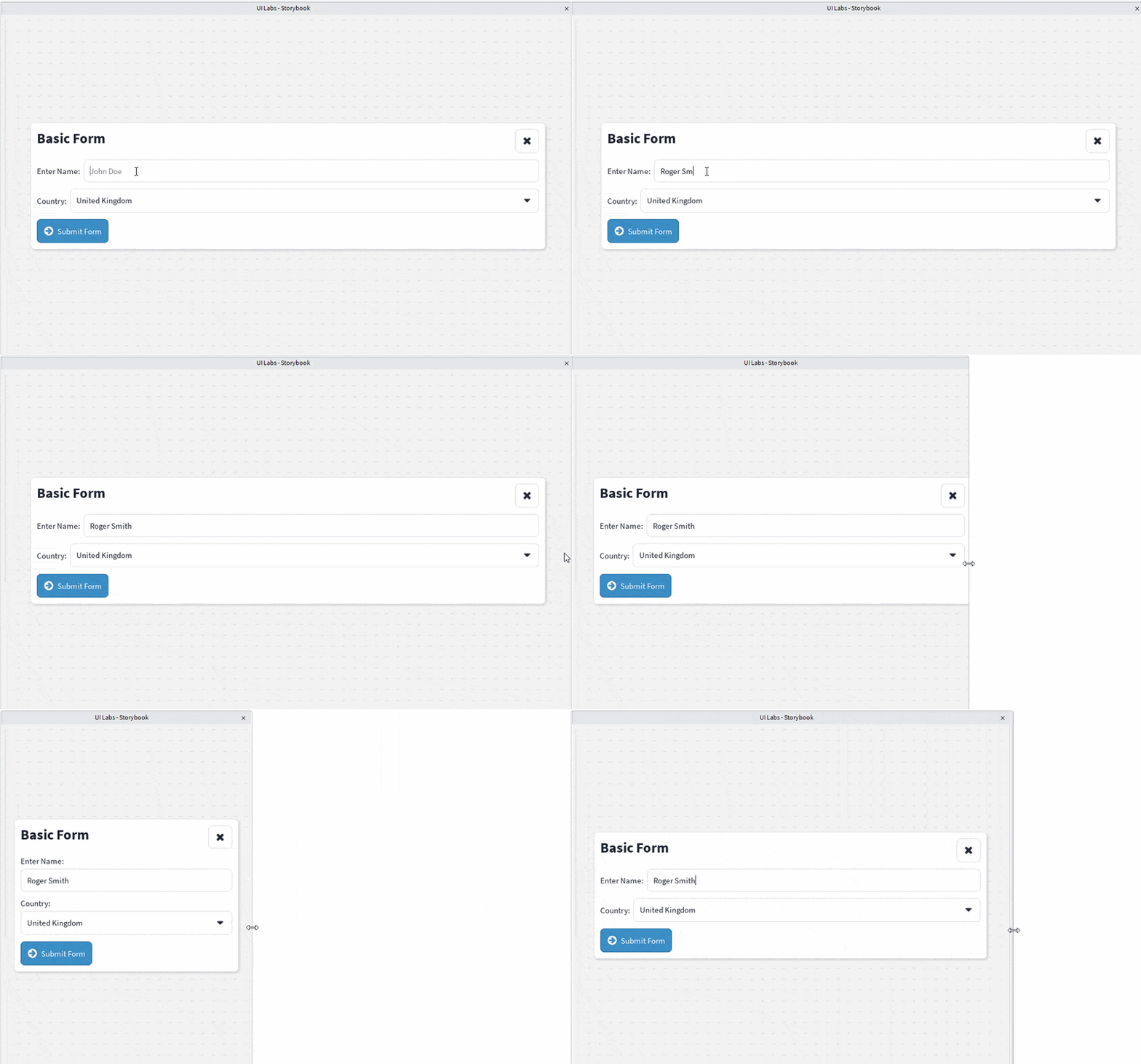 | 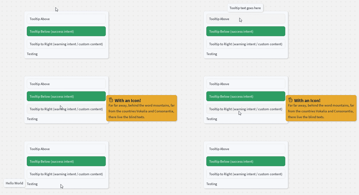 | 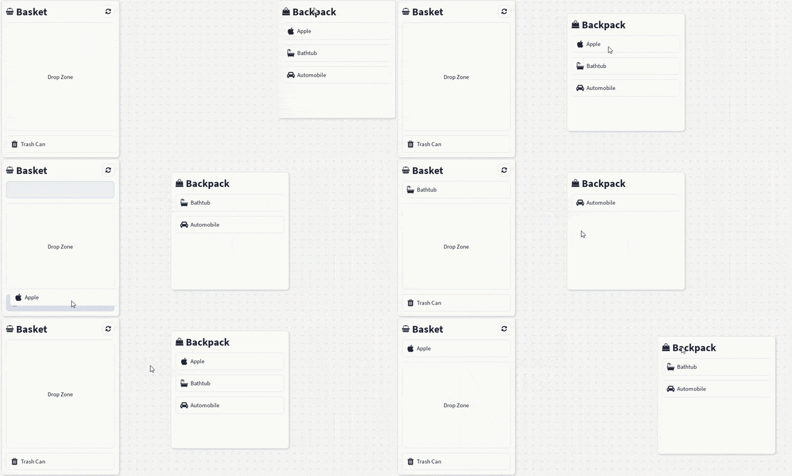 |
|
|
22
|
+
|
|
23
|
+
More components, including layouts, forms, charts, and navigation, are in the [docs](https://shadercloud.github.io/rbxts-react-clean-ui/).
|
|
24
|
+
|
|
25
|
+
## Why React Clean UI?
|
|
26
|
+
|
|
27
|
+
Roblox gives you powerful low-level UI instances, but every screen ends up repeating the same work: calculating sizes and positions, configuring layout and spacing, applying colours/typography/corners/shadows, and keeping it all visually consistent.
|
|
28
|
+
|
|
29
|
+
React Clean UI moves that repeated work into reusable components, helpers, and theme definitions — you describe **what** the interface should contain, the library handles **how** it's presented.
|
|
30
|
+
|
|
31
|
+
## Features
|
|
32
|
+
|
|
33
|
+
- 🧩 **Composable components** — containers, stacks, boxes, buttons, text, fieldsets, inputs, selects, and more
|
|
34
|
+
- 🎨 **Theme-driven design** — colours, spacing, typography, radii, and semantic intent colours (`primary`, `info`, `success`, `danger`) defined centrally; light/dark and custom themes supported
|
|
35
|
+
- 📐 **Familiar sizing & spacing** — concise, CSS-like props translated into native Roblox `UDim`/`UDim2`
|
|
36
|
+
- 📱 **Responsive layouts** — breakpoint-aware components for phone, tablet, desktop, and console
|
|
37
|
+
- ⚛️ **Built for Roblox React** — renders ordinary Roblox GUI instances through `@rbxts/react`; plays nicely with hooks, contexts, Rojo, and UI Labs stories
|
|
38
|
+
|
|
39
|
+
## Quick start
|
|
40
|
+
|
|
41
|
+
First set up a roblox-ts project (`npm init roblox-ts`), then:
|
|
42
|
+
|
|
43
|
+
```bash
|
|
44
|
+
npm install @rbxts/react-clean-ui
|
|
45
|
+
```
|
|
46
|
+
|
|
47
|
+
```tsx
|
|
48
|
+
// src/client/demo.client.tsx
|
|
49
|
+
import React from "@rbxts/react";
|
|
50
|
+
import ReactRoblox from "@rbxts/react-roblox";
|
|
51
|
+
import { CleanUiProvider, DefaultTheme, Container, Box, VStack, HStack, FlexItem, Text, Button, Fieldset, Input, Select } from "@rbxts/react-clean-ui";
|
|
52
|
+
|
|
53
|
+
const playerGui = game.GetService("Players").LocalPlayer.WaitForChild("PlayerGui") as PlayerGui;
|
|
54
|
+
|
|
55
|
+
const screenGui = new Instance("ScreenGui");
|
|
56
|
+
screenGui.ResetOnSpawn = false;
|
|
57
|
+
screenGui.IgnoreGuiInset = true;
|
|
58
|
+
screenGui.Parent = playerGui;
|
|
59
|
+
|
|
60
|
+
const root = ReactRoblox.createRoot(screenGui);
|
|
61
|
+
|
|
62
|
+
root.render(
|
|
63
|
+
<CleanUiProvider theme={DefaultTheme}>
|
|
64
|
+
<Container width="90%" center>
|
|
65
|
+
<Box>
|
|
66
|
+
<VStack>
|
|
67
|
+
<Container>
|
|
68
|
+
<HStack>
|
|
69
|
+
<FlexItem>
|
|
70
|
+
<Text text="Basic Form" variant="title" />
|
|
71
|
+
</FlexItem>
|
|
72
|
+
<Button icon="times" />
|
|
73
|
+
</HStack>
|
|
74
|
+
</Container>
|
|
75
|
+
<Fieldset>
|
|
76
|
+
<Fieldset.Label>
|
|
77
|
+
<Text text="Enter Name:" />
|
|
78
|
+
</Fieldset.Label>
|
|
79
|
+
<Fieldset.Control>
|
|
80
|
+
<Input placeholder="John Doe" value="" />
|
|
81
|
+
</Fieldset.Control>
|
|
82
|
+
</Fieldset>
|
|
83
|
+
<Fieldset>
|
|
84
|
+
<Fieldset.Label>
|
|
85
|
+
<Text text="Country:" />
|
|
86
|
+
</Fieldset.Label>
|
|
87
|
+
<Fieldset.Control>
|
|
88
|
+
<Select>
|
|
89
|
+
<Select.Option text="United Kingdom" />
|
|
90
|
+
<Select.Option text="United States" />
|
|
91
|
+
<Select.Option text="Canada" />
|
|
92
|
+
</Select>
|
|
93
|
+
</Fieldset.Control>
|
|
94
|
+
</Fieldset>
|
|
95
|
+
<Container>
|
|
96
|
+
<Button text="Submit Form" intent="info" icon="arrow-circle-right" />
|
|
97
|
+
</Container>
|
|
98
|
+
</VStack>
|
|
99
|
+
</Box>
|
|
100
|
+
</Container>
|
|
101
|
+
</CleanUiProvider>
|
|
102
|
+
);
|
|
103
|
+
```
|
|
104
|
+
|
|
105
|
+
See the [Quick Start docs](https://shadercloud.github.io/rbxts-react-clean-ui/quickstart) for the full walkthrough (including `default.project.json` setup), and the [`Stories`](./Stories) directory for live UI Labs examples you can open directly in Roblox Studio.
|
|
106
|
+
|
|
107
|
+
## Project status
|
|
108
|
+
|
|
109
|
+
React Clean UI is under active development and being built in public. APIs, component props, and installation details may still change before a first stable release. Feedback, issues, and contributions are welcome.
|
|
110
|
+
|
|
111
|
+
## License
|
|
112
|
+
|
|
113
|
+
[ISC](./LICENSE)
|
|
@@ -155,6 +155,7 @@ local function Pie(props)
|
|
|
155
155
|
AnchorPoint = Vector2.new(0.5, 0.5),
|
|
156
156
|
Position = position,
|
|
157
157
|
BackgroundColor3 = background,
|
|
158
|
+
BorderSizePixel = 0,
|
|
158
159
|
}
|
|
159
160
|
local _condition_1 = theme.components.charts.pie.labels.backgroundTransparency
|
|
160
161
|
if _condition_1 == nil then
|
|
@@ -195,6 +196,7 @@ local function Pie(props)
|
|
|
195
196
|
AnchorPoint = Vector2.new(0.5, 0.5),
|
|
196
197
|
Position = position,
|
|
197
198
|
BackgroundTransparency = 1,
|
|
199
|
+
BorderSizePixel = 0,
|
|
198
200
|
}, label.content)
|
|
199
201
|
table.insert(labels, _arg0_1)
|
|
200
202
|
end
|
|
@@ -229,10 +231,12 @@ local function Pie(props)
|
|
|
229
231
|
end
|
|
230
232
|
_attributes.key = _condition
|
|
231
233
|
_attributes.BackgroundTransparency = 1
|
|
234
|
+
_attributes.BorderSizePixel = 0
|
|
232
235
|
_attributes.Size = UDim2.fromScale(1, 1)
|
|
233
236
|
return React.createElement("canvasgroup", _attributes, shadowPadding, React.createElement("frame", {
|
|
234
237
|
key = "HitArea",
|
|
235
238
|
BackgroundTransparency = 1,
|
|
239
|
+
BorderSizePixel = 0,
|
|
236
240
|
Size = UDim2.fromScale(1, 1),
|
|
237
241
|
Event = {
|
|
238
242
|
MouseLeave = function()
|
|
@@ -20,6 +20,7 @@ export interface ButtonTextProps extends ScalableElementProps, IntentElementProp
|
|
|
20
20
|
text: string;
|
|
21
21
|
disabled?: boolean;
|
|
22
22
|
styleOverride?: ButtonStyleOverride;
|
|
23
|
+
LayoutOrder?: number;
|
|
23
24
|
}
|
|
24
25
|
declare function ButtonText(props: ButtonTextProps): React.JSX.Element;
|
|
25
26
|
export interface ButtonIconProps extends IconProps, IntentElementProps {
|
|
@@ -71,6 +71,7 @@ local function ButtonText(props)
|
|
|
71
71
|
end
|
|
72
72
|
end
|
|
73
73
|
_attributes.typography = TypographyHelper:getTypography(theme, _exp, _object)
|
|
74
|
+
_attributes.LayoutOrder = props.LayoutOrder
|
|
74
75
|
local _exp_1 = props.intent
|
|
75
76
|
local _exp_2 = if props.disabled then "disabled" else "default"
|
|
76
77
|
local _exp_3 = theme.components.button.intents
|
|
@@ -222,6 +223,7 @@ local Button = React.forwardRef(function(props, ref)
|
|
|
222
223
|
_attributes.AutoButtonColor = false
|
|
223
224
|
_attributes.LayoutOrder = props.LayoutOrder
|
|
224
225
|
_attributes.ZIndex = props.ZIndex
|
|
226
|
+
_attributes.BorderSizePixel = 0
|
|
225
227
|
_attributes.Image = backgroundImage.Image
|
|
226
228
|
_attributes.ImageColor3 = backgroundImage.ImageColor3
|
|
227
229
|
_attributes.ImageTransparency = backgroundImage.ImageTransparency
|
|
@@ -283,6 +285,7 @@ local Button = React.forwardRef(function(props, ref)
|
|
|
283
285
|
spacing = props.spacing,
|
|
284
286
|
Wraps = false,
|
|
285
287
|
}, props.icon ~= nil and React.createElement(ButtonIcon, {
|
|
288
|
+
LayoutOrder = 1,
|
|
286
289
|
scale = props.scale,
|
|
287
290
|
intent = props.intent,
|
|
288
291
|
disabled = props.disabled,
|
|
@@ -290,6 +293,7 @@ local Button = React.forwardRef(function(props, ref)
|
|
|
290
293
|
spinning = props.spinning,
|
|
291
294
|
styleOverride = props.styleOverride,
|
|
292
295
|
}), props.text ~= nil and React.createElement(ButtonText, {
|
|
296
|
+
LayoutOrder = 2,
|
|
293
297
|
text = props.text,
|
|
294
298
|
intent = props.intent,
|
|
295
299
|
disabled = props.disabled,
|
|
@@ -67,6 +67,7 @@ local function Checkbox(props)
|
|
|
67
67
|
_attributes.BackgroundTransparency = _condition_2
|
|
68
68
|
_attributes.BackgroundColor3 = ColorHelper:getIntentColors(theme, props.intent, "default", theme.components.checkbox.intents).backgroundColor
|
|
69
69
|
_attributes.AutoButtonColor = false
|
|
70
|
+
_attributes.BorderSizePixel = 0
|
|
70
71
|
_attributes.Image = backgroundImage.Image
|
|
71
72
|
_attributes.ImageColor3 = backgroundImage.ImageColor3
|
|
72
73
|
_attributes.ImageTransparency = backgroundImage.ImageTransparency
|
|
@@ -35,7 +35,7 @@ local function HoverButton(propSet)
|
|
|
35
35
|
_attributes.BackgroundTransparency = props.BackgroundTransparency
|
|
36
36
|
_attributes.BorderColor3 = props.BorderColor3
|
|
37
37
|
_attributes.BorderMode = props.BorderMode
|
|
38
|
-
_attributes.BorderSizePixel = props.BorderSizePixel
|
|
38
|
+
_attributes.BorderSizePixel = if props.BorderSizePixel == nil then 0 else props.BorderSizePixel
|
|
39
39
|
_attributes.ClipsDescendants = props.ClipsDescendants
|
|
40
40
|
_attributes.LayoutOrder = props.LayoutOrder
|
|
41
41
|
_attributes.NextSelectionDown = props.NextSelectionDown
|
|
@@ -67,6 +67,7 @@ local function Input(props)
|
|
|
67
67
|
_attributes.LayoutOrder = props.LayoutOrder
|
|
68
68
|
_attributes.Visible = props.Visible
|
|
69
69
|
_attributes.ZIndex = props.ZIndex
|
|
70
|
+
_attributes.BorderSizePixel = 0
|
|
70
71
|
_attributes.Image = backgroundImage.Image
|
|
71
72
|
_attributes.ImageColor3 = backgroundImage.ImageColor3
|
|
72
73
|
_attributes.ImageTransparency = backgroundImage.ImageTransparency
|
|
@@ -123,7 +124,7 @@ local function Input(props)
|
|
|
123
124
|
_attributes_2.Archivable = props.Archivable
|
|
124
125
|
_attributes_2.BorderColor3 = props.BorderColor3
|
|
125
126
|
_attributes_2.BorderMode = props.BorderMode
|
|
126
|
-
_attributes_2.BorderSizePixel = props.BorderSizePixel
|
|
127
|
+
_attributes_2.BorderSizePixel = if props.BorderSizePixel == nil then 0 else props.BorderSizePixel
|
|
127
128
|
_attributes_2.ClipsDescendants = props.ClipsDescendants
|
|
128
129
|
_attributes_2.Rotation = props.Rotation
|
|
129
130
|
_attributes_2.Selectable = props.Selectable
|
|
@@ -71,6 +71,7 @@ local function SelectOption(props)
|
|
|
71
71
|
_attributes.Size = UDim2.new(1, 0, 0, 0)
|
|
72
72
|
_attributes.AutomaticSize = Enum.AutomaticSize.Y
|
|
73
73
|
_attributes.BackgroundTransparency = 0
|
|
74
|
+
_attributes.BorderSizePixel = 0
|
|
74
75
|
_attributes.BackgroundColor3 = ColorHelper:getIntentColors(theme, "primary", if context.selected == props.index then "focus" elseif hover then "hover" else "default", theme.components.select.intents).backgroundColor
|
|
75
76
|
_attributes.AutoButtonColor = false
|
|
76
77
|
local _attributes_1 = table.clone(props)
|
|
@@ -202,6 +203,7 @@ local function SelectSearchInput(props)
|
|
|
202
203
|
Size = UDim2.fromScale(1, 0),
|
|
203
204
|
AutomaticSize = Enum.AutomaticSize.Y,
|
|
204
205
|
BackgroundTransparency = 1,
|
|
206
|
+
BorderSizePixel = 0,
|
|
205
207
|
}, _exp, React.createElement(Input, _attributes))
|
|
206
208
|
end
|
|
207
209
|
local function SelectGroupHeader(props)
|
|
@@ -486,6 +488,7 @@ local Select = React.forwardRef(function(props, ref)
|
|
|
486
488
|
local _attributes_3 = {
|
|
487
489
|
key = "SelectDropdown",
|
|
488
490
|
BackgroundTransparency = 0,
|
|
491
|
+
BorderSizePixel = 0,
|
|
489
492
|
BackgroundColor3 = theme.components.select.dropDownBackgroundColor,
|
|
490
493
|
AnchorPoint = Vector2.zero,
|
|
491
494
|
}
|
|
@@ -532,6 +535,7 @@ local Select = React.forwardRef(function(props, ref)
|
|
|
532
535
|
Size = UDim2.fromScale(1, 0),
|
|
533
536
|
AutomaticSize = Enum.AutomaticSize.Y,
|
|
534
537
|
BackgroundTransparency = 1,
|
|
538
|
+
BorderSizePixel = 0,
|
|
535
539
|
Event = {
|
|
536
540
|
Activated = activateSelect,
|
|
537
541
|
},
|
|
@@ -243,7 +243,7 @@ local Slider = React.forwardRef(function(props, ref)
|
|
|
243
243
|
_attributes.BackgroundTransparency = _condition_2
|
|
244
244
|
_attributes.BorderColor3 = props.BorderColor3
|
|
245
245
|
_attributes.BorderMode = props.BorderMode
|
|
246
|
-
_attributes.BorderSizePixel = props.BorderSizePixel
|
|
246
|
+
_attributes.BorderSizePixel = if props.BorderSizePixel == nil then 0 else props.BorderSizePixel
|
|
247
247
|
_attributes.ClipsDescendants = props.ClipsDescendants
|
|
248
248
|
_attributes.Interactable = props.Interactable
|
|
249
249
|
_attributes.LayoutOrder = props.LayoutOrder
|
|
@@ -273,6 +273,7 @@ local Slider = React.forwardRef(function(props, ref)
|
|
|
273
273
|
AnchorPoint = Vector2.new(0.5, 0.5),
|
|
274
274
|
BackgroundTransparency = theme.bar.backgroundTransparency,
|
|
275
275
|
BackgroundColor3 = theme.bar.backgroundColor,
|
|
276
|
+
BorderSizePixel = 0,
|
|
276
277
|
}, React.createElement("uistroke", {
|
|
277
278
|
key = "Stroke",
|
|
278
279
|
Thickness = theme.bar.borderThickness,
|
|
@@ -289,6 +290,7 @@ local Slider = React.forwardRef(function(props, ref)
|
|
|
289
290
|
local _uDim2 = UDim2.new(padding + padding, UDim.new(0, 0))
|
|
290
291
|
_attributes_1.Size = _exp_1 - _uDim2
|
|
291
292
|
_attributes_1.BackgroundTransparency = 1
|
|
293
|
+
_attributes_1.BorderSizePixel = 0
|
|
292
294
|
_attributes_1.Position = UDim2.fromScale(0.5, 0.5)
|
|
293
295
|
_attributes_1.AnchorPoint = Vector2.new(0.5, 0.5)
|
|
294
296
|
local _condition_3 = props.highlight ~= nil
|
|
@@ -297,6 +299,7 @@ local Slider = React.forwardRef(function(props, ref)
|
|
|
297
299
|
key = "Highlight",
|
|
298
300
|
BackgroundColor3 = theme.bar.highlight.backgroundColor,
|
|
299
301
|
BackgroundTransparency = theme.bar.highlight.backgroundTransparency,
|
|
302
|
+
BorderSizePixel = 0,
|
|
300
303
|
}
|
|
301
304
|
local _result
|
|
302
305
|
if props.highlight == "start" then
|
|
@@ -95,6 +95,7 @@ local function Switch(props)
|
|
|
95
95
|
_attributes.AutoButtonColor = false
|
|
96
96
|
_attributes.Size = UDim2.new(trackWidth, trackHeight)
|
|
97
97
|
_attributes.ZIndex = props.ZIndex
|
|
98
|
+
_attributes.BorderSizePixel = 0
|
|
98
99
|
_attributes.BackgroundColor3 = trackBackgroundColor
|
|
99
100
|
local _result
|
|
100
101
|
if props.disabled then
|
|
@@ -215,6 +215,7 @@ local function Modal(props)
|
|
|
215
215
|
AutoButtonColor = false,
|
|
216
216
|
AutomaticSize = panelAutomaticSize,
|
|
217
217
|
BackgroundTransparency = 1,
|
|
218
|
+
BorderSizePixel = 0,
|
|
218
219
|
ImageTransparency = 1,
|
|
219
220
|
Position = if props.draggable then UDim2.fromScale(0.5, 0.5) else nil,
|
|
220
221
|
Size = panelSize,
|
|
@@ -229,6 +230,7 @@ local function Modal(props)
|
|
|
229
230
|
Active = true,
|
|
230
231
|
BackgroundColor3 = theme.components.modal.backdrop.backgroundColor,
|
|
231
232
|
BackgroundTransparency = backdropTransparency,
|
|
233
|
+
BorderSizePixel = 0,
|
|
232
234
|
ZIndex = backdropZIndex,
|
|
233
235
|
Event = {
|
|
234
236
|
Activated = function()
|
|
@@ -241,6 +243,7 @@ local function Modal(props)
|
|
|
241
243
|
key = "ModalPanel",
|
|
242
244
|
Size = UDim2.fromScale(1, 1),
|
|
243
245
|
BackgroundTransparency = 1,
|
|
246
|
+
BorderSizePixel = 0,
|
|
244
247
|
GroupTransparency = panelTransparency,
|
|
245
248
|
ZIndex = 2,
|
|
246
249
|
}, not props.draggable and (React.createElement("uilistlayout", {
|
|
@@ -122,6 +122,7 @@ local function Toast(_param)
|
|
|
122
122
|
_attributes.Size = UDim2.fromScale(0, 0)
|
|
123
123
|
_attributes.AutomaticSize = Enum.AutomaticSize.XY
|
|
124
124
|
_attributes.BackgroundTransparency = 1
|
|
125
|
+
_attributes.BorderSizePixel = 0
|
|
125
126
|
_attributes.GroupTransparency = groupTransparency
|
|
126
127
|
local _condition_1 = children ~= nil and children
|
|
127
128
|
if not _condition_1 then
|
|
@@ -115,6 +115,7 @@ local function TooltipPopup(props)
|
|
|
115
115
|
_attributes.AutomaticSize = Enum.AutomaticSize.XY
|
|
116
116
|
_attributes.GroupTransparency = groupTransparency
|
|
117
117
|
_attributes.BackgroundTransparency = 1
|
|
118
|
+
_attributes.BorderSizePixel = 0
|
|
118
119
|
local _exp_1 = React.createElement(Padding, {
|
|
119
120
|
resolvedPadding = resolvedPadding,
|
|
120
121
|
})
|
|
@@ -146,12 +147,14 @@ local function TooltipPopup(props)
|
|
|
146
147
|
Size = UDim2.fromOffset(0, 0),
|
|
147
148
|
AutomaticSize = Enum.AutomaticSize.XY,
|
|
148
149
|
BackgroundTransparency = 1,
|
|
150
|
+
BorderSizePixel = 0,
|
|
149
151
|
}, _exp_1, React.createElement("frame", {
|
|
150
152
|
key = "Content",
|
|
151
153
|
Size = UDim2.fromOffset(0, 0),
|
|
152
154
|
AutomaticSize = Enum.AutomaticSize.XY,
|
|
153
155
|
BackgroundColor3 = intent.backgroundColor,
|
|
154
156
|
BackgroundTransparency = intent.backgroundTransparency,
|
|
157
|
+
BorderSizePixel = 0,
|
|
155
158
|
}, _exp_2, _exp_3, _exp_4, _exp_5, if type(_content) == "string" then React.createElement(Text, {
|
|
156
159
|
name = "TooltipText",
|
|
157
160
|
text = props.content,
|
|
@@ -255,6 +255,7 @@ local function RenderedAccordionItem(props)
|
|
|
255
255
|
})), mounted and (React.createElement("frame", {
|
|
256
256
|
key = "ContentClip",
|
|
257
257
|
BackgroundTransparency = 1,
|
|
258
|
+
BorderSizePixel = 0,
|
|
258
259
|
ClipsDescendants = true,
|
|
259
260
|
Size = height:map(function(value)
|
|
260
261
|
local _exp = UDim2.fromScale(1, 0)
|
|
@@ -265,6 +266,7 @@ local function RenderedAccordionItem(props)
|
|
|
265
266
|
key = "Content",
|
|
266
267
|
BackgroundColor3 = theme.components.accordion.content.backgroundColor,
|
|
267
268
|
BackgroundTransparency = theme.components.accordion.content.backgroundTransparency,
|
|
269
|
+
BorderSizePixel = 0,
|
|
268
270
|
Size = UDim2.fromScale(1, 0),
|
|
269
271
|
AutomaticSize = Enum.AutomaticSize.Y,
|
|
270
272
|
Change = {
|
|
@@ -53,6 +53,7 @@ local BreakpointProvider = React.forwardRef(function(props, ref)
|
|
|
53
53
|
_attributes.LayoutOrder = props.LayoutOrder
|
|
54
54
|
_attributes.Size = UDim2.fromScale(1, 1)
|
|
55
55
|
_attributes.BackgroundTransparency = 1
|
|
56
|
+
_attributes.BorderSizePixel = 0
|
|
56
57
|
_attributes.Change = {
|
|
57
58
|
AbsoluteSize = function(instance)
|
|
58
59
|
return resolve(instance.AbsoluteSize.X)
|
|
@@ -38,6 +38,7 @@ local Column = React.forwardRef(function(props, ref)
|
|
|
38
38
|
_attributes.Size = UDim2.new(widthScale, widthOffset, 0, 0)
|
|
39
39
|
_attributes.AutomaticSize = Enum.AutomaticSize.Y
|
|
40
40
|
_attributes.BackgroundTransparency = 1
|
|
41
|
+
_attributes.BorderSizePixel = 0
|
|
41
42
|
return React.createElement("frame", _attributes, props.children)
|
|
42
43
|
end)
|
|
43
44
|
return {
|
|
@@ -34,7 +34,7 @@ local Container = React.forwardRef(function(props, ref)
|
|
|
34
34
|
_attributes.BackgroundTransparency = _condition_1
|
|
35
35
|
_attributes.BorderColor3 = props.BorderColor3
|
|
36
36
|
_attributes.BorderMode = props.BorderMode
|
|
37
|
-
_attributes.BorderSizePixel = props.BorderSizePixel
|
|
37
|
+
_attributes.BorderSizePixel = if props.BorderSizePixel == nil then 0 else props.BorderSizePixel
|
|
38
38
|
_attributes.ClipsDescendants = props.ClipsDescendants
|
|
39
39
|
_attributes.Interactable = props.Interactable
|
|
40
40
|
_attributes.LayoutOrder = props.LayoutOrder
|
|
@@ -93,6 +93,7 @@ local Container = React.forwardRef(function(props, ref)
|
|
|
93
93
|
key = if props.name ~= nil then `{props.name}CenterWrapper` else "ContainerCenterWrapper",
|
|
94
94
|
Size = UDim2.fromScale(1, 1),
|
|
95
95
|
BackgroundTransparency = 1,
|
|
96
|
+
BorderSizePixel = 0,
|
|
96
97
|
ZIndex = props.ZIndex,
|
|
97
98
|
LayoutOrder = props.LayoutOrder,
|
|
98
99
|
}, React.createElement("uilistlayout", {
|
|
@@ -41,6 +41,7 @@ local function GridCell(props)
|
|
|
41
41
|
Size = UDim2.new(props.width, UDim.new(0, if props.locked then props.height else 0)),
|
|
42
42
|
AutomaticSize = if props.locked then Enum.AutomaticSize.None else Enum.AutomaticSize.Y,
|
|
43
43
|
BackgroundTransparency = 1,
|
|
44
|
+
BorderSizePixel = 0,
|
|
44
45
|
ClipsDescendants = true,
|
|
45
46
|
Change = if props.locked then nil else {
|
|
46
47
|
AbsoluteSize = reportMeasurement,
|
|
@@ -131,6 +132,7 @@ local Grid = React.forwardRef(function(props, ref)
|
|
|
131
132
|
_attributes.Size = SizeHelper:GetSize(props, UDim2.fromScale(1, 1))
|
|
132
133
|
_attributes.AutomaticSize = Enum.AutomaticSize.Y
|
|
133
134
|
_attributes.BackgroundTransparency = 1
|
|
135
|
+
_attributes.BorderSizePixel = 0
|
|
134
136
|
_attributes.Change = {
|
|
135
137
|
AbsoluteSize = function(instance)
|
|
136
138
|
local nextWidth = instance.AbsoluteSize.X
|
|
@@ -13,10 +13,10 @@ interface GroupElementProps {
|
|
|
13
13
|
children?: React.ReactNode;
|
|
14
14
|
name?: string;
|
|
15
15
|
}
|
|
16
|
-
declare function GroupElement(props: GroupElementProps): boolean | ReadonlyMap<React.Key, React.ReactNode> | {
|
|
16
|
+
declare function GroupElement(props: GroupElementProps): boolean | React.JSX.Element | ReadonlyMap<React.Key, React.ReactNode> | {
|
|
17
17
|
readonly [key: string]: React.ReactNode;
|
|
18
18
|
readonly [key: number]: React.ReactNode;
|
|
19
|
-
} | readonly React.ReactNode[] |
|
|
19
|
+
} | readonly React.ReactNode[] | undefined;
|
|
20
20
|
interface GroupProps {
|
|
21
21
|
children?: React.ReactNode;
|
|
22
22
|
BackgroundTransparency?: number;
|
|
@@ -83,6 +83,7 @@ local function GroupElement(props)
|
|
|
83
83
|
end
|
|
84
84
|
_attributes.key = _condition_4
|
|
85
85
|
_attributes.BackgroundTransparency = 1
|
|
86
|
+
_attributes.BorderSizePixel = 0
|
|
86
87
|
_attributes.AutomaticSize = Enum.AutomaticSize.XY
|
|
87
88
|
_attributes.Change = {
|
|
88
89
|
AbsoluteSize = function(instance)
|
|
@@ -147,10 +147,17 @@ local function PaginationItemVisual(props)
|
|
|
147
147
|
_result = _result_2
|
|
148
148
|
end
|
|
149
149
|
local colors = ColorHelper:getIntentColors(theme, "primary", _result, theme.components.pagination.item.intents)
|
|
150
|
-
local
|
|
150
|
+
local borderThickness = theme.components.pagination.item.borderThickness
|
|
151
|
+
local _exp = borderThickness > 0 and (React.createElement("uistroke", {
|
|
152
|
+
key = "Stroke",
|
|
153
|
+
ApplyStrokeMode = Enum.ApplyStrokeMode.Border,
|
|
154
|
+
Thickness = borderThickness,
|
|
155
|
+
Color = colors.borderColor,
|
|
156
|
+
}))
|
|
157
|
+
local _exp_1 = React.createElement(Corners, {
|
|
151
158
|
radius = theme.components.pagination.item.cornerRadius,
|
|
152
159
|
})
|
|
153
|
-
local
|
|
160
|
+
local _exp_2 = React.createElement(Padding, {
|
|
154
161
|
resolvedPadding = SpacingHelper:GetResolvedPadding(theme, props, theme.components.pagination.item.spacing, theme.components.pagination.item.padding),
|
|
155
162
|
})
|
|
156
163
|
local _attributes = {}
|
|
@@ -159,7 +166,7 @@ local function PaginationItemVisual(props)
|
|
|
159
166
|
_condition = theme.components.pagination.item.boxShadow
|
|
160
167
|
end
|
|
161
168
|
_attributes.value = _condition
|
|
162
|
-
return React.createElement(React.Fragment, nil, _exp, _exp_1, React.createElement(BoxShadow, _attributes), if props.text ~= nil then (React.createElement(Text, {
|
|
169
|
+
return React.createElement(React.Fragment, nil, _exp, _exp_1, _exp_2, React.createElement(BoxShadow, _attributes), if props.text ~= nil then (React.createElement(Text, {
|
|
163
170
|
name = "PaginationItemText",
|
|
164
171
|
text = props.text,
|
|
165
172
|
TextColor3 = colors.textColor,
|
|
@@ -202,8 +209,7 @@ local function PaginationButton(props)
|
|
|
202
209
|
AutomaticSize = Enum.AutomaticSize.XY,
|
|
203
210
|
BackgroundColor3 = if props.disabled then state.disabledColors.backgroundColor else state.defaultColors.backgroundColor,
|
|
204
211
|
BackgroundTransparency = if props.disabled then state.disabledColors.backgroundTransparency else state.defaultColors.backgroundTransparency,
|
|
205
|
-
BorderSizePixel =
|
|
206
|
-
BorderColor3 = if props.disabled then state.disabledColors.borderColor else state.defaultColors.borderColor,
|
|
212
|
+
BorderSizePixel = 0,
|
|
207
213
|
AutoButtonColor = false,
|
|
208
214
|
Image = state.defaultImage.Image,
|
|
209
215
|
ImageColor3 = state.defaultImage.ImageColor3,
|
|
@@ -223,7 +229,6 @@ local function PaginationButton(props)
|
|
|
223
229
|
hover = if props.disabled then nil else {
|
|
224
230
|
BackgroundColor3 = state.hoverColors.backgroundColor,
|
|
225
231
|
BackgroundTransparency = state.hoverColors.backgroundTransparency,
|
|
226
|
-
BorderColor3 = state.hoverColors.borderColor,
|
|
227
232
|
Image = state.hoverImage.Image,
|
|
228
233
|
ImageColor3 = state.hoverImage.ImageColor3,
|
|
229
234
|
ImageTransparency = state.hoverImage.ImageTransparency,
|
|
@@ -235,7 +240,6 @@ local function PaginationButton(props)
|
|
|
235
240
|
focus = {
|
|
236
241
|
BackgroundColor3 = state.focusColors.backgroundColor,
|
|
237
242
|
BackgroundTransparency = state.focusColors.backgroundTransparency,
|
|
238
|
-
BorderColor3 = state.focusColors.borderColor,
|
|
239
243
|
Image = state.focusImage.Image,
|
|
240
244
|
ImageColor3 = state.focusImage.ImageColor3,
|
|
241
245
|
ImageTransparency = state.focusImage.ImageTransparency,
|
|
@@ -23,6 +23,7 @@ local Row = React.forwardRef(function(props, ref)
|
|
|
23
23
|
_attributes.Size = UDim2.fromScale(1, 1)
|
|
24
24
|
_attributes.AutomaticSize = Enum.AutomaticSize.Y
|
|
25
25
|
_attributes.BackgroundTransparency = 1
|
|
26
|
+
_attributes.BorderSizePixel = 0
|
|
26
27
|
_attributes.Change = {
|
|
27
28
|
AbsoluteSize = function(instance)
|
|
28
29
|
local nextWidth = instance.AbsoluteSize.X
|
|
@@ -460,6 +460,7 @@ local Card = React.forwardRef(function(props, ref)
|
|
|
460
460
|
_attributes_1.key = _condition_1
|
|
461
461
|
_attributes_1.ref = overlayWrapperRef
|
|
462
462
|
_attributes_1.BackgroundTransparency = 1
|
|
463
|
+
_attributes_1.BorderSizePixel = 0
|
|
463
464
|
_attributes_1.ClipsDescendants = false
|
|
464
465
|
_attributes_1.Size = SizeHelper:GetSize(props, UDim2.fromScale(1, 1))
|
|
465
466
|
_attributes_1.AutomaticSize = SizeHelper:GetAutoSize(props)
|
|
@@ -27,6 +27,7 @@ local function SpinningIcon(props)
|
|
|
27
27
|
end
|
|
28
28
|
_attributes.key = _condition_1
|
|
29
29
|
_attributes.BackgroundTransparency = 1
|
|
30
|
+
_attributes.BorderSizePixel = 0
|
|
30
31
|
_attributes.Size = UDim2.fromOffset(0, 0)
|
|
31
32
|
_attributes.AutomaticSize = Enum.AutomaticSize.XY
|
|
32
33
|
return React.createElement("frame", _attributes, React.createElement(Icon, {
|
|
@@ -81,7 +82,7 @@ function Icon(props)
|
|
|
81
82
|
_attributes.BackgroundColor3 = props.BackgroundColor3
|
|
82
83
|
_attributes.BorderColor3 = props.BorderColor3
|
|
83
84
|
_attributes.BorderMode = props.BorderMode
|
|
84
|
-
_attributes.BorderSizePixel = props.BorderSizePixel
|
|
85
|
+
_attributes.BorderSizePixel = if props.BorderSizePixel == nil then 0 else props.BorderSizePixel
|
|
85
86
|
_attributes.ClipsDescendants = props.ClipsDescendants
|
|
86
87
|
_attributes.Selectable = props.Selectable
|
|
87
88
|
_attributes.SelectionImageObject = props.SelectionImageObject
|
|
@@ -166,6 +166,7 @@ local ProgressBar = React.forwardRef(function(props, ref)
|
|
|
166
166
|
local _attributes_2 = {
|
|
167
167
|
key = "Stripe",
|
|
168
168
|
BackgroundTransparency = 1,
|
|
169
|
+
BorderSizePixel = 0,
|
|
169
170
|
}
|
|
170
171
|
local _condition_8 = resolvedStripeImage.ImageTransparency
|
|
171
172
|
if _condition_8 == nil then
|
|
@@ -195,6 +196,7 @@ local ProgressBar = React.forwardRef(function(props, ref)
|
|
|
195
196
|
end
|
|
196
197
|
_attributes_2.key = _condition_8
|
|
197
198
|
_attributes_2.BackgroundTransparency = 1
|
|
199
|
+
_attributes_2.BorderSizePixel = 0
|
|
198
200
|
_attributes_2.Size = SizeHelper:GetSize(props, UDim2.fromScale(1, 0))
|
|
199
201
|
_attributes_2.AutomaticSize = Enum.AutomaticSize.Y
|
|
200
202
|
_attributes_2.Position = SizeHelper:GetPosition(props)
|
|
@@ -207,6 +209,7 @@ local ProgressBar = React.forwardRef(function(props, ref)
|
|
|
207
209
|
}, React.createElement("frame", {
|
|
208
210
|
key = "ProgressBarHeader",
|
|
209
211
|
BackgroundTransparency = 1,
|
|
212
|
+
BorderSizePixel = 0,
|
|
210
213
|
Size = UDim2.fromScale(1, 0),
|
|
211
214
|
AutomaticSize = Enum.AutomaticSize.Y,
|
|
212
215
|
}, React.createElement(HStack, {
|
|
@@ -31,6 +31,7 @@ local Text = React.forwardRef(function(props, ref)
|
|
|
31
31
|
_attributes.AutomaticSize = Enum.AutomaticSize.XY
|
|
32
32
|
_attributes.AnchorPoint = props.AnchorPoint
|
|
33
33
|
_attributes.BackgroundTransparency = 1
|
|
34
|
+
_attributes.BorderSizePixel = 0
|
|
34
35
|
_attributes.Position = props.Position
|
|
35
36
|
_attributes.ZIndex = props.ZIndex
|
|
36
37
|
_attributes.LayoutOrder = props.LayoutOrder
|
|
@@ -53,6 +54,7 @@ local Text = React.forwardRef(function(props, ref)
|
|
|
53
54
|
Size = UDim2.fromScale(0, 0),
|
|
54
55
|
AutomaticSize = Enum.AutomaticSize.XY,
|
|
55
56
|
BackgroundTransparency = 1,
|
|
57
|
+
BorderSizePixel = 0,
|
|
56
58
|
TextColor3 = props.TextColor3 or theme.colors.intents.primary.default.textColor,
|
|
57
59
|
Text = character,
|
|
58
60
|
}
|
|
@@ -127,7 +129,7 @@ local Text = React.forwardRef(function(props, ref)
|
|
|
127
129
|
_attributes.BackgroundColor3 = props.BackgroundColor3
|
|
128
130
|
_attributes.BorderColor3 = props.BorderColor3
|
|
129
131
|
_attributes.BorderMode = props.BorderMode
|
|
130
|
-
_attributes.BorderSizePixel = props.BorderSizePixel
|
|
132
|
+
_attributes.BorderSizePixel = if props.BorderSizePixel == nil then 0 else props.BorderSizePixel
|
|
131
133
|
_attributes.ClipsDescendants = props.ClipsDescendants
|
|
132
134
|
_attributes.Selectable = props.Selectable
|
|
133
135
|
_attributes.SelectionImageObject = props.SelectionImageObject
|