@razorpay/blade 1.0.0 → 3.1.4-npm-publish-test.2
This diff represents the content of publicly available package versions that have been released to one of the supported registries. The information contained in this diff is provided for informational purposes only and reflects changes between package versions as they appear in their respective public registries.
- package/CHANGELOG.md +804 -0
- package/build/components/index.d.ts +1943 -0
- package/build/components/index.native.d.ts +1931 -0
- package/build/components/index.native.js +3477 -0
- package/build/components/index.native.js.map +1 -0
- package/build/components/index.web.js +10103 -0
- package/build/components/index.web.js.map +1 -0
- package/build/css/bankingThemeDarkDesktop.css +572 -0
- package/build/css/bankingThemeDarkMobile.css +572 -0
- package/build/css/bankingThemeLightDesktop.css +572 -0
- package/build/css/bankingThemeLightMobile.css +572 -0
- package/build/css/paymentThemeDarkDesktop.css +572 -0
- package/build/css/paymentThemeDarkMobile.css +572 -0
- package/build/css/paymentThemeLightDesktop.css +572 -0
- package/build/css/paymentThemeLightMobile.css +572 -0
- package/build/tokens/index.d.ts +948 -0
- package/build/tokens/index.native.d.ts +948 -0
- package/build/tokens/index.native.js +4210 -0
- package/build/tokens/index.native.js.map +1 -0
- package/build/tokens/index.web.js +9117 -0
- package/build/tokens/index.web.js.map +1 -0
- package/build/utils/index.d.ts +427 -0
- package/build/utils/index.native.d.ts +426 -0
- package/build/utils/index.native.js +4555 -0
- package/build/utils/index.native.js.map +1 -0
- package/build/utils/index.web.js +5095 -0
- package/build/utils/index.web.js.map +1 -0
- package/components.d.ts +1 -0
- package/components.js +1 -0
- package/package.json +157 -108
- package/tokens.d.ts +1 -0
- package/tokens.js +1 -0
- package/utils.d.ts +1 -0
- package/utils.js +1 -0
- package/.babelrc.js +0 -56
- package/.eslintignore +0 -21
- package/.eslintrc.js +0 -28
- package/.prettierignore +0 -21
- package/.prettierrc.js +0 -12
- package/.stylelintrc.js +0 -4
- package/README.md +0 -3
- package/android/.watchmanconfig +0 -1
- package/android/app/_BUCK +0 -55
- package/android/app/build.gradle +0 -200
- package/android/app/build_defs.bzl +0 -19
- package/android/app/debug.keystore +0 -0
- package/android/app/proguard-rules.pro +0 -10
- package/android/app/src/debug/AndroidManifest.xml +0 -8
- package/android/app/src/main/AndroidManifest.xml +0 -26
- package/android/app/src/main/assets/fonts/Lato-Light.ttf +0 -0
- package/android/app/src/main/assets/fonts/Lato-Regular.ttf +0 -0
- package/android/app/src/main/assets/fonts/Lato_bold.ttf +0 -0
- package/android/app/src/main/java/com/blade/MainActivity.java +0 -15
- package/android/app/src/main/java/com/blade/MainApplication.java +0 -74
- package/android/app/src/main/res/mipmap-hdpi/ic_launcher.png +0 -0
- package/android/app/src/main/res/mipmap-hdpi/ic_launcher_round.png +0 -0
- package/android/app/src/main/res/mipmap-mdpi/ic_launcher.png +0 -0
- package/android/app/src/main/res/mipmap-mdpi/ic_launcher_round.png +0 -0
- package/android/app/src/main/res/mipmap-xhdpi/ic_launcher.png +0 -0
- package/android/app/src/main/res/mipmap-xhdpi/ic_launcher_round.png +0 -0
- package/android/app/src/main/res/mipmap-xxhdpi/ic_launcher.png +0 -0
- package/android/app/src/main/res/mipmap-xxhdpi/ic_launcher_round.png +0 -0
- package/android/app/src/main/res/mipmap-xxxhdpi/ic_launcher.png +0 -0
- package/android/app/src/main/res/mipmap-xxxhdpi/ic_launcher_round.png +0 -0
- package/android/app/src/main/res/values/strings.xml +0 -3
- package/android/app/src/main/res/values/styles.xml +0 -9
- package/android/build.gradle +0 -38
- package/android/gradle/wrapper/gradle-wrapper.jar +0 -0
- package/android/gradle/wrapper/gradle-wrapper.properties +0 -5
- package/android/gradle.properties +0 -21
- package/android/gradlew +0 -188
- package/android/gradlew.bat +0 -100
- package/android/settings.gradle +0 -3
- package/ios/Podfile +0 -43
- package/ios/Podfile.lock +0 -338
- package/ios/blade/AppDelegate.h +0 -15
- package/ios/blade/AppDelegate.m +0 -42
- package/ios/blade/Base.lproj/LaunchScreen.xib +0 -42
- package/ios/blade/Images.xcassets/AppIcon.appiconset/1024.png +0 -0
- package/ios/blade/Images.xcassets/AppIcon.appiconset/114.png +0 -0
- package/ios/blade/Images.xcassets/AppIcon.appiconset/120.png +0 -0
- package/ios/blade/Images.xcassets/AppIcon.appiconset/180.png +0 -0
- package/ios/blade/Images.xcassets/AppIcon.appiconset/29.png +0 -0
- package/ios/blade/Images.xcassets/AppIcon.appiconset/40.png +0 -0
- package/ios/blade/Images.xcassets/AppIcon.appiconset/57.png +0 -0
- package/ios/blade/Images.xcassets/AppIcon.appiconset/58.png +0 -0
- package/ios/blade/Images.xcassets/AppIcon.appiconset/60.png +0 -0
- package/ios/blade/Images.xcassets/AppIcon.appiconset/80.png +0 -0
- package/ios/blade/Images.xcassets/AppIcon.appiconset/87.png +0 -0
- package/ios/blade/Images.xcassets/AppIcon.appiconset/Contents.json +0 -100
- package/ios/blade/Images.xcassets/Contents.json +0 -6
- package/ios/blade/Info.plist +0 -65
- package/ios/blade/main.m +0 -16
- package/ios/blade.xcodeproj/project.pbxproj +0 -619
- package/ios/blade.xcodeproj/xcshareddata/xcschemes/blade.xcscheme +0 -129
- package/ios/blade.xcworkspace/contents.xcworkspacedata +0 -10
- package/ios/blade.xcworkspace/xcshareddata/IDEWorkspaceChecks.plist +0 -8
- package/ios/bladeTests/Info.plist +0 -24
- package/ios/bladeTests/bladeTests.m +0 -72
- package/jest-preprocess.js +0 -3
- package/jest.native.config.js +0 -24
- package/jest.web.config.js +0 -21
- package/metro.config.js +0 -11
- package/public/fonts/Lato-Bold.ttf +0 -0
- package/public/fonts/Lato-Light.ttf +0 -0
- package/public/fonts/Lato-Regular.ttf +0 -0
- package/react-native.config.js +0 -5
- package/src/atoms/Button/Button.native.js +0 -30
- package/src/atoms/Button/Button.stories.js +0 -11
- package/src/atoms/Button/Button.web.js +0 -20
- package/src/atoms/Button/__tests__/Button.native.test.js +0 -26
- package/src/atoms/Button/__tests__/Button.web.test.js +0 -19
- package/src/atoms/Button/__tests__/__snapshots__/Button.native.test.js.snap +0 -42
- package/src/atoms/Button/__tests__/__snapshots__/Button.web.test.js.snap +0 -11
- package/src/atoms/Button/index.js +0 -1
- package/src/scripts/build.js +0 -86
- package/src/setupTests.js +0 -5
- package/src/storybook.test.js +0 -2
- package/src/tokens/colors.js +0 -101
- package/src/tokens/fonts.js +0 -33
- package/src/tokens/index.js +0 -5
- package/src/tokens/spacings.js +0 -13
- package/storybook/native/main.js +0 -35
- package/storybook/native/rn-addons.js +0 -2
- package/storybook/web/main.js +0 -10
- package/storybook/web/manager.js +0 -12
- package/storybook/web/preview.js +0 -11
- package/storybook/web/webpack.config.js +0 -5
- package/tsconfig.json +0 -12
package/CHANGELOG.md
ADDED
|
@@ -0,0 +1,804 @@
|
|
|
1
|
+
# @razorpay/blade
|
|
2
|
+
|
|
3
|
+
## 3.1.4
|
|
4
|
+
|
|
5
|
+
### Patch Changes
|
|
6
|
+
|
|
7
|
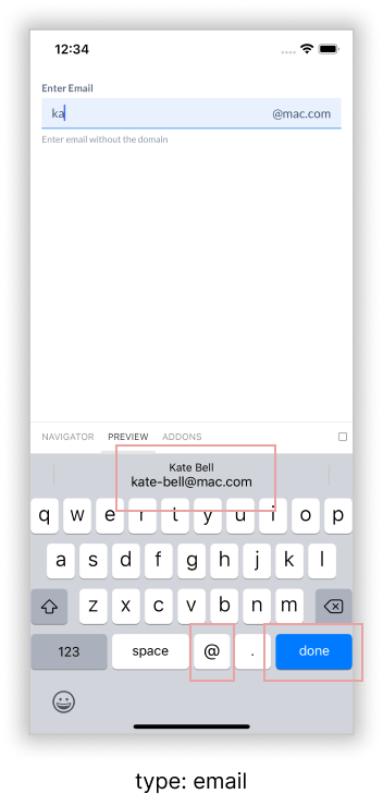
+
- f0b901d: chore: remove border from Badge component
|
|
8
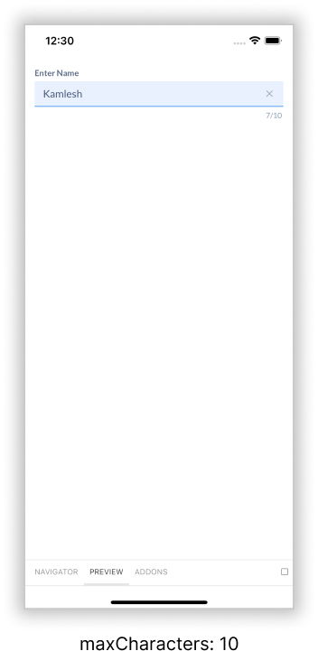
|
+
|
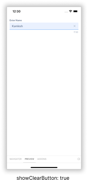
|
9
|
+
## 3.1.3
|
|
10
|
+
|
|
11
|
+
### Patch Changes
|
|
12
|
+
|
|
13
|
+
- 2576ce3: fix(link): add type prop for button variant
|
|
14
|
+
|
|
15
|
+
## 3.1.2
|
|
16
|
+
|
|
17
|
+
### Patch Changes
|
|
18
|
+
|
|
19
|
+
- ba0c74d: fix: use the correct maxWidth for OTPInput
|
|
20
|
+
|
|
21
|
+
## 3.1.1
|
|
22
|
+
|
|
23
|
+
### Patch Changes
|
|
24
|
+
|
|
25
|
+
- aee7e57: feat(Icons): add MinusIcon
|
|
26
|
+
|
|
27
|
+
## 3.1.0
|
|
28
|
+
|
|
29
|
+
### Minor Changes
|
|
30
|
+
|
|
31
|
+
- c3d9d2f: feat: add OTPInput component
|
|
32
|
+
|
|
33
|
+
## 3.0.0
|
|
34
|
+
|
|
35
|
+
### Major Changes
|
|
36
|
+
|
|
37
|
+
- 3aebc58: feat(Typography): make `size` prop consistent for `Heading`, `Title`, and `Text`
|
|
38
|
+
|
|
39
|
+
> **Warning**
|
|
40
|
+
>
|
|
41
|
+
> Breaking Change!
|
|
42
|
+
> This is a breaking change for apps that are using `Title` or `Heading` component from blade. Rest of the apps can upgrade without any migrations.
|
|
43
|
+
|
|
44
|
+
#### Migration
|
|
45
|
+
|
|
46
|
+
_**Tip:** If you're using TypeScript, run `yarn tsc` and that should throw errors wherever a change is required._
|
|
47
|
+
|
|
48
|
+
1. **`<Title />`:** Rename `variant` prop to `size` in Title
|
|
49
|
+
|
|
50
|
+
```diff
|
|
51
|
+
- <Title variant="small">Some Title</Title>
|
|
52
|
+
+ <Title size="small">Some Title</Title>
|
|
53
|
+
```
|
|
54
|
+
|
|
55
|
+
2. **`<Heading />`:** Rename `variant` prop to `size` if the value is `small`, `medium,` or `large`. No change is required on `variant="subheading"`.
|
|
56
|
+
|
|
57
|
+
```diff
|
|
58
|
+
<Heading variant="subheading">Nothing changes here</Heading> // No change here
|
|
59
|
+
|
|
60
|
+
- <Heading variant="medium">Medium Heading</Heading>
|
|
61
|
+
+ <Heading size="medium">Medium Heading</Heading>
|
|
62
|
+
```
|
|
63
|
+
|
|
64
|
+
##### Edge Cases
|
|
65
|
+
|
|
66
|
+
Make sure to follow migration on new component if `Title` or `Heading` from blade is overriden with styled-components.
|
|
67
|
+
|
|
68
|
+
```diff
|
|
69
|
+
const MyTitle = styled(Title)`
|
|
70
|
+
// some styles
|
|
71
|
+
`
|
|
72
|
+
|
|
73
|
+
- <MyTitle variant="large" />
|
|
74
|
+
+ <MyTitle size="large" />
|
|
75
|
+
```
|
|
76
|
+
|
|
77
|
+
- e16c154: feat(PasswordInput)!: rename from `PasswordField` to `PasswordInput`
|
|
78
|
+
|
|
79
|
+
#### Migration
|
|
80
|
+
|
|
81
|
+
> **Warning**
|
|
82
|
+
>
|
|
83
|
+
> Breaking change!
|
|
84
|
+
|
|
85
|
+
Rename occurences of `PasswordField` to `PasswordInput`, no changes in the API.
|
|
86
|
+
|
|
87
|
+
```diff
|
|
88
|
+
- PasswordField
|
|
89
|
+
+ PasswordInput
|
|
90
|
+
```
|
|
91
|
+
|
|
92
|
+
### Minor Changes
|
|
93
|
+
|
|
94
|
+
- eeba339: feat(Code): add `<Code />` component :shipit:
|
|
95
|
+
|
|
96
|
+
## 2.5.1
|
|
97
|
+
|
|
98
|
+
### Patch Changes
|
|
99
|
+
|
|
100
|
+
- 0ce8390: fix(BaseInput): use cursor not-allowed for disabled inputs
|
|
101
|
+
|
|
102
|
+
## 2.5.0
|
|
103
|
+
|
|
104
|
+
### Minor Changes
|
|
105
|
+
|
|
106
|
+
- d0017cd: feat(PasswordField): add final export :tada:
|
|
107
|
+
- adds a new `PasswordField` component
|
|
108
|
+
|
|
109
|
+
## 2.4.0
|
|
110
|
+
|
|
111
|
+
### Minor Changes
|
|
112
|
+
|
|
113
|
+
- bf92637: feat(blade): Improve platform types with TS 4.7
|
|
114
|
+
|
|
115
|
+
### Added support for platform dependant types
|
|
116
|
+
|
|
117
|
+
Migration Steps
|
|
118
|
+
|
|
119
|
+
1. Upgrade to TypeScript 4.7+
|
|
120
|
+
2. In `tsconfig.json` add `moduleSuffix: ['.web', '']` or `moduleSuffix: ['.native', '']` (depending on the platform)
|
|
121
|
+
|
|
122
|
+
```js
|
|
123
|
+
{
|
|
124
|
+
"compilerOptions": {
|
|
125
|
+
// For react-native use `.native`
|
|
126
|
+
// For web use `.web` extension
|
|
127
|
+
"moduleSuffixes": [".web", ""]
|
|
128
|
+
}
|
|
129
|
+
}
|
|
130
|
+
```
|
|
131
|
+
|
|
132
|
+
> **Note**:
|
|
133
|
+
> if you are on <TS 4.7 or don't specify the `moduleSuffixes` blade will fallback to resolving `web` types
|
|
134
|
+
|
|
135
|
+
## 2.3.0
|
|
136
|
+
|
|
137
|
+
### Minor Changes
|
|
138
|
+
|
|
139
|
+
- 887cd11: feat(blade): added TextArea component
|
|
140
|
+
|
|
141
|
+
## 2.2.2
|
|
142
|
+
|
|
143
|
+
### Patch Changes
|
|
144
|
+
|
|
145
|
+
- a8c5c08: tests: add tests for `TextInput`
|
|
146
|
+
fix: render clear button on mount when the `defaultValue` or `value` is passed
|
|
147
|
+
|
|
148
|
+
## 2.2.1
|
|
149
|
+
|
|
150
|
+
### Patch Changes
|
|
151
|
+
|
|
152
|
+
- 4b6bfda: fix: update spinner easing
|
|
153
|
+
|
|
154
|
+
## 2.2.0
|
|
155
|
+
|
|
156
|
+
### Minor Changes
|
|
157
|
+
|
|
158
|
+
- 7c272be: feat: add `Spinner` component
|
|
159
|
+
- Also adds an internal `BaseSpinner` component
|
|
160
|
+
|
|
161
|
+
## 2.1.0
|
|
162
|
+
|
|
163
|
+
### Minor Changes
|
|
164
|
+
|
|
165
|
+
- a6bf780: feat(TextInput): add TextInput Field
|
|
166
|
+
|
|
167
|
+
### This release publishes **`TextField`** Input
|
|
168
|
+
|
|
169
|
+
#### [Figma Link](https://www.figma.com/file/jubmQL9Z8V7881ayUD95ps/Blade---Payment-Light?node-id=10953%3A210737)
|
|
170
|
+
|
|
171
|
+
#### Capabilities
|
|
172
|
+
|
|
173
|
+
- Support for various `type` of TextInput i.e `'text' | 'telephone' | 'email' | 'url' | 'numeric' | 'search'`
|
|
174
|
+
- Automatically decide `keyboardType`, `keyboardReturnKeyType`, `autoCompleteSuggestionType` based on `type` attribute alone
|
|
175
|
+
|
|
176
|
+
|
|
177
|
+
|
|
178
|
+
- Max characters to be accepted by the input field which will in turn also render a counter
|
|
179
|
+
|
|
180
|
+
|
|
181
|
+
- Clear the content of the input field with the help of a clear button
|
|
182
|
+
|
|
183
|
+
|
|
184
|
+
- Attach `prefix` and `suffix` to the input field
|
|
185
|
+
- Fully Accessible
|
|
186
|
+
|
|
187
|
+
### Patch Changes
|
|
188
|
+
|
|
189
|
+
- a8c7620: ## Internal changes
|
|
190
|
+
|
|
191
|
+
tests(BaseInput): add web tests and fix onBlur
|
|
192
|
+
|
|
193
|
+
- Adds `onBlur`
|
|
194
|
+
|
|
195
|
+
- 1417e90: changed native text-input helptext color
|
|
196
|
+
|
|
197
|
+
## 2.0.0
|
|
198
|
+
|
|
199
|
+
### Major Changes
|
|
200
|
+
|
|
201
|
+
- cc4355a: feat(blade): added 2px spacing token
|
|
202
|
+
|
|
203
|
+
#### Breaking changes
|
|
204
|
+
|
|
205
|
+
> **Note**
|
|
206
|
+
>
|
|
207
|
+
> This breaking change affects you only if you're using the tokens directly somewhere. If you're only using the components then nothing needs to be updated at your end.
|
|
208
|
+
|
|
209
|
+
- Added 2px token, thus all spacing tokens have shifted by 1 step.
|
|
210
|
+
|
|
211
|
+
#### Migration steps
|
|
212
|
+
|
|
213
|
+
Shift every spacing token other than the first one (`0th` index) by +1
|
|
214
|
+
|
|
215
|
+
```diff
|
|
216
|
+
- <div style={{ margin: theme.spacing[1] }} />
|
|
217
|
+
+ <div style={{ margin: theme.spacing[2] }} />
|
|
218
|
+
```
|
|
219
|
+
|
|
220
|
+
### Patch Changes
|
|
221
|
+
|
|
222
|
+
- a402ef1: feat(icons): add `RefreshLeft` icon
|
|
223
|
+
|
|
224
|
+
## 1.1.0
|
|
225
|
+
|
|
226
|
+
### Minor Changes
|
|
227
|
+
|
|
228
|
+
- 5f1033c: feat: add `Alert` component :tada:
|
|
229
|
+
|
|
230
|
+
### Patch Changes
|
|
231
|
+
|
|
232
|
+
- cd5f61f: feat(tokens): add new tokens
|
|
233
|
+
- e8d932a: feat: add `blue` variant to `Badge`
|
|
234
|
+
- acfd566: feat(icons): arrow up and arrow left
|
|
235
|
+
|
|
236
|
+
## 1.0.2
|
|
237
|
+
|
|
238
|
+
### Patch Changes
|
|
239
|
+
|
|
240
|
+
- 771981c: fix(blade): radio & checkbox icon alignment
|
|
241
|
+
|
|
242
|
+
## 1.0.1
|
|
243
|
+
|
|
244
|
+
### Patch Changes
|
|
245
|
+
|
|
246
|
+
- ef7f459: fix: font weight of `Link` component
|
|
247
|
+
|
|
248
|
+
## 1.0.0
|
|
249
|
+
|
|
250
|
+
### Major Changes
|
|
251
|
+
|
|
252
|
+
- 51a6787: feat: add `Radio` & `RadioGroup` component
|
|
253
|
+
|
|
254
|
+
## ⚠️ Breaking change for `Checkbox`
|
|
255
|
+
|
|
256
|
+
- We've renamed the `neccessityIndicator` prop to `necessityIndicator` to fix a spelling error
|
|
257
|
+
|
|
258
|
+
- 65834be: fix: icon sizes for `Icon`, `IconButton`, `Button`, `Link` & `Spinner` components
|
|
259
|
+
|
|
260
|
+
## ⚠️ Breaking changes for `Icon`
|
|
261
|
+
|
|
262
|
+
**❗️This version introduces a breaking change for the `Icon` component's `size` prop**
|
|
263
|
+
|
|
264
|
+
Earlier, the `size` prop had the following size to pixel mapping:
|
|
265
|
+
|
|
266
|
+
- **xxsmall:** 10px
|
|
267
|
+
- **xsmall**: 12px
|
|
268
|
+
- **small**: 16px
|
|
269
|
+
- **medium**: 20px
|
|
270
|
+
- **large**: 24px
|
|
271
|
+
- **xlarge**: 32px
|
|
272
|
+
|
|
273
|
+
Now, the correct `size` prop will have the following size to pixel mapping:
|
|
274
|
+
|
|
275
|
+
- **xsmall**: 8px
|
|
276
|
+
- **small**: 12px
|
|
277
|
+
- **medium**: 16px
|
|
278
|
+
- **large**: 20px
|
|
279
|
+
- **xlarge**: 24px
|
|
280
|
+
- **2xlarge**: 32px
|
|
281
|
+
|
|
282
|
+
> ⚠️ `xxsmall` is not an accepted value anymore. Instead, we have a new acceptable value of `2xlarge`.
|
|
283
|
+
|
|
284
|
+
### Minor Changes
|
|
285
|
+
|
|
286
|
+
- 61a17fe: feat: add `Badge` component
|
|
287
|
+
|
|
288
|
+
## 0.13.6
|
|
289
|
+
|
|
290
|
+
### Patch Changes
|
|
291
|
+
|
|
292
|
+
- b365464: fix: button spinner layout
|
|
293
|
+
- f3abfbe: feat(Icons): add new icons
|
|
294
|
+
|
|
295
|
+
## 0.13.5
|
|
296
|
+
|
|
297
|
+
### Patch Changes
|
|
298
|
+
|
|
299
|
+
- 7909d7c: fix(blade): Checkbox design changes
|
|
300
|
+
|
|
301
|
+
## 0.13.4
|
|
302
|
+
|
|
303
|
+
### Patch Changes
|
|
304
|
+
|
|
305
|
+
- 2778973: chore: add appropriate types for onClick of Button & BaseButton
|
|
306
|
+
|
|
307
|
+
## 0.13.3
|
|
308
|
+
|
|
309
|
+
### Patch Changes
|
|
310
|
+
|
|
311
|
+
- 3ea6d6c: fix(blade): fixes checkbox helptext and errortext alignment for individual checkboxes
|
|
312
|
+
|
|
313
|
+
## 0.13.2
|
|
314
|
+
|
|
315
|
+
### Patch Changes
|
|
316
|
+
|
|
317
|
+
- 17b2c71: fix: button styling for native
|
|
318
|
+
|
|
319
|
+
## 0.13.1
|
|
320
|
+
|
|
321
|
+
### Patch Changes
|
|
322
|
+
|
|
323
|
+
- 985f82a: refactor: use Box component on BaseButton
|
|
324
|
+
|
|
325
|
+
## 0.13.0
|
|
326
|
+
|
|
327
|
+
### Minor Changes
|
|
328
|
+
|
|
329
|
+
- b8cc7df: feat: add checkbox component
|
|
330
|
+
- eb65c30: feat: add support for css theme variables
|
|
331
|
+
- f61675e: feat: add `Link` & `BaseLink` components
|
|
332
|
+
|
|
333
|
+
## 0.12.0
|
|
334
|
+
|
|
335
|
+
### Minor Changes
|
|
336
|
+
|
|
337
|
+
- 381e9c7: fix(Blade): add `size` prop to Text component and update tokens
|
|
338
|
+
|
|
339
|
+
This PR updates the typography tokens scale for mobile devices to create better visual hierarchy which we received as feedback from other teams as well.
|
|
340
|
+
|
|
341
|
+
It also adds a new `size` prop to `Text` component for `variant='body'`
|
|
342
|
+
|
|
343
|
+
## 0.11.4
|
|
344
|
+
|
|
345
|
+
### Patch Changes
|
|
346
|
+
|
|
347
|
+
- 66f9b24: feat(tokens): add new tokens
|
|
348
|
+
|
|
349
|
+
## 0.11.3
|
|
350
|
+
|
|
351
|
+
### Patch Changes
|
|
352
|
+
|
|
353
|
+
- e0a2631: feat: add Download, Edit, History, Plus, Pause, & Trash icons
|
|
354
|
+
|
|
355
|
+
## 0.11.2
|
|
356
|
+
|
|
357
|
+
### Patch Changes
|
|
358
|
+
|
|
359
|
+
- b2b86b4: fix: SkipNav export
|
|
360
|
+
|
|
361
|
+
## 0.11.1
|
|
362
|
+
|
|
363
|
+
### Patch Changes
|
|
364
|
+
|
|
365
|
+
- 873676f: fix: button export to components
|
|
366
|
+
|
|
367
|
+
## 0.11.0
|
|
368
|
+
|
|
369
|
+
### Minor Changes
|
|
370
|
+
|
|
371
|
+
- 5d022f4: feat: add `Button` component
|
|
372
|
+
|
|
373
|
+
### Patch Changes
|
|
374
|
+
|
|
375
|
+
- cddd298: chore: update currency icons
|
|
376
|
+
|
|
377
|
+
## 0.10.1
|
|
378
|
+
|
|
379
|
+
### Patch Changes
|
|
380
|
+
|
|
381
|
+
- 7b9baf7: fix(blade): broken gray color types in theme.d.ts file
|
|
382
|
+
|
|
383
|
+
## 0.10.0
|
|
384
|
+
|
|
385
|
+
### Minor Changes
|
|
386
|
+
|
|
387
|
+
- a800a96: feat(blade): added makeAccessible function
|
|
388
|
+
|
|
389
|
+
makeAccessible function is a compatibility layer between web & native for accessibility props
|
|
390
|
+
More [info in RFC](https://github.com/razorpay/blade/blob/master/rfcs/2022-04-09-accessibility.md#platform-specific-implementation--5)
|
|
391
|
+
|
|
392
|
+
### Patch Changes
|
|
393
|
+
|
|
394
|
+
- a800a96: fix(blade): added aria hidden in icons
|
|
395
|
+
|
|
396
|
+
## 0.9.0
|
|
397
|
+
|
|
398
|
+
### Minor Changes
|
|
399
|
+
|
|
400
|
+
- 0c3a951: feat(blade): Added SkipNav component
|
|
401
|
+
|
|
402
|
+
Learn more about [Skip Navigations in Accessibility RFC](https://github.com/razorpay/blade/blob/master/rfcs/2022-04-09-accessibility.md#skip-navigations)
|
|
403
|
+
|
|
404
|
+
- 5c750bb: feat(blade): add VisuallyHidden component
|
|
405
|
+
|
|
406
|
+
This component is used specifically when you want to hide certain things visually for people who are not visually impaired but also want to make your content is accessible to visually impaired people via assistive technologies.
|
|
407
|
+
|
|
408
|
+
You can play around with it on [Storybook](https://master--61c19ee8d3d282003ac1d81c.chromatic.com/?path=/docs/components-accessibility-visuallyhidden--visually-hidden)
|
|
409
|
+
|
|
410
|
+
## 0.8.0
|
|
411
|
+
|
|
412
|
+
### Minor Changes
|
|
413
|
+
|
|
414
|
+
- 002fce2: fix: icon colors & remove `surface.action.icon.link.*` colors from `theme`
|
|
415
|
+
|
|
416
|
+
## Breaking Changes
|
|
417
|
+
|
|
418
|
+
- Remove the following tokens from `paymentTheme` & `bankingTheme` theme of Blade:
|
|
419
|
+
|
|
420
|
+
- `colors.surface.action.icon.link.default.lowContrast`
|
|
421
|
+
- `colors.surface.action.icon.link.default.highContrast`
|
|
422
|
+
- `colors.surface.action.icon.link.hover.lowContrast`
|
|
423
|
+
- `colors.surface.action.icon.link.hover.highContrast`
|
|
424
|
+
- `colors.surface.action.icon.link.focus.lowContrast`
|
|
425
|
+
- `colors.surface.action.icon.link.focus.highContrast`
|
|
426
|
+
- `colors.surface.action.icon.link.active.lowContrast`
|
|
427
|
+
- `colors.surface.action.icon.link.active.highContrast`
|
|
428
|
+
- `colors.surface.action.icon.link.disabled.lowContrast`
|
|
429
|
+
- `colors.surface.action.icon.link.disabled.highContrast`
|
|
430
|
+
|
|
431
|
+
If you are using any of these tokens, they will no longer be available in your `theme`. Make sure you remove usage of these tokens from your codebase.
|
|
432
|
+
|
|
433
|
+
## Fixes
|
|
434
|
+
|
|
435
|
+
1. Fix incorrect Icon colors that were supported & suggested by TypeScript
|
|
436
|
+
|
|
437
|
+
## 0.7.2
|
|
438
|
+
|
|
439
|
+
### Patch Changes
|
|
440
|
+
|
|
441
|
+
- 9f0bb83: feat: add Dollar, ChevronUp, ChevronDown, ChevronLeft, ChevronRight, Eye, EyeOff, Close icons
|
|
442
|
+
|
|
443
|
+
## 0.7.1
|
|
444
|
+
|
|
445
|
+
### Patch Changes
|
|
446
|
+
|
|
447
|
+
- 25a7b89: fix(blade): add contrast prop to Typography components
|
|
448
|
+
|
|
449
|
+
Add `contrast` prop to all the Typography components so that consumers can change the intent to grab the attention towards the text. The possible values for `contrast` are `high` or `low` and accordingly the color token will be used to set the color of the Typography components
|
|
450
|
+
|
|
451
|
+
## 0.7.0
|
|
452
|
+
|
|
453
|
+
### Minor Changes
|
|
454
|
+
|
|
455
|
+
- 52efedb: fix(blade): set defaults for all typography components
|
|
456
|
+
|
|
457
|
+
Make all the props optional to have a better DX and add default values for all the important props
|
|
458
|
+
|
|
459
|
+
## 0.6.0
|
|
460
|
+
|
|
461
|
+
### Minor Changes
|
|
462
|
+
|
|
463
|
+
- e352eef: fix(blade): add `Heading` component
|
|
464
|
+
|
|
465
|
+
## 0.5.0
|
|
466
|
+
|
|
467
|
+
### Minor Changes
|
|
468
|
+
|
|
469
|
+
- 75882a7: feat(Blade): add `Title`component
|
|
470
|
+
|
|
471
|
+
The API for `Title` component can be found under [Typography/Text/\_decisions](https://github.com/razorpay/blade/blob/master/packages/blade/src/components/Typography/_decisions/decisions.md)
|
|
472
|
+
|
|
473
|
+
## 0.4.0
|
|
474
|
+
|
|
475
|
+
### Minor Changes
|
|
476
|
+
|
|
477
|
+
- 294173e: - Add the following components that would act as building blocks for our icons:
|
|
478
|
+
1. `Svg`
|
|
479
|
+
2. `Path`
|
|
480
|
+
3. `Rect`
|
|
481
|
+
4. `Defs`
|
|
482
|
+
5. `ClipPath`
|
|
483
|
+
6. `G`
|
|
484
|
+
- Add `CreditCardIcon` component
|
|
485
|
+
- Add `RupeeIcon` component
|
|
486
|
+
|
|
487
|
+
### Patch Changes
|
|
488
|
+
|
|
489
|
+
- e76cd01: feat/add-text-component
|
|
490
|
+
|
|
491
|
+
## 0.3.0
|
|
492
|
+
|
|
493
|
+
### Minor Changes
|
|
494
|
+
|
|
495
|
+
- a20b608: feat(blade): add motion tokens
|
|
496
|
+
|
|
497
|
+
### Motion tokens
|
|
498
|
+
|
|
499
|
+
We have added tokens for
|
|
500
|
+
|
|
501
|
+
1. Delay
|
|
502
|
+
2. Duration
|
|
503
|
+
3. Easing
|
|
504
|
+
|
|
505
|
+
You can find a detailed RFC for motion here: [View Formatted RFC](https://github.com/razorpay/blade/blob/rfc/2022-03-22-motion-rfc/rfcs/2022-03-22-motion-rfc.md)
|
|
506
|
+
|
|
507
|
+
## 0.2.0
|
|
508
|
+
|
|
509
|
+
### Minor Changes
|
|
510
|
+
|
|
511
|
+
- 6885ac3: feat(blade): add BaseText component
|
|
512
|
+
|
|
513
|
+
## 0.1.6
|
|
514
|
+
|
|
515
|
+
### Patch Changes
|
|
516
|
+
|
|
517
|
+
- 33e3930: feat(blade): add listener for toggling breakpoints
|
|
518
|
+
|
|
519
|
+
**Updates**
|
|
520
|
+
|
|
521
|
+
- Add `breakpoints` token to the themes.
|
|
522
|
+
- Out of the box responsiveness support for typography tokens.
|
|
523
|
+
- Publish `useBreakpoint` hook.
|
|
524
|
+
- Following breakpoints are supported as of today.
|
|
525
|
+
```
|
|
526
|
+
/** max width: 320px */
|
|
527
|
+
xs: 320;
|
|
528
|
+
/** min width: 321px and max width: 480px */
|
|
529
|
+
s: 480;
|
|
530
|
+
/** min width: 481px and max width: 768px */
|
|
531
|
+
m: 768;
|
|
532
|
+
/** min width: 769 and max width: 1024px */
|
|
533
|
+
l: 1024;
|
|
534
|
+
/** min width: 1025 and max width: 1200px */
|
|
535
|
+
xl: 1200;
|
|
536
|
+
/** min width: 1201px */
|
|
537
|
+
max: 1201;
|
|
538
|
+
```
|
|
539
|
+
- For web the typography scale will toggle between mobile and desktop
|
|
540
|
+
- `xs, s, m` are considered as mobile
|
|
541
|
+
- `l, xl, xl` are considered as desktop
|
|
542
|
+
- For react native we always default to mobile typography scale
|
|
543
|
+
|
|
544
|
+
**What does it mean for me(as a developer)?**
|
|
545
|
+
|
|
546
|
+
- If you’re already using Blade tokens then you can leverage this by just running `yarn upgrade @razorpay/blade@0.1.6` and that’s it you are set 🚀
|
|
547
|
+
- You can use the typography tokens as you were doing previously. Refer the [usage guideline here](https://61c19ee8d3d282003ac1d81c-jukcfyruls.chromatic.com/?path=/story/guides-usage--page&globals=measureEnabled:false#tokens)
|
|
548
|
+
- You can use these `breakpoints` as a base reference to build your next set of features by just following the [usage guidelines here](https://61c19ee8d3d282003ac1d81c-jukcfyruls.chromatic.com/?path=/story/tokens-breakpoints--page&globals=measureEnabled:false).
|
|
549
|
+
|
|
550
|
+
This is our first step towards building responsive and adaptive applications. We’ll be publishing Typography Components next which will be built on top of these tokens and you can use them directly for your projects. Meanwhile, [read more about our responsive and adaptive strategy in this RFC](https://github.com/razorpay/blade/blob/master/rfcs/2022-02-11-responsive-and-adaptive-layout-strategy.md)
|
|
551
|
+
|
|
552
|
+
## 0.1.5
|
|
553
|
+
|
|
554
|
+
### Patch Changes
|
|
555
|
+
|
|
556
|
+
- 04677a3: fix(blade): add lineheight tokens
|
|
557
|
+
|
|
558
|
+
## 0.1.4
|
|
559
|
+
|
|
560
|
+
### Patch Changes
|
|
561
|
+
|
|
562
|
+
- f992f77: fix(blade): typo in exports field
|
|
563
|
+
|
|
564
|
+
## 0.1.3
|
|
565
|
+
|
|
566
|
+
### Patch Changes
|
|
567
|
+
|
|
568
|
+
- d32dd9d: fix(blade): add overlay color token
|
|
569
|
+
|
|
570
|
+
## 0.1.2
|
|
571
|
+
|
|
572
|
+
### Patch Changes
|
|
573
|
+
|
|
574
|
+
- 8cddfad: fix(blade): update desktop typography scale
|
|
575
|
+
|
|
576
|
+
## 0.1.1
|
|
577
|
+
|
|
578
|
+
### Patch Changes
|
|
579
|
+
|
|
580
|
+
- 6c69a4d: fix(blade): update imports and exports
|
|
581
|
+
|
|
582
|
+
## 0.1.0
|
|
583
|
+
|
|
584
|
+
### Minor Changes
|
|
585
|
+
|
|
586
|
+
- de4124f: ### ⚠️ **Breaking Change** ⚠️
|
|
587
|
+
This PR introduces a major breaking change on how we access tokens.
|
|
588
|
+
|
|
589
|
+
### Why did we want to change the way we access tokens?
|
|
590
|
+
|
|
591
|
+
So, previously if you had to start consuming tokens from the new version of Blade you start with importing the theme provider:
|
|
592
|
+
|
|
593
|
+
```jsx
|
|
594
|
+
// App entry point
|
|
595
|
+
import { ThemeProvider } from '@razorpay/blade/components';
|
|
596
|
+
import { paymentTheme } from '@razorpay/blade/tokens';
|
|
597
|
+
|
|
598
|
+
function App(): JSX.Element {
|
|
599
|
+
return (
|
|
600
|
+
<React.Fragment>
|
|
601
|
+
<GlobalStyle />
|
|
602
|
+
<ThemeProvider theme={paymentTheme}>
|
|
603
|
+
<Card />
|
|
604
|
+
</ThemeProvider>
|
|
605
|
+
</React.Fragment>
|
|
606
|
+
);
|
|
607
|
+
}
|
|
608
|
+
|
|
609
|
+
export default App;
|
|
610
|
+
```
|
|
611
|
+
|
|
612
|
+
And then in one of our components, we'll use the `useTheme()` hook to get the theme and the mode like following 👇
|
|
613
|
+
|
|
614
|
+
```jsx
|
|
615
|
+
const StyledCard = styled.div(
|
|
616
|
+
({ theme }: { theme: Theme }) => `
|
|
617
|
+
width: 368px;
|
|
618
|
+
background-color: ${theme.colors.surface.background.level2.lowContrast.onLight};
|
|
619
|
+
border-radius: ${theme.border.radius.medium}px;
|
|
620
|
+
box-shadow: ${theme.shadows.offsetX.level[1]}px ${theme.shadows.offsetY.level[1]}px ${theme.shadows.blurRadius.level[1]}px ${theme.shadows.color.level[1].onLight}, ${theme.shadows.offsetX.level[1]}px ${theme.shadows.offsetY.level[1]}px ${theme.shadows.blurRadius.level[1]}px ${theme.shadows.color.level[1].onLight};
|
|
621
|
+
padding: ${theme.spacing[5]}px;
|
|
622
|
+
display: flex;
|
|
623
|
+
flex-direction: column;
|
|
624
|
+
`,
|
|
625
|
+
);
|
|
626
|
+
|
|
627
|
+
const Card = (): React.ReactElement => {
|
|
628
|
+
const { theme } = useTheme();
|
|
629
|
+
return (
|
|
630
|
+
<React.Fragment>
|
|
631
|
+
<DisplayLarge theme={theme}>Cash Advance </DisplayLarge>
|
|
632
|
+
<StyledCard theme={theme}>
|
|
633
|
+
<AlertInformation theme={theme}>
|
|
634
|
+
The interest charged will be deposited back into your bank account within a day of
|
|
635
|
+
repayment.
|
|
636
|
+
</AlertInformation>
|
|
637
|
+
<Divider theme={theme} />
|
|
638
|
+
<CaptionRegular theme={theme}>
|
|
639
|
+
This amount will be deducted in 3 installments from your settlement balance between Feb
|
|
640
|
+
18-20 on a daily basis.
|
|
641
|
+
</CaptionRegular>
|
|
642
|
+
</StyledCard>
|
|
643
|
+
</React.Fragment>
|
|
644
|
+
);
|
|
645
|
+
};
|
|
646
|
+
```
|
|
647
|
+
|
|
648
|
+
#### Problem with the existing implementation:
|
|
649
|
+
|
|
650
|
+
So we pass the raw theme tokens which have everything light mode colors, dark mode colors. Different typography scales for desktop, mobile, etc. But as a consumer look at how do we access the tokens from the above file
|
|
651
|
+
|
|
652
|
+
```jsx
|
|
653
|
+
|
|
654
|
+
const { theme } = useTheme();
|
|
655
|
+
|
|
656
|
+
background-color: ${theme.colors.surface.background.level2.lowContrast.onLight};
|
|
657
|
+
font-size: ${theme.typography.desktop.fonts.size[200]}px;
|
|
658
|
+
```
|
|
659
|
+
|
|
660
|
+
- Isn't it weird to explicitly write `onLight`/`onDark` by hand while accessing color tokens?
|
|
661
|
+
- Isn't it weird to explicitly write `desktop` to access the typography scale for desktop?
|
|
662
|
+
- How would you as a developer change things let's say if the user toggles the color mode?
|
|
663
|
+
- How would you as a developer change the typography scale if the user switches from desktop to mobile or vice-versa?
|
|
664
|
+
|
|
665
|
+
You can't! Because we have **hardcoded** the object properties and which means we lost the power of dynamically changing these things based on the user's behavior which is incorrect.
|
|
666
|
+
|
|
667
|
+
#### What is the root cause of this issue?
|
|
668
|
+
|
|
669
|
+
The root cause is the mental model of how we store tokens and how do we consume them. Typically our tokens are nothing but our design decisions. So this means we need to store every decision in our token file, for eg: light mode colors, dark mode colors, typography scale for desktop, typography scale for mobile but when we consume them we want the system to take care of these things and give us single value for the modes and the platform.
|
|
670
|
+
|
|
671
|
+
So we want something like this 👇
|
|
672
|
+
|
|
673
|
+
```diff
|
|
674
|
+
|
|
675
|
+
const { theme } = useTheme();
|
|
676
|
+
|
|
677
|
+
-background-color: ${theme.colors.surface.background.level2.lowContrast.onLight};
|
|
678
|
+
+background-color: ${theme.colors.surface.background.level2.lowContrast};
|
|
679
|
+
-font-size: ${theme.typography.desktop.fonts.size[200]}px;
|
|
680
|
+
+font-size: ${theme.typography.fonts.size[200]}px;
|
|
681
|
+
```
|
|
682
|
+
|
|
683
|
+
Notice the removal of **`onLight`** and **`desktop`** keys from the theme object.
|
|
684
|
+
|
|
685
|
+
So we want our system to behave in such a manner that:
|
|
686
|
+
|
|
687
|
+
- We input the raw theme(which has color modes and platform types)
|
|
688
|
+
- It will output the flat theme which will have color mode and platform type selected, so we don't have to hardcode `onLight`/`onDark` or `desktop`/`mobile`.
|
|
689
|
+
|
|
690
|
+
### What is the solution?
|
|
691
|
+
|
|
692
|
+
The system we spoke about is nothing but our `BladeProvider`(previously known as `ThemeProvider`). It'll accept the raw theme as a prop and then based on the device type and color mode pick those values from `themeTokens` and set it in the context as `theme`. We can then use `useTheme()` hook to get the theme from the context which will be flattened.
|
|
693
|
+
|
|
694
|
+
This is how things will look after this change 👇
|
|
695
|
+
|
|
696
|
+
```diff
|
|
697
|
+
// App entry point
|
|
698
|
+
-import { ThemeProvider } from '@razorpay/blade/components';
|
|
699
|
+
+import { BladeProvider } from '@razorpay/blade/components';
|
|
700
|
+
import { paymentTheme } from '@razorpay/blade/tokens';
|
|
701
|
+
|
|
702
|
+
function App(): JSX.Element {
|
|
703
|
+
return (
|
|
704
|
+
<React.Fragment>
|
|
705
|
+
<GlobalStyle />
|
|
706
|
+
- <ThemeProvider theme={paymentTheme}>
|
|
707
|
+
+ <BladeProvider themeTokens={paymentTheme}>
|
|
708
|
+
<Card />
|
|
709
|
+
- </ThemeProvider>
|
|
710
|
+
+ </BladeProvider>
|
|
711
|
+
</React.Fragment>
|
|
712
|
+
);
|
|
713
|
+
}
|
|
714
|
+
|
|
715
|
+
export default App;
|
|
716
|
+
|
|
717
|
+
// somewhere in the app
|
|
718
|
+
const { theme } = useTheme();
|
|
719
|
+
|
|
720
|
+
-background-color: ${theme.colors.surface.background.level2.lowContrast.onLight};
|
|
721
|
+
+background-color: ${theme.colors.surface.background.level2.lowContrast};
|
|
722
|
+
-font-size: ${theme.typography.desktop.fonts.size[200]}px;
|
|
723
|
+
+font-size: ${theme.typography.fonts.size[200]}px;
|
|
724
|
+
```
|
|
725
|
+
|
|
726
|
+
### Migration guide for apps using the older version
|
|
727
|
+
|
|
728
|
+
1. Rename **ThemeProvider** to **BladeProvider**
|
|
729
|
+
|
|
730
|
+
```diff
|
|
731
|
+
-import { ThemeProvider } from '@razorpay/blade/components';
|
|
732
|
+
+import { BladeProvider } from '@razorpay/blade/components';
|
|
733
|
+
```
|
|
734
|
+
|
|
735
|
+
2. Rename `theme` prop on provider to `themeTokens`
|
|
736
|
+
|
|
737
|
+
```diff
|
|
738
|
+
-<BladeProvider theme={paymentTheme}>
|
|
739
|
+
+<BladeProvider themeTokens={paymentTheme}>
|
|
740
|
+
```
|
|
741
|
+
|
|
742
|
+
3. import `Theme` type to be imported from `@razorpay/blade/components` instead of `@razorpay/blade/tokens`
|
|
743
|
+
|
|
744
|
+
```diff
|
|
745
|
+
-import type { Theme } from '@razorpay/blade/tokens';
|
|
746
|
+
+import type { Theme } from '@razorpay/blade/components';
|
|
747
|
+
```
|
|
748
|
+
|
|
749
|
+
4. Remove all the `onLight`/`onDark` keywords from the theme colors object
|
|
750
|
+
|
|
751
|
+
```diff
|
|
752
|
+
-background-color: ${theme.colors.surface.background.level2.lowContrast.onLight};
|
|
753
|
+
+background-color: ${theme.colors.surface.background.level2.lowContrast};
|
|
754
|
+
```
|
|
755
|
+
|
|
756
|
+
5. Remove all the `desktop`/`mobile` keywords from the theme typography object
|
|
757
|
+
|
|
758
|
+
```diff
|
|
759
|
+
-background-color: ${theme.colors.surface.background.level2.lowContrast.onLight};
|
|
760
|
+
+background-color: ${theme.colors.surface.background.level2.lowContrast};
|
|
761
|
+
```
|
|
762
|
+
|
|
763
|
+
## 0.0.8
|
|
764
|
+
|
|
765
|
+
### Patch Changes
|
|
766
|
+
|
|
767
|
+
- 7a09800: fix(blade): add description in token types
|
|
768
|
+
|
|
769
|
+
## 0.0.7
|
|
770
|
+
|
|
771
|
+
### Patch Changes
|
|
772
|
+
|
|
773
|
+
- 1aa2961: fix(blade): export all the types of global tokens for consumers
|
|
774
|
+
- d8d8027: fix(blade): typo in color tokens
|
|
775
|
+
|
|
776
|
+
## 0.0.6
|
|
777
|
+
|
|
778
|
+
### Patch Changes
|
|
779
|
+
|
|
780
|
+
- 8374dc1: build(blade): generate root `.d.ts`
|
|
781
|
+
|
|
782
|
+
## 0.0.5
|
|
783
|
+
|
|
784
|
+
### Patch Changes
|
|
785
|
+
|
|
786
|
+
- 057cf66: build(blade): add re-exports to `.ts` instead of `.js`
|
|
787
|
+
|
|
788
|
+
## 0.0.4
|
|
789
|
+
|
|
790
|
+
### Patch Changes
|
|
791
|
+
|
|
792
|
+
- efb59d9: feat(blade): add type generation scripts
|
|
793
|
+
|
|
794
|
+
## 0.0.3
|
|
795
|
+
|
|
796
|
+
### Patch Changes
|
|
797
|
+
|
|
798
|
+
- f0b2b01: fix(blade): typo in exports field
|
|
799
|
+
|
|
800
|
+
## 0.0.2
|
|
801
|
+
|
|
802
|
+
### Patch Changes
|
|
803
|
+
|
|
804
|
+
- 55ac5d3: feat(blade): add rollup to build blade
|