@primereact/ui 11.0.0-rc.4 → 11.1.0
This diff represents the content of publicly available package versions that have been released to one of the supported registries. The information contained in this diff is provided for informational purposes only and reflects changes between package versions as they appear in their respective public registries.
- package/README.md +27 -11
- package/package.json +3 -3
package/README.md
CHANGED
|
@@ -1,24 +1,40 @@
|
|
|
1
|
-
|
|
1
|
+
[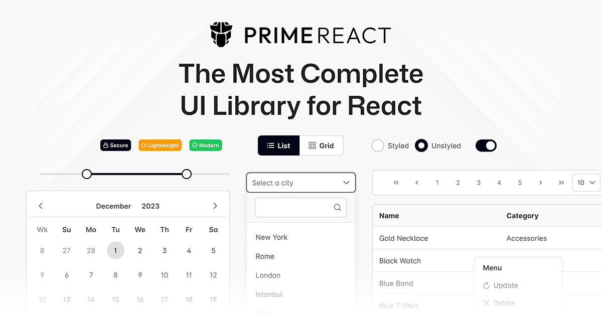](https://primereact.dev)
|
|
2
2
|
|
|
3
|
-
|
|
3
|
+
# @primereact/ui
|
|
4
4
|
|
|
5
|
-
|
|
5
|
+
Themed React components, ready to use. Pairs the `primereact` primitives with `@primereact/styles`, so one PrimeUIX preset styles the whole application.
|
|
6
6
|
|
|
7
|
-
|
|
7
|
+
```bash
|
|
8
|
+
npm install @primereact/ui @primeuix/themes @primeicons/react
|
|
9
|
+
```
|
|
10
|
+
|
|
11
|
+
## Usage
|
|
12
|
+
|
|
13
|
+
The application is wrapped once with `PrimeReactProvider`, which takes the theme preset and a [PrimeUI license](https://primeui.dev/pricing) key. Components are imported from their own subpaths.
|
|
8
14
|
|
|
9
15
|
```tsx
|
|
16
|
+
'use client';
|
|
17
|
+
import { PrimeReactProvider } from '@primereact/core';
|
|
10
18
|
import { Button } from '@primereact/ui/button';
|
|
11
|
-
import
|
|
12
|
-
|
|
19
|
+
import Aura from '@primeuix/themes/aura';
|
|
20
|
+
|
|
21
|
+
export function App() {
|
|
22
|
+
return (
|
|
23
|
+
<PrimeReactProvider theme={{ preset: Aura }} license="PrimeUI-Commercial-Key...">
|
|
24
|
+
<Button>Submit</Button>
|
|
25
|
+
</PrimeReactProvider>
|
|
26
|
+
);
|
|
27
|
+
}
|
|
13
28
|
```
|
|
14
29
|
|
|
15
|
-
|
|
30
|
+
Appearance changes globally by swapping the preset, or per element through Pass Through. `pt={{ root: { className: 'my-button' } }}` reaches any internal DOM node without forking the component.
|
|
16
31
|
|
|
17
|
-
|
|
18
|
-
<Button label="Save" pt={{ root: { className: 'my-custom-button' } }} />
|
|
19
|
-
```
|
|
32
|
+
## Documentation
|
|
20
33
|
|
|
21
|
-
|
|
34
|
+
- [Installation](https://primereact.dev/docs/styled/guides/installation)
|
|
35
|
+
- [Components](https://primereact.dev/docs/styled/components/autocomplete)
|
|
36
|
+
- [Theming](https://primereact.dev/docs/styled/guides/theming/styled)
|
|
37
|
+
- [MCP server](https://www.npmjs.com/package/@primereact/mcp)
|
|
22
38
|
|
|
23
39
|
## License
|
|
24
40
|
|
package/package.json
CHANGED
|
@@ -1,6 +1,6 @@
|
|
|
1
1
|
{
|
|
2
2
|
"name": "@primereact/ui",
|
|
3
|
-
"version": "11.
|
|
3
|
+
"version": "11.1.0",
|
|
4
4
|
"author": "PrimeTek Informatics",
|
|
5
5
|
"description": "A UI component library for React.",
|
|
6
6
|
"homepage": "https://primereact.dev",
|
|
@@ -28,8 +28,8 @@
|
|
|
28
28
|
"access": "public"
|
|
29
29
|
},
|
|
30
30
|
"dependencies": {
|
|
31
|
-
"primereact": "11.
|
|
32
|
-
"
|
|
31
|
+
"@primereact/styles": "11.1.0",
|
|
32
|
+
"primereact": "11.1.0"
|
|
33
33
|
},
|
|
34
34
|
"peerDependencies": {
|
|
35
35
|
"react": ">=19.0.0"
|