@primereact/mcp 11.0.0 → 11.2.0
This diff represents the content of publicly available package versions that have been released to one of the supported registries. The information contained in this diff is provided for informational purposes only and reflects changes between package versions as they appear in their respective public registries.
- package/data/llms/headless/components/accordion/api.json +9 -9
- package/data/llms/headless/components/animateonscroll/api.json +2 -2
- package/data/llms/headless/components/autocomplete/api.json +33 -33
- package/data/llms/headless/components/avatar/api.json +1 -1
- package/data/llms/headless/components/carousel/api.json +15 -15
- package/data/llms/headless/components/checkbox/api.json +18 -18
- package/data/llms/headless/components/collapsible/api.json +14 -14
- package/data/llms/headless/components/compare/api.json +3 -3
- package/data/llms/headless/components/contextmenu/api.json +2 -2
- package/data/llms/headless/components/datatable/api.json +19 -19
- package/data/llms/headless/components/dataview/api.json +3 -3
- package/data/llms/headless/components/datepicker/api.json +43 -43
- package/data/llms/headless/components/dialog/api.json +19 -19
- package/data/llms/headless/components/divider/api.json +3 -3
- package/data/llms/headless/components/drawer/api.json +13 -13
- package/data/llms/headless/components/fieldset/api.json +9 -9
- package/data/llms/headless/components/fileupload/api.json +5 -5
- package/data/llms/headless/components/focustrap/api.json +4 -4
- package/data/llms/headless/components/gallery/api.json +23 -23
- package/data/llms/headless/components/inplace/api.json +3 -3
- package/data/llms/headless/components/inputcolor/api.json +6 -6
- package/data/llms/headless/components/inputcolor.md +0 -1
- package/data/llms/headless/components/inputnumber/api.json +8 -8
- package/data/llms/headless/components/inputotp/api.json +7 -7
- package/data/llms/headless/components/inputpassword/api.json +4 -4
- package/data/llms/headless/components/inputpassword.md +3 -3
- package/data/llms/headless/components/inputtags/api.json +8 -8
- package/data/llms/headless/components/inputtext/api.json +1 -1
- package/data/llms/headless/components/knob/api.json +18 -18
- package/data/llms/headless/components/listbox/api.json +27 -27
- package/data/llms/headless/components/menu/api.json +10 -10
- package/data/llms/headless/components/message/api.json +1 -1
- package/data/llms/headless/components/metergroup/api.json +3 -3
- package/data/llms/headless/components/motion/api.json +1 -1
- package/data/llms/headless/components/navigationmenu/api.json +5 -5
- package/data/llms/headless/components/orderlist/api.json +5 -5
- package/data/llms/headless/components/organizationchart/api.json +6 -6
- package/data/llms/headless/components/paginator/api.json +5 -5
- package/data/llms/headless/components/panel/api.json +9 -9
- package/data/llms/headless/components/picklist/api.json +5 -5
- package/data/llms/headless/components/popover/api.json +16 -16
- package/data/llms/headless/components/positioner/api.json +7 -7
- package/data/llms/headless/components/progressbar/api.json +3 -3
- package/data/llms/headless/components/progressspinner/api.json +3 -3
- package/data/llms/headless/components/radiobutton/api.json +16 -16
- package/data/llms/headless/components/rating/api.json +5 -5
- package/data/llms/headless/components/scrollarea/api.json +6 -6
- package/data/llms/headless/components/select/api.json +34 -34
- package/data/llms/headless/components/sidebar/api.json +1116 -141
- package/data/llms/headless/components/sidebar.md +4 -2
- package/data/llms/headless/components/slider/api.json +3 -3
- package/data/llms/headless/components/speeddial/api.json +4 -4
- package/data/llms/headless/components/splitter/api.json +5 -5
- package/data/llms/headless/components/stepper/api.json +13 -13
- package/data/llms/headless/components/styleclass/api.json +1 -1
- package/data/llms/headless/components/tabs/api.json +17 -17
- package/data/llms/headless/components/terminal/api.json +1 -1
- package/data/llms/headless/components/toast/api.json +4 -4
- package/data/llms/headless/components/togglebutton/api.json +27 -3
- package/data/llms/headless/components/toggleswitch/api.json +3 -3
- package/data/llms/headless/components/tooltip/api.json +17 -17
- package/data/llms/headless/components/tree/api.json +20 -20
- package/data/llms/headless/components/tree.md +1 -0
- package/data/llms/headless/components/treetable/api.json +19 -19
- package/data/llms/headless/guides/misc/internationalization.md +282 -0
- package/data/llms/hooks/use-filter.md +2 -2
- package/data/llms/hooks/use-tree-filter.md +3 -1
- package/data/llms/llms-full.txt +10444 -1743
- package/data/llms/llms.txt +15 -0
- package/data/llms/primitive/components/accordion/api.json +39 -39
- package/data/llms/primitive/components/animateonscroll/api.json +5 -5
- package/data/llms/primitive/components/autocomplete/api.json +105 -105
- package/data/llms/primitive/components/avatar/api.json +14 -14
- package/data/llms/primitive/components/badge/api.json +6 -6
- package/data/llms/primitive/components/breadcrumb/api.json +27 -27
- package/data/llms/primitive/components/button/api.json +8 -8
- package/data/llms/primitive/components/buttongroup/api.json +3 -3
- package/data/llms/primitive/components/card/api.json +24 -24
- package/data/llms/primitive/components/carousel/api.json +28 -28
- package/data/llms/primitive/components/checkbox/api.json +14 -14
- package/data/llms/primitive/components/checkboxgroup/api.json +5 -5
- package/data/llms/primitive/components/chip/api.json +19 -19
- package/data/llms/primitive/components/collapsible/api.json +18 -18
- package/data/llms/primitive/components/compare/api.json +18 -18
- package/data/llms/primitive/components/contextmenu/api.json +150 -1141
- package/data/llms/primitive/components/datatable/api.json +215 -164
- package/data/llms/primitive/components/dataview/api.json +17 -17
- package/data/llms/primitive/components/datepicker/api.json +230 -230
- package/data/llms/primitive/components/dialog/api.json +63 -63
- package/data/llms/primitive/components/divider/api.json +3 -3
- package/data/llms/primitive/components/drawer/api.json +47 -47
- package/data/llms/primitive/components/fieldset/api.json +31 -31
- package/data/llms/primitive/components/fileupload/api.json +53 -53
- package/data/llms/primitive/components/floatlabel/api.json +3 -3
- package/data/llms/primitive/components/focustrap/api.json +7 -7
- package/data/llms/primitive/components/gallery/api.json +91 -91
- package/data/llms/primitive/components/iconfield/api.json +7 -7
- package/data/llms/primitive/components/iftalabel/api.json +3 -3
- package/data/llms/primitive/components/inplace/api.json +18 -18
- package/data/llms/primitive/components/inputcolor/api.json +51 -51
- package/data/llms/primitive/components/inputnumber/api.json +10 -10
- package/data/llms/primitive/components/inputotp/api.json +12 -12
- package/data/llms/primitive/components/inputpassword/api.json +7 -7
- package/data/llms/primitive/components/inputtags/api.json +6 -6
- package/data/llms/primitive/components/inputtext/api.json +4 -4
- package/data/llms/primitive/components/knob/api.json +19 -19
- package/data/llms/primitive/components/label/api.json +3 -3
- package/data/llms/primitive/components/listbox/api.json +57 -57
- package/data/llms/primitive/components/menu/api.json +87 -279
- package/data/llms/primitive/components/message/api.json +22 -22
- package/data/llms/primitive/components/metergroup/api.json +27 -27
- package/data/llms/primitive/components/navigationmenu/api.json +8 -8
- package/data/llms/primitive/components/paginator/api.json +43 -43
- package/data/llms/primitive/components/panel/api.json +34 -34
- package/data/llms/primitive/components/popover/api.json +67 -67
- package/data/llms/primitive/components/portal/api.json +4 -4
- package/data/llms/primitive/components/progressbar/api.json +22 -22
- package/data/llms/primitive/components/progressspinner/api.json +18 -18
- package/data/llms/primitive/components/radiobutton/api.json +16 -16
- package/data/llms/primitive/components/rating/api.json +20 -20
- package/data/llms/primitive/components/scrollarea/api.json +23 -23
- package/data/llms/primitive/components/select/api.json +95 -95
- package/data/llms/primitive/components/sidebar/api.json +215 -121
- package/data/llms/primitive/components/sidebar.md +2 -1
- package/data/llms/primitive/components/skeleton/api.json +3 -3
- package/data/llms/primitive/components/slider/api.json +22 -22
- package/data/llms/primitive/components/speeddial/api.json +22 -22
- package/data/llms/primitive/components/splitter/api.json +18 -18
- package/data/llms/primitive/components/stepper/api.json +64 -64
- package/data/llms/primitive/components/tabs/api.json +51 -51
- package/data/llms/primitive/components/tag/api.json +3 -3
- package/data/llms/primitive/components/terminal/api.json +44 -44
- package/data/llms/primitive/components/textarea/api.json +4 -4
- package/data/llms/primitive/components/timeline/api.json +27 -27
- package/data/llms/primitive/components/toast/api.json +48 -48
- package/data/llms/primitive/components/togglebutton/api.json +10 -10
- package/data/llms/primitive/components/togglebuttongroup/api.json +5 -5
- package/data/llms/primitive/components/toggleswitch/api.json +12 -12
- package/data/llms/primitive/components/toolbar/api.json +15 -15
- package/data/llms/primitive/components/tooltip/api.json +52 -52
- package/data/llms/primitive/components/tree/api.json +73 -73
- package/data/llms/primitive/components/visuallyhidden/api.json +3 -3
- package/data/llms/primitive/guides/migration/updating-to-v11.md +2219 -0
- package/data/llms/primitive/guides/misc/internationalization.md +287 -0
- package/data/llms/styled/add-ons/designer/ci.md +273 -0
- package/data/llms/styled/add-ons/designer/guide.md +99 -0
- package/data/llms/styled/add-ons/designer/overview.md +194 -0
- package/data/llms/styled/add-ons/uikit/guide/v3.md +182 -0
- package/data/llms/styled/add-ons/uikit/guide/v4.md +163 -0
- package/data/llms/styled/add-ons/uikit/overview.md +204 -0
- package/data/llms/styled/components/button/api.json +8 -8
- package/data/llms/styled/components/carousel.md +65 -0
- package/data/llms/styled/components/datatable.md +101 -88
- package/data/llms/styled/components/floatlabel/api.json +3 -3
- package/data/llms/styled/components/fluid/api.json +3 -3
- package/data/llms/styled/components/iconfield/api.json +7 -7
- package/data/llms/styled/components/iftalabel/api.json +3 -3
- package/data/llms/styled/components/inputcolor.md +3 -0
- package/data/llms/styled/components/inputgroup/api.json +7 -7
- package/data/llms/styled/components/label/api.json +3 -3
- package/data/llms/styled/components/menu.md +39 -41
- package/data/llms/styled/components/organizationchart/api.json +33 -33
- package/data/llms/styled/components/rating/api.json +11 -11
- package/data/llms/styled/components/select.md +6 -0
- package/data/llms/styled/components/sidebar.md +12 -8
- package/data/llms/styled/components/tree.md +5 -0
- package/data/llms/styled/components/treetable.md +171 -62
- package/data/llms/styled/guides/configuration.md +223 -0
- package/data/llms/styled/guides/form/formik.md +448 -0
- package/data/llms/styled/guides/form/react-hook-form.md +503 -0
- package/data/llms/styled/guides/form/tanstack.md +502 -0
- package/data/llms/styled/guides/migration/updating-to-v11.md +2219 -0
- package/data/llms/styled/guides/misc/internationalization.md +379 -0
- package/data/llms/styled/guides/theming/tailwind.md +25 -0
- package/data/llms/tailwind/components/button/api.json +8 -8
- package/data/llms/tailwind/components/datatable.md +33 -42
- package/data/llms/tailwind/components/inputgroup.md +0 -1
- package/data/llms/tailwind/components/menu.md +5 -5
- package/data/llms/tailwind/components/select.md +3 -0
- package/data/llms/tailwind/components/sidebar.md +16 -11
- package/data/llms/tailwind/components/tooltip.md +4 -13
- package/data/llms/tailwind/guides/misc/internationalization.md +287 -0
- package/data/manifest.json +1089 -779
- package/data/mcp-data.json +263 -32
- package/dist/index.d.ts +7 -2
- package/dist/index.js +1 -1
- package/package.json +9 -8
- package/data/llms/styled/guides/installation/configuration.md +0 -135
- package/data/llms/tailwind/guides/theming/guide.md +0 -179
|
@@ -0,0 +1,194 @@
|
|
|
1
|
+
# Theme Designer
|
|
2
|
+
|
|
3
|
+
Theme Designer is the ultimate tool to customize and design your own themes featuring a visual editor, Figma to theme code, cloud storage, and migration assistant.
|
|
4
|
+
|
|
5
|
+
<img src="https://fqjltiegiezfetthbags.supabase.co/storage/v1/object/public/common.images/designer/hero.png" alt="PrimeReact Theme Designer" className="w-full rounded-[50px] mb-8!" />
|
|
6
|
+
|
|
7
|
+
<div className="card rounded-[50px]! p-8! md:p-12! mb-8!">
|
|
8
|
+
<div className="flex flex-col gap-20">
|
|
9
|
+
<div className="flex flex-col md:flex-row items-center gap-6 md:gap-20">
|
|
10
|
+
<div className="w-full md:w-1/2">
|
|
11
|
+
<img src="https://fqjltiegiezfetthbags.supabase.co/storage/v1/object/public/common.images/designer/feature-1.png" alt="Visual Editor" className="w-full rounded-xl mb-0!" />
|
|
12
|
+
</div>
|
|
13
|
+
<div className="w-full md:w-1/2">
|
|
14
|
+
<div className="text-primary font-bold mb-2">POWERFUL</div>
|
|
15
|
+
<div className="text-5xl font-bold text-surface-900 dark:text-surface-0 mb-4">Visual Editor</div>
|
|
16
|
+
<p className="text-lg text-surface-600 dark:text-surface-300 mb-4">Transform your PrimeReact components with our advanced visual editor. Design, customize, and preview changes in real-time, all within an intuitive interface.</p>
|
|
17
|
+
<div className="flex flex-wrap text-lg mt-4">
|
|
18
|
+
<div className="flex items-center w-1/2 p-4"><i className="pi pi-check-circle text-green-600 mr-2" /><span className="font-bold text-surface-800 dark:text-surface-100">Intelligent Completion</span></div>
|
|
19
|
+
<div className="flex items-center w-1/2 p-4"><i className="pi pi-check-circle text-green-600 mr-2" /><span className="font-bold text-surface-800 dark:text-surface-100">Entire Collections</span></div>
|
|
20
|
+
<div className="flex items-center w-1/2 p-4"><i className="pi pi-check-circle text-green-600 mr-2" /><span className="font-bold text-surface-800 dark:text-surface-100">Custom Tokens</span></div>
|
|
21
|
+
<div className="flex items-center w-1/2 p-4"><i className="pi pi-check-circle text-green-600 mr-2" /><span className="font-bold text-surface-800 dark:text-surface-100">Light and Dark Modes</span></div>
|
|
22
|
+
<div className="flex items-center w-1/2 p-4"><i className="pi pi-check-circle text-green-600 mr-2" /><span className="font-bold text-surface-800 dark:text-surface-100">Real Time Preview</span></div>
|
|
23
|
+
<div className="flex items-center w-1/2 p-4"><i className="pi pi-check-circle text-green-600 mr-2" /><span className="font-bold text-surface-800 dark:text-surface-100">Starter Kits</span></div>
|
|
24
|
+
</div>
|
|
25
|
+
</div>
|
|
26
|
+
</div>
|
|
27
|
+
<div className="flex flex-col md:flex-row-reverse items-center gap-6 md:gap-20">
|
|
28
|
+
<div className="w-full md:w-1/2">
|
|
29
|
+
<img src="https://fqjltiegiezfetthbags.supabase.co/storage/v1/object/public/common.images/designer/feature-2.png" alt="Figma to Theme Code" className="w-full rounded-xl mb-0!" />
|
|
30
|
+
</div>
|
|
31
|
+
<div className="w-full md:w-1/2">
|
|
32
|
+
<div className="text-primary font-bold mb-2">AUTOMATED</div>
|
|
33
|
+
<div className="text-5xl font-bold text-surface-900 dark:text-surface-0 mb-4">Figma to Theme Code</div>
|
|
34
|
+
<p className="text-lg text-surface-600 dark:text-surface-300 mb-4">Sync design tokens from Figma to theme code with ease. Export token.json to the Visual Editor or generate and sync themes directly to your repository via the Figma plugin, eliminating manual steps and speeding up your workflow.</p>
|
|
35
|
+
<div className="flex flex-wrap text-lg mt-4">
|
|
36
|
+
<div className="flex items-center w-1/2 p-4"><i className="pi pi-check-circle text-green-600 mr-2" /><span className="font-bold text-surface-800 dark:text-surface-100">Automatic Mapping</span></div>
|
|
37
|
+
<div className="flex items-center w-1/2 p-4"><i className="pi pi-check-circle text-green-600 mr-2" /><span className="font-bold text-surface-800 dark:text-surface-100">Eliminate Handoff</span></div>
|
|
38
|
+
<div className="flex items-center w-1/2 p-4"><i className="pi pi-check-circle text-green-600 mr-2" /><span className="font-bold text-surface-800 dark:text-surface-100">CI Pipeline</span></div>
|
|
39
|
+
<div className="flex items-center w-1/2 p-4"><i className="pi pi-check-circle text-green-600 mr-2" /><span className="font-bold text-surface-800 dark:text-surface-100">Live Preview</span></div>
|
|
40
|
+
<div className="flex items-center w-1/2 p-4"><i className="pi pi-check-circle text-green-600 mr-2" /><span className="font-bold text-surface-800 dark:text-surface-100">Maintain Perfect Fidelity</span></div>
|
|
41
|
+
<div className="flex items-center w-1/2 p-4"><i className="pi pi-check-circle text-green-600 mr-2" /><span className="font-bold text-surface-800 dark:text-surface-100">Verify Synchronization</span></div>
|
|
42
|
+
</div>
|
|
43
|
+
</div>
|
|
44
|
+
</div>
|
|
45
|
+
<div className="flex flex-col md:flex-row items-center gap-6 md:gap-20">
|
|
46
|
+
<div className="w-full md:w-1/2">
|
|
47
|
+
<img src="https://fqjltiegiezfetthbags.supabase.co/storage/v1/object/public/common.images/designer/feature-3.png" alt="Migration Assistant" className="w-full rounded-xl mb-0!" />
|
|
48
|
+
</div>
|
|
49
|
+
<div className="w-full md:w-1/2">
|
|
50
|
+
<div className="text-primary font-bold mb-2">INTELLIGENT</div>
|
|
51
|
+
<div className="text-5xl font-bold text-surface-900 dark:text-surface-0 mb-4">Migration Assistant</div>
|
|
52
|
+
<p className="text-lg text-surface-600 dark:text-surface-300 mb-4">Update your existing themes and design tokens into the latest version effortlessly. Our intelligent migration assistant handles the heavy lifting, ensuring a smooth transition for your design system.</p>
|
|
53
|
+
<div className="flex flex-wrap text-lg mt-4">
|
|
54
|
+
<div className="flex items-center w-1/2 p-4"><i className="pi pi-check-circle text-green-600 mr-2" /><span className="font-bold text-surface-800 dark:text-surface-100">Automatic Updates</span></div>
|
|
55
|
+
<div className="flex items-center w-1/2 p-4"><i className="pi pi-check-circle text-green-600 mr-2" /><span className="font-bold text-surface-800 dark:text-surface-100">Preview Changes</span></div>
|
|
56
|
+
</div>
|
|
57
|
+
</div>
|
|
58
|
+
</div>
|
|
59
|
+
<div className="flex flex-col md:flex-row-reverse items-center gap-6 md:gap-20">
|
|
60
|
+
<div className="w-full md:w-1/2">
|
|
61
|
+
<img src="https://fqjltiegiezfetthbags.supabase.co/storage/v1/object/public/common.images/designer/feature-4.png" alt="Cloud Storage" className="w-full rounded-xl mb-0!" />
|
|
62
|
+
</div>
|
|
63
|
+
<div className="w-full md:w-1/2">
|
|
64
|
+
<div className="text-primary font-bold mb-2">REMOTE</div>
|
|
65
|
+
<div className="text-5xl font-bold text-surface-900 dark:text-surface-0 mb-4">Cloud Storage</div>
|
|
66
|
+
<p className="text-lg text-surface-600 dark:text-surface-300 mb-4">Store and manage your themes securely in the cloud. Access your design system from anywhere with enterprise-grade cloud storage.</p>
|
|
67
|
+
<div className="flex flex-wrap text-lg mt-4">
|
|
68
|
+
<div className="flex items-center w-1/2 p-4"><i className="pi pi-check-circle text-green-600 mr-2" /><span className="font-bold text-surface-800 dark:text-surface-100">Access Anywhere</span></div>
|
|
69
|
+
<div className="flex items-center w-1/2 p-4"><i className="pi pi-check-circle text-green-600 mr-2" /><span className="font-bold text-surface-800 dark:text-surface-100">Multiple Themes</span></div>
|
|
70
|
+
</div>
|
|
71
|
+
</div>
|
|
72
|
+
</div>
|
|
73
|
+
</div>
|
|
74
|
+
</div>
|
|
75
|
+
|
|
76
|
+
<div className="card rounded-[50px]! p-8! md:p-12! mb-8!">
|
|
77
|
+
<div className="text-5xl font-bold text-center text-surface-900 dark:text-surface-0 mb-2">Pricing</div>
|
|
78
|
+
<div className="text-center text-lg text-surface-600 dark:text-surface-300 mb-8">Choose the right plan for your business. Whether you are an individual or a member of a team, Designer is available for affordable prices. <a href="#terms">View Terms and Conditions</a>.</div>
|
|
79
|
+
<div className="grid grid-cols-1 lg:grid-cols-3 gap-6">
|
|
80
|
+
<div className="flex flex-col shadow rounded-md p-8 bg-surface-0 dark:bg-surface-900">
|
|
81
|
+
<div className="text-xl font-medium text-surface-900 dark:text-surface-0 mb-2">Basic</div>
|
|
82
|
+
<div className="text-surface-500 dark:text-surface-400 font-medium">For small teams</div>
|
|
83
|
+
<div className="border-t border-surface-200 dark:border-surface-700 my-4" />
|
|
84
|
+
<div className="flex items-baseline gap-1"><span className="text-2xl font-bold text-surface-900 dark:text-surface-0">$249</span><span className="text-sm text-surface-500 dark:text-surface-400">/ year</span></div>
|
|
85
|
+
<div className="border-t border-surface-200 dark:border-surface-700 my-4" />
|
|
86
|
+
<div className="flex flex-col grow text-lg">
|
|
87
|
+
<div className="flex items-center mb-4"><i className="pi pi-times-circle text-red-500 mr-2" /><span className="font-bold text-surface-800 dark:text-surface-100">Figma to Theme Code</span></div>
|
|
88
|
+
<div className="flex items-center mb-4"><i className="pi pi-check-circle text-green-500 mr-2" /><span className="text-surface-700 dark:text-surface-200">Up to 2 Themes</span></div>
|
|
89
|
+
<div className="flex items-center mb-4"><i className="pi pi-check-circle text-green-500 mr-2" /><span className="text-surface-700 dark:text-surface-200">1 Year Service</span></div>
|
|
90
|
+
<div className="flex items-center mb-4"><i className="pi pi-check-circle text-green-500 mr-2" /><span className="text-surface-700 dark:text-surface-200">Visual Editor</span></div>
|
|
91
|
+
<div className="flex items-center mb-4"><i className="pi pi-check-circle text-green-500 mr-2" /><span className="text-surface-700 dark:text-surface-200">Migration Assistant</span></div>
|
|
92
|
+
<div className="flex items-center mb-4"><i className="pi pi-check-circle text-green-500 mr-2" /><span className="text-surface-700 dark:text-surface-200">Cloud Storage</span></div>
|
|
93
|
+
<div className="flex items-center mb-4"><i className="pi pi-check-circle text-green-500 mr-2" /><span className="text-surface-700 dark:text-surface-200">Use on Unlimited Projects</span></div>
|
|
94
|
+
</div>
|
|
95
|
+
<div className="border-t border-surface-200 dark:border-surface-700 mb-4 mt-auto" />
|
|
96
|
+
<a href="https://primeui.store/designer" className="bg-blue-500 text-white hover:bg-blue-400 p-4 w-full rounded text-center font-bold no-underline! hover:no-underline! transition-colors">Buy Now</a>
|
|
97
|
+
</div>
|
|
98
|
+
<div className="flex flex-col shadow rounded-md p-8 bg-surface-0 dark:bg-surface-900">
|
|
99
|
+
<div className="text-xl font-medium text-surface-900 dark:text-surface-0 mb-2">Extended</div>
|
|
100
|
+
<div className="text-surface-500 dark:text-surface-400 font-medium">For teams with UI/UX designers</div>
|
|
101
|
+
<div className="border-t border-surface-200 dark:border-surface-700 my-4" />
|
|
102
|
+
<div className="flex items-baseline gap-1"><span className="text-2xl font-bold text-surface-900 dark:text-surface-0">$990</span><span className="text-sm text-surface-500 dark:text-surface-400">/ year</span></div>
|
|
103
|
+
<div className="border-t border-surface-200 dark:border-surface-700 my-4" />
|
|
104
|
+
<div className="flex flex-col grow text-lg">
|
|
105
|
+
<div className="flex items-center mb-4"><i className="pi pi-check-circle text-green-500 mr-2" /><span className="font-bold text-surface-800 dark:text-surface-100">Figma to Theme Code</span></div>
|
|
106
|
+
<div className="flex items-center mb-4"><i className="pi pi-check-circle text-green-500 mr-2" /><span className="text-surface-700 dark:text-surface-200">Up to 10 Themes</span></div>
|
|
107
|
+
<div className="flex items-center mb-4"><i className="pi pi-check-circle text-green-500 mr-2" /><span className="text-surface-700 dark:text-surface-200">1 Year Service</span></div>
|
|
108
|
+
<div className="flex items-center mb-4"><i className="pi pi-check-circle text-green-500 mr-2" /><span className="text-surface-700 dark:text-surface-200">Visual Editor</span></div>
|
|
109
|
+
<div className="flex items-center mb-4"><i className="pi pi-check-circle text-green-500 mr-2" /><span className="text-surface-700 dark:text-surface-200">Migration Assistant</span></div>
|
|
110
|
+
<div className="flex items-center mb-4"><i className="pi pi-check-circle text-green-500 mr-2" /><span className="text-surface-700 dark:text-surface-200">Cloud Storage</span></div>
|
|
111
|
+
<div className="flex items-center mb-4"><i className="pi pi-check-circle text-green-500 mr-2" /><span className="text-surface-700 dark:text-surface-200">Use on Unlimited Projects</span></div>
|
|
112
|
+
</div>
|
|
113
|
+
<div className="border-t border-surface-200 dark:border-surface-700 mb-4 mt-auto" />
|
|
114
|
+
<a href="https://primeui.store/designer" className="bg-purple-500 text-white hover:bg-purple-400 p-4 w-full rounded text-center font-bold no-underline! hover:no-underline! transition-colors">Buy Now</a>
|
|
115
|
+
</div>
|
|
116
|
+
<div className="flex flex-col shadow rounded-md p-8 bg-surface-0 dark:bg-surface-900">
|
|
117
|
+
<div className="text-xl font-medium text-surface-900 dark:text-surface-0 mb-2">Enterprise</div>
|
|
118
|
+
<div className="text-surface-500 dark:text-surface-400 font-medium">For custom requirements</div>
|
|
119
|
+
<div className="border-t border-surface-200 dark:border-surface-700 my-4" />
|
|
120
|
+
<div className="text-2xl font-bold text-surface-900 dark:text-surface-0">Exclusive Deals</div>
|
|
121
|
+
<div className="border-t border-surface-200 dark:border-surface-700 my-4" />
|
|
122
|
+
<div className="flex flex-col grow text-lg">
|
|
123
|
+
<div className="flex items-center mb-4"><i className="pi pi-check-circle text-green-500 mr-2" /><span className="font-bold text-surface-800 dark:text-surface-100">Figma to Theme Code</span></div>
|
|
124
|
+
<div className="flex items-center mb-4"><i className="pi pi-check-circle text-green-500 mr-2" /><span className="text-surface-700 dark:text-surface-200">Custom Theme Limit</span></div>
|
|
125
|
+
<div className="flex items-center mb-4"><i className="pi pi-check-circle text-green-500 mr-2" /><span className="text-surface-700 dark:text-surface-200">Multi Year Service</span></div>
|
|
126
|
+
<div className="flex items-center mb-4"><i className="pi pi-check-circle text-green-500 mr-2" /><span className="text-surface-700 dark:text-surface-200">Visual Editor</span></div>
|
|
127
|
+
<div className="flex items-center mb-4"><i className="pi pi-check-circle text-green-500 mr-2" /><span className="text-surface-700 dark:text-surface-200">Migration Assistant</span></div>
|
|
128
|
+
<div className="flex items-center mb-4"><i className="pi pi-check-circle text-green-500 mr-2" /><span className="text-surface-700 dark:text-surface-200">Cloud Storage</span></div>
|
|
129
|
+
<div className="flex items-center mb-4"><i className="pi pi-check-circle text-green-500 mr-2" /><span className="text-surface-700 dark:text-surface-200">Use on Unlimited Projects</span></div>
|
|
130
|
+
</div>
|
|
131
|
+
<div className="border-t border-surface-200 dark:border-surface-700 mb-4 mt-auto" />
|
|
132
|
+
<a href="mailto:contact@primetek.com.tr" className="bg-gray-500 text-white hover:bg-gray-400 p-4 w-full rounded text-center font-bold no-underline! hover:no-underline! transition-colors">Contact Us</a>
|
|
133
|
+
</div>
|
|
134
|
+
</div>
|
|
135
|
+
</div>
|
|
136
|
+
|
|
137
|
+
<div className="card rounded-[50px]! p-8! md:p-12! mb-8!">
|
|
138
|
+
<div className="text-5xl font-bold text-center text-surface-900 dark:text-surface-0 mb-8">Frequently Asked Questions</div>
|
|
139
|
+
<div className="grid grid-cols-1 md:grid-cols-2 lg:grid-cols-3 gap-x-8 gap-y-6">
|
|
140
|
+
<div>
|
|
141
|
+
<div className="font-bold text-surface-900 dark:text-surface-0 mb-2">What do I get when I purchase a plan?</div>
|
|
142
|
+
<p className="text-surface-600 dark:text-surface-300 mb-0! leading-normal">A license key to unlock the features based on your plan.</p>
|
|
143
|
+
</div>
|
|
144
|
+
<div>
|
|
145
|
+
<div className="font-bold text-surface-900 dark:text-surface-0 mb-2">Is there a recurring fee or is the license perpetual?</div>
|
|
146
|
+
<p className="text-surface-600 dark:text-surface-300 mb-0! leading-normal">Designer license key is valid for 1 year with no auto renewals.</p>
|
|
147
|
+
</div>
|
|
148
|
+
<div>
|
|
149
|
+
<div className="font-bold text-surface-900 dark:text-surface-0 mb-2">What happens after the 1 year period is concluded?</div>
|
|
150
|
+
<p className="text-surface-600 dark:text-surface-300 mb-0! leading-normal">License key will expire and a new one needs to be renewed to continue using the tool. Downloaded themes can be used indefinitely.</p>
|
|
151
|
+
</div>
|
|
152
|
+
<div>
|
|
153
|
+
<div className="font-bold text-surface-900 dark:text-surface-0 mb-2">Can I have trial access to the Designer?</div>
|
|
154
|
+
<p className="text-surface-600 dark:text-surface-300 mb-0! leading-normal">Visual Editor is available for trial purposes; features such as downloads, migration assistant and cloud storage are disabled.</p>
|
|
155
|
+
</div>
|
|
156
|
+
<div>
|
|
157
|
+
<div className="font-bold text-surface-900 dark:text-surface-0 mb-2">Can I create multiple themes?</div>
|
|
158
|
+
<p className="text-surface-600 dark:text-surface-300 mb-0! leading-normal">Yes, based on the theme limit of your plan.</p>
|
|
159
|
+
</div>
|
|
160
|
+
<div>
|
|
161
|
+
<div className="font-bold text-surface-900 dark:text-surface-0 mb-2">How can I update my theme?</div>
|
|
162
|
+
<p className="text-surface-600 dark:text-surface-300 mb-0! leading-normal">The Migration Assistant automatically scans your theme and adds missing tokens for the latest version.</p>
|
|
163
|
+
</div>
|
|
164
|
+
<div>
|
|
165
|
+
<div className="font-bold text-surface-900 dark:text-surface-0 mb-2">Does Designer require a separate purchase from the UI Kit?</div>
|
|
166
|
+
<p className="text-surface-600 dark:text-surface-300 mb-0! leading-normal">Yes, Figma UI Kit and Designer are different products. It is recommended to purchase both for an efficient workflow.</p>
|
|
167
|
+
</div>
|
|
168
|
+
<div>
|
|
169
|
+
<div className="font-bold text-surface-900 dark:text-surface-0 mb-2">Can I include a generated theme in an open source project?</div>
|
|
170
|
+
<p className="text-surface-600 dark:text-surface-300 mb-0! leading-normal">Yes, the generated theme is suitable for usage in an open source project.</p>
|
|
171
|
+
</div>
|
|
172
|
+
<div>
|
|
173
|
+
<div className="font-bold text-surface-900 dark:text-surface-0 mb-2">How can I get support?</div>
|
|
174
|
+
<p className="text-surface-600 dark:text-surface-300 mb-0! leading-normal">Seek assistance in our community via our public <a href="https://discord.com/invite/gzKFYnpmCY">Discord</a> and <a href="https://github.com/orgs/primefaces/discussions/categories/theme-designer">Forum</a>.</p>
|
|
175
|
+
</div>
|
|
176
|
+
</div>
|
|
177
|
+
</div>
|
|
178
|
+
|
|
179
|
+
<div id="terms" className="card rounded-[50px]! p-8! md:p-12! mb-8! scroll-mt-24">
|
|
180
|
+
<div className="text-5xl font-bold text-center text-surface-900 dark:text-surface-0 mb-2">Terms and Conditions</div>
|
|
181
|
+
<div className="text-center text-surface-500 dark:text-surface-400 mb-8">Effective Date: April 7, 2025</div>
|
|
182
|
+
<div className="flex flex-col gap-5 text-sm text-surface-600 dark:text-surface-300">
|
|
183
|
+
<div><span className="font-semibold text-surface-900 dark:text-surface-0">1. Acceptance of Terms</span> — By purchasing and using the PrimeReact Theme Designer, you acknowledge that you have read, understood, and agree to be bound by these Terms and Conditions.</div>
|
|
184
|
+
<div><span className="font-semibold text-surface-900 dark:text-surface-0">2. Subscription Plans</span> — Upon purchase, PrimeTek grants you non-exclusive, non-transferable access to use the Theme Designer in accordance with the selected plan. Each plan is valid for one year from the date of purchase and does not auto-renew. Themes generated during the active plan period can be used indefinitely.</div>
|
|
185
|
+
<div><span className="font-semibold text-surface-900 dark:text-surface-0">3. Usage Restrictions</span> — You may not use the Theme Designer to develop themes for applications that violate any laws or regulations.</div>
|
|
186
|
+
<div><span className="font-semibold text-surface-900 dark:text-surface-0">4. Intellectual Property</span> — All intellectual property rights in the Theme Designer service are owned by PrimeTek. The ownership of intellectual property rights for the generated themes shall vest in the Client.</div>
|
|
187
|
+
<div><span className="font-semibold text-surface-900 dark:text-surface-0">5. Support and Updates</span> — PrimeTek offers assistance with account management and licensing issues. Technical support or consulting is not provided. Updates are provided at PrimeTek's discretion.</div>
|
|
188
|
+
<div><span className="font-semibold text-surface-900 dark:text-surface-0">6. Refunds</span> — Due to the digital nature of the Theme Designer, all sales are final except as required by applicable law.</div>
|
|
189
|
+
<div><span className="font-semibold text-surface-900 dark:text-surface-0">7. Limitation of Liability</span> — To the maximum extent permitted by law, PrimeTek shall not be liable for any indirect, incidental, special, consequential, or punitive damages.</div>
|
|
190
|
+
<div><span className="font-semibold text-surface-900 dark:text-surface-0">8. Amendments</span> — PrimeTek reserves the right to modify these Terms at any time. Continued use constitutes your consent to such changes.</div>
|
|
191
|
+
<div><span className="font-semibold text-surface-900 dark:text-surface-0">9. Governing Law</span> — These Terms are governed by and construed in accordance with the laws of the Republic of Turkiye.</div>
|
|
192
|
+
<div><span className="font-semibold text-surface-900 dark:text-surface-0">10. Contact Information</span> — For any questions regarding these Terms, please contact us through our official channels as listed on our website.</div>
|
|
193
|
+
</div>
|
|
194
|
+
</div>
|
|
@@ -0,0 +1,182 @@
|
|
|
1
|
+
# PrimeOne Guide v3
|
|
2
|
+
|
|
3
|
+
PrimeOne is PrimeTek's official Figma UI Kit, built to work seamlessly with the Prime UI Suites.
|
|
4
|
+
|
|
5
|
+
> **Legacy Notice:** UI Kit v3 is deprecated due to its dependency on the Tokens Studio Plugin. We strongly recommend migrating to UI Kit v4, which uses native Figma variables for significantly improved performance and eliminates third-party dependencies.
|
|
6
|
+
|
|
7
|
+
## Overview
|
|
8
|
+
|
|
9
|
+
PrimeOne is the official Figma library of UI components designed to match the implementations in the Prime UI Suites. The current iteration of PrimeOne is structured around the **Aura Light** and **Aura Dark** themes.
|
|
10
|
+
|
|
11
|
+
## Resources
|
|
12
|
+
|
|
13
|
+
PrimeOne for Figma takes full advantage of powerful Figma features such as components, variants, auto layout, styles, interactivity, and design tokens via Tokens Studio.
|
|
14
|
+
|
|
15
|
+
If you're new to Figma or want to get the most out of PrimeOne, we recommend exploring the following resources:
|
|
16
|
+
|
|
17
|
+
- [Tokens Studio Documentation](https://docs.tokens.studio/) - PrimeOne uses Tokens Studio for design token management. Visit the official docs to understand how it works and how to use it effectively.
|
|
18
|
+
- [Figma's Best Practice Guides](https://www.figma.com/best-practices/) - Learn how to work efficiently with components, variants, and layouts.
|
|
19
|
+
- [Figma's Official YouTube Channel](https://www.youtube.com/figmadesign) - Tutorials and feature walkthroughs from the Figma team.
|
|
20
|
+
- [Figmalion Newsletter](https://figmalion.com/) - Stay updated with curated insights from the Figma community.
|
|
21
|
+
|
|
22
|
+
## Installation
|
|
23
|
+
|
|
24
|
+
### Importing
|
|
25
|
+
|
|
26
|
+
- **Download the latest .fig UI Kit** - From your PrimeStore panel, download the latest PrimeOne package. The archive contains the .fig UI Kit.
|
|
27
|
+
- **Open Figma in Google Chrome** - Launch Figma in Chrome (or another supported browser). Avoid using the Desktop app for this import. It's more reliable in-browser.
|
|
28
|
+
- **Import into your Team project** - Navigate to the Teams section in the left sidebar. Select your Team project where you want PrimeOne. Drag and drop the .fig file into the project folder in the browser UI. Figma will upload it, showing a new file card once complete.
|
|
29
|
+
|
|
30
|
+
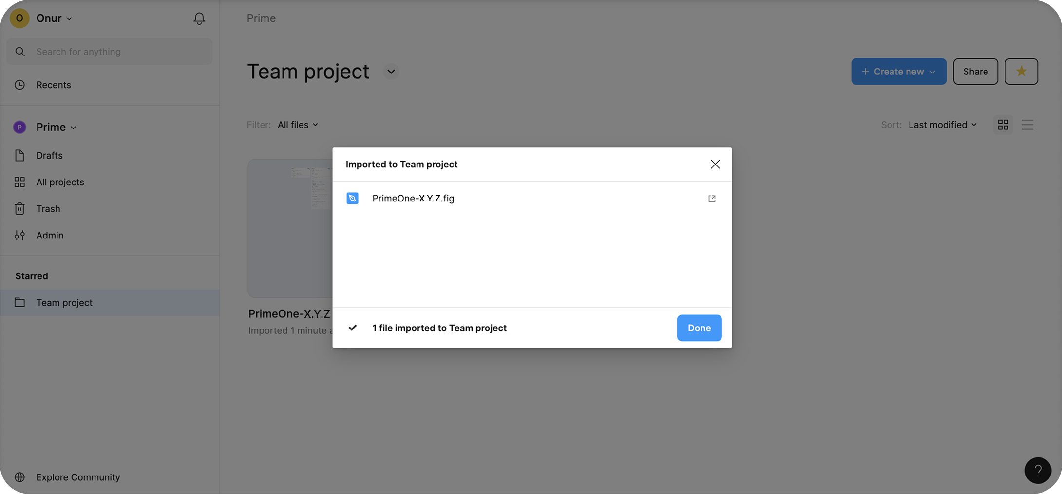
|
|
31
|
+
|
|
32
|
+
### Publishing
|
|
33
|
+
|
|
34
|
+
To make PrimeOne available as a shared library:
|
|
35
|
+
|
|
36
|
+
- Open the imported PrimeOne .fig file.
|
|
37
|
+
- Go to **Assets → Manage Libraries**.
|
|
38
|
+
- Click **"Publish..."** to share PrimeOne with your team, then confirm by clicking the "Publish" button in the modal.
|
|
39
|
+
|
|
40
|
+
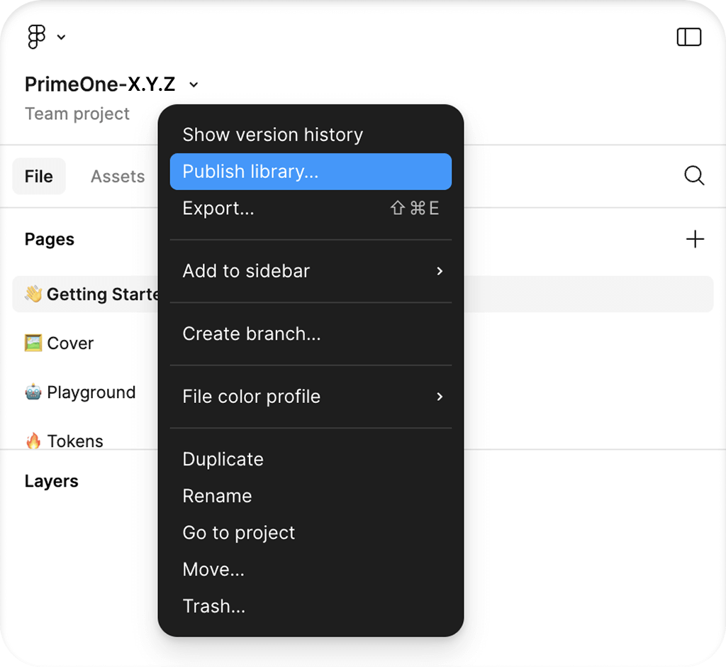
|
|
41
|
+
|
|
42
|
+
### Enabling
|
|
43
|
+
|
|
44
|
+
If you want to enable PrimeOne across all files in your team, follow these steps:
|
|
45
|
+
|
|
46
|
+
- Navigate to **All Projects** from the Teams section.
|
|
47
|
+
- Go to **View Settings → View Team Libraries**. You can find this option in the dropdown menu next to your team name.
|
|
48
|
+
- Toggle PrimeOne "On" to make it available globally.
|
|
49
|
+
|
|
50
|
+
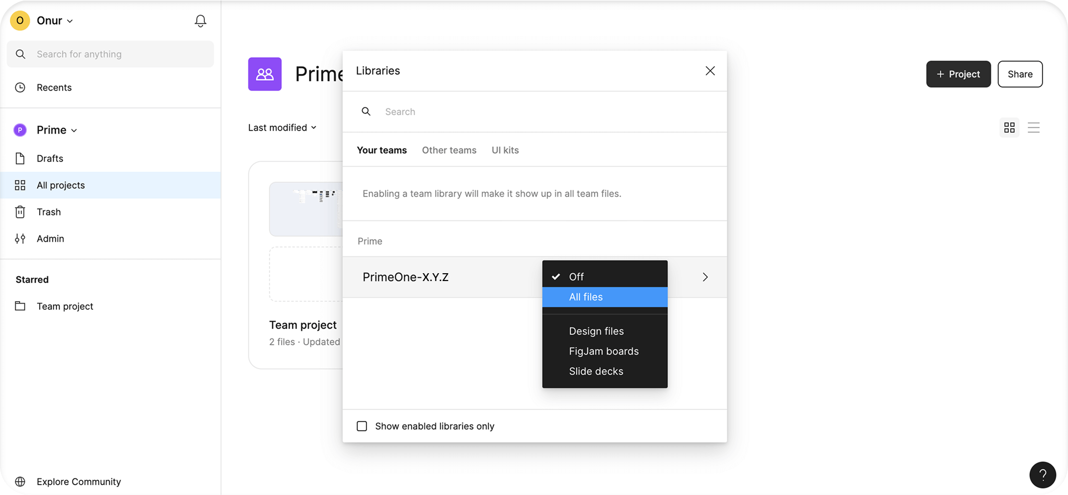
|
|
51
|
+
|
|
52
|
+
## Suggested Workflow
|
|
53
|
+
|
|
54
|
+
PrimeOne uses Tokens Studio as its primary tool for design token management. To leverage the benefits of Figma Variables, these variables have also been exported from Tokens Studio and included in the file. This setup, while powerful, can make design changes somewhat complex and less fluid due to the way the tools interact. Although the provided guide outlines the recommended steps, we acknowledge that the workflow may feel unintuitive or slow at times. We're actively exploring improvements, and in the meantime, suggest following the guide as a baseline while adapting it to your team's needs where necessary.
|
|
55
|
+
|
|
56
|
+
### Tokens Studio Setup
|
|
57
|
+
|
|
58
|
+
- **Set sync provider via Tokens Studio** - Figma plugins are limited to sharing a maximum of 100KB of data through their APIs. Because PrimeOne's token data exceeds this limit, using tokens locally within your Figma file may lead to performance issues. To avoid this, you should first configure and switch to a remote sync provider. You can follow the official [Tokens Studio guide](https://docs.tokens.studio/token-storage/remote) for setting up remote storage.
|
|
59
|
+
- **Push tokens to your sync provider** - Once you've successfully switched to your new sync provider, push the token data from your local file to the new provider to ensure everything stays in sync.
|
|
60
|
+
- **Set Base Font Size to `{app.font.size}` in Tokens Studio Settings** - PrimeOne uses a base font size of 14px, aligning with the default in Prime UI libraries. In Tokens Studio, go to the Settings tab and set the Base font size to `{app.font.size}`.
|
|
61
|
+
- If you wish to change this value, you can [update](https://docs.tokens.studio/manage-settings/base-font-size) the corresponding token in the app set.
|
|
62
|
+
|
|
63
|
+
### CI Pipeline
|
|
64
|
+
|
|
65
|
+
Theme Designer offers an API that can be utilized to implement continuous integration pipelines to automate Figma to theme code generation whenever you push updates to the repository from Figma. Visit the [CI Pipeline](/docs/styled/add-ons/designer/ci) documentation for comprehensive information.
|
|
66
|
+
|
|
67
|
+
### Design Changes
|
|
68
|
+
|
|
69
|
+
- **Change on Tokens Studio** - The first step when planning a design change is to identify which tokens need to be modified within Tokens Studio. Use the **Inspect** tab in Tokens Studio to locate the relevant tokens, then apply your changes directly via the plugin. After making the updates, don't forget to push the changes to your Sync Provider.
|
|
70
|
+
- **Change on Figma Variables** - After making changes in Tokens Studio, you also need to apply these updates in Figma Variables. There are two options:
|
|
71
|
+
- Manually update the variables one by one, or
|
|
72
|
+
- Use the **Export to Styles & Variables** feature in Tokens Studio.
|
|
73
|
+
|
|
74
|
+
In our own workflow, we prefer to update the variables manually, as the export feature can be unstable with large files like PrimeOne. We recommend this manual approach for reliability. However, if you choose to use the export feature, make sure the settings match the screenshot provided. Specifically, ensure the "**Themes (Pro)**" tab is selected during the second step. Don't worry, even though it says "Pro," you don't need a Pro license to access this feature in Tokens Studio. If you notice missing or incomplete exports on your first attempt, try running the export again from the beginning. This is a known issue with Tokens Studio and often resolves on the second attempt. For more detailed guidance, see the [official documentation](https://docs.tokens.studio/figma/export).
|
|
75
|
+
|
|
76
|
+
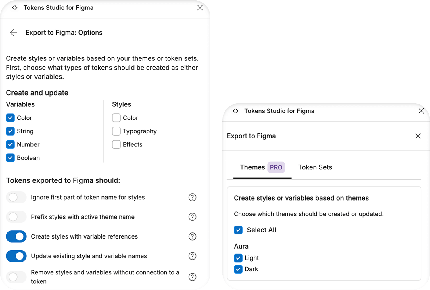
|
|
77
|
+
|
|
78
|
+
- **Get Updates on Consumer Files** - We do not recommend making design changes directly in consumer files, as this goes against best practices. Instead, apply all design updates in the main UI Kit file, then publish the library and accept the updates in any consumer files that rely on it.
|
|
79
|
+
|
|
80
|
+
## Token Sets
|
|
81
|
+
|
|
82
|
+
- **Primitive** - This set contains the most foundational tokens, such as base colors and border radius, elements that are considered "primitive" by nature.
|
|
83
|
+
- **Semantic** - Includes essential system-wide tokens like primary, surface, and other shared design values. It also defines tokens used across multiple component groups. For example, tokens under `{form.field.*}` are referenced by component-level tokens in InputText, MultiSelect, Checkbox, and other form components, enabling consistent styling across the board.
|
|
84
|
+
- **Component** - These tokens are defined specifically for each component to allow deep customization. While we've aimed to create dedicated tokens for every component state, many of them still reference the semantic or primitive tokens, allowing you to make global updates from a single place when needed.
|
|
85
|
+
- **App** - Tokens in this set are not part of the [PrimeUIX](https://github.com/primefaces/primeuix) system. They are intended for values defined in your own application. The same applies to tokens used in our UI library showcases. For example, there is no dedicated font size token in **PrimeUIX** because font styles are not part of the design system. UI components inherit their font settings from the application.
|
|
86
|
+
- **Custom** - If you're using the Figma to Theme feature and want your newly created custom tokens to appear in your Theme Designer themes, place them in this set. Even if you're not using the Theme Designer, we still recommend creating a separate set — or using the existing "Custom" set — for your own tokens. Making changes to the default sets, especially deleting tokens or altering reference values, can lead to inconsistencies with the library tokens and cause additional work during development.
|
|
87
|
+
|
|
88
|
+
## Update PrimeOne
|
|
89
|
+
|
|
90
|
+
When a new version of PrimeOne is released, follow the steps below to update your files:
|
|
91
|
+
|
|
92
|
+
- Download the latest version of PrimeOne from PrimeStore.
|
|
93
|
+
- Unzip the file and upload it to your Figma workspace.
|
|
94
|
+
- Publish the newly uploaded file as a library.
|
|
95
|
+
- In all consumer files, use **Swap Library** to point to the new version.
|
|
96
|
+
- Once the transition is complete, you can safely unpublish the old PrimeOne library.
|
|
97
|
+
|
|
98
|
+
Before each update, it's a good idea to review the **Changelog** on the Get Started page of the PrimeOne Figma file.
|
|
99
|
+
|
|
100
|
+
Keep in mind that while Swap Library will update most components, any customized components may require manual review and adjustment.
|
|
101
|
+
|
|
102
|
+
## Adding PrimeIcons
|
|
103
|
+
|
|
104
|
+
PrimeOne uses PrimeIcons, the official icon library by PrimeTek. To use it effectively within your design system, you need to add PrimeIcons to your Figma environment by following these steps:
|
|
105
|
+
|
|
106
|
+
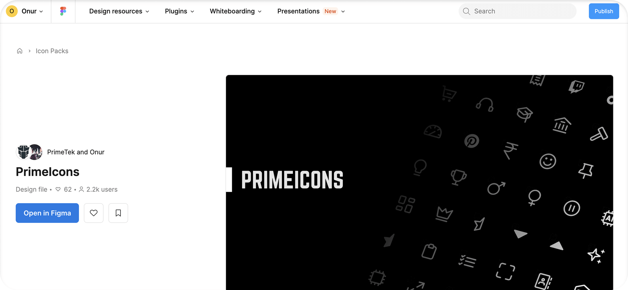
- Open the [PrimeIcons](https://www.figma.com/community/file/1354343849355792252/primeicons) file in Figma and move it to your team project.
|
|
107
|
+
|
|
108
|
+
|
|
109
|
+
|
|
110
|
+
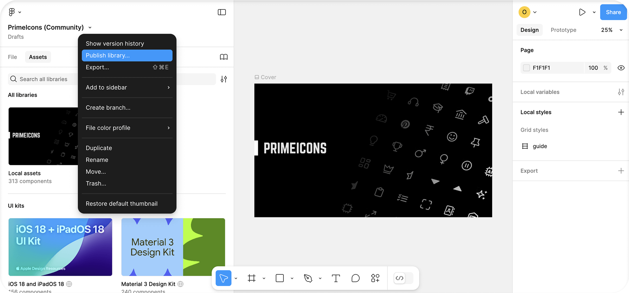
- Publish the PrimeIcons file and enable it for all team files in your Team Settings.
|
|
111
|
+
|
|
112
|
+
|
|
113
|
+
|
|
114
|
+
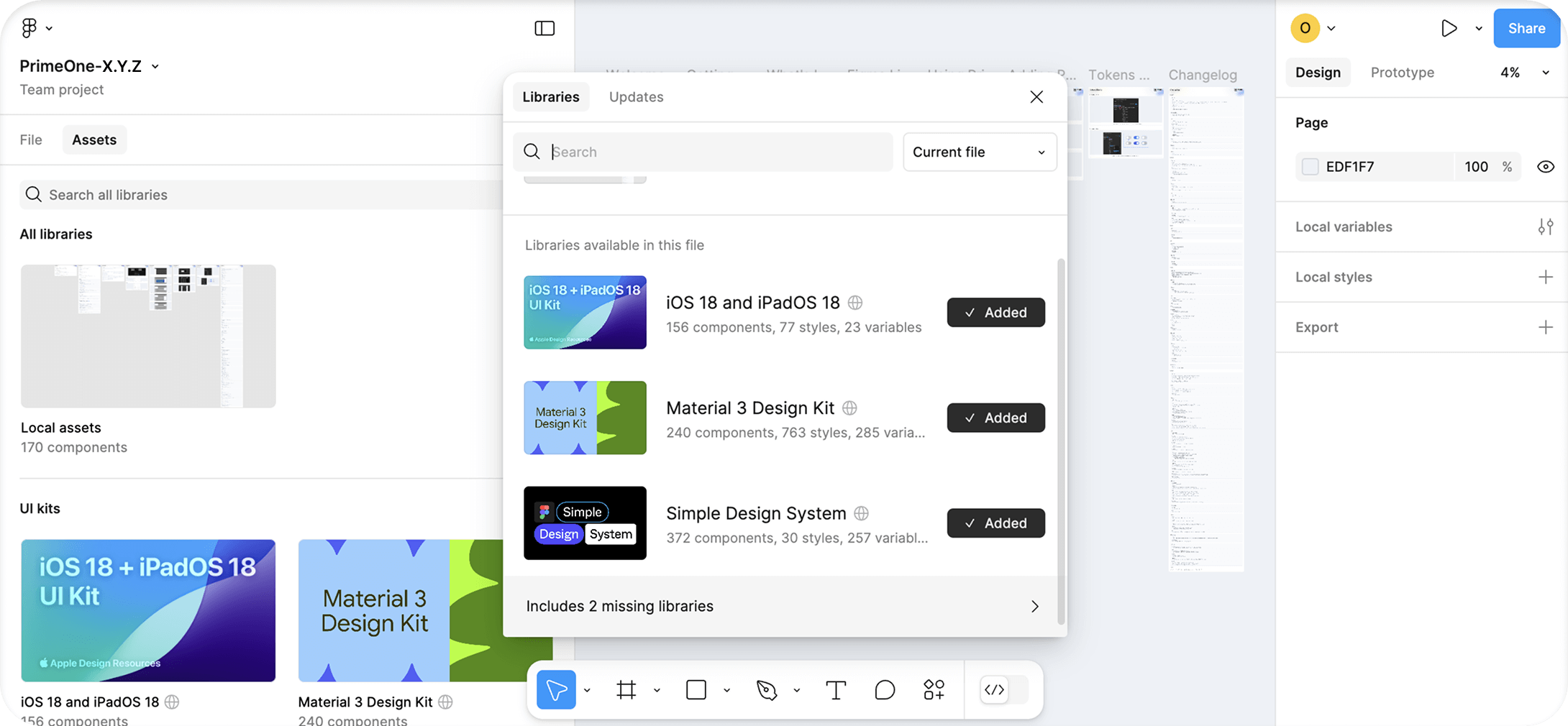
- Return to your PrimeOne file. In the Libraries panel, click on the banner that says "Includes X missing libraries."
|
|
115
|
+
|
|
116
|
+
|
|
117
|
+
|
|
118
|
+
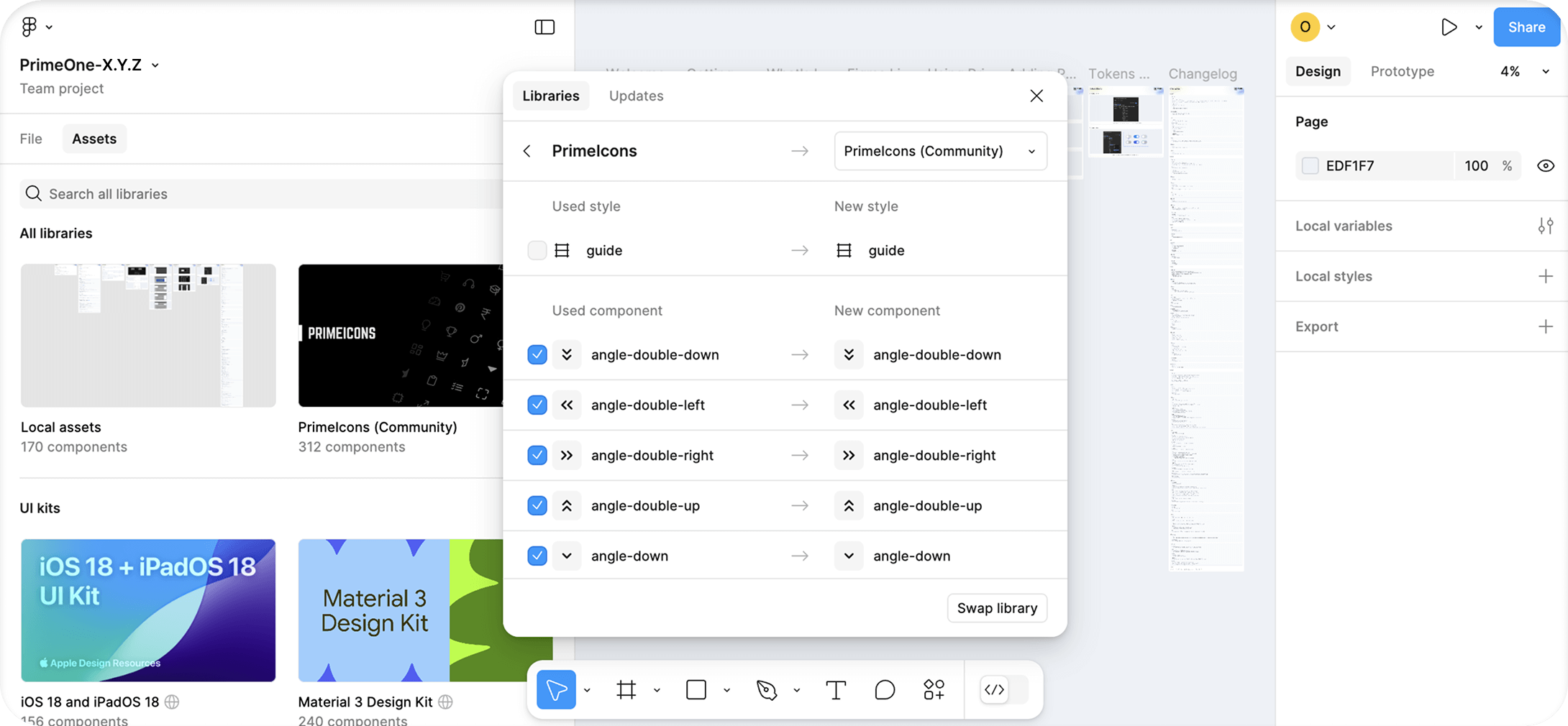
- From the dropdown, select "**PrimeIcons (Community)**" and click the **Swap Library** button.
|
|
119
|
+
|
|
120
|
+
|
|
121
|
+
|
|
122
|
+
## FAQ
|
|
123
|
+
|
|
124
|
+
### Usage
|
|
125
|
+
|
|
126
|
+
**What should we do after purchasing? I can't publish the Preview file?**
|
|
127
|
+
|
|
128
|
+
The Preview file is **view-only**, so it can't be published. To use the library, download the .fig file from PrimeStore and import it into your Figma workspace. Once imported, you'll be able to open the file and publish it as a library for use in your projects.
|
|
129
|
+
|
|
130
|
+
**How to change theme?**
|
|
131
|
+
|
|
132
|
+
After exporting your tokens as Figma Variables using the Themes option in Tokens Studio, theme switching must be handled using Figma's native **Mode Switching** feature. The Theme Switcher within the Tokens Studio plugin will no longer function once themes are bound to a Variable Collection — this applies to PrimeOne as well. Therefore, to switch between Light and Dark modes, you should always use Figma's built-in Mode Switching interface.
|
|
133
|
+
|
|
134
|
+
### Components
|
|
135
|
+
|
|
136
|
+
**How to change base font size?**
|
|
137
|
+
|
|
138
|
+
The base font size used in PrimeOne is 14px. Similar to how rem works in CSS, this is controlled by the `{app.font.size}` token located under the "app" set in Tokens Studio. When you change the value of this token, all size calculations will adjust accordingly based on the new value.
|
|
139
|
+
|
|
140
|
+
To apply this change, you need to use the "Apply" function in Tokens Studio. However, we do not recommend using the "**Apply to Document**" option if the change affects the entire library, as it may lead to unexpected errors. Instead, go page by page and review the updates carefully before applying changes.
|
|
141
|
+
|
|
142
|
+
Also note: not all token values in the library may be linked to `{app.font.size}`. So it's important to check components individually. After completing each page, verify the updated values under Local Variables and make manual adjustments if needed. Alternatively, you can use **Export Styles & Variables** to Figma in Tokens Studio to sync the updated values.
|
|
143
|
+
|
|
144
|
+
### Tokens
|
|
145
|
+
|
|
146
|
+
**Is Tokens Studio too slow?**
|
|
147
|
+
|
|
148
|
+
This might be caused by using the wrong Apply method when pushing your changes. Since PrimeOne is a large file, using **Apply to Document** can result in very long processing times. We recommend using **Apply to Selection** or **Apply to Page** instead for better performance.
|
|
149
|
+
|
|
150
|
+
### Updates
|
|
151
|
+
|
|
152
|
+
**Will there be a completely new Figma file with each update, or will the current PrimeOne file be modified and versioned?**
|
|
153
|
+
|
|
154
|
+
Each update will come as a new Figma file—an updated version of the previous one. You can seamlessly transition to the new version in your consumer files using Figma's **Swap Library** feature.
|
|
155
|
+
|
|
156
|
+
**Will the PrimeOne UI Kit stay in sync with ongoing updates to the Prime UI Libraries?**
|
|
157
|
+
|
|
158
|
+
The PrimeOne UI Kit does not update in real time alongside the libraries. However, we regularly release updates to bridge the gap and ensure alignment with key changes.
|
|
159
|
+
|
|
160
|
+
**How will users receive new components when they're added?**
|
|
161
|
+
|
|
162
|
+
New components will be included in future updates to the UI Kit. Please note that these updates may not coincide immediately with library changes and may take some time to roll out.
|
|
163
|
+
|
|
164
|
+
**How frequently is the PrimeOne UI Kit updated?**
|
|
165
|
+
|
|
166
|
+
We don't follow a fixed release schedule. Updates are made as needed, based on significant changes or additions to the Prime UI libraries.
|
|
167
|
+
|
|
168
|
+
### Roadmap
|
|
169
|
+
|
|
170
|
+
**Are there plans to add a Tailwind theme to the UI Kit?**
|
|
171
|
+
|
|
172
|
+
At this time, we do not plan to include Tailwind theme support in the Figma UI Kit.
|
|
173
|
+
|
|
174
|
+
### Licence
|
|
175
|
+
|
|
176
|
+
**Will purchasing a PrimeBlocks license include access to PrimeOne components?**
|
|
177
|
+
|
|
178
|
+
No. The PrimeBlocks license does not grant access to the PrimeOne UI Kit. They are separate products with individual licenses.
|
|
179
|
+
|
|
180
|
+
## Support
|
|
181
|
+
|
|
182
|
+
The community gathers on [GitHub Discussions](https://github.com/orgs/primefaces/discussions/categories/figma-ui-kit) and [Discord](https://discord.gg/gzKFYnpmCY) to ask questions, share ideas, and discuss the technology. For direct inquiries or suggestions, feel free to contact us at [contact@primetek.com.tr](mailto:contact@primetek.com.tr).
|
|
@@ -0,0 +1,163 @@
|
|
|
1
|
+
# PrimeOne Guide
|
|
2
|
+
|
|
3
|
+
PrimeOne is a strong UI component library that gets even better with a great Figma UI Kit. It is PrimeTek's official Figma UI Kit, built to work seamlessly with the Prime UI Suites.
|
|
4
|
+
|
|
5
|
+
## Overview
|
|
6
|
+
|
|
7
|
+
PrimeOne is the official Figma library of UI components designed to match the implementations in the Prime UI Suites. The current iteration of PrimeOne is structured around the **Aura Light** and **Aura Dark** themes.
|
|
8
|
+
|
|
9
|
+
## Important Notice
|
|
10
|
+
|
|
11
|
+
Starting from PrimeOne UI Kit version 4.0, the Tokens Studio plugin is no longer used. We've fully migrated to Figma's native variable features, which now power the system. If you prefer to continue working with Tokens Studio, please use PrimeOne UI Kit version 3.2, which still supports the plugin.
|
|
12
|
+
|
|
13
|
+
## Resources
|
|
14
|
+
|
|
15
|
+
PrimeOne for Figma takes full advantage of powerful Figma features such as components, variants, auto layout, styles, prototypes, and variables.
|
|
16
|
+
|
|
17
|
+
If you're new to Figma or want to get the most out of PrimeOne, we recommend exploring the following resources:
|
|
18
|
+
|
|
19
|
+
- [Variables](https://help.figma.com/hc/en-us/sections/14506605769879-Variables) - PrimeOne uses Figma Variables for design token management. Visit the official docs to understand how it works and how to use it effectively.
|
|
20
|
+
- [Figma's Best Practice Guides](https://www.figma.com/best-practices/) - Learn how to work efficiently with components, variants, and layouts.
|
|
21
|
+
- [Figma's Official YouTube Channel](https://www.youtube.com/figmadesign) - Tutorials and feature walkthroughs from the Figma team.
|
|
22
|
+
- [Figmalion Newsletter](https://figmalion.com/) - Stay updated with curated insights from the Figma community.
|
|
23
|
+
|
|
24
|
+
## Installation
|
|
25
|
+
|
|
26
|
+
### Importing
|
|
27
|
+
|
|
28
|
+
- **Download the latest .fig UI Kit** - From your PrimeStore panel, download the latest PrimeOne package. The archive contains the .fig UI Kit.
|
|
29
|
+
- **Open Figma in Google Chrome** - Launch Figma in Chrome (or another supported browser). Avoid using the Desktop app for this import. It's more reliable in-browser.
|
|
30
|
+
- **Import into your Team project** - Navigate to the Teams section in the left sidebar. Select your Team project where you want PrimeOne. Drag and drop the .fig file into the project folder in the browser UI. Figma will upload it, showing a new file card once complete.
|
|
31
|
+
|
|
32
|
+

|
|
33
|
+
|
|
34
|
+
### Publishing
|
|
35
|
+
|
|
36
|
+
To make PrimeOne available as a shared library:
|
|
37
|
+
|
|
38
|
+
- Open the imported PrimeOne .fig file.
|
|
39
|
+
- Go to **Assets → Manage Libraries**.
|
|
40
|
+
- Click **"Publish..."** to share PrimeOne with your team, then confirm by clicking the "Publish" button in the modal.
|
|
41
|
+
|
|
42
|
+

|
|
43
|
+
|
|
44
|
+
### Enabling
|
|
45
|
+
|
|
46
|
+
If you want to enable PrimeOne across all files in your team, follow these steps:
|
|
47
|
+
|
|
48
|
+
- Navigate to **All Projects** from the Teams section.
|
|
49
|
+
- Go to **View Settings → View Team Libraries**. You can find this option in the dropdown menu next to your team name.
|
|
50
|
+
- Toggle PrimeOne "On" to make it available globally.
|
|
51
|
+
|
|
52
|
+

|
|
53
|
+
|
|
54
|
+
## Collections
|
|
55
|
+
|
|
56
|
+
- **Primitive** — This collection contains the most foundational variables, such as base colors and border radius, elements that are considered "primitive" by nature.
|
|
57
|
+
- **Semantic Common & Semantic Color Scheme** — Includes essential system-wide variables like primary, surface, and other shared design values. It also defines variables used across multiple component groups. For example, variables under form/field are referenced by component-level variables in InputText, MultiSelect, Checkbox, and other form components, enabling consistent styling across the board.
|
|
58
|
+
- **Component Common & Component Color Scheme** — These variables are defined specifically for each component to allow deep customization. While we've aimed to create dedicated variables for every component state, many of them still reference the semantic or primitive variables, allowing you to make global updates from a single place when needed.
|
|
59
|
+
- **App** — Variables in this collection are not part of the [PrimeUIX](https://github.com/primefaces/primeuix) system. They are intended for values defined in your own application. The same applies to variables used in our UI library showcases. For example, there is no dedicated font size variable in **PrimeUIX** because font styles are not part of the design system. UI components inherit their font settings from the application.
|
|
60
|
+
- **Custom** — If you're using the Figma to Theme feature and want your newly created custom variables to appear in your Theme Designer themes, place them in this collection. Even if you're not using the Theme Designer, we still recommend creating a separate collection — or using the existing "Custom" collection — for your own variables. Making changes to the default collections, especially deleting variables or altering reference values, can lead to inconsistencies with the library variables and cause additional work during development.
|
|
61
|
+
|
|
62
|
+
## PrimeUI Figma Plugin
|
|
63
|
+
|
|
64
|
+
PrimeUI Theme Generator Figma plugin is the official tool developed by PrimeTek that provides built-in synchronization capabilities to automate the theme code generation process. Visit the [plugin website](https://www.figma.com/community/plugin/1592914021886732603/primeui-theme-generator) to learn more about this workflow.
|
|
65
|
+
|
|
66
|
+
## Update PrimeOne
|
|
67
|
+
|
|
68
|
+
When a new version of PrimeOne is released, follow the steps below to update your files:
|
|
69
|
+
|
|
70
|
+
- Download the latest version of PrimeOne from PrimeStore.
|
|
71
|
+
- Unzip the file and upload it to your Figma workspace.
|
|
72
|
+
- Publish the newly uploaded file as a library.
|
|
73
|
+
- In all consumer files, use **Swap Library** to point to the new version.
|
|
74
|
+
- Once the transition is complete, you can safely unpublish the old PrimeOne library.
|
|
75
|
+
|
|
76
|
+
Before each update, it's a good idea to review the **Changelog** on the Get Started page of the PrimeOne Figma file.
|
|
77
|
+
|
|
78
|
+
Keep in mind that while Swap Library will update most components, any customized components may require manual review and adjustment.
|
|
79
|
+
|
|
80
|
+
## Adding PrimeIcons
|
|
81
|
+
|
|
82
|
+
PrimeOne uses PrimeIcons, the official icon library by PrimeTek. To use it effectively within your design system, you need to add PrimeIcons to your Figma environment by following these steps:
|
|
83
|
+
|
|
84
|
+
- Open the [PrimeIcons](https://www.figma.com/community/file/1354343849355792252/primeicons) file in Figma and move it to your team project.
|
|
85
|
+
|
|
86
|
+

|
|
87
|
+
|
|
88
|
+
- Publish the PrimeIcons file and enable it for all team files in your Team Settings.
|
|
89
|
+
|
|
90
|
+

|
|
91
|
+
|
|
92
|
+
- Return to your PrimeOne file. In the Libraries panel, click on the banner that says "Includes X missing libraries."
|
|
93
|
+
|
|
94
|
+

|
|
95
|
+
|
|
96
|
+
- From the dropdown, select "**PrimeIcons (Community)**" and click the **Swap Library** button.
|
|
97
|
+
|
|
98
|
+

|
|
99
|
+
|
|
100
|
+
## FAQ
|
|
101
|
+
|
|
102
|
+
### Usage
|
|
103
|
+
|
|
104
|
+
**What should we do after purchasing? I can't publish the Preview file?**
|
|
105
|
+
|
|
106
|
+
The Preview file is **view-only**, so it can't be published. To use the library, download the .fig file from PrimeStore and import it into your Figma workspace. Once imported, you'll be able to open the file and publish it as a library for use in your projects.
|
|
107
|
+
|
|
108
|
+
**How to change theme?**
|
|
109
|
+
|
|
110
|
+
To enable theme switching in PrimeOne, you need to set up the Variable modes. Select the layers you want to switch between Light or Dark. Then, under Appearance, use the Apply variable modes icon to assign both the Semantic and Component modes to the target theme.
|
|
111
|
+
|
|
112
|
+
### Components
|
|
113
|
+
|
|
114
|
+
**How to change base font size?**
|
|
115
|
+
|
|
116
|
+
The base font size used in PrimeOne is 14px. Similar to how rem works in CSS, this is controlled by the scale/\* variables located under the "Primitive" collection in Variables.
|
|
117
|
+
|
|
118
|
+
When you change the values of these variables, all size calculations will adjust accordingly.
|
|
119
|
+
|
|
120
|
+
Note that not all variables in the library may be linked to scale/\* variables. So it's essential to check components individually.
|
|
121
|
+
|
|
122
|
+
### Updates
|
|
123
|
+
|
|
124
|
+
**Will there be a completely new Figma file with each update, or will the current PrimeOne file be modified and versioned?**
|
|
125
|
+
|
|
126
|
+
Each update will come as a new Figma file—an updated version of the previous one. You can seamlessly transition to the new version in your consumer files using Figma's **Swap Library** feature.
|
|
127
|
+
|
|
128
|
+
**Will the PrimeOne UI Kit stay in sync with ongoing updates to the Prime UI Libraries?**
|
|
129
|
+
|
|
130
|
+
The PrimeOne UI Kit does not update in real time alongside the libraries. However, we regularly release updates to bridge the gap and ensure alignment with key changes.
|
|
131
|
+
|
|
132
|
+
**How will users receive new components when they're added?**
|
|
133
|
+
|
|
134
|
+
New components will be included in future updates to the UI Kit. Please note that these updates may not coincide immediately with library changes and may take some time to roll out.
|
|
135
|
+
|
|
136
|
+
**How frequently is the PrimeOne UI Kit updated?**
|
|
137
|
+
|
|
138
|
+
We don't follow a fixed release schedule. Updates are made as needed, based on significant changes or additions to the Prime UI libraries.
|
|
139
|
+
|
|
140
|
+
### Roadmap
|
|
141
|
+
|
|
142
|
+
**Are there plans to add a Tailwind theme to the UI Kit?**
|
|
143
|
+
|
|
144
|
+
At this time, we do not plan to include Tailwind theme support in the Figma UI Kit.
|
|
145
|
+
|
|
146
|
+
### Licence
|
|
147
|
+
|
|
148
|
+
**Will purchasing a PrimeBlocks license include access to PrimeOne components?**
|
|
149
|
+
|
|
150
|
+
No. The PrimeBlocks license does not grant access to the PrimeOne UI Kit. They are separate products with individual licenses.
|
|
151
|
+
|
|
152
|
+
## Limitations
|
|
153
|
+
|
|
154
|
+
Current known technical limitations are listed at this section.
|
|
155
|
+
|
|
156
|
+
- **Multiple-value variables** - Figma currently supports only a single value per variable. For this reason, multi-value tokens defined in PrimeUIX—such as padding or margin, which can contain multiple values—are represented in Figma as separate variables for each side (top/right/bottom/left) or axis (x/y), unlike the combined multi-value CSS definitions in PrimeUIX.
|
|
157
|
+
- **Calculations** - Since Figma does not yet allow calculations within variable definitions, values that rely on expressions like calc() cannot function dynamically. In these cases, any adjustments you make may require manual updates.
|
|
158
|
+
- **Focus Rings** - In Tokens Studio, focus rings could be positioned by calculating the outer stroke distance using expressions such as focus.ring.width + focus.ring.offset. Since Figma Variables do not support arithmetic operations, these calculations cannot be reproduced. As a result, focus ring width values are no longer dynamically linked and must be handled as static values.
|
|
159
|
+
- **Color Mix** - Figma Variables do not currently support color mix modifiers. Values in PrimeUIX that rely on color mixing have therefore been converted into raw hex values when brought into Figma Variables.
|
|
160
|
+
|
|
161
|
+
## Support
|
|
162
|
+
|
|
163
|
+
The community gathers on [GitHub Discussions](https://github.com/orgs/primefaces/discussions/categories/figma-ui-kit) and [Discord](https://discord.gg/gzKFYnpmCY) to ask questions, share ideas, and discuss the technology. For direct inquiries or suggestions, feel free to contact us at [contact@primetek.com.tr](mailto:contact@primetek.com.tr).
|