@primereact/mcp 11.0.0 → 11.1.0
This diff represents the content of publicly available package versions that have been released to one of the supported registries. The information contained in this diff is provided for informational purposes only and reflects changes between package versions as they appear in their respective public registries.
- package/data/llms/headless/components/sidebar/api.json +1029 -54
- package/data/llms/headless/guides/misc/internationalization.md +282 -0
- package/data/llms/headless/guides/misc/locale.md +280 -0
- package/data/llms/llms-full.txt +9822 -1377
- package/data/llms/llms.txt +15 -0
- package/data/llms/primitive/components/sidebar/api.json +127 -33
- package/data/llms/primitive/guides/migration/updating-to-v11.md +2219 -0
- package/data/llms/primitive/guides/misc/internationalization.md +287 -0
- package/data/llms/primitive/guides/misc/locale.md +280 -0
- package/data/llms/styled/add-ons/designer/ci.md +273 -0
- package/data/llms/styled/add-ons/designer/guide.md +99 -0
- package/data/llms/styled/add-ons/designer/overview.md +194 -0
- package/data/llms/styled/add-ons/uikit/guide/v3.md +181 -0
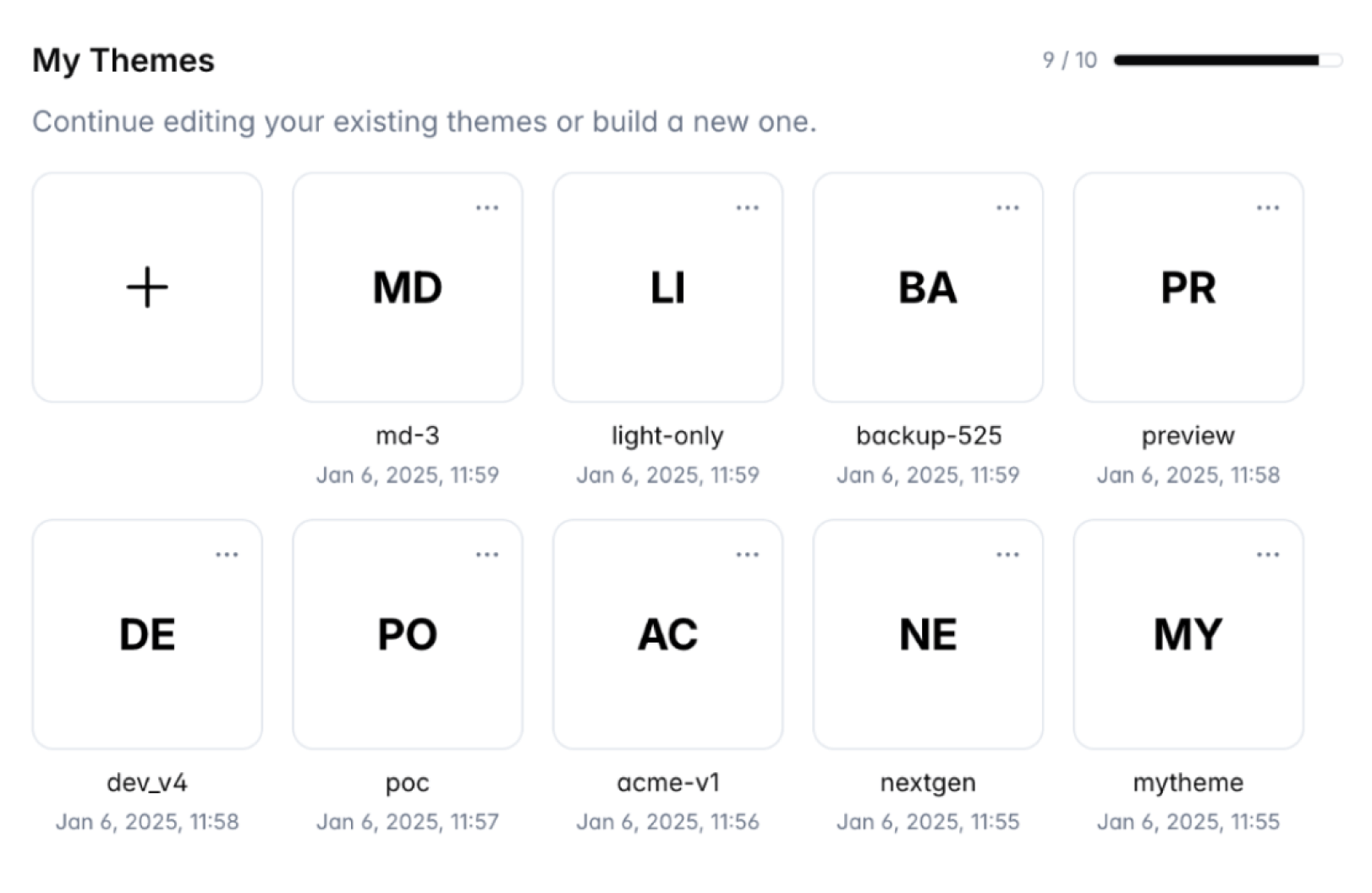
- package/data/llms/styled/add-ons/uikit/guide/v4.md +163 -0
- package/data/llms/styled/add-ons/uikit/overview.md +204 -0
- package/data/llms/styled/components/datatable.md +8 -5
- package/data/llms/styled/components/menu.md +39 -41
- package/data/llms/styled/guides/configuration.md +198 -0
- package/data/llms/styled/guides/form/formik.md +448 -0
- package/data/llms/styled/guides/form/react-hook-form.md +503 -0
- package/data/llms/styled/guides/form/tanstack.md +502 -0
- package/data/llms/styled/guides/migration/updating-to-v11.md +2219 -0
- package/data/llms/styled/guides/misc/internationalization.md +379 -0
- package/data/llms/styled/guides/misc/locale.md +280 -0
- package/data/llms/tailwind/components/menu.md +5 -5
- package/data/llms/tailwind/components/tooltip.md +4 -13
- package/data/llms/tailwind/guides/misc/internationalization.md +287 -0
- package/data/llms/tailwind/guides/misc/locale.md +280 -0
- package/data/manifest.json +339 -24
- package/data/mcp-data.json +263 -8
- package/dist/index.js +1 -1
- package/package.json +1 -1
|
@@ -0,0 +1,273 @@
|
|
|
1
|
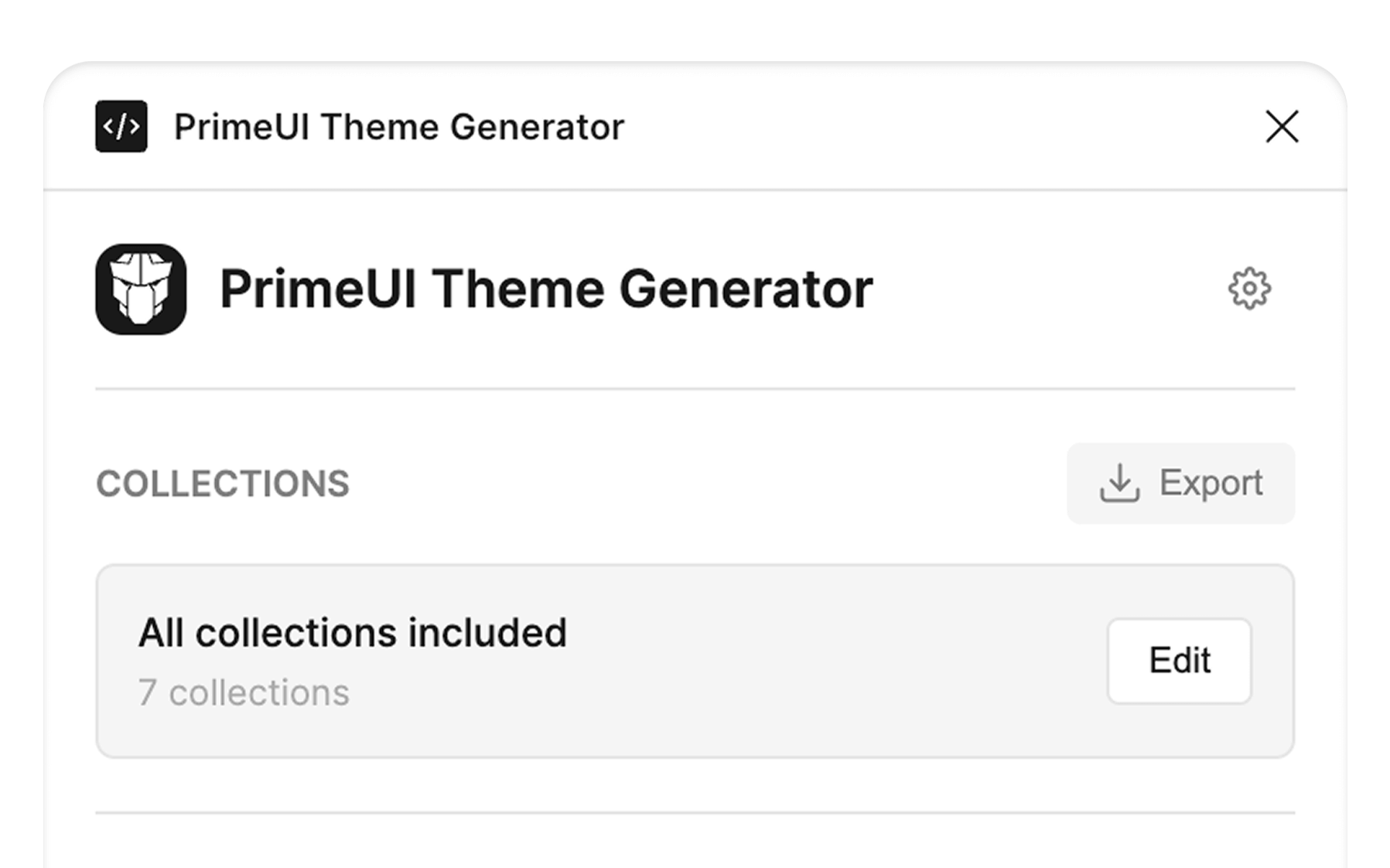
+
# Figma to Theme Code CI Pipeline
|
|
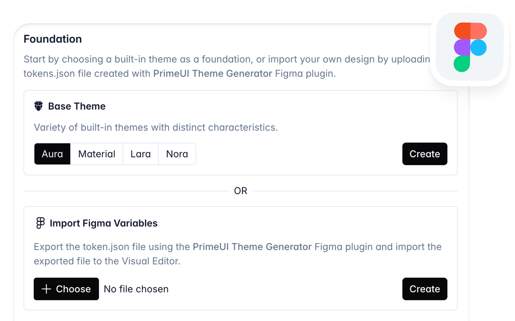
2
|
+
|
|
3
|
+
Automate the conversion of Figma design tokens to theme code using CI pipelines and the theme designer API.
|
|
4
|
+
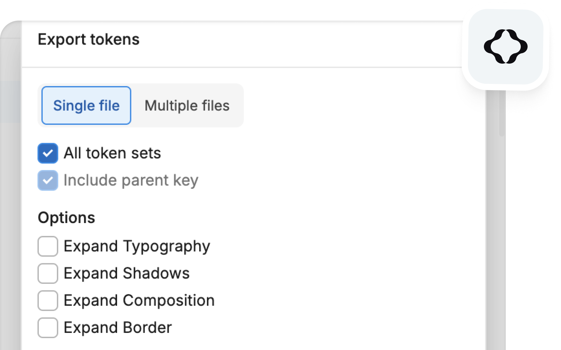
|
|
5
|
+
> **UI Kit v4 Users:** You may ignore this documentation and use the [PrimeUI Theme Generator](https://www.figma.com/community/plugin/1592914021886732603/primeui-theme-generator) Figma plugin instead, which provides built-in synchronization capabilities that automate the theme generation process.
|
|
6
|
+
>
|
|
7
|
+
> **UI Kit v3 Users:** Follow the CI pipeline configuration below to integrate with Figma via the Tokens Studio plugin.
|
|
8
|
+
|
|
9
|
+
## Overview
|
|
10
|
+
|
|
11
|
+
The Figma UI Kit and the theming api is fully synchronized, meaning the design tokens in Figma map to the corresponding properties in a theme preset. The Theme Designer offers a feature to create a theme by uploading a tokens.json file that is exported from the Tokens Studio plugin in Figma. Once the theme is converted, it can either be edited further in the visual editor or downloaded as a zip file to access the full code. Visit the [Figma](/docs/styled/add-ons/designer/guide#figma) section at the designer documentation for more information.
|
|
12
|
+
|
|
13
|
+
Manually exporting the tokens file from Figma and uploading it to the online designer tool may quickly become tedious in active development cycles. As a solution, theme designer provides a remote API that can be integrated into your CI pipeline.
|
|
14
|
+
|
|
15
|
+

|
|
16
|
+
|
|
17
|
+
## Video Tutorial
|
|
18
|
+
|
|
19
|
+
Before diving into the implementation details, if you would like to understand the final outcome and see how the solution operates, please refer to the [video tutorial](https://www.youtube.com/watch?v=ksNPUrCYcto) for a comprehensive walkthrough and demonstration.
|
|
20
|
+
|
|
21
|
+
## Designer API
|
|
22
|
+
|
|
23
|
+
Theme Designer public endpoint is hosted at PrimeUI Store.
|
|
24
|
+
|
|
25
|
+
```text
|
|
26
|
+
https://primeui.store/api/designer/integration/theme/create
|
|
27
|
+
```
|
|
28
|
+
|
|
29
|
+
### Get a Secret Key
|
|
30
|
+
|
|
31
|
+
1. Visit the [PrimeUI Store](https://primeui.store/designer).
|
|
32
|
+
2. Purchase an Extended License of Theme Designer.
|
|
33
|
+
3. Navigate to your [account settings](https://primeui.store/user/designer).
|
|
34
|
+
4. Generate a secret key for CI/CD integration.
|
|
35
|
+
|
|
36
|
+
### Authentication
|
|
37
|
+
|
|
38
|
+
Define an _Authorization: Bearer_ request header to configure your secret key.
|
|
39
|
+
|
|
40
|
+
### Parameters
|
|
41
|
+
|
|
42
|
+
The request type must be _POST_.
|
|
43
|
+
|
|
44
|
+
| Name | Type | Required | Description |
|
|
45
|
+
| --- | --- | --- | --- |
|
|
46
|
+
| `name` | string | yes | Name of the theme to be generated. |
|
|
47
|
+
| `tokens` | json | yes | Content of the json file exported from Figma. |
|
|
48
|
+
| `project` | string | yes | Name of the project, possible values are "primereact", "primeng" or "primevue". |
|
|
49
|
+
| `config.font_size` | string | no | Font size for theme preview in visual editor at website, defaults to "14px". |
|
|
50
|
+
| `config.font_family` | string | no | Font family for theme preview in visual editor at website, defaults to "Inter Var". |
|
|
51
|
+
|
|
52
|
+
### Example
|
|
53
|
+
|
|
54
|
+
```ts
|
|
55
|
+
const response = await fetch('https://primeui.store/api/designer/integration/theme/create', {
|
|
56
|
+
method: 'POST',
|
|
57
|
+
headers: {
|
|
58
|
+
'Content-Type': 'application/json',
|
|
59
|
+
Accept: 'application/json, application/zip',
|
|
60
|
+
Authorization: `Bearer ${designer_secret_key}`
|
|
61
|
+
},
|
|
62
|
+
body: JSON.stringify({
|
|
63
|
+
name: 'acme-theme',
|
|
64
|
+
project: 'primereact',
|
|
65
|
+
tokens: tokensJson // JSON data
|
|
66
|
+
})
|
|
67
|
+
});
|
|
68
|
+
```
|
|
69
|
+
|
|
70
|
+
### Response
|
|
71
|
+
|
|
72
|
+
A successful response returns a zip file containing the source code of the generated theme preset. The content-type header of this type of response is _application/zip_.
|
|
73
|
+
|
|
74
|
+
### Error Handling
|
|
75
|
+
|
|
76
|
+
When theme generation fails, a json response is returned with _application/json_ content-type header. The response contains an error object with _code_ and _message_.
|
|
77
|
+
|
|
78
|
+
```json
|
|
79
|
+
{
|
|
80
|
+
"error": {
|
|
81
|
+
"code": "download_failed",
|
|
82
|
+
"message": "Failed to create archive."
|
|
83
|
+
}
|
|
84
|
+
}
|
|
85
|
+
```
|
|
86
|
+
|
|
87
|
+
## Figma
|
|
88
|
+
|
|
89
|
+
Tokens Studio in Figma is the starting point of a continuous integration pipeline. You can connect a remote repository to sync your tokens data so that changes are saved remotely instead of locally. Tokens Studio offers various remote storage options such as [GitHub](https://docs.tokens.studio/token-storage/remote/sync-git-github), [GitLab](https://docs.tokens.studio/token-storage/remote/sync-git-gitlab) and [Bitbucket](https://docs.tokens.studio/token-storage/remote/sync-git-bitbucket). Refer to these documentations based on your environment before proceeding to the integrations in the next section.
|
|
90
|
+
|
|
91
|
+
## Integration
|
|
92
|
+
|
|
93
|
+
Once the Tokens Studio Sync Provider is running and you have obtained a Secret Key for the Designer API, you can connect your repository to the Theme Designer API to automatically generate themes whenever the tokens file changes via your CI pipeline. For GitHub, PrimeTek provides an official GitHub Action available on the GitHub Marketplace, while for GitLab and Bitbucket, sample implementations are provided as references for building your own integration.
|
|
94
|
+
|
|
95
|
+
### GitHub
|
|
96
|
+
|
|
97
|
+
The [prime-figma-to-theme-code-generator](https://github.com/marketplace/actions/prime-figma-to-theme-code-generator) is a GitHub Action that is available on the marketplace.
|
|
98
|
+
|
|
99
|
+
#### 1. Add Secret Key to Repository Secrets
|
|
100
|
+
|
|
101
|
+
- Go to your GitHub repository.
|
|
102
|
+
- Navigate to **Settings > Secrets and variables > Actions**.
|
|
103
|
+
- Click **New repository secret**.
|
|
104
|
+
- Give a name such as: _THEME_DESIGNER_SECRET_KEY_.
|
|
105
|
+
- Value: Your API key from Prime Theme Designer.
|
|
106
|
+
- Click **Add secret**.
|
|
107
|
+
|
|
108
|
+
#### 2. Add the action to your `.github/workflows`
|
|
109
|
+
|
|
110
|
+
Visit the [inputs](https://github.com/marketplace/actions/prime-figma-to-theme-code-generator#-inputs) documentation for more details about the parameters such as the _theme-name_.
|
|
111
|
+
|
|
112
|
+
```yaml
|
|
113
|
+
name: Automated Figma To Theme Code
|
|
114
|
+
|
|
115
|
+
on:
|
|
116
|
+
push:
|
|
117
|
+
paths:
|
|
118
|
+
- 'tokens.json'
|
|
119
|
+
|
|
120
|
+
permissions:
|
|
121
|
+
contents: write
|
|
122
|
+
|
|
123
|
+
jobs:
|
|
124
|
+
generate-tokens:
|
|
125
|
+
name: Generate Theme Code
|
|
126
|
+
runs-on: ubuntu-latest
|
|
127
|
+
steps:
|
|
128
|
+
- name: Checkout repository
|
|
129
|
+
uses: actions/checkout@v3
|
|
130
|
+
|
|
131
|
+
- name: Generate Prime Theme
|
|
132
|
+
uses: primefaces/theme-designer-ci@1.0.0-beta.4
|
|
133
|
+
with:
|
|
134
|
+
designer-secret: ${{ secrets.THEME_DESIGNER_SECRET_KEY }}
|
|
135
|
+
theme-name: 'acme'
|
|
136
|
+
project: 'primereact'
|
|
137
|
+
font-size: '14px'
|
|
138
|
+
font-family: 'Inter Var'
|
|
139
|
+
tokens-path: 'tokens.json'
|
|
140
|
+
output-dir: './acme-theme'
|
|
141
|
+
```
|
|
142
|
+
|
|
143
|
+
#### 3. Test Integration
|
|
144
|
+
|
|
145
|
+
Edit a token in Tokens Studio in Figma and click **Push to GitHub** button to update the tokens file in your Git repository, triggering the configured GitHub Action. The GitHub Action then sends the updated file content to the Theme Designer API, receives the generated theme code, and commits the resulting changes back to your repository. An [example repository](https://github.com/primefaces/theme-designer-ci-test) is available at GitHub that you may use as a starter.
|
|
146
|
+
|
|
147
|
+
### GitLab
|
|
148
|
+
|
|
149
|
+
The GitLab integration is implemented by executing a script whenever the tokens file changes.
|
|
150
|
+
|
|
151
|
+
#### 1. Add Secret Key to Repository Secrets
|
|
152
|
+
|
|
153
|
+
- Go to your GitLab repository.
|
|
154
|
+
- Navigate to **Settings > CI/CD > Variables**.
|
|
155
|
+
- Click **Add variable**.
|
|
156
|
+
- Give a name such as: _THEME_DESIGNER_SECRET_KEY_.
|
|
157
|
+
- Value: Your API key from Prime Theme Designer.
|
|
158
|
+
- Click **Add variable**.
|
|
159
|
+
|
|
160
|
+
#### 2. Add the script to your project
|
|
161
|
+
|
|
162
|
+
A sample script named [figma-to-theme-converter.sh](https://gitlab.com/cagataycivici/theme-designer-ci-test/-/blob/main/figma-to-theme-converter.sh?ref_type=heads) is available as a starter, copy and paste this script to your project. You may alter the script further per your requirements.
|
|
163
|
+
|
|
164
|
+
#### 3. Add the script to your `.gitlab-ci.yml`
|
|
165
|
+
|
|
166
|
+
Define the configuration parameters for the Designer API and add the script to the action.
|
|
167
|
+
|
|
168
|
+
```yaml
|
|
169
|
+
variables:
|
|
170
|
+
# Set these as GitLab CI/CD variables for security
|
|
171
|
+
DESIGNER_SECRET: ${THEME_DESIGNER_SECRET_KEY}
|
|
172
|
+
THEME_NAME: 'my-custom-theme'
|
|
173
|
+
PROJECT: 'primereact' # or your target project
|
|
174
|
+
TOKENS_PATH: './tokens.json'
|
|
175
|
+
OUTPUT_DIR: './my-custom-theme'
|
|
176
|
+
# Optional configuration
|
|
177
|
+
FONT_SIZE: '14px'
|
|
178
|
+
FONT_FAMILY: 'Inter'
|
|
179
|
+
|
|
180
|
+
stages:
|
|
181
|
+
- generate-theme
|
|
182
|
+
|
|
183
|
+
generate_theme_tokens:
|
|
184
|
+
stage: generate-theme
|
|
185
|
+
image: ubuntu:22.04
|
|
186
|
+
|
|
187
|
+
before_script:
|
|
188
|
+
# Install required dependencies
|
|
189
|
+
- apt-get update -qq
|
|
190
|
+
- apt-get install -y -qq git curl python3 unzip
|
|
191
|
+
- git config --global --add safe.directory $CI_PROJECT_DIR
|
|
192
|
+
# Ensure we're on the correct branch and have latest changes
|
|
193
|
+
- git fetch origin
|
|
194
|
+
- git checkout $CI_COMMIT_REF_NAME
|
|
195
|
+
- git pull origin $CI_COMMIT_REF_NAME || true
|
|
196
|
+
|
|
197
|
+
script:
|
|
198
|
+
# Run the theme generator script
|
|
199
|
+
- ./figma-to-theme-converter.sh
|
|
200
|
+
|
|
201
|
+
artifacts:
|
|
202
|
+
paths:
|
|
203
|
+
- $OUTPUT_DIR/
|
|
204
|
+
expire_in: 1 week
|
|
205
|
+
|
|
206
|
+
rules:
|
|
207
|
+
# Run on main branch when tokens.json is modified
|
|
208
|
+
- if: $CI_COMMIT_BRANCH == "main"
|
|
209
|
+
changes:
|
|
210
|
+
- tokens.json
|
|
211
|
+
# Or run manually
|
|
212
|
+
- when: manual
|
|
213
|
+
```
|
|
214
|
+
|
|
215
|
+
#### 4. Test Integration
|
|
216
|
+
|
|
217
|
+
Edit a token in Tokens Studio in Figma and click **Push to GitLab** button to update the tokens file in your Git repository, triggering the configured GitLab Action. The GitLab Action then sends the updated file content to the Theme Designer API, receives the generated theme code, and commits the resulting changes back to your repository. An [example repository](https://gitlab.com/cagataycivici/theme-designer-ci-test) is available at GitLab that you may use as a starter.
|
|
218
|
+
|
|
219
|
+
### Bitbucket
|
|
220
|
+
|
|
221
|
+
The BitBucket integration is implemented by executing a custom pipe whenever the tokens file changes.
|
|
222
|
+
|
|
223
|
+
#### 1. Add Secret Key to Repository Secrets
|
|
224
|
+
|
|
225
|
+
- Go to your BitBucket repository.
|
|
226
|
+
- Navigate to **Repository Settings > Repository Variables**.
|
|
227
|
+
- Give a name such as: _THEME_DESIGNER_SECRET_KEY_.
|
|
228
|
+
- Value: Your API key from Prime Theme Designer.
|
|
229
|
+
- Click **Add**.
|
|
230
|
+
|
|
231
|
+
#### 2. Add the pipe configuration to your `bitbucket-pipelines.yml`
|
|
232
|
+
|
|
233
|
+
Define the configuration parameters for the Designer API and add the pipe as a runnable script to the action. Notice that, the referenced [pipe](https://bitbucket.org/cagataycivici/figma-to-theme-code-generator/src/main/) is executed as a script rather than a pipe from the BitBucket pipe registry as PrimeTek currently has no intentions to maintain an official pipe for BitBucket. You may further improve this example by building a dockerized pipe that is accessible in the BitBucket Registry to refer it with the _pipe_ config in yml.
|
|
234
|
+
|
|
235
|
+
```yaml
|
|
236
|
+
image: atlassian/default-image:4
|
|
237
|
+
|
|
238
|
+
pipelines:
|
|
239
|
+
default:
|
|
240
|
+
- step:
|
|
241
|
+
name: Generate Theme with Theme Designer
|
|
242
|
+
condition:
|
|
243
|
+
changesets:
|
|
244
|
+
includePaths:
|
|
245
|
+
- 'tokens.json'
|
|
246
|
+
script:
|
|
247
|
+
- apt-get update && apt-get install -y jq curl unzip
|
|
248
|
+
- git clone https://bitbucket.org/cagataycivici/figma-to-theme-code-generator.git temp-pipe
|
|
249
|
+
- cp temp-pipe/pipe.sh ./
|
|
250
|
+
- chmod +x pipe.sh
|
|
251
|
+
- export DESIGNER_SECRET="${THEME_DESIGNER_SECRET_KEY}"
|
|
252
|
+
- export THEME_NAME="acme-theme"
|
|
253
|
+
- export PROJECT="primereact"
|
|
254
|
+
- export FONT_SIZE="14px"
|
|
255
|
+
- export FONT_FAMILY="Inter Var"
|
|
256
|
+
- export TOKENS_PATH="./tokens.json"
|
|
257
|
+
- export OUTPUT_DIR="./acme-theme"
|
|
258
|
+
- ./pipe.sh
|
|
259
|
+
```
|
|
260
|
+
|
|
261
|
+
#### 3. Test Integration
|
|
262
|
+
|
|
263
|
+
Edit a token in Tokens Studio in Figma and click **Push to BitBucket** button to update the tokens file in your Git repository, triggering the configured BitBucket Pipe. The pipe then sends the updated file content to the Theme Designer API, receives the generated theme code, and commits the resulting changes back to your repository. An [example repository](https://bitbucket.org/cagataycivici/theme-designer-ci-test) is available at BitBucket that you may use as a starter.
|
|
264
|
+
|
|
265
|
+
## Live Preview
|
|
266
|
+
|
|
267
|
+
After your CI pipeline completes successfully, your theme also becomes available in the Prime UI Theme Designer.
|
|
268
|
+
|
|
269
|
+
- Navigate to the Prime UI library website.
|
|
270
|
+
- Click the ⚙️ icon at topbar to open up Designer Editor.
|
|
271
|
+
- Sign in with your license key and pass key credentials.
|
|
272
|
+
- Then select your theme from the available options to apply it across all demos and website content.
|
|
273
|
+
- Note that CI-generated themes are provided in read-only mode for preview purposes only and cannot be edited within the Theme Designer. The Migration Assistant is available to identify any missing tokens in your preset; however, if tokens are missing, they must be added manually in Figma as needed.
|
|
@@ -0,0 +1,99 @@
|
|
|
1
|
+
# Designer
|
|
2
|
+
|
|
3
|
+
Theme Designer is the ultimate tool to customize and design your own themes featuring a visual editor, Figma to theme code, cloud storage, and migration assistant.
|
|
4
|
+
|
|
5
|
+
## Overview
|
|
6
|
+
|
|
7
|
+
The [theming api](/docs/styled/guides/theming/styled) is open source and freely available with an extensive documentation. Theme Designer is a tool built on top of this theming api with important features to make theming easier. Designer consists of 4 key features; the **visual editor** provides a UI to edit the complete set of tokens. The **Figma to theme code** generator is extremely useful to automate the design to code process and integrates seamlessly with the Figma UI Kit. The themes are saved in the **cloud storage** to be accessible from anywhere and any device and finally the **migration assistant** automatically updates your themes to the latest library version.
|
|
8
|
+
|
|
9
|
+
## License
|
|
10
|
+
|
|
11
|
+
A license key is required to be able to use all the services provided by the designer. Without a license, the visual editor is still available for trial purposes with various options such as downloads, and cloud storage disabled. The license key can be purchased at [PrimeStore](https://primeui.store/designer), it is valid for 1 year and needs to be renewed manually after a year.
|
|
12
|
+
|
|
13
|
+
## Dashboard
|
|
14
|
+
|
|
15
|
+
Dashboard is the entry point of the designer. The license key can be configured at this view before getting started with the full set of features. In the **My Themes** section, you're able to create a theme, and manage existing themes. A theme can be renamed, duplicated and downloaded using the more options (⋯) button.
|
|
16
|
+
|
|
17
|
+
|
|
18
|
+
|
|
19
|
+
## Create Theme
|
|
20
|
+
|
|
21
|
+
A theme can be initiated from one of the built-in themes or from Figma UI Kit.
|
|
22
|
+
|
|
23
|
+
### Base
|
|
24
|
+
|
|
25
|
+
In the new theme section, all of the built-in themes are available to use as the base. These are; _Aura_, _Material_, _Lara_ and _Nora_. Each have their own characteristics, and it is recommended to choose the one that best suits your requirements.
|
|
26
|
+
|
|
27
|
+
### Figma
|
|
28
|
+
|
|
29
|
+
For teams with UI designers, we recommend using PrimeOne Figma UI Kit for the design phase and utilizing the Theme Designer service to automate code generation during handoff. This workflow eliminates manual design-to-code translation, reducing implementation time and ensuring consistency between design and production.
|
|
30
|
+
|
|
31
|
+
#### UI Kit v4
|
|
32
|
+
|
|
33
|
+
**Automated Flow**
|
|
34
|
+
|
|
35
|
+
Recommended approach is using the PrimeUI Theme Generator Figma plugin which provides built-in synchronization capabilities that automate the theme generation process. Visit [the plugin website](https://www.figma.com/community/plugin/1592914021886732603/primeui-theme-generator) to learn more about this workflow.
|
|
36
|
+
|
|
37
|
+
**Manual Flow**
|
|
38
|
+
|
|
39
|
+
Instead of generating themes directly from Figma using the plugin, for quick prototyping purposes, you may also choose to manually export a tokens json file and then upload it to the Theme Designer. Note that, this flow would get tedious and repetitive in active development cycles when compared to an automated flow.
|
|
40
|
+
|
|
41
|
+
Open the [PrimeOne UI Kit](/docs/styled/add-ons/uikit/overview) in which you've modified tokens. In the PrimeUI Theme Generator plugin, click the _Export_ option to export all variable collections.
|
|
42
|
+
|
|
43
|
+
|
|
44
|
+
|
|
45
|
+
When creating a new theme at Theme Designer, choose the _Import Figma Variables_ option and import the json file.
|
|
46
|
+
|
|
47
|
+
|
|
48
|
+
|
|
49
|
+
#### UI Kit v3 (Deprecated)
|
|
50
|
+
|
|
51
|
+
**CI Pipeline**
|
|
52
|
+
|
|
53
|
+
Recommended approach is setting up the CI Pipeline flow as manually exporting the tokens file from Figma and uploading it to the online designer tool may quickly become tedious in active development cycles. As a solution, theme designer provides a remote API that can be integrated into your flow. Visit the [CI Pipeline](/docs/styled/add-ons/designer/ci) documentation for comprehensive information and examples for GitHub, GitLab and BitBucket.
|
|
54
|
+
|
|
55
|
+
**Manual Flow**
|
|
56
|
+
|
|
57
|
+
Instead of setting a CI pipeline, for quick prototyping purposes, you may also choose to manually export a tokens json file and then upload it to the designer. Note that, this flow would get tedious and repetitive in active development cycles when compared to an automated CI pipeline.
|
|
58
|
+
|
|
59
|
+
Open the PrimeOne UI Kit in which you've modified tokens. In the Tokens Studio plugin, navigate to the _Tools_ menu and select _Export to file/folder._ When the Export tokens modal appears, make sure the _Single file_ tab is selected. Check the _All tokens sets_ option, then click _Export_.
|
|
60
|
+
|
|
61
|
+
In case you utilize custom tokens, create a new token set named _custom_ and define your tokens under this set to make sure they are also exported to the theme code.
|
|
62
|
+
|
|
63
|
+
|
|
64
|
+
|
|
65
|
+
When creating a new theme at Theme Designer, choose the _Import Figma Variables_ option and import the json file.
|
|
66
|
+
|
|
67
|
+
## Editor
|
|
68
|
+
|
|
69
|
+
### Token Collections
|
|
70
|
+
|
|
71
|
+
The theming architecture is based on primitive, semantic and components tokens. The visual editor, displays a dedicated section for each collection. For basic purposes such as customizing the primary and surface colors, primitive and semantic sections would be more than enough. The component tokens are displayed per route so navigate to the component page first to view the tokens of the specific component.
|
|
72
|
+
|
|
73
|
+
### Custom Tokens
|
|
74
|
+
|
|
75
|
+
Custom tokens allow bringing in your own design tokens to the theme to go beyond the built-in ones. A design token requires a name and a value where the value can be a static value like a color or another token. The name of the token should be a dot separated lowercase value e.g. `accent.color`. For example, a custom token name can be defined as `accent.color` and the value can either be a value like `#eab308` or another token such as `{yellow.50}`. Custom tokens can also refer to each other, e.g. `selection.background` custom token can define `{accent.color}` as a value.
|
|
76
|
+
|
|
77
|
+
If you have created a theme from Figma, use the name **custom** as the name of your token set group. This keyword is special since the import tool will populate the custom tokens using this set in tokens json file.
|
|
78
|
+
|
|
79
|
+
### Intelligent Completion
|
|
80
|
+
|
|
81
|
+
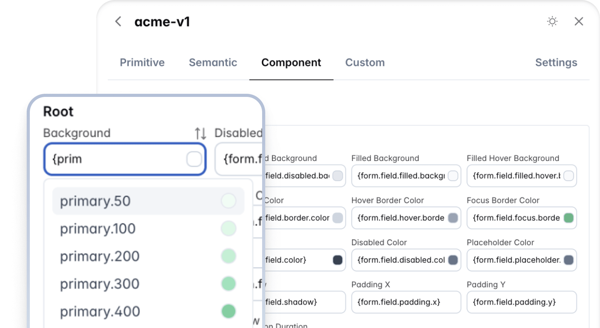
The editor is packed with features for improved user experience. The input fields in the editor are capable of displaying a color preview when the value is a color, and beginning the value with a curly brace (`{`) opens up the autocompletion feature to list the available tokens to choose from. The _pi-sort-alt_ symbol over the input, transfers the token between the common tokens and color scheme specific tokens so that you are able to define tokens based on light and dark mode as well.
|
|
82
|
+
|
|
83
|
+
|
|
84
|
+
|
|
85
|
+
### Typography
|
|
86
|
+
|
|
87
|
+
The components are not opinionated about the typography. Important properties such as the font family, font size, and line-height do not have design tokens since they can be inherited from the document. For preview purposes, the _settings_ tab displays options to customize the base font and the font family of the document. These values are not available in the generated theme and need to be applied to your application at the document level.
|
|
88
|
+
|
|
89
|
+
## Migration Assistant
|
|
90
|
+
|
|
91
|
+
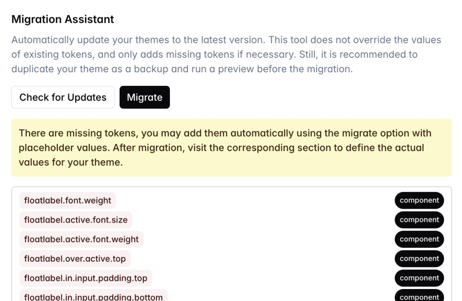
Prime UI libraries continue to evolve with each version. New tokens are likely to be added with each major release, in order to keep your themes up to date the migration assistant is available featuring automated migration. The **Check for Updates** option initially scans a theme for any missing tokens. This tool does not override the values of existing tokens, and only adds missing tokens if necessary. Still, it is recommended to duplicate your theme as a backup and run a preview before the migration. Depending on the result, you may choose to proceed with the migration process. In case there are missing tokens, your theme would receive them with placeholder values so it is recommended to take a note of them before migration and then visit the components to replace the placeholder values with actual values of your choice. These types of newly added tokens would be highlighted in Editor.
|
|
92
|
+
|
|
93
|
+
|
|
94
|
+
|
|
95
|
+
## Limitations
|
|
96
|
+
|
|
97
|
+
Current known technical limitations are listed at this section.
|
|
98
|
+
|
|
99
|
+
- The border width token in Figma does not support multiple values, related [issue](https://github.com/tokens-studio/figma-plugin/issues/3237).
|
|
@@ -0,0 +1,194 @@
|
|
|
1
|
+
# Theme Designer
|
|
2
|
+
|
|
3
|
+
Theme Designer is the ultimate tool to customize and design your own themes featuring a visual editor, Figma to theme code, cloud storage, and migration assistant.
|
|
4
|
+
|
|
5
|
+
<img src="https://fqjltiegiezfetthbags.supabase.co/storage/v1/object/public/common.images/designer/hero.png" alt="PrimeReact Theme Designer" className="w-full rounded-[50px] mb-8!" />
|
|
6
|
+
|
|
7
|
+
<div className="card rounded-[50px]! p-8! md:p-12! mb-8!">
|
|
8
|
+
<div className="flex flex-col gap-20">
|
|
9
|
+
<div className="flex flex-col md:flex-row items-center gap-6 md:gap-20">
|
|
10
|
+
<div className="w-full md:w-1/2">
|
|
11
|
+
<img src="https://fqjltiegiezfetthbags.supabase.co/storage/v1/object/public/common.images/designer/feature-1.png" alt="Visual Editor" className="w-full rounded-xl mb-0!" />
|
|
12
|
+
</div>
|
|
13
|
+
<div className="w-full md:w-1/2">
|
|
14
|
+
<div className="text-primary font-bold mb-2">POWERFUL</div>
|
|
15
|
+
<div className="text-5xl font-bold text-surface-900 dark:text-surface-0 mb-4">Visual Editor</div>
|
|
16
|
+
<p className="text-lg text-surface-600 dark:text-surface-300 mb-4">Transform your PrimeReact components with our advanced visual editor. Design, customize, and preview changes in real-time, all within an intuitive interface.</p>
|
|
17
|
+
<div className="flex flex-wrap text-lg mt-4">
|
|
18
|
+
<div className="flex items-center w-1/2 p-4"><i className="pi pi-check-circle text-green-600 mr-2" /><span className="font-bold text-surface-800 dark:text-surface-100">Intelligent Completion</span></div>
|
|
19
|
+
<div className="flex items-center w-1/2 p-4"><i className="pi pi-check-circle text-green-600 mr-2" /><span className="font-bold text-surface-800 dark:text-surface-100">Entire Collections</span></div>
|
|
20
|
+
<div className="flex items-center w-1/2 p-4"><i className="pi pi-check-circle text-green-600 mr-2" /><span className="font-bold text-surface-800 dark:text-surface-100">Custom Tokens</span></div>
|
|
21
|
+
<div className="flex items-center w-1/2 p-4"><i className="pi pi-check-circle text-green-600 mr-2" /><span className="font-bold text-surface-800 dark:text-surface-100">Light and Dark Modes</span></div>
|
|
22
|
+
<div className="flex items-center w-1/2 p-4"><i className="pi pi-check-circle text-green-600 mr-2" /><span className="font-bold text-surface-800 dark:text-surface-100">Real Time Preview</span></div>
|
|
23
|
+
<div className="flex items-center w-1/2 p-4"><i className="pi pi-check-circle text-green-600 mr-2" /><span className="font-bold text-surface-800 dark:text-surface-100">Starter Kits</span></div>
|
|
24
|
+
</div>
|
|
25
|
+
</div>
|
|
26
|
+
</div>
|
|
27
|
+
<div className="flex flex-col md:flex-row-reverse items-center gap-6 md:gap-20">
|
|
28
|
+
<div className="w-full md:w-1/2">
|
|
29
|
+
<img src="https://fqjltiegiezfetthbags.supabase.co/storage/v1/object/public/common.images/designer/feature-2.png" alt="Figma to Theme Code" className="w-full rounded-xl mb-0!" />
|
|
30
|
+
</div>
|
|
31
|
+
<div className="w-full md:w-1/2">
|
|
32
|
+
<div className="text-primary font-bold mb-2">AUTOMATED</div>
|
|
33
|
+
<div className="text-5xl font-bold text-surface-900 dark:text-surface-0 mb-4">Figma to Theme Code</div>
|
|
34
|
+
<p className="text-lg text-surface-600 dark:text-surface-300 mb-4">Sync design tokens from Figma to theme code with ease. Export token.json to the Visual Editor or generate and sync themes directly to your repository via the Figma plugin, eliminating manual steps and speeding up your workflow.</p>
|
|
35
|
+
<div className="flex flex-wrap text-lg mt-4">
|
|
36
|
+
<div className="flex items-center w-1/2 p-4"><i className="pi pi-check-circle text-green-600 mr-2" /><span className="font-bold text-surface-800 dark:text-surface-100">Automatic Mapping</span></div>
|
|
37
|
+
<div className="flex items-center w-1/2 p-4"><i className="pi pi-check-circle text-green-600 mr-2" /><span className="font-bold text-surface-800 dark:text-surface-100">Eliminate Handoff</span></div>
|
|
38
|
+
<div className="flex items-center w-1/2 p-4"><i className="pi pi-check-circle text-green-600 mr-2" /><span className="font-bold text-surface-800 dark:text-surface-100">CI Pipeline</span></div>
|
|
39
|
+
<div className="flex items-center w-1/2 p-4"><i className="pi pi-check-circle text-green-600 mr-2" /><span className="font-bold text-surface-800 dark:text-surface-100">Live Preview</span></div>
|
|
40
|
+
<div className="flex items-center w-1/2 p-4"><i className="pi pi-check-circle text-green-600 mr-2" /><span className="font-bold text-surface-800 dark:text-surface-100">Maintain Perfect Fidelity</span></div>
|
|
41
|
+
<div className="flex items-center w-1/2 p-4"><i className="pi pi-check-circle text-green-600 mr-2" /><span className="font-bold text-surface-800 dark:text-surface-100">Verify Synchronization</span></div>
|
|
42
|
+
</div>
|
|
43
|
+
</div>
|
|
44
|
+
</div>
|
|
45
|
+
<div className="flex flex-col md:flex-row items-center gap-6 md:gap-20">
|
|
46
|
+
<div className="w-full md:w-1/2">
|
|
47
|
+
<img src="https://fqjltiegiezfetthbags.supabase.co/storage/v1/object/public/common.images/designer/feature-3.png" alt="Migration Assistant" className="w-full rounded-xl mb-0!" />
|
|
48
|
+
</div>
|
|
49
|
+
<div className="w-full md:w-1/2">
|
|
50
|
+
<div className="text-primary font-bold mb-2">INTELLIGENT</div>
|
|
51
|
+
<div className="text-5xl font-bold text-surface-900 dark:text-surface-0 mb-4">Migration Assistant</div>
|
|
52
|
+
<p className="text-lg text-surface-600 dark:text-surface-300 mb-4">Update your existing themes and design tokens into the latest version effortlessly. Our intelligent migration assistant handles the heavy lifting, ensuring a smooth transition for your design system.</p>
|
|
53
|
+
<div className="flex flex-wrap text-lg mt-4">
|
|
54
|
+
<div className="flex items-center w-1/2 p-4"><i className="pi pi-check-circle text-green-600 mr-2" /><span className="font-bold text-surface-800 dark:text-surface-100">Automatic Updates</span></div>
|
|
55
|
+
<div className="flex items-center w-1/2 p-4"><i className="pi pi-check-circle text-green-600 mr-2" /><span className="font-bold text-surface-800 dark:text-surface-100">Preview Changes</span></div>
|
|
56
|
+
</div>
|
|
57
|
+
</div>
|
|
58
|
+
</div>
|
|
59
|
+
<div className="flex flex-col md:flex-row-reverse items-center gap-6 md:gap-20">
|
|
60
|
+
<div className="w-full md:w-1/2">
|
|
61
|
+
<img src="https://fqjltiegiezfetthbags.supabase.co/storage/v1/object/public/common.images/designer/feature-4.png" alt="Cloud Storage" className="w-full rounded-xl mb-0!" />
|
|
62
|
+
</div>
|
|
63
|
+
<div className="w-full md:w-1/2">
|
|
64
|
+
<div className="text-primary font-bold mb-2">REMOTE</div>
|
|
65
|
+
<div className="text-5xl font-bold text-surface-900 dark:text-surface-0 mb-4">Cloud Storage</div>
|
|
66
|
+
<p className="text-lg text-surface-600 dark:text-surface-300 mb-4">Store and manage your themes securely in the cloud. Access your design system from anywhere with enterprise-grade cloud storage.</p>
|
|
67
|
+
<div className="flex flex-wrap text-lg mt-4">
|
|
68
|
+
<div className="flex items-center w-1/2 p-4"><i className="pi pi-check-circle text-green-600 mr-2" /><span className="font-bold text-surface-800 dark:text-surface-100">Access Anywhere</span></div>
|
|
69
|
+
<div className="flex items-center w-1/2 p-4"><i className="pi pi-check-circle text-green-600 mr-2" /><span className="font-bold text-surface-800 dark:text-surface-100">Multiple Themes</span></div>
|
|
70
|
+
</div>
|
|
71
|
+
</div>
|
|
72
|
+
</div>
|
|
73
|
+
</div>
|
|
74
|
+
</div>
|
|
75
|
+
|
|
76
|
+
<div className="card rounded-[50px]! p-8! md:p-12! mb-8!">
|
|
77
|
+
<div className="text-5xl font-bold text-center text-surface-900 dark:text-surface-0 mb-2">Pricing</div>
|
|
78
|
+
<div className="text-center text-lg text-surface-600 dark:text-surface-300 mb-8">Choose the right plan for your business. Whether you are an individual or a member of a team, Designer is available for affordable prices. <a href="#terms">View Terms and Conditions</a>.</div>
|
|
79
|
+
<div className="grid grid-cols-1 lg:grid-cols-3 gap-6">
|
|
80
|
+
<div className="flex flex-col shadow rounded-md p-8 bg-surface-0 dark:bg-surface-900">
|
|
81
|
+
<div className="text-xl font-medium text-surface-900 dark:text-surface-0 mb-2">Basic</div>
|
|
82
|
+
<div className="text-surface-500 dark:text-surface-400 font-medium">For small teams</div>
|
|
83
|
+
<div className="border-t border-surface-200 dark:border-surface-700 my-4" />
|
|
84
|
+
<div className="flex items-baseline gap-1"><span className="text-2xl font-bold text-surface-900 dark:text-surface-0">$249</span><span className="text-sm text-surface-500 dark:text-surface-400">/ year</span></div>
|
|
85
|
+
<div className="border-t border-surface-200 dark:border-surface-700 my-4" />
|
|
86
|
+
<div className="flex flex-col grow text-lg">
|
|
87
|
+
<div className="flex items-center mb-4"><i className="pi pi-times-circle text-red-500 mr-2" /><span className="font-bold text-surface-800 dark:text-surface-100">Figma to Theme Code</span></div>
|
|
88
|
+
<div className="flex items-center mb-4"><i className="pi pi-check-circle text-green-500 mr-2" /><span className="text-surface-700 dark:text-surface-200">Up to 2 Themes</span></div>
|
|
89
|
+
<div className="flex items-center mb-4"><i className="pi pi-check-circle text-green-500 mr-2" /><span className="text-surface-700 dark:text-surface-200">1 Year Service</span></div>
|
|
90
|
+
<div className="flex items-center mb-4"><i className="pi pi-check-circle text-green-500 mr-2" /><span className="text-surface-700 dark:text-surface-200">Visual Editor</span></div>
|
|
91
|
+
<div className="flex items-center mb-4"><i className="pi pi-check-circle text-green-500 mr-2" /><span className="text-surface-700 dark:text-surface-200">Migration Assistant</span></div>
|
|
92
|
+
<div className="flex items-center mb-4"><i className="pi pi-check-circle text-green-500 mr-2" /><span className="text-surface-700 dark:text-surface-200">Cloud Storage</span></div>
|
|
93
|
+
<div className="flex items-center mb-4"><i className="pi pi-check-circle text-green-500 mr-2" /><span className="text-surface-700 dark:text-surface-200">Use on Unlimited Projects</span></div>
|
|
94
|
+
</div>
|
|
95
|
+
<div className="border-t border-surface-200 dark:border-surface-700 mb-4 mt-auto" />
|
|
96
|
+
<a href="https://primeui.store/designer" className="bg-blue-500 text-white hover:bg-blue-400 p-4 w-full rounded text-center font-bold no-underline! hover:no-underline! transition-colors">Buy Now</a>
|
|
97
|
+
</div>
|
|
98
|
+
<div className="flex flex-col shadow rounded-md p-8 bg-surface-0 dark:bg-surface-900">
|
|
99
|
+
<div className="text-xl font-medium text-surface-900 dark:text-surface-0 mb-2">Extended</div>
|
|
100
|
+
<div className="text-surface-500 dark:text-surface-400 font-medium">For teams with UI/UX designers</div>
|
|
101
|
+
<div className="border-t border-surface-200 dark:border-surface-700 my-4" />
|
|
102
|
+
<div className="flex items-baseline gap-1"><span className="text-2xl font-bold text-surface-900 dark:text-surface-0">$990</span><span className="text-sm text-surface-500 dark:text-surface-400">/ year</span></div>
|
|
103
|
+
<div className="border-t border-surface-200 dark:border-surface-700 my-4" />
|
|
104
|
+
<div className="flex flex-col grow text-lg">
|
|
105
|
+
<div className="flex items-center mb-4"><i className="pi pi-check-circle text-green-500 mr-2" /><span className="font-bold text-surface-800 dark:text-surface-100">Figma to Theme Code</span></div>
|
|
106
|
+
<div className="flex items-center mb-4"><i className="pi pi-check-circle text-green-500 mr-2" /><span className="text-surface-700 dark:text-surface-200">Up to 10 Themes</span></div>
|
|
107
|
+
<div className="flex items-center mb-4"><i className="pi pi-check-circle text-green-500 mr-2" /><span className="text-surface-700 dark:text-surface-200">1 Year Service</span></div>
|
|
108
|
+
<div className="flex items-center mb-4"><i className="pi pi-check-circle text-green-500 mr-2" /><span className="text-surface-700 dark:text-surface-200">Visual Editor</span></div>
|
|
109
|
+
<div className="flex items-center mb-4"><i className="pi pi-check-circle text-green-500 mr-2" /><span className="text-surface-700 dark:text-surface-200">Migration Assistant</span></div>
|
|
110
|
+
<div className="flex items-center mb-4"><i className="pi pi-check-circle text-green-500 mr-2" /><span className="text-surface-700 dark:text-surface-200">Cloud Storage</span></div>
|
|
111
|
+
<div className="flex items-center mb-4"><i className="pi pi-check-circle text-green-500 mr-2" /><span className="text-surface-700 dark:text-surface-200">Use on Unlimited Projects</span></div>
|
|
112
|
+
</div>
|
|
113
|
+
<div className="border-t border-surface-200 dark:border-surface-700 mb-4 mt-auto" />
|
|
114
|
+
<a href="https://primeui.store/designer" className="bg-purple-500 text-white hover:bg-purple-400 p-4 w-full rounded text-center font-bold no-underline! hover:no-underline! transition-colors">Buy Now</a>
|
|
115
|
+
</div>
|
|
116
|
+
<div className="flex flex-col shadow rounded-md p-8 bg-surface-0 dark:bg-surface-900">
|
|
117
|
+
<div className="text-xl font-medium text-surface-900 dark:text-surface-0 mb-2">Enterprise</div>
|
|
118
|
+
<div className="text-surface-500 dark:text-surface-400 font-medium">For custom requirements</div>
|
|
119
|
+
<div className="border-t border-surface-200 dark:border-surface-700 my-4" />
|
|
120
|
+
<div className="text-2xl font-bold text-surface-900 dark:text-surface-0">Exclusive Deals</div>
|
|
121
|
+
<div className="border-t border-surface-200 dark:border-surface-700 my-4" />
|
|
122
|
+
<div className="flex flex-col grow text-lg">
|
|
123
|
+
<div className="flex items-center mb-4"><i className="pi pi-check-circle text-green-500 mr-2" /><span className="font-bold text-surface-800 dark:text-surface-100">Figma to Theme Code</span></div>
|
|
124
|
+
<div className="flex items-center mb-4"><i className="pi pi-check-circle text-green-500 mr-2" /><span className="text-surface-700 dark:text-surface-200">Custom Theme Limit</span></div>
|
|
125
|
+
<div className="flex items-center mb-4"><i className="pi pi-check-circle text-green-500 mr-2" /><span className="text-surface-700 dark:text-surface-200">Multi Year Service</span></div>
|
|
126
|
+
<div className="flex items-center mb-4"><i className="pi pi-check-circle text-green-500 mr-2" /><span className="text-surface-700 dark:text-surface-200">Visual Editor</span></div>
|
|
127
|
+
<div className="flex items-center mb-4"><i className="pi pi-check-circle text-green-500 mr-2" /><span className="text-surface-700 dark:text-surface-200">Migration Assistant</span></div>
|
|
128
|
+
<div className="flex items-center mb-4"><i className="pi pi-check-circle text-green-500 mr-2" /><span className="text-surface-700 dark:text-surface-200">Cloud Storage</span></div>
|
|
129
|
+
<div className="flex items-center mb-4"><i className="pi pi-check-circle text-green-500 mr-2" /><span className="text-surface-700 dark:text-surface-200">Use on Unlimited Projects</span></div>
|
|
130
|
+
</div>
|
|
131
|
+
<div className="border-t border-surface-200 dark:border-surface-700 mb-4 mt-auto" />
|
|
132
|
+
<a href="mailto:contact@primetek.com.tr" className="bg-gray-500 text-white hover:bg-gray-400 p-4 w-full rounded text-center font-bold no-underline! hover:no-underline! transition-colors">Contact Us</a>
|
|
133
|
+
</div>
|
|
134
|
+
</div>
|
|
135
|
+
</div>
|
|
136
|
+
|
|
137
|
+
<div className="card rounded-[50px]! p-8! md:p-12! mb-8!">
|
|
138
|
+
<div className="text-5xl font-bold text-center text-surface-900 dark:text-surface-0 mb-8">Frequently Asked Questions</div>
|
|
139
|
+
<div className="grid grid-cols-1 md:grid-cols-2 lg:grid-cols-3 gap-x-8 gap-y-6">
|
|
140
|
+
<div>
|
|
141
|
+
<div className="font-bold text-surface-900 dark:text-surface-0 mb-2">What do I get when I purchase a plan?</div>
|
|
142
|
+
<p className="text-surface-600 dark:text-surface-300 mb-0! leading-normal">A license key to unlock the features based on your plan.</p>
|
|
143
|
+
</div>
|
|
144
|
+
<div>
|
|
145
|
+
<div className="font-bold text-surface-900 dark:text-surface-0 mb-2">Is there a recurring fee or is the license perpetual?</div>
|
|
146
|
+
<p className="text-surface-600 dark:text-surface-300 mb-0! leading-normal">Designer license key is valid for 1 year with no auto renewals.</p>
|
|
147
|
+
</div>
|
|
148
|
+
<div>
|
|
149
|
+
<div className="font-bold text-surface-900 dark:text-surface-0 mb-2">What happens after the 1 year period is concluded?</div>
|
|
150
|
+
<p className="text-surface-600 dark:text-surface-300 mb-0! leading-normal">License key will expire and a new one needs to be renewed to continue using the tool. Downloaded themes can be used indefinitely.</p>
|
|
151
|
+
</div>
|
|
152
|
+
<div>
|
|
153
|
+
<div className="font-bold text-surface-900 dark:text-surface-0 mb-2">Can I have trial access to the Designer?</div>
|
|
154
|
+
<p className="text-surface-600 dark:text-surface-300 mb-0! leading-normal">Visual Editor is available for trial purposes; features such as downloads, migration assistant and cloud storage are disabled.</p>
|
|
155
|
+
</div>
|
|
156
|
+
<div>
|
|
157
|
+
<div className="font-bold text-surface-900 dark:text-surface-0 mb-2">Can I create multiple themes?</div>
|
|
158
|
+
<p className="text-surface-600 dark:text-surface-300 mb-0! leading-normal">Yes, based on the theme limit of your plan.</p>
|
|
159
|
+
</div>
|
|
160
|
+
<div>
|
|
161
|
+
<div className="font-bold text-surface-900 dark:text-surface-0 mb-2">How can I update my theme?</div>
|
|
162
|
+
<p className="text-surface-600 dark:text-surface-300 mb-0! leading-normal">The Migration Assistant automatically scans your theme and adds missing tokens for the latest version.</p>
|
|
163
|
+
</div>
|
|
164
|
+
<div>
|
|
165
|
+
<div className="font-bold text-surface-900 dark:text-surface-0 mb-2">Does Designer require a separate purchase from the UI Kit?</div>
|
|
166
|
+
<p className="text-surface-600 dark:text-surface-300 mb-0! leading-normal">Yes, Figma UI Kit and Designer are different products. It is recommended to purchase both for an efficient workflow.</p>
|
|
167
|
+
</div>
|
|
168
|
+
<div>
|
|
169
|
+
<div className="font-bold text-surface-900 dark:text-surface-0 mb-2">Can I include a generated theme in an open source project?</div>
|
|
170
|
+
<p className="text-surface-600 dark:text-surface-300 mb-0! leading-normal">Yes, the generated theme is suitable for usage in an open source project.</p>
|
|
171
|
+
</div>
|
|
172
|
+
<div>
|
|
173
|
+
<div className="font-bold text-surface-900 dark:text-surface-0 mb-2">How can I get support?</div>
|
|
174
|
+
<p className="text-surface-600 dark:text-surface-300 mb-0! leading-normal">Seek assistance in our community via our public <a href="https://discord.com/invite/gzKFYnpmCY">Discord</a> and <a href="https://github.com/orgs/primefaces/discussions/categories/theme-designer">Forum</a>.</p>
|
|
175
|
+
</div>
|
|
176
|
+
</div>
|
|
177
|
+
</div>
|
|
178
|
+
|
|
179
|
+
<div id="terms" className="card rounded-[50px]! p-8! md:p-12! mb-8! scroll-mt-24">
|
|
180
|
+
<div className="text-5xl font-bold text-center text-surface-900 dark:text-surface-0 mb-2">Terms and Conditions</div>
|
|
181
|
+
<div className="text-center text-surface-500 dark:text-surface-400 mb-8">Effective Date: April 7, 2025</div>
|
|
182
|
+
<div className="flex flex-col gap-5 text-sm text-surface-600 dark:text-surface-300">
|
|
183
|
+
<div><span className="font-semibold text-surface-900 dark:text-surface-0">1. Acceptance of Terms</span> — By purchasing and using the PrimeReact Theme Designer, you acknowledge that you have read, understood, and agree to be bound by these Terms and Conditions.</div>
|
|
184
|
+
<div><span className="font-semibold text-surface-900 dark:text-surface-0">2. Subscription Plans</span> — Upon purchase, PrimeTek grants you non-exclusive, non-transferable access to use the Theme Designer in accordance with the selected plan. Each plan is valid for one year from the date of purchase and does not auto-renew. Themes generated during the active plan period can be used indefinitely.</div>
|
|
185
|
+
<div><span className="font-semibold text-surface-900 dark:text-surface-0">3. Usage Restrictions</span> — You may not use the Theme Designer to develop themes for applications that violate any laws or regulations.</div>
|
|
186
|
+
<div><span className="font-semibold text-surface-900 dark:text-surface-0">4. Intellectual Property</span> — All intellectual property rights in the Theme Designer service are owned by PrimeTek. The ownership of intellectual property rights for the generated themes shall vest in the Client.</div>
|
|
187
|
+
<div><span className="font-semibold text-surface-900 dark:text-surface-0">5. Support and Updates</span> — PrimeTek offers assistance with account management and licensing issues. Technical support or consulting is not provided. Updates are provided at PrimeTek's discretion.</div>
|
|
188
|
+
<div><span className="font-semibold text-surface-900 dark:text-surface-0">6. Refunds</span> — Due to the digital nature of the Theme Designer, all sales are final except as required by applicable law.</div>
|
|
189
|
+
<div><span className="font-semibold text-surface-900 dark:text-surface-0">7. Limitation of Liability</span> — To the maximum extent permitted by law, PrimeTek shall not be liable for any indirect, incidental, special, consequential, or punitive damages.</div>
|
|
190
|
+
<div><span className="font-semibold text-surface-900 dark:text-surface-0">8. Amendments</span> — PrimeTek reserves the right to modify these Terms at any time. Continued use constitutes your consent to such changes.</div>
|
|
191
|
+
<div><span className="font-semibold text-surface-900 dark:text-surface-0">9. Governing Law</span> — These Terms are governed by and construed in accordance with the laws of the Republic of Turkiye.</div>
|
|
192
|
+
<div><span className="font-semibold text-surface-900 dark:text-surface-0">10. Contact Information</span> — For any questions regarding these Terms, please contact us through our official channels as listed on our website.</div>
|
|
193
|
+
</div>
|
|
194
|
+
</div>
|