@primer/react-brand 0.77.1-rc.bd5b9efe → 0.78.0-rc.6fbe9fb5
This diff represents the content of publicly available package versions that have been released to one of the supported registries. The information contained in this diff is provided for informational purposes only and reflects changes between package versions as they appear in their respective public registries.
- package/docs/components/ActionMenu/index.md +65 -19
- package/docs/components/ButtonGroup/index.md +9 -6
- package/docs/components/ButtonGroup/react.md +26 -6
- package/docs/components/IconButton/index.md +99 -0
- package/docs/components/IconButton/react.md +189 -0
- package/docs/components/Tooltip/index.md +24 -13
- package/docs/components/index.md +1 -0
- package/docs/forms/TextInput/index.md +4 -2
- package/docs/index.md +3 -2
- package/esm/ActionMenu/ActionMenu.d.ts +18 -24
- package/esm/ActionMenu/ActionMenu.d.ts.map +1 -1
- package/esm/ActionMenu/ActionMenu.js +247 -168
- package/esm/ActionMenu/ActionMenu.js.map +1 -1
- package/esm/ActionMenu/ActionMenu.module-DlO2FtEt.css +1 -0
- package/esm/ActionMenu/ActionMenu.module.js +4 -1
- package/esm/ActionMenu/ActionMenu.module.js.map +1 -1
- package/esm/ActionMenu/ActionMenuContext.d.ts +23 -0
- package/esm/ActionMenu/ActionMenuContext.d.ts.map +1 -0
- package/esm/ActionMenu/ActionMenuContext.js +24 -0
- package/esm/ActionMenu/ActionMenuContext.js.map +1 -0
- package/esm/Button/Button.d.ts +4 -2
- package/esm/Button/Button.d.ts.map +1 -1
- package/esm/Button/Button.js +25 -24
- package/esm/Button/Button.js.map +1 -1
- package/esm/Button/Button.module-CqRiLusx.css +1 -0
- package/esm/Button/Button.module.js +1 -1
- package/esm/Button/Button.module.js.map +1 -1
- package/esm/ButtonGroup/ButtonGroup.d.ts +7 -1
- package/esm/ButtonGroup/ButtonGroup.d.ts.map +1 -1
- package/esm/ButtonGroup/ButtonGroup.js +44 -22
- package/esm/ButtonGroup/ButtonGroup.js.map +1 -1
- package/esm/ButtonGroup/ButtonGroup.module-pJbqxGBe.css +1 -0
- package/esm/ButtonGroup/ButtonGroup.module.js +8 -3
- package/esm/ButtonGroup/ButtonGroup.module.js.map +1 -1
- package/esm/IconButton/IconButton.d.ts +30 -0
- package/esm/IconButton/IconButton.d.ts.map +1 -0
- package/esm/IconButton/IconButton.js +68 -0
- package/esm/IconButton/IconButton.js.map +1 -0
- package/esm/IconButton/IconButton.module-tmxv8TCl.css +1 -0
- package/esm/IconButton/IconButton.module.js +19 -0
- package/esm/IconButton/IconButton.module.js.map +1 -0
- package/esm/IconButton/index.d.ts +2 -0
- package/esm/IconButton/index.d.ts.map +1 -0
- package/esm/PricingOptions/PricingOptions.js +26 -26
- package/esm/Tooltip/Tooltip.d.ts +5 -2
- package/esm/Tooltip/Tooltip.d.ts.map +1 -1
- package/esm/Tooltip/Tooltip.js +90 -45
- package/esm/Tooltip/Tooltip.js.map +1 -1
- package/esm/Tooltip/Tooltip.module-CSt4tNaI.css +1 -0
- package/esm/Tooltip/Tooltip.module.js +1 -1
- package/esm/Tooltip/Tooltip.module.js.map +1 -1
- package/esm/forms/TextInput/TextInput.d.ts +4 -2
- package/esm/forms/TextInput/TextInput.d.ts.map +1 -1
- package/esm/forms/TextInput/TextInput.js +8 -3
- package/esm/forms/TextInput/TextInput.js.map +1 -1
- package/esm/forms/TextInput/TextInput.module-CeOwKkHk.css +1 -0
- package/esm/forms/TextInput/TextInput.module.js +10 -1
- package/esm/forms/TextInput/TextInput.module.js.map +1 -1
- package/esm/index.d.ts +1 -0
- package/esm/index.d.ts.map +1 -1
- package/esm/index.esm.js +70 -68
- package/esm/packages/design-tokens/lib/design-tokens/css/tokens/functional/components/action-menu/colors-with-modes-mgXFtgvP.css +1 -0
- package/esm/packages/design-tokens/lib/design-tokens/css/tokens/functional/components/button/base-DhkVnZYz.css +1 -0
- package/esm/packages/design-tokens/lib/design-tokens/css/tokens/functional/components/icon-button/base-DLPw97mz.css +1 -0
- package/esm/packages/design-tokens/lib/design-tokens/css/tokens/functional/components/icon-button/colors-with-modes-D7iaptsa.css +1 -0
- package/lib/ActionMenu/ActionMenu.d.ts +18 -24
- package/lib/ActionMenu/ActionMenuContext.d.ts +22 -0
- package/lib/Button/Button.d.ts +4 -2
- package/lib/ButtonGroup/ButtonGroup.d.ts +7 -1
- package/lib/IconButton/IconButton.d.ts +29 -0
- package/lib/IconButton/index.d.ts +1 -0
- package/lib/Tooltip/Tooltip.d.ts +5 -2
- package/lib/css/main.css +655 -347
- package/lib/design-tokens/css/tokens/base/colors/color-scales-with-modes.css +1 -1
- package/lib/design-tokens/css/tokens/base/colors/light.css +1 -1
- package/lib/design-tokens/css/tokens/base/size/size.css +1 -1
- package/lib/design-tokens/css/tokens/base/typography/typography.css +1 -1
- package/lib/design-tokens/css/tokens/functional/animation/base.css +1 -1
- package/lib/design-tokens/css/tokens/functional/colors/global-with-modes.css +1 -1
- package/lib/design-tokens/css/tokens/functional/colors/global.css +1 -1
- package/lib/design-tokens/css/tokens/functional/components/accordion/colors-with-modes.css +1 -1
- package/lib/design-tokens/css/tokens/functional/components/action-menu/colors-with-modes.css +5 -1
- package/lib/design-tokens/css/tokens/functional/components/anchor-nav/colors-with-modes.css +1 -1
- package/lib/design-tokens/css/tokens/functional/components/bento/base.css +1 -1
- package/lib/design-tokens/css/tokens/functional/components/blinking-cursor/colors-with-modes.css +1 -1
- package/lib/design-tokens/css/tokens/functional/components/breadcrumbs/colors-with-modes.css +1 -1
- package/lib/design-tokens/css/tokens/functional/components/button/base.css +13 -0
- package/lib/design-tokens/css/tokens/functional/components/button/colors-with-modes.css +1 -1
- package/lib/design-tokens/css/tokens/functional/components/card/base.css +1 -1
- package/lib/design-tokens/css/tokens/functional/components/card/colors-with-modes.css +1 -1
- package/lib/design-tokens/css/tokens/functional/components/card/colors.css +1 -1
- package/lib/design-tokens/css/tokens/functional/components/comparison-table/colors-with-modes.css +1 -1
- package/lib/design-tokens/css/tokens/functional/components/comparison-table/comparison-table.css +1 -1
- package/lib/design-tokens/css/tokens/functional/components/control/colors-with-modes.css +1 -1
- package/lib/design-tokens/css/tokens/functional/components/cta-banner/colors-with-modes.css +1 -1
- package/lib/design-tokens/css/tokens/functional/components/eyebrow-banner/colors-with-modes.css +1 -1
- package/lib/design-tokens/css/tokens/functional/components/eyebrow-banner/eyebrow-banner.css +1 -1
- package/lib/design-tokens/css/tokens/functional/components/faq/base.css +1 -1
- package/lib/design-tokens/css/tokens/functional/components/faq/colors-with-modes.css +1 -1
- package/lib/design-tokens/css/tokens/functional/components/faq/colors.css +1 -1
- package/lib/design-tokens/css/tokens/functional/components/faq/faq.css +1 -1
- package/lib/design-tokens/css/tokens/functional/components/footer/base.css +1 -1
- package/lib/design-tokens/css/tokens/functional/components/footer/colors-with-modes.css +1 -1
- package/lib/design-tokens/css/tokens/functional/components/footer/colors.css +1 -1
- package/lib/design-tokens/css/tokens/functional/components/frosted-glass-vfx/base.css +1 -1
- package/lib/design-tokens/css/tokens/functional/components/frosted-glass-vfx/colors-with-modes.css +1 -1
- package/lib/design-tokens/css/tokens/functional/components/grid/colors-with-modes.css +1 -1
- package/lib/design-tokens/css/tokens/functional/components/grid/colors.css +1 -1
- package/lib/design-tokens/css/tokens/functional/components/grid/grid.css +1 -1
- package/lib/design-tokens/css/tokens/functional/components/hero/base.css +1 -1
- package/lib/design-tokens/css/tokens/functional/components/icon/colors-with-modes.css +1 -1
- package/lib/design-tokens/css/tokens/functional/components/icon/colors.css +1 -1
- package/lib/design-tokens/css/tokens/functional/components/icon-button/base.css +15 -0
- package/lib/design-tokens/css/tokens/functional/components/icon-button/colors-with-modes.css +39 -0
- package/lib/design-tokens/css/tokens/functional/components/icon-button/colors.css +21 -0
- package/lib/design-tokens/css/tokens/functional/components/ide/base.css +1 -1
- package/lib/design-tokens/css/tokens/functional/components/ide/colors-with-modes.css +1 -1
- package/lib/design-tokens/css/tokens/functional/components/image/base.css +1 -1
- package/lib/design-tokens/css/tokens/functional/components/inline-code/colors-with-modes.css +1 -1
- package/lib/design-tokens/css/tokens/functional/components/inline-code/colors.css +1 -1
- package/lib/design-tokens/css/tokens/functional/components/inline-link/base.css +1 -1
- package/lib/design-tokens/css/tokens/functional/components/inline-link/colors-with-modes.css +1 -1
- package/lib/design-tokens/css/tokens/functional/components/inline-link/colors.css +1 -1
- package/lib/design-tokens/css/tokens/functional/components/label/colors-with-modes.css +1 -1
- package/lib/design-tokens/css/tokens/functional/components/label/colors.css +1 -1
- package/lib/design-tokens/css/tokens/functional/components/link/colors-with-modes.css +1 -1
- package/lib/design-tokens/css/tokens/functional/components/link/colors.css +1 -1
- package/lib/design-tokens/css/tokens/functional/components/logosuite/base.css +1 -1
- package/lib/design-tokens/css/tokens/functional/components/logosuite/colors-with-modes.css +1 -1
- package/lib/design-tokens/css/tokens/functional/components/logosuite/colors.css +1 -1
- package/lib/design-tokens/css/tokens/functional/components/media-playlist/colors-with-modes.css +1 -1
- package/lib/design-tokens/css/tokens/functional/components/media-playlist/colors.css +1 -1
- package/lib/design-tokens/css/tokens/functional/components/nav-list/colors-with-modes.css +1 -1
- package/lib/design-tokens/css/tokens/functional/components/pricing-options/colors-with-modes.css +1 -1
- package/lib/design-tokens/css/tokens/functional/components/pricing-options/colors.css +1 -1
- package/lib/design-tokens/css/tokens/functional/components/pricing-options/pricing-options.css +1 -1
- package/lib/design-tokens/css/tokens/functional/components/prose/base.css +1 -1
- package/lib/design-tokens/css/tokens/functional/components/prose/colors-with-modes.css +1 -1
- package/lib/design-tokens/css/tokens/functional/components/river/base.css +1 -1
- package/lib/design-tokens/css/tokens/functional/components/river/river.css +1 -1
- package/lib/design-tokens/css/tokens/functional/components/river-story-scroll/colors-with-modes.css +1 -1
- package/lib/design-tokens/css/tokens/functional/components/section/section.css +1 -1
- package/lib/design-tokens/css/tokens/functional/components/statistic/base.css +1 -1
- package/lib/design-tokens/css/tokens/functional/components/sub-nav/base.css +1 -1
- package/lib/design-tokens/css/tokens/functional/components/sub-nav/colors-with-modes.css +1 -1
- package/lib/design-tokens/css/tokens/functional/components/subdomain-nav-bar/colors-with-modes.css +1 -1
- package/lib/design-tokens/css/tokens/functional/components/tabs/base.css +1 -1
- package/lib/design-tokens/css/tokens/functional/components/tabs/colors-with-modes.css +1 -1
- package/lib/design-tokens/css/tokens/functional/components/tabs/colors.css +1 -1
- package/lib/design-tokens/css/tokens/functional/components/testimonial/base.css +1 -1
- package/lib/design-tokens/css/tokens/functional/components/testimonial/colors-with-modes.css +1 -1
- package/lib/design-tokens/css/tokens/functional/components/testimonial/colors.css +1 -1
- package/lib/design-tokens/css/tokens/functional/components/text-cursor-animation/base.css +1 -1
- package/lib/design-tokens/css/tokens/functional/components/text-cursor-animation/colors-with-modes.css +1 -1
- package/lib/design-tokens/css/tokens/functional/components/text-cursor-animation/colors.css +1 -1
- package/lib/design-tokens/css/tokens/functional/components/tiles/colors-with-modes.css +1 -1
- package/lib/design-tokens/css/tokens/functional/components/timeline/base.css +1 -1
- package/lib/design-tokens/css/tokens/functional/components/timeline/colors-with-modes.css +1 -1
- package/lib/design-tokens/css/tokens/functional/components/timeline/colors.css +1 -1
- package/lib/design-tokens/css/tokens/functional/components/token/colors-with-modes.css +1 -1
- package/lib/design-tokens/css/tokens/functional/components/token/colors.css +1 -1
- package/lib/design-tokens/css/tokens/functional/components/tooltip/colors-with-modes.css +1 -1
- package/lib/design-tokens/css/tokens/functional/components/tooltip/colors.css +1 -1
- package/lib/design-tokens/css/tokens/functional/components/video-player/base.css +1 -1
- package/lib/design-tokens/css/tokens/functional/components/video-player/colors-with-modes.css +1 -1
- package/lib/design-tokens/css/tokens/functional/size/border.css +1 -1
- package/lib/design-tokens/css/tokens/functional/size/breakpoints.css +1 -1
- package/lib/design-tokens/css/tokens/functional/size/size-coarse.css +1 -1
- package/lib/design-tokens/css/tokens/functional/size/size-fine.css +1 -1
- package/lib/design-tokens/css/tokens/functional/size/size.css +1 -1
- package/lib/design-tokens/css/tokens/functional/size/viewport.css +1 -1
- package/lib/design-tokens/css/tokens/functional/typography/typography-responsive.css +1 -1
- package/lib/design-tokens/css/tokens/functional/typography/typography.css +1 -1
- package/lib/design-tokens/js/module/tokens/base/colors/light.js +1 -1
- package/lib/design-tokens/js/module/tokens/base/size/size.js +1 -1
- package/lib/design-tokens/js/module/tokens/base/typography/typography.js +1 -1
- package/lib/design-tokens/js/module/tokens/functional/animation/base.js +1 -1
- package/lib/design-tokens/js/module/tokens/functional/colors/global.js +1 -1
- package/lib/design-tokens/js/module/tokens/functional/components/bento/base.js +1 -1
- package/lib/design-tokens/js/module/tokens/functional/components/button/base.js +25 -0
- package/lib/design-tokens/js/module/tokens/functional/components/card/base.js +1 -1
- package/lib/design-tokens/js/module/tokens/functional/components/card/colors.js +1 -1
- package/lib/design-tokens/js/module/tokens/functional/components/comparison-table/comparison-table.js +1 -1
- package/lib/design-tokens/js/module/tokens/functional/components/eyebrow-banner/eyebrow-banner.js +1 -1
- package/lib/design-tokens/js/module/tokens/functional/components/faq/base.js +1 -1
- package/lib/design-tokens/js/module/tokens/functional/components/faq/colors.js +1 -1
- package/lib/design-tokens/js/module/tokens/functional/components/faq/faq.js +1 -1
- package/lib/design-tokens/js/module/tokens/functional/components/footer/base.js +1 -1
- package/lib/design-tokens/js/module/tokens/functional/components/footer/colors.js +1 -1
- package/lib/design-tokens/js/module/tokens/functional/components/frosted-glass-vfx/base.js +1 -1
- package/lib/design-tokens/js/module/tokens/functional/components/grid/colors.js +1 -1
- package/lib/design-tokens/js/module/tokens/functional/components/grid/grid.js +1 -1
- package/lib/design-tokens/js/module/tokens/functional/components/hero/base.js +1 -1
- package/lib/design-tokens/js/module/tokens/functional/components/icon/colors.js +1 -1
- package/lib/design-tokens/js/module/tokens/functional/components/icon-button/base.js +31 -0
- package/lib/design-tokens/js/module/tokens/functional/components/icon-button/colors.js +83 -0
- package/lib/design-tokens/js/module/tokens/functional/components/ide/base.js +1 -1
- package/lib/design-tokens/js/module/tokens/functional/components/image/base.js +1 -1
- package/lib/design-tokens/js/module/tokens/functional/components/inline-code/colors.js +1 -1
- package/lib/design-tokens/js/module/tokens/functional/components/inline-link/base.js +1 -1
- package/lib/design-tokens/js/module/tokens/functional/components/inline-link/colors.js +1 -1
- package/lib/design-tokens/js/module/tokens/functional/components/label/colors.js +1 -1
- package/lib/design-tokens/js/module/tokens/functional/components/link/colors.js +1 -1
- package/lib/design-tokens/js/module/tokens/functional/components/logosuite/base.js +1 -1
- package/lib/design-tokens/js/module/tokens/functional/components/logosuite/colors.js +1 -1
- package/lib/design-tokens/js/module/tokens/functional/components/media-playlist/colors.js +1 -1
- package/lib/design-tokens/js/module/tokens/functional/components/pricing-options/colors.js +1 -1
- package/lib/design-tokens/js/module/tokens/functional/components/pricing-options/pricing-options.js +1 -1
- package/lib/design-tokens/js/module/tokens/functional/components/prose/base.js +1 -1
- package/lib/design-tokens/js/module/tokens/functional/components/river/base.js +1 -1
- package/lib/design-tokens/js/module/tokens/functional/components/river/river.js +1 -1
- package/lib/design-tokens/js/module/tokens/functional/components/section/section.js +1 -1
- package/lib/design-tokens/js/module/tokens/functional/components/statistic/base.js +1 -1
- package/lib/design-tokens/js/module/tokens/functional/components/sub-nav/base.js +1 -1
- package/lib/design-tokens/js/module/tokens/functional/components/tabs/base.js +1 -1
- package/lib/design-tokens/js/module/tokens/functional/components/tabs/colors.js +1 -1
- package/lib/design-tokens/js/module/tokens/functional/components/testimonial/base.js +1 -1
- package/lib/design-tokens/js/module/tokens/functional/components/testimonial/colors.js +1 -1
- package/lib/design-tokens/js/module/tokens/functional/components/text-cursor-animation/base.js +1 -1
- package/lib/design-tokens/js/module/tokens/functional/components/text-cursor-animation/colors.js +1 -1
- package/lib/design-tokens/js/module/tokens/functional/components/timeline/base.js +1 -1
- package/lib/design-tokens/js/module/tokens/functional/components/timeline/colors.js +1 -1
- package/lib/design-tokens/js/module/tokens/functional/components/token/colors.js +1 -1
- package/lib/design-tokens/js/module/tokens/functional/components/tooltip/colors.js +1 -1
- package/lib/design-tokens/js/module/tokens/functional/components/video-player/base.js +1 -1
- package/lib/design-tokens/js/module/tokens/functional/size/border.js +1 -1
- package/lib/design-tokens/js/module/tokens/functional/size/breakpoints.js +1 -1
- package/lib/design-tokens/js/module/tokens/functional/size/size-coarse.js +1 -1
- package/lib/design-tokens/js/module/tokens/functional/size/size-fine.js +1 -1
- package/lib/design-tokens/js/module/tokens/functional/size/size.js +1 -1
- package/lib/design-tokens/js/module/tokens/functional/size/viewport.js +1 -1
- package/lib/design-tokens/js/module/tokens/functional/typography/typography-responsive.js +1 -1
- package/lib/design-tokens/js/module/tokens/functional/typography/typography.js +1 -1
- package/lib/design-tokens/js/tokens/base/colors/light.js +1 -1
- package/lib/design-tokens/js/tokens/base/size/size.js +1 -1
- package/lib/design-tokens/js/tokens/base/typography/typography.js +1 -1
- package/lib/design-tokens/js/tokens/functional/animation/base.js +1 -1
- package/lib/design-tokens/js/tokens/functional/colors/global.js +1 -1
- package/lib/design-tokens/js/tokens/functional/components/bento/base.js +1 -1
- package/lib/design-tokens/js/tokens/functional/components/button/base.js +11 -0
- package/lib/design-tokens/js/tokens/functional/components/card/base.js +1 -1
- package/lib/design-tokens/js/tokens/functional/components/card/colors.js +1 -1
- package/lib/design-tokens/js/tokens/functional/components/comparison-table/comparison-table.js +1 -1
- package/lib/design-tokens/js/tokens/functional/components/eyebrow-banner/eyebrow-banner.js +1 -1
- package/lib/design-tokens/js/tokens/functional/components/faq/base.js +1 -1
- package/lib/design-tokens/js/tokens/functional/components/faq/colors.js +1 -1
- package/lib/design-tokens/js/tokens/functional/components/faq/faq.js +1 -1
- package/lib/design-tokens/js/tokens/functional/components/footer/base.js +1 -1
- package/lib/design-tokens/js/tokens/functional/components/footer/colors.js +1 -1
- package/lib/design-tokens/js/tokens/functional/components/frosted-glass-vfx/base.js +1 -1
- package/lib/design-tokens/js/tokens/functional/components/grid/colors.js +1 -1
- package/lib/design-tokens/js/tokens/functional/components/grid/grid.js +1 -1
- package/lib/design-tokens/js/tokens/functional/components/hero/base.js +1 -1
- package/lib/design-tokens/js/tokens/functional/components/icon/colors.js +1 -1
- package/lib/design-tokens/js/tokens/functional/components/icon-button/base.js +13 -0
- package/lib/design-tokens/js/tokens/functional/components/icon-button/colors.js +19 -0
- package/lib/design-tokens/js/tokens/functional/components/ide/base.js +1 -1
- package/lib/design-tokens/js/tokens/functional/components/image/base.js +1 -1
- package/lib/design-tokens/js/tokens/functional/components/inline-code/colors.js +1 -1
- package/lib/design-tokens/js/tokens/functional/components/inline-link/base.js +1 -1
- package/lib/design-tokens/js/tokens/functional/components/inline-link/colors.js +1 -1
- package/lib/design-tokens/js/tokens/functional/components/label/colors.js +1 -1
- package/lib/design-tokens/js/tokens/functional/components/link/colors.js +1 -1
- package/lib/design-tokens/js/tokens/functional/components/logosuite/base.js +1 -1
- package/lib/design-tokens/js/tokens/functional/components/logosuite/colors.js +1 -1
- package/lib/design-tokens/js/tokens/functional/components/media-playlist/colors.js +1 -1
- package/lib/design-tokens/js/tokens/functional/components/pricing-options/colors.js +1 -1
- package/lib/design-tokens/js/tokens/functional/components/pricing-options/pricing-options.js +1 -1
- package/lib/design-tokens/js/tokens/functional/components/prose/base.js +1 -1
- package/lib/design-tokens/js/tokens/functional/components/river/base.js +1 -1
- package/lib/design-tokens/js/tokens/functional/components/river/river.js +1 -1
- package/lib/design-tokens/js/tokens/functional/components/section/section.js +1 -1
- package/lib/design-tokens/js/tokens/functional/components/statistic/base.js +1 -1
- package/lib/design-tokens/js/tokens/functional/components/sub-nav/base.js +1 -1
- package/lib/design-tokens/js/tokens/functional/components/tabs/base.js +1 -1
- package/lib/design-tokens/js/tokens/functional/components/tabs/colors.js +1 -1
- package/lib/design-tokens/js/tokens/functional/components/testimonial/base.js +1 -1
- package/lib/design-tokens/js/tokens/functional/components/testimonial/colors.js +1 -1
- package/lib/design-tokens/js/tokens/functional/components/text-cursor-animation/base.js +1 -1
- package/lib/design-tokens/js/tokens/functional/components/text-cursor-animation/colors.js +1 -1
- package/lib/design-tokens/js/tokens/functional/components/timeline/base.js +1 -1
- package/lib/design-tokens/js/tokens/functional/components/timeline/colors.js +1 -1
- package/lib/design-tokens/js/tokens/functional/components/token/colors.js +1 -1
- package/lib/design-tokens/js/tokens/functional/components/tooltip/colors.js +1 -1
- package/lib/design-tokens/js/tokens/functional/components/video-player/base.js +1 -1
- package/lib/design-tokens/js/tokens/functional/size/border.js +1 -1
- package/lib/design-tokens/js/tokens/functional/size/breakpoints.js +1 -1
- package/lib/design-tokens/js/tokens/functional/size/size-coarse.js +1 -1
- package/lib/design-tokens/js/tokens/functional/size/size-fine.js +1 -1
- package/lib/design-tokens/js/tokens/functional/size/size.js +1 -1
- package/lib/design-tokens/js/tokens/functional/size/viewport.js +1 -1
- package/lib/design-tokens/js/tokens/functional/typography/typography-responsive.js +1 -1
- package/lib/design-tokens/js/tokens/functional/typography/typography.js +1 -1
- package/lib/design-tokens/json/colors.json +16 -0
- package/lib/design-tokens/scss/tokens/base/colors/light.scss +1 -1
- package/lib/design-tokens/scss/tokens/base/size/size.scss +1 -1
- package/lib/design-tokens/scss/tokens/base/typography/typography.scss +1 -1
- package/lib/design-tokens/scss/tokens/functional/animation/base.scss +1 -1
- package/lib/design-tokens/scss/tokens/functional/colors/global.scss +1 -1
- package/lib/design-tokens/scss/tokens/functional/components/bento/base.scss +1 -1
- package/lib/design-tokens/scss/tokens/functional/components/button/base.scss +10 -0
- package/lib/design-tokens/scss/tokens/functional/components/card/base.scss +1 -1
- package/lib/design-tokens/scss/tokens/functional/components/card/colors.scss +1 -1
- package/lib/design-tokens/scss/tokens/functional/components/comparison-table/comparison-table.scss +1 -1
- package/lib/design-tokens/scss/tokens/functional/components/eyebrow-banner/eyebrow-banner.scss +1 -1
- package/lib/design-tokens/scss/tokens/functional/components/faq/base.scss +1 -1
- package/lib/design-tokens/scss/tokens/functional/components/faq/colors.scss +1 -1
- package/lib/design-tokens/scss/tokens/functional/components/faq/faq.scss +1 -1
- package/lib/design-tokens/scss/tokens/functional/components/footer/base.scss +1 -1
- package/lib/design-tokens/scss/tokens/functional/components/footer/colors.scss +1 -1
- package/lib/design-tokens/scss/tokens/functional/components/frosted-glass-vfx/base.scss +1 -1
- package/lib/design-tokens/scss/tokens/functional/components/grid/colors.scss +1 -1
- package/lib/design-tokens/scss/tokens/functional/components/grid/grid.scss +1 -1
- package/lib/design-tokens/scss/tokens/functional/components/hero/base.scss +1 -1
- package/lib/design-tokens/scss/tokens/functional/components/icon/colors.scss +1 -1
- package/lib/design-tokens/scss/tokens/functional/components/icon-button/base.scss +12 -0
- package/lib/design-tokens/scss/tokens/functional/components/icon-button/colors.scss +18 -0
- package/lib/design-tokens/scss/tokens/functional/components/ide/base.scss +1 -1
- package/lib/design-tokens/scss/tokens/functional/components/image/base.scss +1 -1
- package/lib/design-tokens/scss/tokens/functional/components/inline-code/colors.scss +1 -1
- package/lib/design-tokens/scss/tokens/functional/components/inline-link/base.scss +1 -1
- package/lib/design-tokens/scss/tokens/functional/components/inline-link/colors.scss +1 -1
- package/lib/design-tokens/scss/tokens/functional/components/label/colors.scss +1 -1
- package/lib/design-tokens/scss/tokens/functional/components/link/colors.scss +1 -1
- package/lib/design-tokens/scss/tokens/functional/components/logosuite/base.scss +1 -1
- package/lib/design-tokens/scss/tokens/functional/components/logosuite/colors.scss +1 -1
- package/lib/design-tokens/scss/tokens/functional/components/media-playlist/colors.scss +1 -1
- package/lib/design-tokens/scss/tokens/functional/components/pricing-options/colors.scss +1 -1
- package/lib/design-tokens/scss/tokens/functional/components/pricing-options/pricing-options.scss +1 -1
- package/lib/design-tokens/scss/tokens/functional/components/prose/base.scss +1 -1
- package/lib/design-tokens/scss/tokens/functional/components/river/base.scss +1 -1
- package/lib/design-tokens/scss/tokens/functional/components/river/river.scss +1 -1
- package/lib/design-tokens/scss/tokens/functional/components/section/section.scss +1 -1
- package/lib/design-tokens/scss/tokens/functional/components/statistic/base.scss +1 -1
- package/lib/design-tokens/scss/tokens/functional/components/sub-nav/base.scss +1 -1
- package/lib/design-tokens/scss/tokens/functional/components/tabs/base.scss +1 -1
- package/lib/design-tokens/scss/tokens/functional/components/tabs/colors.scss +1 -1
- package/lib/design-tokens/scss/tokens/functional/components/testimonial/base.scss +1 -1
- package/lib/design-tokens/scss/tokens/functional/components/testimonial/colors.scss +1 -1
- package/lib/design-tokens/scss/tokens/functional/components/text-cursor-animation/base.scss +1 -1
- package/lib/design-tokens/scss/tokens/functional/components/text-cursor-animation/colors.scss +1 -1
- package/lib/design-tokens/scss/tokens/functional/components/timeline/base.scss +1 -1
- package/lib/design-tokens/scss/tokens/functional/components/timeline/colors.scss +1 -1
- package/lib/design-tokens/scss/tokens/functional/components/token/colors.scss +1 -1
- package/lib/design-tokens/scss/tokens/functional/components/tooltip/colors.scss +1 -1
- package/lib/design-tokens/scss/tokens/functional/components/video-player/base.scss +1 -1
- package/lib/design-tokens/scss/tokens/functional/size/border.scss +1 -1
- package/lib/design-tokens/scss/tokens/functional/size/breakpoints.scss +1 -1
- package/lib/design-tokens/scss/tokens/functional/size/size-coarse.scss +1 -1
- package/lib/design-tokens/scss/tokens/functional/size/size-fine.scss +1 -1
- package/lib/design-tokens/scss/tokens/functional/size/size.scss +1 -1
- package/lib/design-tokens/scss/tokens/functional/size/viewport.scss +1 -1
- package/lib/design-tokens/scss/tokens/functional/typography/typography-responsive.scss +1 -1
- package/lib/design-tokens/scss/tokens/functional/typography/typography.scss +1 -1
- package/lib/design-tokens/ts/tokens/base/colors/light.d.ts +1 -1
- package/lib/design-tokens/ts/tokens/base/colors/light.js +1 -1
- package/lib/design-tokens/ts/tokens/base/size/size.d.ts +1 -1
- package/lib/design-tokens/ts/tokens/base/size/size.js +1 -1
- package/lib/design-tokens/ts/tokens/base/typography/typography.d.ts +1 -1
- package/lib/design-tokens/ts/tokens/base/typography/typography.js +1 -1
- package/lib/design-tokens/ts/tokens/functional/animation/base.d.ts +1 -1
- package/lib/design-tokens/ts/tokens/functional/animation/base.js +1 -1
- package/lib/design-tokens/ts/tokens/functional/colors/global.d.ts +1 -1
- package/lib/design-tokens/ts/tokens/functional/colors/global.js +1 -1
- package/lib/design-tokens/ts/tokens/functional/components/bento/base.d.ts +1 -1
- package/lib/design-tokens/ts/tokens/functional/components/bento/base.js +1 -1
- package/lib/design-tokens/ts/tokens/functional/components/button/base.d.ts +28 -0
- package/lib/design-tokens/ts/tokens/functional/components/button/base.js +25 -0
- package/lib/design-tokens/ts/tokens/functional/components/card/base.d.ts +1 -1
- package/lib/design-tokens/ts/tokens/functional/components/card/base.js +1 -1
- package/lib/design-tokens/ts/tokens/functional/components/card/colors.d.ts +1 -1
- package/lib/design-tokens/ts/tokens/functional/components/card/colors.js +1 -1
- package/lib/design-tokens/ts/tokens/functional/components/comparison-table/comparison-table.d.ts +1 -1
- package/lib/design-tokens/ts/tokens/functional/components/comparison-table/comparison-table.js +1 -1
- package/lib/design-tokens/ts/tokens/functional/components/eyebrow-banner/eyebrow-banner.d.ts +1 -1
- package/lib/design-tokens/ts/tokens/functional/components/eyebrow-banner/eyebrow-banner.js +1 -1
- package/lib/design-tokens/ts/tokens/functional/components/faq/base.d.ts +1 -1
- package/lib/design-tokens/ts/tokens/functional/components/faq/base.js +1 -1
- package/lib/design-tokens/ts/tokens/functional/components/faq/colors.d.ts +1 -1
- package/lib/design-tokens/ts/tokens/functional/components/faq/colors.js +1 -1
- package/lib/design-tokens/ts/tokens/functional/components/faq/faq.d.ts +1 -1
- package/lib/design-tokens/ts/tokens/functional/components/faq/faq.js +1 -1
- package/lib/design-tokens/ts/tokens/functional/components/footer/base.d.ts +1 -1
- package/lib/design-tokens/ts/tokens/functional/components/footer/base.js +1 -1
- package/lib/design-tokens/ts/tokens/functional/components/footer/colors.d.ts +1 -1
- package/lib/design-tokens/ts/tokens/functional/components/footer/colors.js +1 -1
- package/lib/design-tokens/ts/tokens/functional/components/frosted-glass-vfx/base.d.ts +1 -1
- package/lib/design-tokens/ts/tokens/functional/components/frosted-glass-vfx/base.js +1 -1
- package/lib/design-tokens/ts/tokens/functional/components/grid/colors.d.ts +1 -1
- package/lib/design-tokens/ts/tokens/functional/components/grid/colors.js +1 -1
- package/lib/design-tokens/ts/tokens/functional/components/grid/grid.d.ts +1 -1
- package/lib/design-tokens/ts/tokens/functional/components/grid/grid.js +1 -1
- package/lib/design-tokens/ts/tokens/functional/components/hero/base.d.ts +1 -1
- package/lib/design-tokens/ts/tokens/functional/components/hero/base.js +1 -1
- package/lib/design-tokens/ts/tokens/functional/components/icon/colors.d.ts +1 -1
- package/lib/design-tokens/ts/tokens/functional/components/icon/colors.js +1 -1
- package/lib/design-tokens/ts/tokens/functional/components/icon-button/base.d.ts +34 -0
- package/lib/design-tokens/ts/tokens/functional/components/icon-button/base.js +31 -0
- package/lib/design-tokens/ts/tokens/functional/components/icon-button/colors.d.ts +44 -0
- package/lib/design-tokens/ts/tokens/functional/components/icon-button/colors.js +41 -0
- package/lib/design-tokens/ts/tokens/functional/components/ide/base.d.ts +1 -1
- package/lib/design-tokens/ts/tokens/functional/components/ide/base.js +1 -1
- package/lib/design-tokens/ts/tokens/functional/components/image/base.d.ts +1 -1
- package/lib/design-tokens/ts/tokens/functional/components/image/base.js +1 -1
- package/lib/design-tokens/ts/tokens/functional/components/inline-code/colors.d.ts +1 -1
- package/lib/design-tokens/ts/tokens/functional/components/inline-code/colors.js +1 -1
- package/lib/design-tokens/ts/tokens/functional/components/inline-link/base.d.ts +1 -1
- package/lib/design-tokens/ts/tokens/functional/components/inline-link/base.js +1 -1
- package/lib/design-tokens/ts/tokens/functional/components/inline-link/colors.d.ts +1 -1
- package/lib/design-tokens/ts/tokens/functional/components/inline-link/colors.js +1 -1
- package/lib/design-tokens/ts/tokens/functional/components/label/colors.d.ts +1 -1
- package/lib/design-tokens/ts/tokens/functional/components/label/colors.js +1 -1
- package/lib/design-tokens/ts/tokens/functional/components/link/colors.d.ts +1 -1
- package/lib/design-tokens/ts/tokens/functional/components/link/colors.js +1 -1
- package/lib/design-tokens/ts/tokens/functional/components/logosuite/base.d.ts +1 -1
- package/lib/design-tokens/ts/tokens/functional/components/logosuite/base.js +1 -1
- package/lib/design-tokens/ts/tokens/functional/components/logosuite/colors.d.ts +1 -1
- package/lib/design-tokens/ts/tokens/functional/components/logosuite/colors.js +1 -1
- package/lib/design-tokens/ts/tokens/functional/components/media-playlist/colors.d.ts +1 -1
- package/lib/design-tokens/ts/tokens/functional/components/media-playlist/colors.js +1 -1
- package/lib/design-tokens/ts/tokens/functional/components/pricing-options/colors.d.ts +1 -1
- package/lib/design-tokens/ts/tokens/functional/components/pricing-options/colors.js +1 -1
- package/lib/design-tokens/ts/tokens/functional/components/pricing-options/pricing-options.d.ts +1 -1
- package/lib/design-tokens/ts/tokens/functional/components/pricing-options/pricing-options.js +1 -1
- package/lib/design-tokens/ts/tokens/functional/components/prose/base.d.ts +1 -1
- package/lib/design-tokens/ts/tokens/functional/components/prose/base.js +1 -1
- package/lib/design-tokens/ts/tokens/functional/components/river/base.d.ts +1 -1
- package/lib/design-tokens/ts/tokens/functional/components/river/base.js +1 -1
- package/lib/design-tokens/ts/tokens/functional/components/river/river.d.ts +1 -1
- package/lib/design-tokens/ts/tokens/functional/components/river/river.js +1 -1
- package/lib/design-tokens/ts/tokens/functional/components/section/section.d.ts +1 -1
- package/lib/design-tokens/ts/tokens/functional/components/section/section.js +1 -1
- package/lib/design-tokens/ts/tokens/functional/components/statistic/base.d.ts +1 -1
- package/lib/design-tokens/ts/tokens/functional/components/statistic/base.js +1 -1
- package/lib/design-tokens/ts/tokens/functional/components/sub-nav/base.d.ts +1 -1
- package/lib/design-tokens/ts/tokens/functional/components/sub-nav/base.js +1 -1
- package/lib/design-tokens/ts/tokens/functional/components/tabs/base.d.ts +1 -1
- package/lib/design-tokens/ts/tokens/functional/components/tabs/base.js +1 -1
- package/lib/design-tokens/ts/tokens/functional/components/tabs/colors.d.ts +1 -1
- package/lib/design-tokens/ts/tokens/functional/components/tabs/colors.js +1 -1
- package/lib/design-tokens/ts/tokens/functional/components/testimonial/base.d.ts +1 -1
- package/lib/design-tokens/ts/tokens/functional/components/testimonial/base.js +1 -1
- package/lib/design-tokens/ts/tokens/functional/components/testimonial/colors.d.ts +1 -1
- package/lib/design-tokens/ts/tokens/functional/components/testimonial/colors.js +1 -1
- package/lib/design-tokens/ts/tokens/functional/components/text-cursor-animation/base.d.ts +1 -1
- package/lib/design-tokens/ts/tokens/functional/components/text-cursor-animation/base.js +1 -1
- package/lib/design-tokens/ts/tokens/functional/components/text-cursor-animation/colors.d.ts +1 -1
- package/lib/design-tokens/ts/tokens/functional/components/text-cursor-animation/colors.js +1 -1
- package/lib/design-tokens/ts/tokens/functional/components/timeline/base.d.ts +1 -1
- package/lib/design-tokens/ts/tokens/functional/components/timeline/base.js +1 -1
- package/lib/design-tokens/ts/tokens/functional/components/timeline/colors.d.ts +1 -1
- package/lib/design-tokens/ts/tokens/functional/components/timeline/colors.js +1 -1
- package/lib/design-tokens/ts/tokens/functional/components/token/colors.d.ts +1 -1
- package/lib/design-tokens/ts/tokens/functional/components/token/colors.js +1 -1
- package/lib/design-tokens/ts/tokens/functional/components/tooltip/colors.d.ts +1 -1
- package/lib/design-tokens/ts/tokens/functional/components/tooltip/colors.js +1 -1
- package/lib/design-tokens/ts/tokens/functional/components/video-player/base.d.ts +1 -1
- package/lib/design-tokens/ts/tokens/functional/components/video-player/base.js +1 -1
- package/lib/design-tokens/ts/tokens/functional/size/border.d.ts +1 -1
- package/lib/design-tokens/ts/tokens/functional/size/border.js +1 -1
- package/lib/design-tokens/ts/tokens/functional/size/breakpoints.d.ts +1 -1
- package/lib/design-tokens/ts/tokens/functional/size/breakpoints.js +1 -1
- package/lib/design-tokens/ts/tokens/functional/size/size-coarse.d.ts +1 -1
- package/lib/design-tokens/ts/tokens/functional/size/size-coarse.js +1 -1
- package/lib/design-tokens/ts/tokens/functional/size/size-fine.d.ts +1 -1
- package/lib/design-tokens/ts/tokens/functional/size/size-fine.js +1 -1
- package/lib/design-tokens/ts/tokens/functional/size/size.d.ts +1 -1
- package/lib/design-tokens/ts/tokens/functional/size/size.js +1 -1
- package/lib/design-tokens/ts/tokens/functional/size/viewport.d.ts +1 -1
- package/lib/design-tokens/ts/tokens/functional/size/viewport.js +1 -1
- package/lib/design-tokens/ts/tokens/functional/typography/typography-responsive.d.ts +1 -1
- package/lib/design-tokens/ts/tokens/functional/typography/typography-responsive.js +1 -1
- package/lib/design-tokens/ts/tokens/functional/typography/typography.d.ts +1 -1
- package/lib/design-tokens/ts/tokens/functional/typography/typography.js +1 -1
- package/lib/forms/TextInput/TextInput.d.ts +4 -2
- package/lib/index.d.ts +1 -0
- package/lib/index.js +1 -1
- package/llms.txt +3 -2
- package/package.json +1 -1
- package/esm/ActionMenu/ActionMenu.module-BAeHTqHw.css +0 -1
- package/esm/Button/Button.module-9oHHqqnx.css +0 -1
- package/esm/ButtonGroup/ButtonGroup.module-wZYyupar.css +0 -1
- package/esm/Tooltip/Tooltip.module-5Km7qGR5.css +0 -1
- package/esm/forms/TextInput/TextInput.module-CrmcmO_m.css +0 -1
- package/esm/packages/design-tokens/lib/design-tokens/css/tokens/functional/components/action-menu/colors-with-modes-B69RzUbe.css +0 -1
|
@@ -29,6 +29,23 @@ import {ActionMenu} from '@primer/react-brand'
|
|
|
29
29
|
</ActionMenu>
|
|
30
30
|
```
|
|
31
31
|
|
|
32
|
+
### Icon button trigger-only
|
|
33
|
+
|
|
34
|
+
Use `ActionMenu.IconButton` when a familiar icon clearly communicates that contextual actions are available. Always provide a concise, context-specific `aria-label`, which also supplies content for the visible tooltip.
|
|
35
|
+
|
|
36
|
+
Prefer `ActionMenu.Button` when the icon would be ambiguous without a visible label.
|
|
37
|
+
|
|
38
|
+
```jsx
|
|
39
|
+
<ActionMenu>
|
|
40
|
+
<ActionMenu.IconButton icon={KebabHorizontalIcon} aria-label="File actions" />
|
|
41
|
+
<ActionMenu.Overlay aria-label="File actions">
|
|
42
|
+
<ActionMenu.Item value="Copy link">Copy link</ActionMenu.Item>
|
|
43
|
+
<ActionMenu.Item value="Rename file">Rename file</ActionMenu.Item>
|
|
44
|
+
<ActionMenu.Item value="Move to archive">Move to archive</ActionMenu.Item>
|
|
45
|
+
</ActionMenu.Overlay>
|
|
46
|
+
</ActionMenu>
|
|
47
|
+
```
|
|
48
|
+
|
|
32
49
|
### Single selection
|
|
33
50
|
|
|
34
51
|
In single selection mode it is important to apply an `aria-label` to the
|
|
@@ -62,28 +79,43 @@ render(<App />)
|
|
|
62
79
|
|
|
63
80
|
### Split-button layout
|
|
64
81
|
|
|
65
|
-
In this `mode`, the `ActionMenu` can be shown as a split button with an action
|
|
82
|
+
In this `mode`, the `ActionMenu` can be shown as a split button with an action on the left and a dropdown button with additional actions on the right.
|
|
83
|
+
|
|
84
|
+
The primary action may use a visible label or a familiar icon. For an icon-only primary action, ensure that its `aria-label` names the action, while the required `ActionMenu.Overlay` label names the generated menu trigger.
|
|
66
85
|
|
|
67
86
|
```jsx
|
|
68
|
-
<
|
|
69
|
-
<ActionMenu
|
|
70
|
-
|
|
71
|
-
</ActionMenu.Button>
|
|
72
|
-
<ActionMenu.Overlay aria-label="Alternative actions">
|
|
73
|
-
<ActionMenu.Item as="a" href="#location-for-link" leadingVisual={<StarIcon />}>
|
|
87
|
+
<Stack direction="horizontal" alignItems="center" gap="condensed">
|
|
88
|
+
<ActionMenu mode="split-button">
|
|
89
|
+
<ActionMenu.Button variant="subtle" as="a" href="#location-for-link" leadingVisual={<StarIcon />}>
|
|
74
90
|
Action 1
|
|
75
|
-
</ActionMenu.
|
|
76
|
-
<ActionMenu.
|
|
77
|
-
|
|
78
|
-
|
|
79
|
-
|
|
80
|
-
|
|
81
|
-
|
|
82
|
-
|
|
83
|
-
|
|
84
|
-
|
|
85
|
-
|
|
86
|
-
|
|
91
|
+
</ActionMenu.Button>
|
|
92
|
+
<ActionMenu.Overlay aria-label="Alternative actions">
|
|
93
|
+
<ActionMenu.Item as="a" href="#location-for-link" leadingVisual={<StarIcon />}>
|
|
94
|
+
Action 1
|
|
95
|
+
</ActionMenu.Item>
|
|
96
|
+
<ActionMenu.Item as="a" href="#location-for-link-2" leadingVisual={<StarIcon />}>
|
|
97
|
+
Action 2
|
|
98
|
+
</ActionMenu.Item>
|
|
99
|
+
<ActionMenu.Item as="a" href="#location-for-link-3" leadingVisual={<StarIcon />}>
|
|
100
|
+
Action 3
|
|
101
|
+
</ActionMenu.Item>
|
|
102
|
+
<ActionMenu.Item as="a" href="#location-for-link-4" leadingVisual={<StarIcon />}>
|
|
103
|
+
Action 4
|
|
104
|
+
</ActionMenu.Item>
|
|
105
|
+
</ActionMenu.Overlay>
|
|
106
|
+
</ActionMenu>
|
|
107
|
+
<ActionMenu mode="split-button">
|
|
108
|
+
<ActionMenu.IconButton as="a" href="#new-document" icon={PlusIcon} aria-label="Create document" />
|
|
109
|
+
<ActionMenu.Overlay aria-label="Creation options">
|
|
110
|
+
<ActionMenu.Item as="a" href="#new-document">
|
|
111
|
+
New document
|
|
112
|
+
</ActionMenu.Item>
|
|
113
|
+
<ActionMenu.Item as="a" href="#upload-file">
|
|
114
|
+
Upload file
|
|
115
|
+
</ActionMenu.Item>
|
|
116
|
+
</ActionMenu.Overlay>
|
|
117
|
+
</ActionMenu>
|
|
118
|
+
</Stack>
|
|
87
119
|
```
|
|
88
120
|
|
|
89
121
|
### Sizes
|
|
@@ -135,6 +167,20 @@ In this `mode`, the `ActionMenu` can be shown as a split button with an action (
|
|
|
135
167
|
| `onClick` | `(event: MouseEvent) => void` | `undefined` | `false` | Handles activation of the button |
|
|
136
168
|
| `leadingVisual` | `ReactElement` | `undefined` | `false` | Renders a leading visual before the button label |
|
|
137
169
|
|
|
170
|
+
### ActionMenu.IconButton
|
|
171
|
+
|
|
172
|
+
| name | type | default | required | description |
|
|
173
|
+
| ------------------ | ----------------------------- | ------------- | -------- | ------------------------------------------------------------- |
|
|
174
|
+
| `icon` | `Icon` | | `true` | Icon that represents the menu trigger |
|
|
175
|
+
| `aria-label` | `string` | | `true` | Action-oriented accessible label and visible tooltip text |
|
|
176
|
+
| `as` | `ElementType` | `'button'` | `false` | Element rendered for the primary action |
|
|
177
|
+
| `href` | `string` | `undefined` | `false` | Link destination when the primary action renders as an anchor |
|
|
178
|
+
| `variant` | `IconButtonVariants` | `'secondary'` | `false` | Sets the icon button styling variation |
|
|
179
|
+
| `description` | `string` | `undefined` | `false` | Supplies supplementary tooltip text |
|
|
180
|
+
| `tooltipDirection` | `TooltipDirection` | `'s'` | `false` | Preferred direction for the automatic tooltip |
|
|
181
|
+
| `rounded` | `boolean` | `false` | `false` | Uses a fully rounded shape |
|
|
182
|
+
| `onClick` | `(event: MouseEvent) => void` | `undefined` | `false` | Handles activation; toggles the menu only in default mode |
|
|
183
|
+
|
|
138
184
|
### ActionMenu.Overlay `Required`
|
|
139
185
|
|
|
140
186
|
| name | type | default | required | description |
|
|
@@ -8,10 +8,12 @@ keywords: ['buttons', 'control', 'action', 'group', 'paired']
|
|
|
8
8
|
|
|
9
9
|
## Usage
|
|
10
10
|
|
|
11
|
-
Use button group
|
|
11
|
+
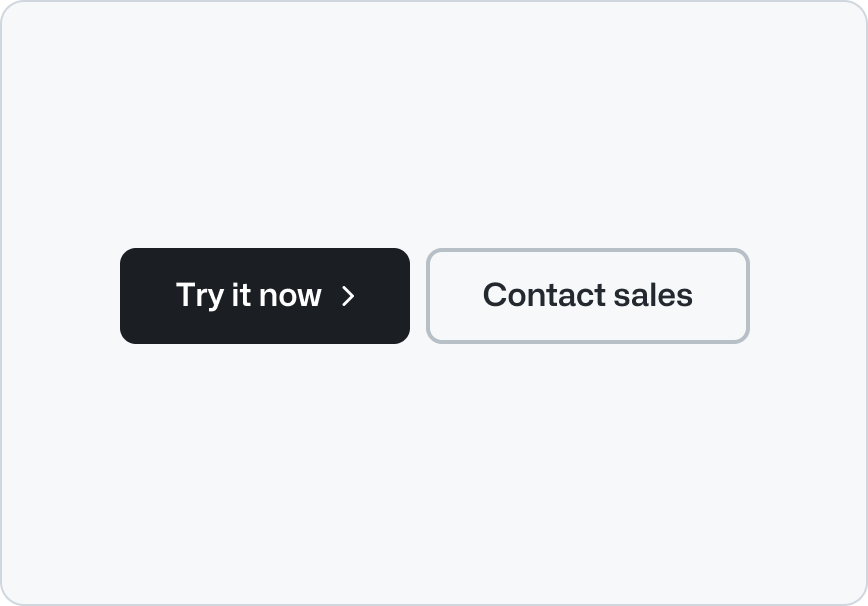
Use a button group for actions that are related to each other or to a single task, such as “Log in” and “Sign up” or “Try it out” and “Learn more.”
|
|
12
12
|
|
|
13
13
|
Use button group to display a pair of primary and a secondary actions. The primary button is used for the main call to action while the secondary button is a related, less important action.
|
|
14
14
|
|
|
15
|
+
Join controls when they represent closely related peer actions with equal hierarchy. Icon-only actions must use a familiar symbol and have a concise, action-oriented accessible name.
|
|
16
|
+
|
|
15
17
|
**✅ Do**
|
|
16
18
|
|
|
17
19
|
|
|
@@ -52,11 +54,12 @@ _Don't stack the buttons horizontally when there's not enough space to avoid tex
|
|
|
52
54
|
|
|
53
55
|
### Size
|
|
54
56
|
|
|
55
|
-
|
|
57
|
+
Use the default size in most cases. Use the smallest size in compact toolbars and the largest size alongside prominent page introductions.
|
|
56
58
|
|
|
57
59
|
## Related components
|
|
58
60
|
|
|
59
|
-
- [Button](../Button/index.md): To display
|
|
60
|
-
-
|
|
61
|
-
-
|
|
62
|
-
- [
|
|
61
|
+
- [Button](../Button/index.md): To display an action with a visible label.
|
|
62
|
+
- [Icon button](../IconButton/index.md): To display a familiar icon-only action with an accessible name.
|
|
63
|
+
- Link: To navigate to another page.
|
|
64
|
+
- [Hero](../Hero/index.md): To introduce a page with a large heading, description, and actions.
|
|
65
|
+
- [CTA banner](../CTABanner/index.md): To draw attention to or create urgency around an action.
|
|
@@ -8,7 +8,7 @@ storybook: '/brand/storybook/?path=/story/components-buttongroup--playground'
|
|
|
8
8
|
---
|
|
9
9
|
|
|
10
10
|
```js
|
|
11
|
-
import {ActionMenu, Button, ButtonGroup} from '@primer/react-brand'
|
|
11
|
+
import {ActionMenu, Button, ButtonGroup, IconButton} from '@primer/react-brand'
|
|
12
12
|
```
|
|
13
13
|
|
|
14
14
|
## Examples
|
|
@@ -24,9 +24,28 @@ This is the default variant for the ButtonGroup component. The first item in the
|
|
|
24
24
|
</ButtonGroup>
|
|
25
25
|
```
|
|
26
26
|
|
|
27
|
+
### Joined buttons and icon buttons
|
|
28
|
+
|
|
29
|
+
Set `variant="joined"` to connect any number of `Button` and `IconButton` children. Joined controls use the `secondary` variant by default so they share one visual hierarchy; explicit child variants override that default.
|
|
30
|
+
|
|
31
|
+
```jsx
|
|
32
|
+
<Stack direction="vertical" alignItems="flex-start" gap="condensed">
|
|
33
|
+
<ButtonGroup variant="joined">
|
|
34
|
+
<Button>Previous</Button>
|
|
35
|
+
<Button>Today</Button>
|
|
36
|
+
<Button>Next</Button>
|
|
37
|
+
</ButtonGroup>
|
|
38
|
+
<ButtonGroup variant="joined">
|
|
39
|
+
<IconButton icon={DownloadIcon} aria-label="Download" />
|
|
40
|
+
<IconButton icon={ShareIcon} aria-label="Share" />
|
|
41
|
+
<IconButton icon={KebabHorizontalIcon} aria-label="More actions" />
|
|
42
|
+
</ButtonGroup>
|
|
43
|
+
</Stack>
|
|
44
|
+
```
|
|
45
|
+
|
|
27
46
|
### Action menus
|
|
28
47
|
|
|
29
|
-
|
|
48
|
+
The default ButtonGroup variant supports up to two children and applies `primary` to the first action and `secondary` to the second. Joined groups support any number of `Button` and `IconButton` children. `ActionMenu` is supported only by the default variant.
|
|
30
49
|
|
|
31
50
|
Explicit `variant` overrides to `Button` or `ActionMenu.Button` will override the default values.
|
|
32
51
|
|
|
@@ -75,7 +94,8 @@ The `Button` component can render as a `button` or `a` HTML element. By default,
|
|
|
75
94
|
|
|
76
95
|
### ButtonGroup
|
|
77
96
|
|
|
78
|
-
| Name | Type | Default
|
|
79
|
-
| :----------- | :------------------------------- |
|
|
80
|
-
| `buttonSize` | `'small' \| 'medium' \| 'large'` |
|
|
81
|
-
| `buttonsAs` | `'button' \| 'a'` |
|
|
97
|
+
| Name | Type | Default | Description |
|
|
98
|
+
| :----------- | :------------------------------- | :---------: | :-------------------------------------- |
|
|
99
|
+
| `buttonSize` | `'small' \| 'medium' \| 'large'` | `'medium'` | The size variations available in Button |
|
|
100
|
+
| `buttonsAs` | `'button' \| 'a'` | `'button'` | The HTML variations available in Button |
|
|
101
|
+
| `variant` | `ButtonGroupVariants` | `'default'` | The visual presentation of the group |
|
|
@@ -0,0 +1,99 @@
|
|
|
1
|
+
---
|
|
2
|
+
title: Icon button
|
|
3
|
+
description: Use an icon button to represent an action with an Octicon instead of a visible text label.
|
|
4
|
+
keywords: ['action', 'button', 'control', 'icon', 'interactive']
|
|
5
|
+
ready: true
|
|
6
|
+
---
|
|
7
|
+
|
|
8
|
+
## Usage
|
|
9
|
+
|
|
10
|
+
Icon buttons represent an action with an [Octicon](https://primer.style/octicons) instead of a visible text label. Always choose a familiar Octicon whose meaning is clear in context. Otherwise, use a [button](../Button/index.md) with a visible text label.
|
|
11
|
+
|
|
12
|
+
Every icon button displays a tooltip on hover and keyboard focus. The tooltip repeats the accessible label by default, helping users confirm the action before activating it.
|
|
13
|
+
|
|
14
|
+
**✅ Do**
|
|
15
|
+
|
|
16
|
+
_Use an Octicon that clearly represents the action._
|
|
17
|
+
|
|
18
|
+
**❌ Don't**
|
|
19
|
+
|
|
20
|
+
_Don't pair a familiar Octicon with an unrelated action._
|
|
21
|
+
|
|
22
|
+
## Labels
|
|
23
|
+
|
|
24
|
+
Every icon button needs a concise name that describes what happens when someone activates it. Begin with a clear verb when possible, such as Search, Share, Close, or Delete item.
|
|
25
|
+
|
|
26
|
+
Describe the action rather than the icon's appearance. Keep supplementary tooltip text short and non-essential.
|
|
27
|
+
|
|
28
|
+
**✅ Do**
|
|
29
|
+
|
|
30
|
+
_Describe the action the button performs._
|
|
31
|
+
|
|
32
|
+
**❌ Don't**
|
|
33
|
+
|
|
34
|
+
_Don't describe the icon's appearance._
|
|
35
|
+
|
|
36
|
+
## Hierarchy and emphasis
|
|
37
|
+
|
|
38
|
+
Use the default visual appearance for most icon buttons. Only use the stronger accent colors for the highest-priority action in a group.
|
|
39
|
+
|
|
40
|
+
Reserve danger styling for destructive actions. The icon and accessible name must still communicate the destructive outcome without relying on color alone.
|
|
41
|
+
|
|
42
|
+
Use the invisible appearance only when the surrounding interface already provides enough structure and the control remains discoverable in every interaction state.
|
|
43
|
+
|
|
44
|
+
## Grouping
|
|
45
|
+
|
|
46
|
+
Join closely related peer actions so their relationship is visually clear. Keep unrelated actions separate and provide enough space between their targets.
|
|
47
|
+
|
|
48
|
+
**✅ Do**
|
|
49
|
+
|
|
50
|
+
_Join closely related icon buttons into one group._
|
|
51
|
+
|
|
52
|
+
**❌ Don't**
|
|
53
|
+
|
|
54
|
+
_Don't separate icon buttons that represent one related set of actions._
|
|
55
|
+
|
|
56
|
+
## Shape
|
|
57
|
+
|
|
58
|
+
Icon buttons are available in two shapes, with square the default.
|
|
59
|
+
|
|
60
|
+
Use the standard square shape for most use-cases. Use a rounded shape only when it matches an established interaction pattern, such as sending a chat message or advancing through media quickly.
|
|
61
|
+
|
|
62
|
+
Keep shape consistent among related controls. Do not use shape alone to communicate an action's meaning or state.
|
|
63
|
+
|
|
64
|
+
**✅ Do**
|
|
65
|
+
|
|
66
|
+
_Use a consistent shape for related icon buttons._
|
|
67
|
+
|
|
68
|
+
**❌ Don't**
|
|
69
|
+
|
|
70
|
+
_Don't mix shapes unless the difference communicates an established pattern._
|
|
71
|
+
|
|
72
|
+
## Loading
|
|
73
|
+
|
|
74
|
+
Show progress in place when an action takes time to complete. Keep focus on the control, prevent repeated activation, and announce that work is in progress. Use a specific announcement when the surrounding context does not make the operation clear.
|
|
75
|
+
|
|
76
|
+
**✅ Do**
|
|
77
|
+
|
|
78
|
+
_Replace the Octicon with a loading indicator while the action is in progress._
|
|
79
|
+
|
|
80
|
+
**❌ Don't**
|
|
81
|
+
|
|
82
|
+
_Don't use only disabled styling to communicate that an action is in progress._
|
|
83
|
+
|
|
84
|
+
## Accessibility
|
|
85
|
+
|
|
86
|
+
- Give every icon button an accessible name, even when the icon seems self-explanatory.
|
|
87
|
+
- Ensure the name describes the action and remains accurate when the button's state changes.
|
|
88
|
+
- Keep the tooltip available on both pointer hover and keyboard focus.
|
|
89
|
+
- Ensure the control has a visible focus indicator.
|
|
90
|
+
- Maintain at least a 24x24 pixel target size and provide enough spacing from nearby controls.
|
|
91
|
+
- Treat the Octicon as decorative because the accessible name communicates the purpose.
|
|
92
|
+
- Do not rely on color, shape, or iconography alone to communicate state.
|
|
93
|
+
|
|
94
|
+
## Related components
|
|
95
|
+
|
|
96
|
+
- [Button](../Button/index.md): For actions with a visible text label.
|
|
97
|
+
- [Button group](../ButtonGroup/index.md): For a set of closely related actions.
|
|
98
|
+
- [Tooltip](../Tooltip/index.md): For guidance on concise labels and supplementary information.
|
|
99
|
+
- [Octicons](https://primer.style/octicons): For the icon library used by icon buttons.
|
|
@@ -0,0 +1,189 @@
|
|
|
1
|
+
---
|
|
2
|
+
title: Icon button
|
|
3
|
+
description: Use an icon button to represent an action with an Octicon instead of a visible text label.
|
|
4
|
+
keywords: ['action', 'button', 'control', 'icon', 'interactive']
|
|
5
|
+
ready: true
|
|
6
|
+
a11yReviewed: false
|
|
7
|
+
source: https://github.com/primer/brand/blob/main/packages/react/src/IconButton/IconButton.tsx
|
|
8
|
+
storybook: '/brand/storybook/?path=/story/components-iconbutton--playground'
|
|
9
|
+
---
|
|
10
|
+
|
|
11
|
+
```js
|
|
12
|
+
import {IconButton} from '@primer/react-brand'
|
|
13
|
+
```
|
|
14
|
+
|
|
15
|
+
## Examples
|
|
16
|
+
|
|
17
|
+
### Default
|
|
18
|
+
|
|
19
|
+
```jsx
|
|
20
|
+
<IconButton icon={HeartIcon} aria-label="Favorite" />
|
|
21
|
+
```
|
|
22
|
+
|
|
23
|
+
### Variants
|
|
24
|
+
|
|
25
|
+
IconButton inherits standard variants from Button and adds `danger` and `invisible` variants.
|
|
26
|
+
|
|
27
|
+
```jsx
|
|
28
|
+
<Stack direction={{narrow: 'vertical', regular: 'horizontal'}}>
|
|
29
|
+
<IconButton icon={HeartIcon} aria-label="Favorite" variant="primary" />
|
|
30
|
+
<IconButton icon={HeartIcon} aria-label="Favorite" variant="secondary" />
|
|
31
|
+
<IconButton icon={HeartIcon} aria-label="Favorite" variant="subtle" />
|
|
32
|
+
<IconButton icon={TrashIcon} aria-label="Delete item" variant="danger" />
|
|
33
|
+
<IconButton icon={HeartIcon} aria-label="Favorite" variant="invisible" />
|
|
34
|
+
</Stack>
|
|
35
|
+
```
|
|
36
|
+
|
|
37
|
+
### Sizes
|
|
38
|
+
|
|
39
|
+
```jsx
|
|
40
|
+
<Stack direction="horizontal" alignItems="center">
|
|
41
|
+
<IconButton icon={SearchIcon} aria-label="Search" size="small" />
|
|
42
|
+
<IconButton icon={SearchIcon} aria-label="Search" size="medium" />
|
|
43
|
+
<IconButton icon={SearchIcon} aria-label="Search" size="large" />
|
|
44
|
+
</Stack>
|
|
45
|
+
```
|
|
46
|
+
|
|
47
|
+
### Rounded
|
|
48
|
+
|
|
49
|
+
Use `rounded` for circular controls, such as a chat submit action.
|
|
50
|
+
|
|
51
|
+
```jsx
|
|
52
|
+
<IconButton rounded icon={ArrowUpIcon} aria-label="Send message" variant="primary" />
|
|
53
|
+
```
|
|
54
|
+
|
|
55
|
+
### In a `ButtonGroup`
|
|
56
|
+
|
|
57
|
+
Use `variant="joined"` to display related `IconButton` components.
|
|
58
|
+
|
|
59
|
+
```jsx
|
|
60
|
+
<ButtonGroup variant="joined">
|
|
61
|
+
<IconButton icon={DownloadIcon} aria-label="Download" />
|
|
62
|
+
<IconButton icon={ShareIcon} aria-label="Share" />
|
|
63
|
+
<IconButton icon={KebabHorizontalIcon} aria-label="More actions" />
|
|
64
|
+
</ButtonGroup>
|
|
65
|
+
```
|
|
66
|
+
|
|
67
|
+
### In a toolbar
|
|
68
|
+
|
|
69
|
+
Use small icon buttons for familiar actions in compact toolbars.
|
|
70
|
+
|
|
71
|
+
```jsx filename="noinline"
|
|
72
|
+
const App = () => {
|
|
73
|
+
const {isMedium} = useWindowSize()
|
|
74
|
+
|
|
75
|
+
return (
|
|
76
|
+
<Box padding="condensed" backgroundColor="subtle" borderRadius="medium">
|
|
77
|
+
<Stack direction="horizontal" alignItems="center" gap="condensed">
|
|
78
|
+
{isMedium !== false && (
|
|
79
|
+
<FormControl fullWidth>
|
|
80
|
+
<FormControl.Label visuallyHidden>Search files</FormControl.Label>
|
|
81
|
+
<TextInput type="search" size="small" leadingVisual={<SearchIcon />} placeholder="Search files" fullWidth />
|
|
82
|
+
</FormControl>
|
|
83
|
+
)}
|
|
84
|
+
<Stack direction="horizontal" alignItems="center" gap={4} padding="none">
|
|
85
|
+
<ActionMenu mode="split-button" size="small">
|
|
86
|
+
<ActionMenu.IconButton as="a" href="#new-project" icon={PlusIcon} aria-label="Create project" />
|
|
87
|
+
<ActionMenu.Overlay aria-label="Creation options">
|
|
88
|
+
<ActionMenu.Item as="a" href="#new-project">
|
|
89
|
+
New project
|
|
90
|
+
</ActionMenu.Item>
|
|
91
|
+
<ActionMenu.Item as="a" href="#upload-files">
|
|
92
|
+
Upload files
|
|
93
|
+
</ActionMenu.Item>
|
|
94
|
+
</ActionMenu.Overlay>
|
|
95
|
+
</ActionMenu>
|
|
96
|
+
<IconButton size="small" icon={ShareIcon} aria-label="Share workspace" />
|
|
97
|
+
<IconButton size="small" icon={InboxIcon} aria-label="Open notifications" />
|
|
98
|
+
<Avatar size={32} src="/images/avatar-mona.png" alt="Mona profile" />
|
|
99
|
+
</Stack>
|
|
100
|
+
</Stack>
|
|
101
|
+
</Box>
|
|
102
|
+
)
|
|
103
|
+
}
|
|
104
|
+
|
|
105
|
+
render(<App />)
|
|
106
|
+
```
|
|
107
|
+
|
|
108
|
+
### In an `ActionMenu`
|
|
109
|
+
|
|
110
|
+
Use an icon button as the trigger when a familiar icon clearly communicates that contextual actions are available. The menu label also supplies the accessible name for the generated menu trigger.
|
|
111
|
+
|
|
112
|
+
```jsx
|
|
113
|
+
<Stack direction="horizontal" alignItems="center" gap="condensed">
|
|
114
|
+
<ActionMenu>
|
|
115
|
+
<ActionMenu.IconButton icon={KebabHorizontalIcon} aria-label="File actions" />
|
|
116
|
+
<ActionMenu.Overlay aria-label="File actions">
|
|
117
|
+
<ActionMenu.Item value="Copy link">Copy link</ActionMenu.Item>
|
|
118
|
+
<ActionMenu.Item value="Rename file">Rename file</ActionMenu.Item>
|
|
119
|
+
<ActionMenu.Item value="Move to archive">Move to archive</ActionMenu.Item>
|
|
120
|
+
</ActionMenu.Overlay>
|
|
121
|
+
</ActionMenu>
|
|
122
|
+
<ActionMenu mode="split-button">
|
|
123
|
+
<ActionMenu.IconButton as="a" href="#new-document" icon={PlusIcon} aria-label="Create document" />
|
|
124
|
+
<ActionMenu.Overlay aria-label="Creation options">
|
|
125
|
+
<ActionMenu.Item as="a" href="#new-document">
|
|
126
|
+
New document
|
|
127
|
+
</ActionMenu.Item>
|
|
128
|
+
<ActionMenu.Item as="a" href="#upload-file">
|
|
129
|
+
Upload file
|
|
130
|
+
</ActionMenu.Item>
|
|
131
|
+
</ActionMenu.Overlay>
|
|
132
|
+
</ActionMenu>
|
|
133
|
+
</Stack>
|
|
134
|
+
```
|
|
135
|
+
|
|
136
|
+
### Description
|
|
137
|
+
|
|
138
|
+
Use `description` to add supplementary information to the tooltip while keeping `aria-label` as the action name.
|
|
139
|
+
|
|
140
|
+
```jsx
|
|
141
|
+
<IconButton icon={InboxIcon} aria-label="Notifications" description="You have unread notifications" />
|
|
142
|
+
```
|
|
143
|
+
|
|
144
|
+
### Delayed tooltip
|
|
145
|
+
|
|
146
|
+
Wrap IconButton in Tooltip with `delay="long"` when familiar controls appear in a dense group and immediate pointer tooltips would be distracting. Keyboard focus remains immediate.
|
|
147
|
+
|
|
148
|
+
```jsx
|
|
149
|
+
<Tooltip text="Favorite" delay="long">
|
|
150
|
+
<IconButton icon={HeartIcon} aria-label="Favorite" />
|
|
151
|
+
</Tooltip>
|
|
152
|
+
```
|
|
153
|
+
|
|
154
|
+
### Loading
|
|
155
|
+
|
|
156
|
+
```jsx
|
|
157
|
+
<IconButton loading loadingAnnouncement="Saving favorite" icon={HeartIcon} aria-label="Favorite" />
|
|
158
|
+
```
|
|
159
|
+
|
|
160
|
+
### Inactive
|
|
161
|
+
|
|
162
|
+
Inactive controls use the same muted style for every variant and retain focus and activation so they can explain why an action is unavailable. They render with `aria-disabled="true"` and must not perform their normal action.
|
|
163
|
+
|
|
164
|
+
```jsx
|
|
165
|
+
<IconButton
|
|
166
|
+
inactive
|
|
167
|
+
icon={HeartIcon}
|
|
168
|
+
aria-label="Favorite"
|
|
169
|
+
description="Favorites are temporarily unavailable"
|
|
170
|
+
onClick={() => window.alert('Favorites are temporarily unavailable. Try again later.')}
|
|
171
|
+
/>
|
|
172
|
+
```
|
|
173
|
+
|
|
174
|
+
## Component props
|
|
175
|
+
|
|
176
|
+
| Name | Type | Default | Required | Description |
|
|
177
|
+
| :-------------------- | :------------------- | :-----------: | :------: | :-------------------------------------------------------------------------------------- |
|
|
178
|
+
| `icon` | `Icon` | | `true` | Octicon component rendered in the center of the button |
|
|
179
|
+
| `aria-label` | `string` | | `true` | Required non-empty accessible action name and default tooltip label |
|
|
180
|
+
| `variant` | `IconButtonVariants` | `'secondary'` | `false` | Button variants plus IconButton-only `danger` and `invisible` variations |
|
|
181
|
+
| `size` | `IconButtonSizes` | `'medium'` | `false` | Control sizes inherited from Button |
|
|
182
|
+
| `description` | `string` | `undefined` | `false` | Supplementary tooltip description |
|
|
183
|
+
| `tooltipDirection` | `TooltipDirections` | `'s'` | `false` | Preferred tooltip direction |
|
|
184
|
+
| `inactive` | `boolean` | `false` | `false` | Applies variant-independent muted styling while preserving input for required feedback |
|
|
185
|
+
| `loading` | `boolean` | `false` | `false` | Replaces the icon with a loading indicator and blocks activation without removing focus |
|
|
186
|
+
| `loadingAnnouncement` | `string` | `'Loading'` | `false` | Polite live-region message announced while loading |
|
|
187
|
+
| `rounded` | `boolean` | `false` | `false` | Renders the control with a fully circular shape |
|
|
188
|
+
| `disabled` | `boolean` | `false` | `false` | Disables the control using Button's native or polymorphic behavior |
|
|
189
|
+
| `as` | `React.ElementType` | `'button'` | `false` | Element rendered by Button; provide `href` when rendering an anchor |
|
|
@@ -23,7 +23,8 @@ import {Tooltip} from '@primer/react-brand'
|
|
|
23
23
|
|
|
24
24
|
### Custom direction
|
|
25
25
|
|
|
26
|
-
By default, tooltips appear below the element. You can change the direction by passing the `direction` prop with a
|
|
26
|
+
By default, tooltips appear below the element. You can change the direction by passing the `direction` prop with a cardinal or diagonal direction.
|
|
27
|
+
Supported values are `n`, `ne`, `e`, `se`, `s`, `sw`, `w`, and `nw`.
|
|
27
28
|
|
|
28
29
|
As long as there is enough room in the viewport, the tooltip will appear in the specified direction. If there is not enough room, the tooltip will appear in whatever direction it can place the tooltip without overflowing the viewport.
|
|
29
30
|
|
|
@@ -33,29 +34,39 @@ As long as there is enough room in the viewport, the tooltip will appear in the
|
|
|
33
34
|
</Tooltip>
|
|
34
35
|
```
|
|
35
36
|
|
|
36
|
-
###
|
|
37
|
+
### Delay
|
|
37
38
|
|
|
38
|
-
|
|
39
|
+
Tooltips use a short pointer delay by default to avoid appearing while the pointer passes over a trigger. Use `medium` or `long` for groups of familiar controls where immediate tooltips would be distracting. Keyboard focus always opens the tooltip immediately.
|
|
40
|
+
|
|
41
|
+
```jsx
|
|
42
|
+
<Tooltip text="Sample tooltip content" delay="long">
|
|
43
|
+
<Button>Long delay</Button>
|
|
44
|
+
</Tooltip>
|
|
45
|
+
```
|
|
46
|
+
|
|
47
|
+
### With an icon button
|
|
48
|
+
|
|
49
|
+
Use `IconButton` when a familiar Octicon can replace a visible text label. Its required `aria-label` provides the accessible name and automatically appears in a tooltip on hover and keyboard focus, so it does not need to be wrapped in `Tooltip`.
|
|
39
50
|
|
|
40
51
|
Use this with caution. It is generally better to use a visible label for better usability and accessibility.
|
|
41
52
|
|
|
42
53
|
```jsx
|
|
43
|
-
<
|
|
44
|
-
<Button>
|
|
45
|
-
<ScreenFullIcon />
|
|
46
|
-
</Button>
|
|
47
|
-
</Tooltip>
|
|
54
|
+
<IconButton icon={ScreenFullIcon} aria-label="Go fullscreen" />
|
|
48
55
|
```
|
|
49
56
|
|
|
57
|
+
For other custom icon-only controls, use `type="label"` to make the tooltip text the trigger's accessible name.
|
|
58
|
+
|
|
50
59
|
## Component props
|
|
51
60
|
|
|
52
|
-
| name | type | default | required | description
|
|
53
|
-
| ----------- | -------------------------- | --------------- | -------- |
|
|
54
|
-
| `direction` | `
|
|
55
|
-
| `
|
|
56
|
-
| `
|
|
61
|
+
| name | type | default | required | description |
|
|
62
|
+
| ----------- | -------------------------- | --------------- | -------- | ---------------------------------------------------------------------------------------------------------------------------------------------------------------------------------------- |
|
|
63
|
+
| `direction` | `TooltipDirections` | `'s'` | `false` | The side the tooltip appears on |
|
|
64
|
+
| `delay` | `TooltipDelays` | `'short'` | `false` | Pointer hover delay: `short` (50ms), `medium` (400ms), or `long` (1200ms). Keyboard focus is immediate. |
|
|
65
|
+
| `text` | `string` | `undefined` | `true` | The text to be displayed in the tooltip |
|
|
66
|
+
| `type` | `'description' \| 'label'` | `'description'` | `false` | The tooltip's semantic relationship to its trigger. `label` provides the accessible name, while `description` provides supplementary information alongside the trigger's existing label. |
|
|
57
67
|
|
|
58
68
|
## Related components
|
|
59
69
|
|
|
60
70
|
- Popover: For displaying more complex interactive content that appears when triggered
|
|
61
71
|
- [Button](../Button/index.md): Often used in conjunction with tooltips
|
|
72
|
+
- [Icon button](../IconButton/index.md): For familiar icon-only actions with automatic tooltips
|
package/docs/components/index.md
CHANGED
|
@@ -22,6 +22,7 @@ description: Primer Brand UI components
|
|
|
22
22
|
- [Footnotes](Footnotes/react.md): Use footnotes to display contextual information and cite sources in the page content.
|
|
23
23
|
- [Hero](Hero/react.md): Use the hero component to render a full-width banner at the top of a page.
|
|
24
24
|
- [Icon](Icon/index.md): Use the icon component to display Octicons with an optional background
|
|
25
|
+
- [Icon button](IconButton/react.md): Use an icon button to represent an action with an Octicon instead of a visible text label.
|
|
25
26
|
- [IDE](IDE/index.md): Use the IDE to showcase a simulated integrated developer environment, complete with a code editor and AI chat that's intended to enhance code representation in marketing contexts.
|
|
26
27
|
- [Image](Image/react.md): Use the image component to display a graphical representation.
|
|
27
28
|
- [Inline code](InlineCode/index.md): Use InlineCode to render a short inline code fragment.
|
|
@@ -132,10 +132,12 @@ The `autoComplete` prop should be provided wherever possible to allow browsers t
|
|
|
132
132
|
|
|
133
133
|
### Sizes
|
|
134
134
|
|
|
135
|
-
`
|
|
135
|
+
`TextInput` can appear in `small`, `medium` (default), and `large` dimensions using the `size` prop.
|
|
136
136
|
|
|
137
137
|
```jsx
|
|
138
138
|
<div style={{display: 'inline-grid', gap: 3}}>
|
|
139
|
+
<TextInput size="small" aria-label="Small TextInput" />
|
|
140
|
+
|
|
139
141
|
<TextInput size="medium" aria-label="Medium TextInput" />
|
|
140
142
|
|
|
141
143
|
<TextInput size="large" aria-label="Large TextInput" />
|
|
@@ -208,7 +210,7 @@ The component API supports all standard HTML attribute props, while providing so
|
|
|
208
210
|
| `id` | `string` | | Sets a custom id |
|
|
209
211
|
| `fullWidth` | `boolean` | | Stretches elements visually to the edges of its parent div. |
|
|
210
212
|
| `ref` | `React.RefObject` | | Forward a Ref to the underlying DOM node |
|
|
211
|
-
| `size` | `'medium' \| 'large'`
|
|
213
|
+
| `size` | `'small' \| 'medium' \| 'large'` | | Visual dimensions for the input |
|
|
212
214
|
| `type` | `'text' \| 'number' \| 'email' \| 'password' \| 'search' \| 'tel' \| 'url' \| 'date' \| 'time' \| 'datetime-local'` | `text` | Alternative text inputs |
|
|
213
215
|
| `validationStatus` | `'error' \| 'success'` | | Applies visual and semantic state to the underlying elements |
|
|
214
216
|
|
package/docs/index.md
CHANGED
|
@@ -1,6 +1,6 @@
|
|
|
1
|
-
# Primer Brand docs (v0.
|
|
1
|
+
# Primer Brand docs (v0.78.0-rc.6fbe9fb5)
|
|
2
2
|
|
|
3
|
-
These docs are bundled with `@primer/react-brand@0.
|
|
3
|
+
These docs are bundled with `@primer/react-brand@0.78.0-rc.6fbe9fb5` and match your installed version.
|
|
4
4
|
|
|
5
5
|
New here? Start with [Getting started](getting-started/index.md) for installation, global
|
|
6
6
|
stylesheet and font setup. Component directories are named after their import (e.g.
|
|
@@ -56,6 +56,7 @@ stylesheet and font setup. Component directories are named after their import (e
|
|
|
56
56
|
- [Footnotes](components/Footnotes/react.md): Use footnotes to display contextual information and cite sources in the page content.
|
|
57
57
|
- [Hero](components/Hero/react.md): Use the hero component to render a full-width banner at the top of a page.
|
|
58
58
|
- [Icon](components/Icon/index.md): Use the icon component to display Octicons with an optional background
|
|
59
|
+
- [Icon button](components/IconButton/react.md): Use an icon button to represent an action with an Octicon instead of a visible text label.
|
|
59
60
|
- [IDE](components/IDE/index.md): Use the IDE to showcase a simulated integrated developer environment, complete with a code editor and AI chat that's intended to enhance code representation in marketing contexts.
|
|
60
61
|
- [Image](components/Image/react.md): Use the image component to display a graphical representation.
|
|
61
62
|
- [Inline code](components/InlineCode/index.md): Use InlineCode to render a short inline code fragment.
|