@primer/react-brand 0.74.0-rc.ffd69649 → 0.74.0
This diff represents the content of publicly available package versions that have been released to one of the supported registries. The information contained in this diff is provided for informational purposes only and reflects changes between package versions as they appear in their respective public registries.
- package/docs/components/Card/index.md +2 -2
- package/docs/components/Card/react.md +2 -3
- package/docs/components/InlineCode/index.md +53 -0
- package/docs/components/Label/index.md +14 -46
- package/docs/components/Label/react.md +23 -20
- package/docs/components/MinimalFooter/index.md +54 -10
- package/docs/components/PricingOptions/index.md +28 -6
- package/docs/components/River/react.md +11 -8
- package/docs/components/Token/index.md +4 -3
- package/docs/components/index.md +4 -3
- package/docs/index.md +6 -5
- package/docs/introduction/mcp.md +10 -10
- package/esm/Bento/Bento.d.ts.map +1 -1
- package/esm/Bento/Bento.js +3 -3
- package/esm/Bento/Bento.js.map +1 -1
- package/esm/CTABanner/CTABanner.d.ts +1 -0
- package/esm/CTABanner/CTABanner.d.ts.map +1 -1
- package/esm/CTABanner/CTABanner.js +4 -3
- package/esm/CTABanner/CTABanner.js.map +1 -1
- package/esm/CTABanner/{CTABanner.module-CDLOww8c.css → CTABanner.module-D4pYR4mY.css} +1 -1
- package/esm/CTABanner/CTABanner.module.js +1 -2
- package/esm/CTABanner/CTABanner.module.js.map +1 -1
- package/esm/Card/Card.d.ts +2 -1
- package/esm/Card/Card.d.ts.map +1 -1
- package/esm/Card/Card.js +2 -1
- package/esm/Card/Card.js.map +1 -1
- package/esm/Card/Card.module-Svi04dp7.css +1 -0
- package/esm/Card/Card.module.js +1 -1
- package/esm/Card/Card.module.js.map +1 -1
- package/esm/InlineCode/InlineCode.d.ts +19 -0
- package/esm/InlineCode/InlineCode.d.ts.map +1 -0
- package/esm/InlineCode/InlineCode.js +22 -0
- package/esm/InlineCode/InlineCode.js.map +1 -0
- package/esm/InlineCode/InlineCode.module-Br3-YmSA.css +1 -0
- package/esm/InlineCode/InlineCode.module.js +9 -0
- package/esm/InlineCode/InlineCode.module.js.map +1 -0
- package/esm/InlineCode/index.d.ts +2 -0
- package/esm/InlineCode/index.d.ts.map +1 -0
- package/esm/Label/Label.d.ts +3 -1
- package/esm/Label/Label.d.ts.map +1 -1
- package/esm/Label/Label.js.map +1 -1
- package/esm/MinimalFooter/MinimalFooter.d.ts +25 -1
- package/esm/MinimalFooter/MinimalFooter.d.ts.map +1 -1
- package/esm/MinimalFooter/MinimalFooter.js +140 -100
- package/esm/MinimalFooter/MinimalFooter.js.map +1 -1
- package/esm/MinimalFooter/MinimalFooter.module-CGtOtT5r.css +1 -0
- package/esm/MinimalFooter/MinimalFooter.module.js +26 -13
- package/esm/MinimalFooter/MinimalFooter.module.js.map +1 -1
- package/esm/Pillar/Pillar.d.ts +1 -1
- package/esm/Pillar/Pillar.js.map +1 -1
- package/esm/PricingOptions/PricingOptions.d.ts +4 -0
- package/esm/PricingOptions/PricingOptions.d.ts.map +1 -1
- package/esm/PricingOptions/PricingOptions.js +10 -10
- package/esm/PricingOptions/PricingOptions.js.map +1 -1
- package/esm/Token/Token.d.ts +2 -2
- package/esm/Token/Token.js.map +1 -1
- package/esm/index.d.ts +1 -0
- package/esm/index.d.ts.map +1 -1
- package/esm/index.esm.js +48 -47
- package/esm/node_modules/@primer/octicons-react/dist/index.esm.js +22 -28
- package/esm/node_modules/@primer/octicons-react/dist/index.esm.js.map +1 -1
- package/esm/packages/design-tokens/lib/design-tokens/css/tokens/functional/components/footer/base-C0fjI9_t.css +1 -0
- package/esm/packages/design-tokens/lib/design-tokens/css/tokens/functional/components/footer/colors-with-modes-CMFhnjfv.css +1 -0
- package/esm/packages/design-tokens/lib/design-tokens/css/tokens/functional/components/inline-code/colors-with-modes-Bj7XtHMY.css +1 -0
- package/esm/river/River/River.d.ts +8 -2
- package/esm/river/River/River.d.ts.map +1 -1
- package/esm/river/River/River.js +6 -6
- package/esm/river/River/River.js.map +1 -1
- package/esm/river/river-shared.module-B1HvdKsP.css +1 -0
- package/esm/river/river-shared.module.js +1 -2
- package/esm/river/river-shared.module.js.map +1 -1
- package/lib/CTABanner/CTABanner.d.ts +1 -0
- package/lib/Card/Card.d.ts +2 -1
- package/lib/InlineCode/InlineCode.d.ts +18 -0
- package/lib/InlineCode/index.d.ts +1 -0
- package/lib/Label/Label.d.ts +3 -1
- package/lib/MinimalFooter/MinimalFooter.d.ts +25 -1
- package/lib/Pillar/Pillar.d.ts +1 -1
- package/lib/PricingOptions/PricingOptions.d.ts +4 -0
- package/lib/Token/Token.d.ts +2 -2
- package/lib/css/main.css +417 -218
- package/lib/design-tokens/css/tokens/base/colors/color-scales-with-modes.css +1 -1
- package/lib/design-tokens/css/tokens/base/colors/light.css +1 -1
- package/lib/design-tokens/css/tokens/base/size/size.css +1 -1
- package/lib/design-tokens/css/tokens/base/typography/typography.css +1 -1
- package/lib/design-tokens/css/tokens/functional/animation/base.css +1 -1
- package/lib/design-tokens/css/tokens/functional/colors/global-with-modes.css +1 -1
- package/lib/design-tokens/css/tokens/functional/colors/global.css +1 -1
- package/lib/design-tokens/css/tokens/functional/components/accordion/colors-with-modes.css +1 -1
- package/lib/design-tokens/css/tokens/functional/components/action-menu/colors-with-modes.css +1 -1
- package/lib/design-tokens/css/tokens/functional/components/anchor-nav/colors-with-modes.css +1 -1
- package/lib/design-tokens/css/tokens/functional/components/bento/base.css +1 -1
- package/lib/design-tokens/css/tokens/functional/components/blinking-cursor/colors-with-modes.css +1 -1
- package/lib/design-tokens/css/tokens/functional/components/breadcrumbs/colors-with-modes.css +1 -1
- package/lib/design-tokens/css/tokens/functional/components/button/colors-with-modes.css +1 -1
- package/lib/design-tokens/css/tokens/functional/components/card/base.css +1 -1
- package/lib/design-tokens/css/tokens/functional/components/card/colors-with-modes.css +1 -1
- package/lib/design-tokens/css/tokens/functional/components/card/colors.css +1 -1
- package/lib/design-tokens/css/tokens/functional/components/comparison-table/colors-with-modes.css +1 -1
- package/lib/design-tokens/css/tokens/functional/components/comparison-table/comparison-table.css +1 -1
- package/lib/design-tokens/css/tokens/functional/components/control/colors-with-modes.css +1 -1
- package/lib/design-tokens/css/tokens/functional/components/cta-banner/colors-with-modes.css +1 -1
- package/lib/design-tokens/css/tokens/functional/components/eyebrow-banner/colors-with-modes.css +1 -1
- package/lib/design-tokens/css/tokens/functional/components/eyebrow-banner/eyebrow-banner.css +1 -1
- package/lib/design-tokens/css/tokens/functional/components/faq/base.css +1 -1
- package/lib/design-tokens/css/tokens/functional/components/faq/colors-with-modes.css +1 -1
- package/lib/design-tokens/css/tokens/functional/components/faq/colors.css +1 -1
- package/lib/design-tokens/css/tokens/functional/components/faq/faq.css +1 -1
- package/lib/design-tokens/css/tokens/functional/components/footer/base.css +8 -0
- package/lib/design-tokens/css/tokens/functional/components/footer/colors-with-modes.css +19 -3
- package/lib/design-tokens/css/tokens/functional/components/footer/colors.css +10 -2
- package/lib/design-tokens/css/tokens/functional/components/frosted-glass-vfx/base.css +1 -1
- package/lib/design-tokens/css/tokens/functional/components/frosted-glass-vfx/colors-with-modes.css +1 -1
- package/lib/design-tokens/css/tokens/functional/components/grid/colors-with-modes.css +1 -1
- package/lib/design-tokens/css/tokens/functional/components/grid/colors.css +1 -1
- package/lib/design-tokens/css/tokens/functional/components/grid/grid.css +1 -1
- package/lib/design-tokens/css/tokens/functional/components/hero/base.css +1 -1
- package/lib/design-tokens/css/tokens/functional/components/icon/colors-with-modes.css +1 -1
- package/lib/design-tokens/css/tokens/functional/components/icon/colors.css +1 -1
- package/lib/design-tokens/css/tokens/functional/components/ide/base.css +1 -1
- package/lib/design-tokens/css/tokens/functional/components/ide/colors-with-modes.css +1 -1
- package/lib/design-tokens/css/tokens/functional/components/image/base.css +1 -1
- package/lib/design-tokens/css/tokens/functional/components/inline-code/colors-with-modes.css +17 -0
- package/lib/design-tokens/css/tokens/functional/components/inline-code/colors.css +10 -0
- package/lib/design-tokens/css/tokens/functional/components/inline-link/base.css +1 -1
- package/lib/design-tokens/css/tokens/functional/components/inline-link/colors-with-modes.css +1 -1
- package/lib/design-tokens/css/tokens/functional/components/inline-link/colors.css +1 -1
- package/lib/design-tokens/css/tokens/functional/components/label/colors-with-modes.css +1 -1
- package/lib/design-tokens/css/tokens/functional/components/label/colors.css +1 -1
- package/lib/design-tokens/css/tokens/functional/components/link/colors-with-modes.css +1 -1
- package/lib/design-tokens/css/tokens/functional/components/link/colors.css +1 -1
- package/lib/design-tokens/css/tokens/functional/components/logosuite/base.css +1 -1
- package/lib/design-tokens/css/tokens/functional/components/logosuite/colors-with-modes.css +1 -1
- package/lib/design-tokens/css/tokens/functional/components/logosuite/colors.css +1 -1
- package/lib/design-tokens/css/tokens/functional/components/media-playlist/colors-with-modes.css +1 -1
- package/lib/design-tokens/css/tokens/functional/components/media-playlist/colors.css +1 -1
- package/lib/design-tokens/css/tokens/functional/components/nav-list/colors-with-modes.css +1 -1
- package/lib/design-tokens/css/tokens/functional/components/pricing-options/colors-with-modes.css +1 -1
- package/lib/design-tokens/css/tokens/functional/components/pricing-options/colors.css +1 -1
- package/lib/design-tokens/css/tokens/functional/components/pricing-options/pricing-options.css +1 -1
- package/lib/design-tokens/css/tokens/functional/components/prose/base.css +1 -1
- package/lib/design-tokens/css/tokens/functional/components/prose/colors-with-modes.css +1 -1
- package/lib/design-tokens/css/tokens/functional/components/river/base.css +1 -1
- package/lib/design-tokens/css/tokens/functional/components/river/river.css +1 -1
- package/lib/design-tokens/css/tokens/functional/components/river-story-scroll/colors-with-modes.css +1 -1
- package/lib/design-tokens/css/tokens/functional/components/section/section.css +1 -1
- package/lib/design-tokens/css/tokens/functional/components/statistic/base.css +1 -1
- package/lib/design-tokens/css/tokens/functional/components/sub-nav/base.css +1 -1
- package/lib/design-tokens/css/tokens/functional/components/sub-nav/colors-with-modes.css +1 -1
- package/lib/design-tokens/css/tokens/functional/components/subdomain-nav-bar/colors-with-modes.css +1 -1
- package/lib/design-tokens/css/tokens/functional/components/tabs/base.css +1 -1
- package/lib/design-tokens/css/tokens/functional/components/tabs/colors-with-modes.css +1 -1
- package/lib/design-tokens/css/tokens/functional/components/tabs/colors.css +1 -1
- package/lib/design-tokens/css/tokens/functional/components/testimonial/base.css +1 -1
- package/lib/design-tokens/css/tokens/functional/components/testimonial/colors-with-modes.css +1 -1
- package/lib/design-tokens/css/tokens/functional/components/testimonial/colors.css +1 -1
- package/lib/design-tokens/css/tokens/functional/components/text-cursor-animation/colors-with-modes.css +1 -1
- package/lib/design-tokens/css/tokens/functional/components/text-cursor-animation/colors.css +1 -1
- package/lib/design-tokens/css/tokens/functional/components/tiles/colors-with-modes.css +1 -1
- package/lib/design-tokens/css/tokens/functional/components/timeline/base.css +1 -1
- package/lib/design-tokens/css/tokens/functional/components/timeline/colors-with-modes.css +1 -1
- package/lib/design-tokens/css/tokens/functional/components/timeline/colors.css +1 -1
- package/lib/design-tokens/css/tokens/functional/components/token/colors-with-modes.css +1 -1
- package/lib/design-tokens/css/tokens/functional/components/token/colors.css +1 -1
- package/lib/design-tokens/css/tokens/functional/components/tooltip/colors-with-modes.css +1 -1
- package/lib/design-tokens/css/tokens/functional/components/tooltip/colors.css +1 -1
- package/lib/design-tokens/css/tokens/functional/components/video-player/base.css +1 -1
- package/lib/design-tokens/css/tokens/functional/components/video-player/colors-with-modes.css +1 -1
- package/lib/design-tokens/css/tokens/functional/size/border.css +1 -1
- package/lib/design-tokens/css/tokens/functional/size/breakpoints.css +1 -1
- package/lib/design-tokens/css/tokens/functional/size/size-coarse.css +1 -1
- package/lib/design-tokens/css/tokens/functional/size/size-fine.css +1 -1
- package/lib/design-tokens/css/tokens/functional/size/size.css +1 -1
- package/lib/design-tokens/css/tokens/functional/size/viewport.css +1 -1
- package/lib/design-tokens/css/tokens/functional/typography/typography-responsive.css +1 -1
- package/lib/design-tokens/css/tokens/functional/typography/typography.css +1 -1
- package/lib/design-tokens/js/module/tokens/base/colors/light.js +1 -1
- package/lib/design-tokens/js/module/tokens/base/size/size.js +1 -1
- package/lib/design-tokens/js/module/tokens/base/typography/typography.js +1 -1
- package/lib/design-tokens/js/module/tokens/functional/animation/base.js +1 -1
- package/lib/design-tokens/js/module/tokens/functional/colors/global.js +1 -1
- package/lib/design-tokens/js/module/tokens/functional/components/bento/base.js +1 -1
- package/lib/design-tokens/js/module/tokens/functional/components/card/base.js +1 -1
- package/lib/design-tokens/js/module/tokens/functional/components/card/colors.js +1 -1
- package/lib/design-tokens/js/module/tokens/functional/components/comparison-table/comparison-table.js +1 -1
- package/lib/design-tokens/js/module/tokens/functional/components/eyebrow-banner/eyebrow-banner.js +1 -1
- package/lib/design-tokens/js/module/tokens/functional/components/faq/base.js +1 -1
- package/lib/design-tokens/js/module/tokens/functional/components/faq/colors.js +1 -1
- package/lib/design-tokens/js/module/tokens/functional/components/faq/faq.js +1 -1
- package/lib/design-tokens/js/module/tokens/functional/components/footer/base.js +14 -0
- package/lib/design-tokens/js/module/tokens/functional/components/footer/colors.js +41 -3
- package/lib/design-tokens/js/module/tokens/functional/components/frosted-glass-vfx/base.js +1 -1
- package/lib/design-tokens/js/module/tokens/functional/components/grid/colors.js +1 -1
- package/lib/design-tokens/js/module/tokens/functional/components/grid/grid.js +1 -1
- package/lib/design-tokens/js/module/tokens/functional/components/hero/base.js +1 -1
- package/lib/design-tokens/js/module/tokens/functional/components/icon/colors.js +1 -1
- package/lib/design-tokens/js/module/tokens/functional/components/ide/base.js +1 -1
- package/lib/design-tokens/js/module/tokens/functional/components/image/base.js +1 -1
- package/lib/design-tokens/js/module/tokens/functional/components/inline-code/colors.js +27 -0
- package/lib/design-tokens/js/module/tokens/functional/components/inline-link/base.js +1 -1
- package/lib/design-tokens/js/module/tokens/functional/components/inline-link/colors.js +1 -1
- package/lib/design-tokens/js/module/tokens/functional/components/label/colors.js +1 -1
- package/lib/design-tokens/js/module/tokens/functional/components/link/colors.js +1 -1
- package/lib/design-tokens/js/module/tokens/functional/components/logosuite/base.js +1 -1
- package/lib/design-tokens/js/module/tokens/functional/components/logosuite/colors.js +1 -1
- package/lib/design-tokens/js/module/tokens/functional/components/media-playlist/colors.js +1 -1
- package/lib/design-tokens/js/module/tokens/functional/components/pricing-options/colors.js +1 -1
- package/lib/design-tokens/js/module/tokens/functional/components/pricing-options/pricing-options.js +1 -1
- package/lib/design-tokens/js/module/tokens/functional/components/prose/base.js +1 -1
- package/lib/design-tokens/js/module/tokens/functional/components/river/base.js +1 -1
- package/lib/design-tokens/js/module/tokens/functional/components/river/river.js +1 -1
- package/lib/design-tokens/js/module/tokens/functional/components/section/section.js +1 -1
- package/lib/design-tokens/js/module/tokens/functional/components/statistic/base.js +1 -1
- package/lib/design-tokens/js/module/tokens/functional/components/sub-nav/base.js +1 -1
- package/lib/design-tokens/js/module/tokens/functional/components/tabs/base.js +1 -1
- package/lib/design-tokens/js/module/tokens/functional/components/tabs/colors.js +1 -1
- package/lib/design-tokens/js/module/tokens/functional/components/testimonial/base.js +1 -1
- package/lib/design-tokens/js/module/tokens/functional/components/testimonial/colors.js +1 -1
- package/lib/design-tokens/js/module/tokens/functional/components/text-cursor-animation/colors.js +1 -1
- package/lib/design-tokens/js/module/tokens/functional/components/timeline/base.js +1 -1
- package/lib/design-tokens/js/module/tokens/functional/components/timeline/colors.js +1 -1
- package/lib/design-tokens/js/module/tokens/functional/components/token/colors.js +1 -1
- package/lib/design-tokens/js/module/tokens/functional/components/tooltip/colors.js +1 -1
- package/lib/design-tokens/js/module/tokens/functional/components/video-player/base.js +1 -1
- package/lib/design-tokens/js/module/tokens/functional/size/border.js +1 -1
- package/lib/design-tokens/js/module/tokens/functional/size/breakpoints.js +1 -1
- package/lib/design-tokens/js/module/tokens/functional/size/size-coarse.js +1 -1
- package/lib/design-tokens/js/module/tokens/functional/size/size-fine.js +1 -1
- package/lib/design-tokens/js/module/tokens/functional/size/size.js +1 -1
- package/lib/design-tokens/js/module/tokens/functional/size/viewport.js +1 -1
- package/lib/design-tokens/js/module/tokens/functional/typography/typography-responsive.js +1 -1
- package/lib/design-tokens/js/module/tokens/functional/typography/typography.js +1 -1
- package/lib/design-tokens/js/tokens/base/colors/light.js +1 -1
- package/lib/design-tokens/js/tokens/base/size/size.js +1 -1
- package/lib/design-tokens/js/tokens/base/typography/typography.js +1 -1
- package/lib/design-tokens/js/tokens/functional/animation/base.js +1 -1
- package/lib/design-tokens/js/tokens/functional/colors/global.js +1 -1
- package/lib/design-tokens/js/tokens/functional/components/bento/base.js +1 -1
- package/lib/design-tokens/js/tokens/functional/components/card/base.js +1 -1
- package/lib/design-tokens/js/tokens/functional/components/card/colors.js +1 -1
- package/lib/design-tokens/js/tokens/functional/components/comparison-table/comparison-table.js +1 -1
- package/lib/design-tokens/js/tokens/functional/components/eyebrow-banner/eyebrow-banner.js +1 -1
- package/lib/design-tokens/js/tokens/functional/components/faq/base.js +1 -1
- package/lib/design-tokens/js/tokens/functional/components/faq/colors.js +1 -1
- package/lib/design-tokens/js/tokens/functional/components/faq/faq.js +1 -1
- package/lib/design-tokens/js/tokens/functional/components/footer/base.js +6 -0
- package/lib/design-tokens/js/tokens/functional/components/footer/colors.js +10 -2
- package/lib/design-tokens/js/tokens/functional/components/frosted-glass-vfx/base.js +1 -1
- package/lib/design-tokens/js/tokens/functional/components/grid/colors.js +1 -1
- package/lib/design-tokens/js/tokens/functional/components/grid/grid.js +1 -1
- package/lib/design-tokens/js/tokens/functional/components/hero/base.js +1 -1
- package/lib/design-tokens/js/tokens/functional/components/icon/colors.js +1 -1
- package/lib/design-tokens/js/tokens/functional/components/ide/base.js +1 -1
- package/lib/design-tokens/js/tokens/functional/components/image/base.js +1 -1
- package/lib/design-tokens/js/tokens/functional/components/inline-code/colors.js +8 -0
- package/lib/design-tokens/js/tokens/functional/components/inline-link/base.js +1 -1
- package/lib/design-tokens/js/tokens/functional/components/inline-link/colors.js +1 -1
- package/lib/design-tokens/js/tokens/functional/components/label/colors.js +1 -1
- package/lib/design-tokens/js/tokens/functional/components/link/colors.js +1 -1
- package/lib/design-tokens/js/tokens/functional/components/logosuite/base.js +1 -1
- package/lib/design-tokens/js/tokens/functional/components/logosuite/colors.js +1 -1
- package/lib/design-tokens/js/tokens/functional/components/media-playlist/colors.js +1 -1
- package/lib/design-tokens/js/tokens/functional/components/pricing-options/colors.js +1 -1
- package/lib/design-tokens/js/tokens/functional/components/pricing-options/pricing-options.js +1 -1
- package/lib/design-tokens/js/tokens/functional/components/prose/base.js +1 -1
- package/lib/design-tokens/js/tokens/functional/components/river/base.js +1 -1
- package/lib/design-tokens/js/tokens/functional/components/river/river.js +1 -1
- package/lib/design-tokens/js/tokens/functional/components/section/section.js +1 -1
- package/lib/design-tokens/js/tokens/functional/components/statistic/base.js +1 -1
- package/lib/design-tokens/js/tokens/functional/components/sub-nav/base.js +1 -1
- package/lib/design-tokens/js/tokens/functional/components/tabs/base.js +1 -1
- package/lib/design-tokens/js/tokens/functional/components/tabs/colors.js +1 -1
- package/lib/design-tokens/js/tokens/functional/components/testimonial/base.js +1 -1
- package/lib/design-tokens/js/tokens/functional/components/testimonial/colors.js +1 -1
- package/lib/design-tokens/js/tokens/functional/components/text-cursor-animation/colors.js +1 -1
- package/lib/design-tokens/js/tokens/functional/components/timeline/base.js +1 -1
- package/lib/design-tokens/js/tokens/functional/components/timeline/colors.js +1 -1
- package/lib/design-tokens/js/tokens/functional/components/token/colors.js +1 -1
- package/lib/design-tokens/js/tokens/functional/components/tooltip/colors.js +1 -1
- package/lib/design-tokens/js/tokens/functional/components/video-player/base.js +1 -1
- package/lib/design-tokens/js/tokens/functional/size/border.js +1 -1
- package/lib/design-tokens/js/tokens/functional/size/breakpoints.js +1 -1
- package/lib/design-tokens/js/tokens/functional/size/size-coarse.js +1 -1
- package/lib/design-tokens/js/tokens/functional/size/size-fine.js +1 -1
- package/lib/design-tokens/js/tokens/functional/size/size.js +1 -1
- package/lib/design-tokens/js/tokens/functional/size/viewport.js +1 -1
- package/lib/design-tokens/js/tokens/functional/typography/typography-responsive.js +1 -1
- package/lib/design-tokens/js/tokens/functional/typography/typography.js +1 -1
- package/lib/design-tokens/json/colors.json +11 -1
- package/lib/design-tokens/scss/tokens/base/colors/light.scss +1 -1
- package/lib/design-tokens/scss/tokens/base/size/size.scss +1 -1
- package/lib/design-tokens/scss/tokens/base/typography/typography.scss +1 -1
- package/lib/design-tokens/scss/tokens/functional/animation/base.scss +1 -1
- package/lib/design-tokens/scss/tokens/functional/colors/global.scss +1 -1
- package/lib/design-tokens/scss/tokens/functional/components/bento/base.scss +1 -1
- package/lib/design-tokens/scss/tokens/functional/components/card/base.scss +1 -1
- package/lib/design-tokens/scss/tokens/functional/components/card/colors.scss +1 -1
- package/lib/design-tokens/scss/tokens/functional/components/comparison-table/comparison-table.scss +1 -1
- package/lib/design-tokens/scss/tokens/functional/components/eyebrow-banner/eyebrow-banner.scss +1 -1
- package/lib/design-tokens/scss/tokens/functional/components/faq/base.scss +1 -1
- package/lib/design-tokens/scss/tokens/functional/components/faq/colors.scss +1 -1
- package/lib/design-tokens/scss/tokens/functional/components/faq/faq.scss +1 -1
- package/lib/design-tokens/scss/tokens/functional/components/footer/base.scss +5 -0
- package/lib/design-tokens/scss/tokens/functional/components/footer/colors.scss +10 -2
- package/lib/design-tokens/scss/tokens/functional/components/frosted-glass-vfx/base.scss +1 -1
- package/lib/design-tokens/scss/tokens/functional/components/grid/colors.scss +1 -1
- package/lib/design-tokens/scss/tokens/functional/components/grid/grid.scss +1 -1
- package/lib/design-tokens/scss/tokens/functional/components/hero/base.scss +1 -1
- package/lib/design-tokens/scss/tokens/functional/components/icon/colors.scss +1 -1
- package/lib/design-tokens/scss/tokens/functional/components/ide/base.scss +1 -1
- package/lib/design-tokens/scss/tokens/functional/components/image/base.scss +1 -1
- package/lib/design-tokens/scss/tokens/functional/components/inline-code/colors.scss +7 -0
- package/lib/design-tokens/scss/tokens/functional/components/inline-link/base.scss +1 -1
- package/lib/design-tokens/scss/tokens/functional/components/inline-link/colors.scss +1 -1
- package/lib/design-tokens/scss/tokens/functional/components/label/colors.scss +1 -1
- package/lib/design-tokens/scss/tokens/functional/components/link/colors.scss +1 -1
- package/lib/design-tokens/scss/tokens/functional/components/logosuite/base.scss +1 -1
- package/lib/design-tokens/scss/tokens/functional/components/logosuite/colors.scss +1 -1
- package/lib/design-tokens/scss/tokens/functional/components/media-playlist/colors.scss +1 -1
- package/lib/design-tokens/scss/tokens/functional/components/pricing-options/colors.scss +1 -1
- package/lib/design-tokens/scss/tokens/functional/components/pricing-options/pricing-options.scss +1 -1
- package/lib/design-tokens/scss/tokens/functional/components/prose/base.scss +1 -1
- package/lib/design-tokens/scss/tokens/functional/components/river/base.scss +1 -1
- package/lib/design-tokens/scss/tokens/functional/components/river/river.scss +1 -1
- package/lib/design-tokens/scss/tokens/functional/components/section/section.scss +1 -1
- package/lib/design-tokens/scss/tokens/functional/components/statistic/base.scss +1 -1
- package/lib/design-tokens/scss/tokens/functional/components/sub-nav/base.scss +1 -1
- package/lib/design-tokens/scss/tokens/functional/components/tabs/base.scss +1 -1
- package/lib/design-tokens/scss/tokens/functional/components/tabs/colors.scss +1 -1
- package/lib/design-tokens/scss/tokens/functional/components/testimonial/base.scss +1 -1
- package/lib/design-tokens/scss/tokens/functional/components/testimonial/colors.scss +1 -1
- package/lib/design-tokens/scss/tokens/functional/components/text-cursor-animation/colors.scss +1 -1
- package/lib/design-tokens/scss/tokens/functional/components/timeline/base.scss +1 -1
- package/lib/design-tokens/scss/tokens/functional/components/timeline/colors.scss +1 -1
- package/lib/design-tokens/scss/tokens/functional/components/token/colors.scss +1 -1
- package/lib/design-tokens/scss/tokens/functional/components/tooltip/colors.scss +1 -1
- package/lib/design-tokens/scss/tokens/functional/components/video-player/base.scss +1 -1
- package/lib/design-tokens/scss/tokens/functional/size/border.scss +1 -1
- package/lib/design-tokens/scss/tokens/functional/size/breakpoints.scss +1 -1
- package/lib/design-tokens/scss/tokens/functional/size/size-coarse.scss +1 -1
- package/lib/design-tokens/scss/tokens/functional/size/size-fine.scss +1 -1
- package/lib/design-tokens/scss/tokens/functional/size/size.scss +1 -1
- package/lib/design-tokens/scss/tokens/functional/size/viewport.scss +1 -1
- package/lib/design-tokens/scss/tokens/functional/typography/typography-responsive.scss +1 -1
- package/lib/design-tokens/scss/tokens/functional/typography/typography.scss +1 -1
- package/lib/design-tokens/ts/tokens/base/colors/light.d.ts +1 -1
- package/lib/design-tokens/ts/tokens/base/colors/light.js +1 -1
- package/lib/design-tokens/ts/tokens/base/size/size.d.ts +1 -1
- package/lib/design-tokens/ts/tokens/base/size/size.js +1 -1
- package/lib/design-tokens/ts/tokens/base/typography/typography.d.ts +1 -1
- package/lib/design-tokens/ts/tokens/base/typography/typography.js +1 -1
- package/lib/design-tokens/ts/tokens/functional/animation/base.d.ts +1 -1
- package/lib/design-tokens/ts/tokens/functional/animation/base.js +1 -1
- package/lib/design-tokens/ts/tokens/functional/colors/global.d.ts +1 -1
- package/lib/design-tokens/ts/tokens/functional/colors/global.js +1 -1
- package/lib/design-tokens/ts/tokens/functional/components/bento/base.d.ts +1 -1
- package/lib/design-tokens/ts/tokens/functional/components/bento/base.js +1 -1
- package/lib/design-tokens/ts/tokens/functional/components/card/base.d.ts +1 -1
- package/lib/design-tokens/ts/tokens/functional/components/card/base.js +1 -1
- package/lib/design-tokens/ts/tokens/functional/components/card/colors.d.ts +1 -1
- package/lib/design-tokens/ts/tokens/functional/components/card/colors.js +1 -1
- package/lib/design-tokens/ts/tokens/functional/components/comparison-table/comparison-table.d.ts +1 -1
- package/lib/design-tokens/ts/tokens/functional/components/comparison-table/comparison-table.js +1 -1
- package/lib/design-tokens/ts/tokens/functional/components/eyebrow-banner/eyebrow-banner.d.ts +1 -1
- package/lib/design-tokens/ts/tokens/functional/components/eyebrow-banner/eyebrow-banner.js +1 -1
- package/lib/design-tokens/ts/tokens/functional/components/faq/base.d.ts +1 -1
- package/lib/design-tokens/ts/tokens/functional/components/faq/base.js +1 -1
- package/lib/design-tokens/ts/tokens/functional/components/faq/colors.d.ts +1 -1
- package/lib/design-tokens/ts/tokens/functional/components/faq/colors.js +1 -1
- package/lib/design-tokens/ts/tokens/functional/components/faq/faq.d.ts +1 -1
- package/lib/design-tokens/ts/tokens/functional/components/faq/faq.js +1 -1
- package/lib/design-tokens/ts/tokens/functional/components/footer/base.d.ts +17 -0
- package/lib/design-tokens/ts/tokens/functional/components/footer/base.js +14 -0
- package/lib/design-tokens/ts/tokens/functional/components/footer/colors.d.ts +15 -1
- package/lib/design-tokens/ts/tokens/functional/components/footer/colors.js +16 -2
- package/lib/design-tokens/ts/tokens/functional/components/frosted-glass-vfx/base.d.ts +1 -1
- package/lib/design-tokens/ts/tokens/functional/components/frosted-glass-vfx/base.js +1 -1
- package/lib/design-tokens/ts/tokens/functional/components/grid/colors.d.ts +1 -1
- package/lib/design-tokens/ts/tokens/functional/components/grid/colors.js +1 -1
- package/lib/design-tokens/ts/tokens/functional/components/grid/grid.d.ts +1 -1
- package/lib/design-tokens/ts/tokens/functional/components/grid/grid.js +1 -1
- package/lib/design-tokens/ts/tokens/functional/components/hero/base.d.ts +1 -1
- package/lib/design-tokens/ts/tokens/functional/components/hero/base.js +1 -1
- package/lib/design-tokens/ts/tokens/functional/components/icon/colors.d.ts +1 -1
- package/lib/design-tokens/ts/tokens/functional/components/icon/colors.js +1 -1
- package/lib/design-tokens/ts/tokens/functional/components/ide/base.d.ts +1 -1
- package/lib/design-tokens/ts/tokens/functional/components/ide/base.js +1 -1
- package/lib/design-tokens/ts/tokens/functional/components/image/base.d.ts +1 -1
- package/lib/design-tokens/ts/tokens/functional/components/image/base.js +1 -1
- package/lib/design-tokens/ts/tokens/functional/components/inline-code/colors.d.ts +21 -0
- package/lib/design-tokens/ts/tokens/functional/components/inline-code/colors.js +18 -0
- package/lib/design-tokens/ts/tokens/functional/components/inline-link/base.d.ts +1 -1
- package/lib/design-tokens/ts/tokens/functional/components/inline-link/base.js +1 -1
- package/lib/design-tokens/ts/tokens/functional/components/inline-link/colors.d.ts +1 -1
- package/lib/design-tokens/ts/tokens/functional/components/inline-link/colors.js +1 -1
- package/lib/design-tokens/ts/tokens/functional/components/label/colors.d.ts +1 -1
- package/lib/design-tokens/ts/tokens/functional/components/label/colors.js +1 -1
- package/lib/design-tokens/ts/tokens/functional/components/link/colors.d.ts +1 -1
- package/lib/design-tokens/ts/tokens/functional/components/link/colors.js +1 -1
- package/lib/design-tokens/ts/tokens/functional/components/logosuite/base.d.ts +1 -1
- package/lib/design-tokens/ts/tokens/functional/components/logosuite/base.js +1 -1
- package/lib/design-tokens/ts/tokens/functional/components/logosuite/colors.d.ts +1 -1
- package/lib/design-tokens/ts/tokens/functional/components/logosuite/colors.js +1 -1
- package/lib/design-tokens/ts/tokens/functional/components/media-playlist/colors.d.ts +1 -1
- package/lib/design-tokens/ts/tokens/functional/components/media-playlist/colors.js +1 -1
- package/lib/design-tokens/ts/tokens/functional/components/pricing-options/colors.d.ts +1 -1
- package/lib/design-tokens/ts/tokens/functional/components/pricing-options/colors.js +1 -1
- package/lib/design-tokens/ts/tokens/functional/components/pricing-options/pricing-options.d.ts +1 -1
- package/lib/design-tokens/ts/tokens/functional/components/pricing-options/pricing-options.js +1 -1
- package/lib/design-tokens/ts/tokens/functional/components/prose/base.d.ts +1 -1
- package/lib/design-tokens/ts/tokens/functional/components/prose/base.js +1 -1
- package/lib/design-tokens/ts/tokens/functional/components/river/base.d.ts +1 -1
- package/lib/design-tokens/ts/tokens/functional/components/river/base.js +1 -1
- package/lib/design-tokens/ts/tokens/functional/components/river/river.d.ts +1 -1
- package/lib/design-tokens/ts/tokens/functional/components/river/river.js +1 -1
- package/lib/design-tokens/ts/tokens/functional/components/section/section.d.ts +1 -1
- package/lib/design-tokens/ts/tokens/functional/components/section/section.js +1 -1
- package/lib/design-tokens/ts/tokens/functional/components/statistic/base.d.ts +1 -1
- package/lib/design-tokens/ts/tokens/functional/components/statistic/base.js +1 -1
- package/lib/design-tokens/ts/tokens/functional/components/sub-nav/base.d.ts +1 -1
- package/lib/design-tokens/ts/tokens/functional/components/sub-nav/base.js +1 -1
- package/lib/design-tokens/ts/tokens/functional/components/tabs/base.d.ts +1 -1
- package/lib/design-tokens/ts/tokens/functional/components/tabs/base.js +1 -1
- package/lib/design-tokens/ts/tokens/functional/components/tabs/colors.d.ts +1 -1
- package/lib/design-tokens/ts/tokens/functional/components/tabs/colors.js +1 -1
- package/lib/design-tokens/ts/tokens/functional/components/testimonial/base.d.ts +1 -1
- package/lib/design-tokens/ts/tokens/functional/components/testimonial/base.js +1 -1
- package/lib/design-tokens/ts/tokens/functional/components/testimonial/colors.d.ts +1 -1
- package/lib/design-tokens/ts/tokens/functional/components/testimonial/colors.js +1 -1
- package/lib/design-tokens/ts/tokens/functional/components/text-cursor-animation/colors.d.ts +1 -1
- package/lib/design-tokens/ts/tokens/functional/components/text-cursor-animation/colors.js +1 -1
- package/lib/design-tokens/ts/tokens/functional/components/timeline/base.d.ts +1 -1
- package/lib/design-tokens/ts/tokens/functional/components/timeline/base.js +1 -1
- package/lib/design-tokens/ts/tokens/functional/components/timeline/colors.d.ts +1 -1
- package/lib/design-tokens/ts/tokens/functional/components/timeline/colors.js +1 -1
- package/lib/design-tokens/ts/tokens/functional/components/token/colors.d.ts +1 -1
- package/lib/design-tokens/ts/tokens/functional/components/token/colors.js +1 -1
- package/lib/design-tokens/ts/tokens/functional/components/tooltip/colors.d.ts +1 -1
- package/lib/design-tokens/ts/tokens/functional/components/tooltip/colors.js +1 -1
- package/lib/design-tokens/ts/tokens/functional/components/video-player/base.d.ts +1 -1
- package/lib/design-tokens/ts/tokens/functional/components/video-player/base.js +1 -1
- package/lib/design-tokens/ts/tokens/functional/size/border.d.ts +1 -1
- package/lib/design-tokens/ts/tokens/functional/size/border.js +1 -1
- package/lib/design-tokens/ts/tokens/functional/size/breakpoints.d.ts +1 -1
- package/lib/design-tokens/ts/tokens/functional/size/breakpoints.js +1 -1
- package/lib/design-tokens/ts/tokens/functional/size/size-coarse.d.ts +1 -1
- package/lib/design-tokens/ts/tokens/functional/size/size-coarse.js +1 -1
- package/lib/design-tokens/ts/tokens/functional/size/size-fine.d.ts +1 -1
- package/lib/design-tokens/ts/tokens/functional/size/size-fine.js +1 -1
- package/lib/design-tokens/ts/tokens/functional/size/size.d.ts +1 -1
- package/lib/design-tokens/ts/tokens/functional/size/size.js +1 -1
- package/lib/design-tokens/ts/tokens/functional/size/viewport.d.ts +1 -1
- package/lib/design-tokens/ts/tokens/functional/size/viewport.js +1 -1
- package/lib/design-tokens/ts/tokens/functional/typography/typography-responsive.d.ts +1 -1
- package/lib/design-tokens/ts/tokens/functional/typography/typography-responsive.js +1 -1
- package/lib/design-tokens/ts/tokens/functional/typography/typography.d.ts +1 -1
- package/lib/design-tokens/ts/tokens/functional/typography/typography.js +1 -1
- package/lib/index.d.ts +1 -0
- package/lib/index.js +1 -1
- package/lib/river/River/River.d.ts +8 -2
- package/llms.txt +6 -5
- package/package.json +1 -1
- package/esm/Card/Card.module-DvGFYMFf.css +0 -1
- package/esm/MinimalFooter/MinimalFooter.module-Cl2g38SO.css +0 -1
- package/esm/packages/design-tokens/lib/design-tokens/css/tokens/functional/components/footer/colors-with-modes-DhME9i-y.css +0 -1
- package/esm/river/river-shared.module-5fefR7ip.css +0 -1
|
@@ -96,9 +96,9 @@ _Don't use both icon and image as the visual asset._
|
|
|
96
96
|
|
|
97
97
|
### Label
|
|
98
98
|
|
|
99
|
-
|
|
99
|
+
Use `Card.Label` for displaying one short label above the heading. It renders a [Token](../Token/index.md) by default.
|
|
100
100
|
|
|
101
|
-
|
|
101
|
+
Prefer `Card.Tokens` for showing groups of metadata. Both are optional. Never place the standalone [Label](../Label/index.md) component inside or alongside a Card.
|
|
102
102
|
|
|
103
103
|
### Heading
|
|
104
104
|
|
|
@@ -101,8 +101,7 @@ Use `Card.Tokens` to display one or more [Token](../Token/index.md) components b
|
|
|
101
101
|
|
|
102
102
|
### Label
|
|
103
103
|
|
|
104
|
-
Use `Card.Label`
|
|
105
|
-
`variant="accent-text"` for eyebrow-style copy.
|
|
104
|
+
Use `Card.Label` for displaying one short label above the heading.
|
|
106
105
|
|
|
107
106
|
```jsx
|
|
108
107
|
<Card href="https://github.com" ctaVariant="arrow">
|
|
@@ -197,7 +196,7 @@ When an image should stretch to fill the card width, set `padding="none"` on `Ca
|
|
|
197
196
|
|
|
198
197
|
### Tokens
|
|
199
198
|
|
|
200
|
-
Use `Card.Tokens` to display
|
|
199
|
+
Use `Card.Tokens` to display one or more [Token](../Token/index.md) components.
|
|
201
200
|
|
|
202
201
|
```jsx
|
|
203
202
|
<>
|
|
@@ -0,0 +1,53 @@
|
|
|
1
|
+
---
|
|
2
|
+
title: Inline code
|
|
3
|
+
description: Use InlineCode to render a short inline code fragment.
|
|
4
|
+
keywords: ['code', 'command', 'filename', 'inline']
|
|
5
|
+
source: https://github.com/primer/brand/blob/main/packages/react/src/InlineCode/InlineCode.tsx
|
|
6
|
+
storybook: '/brand/storybook/?path=/story/components-inlinecode--playground'
|
|
7
|
+
---
|
|
8
|
+
|
|
9
|
+
```js
|
|
10
|
+
import {InlineCode} from '@primer/react-brand'
|
|
11
|
+
```
|
|
12
|
+
|
|
13
|
+
## Usage
|
|
14
|
+
|
|
15
|
+
Use inline code for short code fragments such as commands, filenames, API names, configuration keys and values.
|
|
16
|
+
|
|
17
|
+
## Examples
|
|
18
|
+
|
|
19
|
+
### Default
|
|
20
|
+
|
|
21
|
+
```jsx
|
|
22
|
+
<Text as="p">
|
|
23
|
+
Install Primer Brand with <InlineCode>npm install @primer/react-brand</InlineCode>.
|
|
24
|
+
</Text>
|
|
25
|
+
```
|
|
26
|
+
|
|
27
|
+
### In a heading
|
|
28
|
+
|
|
29
|
+
```jsx
|
|
30
|
+
<Heading>
|
|
31
|
+
Work directly with your GitHub Issues via <InlineCode wrap={false}>/mcp</InlineCode> support
|
|
32
|
+
</Heading>
|
|
33
|
+
```
|
|
34
|
+
|
|
35
|
+
### Wrapping
|
|
36
|
+
|
|
37
|
+
`InlineCode` wraps by default to prevent long fragments from overflowing their container. Use `wrap={false}` only for
|
|
38
|
+
slash commands that must remain together and have a low character count.
|
|
39
|
+
|
|
40
|
+
```jsx
|
|
41
|
+
<Text as="p">
|
|
42
|
+
Long commands wrap when needed: <InlineCode>npm install @primer/react-brand@latest --save-exact</InlineCode>. Short
|
|
43
|
+
slash commands can remain together: <InlineCode wrap={false}>/mcp</InlineCode>.
|
|
44
|
+
</Text>
|
|
45
|
+
```
|
|
46
|
+
|
|
47
|
+
## Component props
|
|
48
|
+
|
|
49
|
+
| Name | Type | Default | Description |
|
|
50
|
+
| :----- | :-------- | :-----: | :------------------------------------------- |
|
|
51
|
+
| `wrap` | `boolean` | `true` | Controls whether the code fragment can wrap. |
|
|
52
|
+
|
|
53
|
+
`InlineCode` renders a native `code` element and accepts its standard HTML attributes.
|
|
@@ -1,76 +1,44 @@
|
|
|
1
1
|
---
|
|
2
2
|
title: Label
|
|
3
|
-
description: Use
|
|
4
|
-
keywords: ['
|
|
3
|
+
description: Use label to display short status or metadata attached to an object in product-like UI.
|
|
4
|
+
keywords: ['product UI', 'data table', 'issue metadata', 'status', 'indicator']
|
|
5
5
|
---
|
|
6
6
|
|
|
7
7
|
|
|
8
8
|
|
|
9
9
|
## Usage
|
|
10
10
|
|
|
11
|
-
Use
|
|
11
|
+
Use Label to display short status or metadata attached to an object in product-like UI, such as a data-table row,
|
|
12
|
+
dashboard item, application workflow, or GitHub issue. Keep it visually attached to the object it describes. Label is
|
|
13
|
+
not interactive and should not be used as an isolated eyebrow or pre-heading marker.
|
|
12
14
|
|
|
13
|
-
|
|
14
|
-
|
|
15
|
-

|
|
16
|
-
|
|
17
|
-
_Use labels to categorize an item._
|
|
18
|
-
|
|
19
|
-
**❌ Don't**
|
|
20
|
-
|
|
21
|
-

|
|
22
|
-
|
|
23
|
-
_Don't use labels as an interactive or navigational element. Use a button or a link component._
|
|
24
|
-
|
|
25
|
-
Position the labels to clearly identify the object they’re informing.
|
|
26
|
-
|
|
27
|
-
**✅ Do**
|
|
28
|
-
|
|
29
|
-

|
|
30
|
-
|
|
31
|
-
_Give labels enough space to be clearly identified. Use size or color to differentiate them if needed._
|
|
32
|
-
|
|
33
|
-
**❌ Don't**
|
|
34
|
-
|
|
35
|
-

|
|
36
|
-
|
|
37
|
-
_When used along with other items, don't place the label too close to them._
|
|
15
|
+
Choose a size and color that fit the surrounding product UI without relying on color alone to communicate meaning.
|
|
38
16
|
|
|
39
17
|
### Content
|
|
40
18
|
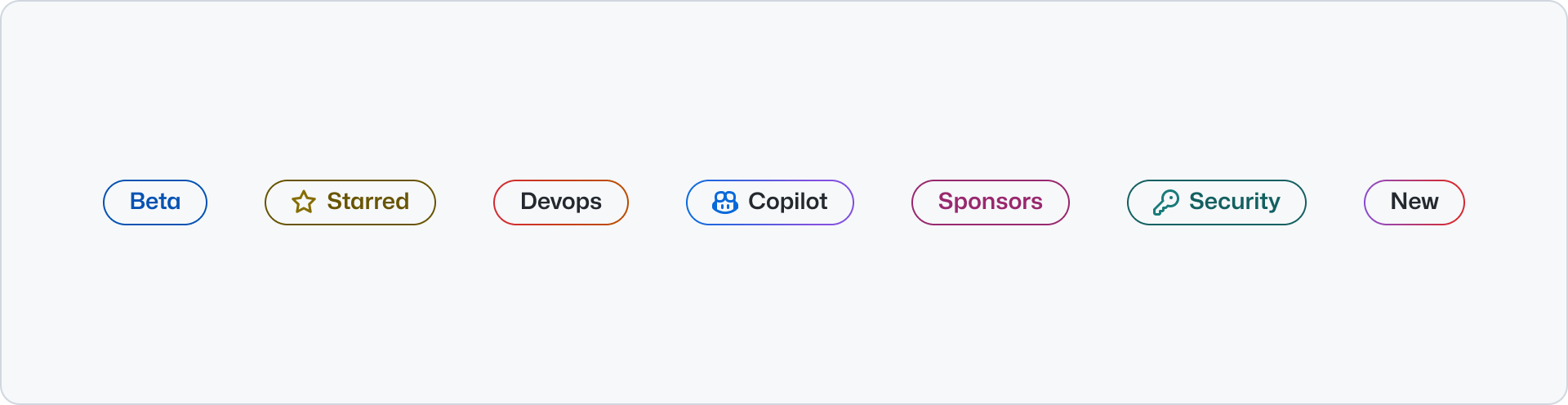
|
|
41
|
-
Use Label with
|
|
19
|
+
Use Label with short, scannable text. A single word is ideal. Use two or more words only when a record's status needs more context, such as “Limited availability" or “Enterprise only".
|
|
42
20
|
|
|
43
21
|
## Options
|
|
44
22
|
|
|
45
23
|
### Size
|
|
46
24
|
|
|
47
|
-
Labels come in
|
|
48
|
-
|
|
49
|
-
### Medium
|
|
25
|
+
Labels come in three sizes: `small`, `medium`, and `large`. Prefer the smallest size that remains legible in the product UI context.
|
|
50
26
|
|
|
51
|
-
|
|
27
|
+
### Small
|
|
52
28
|
|
|
53
|
-
|
|
29
|
+
Use the `small` size for compact data rows and issue-style metadata.
|
|
54
30
|
|
|
55
|
-
|
|
56
|
-
the label helps to quickly scan certain items._
|
|
57
|
-
|
|
58
|
-

|
|
31
|
+
### Medium
|
|
59
32
|
|
|
60
|
-
|
|
61
|
-
visual break._
|
|
33
|
+
Use the `medium` size when record metadata needs more emphasis than the small treatment.
|
|
62
34
|
|
|
63
35
|
### Large
|
|
64
36
|
|
|
65
|
-
Use the `large` size when
|
|
66
|
-
|
|
67
|
-

|
|
68
|
-
|
|
69
|
-
_Use large labels with headings that introduce a page. Use it to introduce the main topic or application._
|
|
37
|
+
Use the `large` size only when product-like UI needs a particularly prominent status treatment.
|
|
70
38
|
|
|
71
39
|
### Color
|
|
72
40
|
|
|
73
|
-
|
|
41
|
+
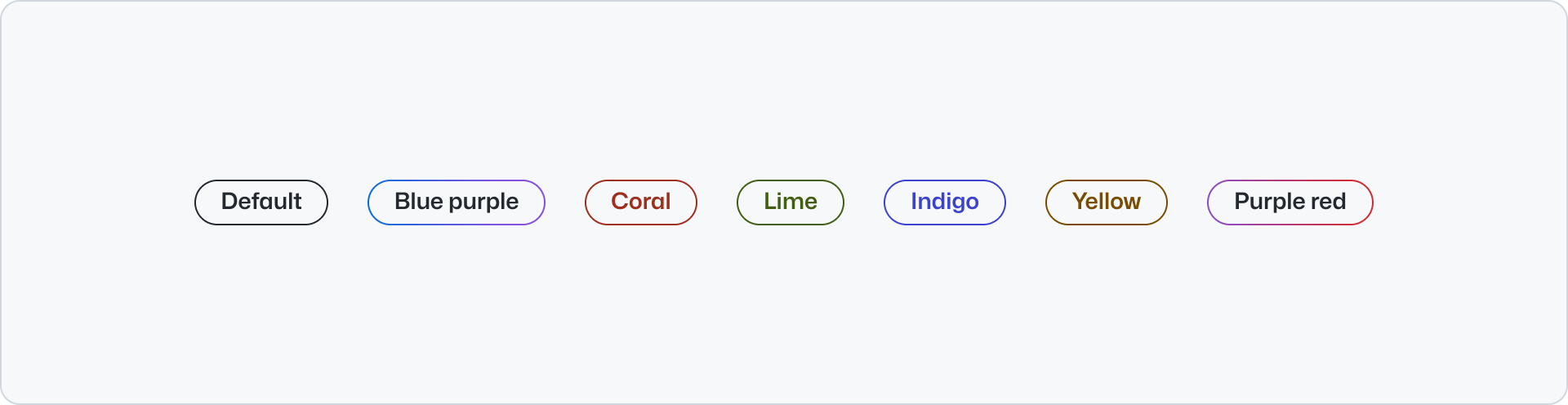
Label offers color options from the [Primer Brand color palette](../../primitives/color.md). Choose a color that helps distinguish record metadata without relying on color alone to communicate status.
|
|
74
42
|
|
|
75
43
|
|
|
76
44
|
|
|
@@ -1,7 +1,7 @@
|
|
|
1
1
|
---
|
|
2
2
|
title: Label
|
|
3
|
-
description: Use
|
|
4
|
-
keywords: ['
|
|
3
|
+
description: Use label to display short status or metadata attached to an object in product-like UI.
|
|
4
|
+
keywords: ['product UI', 'data table', 'issue metadata', 'status', 'indicator']
|
|
5
5
|
ready: true
|
|
6
6
|
figma: 'https://www.figma.com/file/BJ95AjraesmRCWsKA013GS/Primer-Brand?node-id=6084-28401'
|
|
7
7
|
source: https://github.com/primer/brand/blob/main/packages/react/src/Label/Label.tsx
|
|
@@ -10,25 +10,32 @@ a11yReviewed: true
|
|
|
10
10
|
---
|
|
11
11
|
|
|
12
12
|
```js
|
|
13
|
-
import {Label} from '@primer/react-brand'
|
|
13
|
+
import {Label, Stack, Text} from '@primer/react-brand'
|
|
14
14
|
```
|
|
15
15
|
|
|
16
|
+
Use Label to display short status or metadata attached to an object in product-like UI, such as a data-table row,
|
|
17
|
+
dashboard item, application workflow, or GitHub issue. Keep it visually attached to the object it describes. Never use
|
|
18
|
+
Label as an isolated eyebrow or pre-heading marker.
|
|
19
|
+
|
|
16
20
|
## Examples
|
|
17
21
|
|
|
18
22
|
### Default
|
|
19
23
|
|
|
20
|
-
|
|
24
|
+
The default Label uses the `medium` size and `default` color. Keep it visually attached to the record it describes.
|
|
21
25
|
|
|
22
26
|
```jsx
|
|
23
|
-
<
|
|
27
|
+
<Stack direction="horizontal" alignItems="center" padding="none">
|
|
28
|
+
<Label>In progress</Label>
|
|
29
|
+
</Stack>
|
|
24
30
|
```
|
|
25
31
|
|
|
26
32
|
### Sizes
|
|
27
33
|
|
|
28
|
-
Use the `size` prop to
|
|
34
|
+
Use the `size` prop to fit the density and emphasis of product UI metadata. Prefer the smallest size that remains
|
|
35
|
+
legible. Do not choose a size based on a nearby heading.
|
|
29
36
|
|
|
30
37
|
```jsx
|
|
31
|
-
<Stack direction="horizontal" alignItems="
|
|
38
|
+
<Stack direction="horizontal" alignItems="center" padding="none">
|
|
32
39
|
<Label size="small">Small</Label>
|
|
33
40
|
<Label size="medium">Medium</Label>
|
|
34
41
|
<Label size="large">Large</Label>
|
|
@@ -37,31 +44,27 @@ Use the `size` prop to adjust the size of the `Label` component. The `small` siz
|
|
|
37
44
|
|
|
38
45
|
### Color
|
|
39
46
|
|
|
40
|
-
Use the `color` prop to
|
|
47
|
+
Use the `color` prop to distinguish metadata attached to the same record. Do not rely on color alone to communicate
|
|
48
|
+
status.
|
|
41
49
|
|
|
42
50
|
```jsx
|
|
43
|
-
<Stack direction="horizontal" alignItems="
|
|
44
|
-
<Label color="
|
|
45
|
-
<Label color="
|
|
46
|
-
<Label color="
|
|
47
|
-
<Label color="red">Red</Label>
|
|
48
|
-
<Label color="pink-blue">Pink blue</Label>
|
|
49
|
-
<Label color="orange">Orange</Label>
|
|
51
|
+
<Stack direction="horizontal" alignItems="center" padding="none" flexWrap="wrap">
|
|
52
|
+
<Label color="red">Bug</Label>
|
|
53
|
+
<Label color="orange">High priority</Label>
|
|
54
|
+
<Label color="blue">Needs review</Label>
|
|
50
55
|
</Stack>
|
|
51
56
|
```
|
|
52
57
|
|
|
53
58
|
### Leading visual
|
|
54
59
|
|
|
55
|
-
|
|
60
|
+
Add a leading icon only when it makes product UI metadata easier to scan. Use an [Octicon](https://primer.style/octicons)
|
|
61
|
+
that reinforces the metadata meaning.
|
|
56
62
|
|
|
57
63
|
```jsx
|
|
58
|
-
<Stack direction="horizontal" alignItems="
|
|
64
|
+
<Stack direction="horizontal" alignItems="center" padding="none">
|
|
59
65
|
<Label color="yellow" leadingVisual={<StarIcon />}>
|
|
60
66
|
Starred
|
|
61
67
|
</Label>
|
|
62
|
-
<Label color="blue-purple" leadingVisual={<CopilotIcon />}>
|
|
63
|
-
Copilot
|
|
64
|
-
</Label>
|
|
65
68
|
</Stack>
|
|
66
69
|
```
|
|
67
70
|
|
|
@@ -1,6 +1,6 @@
|
|
|
1
1
|
---
|
|
2
2
|
title: Minimal footer
|
|
3
|
-
description: Use the minimal footer component to provide a global footer featuring legal links,
|
|
3
|
+
description: Use the minimal footer component to provide a global footer featuring legal links, social links, and optional footnotes.
|
|
4
4
|
keywords: ['legal', 'copyright', 'social', 'links', 'footnotes']
|
|
5
5
|
ready: true
|
|
6
6
|
source: https://github.com/primer/brand/blob/main/packages/react/src/MinimalFooter/MinimalFooter.tsx
|
|
@@ -22,6 +22,8 @@ import {MinimalFooter} from '@primer/react-brand'
|
|
|
22
22
|
|
|
23
23
|
### Footer links
|
|
24
24
|
|
|
25
|
+
Use up to five `MinimalFooter.Link` children. Links can render as anchors or buttons.
|
|
26
|
+
|
|
25
27
|
```jsx
|
|
26
28
|
<MinimalFooter>
|
|
27
29
|
<MinimalFooter.Link href="https://github.com/organizations/enterprise_plan">Try GitHub for free</MinimalFooter.Link>
|
|
@@ -56,7 +58,7 @@ import {MinimalFooter} from '@primer/react-brand'
|
|
|
56
58
|
|
|
57
59
|
### Footer social links
|
|
58
60
|
|
|
59
|
-
`MinimalFooter` will render all supported social links by default. Social links can be removed however, by passing `socialLinks={false}`.
|
|
61
|
+
`MinimalFooter` will render all supported social links by default. Social links can be removed however, by passing `socialLinks={false}`. Alternatively, pass an array of valid social links to filter and reorder the default list.
|
|
60
62
|
|
|
61
63
|
```jsx
|
|
62
64
|
<Stack>
|
|
@@ -68,27 +70,69 @@ import {MinimalFooter} from '@primer/react-brand'
|
|
|
68
70
|
</Stack>
|
|
69
71
|
```
|
|
70
72
|
|
|
73
|
+
### Center component
|
|
74
|
+
|
|
75
|
+
Use `centerComponent` for an exceptional page-specific control or status indicator between the top and bottom sections.
|
|
76
|
+
|
|
77
|
+
```jsx
|
|
78
|
+
<MinimalFooter
|
|
79
|
+
centerComponent={
|
|
80
|
+
<Stack direction="horizontal" gap="condensed" padding="none">
|
|
81
|
+
<Text size="200" variant="muted">
|
|
82
|
+
Status:
|
|
83
|
+
</Text>
|
|
84
|
+
<InlineLink href="https://www.githubstatus.com" size="200">
|
|
85
|
+
All systems operational
|
|
86
|
+
</InlineLink>
|
|
87
|
+
</Stack>
|
|
88
|
+
}
|
|
89
|
+
/>
|
|
90
|
+
```
|
|
91
|
+
|
|
92
|
+
### Back to top
|
|
93
|
+
|
|
94
|
+
Use `MinimalFooter.BackToTop` to opt into a control in the top row that scrolls the document back to the top.
|
|
95
|
+
|
|
96
|
+
After keyboard activation, focus moves to the first `<main>` element, falling back to `<body>` or `<html>` when a main landmark is unavailable. Use `focusTargetId` to identify a different semantic top-of-page destination.
|
|
97
|
+
|
|
98
|
+
```jsx
|
|
99
|
+
<MinimalFooter socialLinks={false}>
|
|
100
|
+
<MinimalFooter.BackToTop>Back to top</MinimalFooter.BackToTop>
|
|
101
|
+
</MinimalFooter>
|
|
102
|
+
```
|
|
103
|
+
|
|
71
104
|
## Component props
|
|
72
105
|
|
|
73
106
|
### MinimalFooter
|
|
74
107
|
|
|
75
|
-
| Name | Type
|
|
76
|
-
| :------------------- |
|
|
77
|
-
| `className` | `string`
|
|
78
|
-
| `
|
|
79
|
-
| `
|
|
80
|
-
| `
|
|
81
|
-
| `
|
|
108
|
+
| Name | Type | Default | Description |
|
|
109
|
+
| :------------------- | :------------------------------------------------------------------------------------------------------------------ | :-----------------------------------------------------------------------------------: | :----------------------------------------------------------------- |
|
|
110
|
+
| `className` | `string` | | Sets a custom class on the root element |
|
|
111
|
+
| `centerComponent` | `ReactElement` | `undefined` | Renders an optional component between the top and bottom sections. |
|
|
112
|
+
| `children` | `'MinimalFooter.Link' \| 'MinimalFooter.Footnotes' \| 'MinimalFooter.BackToTop'` | `undefined` | Valid child components |
|
|
113
|
+
| `copyrightStatement` | `string` \| `ReactElement` | Current-year GitHub copyright statement | The copyright statement displayed in the bottom section. |
|
|
114
|
+
| `logoHref` | `string` | `'https://github.com'` | The href for the GitHub logomark. |
|
|
115
|
+
| `socialLinks` | `Array<'x' \| 'github' \| 'linkedin' \| 'youtube' \| 'facebook' \| 'twitch' \| 'tiktok' \| 'instagram'>` \| `false` | `['x', 'github', 'linkedin', 'youtube', 'facebook', 'twitch', 'tiktok', 'instagram']` | Ordered subset of social links, or `false` to hide all links. |
|
|
82
116
|
|
|
83
117
|
### MinimalFooter.Link
|
|
84
118
|
|
|
85
119
|
| Name | Type | Default | Description |
|
|
86
120
|
| :--------- | :---------------- | :---------: | :---------------------------------- |
|
|
87
121
|
| `as` | `'a'`, `'button'` | `'a'` | Applies the underlying HTML element |
|
|
88
|
-
| `children` | `string` | `undefined` |
|
|
122
|
+
| `children` | `string` | `undefined` | Label for a link in the top section |
|
|
89
123
|
|
|
90
124
|
### MinimalFooter.Footnotes
|
|
91
125
|
|
|
92
126
|
| Name | Type | Default | Description |
|
|
93
127
|
| :--------- | :----------- | :---------: | :-------------------------------------------------------------------- |
|
|
94
128
|
| `children` | ReactElement | `undefined` | Use Primer Brand `Text` components to benefit from inherited styling. |
|
|
129
|
+
|
|
130
|
+
### MinimalFooter.BackToTop
|
|
131
|
+
|
|
132
|
+
| Name | Type | Default | Description |
|
|
133
|
+
| :-------------- | :------------------ | :---------: | :------------------------------------------------------------------------------------------------------------------------------------------------------------- |
|
|
134
|
+
| `children` | `ReactNode` | Required | The visible and accessible localized label. |
|
|
135
|
+
| `focusTargetId` | `string` | `undefined` | ID of the semantic top-of-page element that receives focus after keyboard activation. Defaults to the first `<main>`, then falls back to `<body>` or `<html>`. |
|
|
136
|
+
| `onClick` | `MouseEventHandler` | `undefined` | Runs before the built-in behavior. Call `event.preventDefault()` to cancel scrolling and focus transfer. |
|
|
137
|
+
|
|
138
|
+
All other props, including ARIA and `data-*` attributes, forward to the underlying `<button>`.
|
|
@@ -359,7 +359,9 @@ Use `PricingOptions.FeatureListItem` with `variant="included"` and `variant="exc
|
|
|
359
359
|
|
|
360
360
|
### Info tooltips
|
|
361
361
|
|
|
362
|
-
Use `infoTooltip` on `PricingOptions.FeatureListItem` to add
|
|
362
|
+
Use `infoTooltip` on `PricingOptions.FeatureListItem` to add an optional tooltip to a feature.
|
|
363
|
+
|
|
364
|
+
An `aria-label` is automatically applied to the tooltip trigger. Use `infoTooltipAriaLabel` to customize it.
|
|
363
365
|
|
|
364
366
|
```jsx
|
|
365
367
|
<PricingOptions>
|
|
@@ -384,6 +386,25 @@ Use `infoTooltip` on `PricingOptions.FeatureListItem` to add a supplementary too
|
|
|
384
386
|
</PricingOptions>
|
|
385
387
|
```
|
|
386
388
|
|
|
389
|
+
Use a custom trigger label when conditionally rendered content prevents the feature text from being used as the
|
|
390
|
+
automatically generated label:
|
|
391
|
+
|
|
392
|
+
```jsx
|
|
393
|
+
function FeatureWithCustomContent({customContent}) {
|
|
394
|
+
return (
|
|
395
|
+
<PricingOptions.FeatureListItem
|
|
396
|
+
infoTooltip="Interact with Copilot using natural language."
|
|
397
|
+
infoTooltipAriaLabel="More information about Chat in IDE and Mobile"
|
|
398
|
+
>
|
|
399
|
+
<>
|
|
400
|
+
Chat in IDE and Mobile
|
|
401
|
+
{customContent ? <Text>Custom footnote</Text> : null}
|
|
402
|
+
</>
|
|
403
|
+
</PricingOptions.FeatureListItem>
|
|
404
|
+
)
|
|
405
|
+
}
|
|
406
|
+
```
|
|
407
|
+
|
|
387
408
|
### Actions message
|
|
388
409
|
|
|
389
410
|
Use `PricingOptions.ActionsMessage` to render status, billing, or upgrade notes in the actions area. Add
|
|
@@ -490,11 +511,12 @@ One item per pricing plan to be displayed. Maximum of 4 items.
|
|
|
490
511
|
|
|
491
512
|
### PricingOptions.FeatureListItem
|
|
492
513
|
|
|
493
|
-
| Name
|
|
494
|
-
|
|
|
495
|
-
| `children`
|
|
496
|
-
| `infoTooltip`
|
|
497
|
-
| `
|
|
514
|
+
| Name | Type | Default | required | Description |
|
|
515
|
+
| :--------------------- | :------------------------- | :---------: | :------: | :---------------------------------------------------------------------------------- |
|
|
516
|
+
| `children` | `ReactNode` | `undefined` | `true` | The item of the feature list set |
|
|
517
|
+
| `infoTooltip` | `string` | `undefined` | `false` | Tooltip text shown on hover/focus via an info icon button |
|
|
518
|
+
| `infoTooltipAriaLabel` | `string` | `undefined` | `false` | Overrides the automatically generated accessible label for the info tooltip trigger |
|
|
519
|
+
| `variant` | `'included' \| 'excluded'` | `included` | `false` | The variant of the feature list set |
|
|
498
520
|
|
|
499
521
|
### PricingOptions.MenuAction
|
|
500
522
|
|
|
@@ -49,7 +49,6 @@ import {River, RiverBreakout} from '@primer/react-brand'
|
|
|
49
49
|
<img src="/images/placeholder.png" alt="placeholder, blank area with a gray background color" />
|
|
50
50
|
</River.Visual>
|
|
51
51
|
<River.Content>
|
|
52
|
-
<Label>Label</Label>
|
|
53
52
|
<Heading>Heading</Heading>
|
|
54
53
|
<Text>
|
|
55
54
|
Lorem ipsum dolor sit amet, consectetur adipiscing elit. In sapien sit ullamcorper id. Aliquam luctus sed turpis
|
|
@@ -271,14 +270,18 @@ The `gridline` variant adds lateral padding and applies a full-bleed visual back
|
|
|
271
270
|
|
|
272
271
|
### River.Content and RiverBreakout.Content `Required`
|
|
273
272
|
|
|
274
|
-
|
|
273
|
+
`EyebrowText`, [`Text`](../../typography/Text/index.md),
|
|
274
|
+
[`Heading`](../../typography/Heading/index.md), and
|
|
275
|
+
`Link` are the supported `children`. They can be composed in
|
|
276
|
+
any order, but their rendered output will always be in a predetermined order. Standalone `Label` children remain
|
|
277
|
+
rendered for compatibility, but are deprecated; use `EyebrowText` instead.
|
|
275
278
|
|
|
276
|
-
| Name | Type
|
|
277
|
-
| :---------- |
|
|
278
|
-
| `children` | [`Text`](../../typography/Text/index.md),[`Heading`](../../typography/Heading/index.md), `Link` | | Content that corresponds to the adjacent visual. |
|
|
279
|
-
| `className` | `string`
|
|
280
|
-
| `id` | `string`
|
|
281
|
-
| `ref` | `React.RefObject`
|
|
279
|
+
| Name | Type | Default | Description |
|
|
280
|
+
| :---------- | :-------------------------------------------------------------------------------------------------------------- | :-----: | :----------------------------------------------- |
|
|
281
|
+
| `children` | `EyebrowText`, [`Text`](../../typography/Text/index.md), [`Heading`](../../typography/Heading/index.md), `Link` | | Content that corresponds to the adjacent visual. |
|
|
282
|
+
| `className` | `string` | | Sets a custom class on the root element |
|
|
283
|
+
| `id` | `string` | | Sets a custom id |
|
|
284
|
+
| `ref` | `React.RefObject` | | Forward a Ref to the underlying DOM node |
|
|
282
285
|
|
|
283
286
|
### RiverBreakout
|
|
284
287
|
|
|
@@ -1,6 +1,6 @@
|
|
|
1
1
|
---
|
|
2
2
|
title: Token
|
|
3
|
-
description: Token
|
|
3
|
+
description: Use Token to display compact metadata that describes or supports adjacent content.
|
|
4
4
|
keywords: ['tag', 'metadata', 'category', 'chip', 'link']
|
|
5
5
|
ready: true
|
|
6
6
|
source: https://github.com/primer/brand/blob/main/packages/react/src/Token/Token.tsx
|
|
@@ -12,7 +12,9 @@ a11yReviewed: false
|
|
|
12
12
|
import {Avatar, Stack, Token} from '@primer/react-brand'
|
|
13
13
|
```
|
|
14
14
|
|
|
15
|
-
|
|
15
|
+
Use Token to display compact metadata that describes or supports adjacent content, such as a category, status, date,
|
|
16
|
+
author, or related topic. Keep it visually attached to the content it describes, and follow each compound component's
|
|
17
|
+
documented child API rather than inserting Token directly.
|
|
16
18
|
|
|
17
19
|
Keep `Token` content short and easy to scan. A single word is ideal. Two short words are acceptable when the category or type needs more context.
|
|
18
20
|
|
|
@@ -81,6 +83,5 @@ Use a leading visual when it helps users scan the Token more quickly. Octicons,
|
|
|
81
83
|
|
|
82
84
|
## Related components
|
|
83
85
|
|
|
84
|
-
- [Label](../Label/index.md): For larger non-interactive status and metadata treatments.
|
|
85
86
|
- Link: For inline navigational text.
|
|
86
87
|
- [Button](../Button/index.md): For higher-emphasis actions.
|
package/docs/components/index.md
CHANGED
|
@@ -24,10 +24,11 @@ description: Primer Brand UI components
|
|
|
24
24
|
- [Icon](Icon/index.md): Use the icon component to display Octicons with an optional background
|
|
25
25
|
- [IDE](IDE/index.md): Use the IDE to showcase a simulated integrated developer environment, complete with a code editor and AI chat that's intended to enhance code representation in marketing contexts.
|
|
26
26
|
- [Image](Image/react.md): Use the image component to display a graphical representation.
|
|
27
|
-
- [
|
|
27
|
+
- [Inline code](InlineCode/index.md): Use InlineCode to render a short inline code fragment.
|
|
28
|
+
- [Label](Label/react.md): Use label to display short status or metadata attached to an object in product-like UI.
|
|
28
29
|
- [Logo suite](LogoSuite/react.md): Use a logo suite to present a list logos, such as sponsors or vendors.
|
|
29
30
|
- [Media playlist](MediaPlaylist/index.md): Use MediaPlaylist to pair thumbnail-backed media items with a shared playback or media area.
|
|
30
|
-
- [Minimal footer](MinimalFooter/index.md): Use the minimal footer component to provide a global footer featuring legal links,
|
|
31
|
+
- [Minimal footer](MinimalFooter/index.md): Use the minimal footer component to provide a global footer featuring legal links, social links, and optional footnotes.
|
|
31
32
|
- [Minimal video player](MinimalVideoPlayer/index.md): Use MinimalVideoPlayer for muted, looping product demonstrations with a single play and pause control
|
|
32
33
|
- [NavList](NavList/index.md): Use NavList to render vertical navigation with optional expandable groups.
|
|
33
34
|
- [Ordered list](OrderedList/react.md): Use the ordered list component to display a list of numbered items.
|
|
@@ -48,7 +49,7 @@ description: Primer Brand UI components
|
|
|
48
49
|
- [Testimonial](Testimonial/react.md): Use testimonial to display a quote from a customer or user.
|
|
49
50
|
- [Tiles](Tiles/index.md): Use tiles to display a grid of logos or icons with optional links.
|
|
50
51
|
- [Timeline](Timeline/index.md): Use the timeline component to display a list of connected items as a vertical timeline.
|
|
51
|
-
- [Token](Token/index.md): Token
|
|
52
|
+
- [Token](Token/index.md): Use Token to display compact metadata that describes or supports adjacent content.
|
|
52
53
|
- [Tooltip](Tooltip/index.md): Use the tooltip component to display a short message when a user hovers or focuses an interactive element.
|
|
53
54
|
- [Unordered list](UnorderedList/react.md): Use the unordered list component to present a collection of items without specific ordering.
|
|
54
55
|
- [Video player](VideoPlayer/index.md): Use the video player component to enable playback of self-hosted videos
|
package/docs/index.md
CHANGED
|
@@ -1,6 +1,6 @@
|
|
|
1
|
-
# Primer Brand docs (v0.74.0
|
|
1
|
+
# Primer Brand docs (v0.74.0)
|
|
2
2
|
|
|
3
|
-
These docs are bundled with `@primer/react-brand@0.74.0
|
|
3
|
+
These docs are bundled with `@primer/react-brand@0.74.0` and match your installed version.
|
|
4
4
|
|
|
5
5
|
New here? Start with [Getting started](getting-started/index.md) for installation, global
|
|
6
6
|
stylesheet and font setup. Component directories are named after their import (e.g.
|
|
@@ -58,10 +58,11 @@ stylesheet and font setup. Component directories are named after their import (e
|
|
|
58
58
|
- [Icon](components/Icon/index.md): Use the icon component to display Octicons with an optional background
|
|
59
59
|
- [IDE](components/IDE/index.md): Use the IDE to showcase a simulated integrated developer environment, complete with a code editor and AI chat that's intended to enhance code representation in marketing contexts.
|
|
60
60
|
- [Image](components/Image/react.md): Use the image component to display a graphical representation.
|
|
61
|
-
- [
|
|
61
|
+
- [Inline code](components/InlineCode/index.md): Use InlineCode to render a short inline code fragment.
|
|
62
|
+
- [Label](components/Label/react.md): Use label to display short status or metadata attached to an object in product-like UI.
|
|
62
63
|
- [Logo suite](components/LogoSuite/react.md): Use a logo suite to present a list logos, such as sponsors or vendors.
|
|
63
64
|
- [Media playlist](components/MediaPlaylist/index.md): Use MediaPlaylist to pair thumbnail-backed media items with a shared playback or media area.
|
|
64
|
-
- [Minimal footer](components/MinimalFooter/index.md): Use the minimal footer component to provide a global footer featuring legal links,
|
|
65
|
+
- [Minimal footer](components/MinimalFooter/index.md): Use the minimal footer component to provide a global footer featuring legal links, social links, and optional footnotes.
|
|
65
66
|
- [Minimal video player](components/MinimalVideoPlayer/index.md): Use MinimalVideoPlayer for muted, looping product demonstrations with a single play and pause control
|
|
66
67
|
- [NavList](components/NavList/index.md): Use NavList to render vertical navigation with optional expandable groups.
|
|
67
68
|
- [Ordered list](components/OrderedList/react.md): Use the ordered list component to display a list of numbered items.
|
|
@@ -82,7 +83,7 @@ stylesheet and font setup. Component directories are named after their import (e
|
|
|
82
83
|
- [Testimonial](components/Testimonial/react.md): Use testimonial to display a quote from a customer or user.
|
|
83
84
|
- [Tiles](components/Tiles/index.md): Use tiles to display a grid of logos or icons with optional links.
|
|
84
85
|
- [Timeline](components/Timeline/index.md): Use the timeline component to display a list of connected items as a vertical timeline.
|
|
85
|
-
- [Token](components/Token/index.md): Token
|
|
86
|
+
- [Token](components/Token/index.md): Use Token to display compact metadata that describes or supports adjacent content.
|
|
86
87
|
- [Tooltip](components/Tooltip/index.md): Use the tooltip component to display a short message when a user hovers or focuses an interactive element.
|
|
87
88
|
- [Unordered list](components/UnorderedList/react.md): Use the unordered list component to present a collection of items without specific ordering.
|
|
88
89
|
- [Video player](components/VideoPlayer/index.md): Use the video player component to enable playback of self-hosted videos
|
package/docs/introduction/mcp.md
CHANGED
|
@@ -14,16 +14,16 @@ It is a version-aware, local (`stdio`) server that reads the docs and metadata o
|
|
|
14
14
|
|
|
15
15
|
The server exposes a set of tools that AI agents can call:
|
|
16
16
|
|
|
17
|
-
| Tool | What it does
|
|
18
|
-
| -------------------------- |
|
|
19
|
-
| `primer_brand_setup` | Configures Primer Brand first-time and maintains a Primer Brand pointer beside the declaring `package.json`.
|
|
20
|
-
| `primer_brand_page_design` | Page-design conventions (header/footer, hero media, gridline aesthetic, card grids,
|
|
21
|
-
| `primer_brand_component` | Get a component API information like props, allowed values and named sub-components.
|
|
22
|
-
| `primer_brand_examples` | Reference examples taken from our Storybook.
|
|
23
|
-
| `primer_brand_tokens` | Resolve design tokens by intent (color, space, typography) to CSS variables and values.
|
|
24
|
-
| `primer_brand_asset` | Find Octicons (`@primer/octicons-react`) and Octovisuals (`@primer/octovisuals-react`) more easily
|
|
25
|
-
| `primer_brand_docs` | Search and read Primer Brand guidance, including principles, accessibility and getting started.
|
|
26
|
-
| `primer_brand_review` | Check generated JSX and CSS against the design system for unknown components, invalid props, hardcoded values
|
|
17
|
+
| Tool | What it does |
|
|
18
|
+
| -------------------------- | --------------------------------------------------------------------------------------------------------------------------------------------------------------- |
|
|
19
|
+
| `primer_brand_setup` | Configures Primer Brand first-time and maintains a Primer Brand pointer beside the declaring `package.json`. |
|
|
20
|
+
| `primer_brand_page_design` | Page-design conventions (header/footer, hero media, gridline aesthetic, card grids, metadata patterns) and the current-brand reference templates to start from. |
|
|
21
|
+
| `primer_brand_component` | Get a component API information like props, allowed values and named sub-components. |
|
|
22
|
+
| `primer_brand_examples` | Reference examples taken from our Storybook. |
|
|
23
|
+
| `primer_brand_tokens` | Resolve design tokens by intent (color, space, typography) to CSS variables and values. |
|
|
24
|
+
| `primer_brand_asset` | Find Octicons (`@primer/octicons-react`) and Octovisuals (`@primer/octovisuals-react`) more easily |
|
|
25
|
+
| `primer_brand_docs` | Search and read Primer Brand guidance, including principles, accessibility and getting started. |
|
|
26
|
+
| `primer_brand_review` | Check generated JSX and CSS against the design system for unknown components, invalid props, hardcoded values |
|
|
27
27
|
|
|
28
28
|
## Set up in VS Code
|
|
29
29
|
|
package/esm/Bento/Bento.d.ts.map
CHANGED
|
@@ -1 +1 @@
|
|
|
1
|
-
{"version":3,"file":"Bento.d.ts","sourceRoot":"","sources":["../../src/Bento/Bento.tsx"],"names":[],"mappings":"AAAA,OAAO,KAAK,EAAE,EAAC,YAAY,EAA2D,MAAM,OAAO,CAAA;AAGnG,OAAO,KAAK,EAAC,SAAS,EAAC,MAAM,sBAAsB,CAAA;AAGnD,OAAO,EAAsB,YAAY,EAAwB,SAAS,IAAI,aAAa,
|
|
1
|
+
{"version":3,"file":"Bento.d.ts","sourceRoot":"","sources":["../../src/Bento/Bento.tsx"],"names":[],"mappings":"AAAA,OAAO,KAAK,EAAE,EAAC,YAAY,EAA2D,MAAM,OAAO,CAAA;AAGnG,OAAO,KAAK,EAAC,SAAS,EAAC,MAAM,sBAAsB,CAAA;AAGnD,OAAO,EAAsB,YAAY,EAAwB,SAAS,IAAI,aAAa,EAAQ,MAAM,KAAK,CAAA;AAG9G,OAAO,KAAK,EAAC,SAAS,EAAC,MAAM,SAAS,CAAA;AAEtC,OAAO,4FAA4F,CAAA;AAGnG,KAAK,SAAS,GAAG,OAAO,CAAC,aAAa,EAAE,MAAM,CAAC,CAAA;AAE/C,MAAM,MAAM,IAAI,GAAG,QAAQ,GAAG,OAAO,GAAG,QAAQ,GAAG,OAAO,GAAG,QAAQ,GAAG,SAAS,CAAA;AACjF,MAAM,MAAM,WAAW,GAAG,CAAC,GAAG,CAAC,GAAG,CAAC,GAAG,CAAC,GAAG,CAAC,GAAG,CAAC,GAAG,CAAC,GAAG,CAAC,GAAG,CAAC,GAAG,EAAE,GAAG,EAAE,GAAG,EAAE,CAAA;AAE1E,KAAK,qBAAqB,GAAG,OAAO,CAAC,MAAM,CAAC,IAAI,EAAE,WAAW,CAAC,CAAC,CAAA;AAC/D,KAAK,kBAAkB,GAAG,OAAO,CAAC,MAAM,CAAC,IAAI,EAAE,MAAM,CAAC,CAAC,CAAA;AAEvD,KAAK,IAAI,GAAG,KAAK,GAAG,QAAQ,CAAA;AAC5B,KAAK,cAAc,GAAG,OAAO,CAAC,MAAM,CAAC,IAAI,EAAE,IAAI,CAAC,CAAC,CAAA;AAEjD,KAAK,KAAK,GAAG,OAAO,GAAG,QAAQ,GAAG,KAAK,CAAA;AACvC,KAAK,eAAe,GAAG,OAAO,CAAC,MAAM,CAAC,IAAI,EAAE,KAAK,CAAC,CAAC,CAAA;AAEnD,KAAK,OAAO,GAAG,WAAW,GAAG,QAAQ,GAAG,UAAU,CAAA;AAClD,KAAK,iBAAiB,GAAG,OAAO,CAAC,MAAM,CAAC,IAAI,EAAE,OAAO,CAAC,CAAC,CAAA;AAEvD,KAAK,KAAK,GAAG,SAAS,GAAG,UAAU,CAAA;AACnC,KAAK,eAAe,GAAG,OAAO,CAAC,MAAM,CAAC,IAAI,EAAE,KAAK,CAAC,CAAC,CAAA;AAEnD,KAAK,UAAU,GAAG,KAAK,CAAC,cAAc,CAAC,cAAc,CAAC,GAAG,SAAS,CAAC,cAAc,CAAC,CAAA;AASlF,KAAK,cAAc,GAAG;IACpB,WAAW,CAAC,EAAE,WAAW,GAAG,qBAAqB,CAAA;IACjD,UAAU,CAAC,EAAE,WAAW,GAAG,qBAAqB,CAAA;IAChD,QAAQ,CAAC,EAAE,MAAM,GAAG,kBAAkB,CAAA;IACtC,OAAO,CAAC,EAAE,MAAM,GAAG,kBAAkB,CAAA;IACrC,IAAI,CAAC,EAAE,IAAI,GAAG,cAAc,CAAA;IAC5B,SAAS,CAAC,EAAE,SAAS,CAAA;IACrB,kBAAkB,CAAC,EAAE,OAAO,CAAA;IAC5B,KAAK,CAAC,EAAE,KAAK,GAAG,eAAe,CAAA;IAC/B,OAAO,CAAC,EAAE,SAAS,GAAG,QAAQ,CAAA;CAC/B,GAAG,KAAK,CAAC,cAAc,CAAC,cAAc,CAAC,GACtC,SAAS,CAAC,cAAc,CAAC,CAAA;AA4H3B,KAAK,iBAAiB,GAAG;IACvB,aAAa,CAAC,EAAE,YAAY,CAAC,SAAS,CAAC,CAAA;IACvC,OAAO,CAAC,EAAE,OAAO,GAAG,iBAAiB,CAAA;IACrC,aAAa,CAAC,EAAE,KAAK,GAAG,eAAe,CAAA;IACvC,eAAe,CAAC,EAAE,OAAO,CAAC,KAAK,EAAE,KAAK,CAAC,GAAG,OAAO,CAAC,MAAM,CAAC,IAAI,EAAE,OAAO,CAAC,KAAK,EAAE,KAAK,CAAC,CAAC,CAAC,CAAA;CACvF,GAAG,KAAK,CAAC,cAAc,CAAC,cAAc,CAAC,GACtC,SAAS,CAAC,cAAc,CAAC,CAAA;AAkF3B,KAAK,iBAAiB,GAAG;IACvB,OAAO,CAAC,EAAE,SAAS,GAAG,OAAO,CAAA;CAC9B,GAAG,SAAS,CAAC,kBAAkB,CAAC,GAC/B,YAAY,CAAA;AA6Cd,KAAK,gBAAgB,GAAG;IACtB,eAAe,CAAC,EAAE,KAAK,CAAA;IACvB,aAAa,CAAC,EAAE,KAAK,CAAA;IACrB,SAAS,CAAC,EAAE,OAAO,CAAA;IACnB,QAAQ,CAAC,EAAE,QAAQ,GAAG,SAAS,CAAA;IAC/B,QAAQ,CAAC,EAAE,MAAM,CAAA;IACjB,OAAO,CAAC,EAAE,OAAO,GAAG,iBAAiB,CAAA;CACtC,GAAG,KAAK,CAAC,cAAc,CAAC,cAAc,CAAC,GACtC,SAAS,CAAC,cAAc,CAAC,CAAA;AAmD3B;;;;GAIG;AACH,eAAO,MAAM,KAAK,4BAtVkB,UAAU;8IAmF3C,cAAc;uHAuNd,gBAAgB;uHA5IhB,iBAAiB;;CAwLgE,CAAA"}
|