@primer/react-brand 0.69.1-rc.9dc041db → 0.70.0-rc.4599efb5
This diff represents the content of publicly available package versions that have been released to one of the supported registries. The information contained in this diff is provided for informational purposes only and reflects changes between package versions as they appear in their respective public registries.
- package/README.md +19 -0
- package/docs/components/ActionMenu/index.md +156 -0
- package/docs/components/AnchorNav/index.md +220 -0
- package/docs/components/Avatar/index.md +30 -0
- package/docs/components/Avatar/react.md +71 -0
- package/docs/components/Bento/index.md +223 -0
- package/docs/components/Breadcrumbs/index.md +51 -0
- package/docs/components/Breadcrumbs/react.md +53 -0
- package/docs/components/BreakoutBanner/index.md +102 -0
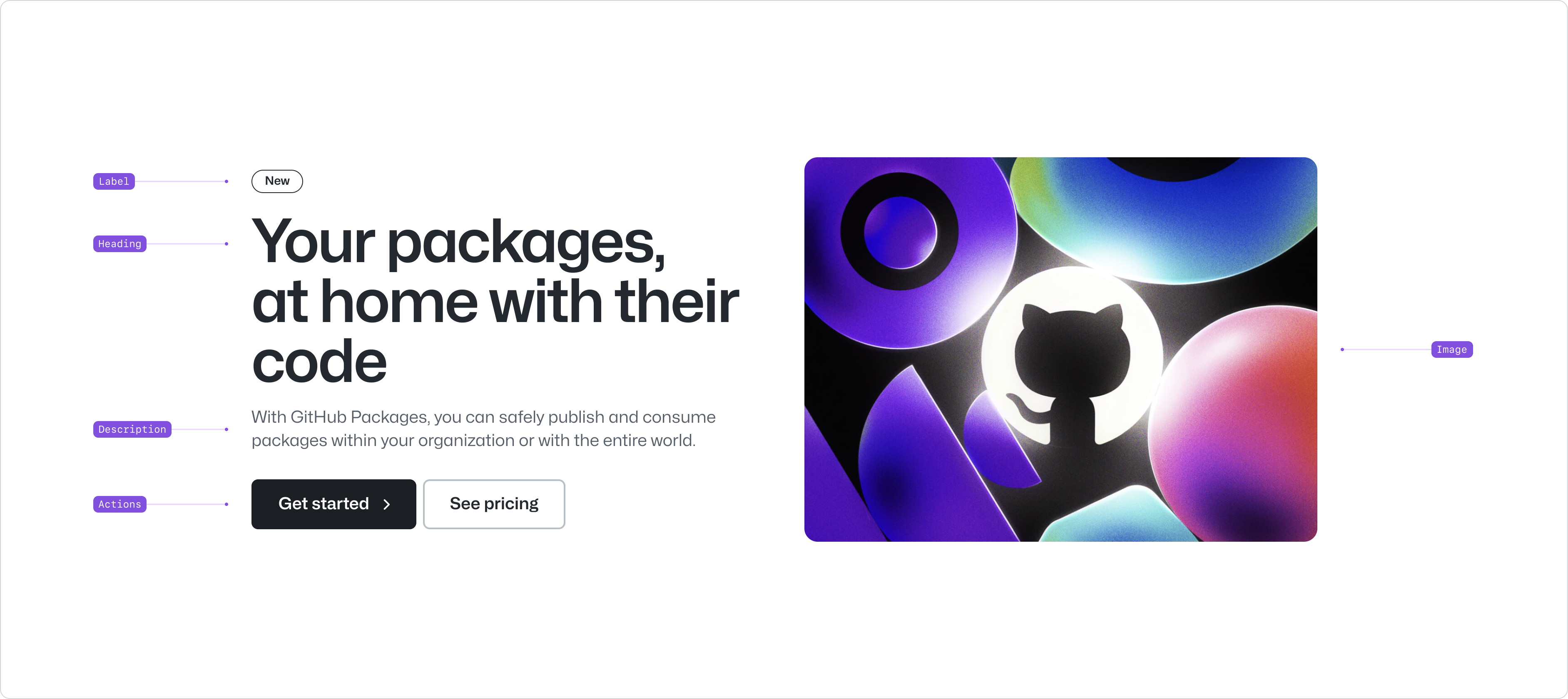
- package/docs/components/BreakoutBanner/react.md +174 -0
- package/docs/components/Button/index.md +133 -0
- package/docs/components/Button/react.md +94 -0
- package/docs/components/ButtonGroup/index.md +62 -0
- package/docs/components/ButtonGroup/react.md +60 -0
- package/docs/components/CTABanner/index.md +114 -0
- package/docs/components/CTABanner/react.md +343 -0
- package/docs/components/CTAForm/index.md +95 -0
- package/docs/components/CTAForm/react.md +103 -0
- package/docs/components/Card/index.md +126 -0
- package/docs/components/Card/react.md +240 -0
- package/docs/components/ComparisonTable/index.md +381 -0
- package/docs/components/EyebrowBanner/index.md +153 -0
- package/docs/components/FAQ/index.md +66 -0
- package/docs/components/FAQ/react.md +477 -0
- package/docs/components/Footnotes/index.md +41 -0
- package/docs/components/Footnotes/react.md +156 -0
- package/docs/components/Hero/index.md +65 -0
- package/docs/components/Hero/react.md +215 -0
- package/docs/components/IDE/index.md +278 -0
- package/docs/components/Icon/index.md +87 -0
- package/docs/components/Image/index.md +51 -0
- package/docs/components/Image/react.md +160 -0
- package/docs/components/Label/index.md +86 -0
- package/docs/components/Label/react.md +76 -0
- package/docs/components/LogoSuite/index.md +93 -0
- package/docs/components/LogoSuite/react.md +667 -0
- package/docs/components/MediaPlaylist/index.md +133 -0
- package/docs/components/MinimalFooter/index.md +94 -0
- package/docs/components/OrderedList/index.md +55 -0
- package/docs/components/OrderedList/react.md +41 -0
- package/docs/components/Pagination/index.md +80 -0
- package/docs/components/Pillar/index.md +114 -0
- package/docs/components/Pillar/react.md +175 -0
- package/docs/components/PricingOptions/index.md +509 -0
- package/docs/components/Prose/index.md +158 -0
- package/docs/components/River/index.md +190 -0
- package/docs/components/River/react.md +295 -0
- package/docs/components/RiverAccordion/index.md +200 -0
- package/docs/components/RiverBreakoutTabs/index.md +171 -0
- package/docs/components/Section/index.md +40 -0
- package/docs/components/Section/react.md +137 -0
- package/docs/components/SectionIntro/index.md +77 -0
- package/docs/components/SectionIntro/react.md +107 -0
- package/docs/components/SectionIntroStacked/index.md +226 -0
- package/docs/components/Statistic/index.md +111 -0
- package/docs/components/SubNav/index.md +156 -0
- package/docs/components/SubdomainNavBar/index.md +136 -0
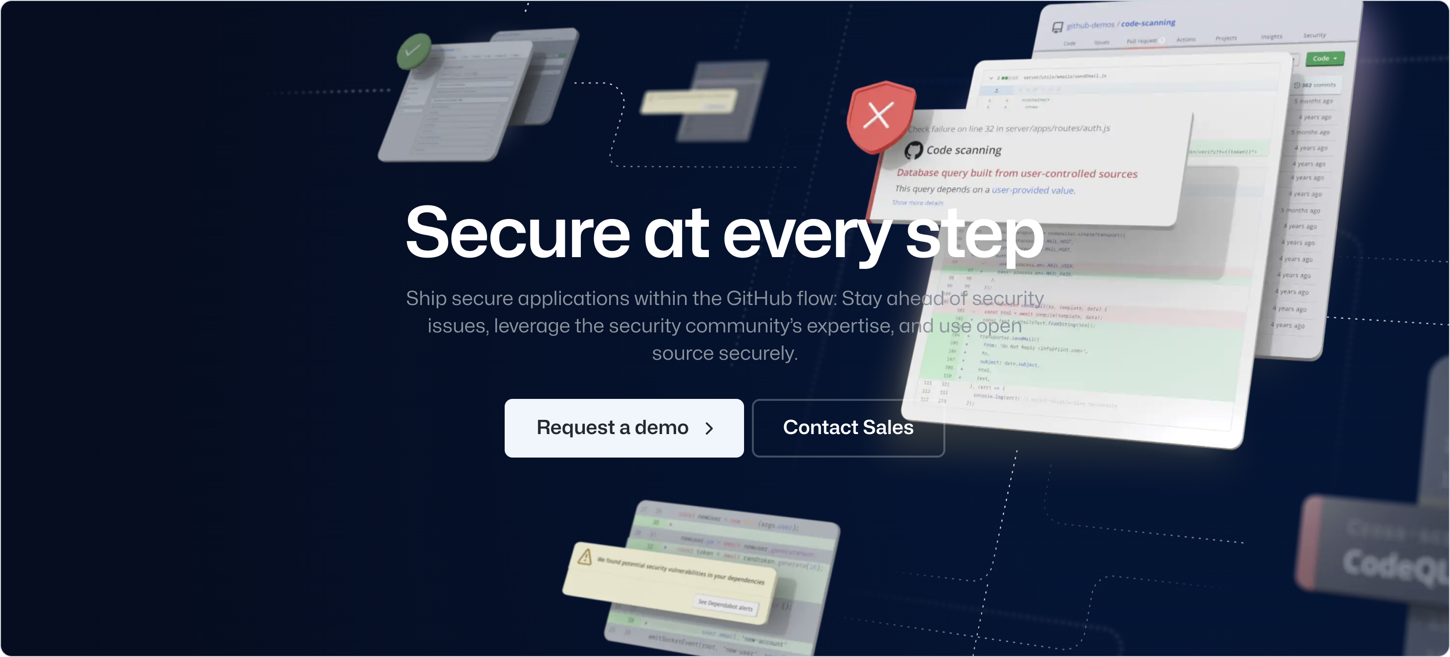
- package/docs/components/Tabs/index.md +243 -0
- package/docs/components/Testimonial/index.md +138 -0
- package/docs/components/Testimonial/react.md +191 -0
- package/docs/components/Tiles/index.md +1441 -0
- package/docs/components/Timeline/index.md +68 -0
- package/docs/components/Token/index.md +86 -0
- package/docs/components/Tooltip/index.md +61 -0
- package/docs/components/UnorderedList/index.md +67 -0
- package/docs/components/UnorderedList/react.md +89 -0
- package/docs/components/VideoPlayer/index.md +234 -0
- package/docs/components/index.md +52 -0
- package/docs/forms/Checkbox/index.md +86 -0
- package/docs/forms/Checkbox/react.md +111 -0
- package/docs/forms/CheckboxGroup/index.md +37 -0
- package/docs/forms/CheckboxGroup/react.md +175 -0
- package/docs/forms/FormControl/index.md +404 -0
- package/docs/forms/Radio/index.md +63 -0
- package/docs/forms/Radio/react.md +68 -0
- package/docs/forms/RadioGroup/index.md +45 -0
- package/docs/forms/RadioGroup/react.md +151 -0
- package/docs/forms/Select/index.md +244 -0
- package/docs/forms/TextArea/index.md +126 -0
- package/docs/forms/TextInput/index.md +221 -0
- package/docs/forms/index.md +14 -0
- package/docs/getting-started/esm.md +49 -0
- package/docs/getting-started/index.md +95 -0
- package/docs/index.md +97 -0
- package/docs/introduction/animation.md +127 -0
- package/docs/introduction/index.md +9 -0
- package/docs/introduction/theming.md +132 -0
- package/docs/layout/Box/index.md +46 -0
- package/docs/layout/Box/react.md +284 -0
- package/docs/layout/Grid/index.md +132 -0
- package/docs/layout/Grid/react.md +117 -0
- package/docs/layout/Stack/index.md +60 -0
- package/docs/layout/Stack/react.md +166 -0
- package/docs/layout/index.md +9 -0
- package/docs/primitives/color.md +6 -0
- package/docs/primitives/index.md +8 -0
- package/docs/typography/Heading/index.md +53 -0
- package/docs/typography/Heading/react.md +182 -0
- package/docs/typography/Text/index.md +68 -0
- package/docs/typography/Text/react.md +125 -0
- package/docs/typography/index.md +8 -0
- package/esm/Token/Token.js +0 -1
- package/esm/Token/Token.js.map +1 -1
- package/esm/Token/{Token.module-BcKU1KwK.css → Token.module-DtWE9IPI.css} +1 -1
- package/esm/Token/Token.module.js +1 -1
- package/esm/Token/Token.module.js.map +1 -1
- package/lib/Grid/Grid.d.ts +1 -1
- package/lib/Hero/HeroContext.d.ts +1 -1
- package/lib/SubNav/SubNav.d.ts +1 -1
- package/lib/Token/Token.d.ts +1 -1
- package/lib/css/main.css +68 -69
- package/lib/design-tokens/css/tokens/base/colors/color-scales-with-modes.css +1 -1
- package/lib/design-tokens/css/tokens/base/colors/light.css +1 -1
- package/lib/design-tokens/css/tokens/base/size/size.css +1 -1
- package/lib/design-tokens/css/tokens/base/typography/typography.css +1 -1
- package/lib/design-tokens/css/tokens/functional/animation/base.css +1 -1
- package/lib/design-tokens/css/tokens/functional/colors/global-with-modes.css +1 -1
- package/lib/design-tokens/css/tokens/functional/colors/global.css +1 -1
- package/lib/design-tokens/css/tokens/functional/components/accordion/colors-with-modes.css +1 -1
- package/lib/design-tokens/css/tokens/functional/components/action-menu/colors-with-modes.css +1 -1
- package/lib/design-tokens/css/tokens/functional/components/anchor-nav/colors-with-modes.css +1 -1
- package/lib/design-tokens/css/tokens/functional/components/bento/base.css +1 -1
- package/lib/design-tokens/css/tokens/functional/components/blinking-cursor/colors-with-modes.css +1 -1
- package/lib/design-tokens/css/tokens/functional/components/breadcrumbs/colors-with-modes.css +1 -1
- package/lib/design-tokens/css/tokens/functional/components/button/colors-with-modes.css +1 -1
- package/lib/design-tokens/css/tokens/functional/components/card/base.css +1 -1
- package/lib/design-tokens/css/tokens/functional/components/card/colors-with-modes.css +1 -1
- package/lib/design-tokens/css/tokens/functional/components/card/colors.css +1 -1
- package/lib/design-tokens/css/tokens/functional/components/comparison-table/colors-with-modes.css +1 -1
- package/lib/design-tokens/css/tokens/functional/components/comparison-table/comparison-table.css +1 -1
- package/lib/design-tokens/css/tokens/functional/components/control/colors-with-modes.css +1 -1
- package/lib/design-tokens/css/tokens/functional/components/cta-banner/colors-with-modes.css +1 -1
- package/lib/design-tokens/css/tokens/functional/components/eyebrow-banner/colors-with-modes.css +1 -1
- package/lib/design-tokens/css/tokens/functional/components/eyebrow-banner/eyebrow-banner.css +1 -1
- package/lib/design-tokens/css/tokens/functional/components/faq/base.css +1 -1
- package/lib/design-tokens/css/tokens/functional/components/faq/colors-with-modes.css +1 -1
- package/lib/design-tokens/css/tokens/functional/components/faq/colors.css +1 -1
- package/lib/design-tokens/css/tokens/functional/components/faq/faq.css +1 -1
- package/lib/design-tokens/css/tokens/functional/components/footer/colors-with-modes.css +1 -1
- package/lib/design-tokens/css/tokens/functional/components/footer/colors.css +1 -1
- package/lib/design-tokens/css/tokens/functional/components/frosted-glass-vfx/base.css +1 -1
- package/lib/design-tokens/css/tokens/functional/components/frosted-glass-vfx/colors-with-modes.css +1 -1
- package/lib/design-tokens/css/tokens/functional/components/grid/colors-with-modes.css +1 -1
- package/lib/design-tokens/css/tokens/functional/components/grid/colors.css +1 -1
- package/lib/design-tokens/css/tokens/functional/components/grid/grid.css +1 -1
- package/lib/design-tokens/css/tokens/functional/components/hero/base.css +1 -1
- package/lib/design-tokens/css/tokens/functional/components/icon/colors-with-modes.css +1 -1
- package/lib/design-tokens/css/tokens/functional/components/icon/colors.css +1 -1
- package/lib/design-tokens/css/tokens/functional/components/ide/base.css +1 -1
- package/lib/design-tokens/css/tokens/functional/components/ide/colors-with-modes.css +1 -1
- package/lib/design-tokens/css/tokens/functional/components/image/base.css +1 -1
- package/lib/design-tokens/css/tokens/functional/components/inline-link/base.css +1 -1
- package/lib/design-tokens/css/tokens/functional/components/inline-link/colors-with-modes.css +1 -1
- package/lib/design-tokens/css/tokens/functional/components/inline-link/colors.css +1 -1
- package/lib/design-tokens/css/tokens/functional/components/label/colors-with-modes.css +1 -1
- package/lib/design-tokens/css/tokens/functional/components/label/colors.css +1 -1
- package/lib/design-tokens/css/tokens/functional/components/link/colors-with-modes.css +1 -1
- package/lib/design-tokens/css/tokens/functional/components/link/colors.css +1 -1
- package/lib/design-tokens/css/tokens/functional/components/logosuite/base.css +1 -1
- package/lib/design-tokens/css/tokens/functional/components/logosuite/colors-with-modes.css +1 -1
- package/lib/design-tokens/css/tokens/functional/components/logosuite/colors.css +1 -1
- package/lib/design-tokens/css/tokens/functional/components/media-playlist/colors-with-modes.css +1 -1
- package/lib/design-tokens/css/tokens/functional/components/media-playlist/colors.css +1 -1
- package/lib/design-tokens/css/tokens/functional/components/pricing-options/colors-with-modes.css +1 -1
- package/lib/design-tokens/css/tokens/functional/components/pricing-options/colors.css +1 -1
- package/lib/design-tokens/css/tokens/functional/components/pricing-options/pricing-options.css +1 -1
- package/lib/design-tokens/css/tokens/functional/components/prose/base.css +1 -1
- package/lib/design-tokens/css/tokens/functional/components/prose/colors-with-modes.css +1 -1
- package/lib/design-tokens/css/tokens/functional/components/river/base.css +1 -1
- package/lib/design-tokens/css/tokens/functional/components/river/river.css +1 -1
- package/lib/design-tokens/css/tokens/functional/components/river-story-scroll/colors-with-modes.css +1 -1
- package/lib/design-tokens/css/tokens/functional/components/section/section.css +1 -1
- package/lib/design-tokens/css/tokens/functional/components/statistic/base.css +1 -1
- package/lib/design-tokens/css/tokens/functional/components/sub-nav/base.css +1 -1
- package/lib/design-tokens/css/tokens/functional/components/sub-nav/colors-with-modes.css +1 -1
- package/lib/design-tokens/css/tokens/functional/components/subdomain-nav-bar/colors-with-modes.css +1 -1
- package/lib/design-tokens/css/tokens/functional/components/tabs/base.css +1 -1
- package/lib/design-tokens/css/tokens/functional/components/tabs/colors-with-modes.css +1 -1
- package/lib/design-tokens/css/tokens/functional/components/tabs/colors.css +1 -1
- package/lib/design-tokens/css/tokens/functional/components/testimonial/base.css +1 -1
- package/lib/design-tokens/css/tokens/functional/components/testimonial/colors-with-modes.css +1 -1
- package/lib/design-tokens/css/tokens/functional/components/testimonial/colors.css +1 -1
- package/lib/design-tokens/css/tokens/functional/components/text-cursor-animation/colors-with-modes.css +1 -1
- package/lib/design-tokens/css/tokens/functional/components/text-cursor-animation/colors.css +1 -1
- package/lib/design-tokens/css/tokens/functional/components/tiles/colors-with-modes.css +1 -1
- package/lib/design-tokens/css/tokens/functional/components/timeline/base.css +1 -1
- package/lib/design-tokens/css/tokens/functional/components/timeline/colors-with-modes.css +1 -1
- package/lib/design-tokens/css/tokens/functional/components/timeline/colors.css +1 -1
- package/lib/design-tokens/css/tokens/functional/components/token/colors-with-modes.css +1 -1
- package/lib/design-tokens/css/tokens/functional/components/token/colors.css +1 -1
- package/lib/design-tokens/css/tokens/functional/components/tooltip/colors-with-modes.css +1 -1
- package/lib/design-tokens/css/tokens/functional/components/tooltip/colors.css +1 -1
- package/lib/design-tokens/css/tokens/functional/components/video-player/base.css +1 -1
- package/lib/design-tokens/css/tokens/functional/components/video-player/colors-with-modes.css +1 -1
- package/lib/design-tokens/css/tokens/functional/size/border.css +1 -1
- package/lib/design-tokens/css/tokens/functional/size/breakpoints.css +1 -1
- package/lib/design-tokens/css/tokens/functional/size/size-coarse.css +1 -1
- package/lib/design-tokens/css/tokens/functional/size/size-fine.css +1 -1
- package/lib/design-tokens/css/tokens/functional/size/size.css +1 -1
- package/lib/design-tokens/css/tokens/functional/size/viewport.css +1 -1
- package/lib/design-tokens/css/tokens/functional/typography/typography-responsive.css +1 -1
- package/lib/design-tokens/css/tokens/functional/typography/typography.css +1 -1
- package/lib/design-tokens/js/module/tokens/base/colors/light.js +1 -1
- package/lib/design-tokens/js/module/tokens/base/size/size.js +1 -1
- package/lib/design-tokens/js/module/tokens/base/typography/typography.js +1 -1
- package/lib/design-tokens/js/module/tokens/functional/animation/base.js +1 -1
- package/lib/design-tokens/js/module/tokens/functional/colors/global.js +1 -1
- package/lib/design-tokens/js/module/tokens/functional/components/bento/base.js +1 -1
- package/lib/design-tokens/js/module/tokens/functional/components/card/base.js +1 -1
- package/lib/design-tokens/js/module/tokens/functional/components/card/colors.js +1 -1
- package/lib/design-tokens/js/module/tokens/functional/components/comparison-table/comparison-table.js +1 -1
- package/lib/design-tokens/js/module/tokens/functional/components/eyebrow-banner/eyebrow-banner.js +1 -1
- package/lib/design-tokens/js/module/tokens/functional/components/faq/base.js +1 -1
- package/lib/design-tokens/js/module/tokens/functional/components/faq/colors.js +1 -1
- package/lib/design-tokens/js/module/tokens/functional/components/faq/faq.js +1 -1
- package/lib/design-tokens/js/module/tokens/functional/components/footer/colors.js +1 -1
- package/lib/design-tokens/js/module/tokens/functional/components/frosted-glass-vfx/base.js +1 -1
- package/lib/design-tokens/js/module/tokens/functional/components/grid/colors.js +1 -1
- package/lib/design-tokens/js/module/tokens/functional/components/grid/grid.js +1 -1
- package/lib/design-tokens/js/module/tokens/functional/components/hero/base.js +1 -1
- package/lib/design-tokens/js/module/tokens/functional/components/icon/colors.js +1 -1
- package/lib/design-tokens/js/module/tokens/functional/components/ide/base.js +1 -1
- package/lib/design-tokens/js/module/tokens/functional/components/image/base.js +1 -1
- package/lib/design-tokens/js/module/tokens/functional/components/inline-link/base.js +1 -1
- package/lib/design-tokens/js/module/tokens/functional/components/inline-link/colors.js +1 -1
- package/lib/design-tokens/js/module/tokens/functional/components/label/colors.js +1 -1
- package/lib/design-tokens/js/module/tokens/functional/components/link/colors.js +1 -1
- package/lib/design-tokens/js/module/tokens/functional/components/logosuite/base.js +1 -1
- package/lib/design-tokens/js/module/tokens/functional/components/logosuite/colors.js +1 -1
- package/lib/design-tokens/js/module/tokens/functional/components/media-playlist/colors.js +1 -1
- package/lib/design-tokens/js/module/tokens/functional/components/pricing-options/colors.js +1 -1
- package/lib/design-tokens/js/module/tokens/functional/components/pricing-options/pricing-options.js +1 -1
- package/lib/design-tokens/js/module/tokens/functional/components/prose/base.js +1 -1
- package/lib/design-tokens/js/module/tokens/functional/components/river/base.js +1 -1
- package/lib/design-tokens/js/module/tokens/functional/components/river/river.js +1 -1
- package/lib/design-tokens/js/module/tokens/functional/components/section/section.js +1 -1
- package/lib/design-tokens/js/module/tokens/functional/components/statistic/base.js +1 -1
- package/lib/design-tokens/js/module/tokens/functional/components/sub-nav/base.js +1 -1
- package/lib/design-tokens/js/module/tokens/functional/components/tabs/base.js +1 -1
- package/lib/design-tokens/js/module/tokens/functional/components/tabs/colors.js +1 -1
- package/lib/design-tokens/js/module/tokens/functional/components/testimonial/base.js +1 -1
- package/lib/design-tokens/js/module/tokens/functional/components/testimonial/colors.js +1 -1
- package/lib/design-tokens/js/module/tokens/functional/components/text-cursor-animation/colors.js +1 -1
- package/lib/design-tokens/js/module/tokens/functional/components/timeline/base.js +1 -1
- package/lib/design-tokens/js/module/tokens/functional/components/timeline/colors.js +1 -1
- package/lib/design-tokens/js/module/tokens/functional/components/token/colors.js +1 -1
- package/lib/design-tokens/js/module/tokens/functional/components/tooltip/colors.js +1 -1
- package/lib/design-tokens/js/module/tokens/functional/components/video-player/base.js +1 -1
- package/lib/design-tokens/js/module/tokens/functional/size/border.js +1 -1
- package/lib/design-tokens/js/module/tokens/functional/size/breakpoints.js +1 -1
- package/lib/design-tokens/js/module/tokens/functional/size/size-coarse.js +1 -1
- package/lib/design-tokens/js/module/tokens/functional/size/size-fine.js +1 -1
- package/lib/design-tokens/js/module/tokens/functional/size/size.js +1 -1
- package/lib/design-tokens/js/module/tokens/functional/size/viewport.js +1 -1
- package/lib/design-tokens/js/module/tokens/functional/typography/typography-responsive.js +1 -1
- package/lib/design-tokens/js/module/tokens/functional/typography/typography.js +1 -1
- package/lib/design-tokens/js/tokens/base/colors/light.js +1 -1
- package/lib/design-tokens/js/tokens/base/size/size.js +1 -1
- package/lib/design-tokens/js/tokens/base/typography/typography.js +1 -1
- package/lib/design-tokens/js/tokens/functional/animation/base.js +1 -1
- package/lib/design-tokens/js/tokens/functional/colors/global.js +1 -1
- package/lib/design-tokens/js/tokens/functional/components/bento/base.js +1 -1
- package/lib/design-tokens/js/tokens/functional/components/card/base.js +1 -1
- package/lib/design-tokens/js/tokens/functional/components/card/colors.js +1 -1
- package/lib/design-tokens/js/tokens/functional/components/comparison-table/comparison-table.js +1 -1
- package/lib/design-tokens/js/tokens/functional/components/eyebrow-banner/eyebrow-banner.js +1 -1
- package/lib/design-tokens/js/tokens/functional/components/faq/base.js +1 -1
- package/lib/design-tokens/js/tokens/functional/components/faq/colors.js +1 -1
- package/lib/design-tokens/js/tokens/functional/components/faq/faq.js +1 -1
- package/lib/design-tokens/js/tokens/functional/components/footer/colors.js +1 -1
- package/lib/design-tokens/js/tokens/functional/components/frosted-glass-vfx/base.js +1 -1
- package/lib/design-tokens/js/tokens/functional/components/grid/colors.js +1 -1
- package/lib/design-tokens/js/tokens/functional/components/grid/grid.js +1 -1
- package/lib/design-tokens/js/tokens/functional/components/hero/base.js +1 -1
- package/lib/design-tokens/js/tokens/functional/components/icon/colors.js +1 -1
- package/lib/design-tokens/js/tokens/functional/components/ide/base.js +1 -1
- package/lib/design-tokens/js/tokens/functional/components/image/base.js +1 -1
- package/lib/design-tokens/js/tokens/functional/components/inline-link/base.js +1 -1
- package/lib/design-tokens/js/tokens/functional/components/inline-link/colors.js +1 -1
- package/lib/design-tokens/js/tokens/functional/components/label/colors.js +1 -1
- package/lib/design-tokens/js/tokens/functional/components/link/colors.js +1 -1
- package/lib/design-tokens/js/tokens/functional/components/logosuite/base.js +1 -1
- package/lib/design-tokens/js/tokens/functional/components/logosuite/colors.js +1 -1
- package/lib/design-tokens/js/tokens/functional/components/media-playlist/colors.js +1 -1
- package/lib/design-tokens/js/tokens/functional/components/pricing-options/colors.js +1 -1
- package/lib/design-tokens/js/tokens/functional/components/pricing-options/pricing-options.js +1 -1
- package/lib/design-tokens/js/tokens/functional/components/prose/base.js +1 -1
- package/lib/design-tokens/js/tokens/functional/components/river/base.js +1 -1
- package/lib/design-tokens/js/tokens/functional/components/river/river.js +1 -1
- package/lib/design-tokens/js/tokens/functional/components/section/section.js +1 -1
- package/lib/design-tokens/js/tokens/functional/components/statistic/base.js +1 -1
- package/lib/design-tokens/js/tokens/functional/components/sub-nav/base.js +1 -1
- package/lib/design-tokens/js/tokens/functional/components/tabs/base.js +1 -1
- package/lib/design-tokens/js/tokens/functional/components/tabs/colors.js +1 -1
- package/lib/design-tokens/js/tokens/functional/components/testimonial/base.js +1 -1
- package/lib/design-tokens/js/tokens/functional/components/testimonial/colors.js +1 -1
- package/lib/design-tokens/js/tokens/functional/components/text-cursor-animation/colors.js +1 -1
- package/lib/design-tokens/js/tokens/functional/components/timeline/base.js +1 -1
- package/lib/design-tokens/js/tokens/functional/components/timeline/colors.js +1 -1
- package/lib/design-tokens/js/tokens/functional/components/token/colors.js +1 -1
- package/lib/design-tokens/js/tokens/functional/components/tooltip/colors.js +1 -1
- package/lib/design-tokens/js/tokens/functional/components/video-player/base.js +1 -1
- package/lib/design-tokens/js/tokens/functional/size/border.js +1 -1
- package/lib/design-tokens/js/tokens/functional/size/breakpoints.js +1 -1
- package/lib/design-tokens/js/tokens/functional/size/size-coarse.js +1 -1
- package/lib/design-tokens/js/tokens/functional/size/size-fine.js +1 -1
- package/lib/design-tokens/js/tokens/functional/size/size.js +1 -1
- package/lib/design-tokens/js/tokens/functional/size/viewport.js +1 -1
- package/lib/design-tokens/js/tokens/functional/typography/typography-responsive.js +1 -1
- package/lib/design-tokens/js/tokens/functional/typography/typography.js +1 -1
- package/lib/design-tokens/scss/tokens/base/colors/light.scss +1 -1
- package/lib/design-tokens/scss/tokens/base/size/size.scss +1 -1
- package/lib/design-tokens/scss/tokens/base/typography/typography.scss +1 -1
- package/lib/design-tokens/scss/tokens/functional/animation/base.scss +1 -1
- package/lib/design-tokens/scss/tokens/functional/colors/global.scss +1 -1
- package/lib/design-tokens/scss/tokens/functional/components/bento/base.scss +1 -1
- package/lib/design-tokens/scss/tokens/functional/components/card/base.scss +1 -1
- package/lib/design-tokens/scss/tokens/functional/components/card/colors.scss +1 -1
- package/lib/design-tokens/scss/tokens/functional/components/comparison-table/comparison-table.scss +1 -1
- package/lib/design-tokens/scss/tokens/functional/components/eyebrow-banner/eyebrow-banner.scss +1 -1
- package/lib/design-tokens/scss/tokens/functional/components/faq/base.scss +1 -1
- package/lib/design-tokens/scss/tokens/functional/components/faq/colors.scss +1 -1
- package/lib/design-tokens/scss/tokens/functional/components/faq/faq.scss +1 -1
- package/lib/design-tokens/scss/tokens/functional/components/footer/colors.scss +1 -1
- package/lib/design-tokens/scss/tokens/functional/components/frosted-glass-vfx/base.scss +1 -1
- package/lib/design-tokens/scss/tokens/functional/components/grid/colors.scss +1 -1
- package/lib/design-tokens/scss/tokens/functional/components/grid/grid.scss +1 -1
- package/lib/design-tokens/scss/tokens/functional/components/hero/base.scss +1 -1
- package/lib/design-tokens/scss/tokens/functional/components/icon/colors.scss +1 -1
- package/lib/design-tokens/scss/tokens/functional/components/ide/base.scss +1 -1
- package/lib/design-tokens/scss/tokens/functional/components/image/base.scss +1 -1
- package/lib/design-tokens/scss/tokens/functional/components/inline-link/base.scss +1 -1
- package/lib/design-tokens/scss/tokens/functional/components/inline-link/colors.scss +1 -1
- package/lib/design-tokens/scss/tokens/functional/components/label/colors.scss +1 -1
- package/lib/design-tokens/scss/tokens/functional/components/link/colors.scss +1 -1
- package/lib/design-tokens/scss/tokens/functional/components/logosuite/base.scss +1 -1
- package/lib/design-tokens/scss/tokens/functional/components/logosuite/colors.scss +1 -1
- package/lib/design-tokens/scss/tokens/functional/components/media-playlist/colors.scss +1 -1
- package/lib/design-tokens/scss/tokens/functional/components/pricing-options/colors.scss +1 -1
- package/lib/design-tokens/scss/tokens/functional/components/pricing-options/pricing-options.scss +1 -1
- package/lib/design-tokens/scss/tokens/functional/components/prose/base.scss +1 -1
- package/lib/design-tokens/scss/tokens/functional/components/river/base.scss +1 -1
- package/lib/design-tokens/scss/tokens/functional/components/river/river.scss +1 -1
- package/lib/design-tokens/scss/tokens/functional/components/section/section.scss +1 -1
- package/lib/design-tokens/scss/tokens/functional/components/statistic/base.scss +1 -1
- package/lib/design-tokens/scss/tokens/functional/components/sub-nav/base.scss +1 -1
- package/lib/design-tokens/scss/tokens/functional/components/tabs/base.scss +1 -1
- package/lib/design-tokens/scss/tokens/functional/components/tabs/colors.scss +1 -1
- package/lib/design-tokens/scss/tokens/functional/components/testimonial/base.scss +1 -1
- package/lib/design-tokens/scss/tokens/functional/components/testimonial/colors.scss +1 -1
- package/lib/design-tokens/scss/tokens/functional/components/text-cursor-animation/colors.scss +1 -1
- package/lib/design-tokens/scss/tokens/functional/components/timeline/base.scss +1 -1
- package/lib/design-tokens/scss/tokens/functional/components/timeline/colors.scss +1 -1
- package/lib/design-tokens/scss/tokens/functional/components/token/colors.scss +1 -1
- package/lib/design-tokens/scss/tokens/functional/components/tooltip/colors.scss +1 -1
- package/lib/design-tokens/scss/tokens/functional/components/video-player/base.scss +1 -1
- package/lib/design-tokens/scss/tokens/functional/size/border.scss +1 -1
- package/lib/design-tokens/scss/tokens/functional/size/breakpoints.scss +1 -1
- package/lib/design-tokens/scss/tokens/functional/size/size-coarse.scss +1 -1
- package/lib/design-tokens/scss/tokens/functional/size/size-fine.scss +1 -1
- package/lib/design-tokens/scss/tokens/functional/size/size.scss +1 -1
- package/lib/design-tokens/scss/tokens/functional/size/viewport.scss +1 -1
- package/lib/design-tokens/scss/tokens/functional/typography/typography-responsive.scss +1 -1
- package/lib/design-tokens/scss/tokens/functional/typography/typography.scss +1 -1
- package/lib/design-tokens/ts/tokens/base/colors/light.d.ts +1 -1
- package/lib/design-tokens/ts/tokens/base/colors/light.js +1 -1
- package/lib/design-tokens/ts/tokens/base/size/size.d.ts +1 -1
- package/lib/design-tokens/ts/tokens/base/size/size.js +1 -1
- package/lib/design-tokens/ts/tokens/base/typography/typography.d.ts +1 -1
- package/lib/design-tokens/ts/tokens/base/typography/typography.js +1 -1
- package/lib/design-tokens/ts/tokens/functional/animation/base.d.ts +1 -1
- package/lib/design-tokens/ts/tokens/functional/animation/base.js +1 -1
- package/lib/design-tokens/ts/tokens/functional/colors/global.d.ts +1 -1
- package/lib/design-tokens/ts/tokens/functional/colors/global.js +1 -1
- package/lib/design-tokens/ts/tokens/functional/components/bento/base.d.ts +1 -1
- package/lib/design-tokens/ts/tokens/functional/components/bento/base.js +1 -1
- package/lib/design-tokens/ts/tokens/functional/components/card/base.d.ts +1 -1
- package/lib/design-tokens/ts/tokens/functional/components/card/base.js +1 -1
- package/lib/design-tokens/ts/tokens/functional/components/card/colors.d.ts +1 -1
- package/lib/design-tokens/ts/tokens/functional/components/card/colors.js +1 -1
- package/lib/design-tokens/ts/tokens/functional/components/comparison-table/comparison-table.d.ts +1 -1
- package/lib/design-tokens/ts/tokens/functional/components/comparison-table/comparison-table.js +1 -1
- package/lib/design-tokens/ts/tokens/functional/components/eyebrow-banner/eyebrow-banner.d.ts +1 -1
- package/lib/design-tokens/ts/tokens/functional/components/eyebrow-banner/eyebrow-banner.js +1 -1
- package/lib/design-tokens/ts/tokens/functional/components/faq/base.d.ts +1 -1
- package/lib/design-tokens/ts/tokens/functional/components/faq/base.js +1 -1
- package/lib/design-tokens/ts/tokens/functional/components/faq/colors.d.ts +1 -1
- package/lib/design-tokens/ts/tokens/functional/components/faq/colors.js +1 -1
- package/lib/design-tokens/ts/tokens/functional/components/faq/faq.d.ts +1 -1
- package/lib/design-tokens/ts/tokens/functional/components/faq/faq.js +1 -1
- package/lib/design-tokens/ts/tokens/functional/components/footer/colors.d.ts +1 -1
- package/lib/design-tokens/ts/tokens/functional/components/footer/colors.js +1 -1
- package/lib/design-tokens/ts/tokens/functional/components/frosted-glass-vfx/base.d.ts +1 -1
- package/lib/design-tokens/ts/tokens/functional/components/frosted-glass-vfx/base.js +1 -1
- package/lib/design-tokens/ts/tokens/functional/components/grid/colors.d.ts +1 -1
- package/lib/design-tokens/ts/tokens/functional/components/grid/colors.js +1 -1
- package/lib/design-tokens/ts/tokens/functional/components/grid/grid.d.ts +1 -1
- package/lib/design-tokens/ts/tokens/functional/components/grid/grid.js +1 -1
- package/lib/design-tokens/ts/tokens/functional/components/hero/base.d.ts +1 -1
- package/lib/design-tokens/ts/tokens/functional/components/hero/base.js +1 -1
- package/lib/design-tokens/ts/tokens/functional/components/icon/colors.d.ts +1 -1
- package/lib/design-tokens/ts/tokens/functional/components/icon/colors.js +1 -1
- package/lib/design-tokens/ts/tokens/functional/components/ide/base.d.ts +1 -1
- package/lib/design-tokens/ts/tokens/functional/components/ide/base.js +1 -1
- package/lib/design-tokens/ts/tokens/functional/components/image/base.d.ts +1 -1
- package/lib/design-tokens/ts/tokens/functional/components/image/base.js +1 -1
- package/lib/design-tokens/ts/tokens/functional/components/inline-link/base.d.ts +1 -1
- package/lib/design-tokens/ts/tokens/functional/components/inline-link/base.js +1 -1
- package/lib/design-tokens/ts/tokens/functional/components/inline-link/colors.d.ts +1 -1
- package/lib/design-tokens/ts/tokens/functional/components/inline-link/colors.js +1 -1
- package/lib/design-tokens/ts/tokens/functional/components/label/colors.d.ts +1 -1
- package/lib/design-tokens/ts/tokens/functional/components/label/colors.js +1 -1
- package/lib/design-tokens/ts/tokens/functional/components/link/colors.d.ts +1 -1
- package/lib/design-tokens/ts/tokens/functional/components/link/colors.js +1 -1
- package/lib/design-tokens/ts/tokens/functional/components/logosuite/base.d.ts +1 -1
- package/lib/design-tokens/ts/tokens/functional/components/logosuite/base.js +1 -1
- package/lib/design-tokens/ts/tokens/functional/components/logosuite/colors.d.ts +1 -1
- package/lib/design-tokens/ts/tokens/functional/components/logosuite/colors.js +1 -1
- package/lib/design-tokens/ts/tokens/functional/components/media-playlist/colors.d.ts +1 -1
- package/lib/design-tokens/ts/tokens/functional/components/media-playlist/colors.js +1 -1
- package/lib/design-tokens/ts/tokens/functional/components/pricing-options/colors.d.ts +1 -1
- package/lib/design-tokens/ts/tokens/functional/components/pricing-options/colors.js +1 -1
- package/lib/design-tokens/ts/tokens/functional/components/pricing-options/pricing-options.d.ts +1 -1
- package/lib/design-tokens/ts/tokens/functional/components/pricing-options/pricing-options.js +1 -1
- package/lib/design-tokens/ts/tokens/functional/components/prose/base.d.ts +1 -1
- package/lib/design-tokens/ts/tokens/functional/components/prose/base.js +1 -1
- package/lib/design-tokens/ts/tokens/functional/components/river/base.d.ts +1 -1
- package/lib/design-tokens/ts/tokens/functional/components/river/base.js +1 -1
- package/lib/design-tokens/ts/tokens/functional/components/river/river.d.ts +1 -1
- package/lib/design-tokens/ts/tokens/functional/components/river/river.js +1 -1
- package/lib/design-tokens/ts/tokens/functional/components/section/section.d.ts +1 -1
- package/lib/design-tokens/ts/tokens/functional/components/section/section.js +1 -1
- package/lib/design-tokens/ts/tokens/functional/components/statistic/base.d.ts +1 -1
- package/lib/design-tokens/ts/tokens/functional/components/statistic/base.js +1 -1
- package/lib/design-tokens/ts/tokens/functional/components/sub-nav/base.d.ts +1 -1
- package/lib/design-tokens/ts/tokens/functional/components/sub-nav/base.js +1 -1
- package/lib/design-tokens/ts/tokens/functional/components/tabs/base.d.ts +1 -1
- package/lib/design-tokens/ts/tokens/functional/components/tabs/base.js +1 -1
- package/lib/design-tokens/ts/tokens/functional/components/tabs/colors.d.ts +1 -1
- package/lib/design-tokens/ts/tokens/functional/components/tabs/colors.js +1 -1
- package/lib/design-tokens/ts/tokens/functional/components/testimonial/base.d.ts +1 -1
- package/lib/design-tokens/ts/tokens/functional/components/testimonial/base.js +1 -1
- package/lib/design-tokens/ts/tokens/functional/components/testimonial/colors.d.ts +1 -1
- package/lib/design-tokens/ts/tokens/functional/components/testimonial/colors.js +1 -1
- package/lib/design-tokens/ts/tokens/functional/components/text-cursor-animation/colors.d.ts +1 -1
- package/lib/design-tokens/ts/tokens/functional/components/text-cursor-animation/colors.js +1 -1
- package/lib/design-tokens/ts/tokens/functional/components/timeline/base.d.ts +1 -1
- package/lib/design-tokens/ts/tokens/functional/components/timeline/base.js +1 -1
- package/lib/design-tokens/ts/tokens/functional/components/timeline/colors.d.ts +1 -1
- package/lib/design-tokens/ts/tokens/functional/components/timeline/colors.js +1 -1
- package/lib/design-tokens/ts/tokens/functional/components/token/colors.d.ts +1 -1
- package/lib/design-tokens/ts/tokens/functional/components/token/colors.js +1 -1
- package/lib/design-tokens/ts/tokens/functional/components/tooltip/colors.d.ts +1 -1
- package/lib/design-tokens/ts/tokens/functional/components/tooltip/colors.js +1 -1
- package/lib/design-tokens/ts/tokens/functional/components/video-player/base.d.ts +1 -1
- package/lib/design-tokens/ts/tokens/functional/components/video-player/base.js +1 -1
- package/lib/design-tokens/ts/tokens/functional/size/border.d.ts +1 -1
- package/lib/design-tokens/ts/tokens/functional/size/border.js +1 -1
- package/lib/design-tokens/ts/tokens/functional/size/breakpoints.d.ts +1 -1
- package/lib/design-tokens/ts/tokens/functional/size/breakpoints.js +1 -1
- package/lib/design-tokens/ts/tokens/functional/size/size-coarse.d.ts +1 -1
- package/lib/design-tokens/ts/tokens/functional/size/size-coarse.js +1 -1
- package/lib/design-tokens/ts/tokens/functional/size/size-fine.d.ts +1 -1
- package/lib/design-tokens/ts/tokens/functional/size/size-fine.js +1 -1
- package/lib/design-tokens/ts/tokens/functional/size/size.d.ts +1 -1
- package/lib/design-tokens/ts/tokens/functional/size/size.js +1 -1
- package/lib/design-tokens/ts/tokens/functional/size/viewport.d.ts +1 -1
- package/lib/design-tokens/ts/tokens/functional/size/viewport.js +1 -1
- package/lib/design-tokens/ts/tokens/functional/typography/typography-responsive.d.ts +1 -1
- package/lib/design-tokens/ts/tokens/functional/typography/typography-responsive.js +1 -1
- package/lib/design-tokens/ts/tokens/functional/typography/typography.d.ts +1 -1
- package/lib/design-tokens/ts/tokens/functional/typography/typography.js +1 -1
- package/lib/index.js +1 -1
- package/llms.txt +95 -0
- package/package.json +17 -5
- package/esm/Hero/Hero.figma.d.ts +0 -2
- package/esm/Hero/Hero.figma.d.ts.map +0 -1
- package/esm/IDE/fixtures/content.d.ts +0 -7
- package/esm/IDE/fixtures/content.d.ts.map +0 -1
- package/esm/LogoSuite/LogoSuite.figma.d.ts +0 -2
- package/esm/LogoSuite/LogoSuite.figma.d.ts.map +0 -1
- package/esm/LogoSuite/LogoSuite.fixtures.d.ts +0 -2
- package/esm/LogoSuite/LogoSuite.fixtures.d.ts.map +0 -1
- package/esm/MonaSans/MonaSans.d.ts +0 -11
- package/esm/MonaSans/MonaSans.d.ts.map +0 -1
- package/esm/MonaSans/index.d.ts +0 -2
- package/esm/MonaSans/index.d.ts.map +0 -1
- package/esm/PricingOptions/PricingOptions.figma.d.ts +0 -2
- package/esm/PricingOptions/PricingOptions.figma.d.ts.map +0 -1
- package/esm/Tiles/Tiles.fixtures.d.ts +0 -7
- package/esm/Tiles/Tiles.fixtures.d.ts.map +0 -1
- package/esm/fixtures/third-party-logos/AzureLogo.d.ts +0 -5
- package/esm/fixtures/third-party-logos/AzureLogo.d.ts.map +0 -1
- package/esm/fixtures/third-party-logos/JetBrainsLogo.d.ts +0 -5
- package/esm/fixtures/third-party-logos/JetBrainsLogo.d.ts.map +0 -1
- package/esm/fixtures/third-party-logos/MicrosoftCopilotLogo.d.ts +0 -5
- package/esm/fixtures/third-party-logos/MicrosoftCopilotLogo.d.ts.map +0 -1
- package/esm/fixtures/third-party-logos/MicrosoftLogo.d.ts +0 -5
- package/esm/fixtures/third-party-logos/MicrosoftLogo.d.ts.map +0 -1
- package/esm/fixtures/third-party-logos/NeoVimLogo.d.ts +0 -5
- package/esm/fixtures/third-party-logos/NeoVimLogo.d.ts.map +0 -1
- package/esm/fixtures/third-party-logos/VisualStudioCodeLogo.d.ts +0 -5
- package/esm/fixtures/third-party-logos/VisualStudioCodeLogo.d.ts.map +0 -1
- package/esm/fixtures/third-party-logos/VisualStudioLogo.d.ts +0 -5
- package/esm/fixtures/third-party-logos/VisualStudioLogo.d.ts.map +0 -1
- package/esm/list/ListItem/index.d.ts +0 -2
- package/esm/list/ListItem/index.d.ts.map +0 -1
- package/esm/recipes/FeaturePreviewLPs/FeaturePreviewLevelOne/FeaturePreviewLevelOne.d.ts +0 -13
- package/esm/recipes/FeaturePreviewLPs/FeaturePreviewLevelOne/FeaturePreviewLevelOne.d.ts.map +0 -1
- package/esm/recipes/FeaturePreviewLPs/FeaturePreviewLevelOne/FeaturePreviewLevelOneSideBySide.d.ts +0 -14
- package/esm/recipes/FeaturePreviewLPs/FeaturePreviewLevelOne/FeaturePreviewLevelOneSideBySide.d.ts.map +0 -1
- package/esm/recipes/FeaturePreviewLPs/FeaturePreviewLevelOne/components/FormExample.d.ts +0 -8
- package/esm/recipes/FeaturePreviewLPs/FeaturePreviewLevelOne/components/FormExample.d.ts.map +0 -1
- package/esm/recipes/FeaturePreviewLPs/FeaturePreviewLevelOne/index.d.ts +0 -2
- package/esm/recipes/FeaturePreviewLPs/FeaturePreviewLevelOne/index.d.ts.map +0 -1
- package/esm/recipes/FeaturePreviewLPs/FeaturePreviewLevelTwo/FeaturePreviewLevelTwo.d.ts +0 -49
- package/esm/recipes/FeaturePreviewLPs/FeaturePreviewLevelTwo/FeaturePreviewLevelTwo.d.ts.map +0 -1
- package/esm/recipes/FeaturePreviewLPs/FeaturePreviewLevelTwo/index.d.ts +0 -2
- package/esm/recipes/FeaturePreviewLPs/FeaturePreviewLevelTwo/index.d.ts.map +0 -1
- package/esm/recipes/FeaturePreviewLPs/FeaturePreviewLevelZero/FeaturePreviewLevelZero.d.ts +0 -17
- package/esm/recipes/FeaturePreviewLPs/FeaturePreviewLevelZero/FeaturePreviewLevelZero.d.ts.map +0 -1
- package/esm/recipes/FeaturePreviewLPs/FeaturePreviewLevelZero/index.d.ts +0 -2
- package/esm/recipes/FeaturePreviewLPs/FeaturePreviewLevelZero/index.d.ts.map +0 -1
- package/esm/recipes/FeaturePreviewLPs/helpers.d.ts +0 -30
- package/esm/recipes/FeaturePreviewLPs/helpers.d.ts.map +0 -1
- package/esm/recipes/FlexTemplate/FlexSection/FlexSection.d.ts +0 -8
- package/esm/recipes/FlexTemplate/FlexSection/FlexSection.d.ts.map +0 -1
- package/esm/recipes/FlexTemplate/FlexSection/components/ContentfulRiver.d.ts +0 -2
- package/esm/recipes/FlexTemplate/FlexSection/components/ContentfulRiver.d.ts.map +0 -1
- package/esm/recipes/FlexTemplate/FlexSection/components/ContentfulRiverAccordion.d.ts +0 -8
- package/esm/recipes/FlexTemplate/FlexSection/components/ContentfulRiverAccordion.d.ts.map +0 -1
- package/esm/recipes/FlexTemplate/FlexSection/components/ContentfulRiverBreakout.d.ts +0 -2
- package/esm/recipes/FlexTemplate/FlexSection/components/ContentfulRiverBreakout.d.ts.map +0 -1
- package/esm/recipes/FlexTemplate/FlexSection/components/ContentfulTestimonials.d.ts +0 -8
- package/esm/recipes/FlexTemplate/FlexSection/components/ContentfulTestimonials.d.ts.map +0 -1
- package/esm/recipes/FlexTemplate/FlexSection/components/FlexSectionTestimonials.d.ts +0 -8
- package/esm/recipes/FlexTemplate/FlexSection/components/FlexSectionTestimonials.d.ts.map +0 -1
- package/esm/recipes/FlexTemplate/FlexSection/components/index.d.ts +0 -6
- package/esm/recipes/FlexTemplate/FlexSection/components/index.d.ts.map +0 -1
- package/esm/recipes/FlexTemplate/FlexSection/index.d.ts +0 -2
- package/esm/recipes/FlexTemplate/FlexSection/index.d.ts.map +0 -1
- package/esm/recipes/FlexTemplate/FlexTemplate.d.ts +0 -7
- package/esm/recipes/FlexTemplate/FlexTemplate.d.ts.map +0 -1
- package/esm/recipes/FlexTemplate/FlexTemplate.types.d.ts +0 -318
- package/esm/recipes/FlexTemplate/FlexTemplate.types.d.ts.map +0 -1
- package/esm/recipes/FlexTemplate/FlexTemplateTrailingSection/FlexTemplateTrailingSection.d.ts +0 -6
- package/esm/recipes/FlexTemplate/FlexTemplateTrailingSection/FlexTemplateTrailingSection.d.ts.map +0 -1
- package/esm/recipes/FlexTemplate/FlexTemplateTrailingSection/index.d.ts +0 -3
- package/esm/recipes/FlexTemplate/FlexTemplateTrailingSection/index.d.ts.map +0 -1
- package/esm/recipes/FlexTemplate/fixtures/content.d.ts +0 -2
- package/esm/recipes/FlexTemplate/fixtures/content.d.ts.map +0 -1
- package/esm/recipes/FlexTemplate/index.d.ts +0 -4
- package/esm/recipes/FlexTemplate/index.d.ts.map +0 -1
- package/esm/recipes/Flexsuite/Category/FlexSuiteSecurityCategory/FlexSuiteSecurityCategory.content.d.ts +0 -68
- package/esm/recipes/Flexsuite/Category/FlexSuiteSecurityCategory/FlexSuiteSecurityCategory.content.d.ts.map +0 -1
- package/esm/recipes/Flexsuite/Category/FlexSuiteSecurityCategory/FlexSuiteSecurityCategory.d.ts +0 -7
- package/esm/recipes/Flexsuite/Category/FlexSuiteSecurityCategory/FlexSuiteSecurityCategory.d.ts.map +0 -1
- package/esm/recipes/Flexsuite/Category/index.d.ts +0 -2
- package/esm/recipes/Flexsuite/Category/index.d.ts.map +0 -1
- package/esm/recipes/Flexsuite/Details/FlexSuiteAIDetailsPlaylist/FlexSuiteAIDetailsPlaylist.content.d.ts +0 -49
- package/esm/recipes/Flexsuite/Details/FlexSuiteAIDetailsPlaylist/FlexSuiteAIDetailsPlaylist.content.d.ts.map +0 -1
- package/esm/recipes/Flexsuite/Details/FlexSuiteAIDetailsPlaylist/FlexSuiteAIDetailsPlaylist.d.ts +0 -7
- package/esm/recipes/Flexsuite/Details/FlexSuiteAIDetailsPlaylist/FlexSuiteAIDetailsPlaylist.d.ts.map +0 -1
- package/esm/recipes/Flexsuite/Details/index.d.ts +0 -4
- package/esm/recipes/Flexsuite/Details/index.d.ts.map +0 -1
- package/esm/recipes/Flexsuite/Overview/FlexSuiteAIOverview.content.d.ts +0 -101
- package/esm/recipes/Flexsuite/Overview/FlexSuiteAIOverview.content.d.ts.map +0 -1
- package/esm/recipes/Flexsuite/Overview/FlexSuiteAIOverview.d.ts +0 -7
- package/esm/recipes/Flexsuite/Overview/FlexSuiteAIOverview.d.ts.map +0 -1
- package/esm/recipes/Flexsuite/Overview/FlexSuiteOverview.content.d.ts +0 -5
- package/esm/recipes/Flexsuite/Overview/FlexSuiteOverview.content.d.ts.map +0 -1
- package/esm/recipes/Flexsuite/Overview/index.d.ts +0 -4
- package/esm/recipes/Flexsuite/Overview/index.d.ts.map +0 -1
- package/esm/recipes/SolutionTemplates/CategoryPage/CategoryPage.d.ts +0 -16
- package/esm/recipes/SolutionTemplates/CategoryPage/CategoryPage.d.ts.map +0 -1
- package/esm/recipes/SolutionTemplates/SolutionPage/SolutionPage.d.ts +0 -33
- package/esm/recipes/SolutionTemplates/SolutionPage/SolutionPage.d.ts.map +0 -1
- package/esm/recipes/SolutionTemplates/SolutionPage/index.d.ts +0 -2
- package/esm/recipes/SolutionTemplates/SolutionPage/index.d.ts.map +0 -1
- package/esm/recipes/SolutionTemplates/SolutionsOverview/SolutionsOverview.d.ts +0 -17
- package/esm/recipes/SolutionTemplates/SolutionsOverview/SolutionsOverview.d.ts.map +0 -1
- package/esm/recipes/SolutionTemplates/helpers.d.ts +0 -127
- package/esm/recipes/SolutionTemplates/helpers.d.ts.map +0 -1
- package/esm/recipes/SolutionTemplates/index.d.ts +0 -1
- package/esm/recipes/SolutionTemplates/index.d.ts.map +0 -1
- package/esm/recipes/seo/Article/Article.d.ts +0 -14
- package/esm/recipes/seo/Article/Article.d.ts.map +0 -1
- package/esm/recipes/seo/Article/ArticleToC.d.ts +0 -4
- package/esm/recipes/seo/Article/ArticleToC.d.ts.map +0 -1
- package/esm/recipes/seo/Article/article-shared.d.ts +0 -5
- package/esm/recipes/seo/Article/article-shared.d.ts.map +0 -1
- package/esm/recipes/seo/Article/index.d.ts +0 -2
- package/esm/recipes/seo/Article/index.d.ts.map +0 -1
- package/esm/recipes/seo/Category/CategoryPage.d.ts +0 -9
- package/esm/recipes/seo/Category/CategoryPage.d.ts.map +0 -1
- package/esm/recipes/seo/Category/index.d.ts +0 -2
- package/esm/recipes/seo/Category/index.d.ts.map +0 -1
- package/esm/recipes/seo/helpers.d.ts +0 -16
- package/esm/recipes/seo/helpers.d.ts.map +0 -1
- package/esm/recipes/seo/index.d.ts +0 -1
- package/esm/recipes/seo/index.d.ts.map +0 -1
- package/esm/river/River.figma.d.ts +0 -2
- package/esm/river/River.figma.d.ts.map +0 -1
- package/lib/Hero/Hero.figma.d.ts +0 -1
- package/lib/IDE/fixtures/content.d.ts +0 -6
- package/lib/LogoSuite/LogoSuite.figma.d.ts +0 -1
- package/lib/LogoSuite/LogoSuite.fixtures.d.ts +0 -1
- package/lib/MonaSans/MonaSans.d.ts +0 -10
- package/lib/MonaSans/index.d.ts +0 -1
- package/lib/PricingOptions/PricingOptions.figma.d.ts +0 -1
- package/lib/Tiles/Tiles.fixtures.d.ts +0 -6
- package/lib/fixtures/third-party-logos/AzureLogo.d.ts +0 -4
- package/lib/fixtures/third-party-logos/JetBrainsLogo.d.ts +0 -4
- package/lib/fixtures/third-party-logos/MicrosoftCopilotLogo.d.ts +0 -4
- package/lib/fixtures/third-party-logos/MicrosoftLogo.d.ts +0 -4
- package/lib/fixtures/third-party-logos/NeoVimLogo.d.ts +0 -4
- package/lib/fixtures/third-party-logos/VisualStudioCodeLogo.d.ts +0 -4
- package/lib/fixtures/third-party-logos/VisualStudioLogo.d.ts +0 -4
- package/lib/index.esm.d.ts +0 -7
- package/lib/list/ListItem/index.d.ts +0 -1
- package/lib/recipes/FeaturePreviewLPs/FeaturePreviewLevelOne/FeaturePreviewLevelOne.d.ts +0 -12
- package/lib/recipes/FeaturePreviewLPs/FeaturePreviewLevelOne/FeaturePreviewLevelOneSideBySide.d.ts +0 -13
- package/lib/recipes/FeaturePreviewLPs/FeaturePreviewLevelOne/components/FormExample.d.ts +0 -7
- package/lib/recipes/FeaturePreviewLPs/FeaturePreviewLevelOne/index.d.ts +0 -1
- package/lib/recipes/FeaturePreviewLPs/FeaturePreviewLevelTwo/FeaturePreviewLevelTwo.d.ts +0 -48
- package/lib/recipes/FeaturePreviewLPs/FeaturePreviewLevelTwo/index.d.ts +0 -1
- package/lib/recipes/FeaturePreviewLPs/FeaturePreviewLevelZero/FeaturePreviewLevelZero.d.ts +0 -16
- package/lib/recipes/FeaturePreviewLPs/FeaturePreviewLevelZero/index.d.ts +0 -1
- package/lib/recipes/FeaturePreviewLPs/helpers.d.ts +0 -29
- package/lib/recipes/FlexTemplate/FlexSection/FlexSection.d.ts +0 -7
- package/lib/recipes/FlexTemplate/FlexSection/components/ContentfulRiver.d.ts +0 -1
- package/lib/recipes/FlexTemplate/FlexSection/components/ContentfulRiverAccordion.d.ts +0 -7
- package/lib/recipes/FlexTemplate/FlexSection/components/ContentfulRiverBreakout.d.ts +0 -1
- package/lib/recipes/FlexTemplate/FlexSection/components/ContentfulTestimonials.d.ts +0 -7
- package/lib/recipes/FlexTemplate/FlexSection/components/FlexSectionTestimonials.d.ts +0 -7
- package/lib/recipes/FlexTemplate/FlexSection/components/index.d.ts +0 -5
- package/lib/recipes/FlexTemplate/FlexSection/index.d.ts +0 -1
- package/lib/recipes/FlexTemplate/FlexTemplate.d.ts +0 -6
- package/lib/recipes/FlexTemplate/FlexTemplate.types.d.ts +0 -317
- package/lib/recipes/FlexTemplate/FlexTemplateTrailingSection/FlexTemplateTrailingSection.d.ts +0 -5
- package/lib/recipes/FlexTemplate/FlexTemplateTrailingSection/index.d.ts +0 -2
- package/lib/recipes/FlexTemplate/fixtures/content.d.ts +0 -1
- package/lib/recipes/FlexTemplate/index.d.ts +0 -3
- package/lib/recipes/Flexsuite/Category/FlexSuiteSecurityCategory/FlexSuiteSecurityCategory.content.d.ts +0 -67
- package/lib/recipes/Flexsuite/Category/FlexSuiteSecurityCategory/FlexSuiteSecurityCategory.d.ts +0 -6
- package/lib/recipes/Flexsuite/Category/index.d.ts +0 -1
- package/lib/recipes/Flexsuite/Details/FlexSuiteAIDetailsPlaylist/FlexSuiteAIDetailsPlaylist.content.d.ts +0 -48
- package/lib/recipes/Flexsuite/Details/FlexSuiteAIDetailsPlaylist/FlexSuiteAIDetailsPlaylist.d.ts +0 -6
- package/lib/recipes/Flexsuite/Details/index.d.ts +0 -3
- package/lib/recipes/Flexsuite/Overview/FlexSuiteAIOverview.content.d.ts +0 -100
- package/lib/recipes/Flexsuite/Overview/FlexSuiteAIOverview.d.ts +0 -6
- package/lib/recipes/Flexsuite/Overview/FlexSuiteOverview.content.d.ts +0 -4
- package/lib/recipes/Flexsuite/Overview/index.d.ts +0 -3
- package/lib/recipes/SolutionTemplates/CategoryPage/CategoryPage.d.ts +0 -15
- package/lib/recipes/SolutionTemplates/SolutionPage/SolutionPage.d.ts +0 -32
- package/lib/recipes/SolutionTemplates/SolutionPage/index.d.ts +0 -1
- package/lib/recipes/SolutionTemplates/SolutionsOverview/SolutionsOverview.d.ts +0 -16
- package/lib/recipes/SolutionTemplates/helpers.d.ts +0 -126
- package/lib/recipes/SolutionTemplates/index.d.ts +0 -0
- package/lib/recipes/seo/Article/Article.d.ts +0 -13
- package/lib/recipes/seo/Article/ArticleToC.d.ts +0 -3
- package/lib/recipes/seo/Article/article-shared.d.ts +0 -4
- package/lib/recipes/seo/Article/index.d.ts +0 -1
- package/lib/recipes/seo/Category/CategoryPage.d.ts +0 -8
- package/lib/recipes/seo/Category/index.d.ts +0 -1
- package/lib/recipes/seo/helpers.d.ts +0 -15
- package/lib/recipes/seo/index.d.ts +0 -0
- package/lib/river/River.figma.d.ts +0 -1
|
@@ -0,0 +1,65 @@
|
|
|
1
|
+
---
|
|
2
|
+
title: Hero
|
|
3
|
+
description: Use the hero component to render a full-width banner at the top of a page.
|
|
4
|
+
keywords: ['heading', 'intro', 'cta', 'banner']
|
|
5
|
+
---
|
|
6
|
+
|
|
7
|
+
## Anatomy
|
|
8
|
+
|
|
9
|
+
|
|
10
|
+
|
|
11
|
+
- Label: an optional label to provide leading context to the hero.
|
|
12
|
+
- Heading: the main title of the hero.
|
|
13
|
+
- Description: a short description of the hero.
|
|
14
|
+
- Actions: the main and secondary actions the user should take on the page.
|
|
15
|
+
- Image: an optional foreground image that appears adjacent to the text
|
|
16
|
+
|
|
17
|
+
## Usage
|
|
18
|
+
|
|
19
|
+
Use the hero component to provide a title, description and action that introduces the main content of a page. The hero component is designed to be positioned at the top of a page and spans the full width of the viewport. Consider using the [CTA banner](../CTABanner/index.md) to replicate the content and actions in other parts of the page.
|
|
20
|
+
|
|
21
|
+
Both the heading and description of the hero should be concise and descriptive. The heading should not exceed two lines, and the description should be limited to 3–4 lines.
|
|
22
|
+
|
|
23
|
+
The description must maintain a minimum contrast ratio of 4.5:1 at all times. Since it may appear in either the `default` or `muted` text colors, ensure the `muted` variant is used only when contrast is sufficient and no background imagery is present.
|
|
24
|
+
|
|
25
|
+
The hero component is not designed to provide a lot of information to the user. Consider using other components, such as the [section intro](../SectionIntro/index.md) or the [river](../River/index.md) component instead.
|
|
26
|
+
|
|
27
|
+
The hero heading is rendered as an `h1` element by default. You can modify the heading level but be aware that this will affect the page's heading structure and may impact accessibility. [See heading accessibility](../../typography/Heading/index.md#accessibility) for more information.
|
|
28
|
+
|
|
29
|
+
The hero can optionally include primary and secondary actions. These actions are rendered as a [button group](../ButtonGroup/index.md) and follow the same guidelines as the button group component.
|
|
30
|
+
|
|
31
|
+
**✅ Do**
|
|
32
|
+
|
|
33
|
+

|
|
34
|
+
|
|
35
|
+
_Use the hero component to introduce the page with short, descriptive text._
|
|
36
|
+
|
|
37
|
+
**❌ Don't**
|
|
38
|
+
|
|
39
|
+

|
|
40
|
+
|
|
41
|
+
_Don't use long, complex text in the hero. Consider splitting the content using other components._
|
|
42
|
+
|
|
43
|
+
## Options
|
|
44
|
+
|
|
45
|
+
### Alignment
|
|
46
|
+
|
|
47
|
+
Hero elements can be aligned to the start or center of the page. By default, the hero is aligned to the start of the page to allow for an image or a visual asset to be positioned on the right of the hero. Use the center alignment if the asset is centered or not present, or the scenario calls for it.
|
|
48
|
+
|
|
49
|
+
**✅ Do**
|
|
50
|
+
|
|
51
|
+

|
|
52
|
+
|
|
53
|
+
_Use left alignment if the hero includes an image or visual asset on the right._
|
|
54
|
+
|
|
55
|
+
**❌ Don't**
|
|
56
|
+
|
|
57
|
+
|
|
58
|
+
|
|
59
|
+
_Don't use center alignment if the background interfere with the legibility of the content._
|
|
60
|
+
|
|
61
|
+
## Related components
|
|
62
|
+
|
|
63
|
+
- [Section intro](../SectionIntro/index.md): To provide a title, description and a link to a new section in the page.
|
|
64
|
+
- [River](../River/index.md): To display a list of content items with a visual asset.
|
|
65
|
+
- [CTABanner](../CTABanner/index.md): To draw attention to or create urgency around a user action.
|
|
@@ -0,0 +1,215 @@
|
|
|
1
|
+
---
|
|
2
|
+
title: Hero
|
|
3
|
+
description: Use the hero component to render a full-width banner at the top of a page.
|
|
4
|
+
keywords: ['heading', 'intro', 'cta', 'banner']
|
|
5
|
+
ready: true
|
|
6
|
+
figma: https://www.figma.com/file/BJ95AjraesmRCWsKA013GS/Primer-Brand?node-id=431%3A8481
|
|
7
|
+
source: https://github.com/primer/brand/blob/main/packages/react/src/Hero/Hero.tsx
|
|
8
|
+
storybook: '/brand/storybook/?path=/story/components-hero--default'
|
|
9
|
+
---
|
|
10
|
+
|
|
11
|
+
```js
|
|
12
|
+
import {Hero} from '@primer/react-brand'
|
|
13
|
+
```
|
|
14
|
+
|
|
15
|
+
## Examples
|
|
16
|
+
|
|
17
|
+
### Default
|
|
18
|
+
|
|
19
|
+
```jsx
|
|
20
|
+
<Hero>
|
|
21
|
+
<Hero.Label>Label</Hero.Label>
|
|
22
|
+
<Hero.Heading>This is my super sweet hero heading</Hero.Heading>
|
|
23
|
+
<Hero.Description>
|
|
24
|
+
Lorem ipsum dolor sit amet, consectetur adipiscing elit. In sapien sit ullamcorper id. Aliquam luctus sed turpis
|
|
25
|
+
felis nam pulvinar risus elementum.
|
|
26
|
+
</Hero.Description>
|
|
27
|
+
<Hero.PrimaryAction href="#">Primary action</Hero.PrimaryAction>
|
|
28
|
+
<Hero.SecondaryAction href="#">Secondary action</Hero.SecondaryAction>
|
|
29
|
+
</Hero>
|
|
30
|
+
```
|
|
31
|
+
|
|
32
|
+
### Images
|
|
33
|
+
|
|
34
|
+
`Hero` can display an optional foreground image. Use `position` to alternate between various layouts.
|
|
35
|
+
|
|
36
|
+
```jsx
|
|
37
|
+
<Stack>
|
|
38
|
+
<Hero>
|
|
39
|
+
<Hero.Label>Actions</Hero.Label>
|
|
40
|
+
<Hero.Heading>Automate your workflow from idea to production</Hero.Heading>
|
|
41
|
+
<Hero.PrimaryAction href="#">Get started with Actions</Hero.PrimaryAction>
|
|
42
|
+
<Hero.Image src="/images/placeholder.png" alt="placeholder, blank area with a gray background color" />
|
|
43
|
+
</Hero>
|
|
44
|
+
<br />
|
|
45
|
+
<Hero align="center">
|
|
46
|
+
<Hero.Label>Actions</Hero.Label>
|
|
47
|
+
<Hero.Heading size="2">Automate your workflow from idea to production</Hero.Heading>
|
|
48
|
+
<Hero.PrimaryAction href="#">Get started with Actions</Hero.PrimaryAction>
|
|
49
|
+
<Hero.Image
|
|
50
|
+
position="inline-end"
|
|
51
|
+
src="/images/placeholder.png"
|
|
52
|
+
alt="placeholder, blank area with a gray background color"
|
|
53
|
+
style={{height: '100%'}}
|
|
54
|
+
/>
|
|
55
|
+
</Hero>
|
|
56
|
+
</Stack>
|
|
57
|
+
```
|
|
58
|
+
|
|
59
|
+
### GridLine variant
|
|
60
|
+
|
|
61
|
+
Use `variant="gridline"` to display the Hero with a contained image, subtle background color, and borders.
|
|
62
|
+
|
|
63
|
+
The `GridLine` variants all feature a trailing border by default. Use `Box` if you need to add one to the top also.
|
|
64
|
+
|
|
65
|
+
```jsx
|
|
66
|
+
<Hero variant="gridline" align="center">
|
|
67
|
+
<Hero.Heading>This is my super sweet hero heading</Hero.Heading>
|
|
68
|
+
<Hero.Description>
|
|
69
|
+
Lorem ipsum dolor sit amet, consectetur adipiscing elit. In sapien sit ullamcorper id. Aliquam luctus sed turpis
|
|
70
|
+
felis nam pulvinar risus elementum.
|
|
71
|
+
</Hero.Description>
|
|
72
|
+
<Hero.PrimaryAction href="#">Primary action</Hero.PrimaryAction>
|
|
73
|
+
<Hero.Image src="/images/placeholder.png" alt="placeholder, blank area with a gray background color" />
|
|
74
|
+
</Hero>
|
|
75
|
+
```
|
|
76
|
+
|
|
77
|
+
### GridLine "Expressive" variant
|
|
78
|
+
|
|
79
|
+
Use `variant="gridline-expressive"` for an alternative split-content layout.
|
|
80
|
+
|
|
81
|
+
The `GridLine` variants all feature a trailing border by default. Use `Box` if you need to add one to the top also.
|
|
82
|
+
|
|
83
|
+
```jsx
|
|
84
|
+
<Hero variant="gridline-expressive">
|
|
85
|
+
<Hero.Heading>This is my super sweet hero heading</Hero.Heading>
|
|
86
|
+
<Hero.Description>
|
|
87
|
+
Lorem ipsum dolor sit amet, consectetur adipiscing elit. In sapien sit ullamcorper id. Aliquam luctus sed turpis
|
|
88
|
+
felis nam pulvinar risus elementum.
|
|
89
|
+
</Hero.Description>
|
|
90
|
+
<Hero.PrimaryAction href="#">Primary action</Hero.PrimaryAction>
|
|
91
|
+
<Hero.Image src="/images/placeholder.png" alt="placeholder, blank area with a gray background color" />
|
|
92
|
+
</Hero>
|
|
93
|
+
```
|
|
94
|
+
|
|
95
|
+
### Video
|
|
96
|
+
|
|
97
|
+
`Hero` includes support for inserting videos.
|
|
98
|
+
|
|
99
|
+
Use [VideoPlayer](../VideoPlayer/index.md), a native `<video>` element or a YouTube embed as valid `children`. Similarly to `Hero.Image`, use the `position` prop to alternate between various layouts.
|
|
100
|
+
|
|
101
|
+
```jsx
|
|
102
|
+
<Hero>
|
|
103
|
+
<Hero.Label>Label</Hero.Label>
|
|
104
|
+
<Hero.Heading>This is my super sweet hero heading</Hero.Heading>
|
|
105
|
+
<Hero.Description>
|
|
106
|
+
Lorem ipsum dolor sit amet, consectetur adipiscing elit. In sapien sit ullamcorper id. Aliquam luctus sed turpis
|
|
107
|
+
felis nam pulvinar risus elementum.
|
|
108
|
+
</Hero.Description>
|
|
109
|
+
<Hero.PrimaryAction href="#">Primary action</Hero.PrimaryAction>
|
|
110
|
+
<Hero.Video>
|
|
111
|
+
<iframe
|
|
112
|
+
src="https://www.youtube.com/embed/fHwtrOcLAnI"
|
|
113
|
+
title="YouTube video player"
|
|
114
|
+
frameBorder="0"
|
|
115
|
+
allow="accelerometer; autoplay; clipboard-write; encrypted-media; gyroscope; picture-in-picture; web-share"
|
|
116
|
+
referrerPolicy="strict-origin-when-cross-origin"
|
|
117
|
+
allowFullScreen
|
|
118
|
+
style={{width: '100%', height: 'auto', aspectRatio: '16/10'}}
|
|
119
|
+
></iframe>
|
|
120
|
+
</Hero.Video>
|
|
121
|
+
</Hero>
|
|
122
|
+
```
|
|
123
|
+
|
|
124
|
+
### Alignment
|
|
125
|
+
|
|
126
|
+
`Hero` text alignment can be adjusted by changing the `align` prop.
|
|
127
|
+
|
|
128
|
+
```jsx
|
|
129
|
+
<Hero align="center">
|
|
130
|
+
<Hero.Label>Label</Hero.Label>
|
|
131
|
+
<Hero.Heading>
|
|
132
|
+
Blazing fast cloud
|
|
133
|
+
<br />
|
|
134
|
+
developer environments
|
|
135
|
+
</Hero.Heading>
|
|
136
|
+
<Hero.PrimaryAction href="#">Primary action</Hero.PrimaryAction>
|
|
137
|
+
</Hero>
|
|
138
|
+
```
|
|
139
|
+
|
|
140
|
+
## Component props
|
|
141
|
+
|
|
142
|
+
### Hero
|
|
143
|
+
|
|
144
|
+
| Name | Type | Default | Description |
|
|
145
|
+
| :---------------- | :------------------------ | :---------: | :-------------------------------------------------------------- |
|
|
146
|
+
| `align` | `'center'`, `'start'` | `'start'` | Optional text alignment |
|
|
147
|
+
| `variant` | `'default' \| 'gridline'` | `'default'` | Visual variants to the Hero. |
|
|
148
|
+
| `enableAnimation` | `boolean` | `false` | Enables animations for variants and children that support them. |
|
|
149
|
+
| `className` | `string` | | Sets a custom class on the root element |
|
|
150
|
+
| `ref` | `React.RefObject` | | Forward a Ref to the underlying DOM node |
|
|
151
|
+
|
|
152
|
+
### Hero.Label
|
|
153
|
+
|
|
154
|
+
| name | type | default | description |
|
|
155
|
+
| ----------- | ----------------- | --------- | -------------------------------------------- |
|
|
156
|
+
| `variant` | `TextVariants` | `'muted'` | Specify alternative text appearance |
|
|
157
|
+
| `className` | `string` | | Sets a custom class on the root of the label |
|
|
158
|
+
| `id` | `string` | | Sets a custom id on the root of the label |
|
|
159
|
+
| `ref` | `React.RefObject` | | Forward a Ref to the underlying DOM node |
|
|
160
|
+
|
|
161
|
+
### Hero.Heading
|
|
162
|
+
|
|
163
|
+
| name | type | default | description |
|
|
164
|
+
| ----------- | ----------------- | ------- | ---------------------------------------- |
|
|
165
|
+
| `className` | `string` | | Sets a custom class on the root element |
|
|
166
|
+
| `id` | `string` | | Sets a custom id |
|
|
167
|
+
| `ref` | `React.RefObject` | | Forward a Ref to the underlying DOM node |
|
|
168
|
+
|
|
169
|
+
Forwards all props from the [Heading component](../../typography/Heading/index.md), including `as`, `size`, and `weight`.
|
|
170
|
+
|
|
171
|
+
### Hero.Description
|
|
172
|
+
|
|
173
|
+
| name | type | default | description |
|
|
174
|
+
| ----------- | -------------- | -------------------- | ----------------------------------- |
|
|
175
|
+
| `className` | `string` | | Sets a custom CSS class |
|
|
176
|
+
| `variant` | `TextVariants` | `defaultTextVariant` | Specify alternative text appearance |
|
|
177
|
+
|
|
178
|
+
Forwards `size` and `weight` props from the [Text component](../../typography/Text/index.md).
|
|
179
|
+
|
|
180
|
+
### Hero.PrimaryAction
|
|
181
|
+
|
|
182
|
+
| name | type | default | description |
|
|
183
|
+
| ----------- | ------------- | ------- | ----------------------------------- |
|
|
184
|
+
| `className` | `string` | | Primary link custom class |
|
|
185
|
+
| `href` | `string` | | `href` for primary link |
|
|
186
|
+
| `as` | `a`, `button` | `a` | Applies the underlying HTML element |
|
|
187
|
+
|
|
188
|
+
Forwards all props from the [Button component](../Button/index.md).
|
|
189
|
+
|
|
190
|
+
### Hero.SecondaryAction
|
|
191
|
+
|
|
192
|
+
| name | type | default | description |
|
|
193
|
+
| ----------- | ------------- | ------- | ----------------------------------- |
|
|
194
|
+
| `className` | `string` | | Secondary link custom class |
|
|
195
|
+
| `href` | `string` | | `href` for secondary link |
|
|
196
|
+
| `as` | `a`, `button` | `a` | Applies the underlying HTML element |
|
|
197
|
+
|
|
198
|
+
Forwards all props from the [Button component](../Button/index.md).
|
|
199
|
+
|
|
200
|
+
### Hero.Image
|
|
201
|
+
|
|
202
|
+
| name | type | default | description |
|
|
203
|
+
| ---------- | --------------------------------------------------------------------------------------------------------------------- | ------------- | -------------------------------------------- |
|
|
204
|
+
| `position` | `'block-end' \| 'block-end-padded' \| 'inline-end' \| 'inline-end-padded' \| 'inline-start' \| 'inline-start-padded'` | `'block-end'` | Controls positioning of the foreground image |
|
|
205
|
+
|
|
206
|
+
Forwards all props from the [Image component](../Image/index.md), including `src`, `alt`, and `aspectRatio`.
|
|
207
|
+
|
|
208
|
+
### Hero.Video
|
|
209
|
+
|
|
210
|
+
| name | type | default | description |
|
|
211
|
+
| --------------- | --------------------------------------------------------------------------------------------------------------------- | ------------- | --------------------------------------------------------------------------------------------------------------- |
|
|
212
|
+
| `position` | `'block-end' \| 'block-end-padded' \| 'inline-end' \| 'inline-end-padded' \| 'inline-start' \| 'inline-start-padded'` | `'block-end'` | Controls positioning of the child video element |
|
|
213
|
+
| `poster` | `string` | | URL of the poster image to display before video plays. When set, `posterAltText` and `posterTitle` are required |
|
|
214
|
+
| `posterAltText` | `string` | | Alt text for the poster image. Required when `poster` is set |
|
|
215
|
+
| `posterTitle` | `string` | | Title text displayed on the poster overlay. Required when `poster` is set |
|
|
@@ -0,0 +1,278 @@
|
|
|
1
|
+
---
|
|
2
|
+
title: IDE
|
|
3
|
+
description: Use the IDE to showcase a simulated integrated developer environment, complete with a code editor and AI chat that's intended to enhance code representation in marketing contexts.
|
|
4
|
+
keywords: ['code', 'editor', 'chat', 'suggestions', 'AI']
|
|
5
|
+
source: https://github.com/primer/brand/blob/main/packages/react/src/IDE/IDE.tsx
|
|
6
|
+
storybook: '/brand/storybook/?path=/story/components-ide--playground'
|
|
7
|
+
---
|
|
8
|
+
|
|
9
|
+
> This component is deprecated and will be removed in a future release. No further updates will be made to it. This page is
|
|
10
|
+
> preserved for reference only.
|
|
11
|
+
|
|
12
|
+
```js
|
|
13
|
+
import {IDE} from '@primer/react-brand'
|
|
14
|
+
```
|
|
15
|
+
|
|
16
|
+
## Examples
|
|
17
|
+
|
|
18
|
+
### Default
|
|
19
|
+
|
|
20
|
+
> The `IDE` does not automatically apply syntax highlighting to code snippets. Usage of this component in GitHub.com is expected to use the proprietary tokenizer and highlighter, the output of which can be passed directly into `IDE` as a parameter.
|
|
21
|
+
|
|
22
|
+
```jsx
|
|
23
|
+
<IDE height={500}>
|
|
24
|
+
<IDE.Editor
|
|
25
|
+
files={[
|
|
26
|
+
{
|
|
27
|
+
name: 'index.js',
|
|
28
|
+
alternativeText: 'TypeScript sentiment analysis function with D3.js visualization.',
|
|
29
|
+
code: `import { fetch } from "fetch-h2";
|
|
30
|
+
|
|
31
|
+
async function isPositive(text: string): Promise<boolean> {
|
|
32
|
+
const response = await fetch(...)
|
|
33
|
+
const drawScatterplot = (data, height, width) => {
|
|
34
|
+
const svg = d3.select("#scatterplot")
|
|
35
|
+
.data(data)
|
|
36
|
+
.attr("cx", d => d.x)
|
|
37
|
+
.attr("cy", d => d.y)
|
|
38
|
+
.attr("r", 5)
|
|
39
|
+
}
|
|
40
|
+
const json = await response.json();
|
|
41
|
+
return json.label === "pos";
|
|
42
|
+
}`,
|
|
43
|
+
},
|
|
44
|
+
{
|
|
45
|
+
name: 'parse_expenses.py',
|
|
46
|
+
alternativeText:
|
|
47
|
+
'Python function that converts financial transaction strings into structured data, parsing dates, amounts, and currencies while skipping comments',
|
|
48
|
+
code: `import datetime
|
|
49
|
+
|
|
50
|
+
def parse_expenses(expenses_string):
|
|
51
|
+
Ignore lines starting with #.
|
|
52
|
+
Parse the date using datetime.
|
|
53
|
+
Example expenses_string:
|
|
54
|
+
2016-01-02 -34.01 USD
|
|
55
|
+
2016-01-03 2.59 DKK
|
|
56
|
+
2016-01-03 -2.72 EUR
|
|
57
|
+
"""
|
|
58
|
+
expenses = []
|
|
59
|
+
for line in expenses_string.splitlines():
|
|
60
|
+
if line.startswith("#"):
|
|
61
|
+
continue
|
|
62
|
+
date, value, currency = line.split(" ")
|
|
63
|
+
expenses.append((datetime.datetime.strptime(date, "%Y-%m-%d"),
|
|
64
|
+
float(value),
|
|
65
|
+
currency))
|
|
66
|
+
return expenses`,
|
|
67
|
+
},
|
|
68
|
+
]}
|
|
69
|
+
/>
|
|
70
|
+
</IDE>
|
|
71
|
+
```
|
|
72
|
+
|
|
73
|
+
### Animations
|
|
74
|
+
|
|
75
|
+
Line-by-line animations can be enabled using pre-formatted prop values. A replay button is enabled by default.
|
|
76
|
+
|
|
77
|
+
```jsx
|
|
78
|
+
<IDE height={500}>
|
|
79
|
+
<IDE.Editor
|
|
80
|
+
files={[
|
|
81
|
+
{
|
|
82
|
+
name: 'index.js',
|
|
83
|
+
alternativeText: 'TypeScript sentiment analysis function with D3.js visualization.',
|
|
84
|
+
|
|
85
|
+
code: `import { fetch } from "fetch-h2";
|
|
86
|
+
|
|
87
|
+
async function isPositive(text: string): Promise<boolean> {
|
|
88
|
+
const response = await fetch(...)
|
|
89
|
+
const drawScatterplot = (data, height, width) => {
|
|
90
|
+
const svg = d3.select("#scatterplot")
|
|
91
|
+
.data(data)
|
|
92
|
+
.attr("cx", d => d.x)
|
|
93
|
+
.attr("cy", d => d.y)
|
|
94
|
+
.attr("r", 5)
|
|
95
|
+
}
|
|
96
|
+
const json = await response.json();
|
|
97
|
+
return json.label === "pos";
|
|
98
|
+
}`
|
|
99
|
+
.split('\n')
|
|
100
|
+
.map(line => line || ' '),
|
|
101
|
+
},
|
|
102
|
+
]}
|
|
103
|
+
/>
|
|
104
|
+
</IDE>
|
|
105
|
+
```
|
|
106
|
+
|
|
107
|
+
### GitHub Copilot suggestions
|
|
108
|
+
|
|
109
|
+
Simulate GitHub Copilot suggestions using the `suggestedLineStart` property.
|
|
110
|
+
|
|
111
|
+
```jsx
|
|
112
|
+
<IDE height={500}>
|
|
113
|
+
<IDE.Editor
|
|
114
|
+
files={[
|
|
115
|
+
{
|
|
116
|
+
name: 'index.js',
|
|
117
|
+
// Line number at which the suggestion will apply
|
|
118
|
+
suggestedLineStart: 6,
|
|
119
|
+
alternativeText:
|
|
120
|
+
'TypeScript sentiment analysis function with D3.js visualization. Copilot suggests completing the scatterplot with SVG creation and circle attributes.',
|
|
121
|
+
|
|
122
|
+
code: `import { fetch } from "fetch-h2";
|
|
123
|
+
|
|
124
|
+
async function isPositive(text: string): Promise<boolean> {
|
|
125
|
+
const response = await fetch(...)
|
|
126
|
+
const drawScatterplot = (data, height, width) => {
|
|
127
|
+
const svg = d3.select("#scatterplot")
|
|
128
|
+
.data(data)
|
|
129
|
+
.attr("cx", d => d.x)
|
|
130
|
+
.attr("cy", d => d.y)
|
|
131
|
+
.attr("r", 5)
|
|
132
|
+
}
|
|
133
|
+
const json = await response.json();
|
|
134
|
+
return json.label === "pos";
|
|
135
|
+
}`
|
|
136
|
+
.split('\n')
|
|
137
|
+
.map(line => line || ' '),
|
|
138
|
+
},
|
|
139
|
+
]}
|
|
140
|
+
/>
|
|
141
|
+
</IDE>
|
|
142
|
+
```
|
|
143
|
+
|
|
144
|
+
### GitHub Copilot chat
|
|
145
|
+
|
|
146
|
+
Simulate GitHub Copilot Chat using the `IDE.Chat` sub-component. The script is fully customizable, and code snippets will require pre-formatting to enable syntax highlighting.
|
|
147
|
+
|
|
148
|
+
> See Storybook for a comprehensive example of the Chat feature, inclusive of syntax highlighting.
|
|
149
|
+
>
|
|
150
|
+
> See Chat example in Storybook
|
|
151
|
+
|
|
152
|
+
```jsx
|
|
153
|
+
<IDE height={700}>
|
|
154
|
+
<IDE.Chat
|
|
155
|
+
alternativeText="A user asks how to concatenate arrays in JavaScript, Copilot demonstrates using the concat method, and the user confirms it worked."
|
|
156
|
+
script={[
|
|
157
|
+
{
|
|
158
|
+
role: 'user',
|
|
159
|
+
handle: 'monalisa',
|
|
160
|
+
avatar: '/images/avatar-mona.png',
|
|
161
|
+
message: 'How do I concatenate two arrays in JavaScript?',
|
|
162
|
+
},
|
|
163
|
+
{
|
|
164
|
+
role: 'assistant',
|
|
165
|
+
handle: 'GitHub Copilot',
|
|
166
|
+
message: "To concatenate two arrays in JavaScript, you can use the `concat` method. Here's an example:",
|
|
167
|
+
codeSnippet: `const array1 = [1, 2, 3];\nconst array2 = [4, 5, 6];\nconst resultArray = array1.concat(array2);\nconsole.log(resultArray); // Output: [1, 2, 3, 4, 5, 6]`,
|
|
168
|
+
},
|
|
169
|
+
{
|
|
170
|
+
role: 'user',
|
|
171
|
+
handle: 'monalisa',
|
|
172
|
+
avatar: '/images/avatar-mona.png',
|
|
173
|
+
message: 'It worked!',
|
|
174
|
+
},
|
|
175
|
+
]}
|
|
176
|
+
/>
|
|
177
|
+
</IDE>
|
|
178
|
+
```
|
|
179
|
+
|
|
180
|
+
### Glass variant
|
|
181
|
+
|
|
182
|
+
A `glass` variant is available to simplify placement of the `IDE` on background images. This variant adds alpha transparency and background blurring.
|
|
183
|
+
|
|
184
|
+
When using the `glass` variant, pay close attention to the background image behind the tabs of the `IDE.Editor`. Ensure there is sufficient contrast between the text and the background on inactive tabs.
|
|
185
|
+
|
|
186
|
+
```jsx
|
|
187
|
+
<Box
|
|
188
|
+
padding={48}
|
|
189
|
+
borderRadius="large"
|
|
190
|
+
style={{
|
|
191
|
+
backgroundImage: `url(https://github.com/primer/brand/assets/13340707/7fe496dc-f6e0-417e-9453-32cec638ca68)`,
|
|
192
|
+
backgroundRepeat: 'no-repeat',
|
|
193
|
+
backgroundSize: 'cover',
|
|
194
|
+
backgroundPosition: 'center',
|
|
195
|
+
}}
|
|
196
|
+
>
|
|
197
|
+
<IDE height={400} variant="glass">
|
|
198
|
+
<IDE.Editor
|
|
199
|
+
files={[
|
|
200
|
+
{
|
|
201
|
+
name: 'index.js',
|
|
202
|
+
alternativeText: 'TypeScript sentiment analysis function with D3.js visualization.',
|
|
203
|
+
code: `import { fetch } from "fetch-h2";
|
|
204
|
+
|
|
205
|
+
async function isPositive(text: string): Promise<boolean> {
|
|
206
|
+
const response = await fetch(...)
|
|
207
|
+
const drawScatterplot = (data, height, width) => {
|
|
208
|
+
const svg = d3.select("#scatterplot")
|
|
209
|
+
.data(data)
|
|
210
|
+
.attr("cx", d => d.x)
|
|
211
|
+
.attr("cy", d => d.y)
|
|
212
|
+
.attr("r", 5)
|
|
213
|
+
}
|
|
214
|
+
const json = await response.json();
|
|
215
|
+
return json.label === "pos";
|
|
216
|
+
}`,
|
|
217
|
+
},
|
|
218
|
+
{
|
|
219
|
+
name: 'parse_expenses.py',
|
|
220
|
+
alternativeText:
|
|
221
|
+
'Python function description and docstring showing how to parse financial transactions with example date, amount, and currency formats.',
|
|
222
|
+
|
|
223
|
+
code: `import datetime
|
|
224
|
+
|
|
225
|
+
def parse_expenses(expenses_string):
|
|
226
|
+
Ignore lines starting with #.
|
|
227
|
+
Parse the date using datetime.
|
|
228
|
+
Example expenses_string:
|
|
229
|
+
2016-01-02 -34.01 USD
|
|
230
|
+
2016-01-03 2.59 DKK
|
|
231
|
+
2016-01-03 -2.72 EUR
|
|
232
|
+
"""`,
|
|
233
|
+
},
|
|
234
|
+
]}
|
|
235
|
+
/>
|
|
236
|
+
</IDE>
|
|
237
|
+
</Box>
|
|
238
|
+
```
|
|
239
|
+
|
|
240
|
+
## Accessibility
|
|
241
|
+
|
|
242
|
+
The full contents of `IDE.Chat` and `IDE.Editor` are intentionally not made available to users of assistive technologies. Summaries of the content — which must be provided using the `alternativeText` prop — are made available instead.
|
|
243
|
+
|
|
244
|
+
When writing `alternativeText`, consider the following:
|
|
245
|
+
|
|
246
|
+
- The `IDE.Chat` script should be summarized in a way that conveys the essential information of the conversation.
|
|
247
|
+
- The `IDE.Editor` code should be summarized in a way that conveys the essential information of the code snippet, specifically noting any suggestions made by Copilot.
|
|
248
|
+
|
|
249
|
+
In both cases, the goal is to provide a meaningful summary of the content that will allow users of assistive technologies to understand the purpose and scope of the conversation or code snippet, without needing to understand the full content.
|
|
250
|
+
|
|
251
|
+
## Component props
|
|
252
|
+
|
|
253
|
+
### IDE `Required`
|
|
254
|
+
|
|
255
|
+
| name | type | default | required | description |
|
|
256
|
+
| --------- | ---------------------- | --------- | -------- | --------------------------------------------- |
|
|
257
|
+
| `height` | `number` | `800` | `false` | The optionally configurable height of the IDE |
|
|
258
|
+
| `variant` | `'default' \| 'glass'` | `default` | `false` | Alternative presentation of the IDE |
|
|
259
|
+
|
|
260
|
+
### IDE.Editor
|
|
261
|
+
|
|
262
|
+
| name | type | default | required | description |
|
|
263
|
+
| ------------------ | -------------------------------- | ------- | -------- | ------------------------------- |
|
|
264
|
+
| `activeTab` | `number` | | `false` | Active tab index |
|
|
265
|
+
| `files` | [`IDEEditorFile[]`](#) | | `true` | Array of editor files |
|
|
266
|
+
| `showLineNumbers` | `boolean` | | `false` | Show line numbers in the editor |
|
|
267
|
+
| `size` | `'small' \| 'medium' \| 'large'` | | `false` | Controls editor text size |
|
|
268
|
+
| `triggerAnimation` | `boolean` | | `false` | Trigger animation externally |
|
|
269
|
+
|
|
270
|
+
Supported file extensions in the editor include: 
|
|
271
|
+
|
|
272
|
+
### IDE.Chat
|
|
273
|
+
|
|
274
|
+
| name | type | default | required | description |
|
|
275
|
+
| ----------------- | ----------------------- | ------- | -------- | ------------------------------------------------------------------------------ |
|
|
276
|
+
| `script` | [`IDEChatMessage[]`](#) | | `true` | Array of chat messages |
|
|
277
|
+
| `alternativeText` | `string` | | `true` | Alternative description of the chat script for users of assistive technologies |
|
|
278
|
+
| `animationDelay` | `number` | `3000` | `false` | Delay for the chat animation |
|
|
@@ -0,0 +1,87 @@
|
|
|
1
|
+
---
|
|
2
|
+
title: Icon
|
|
3
|
+
description: Use the icon component to display Octicons with an optional background
|
|
4
|
+
keywords: ['Octicon', 'symbol']
|
|
5
|
+
ready: true
|
|
6
|
+
source: https://github.com/primer/brand/blob/main/packages/react/src/Icon/Icon.tsx
|
|
7
|
+
storybook: '/brand/storybook/?path=/story/components-icon--playground'
|
|
8
|
+
figma: https://www.figma.com/design/BJ95AjraesmRCWsKA013GS/Primer-Brand?node-id=15397-35
|
|
9
|
+
---
|
|
10
|
+
|
|
11
|
+
```js
|
|
12
|
+
import {Icon} from '@primer/react-brand'
|
|
13
|
+
```
|
|
14
|
+
|
|
15
|
+
## Examples
|
|
16
|
+
|
|
17
|
+
### Default
|
|
18
|
+
|
|
19
|
+
```jsx
|
|
20
|
+
<Icon icon={ZapIcon} />
|
|
21
|
+
```
|
|
22
|
+
|
|
23
|
+
### Colors
|
|
24
|
+
|
|
25
|
+
```jsx
|
|
26
|
+
<Stack direction="horizontal" gap={16} flexWrap="wrap" padding="none">
|
|
27
|
+
<Icon icon={RocketIcon} color="default" />
|
|
28
|
+
<Icon icon={RocketIcon} color="blue" />
|
|
29
|
+
<Icon icon={RocketIcon} color="coral" />
|
|
30
|
+
<Icon icon={RocketIcon} color="green" />
|
|
31
|
+
<Icon icon={RocketIcon} color="gray" />
|
|
32
|
+
<Icon icon={RocketIcon} color="indigo" />
|
|
33
|
+
<Icon icon={RocketIcon} color="lemon" />
|
|
34
|
+
<Icon icon={RocketIcon} color="lime" />
|
|
35
|
+
<Icon icon={RocketIcon} color="orange" />
|
|
36
|
+
<Icon icon={RocketIcon} color="pink" />
|
|
37
|
+
<Icon icon={RocketIcon} color="purple" />
|
|
38
|
+
<Icon icon={RocketIcon} color="red" />
|
|
39
|
+
<Icon icon={RocketIcon} color="teal" />
|
|
40
|
+
<Icon icon={RocketIcon} color="yellow" />
|
|
41
|
+
</Stack>
|
|
42
|
+
```
|
|
43
|
+
|
|
44
|
+
### With background
|
|
45
|
+
|
|
46
|
+
```jsx
|
|
47
|
+
<Stack direction="horizontal" gap={16} flexWrap="wrap" padding="none">
|
|
48
|
+
<Icon icon={RocketIcon} hasBackground color="default" />
|
|
49
|
+
<Icon icon={RocketIcon} hasBackground color="blue" />
|
|
50
|
+
<Icon icon={RocketIcon} hasBackground color="coral" />
|
|
51
|
+
<Icon icon={RocketIcon} hasBackground color="green" />
|
|
52
|
+
<Icon icon={RocketIcon} hasBackground color="gray" />
|
|
53
|
+
<Icon icon={RocketIcon} hasBackground color="indigo" />
|
|
54
|
+
<Icon icon={RocketIcon} hasBackground color="lemon" />
|
|
55
|
+
<Icon icon={RocketIcon} hasBackground color="lime" />
|
|
56
|
+
<Icon icon={RocketIcon} hasBackground color="orange" />
|
|
57
|
+
<Icon icon={RocketIcon} hasBackground color="pink" />
|
|
58
|
+
<Icon icon={RocketIcon} hasBackground color="purple" />
|
|
59
|
+
<Icon icon={RocketIcon} hasBackground color="red" />
|
|
60
|
+
<Icon icon={RocketIcon} hasBackground color="teal" />
|
|
61
|
+
<Icon icon={RocketIcon} hasBackground color="yellow" />
|
|
62
|
+
</Stack>
|
|
63
|
+
```
|
|
64
|
+
|
|
65
|
+
### Sizes
|
|
66
|
+
|
|
67
|
+
```jsx
|
|
68
|
+
<Stack direction="vertical">
|
|
69
|
+
<Icon icon={CopilotIcon} size="small" />
|
|
70
|
+
<Icon icon={CopilotIcon} size="medium" />
|
|
71
|
+
<Icon icon={CopilotIcon} size="large" />
|
|
72
|
+
</Stack>
|
|
73
|
+
```
|
|
74
|
+
|
|
75
|
+
## Component props
|
|
76
|
+
|
|
77
|
+
### Icon
|
|
78
|
+
|
|
79
|
+
| Name | Type | Default | Description |
|
|
80
|
+
| :-------------- | :--------------------------------------------------- | :---------- | :------------------------------------------- |
|
|
81
|
+
| `icon` | `OcticonProps` \| `React.ReactElement<OcticonProps>` | | The Octicon component to render |
|
|
82
|
+
| `color` | `iconColors` | `'default'` | The color of the icon |
|
|
83
|
+
| `size` | `namedIconSizes \| numericIconSizes` | `'small'` | The size of the icon |
|
|
84
|
+
| `hasBackground` | `boolean` | `false` | Whether to show a background behind the icon |
|
|
85
|
+
| `className` | `string` | | Additional CSS class for the icon |
|
|
86
|
+
|
|
87
|
+
All other props are forwarded to the underlying SVG element.
|