@polyxd/mcp 0.4.2 → 0.4.4
This diff represents the content of publicly available package versions that have been released to one of the supported registries. The information contained in this diff is provided for informational purposes only and reflects changes between package versions as they appear in their respective public registries.
- package/README.md +1 -0
- package/dist/docs.d.ts +32 -0
- package/dist/docs.generated.d.ts +13 -0
- package/dist/docs.generated.js +219 -0
- package/dist/docs.generated.js.map +1 -0
- package/dist/docs.js +102 -0
- package/dist/docs.js.map +1 -0
- package/dist/output-schemas.d.ts +93 -0
- package/dist/output-schemas.js +48 -0
- package/dist/output-schemas.js.map +1 -1
- package/dist/server.d.ts +1 -1
- package/dist/server.js +33 -3
- package/dist/server.js.map +1 -1
- package/dist/view.html +1 -1
- package/package.json +5 -5
|
@@ -0,0 +1,219 @@
|
|
|
1
|
+
export const DOCS = [
|
|
2
|
+
{
|
|
3
|
+
"slug": "",
|
|
4
|
+
"title": "Introduction",
|
|
5
|
+
"description": "What Polyxd is, the four ideas behind it, what exists today and what is still planned.",
|
|
6
|
+
"section": "Start",
|
|
7
|
+
"order": 1,
|
|
8
|
+
"url": "https://polyxd.com/docs/",
|
|
9
|
+
"markdown": "Polyxd is an open spec and runtime for **just-in-time interfaces**: UI that is generated when someone needs it, used, and then thrown away. Any generator that emits spec-valid JSON can write those interfaces: Claude, GPT, Gemini, or a model or program of your own. Polyxd ships no model.\n\nA document doesn't have to be generated, either. Designers author screens in the same format, and they render and verify the same way. Since spec 0.3 the product's shell (the frame, app bar, navigation and footer around every screen) can be a document too, authored once per product and never generated: a generator's surfaces render inside it. See [Generated or authored](https://polyxd.com/docs/authored-screens/), and the demos, four products in four design systems with generated and authored screens side by side: [Halden](https://polyxd.com/demos/halden/) (Material 3), [Foundry](https://polyxd.com/demos/foundry/) (shadcn/ui), [Wexley Borough Council](https://polyxd.com/demos/wexley/) (GOV.UK) and [Quay](https://polyxd.com/demos/quay/) (Polaris).\n\nA just-in-time interface is not code. It is a **UI document**, a small JSON file that lists semantic components (\"a choice\", \"a confirmation\", \"a table\") bound to data your app provides. A renderer turns that document into native components in your design system, and a verifier checks it before anyone sees it.\n\n```\nrequest ──► generator (any model that emits spec-valid JSON)\n │ UI document (semantic only)\n ▼\n renderer (@polyxd/react or @polyxd/web, themed by a design-system pack)\n │\n ▼\n verifier (polyxd-verify) → score\n```\n\n## Four ideas\n\n### The generator picks meaning\n\nThe generator chooses *what* to show: which components, which pattern, which action is primary, what the labels say. It never chooses pixels, colours, fonts or control types. A `Choice` with three short options becomes a segmented control and one with twelve becomes a filterable list, but the renderer makes that call, not the generator. See [Components](https://polyxd.com/docs/components).\n\n### Your design system picks the look\n\nEvery visual value comes from a design-system pack's semantic tokens. Swap Material 3 for IBM Carbon or Ant Design and the same document renders in that system, with no change to the JSON and no retraining. See [Design systems](https://polyxd.com/docs/design-systems).\n\n### Built for people and agents\n\nEvery component carries accessibility semantics: roles, names, headings, live regions. The same accessibility tree that a screen reader uses is what an AI agent uses to operate the UI. The verifier proves this by completing tasks through the accessibility tree alone. See [People and agents](https://polyxd.com/docs/people-and-agents).\n\n### Verified before it ships\n\nA document is checked against the schema, structural rules, the pattern it declares, the capabilities it triggers, and any design or product rules. It is then rendered in every design system, mode and width and audited with axe-core, and scripted agent tasks are run against it. See [Verifier](https://polyxd.com/docs/verifier).\n\n## Contract rules\n\nThese rules make a Polyxd surface safe to embed in other software:\n\n- **UI is data, never code.** A document contains no scripts, no URLs to load and no styles.\n- **Actions are declared intents.** A button emits `{\"event\": {\"name\": \"transfer.confirm\", ...}}`. Your app decides what that does.\n- **Data comes from the host.** The generator lays out and labels data it is given. Key figures and images must be bound to host data, so a generator cannot invent a balance or load an image.\n- **The generator is swappable.** Anything that can emit spec-valid JSON can drive the renderer: a hosted LLM, a local model, a template, or code.\n\n## What's in the box today\n\nEverything here is on npm under the [`@polyxd`](https://www.npmjs.com/org/polyxd) scope, from one [open-source monorepo](https://github.com/visualfart/polyxd), except the Python package `polyxd-spec` and `@polyxd/analytics`, which are in the repository only for now.\n\n| Package | What it does |\n|---|---|\n| `@polyxd/spec` | JSON Schema and TypeScript types for UI documents; 44 semantic components, five of them the authored-only shell; 6 core patterns and a shared check vocabulary; the semantic token contract; schemas for capabilities, journeys, analytics events and Design Direction; a validator (`polyxd-validate`); example documents across six domains |\n| `@polyxd/core` | The framework-free heart of rendering: document types, JSON Pointer bindings, localised formatting, every decision the renderer makes instead of the model, and a headless surface model. No DOM, no dependencies; both renderers are built on it |\n| `@polyxd/react` | React renderer for all 44 components, built on Radix primitives and styled only by token CSS variables, with theme CSS for every pack |\n| `@polyxd/web` | Web Components renderer: `<polyxd-surface>` and `<polyxd-frame>`, no framework, no shadow DOM, the same DOM and ARIA as the React renderer, so the same styles and checks apply; Vue and Svelte adapters as files to copy |\n| `@polyxd/analytics` | Sends the renderers' [semantic events](https://polyxd.com/docs/product#semantic-analytics-events) (shown, actions, completion, abandonment, input errors and more, never what anyone typed) to your own PostHog, Segment, Google Analytics 4 or endpoint, through an allow-list guard. Polyxd receives none of them, unless you send them to Studio Insights. On npm. The renderers emit the events from 0.4.1 on |\n| `@polyxd/ds-*` | Thirteen design-system packs as DTCG tokens: Material 3, Carbon, Ant Design, Fluent 2, shadcn/ui, Bootstrap 5, Mantine, Radix Themes, Shopify Polaris, GitHub Primer, Adobe Spectrum 2, GOV.UK Frontend and Chakra UI; and twelve original templates to start your own from |\n| `polyxd` | The `polyxd pack` command, which makes a pack from your own tokens. See [Your design system](https://polyxd.com/docs/your-design-system) |\n| `@polyxd/a2ui` | Exports UI documents to A2UI v1.0 (release candidate) messages, with a Polyxd A2UI catalog |\n| `@polyxd/mcp` | An MCP server: gives the host's model the spec, validates and verifies what it writes, and shows it to the user as an MCP App in any pack. Hosted at `https://mcp.polyxd.com/mcp`, or run it with `npx -y @polyxd/mcp`. See [MCP server](https://polyxd.com/docs/mcp/) |\n| `@polyxd/server` | A generation server: the runtime behind an HTTP API, with streaming, pointed at the model you choose. Run it with `npx @polyxd/server` or the Docker image `ghcr.io/visualfart/polyxd-server`. See [Generation server](https://polyxd.com/docs/server/) |\n| `@polyxd/verifier` | The `polyxd-verify` CLI and library: document checks, rendered accessibility and layout checks, scripted agent tasks, and a consistency score. The document checks alone are `@polyxd/verifier/static`, which runs anywhere and needs no Playwright |\n| `polyxd-spec` (Python) | The spec's schemas, component catalogue and validator for Python, with the same verdicts and messages as `@polyxd/spec`, and a `polyxd-spec validate` command. In the repository at `packages/python-spec`; not yet on PyPI |\n| `@polyxd/runtime` | Generates a document for an ask with the model you choose (Claude, GPT, Gemini, or a local model behind an OpenAI-compatible endpoint), with your Design Direction applied; checks and repairs the answer, streams it, and remembers the screen per intent on the client. See [Runtime](https://polyxd.com/docs/runtime) |\n\nThe repository also holds the benchmark (`bench/`: 50 requests, multi-turn sequences, agent tasks and a gold set) and the [gallery](https://polyxd.com/gallery/).\n\n## Status\n\nPolyxd is an **early preview**. The spec is at `specVersion` 0.3 and may still change in breaking ways before v1.0.\n\n| Phase | Status |\n|---|---|\n| 0: Setup and grounding | Done |\n| 1: Spec v0 | Done |\n| 2: Web renderer and theming | Done: React and Web Components renderers on one core, held to each other by a [conformance suite](https://polyxd.com/docs/renderers/) |\n| 3: Verifier and benchmark | In progress. The verifier is done; the benchmark is in progress |\n| 4–6: Generator experiments | Paused |\n| 7: Demo and release | Done: [four demo products](https://polyxd.com/demos/), the 0.3 release of every package then built, on npm, and [Studio](https://polyxd.com/docs/studio) |\n\n**There is no bundled model.** Today you write or generate UI documents with any generator (or with the [runtime](https://polyxd.com/docs/runtime) and the model you choose), validate them, render them in thirteen design systems, and verify them. See the [roadmap](https://polyxd.com/docs/roadmap).\n\n## Next steps\n\n- [Quickstart](https://polyxd.com/docs/quickstart): render, validate and verify a document.\n- [UI documents](https://polyxd.com/docs/ui-documents): how a document is put together.\n- [Renderers](https://polyxd.com/docs/renderers/): not React? The Web Components renderer, the shared core, and what a conformant renderer must do.\n- [MCP server](https://polyxd.com/docs/mcp/): let Claude or another MCP host write screens and show them to the user.\n- [Generation server](https://polyxd.com/docs/server/): generate screens over HTTP, with the model key kept on your server.\n- [Components reference](https://polyxd.com/docs/reference/components): every component and its props."
|
|
10
|
+
},
|
|
11
|
+
{
|
|
12
|
+
"slug": "quickstart",
|
|
13
|
+
"title": "Quickstart",
|
|
14
|
+
"description": "Render a UI document with @polyxd/react, validate it with @polyxd/spec, and verify it with polyxd-verify.",
|
|
15
|
+
"section": "Start",
|
|
16
|
+
"order": 2,
|
|
17
|
+
"url": "https://polyxd.com/docs/quickstart/",
|
|
18
|
+
"markdown": "This page takes one UI document through the three steps: render it, validate it, and verify it.\n\nInstall the renderer and the spec:\n\n```bash\nnpm install @polyxd/react @polyxd/spec\n```\n\n## 1. Render a document\n\n`@polyxd/react` needs React 19. Import the base stylesheet and the theme CSS for each design system you want to use.\n\n```tsx\nimport { PolyxdSurface } from \"@polyxd/react\";\nimport \"@polyxd/react/styles.css\";\nimport \"@polyxd/react/themes/material3.css\"; // one file per pack: carbon.css, polaris.css, govuk.css…\n\nimport doc from \"./money-send-confirm.json\";\n\nexport function SendConfirm({ quote, close }) {\n return (\n <PolyxdSurface\n document={doc}\n data={{ quote }}\n theme=\"material3\"\n mode=\"light\"\n onAction={({ name, context, source }) => {\n if (name === \"transfer.confirm\") sendMoney(context.quoteId);\n }}\n onDismiss={close}\n resolveMedia={(ref) => imageUrls[ref]}\n />\n );\n}\n```\n\n### Props\n\n| Prop | Type | What it does |\n|---|---|---|\n| `document` | `UIDocument` | The UI document to render. Validate it first (step 2). |\n| `data` | `object` | Host data the document binds to. Defaults to `document.data`. The surface keeps its own copy as inputs change it. |\n| `theme` | `string` | Design-system pack name, such as `\"material3\"`, `\"carbon\"` or `\"polaris\"`. Must match a theme CSS file you imported. See [Design systems](https://polyxd.com/docs/design-systems) for all thirteen. |\n| `mode` | `\"light\" \\| \"dark\"` | Colour mode. Without it the pack's default mode (light) applies. |\n| `onAction` | `(event) => void` | Called for every capability action. `event` is `{ name, context, source }`: the capability name, the resolved context values, and the id of the component that sent it. |\n| `onDismiss` | `() => void` | Called for `ui.dismiss`, for example Cancel on a confirmation dialog. |\n| `onDataChange` | `(data) => void` | Called with the new data whenever an input changes it. |\n| `derive` | `(data) => data \\| void` | Derived data: called after each input change and may return a replacement, so a receipt or a filtered list follows what the person types without a remount. Pure. |\n| `density` | `\"compact\" \\| \"comfortable\" \\| \"spacious\"` | Row heights and spacing; compact is for pointer-first tools. |\n| `resolveMedia` | `(ref: string) => string \\| undefined` | Turns a media reference from host data into a URL. Documents never contain URLs. |\n| `components` | `Partial<Record<string, ComponentRenderer>>` | Replace the renderer for any component. See [Custom renderers](https://polyxd.com/docs/custom-renderers). |\n| `locale` | `string` | Locale for number, currency and date formatting. Defaults to `\"en-GB\"`. |\n| `className` | `string` | Extra class on the surface element. |\n\nThe renderer handles `ui.back` and `ui.next` itself inside `Steps`, and `ui.copy`. Every other action name goes to `onAction`, and your app decides what it does.\n\n**Not React?** `@polyxd/web` renders the same documents as `<polyxd-surface>` and `<polyxd-frame>`, no framework and no shadow DOM, with the same DOM, styles and checks; Vue and Svelte wrappers are a file each. See [Renderers](https://polyxd.com/docs/renderers/).\n\nTwo more exports: `PolyxdSkeleton` shows a loading state shaped by the coming document's pattern (`<PolyxdSkeleton pattern=\"multi-step-form\" title=\"Send money\" theme=\"material3\" />`) while a document is on its way; `PolyxdFrame` renders a **shell document**, the product's frame, with your screens in its Outlet (see [Rendering a shell](https://polyxd.com/docs/shell/)).\n\n### Write documents with help\n\nAdd `\"$schema\": \"https://polyxd.com/schema/0.3/ui.schema.json\"` to a document and VS Code, Cursor, Zed and JetBrains validate and complete it. `npx polyxd dev ./screens` previews a folder of documents in every pack as you edit (see [Your design system](https://polyxd.com/docs/your-design-system/#preview-documents-as-you-write-them)); the [Polyxd extension](https://polyxd.com/docs/vscode/) adds a preview panel and diagnostics inside the editor.\n\n### Try it without writing code\n\nThe [gallery](https://polyxd.com/gallery/) renders every example in every pack, mode and width, and logs each action.\n\n## 2. Validate it\n\n`validateDocument` runs the JSON Schema first, then the structural rules the schema can't express: every reference resolves, each component has one parent, at most one primary action is visible at a time, relative paths only appear inside repeated items, and so on.\n\n```ts\nimport { validateDocument } from \"@polyxd/spec\";\nimport { checkPattern } from \"@polyxd/spec/patterns\";\nimport { checkCapabilities } from \"@polyxd/spec/capabilities\";\n\nconst { valid, issues } = validateDocument(doc);\n// issues: [{ severity: \"error\" | \"warning\", at: \"/components/1/value/path\", message: \"...\" }]\n\n// Rules of the pattern the document declares in surface.pattern\nconst patternResults = checkPattern(doc);\n\n// Actions checked against your capability registry\nconst capabilityIssues = checkCapabilities(doc, registry);\n```\n\nFrom the command line:\n\n```bash\nnpx polyxd-validate my-ui.json\n```\n\n```\n✓ examples/money-send-confirm.json\n✗ my-ui.json\n error /components/1/value/path: relative path \"draft/title\" used outside a repeated item\n```\n\n### From Python\n\nThe Python package `polyxd-spec` runs the same checks and reports the same paths and messages. It is not on PyPI yet, so install it from a clone of the repository:\n\n```bash\npip install ./packages/python-spec\npolyxd-spec validate my-ui.json\n```\n\n```python\nfrom polyxd_spec import validate_document\n\nresult = validate_document(doc)\nfor issue in result.errors:\n print(issue.path, issue.message, issue.hint)\n```\n\n## 3. Verify it\n\nThe verifier renders the document in headless Chromium, in each design system, mode and width, and checks it the way it will actually be used. It needs Playwright's Chromium.\n\n```bash\nnpm install -D @polyxd/verifier playwright\nnpx playwright install chromium # once\n\nnpx polyxd-verify my-ui.json \\\n --themes carbon --modes light --widths 390 \\\n --registry capabilities.json \\\n --json report.json\n```\n\nEach document gets a score from 0 to 100:\n\n```\n100 money-send-confirm (0 errors, 0 warnings agent 12/12)\n```\n\nSee [Verifier](https://polyxd.com/docs/verifier) for every flag and check.\n\n## Next\n\n- [UI documents](https://polyxd.com/docs/ui-documents): what goes in a document.\n- [Design systems](https://polyxd.com/docs/design-systems): switching and building packs.\n- [Verifier](https://polyxd.com/docs/verifier): what the score means.\n- [Generated or authored](https://polyxd.com/docs/authored-screens/): screens a person writes in the same format, and the shell.\n- [Studio](https://polyxd.com/docs/studio/): where a team brings its design system and authors screens."
|
|
19
|
+
},
|
|
20
|
+
{
|
|
21
|
+
"slug": "your-design-system",
|
|
22
|
+
"title": "Your design system",
|
|
23
|
+
"description": "Make a Polyxd pack out of your own tokens with one command, and find out in a minute what the contract still needs from you.",
|
|
24
|
+
"section": "Start",
|
|
25
|
+
"order": 3,
|
|
26
|
+
"url": "https://polyxd.com/docs/your-design-system/",
|
|
27
|
+
"markdown": "Polyxd ships thirteen packs — Material 3, Carbon, Ant, Fluent, shadcn, Bootstrap, Mantine, Radix, Polaris, Primer, Spectrum, GOV.UK, Chakra. You almost certainly want a fourteenth: yours.\n\n```sh\nnpx polyxd pack ./src/tokens.css\n```\n\nThat reads your CSS custom properties, works out which of the contract's 87 tokens each one is, and writes a pack plus `polyxd.mapping.json` recording every guess it made. Correct the wrong lines, fill the blanks, run it again.\n\nIt takes a DTCG JSON file too, and `--dark ./dark.css` when your two modes live in separate files.\n\n## What one run looks like\n\n```\nread 42 variables from tokens.css\n\nmapped 61 of 87 contract tokens\n 46 from their names\n color.surface.default ← acme-bg (the lightest colour you define)\n color.text.default ← acme-text (17.8:1 on your page colour)\n\n15 tokens took a Polyxd default (state opacities, touch target, focus ring, motion).\n\nstill needed — nothing in your tokens matched, and there is no sensible default:\n color.scrim (color)\n color.text.link (color)\n color.action.secondary.border (color)\n\n3 of your own pairs don't meet the contrast the contract requires:\n color.border.strong on color.surface.default: 2.56:1, needs 3:1\n color.border.focus on color.surface.default: 1.80:1, needs 3:1\n These are your tokens, not ours — the pack won't paper over them.\n```\n\nThree questions to answer and two decisions to make, rather than a specification to read.\n\n## How it guesses\n\n**Names first.** A variable called `--border-focus` is telling you what it is. Patterns are matched against the name and every suffix of it, so `--acme-border` and `--border` map alike — real files mix prefixed and bare names, so guessing one project-wide prefix doesn't work.\n\n**Then the kind of value.** A `16px` never becomes a colour, whatever it's called.\n\n**Then measurement,** for the two roles defined by contrast rather than by name: your page colour is the lightest you define, and your body text is the furthest from it that still clears 4.5:1.\n\n**Then what one role implies about another.** A system that names a success colour has said enough for a chart's positive series. A system with an informative tint has said enough for a selected row. Each of these is marked `derived` and names where it came from, so you can disagree.\n\n**Never invention.** Where the contract needs something your tokens don't have, it says so. It will not pick a colour for you.\n\n## What Polyxd fills in\n\nFifteen tokens aren't values a design system publishes: state-layer opacities, the 44px touch target, the focus ring's width and offset, the 65-character measure, and motion durations when you have none. These are the same for everyone and you shouldn't have to invent them. Override any of them in the mapping.\n\n## Then check it\n\n```sh\nnpx polyxd check ./ds-acme/manifest.json\n```\n\nEvery token present and correctly typed, all 34 contrast pairs measured with alpha compositing, every constraint met. This is the same check the thirteen shipped packs pass, and it's the thing that tells you a generated interface in your design system will be readable before anyone sees it.\n\n## Preview documents as you write them\n\n```sh\nnpx polyxd dev ./screens\n```\n\n`polyxd dev` watches a folder for Polyxd documents (a JSON file with `specVersion` and `components`, or an intent file with a `document` inside) and opens a page that renders the one you pick with the real renderer. Switch it between every built-in design system, or your own pack with `--pack ./ds-acme/manifest.json`; light and dark; phone, tablet and desktop, or drag the edge to any width; compact to spacious. Beside the surface sit the static check (schema, structure, and every binding against the data, so a path that reads nothing shows up before anyone sees a blank), the document, its data, and a log of the actions the surface dispatches with their context resolved. Save the file and the surface reloads in place; your selection and controls stay.\n\nData comes from the document's own `data`, from a `<name>.data.json` beside it, or from `--data sample.json` for every document that has none. With `--verify`, a button runs the full verifier (13 packs, light and dark, phone and desktop, with axe and the layout check) and streams the result into the panel (`npm install -D @polyxd/verifier playwright` first). Documents that name `\"$schema\": \"https://polyxd.com/schema/0.3/ui.schema.json\"` also get completion and hover text in VS Code, Cursor, Zed and JetBrains without anything installed.\n\n## In your editor\n\nThe **Polyxd** extension for VS Code, Cursor, VSCodium and Windsurf puts the same check and preview next to the file you're editing, without a server to start. Mistakes are underlined as you type, and the preview follows the cursor. See [VS Code extension](https://polyxd.com/docs/vscode/) to install it.\n\n## Keep Studio in step\n\nIf your team uses [Studio](https://studio.polyxd.com), the same tokens can go there from the build that produces them, with an API key from the workspace's Team page:\n\n```sh\nPOLYXD_STUDIO_KEY=… npx polyxd studio push ./ --to https://studio.polyxd.com/api/w/<workspace>\n```\n\nA directory is packed with `npm pack`; a tarball or a token file is sent as is. Each push with the same package name becomes a new version of the same design system, scanned and ready to map, so a release step can run it every time.\n\n## The contrast failures are worth reading\n\nEvery pack in this repository needed adjustments, including ones built by very large teams: Ant's primary blue is 4.10:1 with white text, Chakra's focus ring is 1.48:1 on the page, Carbon's light warning colour is 1.68:1. Yours will have some too. Where a role fails, move it to the nearest passing step of your own ramp rather than inventing a colour, and write down why — that's what [every pack here does](https://polyxd.com/docs/design-systems)."
|
|
28
|
+
},
|
|
29
|
+
{
|
|
30
|
+
"slug": "ui-documents",
|
|
31
|
+
"title": "UI documents",
|
|
32
|
+
"description": "The structure of a Polyxd UI document, how it binds to host data, how actions work, and why keys matter.",
|
|
33
|
+
"section": "Concepts",
|
|
34
|
+
"order": 10,
|
|
35
|
+
"url": "https://polyxd.com/docs/ui-documents/",
|
|
36
|
+
"markdown": "A UI document is one interface, generated or authored: a JSON object that lists semantic components, says which one is the root, and binds them to data the host provides. It is validated by `packages/spec/schema/ui.schema.json`, published at `https://polyxd.com/schema/0.3/ui.schema.json`.\n\n## A real example\n\nThis is `packages/spec/examples/money-send-confirm.json`, the confirmation step of sending money:\n\n```json\n{\n \"$schema\": \"https://polyxd.com/schema/0.3/ui.schema.json\",\n \"specVersion\": \"0.3.0\",\n \"surface\": {\n \"id\": \"send-confirm\",\n \"title\": \"Confirm payment\",\n \"intent\": \"money.send\",\n \"pattern\": \"confirm-destructive\"\n },\n \"root\": \"confirm\",\n \"components\": [\n {\n \"id\": \"confirm\",\n \"component\": \"Confirm\",\n \"title\": \"Send £250.00 to Alex Kim?\",\n \"severity\": \"consequential\",\n \"consequence\": \"The money leaves your account immediately and can't be recalled.\",\n \"summary\": \"summary\",\n \"confirm\": {\n \"label\": \"Send £250.00\",\n \"action\": {\n \"event\": {\n \"name\": \"transfer.confirm\",\n \"context\": { \"quoteId\": { \"path\": \"/quote/id\" } }\n }\n }\n }\n },\n {\n \"id\": \"summary\",\n \"component\": \"DetailList\",\n \"items\": [\n { \"key\": \"recipient\", \"label\": \"To\", \"value\": { \"path\": \"/quote/recipient\" } },\n { \"key\": \"amount\", \"label\": \"Amount\", \"value\": { \"path\": \"/quote/amount\" },\n \"format\": { \"type\": \"currency\", \"currency\": \"GBP\" } },\n { \"key\": \"fee\", \"label\": \"Fee\", \"value\": { \"path\": \"/quote/fee\" },\n \"format\": { \"type\": \"currency\", \"currency\": \"GBP\" } },\n { \"key\": \"reference\", \"label\": \"Reference\", \"value\": { \"path\": \"/quote/reference\" } }\n ]\n }\n ],\n \"data\": {\n \"quote\": { \"id\": \"q_91\", \"recipient\": \"Alex Kim\", \"amount\": 250, \"fee\": 0, \"reference\": \"Rent share\" }\n }\n}\n```\n\n## Structure\n\n| Field | Required | What it is |\n|---|---|---|\n| `$schema` | No | The schema the document follows, `https://polyxd.com/schema/0.3/ui.schema.json`, so editors validate and complete it as you type. |\n| `specVersion` | Yes | The spec version the document follows. Currently `0.3.x`; `0.2.x` and `0.1.x` documents still validate. |\n| `surface` | Yes | What this interface is for (see below). |\n| `root` | Yes | Id of the top-level component. |\n| `components` | Yes | A flat list of components. |\n| `data` | No | A snapshot of host data, for tests and examples. In an app, the host passes data to the renderer instead. |\n\n### The surface\n\n| Field | Required | What it is |\n|---|---|---|\n| `id` | Yes | Id of the surface. |\n| `title` | Yes | Short title (page title or dialog title). The web renderer shows it as the page's `h1`, except when the root is a `Confirm`. |\n| `intent` | No | What the user is trying to do, as a stable key such as `money.send`. Interface memory and analytics are organised by intent. |\n| `pattern` | No | Id of the [pattern](https://polyxd.com/docs/patterns) the surface follows. The validator runs that pattern's checks. |\n| `journey` | No | Id of the [journey](https://polyxd.com/docs/product) this surface is a step of. |\n| `dismissible` | No | Whether the surface can be dismissed. Defaults to `true`. |\n| `kind` | No | `surface` (the default: a screen, panel or dialog that lives inside a shell) or `shell` (the product's frame: a `Frame` at the root with an `Outlet` for screens). A shell is always authored, and the shell components are allowed only in one; see [Components](https://polyxd.com/docs/components/#shell). |\n| `origin` | No | `generated` or `authored`: whether a generator wrote it for a request, or a person authored it as a screen of the product. Validation and rendering are the same either way; see [Generated or authored](https://polyxd.com/docs/authored-screens/). |\n\n### A flat list of components\n\nComponents are not nested. Each one has an `id`, and components refer to their children by id. This is the same adjacency-list shape A2UI uses, which is what makes [A2UI export](https://polyxd.com/docs/a2ui) a near one-to-one projection and makes progressive streaming possible.\n\nEvery component has these common fields:\n\n| Field | What it is |\n|---|---|\n| `id` | Unique within the document. Starts with a letter; letters, digits, `_` and `-`. |\n| `component` | One of the 44 [component](https://polyxd.com/docs/components) names. |\n| `key` | Optional stable semantic key (see [Keys](#keys-and-memory)). |\n| `visible` | Optional boolean or binding. The component is hidden when it is `false`. |\n| `accessibility` | Optional `{label, description, live, hidden}`, the same fields as A2UI v1.0. Only needed to add to what the component's semantics already provide. |\n\nThe validator checks the tree beyond the schema:\n\n- Every referenced id exists, every component has exactly one parent, and there are no cycles. Components not reachable from the root produce a warning.\n- References have allowed types. For example, `ActionBar` holds only `Action`s, `Confirm.summary` must be a `DetailList`, and `Collection.empty` must be a `Status`.\n- At most one primary action is visible at a time. A `Form` submit counts as primary. Each `Views` panel, `Steps` step and `Confirm` dialog is its own context.\n- `Media` needs `alt` unless it is `decorative`.\n- The shell components (`Frame`, `AppBar`, `Footer`, `Outlet`, `Custom`) appear only in a document whose `surface.kind` is `shell` and whose `surface.origin` is `authored`; a shell's root is a `Frame` with exactly one `Outlet` under its `main`.\n\nThe validator is `validateDocument` in `@polyxd/spec`. Import it from `@polyxd/spec/browser` to use it anywhere: Node, browsers and Cloudflare Workers. Its schema check is compiled ahead of time. It never uses `eval` or `new Function`, so it also works on a page with a strict content security policy.\n\n## Bindings\n\nAny value that comes from the host is a **binding**: `{ \"path\": \"<JSON Pointer>\" }`. Paths are RFC 6901 JSON Pointers into host data.\n\n```json\n{ \"component\": \"Metric\", \"label\": \"Balance\", \"value\": { \"path\": \"/account/balance\" },\n \"format\": { \"type\": \"currency\", \"currency\": \"GBP\" } }\n```\n\nMany text props accept either a literal string or a binding. Input components (`TextInput`, `Choice`, `Toggle`, `DateInput`, `RangeInput`) bind their `value` two ways: the renderer writes the user's input back to that path.\n\nValues are never pre-formatted by the generator. A `format` (`text`, `number`, `currency`, `percent`, `date`, `time`, `datetime`, `relativeTime`, `duration`) tells the renderer how to present a raw value, and the renderer localises it.\n\n### Relative paths inside repeated items\n\nA `Collection` repeats one component per item in an array. Inside that template, paths without a leading `/` resolve against the current item. From `personal-reading-log.json`:\n\n```json\n{\n \"id\": \"books\",\n \"component\": \"Collection\",\n \"label\": \"Books to read\",\n \"items\": { \"path\": \"/books\", \"componentId\": \"book\" },\n \"empty\": \"empty\"\n},\n{\n \"id\": \"book\",\n \"component\": \"Card\",\n \"title\": { \"path\": \"title\" },\n \"subtitle\": { \"path\": \"author\" },\n \"action\": { \"event\": { \"name\": \"book.open\", \"context\": { \"id\": { \"path\": \"id\" } } } }\n}\n```\n\nSome props are also item-scoped by definition: `Table` columns and `rowAction` resolve against each row, `Chart` `x` and `series` against each data point, and `Comparison` attributes and `choose` against each option. A relative path anywhere else is a validation error. An absolute path that doesn't exist in `data` (when `data` is given) is a warning.\n\n## Actions are capability intents\n\nAn action never contains code. It names a capability the host has registered, plus the values to send with it:\n\n```json\n{ \"event\": { \"name\": \"task.save\", \"context\": { \"title\": { \"path\": \"/draft/title\" } } } }\n```\n\nThe renderer resolves the context bindings and calls the host's `onAction({ name, context, source })`. The host decides what happens. Capability names are dotted, lowercase-first identifiers such as `transfer.confirm`.\n\nThe `ui.` namespace is reserved for actions the renderer handles itself. Only three exist:\n\n| Action | What the renderer does |\n|---|---|\n| `ui.dismiss` | Closes the surface (calls `onDismiss`). The default cancel of a `Confirm`. |\n| `ui.back` | Goes to the previous step inside `Steps`. |\n| `ui.next` | Goes to the next step inside `Steps`. |\n\nAny other `ui.*` name is a validation error. With a capability registry, the verifier also checks that every action names a registered capability and that risky ones sit behind a confirmation. See [Product](https://polyxd.com/docs/product).\n\n## Data comes from the host\n\nThe generator lays out and labels data; it never supplies it. The schema enforces this where it matters most: `Metric.value`, `Media.src`, `Table.rows` and `Chart.data` must be bindings, and a `Collection` can only repeat over an array path in host data, so a document can't hard-code a balance or embed an image URL. The `data` field in a document is only a snapshot for tests and examples.\n\n## UI is data, never code\n\nA UI document has no scripts, no styles, no class names and no URLs. Media is a reference in host data that the host turns into a URL through `resolveMedia`. Everything visual comes from the design-system pack, and everything that happens comes from the host's handlers. That is what makes a generated surface safe to embed: the worst a bad document can do is fail validation or be ugly.\n\n## Keys and memory\n\nA `key` is a stable semantic name for a thing on screen, such as `fee` or `recipient.name` (lowercase, dotted, `_` allowed). Ids are local to one document. Keys are meant to be the same across generations: if the fee appeared last time with the key `fee`, it should have the key `fee` next time too.\n\nKeys can go on components and on items inside them (detail rows, table columns, steps, views, chart series, comparison attributes).\n\nThey matter because recognition depends on them. The verifier's consistency check matches two generations of the same intent by key, then compares which component each key uses, their relative order, and their labels. The runtime's [interface memory](https://polyxd.com/docs/runtime#memory) keeps the screen shown for each intent on the client and gives it back to the model next time, with the instruction to keep its keys, structure, order and labels, so the same task keeps the same shape. See [Verifier](https://polyxd.com/docs/verifier#consistency)."
|
|
37
|
+
},
|
|
38
|
+
{
|
|
39
|
+
"slug": "authored-screens",
|
|
40
|
+
"title": "Generated or authored",
|
|
41
|
+
"description": "A document doesn't have to come from a generator. Designers author screens in the same format, they render in the same design system, and the verifier holds them to the same rules.",
|
|
42
|
+
"section": "Concepts",
|
|
43
|
+
"order": 10.5,
|
|
44
|
+
"url": "https://polyxd.com/docs/authored-screens/",
|
|
45
|
+
"markdown": "Polyxd is for **surfaces**: the screens, panels and dialogs a product shows. Where a surface comes from is not part of the format. A generator can write one for a request nobody anticipated; a designer can write one on purpose, as a screen of the product. Both are the same JSON, rendered by the same renderer in the same design system, and checked by the same verifier.\n\nThe **shell** around surfaces (the app bar, the main navigation, the footer, brand moments) is the product's own. Since spec 0.3 it can be a document as well, but only an authored one: a shell is written once per product by a person, and a generated screen can never take it over. See [The shell](#the-shell).\n\n## Why author a screen as a document\n\n- **One set of rules.** An authored screen is verified like a generated one: schema, bindings against real data, accessibility and layout in every design system, your Design Direction's rules. The screen a designer signs off is the screen people get.\n- **One design system, many products.** The document says *what* the screen means; the pack says what it looks like. The same Budgets screen renders in Material 3 for the phone app and in your own tokens for the web, with no second build.\n- **Agents can operate it.** Every component carries its role and name, so a person's screen reader and someone else's agent get the same structure.\n- **It ages well.** A generated surface and an authored one can share components, keys and data shapes, so the long tail matches the screens people already know.\n\n## How to mark one\n\nSet `surface.origin` to `\"authored\"`. It changes nothing in how the document is validated or rendered; it lets a renderer say so (the demos' \"Checked\" mark reads *Authored · Checked in 13 design systems*), and lets tooling list a product's authored screens apart from its generated ones.\n\n```json\n{\n \"$schema\": \"https://polyxd.com/schema/0.3/ui.schema.json\",\n \"specVersion\": \"0.3.0\",\n \"surface\": { \"id\": \"budgets\", \"title\": \"Budgets\", \"intent\": \"budgets.overview\", \"origin\": \"authored\", \"presentation\": \"page\" },\n \"root\": \"page\",\n \"components\": [ … ]\n}\n```\n\n## Where to author\n\n- **In a file.** The [demos](https://polyxd.com/demos/) keep authored screens next to generated ones (`authored/*.json`), snapshot their data from the product's own views, and verify them in the same run. Halden's Budgets, Insights and Card, Foundry's Renewals, Team and account overview, and Wexley's Council tax, Bins and Benefits are documents, rendered inside each product's own shell.\n- **In Studio.** [Studio](https://studio.polyxd.com) has a Screens editor made for designers: a component tree, a property panel generated from the spec, a live preview in the workspace's design system at phone, tablet and desktop widths, issues as you go, versions, and a published document your product fetches by key.\n\n## The shell\n\nA product has one frame around all its screens. Spec 0.3 lets that frame be a document: a **shell document**, with `surface.kind` set to `\"shell\"`, a `Frame` at the root, and an `Outlet` where screens render. It renders in the same design system as the screens inside it, and the verifier holds it to the same rules.\n\nThe rule that keeps it safe: the shell components (`Frame`, `AppBar`, `Footer`, `Outlet`, `Custom`) appear only in a shell document, and **a shell is always authored**. The validator refuses a `Frame` in a surface (*Frame belongs in a shell document: set surface.kind to \"shell\"*) and a shell whose origin isn't `\"authored\"` (*a shell is authored; set surface.origin to \"authored\"*). A generator is never shown these components. So a product has one shell document, written by a person, and every screen, authored or generated, renders in its `Outlet`.\n\n```json\n{\n \"$schema\": \"https://polyxd.com/schema/0.3/ui.schema.json\",\n \"specVersion\": \"0.3.0\",\n \"surface\": { \"id\": \"shell\", \"title\": \"Harbourline\", \"kind\": \"shell\", \"origin\": \"authored\" },\n \"root\": \"frame\",\n \"components\": [\n { \"id\": \"frame\", \"component\": \"Frame\", \"header\": \"bar\", \"navigation\": \"nav\", \"main\": \"outlet\", \"footer\": \"footer\" },\n { \"id\": \"bar\", \"component\": \"AppBar\", \"title\": \"Harbourline\", \"search\": \"search\", \"account\": \"me\" },\n { \"id\": \"search\", \"component\": \"TextInput\", \"kind\": \"search\", \"label\": \"Search\", \"value\": { \"path\": \"/search/query\" } },\n { \"id\": \"me\", \"component\": \"Identity\", \"name\": { \"path\": \"/account/name\" } },\n { \"id\": \"nav\", \"component\": \"Navigation\", \"label\": \"Main\", \"placement\": \"auto\", \"current\": { \"path\": \"/nav/current\" },\n \"items\": [\n { \"key\": \"home\", \"label\": \"Home\", \"icon\": \"home\", \"action\": { \"event\": { \"name\": \"nav.go\", \"context\": { \"to\": \"home\" } } } },\n { \"key\": \"shipments\", \"label\": \"Shipments\", \"icon\": \"orders\", \"action\": { \"event\": { \"name\": \"nav.go\", \"context\": { \"to\": \"shipments\" } } } }\n ] },\n { \"id\": \"outlet\", \"component\": \"Outlet\", \"label\": \"Current screen\" },\n { \"id\": \"footer\", \"component\": \"Footer\", \"legal\": { \"path\": \"/legal\" },\n \"groups\": [ { \"key\": \"help\", \"label\": \"Help\", \"items\": [ { \"key\": \"docs\", \"label\": \"Documentation\", \"action\": { \"event\": { \"name\": \"help.open\", \"context\": { \"topic\": \"docs\" } } } } ] } ] }\n ]\n}\n```\n\nThe full example, with a banner, an aside and a `Custom` logo with a `Media` fallback, is `packages/spec/examples/shell-product.json`. A `Custom` is how the shell keeps the parts that are truly the product's own (a logo, a map, a chart type the spec doesn't have): the host renders the component it names, and the fallback stands in when it can't.\n\nWhat a document still can't be is code. If a screen is mostly animation or bespoke interaction, it belongs in the host, on the same tokens; the [renderer](https://polyxd.com/docs/custom-renderers/) lets you swap any component's implementation for your own, and a `Custom` in the shell names one."
|
|
46
|
+
},
|
|
47
|
+
{
|
|
48
|
+
"slug": "components",
|
|
49
|
+
"title": "Components",
|
|
50
|
+
"description": "The 44 semantic components, what \"semantic\" means, how the renderer turns meaning into concrete controls, and the shell components a person authors.",
|
|
51
|
+
"section": "Concepts",
|
|
52
|
+
"order": 11,
|
|
53
|
+
"url": "https://polyxd.com/docs/components/",
|
|
54
|
+
"markdown": "> Looking for how your design system's components map onto these? See [All components](https://polyxd.com/docs/reference/coverage/): every component in 13 systems, and what Polyxd calls it.\n\nPolyxd has 44 components. Each one describes **what something is for**, not what it looks like. The generator picks components; the renderer and the design-system pack decide how they appear on each platform. Five of them, the shell components, are picked by a person, never by a generator: see [Shell](#shell).\n\nFor every component's props, usage rules, accessibility requirements and platform mappings, see the generated [components reference](https://polyxd.com/docs/reference/components). This page explains the ideas behind them.\n\n## By category\n\n| Category | Components |\n|---|---|\n| Shell | `Frame`, `AppBar`, `Footer`, `Outlet`, `Custom`. Authored only: they belong in a shell document, one per product, and a generator never writes them |\n| Structure | `Section`, `Group`, `Card`, `Columns`, `Split`, `Disclosure`, `Views`, `Navigation`, `Panel` |\n| Content | `Text`, `Metric`, `DetailList`, `Collection`, `Table`, `Chart`, `Media`, `Tag`, `Identity`, `Tree`, `Progress`, `Code` |\n| Feedback | `Status` |\n| Input | `TextInput`, `Choice`, `Toggle`, `DateInput`, `RangeInput`, `Form`, `FilterPanel`, `Rating`, `FileInput`, `ColorInput`, `CodeInput` |\n| Action | `Action`, `ActionBar`, `ActionMenu` |\n| Flow | `Steps`, `Confirm`, `Comparison` |\n\nSpec v0.2 added eleven of these (`Tag`, `Identity`, `Tree`, `Progress`, `Rating`, `Code`, `FileInput`, `ColorInput`, `CodeInput`, `Panel`, `ActionMenu`) and variants on the rest, after a survey of every component in 13 design systems: [design-system coverage](https://polyxd.com/docs/reference/coverage/). Spec v0.3 added the five shell components, `Columns` and `Split`, and `Navigation.placement`.\n\nThe source of truth is `packages/spec/components/*.json`. The UI schema, the A2UI catalog and the reference page are all generated from those files.\n\n## Shell\n\nA product has one frame around all its screens: the app bar, the main navigation, a footer, maybe a banner above everything and a column beside the content. Until v0.3 that frame stayed in code. Now it can be a document too, so it renders in the same design system as the screens inside it and is verified by the same rules.\n\nThe shell components are:\n\n- **`Frame`**: the regions, in reading order `banner`, `header`, `navigation`, `main`, `aside`, `footer`. It adds the skip link and the landmarks.\n- **`AppBar`**: the bar at the top: title, a leading action, search (a search `TextInput` or a command-palette `Action`), an `ActionBar` of trailing actions and the account (an `Identity` or an `ActionMenu`).\n- **`Footer`**: link groups under headings, the legal line, and something at the end of it (a locale `Choice`, a `Tag`, a `Text`).\n- **`Outlet`**: where the current screen renders. The host fills it with a screen document or a generated surface.\n- **`Custom`**: a slot for a component the host implements itself, named like `brand.logo`, with props and a `fallback` the renderer can draw when the host has no such component.\n\n`Navigation` is not a shell component (a surface may carry its own), but its `placement` (`auto`, `side`, `rail`, `bar`, `drawer`) is read only when it is a `Frame`'s navigation.\n\nThe rule that keeps the shell safe: **shell components appear only in a shell document**, one whose `surface.kind` is `\"shell\"` and whose `surface.origin` is `\"authored\"`. A generator never writes a shell, and never sees these components in its prompt or in the A2UI catalog's instructions. The validator enforces it with errors:\n\n- a shell component in a surface: *Frame belongs in a shell document: set surface.kind to \"shell\"*;\n- a shell that isn't authored: *a shell is authored; set surface.origin to \"authored\"*;\n- a shell's root is a `Frame`, and it has exactly one `Outlet`, reachable from the `Frame`'s `main`; a surface has none;\n- a `Custom` needs a `fallback`, and the fallback is a component the renderer draws itself, never another shell part;\n- `Navigation.placement` outside a `Frame` is a warning: nothing reads it.\n\nOne shell document per product; every screen, authored or generated, renders in its `Outlet`. The example is `packages/spec/examples/shell-product.json`; [Generated or authored](https://polyxd.com/docs/authored-screens/#the-shell) shows the shape.\n\n## What \"semantic\" means\n\nA concrete component library has `RadioGroup`, `Select`, `SegmentedControl` and `Combobox`. Polyxd has one `Choice`: \"pick one or several options from a known set.\" Which control that becomes depends on the number of options, their length, the screen width and the platform. That is a rendering decision, so the generator doesn't make it.\n\nEach component definition carries:\n\n- **Props**, with required and optional fields.\n- **When to use it and when not to**, with the component to use instead. For example, `DetailList` is for one entity's attributes; many entities with the same attributes should be a `Table`.\n- **Accessibility**: the role it must expose and what must be true (a `Table` has a caption and real header cells; a `Chart` has a text summary and a data-table alternative).\n- **Agent semantics**: how an agent operates it (\"select options by label\", \"activate the card by its title\").\n- **Rendering rules** the renderer must follow.\n- **Platform mappings** to shadcn/Radix on the web, SwiftUI, Jetpack Compose (Material 3) and A2UI. Only the web renderer exists today.\n\nSome decisions are deliberately taken away from the generator. Heading levels follow nesting depth. Table column alignment follows the column's format. Chart type follows the chart's intent. The primary action is limited to one per view.\n\n## How the renderer chooses controls\n\nThese are the rules the web renderer (`@polyxd/react`) applies today.\n\n### Choice\n\n| Options | Rendered as |\n|---|---|\n| Single choice, 2–4 options, each label 20 characters or fewer, no descriptions | Segmented control |\n| Single choice, otherwise | Radio list |\n| Multiple choice | Checkbox list |\n| More than 10 options (either mode) | The list gets a filter box above it |\n\nThe spec also allows a select on compact screens for 5–10 single-choice options; the web renderer currently keeps radios.\n\n### Toggle\n\nWith an `action`, a `Toggle` is a switch that applies immediately. Inside a `Form` without an action, it is a checkbox submitted with the form.\n\n### Table\n\nTables use the surface's own width, through container queries, not the viewport. Below 36rem the header row is visually hidden and each row becomes a stacked card of label/value pairs. Numeric alignment comes from each column's `format`.\n\n### Chart\n\nA `Chart` states an `intent`, not a chart type:\n\n| Intent | Rendered as |\n|---|---|\n| `trend` | Line chart, with per-series markers so series differ by more than colour |\n| `comparison` | Bar chart |\n| `composition` | Share bar with a legend |\n| `distribution` | Bar chart (the spec's rule is a histogram) |\n\nEvery chart shows its written `summary` and includes the data as a table, so people who can't see the chart and agents reading the accessibility tree get the same information. Series colours use `color.data.categorical.1` to `.6` in order.\n\n### Other layout rules\n\n- **Section** titles are real headings. The surface title is `h1`, and each nested `Section` goes one level deeper.\n- **DetailList** rows go to a single column below 30rem.\n- **ActionBar** stacks its actions vertically below 30rem.\n- **Steps** shows \"Step N of M\", provides Back (`ui.back`) and Next (`ui.next`) itself, and shows the `finish` action on the last step.\n- **Confirm** is an alert dialog. When it is the surface's root, it renders inline as a non-modal `alertdialog`, so it doesn't block the host page. When it is nested, it opens as a modal dialog inside the themed surface, with focus starting on Cancel, the least destructive option. Escape cancels in both cases. With `typeToConfirm`, the confirm button stays disabled until the text matches.\n- **Status** with kind `error` is an assertive live region (`role=\"alert\"`); the other kinds are polite (`role=\"status\"`).\n- **Numbers, currency and dates** are formatted with `Intl` in the surface's locale.\n\n## Where to go next\n\n- [Components reference](https://polyxd.com/docs/reference/components): props and rules for each component.\n- [Patterns](https://polyxd.com/docs/patterns): how components combine for common tasks.\n- [People and agents](https://polyxd.com/docs/people-and-agents): the accessibility guarantees in more detail."
|
|
55
|
+
},
|
|
56
|
+
{
|
|
57
|
+
"slug": "patterns",
|
|
58
|
+
"title": "Patterns",
|
|
59
|
+
"description": "The six core patterns, what each one is for, and the shared check vocabulary that makes them self-checking.",
|
|
60
|
+
"section": "Concepts",
|
|
61
|
+
"order": 12,
|
|
62
|
+
"url": "https://polyxd.com/docs/patterns/",
|
|
63
|
+
"markdown": "A pattern is a known arrangement of components for a kind of task. Patterns are where recognition comes from: if the same task always takes the same shape, people recognise the interface instead of having to work it out again.\n\nA surface declares its pattern in `surface.pattern`. The validator then runs that pattern's checks against the document. Patterns live in `packages/spec/patterns/*.json` and follow `schema/pattern.schema.json`.\n\n## The six core patterns\n\nNone of them is tied to a domain. The same `confirm-destructive` pattern covers sending money, deleting a project and closing an account.\n\n| Pattern | Use it for | Shape |\n|---|---|---|\n| `confirm-destructive` | Moving money, deleting data or accounts, sending on someone's behalf, any `consequential` or `destructive` capability | A `Confirm` at the root that states the consequence, an optional `DetailList` summary, and a confirm button that repeats the verb |\n| `multi-step-form` | Any data entry task | One `Form` for 6 inputs or fewer; `Steps` with one topic per step for longer or dependent tasks |\n| `compare-and-choose` | Choosing between 2–4 plans, products, routes or offers | One `Comparison` with the same attributes for every option, an optional recommendation, and a choose action per option |\n| `filter-and-browse` | Searching or browsing many items | Filters before the results, a `Collection` or `Table` of results, and an empty state that says how to widen the search |\n| `undo-over-confirm` | Everyday actions that can be reversed: archive, remove from a list, mark done, move to trash. Any `none` or `low` capability that names an `undo` capability | The action runs straight away; a `Status` of kind `undo` says what happened and offers Undo. No confirmation dialog |\n| `review-and-submit` | Bookings, orders, applications: any multi-field commitment | `DetailList` summaries of what will be submitted, any final acknowledgements, and a submit label that states the commitment (\"Book and pay £312\") |\n\nEach pattern file also records when *not* to use it, its journey semantics (goal, checkpoints, done-condition), how an agent completes it, the example documents that use it, and its sources (for example GOV.UK's \"check answers\" pattern for `review-and-submit`).\n\n## How a pattern checks itself\n\nA pattern's `checks` are rules. Each rule has an id, a plain-language description, a severity, and a machine-checkable `rule`:\n\n```json\n{\n \"id\": \"specific-confirm-label\",\n \"description\": \"The confirm button says what it does, never just 'OK' or 'Yes'\",\n \"severity\": \"error\",\n \"rule\": { \"check\": \"noLabelMatches\", \"pattern\": \"^(OK|Ok|Yes|Confirm|Submit|Done)$\" }\n}\n```\n\nErrors fail the document; warnings lower its verifier score. A failing check explains itself, for example `needs at least 1 DetailList, found 0` or `Filters come before the results: TextInput/Choice/RangeInput/DateInput must all come before Collection/Table`.\n\n```ts\nimport { checkPattern, evaluateRules } from \"@polyxd/spec/patterns\";\n\ncheckPattern(doc); // runs the checks of doc.surface.pattern\nevaluateRules(rules, doc); // runs any list of rules\n// → [{ id, description, severity, pass, message }]\n```\n\n## The check vocabulary\n\nThe same small vocabulary is used by patterns, [Design Direction](https://polyxd.com/docs/design-direction) rules, and [journey](https://polyxd.com/docs/product) checkpoints and acceptance criteria. It is plain JSON, so rules written by designers and PMs can be stored, diffed and versioned. It is defined in `schema/check.schema.json` and implemented in `src/checks.ts`.\n\nChecks look at components in **reading order**: depth-first from the root, following every reference.\n\n| Check | Passes when | Fields |\n|---|---|---|\n| `rootIs` | The root component is one of the listed types | `components` |\n| `contains` | The document contains between `min` (default 1) and `max` matching components | `component` (or `*`), `where`, `min`, `max` |\n| `precedes` | Every `before` component comes before the first `after` component. Fails if either is missing | `before`, `after` |\n| `maxInputsPerView` | No view has more than `max` inputs. Each `Steps` step and `Views` panel counts separately | `max` |\n| `requires` | Every matching component sets all the listed props | `component`, `where`, `props` |\n| `labelMatches` | Every matching component has a label matching the regex (or the one prop named in `prop`, such as `confirm.label`) | `component`, `where`, `prop`, `pattern`, `flags` |\n| `noLabelMatches` | No visible label anywhere matches the regex | `pattern`, `flags` |\n| `actionInside` | The listed capabilities are only triggered from inside one of the listed containers | `capabilities`, `container` |\n| `anyOf` | At least one nested check passes | `checks` |\n| `allOf` | Every nested check passes | `checks` |\n| `not` | The single nested check fails | `checks` (one item) |\n\n`where` matches props exactly, for example `{ \"severity\": \"destructive\" }`. Label checks only look at literal text; bound values come from host data and are skipped.\n\nThe inputs counted by `maxInputsPerView` are `TextInput`, `Choice`, `Toggle`, `DateInput` and `RangeInput`.\n\n### Combining checks\n\n`review-and-submit` says review content should come before any last inputs, but only if there are any. That is an `anyOf` with a `not`:\n\n```json\n{\n \"check\": \"anyOf\",\n \"checks\": [\n { \"check\": \"not\", \"checks\": [{ \"check\": \"contains\", \"component\": \"Toggle\" }] },\n { \"check\": \"precedes\", \"before\": [\"DetailList\"], \"after\": [\"Toggle\"] }\n ]\n}\n```\n\nA journey can pin down its own copy. `money.send` requires the confirm button to state the amount and money to move only from a confirmation:\n\n```json\n[\n { \"check\": \"labelMatches\", \"component\": \"Confirm\", \"prop\": \"confirm.label\", \"pattern\": \"£[0-9]\" },\n { \"check\": \"actionInside\", \"capabilities\": [\"transfer.confirm\"], \"container\": [\"Confirm\"] }\n]\n```\n\n## Your own patterns\n\nThe [Design Direction](https://polyxd.com/docs/design-direction) schema has `patterns.custom`: paths to a company's own pattern files, in the same format as the core patterns, which take precedence over them. [Studio](https://polyxd.com/docs/studio)'s Direction editor writes a team's pattern files and serves them beside its Direction. The [runtime](https://polyxd.com/docs/runtime) applies a Direction's preferred and disallowed patterns today; loading company pattern files is planned."
|
|
64
|
+
},
|
|
65
|
+
{
|
|
66
|
+
"slug": "design-systems",
|
|
67
|
+
"title": "Design systems",
|
|
68
|
+
"description": "Three token tiers, the semantic contract every pack satisfies, the thirteen packs and twelve original templates, and how to build your own.",
|
|
69
|
+
"section": "Concepts",
|
|
70
|
+
"order": 13,
|
|
71
|
+
"url": "https://polyxd.com/docs/design-systems/",
|
|
72
|
+
"markdown": "A UI document never contains a colour, a font size or a radius. Every visual value comes from a **design-system pack**: a set of design tokens in the W3C DTCG 2025.10 format. Swap the pack and the same document renders in a different design system, with no change to the JSON.\n\n## Three token tiers\n\n| Tier | What it holds | Example |\n|---|---|---|\n| Primitive (reference) | Raw palettes, type families, spacing steps | `md.ref.palette.primary.40`, `carbon.color.blue.60` |\n| System | The design system's own named roles, often per mode | `md.sys.color.on-surface`, `carbon.theme.text-primary`, `antd.token.colorText` |\n| Semantic | The Polyxd contract: the only tier renderers and documents see | `color.text.default`, `type.body.default`, `size.target.min` |\n\nEach pack keeps its design system's own names in the primitive and system tiers, so every semantic token can be traced back to its source. Semantic tokens are `{alias}` references to system tokens wherever an equivalent exists.\n\n## The semantic contract\n\n`packages/spec/tokens/semantic-contract.json` (contract version 0.1.0) lists what every pack must provide, in every mode it declares:\n\n- **87 tokens**: colour (43: surfaces, text, borders, actions, selection, status, data), type (8), space (10), motion (7), radius (5), opacity (4), size (3), border (2), focus (2), shadow (2) and measure (1).\n- **34 contrast pairs**: 18 text pairs at WCAG 2.2 1.4.3 (4.5:1) and 16 non-text pairs at WCAG 2.2 1.4.11 (3:1).\n- **4 constraints**:\n\n| Token | Constraint | Why |\n|---|---|---|\n| `type.body.default` | font size at least 16px | Readable body text |\n| `size.target.min` | at least 24px | WCAG 2.2 2.5.8 target size (minimum) |\n| `measure.max` | 45–75 | Comfortable line length |\n| `opacity.state.disabled` | 0.3–0.6 | Disabled content stays perceivable but clearly inactive |\n\nThe contract checker resolves aliases, checks each token's type, measures every contrast pair (compositing translucent colours before measuring), and checks the constraints.\n\n## The packs\n\n| Pack | Modes | Built from |\n|---|---|---|\n| `@polyxd/ds-material3` | light, dark | `@material/material-color-utilities` 0.4.0 (seed `#6750A4`, tonal spot) and material-web `v0_192` token sources |\n| `@polyxd/ds-carbon` | light (Carbon White), dark (Carbon Gray 100) | `@carbon/colors`, `themes`, `layout`, `type`, `motion` and `charts`, at pinned versions |\n| `@polyxd/ds-antd` | light (`defaultAlgorithm`), dark (`darkAlgorithm`) | `antd` 6.6.4 and `@ant-design/colors` 8.0.1 |\n| `@polyxd/ds-fluent` | light (`webLightTheme`), dark (`webDarkTheme`) | `@fluentui/tokens` 1.0.0-alpha.24 |\n| `@polyxd/ds-shadcn` | light, dark | shadcn/ui's default theme variables and Tailwind CSS 4.3.3's scales |\n| `@polyxd/ds-bootstrap` | light, dark (`[data-bs-theme]`) | `bootstrap` 5.3.8's CSS custom properties |\n| `@polyxd/ds-mantine` | light, dark (`[data-mantine-color-scheme]`) | `@mantine/core` 8.4.2's stylesheet |\n| `@polyxd/ds-radix` | light, dark | `@radix-ui/themes` 3.3.0 at its defaults: indigo accent, medium radius, 100% scaling |\n| `@polyxd/ds-polaris` | light, dark (`.p-theme-dark`) | `@shopify/polaris-tokens` 9.4.2's stylesheet |\n| `@polyxd/ds-primer` | light, dark | `@primer/primitives` 11.10.0's base scales, functional scales and theme files |\n| `@polyxd/ds-spectrum` | light, dark | `@adobe/spectrum-tokens` 15.4.1's `variables.json`, desktop scale |\n| `@polyxd/ds-govuk` | light (GOV.UK has one theme) | `govuk-frontend` 6.5.1's Sass settings |\n| `@polyxd/ds-chakra` | light, dark | `@chakra-ui/react` 3.37.0, via its own `getTokenCss()` emitter |\n\nEach pack is generated by a script from vendored, version-pinned sources, gives the same output on every run, and records provenance in its manifest. None of the values are scraped from design-system websites.\n\nA pack's manifest also records its **logo**, and the pack ships it: `\"logo\": { \"file\": \"logo.svg\", \"source\": \"<the owner's URL>\", \"guidelines\": \"<their brand rules>\" }`. It is the system's official file, unaltered, from the owner's own site or repository, and Polyxd shows it only beside the system's name, on a white tile, to say which system a pack is modelled on. Where the owner doesn't allow that, the manifest has words instead of a file (`\"text\"`, with a `note` saying why) and the pack is named without a logo: GOV.UK, whose crown and logotype are protected, and Material 3, Carbon, Polaris, Fluent 2, Spectrum 2 and Primer, whose owners allow their logos only with permission. Six packs have their logo today: shadcn/ui, Ant Design, Bootstrap, Chakra UI, Mantine and Radix.\n\n## Templates\n\nAlongside the 13 design systems there are twelve **original templates**: packs that reproduce nobody's brand, each with one clear character, each passing the same contract check in light and dark. They exist to be copied and changed. A team without a design system starts from the nearest one; a team with one uses them to see what a role is for before mapping its own tokens. Their manifests carry `\"template\": true` and provenance that says so. Each has a small mark, `logo.svg`, that Polyxd draws from the template's own tokens (its ground, border, radius, text, primary and accent) with `node packages/ds-kit/scripts/pack-logos.ts`; a test fails if one no longer matches its tokens.\n\n| Template | Character | Type |\n|---|---|---|\n| `@polyxd/ds-sketch` | Hand-drawn: paper and ink, pencil-grey borders, no shadows, uneven corners, wavy underlines, cards that lean a third of a degree | Caveat, Patrick Hand, Nunito |\n| `@polyxd/ds-wireframe` | The second sketch look, low-fidelity: greyscale, dashed borders, placeholder blue for anything you can act on, hatched media, mono labels | System sans, JetBrains Mono |\n| `@polyxd/ds-editorial` | Serif display, warm paper, hairline rules, a 72-character measure, oxblood accent; magazines and long reads | Fraunces |\n| `@polyxd/ds-brutalist` | Two-pixel black borders, flat yellow and black, hard 4px shadows, no radius anywhere, mono labels | Space Grotesk, Arial, JetBrains Mono |\n| `@polyxd/ds-glass` | Translucent surfaces over a cool ground, an edge highlight, wide soft shadows, 20px corners | System sans |\n| `@polyxd/ds-terminal` | Dark by default, monospace in every role, phosphor green and amber, 2px radii, dense | JetBrains Mono |\n| `@polyxd/ds-pastel` | Mint, lavender and peach, pill buttons, 16px cards, a friendly rounded sans; consumer apps | Nunito |\n| `@polyxd/ds-civic` | Plain and high-contrast: 18px body, one blue, 48px targets, a thick focus ring; public services | System sans |\n| `@polyxd/ds-finance` | Navy and gold, serif titles, tabular figures, 4px radii, dense tables; banking and trading | Georgia, system sans |\n| `@polyxd/ds-health` | Calm teal on cream, extra spacing, 48px targets, warm feedback colours; care and wellbeing | System sans |\n| `@polyxd/ds-neon` | Dark by default, magenta primary, cyan links, shadows that glow; entertainment and gaming | Space Grotesk |\n| `@polyxd/ds-mono` | One hue in every role, written as `oklch(L C 275)`: change the hue once and the whole system follows | System sans |\n\nThe Google Fonts they name are OFL and are not shipped; each falls back to a stated system stack and still passes every check without them.\n\n**The two sketch looks need one thing tokens can't say.** A wobbly corner, a wavy underline or a dashed border isn't a value, so a manifest may name an `extras` stylesheet (`\"extras\": \"tokens/extras.css\"`) that the theme compiler appends verbatim to the pack's theme CSS. It is held to two rules, checked at build: every selector is scoped by `[data-pxd-theme=\"<name>\"]`, and it names no colour of its own — only `var(--pxd-…)` tokens — so recolouring the tokens recolours the extras. Sketch and wireframe are the only packs that use it, and a test keeps it that way.\n\nEach template's README says what it is for and how to make it yours: edit its palette (every role points at a named colour), or run `npx polyxd pack` on your own tokens and keep the template beside you as a reference.\n\n### Layout a token can't express\n\nOne thing kept not fitting: a dialog's footer. Carbon's runs the full width of the dialog in equal halves; Material's, Ant's and everyone else's sits inline at the trailing edge. That is a layout decision, not a value, and copying Carbon's into the renderer as a special case would have put a design system's name in the renderer.\n\nSo a manifest may set `layout`, a small set of variables the renderer defines and documents — currently `action-gap`, `action-item` and `action-bleed`. The renderer's stylesheet reads them with its own defaults, so a pack that says nothing keeps the inline footer, and a pack may set these variables but may never add a rule. Carbon is the only pack that sets any today:\n\n```json\n\"layout\": {\n \"action-gap\": \"1px\",\n \"action-item\": \"1 1 0\",\n \"action-bleed\": \"var(--pxd-space-stack-default) calc(-1 * var(--pxd-space-inset-comfortable)) calc(-1 * var(--pxd-space-inset-comfortable))\"\n}\n```\n\n## What building the packs found\n\nMapping thirteen real design systems onto one contract surfaced real accessibility gaps. The packs fix them by moving to the nearest passing value **from the same design system**, and leave the original tokens in place.\n\n- **Material 3** passes every contrast pair with its raw roles in both modes. No tones were adjusted.\n- **Ant Design's defaults fail WCAG in several places.** White on the primary blue `#1677ff` is 4.10:1, below 4.5:1 for normal text. Warning text on the warning background is 1.83:1. The default input border `#d9d9d9` is 1.41:1 against the 3:1 non-text minimum. The pack moves each failing role to the nearest passing step of the same Ant palette; for example, the primary background becomes step 7 `#0958d9` (6.16:1).\n- **Carbon's light warning colour** (`$support-warning`, yellow 30) is 1.68:1 on white. The pack uses Carbon's own `$status-yellow-outline` (yellow 60, 4.99:1) instead.\n- **Disabled opacity** is below the contract's 0.3 minimum in both Carbon (0.25, raised to 0.3) and Ant (0.25, raised to 0.45, the next step of Ant's text-alpha ladder).\n- **Body text is 16px, not 14px.** Both Carbon and Ant default to 14px body text. The contract requires `type.body.default` of at least 16px, so both packs map it to their 16px style (`body-02` in Carbon, `fontSizeLG` in Ant) and keep 14px for `type.body.small` and labels.\n- **Fluent's default stroke** (`colorNeutralStroke1`) is 1.46:1 in light and 2.87:1 in dark. Fluent publishes the answer itself: `colorNeutralStrokeAccessible`. Its dark brand fill is 2.48:1 on the dark canvas, so the pack uses `colorBrandBackgroundStatic` (3.06:1, white text on it at 5.38:1).\n- **shadcn's focus ring** is 2.59:1 on white, and a focus indicator that faint is hard to find by keyboard. Its muted text is 4.34:1 on its own muted fill. Both move to the nearest step of Tailwind's neutral ramp that passes; dark mode keeps shadcn's own values.\n- **shadcn defines no success, warning or info colour** — only `destructive` — and its chart ramp is five steps of one blue. Status colours and six distinguishable chart hues come from Tailwind's palette, marked as Polyxd additions.\n- **Translucent colours** (Ant's neutrals are alpha colours, shadcn's dark borders are `oklch(1 0 0 / 10%)`) are composited on the real background before contrast is measured.\n- **OKLCH.** Tailwind v4 and shadcn publish colours in OKLCH, so the contract's colour maths converts OKLCH to sRGB before measuring: WCAG contrast is defined on sRGB luminance. It also reads short hex (`#fff`, Bootstrap's habit) and plain keywords (`white`, which Radix writes).\n- **Bootstrap's bright hues** can't carry a 3:1 accent in light mode — cyan is 1.35:1 on white, yellow 1.23:1 — and Bootstrap already solves this with `*-text-emphasis` variables that darken in light and lighten in dark. Every status emphasis and chart colour uses those.\n- **Mantine's filled buttons put white on step 6 of a hue**, which is 3.56:1 — below 4.5:1 for their own label. The pack measures each role against the surface it sits on and moves along Mantine's own ramp until it passes; where nothing passes (green and yellow tints), status text falls back to the body colour and the token says so.\n- **Polaris's dark theme is partial.** As of 9.4.2 it overrides forty variables and leaves every status colour at its light value — a light green success chip on a dark page is what Polaris itself renders. The pack keeps those chips (they are internally consistent) and moves only what the contract measures against the page: status accents, the destructive button, the link colour and the focus ring, each along Polaris's own status family, sorted by measured luminance because the order of its role names is not the order of its colours.\n- **Primer needed no colour moved at all** — GitHub tunes its semantic pairs — but its dark muted fills are translucent (`bgColor-danger-muted` is `#f851491a`), so the pack composites each one over the page and stores the colour a reader actually sees.\n- **Spectrum numbers its ramps by contrast, not by lightness.** `gray-25` is white in light and near-black in dark; `gray-800` is body text in both. A role that needs more contrast moves *up* the numbers in either scheme, which makes Spectrum the one pack whose search direction doesn't flip. The same logic sets a button's fill: its label is `gray-25`, so the fill is measured against that rather than against literal white.\n- **GOV.UK has no tokens, no dark mode, no shadows, no radii and no motion.** Its palette and scales live in Sass maps, which the pack reads; the rest is not missing data but a design position, and the pack records it as one — zero radii, a transparent shadow, zero durations. Its focus state is the interesting case: a yellow block with a black bar under it, where the yellow alone is 1.35:1 and the bar carries the contrast. A single-colour ring can only be one of the two, so it takes the black.\n- **Chakra's focus ring is a 1.48:1 hairline** — its neutral `border-emphasized` — and a focus ring is the one thing a keyboard user has to find. It moves up Chakra's own gray ramp until it is a 3:1 graphic, as do its status texts, which sit 4.4:1 on their own tints.\n- **A unitless number is not a length.** Several packs write line heights as ratios (`1.5`), and typing one as a DTCG dimension compiles to `line-height: 1.5px`, which collapses every line box in the pack. The kit now types a unitless value as a number whatever the mapping says, and the theme compiler keeps a dimension's unit so a pack whose line heights are real lengths (Polaris, Radix, Fluent) still works.\n- **Radix Themes' steps carry meaning** (9 is a solid fill, 11 accessible text, 12 high contrast), so little needed moving. The exception: no solid red step carries white text at 4.5:1 — step 9 is 3.91:1, and in dark mode the ramp gets lighter, not darker. Step 11 flips with the mode, so pairing it with step 1 passes both ways.\n- **Wide-gamut duplicates.** Radix publishes every scale twice, sRGB and display-p3 inside `@supports`; the packs read the sRGB ones.\n\nEach pack's README lists every mapping and adjustment with before and after ratios.\n\n## Theme CSS\n\n`@polyxd/react` compiles each pack into one CSS file, `themes/<pack>.css`. Only semantic contract tokens are emitted; renderers never see primitives.\n\n```css\n[data-pxd-theme=\"material3\"]:not([data-pxd-mode]),\n[data-pxd-theme=\"material3\"][data-pxd-mode=\"light\"] {\n --pxd-color-surface-default: #fdf7ff;\n --pxd-color-text-default: #1d1b20;\n --pxd-color-action-primary-background: #65558f;\n /* … every contract token … */\n\n /* shadcn/ui variable names, so shadcn components follow this pack too */\n --background: var(--pxd-color-surface-default);\n --primary: var(--pxd-color-action-primary-background);\n --radius: var(--pxd-radius-default);\n color-scheme: light;\n}\n```\n\nToken names become variables by replacing dots with dashes and adding `--pxd-`: `color.text.default` is `--pxd-color-text-default`. Typography tokens expand into `-family`, `-size`, `-weight`, `-line-height` and `-letter-spacing`.\n\nEach theme also sets shadcn/ui's variable names (`--background`, `--foreground`, `--card`, `--popover`, `--primary`, `--secondary`, `--muted`, `--accent`, `--destructive`, `--border`, `--input`, `--ring`, `--radius`, `--chart-1` to `--chart-5`), so an existing shadcn app picks up the same pack.\n\nThe `PolyxdSurface` `theme` and `mode` props set `data-pxd-theme` and `data-pxd-mode` on the surface element.\n\n## Make your own pack\n\nA pack is a manifest plus DTCG token files.\n\n**1. Write the manifest** (`manifest.json`, validated by `schema/design-system.schema.json`). Files listed for a mode are merged in order, later files overriding earlier ones.\n\n```json\n{\n \"$schema\": \"../spec/schema/design-system.schema.json\",\n \"name\": \"acme\",\n \"displayName\": \"Acme\",\n \"version\": \"0.1.0\",\n \"contractVersion\": \"0.1.0\",\n \"license\": \"Apache-2.0\",\n \"modes\": {\n \"light\": [\"tokens/primitive.json\", \"tokens/system.json\", \"tokens/system.light.json\", \"tokens/semantic.json\"],\n \"dark\": [\"tokens/primitive.json\", \"tokens/system.json\", \"tokens/system.dark.json\", \"tokens/semantic.json\"]\n },\n \"defaultMode\": \"light\",\n \"provenance\": [{ \"source\": \"Acme brand tokens\", \"version\": \"2026.1\" }]\n}\n```\n\n**2. Write DTCG token files.** Keep your own names in the primitive and system tiers, and alias them from a semantic file that defines all 86 contract tokens. A `$type` on a group is inherited by its tokens.\n\n```json\n{\n \"color\": {\n \"$type\": \"color\",\n \"text\": {\n \"default\": { \"$value\": \"{acme.color.ink}\" },\n \"muted\": { \"$value\": \"{acme.color.ink-soft}\" }\n }\n }\n}\n```\n\n**3. Check it against the contract.**\n\n```bash\nnpm run check-ds -w @polyxd/spec -- ../ds-acme/manifest.json\n```\n\n```\n[light] color.text.muted: contrast 3.92:1 against color.surface.default is below 4.5:1 (WCAG 2.2 1.4.3)\n\n1 issue(s)\n```\n\nIt exits with 0 and prints \"Design system satisfies the semantic token contract.\" when every mode passes. From code, use `checkDesignSystem(manifestPath)` from `@polyxd/spec`.\n\n**4. Compile it to CSS.** Put the pack in `packages/ds-<name>/` and run `npm run build:themes -w @polyxd/react`, or pass manifest paths to `scripts/build-themes.ts` directly.\n\n[Studio](https://polyxd.com/docs/studio) imports a design system as it is: an npm package, a `.tgz`, a Tokens Studio file, a W3C DTCG file or CSS custom properties. An importer for Figma variables is planned."
|
|
73
|
+
},
|
|
74
|
+
{
|
|
75
|
+
"slug": "dense-software",
|
|
76
|
+
"title": "Dense software",
|
|
77
|
+
"description": "How Polyxd handles B2B interfaces: data tables, bulk actions, navigation, record pages and density.",
|
|
78
|
+
"section": "Concepts",
|
|
79
|
+
"order": 13.5,
|
|
80
|
+
"url": "https://polyxd.com/docs/dense-software/",
|
|
81
|
+
"markdown": "Consumer apps and internal tools need different amounts of information on screen. A payment screen shows one amount; an accounts list shows 1,284 rows, each with seven fields, that people scan, sort, select and act on in bulk.\n\nPolyxd handles both with the same principle: **the generator states meaning, the renderer decides density**. The generator never sets a row height. It says \"this is a list of records with these columns, people can select several and act on them\", and Design Direction plus the renderer decide how tightly that is packed on each screen.\n\n## Density\n\nDesign Direction's `profile.density` sets row heights and spacing:\n\n| Density | Row height | For |\n|---|---|---|\n| `compact` | 32px | Data-heavy tools on pointer surfaces |\n| `comfortable` | 40px | Most B2B software (the default) |\n| `spacious` | 48px | Consumer apps, touch |\n\nTouch targets keep their minimum whatever the density: inside a dense row, WCAG 2.2's 24px minimum applies, and on phones rows never fall below 44px. The verifier checks this on every render.\n\n## Tables\n\n`Table` is the component most B2B software is made of. Beyond rows and columns it carries:\n\n- **Saved views** (`views`, `view`): All, Mine, Past due, with counts, as tabs above the table.\n- **A toolbar** (`search`, `toolbar`): search on the left, actions like New and Export on the right.\n- **Sorting** (`sort`): which column and direction the host sorted by. Sortable headers expose `aria-sort` and send an action so the host can re-query.\n- **Selection** (`selection: \"multiple\"`, `selected`, `rowValuePath`): a checkbox column with a select-all that shows a mixed state. While rows are selected, the toolbar becomes a bulk-action bar (`bulkActions`) that names how many are selected and announces it.\n- **A menu per row** (`rowActions`): named after its row, so \"Actions for Acme Corp\" rather than \"Actions\".\n- **Cell kinds** (`columns[].kind`): `entity` (avatar, name, second line), `status` (a tag, coloured by a `tones` map), `currency` and `number` (right-aligned, tabular figures), `date`, `link`.\n- **Paging** (`page`): rows per page, \"1–50 of 1,284\", previous and next.\n\n**On phones a table becomes a list of rows**: the entity, the key fields in one line, and the status. Seven columns don't fit a phone, and a horizontally scrolling table is worse than a list. The per-row action keeps the same name at every width, so an agent's steps don't depend on screen size.\n\n## The shell around the page\n\n- **`Navigation`**: the product's sections, grouped, with counts that need attention. A side navigation on wide surfaces, a menu on compact ones. Use it only when the host doesn't already provide navigation.\n- **Page header**: `surface.breadcrumbs`, `surface.subtitle`, `surface.badge` (the record's status), `surface.avatar` and `surface.actions` (an `ActionBar`: what you can do to this record).\n- **`Views` with counts**: sections of one record, as tabs.\n- **`surface.presentation: \"panel\"`**: creating or editing something opens beside the list it came from, so the list stays in view. Full screen on compact surfaces.\n\n## Record pages\n\n- **`DetailList layout: \"grid\"`** packs many short fields into columns, label above value.\n- **A group of `Metric`s** renders as one strip of tiles.\n- **`Collection layout: \"timeline\"`** for activity.\n- **`Status variant: \"inline\"`** for a notice inside the page, such as an overdue invoice, with one action beside it.\n- **`Form layout: \"horizontal\"`** for settings: label and help on the left, control on the right, stacking on compact surfaces.\n\n## What stays the same\n\nEverything the rest of the spec guarantees still applies. Bulk actions go through registered capabilities with their risk levels, so \"Cancel 3 subscriptions\" still needs a confirmation. The verifier checks contrast, target size, reading order and agent tasks on dense screens exactly as it does on a payment screen."
|
|
82
|
+
},
|
|
83
|
+
{
|
|
84
|
+
"slug": "design-direction",
|
|
85
|
+
"title": "Design Direction",
|
|
86
|
+
"description": "The taste layer, in which a company's designers set profile, voice, patterns, rules and exemplars without writing prompts or retraining a model.",
|
|
87
|
+
"section": "Concepts",
|
|
88
|
+
"order": 14,
|
|
89
|
+
"url": "https://polyxd.com/docs/design-direction/",
|
|
90
|
+
"markdown": "Tokens control how things look. Taste goes further: how dense a screen is, how much gets emphasised, how the copy sounds, which patterns a team prefers, and what to leave out. A **Design Direction** holds a company's taste as one versioned JSON package next to its design-system pack.\n\nThe goal is that designers shape generated UI without writing prompts or JSON by hand, and without retraining a model. Today the Direction **schema** exists (`schema/direction.schema.json`), with two example directions, and its rules and checkable voice settings run in the verifier. [Studio](https://polyxd.com/docs/studio) edits a whole Direction, versions and publishes it, and serves the published one to products by key. The [runtime](https://polyxd.com/docs/runtime) applies a Direction at generation. It gives the model the profile, the voice and the rules, the preferred patterns that fit the ask, and up to two exemplars chosen by relevance. Then it checks every answer against the rules and the compiled voice before accepting it. `profile.motion` and custom pattern files aren't applied yet.\n\n## What a Direction contains\n\n| Part | What the designer sets | How it's used today |\n|---|---|---|\n| `designSystem` | The pack it goes with, e.g. `material3` | Named in the runtime's prompt |\n| `profile` | Density, emphasis budget, data display, motion, disclosure, freedom | **Given to the generator by the runtime**, all but `motion`. The emphasis budget is also enforced by the validator |\n| `voice` | Copy and tone: tone, person, reading level, casing, spelling, punctuation, label length, glossary, words to avoid, guidance for recurring situations | **Checkable settings are compiled into rules and checked today**; all of it is given to the generator by the runtime |\n| `patterns` | Preferred and disallowed patterns, plus the company's own pattern files | **The runtime gives the generator the preferred patterns that fit the ask, and the disallowed ones, which it also checks.** Company pattern files are planned |\n| `rules` | Dos and don'ts, each written in plain language and as a check | **Checked by the verifier and the runtime today**; the runtime also gives them to the generator |\n| `exemplars` | \"This is how we'd do it\" pairs of request and UI document | **Chosen by relevance to the ask and given to the generator by the runtime** |\n\n### Profile\n\n| Setting | Values | Default |\n|---|---|---|\n| `density` | `compact`, `comfortable`, `spacious`. Sets row heights and how tightly rows pack: 32, 40 and 48px. `compact` is for pointer surfaces; touch targets keep their minimum either way | `comfortable` |\n| `emphasisBudget` | Primary actions allowed per view, 1–3. The validator enforces it: above one, a surface may carry two or three primary actions | `1` |\n| `dataDisplay` | `auto`, `prefer-charts`, `prefer-tables`, `prefer-metrics` | `auto` |\n| `motion` | `none`, `subtle`, `expressive` | `subtle` |\n| `disclosure` | `show-everything`, `progressive` (how eagerly secondary detail goes behind a `Disclosure`). `show-everything` also opens every `Disclosure` on arrival | `progressive` |\n| `freedom` | `strict`, `guided`, `open` | `guided` |\n\nThe validator currently enforces one primary action per view regardless of `emphasisBudget`, since the accessibility floor caps it at one on most platforms.\n\n### Copy and tone\n\n`voice` is where a content designer sets how the product sounds. Settings that can be checked mechanically compile into rules with `compileVoice(direction)`; the rest (tone, situation guidance) steer the generator.\n\n| Setting | Values | Checked by |\n|---|---|---|\n| `tone.formality` | `formal`, `neutral`, `casual` | Generator guidance |\n| `tone.energy` | `calm`, `neutral`, `upbeat` | Generator guidance |\n| `tone.warmth` | `reserved`, `friendly`, `warm` | Generator guidance |\n| `tone.humor` | `none`, `light` | Generator guidance |\n| `person` | `you` (the product never says \"we\"), `we-and-you`, `impersonal` | `person` check |\n| `readingLevel.maxGrade` | Highest Flesch–Kincaid grade for running text (applied once there are 30+ words) | `readingLevel` check |\n| `casing` | `sentence`, `title` | `casing` check |\n| `spelling` | `en-GB`, `en-US` | `spelling` check (common interface words: colour/color, cancelled/canceled, organise/organize…) |\n| `punctuation.exclamation` | `never`, `allowed` | `noLabelMatches` \"!\" |\n| `punctuation.emoji` | `never`, `allowed` | `noEmoji` check |\n| `labels.maxWords` | Longest button label | `maxWords` check |\n| `labels.verbFirst` | Buttons start with what they do | Generator guidance |\n| `glossary` | `{ \"use\": \"payment\", \"insteadOf\": [\"transaction\"] }` | `avoidTerms` check, with the preferred word as the suggestion (plurals included) |\n| `avoid` | Words never to use, e.g. \"simply\", \"oops\", \"invalid\" | `avoidTerms` check |\n| `situations` | Guidance for `empty`, `error`, `success`, `confirm`, `loading`, `destructive` moments | Generator guidance |\n\n```json\n\"voice\": {\n \"tone\": { \"formality\": \"neutral\", \"energy\": \"calm\", \"warmth\": \"reserved\", \"humor\": \"none\" },\n \"person\": \"you\",\n \"readingLevel\": { \"maxGrade\": 8 },\n \"casing\": \"sentence\",\n \"spelling\": \"en-GB\",\n \"punctuation\": { \"exclamation\": \"never\", \"emoji\": \"never\" },\n \"labels\": { \"maxWords\": 4, \"verbFirst\": true },\n \"glossary\": [{ \"use\": \"payment\", \"insteadOf\": [\"transaction\", \"txn\"] }],\n \"avoid\": [\"simply\", \"just\", \"oops\", \"invalid\"],\n \"situations\": { \"error\": \"Say what happened, that nothing was lost, and what to do next. Never blame the user.\" }\n}\n```\n\nHold a document to everything a Direction says, its explicit rules and its compiled voice, with `directionRules`:\n\n```ts\nimport { directionRules } from \"@polyxd/spec\";\n\nconst report = await verifyDocument(doc, { registry, rules: directionRules(direction) });\n```\n\nCopy checks are warnings by default: they flag, and the team decides. Voice and tone are taste, and the verifier's job is to make them visible, not to overrule the people who own them.\n\n### Rules\n\nRules use the same [check vocabulary](https://polyxd.com/docs/patterns#the-check-vocabulary) as patterns and journeys. The description is what a designer would say; the `rule` is how a machine checks it.\n\n```json\n{\n \"id\": \"money-moves-in-confirm\",\n \"description\": \"Money only moves from a confirmation\",\n \"severity\": \"error\",\n \"rule\": { \"check\": \"actionInside\", \"capabilities\": [\"transfer.confirm\"], \"container\": [\"Confirm\"] }\n}\n```\n\nPass a Direction's rules to the verifier to hold a document to them:\n\n```ts\nimport { verifyDocument } from \"@polyxd/verifier\";\n\nconst report = await verifyDocument(doc, { registry, rules: directionRules(direction) });\n```\n\n## The freedom dial\n\n`profile.freedom` sets how far the generator may go beyond approved patterns:\n\n- **Strict:** only approved patterns.\n- **Guided:** new layouts are allowed, built from approved components.\n- **Open:** anything that passes the verifier.\n\nThe runtime gives the model this setting as an instruction. When the generator has no fitting pattern, the plan is for it to flag the gap for review. That part is planned.\n\n## Precedence\n\nWhen layers disagree, higher ones win:\n\n1. The accessibility floor. Nobody can override it.\n2. The end user's accessibility needs (text size, reduced motion, contrast).\n3. Company rules.\n4. Company profile, voice and patterns.\n5. End-user preferences (for example density), within the company's bounds.\n6. Generator defaults.\n\nThe precedence engine that applies this order at generation time is planned.\n\n## Two contrasting examples\n\nThe spec ships two deliberately different Directions in `packages/spec/examples/directions/`. The same request under each should produce different UIs that each comply. Both use Material 3.\n\n| | `calm-finance` | `playful-personal` |\n|---|---|---|\n| Density | comfortable | compact |\n| Data display | prefer-metrics | prefer-charts |\n| Motion | subtle | expressive |\n| Disclosure | progressive | show-everything |\n| Freedom | strict | open |\n| Tone | Calm, reserved, neutral formality, no humour | Upbeat, warm, casual, light humour |\n| Copy | \"you\" only; reading grade ≤ 8; en-GB; no exclamation marks or emoji; buttons ≤ 4 words; never \"simply\", \"just\", \"oops\", \"invalid\", \"failed\" | \"we\" and \"you\"; reading grade ≤ 6; en-US; exclamation marks and emoji allowed; buttons ≤ 3 words; never \"should\", \"failed\" |\n| Glossary | \"payment\" instead of \"transaction\" or \"txn\"; \"send\" instead of \"transfer\" | none |\n| Patterns | prefer `confirm-destructive`, `review-and-submit` | none |\n| Rules | Money only moves from a confirmation (error), plus the compiled voice checks | Personal dashboards show progress visually, i.e. contain a `Chart` (warning), plus the compiled voice checks |\n| Exemplars | The send-money form and confirmation examples | none |\n\nThe glossary entry shows how voice becomes a check. `compileVoice` turns `{ \"use\": \"payment\", \"insteadOf\": [\"transaction\", \"txn\"] }` into:\n\n```json\n{\n \"id\": \"voice-glossary-payment\",\n \"description\": \"Say \\\"payment\\\", not \\\"transaction\\\" or \\\"txn\\\"\",\n \"severity\": \"warning\",\n \"rule\": { \"check\": \"avoidTerms\", \"terms\": [\"transaction\", \"txn\"], \"suggest\": \"payment\" }\n}\n```\n\nOn the balance overview example, calm-finance flags \"Recent transactions\" with this rule, and playful-personal passes the same surface.\n\n## In Studio\n\n[Studio](https://polyxd.com/docs/studio) is where a team's designers keep their taste. Its Direction editor edits every part of a Direction: the profile as visual choices, the voice with a sample sentence checked as you type by the verifier's copy checks, the spec's patterns preferred or ruled out and the team's own written in the pattern format, and the workspace's screens attached as exemplars. The team's rules (checks with a severity, run on every screen saved in Studio and in the verifier) are the Direction's rules, and which components generated screens may use sits beside them. Every change is checked against this schema; versions are saved with notes, compared field by field with what is published, and published for products to fetch by key (`GET /api/w/<workspace>/directions/<key>`); a Direction exports as a file and imports from one.\n\nStill planned: previewing a company's typical requests under a Direction, and reviewing generated screens (approve, reject, edit, with approvals becoming exemplars and repeated corrections suggested as rules). See the [roadmap](https://polyxd.com/docs/roadmap)."
|
|
91
|
+
},
|
|
92
|
+
{
|
|
93
|
+
"slug": "designers",
|
|
94
|
+
"title": "The designer's job",
|
|
95
|
+
"description": "Where taste enters a system that generates its own interfaces — the four touchpoints, what each one is for, and who owns what.",
|
|
96
|
+
"section": "Concepts",
|
|
97
|
+
"order": 14.5,
|
|
98
|
+
"url": "https://polyxd.com/docs/designers/",
|
|
99
|
+
"markdown": "When interfaces are generated, the designer's job moves. It stops being \"draw every screen\" and becomes \"decide what every screen must be like, and prove it\". That is not less design work. It is the same judgement, applied once instead of a thousand times.\n\nThere are four touchpoints, each on a different clock.\n\n## 1. Direction — set once, revisited occasionally\n\nThe [Design Direction](https://polyxd.com/docs/design-direction) package is a company's taste, versioned like code. A designer sets:\n\n- **Voice and tone**: sentence case or title case, British or American spelling, how an error is phrased, words to avoid and what to say instead, whether the product says \"we\".\n- **Profile**: [density](https://polyxd.com/docs/dense-software#density), how many primary actions a view may have, how eagerly secondary detail goes behind a disclosure, whether charts or tables are preferred.\n- **Patterns**: which of the [core patterns](https://polyxd.com/docs/patterns) this product prefers, and which it never uses.\n- **The design system pack**: where colour, type, spacing and shape come from.\n\nToday this is a JSON file that lives with the product's code. It is meant to be edited through visual controls, which is what Studio is for.\n\n**How often:** at the start, then when the brand or the product's stance changes.\n\n## 2. Rules — written when something goes wrong, then held forever\n\nThis is the main lever, and the one that changes the job most.\n\nWhen a designer sees something wrong in a generated screen, the useful response is not to fix that screen. It is to write the rule that makes the whole class of screens impossible:\n\n```json\n{ \"id\": \"no-typed-confirm-on-reversible\",\n \"description\": \"A typed confirmation is only for actions that can't be undone\",\n \"severity\": \"error\",\n \"rule\": { \"check\": \"not\", \"checks\": [{ \"check\": \"requires\", \"component\": \"Confirm\",\n \"where\": { \"severity\": \"consequential\" }, \"props\": [\"typeToConfirm\"] }] } }\n```\n\nRules use the same [check vocabulary](https://polyxd.com/docs/patterns#how-a-pattern-checks-itself) the patterns use, so a rule written on Tuesday fails a bad screen on Wednesday, in every generated surface, for everyone.\n\nA designer who writes ten good rules has done more for the product than one who reviews a hundred screens.\n\n**How often:** whenever a review turns up something that will recur.\n\n## 3. Review and ranking — regularly, on a sample\n\nThe system proposes several versions of the same interface. A designer ranks them, blind, and annotates what is wrong with each — down to a single element.\n\nThat ranking is the taste signal. It does three things:\n\n- It measures the gap between what the verifier can check and what a designer actually wants. When we last did this, the verifier's order matched the designer's exactly in 5 of 10 cases: it knows safety, not taste ([what the score is not](https://polyxd.com/docs/verifier#what-the-score-is-not)).\n- It becomes preference data: ranked pairs you can hand to whichever generator you use, as exemplars, as prompt guidance, or as tuning data if your generator takes it.\n- It tells us which rules are missing. Anything a designer downranks that the verifier scored full marks for is a rule waiting to be written.\n\n**How often:** a sample every release, and after any change to the generator or the direction.\n\n## 4. Exemplars — whenever something is exactly right\n\nA designer marks a finished surface as \"this is what good looks like for this kind of task\". The generator draws on exemplars for similar requests, and the verifier can hold new surfaces to their shape.\n\n**How often:** rarely, and deliberately. Ten exemplars a designer stands behind beat a hundred nobody checked.\n\n## Who owns what\n\n| Decision | Owner |\n|---|---|\n| Voice, tone, density, patterns, the pack | Designer |\n| Rules that constrain every generated surface | Designer, with engineering for the checks |\n| What the product can do, and how risky each thing is ([capabilities](https://polyxd.com/docs/product#capabilities)) | Product manager, with engineering |\n| Which journeys matter, and what \"done\" means for each | Product manager |\n| Component semantics and the token contract | The spec (shared, versioned) |\n| How a component looks on each platform | The design system pack |\n| What appears on a given screen, right now | The generator, within all of the above |\n\nThe accessibility floor is not anyone's to trade away: it holds above direction, above rules, above preference.\n\n## What this does not replace\n\n- **Hand-designed critical flows.** Some screens deserve to be drawn and fixed. The way to do that today is an exemplar plus strict rules; a way to pin a surface outright is on the roadmap.\n- **Research.** Nothing here tells you what people need. It tells the system how to say it once you know.\n- **Judgement about the product.** The system will make a competent screen for a bad idea.\n\n## Getting started as a designer\n\n1. Read the [components](https://polyxd.com/docs/components) once. You are choosing meanings, not widgets.\n2. Write your Design Direction: voice first, it changes every screen.\n3. Rank a gold set of ten. Note what annoys you.\n4. Turn the three most repeated annoyances into rules.\n5. Re-rank. The gap between your order and the verifier's is your remaining work."
|
|
100
|
+
},
|
|
101
|
+
{
|
|
102
|
+
"slug": "product",
|
|
103
|
+
"title": "Capabilities, journeys and events",
|
|
104
|
+
"description": "How product teams define what a product can do, which flows must hold, and what gets measured, when screens are generated.",
|
|
105
|
+
"section": "Concepts",
|
|
106
|
+
"order": 15,
|
|
107
|
+
"url": "https://polyxd.com/docs/product/",
|
|
108
|
+
"markdown": "When screens are generated, product managers and designers stop drawing screens and define what sits one level above them:\n\n| Today | In Polyxd |\n|---|---|\n| Feature | **Capability**: a registered thing the product can do |\n| Flow or user journey | **Journey**: a goal with required checkpoints |\n| Acceptance criteria | **Checks** that run against generated UIs |\n| Analytics and funnels | **Semantic events**, emitted automatically |\n\nAll three have schemas in `@polyxd/spec` today. Capabilities and journeys are checked by the validator and verifier. Both renderers emit the events to a handler you pass, and `@polyxd/analytics` sends them on to your own analytics. Polyxd receives none of them, unless you choose to send them to [Studio Insights](#send-them-to-studio-insights).\n\n## Capabilities\n\nA generated UI can only trigger capabilities the host has registered. The action intents in a [UI document](https://polyxd.com/docs/ui-documents#actions-are-capability-intents) are capability names. A registry (`schema/capabilities.schema.json`) gives each one metadata:\n\n```json\n{\n \"name\": \"polyxd-examples\",\n \"capabilities\": {\n \"transfer.confirm\": {\n \"description\": \"Send money for a reviewed quote\",\n \"risk\": \"consequential\",\n \"inputs\": {\n \"type\": \"object\",\n \"properties\": { \"quoteId\": { \"type\": \"string\" } },\n \"required\": [\"quoteId\"],\n \"additionalProperties\": false\n },\n \"preconditions\": [\"Quote not expired\"],\n \"sideEffects\": [\"Moves money out of the account\"],\n \"agentMayInvoke\": false\n }\n }\n}\n```\n\n| Field | What it is |\n|---|---|\n| `description` | What it does. Required. |\n| `risk` | `none`, `low`, `consequential` or `destructive`. Required. |\n| `inputs` | JSON Schema of the event context it accepts. |\n| `preconditions` | Plain-language conditions, e.g. \"Payment method on file\". |\n| `sideEffects` | Plain-language effects, e.g. \"Charges the payment method\". |\n| `flag` | An OpenFeature flag key. When the flag is off, the capability can't appear. |\n| `agentMayInvoke` | Whether an AI agent may trigger it without a human confirming. Defaults to `true`. |\n\n### What risk levels enforce\n\n`checkCapabilities(doc, registry, flags)` checks every action in a document:\n\n| Risk | Rule |\n|---|---|\n| `none`, `low` | Can be triggered from anywhere |\n| `consequential` | Only from inside a `Confirm`, from a surface that declares the `review-and-submit` pattern, or from the `finish` of a `Steps` whose last step contains a `DetailList` review |\n| `destructive` | Only from inside a `Confirm` |\n\nIt also reports an error for any action that isn't registered or whose flag is off, and a warning when the event context sends an input the capability doesn't declare, or leaves out a required one.\n\n```ts\nimport { checkCapabilities } from \"@polyxd/spec/capabilities\";\n\nconst issues = checkCapabilities(doc, registry, { \"reading-import\": false });\n// [{ severity: \"error\", at: \"/components/6/action/event/name\",\n// message: \"\\\"books.import\\\" is switched off by flag \\\"reading-import\\\"\" }]\n```\n\nA product can offer fewer capabilities to a screen written at request time than to one it verified ahead of time. The [demos](https://polyxd.com/demos/) have a live path, off until the site has a model key, that offers a generated screen only the product's `none` and `low` capabilities. Anything consequential stays behind the verified confirmations in the product's library. The browser also refuses any action the screen wasn't offered, before the product's own handlers see it.\n\n`agentMayInvoke` is recorded in the schema; enforcing it at runtime is planned. The spec's example registry is `packages/spec/examples/registry/capabilities.json`, and the benchmark has a larger one (`bench/registry.json`, 58 capabilities).\n\n## Journeys\n\nA journey is a goal, required checkpoints and a done-condition (`schema/journey.schema.json`). The same file is a flow spec for PMs and designers, a set of acceptance tests, and an agent task.\n\n```json\n{\n \"id\": \"money.send\",\n \"goal\": \"Send money to someone I've paid before\",\n \"intent\": \"money.send\",\n \"mode\": \"guided\",\n \"capabilities\": [\"transfer.review\", \"transfer.confirm\"],\n \"checkpoints\": [\n { \"key\": \"details\", \"description\": \"Recipient and amount entered\", \"event\": \"transfer.review\" },\n { \"key\": \"fee-visible\", \"description\": \"The fee is shown before the user confirms\",\n \"rule\": { \"check\": \"contains\", \"component\": \"DetailList\" } },\n { \"key\": \"confirmed\", \"description\": \"User explicitly confirms the exact amount\",\n \"rule\": { \"check\": \"rootIs\", \"components\": [\"Confirm\"] } }\n ],\n \"done\": { \"event\": \"transfer.confirm\" },\n \"acceptance\": [\n { \"id\": \"confirm-names-amount\", \"description\": \"The confirm button states the amount being sent\",\n \"severity\": \"error\",\n \"rule\": { \"check\": \"labelMatches\", \"component\": \"Confirm\", \"pattern\": \"£[0-9]\", \"prop\": \"confirm.label\" } }\n ],\n \"task\": {\n \"instruction\": \"Send £250 to Alex Kim with the reference 'Rent share'.\",\n \"inputs\": { \"recipient\": \"Alex Kim\", \"amount\": 250, \"reference\": \"Rent share\" },\n \"maxSteps\": 8\n }\n}\n```\n\n### Modes\n\n| Mode | What's fixed | For |\n|---|---|---|\n| `fixed` | The exact surfaces | Regulated or legal flows such as KYC and consent. The example `account.delete` journey is fixed |\n| `guided` | The checkpoints; the layout between them is generated | Most flows |\n| `open` | Only the goal and done-condition | Open-ended tasks |\n\n### Parts\n\n- **Checkpoints** have a `key` and description, and either a `rule` (a [check](https://polyxd.com/docs/patterns#the-check-vocabulary) that must hold on the surface where the checkpoint happens) or an `event` (the capability event that marks it reached).\n- **Done** is the capability event that completes the journey.\n- **Acceptance criteria** are rules that should hold on every direction, pattern or generator change. Run them with `evaluateRules(journey.acceptance, doc)` or pass them to the verifier as `rules`.\n- **Task** is what a simulated user is asked to do, with what inputs and a step budget.\n\nThe verifier's scripted agent tasks (`bench/tasks.json`) use this goal and done-event shape. See [People and agents](https://polyxd.com/docs/people-and-agents#agent-tasks).\n\n## Semantic analytics events\n\nEvery screen already knows its intent, pattern, components and capabilities. So the renderers can report what people do with it in those terms, with no tracking code. Both renderers, `@polyxd/react` and `@polyxd/web`, emit the events defined in `schema/event.schema.json` when you give them a handler. Without a handler they make none.\n\n**Polyxd itself receives none of these events.** They go to your handler and nowhere else, and Polyxd has no telemetry. The one exception is your choice: point `toFetch` at [Studio Insights](#send-them-to-studio-insights) and Studio counts them for your workspace.\n\nThese are about people using a rendered screen. The [runtime's](https://polyxd.com/docs/runtime#events-and-privacy) `onEvent` is a different hook: it reports on generating a screen.\n\n### Receive them\n\n```tsx\n<PolyxdSurface\n document={doc}\n onEvent={(event) => console.log(event.type)}\n events={{ journey, generator: \"my-model@3\", direction: \"calm-finance@0.1.0\" }}\n/>\n```\n\nOn the Web Components renderer, listen for `polyxd-event` on the element, or set `el.onEvent`. See [Renderers](https://polyxd.com/docs/renderers/#semantic-events).\n\n`events` is optional. It holds what the document can't say: `sessionId`, `actor`, `journey`, `generator`, `direction` and `experiment` (experiment key to variant). It is read when the surface is shown.\n\n### The events\n\n| Event | When it fires | Also carries |\n|---|---|---|\n| `surface.shown` | The surface first mounts in a browser. Once per surface. A server render emits nothing | |\n| `action.taken` | An action reaches your `onAction`: a button, a Form's submit, a Confirm's confirm, an item's action. Not `ui.dismiss`, and not Back or Continue inside Steps | `component`, `capability` |\n| `checkpoint.reached` | You passed a journey, and an action's name is one of its checkpoints' `event`. Once per checkpoint | `component`, `capability`, `checkpoint` |\n| `task.completed` | With a journey: its `done.event`. Without one: the primary action of a Form (submit), a Confirm (confirm) or a Steps (finish). Once | `component`, `capability` |\n| `task.abandoned` | The surface is dismissed or taken down after at least one interaction, and it neither completed nor handed on | `reason`: `dismiss` or `unmount` |\n| `surface.dismissed` | `ui.dismiss` fired (Cancel on a root Confirm, closing a root Panel, any action named `ui.dismiss`): `reason` is `dismiss`. Or the surface was taken down (unmounted, or replaced by a new document) before it completed or handed on: `reason` is `unmount` | `reason` |\n| `input.error` | A control fails the browser's validation, on a Form's submit or a Steps' Continue. Or a FileInput refuses a file | `component`, `reason` |\n| `status.shown` | A Status appears. Again if it goes and comes back, not on a redraw | `component`, `reason`: the Status kind (`error`, `success`, `undo`, `empty`, …) |\n| `undo` | The action of an `undo` Status fires, straight after its `action.taken` | `component`, `capability` |\n| `feedback` | You report a rating: `feedback(rating)` on the surface's handle | `rating`: -1, 0 or 1, and an optional `reason` code |\n| `surface.regenerated` | You report that the person asked again and this surface is being replaced: `regenerated(reason?)`. Nothing else follows from it | optional `reason` |\n\nA surface **hands on** when it reaches a journey checkpoint, or when a Form, Confirm or Steps primary action fires that isn't the journey's done event. It has done its part, so leaving it afterwards is not abandoning it. That is how a journey spread over two surfaces, such as the form and then the confirmation of `money.send`, reads as one task.\n\nA Panel or a Confirm that isn't the surface's root closes only itself. Closing it is not the surface being dismissed.\n\n`input.error` reason codes: `required`, `type`, `pattern`, `too-short`, `too-long`, `too-low`, `too-high`, `step`, `bad-input`, `custom` and `invalid` from the browser's validity checks, and `file-too-large` or `file-type` from a FileInput.\n\nA shell (a document with `surface.kind` of `shell`) is the product's frame. It reports `surface.shown`, its actions and `surface.dismissed`, but it has no task, so never `task.completed` or `task.abandoned`.\n\n### What each event carries\n\n- `type`, `timestamp` and `sessionId`. The session id is random for each surface a renderer shows, unless you pass `events.sessionId`.\n- `surface`: `id`, `intent` (the surface id when the document has none), `pattern`, `journey`, `specVersion`, and `generator`, `direction` and `experiment` when you pass them.\n- `actor`: `kind` is `human` or `agent`. Pass `events.actor` when you know. Otherwise it is `agent` when the browser says it is automated (`navigator.webdriver`), and `human` if not. `assistiveTech` is only there when you pass it; it is never guessed.\n- `component`: the document's `id` for the component, its `key` when the document gives one (the stable semantic key, such as `amount`), and its `type`.\n- After `surface.shown`, every event has `durationMs` (time since `surface.shown`) and `steps` (interactions since then). Each action is a step, and so is each field edited. Typing into one field is one step until you move to another.\n\n```json\n{\n \"type\": \"action.taken\",\n \"timestamp\": \"2026-09-19T21:04:11Z\",\n \"sessionId\": \"s_8f2\",\n \"surface\": {\n \"id\": \"send-confirm\", \"intent\": \"money.send\", \"pattern\": \"confirm-destructive\",\n \"journey\": \"money.send\", \"specVersion\": \"0.3.0\",\n \"generator\": \"polyxd-3b@0.1.0\", \"direction\": \"calm-finance@0.1.0\"\n },\n \"actor\": { \"kind\": \"human\", \"assistiveTech\": false },\n \"component\": { \"id\": \"confirm\", \"type\": \"Confirm\" },\n \"capability\": \"transfer.confirm\",\n \"durationMs\": 5400,\n \"steps\": 1\n}\n```\n\nThis example is from `packages/spec/examples/events/`. The generator name in it is illustrative: record whichever generator wrote the surface, so metrics can be split by generator as well.\n\n### Privacy\n\n- Events carry ids, keys, capability names and short codes. **Never field values, never text from your data, never the document's data.**\n- `reason` is a short code: letters, digits, dots, dashes and underscores, up to 64 characters. Anything else is never sent. An input error's reason becomes `invalid` instead.\n- The adapters below run `redact` on every event first. It rebuilds the event from the schema's allow-list, so a property the schema doesn't define never leaves the page.\n- **Polyxd receives nothing.** The runtime and the renderers have no telemetry. The events go to your handler, and the adapters send them only where you point them. If you point one at Studio Insights, Studio keeps daily counts, never the events.\n\n### Send them to PostHog\n\n`@polyxd/analytics` has adapters with no dependencies. It is on npm, and the renderers emit the events from 0.4.1 on.\n\n```tsx\nimport posthog from \"posthog-js\";\nimport { toPostHog } from \"@polyxd/analytics\";\n\n<PolyxdSurface document={doc} onEvent={toPostHog(posthog)} />\n```\n\nEach event becomes `posthog.capture(\"polyxd action.taken\", properties)`. The properties are flat: `surface_id`, `intent`, `pattern`, `journey`, `spec_version`, `generator`, `direction`, `experiment_<key>`, `actor`, `assistive_tech`, `component`, `component_key`, `component_type`, `capability`, `checkpoint`, `duration_ms`, `steps`, `reason`, `rating` and `polyxd_session_id`, whichever the event has. For PostHog groups, pass `toPostHog(posthog, { groups: { company: \"acme\" } })`, or a function of the event. Every adapter takes `eventName` to rename events.\n\nThe others are one line each:\n\n```ts\ntoSegment(analytics) // analytics.track(\"polyxd action.taken\", properties)\ntoGA4(gtag) // gtag(\"event\", \"polyxd_action_taken\", properties)\ntoFetch(\"/analytics/polyxd\") // POST { \"events\": [...] } to your endpoint; make it once, not on every render\nel.onEvent = toPostHog(posthog); // on <polyxd-surface>\n```\n\nGA4 names can't hold dots or spaces, so `ga4EventName` turns `action.taken` into `polyxd_action_taken`, and values are cut to GA4's limits. `toFetch` sends the events as the schema defines them, not flattened, in batches: 20 at a time, after 5 seconds, or when the page is hidden. It uses `keepalive`, so a batch sent as the page closes still arrives. Its handler also has `flush()` and `close()`.\n\nFor another tool, `flatten(event)` gives the same flat properties and `defaultEventName(type)` the same name, so a handler is one line: `(e) => amplitude.track(defaultEventName(e.type), flatten(redact(e)!))`. `EVENT_TYPES` and `ALLOWED_PROPERTIES` are the event types and the allow-list, both checked against the schema in the package's tests.\n\n### Send them to Studio Insights\n\n[Studio](https://polyxd.com/docs/studio#insights) can count the events for your workspace and show how each screen does: how often it is shown, completed and abandoned, how long it takes, which inputs are refused and why, and generated screens beside authored ones. Make an ingest key in Studio (Team, or the Insights page), then hand the renderer's events to `toFetch`:\n\n```tsx\nimport { toFetch } from \"@polyxd/analytics\";\n\nconst studio = toFetch(\"https://studio.polyxd.com/api/w/<workspace>/events\", {\n headers: { \"x-polyxd-key\": \"<ingest key>\" },\n});\n\n<PolyxdSurface document={doc} onEvent={studio} events={{ generator: \"my-model@3\" }} />\n```\n\nOn `<polyxd-surface>`, set `el.onEvent = studio`. To send to your own analytics too, call both from one handler.\n\nAn ingest key can only send events to its own workspace. It can't read anything, so it is safe in a page. Studio takes a browser's request from any origin, up to 100 events and 64 KB at a time, and limits requests per key and per address.\n\n**What is sent:** the events as they are, the schema's shape. **What is kept:** daily counts, and nothing else.\n\n- Each event is checked against `event.schema.json`. One with a property the schema doesn't define is dropped whole, and the answer says how many were dropped.\n- The rest pass `redact`, then add 1 to a count for the day (UTC) Studio received them. A count is filed by intent, surface id, pattern, event type, component key (or id), capability, reason code, generated or authored, and person or agent.\n- Each of those must be a code: letters, digits, dots, dashes, underscores and colons, with at least one letter. Anything else, such as a sentence, an email address or a card number, is left out. Where the renderers only send reasons from a fixed list (input errors, Status kinds, how a surface was left), only that list is kept.\n- A completion also adds its duration to a sum and to one of eight time ranges. Feedback adds its rating to a sum.\n- Never kept: the events themselves, session ids, timestamps, values, experiment variants, the Direction or the generator's name. A screen counts as generated when its events name a generator, and as authored when they don't.\n- Counts are kept for 90 days. The workspace owner can delete them all at any time.\n\n### Not built yet\n\n- Checkpoints that a journey defines with a `rule` instead of an `event` are not detected while the screen is in use. They stay checks for the [verifier](https://polyxd.com/docs/verifier).\n- There are no Amplitude or OpenTelemetry adapters. The one-line handler above covers Amplitude."
|
|
109
|
+
},
|
|
110
|
+
{
|
|
111
|
+
"slug": "people-and-agents",
|
|
112
|
+
"title": "People and agents",
|
|
113
|
+
"description": "Why accessibility is the bridge to AI agents, what the renderer guarantees, and how agent tasks are written and run.",
|
|
114
|
+
"section": "Concepts",
|
|
115
|
+
"order": 16,
|
|
116
|
+
"url": "https://polyxd.com/docs/people-and-agents/",
|
|
117
|
+
"markdown": "A Polyxd interface has two kinds of users: people, some of them using assistive technology, and AI agents acting for people. Polyxd serves both through one channel, the **accessibility tree**.\n\n## Accessibility is the bridge\n\nA screen reader doesn't see pixels. It reads roles (\"button\", \"radio group\", \"table\"), accessible names (\"Send £250.00\"), states (\"expanded\", \"checked\") and structure (headings, regions, lists). An agent operating a UI needs the same information. If a control has a unique, meaningful name and the right role, both can find and use it. If it doesn't, both get stuck.\n\nSo Polyxd doesn't add a separate agent API. Each component definition states the role it must expose and how an agent operates it (\"fill by label\", \"select options by label\", \"activate the card by its title\"), and the verifier proves it by completing tasks through the accessibility tree alone.\n\n## What the renderer guarantees\n\nThese hold for every document rendered by `@polyxd/react`, in every design system.\n\n### Names and roles\n\n- Every input has a visible label that is also its accessible name, never a placeholder alone. Help text is attached with `aria-describedby`.\n- Choices are real radio groups, checkbox groups or segmented controls with a group label. Toggles are switches (applied immediately) or checkboxes (inside a form).\n- `Confirm` is an `alertdialog` named by its title and described by its consequence.\n- `Table` has a `caption` and real header cells. `Chart` is a `figure` with its written summary and a data table.\n- `Metric` is a named `group`, so label, value and change are read together.\n- Comparison \"choose\" buttons carry the option's title in their accessible name, so three buttons called \"Choose\" become \"Choose Basic\", \"Choose Plus\" and so on.\n- Decorative media is hidden from assistive technology; other media needs `alt` (enforced by the validator).\n- Visual extras such as \"(required)\" markers are kept out of accessible names.\n\n### Headings\n\nThe surface title is the `h1`. Each `Section` title is a real heading, one level deeper per nesting level. The generator never picks a heading level.\n\n### Live regions\n\n`Status` is a live region: `role=\"status\"` (polite) for info, success, warning, empty and loading, and `role=\"alert\"` (assertive) for errors. Meaning is carried in text, not only colour or icon. `RangeInput` announces its current value politely as it changes.\n\n### Target sizes\n\nInteractive controls use the pack's `size.target.min` token as their minimum height. The contract requires that token to be at least 24px (WCAG 2.2 2.5.8). The packs set 48px (Material 3, Carbon) and 32px (Ant Design). The verifier measures every rendered target against both the WCAG minimum and the pack's own value.\n\n### Contrast\n\nEvery pack must pass 34 contrast pairs in every mode (4.5:1 for text, 3:1 for non-text), checked by `check-design-system`. The verifier also runs axe-core's contrast rules on each rendered surface. See [Design systems](https://polyxd.com/docs/design-systems).\n\n### Recoverable state\n\n`Steps` exposes \"Step N of M\" and `aria-current` on the current step. Back never loses entered data. `Disclosure` exposes expanded or collapsed state. `Views` are real tabs.\n\n## Agent tasks\n\nThe verifier's agent is scripted. It is given a task written the way a person would describe it, **by visible names only**, and it resolves every step through Playwright's role and accessible-name queries. It never uses CSS selectors. If a step matches no element, or more than one, the task fails. A task passes only if the host receives the expected capability event with the expected context.\n\nTasks live in `bench/tasks.json`:\n\n```json\n{\n \"id\": \"find-slot\",\n \"document\": \"calendar-find-slot\",\n \"instruction\": \"Invite Tom to the 13:00 slot on Monday.\",\n \"steps\": [\n { \"choose\": \"13:00–13:30\", \"in\": \"Times everyone is free\" },\n { \"check\": \"Tom\" },\n { \"press\": \"Send invite\" }\n ],\n \"expect\": {\n \"event\": \"meeting.invite\",\n \"context\": { \"slot\": \"13:00\", \"people\": [\"c1\", \"c2\"] }\n }\n}\n```\n\n### Step types\n\n| Step | What the agent does |\n|---|---|\n| `{ \"fill\": name, \"value\": v }` | Fills the textbox, searchbox or spinbutton with that exact accessible name |\n| `{ \"choose\": name, \"in\": group }` | Clicks the radio with that name, optionally inside the named radio group or group |\n| `{ \"check\": name }` | Clicks the checkbox with that name |\n| `{ \"toggle\": name }` | Clicks the switch (or checkbox) with that name |\n| `{ \"press\": name }` | Clicks the button with that name |\n| `{ \"tab\": name }` | Selects the tab with that name |\n| `{ \"setDate\": label, \"value\": iso }` | Fills the date field with that label |\n\n`expect.context` is matched as a subset: every expected key must be present with that value.\n\nThe `document` field names the example file the task runs against. `polyxd-verify` runs each task in a fresh render, in every design system, mode and width. Today there are 18 tasks covering 18 of the 20 examples, which makes 216 runs across the default 12-target matrix. All of them pass.\n\nAgent tasks that use a small local LLM instead of a script are part of the Phase 3 plan but are not built yet.\n\n## What agents should do with risky actions\n\nThe `confirm-destructive` pattern tells agents to read the title and consequence, and, when acting for a user, to show that consequence to the user before confirming. Capabilities can set `agentMayInvoke: false` to say an agent may not trigger them without a human confirming. The field is in the schema today; runtime enforcement is planned. See [Capabilities](https://polyxd.com/docs/product#capabilities)."
|
|
118
|
+
},
|
|
119
|
+
{
|
|
120
|
+
"slug": "verifier",
|
|
121
|
+
"title": "Verifier",
|
|
122
|
+
"description": "What polyxd-verify checks, how to run it, how the v0 score works, and what it has found so far.",
|
|
123
|
+
"section": "Guides",
|
|
124
|
+
"order": 20,
|
|
125
|
+
"url": "https://polyxd.com/docs/verifier/",
|
|
126
|
+
"markdown": "`@polyxd/verifier` scores a UI document the way it will actually be used: rendered, in every design system, by people and by agents. It is the check that runs before a generated interface ships, whichever generator wrote it, and it is how you compare generators on equal terms.\n\n## What it checks\n\n| Layer | Checks |\n|---|---|\n| **Document** | Spec validation (schema, references, one primary action per view, data bindings); the declared pattern's rules; capability safety, when you pass a registry; Design Direction or acceptance rules, when you pass them; at most 6 inputs per view; no empty text; unique control names; labels that say what happens |\n| **Rendered** | Headless Chromium, per design system × mode × width: axe-core WCAG 2.2 AA (including contrast), horizontal overflow, target size (WCAG 2.5.8 and the pack's own minimum), runtime errors |\n| **Agent** | Scripted tasks performed only through the accessibility tree. The host must receive the expected capability event |\n| **Consistency** | `compare(previous, current)` between two generations of the same intent |\n\nA document that fails the spec schema or structural rules is not rendered.\n\n### Document checks in detail\n\nBesides the validator, pattern, capability and rule checks, the document layer adds agent-readiness heuristics:\n\n| Check id | Severity | What it catches |\n|---|---|---|\n| `load:inputs-per-view` | error | More than 6 inputs in one view (on every surface, not just `multi-step-form`) |\n| `text:empty` | error | An empty title, label, summary, caption, text, message or consequence |\n| `agent:ambiguous-name` | error | Two controls in one view with the same name, so neither people nor agents can tell them apart |\n| `copy:generic-label` | warning | A button labelled \"OK\", \"Yes\", \"Submit\", \"Click here\", \"Continue\", \"Done\" and similar |\n| `copy:long-label` | warning | A button label over 40 characters |\n| `flow:entity-first` | warning | A picker of people or things that comes *after* the amount, date or range it belongs to: ask who before how much |\n| `safety:typed-confirm` | warning | A typed confirmation (\"type DELETE\") on an action that isn't destructive, which teaches people to type past it |\n| `choice:one-recommendation` | error when several match, warning when none | A comparison whose recommended option matches no option, or more than one |\n\n### Rendered checks in detail\n\n| Check id | Severity | What it catches |\n|---|---|---|\n| `axe:<rule>` | error for critical or serious, warning otherwise | axe-core violations with the WCAG 2.0, 2.1 and 2.2 A and AA tags |\n| `layout:overflow` | error | Content wider than the surface (horizontal scrolling) |\n| `layout:target-size` | error | Targets under 24px without the WCAG spacing exception |\n| `layout:target-size-pack` | warning | Buttons below the pack's own `size.target.min`. Controls inside a dense row are held to WCAG's 24px instead, since a row is dense by design |\n| `layout:consequence-placement` | error | A confirmation's consequence that isn't directly above the buttons it warns about |\n| `runtime` | error | Page errors and console errors during rendering |\n| `runtime:render` | error | The surface never rendered, or never finished rendering, in that design system, mode and width |\n\n## Other renderers\n\nThe rendered checks run through a **harness** page that renders `window.__PXD__` and records what the surface sends; the React and Web Components renderers each ship one, and any renderer can provide its own (`verifyDocument(doc, { harness: { url } | { html } })`). `npm run conformance -w @polyxd/verifier` holds the two shipped renderers to the same DOM, ARIA, text and findings across every document and pack. See [Renderers](https://polyxd.com/docs/renderers/).\n\n## The default matrix\n\nMaterial 3, Carbon and Ant Design × light and dark × 390px and 1100px wide. That is 12 renders per document.\n\n## CLI\n\n```bash\nnpm install -D @polyxd/verifier playwright\nnpx playwright install chromium # once\n\n# one or more documents\nnpx polyxd-verify my-ui.json other-ui.json\n\n# a narrower matrix, with a capability registry, agent tasks and a JSON report\nnpx polyxd-verify my-ui.json \\\n --themes carbon,antd --modes light --widths 390 \\\n --registry capabilities.json \\\n --tasks tasks.json \\\n --json report.json\n\n```\n\nInside the Polyxd repository, `npm run verify:examples -w @polyxd/verifier` runs every spec example through the full matrix with agent tasks.\n\n| Flag | What it does |\n|---|---|\n| `--themes a,b` | Design-system packs to render in: any of the thirteen, or a template such as `sketch`. Default `material3,carbon,antd` |\n| `--modes light,dark` | Modes. Default both |\n| `--widths 390,1100` | Viewport widths in CSS pixels. Default `390,1100` |\n| `--registry file` | Capability registry for capability checks |\n| `--tasks file` | Agent tasks file. Only tasks whose `document` matches the file name (without `.json`) run |\n| `--json out` | Write the full report as JSON |\n| `-q`, `--quiet` | Print only the score line per document |\n\nOutput looks like this:\n\n```\n100 money-send-confirm (0 errors, 0 warnings agent 12/12)\n\n1 documents · 12 renders · mean score 100.0 · agent tasks 12/12\n```\n\nWithout `--quiet`, each distinct finding is listed once with the check id, message and the first target it appeared in. The CLI exits with 1 if any document has an error or a failed agent run.\n\n### From code\n\n```ts\nimport { verifyDocument, compare } from \"@polyxd/verifier\";\n\nconst report = await verifyDocument(doc, {\n registry, // capability registry\n rules: direction.rules, // Design Direction or journey acceptance rules\n tasks, // agent tasks for this document\n themes: [\"material3\"], modes: [\"light\"], widths: [390],\n});\n\nreport.score; // 0–100\nreport.static; // document findings\nreport.targets; // per theme/mode/width: findings and agent results\n```\n\nPlaywright is an optional peer dependency. The rendered checks need it, so install it beside the verifier, as above. Nothing loads it until a browser is launched. Without it, `launch()` says what to install.\n\n### Document checks only\n\n`@polyxd/verifier/static` has the document checks on their own. It imports no Playwright and reads no files, because the spec's pattern checks are built into it. So it runs in Node, browsers and Workers, and you don't need Playwright to use it.\n\n```ts\nimport { staticAudit } from \"@polyxd/verifier/static\";\n\nconst findings = staticAudit(doc, {\n registry, // optional capability registry\n rules: direction.rules, // optional Design Direction or acceptance rules\n emphasisBudget: 1, // optional: primary actions allowed in one view\n missingData: \"warning\", // optional: how a binding that reads nothing is reported. Default \"error\"\n});\n```\n\nThe [runtime](https://polyxd.com/docs/runtime) runs these checks on every answer by default. The [MCP server](https://polyxd.com/docs/mcp/) and the [generation server](https://polyxd.com/docs/server/) use them for their verify tools.\n\n## Score (v0)\n\nStart at 100. Then:\n\n- Each **distinct** failing error check costs 20. A check that fails in all 12 renders still costs 20 once, so one broken thing isn't counted twelve times.\n- Each distinct warning costs 4.\n- Failed agent runs cost up to 40, in proportion: `40 × (1 − successes / runs)`.\n- The score floors at 0. A document that fails the spec schema or structure scores 0.\n\nThese weights are a starting point. `npm run gold -w @polyxd/verifier` measures them against a designer's ranking. Known blind spot in v0: vaguer labels, terser empty-state copy and reordered actions aren't checked, so two of the mild-drift variants score the same as their originals.\n\n## What the score is not\n\nA designer has ranked generated output: twelve requests, three generated options each, best to worst, with notes (`bench/rank-set/ranking.json`, `npm run gold -w @polyxd/verifier -- --model`). The verifier agrees with none of it — **0% exact order, mean Kendall tau-b −0.29**.\n\nThat number is the most useful result the verifier has produced, because of *how* it disagrees:\n\n- **In six of the twelve groups it can't separate the options at all.** All three score the same. Whatever the designer saw — the amount not being the biggest thing on a payment screen, an information architecture that reads in the wrong order, a horizontal bar that means nothing — the score is blind to it.\n- **Where it does discriminate, it mostly runs backwards.** Five groups score −0.82 or −1.00.\n- **It rewards a document for being small.** On \"stop emailing me\", the verifier's favourite has one toggle and the designer's has four: the one-toggle version can't trip the ambiguous-name check, has fewer inputs and doesn't attempt the job. The designer ranked it last, because \"stop emailing me\" is a question about which emails.\n- **A document that doesn't attempt the task can't make mistakes.** On \"find 30 minutes with Tom and Priya\", the two options that tried to send the invitation now carry an error for doing it from a card click; the option that does nothing at all scores 96 and comes top. The designer ranked that one last.\n\nNone of this means the checks are wrong — the three added from this ranking each catch something real (see below). It means the score is a **floor**, not a ranking: it answers *is this correct, accessible and operable by an agent*, and it has no term at all for *does this do the job it was asked to do*. Those are two numbers, and flattening them into one makes both worse.\n\n### It measures damage, not quality\n\nThe same designer also ranked the hand-made gold set — thirty documents in ten groups of *original*, *mild drift* and *clearly worse*. There the verifier agrees: **50% exact order, mean tau-b +0.63**.\n\nSo the verifier is reliable at \"is this a degraded version of a good interface\" and has nothing to say about \"which of these three honest attempts is best\". That second case is the one that matters when a generator produces several candidates and something has to pick one.\n\n### What the reward does about it\n\nThe reward, not the score, is what picks between candidates when a generator produces several (`--reward` measures that instead). It reads what the bench already declares per request — the capability an answer has to wire, and the control the task presses by name — as a **coverage** term, and coverage multiplies rather than adds:\n\n```\nreward = score × (0.2 + 0.8 × coverage) + 20 if an agent could act\n```\n\nMultiplying matters. On \"find 30 minutes with Tom and Priya\", the candidate that attempted nothing scored 96 and the two that tried to send the invitation scored 56, because trying earned them two errors. Adding a coverage bonus left the empty one ahead; multiplying puts it last, which is where the designer put it.\n\nThree honest numbers about this, measured rather than hoped for:\n\n| Reward shape | tau-b on the generated options |\n|---|---|\n| score alone | −0.29 |\n| score + coverage bonus (any additive weight tried) | −0.16 |\n| score × coverage (shipped) | −0.07 |\n\n**Coverage separates the candidates in 1 of 12 groups.** In ten of the twelve, all three candidates cover 100% of what the request asked for and the term is silent. So coverage is a gate, not a ranker: it catches the surface that attempted nothing, a real failure mode that picking by score alone would reward, and adds no ordering signal beyond that. Nothing computable that we have separates honest attempts, which is why taste has to come from a designer's preferences rather than from a check.\n\nThe length penalty is gone. It existed so that padding a document to satisfy checks wouldn't pay, but it pushed the same way as everything else: on \"stop emailing me\" the designer ranked the four-toggle version first and the one-toggle version last, and the reward was already biased towards the small one.\n\n### A model judge agrees with other models, not with the designer\n\nIf the verifier can't rank honest attempts, can a frontier model? The experiment: 23 groups from both ranking rounds, each candidate rendered at 390 and 1100 px, option letters shuffled per group, judged blind by agents with no access to the designer's ranking — the same screenshots the designer saw. Then the whole thing again with a second, independent judge as a control.\n\n| | tau-b | exact order | same top pick |\n|---|---|---|---|\n| Verifier reward | −0.07 / −0.11 | 0% | — |\n| Judge A vs designer | +0.10 | 22% | 26% |\n| Judge B vs designer | +0.16 | 22% | 30% |\n| **Judge A vs judge B** | **+0.71** | **65%** | **83%** |\n| Chance | 0 | 17% | 33% |\n\nThe control is the result. Two judges who never met agree strongly with each other and with the designer at chance — on the 15 groups where they ranked *identically*, agreement with the designer is still only 0.24.\n\nSo the task is reliably judgeable, and models converge on an answer. It is simply a different answer. Read the judges' reasons and the split is plain: they rank on defects in the artefact — a binding that renders `[object Object]`, an empty state where data exists, a missing call to action, copy that repeats itself. The designer ranked on which thing should be biggest, what order the page reads in, whether the visual form suits the data, and what the equivalent screen looks like in products they know.\n\nThis is the project's premise, measured rather than asserted: **conventional quality is recoverable from the artefact; taste is not.** A model judge is worth having as a second verifier — it found three real defect classes the static checks missed, and they are checks now — but it cannot stand in for a designer, and neither a faster nor a cheaper judge would change that, because speed was never what was missing.\n\n### The designer agrees with their own re-rank as much as the models agree with each other\n\nThe control on the other side: six already-ranked groups, shown again under freshly shuffled letters. `npm run rerank -w @polyxd/verifier` builds it, `-- --score` compares the two sittings.\n\n| | tau-b | exact order | same top pick |\n|---|---|---|---|\n| Designer vs their re-rank | **+0.67** | 67% | 67% |\n| Judge A vs judge B | +0.71 | 65% | 83% |\n| Judge vs designer | +0.10 / +0.16 | 22% | 26–30% |\n| Chance | 0 | 17% | 33% |\n\nTwo reliable raters, each reproducing itself, measuring different things. That settles it: the rankings are not noise, and the disagreement with models is not a failure of either side — it is the gap the project exists to cross.\n\n**Where the rater flips, the options are equivalent.** The two groups the designer re-ordered are the two where independent judges also called the candidates near-identical (\"near-identical confirm dialogs\", \"2 and 3 are clean\"). That is information, not error: it says those pairs carry no preference. The numbers follow — the best-versus-worst pair survived in 5 of 6 groups, the adjacent pairs in 10 of 12. So anyone using these rankings as preference data should weight a pair by the distance between its members and drop the ones a re-rank reverses, rather than treating all three pairs in a group as equal evidence.\n\n### The three checks this ranking added\n\n| Check | What it catches | From |\n|---|---|---|\n| `data:progress-not-a-fraction` | a progress bar bound to something that isn't a fraction — £40, or a field that isn't there, drawing a bar whose length means nothing | \"why show the indicator horizontal bar, it's not useful at all\" |\n| `flow:unnamed-commit` | a card that runs a capability above risk `none` when the whole card is clicked: a card opens a thing, a button does a thing | \"CTA missing in all\" |\n| `copy:empty-description` | a description that is its own label again with filler around it (\"Email\" → \"Receive email alerts\") | \"the descriptions of each notification are not useful … must not be redundant\" |\n\n### The three the model judges added\n\n| Check | What it catches |\n|---|---|\n| `text:template-placeholder` | `{{budget}}`, `${budget}` or `{budget}` reaching the screen — the generator writing a template for an engine that doesn't exist |\n| `data:not-text` | a binding that resolves to an object or a list where text belongs, which renders as `[object Object]`. An input's own `value` is exempt: a multi-select holds a list |\n| `copy:raw-identifier` | `pr_9` shown as a project name when the same record carries `name` right beside it |\n\n### The two the approved designs added\n\nRating one generator's output against the approved flow designs, 8 of 12 screens showed nothing real: the layout was plausible and every value was blank. A binding to a path that isn't in the data had been a warning, costing 4 points, so a screen of blanks could still score in the 90s.\n\n| Check | What it catches |\n|---|---|\n| `data:missing-path` | an error now: a binding that reads nothing from the data the screen is shown with. That covers `/status` where the data has `/order/status`, `/airline` inside a flight card where each flight has `airline`, and a table column or item field that no row has. The message names the likely fix. Inputs are exempt for the values they write, and so is anything that reads those back |\n| `text:dangling-label` | a short text ending in a colon with nothing after it: \"Departs:\" where the departure time should be |\n\nThe first blind review against the designs named three more, now checks too:\n\n| Check | What it catches |\n|---|---|\n| `data:not-a-number` | a number, currency or percent format over something that isn't a number: \"48 of 50\" formatted as a number, a time as money. It renders `NaN` |\n| `data:wrong-currency` | money formatted with no currency, which shows US dollars, when the data says it's in pounds |\n| `copy:raw-identifier` | now an error, and it looks across the data: `p1` on a payment, where `/payees` has `{ \"id\": \"p1\", \"name\": \"Alex Kim\" }`. A text field showing an id counts too |\n\nThe same change fixed how the verifier reads bindings inside a repeated item. It now resolves them the way the renderer does: a relative path from the item, an absolute path from the top of the data wherever it appears.\n\n## Consistency\n\n`compare(previous, current)` measures whether something the user saw last time still looks and sits the same way. It matches the two documents by semantic [key](https://polyxd.com/docs/ui-documents#keys-and-memory), not by id.\n\n| Part | Weight | Measures |\n|---|---|---|\n| `pattern` | 0.15 | Same declared pattern (1 or 0) |\n| `coverage` | 0.15 | Shared keys ÷ all keys in either document |\n| `components` | 0.30 | Share of shared keys that use the same component |\n| `order` | 0.20 | Share of pairs of shared keys that keep their relative order |\n| `labels` | 0.20 | Share of shared keys with the same label |\n\n```ts\nconst { score, parts, differences } = compare(lastTime, now);\n// differences: ['\"fee\" changed from DetailList.item to Text', '\"reference\" relabelled: \"Reference\" → \"Note\"']\n```\n\nThe score runs from 0 (nothing recognisable) to 1 (same structure, order and labels). The benchmark's multi-turn sequences use it to measure consistency across turns.\n\n## Results today\n\n- **Injected defects:** 20 of 20 deliberately injected defects are caught (`test/defects.test.ts`). They span schema, structure, patterns, capabilities, copy, rendered accessibility, layout and agent operability: two primary actions, a destructive capability outside a confirmation, a generic \"OK\" confirm label, results before filters, eight inputs in one view, an image without alt text, a hard-coded balance, a required field removed so the task can't be done, unbreakable text overflowing on a phone, and more. The Phase 3 exit test asks for at least 90%.\n- **Examples:** all 24 spec examples score 100 across 1,248 renders — 13 design-system packs at two widths, both modes.\n- **Agents:** 216 of 216 agent task runs succeed (18 tasks × 12 targets).\n\n## Bugs it found in the renderer\n\nBuilding the verifier found real bugs in `@polyxd/react`, all since fixed:\n\n- Graphics-only colours were used for text, which failed WCAG contrast in Carbon and Ant Design.\n- Selection rows were smaller than each pack's target size.\n- \"(required)\" markers and option descriptions leaked into accessible names.\n- Root confirmations blocked the host page."
|
|
127
|
+
},
|
|
128
|
+
{
|
|
129
|
+
"slug": "runtime",
|
|
130
|
+
"title": "Runtime",
|
|
131
|
+
"description": "Generate a UI document for an ask with the model you choose, with your Design Direction applied, checked and repaired, streamed, and remembered per intent.",
|
|
132
|
+
"section": "Guides",
|
|
133
|
+
"order": 20.5,
|
|
134
|
+
"url": "https://polyxd.com/docs/runtime/",
|
|
135
|
+
"markdown": "`@polyxd/runtime` turns an ask into a UI document with the model you choose. It builds the prompt from the spec and your [Design Direction](https://polyxd.com/docs/design-direction), checks the answer, sends any problems back to the model to fix, streams as it goes, and remembers the screen shown for each intent. It uses `fetch` only and has no model SDK dependencies. It runs in Node, in browsers and in Cloudflare Workers as it is. The spec's schema checks come compiled ahead of time, so nothing turns text into code at run time, which Workers forbid.\n\n\n## Install\n\n```bash\nnpm install @polyxd/runtime\n```\n\n## A first document\n\n```ts\nimport { createRuntime, anthropic } from \"@polyxd/runtime\";\n\nconst runtime = createRuntime({\n generator: anthropic({ apiKey: process.env.ANTHROPIC_API_KEY }),\n direction, // your direction.json\n});\n\nconst { document, report, attempts, usage } = await runtime.generate({\n ask: \"Send £250 to Alex for the rent\",\n intent: \"money.send\",\n capabilities: { \"transfer.confirm\": registry.capabilities[\"transfer.confirm\"] },\n data: { quote },\n});\n\nif (report.valid) {\n // render `document` with @polyxd/react or @polyxd/web, passing the same data\n}\n```\n\n`capabilities` are the ones this surface may trigger, by name, with the same fields as your [capability registry](https://polyxd.com/docs/product#capabilities). `data` is what the surface binds to. The document is checked against it.\n\n## Choosing a model\n\nEvery model sits behind one small interface: `generate({ system, messages, signal, onText })` returns the text and token usage, and calls `onText` as text streams in. Four adapters come with the package. You pass the key in. The runtime never reads keys from disk or the environment, and never logs them.\n\n```ts\nimport { anthropic, openai, gemini, local } from \"@polyxd/runtime\";\n\n// Claude, through the Messages API. The model defaults to claude-sonnet-5.\nanthropic({ apiKey, model: \"claude-sonnet-5\", maxTokens: 8192 });\n\n// OpenAI, through Chat Completions (the default) or the Responses API.\nopenai({ apiKey, model: \"your-model-id\" });\nopenai({ apiKey, model: \"your-model-id\", api: \"responses\" });\n\n// Google Gemini, through streamGenerateContent. The key goes in a header, not the URL.\ngemini({ apiKey, model: \"your-model-id\" });\n\n// A model on your machine, through an OpenAI-compatible endpoint.\nlocal({ model: \"qwen3:8b\" }); // Ollama, http://localhost:11434/v1\nlocal({ model: \"your-model\", baseURL: \"http://localhost:8080/v1\" }); // llama.cpp server\nlocal({ model: \"your-model\", baseURL: \"http://localhost:1234/v1\" }); // LM Studio\n```\n\n| Adapter | Details |\n|---|---|\n| `anthropic` | Streams from `/v1/messages`. The system prompt is marked for prompt caching, since it's the same for every ask; `cache: false` turns that off. `browser: true` adds the header Anthropic requires for calls from a browser: only use it with a key the person using the page owns |\n| `openai` | `api: \"chat\"` streams Chat Completions with usage in the last chunk. `api: \"responses\"` streams the Responses API with `store: false`, so responses aren't kept on OpenAI's side |\n| `gemini` | Streams `streamGenerateContent` and asks for JSON output (`responseMimeType: \"application/json\"`) |\n| `local` | Streams Chat Completions from any OpenAI-compatible server. No key unless your server wants one |\n\nEvery adapter takes `baseURL`, `maxTokens`, `temperature`, `headers`, and `fetch` for a proxy or tests. Only `anthropic` has a default model; the others need `model`. A refusal or failure throws a `GeneratorError` with `provider` and `status`.\n\nYour own code can be the generator too: anything with a `name` and a `generate` method that returns text works.\n\n## The prompt\n\n`systemPrompt()` is built from the spec when the package is built: the document shape, the rules a generated document follows, every component a surface may use with its props, and the six patterns. The shell components are left out, and one rule says never to use them. The text is the same for every ask, so a provider's prompt cache can hold it. Pass `components` to `createRuntime` to offer only the components your product allows; the runtime then checks that too.\n\n`userPrompt()` holds the ask:\n\n- the ask, the intent, and a pattern if you name one with `pattern`;\n- the capabilities on offer, each with its risk, its inputs (required ones marked) and its undo;\n- the data as JSON, and the JSON Pointers it offers, with lists described once by their items' fields;\n- the Design Direction (see below);\n- the screen shown last time for this intent, when you use [memory](#memory).\n\nThe same input always gives the same text. `await runtime.prompt(ask)` returns exactly what the first model call would send, for inspection and tests.\n\n## The Design Direction at generation\n\nPass `direction` to `createRuntime`. These parts reach the model:\n\n| Part | What the model is told |\n|---|---|\n| `profile.density` | Compact fits more on one screen; spacious shows fewer things |\n| `profile.emphasisBudget` | How many primary actions may be visible at a time. The validator enforces the same number |\n| `profile.dataDisplay` | Prefer charts, tables or metrics. `auto` adds nothing |\n| `profile.disclosure` | Put secondary detail behind a `Disclosure`, or show it directly |\n| `profile.freedom` | Strict: stay close to the preferred patterns and the examples. Guided: new layouts from the listed components. Open: any layout that passes the checks |\n| `voice` | Guidelines, tone, person, casing, spelling, reading level, punctuation, label length and verb-first labels, glossary, words to avoid, and guidance for each situation |\n| `rules` | Each rule's description, marked as checked |\n| `patterns.prefer` | The preferred patterns that fit this ask, with their structure. A pattern fits when it shares words with the ask, the intent or the capabilities, or when it's written for the risk of a capability on offer |\n| `patterns.disallow` | Listed as patterns never to use, and checked |\n| `exemplars` | Up to two, chosen by the words their request shares with the ask (`exemplars` sets how many). An exemplar's `document` is a path, so pass `resolveExemplar(path)` to load it; without it, path exemplars are skipped. A document given inline is used as it is |\n\n`profile.motion` isn't given to the model, since a document holds no motion. `patterns.custom` files aren't read yet.\n\nThe Direction's rules and its compiled voice are also checked on every answer (see below), the same checks `directionRules` gives the verifier.\n\n## Checks and repair\n\nEach answer is parsed first. A code fence, or a sentence before the JSON, is tolerated. Then it is checked:\n\n- **Everywhere:** `checkDocument` runs the [verifier's](https://polyxd.com/docs/verifier) document checks, `staticAudit` from `@polyxd/verifier/static`. That is the spec validator (with the Direction's `emphasisBudget`, and every binding checked against your `data`), the checks of the pattern the document declares, the capabilities on offer, the Direction's rules and compiled voice, and the verifier's agent-readiness checks: distinct control names, labels that say what happens, no template placeholders, and the rest. They read no files and load no browser, so they run anywhere the runtime does.\n- **Generated only:** the document is never a shell (`generated:shell`), uses only the allowed components (`generated:component`), and follows no disallowed pattern (`direction:pattern-disallowed`).\n- **Your own:** pass `audit` to use your own checks instead of `checkDocument`. It gets the same options `staticAudit` takes. The generated-only checks still run.\n\n```ts\nconst runtime = createRuntime({ generator, direction, audit: (doc, options) => myChecks(doc, options) });\n```\n\nIf an answer has errors, the model gets it back with each problem listed and is asked for the whole document again. That happens up to `maxRepairs` times (default 2). Warnings don't trigger a repair unless you set `repairWarnings: true`, and even then a document with only warnings is accepted on the last attempt.\n\nThe result is `{ document, report, attempts, usage }`. `report` has `valid`, `errors`, `warnings` and the `findings`. `usage` adds up input and output tokens across attempts. When the runtime gives up, `report.valid` is false and `document` is the last answer that parsed, so you can show a fallback.\n\n## Streaming\n\n```ts\nfor await (const p of runtime.stream(ask)) {\n if (p.type === \"text\") appendToPreview(p.text);\n if (p.type === \"attempt\" && !p.report.valid) showChecking();\n if (p.type === \"done\") show(p.result.document);\n if (p.type === \"error\") showFallback(p.reason);\n}\n```\n\n| Item | When |\n|---|---|\n| `started` | Once, with whether memory had a screen and how many exemplars went in |\n| `text` | Each piece of the model's answer, with the attempt number |\n| `attempt` | After each answer is checked, with its report |\n| `repaired` | When an answer passes after a repair |\n| `done` | Last, with the result |\n| `error` | Last, instead of `done`. `reason` is `invalid` (gave up), `generator`, `aborted` or `setup` |\n\nLeaving the loop early aborts the model call. `runtime.generate(ask, { onProgress })` gives the same items to a callback. Pass `signal` in the ask to cancel either.\n\n## Memory\n\nInterface memory keeps the screen shown for each intent, on the client, so asking again gives a screen the person recognises.\n\n```ts\nimport { createRuntime, storageStore } from \"@polyxd/runtime\";\n\nconst runtime = createRuntime({ generator, direction, memory: storageStore(localStorage) });\n```\n\nWhen a document passes, it is stored by its ask's `intent`, without its data. The next ask with that intent sends it to the model with the instruction to keep its keys, structure, order and labels, and to change only what the new ask needs. `memoryStore()` keeps screens in memory instead. Any object with `get`, `set` and `delete` can be a store. The runtime makes no network calls for memory. A store that fails to write doesn't fail the document.\n\n## Events and privacy\n\n`onEvent` is for your own analytics. It receives the same six moments with numbers only:\n\n| Event | Fields |\n|---|---|\n| `started` | `maxAttempts`, `exemplars`, `remembered`, `promptChars` |\n| `text` | `attempt`, `chars` |\n| `attempt` | `attempt`, `ms`, `chars`, `valid`, `errors`, `warnings`, `checks`, `inputTokens`, `outputTokens` |\n| `repaired` | `attempt` |\n| `done` | `attempts`, `ms`, `warnings`, `checks`, `inputTokens`, `outputTokens` |\n| `error` | `reason`, `attempts`, `ms`, and `status` or `checks` when there are any |\n\n`checks` holds check ids such as `spec` or `rule:money-moves-in-confirm`, never their messages. No event carries the ask, the data or the document. A hook that throws never breaks generation. The package sends no telemetry anywhere.\n\n## In the demos\n\nThe [demos](https://polyxd.com/demos/) have a live path built on this package. When an ask matches nothing in a product's verified library, the site's Worker can run `createRuntime` with that product's Design Direction, its own low-risk capabilities and its seed data, and stream the result back. A screen that passes shows with a \"Generated just now\" mark; one that still fails after repair is \"not yet\". The browser keeps interface memory with `storageStore(localStorage)`, so asking again for the same thing sends last time's screen with it.\n\nThe path is off on polyxd.com. It stays off until the site has a model key, so the public demos answer from their library only. [`apps/demos/README.md`](https://github.com/visualfart/polyxd/tree/main/apps/demos#live-generation) says how an operator turns it on.\n\n## Everything it exports\n\n| Export | What it does |\n|---|---|\n| `createRuntime(options)` | The runtime: `generate`, `stream` and `prompt` |\n| `anthropic`, `openai`, `gemini`, `local` | The model adapters |\n| `GeneratorError` | What an adapter throws when a provider refuses or fails |\n| `systemPrompt(options)`, `userPrompt(input)`, `repairPrompt(findings)` | The three kinds of prompt text, for use with your own loop |\n| `dataPaths(data)` | The JSON Pointers a data object offers, as the prompt lists them |\n| `parseDocument(text)`, `extractJson(text)` | The JSON inside a model's answer, fences and prose removed |\n| `checkDocument(doc, options)` | The verifier's document checks (`staticAudit`), which run anywhere. The default checks |\n| `memoryStore()`, `storageStore(storage, { prefix })` | Interface memory in memory, or in `localStorage` |"
|
|
136
|
+
},
|
|
137
|
+
{
|
|
138
|
+
"slug": "a2ui",
|
|
139
|
+
"title": "Export to A2UI",
|
|
140
|
+
"description": "Exporting Polyxd UI documents to A2UI v1.0 messages with a custom Polyxd catalog, what is lossy, and why Polyxd keeps its own schema.",
|
|
141
|
+
"section": "Guides",
|
|
142
|
+
"order": 21,
|
|
143
|
+
"url": "https://polyxd.com/docs/a2ui/",
|
|
144
|
+
"markdown": "[A2UI](https://a2ui.org/) (Agent-to-User Interface) is an open protocol for agents to send UI to renderers as streamed JSON messages. `@polyxd/a2ui` exports any Polyxd UI document to **A2UI v1.0** messages, so Polyxd surfaces can travel over A2UI transports (A2A, AG-UI, MCP) and, eventually, be drawn by A2UI renderers.\n\nThe target is v1.0 as a **release candidate**: the official schemas at a2ui-project/a2ui commit `04e6f07` (2026-09-18), vendored unmodified in `packages/a2ui/vendor/`.\n\n## Exporting\n\n```ts\nimport { exportToA2UI, createValidator, checkComponentTree } from \"@polyxd/a2ui\";\n\n// One createSurface message with components and dataModel inline\nconst { messages, lossy, idMap } = exportToA2UI(doc);\n\n// Streamed: createSurface, then updateComponents, then updateDataModel\nconst streamed = exportToA2UI(doc, { mode: \"stream\" });\n\n// Options\nexportToA2UI(doc, { surfaceId: \"send-7f3a\", extensions: false, sendDataModel: true });\n\n// Validate against the official schemas\nconst v = createValidator();\nv.message(messages[0]); // [] when valid against agent_to_renderer.json\ncheckComponentTree(components); // root exists, ids unique, references resolve\n```\n\n`lossy` lists JSON Pointers into the Polyxd document for every field A2UI can't represent. `idMap` lists renamed ids.\n\n## How the projection works\n\nPolyxd's document shape was designed to mirror A2UI where A2UI has an equivalent, so export is a projection rather than a translation:\n\n| Polyxd | A2UI |\n|---|---|\n| `surface.id` | `createSurface.surfaceId` |\n| `data` | `dataModel` (or `updateDataModel` in stream mode) |\n| Flat `components` list with ids | The same adjacency list. The root component is renamed `root`, which is how A2UI mounts a surface; every reference is remapped |\n| `Collection.items {path, componentId}` | A2UI templated `ChildList`, with the same relative-path scoping |\n| `{ \"path\": ... }` bindings | Copied as they are; A2UI's `DataBinding` has the same shape |\n| `action.event {name, context}` | Copied as the A2UI agent action |\n| `ui.dismiss`, `ui.back`, `ui.next` | A2UI local actions: `{functionCall: {call: \"dismiss\" \\| \"back\" \\| \"next\"}}` |\n| `accessibility {label, description, live, hidden}` | Copied into A2UI's `accessibility` block |\n\nPolyxd-only metadata goes under `metadata.extensions.com_polyxd`, on the surface (`specVersion`, `title`, `intent`, `pattern`, `journey`, `dismissible`, the original root id) and on each component (`key`). Pass `extensions: false` to leave it out.\n\n## A custom catalog\n\nA2UI's Basic catalog is explicitly optional, and the protocol encourages custom catalogs mapped to a design system's own components. Polyxd uses one.\n\nThe rule was: a component maps to a Basic component only if every Polyxd prop has a Basic equivalent with the same meaning. **None of the 24 does.** For example, Basic `ChoicePicker` needs literal options (Polyxd options can come from data), Basic `Image` takes a URL (Polyxd media is a host-data reference), and Basic has no chart, table, stepper or comparison. So all 24 are custom components in the Polyxd catalog, with the same names and props.\n\nThe catalog is `packages/a2ui/catalog/catalog.json` (`catalogId` `https://polyxd.com/catalog/0.1/a2ui`, `protocolVersion` `1.0`). It is generated from the spec's component files, and its `instructions` carry each component's usage, rendering, accessibility and agent guidance for LLMs. Each entry records its nearest Basic analog.\n\n## What is lossy\n\nThese fields have no A2UI representation. They are carried in the extension metadata (which A2UI renderers must ignore) and reported in `lossy`:\n\n| Polyxd field | Why |\n|---|---|\n| `specVersion` | A2UI versions messages, not documents |\n| `surface.title` | `createSurface` has no title |\n| `surface.intent`, `surface.pattern`, `surface.journey` | A2UI has no task, pattern or journey semantics |\n| `surface.dismissible` | No surface-level dismiss flag |\n| Component `key` | A2UI ids are surface-local; keys are for interface memory |\n\nTwo things are dropped outright: `$schema`, and the `context` of a `ui.*` action (A2UI local function calls take no context). Everything else, including formats, `visible`, validation, options from data, tones and nested item keys, survives as props of the custom components.\n\n## Status\n\n- All 20 spec examples export in both modes and every message validates against the official `agent_to_renderer.json` schema. The catalog validates against `catalog_definition.json`.\n- **Not yet rendered in an official A2UI renderer.** `@a2ui/react` 0.11.1 only has v0.8 and v0.9 entry points, so nothing can draw a v1.0 stream yet. Even then, a Polyxd catalog implementation on top of `@a2ui/react` would be needed.\n- **No Basic-only fallback yet.** A lossy mode that flattens into Basic components, so stock renderers can show something, is not implemented.\n- Re-vendoring and re-testing are needed when A2UI v1.0 is final.\n\n## MCP Apps\n\nMCP Apps is the MCP extension for interactive UIs: a `ui://` HTML resource that the host shows in a sandboxed iframe. [`@polyxd/mcp`](https://polyxd.com/docs/mcp/) is Polyxd's MCP server, and it ships that resource. The page is one prebuilt `@polyxd/web` bundle with every pack's theme. The document arrives in the tool result, and the page renders it in the pack the model chose. It follows the host's light or dark theme, but it does not take the host's CSS variables: the look comes from the pack. The generated content stays data; only Polyxd's renderer is code.\n\n## Why Polyxd keeps its own schema\n\nDecision 0001 (`docs/decisions/0001-a2ui-and-foundations.md`) chose to own the schema and export to A2UI, rather than extend A2UI's catalog directly:\n\n1. **Stability.** A2UI is pre-1.0 and has just made a breaking v0.9 to v1.0 change. Owning the schema lets Polyxd version with `specVersion` and semver, while the exporter absorbs A2UI churn. Training data and the constrained-decoding grammar don't have to be regenerated each time A2UI changes.\n2. **Tokens.** A2UI deliberately has no design tokens. Polyxd's components need emphasis and tone semantics tied to its semantic tokens, and its verifier checks token-only values.\n3. **Product semantics.** Design Direction, capability risk levels, journeys and analytics events are outside A2UI's scope. As first-class schema they can be validated and used in constrained decoding.\n4. **Memory.** Consistency across generations needs stable semantic keys and pattern ids, which A2UI's surface-local ids don't provide.\n5. **Agent semantics.** A2UI's `accessibility` block is a minimum. Polyxd needs roles, task and done semantics, and recoverable state in the core schema.\n\nReach comes through a faithful export instead: A2UI's renderers (Lit, Angular, React, Flutter) and transports become available without making A2UI the internal model."
|
|
145
|
+
},
|
|
146
|
+
{
|
|
147
|
+
"slug": "mcp",
|
|
148
|
+
"title": "MCP server",
|
|
149
|
+
"description": "@polyxd/mcp lets the model in Claude, or any MCP host, write Polyxd documents, check them, and show them to the user as a real screen in any design-system pack.",
|
|
150
|
+
"section": "Guides",
|
|
151
|
+
"order": 21.5,
|
|
152
|
+
"url": "https://polyxd.com/docs/mcp/",
|
|
153
|
+
"markdown": "`@polyxd/mcp` is an [MCP](https://modelcontextprotocol.io) server. The model in the host is the generator. The server gives it the spec as instructions and checks the documents it writes. Then it shows each one to the user as an **MCP App**: a real screen, drawn by the Polyxd renderer in the design-system pack the model picks. When the user presses a button in that screen, the model hears about it.\n\nIt runs two ways. Polyxd hosts it at `https://mcp.polyxd.com/mcp`, so you can connect by URL. Or you run it on your own machine over stdio:\n\n```sh\nnpx -y @polyxd/mcp\n```\n\n## Connect by URL\n\nThe hosted server is at this address:\n\n```\nhttps://mcp.polyxd.com/mcp\n```\n\nIt is listed in the official [MCP Registry](https://registry.modelcontextprotocol.io/v0/servers?search=com.polyxd) as `com.polyxd/mcp`, so apps that read the registry can find it by name.\n\nIt needs no account and no sign-in. Every tool is read-only. The server keeps nothing between requests, and it never sees your conversation, only the documents the model sends to its tools.\n\n**Claude.** In claude.ai, open **Customize > Connectors** and click **Add custom connector**. Paste the URL, choose **No sign-in** if Claude asks about authentication, and click **Add**. Then turn the connector on for a chat from **+ > Connectors**. On the Free plan you can add one custom connector.\n\n**Claude Desktop.** Claude Desktop uses the connectors on your claude.ai account, so add it in claude.ai as above and it shows up in the app too.\n\n**Claude Code.**\n\n```sh\nclaude mcp add --transport http polyxd https://mcp.polyxd.com/mcp\n```\n\n**ChatGPT.** Custom servers need developer mode. Open **Settings > Security and login** and turn on **Developer mode**. Then go to [chatgpt.com/plugins](https://chatgpt.com/plugins) and select the plus button. Give it a name, such as Polyxd, and enter the URL under **Connection**. The server needs no authentication. Your workspace's policy decides whether developer mode is available to you.\n\n**Cursor.** Install the [Polyxd extension](https://polyxd.com/docs/vscode/) from Open VSX and the server is added for you. Or add this to `~/.cursor/mcp.json`, or to `.cursor/mcp.json` in a project:\n\n```json\n{\n \"mcpServers\": {\n \"polyxd\": { \"url\": \"https://mcp.polyxd.com/mcp\" }\n }\n}\n```\n\n**VS Code.** Install the [Polyxd extension](https://polyxd.com/docs/vscode/) and the server is in agent mode's tools (VS Code 1.101 or later). Or add this to `.vscode/mcp.json` in a workspace, or run **MCP: Add Server** and choose HTTP:\n\n```json\n{\n \"servers\": {\n \"polyxd\": { \"type\": \"http\", \"url\": \"https://mcp.polyxd.com/mcp\" }\n }\n}\n```\n\n**Grok.** At [grok.com/connectors](https://grok.com/connectors), choose **New Connector**, then **Custom**, and paste the URL. It needs no sign-in. We haven't confirmed that Grok draws MCP Apps; where a client doesn't, `polyxd_show` still answers with a text summary of the screen, and every other tool works as usual. Developers calling the xAI API can pass the same URL as a [remote MCP tool](https://docs.x.ai/developers/tools/remote-mcp).\n\n**Other clients.** Any client that speaks MCP's Streamable HTTP transport can use the URL. A client that can only start local commands can run the stdio server instead, below.\n\nThe hosted server takes request bodies up to 1 MB and answers within 15 seconds. One address can make 600 requests a minute. For each request it logs the method, the path, the status and how long it took. It never logs what you send.\n\nThe hosted server also counts its use, anonymously, in PostHog. When a client connects, it counts the client's name and version and the protocol version. For each tool call, it counts the tool, whether it worked and the kind of error, the pack and mode of a shown screen, how many of each component type the document used, how many errors and warnings came back, how long it took, and the product name from the User-Agent. Each event has a new random id. It never sends the document, its data, a Direction, the IP address or anything from your conversation. The [privacy policy](https://polyxd.com/privacy/#the-hosted-mcp-server) has the details. The server you run yourself, below, sends nothing anywhere.\n\n## Run it on your machine\n\n**Claude Desktop.** Add the server to `claude_desktop_config.json`, then restart Claude Desktop:\n\n```json\n{\n \"mcpServers\": {\n \"polyxd\": { \"command\": \"npx\", \"args\": [\"-y\", \"@polyxd/mcp\"] }\n }\n}\n```\n\n**Claude Code.**\n\n```sh\nclaude mcp add polyxd -- npx -y @polyxd/mcp\n```\n\n**Other MCP clients.** Use the same command and arguments: `npx`, with `-y @polyxd/mcp`. The screen shows in hosts that support MCP Apps. Other hosts get a text summary instead, and every tool still works.\n\n**From a clone.** To run your own changes, clone the [repository](https://github.com/visualfart/polyxd), run `npm install && npm run build -w @polyxd/mcp`, then use `node <repo>/packages/mcp/dist/bin.js` as the command.\n\n## The tools\n\nAll six are read-only.\n\n| Tool | What it does |\n|---|---|\n| `polyxd_guide` | The spec as instructions. First, how to use these tools. Then the generator prompt the [demos](https://polyxd.com/demos/) use: the document shape, the rules for generated screens, bindings, actions, every component with its props, and the patterns. |\n| `polyxd_validate` | Validates a document. Each issue has a JSON Pointer, the component it is in, and a hint saying what to change. |\n| `polyxd_verify` | The [verifier](https://polyxd.com/docs/verifier/)'s document checks, as a short report. Pass a [Design Direction](https://polyxd.com/docs/design-direction/) to check its rules and voice too: the object itself, or the name of an example (`calm-finance`, `playful-personal`). A capability registry is optional. |\n| `polyxd_show` | Validates the document, then shows it. `pack` picks the design system (default `material3`). `mode` picks light or dark (default: the host's theme). A document with errors is not shown. |\n| `polyxd_packs` | Every pack: the published design systems and the original templates. |\n| `polyxd_components` | Every component with a one-line summary, or one component's full definition by `name`. |\n| `polyxd_docs` | The polyxd.com docs, as of the server's version: the sections that best match a `query`, one whole `page`, or the list of pages, each with its URL to cite. |\n\n`polyxd_validate`, `polyxd_verify` and `polyxd_show` also take `data`: the values the screen shows. It replaces the document's own `data`.\n\nEvery tool also returns its result as structured data, and says what that data looks like: each declares an output schema. `polyxd_validate` gives `valid`, the counts and every issue with its pointer and hint. `polyxd_verify` gives the counts and the findings. `polyxd_show` gives the document as shown, with the pack, or `shown: false` and the issues. `polyxd_guide` gives the guide's text and the spec version.\n\n`polyxd_verify` runs the document checks only, from `@polyxd/verifier/static`, so installing the server installs no Playwright and no browser. The rendered checks (accessibility, layout and agent tasks) need a browser, so run [`polyxd-verify`](https://polyxd.com/docs/verifier/) for those.\n\nThe server also lists the spec's example documents as resources (`polyxd://examples/<name>.json`), and the example Design Directions (`polyxd://directions/<name>.json`).\n\n## The MCP App\n\n`polyxd_show` points at one UI resource, `ui://polyxd/surface.html`, in its `_meta.ui.resourceUri`. That is how the [MCP Apps](https://github.com/modelcontextprotocol/ext-apps) extension links a tool to a screen. The host loads the page in a sandboxed iframe.\n\nThe page holds the [Web Components renderer](https://polyxd.com/docs/renderers/), its stylesheet and every pack's theme. Nothing loads from anywhere else, so the host's strictest content rules are enough. The resource says so: its `_meta.ui.csp` lists no domains at all. It also asks for a border (`prefersBorder`). ChatGPT reads its own names for the same things (`openai/widgetCSP`, `openai/widgetDomain` and the rest), and the resource carries those too, so the screen shows there as well.\n\nThe page talks to the host over `postMessage`, as the MCP Apps spec says. It sends `ui/initialize` and `ui/notifications/initialized`. It renders the document from the tool result, in the chosen pack. It follows the host's light or dark theme unless the model set `mode`. It tells the host its height so the frame fits.\n\n## When the user acts\n\nWhen the user presses an action, the page sends the host a `ui/message`. That is a chat message from the user. It names the action and the button's label, and it carries the action's context. The context holds the values bound into the action, including what the user typed:\n\n```\n[Polyxd] In the \"New task\" screen I pressed \"Add task\" (action task.save).\nContext: {\"title\":\"Buy milk\",\"due\":\"2026-10-01\"}\n```\n\nThe model reads it as the user's next message and acts on it. Closing the screen (`ui.dismiss`) arrives the same way. Nothing else happens on its own: the server never runs an action.\n\nNobody registers capabilities with this server. So the guide tells the model to name each action for what it will do when the action arrives, such as `task.save` or `booking.cancel`.\n\n## The prompt\n\nThe guide uses the same generator prompt as the [runtime](https://polyxd.com/docs/runtime), built from the spec, so a model writing screens over MCP gets the same instructions as one the runtime drives."
|
|
154
|
+
},
|
|
155
|
+
{
|
|
156
|
+
"slug": "vscode",
|
|
157
|
+
"title": "VS Code extension",
|
|
158
|
+
"description": "The Polyxd extension for VS Code, Cursor, VSCodium and Windsurf. The check as you type, a live preview in every design system, and the verifier a command away.",
|
|
159
|
+
"section": "Guides",
|
|
160
|
+
"order": 21.6,
|
|
161
|
+
"url": "https://polyxd.com/docs/vscode/",
|
|
162
|
+
"markdown": "The **Polyxd** extension puts the check and the preview next to the document you're writing. You see a mistake where you made it, and the screen as it will look, without a server to start. It runs in VS Code, Cursor, VSCodium and Windsurf.\n\n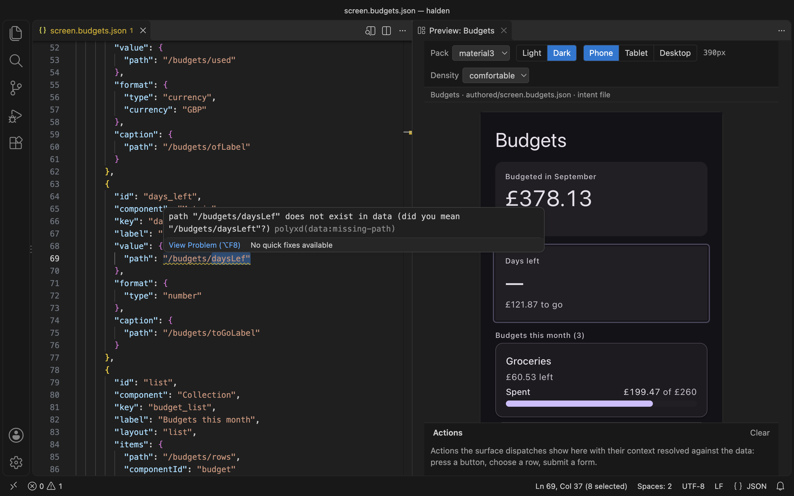\n\n## Install it\n\nSearch for **Polyxd** in the Extensions view, or install it from the command line:\n\n```sh\ncode --install-extension Polyxd.polyxd-vscode\n```\n\n- **VS Code:** [Visual Studio Marketplace](https://marketplace.visualstudio.com/items?itemName=Polyxd.polyxd-vscode)\n- **Cursor, VSCodium and Windsurf:** [Open VSX](https://open-vsx.org/extension/polyxd/polyxd-vscode)\n\nTo build it from the repository instead:\n\n```sh\ngit clone https://github.com/visualfart/polyxd && cd polyxd\nnpm ci\nnpm run build -w @polyxd/core && npm run build:preview -w @polyxd/react\nnpm run package -w polyxd-vscode\ncode --install-extension apps/vscode/polyxd-vscode-0.4.4.vsix # or: cursor --install-extension …\n```\n\nIn Cursor, VSCodium and Windsurf you can also use **Extensions → … → Install from VSIX**.\n\n## What you get\n\n- **The schema, without configuration.** Files named `*.polyxd.json`, or kept in `authored/`, `intents/` or `screens/`, get completion, hover text and squiggles from the spec's JSON Schema. The schema is bundled. An intent file is checked inside its `document`. A file anywhere else needs only the `$schema` line: `\"$schema\": \"https://polyxd.com/schema/0.3/ui.schema.json\"`.\n- **The static check as you type.** The spec's validator runs on each edit and on save, against the document's own `data` or the `<name>.data.json` beside it. A structural problem is an error. A binding that reads nothing is a warning with a \"did you mean\". Each one is underlined at its line.\n- **A preview beside the editor.** Run **Polyxd: Open preview**, or use the icon in a document's title bar. It renders with the real renderer, in any of the thirteen packs or your own (the `polyxd.pack` setting takes a `manifest.json` or a theme stylesheet). Light or dark follows your editor until you pick one. Phone, tablet, desktop, or drag the edge. Compact to spacious. It updates as you type and keeps the surface mounted, so what you typed into an input survives a keystroke in the JSON.\n- **Both ways between JSON and screen.** Click a component in the preview and the cursor goes to its JSON. Put the cursor in a component's JSON and the preview outlines it.\n- **An action log.** Actions the surface dispatches show under the preview, with their context filled in from the data.\n- **Polyxd documents** in the Explorer: every document in the workspace by folder, with the check's status as a dot.\n- **The Polyxd MCP server for your agent.** In Cursor, and in VS Code 1.101 or later, the extension adds the [MCP server](https://polyxd.com/docs/mcp/) (`https://mcp.polyxd.com/mcp`) to the agent's tools. There's no `mcp.json` to edit. In VS Code it shows in **MCP: List Servers**. The `polyxd.mcp.enabled` setting turns it off.\n\n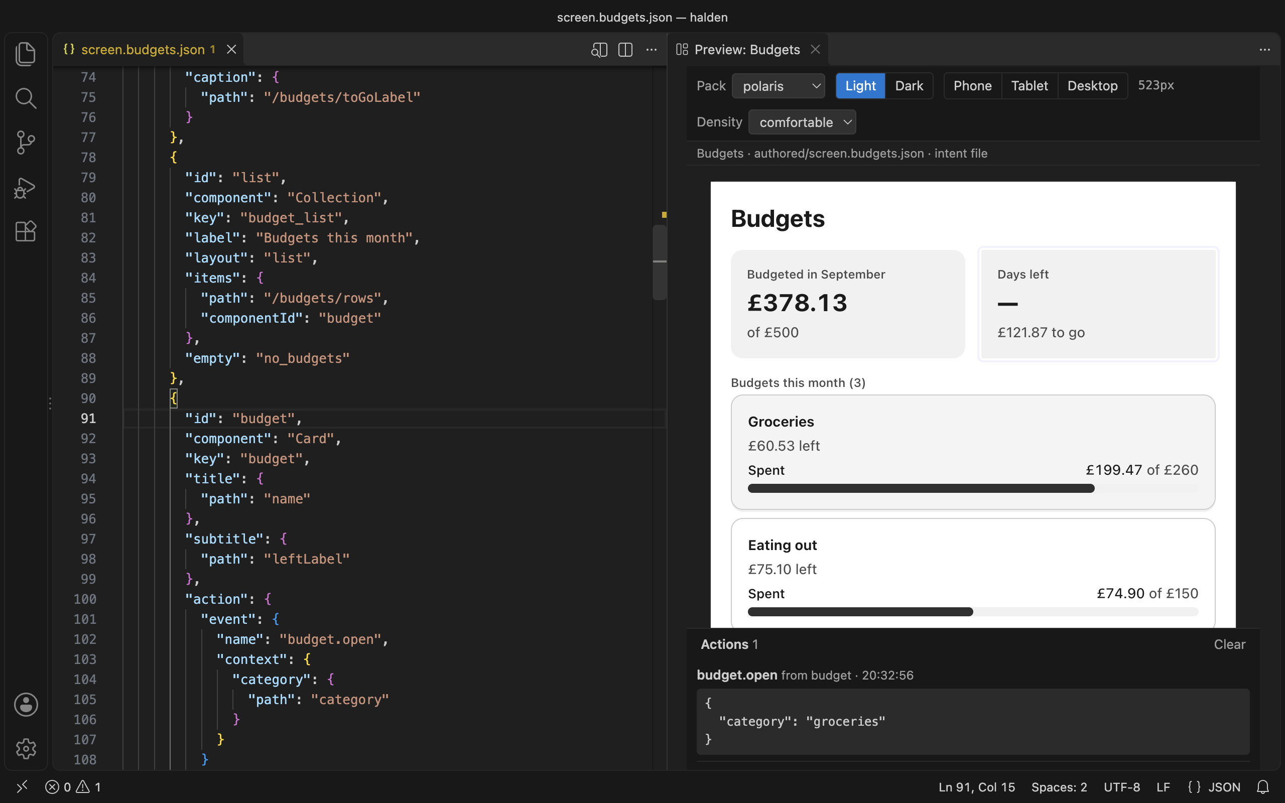\n\n## Commands\n\n- **Verify document** runs `polyxd-verify` from your workspace in a terminal: every pack, light and dark, 390 and 1100 wide. Install it first with `npm install -D @polyxd/verifier playwright && npx playwright install chromium`, or the command runs it through `npx`. See [Verifier](https://polyxd.com/docs/verifier/).\n- **Insert component** offers the 44 components by category, each with the spec's one-line summary. It drops a valid skeleton at the cursor with tab stops on the placeholders.\n- **Open in Studio** copies the document and opens [Studio](https://polyxd.com/docs/studio/), where \"Paste JSON\" makes a screen of it.\n- **Push to Studio** runs `polyxd studio push` with a key from `POLYXD_STUDIO_KEY` or the editor's secret storage (**Set Studio API key**). The key is never kept in a settings file.\n\n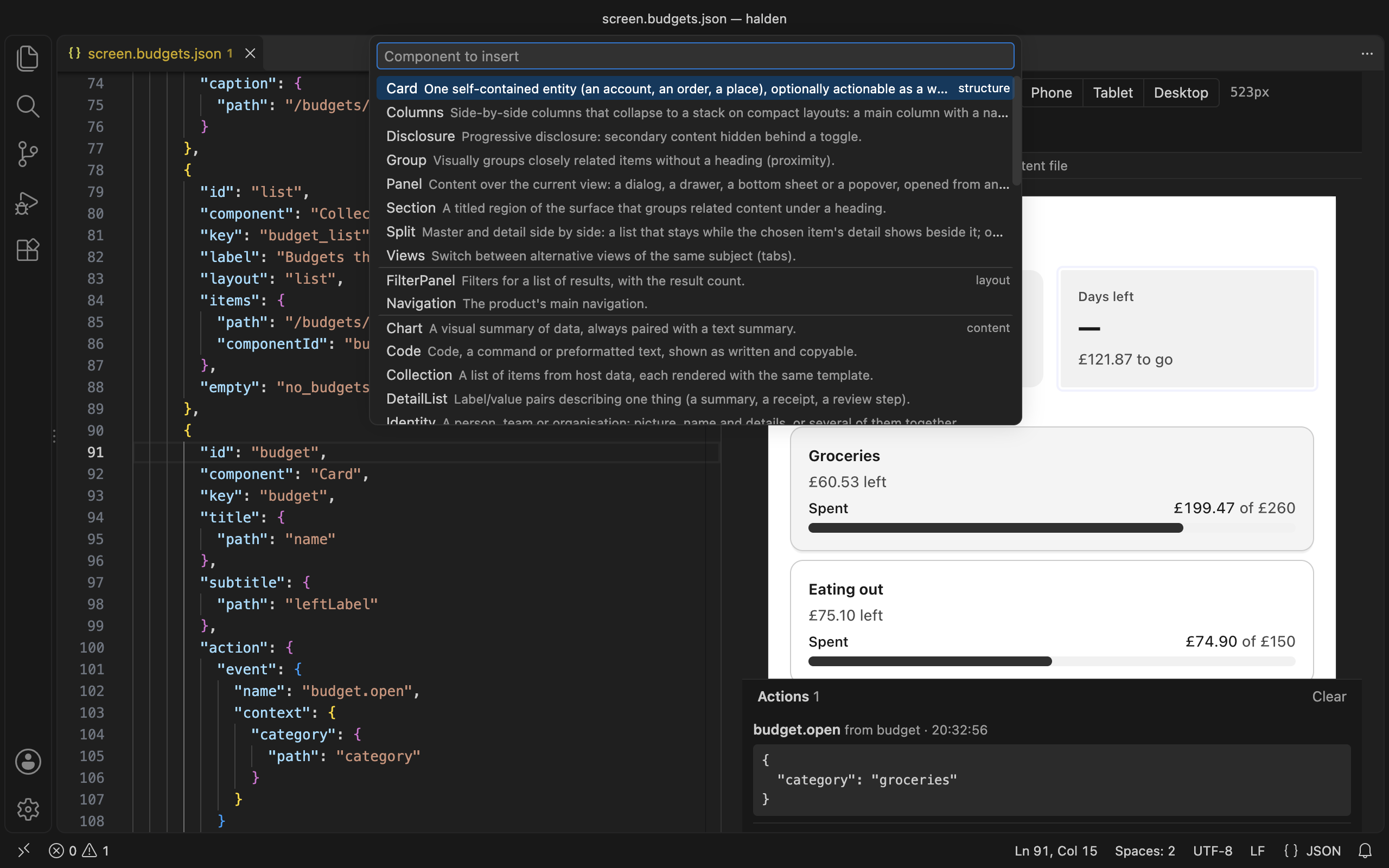\n\n## Settings\n\n| Setting | What it does |\n|---|---|\n| `polyxd.defaultPack` | The pack the preview opens with. `material3` unless you set it. |\n| `polyxd.pack` | Your own pack for the preview's switcher: a `manifest.json` written by `polyxd pack`, or a compiled theme stylesheet. Relative to the workspace folder. |\n| `polyxd.mcp.enabled` | Offer the Polyxd MCP server to Cursor's agent and VS Code's agent mode. On unless you turn it off. |\n| `polyxd.studio.workspaceUrl` | Your Studio workspace's API base, `https://studio.polyxd.com/api/w/<workspace>`, for **Push to Studio**. |\n\n## Privacy\n\nThe extension collects no telemetry. The check and the preview run on your machine from files inside the extension. It reaches the network only when you ask: **Open in Studio** opens your browser, **Push to Studio** uploads the document to your workspace, and **Verify document** may fetch the verifier from npm. The preview shows images from `https` URLs your document names. When Cursor's agent or VS Code's agent mode uses a Polyxd tool, the editor calls mcp.polyxd.com.\n\n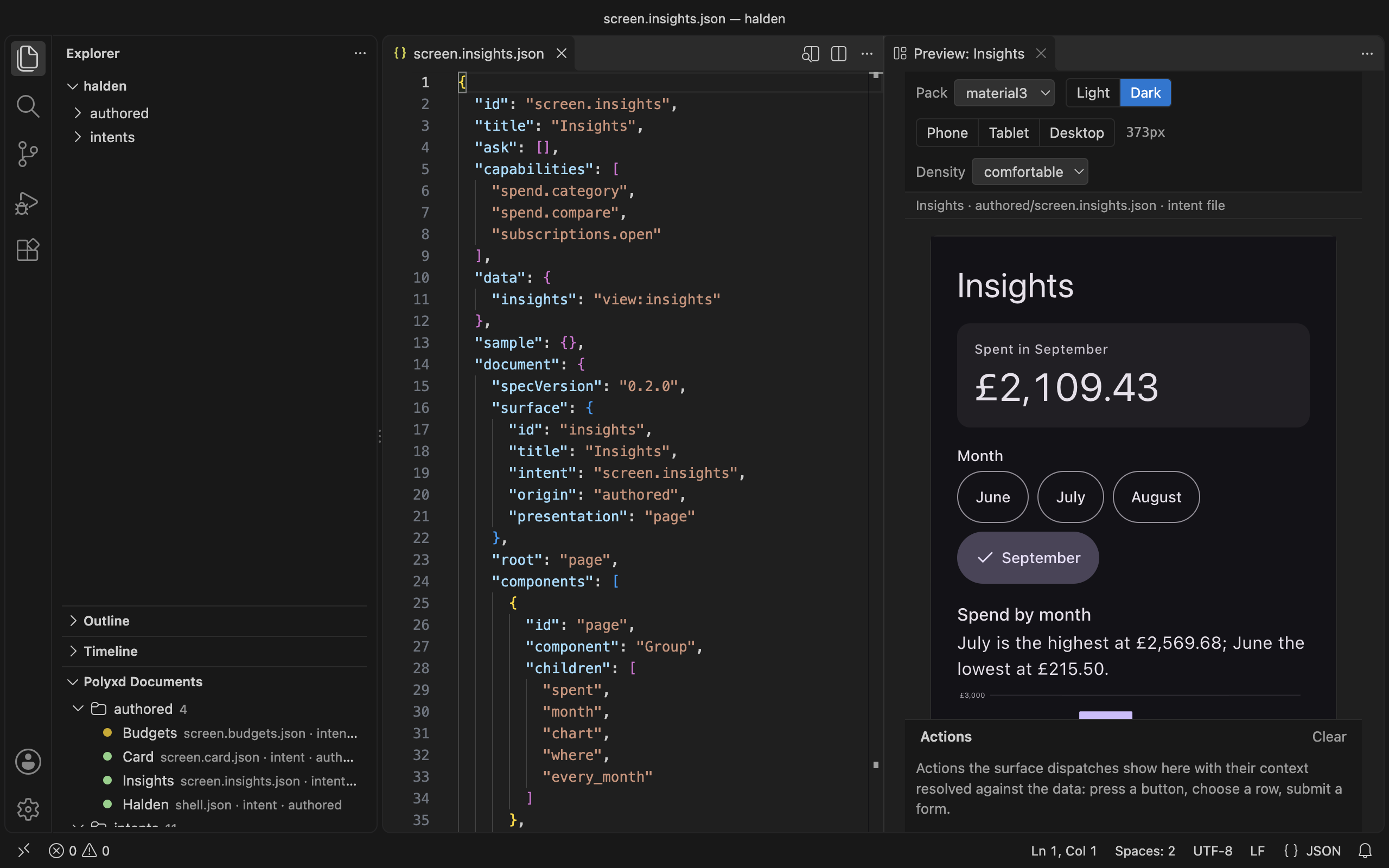\n\n## Without the extension\n\n`npx polyxd dev ./screens` gives you the same preview and check in a browser tab, for any editor. See [Your design system](https://polyxd.com/docs/your-design-system/#preview-documents-as-you-write-them)."
|
|
163
|
+
},
|
|
164
|
+
{
|
|
165
|
+
"slug": "server",
|
|
166
|
+
"title": "Generation server",
|
|
167
|
+
"description": "@polyxd/server puts the runtime behind an HTTP API with streaming, pointed at the model you choose. Run it with Docker or npx.",
|
|
168
|
+
"section": "Guides",
|
|
169
|
+
"order": 21.7,
|
|
170
|
+
"url": "https://polyxd.com/docs/server/",
|
|
171
|
+
"markdown": "`@polyxd/server` is the [runtime](https://polyxd.com/docs/runtime) behind a small HTTP API. Your app sends an ask. The server builds the prompt from the spec and your [Design Direction](https://polyxd.com/docs/design-direction), calls the model you chose, checks the answer, sends problems back for repair, and returns the document. It can stream as it goes.\n\nUse it when the model key must stay on a server, or when the code that wants a screen isn't JavaScript. It keeps no state between requests and logs nothing from them but the method, path, status and duration.\n\nIt is on npm as `@polyxd/server`, and its Docker image is on GitHub Container Registry as `ghcr.io/visualfart/polyxd-server`.\n\n## Run it with Docker\n\n```sh\ndocker run --rm -p 8080:8080 \\\n -e POLYXD_PROVIDER=anthropic \\\n -e ANTHROPIC_API_KEY \\\n ghcr.io/visualfart/polyxd-server:0.4.4\n```\n\nTo build the image yourself, from a clone of the [repository](https://github.com/visualfart/polyxd):\n\n```sh\ndocker build -f packages/server/Dockerfile -t polyxd-server .\n```\n\n`-e ANTHROPIC_API_KEY` with no value passes the key from your shell, so it isn't written in the command. The image runs Node 26 as an unprivileged user, listens on port 8080, and has a health check on `/v1/health`. It contains the server and its production dependencies only: no Playwright and no browser.\n\nTo give it your Design Direction and capability registry, mount them and point at them:\n\n```sh\ndocker run --rm -p 8080:8080 \\\n -e POLYXD_PROVIDER=openai -e POLYXD_MODEL=your-model-id -e OPENAI_API_KEY \\\n -e POLYXD_DIRECTION=/config/direction.json \\\n -e POLYXD_REGISTRY=/config/capabilities.json \\\n -e POLYXD_SERVER_TOKEN \\\n -v \"$PWD/config:/config:ro\" \\\n polyxd-server\n```\n\nA model on your own machine works too. From inside a container, the host is `host.docker.internal` on Docker Desktop:\n\n```sh\ndocker run --rm -p 8080:8080 \\\n -e POLYXD_PROVIDER=local -e POLYXD_MODEL=qwen3:8b \\\n -e POLYXD_BASE_URL=http://host.docker.internal:11434/v1 \\\n polyxd-server\n```\n\n## Run it with npx\n\nOnce it is on npm:\n\n```sh\nPOLYXD_PROVIDER=anthropic ANTHROPIC_API_KEY=... npx @polyxd/server\n```\n\nUntil then, from a clone: `npm install && npm run build -w @polyxd/server`, then `node packages/server/dist/bin.js` with the same settings. `--help` lists them.\n\nOutside Docker it listens on `127.0.0.1` only, so nothing else on the network can reach it. Set `HOST=0.0.0.0` to change that.\n\n## Settings\n\nEverything is set by environment variables. A missing or wrong setting stops the server at start, with a message that says what to set.\n\n| Variable | What it sets |\n|---|---|\n| `POLYXD_PROVIDER` | `anthropic`, `openai`, `gemini` or `local`. Required |\n| `POLYXD_MODEL` | The model id. Required, except for `anthropic`, which defaults to `claude-sonnet-5` |\n| `POLYXD_API_KEY` | The provider's key. `ANTHROPIC_API_KEY`, `OPENAI_API_KEY`, `GEMINI_API_KEY` or `GOOGLE_API_KEY` work too; `POLYXD_API_KEY` wins. `local` needs none |\n| `POLYXD_BASE_URL` | The provider's base URL. For `local`, your server (default `http://localhost:11434/v1`, Ollama). For the others, a proxy, which may add the key itself |\n| `POLYXD_DIRECTION` | Path to your Design Direction. Exemplars it names by path are read relative to it |\n| `POLYXD_REGISTRY` | Path to your capability registry, so callers can offer capabilities by name |\n| `POLYXD_SERVER_TOKEN` | When set, every endpoint but `/v1/health` needs `Authorization: Bearer <token>` |\n| `POLYXD_CORS_ORIGINS` | Origins a browser may call from, comma-separated, or `*`. Default none |\n| `POLYXD_MAX_BODY_BYTES` | The largest request body. Default 1048576 (1 MiB) |\n| `POLYXD_TIMEOUT_MS` | The longest one generation may take. Default 120000 |\n| `POLYXD_MAX_REPAIRS` | How many times a failed answer goes back to the model. Default 2 |\n| `PORT`, `HOST` | Where to listen. Default `8080` on `127.0.0.1`; the Docker image sets `0.0.0.0` |\n\nThe key goes to the provider and nowhere else. The server never prints or logs it.\n\n## Endpoints\n\n| Endpoint | What it does |\n|---|---|\n| `POST /v1/generate` | Generates a document for an ask. Returns JSON, or streams with `Accept: text/event-stream` |\n| `POST /v1/validate` | The spec validator on a document |\n| `POST /v1/verify` | The [verifier's](https://polyxd.com/docs/verifier) document checks on a document, with your Direction's rules and your registry |\n| `GET /v1/spec` | The server and spec versions, the components a generated screen may use, the patterns, your Direction's name and your capabilities' names |\n| `GET /v1/health` | `{ \"status\": \"ok\", \"version\" }`. Never needs a token |\n\nEvery body is JSON, sent with `Content-Type: application/json`. An error is `{ \"error\": { \"code\", \"message\" } }` with a status that fits: 400 for a body that isn't right (the message says what to fix, and unknown fields are refused so a typo doesn't pass silently), 401 without the token, 403 from an origin that isn't allowed, 404, 405, 413 for a body over the limit, and 415 for a body that isn't JSON.\n\n### Generate\n\n```sh\ncurl http://localhost:8080/v1/generate \\\n -H 'content-type: application/json' \\\n -H \"authorization: Bearer $POLYXD_SERVER_TOKEN\" \\\n -d '{\n \"ask\": \"Send £250 to Alex for the rent\",\n \"intent\": \"money.send\",\n \"capabilities\": [\"transfer.confirm\"],\n \"data\": { \"quote\": { \"id\": \"q_1\", \"amount\": 250, \"currency\": \"GBP\", \"recipient\": \"Alex Kim\" } }\n }'\n```\n\n| Field | What it is |\n|---|---|\n| `ask` | What the person asked, in their words. Required |\n| `intent` | A stable key for what they're trying to do, such as `money.send`. Required |\n| `capabilities` | What the screen may trigger: names from the server's registry, or an object of full capability definitions by name. Leave it out and the screen can offer none |\n| `data` | The host data the screen binds to. The document is checked against it |\n| `pattern` | A spec pattern the screen should follow, when you already know |\n\nThe answer is `{ document, report, attempts, usage }`, as the runtime returns it. `report` has `valid`, `errors`, `warnings` and the `findings`.\n\n| Status | When |\n|---|---|\n| 200 | The document passed its checks |\n| 422 | Every repair failed. The body still has the last `document` and its `report`, plus an `error` with code `invalid`, so you can show a fallback |\n| 502 | The model provider failed. `error` has code `generator`, the `provider` and its HTTP `status` (a 401 is a bad key, a 429 a rate limit). The provider's own words are not passed on |\n| 504 | No document within `POLYXD_TIMEOUT_MS`. Code `timeout` |\n\nIf the caller disconnects, the model call is aborted, so an abandoned request stops costing tokens.\n\n### Streaming\n\nSend `Accept: text/event-stream` to get the runtime's progress as [server-sent events](https://html.spec.whatwg.org/multipage/server-sent-events.html). Each event is one `event:` line and one `data:` line of JSON:\n\n```\nevent: started\ndata: {\"remembered\":false,\"exemplars\":0}\n\nevent: text\ndata: {\"attempt\":1,\"text\":\"{\\\"specVersion\\\":\\\"0.3.0\\\",\"}\n\nevent: attempt\ndata: {\"attempt\":1,\"report\":{\"valid\":true,\"errors\":0,\"warnings\":0,\"findings\":[]}}\n\nevent: done\ndata: {\"document\":{...},\"report\":{...},\"attempts\":1,\"usage\":{\"inputTokens\":3200,\"outputTokens\":900}}\n```\n\n| Event | Data |\n|---|---|\n| `started` | `remembered` and `exemplars`, once |\n| `text` | `attempt` and a piece of the model's `text` |\n| `attempt` | `attempt` and the `report` on that answer |\n| `repaired` | `attempt` and `report`, when an answer passes after a repair |\n| `done` | Last: `{ document, report, attempts, usage }`, the same as the JSON answer |\n| `error` | Last, instead of `done`: `code` (`invalid`, `generator`, `timeout`, `setup` or `aborted`), a `message`, the provider's `status` when there is one, and the `result` when the runtime gave up |\n\nThe status is 200 once streaming starts, so read the last event to know how it ended. While the model thinks, the server sends a `: keep-alive` comment every 15 seconds so proxies keep the connection open. Closing the connection aborts the model call.\n\n`EventSource` only sends GET, so read the stream with `fetch`:\n\n```ts\nconst res = await fetch(`${server}/v1/generate`, {\n method: \"POST\",\n headers: { \"content-type\": \"application/json\", accept: \"text/event-stream\", authorization: `Bearer ${token}` },\n body: JSON.stringify({ ask, intent, capabilities, data }),\n});\nconst reader = res.body!.pipeThrough(new TextDecoderStream()).getReader();\nlet buffer = \"\";\nfor (;;) {\n const { value, done } = await reader.read();\n if (done) break;\n buffer += value;\n let end;\n while ((end = buffer.indexOf(\"\\n\\n\")) >= 0) {\n const block = buffer.slice(0, end);\n buffer = buffer.slice(end + 2);\n const event = /^event: (.*)$/m.exec(block)?.[1];\n const data = /^data: (.*)$/m.exec(block)?.[1];\n if (event === \"done\") show(JSON.parse(data!).document);\n if (event === \"error\") showFallback(JSON.parse(data!).code);\n }\n}\n```\n\n### Validate and verify\n\nBoth take `{ document, data? }`. `data` replaces the document's own data.\n\n`/v1/validate` runs the spec validator, with your Direction's `emphasisBudget`, and returns `{ valid, errors, warnings, issues }`. Each issue has a `severity`, a JSON Pointer `at`, and a `message`.\n\n`/v1/verify` runs the verifier's document checks from `@polyxd/verifier/static`: the validator, the declared pattern, capabilities, your Direction's rules and voice, and the agent-readiness checks. It checks capabilities against your whole registry, or against `capabilities` in the body if you send them. It returns `{ valid, errors, warnings, findings }`. The rendered checks need a browser, so run [`polyxd-verify`](https://polyxd.com/docs/verifier/) for those.\n\n## Callers and browsers\n\n- **Token.** Set `POLYXD_SERVER_TOKEN` and send `Authorization: Bearer <token>`. The comparison takes the same time whatever the token, so it can't be guessed a character at a time. Only `/v1/health` is open, for load balancers and the Docker health check.\n- **CORS.** By default no browser page can call the server. `POLYXD_CORS_ORIGINS` names the origins that can. A request from any other origin gets a 403, before any model call. `*` allows every origin; use it only with a token, or on a private network.\n- **Limits.** Bodies over `POLYXD_MAX_BODY_BYTES` are refused, whether or not they say their length. A generation that runs past `POLYXD_TIMEOUT_MS` is aborted.\n\nA token in a web page is readable by anyone who opens the page. For a browser app, call the server from your own backend, or put it behind the sign-in your product already has.\n\n## Privacy\n\nThe server logs one JSON line per request with four fields:\n\n```\n{\"method\":\"POST\",\"path\":\"/v1/generate\",\"status\":200,\"ms\":2140}\n```\n\nIt never logs the ask, the data, the document, a header or a query string. It keeps nothing between requests: no interface memory, no history. Error messages it sends never repeat what the provider said, so a provider's answer can't leak into your client. The package sends no telemetry.\n\nThe model provider does see the ask and the data, as it would with the runtime. Choose `local` to keep them on your own machines.\n\n## From code\n\nThe server is also a library, for tests or to run it inside your own Node process:\n\n```ts\nimport { createServer, configFromEnv } from \"@polyxd/server\";\nimport { anthropic } from \"@polyxd/runtime\";\n\nconst server = createServer({\n generator: anthropic({ apiKey: process.env.ANTHROPIC_API_KEY }),\n direction, // your direction.json, parsed\n registry, // your capability registry, parsed\n token: process.env.POLYXD_SERVER_TOKEN,\n});\nserver.listen(8080);\n```\n\n`createServer` returns a Node `http.Server` and takes the settings above as options (`token`, `corsOrigins`, `maxBodyBytes`, `timeoutMs`, `maxRepairs`, `resolveExemplar`), plus `runtime` in place of `generator` if you built one yourself, and `log` to send the log lines somewhere else. The server's own tests pass a fake generator this way, with no network and no key.\n\n| Export | What it does |\n|---|---|\n| `createServer(options)` | The server, as a Node `http.Server` |\n| `configFromEnv(env)` | Every setting from environment variables, as the bin reads them. Throws a `ConfigError` that says what to fix |\n| `generatorFromEnv(env)` | Just the generator, from `POLYXD_PROVIDER`, `POLYXD_MODEL`, the key and `POLYXD_BASE_URL` |\n| `ConfigError` | What `configFromEnv` throws |\n| `PROVIDERS` | The providers `POLYXD_PROVIDER` accepts |\n| `ENV_HELP` | The text `--help` prints |\n| `VERSION` | The server's version |\n\n## Not yet\n\n- On npm and on GitHub Container Registry. The release workflow builds the image and pushes it on a version tag, once `@polyxd/server` has been published.\n- Interface memory. The runtime can remember the screen per intent, but a server shared by many people would mix theirs up, so the server keeps none.\n- Rate limiting per caller. Put the server behind a gateway or proxy that does it."
|
|
172
|
+
},
|
|
173
|
+
{
|
|
174
|
+
"slug": "custom-renderers",
|
|
175
|
+
"title": "Custom renderers",
|
|
176
|
+
"description": "Replace any component's renderer with the components prop, and how an Astryx adapter is planned to plug in the same way.",
|
|
177
|
+
"section": "Guides",
|
|
178
|
+
"order": 22,
|
|
179
|
+
"url": "https://polyxd.com/docs/custom-renderers/",
|
|
180
|
+
"markdown": "`@polyxd/react` ships one **adapter**: Radix primitives (the same ones shadcn/ui uses) styled only by design-system token variables. You can replace the renderer for any of the 44 components with your own, one component at a time; a shell's `Custom` names one of yours.\n\n## The `components` prop\n\nPass a map from component name to a React component. Each renderer receives the document node as `node`.\n\n```tsx\nimport { PolyxdSurface, Render, useBindings, type Node } from \"@polyxd/react\";\n\nfunction MyStatus({ node }: { node: Node }) {\n const b = useBindings();\n const urgent = node.kind === \"error\";\n return (\n <div role={urgent ? \"alert\" : \"status\"} className={`my-banner my-banner-${node.kind}`}>\n <strong>{b.text(node.title)}</strong>\n {node.message !== undefined && <p>{b.text(node.message)}</p>}\n {node.action && <Render id={node.action} />}\n </div>\n );\n}\n\n<PolyxdSurface document={doc} theme=\"material3\" components={{ Status: MyStatus }} />;\n```\n\nEverything you don't override keeps the default renderer. The default map is exported as `registry` if you want to wrap an existing renderer rather than replace it.\n\nThe same map carries the host's **own components** that a shell or an authored screen names through `Custom`: keys are namespaced (`\"brand.logo\"`, `\"store.map\"`), the component receives the document's `props` resolved against data, and when the map has no such name the document's `fallback` renders instead. See [Rendering a shell](https://polyxd.com/docs/shell/).\n\n## Helpers for renderers\n\n| Export | What it gives you |\n|---|---|\n| `useBindings()` | Binding helpers for the current scope: `value(v)` resolves a literal or binding; `text(v, format?)` resolves and formats it as text; `write(binding, value)` writes an input's value back to host data; `pointer(binding)` gives the absolute JSON Pointer; `context(c)` resolves an action context |\n| `useSurface()` | The surface: the document, `byId`, current `data`, `dispatch(action, scope, sourceId)` for sending actions, `locale`, `resolveMedia`, and the `portal` element dialogs should render into |\n| `Render` | `<Render id=\"child\" />` renders another component by id, in the current scope. Use it for children and referenced components |\n| `formatValue(value, format, locale)` | The same `Intl`-based formatting the default renderer uses |\n| `getPointer`, `setPointer` | JSON Pointer read and immutable write |\n\nUse `dispatch` for every action rather than calling your own handlers, so that `ui.dismiss`, `ui.back` and `ui.next` behave correctly and every capability event reaches the host's `onAction`.\n\n## What a custom renderer must keep\n\nA custom renderer takes over the rendering rules and accessibility guarantees for its component. Keep what the [component definition](https://polyxd.com/docs/reference/components) requires: the role, the accessible name, live-region behaviour, target sizes, and the rendering rules (for example, `Status` errors are assertive, and a `Confirm` starts focus on the least destructive option).\n\nUse token variables (`var(--pxd-color-status-danger-emphasis)` and so on) rather than raw values, so your renderer still follows whichever pack is loaded. Then run the [verifier](https://polyxd.com/docs/verifier) over the examples: its rendered and agent checks apply to any renderer, and they are how the default adapter's own bugs were found.\n\n## Astryx (planned)\n\n[Astryx](https://github.com/facebook/astryx) is Meta's open-source React design system. Decision 0002 (`docs/decisions/0002-astryx.md`) looked at how it relates to Polyxd:\n\n- **Different layers.** Astryx is a concrete component library made easy for coding agents to write code against, at build time. Polyxd is a runtime semantic layer: a model emits UI data and a renderer turns it into native components. So Astryx complements Polyxd rather than competing with it, and it is a good renderer target.\n- **An adapter, not a pack.** The plan is an `@polyxd/react-astryx` adapter after v0.1 that maps the 24 Polyxd components onto Astryx components, for example `Choice` to RadioList, Selector, SegmentedControl or CheckboxList; `DetailList` to MetadataList; `Steps` to Stepper; `Confirm` to AlertDialog; `Status` to Banner, Toast, EmptyState or Skeleton. `Chart` would wait until Astryx's charts leave canary.\n- **Tokens as a bridge.** The adapter would generate an Astryx theme from any Polyxd pack, mapping semantic tokens onto Astryx's CSS variables and building its light/dark values from the pack's modes.\n- **Why it matters.** It would prove the \"any design system\" promise at the component-library level, not only the token level, and give existing Astryx apps a way in.\n\nThe `components` prop is the seam this adapter will use: an adapter is a full map of renderers passed the same way. The adapter itself is not built. Any Astryx-based work would pin a specific Astryx version (it is pre-1.0 and changes often) and be described as \"compatible with Astryx\", not as an official Astryx pack."
|
|
181
|
+
},
|
|
182
|
+
{
|
|
183
|
+
"slug": "shell",
|
|
184
|
+
"title": "Rendering a shell",
|
|
185
|
+
"description": "How a product renders its shell document with PolyxdFrame, puts screens in the Outlet, routes navigation actions, and supplies its own components through Custom.",
|
|
186
|
+
"section": "Guides",
|
|
187
|
+
"order": 22,
|
|
188
|
+
"url": "https://polyxd.com/docs/shell/",
|
|
189
|
+
"markdown": "A **shell document** is the product's frame: the app bar, the main navigation, an aside, a footer, and an `Outlet` where every screen renders. It has `surface.kind: \"shell\"`, a `Frame` at the root, and is always authored (see [Generated or authored](https://polyxd.com/docs/authored-screens/#the-shell)). `@polyxd/react` renders it with `PolyxdFrame`.\n\n```tsx\nimport { PolyxdFrame } from \"@polyxd/react\";\nimport shell from \"./authored/shell.json\";\n\n<PolyxdFrame\n document={shell.document}\n data={shellData} // what the shell binds to: the person, badges, the current item\n theme=\"material3\"\n mode={mode}\n current={{ key: route.key, title: route.title }} // marks the navigation item; the AppBar shows the title on phones\n components={{ \"halden.fab\": Fab }} // host components a Custom names\n onAction={(e) => {\n if (e.name === \"nav.go\") navigate(e.context.to as string);\n if (e.name === \"ask.open\") openAsk();\n }}\n>\n <Routes>…</Routes> {/* whatever the product shows: PolyxdSurface documents, React screens, both */}\n</PolyxdFrame>\n```\n\n## What the frame does\n\n- **Landmarks.** A skip link first, then banner, header, navigation, main, aside, footer, in that reading order at every width. There is exactly one `main`: the Outlet.\n- **Layout by width**, measured on the frame itself, not the viewport: at 1024px and above the navigation is a side column or a rail, with the aside as a third column; from 640px a rail with the aside below; on compact widths a bottom bar (up to five items) or a drawer behind the menu button the AppBar shows. `Navigation.placement` fixes one of these instead.\n- **Current screen.** `current.key` marks the navigation item; `current.title` becomes the AppBar's title on compact layouts and the document title (`Payments · Halden`). Focus moves to the screen's heading when the Outlet's content changes.\n- **Actions.** Navigation items, AppBar actions and Footer links dispatch through `onAction` like any action; the host routes. Nothing in the document knows about URLs.\n- **Custom.** A `Custom` component names one of the host's own (`\"halden.fab\"`), passed in `components`; when the host has none of that name, the document's `fallback` renders instead, so the shell stands on its own.\n\n`useFrame()` gives a host's own screens the layout the frame chose (`{ navigation: \"side\" | \"rail\" | \"bar\" | \"drawer\", compact }`), so a React screen can, say, leave room for the bottom bar.\n\n## Data\n\nA shell is long-lived, so unlike a surface it **adopts each new `data` object** the host passes: a badge count changes, the frame follows. Keep `shellData` derived from the product's store.\n\n## Verification\n\nA shell is verified like any document: `polyxd-verify authored/shell.json` renders it in every pack with a stand-in screen in the Outlet and audits landmarks, target sizes, contrast and the [shell rules](https://polyxd.com/docs/authored-screens/#the-shell). The demos' pipeline treats `authored/shell.json` like every other authored document.\n\n## What stays in code\n\nScreens can be documents or React; the frame can be a document or React; the two mix freely. What has no document form is behaviour that isn't a component: routing, data fetching, animation beyond the packs' motion tokens, and anything a `Custom` names. Halden's shell is a document with one `Custom` (the floating ask button); Foundry's and Wexley's frames are still React on the same tokens, and look the same."
|
|
190
|
+
},
|
|
191
|
+
{
|
|
192
|
+
"slug": "renderers",
|
|
193
|
+
"title": "Renderers",
|
|
194
|
+
"description": "What a conformant Polyxd renderer must do, the two shipped renderers (React and Web Components), the framework-free core they share, the Vue and Svelte adapters, how to run the conformance suite, and native renderers as the next step.",
|
|
195
|
+
"section": "Guides",
|
|
196
|
+
"order": 23,
|
|
197
|
+
"url": "https://polyxd.com/docs/renderers/",
|
|
198
|
+
"markdown": "A UI document says what an interface means; a renderer turns it into your platform's components. Polyxd ships two, built on one framework-free core, and a conformance suite that holds any renderer to the same contract: the same components in the same order, the same roles and names, the same text, the same findings, the same agent tasks passing.\n\n```\n @polyxd/core decisions, bindings, formatting, the headless surface\n / \\\n @polyxd/react @polyxd/web React 19 + Radix Web Components, no framework\n \\ /\n @polyxd/verifier conformance: both renderers, every document, 13 packs × 2 × 2\n```\n\n## Not React?\n\n`@polyxd/web` renders a document as a custom element with no framework and no shadow DOM:\n\n```html\n<link rel=\"stylesheet\" href=\"node_modules/@polyxd/web/styles.css\" />\n<link rel=\"stylesheet\" href=\"node_modules/@polyxd/web/themes/carbon.css\" />\n\n<polyxd-surface id=\"send\" theme=\"carbon\" mode=\"light\"></polyxd-surface>\n\n<script type=\"module\">\n import { defineElements } from \"@polyxd/web\";\n defineElements();\n const el = document.getElementById(\"send\");\n el.document = doc;\n el.data = { quote };\n el.addEventListener(\"polyxd-action\", ({ detail }) => {\n if (detail.name === \"transfer.confirm\") sendMoney(detail.context.quoteId);\n });\n</script>\n```\n\n`document`, `data`, `resolveMedia`, `derive`, `components`, `onEvent` and `events` are properties; `theme`, `mode`, `density`, `locale` and `disclosure` are attributes as well. The element dispatches `polyxd-action` (the `ActionEvent`), `polyxd-datachange` (the new data), `polyxd-dismiss`, and `polyxd-event` for [semantic events](#semantic-events). `<polyxd-frame>` renders a shell document around the host's screen, with `current` and `loading` like `PolyxdFrame`. For a DOM owned by something else, `mount(el, props)` renders without the elements. Without a bundler, `preview/polyxd-web.js` and `preview/polyxd-web.css` are a self-contained build.\n\nThe DOM it produces is the React renderer's: the same `pxd-*` classes, the same ARIA, so the stylesheet and every theme apply unchanged, and so does everything the verifier checks. Overlays are native `<dialog>` elements shown modally; menus, comboboxes, tabs, radios, switches and sliders are written for the DOM with the roles and keyboard handling Radix gives React.\n\n### Vue and Svelte\n\nTwo adapters ship as files to copy, in `@polyxd/web`'s `adapters/` folder: `PolyxdSurface.vue` (Vue 3, `<script setup>`) and `PolyxdSurface.svelte` (Svelte 5 runes). Each takes the same props, including a handler for semantic events (`onEvent` in Vue, `onevent` in Svelte), forwards the element's events as `action`, `datachange` and `dismiss`, and stays a few dozen lines because the element does the work. They are documented, not published.\n\n## Semantic events\n\nBoth renderers emit the semantic analytics events described in [Capabilities, journeys and events](https://polyxd.com/docs/product#semantic-analytics-events): `surface.shown`, `action.taken`, `checkpoint.reached`, `task.completed`, `task.abandoned`, `surface.dismissed`, `input.error`, `status.shown`, `undo`, and `feedback` and `surface.regenerated` when you report them. They are off until you pass a handler, and then they go to that handler and nowhere else. Polyxd receives none of them, unless you send them to [Studio Insights](https://polyxd.com/docs/studio#insights).\n\nIn React, pass `onEvent`. The `ref` gives you `feedback(rating, reason?)`, `regenerated(reason?)` and the `sessionId`:\n\n```tsx\nimport { PolyxdSurface, type PolyxdSurfaceHandle } from \"@polyxd/react\";\n\nconst surface = useRef<PolyxdSurfaceHandle>(null);\n\n<PolyxdSurface\n ref={surface}\n document={doc}\n onEvent={(event) => analytics(event)}\n events={{ journey, generator: \"my-model@3\" }} // optional: sessionId, actor, journey, generator, direction, experiment\n/>\n\nsurface.current?.feedback(1);\n```\n\nA component of your own inside the surface (a `Custom`) can reach the same emitter through `useSurface().events`.\n\nOn the Web Components renderer, set `onEvent`, or listen for `polyxd-event`:\n\n```js\nel.events = { journey }; // optional; setting it also switches the events on\nel.addEventListener(\"polyxd-event\", ({ detail }) => analytics(detail));\nel.feedback(1); // and el.regenerated(\"asked-again\")\n```\n\nThe events are on when you set `onEvent` or `events`, or add a `polyxd-event` listener to the element itself. A listener further up the page can't be seen, so set `events` (even `{}`) in that case. `mount()` takes `onEvent` and `events` in its props, and its handle has `feedback` and `regenerated`.\n\nListening changes nothing in the DOM: the tests render every spec example with and without a handler and compare the markup, and the verifier's harnesses always listen, so the conformance suite runs with events on. The verifier also clicks through the same documents in both renderers and checks they emit the same events.\n\n## The core\n\n`@polyxd/core` is what every renderer shares and what a new one starts from: no DOM, no framework, no dependencies.\n\n| Area | What is there |\n|---|---|\n| Document | The types (`UIDocument`, `Node`, `Action`, `ActionEvent`, `FrameLayout`, `NavigationPlacement`), the component list `COMPONENTS`, the renderer's own action names `RENDERER_ACTIONS`, `indexById`, `mainNavigation` |\n| Bindings | JSON Pointer `get` and immutable `set`; `resolve`, `resolveContext`, `resolveDeep`, `absolute`, `childPointer`, `asList`, `isBinding`, `itemScopes`, `ROOT_SCOPE` |\n| Formatting | `formatValue` (numbers, currency, percent, dates, times, relative time, duration, bytes, colours, per locale), `resolveFormat`, `safeColor`, `currencySymbol`, `formatCount`, `formatPercent` |\n| The headless surface | `createSurface(document, { data, locale, derive, onAction, onDataChange, onDismiss, events })` returns `{ byId, data, setValue, replaceData, dispatch, subscribe, resolve, text, pointer, write, context, visible }`; `dispatchAction` (ui.dismiss to the host's `onDismiss`, everything else to `onAction` with its context resolved), `contextWithValue`, `copyText`, `rowChangeAction`, `isRendererAction`, `a11yAttributes` |\n| Semantic events | `createSurfaceEvents(document, emit, options)` is the emitter a renderer tells what happened: `shown()`, `action(action, source)` (which `dispatchAction` calls for you), `edited(pointer)`, `inputError(node, reason)`, `statusShown(node)`, `feedback(rating)`, `regenerated(reason)` and `unmounted(defer?)`. It decides which events that makes. `validityReason` turns a control's `ValidityState` into a reason code, and `fileRefusalReason` does the same for a refused file. `SEMANTIC_EVENT_TYPES`, `EVENT_PROPERTIES`, `EVENT_SURFACE_PROPERTIES`, `EVENT_ACTOR_PROPERTIES` and `EVENT_COMPONENT_PROPERTIES` are the schema's types and property names, checked against `schema/event.schema.json` in core's tests |\n| Choice | `optionsOf`, `planChoice` (chips for a few short options, a people picker for faces, otherwise a list, searchable past ten), `optionKey`, `matchesQuery`, `partitionRecent`, `toggleSelection`, `isSelected`, `searchPlaceholder`, `idOf`, `idGenerator`, `CHIPS_MAX`, `CHIP_LABEL_MAX`, `SEARCHABLE_PAST` |\n| State machines | Steps: `stepsReducer`, `initialStep`, `isLastStep`, `stepsProgress`, `TASK_STATUS`, `taskStatus`, `tasklistReducer`, `tasklistProgress`. Views: `selectedView`, `viewsReducer`. Split: `splitReducer`, `initialSplit`, `splitPanes`, `splitSelection`, `splitItemValue`, `clampShare`, `SPLIT_COMPACT_PX`, `SHARE`, `SHARE_MIN`, `SHARE_MAX` |\n| Layout rules | Frame: `frameWidth`, `placementFor`, `appBarTitle`, `documentTitle`, `WIDE_PX`, `MEDIUM_PX`, `BAR_MAX`, `NAV_COMPACT_PX`. Table: `TABLE_COMPACT_PX`, `PAGE_SIZES`, `isNumericColumn`, `stackedColumns`, `rowValue`, `rowScopes`, `toggleValue`, `nextSort`, `columnCount`, `paging`. ActionBar: `fitActions`, `minShown`, `menuOrder`, `MORE_ACTIONS`, `TRIGGER_FALLBACK`. Collection: `collectionItemValue`, `collectionLayout`, `orderedIndices`, `moveItem`, `dateParts`, `monthToShow`, `shiftMonth`, `calendarMonth`, `nearestSlide`. Tree: `treeRows`, `treeKey`, `typeAheadTarget`, `visibleWindow`, `VIRTUAL_LIMIT`, `OVERSCAN`, `TYPEAHEAD_MS`. FilterPanel: `activeFilters`, `resultCountText`, `FILTER_COMPACT_PX`. Comparison and Navigation: `bestPerAttribute`, `groupAttributes`, `recommendedFirst`, `groupItems`, `navigationLabel` |\n| Loading | `skeletonShape`, `SKELETON_SHAPES`, `SKELETON_GROUP_CLASS`, `PATTERN_SHAPE`, `skeletonStatus` |\n| Shortcuts | `parseShortcut`, `shortcutMatches`, `unmodified`, `isApplePlatform`, `SHORTCUT_KEYS`, `MODIFIER_FLAGS` |\n| Small marks | `metricChange`, `gaugeState`, `meterHint`, `starsLabel`, `ratingSaid`, `maskSecret`, `groupSummary`, `IDENTITY_SIZE`, `avatarTone`, `initialsOf`, `isMediaRef`, `iconPath`, `ICON_PATHS`, `STATUS_ICON`, `STAR_PATH` |\n| Content | `richText` (tokens for bold, italic, code and safe links), `qrEncode`, chart geometry (`niceMax`, `axisLabel`, `axisLabelStep`, `treemap`, `verticalScale`, `flowLayout`, `markerShape`, `seriesColor`, `CHART_W`, `CHART_H`, `CHART_PAD`, `MARKERS`), masks and numeric fields (`applyMask`, `maskIsNumeric`, `numericValue`, `storedText`, `addTag`), colours (`parseColor`, `formatColor`, `toHex6`, `sameColor`, `colorPlaceholder`, `hslToRgb`, `rgbToHsl`, `clamp`), file limits (`formatBytes`, `describeType`, `listText`, `matchesAccept`, `fileLimits`, `refuseFile`) |\n\n`@polyxd/react` imports all of it; its public API and its rendered output did not change. `@polyxd/web` exports `PolyxdSurfaceElement`, `PolyxdFrameElement`, `defineElements`, `mount`, `Renderer`, `registry` (its 44 component renderers, to wrap or replace), `Skeleton`, and the small virtual-DOM it draws with (`h`, `adopt`, `render`, `unmount`), plus `formatValue`, `getPointer` and `setPointer` from core for symmetry with the React package.\n\n## What a conformant renderer must do\n\nThe contract is on the rendered page, not on a component API, so it holds for any framework. In full in the verifier's `harness/README.md`; in short:\n\n1. **Read `window.__PXD__ = { document, theme, mode }`** and render the document into `#root`, with the outer element carrying `class=\"pxd-surface\"`, `data-pxd-theme` and `data-pxd-mode`, and every component's element carrying `data-pxd-id` and `data-pxd-component`. Overlays render inside the surface. A shell renders around a stand-in screen (`<h1>Screen</h1>`). Media references resolve to a placeholder.\n2. **Record what it sends**: push every `ActionEvent` onto `window.__pxdActions`; count `ui.dismiss` in `window.__pxdDismissed`. Optionally, push every semantic event onto `window.__pxdEvents`, as the shipped harnesses do.\n3. **Set `window.__pxdReady = true`** after the first paint. The verifier waits for finite animations to end before it measures.\n4. **Make the same decisions.** A `Choice` with three short options is chips, a `Table` stacks below 720px, a `Frame` puts five items in a bar on a phone, `ui.dismiss` closes, an input's action carries the value it just wrote. All of these are in `@polyxd/core`; use it.\n5. **Give the same accessibility tree.** The roles, accessible names, states and reading order the [component definitions](https://polyxd.com/docs/reference/components) require, which the React renderer's output defines in practice: a `Confirm` is an `alertdialog` whose consequence sits directly above its buttons, a rating is a radiogroup of \"1 star\" to \"5 stars\", a table's stacked rows keep the Select button an agent presses at any width.\n\nThen run the suite against it:\n\n```ts\nimport { verifyDocument, HARNESSES } from \"@polyxd/verifier\";\n\nconst report = await verifyDocument(doc, { harness: { name: \"mine\", html: \"./my-harness/index.html\" }, fingerprint: true });\n```\n\n`harness` is `{ url }` for a page you serve or `{ html }` for a directory of static files (served from disk, nothing listens on a port). `fingerprint: true` records, per target, the components in order, the ARIA snapshot and the visible text; `compareFingerprints(a, b)` explains any difference in words.\n\n## Running the conformance suite\n\n```bash\nnpm run conformance -w @polyxd/verifier\n```\n\nRenders every spec example and every demo document (`apps/demos/*/{intents,authored}/*.json`) with both shipped renderers in 13 packs × light/dark × 390/1100 and compares the fingerprint, the axe and layout findings, and the agent tasks. Both renderers must score 100 and every fingerprint must match; the report is per document and per renderer, and any difference is printed in words (`aria differs at line 12: react \"button 'Send money'\" vs web \"button 'Send'\"`). Options: `--only <name>`, `--packs a,b`, `--modes light`, `--widths 390`, `--concurrency 6`, `--json report.json`.\n\nThe result today: 90 documents, 4,680 renders per renderer, both at 100 everywhere, fingerprints identical in all 90. Building it found and fixed the differences you would expect between a Radix primitive and a hand-written one (a false `aria-checked` dropped instead of stated, a popover anchor counted as a component) and one the React harness had been getting away with: an entrance fade that axe could catch mid-way, now waited out for every renderer.\n\n## Native renderers: the next step\n\nEach [component definition](https://polyxd.com/docs/reference/components) carries a per-platform mapping, so a native renderer walks the same tree with the same core and draws with the platform's own components. Examples from the spec:\n\n| Component | iOS | Android |\n|---|---|---|\n| `Choice` | `Picker` (`.segmented`, `.inline` or `.menu`) or a multi-select `List` | `SegmentedButton`, `RadioButton` rows, `ExposedDropdownMenuBox` or `Checkbox` rows |\n| `Table` | `Table` on regular width; `List` of rows on compact width | `LazyColumn` of rows with a header row |\n| `Confirm` | `.confirmationDialog` / `.alert` with `role: .destructive` | `AlertDialog` |\n| `Steps` | `NavigationStack` pushes or a paged view with a `ProgressView` | A stepper row with content and a `LinearProgressIndicator` |\n| `Navigation` | `TabView`, or a sidebar on iPad | `NavigationRail` / `NavigationDrawer` |\n| `Frame` | `NavigationSplitView` / `TabView` with a `NavigationStack` | `Scaffold` with `TopAppBar`, `NavigationRail` or `NavigationBar`, and content |\n| `AppBar` | Navigation bar with toolbar items | `TopAppBar` |\n| `Outlet` | `NavigationStack` content | `NavHost` |\n\nWhat such a renderer reuses is everything in `@polyxd/core` (the decisions, the bindings, the formatting, `createSurface`), so what it writes is the drawing. What it must still meet is the contract above; the practical way to audit it is to render the native view for a document into a WebView-hosted harness page, or to compare its accessibility tree against the ARIA snapshot the suite records, which is why the fingerprint is roles, names and text rather than DOM.\n\n## Custom renderers inside React\n\nReplacing one component's renderer inside `@polyxd/react` is a different, smaller thing: the `components` prop. See [Custom renderers](https://polyxd.com/docs/custom-renderers/). The same prop carries a host's own components for a shell's `Custom`; `<polyxd-surface>`'s `components` property does both jobs for the Web renderer."
|
|
199
|
+
},
|
|
200
|
+
{
|
|
201
|
+
"slug": "studio",
|
|
202
|
+
"title": "Studio",
|
|
203
|
+
"description": "Where a design-system team brings its tokens, decides what generated screens may look like, authors screens of its own, delivers them to products, and sees how they do. Hosted at studio.polyxd.com, or run on your own Cloudflare account.",
|
|
204
|
+
"section": "Guides",
|
|
205
|
+
"order": 23,
|
|
206
|
+
"url": "https://polyxd.com/docs/studio/",
|
|
207
|
+
"markdown": "> **Coming soon.** The hosted Studio at studio.polyxd.com isn't open yet. This page describes what it will do.\n\n[Studio](https://studio.polyxd.com) is the team's side of Polyxd: source-available (the [Functional Source License](https://fsl.software), in `apps/studio`: free to run for your own team or company, not as a competing hosted service, and each version becomes Apache-2.0 after two years), running on Cloudflare Workers with D1 and R2, and the same code whether you use the hosted one or your own. The hosted Studio has a Free plan and paid ones ([Plans](#plans)); a Studio you run yourself has no plans and no limits.\n\n## Your design system\n\n- **Import** it as it is: an npm package (public, or private through a read-only registry token kept encrypted), a `.tgz` from `npm pack`, a Tokens Studio file, a W3C DTCG file, or CSS custom properties. Or push from where the tokens are built:\n\n ```sh\n POLYXD_STUDIO_KEY=… npx polyxd studio push ./ --to https://studio.polyxd.com/api/w/<workspace>\n ```\n\n The same package name lands as a new version of the same design system every time, so a release step can run it.\n- **Start from a template** instead: one of twelve original templates (Mono, Civic, Sketch, Wireframe, Editorial, Pastel, Health, Finance, Glass, Terminal, Brutalist, Neon; the same packs as `@polyxd/ds-*`) or a blank one, each shown with a line of character and a strip of swatches from its own tokens. It becomes a design system of your workspace: tokens copied, scanned, every role mapped to the pack's token of the same name.\n- **Scan**: tokens by tier and type, modes, aliases, broken and circular references, deprecated tokens.\n- **Map** Polyxd's 87 roles onto your semantic tier, with alias chains, contrast measured in every mode, candidates for each role, bulk accept for exact matches, and publish, blocked while any pair fails contrast.\n- **Tune** in the tokens editor: primitives by group, colour ramps as swatches with the roles that read each and whether their contrast pairs pass, scales as lists. Change a value and every alias through it follows, with contrast measured again as you type; save the edits as a new draft version. Mono and Blank have a **Rebrand** slider: one hue turns the whole brand ramp, keeping each step's lightness (contrast is re-measured, not assumed).\n- **Export** a version for code: CSS variables (exactly the `--pxd-*` theme `@polyxd/react` builds for a pack, plus shadcn/ui's names), a DTCG pack bundle, a Tailwind theme extension, a Style Dictionary v4 source, a Swift enum, a Kotlin object. From the Export button, or `GET /api/w/<workspace>/design-systems/<id>/versions/<version>/export?format=css|dtcg|tailwind|style-dictionary|swift|compose` with an API key. A published version exports as is; a draft's file starts with a banner saying so.\n- **Browse** your tokens by tier and group, with what each resolves to and what references it.\n\n## Direction\n\nA [Design Direction](https://polyxd.com/docs/design-direction) is the team's taste as one versioned file. Studio edits a whole one, section by section, and products fetch the published one by key.\n\n- **Profile**: density, numbers and data, motion, secondary detail, freedom and primary actions per view, each as cards with a small drawing and a line on what it does; the schema's default is marked until you choose.\n- **Voice**: guidelines, tone as sliders (formality, energy, warmth, humour), who's talking, casing, spelling, the highest reading grade, exclamation marks and emoji, button labels, the words to use instead of others and the words never to say, and guidance for recurring moments (empty, error, success, confirm, loading, before something is lost). Beside it, a heading, a sentence and a button you type are checked as you type by the verifier's own copy checks, with the words it flags marked.\n- **Patterns**: prefer, allow or rule out each of the spec's six, and write your own: the situations it's for, how to handle them, and the components you prefer in reading order. Yours are pattern files of the Direction's own, in the spec's pattern format.\n- **Exemplars**: the workspace's screens, attached with the request each answers and drawn small with the renderer, in your design system.\n- **Rules**: yours, as verifier checks with a severity and an on/off switch. They run on every screen saved in Studio and in the verifier when a product passes them, and every Direction in the workspace carries the ones switched on when it is saved. The Rules page and the Direction's Rules tab are the same list.\n- **Components**: which of the 44 are on for generators, guidance the generator reads, and your own implementation per component. They are the workspace's, shown in the Direction editor too; the Direction file has no place for them yet.\n\nEvery change is checked against the Direction schema (`direction.schema.json`, and the pattern schema for your own patterns), and a problem shows beside the control it's about; a Direction that doesn't fit isn't saved. **Save** keeps a version with a note and your own version number (Studio suggests the next one); **Changes** compares the editor with the published version, or any saved one, field by field (\"Density: Comfortable → Compact\", \"Words to avoid: added “kindly”\"); **Publish** makes a version the one products get. **Export** downloads the Direction as `<key>.direction.json`, valid against the schema; **Import** loads a Direction file into the editor as unsaved changes, keeps your own patterns it still lists, and offers any rules in it that the workspace lacks.\n\n## Screens\n\nWhere designers author a product's surfaces, in the same format a generator writes:\n\n- A **component tree** with a picker of the 44 components by category; add, remove, reorder, duplicate; keyboard throughout.\n- A **property panel** generated from the spec's schema: enums, booleans, numbers, text that can be bound to data with a pointer picker over the sample data, references as pickers of existing components, actions as an event plus context.\n- A **live preview** in the workspace's own design system (its published mapping, as variables) or any of the 13 built-in ones, light and dark, phone, tablet and desktop, or any width; click a component in the preview to select it in the tree.\n- **Issues** as you edit, from the same checks the verifier runs statically; Publish stays disabled while an error remains.\n- **Versions** with notes and restore; **Publish** marks the one products get.\n\n**Shells** are authored the same way. New screen → Shell starts from the spec's shell example, named after your product: a Frame with an AppBar, a main Navigation, the Outlet, an aside and a Footer. The tree shows the Frame's regions as labelled slots; the preview draws the shell with `PolyxdFrame` and a stand-in in the Outlet (a placeholder, or any published screen of the workspace), at phone, tablet and desktop, so the navigation's bar, rail and side forms show. The surface's `kind` and `origin` are edited from the Surface row; the checker applies the spec's shell rules (shell components only in a shell, which is authored, with a Frame at the root and exactly one Outlet under its main), and the picker refuses a shell component in a surface with the same message.\n\n## Delivering a screen to a product\n\nA published screen is fetched by key, with an API key from Team → API keys (keys can import tokens and read design systems, screens and Directions, nothing else):\n\n```sh\ncurl -H \"Authorization: Bearer $POLYXD_STUDIO_KEY\" \\\n https://studio.polyxd.com/api/w/<workspace>/screens/<key>\n```\n\nIt returns the document with `surface.origin: \"authored\"` and an `X-Polyxd-Screen-Version` header. A key reads published screens and design systems and can't change anything; fetch on the server or at build time, since a screen changes when someone publishes, not on every request. Render it with `PolyxdSurface` (or `PolyxdFrame` for a shell) exactly like a generated one.\n\n## Delivering a Direction\n\nA published Direction is fetched the same way, by its key, which is also its `name` in the file:\n\n```sh\ncurl -H \"Authorization: Bearer $POLYXD_STUDIO_KEY\" \\\n https://studio.polyxd.com/api/w/<workspace>/directions/<key>\n```\n\nIt returns the Direction, valid against `direction.schema.json`, with an `X-Polyxd-Direction-Version` header (the Studio version number); an unpublished one answers 404. Paths inside it are relative to that address: your own patterns are listed in `patterns.custom` as `<key>/patterns/<id>.json`, fetched from `…/directions/<key>/patterns/<id>.json`, and an exemplar screen as `../screens/<screen>`, which is the screen's own delivery address. Hold a document to it with `directionRules(direction)` from `@polyxd/spec`, as in [Design Direction](https://polyxd.com/docs/design-direction). A key reads Directions and can't change them.\n\n## Insights\n\nInsights shows how your screens do in your product, from the [semantic events](https://polyxd.com/docs/product#semantic-analytics-events) your product's renderer already emits. Studio counts them each day. It never keeps the events.\n\n- **A table of intents** over the last 7, 30 or 90 days: how often each was shown, completed and abandoned, the completion rate, the time to complete, input errors with the most common component and reason, Statuses shown, undo, and the feedback average. An intent that matches one of your screens links to it.\n- **A page per intent**: each day drawn by Polyxd's own Chart in your design system, the steps from shown to started to completed, input errors by component key and reason, the actions taken, the Statuses shown, how people left, and generated screens beside authored ones when both sent events.\n- **Honest figures.** Completion is tasks completed for every time the screen was shown, so a journey spread over two screens reads lower than it is. A screen with no task, such as an overview, has no completion rate. Time to complete is the range the median falls in (under 2 s, 2 to 5 s, and so on up to over 5 min) and the mean, because Studio keeps no single durations.\n\nTo start, make an **ingest key** (on the Insights page, or in Team) and point `toFetch` from `@polyxd/analytics` at your workspace:\n\n```ts\nconst studio = toFetch(\"https://studio.polyxd.com/api/w/<workspace>/events\", {\n headers: { \"x-polyxd-key\": \"<ingest key>\" },\n});\n<PolyxdSurface document={doc} onEvent={studio} events={{ generator: \"my-model@3\" }} />\n```\n\nName the generator on generated screens; a screen whose events name none counts as authored.\n\nAn ingest key is publishable, like the key a web analytics tool puts in a page. It can send events to its own workspace and nothing else: it can't read a screen, a Direction, a design system or Insights, and it isn't an API key. Studio shows it again whenever you need it, and revoking it stops it at once. The endpoint, `POST /api/w/<workspace>/events`, answers browsers from any origin, without cookies. It takes up to 100 events and 64 KB a request, and limits requests per key and per address.\n\n**What Studio keeps:** daily counts by intent, surface id, pattern, event type, component key, capability, reason code, generated or authored, and person or agent, plus sums of completion times and feedback ratings. Every one of those must be a short code, so a value in the wrong place is left out. An event with a property the schema doesn't define is dropped whole, and the answer says how many were. Never kept: the events, session ids, timestamps, values, experiment variants, the Direction or the generator's name. Counts are kept for 90 days, the same on every workspace, since Studio has no plans yet. The workspace owner can delete them all from the Insights page.\n\n## Team\n\nWorkspaces, invites with roles (design-system, designer, product, engineer, viewer), sign-in through [better-auth](https://www.better-auth.com) (email and password with verification, Google when configured), API keys, and ingest keys for Insights. Owners can take someone out of a workspace, and an invite can be withdrawn before it is used.\n\n## Plans\n\nPlans apply to the hosted Studio only. You pay per editor: a viewer is always free, and every other role (owner, design-system, designer, product, engineer) is an editor.\n\n| | Free | Pro | Team | Enterprise |\n|---|---|---|---|---|\n| Price | $0 | $8 a month, or $80 a year | $12 per editor a month, or $120 a year | talk to us |\n| Workspaces you own | 1 | 3 | unlimited | unlimited |\n| Editors | 2 | 1 | unlimited | unlimited |\n| Design systems | 1 | unlimited | unlimited | unlimited |\n| Directions | 1 | unlimited | unlimited | unlimited |\n| Published screens | 10 | unlimited | unlimited | unlimited |\n| Fetches by key a month (screens, Directions, tokens) | 10,000 | 250,000 | 1,000,000 | 10 million or more |\n| Version history | last 10 | all | all | all |\n\n- **Reaching a limit** stops only the new thing: another design system, another published screen, another editor. Studio says which plan has room. Everything you already have keeps working.\n- **Going over your fetches never breaks your product.** Studio warns you at 80% and 100% on the Billing page. If a workspace stays over for 7 days, editing pauses until it upgrades or the month turns; products still get their screens, Directions and tokens.\n- **Billing** is under Workspace → Billing: your plan, your seats, what you've used this month, and the buttons to upgrade or manage your subscription (owners only; payment is through Stripe). On Team, adding or removing an editor changes your seats, prorated.\n- **The founding offer**: the first 100 paying workspaces pay half, for as long as they stay subscribed.\n- **You can always leave**: every design system, screen and Direction exports as JSON on every plan.\n\n## Roles\n\n| Role | How many | What they can do |\n|---|---|---|\n| Owner | exactly one | Everything, plus billing, deleting the workspace and handing it to someone else |\n| Admin | any number | Everything except those three: invite, remove, change roles, edit tokens, rules, screens and Directions |\n| Design system | any number | Tokens, components, rules, releases |\n| Designer | any number | Direction, reviews, exemplars |\n| Product | any number | Capabilities, journeys, Insights |\n| Engineer | any number | Components, capabilities, integrations |\n| Viewer | any number | Everything, read only — and always free |\n\nOwner is never invited or set from the role list. It moves only by **handing the workspace over** (Team → Make owner), which makes the new person owner and the previous one an admin in the same step, so there is always exactly one. Everyone but a viewer counts as an editor for your plan's seats.\n\n## Support\n\nThe people who run a hosted Studio can open **/admin**: find any workspace or person, set a plan by hand, hand a workspace to a new owner when the old one has gone, take someone out, and read what Stripe says about a customer. It never writes to Stripe.\n\nWho counts is the `SUPER_ADMINS` secret — email addresses separated by commas, checked against the signed-in person on every request. It is deliberately not a column, so editing the database grants nobody access. Every change is recorded with the address that made it, what it was before and after, and the reason given.\n\nA plan set by hand is separate from a Stripe subscription. **Enterprise** is the one a Stripe event never overwrites, so use it for comps, design partners and deals invoiced elsewhere.\n\n## Run it yourself\n\n```sh\ngit clone https://github.com/visualfart/polyxd && cd polyxd && npm install\nnpm run db:migrate -w @polyxd/studio # local D1\nnpm run dev -w @polyxd/studio # http://localhost:8789\n```\n\nFor production: a D1 database, an R2 bucket, `SECRETS_KEY` and `AUTH_SECRET` secrets, `RESEND_API_KEY` for email, and `npm run deploy -w @polyxd/studio`. The README in `apps/studio` has the exact steps. Your own Studio has no plans and no limits: as many editors, design systems, Directions, screens and fetches as you like, and no Billing page.\n\nThe [licence](https://github.com/visualfart/polyxd/blob/main/apps/studio/LICENSE) lets you run Studio for your own team or company, change it, and share your changes. It does not let you offer Studio, or something substantially like it, as a service to others. Each version becomes Apache-2.0 two years after its release."
|
|
208
|
+
},
|
|
209
|
+
{
|
|
210
|
+
"slug": "roadmap",
|
|
211
|
+
"title": "Roadmap",
|
|
212
|
+
"description": "The project phases and where each one stands, how Polyxd will be distributed, and what stays free.",
|
|
213
|
+
"section": "Project",
|
|
214
|
+
"order": 40,
|
|
215
|
+
"url": "https://polyxd.com/docs/roadmap/",
|
|
216
|
+
"markdown": "Polyxd has no fixed timeline. Work is split into phases ordered by dependency, and each phase has an exit test that must pass before the next one starts.\n\n## Phases\n\n| Phase | What | Status |\n|---|---|---|\n| 0 | **Setup and grounding.** Monorepo, research on A2UI, design tokens and prior work. Decision 0001: own schema, exported to A2UI and MCP Apps | Done |\n| 1 | **Spec v0.** 24 components, UI schema and validator, 5 patterns and the check vocabulary, capability, journey, event and Design Direction schemas, 20 examples, the Material 3 pack, A2UI export | Done |\n| 2 | **Web renderer and theming.** `@polyxd/react`, the theme compiler, thirteen design-system packs and twelve templates, the gallery; then `@polyxd/core` and the Web Components renderer `@polyxd/web`, held to each other by a conformance suite. Decision 0002 on Astryx | Done |\n| 3 | **Verifier and benchmark.** Document, rendered, agent and consistency checks; 50 requests, 10 multi-turn sequences and a gold set | In progress. The verifier is done (20 of 20 injected defects caught). The benchmark is in progress: the requests, sequences and gold documents exist, and the designer ranking that the gold-set exit test needs is still to do |\n| 4–6 | **Generator experiments.** Baselines and tuning of small local models, scored by the verifier | Paused. Polyxd ships no model; any generator that emits spec-valid JSON drives it |\n| 7 | **Demo and release.** Four demo products (ask, a UI appears, it goes away, ask again, it's recognisable), the 0.3 release of every package then built, on npm, and Studio at studio.polyxd.com. The write-up waits on the benchmark | Done, except the write-up |\n\nPolyxd does not depend on a model of its own. The spec, renderer and verifier work with any generator, and the verifier is what lets you compare generators on equal terms.\n\nThe [runtime SDK](https://polyxd.com/docs/runtime), `@polyxd/runtime`, the [MCP server](https://polyxd.com/docs/mcp/), `@polyxd/mcp`, and the [generation server](https://polyxd.com/docs/server/), `@polyxd/server`, are on npm since 0.4.0. The runtime generates a document with the model you choose and applies a Design Direction as it does. The MCP server lets a chat app's own model write, check and show a screen. The generation server puts the runtime behind an HTTP API with streaming, with a Dockerfile to build its image. **Next:** the Python runtime and PyPI. **Later:** SwiftUI and Compose renderers (the spec already maps every component to both), a design-system generator, and an importer for Figma variables (Studio already imports Tokens Studio, DTCG and CSS files and npm packages).\n\n### Release milestones\n\n| Release | After | Contents | Status |\n|---|---|---|---|\n| v0.1 | Phase 3 | Spec, design-system packs, React renderer, verifier. Works with any LLM. The first npm release | Released |\n| v0.2 | | Authored screens, more components, the demos, Studio's first version | Released |\n| v0.3 | | The shell components, `@polyxd/core`, the Web Components renderer, twelve templates, `polyxd dev` | Released |\n| v0.4 | | Runtime SDK, MCP server (local and hosted at mcp.polyxd.com), generation server, precompiled spec validators, `@polyxd/verifier/static` | Released |\n| v0.4.1 | | Semantic analytics events from both renderers, `@polyxd/analytics`, chart axis labels that thin themselves | Released |\n| v0.4.2 | | The MCP App holds a button press made while the chat is still replying and sends it when the chat accepts, instead of failing | Released |\n| v0.4.3 | | The MCP server answers questions from the docs (`polyxd_docs`); every docs page as Markdown, with Copy page, `llms.txt` and `llms-full.txt`; `polyxd pack --dark` makes a dark mode that is dark | Released |\n| v0.4.4 | | The VS Code extension adds the Polyxd MCP server to Cursor's agent and VS Code's agent mode when it's installed | Released |\n| v1.0 | | Spec frozen, then native renderers | Planned |\n\nBefore v1.0 the spec may break. Every document carries `specVersion`, releases follow semver, and breaking changes will come with migration notes.\n\n## Distribution\n\nEach layer ships as its own package, so nobody has to adopt all of it. What exists today is on npm, except where the row says otherwise; the rest is planned.\n\n| Layer | Planned package | Channel | Today |\n|---|---|---|---|\n| Spec | `@polyxd/spec`, `polyxd-spec` (Python) | npm, PyPI | `@polyxd/spec` exists. `polyxd-spec` exists in the repository (`packages/python-spec`), not yet on PyPI |\n| Design-system packs | `@polyxd/ds-material3`, `ds-carbon`, `ds-antd` | npm | Exist |\n| Web renderer | `@polyxd/react` | npm | Exists |\n| Verifier and benchmark | `polyxd-verify` CLI, dataset | npm, Hugging Face Datasets | Verifier exists; dataset in progress |\n| Runtime SDK (generator, memory, validation, streaming) | `@polyxd/runtime`, `polyxd` (Python) | npm, PyPI | `@polyxd/runtime` on npm; Python planned |\n| Semantic analytics events and adapters | `@polyxd/react` and `@polyxd/web` emit them; `@polyxd/analytics` sends them to PostHog, Segment, GA4 or an endpoint | npm | `@polyxd/analytics` is on npm, and the renderers emit the events from 0.4.1 on. Amplitude and OpenTelemetry adapters are not written |\n| Agent integration | MCP server (MCP Apps compatible) and A2UI export | npm (`npx @polyxd/mcp`) | A2UI export exists; the MCP server ([`@polyxd/mcp`](https://polyxd.com/docs/mcp/)) is on npm and hosted at `mcp.polyxd.com` |\n| Server | Generation server and HTTP API with streaming, pointed at the model endpoint you choose | Docker image on GitHub Container Registry, and npm (`npx @polyxd/server`) | [`@polyxd/server`](https://polyxd.com/docs/server/) on npm, with a Dockerfile to build the image |\n| Native renderers | Swift package, Compose library | SPM, Maven Central | Later |\n\nThe runtime points at any generator: Claude, GPT or Gemini through their APIs, or a model on your own machine or server behind an OpenAI-compatible endpoint. Interface memory is stored on the client. There is no telemetry.\n\n## Open core\n\nThe spec, design-system packs, React renderer, runtime, MCP server, verifier and benchmark are meant to be free and open: code under Apache-2.0, and the spec and docs under CC-BY-4.0. [Studio](https://polyxd.com/docs/studio) exists for teams (hosted at studio.polyxd.com, free for one workspace, and source-available under the Functional Source License to run yourself): design systems, what generated screens may use, rules, whole Design Directions (edited, versioned and fetched by key), authored screens and delivery, and Insights: how each screen does in a team's product, counted from the semantic events the product sends. Reviewing generated screens there is planned. Paid plans for bigger teams are planned and will be published before they start; one workspace stays free. The intent is that anything that runs inside someone else's product stays free, with no usage metering."
|
|
217
|
+
}
|
|
218
|
+
];
|
|
219
|
+
//# sourceMappingURL=docs.generated.js.map
|