@planningcenter/tapestry 4.13.0 → 4.14.0
This diff represents the content of publicly available package versions that have been released to one of the supported registries. The information contained in this diff is provided for informational purposes only and reflects changes between package versions as they appear in their respective public registries.
- package/dist/componentRegistrars.d.ts +1 -0
- package/dist/componentRegistrars.d.ts.map +1 -1
- package/dist/componentRegistrars.js +7 -1
- package/dist/componentRegistrars.js.map +1 -1
- package/dist/components/DataTable/ActiveFilterInstance.d.ts +3 -3
- package/dist/components/DataTable/ActiveFilterInstance.d.ts.map +1 -1
- package/dist/components/DataTable/ActiveFilterInstance.js +5 -5
- package/dist/components/DataTable/ActiveFilterInstance.js.map +1 -1
- package/dist/components/DataTable/ActiveFilters.d.ts +3 -3
- package/dist/components/DataTable/ActiveFilters.d.ts.map +1 -1
- package/dist/components/DataTable/ActiveFilters.js +11 -6
- package/dist/components/DataTable/ActiveFilters.js.map +1 -1
- package/dist/components/DataTable/DataTable.d.ts +49 -28
- package/dist/components/DataTable/DataTable.d.ts.map +1 -1
- package/dist/components/DataTable/DataTable.js +80 -41
- package/dist/components/DataTable/DataTable.js.map +1 -1
- package/dist/components/DataTable/DataTableColumn.d.ts +29 -5
- package/dist/components/DataTable/DataTableColumn.d.ts.map +1 -1
- package/dist/components/DataTable/DataTableColumnTypes.d.ts +2 -2
- package/dist/components/DataTable/DataTableColumnTypes.d.ts.map +1 -1
- package/dist/components/DataTable/DataTableColumnTypes.js +15 -12
- package/dist/components/DataTable/DataTableColumnTypes.js.map +1 -1
- package/dist/components/DataTable/DeleteSavedViewAlertDialog.d.ts +1 -1
- package/dist/components/DataTable/DeleteSavedViewAlertDialog.d.ts.map +1 -1
- package/dist/components/DataTable/DeleteSavedViewAlertDialog.js.map +1 -1
- package/dist/components/DataTable/FilterTypes.d.ts +2 -0
- package/dist/components/DataTable/FilterTypes.d.ts.map +1 -1
- package/dist/components/DataTable/ManageViewsButton.d.ts +9 -0
- package/dist/components/DataTable/ManageViewsButton.d.ts.map +1 -0
- package/dist/components/DataTable/{ManageSavedViewsButton.js → ManageViewsButton.js} +5 -5
- package/dist/components/DataTable/ManageViewsButton.js.map +1 -0
- package/dist/components/DataTable/{ManageSavedViewsModal.d.ts → ManageViewsModal.d.ts} +7 -7
- package/dist/components/DataTable/ManageViewsModal.d.ts.map +1 -0
- package/dist/components/DataTable/{ManageSavedViewsModal.js → ManageViewsModal.js} +10 -10
- package/dist/components/DataTable/ManageViewsModal.js.map +1 -0
- package/dist/components/DataTable/ManageViewsModal.module.css.js +4 -0
- package/dist/components/DataTable/ManageViewsModal.module.css.js.map +1 -0
- package/dist/components/DataTable/NewSavedViewButton.js +1 -1
- package/dist/components/DataTable/NewSavedViewButton.js.map +1 -1
- package/dist/components/DataTable/OperatorSelect.js +4 -1
- package/dist/components/DataTable/OperatorSelect.js.map +1 -1
- package/dist/components/DataTable/RowActions.d.ts +11 -0
- package/dist/components/DataTable/RowActions.d.ts.map +1 -1
- package/dist/components/DataTable/RowActions.js +7 -4
- package/dist/components/DataTable/RowActions.js.map +1 -1
- package/dist/components/DataTable/TableActions.d.ts +5 -0
- package/dist/components/DataTable/TableActions.d.ts.map +1 -1
- package/dist/components/DataTable/TableActions.js +2 -1
- package/dist/components/DataTable/TableActions.js.map +1 -1
- package/dist/components/DataTable/ViewMenu.d.ts +18 -0
- package/dist/components/DataTable/ViewMenu.d.ts.map +1 -0
- package/dist/components/DataTable/{SavedViewMenu.js → ViewMenu.js} +5 -5
- package/dist/components/DataTable/ViewMenu.js.map +1 -0
- package/dist/components/DataTable/{SavedViewsBar.d.ts → ViewsBar.d.ts} +11 -11
- package/dist/components/DataTable/ViewsBar.d.ts.map +1 -0
- package/dist/components/DataTable/{SavedViewsBar.js → ViewsBar.js} +34 -28
- package/dist/components/DataTable/ViewsBar.js.map +1 -0
- package/dist/components/DataTable/dateFilter.d.ts +19 -3
- package/dist/components/DataTable/dateFilter.d.ts.map +1 -1
- package/dist/components/DataTable/dateFilter.js +36 -11
- package/dist/components/DataTable/dateFilter.js.map +1 -1
- package/dist/components/DataTable/dayFilter.d.ts.map +1 -1
- package/dist/components/DataTable/dayFilter.js +25 -22
- package/dist/components/DataTable/dayFilter.js.map +1 -1
- package/dist/components/DataTable/index.d.ts +3 -3
- package/dist/components/DataTable/index.d.ts.map +1 -1
- package/dist/components/DataTable/scopedFilter.d.ts +1 -1
- package/dist/components/DataTable/scopedFilter.d.ts.map +1 -1
- package/dist/components/DataTable/scopedFilter.js +56 -35
- package/dist/components/DataTable/scopedFilter.js.map +1 -1
- package/dist/components/DataTable/useActiveView.d.ts +7 -0
- package/dist/components/DataTable/useActiveView.d.ts.map +1 -0
- package/dist/components/DataTable/{useActiveSavedView.js → useActiveView.js} +5 -5
- package/dist/components/DataTable/useActiveView.js.map +1 -0
- package/dist/components/DataTable/useColumnVisibility.d.ts +12 -8
- package/dist/components/DataTable/useColumnVisibility.d.ts.map +1 -1
- package/dist/components/DataTable/useColumnVisibility.js +28 -16
- package/dist/components/DataTable/useColumnVisibility.js.map +1 -1
- package/dist/components/DataTable/useSaveStatus.d.ts +6 -6
- package/dist/components/DataTable/useSaveStatus.d.ts.map +1 -1
- package/dist/components/DataTable/useSaveStatus.js +7 -7
- package/dist/components/DataTable/useSaveStatus.js.map +1 -1
- package/dist/components/DataTable/useSavedViewNameModal.d.ts +2 -2
- package/dist/components/DataTable/useSavedViewNameModal.d.ts.map +1 -1
- package/dist/components/DataTable/useSavedViewNameModal.js +2 -2
- package/dist/components/DataTable/useSavedViewNameModal.js.map +1 -1
- package/dist/components/DataTable/useSavedViewsClient.d.ts +3 -3
- package/dist/components/DataTable/useSavedViewsClient.d.ts.map +1 -1
- package/dist/components/DataTable/useSavedViewsClient.js +1 -1
- package/dist/components/DataTable/useSavedViewsClient.js.map +1 -1
- package/dist/components/DataTable/useSavedViewsState.d.ts +7 -7
- package/dist/components/DataTable/useSavedViewsState.d.ts.map +1 -1
- package/dist/components/DataTable/useSavedViewsState.js +1 -1
- package/dist/components/DataTable/useSavedViewsState.js.map +1 -1
- package/dist/components/DataTable/useSearchFilter.d.ts.map +1 -1
- package/dist/components/DataTable/useSearchFilter.js +2 -1
- package/dist/components/DataTable/useSearchFilter.js.map +1 -1
- package/dist/components/DataTable/useUpdateSavedViewName.d.ts +1 -1
- package/dist/components/DataTable/useUpdateSavedViewName.d.ts.map +1 -1
- package/dist/components/DataTable/useUpdateSavedViewName.js.map +1 -1
- package/dist/components/DataTable/{useVisibleSavedViews.d.ts → useVisibleViews.d.ts} +2 -2
- package/dist/components/DataTable/useVisibleViews.d.ts.map +1 -0
- package/dist/components/DataTable/{useVisibleSavedViews.js → useVisibleViews.js} +6 -6
- package/dist/components/DataTable/useVisibleViews.js.map +1 -0
- package/dist/components/DataTable/views.d.ts +56 -0
- package/dist/components/DataTable/views.d.ts.map +1 -0
- package/dist/components/DataTable/{savedViews.js → views.js} +12 -11
- package/dist/components/DataTable/views.js.map +1 -0
- package/dist/components/button/ActionsDropdownIconButton.d.ts +2 -2
- package/dist/components/button/ActionsDropdownIconButton.d.ts.map +1 -1
- package/dist/components/button/ActionsDropdownIconButton.js.map +1 -1
- package/dist/components/button/IconButton.d.ts +2 -2
- package/dist/components/button/IconButton.d.ts.map +1 -1
- package/dist/components/button/IconButton.js.map +1 -1
- package/dist/components/checkbox-group/CheckboxGroup.d.ts +3 -1
- package/dist/components/checkbox-group/CheckboxGroup.d.ts.map +1 -1
- package/dist/components/checkbox-group/CheckboxGroup.js +2 -2
- package/dist/components/checkbox-group/CheckboxGroup.js.map +1 -1
- package/dist/components/date-picker/DatePicker.d.ts +7 -2
- package/dist/components/date-picker/DatePicker.d.ts.map +1 -1
- package/dist/components/date-picker/DatePicker.js +69 -14
- package/dist/components/date-picker/DatePicker.js.map +1 -1
- package/dist/components/dropdown/Dropdown.d.ts.map +1 -1
- package/dist/components/dropdown/Dropdown.js +10 -2
- package/dist/components/dropdown/Dropdown.js.map +1 -1
- package/dist/components/link/BaseLink.js +3 -3
- package/dist/components/link/BaseLink.js.map +1 -1
- package/dist/components/link/IconLink.js +4 -4
- package/dist/components/link/IconLink.js.map +1 -1
- package/dist/components/link/Link.js +2 -2
- package/dist/components/link/Link.js.map +1 -1
- package/dist/components/page-header/defineElements.js +1 -1
- package/dist/components/radio-group/RadioGroup.d.ts +7 -1
- package/dist/components/radio-group/RadioGroup.d.ts.map +1 -1
- package/dist/components/radio-group/RadioGroup.js +2 -2
- package/dist/components/radio-group/RadioGroup.js.map +1 -1
- package/dist/components/sidenav/defineElements.js +1 -1
- package/dist/index.css +107 -27
- package/dist/index.css.map +1 -1
- package/dist/index.d.ts +1 -0
- package/dist/index.d.ts.map +1 -1
- package/dist/index.js +1 -0
- package/dist/index.js.map +1 -1
- package/dist/packages/tapestry-wc/dist/components/{p-CBFtMIxJ.js → p-Bw5XJ46l.js} +2 -2
- package/dist/packages/tapestry-wc/dist/components/{p-CBFtMIxJ.js.map → p-Bw5XJ46l.js.map} +1 -1
- package/dist/packages/tapestry-wc/dist/components/{p-BbuNAv9q.js → p-C5B21uv6.js} +3 -3
- package/dist/packages/tapestry-wc/dist/components/{p-BbuNAv9q.js.map → p-C5B21uv6.js.map} +1 -1
- package/dist/packages/tapestry-wc/dist/components/{p-DNHgMtxw.js → p-D4oSihjy.js} +2 -2
- package/dist/packages/tapestry-wc/dist/components/{p-DNHgMtxw.js.map → p-D4oSihjy.js.map} +1 -1
- package/dist/packages/tapestry-wc/dist/components/{p-A1JK45WV.js → p-DZA99jMW.js} +3 -3
- package/dist/packages/tapestry-wc/dist/components/{p-A1JK45WV.js.map → p-DZA99jMW.js.map} +1 -1
- package/dist/packages/tapestry-wc/dist/components/{p-CY_DC4d_.js → p-Dt250a7E.js} +3 -3
- package/dist/packages/tapestry-wc/dist/components/{p-CY_DC4d_.js.map → p-Dt250a7E.js.map} +1 -1
- package/dist/packages/tapestry-wc/dist/components/tds-page-header-nav.js +2 -2
- package/dist/packages/tapestry-wc/dist/components/tds-page-header-nav.js.map +1 -1
- package/dist/packages/tapestry-wc/dist/components/tds-page-header.js +5 -5
- package/dist/packages/tapestry-wc/dist/components/tds-page-header.js.map +1 -1
- package/dist/packages/tapestry-wc/dist/components/tds-sidenav-item.js +3 -3
- package/dist/packages/tapestry-wc/dist/components/tds-sidenav-item.js.map +1 -1
- package/dist/packages/tapestry-wc/dist/components/tds-sidenav-responsive-header.js +2 -2
- package/dist/packages/tapestry-wc/dist/components/tds-sidenav-responsive-header.js.map +1 -1
- package/dist/packages/tapestry-wc/dist/components/tds-sidenav-section.js +3 -3
- package/dist/packages/tapestry-wc/dist/components/tds-sidenav-section.js.map +1 -1
- package/dist/packages/tapestry-wc/dist/components/tds-sidenav.js +5 -5
- package/dist/packages/tapestry-wc/dist/components/tds-sidenav.js.map +1 -1
- package/dist/reactRender.css +864 -765
- package/dist/reactRender.css.map +1 -1
- package/dist/reactRender.js +1 -1
- package/dist/reactRenderLegacy.css +864 -765
- package/dist/reactRenderLegacy.css.map +1 -1
- package/dist/reactRenderLegacy.js +1 -1
- package/dist/tapestryMount.css +864 -765
- package/dist/tapestryMount.css.map +1 -1
- package/dist/tapestryMount.js +1 -1
- package/dist/tapestryMountLegacy.css +864 -765
- package/dist/tapestryMountLegacy.css.map +1 -1
- package/dist/tapestryMountLegacy.js +1 -1
- package/dist/unstable.css +381 -282
- package/dist/unstable.css.map +1 -1
- package/dist/unstable.js +1 -0
- package/dist/unstable.js.map +1 -1
- package/dist/utilities/dataHooks.d.ts +8 -0
- package/dist/utilities/dataHooks.d.ts.map +1 -0
- package/dist/utilities/dataHooks.js +7 -0
- package/dist/utilities/dataHooks.js.map +1 -0
- package/dist/utilities/locale.d.ts +25 -0
- package/dist/utilities/locale.d.ts.map +1 -0
- package/dist/utilities/locale.js +48 -0
- package/dist/utilities/locale.js.map +1 -0
- package/docs/accessibility/accessibility.md +62 -0
- package/docs/components/button-group.md +44 -0
- package/docs/components/button.md +78 -0
- package/docs/components/checkbox-group.md +51 -0
- package/docs/components/checkbox.md +55 -0
- package/docs/components/combo-box.md +68 -0
- package/docs/components/currency-input.md +50 -0
- package/docs/components/date-picker.md +67 -0
- package/docs/components/dropdown.md +74 -0
- package/docs/components/field.md +44 -0
- package/docs/components/flex.md +66 -0
- package/docs/components/input.md +62 -0
- package/docs/components/link.md +46 -0
- package/docs/components/modal.md +59 -0
- package/docs/components/number-stepper.md +50 -0
- package/docs/components/page-header.md +48 -0
- package/docs/components/popover.md +45 -0
- package/docs/components/radio-group.md +47 -0
- package/docs/components/radio.md +62 -0
- package/docs/components/search-input.md +46 -0
- package/docs/components/segmented-control.md +60 -0
- package/docs/components/select.md +62 -0
- package/docs/components/sidenav.md +36 -0
- package/docs/components/text-area.md +65 -0
- package/docs/components/time-field.md +62 -0
- package/docs/components/toggle-switch.md +56 -0
- package/docs/content/addressing-users-in-products.md +153 -0
- package/docs/content/browser-tabs.md +59 -0
- package/docs/content/capitalization.md +69 -0
- package/docs/content/date-formatting.md +145 -0
- package/docs/content/displaying-names.md +139 -0
- package/docs/content/editing-and-saving.md +95 -0
- package/docs/content/file-size-formatting.md +44 -0
- package/docs/content/household-ordering.md +127 -0
- package/docs/content/micro-copy.md +135 -0
- package/docs/content/prompts.md +271 -0
- package/docs/content/punctuation.md +71 -0
- package/docs/content/sharing-nomenclature.md +67 -0
- package/docs/content/timezones.md +108 -0
- package/docs/content/tooltip-usage.md +49 -0
- package/docs/content/use-of-emoji.md +63 -0
- package/docs/content/voice-and-tone.md +251 -0
- package/docs/design/design-tokens.md +70 -0
- package/docs/design/iconography.md +60 -0
- package/docs/design/layout.md +237 -0
- package/docs/design/mobile-design-principles.md +109 -0
- package/docs/design/pca-design-language.md +78 -0
- package/docs/design/typography.md +94 -0
- package/docs/get-started/design-system-philosophy.md +33 -0
- package/docs/llms.txt +119 -0
- package/package.json +7 -5
- package/react-types/index.d.ts +5 -0
- package/dist/components/DataTable/ManageSavedViewsButton.d.ts +0 -9
- package/dist/components/DataTable/ManageSavedViewsButton.d.ts.map +0 -1
- package/dist/components/DataTable/ManageSavedViewsButton.js.map +0 -1
- package/dist/components/DataTable/ManageSavedViewsModal.d.ts.map +0 -1
- package/dist/components/DataTable/ManageSavedViewsModal.js.map +0 -1
- package/dist/components/DataTable/ManageSavedViewsModal.module.css.js +0 -4
- package/dist/components/DataTable/ManageSavedViewsModal.module.css.js.map +0 -1
- package/dist/components/DataTable/SavedViewMenu.d.ts +0 -18
- package/dist/components/DataTable/SavedViewMenu.d.ts.map +0 -1
- package/dist/components/DataTable/SavedViewMenu.js.map +0 -1
- package/dist/components/DataTable/SavedViewsBar.d.ts.map +0 -1
- package/dist/components/DataTable/SavedViewsBar.js.map +0 -1
- package/dist/components/DataTable/savedViews.d.ts +0 -45
- package/dist/components/DataTable/savedViews.d.ts.map +0 -1
- package/dist/components/DataTable/savedViews.js.map +0 -1
- package/dist/components/DataTable/useActiveSavedView.d.ts +0 -7
- package/dist/components/DataTable/useActiveSavedView.d.ts.map +0 -1
- package/dist/components/DataTable/useActiveSavedView.js.map +0 -1
- package/dist/components/DataTable/useVisibleSavedViews.d.ts.map +0 -1
- package/dist/components/DataTable/useVisibleSavedViews.js.map +0 -1
|
@@ -0,0 +1,135 @@
|
|
|
1
|
+
---
|
|
2
|
+
title: Micro copy
|
|
3
|
+
description: Guidelines for common words and phrases used throughout Planning Center products.
|
|
4
|
+
order: 40
|
|
5
|
+
---
|
|
6
|
+
|
|
7
|
+
# Micro copy
|
|
8
|
+
|
|
9
|
+
## Rules
|
|
10
|
+
|
|
11
|
+
- **Do** write “sign up” and “log in” as two words for verbs, and “signup” and “login” as one word for nouns and adjectives.
|
|
12
|
+
- **Do** hyphenate “to-do” as a noun or adjective; leave “to do” unhyphenated as a verb.
|
|
13
|
+
- **Do** prefer full words over abbreviations, except where space is severely limited.
|
|
14
|
+
- **Do** greet email recipients with “Hi” and their first name only.
|
|
15
|
+
- **Don’t** use technical terms or jargon when plain language works.
|
|
16
|
+
- **Don’t** add sign-offs to system notification emails.
|
|
17
|
+
|
|
18
|
+
## Overview
|
|
19
|
+
|
|
20
|
+
Guidelines for common words and phrases used throughout Planning Center products.
|
|
21
|
+
|
|
22
|
+
## Common terms
|
|
23
|
+
|
|
24
|
+
### Sign up
|
|
25
|
+
|
|
26
|
+
- `Verb` **(two words):** “Sign up for an account”
|
|
27
|
+
- `Noun` **(one word):** “Complete your signup”
|
|
28
|
+
- `Adjective` **(one word):** “Visit the signup page”
|
|
29
|
+
|
|
30
|
+
### Log in
|
|
31
|
+
|
|
32
|
+
- `Verb` **(two words):** “Log in to your account”
|
|
33
|
+
- `Noun` **(one word):** “Your login was successful”
|
|
34
|
+
- `Adjective` **(one word):** “Enter your login credentials”
|
|
35
|
+
|
|
36
|
+
### To-do
|
|
37
|
+
|
|
38
|
+
If it’s used as a noun, it’s hyphenated. As an adjective before a noun? hyphenated, as in “to-do list”. Transitive verb? not hyphenated
|
|
39
|
+
|
|
40
|
+
- `Verb` **(two words):** “You have work to do”
|
|
41
|
+
- `Noun` **(hyphenated):** “Add a to-do”
|
|
42
|
+
- `Adjective` **(hyphenated):** “Your to-do list”
|
|
43
|
+
|
|
44
|
+
## Writing style
|
|
45
|
+
|
|
46
|
+
### Clarity over jargon
|
|
47
|
+
|
|
48
|
+
Use clear, concise language that anyone can understand. Avoid technical terms and industry jargon unless absolutely necessary.
|
|
49
|
+
|
|
50
|
+
::: tip Do
|
|
51
|
+
|
|
52
|
+
- **Do:** “Send a message”
|
|
53
|
+
|
|
54
|
+
:::
|
|
55
|
+
|
|
56
|
+
::: danger Don’t
|
|
57
|
+
|
|
58
|
+
- **Don’t:** “Transmit a communication”
|
|
59
|
+
|
|
60
|
+
:::
|
|
61
|
+
|
|
62
|
+
### Prefer full words
|
|
63
|
+
|
|
64
|
+
Use complete words rather than abbreviations, except where space is severely limited (like button labels).
|
|
65
|
+
|
|
66
|
+
::: tip Do
|
|
67
|
+
|
|
68
|
+
- **Do:** “information” in body text
|
|
69
|
+
- **Do:** “info” in tight button labels
|
|
70
|
+
|
|
71
|
+
:::
|
|
72
|
+
|
|
73
|
+
### Conversational tone
|
|
74
|
+
|
|
75
|
+
Write like you’re talking to a colleague, not drafting a legal document. Be helpful and human.
|
|
76
|
+
|
|
77
|
+
## Email copy
|
|
78
|
+
|
|
79
|
+
### Greetings
|
|
80
|
+
|
|
81
|
+
Planning Center’s tone is friendly and approachable, not corporate or formal.
|
|
82
|
+
|
|
83
|
+
::: tip Do
|
|
84
|
+
|
|
85
|
+
- **Do** address users by first name only
|
|
86
|
+
- **Example:** “Hi Bob” _not “Hi Bob Ledeux”_
|
|
87
|
+
|
|
88
|
+
:::
|
|
89
|
+
|
|
90
|
+
::: tip Do
|
|
91
|
+
|
|
92
|
+
- **Do** use “Hi” as your default greeting
|
|
93
|
+
- **Examples:**
|
|
94
|
+
- “Hi” is preferred over “Hello”
|
|
95
|
+
- “Hello” is acceptable but less warm
|
|
96
|
+
- “Dear” is too formal
|
|
97
|
+
|
|
98
|
+
:::
|
|
99
|
+
|
|
100
|
+
::: tip Do
|
|
101
|
+
|
|
102
|
+
- **Do** make greetings visually prominent Use a heading or larger font size/weight to create visual hierarchy and help the greeting serve as an anchor for the email.
|
|
103
|
+
|
|
104
|
+
:::
|
|
105
|
+
|
|
106
|
+
### Sign-off
|
|
107
|
+
|
|
108
|
+
**When to skip sign-offs:** System notifications don’t need sign-offs. Examples include:
|
|
109
|
+
|
|
110
|
+
- Access request notifications
|
|
111
|
+
- “You’ve been added as a collaborator” messages
|
|
112
|
+
- Automated status updates
|
|
113
|
+
|
|
114
|
+
Emails that we want to have a sign-off are those that appear to come from support, or another group that isn’t just a system notification.
|
|
115
|
+
|
|
116
|
+
**Sign-off format:**
|
|
117
|
+
|
|
118
|
+
```plain
|
|
119
|
+
Thanks!
|
|
120
|
+
Planning Center [Team Name]
|
|
121
|
+
email@planningcenter.com
|
|
122
|
+
```
|
|
123
|
+
|
|
124
|
+
**Sign-off format:**
|
|
125
|
+
|
|
126
|
+
```plain
|
|
127
|
+
Thanks!
|
|
128
|
+
Planning Center Support
|
|
129
|
+
support@planningcenter.com
|
|
130
|
+
```
|
|
131
|
+
|
|
132
|
+
```plain
|
|
133
|
+
Thanks!
|
|
134
|
+
Planning Center Services Team
|
|
135
|
+
```
|
|
@@ -0,0 +1,271 @@
|
|
|
1
|
+
---
|
|
2
|
+
title: Prompts
|
|
3
|
+
description: Guidelines for writing confirmation dialogs, warnings, and destructive action prompts.
|
|
4
|
+
order: 70
|
|
5
|
+
---
|
|
6
|
+
|
|
7
|
+
# Prompts
|
|
8
|
+
|
|
9
|
+
## Rules
|
|
10
|
+
|
|
11
|
+
- **Do** phrase the headline as a specific question that can be answered “yes” or “no” (“Delete person?”).
|
|
12
|
+
- **Do** state the outcome, side effects, and repeatability in the body.
|
|
13
|
+
- **Do** place Cancel to the left of Continue, and label them “Cancel”/“No, ...” and “Continue”/“Yes, ...”.
|
|
14
|
+
- **Do** match the Continue button color to the action: red to destroy, yellow for caution, green to create.
|
|
15
|
+
- **Do** use explicit “No, [keep doing]” / “Yes, [stop]” buttons to avoid “cancel my cancel” confusion.
|
|
16
|
+
- **Don’t** use vague headlines like “Delete?” or “Cancel?”, or vague bodies like “Doing this may be dangerous.”
|
|
17
|
+
- **Don’t** make the Cancel button destructive.
|
|
18
|
+
- **Don’t** use stock icons in prompts.
|
|
19
|
+
|
|
20
|
+
## Overview
|
|
21
|
+
|
|
22
|
+
Guidelines for writing confirmation dialogs, warnings, and destructive action prompts.
|
|
23
|
+
|
|
24
|
+
## Why consistent prompts matter
|
|
25
|
+
|
|
26
|
+
Users may encounter several prompts in the same session. Having those prompts feel like they were written by the same person is reassuring and builds trust.
|
|
27
|
+
|
|
28
|
+
Any of these recommendations may be disregarded for the sake of clarity.
|
|
29
|
+
|
|
30
|
+
**“MUST” rules** should rarely be broken. In most cases, this framework will get you to a passable prompt.
|
|
31
|
+
|
|
32
|
+
## Prompt structure
|
|
33
|
+
|
|
34
|
+
### Headline
|
|
35
|
+
|
|
36
|
+
#### Guidelines
|
|
37
|
+
|
|
38
|
+
- It **MUST** be present.
|
|
39
|
+
- It **MUST** be phrased as a question.
|
|
40
|
+
- It **SHOULD** be specific to the task.
|
|
41
|
+
- It **SHOULD** be answerable with “yes” or “no”.
|
|
42
|
+
|
|
43
|
+
#### Examples
|
|
44
|
+
|
|
45
|
+
##### Good
|
|
46
|
+
|
|
47
|
+
- “Delete person?”
|
|
48
|
+
- “Stop mailing?”
|
|
49
|
+
- “Order pizza?”
|
|
50
|
+
|
|
51
|
+
##### Poor but passable
|
|
52
|
+
|
|
53
|
+
- “Are you sure?”
|
|
54
|
+
|
|
55
|
+
##### Bad
|
|
56
|
+
|
|
57
|
+
- “Delete?”
|
|
58
|
+
- “Remove or keep?”
|
|
59
|
+
- “Cancel?”
|
|
60
|
+
|
|
61
|
+
### Body
|
|
62
|
+
|
|
63
|
+
#### Guidelines
|
|
64
|
+
|
|
65
|
+
- It **SHOULD** be present.
|
|
66
|
+
- It **SHOULD** clearly state the outcome of continuing.
|
|
67
|
+
- It **SHOULD** clearly state side effects.
|
|
68
|
+
- It **SHOULD** clearly state repeatability (if any).
|
|
69
|
+
- It **SHOULD** be clear and concise. 150 is a good target maximum.
|
|
70
|
+
|
|
71
|
+
#### Examples
|
|
72
|
+
|
|
73
|
+
##### Good
|
|
74
|
+
|
|
75
|
+
- “Deleting Cathy will remove her from People and all other Planning Center apps. Any related activity will also be deleted. You cannot un-delete Cathy.”
|
|
76
|
+
- “Your registration is incomplete. Cancel now and your progress will not be lost.”
|
|
77
|
+
- “Generating Lists can take up to 10 minutes. Your list might still be processing. If you cancel now, you can try again later.”
|
|
78
|
+
|
|
79
|
+
##### Bad
|
|
80
|
+
|
|
81
|
+
- “You’re about to take an action that cannot be undone.”
|
|
82
|
+
- “Doing this may be dangerous.”
|
|
83
|
+
- “Deleting this person has consequences.”
|
|
84
|
+
|
|
85
|
+
### Cancel button
|
|
86
|
+
|
|
87
|
+
#### Guidelines
|
|
88
|
+
|
|
89
|
+
- It **MUST** be positioned left of the Continue Button.
|
|
90
|
+
- It **MUST NOT** be destructive.
|
|
91
|
+
- It **SHOULD** look safe/neutral (like hitting escape).
|
|
92
|
+
- It **SHOULD** read “Cancel” or be preceded with “No, ”
|
|
93
|
+
- It **MAY NOT** be present (if other close option is provided).
|
|
94
|
+
|
|
95
|
+
#### Examples
|
|
96
|
+
|
|
97
|
+
##### Good
|
|
98
|
+
|
|
99
|
+
- “Cancel”
|
|
100
|
+
- “Go back”
|
|
101
|
+
- “No, keep this person”
|
|
102
|
+
- “No, keep going” (when cancelling a kill-process request)
|
|
103
|
+
|
|
104
|
+
##### Bad
|
|
105
|
+
|
|
106
|
+
- “Yes”
|
|
107
|
+
- “Escape”
|
|
108
|
+
- “Undo”
|
|
109
|
+
|
|
110
|
+
### Continue button
|
|
111
|
+
|
|
112
|
+
#### Guidelines
|
|
113
|
+
|
|
114
|
+
- It **MUST** be present.
|
|
115
|
+
- It **MUST** be positioned right of the Cancel Button.
|
|
116
|
+
- It’s color **SHOULD** represent the action being taken.
|
|
117
|
+
- It **SHOULD** read “Continue” or preceded with “Yes, ”
|
|
118
|
+
- It **MAY** be destructive.
|
|
119
|
+
|
|
120
|
+
#### Examples
|
|
121
|
+
|
|
122
|
+
##### Good
|
|
123
|
+
|
|
124
|
+
- “Continue”
|
|
125
|
+
- “Yes, delete this person”
|
|
126
|
+
- “Yes, stop importing”
|
|
127
|
+
|
|
128
|
+
##### Bad
|
|
129
|
+
|
|
130
|
+
- “No”
|
|
131
|
+
- “Enter”
|
|
132
|
+
|
|
133
|
+
### Color legend
|
|
134
|
+
|
|
135
|
+
| Action type | Color |
|
|
136
|
+
| ----------------------- | ------------------ |
|
|
137
|
+
| Cancel (safe action) | No color / Neutral |
|
|
138
|
+
| Destroy (delete data) | Red |
|
|
139
|
+
| Caution (warning) | Yellow |
|
|
140
|
+
| Create (add something) | Green |
|
|
141
|
+
| Generic non-destructive | Blue / Gray |
|
|
142
|
+
|
|
143
|
+
## Common prompt patters
|
|
144
|
+
|
|
145
|
+
### Destroy record
|
|
146
|
+
|
|
147
|
+
A user shouldn’t be able to easily delete data. Put some speed bumps in place.
|
|
148
|
+
Your first line of defense is going to be the Action button. It should look pretty ominous.
|
|
149
|
+
|
|
150
|
+
#### Action button
|
|
151
|
+
|
|
152
|
+
- Should start with “Delete” or “Remove”
|
|
153
|
+
- Should be red
|
|
154
|
+
- Example: “Delete Cathy”
|
|
155
|
+
|
|
156
|
+
#### Recommended approach:
|
|
157
|
+
|
|
158
|
+
```plain
|
|
159
|
+
Delete Cathy?
|
|
160
|
+
|
|
161
|
+
Deleting Cathy will remove her from all Planning Center apps.
|
|
162
|
+
Her activity will be lost. You cannot un-delete Cathy.
|
|
163
|
+
|
|
164
|
+
[Cancel] [Yes, delete Cathy]
|
|
165
|
+
```
|
|
166
|
+
|
|
167
|
+
#### Alternative (more generic, easier to code):
|
|
168
|
+
|
|
169
|
+
```plain
|
|
170
|
+
Are you sure?
|
|
171
|
+
|
|
172
|
+
Deleting this person will remove them from all Planning Center apps.
|
|
173
|
+
Their profile and activity will be deleted immediately. This can't be undone.
|
|
174
|
+
|
|
175
|
+
[Cancel] [Yes, delete Cathy]
|
|
176
|
+
```
|
|
177
|
+
|
|
178
|
+
**When to use the generic version:** If the triggering button clearly says what you’ll be deleting, the generic headline is contextually simple and acceptable.
|
|
179
|
+
|
|
180
|
+
### Discard state
|
|
181
|
+
|
|
182
|
+
Discarding transient state isn’t destructive. Users shouldn’t feel too concerned about backing out.
|
|
183
|
+
|
|
184
|
+
#### Action button:
|
|
185
|
+
|
|
186
|
+
- Should read “Cancel”, “Go back”, “Leave”, etc.
|
|
187
|
+
- Should NOT be red (gray or no color)
|
|
188
|
+
- Example: “Cancel” | “Register”
|
|
189
|
+
|
|
190
|
+
#### Pattern:
|
|
191
|
+
|
|
192
|
+
```plain
|
|
193
|
+
Cancel registration?
|
|
194
|
+
|
|
195
|
+
You haven't completed your registration. If you cancel now,
|
|
196
|
+
your progress will be lost.
|
|
197
|
+
|
|
198
|
+
[No, keep going] [Yes, cancel registration]
|
|
199
|
+
```
|
|
200
|
+
|
|
201
|
+
**Note:** This is where you can find yourself in the “cancel my cancel” pit. The way out is to be explicit and really force the “yes”/“no” response.
|
|
202
|
+
|
|
203
|
+
### Disrupt controlled process
|
|
204
|
+
|
|
205
|
+
A controlled process can be halted or rerun with little consequence. Warn users but don’t create panic.
|
|
206
|
+
|
|
207
|
+
#### Action button
|
|
208
|
+
|
|
209
|
+
- Should be active: “Stop”, “Pause”, “Interrupt”
|
|
210
|
+
- “Cancel” is too passive (reserve for cancelling the interrupt request)
|
|
211
|
+
- Typically yellow
|
|
212
|
+
- Example: “Stop importing”
|
|
213
|
+
|
|
214
|
+
#### Pattern
|
|
215
|
+
|
|
216
|
+
```plain
|
|
217
|
+
Stop CSV import?
|
|
218
|
+
|
|
219
|
+
Your CSV import has not completed. If you stop the import,
|
|
220
|
+
no users will have been added. You may safely import this CSV later.
|
|
221
|
+
|
|
222
|
+
[No, keep importing] [Yes, stop this import]
|
|
223
|
+
```
|
|
224
|
+
|
|
225
|
+
### Disrupt uncontrolled process
|
|
226
|
+
|
|
227
|
+
An uncontrolled process can’t be cleanly stopped, rolled back, or restarted (e.g., mass mailers). These are dangerous and should look dangerous.
|
|
228
|
+
|
|
229
|
+
#### Action button
|
|
230
|
+
|
|
231
|
+
- Should be active and ominous: “Halt”, “Stop”, “Pause”, “Interrupt”
|
|
232
|
+
- “Cancel” is too passive
|
|
233
|
+
- Should be red
|
|
234
|
+
- Example: “Stop mailing”
|
|
235
|
+
|
|
236
|
+
#### Pattern
|
|
237
|
+
|
|
238
|
+
```plain
|
|
239
|
+
Stop mailing?
|
|
240
|
+
|
|
241
|
+
This email is being sent to 100 people. If you stop now,
|
|
242
|
+
a portion of those people may have already received an email.
|
|
243
|
+
This mailing cannot be picked up where it left off.
|
|
244
|
+
|
|
245
|
+
[No, continue mailing] [Yes, stop mailing]
|
|
246
|
+
```
|
|
247
|
+
|
|
248
|
+
### Visual design
|
|
249
|
+
|
|
250
|
+
**Don’t use the stock icons.**
|
|
251
|
+
|
|
252
|
+
Stock icons don’t match Planning Center’s aesthetic and are generally overstated. If you follow these guidelines, generic graphics won’t provide much user value.
|
|
253
|
+
|
|
254
|
+
### Quick reference
|
|
255
|
+
|
|
256
|
+
#### For deletion prompts:
|
|
257
|
+
|
|
258
|
+
- Headline: “[Action] [object]?” or “Are you sure?”
|
|
259
|
+
- Body: State what will be deleted, side effects, and that it can’t be undone
|
|
260
|
+
- Cancel: “Cancel” (gray)
|
|
261
|
+
- Continue: “Yes, [action] [object]” (red)
|
|
262
|
+
|
|
263
|
+
#### For “cancel my cancel” situations:
|
|
264
|
+
|
|
265
|
+
- Use explicit “No, [keep doing action]” and “Yes, [stop action]” format
|
|
266
|
+
- This forces users to read and think before clicking
|
|
267
|
+
|
|
268
|
+
#### For process interruption:
|
|
269
|
+
|
|
270
|
+
- Explain current state, what will happen if interrupted, and whether it can be resumed
|
|
271
|
+
- Use “No, [continue]” and “Yes, [stop]” format
|
|
@@ -0,0 +1,71 @@
|
|
|
1
|
+
---
|
|
2
|
+
title: Punctuation
|
|
3
|
+
description: When to use and when to skip punctuation in labels, headings, metadata, and sentences in Planning Center interfaces.
|
|
4
|
+
order: 30
|
|
5
|
+
---
|
|
6
|
+
|
|
7
|
+
# Punctuation
|
|
8
|
+
|
|
9
|
+
## Rules
|
|
10
|
+
|
|
11
|
+
- **Do** omit periods from fragments, headings, labels, and metadata.
|
|
12
|
+
- **Do** use punctuation for complete sentences.
|
|
13
|
+
- **Do** use an exclamation mark for emphasis or a question mark for a query when it fits.
|
|
14
|
+
- **Don’t** add colons to form labels.
|
|
15
|
+
- **Don’t** apply these rules rigidly; punctuation in UI depends on context.
|
|
16
|
+
|
|
17
|
+
## Overview
|
|
18
|
+
|
|
19
|
+
Minimal punctuation creates cleaner, more scannable interfaces. Planning Center uses punctuation sparingly in UI elements, reserving it for complete sentences and specific emphasis rather than applying it universally to labels, headings, and metadata.
|
|
20
|
+
|
|
21
|
+
## Principles
|
|
22
|
+
|
|
23
|
+
- Omit punctuation from incomplete sentences, headings, labels, and metadata
|
|
24
|
+
- Use punctuation only for complete sentences or specific emphasis (! or ?)
|
|
25
|
+
- Avoid colons on form labels
|
|
26
|
+
- Apply these guidelines contextually—exceptions exist based on specific needs
|
|
27
|
+
|
|
28
|
+
## Usage
|
|
29
|
+
|
|
30
|
+
### Guidelines
|
|
31
|
+
|
|
32
|
+
#### Incomplete sentences and fragments
|
|
33
|
+
|
|
34
|
+
Omit periods from incomplete sentences, fragments, headings, labels, and metadata. These elements function as identifiers or descriptors rather than complete thoughts, so they don’t require terminal punctuation.
|
|
35
|
+
|
|
36
|
+
#### Standalone sentences
|
|
37
|
+
|
|
38
|
+
Headings, labels, and metadata that stand alone don’t need periods unless you’re adding emphasis (exclamation marks) or indicating a query (question marks). This keeps interfaces cleaner while preserving the ability to convey tone when needed.
|
|
39
|
+
|
|
40
|
+
#### Form labels
|
|
41
|
+
|
|
42
|
+
Skip colons on form labels. The visual relationship between label and field is clear without additional punctuation.
|
|
43
|
+
|
|
44
|
+
#### Context matters
|
|
45
|
+
|
|
46
|
+
::: warning
|
|
47
|
+
Punctuation in UI is highly contextual. These are general guidelines but exceptions are not uncommon.
|
|
48
|
+
:::
|
|
49
|
+
|
|
50
|
+
Use judgment based on the specific interface needs, user expectations, and clarity requirements.
|
|
51
|
+
|
|
52
|
+
### Examples
|
|
53
|
+
|
|
54
|
+
::: tip Do
|
|
55
|
+
|
|
56
|
+
- Omit periods from incomplete sentences: “Created by Sally”
|
|
57
|
+
- Omit periods from standalone headings: “Welcome to Giving”
|
|
58
|
+
- Add emphasis when appropriate: “Welcome to Giving!”
|
|
59
|
+
- Skip colons on form labels: “Phone number 123-456-7890”
|
|
60
|
+
- Use question marks for queries: “Forgot your password?”
|
|
61
|
+
|
|
62
|
+
:::
|
|
63
|
+
|
|
64
|
+
::: danger Don’t
|
|
65
|
+
|
|
66
|
+
- Add periods to incomplete sentences: “Created by Sally.”
|
|
67
|
+
- Add periods to standalone headings: “Welcome to Giving.”
|
|
68
|
+
- Add colons to form labels: “Phone number: 123-456-7890”
|
|
69
|
+
- Apply these rules rigidly without considering context
|
|
70
|
+
|
|
71
|
+
:::
|
|
@@ -0,0 +1,67 @@
|
|
|
1
|
+
---
|
|
2
|
+
title: Sharing nomenclature
|
|
3
|
+
description: Labeling guidelines for sharing, collaboration, publishing, and Church Center availability and access in Planning Center products.
|
|
4
|
+
order: 130
|
|
5
|
+
---
|
|
6
|
+
|
|
7
|
+
# Sharing nomenclature
|
|
8
|
+
|
|
9
|
+
## Rules
|
|
10
|
+
|
|
11
|
+
- **Do** call shared administrative access “Collaborators”.
|
|
12
|
+
- **Do** use “Publish” for making a resource available in Church Center, and “Share” for distributing a direct link to it.
|
|
13
|
+
- **Do** use “Embed” for sharing with the general public, like 3rd-party calendars, kiosks, or code snippets.
|
|
14
|
+
- **Do** use “Unpublished”/“Published” for availability and “Restricted”/“Unrestricted” for access.
|
|
15
|
+
- **Don’t** use sharing terms to describe what are actually permissions.
|
|
16
|
+
- **Don’t** explicitly label resources “private”; let permissions govern access.
|
|
17
|
+
|
|
18
|
+
## Overview
|
|
19
|
+
|
|
20
|
+
The concept of “sharing” has many different connotations related to specific features in our product ecosystem. To ensure we are presenting unified communication to our users, we have created these guidelines to help with labeling and sharing-related UI.
|
|
21
|
+
|
|
22
|
+
## Mental model
|
|
23
|
+
|
|
24
|
+
### Sharing actions
|
|
25
|
+
|
|
26
|
+
The action for making something shared in the UI should follow these guidelines:
|
|
27
|
+
|
|
28
|
+
#### 1. Making something private
|
|
29
|
+
|
|
30
|
+
We don’t really have a use case for explicitly making something private in the admin in the sense that it’s only visible to me apart from revoking access. Permissions will continue to govern whether something is accessible or not.
|
|
31
|
+
Workflows is a good example of this. A workflow is, by default, only visible to it’s creator. Unless you add a collaborator to the workflow, then it is implied that the task is private to you.
|
|
32
|
+
Tasks is another example of an entity that is inherently private unless there are more than a single collaborator, but we don’t have to explicitly label this “private”.
|
|
33
|
+
|
|
34
|
+
#### 2. Giving access to another administrator
|
|
35
|
+
|
|
36
|
+
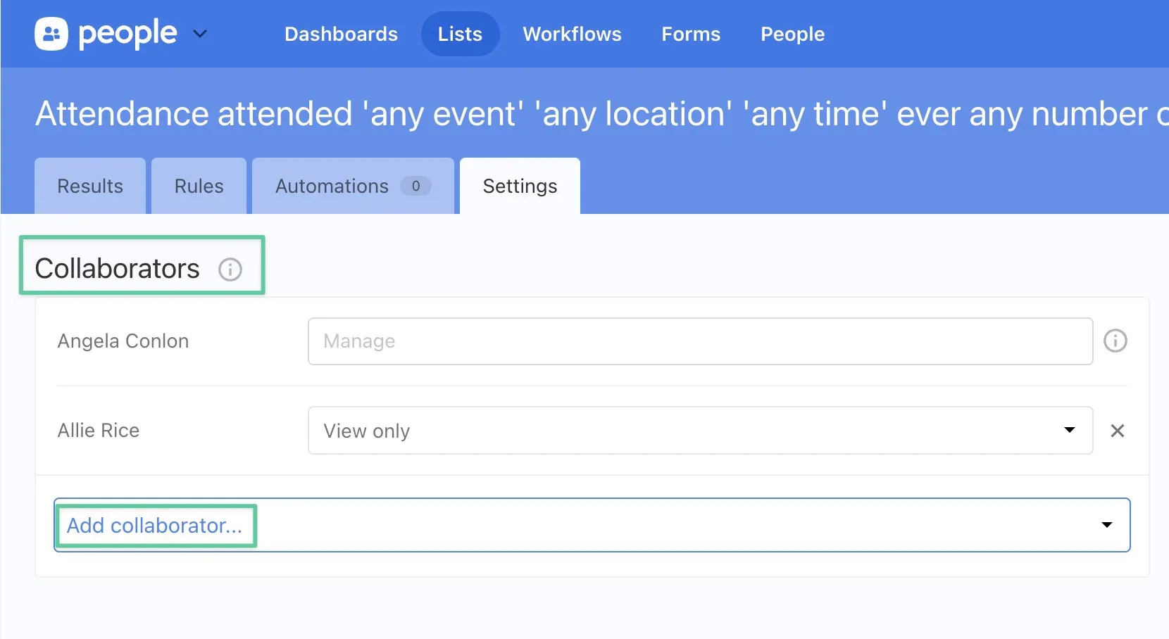
One big concern in talking about visibility and sharing is the “Visible to/Sharing” settings in People lists, workflows, and forms. It complicates things when we use sharing terms to talk about what is actually permissions. Services already has a concept of a `collaborator` which applies to the sharing permissions for these People items. It has the built-in implication that you are working on this entity together as administrators and doesn’t have any congregant or public connotations.
|
|
37
|
+
We should refer to shared administrative access as `Collaborators`
|
|
38
|
+
|
|
39
|
+
|
|
40
|
+
|
|
41
|
+
Continuing with our workflows and task examples, if there is a resource that multiple people can act on, those are considered collaborators.
|
|
42
|
+
|
|
43
|
+
#### 3. & 4. Sharing with congregants and public via Church Center
|
|
44
|
+
|
|
45
|
+
`Publish` is the action reserved to make a resource available in Church Center. Once published, a direct link can also be distributed via a `Share` action. Visibility settings determine whether the published resource is available to only logged-in Church Center users or everyone.
|
|
46
|
+
|
|
47
|
+
#### 5. Sharing with the general public
|
|
48
|
+
|
|
49
|
+
In addition to `Share` , `Embed` may also be used when sharing with the general public (no login required) in the context of 3rd-party calendar sharing, kiosks, code snippets, etc.
|
|
50
|
+
|
|
51
|
+
### Church Center availability
|
|
52
|
+
|
|
53
|
+
Within the admin, changing these availability labels on a resource impacts availability. Availability may also be paired with Access settings to control visibility using these guidelines.
|
|
54
|
+
|
|
55
|
+
#### 🔸 Is it available on Church Center? (Availability)
|
|
56
|
+
|
|
57
|
+
1. `Unpublished` = Only admins are able to see and manage this resource within the admin product. It is not available on Church Center. This covers entities that do not appear in Church Center because the a) sections/pages are `drafts` in Publishing, b) the entity has the option not to publish on an individual level, and c) items that are unavailable because the org does not subscribe to Publishing.
|
|
58
|
+
2. `Published` = The resource has a page in Church Center.
|
|
59
|
+
1. Visibility setting: `Listed & direct link` = The resource is discoverable in the Church Center navigation and may be shared via direct link
|
|
60
|
+
2. Visibility setting: `Direct link only` = The resource is **_not_** discoverable in the Church Center navigation and may only be shared via direct link
|
|
61
|
+
|
|
62
|
+
#### 🔸 Do you need credentials to view it? (Access)
|
|
63
|
+
|
|
64
|
+
1. `Restricted` = You must be in a logged-in state to view this resource
|
|
65
|
+
1. `Admin only` = This is an implied status if a resource has `Unpublished` + `Restricted` access. The resource is not available on Church Center and is only available to view on the admin side.
|
|
66
|
+
2. `CC login required` = This setting is implied when a resource has both `Published` + `Restricted` access. This would be anything on Church Center we’d want congregants to be logged in to view. Most of our resources do no require a CC login, but we do employ this with sections like My Schedule and profile.
|
|
67
|
+
2. `Unrestricted` = No login is required to view on Church Center. A resource is `Published` + `Direct link` access. This is the most common case for resources in Church Center now. (Admin functionality would still require a login to manage.)
|
|
@@ -0,0 +1,108 @@
|
|
|
1
|
+
---
|
|
2
|
+
title: Timezones
|
|
3
|
+
description: Which timezone to display in which context, and how to format date and time with a timezone name.
|
|
4
|
+
order: 150
|
|
5
|
+
---
|
|
6
|
+
|
|
7
|
+
# Timezones
|
|
8
|
+
|
|
9
|
+
## Rules
|
|
10
|
+
|
|
11
|
+
- **Do** use the organization timezone (transitioning to campus timezone) as the source of truth for event creation and reporting.
|
|
12
|
+
- **Do** use the user’s device timezone for personal contexts like chat, activity logs, and notifications.
|
|
13
|
+
- **Do** show the date and time followed by the timezone name (“August 1, 2026, 4:15pm PST”).
|
|
14
|
+
- **Do** use dual display in admin interfaces when a conversion helps (“6:15pm (4:15pm your time)”).
|
|
15
|
+
- **Don’t** use dual display in Church Center; show the user’s timezone only.
|
|
16
|
+
- **Don’t** omit the timezone name unless context makes it abundantly clear.
|
|
17
|
+
- **Don’t** mix timezone display approaches within the same product context.
|
|
18
|
+
|
|
19
|
+
## Overview
|
|
20
|
+
|
|
21
|
+
Consistent timezone display ensures users understand when events occur, whether they’re viewing organizational schedules or personal activity. Planning Center is transitioning from organization-centric timezone display toward campus-aware and user-aware approaches that better serve multi-campus churches and distributed teams.
|
|
22
|
+
|
|
23
|
+
## Principles
|
|
24
|
+
|
|
25
|
+
- Use organization timezone (transitioning to campus timezone) as the canonical source for event creation and reporting
|
|
26
|
+
- Display user’s device timezone for personal contexts (chat, activity logs, notifications)
|
|
27
|
+
- Show date/time followed by timezone name for clarity
|
|
28
|
+
- Provide dual display in admin interfaces when helpful for context
|
|
29
|
+
|
|
30
|
+
## Current state
|
|
31
|
+
|
|
32
|
+
### Organization timezone as default
|
|
33
|
+
|
|
34
|
+
- Calendar and many scheduling products anchor events to the **organization’s timezone**. This ensures a single source of truth for admins.
|
|
35
|
+
- Limitation: when orgs span multiple timezones, members in other zones see times that don’t reflect their local reality.
|
|
36
|
+
|
|
37
|
+
### User/device timezone in personal contexts
|
|
38
|
+
|
|
39
|
+
- Chat timestamps were explicitly shifted to **user timezone** after confusion when messages were shown in org time \[[Timezones in Chat should reflect user’s timezone](https://www.notion.so/Timstamps-in-Chat-should-reflect-the-user-s-timezone-not-the-org-s-timezone-214abbce69a280f5a5eacc27ba5a749a?pvs=21)\]. \[[Slack convo where the team made the case](https://pco.slack.com/archives/C07T0H74J3Y/p1740511968447129?thread_ts=1740511916.535449&cid=C07T0H74J3Y)\]
|
|
40
|
+
- Automation history also uses user timezone, creating inconsistency with Calendar.
|
|
41
|
+
|
|
42
|
+
### Multi-campus realities
|
|
43
|
+
|
|
44
|
+
- Churches increasingly want **campus-level configuration** (logos, labels, and timezones). Right now, most org settings apply org-wide, creating friction \[FR: [Multi-campus orgs can’t customize…per location](https://www.notion.so/1f2abbce69a28093b65bfe57f51ca240?pvs=21)\]
|
|
45
|
+
- Check-Ins and Groups are adding features to tie events directly to a campus, laying groundwork for more granular support \[[Assign a campus to an event](https://www.notion.so/190abbce69a28035b38dd76c289c2570?pvs=21)\].
|
|
46
|
+
|
|
47
|
+
## Usage
|
|
48
|
+
|
|
49
|
+
### Guidelines
|
|
50
|
+
|
|
51
|
+
#### Canonical source of truth
|
|
52
|
+
|
|
53
|
+
**Phase 1 (current):** Organization timezone remains the canonical reference for event creation and reporting.
|
|
54
|
+
**Phase 2 (future):** When campus-aware roles and permissions are available, campus timezone becomes the canonical reference for event creation, display, and reporting.
|
|
55
|
+
|
|
56
|
+
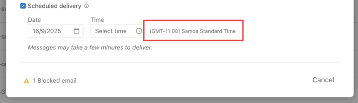
For events explicitly tied to a campus, display the campus timezone and timezone name (e.g., “August 1, 2026, 4:15pm PST”). The timezone name is the default and used in most cases. If context makes it abundantly clear, it may be omitted.
|
|
57
|
+
|
|
58
|
+
For events tied to multiple campuses or virtual events, prefer campus timezone display (future consideration: discuss possible dual display to show originating campus).
|
|
59
|
+
|
|
60
|
+
#### Personal relevance
|
|
61
|
+
|
|
62
|
+
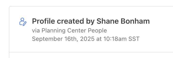
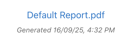
For personal activity logs, chat, toolbar notifications, and similar personal contexts, display the user’s device timezone to reflect their local reality.
|
|
63
|
+
|
|
64
|
+
#### Display format
|
|
65
|
+
|
|
66
|
+
Show date/time followed by timezone name:
|
|
67
|
+
|
|
68
|
+
- August 1, 2026, 6:15pm PST
|
|
69
|
+
- August 1, 2026, 6:15pm Pacific Time
|
|
70
|
+
|
|
71
|
+
Date formatting varies based on context—see [Date formatting](./date-formatting.md) foundation for complete rules.
|
|
72
|
+
|
|
73
|
+
#### Dual display (admin only)
|
|
74
|
+
|
|
75
|
+
In admin interfaces, when clarifying conversion is helpful for context, show both the event timezone and the user’s local time:
|
|
76
|
+
|
|
77
|
+
- Aug 1, 2026, 6:15pm (4:15pm your time)
|
|
78
|
+
|
|
79
|
+
Church Center should display events in the user’s timezone, not dual display.
|
|
80
|
+
|
|
81
|
+
::: tip Do
|
|
82
|
+
|
|
83
|
+
- Display timezone name with date/time in most contexts: “August 1, 2026, 4:15pm PST”
|
|
84
|
+
- Use user’s device timezone for personal contexts (chat, activity logs, notifications)
|
|
85
|
+
- Use organization timezone (transitioning to campus timezone) for event scheduling and reporting
|
|
86
|
+
- Show dual display in admin interfaces when conversion clarity helps: “6:15pm (4:15pm your time)”
|
|
87
|
+
- Omit timezone name only when context makes it abundantly clear
|
|
88
|
+
|
|
89
|
+
:::
|
|
90
|
+
|
|
91
|
+
::: danger Don’t
|
|
92
|
+
|
|
93
|
+
- Display event times in user timezone when organization/campus timezone is the canonical source
|
|
94
|
+
- Use dual display in Church Center—show user’s timezone only
|
|
95
|
+
- Show times without timezone indicators when timezone matters for clarity
|
|
96
|
+
- Mix timezone display approaches inconsistently within the same product context
|
|
97
|
+
|
|
98
|
+
:::
|
|
99
|
+
|
|
100
|
+
## Examples
|
|
101
|
+
|
|
102
|
+
### People
|
|
103
|
+
|
|
104
|
+
|
|
105
|
+
|
|
106
|
+
|
|
107
|
+
|
|
108
|
+
|