@openhistoricalmap/map-styles 0.9.7 → 0.9.8
This diff represents the content of publicly available package versions that have been released to one of the supported registries. The information contained in this diff is provided for informational purposes only and reflects changes between package versions as they appear in their respective public registries.
- package/.nvmrc +1 -1
- package/CODE_OF_CONDUCT.md +94 -94
- package/LICENSE.md +121 -121
- package/README.md +115 -87
- package/demo.html +79 -79
- package/dist/fonts/OpenHistorical/README.md +42 -42
- package/dist/historical/historical.json +12730 -12377
- package/dist/historical/historical_spritesheet.json +1149 -1149
- package/dist/historical/historical_spritesheet@2x.json +1149 -1149
- package/dist/japanese_scroll/japanese_scroll.json +4076 -4062
- package/dist/japanese_scroll/japanese_scroll_spritesheet.json +38 -38
- package/dist/japanese_scroll/japanese_scroll_spritesheet@2x.json +38 -38
- package/dist/ohm.styles.js +35005 -34461
- package/dist/railway/railway.json +13932 -13755
- package/dist/railway/railway_spritesheet.json +1135 -1135
- package/dist/railway/railway_spritesheet@2x.json +1135 -1135
- package/dist/woodblock/woodblock.json +4260 -4260
- package/dist/woodblock/woodblock_spritesheet.json +72 -72
- package/dist/woodblock/woodblock_spritesheet@2x.json +72 -72
- package/docs/historical.md +34 -34
- package/docs/japanese_scroll.md +40 -40
- package/docs/railway.md +60 -60
- package/docs/woodblock.md +29 -29
- package/glyphicons/fonts/glyphicons-regular.svg +827 -827
- package/glyphicons/index.html +857 -857
- package/glyphicons/license.txt +63 -63
- package/historical/historical.json +6883 -6715
- package/historical/historical_spritesheet.json +1149 -1149
- package/historical/historical_spritesheet@2x.json +1149 -1149
- package/historical/poi/bell_tower-18.svg +68 -68
- package/historical/poi/border_control-12.svg +10 -10
- package/historical/poi/border_control-18.svg +4 -4
- package/historical/poi/bucket-18.svg +4 -4
- package/historical/poi/grave_yard-18.svg +6 -6
- package/historical/poi/updated_POI.json +1149 -1149
- package/img/README.md +1 -1
- package/index.html +54 -54
- package/japanese_scroll/japanese_scroll.json +2285 -2284
- package/japanese_scroll/japanese_scroll_spritesheet.json +38 -38
- package/japanese_scroll/japanese_scroll_spritesheet@2x.json +38 -38
- package/package.json +32 -32
- package/railway/railway.json +6888 -6837
- package/railway/railway_demo.html +144 -144
- package/railway/railway_spritesheet.json +1135 -1135
- package/railway/railway_spritesheet@2x.json +1135 -1135
- package/scripts/prepare.js +84 -84
- package/ssl/cert.pem +23 -23
- package/ssl/csr.pem +18 -18
- package/ssl/key.pem +28 -28
- package/woodblock/woodblock.json +2423 -2423
- package/woodblock/woodblock_spritesheet.json +72 -72
- package/woodblock/woodblock_spritesheet@2x.json +72 -72
package/docs/woodblock.md
CHANGED
|
@@ -1,29 +1,29 @@
|
|
|
1
|
-
# Documentation of Woodblock Style
|
|
2
|
-
The woodblock style was directly informed by woodblock map styles in the history of cartography. Specific aesthetic elements that captured the imperfections and textures of these old maps - plus map monsters of course - helped to bring this style to life.
|
|
3
|
-
|
|
4
|
-
## Aesthetic Elements that Made the Map Look Old
|
|
5
|
-
|
|
6
|
-
### Background Layer (ocean)
|
|
7
|
-
 <br>
|
|
8
|
-
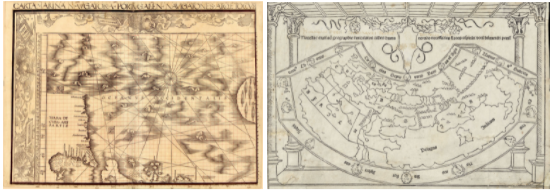
For this style, it made sense to emulate the texture of old, aged paper, as this aesthetic is something we are very used to seeing in old maps.
|
|
9
|
-
|
|
10
|
-
### Typeface and styling
|
|
11
|
-
<br>
|
|
12
|
-
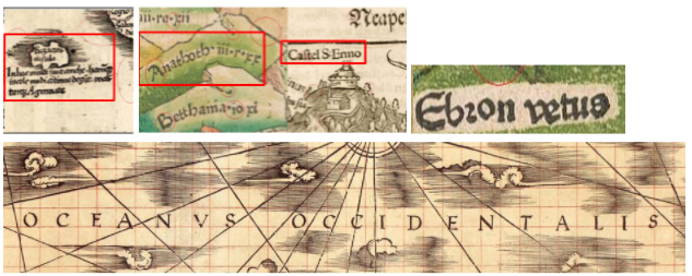
For the font choice, I chose the [Eadui](https://fontlibrary.org/en/font/eadui) (with [SIL Open Font License](https://scripts.sil.org/cms/scripts/page.php?site_id=nrsi&id=OFL)) because it was very close to a typeface style that was used often in woodblock maps, and also was easier to read on a screen than the bolder Blackletter options that also typical woodblock map fonts.I also made a thick halo in the labels, emulating the “halos” that were commonly seen in woodblock maps, due to map makers adding labels via slot cutting (read more about tools and media [here](https://vknoppkewetzel.github.io/VKW_MSthesis.pdf)), or leaving space to label by hand.
|
|
13
|
-
|
|
14
|
-
### Linework design (roads, country boundaries)
|
|
15
|
-
<br>
|
|
16
|
-
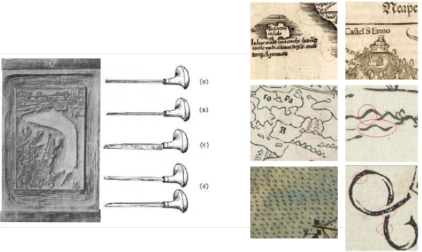
Both the tools used and the medium (wood) meant that everything carved into the wood was not perfectly linear, perfectly spaced, or perfectly circular. Additionally, using ink on the block and pressing down the block onto paper meant the ink sometimes squeezed to the side, or was patchy on the paper itself, providing even more textural elements. Essentially, the tools and mediums used mean that woodblock maps have “imperfections” as an enormous part of the aesthetic.
|
|
17
|
-
|
|
18
|
-
In order to mimic this, I created “splotchy” (ink squeezing/inconsistent) linework which is used in country boundaries and building linework, as well as “inconsistent tapering” linework for the roads.
|
|
19
|
-
|
|
20
|
-
Note, I intentionally used a light dashed-line for state boundaries rather than another textural line pattern, as it was a little too much texture to use another “imperfect” line pattern for states (alongside a more intricate font, country boundaries, paper texture, roads, and stylized icons).
|
|
21
|
-
|
|
22
|
-
### Symbology design
|
|
23
|
-
<br>
|
|
24
|
-
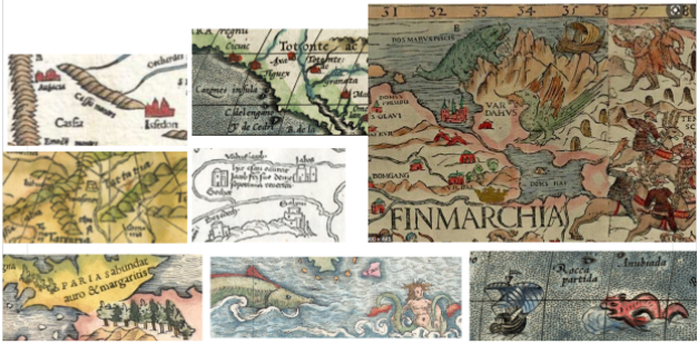
A huge part of old maps are the illustrative elements across the map, from icons used for cities to map monsters across the old map. I created two different sized building icons, two different map monsters, and a tree grouping to provide this final aesthetic element to this map to wrap up the “woodblock map feeling” of the style.
|
|
25
|
-
|
|
26
|
-
### Data Choices
|
|
27
|
-
Another important aspect of making this style work really well in emulating woodblock maps is that this map intentionally removes quite a bit of OHM data from the map. Older maps had a lot less data in them. If this map were to grow over time and have more data added, there would need to be some consideration of how design elements change to ensure that there is an appropriate hierarchy and balance of contrast.
|
|
28
|
-
<br><br>
|
|
29
|
-
For now, this style serves to highlight an older map aesthetic, in modern mapping technologies, alongside showing data over time.
|
|
1
|
+
# Documentation of Woodblock Style
|
|
2
|
+
The woodblock style was directly informed by woodblock map styles in the history of cartography. Specific aesthetic elements that captured the imperfections and textures of these old maps - plus map monsters of course - helped to bring this style to life.
|
|
3
|
+
|
|
4
|
+
## Aesthetic Elements that Made the Map Look Old
|
|
5
|
+
|
|
6
|
+
### Background Layer (ocean)
|
|
7
|
+
 <br>
|
|
8
|
+
For this style, it made sense to emulate the texture of old, aged paper, as this aesthetic is something we are very used to seeing in old maps.
|
|
9
|
+
|
|
10
|
+
### Typeface and styling
|
|
11
|
+
<br>
|
|
12
|
+
For the font choice, I chose the [Eadui](https://fontlibrary.org/en/font/eadui) (with [SIL Open Font License](https://scripts.sil.org/cms/scripts/page.php?site_id=nrsi&id=OFL)) because it was very close to a typeface style that was used often in woodblock maps, and also was easier to read on a screen than the bolder Blackletter options that also typical woodblock map fonts.I also made a thick halo in the labels, emulating the “halos” that were commonly seen in woodblock maps, due to map makers adding labels via slot cutting (read more about tools and media [here](https://vknoppkewetzel.github.io/VKW_MSthesis.pdf)), or leaving space to label by hand.
|
|
13
|
+
|
|
14
|
+
### Linework design (roads, country boundaries)
|
|
15
|
+
<br>
|
|
16
|
+
Both the tools used and the medium (wood) meant that everything carved into the wood was not perfectly linear, perfectly spaced, or perfectly circular. Additionally, using ink on the block and pressing down the block onto paper meant the ink sometimes squeezed to the side, or was patchy on the paper itself, providing even more textural elements. Essentially, the tools and mediums used mean that woodblock maps have “imperfections” as an enormous part of the aesthetic.
|
|
17
|
+
|
|
18
|
+
In order to mimic this, I created “splotchy” (ink squeezing/inconsistent) linework which is used in country boundaries and building linework, as well as “inconsistent tapering” linework for the roads.
|
|
19
|
+
|
|
20
|
+
Note, I intentionally used a light dashed-line for state boundaries rather than another textural line pattern, as it was a little too much texture to use another “imperfect” line pattern for states (alongside a more intricate font, country boundaries, paper texture, roads, and stylized icons).
|
|
21
|
+
|
|
22
|
+
### Symbology design
|
|
23
|
+
<br>
|
|
24
|
+
A huge part of old maps are the illustrative elements across the map, from icons used for cities to map monsters across the old map. I created two different sized building icons, two different map monsters, and a tree grouping to provide this final aesthetic element to this map to wrap up the “woodblock map feeling” of the style.
|
|
25
|
+
|
|
26
|
+
### Data Choices
|
|
27
|
+
Another important aspect of making this style work really well in emulating woodblock maps is that this map intentionally removes quite a bit of OHM data from the map. Older maps had a lot less data in them. If this map were to grow over time and have more data added, there would need to be some consideration of how design elements change to ensure that there is an appropriate hierarchy and balance of contrast.
|
|
28
|
+
<br><br>
|
|
29
|
+
For now, this style serves to highlight an older map aesthetic, in modern mapping technologies, alongside showing data over time.
|