@nicolassancho/storybook-core 3.0.6 → 3.0.7
This diff represents the content of publicly available package versions that have been released to one of the supported registries. The information contained in this diff is provided for informational purposes only and reflects changes between package versions as they appear in their respective public registries.
- package/README.md +64 -33
- package/package.json +1 -1
package/README.md
CHANGED
|
@@ -1,14 +1,53 @@
|
|
|
1
1
|
# Storybook-core
|
|
2
2
|
|
|
3
|
+
[](https://www.npmjs.com/package/@nicolassancho/storybook-core)
|
|
4
|
+
[](https://github.com/NicolasSancho/Storybook-core/actions/workflows/main.yml)
|
|
5
|
+
[](LICENSE)
|
|
6
|
+
|
|
3
7
|
An accessible React component library styled with Tailwind CSS v4 and `tailwind-variants`, and
|
|
4
8
|
documented in Storybook. It is published to npm as `@nicolassancho/storybook-core`.
|
|
5
9
|
|
|
6
|
-
|
|
10
|
+
**[Browse the live Storybook](https://nicolassancho.github.io/Storybook-core/)**
|
|
11
|
+
|
|
12
|
+
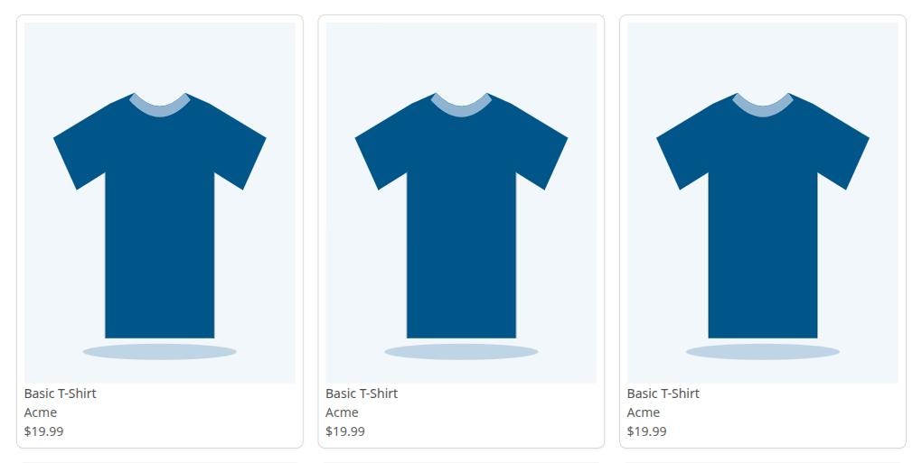
|
|
13
|
+
|
|
14
|
+
## Highlights
|
|
15
|
+
|
|
16
|
+
- **Built with accessibility in mind.** Semantic HTML, visible keyboard focus, accessible names, and
|
|
17
|
+
`prefers-reduced-motion` support. [axe](https://github.com/dequelabs/axe-core) runs on every story
|
|
18
|
+
in CI, and a violation fails the build. Automated checks catch only part of what matters, so this
|
|
19
|
+
is a safety net, not a claim of WCAG conformance.
|
|
20
|
+
- **Works from Next.js Server Components.** The components are stateless, so they carry no
|
|
21
|
+
`"use client"` directive and render on the server with no client JavaScript.
|
|
22
|
+
- **Bring your own router and image component.** Navigation uses `href` and renders a plain `<a>`
|
|
23
|
+
by default. Pass `LinkComponent` (e.g. `next/link`) or `ImageComponent` (e.g. `next/image`) to
|
|
24
|
+
plug in your framework.
|
|
25
|
+
- **Design tokens, not compiled CSS.** Colors, font sizes and breakpoints ship as a Tailwind v4
|
|
26
|
+
`@theme` file, and your app's Tailwind generates the classes.
|
|
27
|
+
- **Typed and documented.** TypeScript strict, every prop documented in JSDoc, and interaction
|
|
28
|
+
tests written as Storybook `play` functions.
|
|
29
|
+
|
|
30
|
+
## Components
|
|
31
|
+
|
|
32
|
+
| Layer | Components |
|
|
33
|
+
| --------- | ------------------------------------------------------------------- |
|
|
34
|
+
| Atoms | Button, Icon, Image, Label, RadioButton, SearchInput, Spinner, Text |
|
|
35
|
+
| Molecules | Breadcrumbs, CartIcon, ProductCard, ProductDetails, RadioGroup |
|
|
36
|
+
| Organisms | Header, ProductGrid |
|
|
37
|
+
| Layouts | Grid |
|
|
38
|
+
|
|
39
|
+
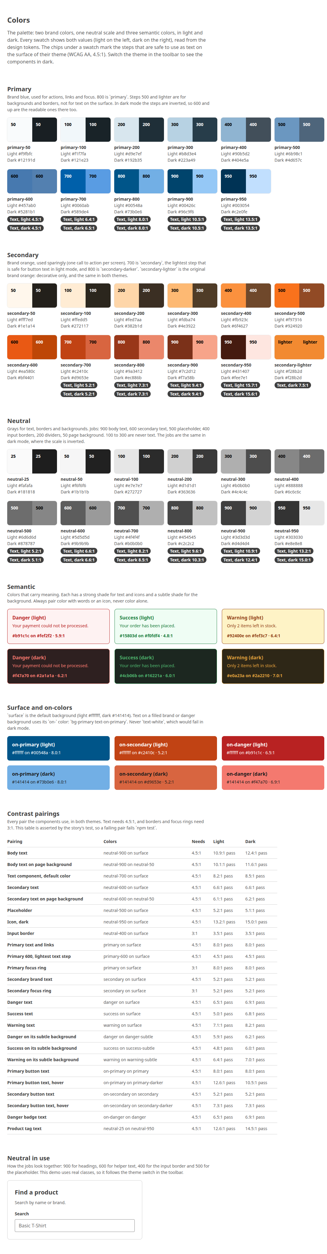
The palette and the contrast of each text color are documented under **Foundations / Colors** in
|
|
40
|
+
Storybook.
|
|
41
|
+
|
|
42
|
+
|
|
7
43
|
|
|
8
44
|
## Using the library
|
|
9
45
|
|
|
10
|
-
Install
|
|
11
|
-
|
|
46
|
+
Install the package, then add the design tokens and the source scan to your Tailwind v4 stylesheet:
|
|
47
|
+
|
|
48
|
+
```bash
|
|
49
|
+
npm install @nicolassancho/storybook-core
|
|
50
|
+
```
|
|
12
51
|
|
|
13
52
|
```css
|
|
14
53
|
@import "tailwindcss";
|
|
@@ -17,8 +56,9 @@ source scan to your Tailwind v4 stylesheet:
|
|
|
17
56
|
```
|
|
18
57
|
|
|
19
58
|
The library ships its design tokens (colors, font sizes, breakpoints), not compiled CSS: your app's
|
|
20
|
-
Tailwind generates the classes, and `@source` is what makes it scan the library. `react`, `react-dom
|
|
21
|
-
`tailwindcss` (v4), `tailwind-variants` (v3) and `tailwind-merge` (v3) are
|
|
59
|
+
Tailwind generates the classes, and `@source` is what makes it scan the library. `react`, `react-dom`
|
|
60
|
+
(18.3.1 or newer, below 20), `tailwindcss` (v4), `tailwind-variants` (v3) and `tailwind-merge` (v3) are
|
|
61
|
+
peer dependencies.
|
|
22
62
|
|
|
23
63
|
```tsx
|
|
24
64
|
import { Button } from "@nicolassancho/storybook-core";
|
|
@@ -27,44 +67,35 @@ const App = () => <Button variant="primary">Click Me</Button>;
|
|
|
27
67
|
```
|
|
28
68
|
|
|
29
69
|
The full guide (install, links and images, the Next.js App Router) is the **Consumers** page in
|
|
30
|
-
Storybook.
|
|
70
|
+
[Storybook](https://nicolassancho.github.io/Storybook-core/).
|
|
31
71
|
|
|
32
72
|
## Development
|
|
33
73
|
|
|
34
|
-
### Installation
|
|
35
|
-
|
|
36
|
-
To install the dependencies, run:
|
|
37
|
-
|
|
38
|
-
```bash
|
|
39
|
-
npm install
|
|
40
|
-
```
|
|
41
|
-
|
|
42
|
-
### Running Storybook
|
|
43
|
-
|
|
44
|
-
To start the Storybook server, run:
|
|
45
|
-
|
|
46
74
|
```bash
|
|
47
|
-
npm
|
|
75
|
+
npm install # also builds the library (the `prepare` script)
|
|
76
|
+
npm run storybook # dev server on http://localhost:6006
|
|
77
|
+
npm test # runs every story in headless Chromium, with axe and the play tests
|
|
78
|
+
npm run build # compiles the library to dist/
|
|
48
79
|
```
|
|
49
80
|
|
|
50
|
-
|
|
51
|
-
|
|
52
|
-
### Building the Library
|
|
81
|
+
The first `npm test` run needs the browser: `npx playwright install chromium`.
|
|
53
82
|
|
|
54
|
-
|
|
83
|
+
### Creating components
|
|
55
84
|
|
|
56
|
-
|
|
57
|
-
|
|
58
|
-
|
|
85
|
+
`npm run generate` scaffolds a component with Plop. Choose Atoms, Molecules or Organisms: it creates
|
|
86
|
+
the component, its story and a mock file. Layouts are created by hand, and every new component must
|
|
87
|
+
be exported from `src/index.js`.
|
|
59
88
|
|
|
60
|
-
|
|
89
|
+
Tests are `play` functions in the component's story file, not separate test files.
|
|
61
90
|
|
|
62
|
-
|
|
91
|
+
## Contributing
|
|
63
92
|
|
|
64
|
-
|
|
93
|
+
1. Branch from `main` (`feat/<description>` or `fix/<description>`) and open a pull request.
|
|
94
|
+
2. Run `npx tsc --noEmit`, `npm run lint`, `npx prettier --check ./src ./.storybook` and `npm test`
|
|
95
|
+
before pushing. CI runs the same checks plus a Storybook build.
|
|
96
|
+
3. Bump the version as the last commit (`npm version <patch|minor> --no-git-tag-version`). CI fails
|
|
97
|
+
a pull request that keeps the version of `main`, and every push to `main` publishes to npm.
|
|
65
98
|
|
|
66
|
-
|
|
67
|
-
npm run generate
|
|
68
|
-
```
|
|
99
|
+
## License
|
|
69
100
|
|
|
70
|
-
|
|
101
|
+
[MIT](LICENSE)
|
package/package.json
CHANGED
|
@@ -1,6 +1,6 @@
|
|
|
1
1
|
{
|
|
2
2
|
"name": "@nicolassancho/storybook-core",
|
|
3
|
-
"version": "3.0.
|
|
3
|
+
"version": "3.0.7",
|
|
4
4
|
"description": "Accessible React + Tailwind component library built with tailwind-variants and documented in Storybook.",
|
|
5
5
|
"main": "dist/index.js",
|
|
6
6
|
"types": "dist/index.d.ts",
|