@mohammadhprp/system-prompt 0.10.1
This diff represents the content of publicly available package versions that have been released to one of the supported registries. The information contained in this diff is provided for informational purposes only and reflects changes between package versions as they appear in their respective public registries.
- package/LICENSE +21 -0
- package/README.md +35 -0
- package/bin/system-prompt.js +8 -0
- package/framework/README.md +163 -0
- package/framework/agents/README.md +49 -0
- package/framework/agents/backend-architect.md +146 -0
- package/framework/agents/researcher.md +79 -0
- package/framework/agents/reviewer.md +183 -0
- package/framework/agents/security-auditor.md +131 -0
- package/framework/commands/README.md +43 -0
- package/framework/commands/changelog.md +44 -0
- package/framework/commands/commit.md +31 -0
- package/framework/commands/learn.md +24 -0
- package/framework/commands/mr.md +46 -0
- package/framework/commands/pr.md +39 -0
- package/framework/commands/release.md +34 -0
- package/framework/commands/review.md +24 -0
- package/framework/commands/summarize-changes.md +49 -0
- package/framework/mcps/README.md +78 -0
- package/framework/mcps/excalidraw/README.md +37 -0
- package/framework/mcps/excalidraw/capabilities.md +54 -0
- package/framework/mcps/excalidraw/configs/opencode.json +8 -0
- package/framework/mcps/excalidraw/install.md +92 -0
- package/framework/mcps/excalidraw/troubleshooting.md +67 -0
- package/framework/mcps/figma-mcp-go/README.md +51 -0
- package/framework/mcps/figma-mcp-go/capabilities.md +190 -0
- package/framework/mcps/figma-mcp-go/configs/opencode.json +9 -0
- package/framework/mcps/figma-mcp-go/install.md +74 -0
- package/framework/mcps/figma-mcp-go/troubleshooting.md +99 -0
- package/framework/mcps/github-mcp/README.md +51 -0
- package/framework/mcps/github-mcp/capabilities.md +83 -0
- package/framework/mcps/github-mcp/configs/.env.example +1 -0
- package/framework/mcps/github-mcp/configs/opencode.json +13 -0
- package/framework/mcps/github-mcp/install.md +60 -0
- package/framework/mcps/github-mcp/troubleshooting.md +79 -0
- package/framework/mcps/gitlab-mcp/README.md +54 -0
- package/framework/mcps/gitlab-mcp/capabilities.md +216 -0
- package/framework/mcps/gitlab-mcp/configs/.env.example +2 -0
- package/framework/mcps/gitlab-mcp/configs/opencode.json +13 -0
- package/framework/mcps/gitlab-mcp/install.md +99 -0
- package/framework/mcps/gitlab-mcp/troubleshooting.md +116 -0
- package/framework/mcps/jira-mcp/README.md +53 -0
- package/framework/mcps/jira-mcp/capabilities.md +79 -0
- package/framework/mcps/jira-mcp/configs/.env.example +2 -0
- package/framework/mcps/jira-mcp/configs/opencode.json +13 -0
- package/framework/mcps/jira-mcp/install.md +94 -0
- package/framework/mcps/jira-mcp/troubleshooting.md +113 -0
- package/framework/mcps/laravel-boost/README.md +53 -0
- package/framework/mcps/laravel-boost/capabilities.md +92 -0
- package/framework/mcps/laravel-boost/configs/opencode.json +9 -0
- package/framework/mcps/laravel-boost/install.md +106 -0
- package/framework/mcps/laravel-boost/troubleshooting.md +119 -0
- package/framework/mcps/notion-mcp/README.md +58 -0
- package/framework/mcps/notion-mcp/capabilities.md +118 -0
- package/framework/mcps/notion-mcp/configs/opencode.json +9 -0
- package/framework/mcps/notion-mcp/install.md +70 -0
- package/framework/mcps/notion-mcp/troubleshooting.md +95 -0
- package/framework/mcps/playwright-mcp/README.md +50 -0
- package/framework/mcps/playwright-mcp/capabilities.md +149 -0
- package/framework/mcps/playwright-mcp/configs/opencode.json +9 -0
- package/framework/mcps/playwright-mcp/install.md +136 -0
- package/framework/mcps/playwright-mcp/troubleshooting.md +154 -0
- package/framework/mcps/supabase-mcp/README.md +66 -0
- package/framework/mcps/supabase-mcp/capabilities.md +127 -0
- package/framework/mcps/supabase-mcp/configs/opencode.json +9 -0
- package/framework/mcps/supabase-mcp/install.md +85 -0
- package/framework/mcps/supabase-mcp/troubleshooting.md +113 -0
- package/framework/memory/README.md +17 -0
- package/framework/memory/codebase-insights.md +6 -0
- package/framework/memory/user-preferences.md +5 -0
- package/framework/modes/README.md +52 -0
- package/framework/modes/audit.md +88 -0
- package/framework/plugins/README.md +65 -0
- package/framework/plugins/opencode-goal-plugin/README.md +45 -0
- package/framework/plugins/opencode-goal-plugin/capabilities.md +127 -0
- package/framework/plugins/opencode-goal-plugin/install.md +71 -0
- package/framework/plugins/opencode-goal-plugin/troubleshooting.md +112 -0
- package/framework/plugins/ponytail/README.md +44 -0
- package/framework/plugins/ponytail/capabilities.md +112 -0
- package/framework/plugins/ponytail/install.md +77 -0
- package/framework/plugins/ponytail/troubleshooting.md +116 -0
- package/framework/references/standards/api.md +44 -0
- package/framework/references/standards/architecture.md +43 -0
- package/framework/references/standards/database.md +43 -0
- package/framework/references/standards/debugging.md +44 -0
- package/framework/references/standards/documentation.md +43 -0
- package/framework/references/standards/logging.md +43 -0
- package/framework/references/standards/naming.md +43 -0
- package/framework/references/standards/observability.md +43 -0
- package/framework/references/standards/performance.md +43 -0
- package/framework/references/standards/pull-requests.md +43 -0
- package/framework/references/standards/security.md +43 -0
- package/framework/references/standards/testing.md +43 -0
- package/framework/references/templates/adr.md +28 -0
- package/framework/references/templates/api-spec.md +56 -0
- package/framework/references/templates/design-document.md +39 -0
- package/framework/references/templates/incident-report.md +38 -0
- package/framework/references/templates/postmortem.md +41 -0
- package/framework/references/templates/pull-request.md +34 -0
- package/framework/references/templates/runbook.md +48 -0
- package/framework/references/templates/task.md +27 -0
- package/framework/skills/README.md +68 -0
- package/framework/skills/agent-browser/SKILL.md +51 -0
- package/framework/skills/backend-best-practices/SKILL.md +136 -0
- package/framework/skills/backend-best-practices/examples.md +31 -0
- package/framework/skills/backend-best-practices/references/api-design.md +79 -0
- package/framework/skills/backend-best-practices/references/architecture-review.md +77 -0
- package/framework/skills/backend-best-practices/references/database-design.md +78 -0
- package/framework/skills/backend-best-practices/references/debugging.md +76 -0
- package/framework/skills/backend-best-practices/references/observability.md +78 -0
- package/framework/skills/backend-best-practices/references/performance.md +78 -0
- package/framework/skills/backend-best-practices/references/refactoring.md +77 -0
- package/framework/skills/backend-best-practices/references/security.md +80 -0
- package/framework/skills/backend-best-practices/references/testing.md +77 -0
- package/framework/skills/backend-engineer/SKILL.md +76 -0
- package/framework/skills/backend-engineer/examples.md +31 -0
- package/framework/skills/brainstorming/SKILL.md +159 -0
- package/framework/skills/brainstorming/examples.md +49 -0
- package/framework/skills/brainstorming/scripts/frame-template.html +213 -0
- package/framework/skills/brainstorming/scripts/helper.js +167 -0
- package/framework/skills/brainstorming/scripts/server.cjs +723 -0
- package/framework/skills/brainstorming/scripts/start-server.sh +209 -0
- package/framework/skills/brainstorming/scripts/stop-server.sh +120 -0
- package/framework/skills/brainstorming/visual-companion.md +291 -0
- package/framework/skills/brand-guidelines/LICENSE.txt +202 -0
- package/framework/skills/brand-guidelines/SKILL.md +73 -0
- package/framework/skills/code-review/SKILL.md +72 -0
- package/framework/skills/code-review/examples.md +31 -0
- package/framework/skills/design/SKILL.md +399 -0
- package/framework/skills/design/examples.md +34 -0
- package/framework/skills/diagram-design/SKILL.md +485 -0
- package/framework/skills/diagram-design/assets/example-architecture-dark.html +180 -0
- package/framework/skills/diagram-design/assets/example-architecture-full.html +192 -0
- package/framework/skills/diagram-design/assets/example-architecture.html +181 -0
- package/framework/skills/diagram-design/assets/example-bar-dark.html +127 -0
- package/framework/skills/diagram-design/assets/example-bar-full.html +103 -0
- package/framework/skills/diagram-design/assets/example-bar.html +127 -0
- package/framework/skills/diagram-design/assets/example-data-flow-dark.html +143 -0
- package/framework/skills/diagram-design/assets/example-data-flow-full.html +185 -0
- package/framework/skills/diagram-design/assets/example-data-flow.html +143 -0
- package/framework/skills/diagram-design/assets/example-datalake-dark.html +241 -0
- package/framework/skills/diagram-design/assets/example-datalake-full.html +246 -0
- package/framework/skills/diagram-design/assets/example-datalake.html +267 -0
- package/framework/skills/diagram-design/assets/example-dp-integration-dark.html +78 -0
- package/framework/skills/diagram-design/assets/example-dp-integration-full.html +88 -0
- package/framework/skills/diagram-design/assets/example-dp-integration.html +78 -0
- package/framework/skills/diagram-design/assets/example-dp-security-matrix-dark.html +31 -0
- package/framework/skills/diagram-design/assets/example-dp-security-matrix-full.html +32 -0
- package/framework/skills/diagram-design/assets/example-dp-security-matrix.html +88 -0
- package/framework/skills/diagram-design/assets/example-er-dark.html +200 -0
- package/framework/skills/diagram-design/assets/example-er-full.html +203 -0
- package/framework/skills/diagram-design/assets/example-er.html +200 -0
- package/framework/skills/diagram-design/assets/example-flowchart-dark.html +154 -0
- package/framework/skills/diagram-design/assets/example-flowchart-full.html +157 -0
- package/framework/skills/diagram-design/assets/example-flowchart.html +154 -0
- package/framework/skills/diagram-design/assets/example-gantt-dark.html +135 -0
- package/framework/skills/diagram-design/assets/example-gantt-full.html +125 -0
- package/framework/skills/diagram-design/assets/example-gantt.html +135 -0
- package/framework/skills/diagram-design/assets/example-high-level-dark.html +249 -0
- package/framework/skills/diagram-design/assets/example-high-level-full.html +245 -0
- package/framework/skills/diagram-design/assets/example-high-level-vertical-dark.html +272 -0
- package/framework/skills/diagram-design/assets/example-high-level-vertical-full.html +250 -0
- package/framework/skills/diagram-design/assets/example-high-level-vertical.html +323 -0
- package/framework/skills/diagram-design/assets/example-high-level.html +299 -0
- package/framework/skills/diagram-design/assets/example-it-state-dark.html +90 -0
- package/framework/skills/diagram-design/assets/example-it-state-full.html +69 -0
- package/framework/skills/diagram-design/assets/example-it-state.html +128 -0
- package/framework/skills/diagram-design/assets/example-layers-dark.html +121 -0
- package/framework/skills/diagram-design/assets/example-layers-full.html +124 -0
- package/framework/skills/diagram-design/assets/example-layers.html +121 -0
- package/framework/skills/diagram-design/assets/example-line-dark.html +109 -0
- package/framework/skills/diagram-design/assets/example-line-full.html +103 -0
- package/framework/skills/diagram-design/assets/example-line.html +109 -0
- package/framework/skills/diagram-design/assets/example-loop-dark.html +100 -0
- package/framework/skills/diagram-design/assets/example-loop-full.html +137 -0
- package/framework/skills/diagram-design/assets/example-loop-terminal.html +347 -0
- package/framework/skills/diagram-design/assets/example-loop.html +100 -0
- package/framework/skills/diagram-design/assets/example-medallion-dark.html +159 -0
- package/framework/skills/diagram-design/assets/example-medallion-full.html +201 -0
- package/framework/skills/diagram-design/assets/example-medallion.html +159 -0
- package/framework/skills/diagram-design/assets/example-nested-dark.html +130 -0
- package/framework/skills/diagram-design/assets/example-nested-full.html +133 -0
- package/framework/skills/diagram-design/assets/example-nested.html +134 -0
- package/framework/skills/diagram-design/assets/example-org-chart-dark.html +45 -0
- package/framework/skills/diagram-design/assets/example-org-chart-full.html +45 -0
- package/framework/skills/diagram-design/assets/example-org-chart.html +45 -0
- package/framework/skills/diagram-design/assets/example-process-dark.html +62 -0
- package/framework/skills/diagram-design/assets/example-process-full.html +72 -0
- package/framework/skills/diagram-design/assets/example-process.html +62 -0
- package/framework/skills/diagram-design/assets/example-pyramid-dark.html +117 -0
- package/framework/skills/diagram-design/assets/example-pyramid-full.html +120 -0
- package/framework/skills/diagram-design/assets/example-pyramid.html +117 -0
- package/framework/skills/diagram-design/assets/example-quadrant-consultant.html +164 -0
- package/framework/skills/diagram-design/assets/example-quadrant-dark.html +133 -0
- package/framework/skills/diagram-design/assets/example-quadrant-full.html +136 -0
- package/framework/skills/diagram-design/assets/example-quadrant.html +133 -0
- package/framework/skills/diagram-design/assets/example-radar-dark.html +137 -0
- package/framework/skills/diagram-design/assets/example-radar-full.html +133 -0
- package/framework/skills/diagram-design/assets/example-radar.html +137 -0
- package/framework/skills/diagram-design/assets/example-scatter-dark.html +139 -0
- package/framework/skills/diagram-design/assets/example-scatter-full.html +114 -0
- package/framework/skills/diagram-design/assets/example-scatter.html +139 -0
- package/framework/skills/diagram-design/assets/example-sequence-dark.html +220 -0
- package/framework/skills/diagram-design/assets/example-sequence-full.html +386 -0
- package/framework/skills/diagram-design/assets/example-sequence.html +220 -0
- package/framework/skills/diagram-design/assets/example-state-dark.html +145 -0
- package/framework/skills/diagram-design/assets/example-state-full.html +148 -0
- package/framework/skills/diagram-design/assets/example-state.html +145 -0
- package/framework/skills/diagram-design/assets/example-swimlane-dark.html +170 -0
- package/framework/skills/diagram-design/assets/example-swimlane-full.html +173 -0
- package/framework/skills/diagram-design/assets/example-swimlane.html +170 -0
- package/framework/skills/diagram-design/assets/example-timeline-dark.html +133 -0
- package/framework/skills/diagram-design/assets/example-timeline-full.html +136 -0
- package/framework/skills/diagram-design/assets/example-timeline.html +133 -0
- package/framework/skills/diagram-design/assets/example-tree-dark.html +171 -0
- package/framework/skills/diagram-design/assets/example-tree-full.html +174 -0
- package/framework/skills/diagram-design/assets/example-tree.html +171 -0
- package/framework/skills/diagram-design/assets/example-venn-dark.html +130 -0
- package/framework/skills/diagram-design/assets/example-venn-full.html +133 -0
- package/framework/skills/diagram-design/assets/example-venn.html +108 -0
- package/framework/skills/diagram-design/assets/icons.html +230 -0
- package/framework/skills/diagram-design/assets/index.html +333 -0
- package/framework/skills/diagram-design/assets/template-dark.html +82 -0
- package/framework/skills/diagram-design/assets/template-full.html +410 -0
- package/framework/skills/diagram-design/assets/template-terminal.html +170 -0
- package/framework/skills/diagram-design/assets/template.html +83 -0
- package/framework/skills/diagram-design/references/export.md +107 -0
- package/framework/skills/diagram-design/references/onboarding.md +268 -0
- package/framework/skills/diagram-design/references/primitive-annotation.md +36 -0
- package/framework/skills/diagram-design/references/primitive-icons.md +821 -0
- package/framework/skills/diagram-design/references/primitive-sketchy.md +43 -0
- package/framework/skills/diagram-design/references/primitive-terminal.md +76 -0
- package/framework/skills/diagram-design/references/style-guide.md +139 -0
- package/framework/skills/diagram-design/references/type-architecture.md +78 -0
- package/framework/skills/diagram-design/references/type-bar.md +48 -0
- package/framework/skills/diagram-design/references/type-data-flow.md +374 -0
- package/framework/skills/diagram-design/references/type-dp-integration.md +410 -0
- package/framework/skills/diagram-design/references/type-dp-security-matrix.md +379 -0
- package/framework/skills/diagram-design/references/type-er.md +23 -0
- package/framework/skills/diagram-design/references/type-flowchart.md +23 -0
- package/framework/skills/diagram-design/references/type-gantt.md +45 -0
- package/framework/skills/diagram-design/references/type-high-level.md +458 -0
- package/framework/skills/diagram-design/references/type-it-state.md +470 -0
- package/framework/skills/diagram-design/references/type-layers.md +26 -0
- package/framework/skills/diagram-design/references/type-line.md +44 -0
- package/framework/skills/diagram-design/references/type-loop.md +223 -0
- package/framework/skills/diagram-design/references/type-medallion.md +356 -0
- package/framework/skills/diagram-design/references/type-nested.md +22 -0
- package/framework/skills/diagram-design/references/type-org-chart.md +44 -0
- package/framework/skills/diagram-design/references/type-process.md +495 -0
- package/framework/skills/diagram-design/references/type-pyramid.md +33 -0
- package/framework/skills/diagram-design/references/type-quadrant.md +81 -0
- package/framework/skills/diagram-design/references/type-radar.md +80 -0
- package/framework/skills/diagram-design/references/type-scatter.md +39 -0
- package/framework/skills/diagram-design/references/type-sequence.md +35 -0
- package/framework/skills/diagram-design/references/type-state.md +21 -0
- package/framework/skills/diagram-design/references/type-swimlane.md +20 -0
- package/framework/skills/diagram-design/references/type-timeline.md +20 -0
- package/framework/skills/diagram-design/references/type-tree.md +24 -0
- package/framework/skills/diagram-design/references/type-venn.md +26 -0
- package/framework/skills/documentation/SKILL.md +74 -0
- package/framework/skills/documentation/examples.md +31 -0
- package/framework/skills/find-skills/SKILL.md +141 -0
- package/framework/skills/find-skills/examples.md +35 -0
- package/framework/skills/gitlab-mcp/SKILL.md +83 -0
- package/framework/skills/gitlab-mcp/examples.md +31 -0
- package/framework/skills/gitlab-mcp/references/code-review.md +110 -0
- package/framework/skills/gitlab-mcp/references/issues.md +141 -0
- package/framework/skills/gitlab-mcp/references/merge-requests.md +120 -0
- package/framework/skills/gitlab-mcp/references/pipelines.md +67 -0
- package/framework/skills/gitlab-mcp/references/search.md +17 -0
- package/framework/skills/gitlab-mcp/references/webhooks.md +32 -0
- package/framework/skills/gitlab-mcp/references/work-items.md +50 -0
- package/framework/skills/jira-mcp/SKILL.md +57 -0
- package/framework/skills/jira-mcp/examples.md +31 -0
- package/framework/skills/jira-mcp/references/comments.md +27 -0
- package/framework/skills/jira-mcp/references/issues.md +97 -0
- package/framework/skills/jira-mcp/references/projects.md +39 -0
- package/framework/skills/laravel-best-practices/SKILL.md +229 -0
- package/framework/skills/laravel-best-practices/examples.md +31 -0
- package/framework/skills/laravel-best-practices/references/advanced-queries.md +106 -0
- package/framework/skills/laravel-best-practices/references/architecture.md +202 -0
- package/framework/skills/laravel-best-practices/references/blade-views.md +36 -0
- package/framework/skills/laravel-best-practices/references/caching.md +70 -0
- package/framework/skills/laravel-best-practices/references/collections.md +44 -0
- package/framework/skills/laravel-best-practices/references/config.md +73 -0
- package/framework/skills/laravel-best-practices/references/db-performance.md +192 -0
- package/framework/skills/laravel-best-practices/references/eloquent.md +148 -0
- package/framework/skills/laravel-best-practices/references/error-handling.md +72 -0
- package/framework/skills/laravel-best-practices/references/events-notifications.md +52 -0
- package/framework/skills/laravel-best-practices/references/http-client.md +160 -0
- package/framework/skills/laravel-best-practices/references/mail.md +27 -0
- package/framework/skills/laravel-best-practices/references/migrations.md +121 -0
- package/framework/skills/laravel-best-practices/references/passport.md +197 -0
- package/framework/skills/laravel-best-practices/references/pennant.md +61 -0
- package/framework/skills/laravel-best-practices/references/pest-testing.md +166 -0
- package/framework/skills/laravel-best-practices/references/pulse.md +196 -0
- package/framework/skills/laravel-best-practices/references/queue-jobs.md +144 -0
- package/framework/skills/laravel-best-practices/references/routing.md +99 -0
- package/framework/skills/laravel-best-practices/references/scheduling.md +39 -0
- package/framework/skills/laravel-best-practices/references/scout.md +176 -0
- package/framework/skills/laravel-best-practices/references/security.md +198 -0
- package/framework/skills/laravel-best-practices/references/spatie-laravel-backup.md +222 -0
- package/framework/skills/laravel-best-practices/references/spatie-laravel-permission.md +272 -0
- package/framework/skills/laravel-best-practices/references/spatie-medialibrary.md +672 -0
- package/framework/skills/laravel-best-practices/references/style.md +125 -0
- package/framework/skills/laravel-best-practices/references/tailwindcss.md +112 -0
- package/framework/skills/laravel-best-practices/references/testing.md +43 -0
- package/framework/skills/laravel-best-practices/references/validation.md +75 -0
- package/framework/skills/lavish/SKILL.md +67 -0
- package/framework/skills/lavish/examples.md +31 -0
- package/framework/skills/notion-mcp/SKILL.md +57 -0
- package/framework/skills/notion-mcp/examples.md +31 -0
- package/framework/skills/notion-mcp/references/comments.md +112 -0
- package/framework/skills/notion-mcp/references/databases.md +193 -0
- package/framework/skills/notion-mcp/references/pages.md +235 -0
- package/framework/skills/skill-creator/LICENSE.txt +202 -0
- package/framework/skills/skill-creator/SKILL.md +485 -0
- package/framework/skills/skill-creator/agents/analyzer.md +274 -0
- package/framework/skills/skill-creator/agents/comparator.md +202 -0
- package/framework/skills/skill-creator/agents/grader.md +223 -0
- package/framework/skills/skill-creator/assets/eval_review.html +146 -0
- package/framework/skills/skill-creator/eval-viewer/generate_review.py +471 -0
- package/framework/skills/skill-creator/eval-viewer/viewer.html +1325 -0
- package/framework/skills/skill-creator/examples.md +31 -0
- package/framework/skills/skill-creator/references/schemas.md +430 -0
- package/framework/skills/skill-creator/scripts/__init__.py +0 -0
- package/framework/skills/skill-creator/scripts/aggregate_benchmark.py +401 -0
- package/framework/skills/skill-creator/scripts/generate_report.py +326 -0
- package/framework/skills/skill-creator/scripts/improve_description.py +247 -0
- package/framework/skills/skill-creator/scripts/package_skill.py +136 -0
- package/framework/skills/skill-creator/scripts/quick_validate.py +103 -0
- package/framework/skills/skill-creator/scripts/run_eval.py +310 -0
- package/framework/skills/skill-creator/scripts/run_loop.py +328 -0
- package/framework/skills/skill-creator/scripts/utils.py +47 -0
- package/framework/styles/README.md +35 -0
- package/framework/styles/linear/DESIGN.md +478 -0
- package/framework/styles/linear/README.md +36 -0
- package/framework/styles/linear/assets/preview.jpg +0 -0
- package/framework/styles/raycast/DESIGN.md +495 -0
- package/framework/styles/raycast/README.md +35 -0
- package/framework/styles/raycast/assets/preview.jpg +0 -0
- package/package.json +33 -0
- package/src/agent-configs.js +96 -0
- package/src/catalog.js +145 -0
- package/src/cli.js +254 -0
- package/src/installer.js +303 -0
|
@@ -0,0 +1,478 @@
|
|
|
1
|
+
# Linear — Style Reference
|
|
2
|
+
> midnight precision instrument
|
|
3
|
+
|
|
4
|
+
**Theme:** dark
|
|
5
|
+
|
|
6
|
+
Linear's design system is a midnight command center built on near-black surfaces (#08090a) with paper-white type and one electric acid-lime accent (#e4f222) that functions as a functional flashlight — small, high-contrast, and used sparingly to signal action. The interface treats darkness as a substrate rather than a theme: text is crisp white at tight tracking (-0.022em), weights sit in a low 400–510 band rather than bold, and borders are hairline-thin (0.5px) to let geometry do the work that shadows usually would. Components feel precision-machined — 6px and 12px radii, compact 8–12px paddings, and almost no decorative ornament — letting the product UI (issue cards, kanban boards, AI agent panels) be the only visual texture in an otherwise quiet system.
|
|
7
|
+
|
|
8
|
+
|
|
9
|
+
|
|
10
|
+
## Tokens — Colors
|
|
11
|
+
|
|
12
|
+
| Name | Value | Token | Role |
|
|
13
|
+
|------|-------|-------|------|
|
|
14
|
+
| Void | `#08090a` | `--color-void` | Page canvas, full-bleed backgrounds — the default everything sits on |
|
|
15
|
+
| Carbon | `#0f1011` | `--color-carbon` | Card surfaces, nav bars — one step above canvas for contained content |
|
|
16
|
+
| Obsidian | `#161718` | `--color-obsidian` | Elevated surfaces, deeper card panels |
|
|
17
|
+
| Graphite | `#23252a` | `--color-graphite` | Subtle borders, dividers, ghost button outlines — low-contrast structural edges |
|
|
18
|
+
| Smoke | `#383b3f` | `--color-smoke` | Hairline borders at higher contrast than graphite — section separators |
|
|
19
|
+
| Ash | `#62666d` | `--color-ash` | Muted body text, inactive icons, secondary metadata |
|
|
20
|
+
| Fog | `#8a8f98` | `--color-fog` | Tertiary text, placeholder copy, icon fills |
|
|
21
|
+
| Mist | `#d0d6e0` | `--color-mist` | Secondary headings, button text on dark surfaces |
|
|
22
|
+
| Bone | `#e5e5e6` | `--color-bone` | Near-white surface fills, high-contrast button text |
|
|
23
|
+
| Paper | `#ffffff` | `--color-paper` | Primary headings, hero type, max-contrast emphasis text |
|
|
24
|
+
| Acid Lime | `#e4f222` | `--color-acid-lime` | Primary action buttons, active nav indicators — electric accent that breaks the monochrome system |
|
|
25
|
+
| Pulse Green | `#27a644` | `--color-pulse-green` | Green outline accent for tags, dividers, and focused UI edges. Use as a supporting accent, not as a status color |
|
|
26
|
+
| Coral Red | `#eb5757` | `--color-coral-red` | Red wash for highlight backgrounds, decorative bands, and soft emphasis behind content. Use as a supporting accent, not as a status color |
|
|
27
|
+
| Signal Teal | `#02b8cc` | `--color-signal-teal` | Decorative accent, informational icon fills |
|
|
28
|
+
| Iris Violet | `#6366f1` | `--color-iris-violet` | Tag/badge fills — soft chromatic punctuation on tags and labels |
|
|
29
|
+
| Lavender | `#8b5cf6` | `--color-lavender` | Secondary tag fills, category indicators |
|
|
30
|
+
|
|
31
|
+
## Tokens — Typography
|
|
32
|
+
|
|
33
|
+
### Inter Variable — Primary UI and heading typeface — used across nav, body, headings, buttons, cards · `--font-inter-variable`
|
|
34
|
+
- **Substitute:** Inter (variable), or system-ui as fallback
|
|
35
|
+
- **Weights:** 300, 400, 510, 590
|
|
36
|
+
- **Sizes:** 10, 11, 12, 13, 14, 15, 16, 17, 20, 24, 32, 48, 64, 72
|
|
37
|
+
- **Line height:** 1.0–2.75
|
|
38
|
+
- **Letter spacing:** -0.022em at 48–72px, -0.012em at 20–32px, -0.011em at 15px, -0.010em at 13–16px
|
|
39
|
+
- **OpenType features:** `"cv01" on, "ss03" on, "zero" on`
|
|
40
|
+
- **Role:** Primary UI and heading typeface — used across nav, body, headings, buttons, cards
|
|
41
|
+
|
|
42
|
+
### Berkeley Mono — Code-adjacent UI text — issue IDs (ENG-2703), keyboard shortcuts, monospaced metadata · `--font-berkeley-mono`
|
|
43
|
+
- **Substitute:** JetBrains Mono, IBM Plex Mono, or ui-monospace
|
|
44
|
+
- **Weights:** 400
|
|
45
|
+
- **Sizes:** 12, 14
|
|
46
|
+
- **Line height:** 1.40–1.71
|
|
47
|
+
- **Letter spacing:** -0.013em
|
|
48
|
+
- **OpenType features:** `"cv01" on, "ss03" on`
|
|
49
|
+
- **Role:** Code-adjacent UI text — issue IDs (ENG-2703), keyboard shortcuts, monospaced metadata
|
|
50
|
+
|
|
51
|
+
### Type Scale
|
|
52
|
+
|
|
53
|
+
| Role | Size | Line Height | Letter Spacing | Token |
|
|
54
|
+
|------|------|-------------|----------------|-------|
|
|
55
|
+
| caption | 13px | 1.2 | — | `--text-caption` |
|
|
56
|
+
| body-sm | 15px | 1.6 | -0.165px | `--text-body-sm` |
|
|
57
|
+
| body-lg | 20px | 1.33 | -0.24px | `--text-body-lg` |
|
|
58
|
+
| subheading | 24px | 1.33 | -0.288px | `--text-subheading` |
|
|
59
|
+
| heading-sm | 32px | 1.13 | -0.704px | `--text-heading-sm` |
|
|
60
|
+
| heading | 48px | 1 | -1.056px | `--text-heading` |
|
|
61
|
+
| heading-lg | 64px | 1 | -1.408px | `--text-heading-lg` |
|
|
62
|
+
| display | 72px | 1 | -1.584px | `--text-display` |
|
|
63
|
+
|
|
64
|
+
## Tokens — Spacing & Shapes
|
|
65
|
+
|
|
66
|
+
**Base unit:** 4px
|
|
67
|
+
|
|
68
|
+
**Density:** compact
|
|
69
|
+
|
|
70
|
+
### Spacing Scale
|
|
71
|
+
|
|
72
|
+
| Name | Value | Token |
|
|
73
|
+
|------|-------|-------|
|
|
74
|
+
| 4 | 4px | `--spacing-4` |
|
|
75
|
+
| 8 | 8px | `--spacing-8` |
|
|
76
|
+
| 12 | 12px | `--spacing-12` |
|
|
77
|
+
| 16 | 16px | `--spacing-16` |
|
|
78
|
+
| 20 | 20px | `--spacing-20` |
|
|
79
|
+
| 24 | 24px | `--spacing-24` |
|
|
80
|
+
| 28 | 28px | `--spacing-28` |
|
|
81
|
+
| 32 | 32px | `--spacing-32` |
|
|
82
|
+
| 36 | 36px | `--spacing-36` |
|
|
83
|
+
| 40 | 40px | `--spacing-40` |
|
|
84
|
+
| 48 | 48px | `--spacing-48` |
|
|
85
|
+
| 56 | 56px | `--spacing-56` |
|
|
86
|
+
| 64 | 64px | `--spacing-64` |
|
|
87
|
+
| 80 | 80px | `--spacing-80` |
|
|
88
|
+
| 96 | 96px | `--spacing-96` |
|
|
89
|
+
| 128 | 128px | `--spacing-128` |
|
|
90
|
+
|
|
91
|
+
### Border Radius
|
|
92
|
+
|
|
93
|
+
| Element | Value |
|
|
94
|
+
|---------|-------|
|
|
95
|
+
| cards | 12px |
|
|
96
|
+
| pills | 9999px |
|
|
97
|
+
| small | 2px |
|
|
98
|
+
| badges | 4px |
|
|
99
|
+
| inputs | 6px |
|
|
100
|
+
| buttons | 6px |
|
|
101
|
+
|
|
102
|
+
### Shadows
|
|
103
|
+
|
|
104
|
+
| Name | Value | Token |
|
|
105
|
+
|------|-------|-------|
|
|
106
|
+
| sm | `rgba(0, 0, 0, 0.4) 0px 2px 4px 0px` | `--shadow-sm` |
|
|
107
|
+
| md | `rgba(0, 0, 0, 0.2) 0px 0px 12px 0px inset` | `--shadow-md` |
|
|
108
|
+
| subtle | `rgb(35, 37, 42) 0px 0px 0px 1px inset` | `--shadow-subtle` |
|
|
109
|
+
| subtle-2 | `rgba(0, 0, 0, 0.2) 0px 0px 0px 1px` | `--shadow-subtle-2` |
|
|
110
|
+
| subtle-3 | `rgba(0, 0, 0, 0.01) 0px 5px 2px 0px, rgba(0, 0, 0, 0.04) ...` | `--shadow-subtle-3` |
|
|
111
|
+
| xl | `rgba(8, 9, 10, 0.6) 0px 4px 32px 0px` | `--shadow-xl` |
|
|
112
|
+
| subtle-4 | `rgba(255, 255, 255, 0.03) 0px 0px 0px 1px inset, rgba(255...` | `--shadow-subtle-4` |
|
|
113
|
+
| subtle-5 | `rgba(0, 0, 0, 0.1) 0px 0px 0px 2px` | `--shadow-subtle-5` |
|
|
114
|
+
|
|
115
|
+
### Layout
|
|
116
|
+
|
|
117
|
+
- **Page max-width:** 1200px
|
|
118
|
+
- **Section gap:** 96px
|
|
119
|
+
- **Card padding:** 24px
|
|
120
|
+
- **Element gap:** 8px
|
|
121
|
+
|
|
122
|
+
## Components
|
|
123
|
+
|
|
124
|
+
### Primary Action Button (Acid Lime)
|
|
125
|
+
**Role:** High-emphasis CTA — the one chromatic button in the system
|
|
126
|
+
|
|
127
|
+
Background #e4f222, text #08090a, border-radius 6px, padding 10px 16px, Inter 14px / weight 510, letter-spacing -0.011em. Sits as the sole filled chromatic element — every other button on the site is neutral.
|
|
128
|
+
|
|
129
|
+
### Nav Text Button
|
|
130
|
+
**Role:** Top navigation items
|
|
131
|
+
|
|
132
|
+
Transparent background, text #d0d6e0, padding 8px 12px, Inter 13px / weight 400. No border, no fill — pure typographic nav with underline on hover.
|
|
133
|
+
|
|
134
|
+
### Pill Button
|
|
135
|
+
**Role:** Tag chips, status pills, compact action triggers
|
|
136
|
+
|
|
137
|
+
Background rgba(255,255,255,0.05), text #d0d6e0, border-radius 9999px, padding 4px 12px, Inter 12–13px / weight 400.
|
|
138
|
+
|
|
139
|
+
### Ghost / Outline Button
|
|
140
|
+
**Role:** Secondary actions, less prominent CTAs
|
|
141
|
+
|
|
142
|
+
Transparent background, border 1px #23252a, text #d0d6e0, border-radius 6px, padding 8px 12px, Inter 13px / weight 400.
|
|
143
|
+
|
|
144
|
+
### Sign-up Button (Rounded Pill, Neutral)
|
|
145
|
+
**Role:** High-emphasis nav CTA
|
|
146
|
+
|
|
147
|
+
Background #ffffff, text #08090a, border-radius 9999px, padding 8px 16px, Inter 13px / weight 510. White pill against the dark nav bar — the second highest-contrast element after the acid-lime CTA.
|
|
148
|
+
|
|
149
|
+
### Card (Product Screenshot Frame)
|
|
150
|
+
**Role:** Large showcase surface for product UI screenshots
|
|
151
|
+
|
|
152
|
+
Background #0f1011, border-radius 12px, inset shadow rgb(35,37,42) 0 0 0 1px, padding 24px. Hairline inner border defines the card edge — no outer shadow, no glow.
|
|
153
|
+
|
|
154
|
+
### Card (Subtle)
|
|
155
|
+
**Role:** Small content cards, nested panels
|
|
156
|
+
|
|
157
|
+
Background rgba(255,255,255,0.02), border-radius 6px, shadow rgba(0,0,0,0.4) 0 2px 4px, padding 8px. Almost invisible — the card barely separates from the canvas.
|
|
158
|
+
|
|
159
|
+
### Text Input
|
|
160
|
+
**Role:** Form fields, search inputs
|
|
161
|
+
|
|
162
|
+
Background rgba(255,255,255,0.02), border 1px rgba(255,255,255,0.08), text #d0d6e0, border-radius 6px, padding 12px 14px, Inter 14px / weight 400. Focus ring: border brightens to #d0d6e0.
|
|
163
|
+
|
|
164
|
+
### Badge / Status Tag
|
|
165
|
+
**Role:** Issue status, category labels, inline metadata
|
|
166
|
+
|
|
167
|
+
Background rgba(255,255,255,0.05), text #8a8f98, border-radius 4px, padding 0px 6px, Inter 12px / weight 400. Color-coded variants use Pulse Green, Coral Red, Iris Violet, or Lavender fills.
|
|
168
|
+
|
|
169
|
+
### Logo Mark
|
|
170
|
+
**Role:** Brand identification in nav
|
|
171
|
+
|
|
172
|
+
Linear wordmark + geometric glyph, Inter 16px / weight 510, color #ffffff. Glyph rendered as inline SVG in white.
|
|
173
|
+
|
|
174
|
+
### Logo Bar (Customer Strip)
|
|
175
|
+
**Role:** Social proof — customer logos in a horizontal row
|
|
176
|
+
|
|
177
|
+
Neutral grey logos (Vercel, Cursor, Oscar, OpenAI, Coinbase, Cash App, Boom, Ramp) at #8a8f98–#d0d6e0, evenly spaced with 48–64px gaps, no card backgrounds.
|
|
178
|
+
|
|
179
|
+
### Hero Gradient Floor
|
|
180
|
+
**Role:** Atmospheric base under the product screenshot
|
|
181
|
+
|
|
182
|
+
Linear gradient from rgb(8,9,10) at 10% to rgb(208,214,224) at 100% — a subtle light wash that grounds the floating product UI against the void.
|
|
183
|
+
|
|
184
|
+
## Do's and Don'ts
|
|
185
|
+
|
|
186
|
+
### Do
|
|
187
|
+
- Use Inter Variable with font-feature-settings 'cv01' on, 'ss03' on, 'zero' on — these alternate glyphs define Linear's typographic identity
|
|
188
|
+
- Use #e4f222 exclusively for the single primary action per view — never for decoration, never for secondary buttons
|
|
189
|
+
- Set body text at 16px Inter weight 400 with line-height 1.5 — larger reading sizes (17px+ at weight 590) are reserved for body emphasis blocks
|
|
190
|
+
- Use letter-spacing -0.022em at 48px and above — tight tracking is non-negotiable for display type
|
|
191
|
+
- Set card radius to 12px, button radius to 6px, pill radius to 9999px — three radii is the entire radius vocabulary
|
|
192
|
+
- Use 0.5px hairline borders (#23252a or #383b3f) instead of shadows for surface separation — Linear's elevation comes from borders and subtle inner shadows
|
|
193
|
+
- Keep section gaps at 96px and element gaps at 8px — the 8/12/24/96 spacing ladder is the rhythm
|
|
194
|
+
|
|
195
|
+
### Don't
|
|
196
|
+
- Do not use bold weights (700+) — Linear's type scale caps at weight 590, the system deliberately avoids heavy display weights
|
|
197
|
+
- Do not use decorative gradients on buttons, cards, or text — gradients are reserved for the hero atmospheric floor only
|
|
198
|
+
- Do not introduce additional chromatic accent colors as actions — the acid-lime button is the only chromatic UI element
|
|
199
|
+
- Do not use large radii (16px+) on cards or panels — 12px is the max card radius in this system
|
|
200
|
+
- Do not use shadows to separate cards from the canvas — use hairline borders (#23252a) and inner inset shadows instead
|
|
201
|
+
- Do not use chromatic text colors for body copy — all body text sits in the #d0d6e0 / #8a8f98 / #62666d grey scale
|
|
202
|
+
- Do not use Berkeley Mono for headings or marketing copy — it is reserved for issue IDs, keyboard shortcuts, and technical metadata
|
|
203
|
+
|
|
204
|
+
## Surfaces
|
|
205
|
+
|
|
206
|
+
| Level | Name | Value | Purpose |
|
|
207
|
+
|-------|------|-------|---------|
|
|
208
|
+
| 0 | Void | `#08090a` | Page canvas — the default full-bleed background |
|
|
209
|
+
| 1 | Carbon | `#0f1011` | Card surfaces, product screenshot frames, nav containers |
|
|
210
|
+
| 2 | Obsidian | `#161718` | Elevated panels, deeper nested surfaces |
|
|
211
|
+
| 3 | Slate | `#23252a` | Interactive surface tint, ghost button fills, border-adjacent backgrounds |
|
|
212
|
+
|
|
213
|
+
## Elevation
|
|
214
|
+
|
|
215
|
+
Elevation in Linear's system is achieved almost entirely through hairline borders (0.5px #23252a or 1px inset #23252a) and subtle dark drop shadows (rgba(0,0,0,0.4) 0 2px 4px) rather than layered shadow stacks. The visual hierarchy comes from the surface-level progression (#08090a → #0f1011 → #161718 → #23252a) and border definition, not from ambient shadow. The acid-lime CTA button uses an inset shadow stack (0px 5px 2px / 0px 3px 2px / 0px 1px 1px) — the only place in the system where a real shadow is applied to a chrome element.
|
|
216
|
+
|
|
217
|
+
## Imagery
|
|
218
|
+
|
|
219
|
+
Linear's visual language is product-screenshot-first: the hero and section illustrations are real Linear app UI captured at full fidelity — issue cards, kanban boards, AI agent panels, command palettes — placed inside framed card containers with hairline borders. No stock photography, no lifestyle imagery, no abstract illustration. Logos appear as a customer strip in neutral grey (#8a8f98) at uniform size. Icons are minimal line-art SVGs in single-color grey scale. The hero screenshot floats on a subtle linear gradient (dark-to-light) that creates atmospheric depth without literal scenery. Every visual element is a functional artifact of the product itself.
|
|
220
|
+
|
|
221
|
+
## Layout
|
|
222
|
+
|
|
223
|
+
Layout is max-width contained at ~1200px, centered, with full-bleed dark backgrounds extending to viewport edges. The hero is a left-aligned oversized headline (64–72px) paired with a right-aligned link CTA, followed by a large product screenshot that bleeds beyond the max-width slightly. Section rhythm alternates between text-left/image-right 2-column compositions and full-width product showcase bands, separated by 96px vertical gaps. The customer logo strip is a single horizontal row. The page never uses 3-column card grids or masonry — information density stays low, with most sections using generous whitespace and a single focal point per screen. Navigation is a fixed top bar with left-aligned logo and right-aligned links, no sidebar, no mega-menu.
|
|
224
|
+
|
|
225
|
+
## Agent Prompt Guide
|
|
226
|
+
|
|
227
|
+
**Quick Color Reference:**
|
|
228
|
+
- text (primary heading): #ffffff
|
|
229
|
+
- text (body): #d0d6e0
|
|
230
|
+
- text (muted): #8a8f98
|
|
231
|
+
- background (canvas): #08090a
|
|
232
|
+
- background (card): #0f1011
|
|
233
|
+
- border (hairline): #23252a
|
|
234
|
+
- accent (CTA): #e4f222
|
|
235
|
+
- primary action: #e4f222 (filled action)
|
|
236
|
+
|
|
237
|
+
**3-5 Example Component Prompts:**
|
|
238
|
+
|
|
239
|
+
1. **Hero headline block:** Full-bleed #08090a canvas. Headline at 64px Inter Variable weight 510, color #ffffff, letter-spacing -0.022em, line-height 1.0. Subtext at 16px Inter weight 400, color #8a8f98. No button — secondary link text in #d0d6e0 with arrow glyph.
|
|
240
|
+
|
|
241
|
+
2. **Product screenshot card:** Background #0f1011, border-radius 12px, inset border 1px #23252a via box-shadow, padding 24px. Contains a simulated app UI at full opacity over the card surface. No outer drop shadow.
|
|
242
|
+
|
|
243
|
+
3. **Acid-lime primary action button:** Background #e4f222, text #08090a, border-radius 6px, padding 10px 16px, Inter 14px weight 510, letter-spacing -0.011em. Only one per view.
|
|
244
|
+
|
|
245
|
+
4. **Nav top bar:** Background #08090a (transparent over canvas), padding 16px horizontal, max-width 1200px centered. Logo wordmark #ffffff at 16px weight 510 left-aligned. Nav links #d0d6e0 at 13px weight 400, 8px gaps. Right-aligned white pill sign-up button: bg #ffffff, text #08090a, border-radius 9999px, padding 8px 16px.
|
|
246
|
+
|
|
247
|
+
5. **Status badge row:** Horizontal flex, 8px gap. Each badge: background rgba(255,255,255,0.05), text #8a8f98, border-radius 4px, padding 0px 6px, Inter 12px weight 400. Color-coded variants: #27a644 for success, #eb5757 for error, #6366f1 for tags.
|
|
248
|
+
|
|
249
|
+
## Type Scale Detail
|
|
250
|
+
|
|
251
|
+
Display: 72px / 510 / lh 1.0 / ls -0.022em
|
|
252
|
+
Hero: 64px / 510 / lh 1.0 / ls -0.022em
|
|
253
|
+
Section heading: 48px / 510 / lh 1.0 / ls -0.022em
|
|
254
|
+
Subheading: 32px / 400 / lh 1.13 / ls -0.022em
|
|
255
|
+
Heading: 24px / 400 / lh 1.33 / ls -0.012em
|
|
256
|
+
Body emphasis: 20px / 590 / lh 1.33 / ls -0.012em
|
|
257
|
+
Body large: 17px / 590 / lh 1.6 / ls default
|
|
258
|
+
Body: 16px / 400 / lh 1.5 / ls default
|
|
259
|
+
Body small: 15px / 400 / lh 1.6 / ls -0.011em
|
|
260
|
+
Caption: 13px / 400 / lh 1.2 / ls default
|
|
261
|
+
Label: 12px / 400 / lh 1.4 / ls default
|
|
262
|
+
Micro: 10px / 510 / lh 1.5 / ls default
|
|
263
|
+
|
|
264
|
+
## Similar Brands
|
|
265
|
+
|
|
266
|
+
- **Vercel** — Same dark-canvas-first approach with hairline borders, tight Inter typography, and product-screenshot-as-hero layout — both treat the product UI as the visual content rather than illustration
|
|
267
|
+
- **Cursor** — Identical midnight dark mode with acid-lime accent CTA, compact Inter type at 400–510 weights, and product-screenshot showcase cards at 12px radius
|
|
268
|
+
- **Raycast** — Shared dark precision-instrument aesthetic — compact spacing, 6px button radius, monochromatic chrome with a single functional accent color for active states
|
|
269
|
+
- **Framer** — Same dark-canvas layout language with large 48–64px Inter headings at tight tracking, product-screenshot hero cards, and minimal ornament between sections
|
|
270
|
+
|
|
271
|
+
## Quick Start
|
|
272
|
+
|
|
273
|
+
### CSS Custom Properties
|
|
274
|
+
|
|
275
|
+
```css
|
|
276
|
+
:root {
|
|
277
|
+
/* Colors */
|
|
278
|
+
--color-void: #08090a;
|
|
279
|
+
--color-carbon: #0f1011;
|
|
280
|
+
--color-obsidian: #161718;
|
|
281
|
+
--color-graphite: #23252a;
|
|
282
|
+
--color-smoke: #383b3f;
|
|
283
|
+
--color-ash: #62666d;
|
|
284
|
+
--color-fog: #8a8f98;
|
|
285
|
+
--color-mist: #d0d6e0;
|
|
286
|
+
--color-bone: #e5e5e6;
|
|
287
|
+
--color-paper: #ffffff;
|
|
288
|
+
--color-acid-lime: #e4f222;
|
|
289
|
+
--color-pulse-green: #27a644;
|
|
290
|
+
--color-coral-red: #eb5757;
|
|
291
|
+
--color-signal-teal: #02b8cc;
|
|
292
|
+
--color-iris-violet: #6366f1;
|
|
293
|
+
--color-lavender: #8b5cf6;
|
|
294
|
+
|
|
295
|
+
/* Typography — Font Families */
|
|
296
|
+
--font-inter-variable: 'Inter Variable', ui-sans-serif, system-ui, -apple-system, BlinkMacSystemFont, "Segoe UI", Roboto, sans-serif;
|
|
297
|
+
--font-berkeley-mono: 'Berkeley Mono', ui-monospace, SFMono-Regular, Menlo, Monaco, Consolas, monospace;
|
|
298
|
+
|
|
299
|
+
/* Typography — Scale */
|
|
300
|
+
--text-caption: 13px;
|
|
301
|
+
--leading-caption: 1.2;
|
|
302
|
+
--text-body-sm: 15px;
|
|
303
|
+
--leading-body-sm: 1.6;
|
|
304
|
+
--tracking-body-sm: -0.165px;
|
|
305
|
+
--text-body-lg: 20px;
|
|
306
|
+
--leading-body-lg: 1.33;
|
|
307
|
+
--tracking-body-lg: -0.24px;
|
|
308
|
+
--text-subheading: 24px;
|
|
309
|
+
--leading-subheading: 1.33;
|
|
310
|
+
--tracking-subheading: -0.288px;
|
|
311
|
+
--text-heading-sm: 32px;
|
|
312
|
+
--leading-heading-sm: 1.13;
|
|
313
|
+
--tracking-heading-sm: -0.704px;
|
|
314
|
+
--text-heading: 48px;
|
|
315
|
+
--leading-heading: 1;
|
|
316
|
+
--tracking-heading: -1.056px;
|
|
317
|
+
--text-heading-lg: 64px;
|
|
318
|
+
--leading-heading-lg: 1;
|
|
319
|
+
--tracking-heading-lg: -1.408px;
|
|
320
|
+
--text-display: 72px;
|
|
321
|
+
--leading-display: 1;
|
|
322
|
+
--tracking-display: -1.584px;
|
|
323
|
+
|
|
324
|
+
/* Typography — Weights */
|
|
325
|
+
--font-weight-light: 300;
|
|
326
|
+
--font-weight-regular: 400;
|
|
327
|
+
--font-weight-w510: 510;
|
|
328
|
+
--font-weight-w590: 590;
|
|
329
|
+
|
|
330
|
+
/* Spacing */
|
|
331
|
+
--spacing-unit: 4px;
|
|
332
|
+
--spacing-4: 4px;
|
|
333
|
+
--spacing-8: 8px;
|
|
334
|
+
--spacing-12: 12px;
|
|
335
|
+
--spacing-16: 16px;
|
|
336
|
+
--spacing-20: 20px;
|
|
337
|
+
--spacing-24: 24px;
|
|
338
|
+
--spacing-28: 28px;
|
|
339
|
+
--spacing-32: 32px;
|
|
340
|
+
--spacing-36: 36px;
|
|
341
|
+
--spacing-40: 40px;
|
|
342
|
+
--spacing-48: 48px;
|
|
343
|
+
--spacing-56: 56px;
|
|
344
|
+
--spacing-64: 64px;
|
|
345
|
+
--spacing-80: 80px;
|
|
346
|
+
--spacing-96: 96px;
|
|
347
|
+
--spacing-128: 128px;
|
|
348
|
+
|
|
349
|
+
/* Layout */
|
|
350
|
+
--page-max-width: 1200px;
|
|
351
|
+
--section-gap: 96px;
|
|
352
|
+
--card-padding: 24px;
|
|
353
|
+
--element-gap: 8px;
|
|
354
|
+
|
|
355
|
+
/* Border Radius */
|
|
356
|
+
--radius-sm: 2px;
|
|
357
|
+
--radius-md: 6px;
|
|
358
|
+
--radius-xl: 12px;
|
|
359
|
+
--radius-2xl: 16px;
|
|
360
|
+
--radius-2xl-2: 22px;
|
|
361
|
+
--radius-full: 400px;
|
|
362
|
+
--radius-full-2: 9999px;
|
|
363
|
+
|
|
364
|
+
/* Named Radii */
|
|
365
|
+
--radius-cards: 12px;
|
|
366
|
+
--radius-pills: 9999px;
|
|
367
|
+
--radius-small: 2px;
|
|
368
|
+
--radius-badges: 4px;
|
|
369
|
+
--radius-inputs: 6px;
|
|
370
|
+
--radius-buttons: 6px;
|
|
371
|
+
|
|
372
|
+
/* Shadows */
|
|
373
|
+
--shadow-sm: rgba(0, 0, 0, 0.4) 0px 2px 4px 0px;
|
|
374
|
+
--shadow-md: rgba(0, 0, 0, 0.2) 0px 0px 12px 0px inset;
|
|
375
|
+
--shadow-subtle: rgb(35, 37, 42) 0px 0px 0px 1px inset;
|
|
376
|
+
--shadow-subtle-2: rgba(0, 0, 0, 0.2) 0px 0px 0px 1px;
|
|
377
|
+
--shadow-subtle-3: rgba(0, 0, 0, 0.01) 0px 5px 2px 0px, rgba(0, 0, 0, 0.04) 0px 3px 2px 0px, rgba(0, 0, 0, 0.07) 0px 1px 1px 0px, rgba(0, 0, 0, 0.08) 0px 0px 1px 0px;
|
|
378
|
+
--shadow-xl: rgba(8, 9, 10, 0.6) 0px 4px 32px 0px;
|
|
379
|
+
--shadow-subtle-4: rgba(255, 255, 255, 0.03) 0px 0px 0px 1px inset, rgba(255, 255, 255, 0.04) 0px 1px 0px 0px inset, rgba(0, 0, 0, 0.6) 0px 0px 0px 1px, rgba(0, 0, 0, 0.1) 0px 4px 4px 0px;
|
|
380
|
+
--shadow-subtle-5: rgba(0, 0, 0, 0.1) 0px 0px 0px 2px;
|
|
381
|
+
|
|
382
|
+
/* Surfaces */
|
|
383
|
+
--surface-void: #08090a;
|
|
384
|
+
--surface-carbon: #0f1011;
|
|
385
|
+
--surface-obsidian: #161718;
|
|
386
|
+
--surface-slate: #23252a;
|
|
387
|
+
}
|
|
388
|
+
```
|
|
389
|
+
|
|
390
|
+
### Tailwind v4
|
|
391
|
+
|
|
392
|
+
```css
|
|
393
|
+
@theme {
|
|
394
|
+
/* Colors */
|
|
395
|
+
--color-void: #08090a;
|
|
396
|
+
--color-carbon: #0f1011;
|
|
397
|
+
--color-obsidian: #161718;
|
|
398
|
+
--color-graphite: #23252a;
|
|
399
|
+
--color-smoke: #383b3f;
|
|
400
|
+
--color-ash: #62666d;
|
|
401
|
+
--color-fog: #8a8f98;
|
|
402
|
+
--color-mist: #d0d6e0;
|
|
403
|
+
--color-bone: #e5e5e6;
|
|
404
|
+
--color-paper: #ffffff;
|
|
405
|
+
--color-acid-lime: #e4f222;
|
|
406
|
+
--color-pulse-green: #27a644;
|
|
407
|
+
--color-coral-red: #eb5757;
|
|
408
|
+
--color-signal-teal: #02b8cc;
|
|
409
|
+
--color-iris-violet: #6366f1;
|
|
410
|
+
--color-lavender: #8b5cf6;
|
|
411
|
+
|
|
412
|
+
/* Typography */
|
|
413
|
+
--font-inter-variable: 'Inter Variable', ui-sans-serif, system-ui, -apple-system, BlinkMacSystemFont, "Segoe UI", Roboto, sans-serif;
|
|
414
|
+
--font-berkeley-mono: 'Berkeley Mono', ui-monospace, SFMono-Regular, Menlo, Monaco, Consolas, monospace;
|
|
415
|
+
|
|
416
|
+
/* Typography — Scale */
|
|
417
|
+
--text-caption: 13px;
|
|
418
|
+
--leading-caption: 1.2;
|
|
419
|
+
--text-body-sm: 15px;
|
|
420
|
+
--leading-body-sm: 1.6;
|
|
421
|
+
--tracking-body-sm: -0.165px;
|
|
422
|
+
--text-body-lg: 20px;
|
|
423
|
+
--leading-body-lg: 1.33;
|
|
424
|
+
--tracking-body-lg: -0.24px;
|
|
425
|
+
--text-subheading: 24px;
|
|
426
|
+
--leading-subheading: 1.33;
|
|
427
|
+
--tracking-subheading: -0.288px;
|
|
428
|
+
--text-heading-sm: 32px;
|
|
429
|
+
--leading-heading-sm: 1.13;
|
|
430
|
+
--tracking-heading-sm: -0.704px;
|
|
431
|
+
--text-heading: 48px;
|
|
432
|
+
--leading-heading: 1;
|
|
433
|
+
--tracking-heading: -1.056px;
|
|
434
|
+
--text-heading-lg: 64px;
|
|
435
|
+
--leading-heading-lg: 1;
|
|
436
|
+
--tracking-heading-lg: -1.408px;
|
|
437
|
+
--text-display: 72px;
|
|
438
|
+
--leading-display: 1;
|
|
439
|
+
--tracking-display: -1.584px;
|
|
440
|
+
|
|
441
|
+
/* Spacing */
|
|
442
|
+
--spacing-4: 4px;
|
|
443
|
+
--spacing-8: 8px;
|
|
444
|
+
--spacing-12: 12px;
|
|
445
|
+
--spacing-16: 16px;
|
|
446
|
+
--spacing-20: 20px;
|
|
447
|
+
--spacing-24: 24px;
|
|
448
|
+
--spacing-28: 28px;
|
|
449
|
+
--spacing-32: 32px;
|
|
450
|
+
--spacing-36: 36px;
|
|
451
|
+
--spacing-40: 40px;
|
|
452
|
+
--spacing-48: 48px;
|
|
453
|
+
--spacing-56: 56px;
|
|
454
|
+
--spacing-64: 64px;
|
|
455
|
+
--spacing-80: 80px;
|
|
456
|
+
--spacing-96: 96px;
|
|
457
|
+
--spacing-128: 128px;
|
|
458
|
+
|
|
459
|
+
/* Border Radius */
|
|
460
|
+
--radius-sm: 2px;
|
|
461
|
+
--radius-md: 6px;
|
|
462
|
+
--radius-xl: 12px;
|
|
463
|
+
--radius-2xl: 16px;
|
|
464
|
+
--radius-2xl-2: 22px;
|
|
465
|
+
--radius-full: 400px;
|
|
466
|
+
--radius-full-2: 9999px;
|
|
467
|
+
|
|
468
|
+
/* Shadows */
|
|
469
|
+
--shadow-sm: rgba(0, 0, 0, 0.4) 0px 2px 4px 0px;
|
|
470
|
+
--shadow-md: rgba(0, 0, 0, 0.2) 0px 0px 12px 0px inset;
|
|
471
|
+
--shadow-subtle: rgb(35, 37, 42) 0px 0px 0px 1px inset;
|
|
472
|
+
--shadow-subtle-2: rgba(0, 0, 0, 0.2) 0px 0px 0px 1px;
|
|
473
|
+
--shadow-subtle-3: rgba(0, 0, 0, 0.01) 0px 5px 2px 0px, rgba(0, 0, 0, 0.04) 0px 3px 2px 0px, rgba(0, 0, 0, 0.07) 0px 1px 1px 0px, rgba(0, 0, 0, 0.08) 0px 0px 1px 0px;
|
|
474
|
+
--shadow-xl: rgba(8, 9, 10, 0.6) 0px 4px 32px 0px;
|
|
475
|
+
--shadow-subtle-4: rgba(255, 255, 255, 0.03) 0px 0px 0px 1px inset, rgba(255, 255, 255, 0.04) 0px 1px 0px 0px inset, rgba(0, 0, 0, 0.6) 0px 0px 0px 1px, rgba(0, 0, 0, 0.1) 0px 4px 4px 0px;
|
|
476
|
+
--shadow-subtle-5: rgba(0, 0, 0, 0.1) 0px 0px 0px 2px;
|
|
477
|
+
}
|
|
478
|
+
```
|
|
@@ -0,0 +1,36 @@
|
|
|
1
|
+
# Linear — Style Reference
|
|
2
|
+
|
|
3
|
+
> midnight precision instrument
|
|
4
|
+
|
|
5
|
+
**Theme:** dark
|
|
6
|
+
|
|
7
|
+
|
|
8
|
+
|
|
9
|
+
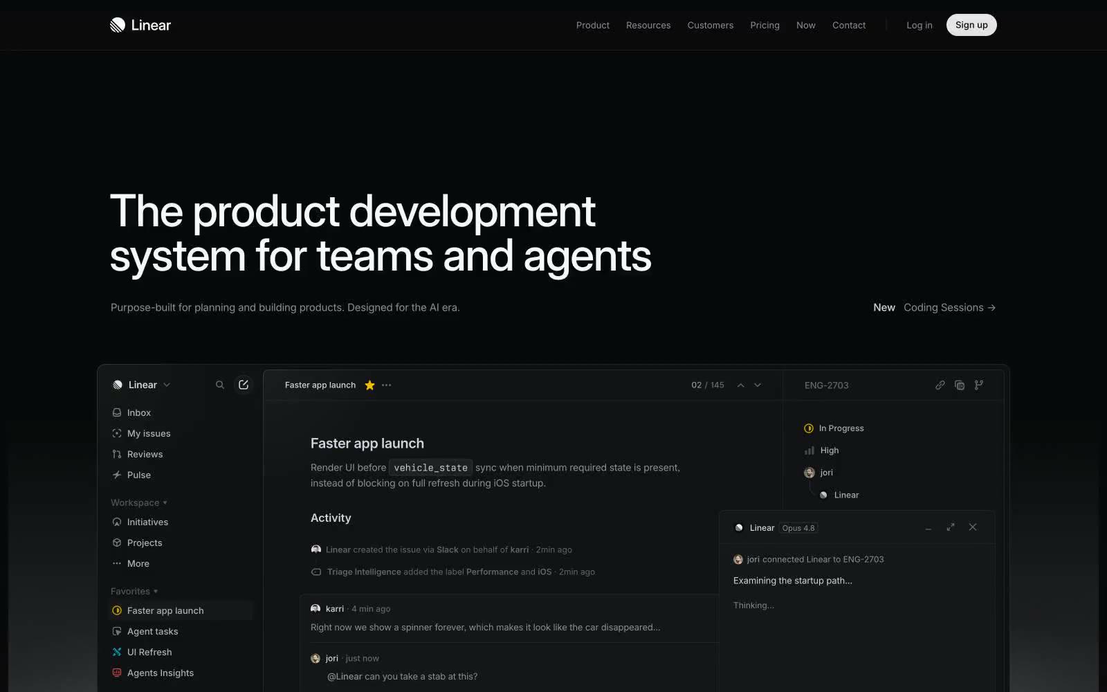
Linear's design system is a midnight command center built on near-black surfaces (#08090a) with paper-white type and one electric acid-lime accent (#e4f222) that functions as a functional flashlight — small, high-contrast, and used sparingly to signal action. The interface treats darkness as a substrate rather than a theme: text is crisp white at tight tracking (-0.022em), weights sit in a low 400–510 band rather than bold, and borders are hairline-thin (0.5px) to let geometry do the work that shadows usually would. Components feel precision-machined — 6px and 12px radii, compact 8–12px paddings, and almost no decorative ornament — letting the product UI (issue cards, kanban boards, AI agent panels) be the only visual texture in an otherwise quiet system.
|
|
10
|
+
|
|
11
|
+
- **Website:** [https://linear.app](https://linear.app)
|
|
12
|
+
- **Source:** [Refero Styles](https://styles.refero.design/style/90ce5883-bb24-4466-93f7-801cd617b0d1)
|
|
13
|
+
|
|
14
|
+
## Guidelines
|
|
15
|
+
|
|
16
|
+
### Do
|
|
17
|
+
|
|
18
|
+
- Use Inter Variable with font-feature-settings 'cv01' on, 'ss03' on, 'zero' on
|
|
19
|
+
- Use #e4f222 exclusively for the single primary action per view
|
|
20
|
+
- Set body text at 16px Inter weight 400 with line-height 1.5
|
|
21
|
+
- Use letter-spacing -0.022em at 48px and above
|
|
22
|
+
- Set card radius to 12px, button radius to 6px, pill radius to 9999px
|
|
23
|
+
- Use 0.5px hairline borders instead of shadows for surface separation
|
|
24
|
+
- Keep section gaps at 96px and element gaps at 8px
|
|
25
|
+
|
|
26
|
+
### Don't
|
|
27
|
+
|
|
28
|
+
- Do not use bold weights (700+)
|
|
29
|
+
- Do not use decorative gradients on buttons, cards, or text
|
|
30
|
+
- Do not introduce additional chromatic accent colors as actions
|
|
31
|
+
- Do not use large radii (16px+) on cards or panels
|
|
32
|
+
- Do not use shadows to separate cards from the canvas
|
|
33
|
+
|
|
34
|
+
## Similar Brands
|
|
35
|
+
|
|
36
|
+
Vercel, Cursor, Raycast, Framer
|
|
Binary file
|