@moduix/react 1.1.0
This diff represents the content of publicly available package versions that have been released to one of the supported registries. The information contained in this diff is provided for informational purposes only and reflects changes between package versions as they appear in their respective public registries.
- package/LICENSE.md +21 -0
- package/README.md +252 -0
- package/dist/components/accordion/Accordion.css +190 -0
- package/dist/components/accordion/Accordion.d.ts +13 -0
- package/dist/components/accordion/Accordion.js +67 -0
- package/dist/components/accordion/Accordion.module.js +15 -0
- package/dist/components/accordion/index.d.ts +2 -0
- package/dist/components/alert/Alert.css +108 -0
- package/dist/components/alert/Alert.d.ts +14 -0
- package/dist/components/alert/Alert.js +69 -0
- package/dist/components/alert/Alert.module.js +11 -0
- package/dist/components/angle-slider/AngleSlider.css +192 -0
- package/dist/components/angle-slider/AngleSlider.d.ts +16 -0
- package/dist/components/angle-slider/AngleSlider.js +92 -0
- package/dist/components/angle-slider/AngleSlider.module.js +13 -0
- package/dist/components/angle-slider/index.d.ts +2 -0
- package/dist/components/aspect-ratio/AspectRatio.css +14 -0
- package/dist/components/aspect-ratio/AspectRatio.d.ts +10 -0
- package/dist/components/aspect-ratio/AspectRatio.js +24 -0
- package/dist/components/aspect-ratio/AspectRatio.module.js +5 -0
- package/dist/components/avatar/Avatar.css +75 -0
- package/dist/components/avatar/Avatar.d.ts +19 -0
- package/dist/components/avatar/Avatar.js +49 -0
- package/dist/components/avatar/Avatar.module.js +9 -0
- package/dist/components/avatar/index.d.ts +2 -0
- package/dist/components/badge/Badge.css +66 -0
- package/dist/components/badge/Badge.d.ts +11 -0
- package/dist/components/badge/Badge.js +35 -0
- package/dist/components/badge/Badge.module.js +8 -0
- package/dist/components/bleed/Bleed.css +51 -0
- package/dist/components/bleed/Bleed.d.ts +12 -0
- package/dist/components/bleed/Bleed.js +22 -0
- package/dist/components/bleed/Bleed.module.js +5 -0
- package/dist/components/breadcrumbs/Breadcrumbs.css +90 -0
- package/dist/components/breadcrumbs/Breadcrumbs.d.ts +12 -0
- package/dist/components/breadcrumbs/Breadcrumbs.js +95 -0
- package/dist/components/breadcrumbs/Breadcrumbs.module.js +13 -0
- package/dist/components/button/Button.css +193 -0
- package/dist/components/button/Button.d.ts +14 -0
- package/dist/components/button/Button.js +28 -0
- package/dist/components/button/Button.module.js +5 -0
- package/dist/components/card/Card.css +148 -0
- package/dist/components/card/Card.d.ts +19 -0
- package/dist/components/card/Card.js +101 -0
- package/dist/components/card/Card.module.js +14 -0
- package/dist/components/carousel/Carousel.css +198 -0
- package/dist/components/carousel/Carousel.d.ts +19 -0
- package/dist/components/carousel/Carousel.js +128 -0
- package/dist/components/carousel/Carousel.module.js +18 -0
- package/dist/components/carousel/index.d.ts +2 -0
- package/dist/components/checkbox/Checkbox.css +135 -0
- package/dist/components/checkbox/Checkbox.d.ts +22 -0
- package/dist/components/checkbox/Checkbox.js +84 -0
- package/dist/components/checkbox/Checkbox.module.js +12 -0
- package/dist/components/checkbox/index.d.ts +2 -0
- package/dist/components/clipboard/Clipboard.css +145 -0
- package/dist/components/clipboard/Clipboard.d.ts +15 -0
- package/dist/components/clipboard/Clipboard.js +96 -0
- package/dist/components/clipboard/Clipboard.module.js +14 -0
- package/dist/components/clipboard/index.d.ts +2 -0
- package/dist/components/close-button/CloseButton.css +49 -0
- package/dist/components/close-button/CloseButton.d.ts +6 -0
- package/dist/components/close-button/CloseButton.js +39 -0
- package/dist/components/close-button/CloseButton.module.js +5 -0
- package/dist/components/collapsible/Collapsible.css +138 -0
- package/dist/components/collapsible/Collapsible.d.ts +12 -0
- package/dist/components/collapsible/Collapsible.js +59 -0
- package/dist/components/collapsible/Collapsible.module.js +12 -0
- package/dist/components/collapsible/index.d.ts +2 -0
- package/dist/components/color-picker/ColorPicker.css +433 -0
- package/dist/components/color-picker/ColorPicker.d.ts +39 -0
- package/dist/components/color-picker/ColorPicker.js +275 -0
- package/dist/components/color-picker/ColorPicker.module.js +33 -0
- package/dist/components/color-picker/index.d.ts +2 -0
- package/dist/components/combobox/Combobox.css +315 -0
- package/dist/components/combobox/Combobox.d.ts +24 -0
- package/dist/components/combobox/Combobox.js +169 -0
- package/dist/components/combobox/Combobox.module.js +23 -0
- package/dist/components/combobox/index.d.ts +2 -0
- package/dist/components/command-palette/CommandPalette.css +492 -0
- package/dist/components/command-palette/CommandPalette.d.ts +71 -0
- package/dist/components/command-palette/CommandPalette.js +383 -0
- package/dist/components/command-palette/CommandPalette.module.js +43 -0
- package/dist/components/command-palette/index.d.ts +2 -0
- package/dist/components/container/Container.css +45 -0
- package/dist/components/container/Container.d.ts +14 -0
- package/dist/components/container/Container.js +22 -0
- package/dist/components/container/Container.module.js +5 -0
- package/dist/components/date-input/DateInput.css +104 -0
- package/dist/components/date-input/DateInput.d.ts +22 -0
- package/dist/components/date-input/DateInput.js +83 -0
- package/dist/components/date-input/DateInput.module.js +12 -0
- package/dist/components/date-input/index.d.ts +2 -0
- package/dist/components/date-picker/DatePicker.css +420 -0
- package/dist/components/date-picker/DatePicker.d.ts +39 -0
- package/dist/components/date-picker/DatePicker.js +284 -0
- package/dist/components/date-picker/DatePicker.module.js +29 -0
- package/dist/components/date-picker/index.d.ts +2 -0
- package/dist/components/dialog/Dialog.css +221 -0
- package/dist/components/dialog/Dialog.d.ts +46 -0
- package/dist/components/dialog/Dialog.js +133 -0
- package/dist/components/dialog/Dialog.module.js +21 -0
- package/dist/components/dialog/index.d.ts +2 -0
- package/dist/components/drawer/Drawer.css +482 -0
- package/dist/components/drawer/Drawer.d.ts +56 -0
- package/dist/components/drawer/Drawer.js +188 -0
- package/dist/components/drawer/Drawer.module.js +32 -0
- package/dist/components/drawer/index.d.ts +2 -0
- package/dist/components/editable/Editable.css +171 -0
- package/dist/components/editable/Editable.d.ts +17 -0
- package/dist/components/editable/Editable.js +106 -0
- package/dist/components/editable/Editable.module.js +13 -0
- package/dist/components/editable/index.d.ts +2 -0
- package/dist/components/empty/Empty.css +78 -0
- package/dist/components/empty/Empty.d.ts +11 -0
- package/dist/components/empty/Empty.js +77 -0
- package/dist/components/empty/Empty.module.js +12 -0
- package/dist/components/field/Field.css +113 -0
- package/dist/components/field/Field.d.ts +25 -0
- package/dist/components/field/Field.js +104 -0
- package/dist/components/field/Field.module.js +15 -0
- package/dist/components/field/index.d.ts +2 -0
- package/dist/components/fieldset/Fieldset.css +52 -0
- package/dist/components/fieldset/Fieldset.d.ts +12 -0
- package/dist/components/fieldset/Fieldset.js +56 -0
- package/dist/components/fieldset/Fieldset.module.js +10 -0
- package/dist/components/fieldset/index.d.ts +2 -0
- package/dist/components/file-upload/FileUpload.css +290 -0
- package/dist/components/file-upload/FileUpload.d.ts +28 -0
- package/dist/components/file-upload/FileUpload.js +149 -0
- package/dist/components/file-upload/FileUpload.module.js +19 -0
- package/dist/components/file-upload/index.d.ts +2 -0
- package/dist/components/floating-panel/FloatingPanel.css +319 -0
- package/dist/components/floating-panel/FloatingPanel.d.ts +45 -0
- package/dist/components/floating-panel/FloatingPanel.js +194 -0
- package/dist/components/floating-panel/FloatingPanel.module.js +20 -0
- package/dist/components/floating-panel/index.d.ts +2 -0
- package/dist/components/heading/Heading.css +58 -0
- package/dist/components/heading/Heading.d.ts +17 -0
- package/dist/components/heading/Heading.js +32 -0
- package/dist/components/heading/Heading.module.js +5 -0
- package/dist/components/highlight/Highlight.css +15 -0
- package/dist/components/highlight/Highlight.d.ts +13 -0
- package/dist/components/highlight/Highlight.js +18 -0
- package/dist/components/highlight/Highlight.module.js +5 -0
- package/dist/components/highlight/index.d.ts +2 -0
- package/dist/components/hover-card/HoverCard.css +107 -0
- package/dist/components/hover-card/HoverCard.d.ts +28 -0
- package/dist/components/hover-card/HoverCard.js +81 -0
- package/dist/components/hover-card/HoverCard.module.js +13 -0
- package/dist/components/hover-card/index.d.ts +2 -0
- package/dist/components/image-cropper/ImageCropper.css +147 -0
- package/dist/components/image-cropper/ImageCropper.d.ts +15 -0
- package/dist/components/image-cropper/ImageCropper.js +75 -0
- package/dist/components/image-cropper/ImageCropper.module.js +12 -0
- package/dist/components/image-cropper/index.d.ts +2 -0
- package/dist/components/input/Input.css +83 -0
- package/dist/components/input/Input.d.ts +15 -0
- package/dist/components/input/Input.js +22 -0
- package/dist/components/input/Input.module.js +5 -0
- package/dist/components/input/index.d.ts +2 -0
- package/dist/components/input-group/InputGroup.css +158 -0
- package/dist/components/input-group/InputGroup.d.ts +25 -0
- package/dist/components/input-group/InputGroup.js +76 -0
- package/dist/components/input-group/InputGroup.module.js +11 -0
- package/dist/components/input-group/index.d.ts +2 -0
- package/dist/components/kbd/Kbd.css +45 -0
- package/dist/components/kbd/Kbd.d.ts +7 -0
- package/dist/components/kbd/Kbd.js +33 -0
- package/dist/components/kbd/Kbd.module.js +8 -0
- package/dist/components/lightbox/Lightbox.css +242 -0
- package/dist/components/lightbox/Lightbox.d.ts +71 -0
- package/dist/components/lightbox/Lightbox.js +219 -0
- package/dist/components/lightbox/Lightbox.module.js +22 -0
- package/dist/components/lightbox/index.d.ts +2 -0
- package/dist/components/list/List.css +118 -0
- package/dist/components/list/List.d.ts +24 -0
- package/dist/components/list/List.js +48 -0
- package/dist/components/list/List.module.js +5 -0
- package/dist/components/list/index.d.ts +2 -0
- package/dist/components/listbox/Listbox.css +255 -0
- package/dist/components/listbox/Listbox.d.ts +35 -0
- package/dist/components/listbox/Listbox.js +145 -0
- package/dist/components/listbox/Listbox.module.js +20 -0
- package/dist/components/listbox/index.d.ts +2 -0
- package/dist/components/marquee/Marquee.css +114 -0
- package/dist/components/marquee/Marquee.d.ts +13 -0
- package/dist/components/marquee/Marquee.js +65 -0
- package/dist/components/marquee/Marquee.module.js +13 -0
- package/dist/components/marquee/index.d.ts +2 -0
- package/dist/components/menu/Menu.css +371 -0
- package/dist/components/menu/Menu.d.ts +83 -0
- package/dist/components/menu/Menu.js +240 -0
- package/dist/components/menu/Menu.module.js +33 -0
- package/dist/components/menu/index.d.ts +2 -0
- package/dist/components/native-select/NativeSelect.css +104 -0
- package/dist/components/native-select/NativeSelect.d.ts +8 -0
- package/dist/components/native-select/NativeSelect.js +32 -0
- package/dist/components/native-select/NativeSelect.module.js +9 -0
- package/dist/components/native-select/index.d.ts +2 -0
- package/dist/components/number-input/NumberInput.css +162 -0
- package/dist/components/number-input/NumberInput.d.ts +16 -0
- package/dist/components/number-input/NumberInput.js +95 -0
- package/dist/components/number-input/NumberInput.module.js +14 -0
- package/dist/components/number-input/index.d.ts +2 -0
- package/dist/components/pagination/Pagination.css +99 -0
- package/dist/components/pagination/Pagination.d.ts +16 -0
- package/dist/components/pagination/Pagination.js +101 -0
- package/dist/components/pagination/Pagination.module.js +12 -0
- package/dist/components/pagination/index.d.ts +2 -0
- package/dist/components/password-input/PasswordInput.css +155 -0
- package/dist/components/password-input/PasswordInput.d.ts +14 -0
- package/dist/components/password-input/PasswordInput.js +77 -0
- package/dist/components/password-input/PasswordInput.module.js +12 -0
- package/dist/components/password-input/index.d.ts +2 -0
- package/dist/components/pin-input/PinInput.css +96 -0
- package/dist/components/pin-input/PinInput.d.ts +23 -0
- package/dist/components/pin-input/PinInput.js +85 -0
- package/dist/components/pin-input/PinInput.module.js +11 -0
- package/dist/components/pin-input/index.d.ts +2 -0
- package/dist/components/popover/Popover.css +162 -0
- package/dist/components/popover/Popover.d.ts +50 -0
- package/dist/components/popover/Popover.js +167 -0
- package/dist/components/popover/Popover.module.js +20 -0
- package/dist/components/popover/index.d.ts +2 -0
- package/dist/components/progress-circular/ProgressCircular.css +68 -0
- package/dist/components/progress-circular/ProgressCircular.d.ts +15 -0
- package/dist/components/progress-circular/ProgressCircular.js +83 -0
- package/dist/components/progress-circular/ProgressCircular.module.js +14 -0
- package/dist/components/progress-circular/index.d.ts +2 -0
- package/dist/components/progress-linear/ProgressLinear.css +106 -0
- package/dist/components/progress-linear/ProgressLinear.d.ts +14 -0
- package/dist/components/progress-linear/ProgressLinear.js +74 -0
- package/dist/components/progress-linear/ProgressLinear.module.js +14 -0
- package/dist/components/progress-linear/index.d.ts +2 -0
- package/dist/components/qr-code/QrCode.css +100 -0
- package/dist/components/qr-code/QrCode.d.ts +13 -0
- package/dist/components/qr-code/QrCode.js +65 -0
- package/dist/components/qr-code/QrCode.module.js +11 -0
- package/dist/components/qr-code/index.d.ts +2 -0
- package/dist/components/radio-group/RadioGroup.css +147 -0
- package/dist/components/radio-group/RadioGroup.d.ts +20 -0
- package/dist/components/radio-group/RadioGroup.js +83 -0
- package/dist/components/radio-group/RadioGroup.module.js +12 -0
- package/dist/components/radio-group/index.d.ts +2 -0
- package/dist/components/rating-group/RatingGroup.css +133 -0
- package/dist/components/rating-group/RatingGroup.d.ts +23 -0
- package/dist/components/rating-group/RatingGroup.js +86 -0
- package/dist/components/rating-group/RatingGroup.module.js +13 -0
- package/dist/components/rating-group/index.d.ts +2 -0
- package/dist/components/scroll-area/ScrollArea.css +162 -0
- package/dist/components/scroll-area/ScrollArea.d.ts +21 -0
- package/dist/components/scroll-area/ScrollArea.js +76 -0
- package/dist/components/scroll-area/ScrollArea.module.js +12 -0
- package/dist/components/scroll-area/index.d.ts +2 -0
- package/dist/components/segment-group/SegmentGroup.css +120 -0
- package/dist/components/segment-group/SegmentGroup.d.ts +15 -0
- package/dist/components/segment-group/SegmentGroup.js +83 -0
- package/dist/components/segment-group/SegmentGroup.module.js +12 -0
- package/dist/components/segment-group/index.d.ts +2 -0
- package/dist/components/select/Select.css +351 -0
- package/dist/components/select/Select.d.ts +48 -0
- package/dist/components/select/Select.js +210 -0
- package/dist/components/select/Select.module.js +27 -0
- package/dist/components/select/index.d.ts +2 -0
- package/dist/components/separator/Separator.css +45 -0
- package/dist/components/separator/Separator.d.ts +14 -0
- package/dist/components/separator/Separator.js +27 -0
- package/dist/components/separator/Separator.module.js +5 -0
- package/dist/components/sidebar/Sidebar.css +341 -0
- package/dist/components/sidebar/Sidebar.d.ts +48 -0
- package/dist/components/sidebar/Sidebar.js +279 -0
- package/dist/components/sidebar/Sidebar.module.js +23 -0
- package/dist/components/sidebar/index.d.ts +2 -0
- package/dist/components/signature-pad/SignaturePad.css +123 -0
- package/dist/components/signature-pad/SignaturePad.d.ts +15 -0
- package/dist/components/signature-pad/SignaturePad.js +82 -0
- package/dist/components/signature-pad/SignaturePad.module.js +12 -0
- package/dist/components/signature-pad/index.d.ts +2 -0
- package/dist/components/simple-grid/SimpleGrid.d.ts +18 -0
- package/dist/components/simple-grid/SimpleGrid.js +32 -0
- package/dist/components/skeleton/Skeleton.css +29 -0
- package/dist/components/skeleton/Skeleton.d.ts +20 -0
- package/dist/components/skeleton/Skeleton.js +32 -0
- package/dist/components/skeleton/Skeleton.module.js +5 -0
- package/dist/components/slider/Slider.css +167 -0
- package/dist/components/slider/Slider.d.ts +19 -0
- package/dist/components/slider/Slider.js +119 -0
- package/dist/components/slider/Slider.module.js +16 -0
- package/dist/components/slider/index.d.ts +2 -0
- package/dist/components/spinner/Spinner.css +60 -0
- package/dist/components/spinner/Spinner.d.ts +12 -0
- package/dist/components/spinner/Spinner.js +40 -0
- package/dist/components/spinner/Spinner.module.js +9 -0
- package/dist/components/split-button/SplitButton.css +51 -0
- package/dist/components/split-button/SplitButton.d.ts +36 -0
- package/dist/components/split-button/SplitButton.js +93 -0
- package/dist/components/split-button/SplitButton.module.js +9 -0
- package/dist/components/split-button/index.d.ts +2 -0
- package/dist/components/splitter/Splitter.css +170 -0
- package/dist/components/splitter/Splitter.d.ts +12 -0
- package/dist/components/splitter/Splitter.js +68 -0
- package/dist/components/splitter/Splitter.module.js +10 -0
- package/dist/components/splitter/index.d.ts +2 -0
- package/dist/components/stack/Stack.css +13 -0
- package/dist/components/stack/Stack.d.ts +31 -0
- package/dist/components/stack/Stack.js +36 -0
- package/dist/components/stack/Stack.module.js +5 -0
- package/dist/components/stack/index.d.ts +2 -0
- package/dist/components/steps/Steps.css +283 -0
- package/dist/components/steps/Steps.d.ts +19 -0
- package/dist/components/steps/Steps.js +122 -0
- package/dist/components/steps/Steps.module.js +17 -0
- package/dist/components/steps/index.d.ts +2 -0
- package/dist/components/switch/Switch.css +130 -0
- package/dist/components/switch/Switch.d.ts +21 -0
- package/dist/components/switch/Switch.js +67 -0
- package/dist/components/switch/Switch.module.js +10 -0
- package/dist/components/switch/index.d.ts +2 -0
- package/dist/components/table/Table.css +162 -0
- package/dist/components/table/Table.d.ts +41 -0
- package/dist/components/table/Table.js +173 -0
- package/dist/components/table/Table.module.js +18 -0
- package/dist/components/tabs/Tabs.css +186 -0
- package/dist/components/tabs/Tabs.d.ts +20 -0
- package/dist/components/tabs/Tabs.js +67 -0
- package/dist/components/tabs/Tabs.module.js +11 -0
- package/dist/components/tabs/index.d.ts +2 -0
- package/dist/components/tag/Tag.css +128 -0
- package/dist/components/tag/Tag.d.ts +18 -0
- package/dist/components/tag/Tag.js +87 -0
- package/dist/components/tag/Tag.module.js +11 -0
- package/dist/components/tags-input/TagsInput.css +248 -0
- package/dist/components/tags-input/TagsInput.d.ts +20 -0
- package/dist/components/tags-input/TagsInput.js +139 -0
- package/dist/components/tags-input/TagsInput.module.js +16 -0
- package/dist/components/tags-input/index.d.ts +2 -0
- package/dist/components/text/Text.css +87 -0
- package/dist/components/text/Text.d.ts +27 -0
- package/dist/components/text/Text.js +43 -0
- package/dist/components/text/Text.module.js +5 -0
- package/dist/components/textarea/Textarea.css +55 -0
- package/dist/components/textarea/Textarea.d.ts +6 -0
- package/dist/components/textarea/Textarea.js +21 -0
- package/dist/components/textarea/Textarea.module.js +5 -0
- package/dist/components/textarea/index.d.ts +2 -0
- package/dist/components/timer/Timer.css +95 -0
- package/dist/components/timer/Timer.d.ts +14 -0
- package/dist/components/timer/Timer.js +74 -0
- package/dist/components/timer/Timer.module.js +12 -0
- package/dist/components/timer/index.d.ts +2 -0
- package/dist/components/toast/Toast.css +154 -0
- package/dist/components/toast/Toast.d.ts +17 -0
- package/dist/components/toast/Toast.js +92 -0
- package/dist/components/toast/Toast.module.js +12 -0
- package/dist/components/toast/index.d.ts +2 -0
- package/dist/components/toggle/Toggle.css +167 -0
- package/dist/components/toggle/Toggle.d.ts +16 -0
- package/dist/components/toggle/Toggle.js +31 -0
- package/dist/components/toggle/Toggle.module.js +8 -0
- package/dist/components/toggle/index.d.ts +2 -0
- package/dist/components/toggle-group/ToggleGroup.css +42 -0
- package/dist/components/toggle-group/ToggleGroup.d.ts +25 -0
- package/dist/components/toggle-group/ToggleGroup.js +62 -0
- package/dist/components/toggle-group/ToggleGroup.module.js +8 -0
- package/dist/components/toggle-group/index.d.ts +2 -0
- package/dist/components/tooltip/Tooltip.css +125 -0
- package/dist/components/tooltip/Tooltip.d.ts +28 -0
- package/dist/components/tooltip/Tooltip.js +75 -0
- package/dist/components/tooltip/Tooltip.module.js +13 -0
- package/dist/components/tooltip/index.d.ts +2 -0
- package/dist/components/tour/Tour.css +286 -0
- package/dist/components/tour/Tour.d.ts +30 -0
- package/dist/components/tour/Tour.js +149 -0
- package/dist/components/tour/Tour.module.js +23 -0
- package/dist/components/tour/index.d.ts +2 -0
- package/dist/components/tree-view/TreeView.css +261 -0
- package/dist/components/tree-view/TreeView.d.ts +32 -0
- package/dist/components/tree-view/TreeView.js +171 -0
- package/dist/components/tree-view/TreeView.module.js +26 -0
- package/dist/components/tree-view/index.d.ts +2 -0
- package/dist/index.d.ts +83 -0
- package/dist/index.js +83 -0
- package/dist/lib/moduix/icons/ui/Icons.d.ts +51 -0
- package/dist/lib/moduix/icons/ui/Icons.js +759 -0
- package/dist/lib/moduix/icons/ui/index.d.ts +2 -0
- package/dist/lib/moduix/normalizeClassName.js +4 -0
- package/dist/lib/moduix/overlayPortal.d.ts +9 -0
- package/dist/lib/moduix/overlayPortal.js +21 -0
- package/dist/lib/moduix/styles/reset.css +175 -0
- package/dist/lib/moduix/styles/style.css +288 -0
- package/dist/reset.d.ts +1 -0
- package/dist/reset.js +1 -0
- package/dist/style.d.ts +1 -0
- package/dist/style.js +1 -0
- package/package.json +76 -0
package/LICENSE.md
ADDED
|
@@ -0,0 +1,21 @@
|
|
|
1
|
+
MIT License
|
|
2
|
+
|
|
3
|
+
Copyright (c) 2026 Blinks44
|
|
4
|
+
|
|
5
|
+
Permission is hereby granted, free of charge, to any person obtaining a copy
|
|
6
|
+
of this software and associated documentation files (the "Software"), to deal
|
|
7
|
+
in the Software without restriction, including without limitation the rights
|
|
8
|
+
to use, copy, modify, merge, publish, distribute, sublicense, and/or sell
|
|
9
|
+
copies of the Software, and to permit persons to whom the Software is
|
|
10
|
+
furnished to do so, subject to the following conditions:
|
|
11
|
+
|
|
12
|
+
The above copyright notice and this permission notice shall be included in all
|
|
13
|
+
copies or substantial portions of the Software.
|
|
14
|
+
|
|
15
|
+
THE SOFTWARE IS PROVIDED "AS IS", WITHOUT WARRANTY OF ANY KIND, EXPRESS OR
|
|
16
|
+
IMPLIED, INCLUDING BUT NOT LIMITED TO THE WARRANTIES OF MERCHANTABILITY,
|
|
17
|
+
FITNESS FOR A PARTICULAR PURPOSE AND NONINFRINGEMENT. IN NO EVENT SHALL THE
|
|
18
|
+
AUTHORS OR COPYRIGHT HOLDERS BE LIABLE FOR ANY CLAIM, DAMAGES OR OTHER
|
|
19
|
+
LIABILITY, WHETHER IN AN ACTION OF CONTRACT, TORT OR OTHERWISE, ARISING FROM,
|
|
20
|
+
OUT OF OR IN CONNECTION WITH THE SOFTWARE OR THE USE OR OTHER DEALINGS IN THE
|
|
21
|
+
SOFTWARE.
|
package/README.md
ADDED
|
@@ -0,0 +1,252 @@
|
|
|
1
|
+
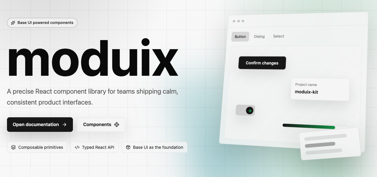
|
|
2
|
+
|
|
3
|
+
[](https://www.npmjs.com/package/@moduix/react)
|
|
4
|
+
[](https://www.typescriptlang.org/)
|
|
5
|
+
[](https://turbo.build/)
|
|
6
|
+
|
|
7
|
+
# moduix
|
|
8
|
+
|
|
9
|
+
React implementation of the moduix component system for product interfaces, built on top of
|
|
10
|
+
[Ark UI](https://ark-ui.com/) primitives.
|
|
11
|
+
|
|
12
|
+
moduix gives you ready-made components with accessible behavior, native CSS styles, and a
|
|
13
|
+
composition-first API. It supports two production workflows: install the package for managed
|
|
14
|
+
updates, or copy registry component source when your application needs direct ownership.
|
|
15
|
+
|
|
16
|
+
## Why It Exists
|
|
17
|
+
|
|
18
|
+
moduix is built for real product screens: predictable behavior, readable composition, small
|
|
19
|
+
runtime surface, and CSS that can be owned by the application. The library is public and actively
|
|
20
|
+
developed around Ark UI primitives, shadcn-compatible source delivery, and practical defaults for
|
|
21
|
+
teams that need consistent interfaces.
|
|
22
|
+
|
|
23
|
+
## Principles
|
|
24
|
+
|
|
25
|
+
- **Ark UI underneath.** Components target Ark UI composition and accessibility primitives instead of
|
|
26
|
+
reimplementing low-level interaction behavior.
|
|
27
|
+
- **Small dependency surface.** Ark UI is the only external UI primitive layer. The package
|
|
28
|
+
keeps the runtime stack intentionally small and does not bring a styling framework with it.
|
|
29
|
+
- **Two installation paths.** Use moduix as an npm package, or copy component source into your
|
|
30
|
+
project when direct ownership is more important than package-managed updates.
|
|
31
|
+
- **Composable API.** Components are exposed as named parts, so complex UI can be assembled
|
|
32
|
+
without hiding important structure.
|
|
33
|
+
- **Native CSS.** Styles are distributed as CSS, use CSS custom properties, and are designed to
|
|
34
|
+
work with your existing styling approach.
|
|
35
|
+
- **shadcn-compatible source delivery.** shadcn/ui remains a major inspiration for readable
|
|
36
|
+
component composition. moduix keeps that ownership model available through its registry.
|
|
37
|
+
|
|
38
|
+
## Installation
|
|
39
|
+
|
|
40
|
+
moduix supports two installation paths:
|
|
41
|
+
|
|
42
|
+
- Install the library as a regular npm package when you want package-managed updates.
|
|
43
|
+
- Install component source into your own project with `shadcn` when you want direct ownership.
|
|
44
|
+
|
|
45
|
+
| Choose this path | When it fits best |
|
|
46
|
+
| --------------------------- | ----------------------------------------------------------------------------------------------------------------------------- |
|
|
47
|
+
| npm package | You want the fastest setup, package-managed updates, imports from `@moduix/react`, and styles from `@moduix/react/style.css`. |
|
|
48
|
+
| `shadcn` copy-owned install | You want generated source files inside your app, direct local customization, and imports from `@/components/moduix/*`. |
|
|
49
|
+
|
|
50
|
+
### npm package
|
|
51
|
+
|
|
52
|
+
```bash
|
|
53
|
+
npm install @moduix/react @ark-ui/react
|
|
54
|
+
```
|
|
55
|
+
|
|
56
|
+
`react`, `react-dom`, and `@ark-ui/react` are peer dependencies. They stay in your application
|
|
57
|
+
bundle, so moduix does not ship duplicate React or Ark UI runtimes.
|
|
58
|
+
|
|
59
|
+
### shadcn copy-owned install
|
|
60
|
+
|
|
61
|
+
`shadcn` can install selected moduix components from the GitHub registry directly into your project.
|
|
62
|
+
The files become part of your codebase instead of staying in `node_modules`.
|
|
63
|
+
|
|
64
|
+
Make sure your project resolves the `@/*` alias to `src/*` in both `tsconfig.json` and
|
|
65
|
+
`tsconfig.app.json`, and mirror it in your bundler config.
|
|
66
|
+
|
|
67
|
+
Create `components.json` in the project root when your app does not already have one:
|
|
68
|
+
|
|
69
|
+
```json
|
|
70
|
+
{
|
|
71
|
+
"$schema": "https://ui.shadcn.com/schema.json",
|
|
72
|
+
"style": "new-york",
|
|
73
|
+
"rsc": false,
|
|
74
|
+
"tsx": true,
|
|
75
|
+
"tailwind": {
|
|
76
|
+
"config": "",
|
|
77
|
+
"css": "src/index.css",
|
|
78
|
+
"baseColor": "neutral",
|
|
79
|
+
"cssVariables": true,
|
|
80
|
+
"prefix": ""
|
|
81
|
+
},
|
|
82
|
+
"iconLibrary": "lucide",
|
|
83
|
+
"rtl": false,
|
|
84
|
+
"aliases": {
|
|
85
|
+
"components": "@/components",
|
|
86
|
+
"utils": "@/lib/utils",
|
|
87
|
+
"ui": "@/components/ui",
|
|
88
|
+
"lib": "@/lib",
|
|
89
|
+
"hooks": "@/hooks"
|
|
90
|
+
},
|
|
91
|
+
"registries": {}
|
|
92
|
+
}
|
|
93
|
+
```
|
|
94
|
+
|
|
95
|
+
```bash
|
|
96
|
+
npx shadcn@latest add Blinks44/moduix/react-button
|
|
97
|
+
npx shadcn@latest add Blinks44/moduix/react-accordion
|
|
98
|
+
```
|
|
99
|
+
|
|
100
|
+
The registry install also pulls in the shared moduix foundation files those components need, such as
|
|
101
|
+
styles, icons, and small utilities.
|
|
102
|
+
|
|
103
|
+
Import the generated foundation stylesheet once in your application entry point:
|
|
104
|
+
|
|
105
|
+
```tsx
|
|
106
|
+
import '@/lib/moduix/styles/style.css';
|
|
107
|
+
```
|
|
108
|
+
|
|
109
|
+
If you want the optional reset in the copy-owned path, import it explicitly before the main
|
|
110
|
+
stylesheet:
|
|
111
|
+
|
|
112
|
+
```tsx
|
|
113
|
+
import '@/lib/moduix/styles/reset.css';
|
|
114
|
+
import '@/lib/moduix/styles/style.css';
|
|
115
|
+
```
|
|
116
|
+
|
|
117
|
+
With the aliases above, generated files land in `src/components/moduix/*` and `src/lib/moduix/*`.
|
|
118
|
+
|
|
119
|
+
## Usage
|
|
120
|
+
|
|
121
|
+
Import the required foundation stylesheet once in your application entry point:
|
|
122
|
+
|
|
123
|
+
```tsx
|
|
124
|
+
import '@moduix/react/style.css';
|
|
125
|
+
```
|
|
126
|
+
|
|
127
|
+
This stylesheet is required. It provides the shared design tokens and base styles that component
|
|
128
|
+
CSS depends on.
|
|
129
|
+
|
|
130
|
+
If you want the optional reset, import it explicitly before the main stylesheet:
|
|
131
|
+
|
|
132
|
+
```tsx
|
|
133
|
+
import '@moduix/react/reset.css';
|
|
134
|
+
import '@moduix/react/style.css';
|
|
135
|
+
```
|
|
136
|
+
|
|
137
|
+
Then import and compose the components you need:
|
|
138
|
+
|
|
139
|
+
```tsx
|
|
140
|
+
import { Button, Dialog, Portal } from '@moduix/react';
|
|
141
|
+
|
|
142
|
+
export function Example() {
|
|
143
|
+
return (
|
|
144
|
+
<Dialog.Root>
|
|
145
|
+
<Dialog.Trigger asChild>
|
|
146
|
+
<Button>Open dialog</Button>
|
|
147
|
+
</Dialog.Trigger>
|
|
148
|
+
<Portal>
|
|
149
|
+
<Dialog.Backdrop />
|
|
150
|
+
<Dialog.Positioner>
|
|
151
|
+
<Dialog.Content>
|
|
152
|
+
<Dialog.Title>Project settings</Dialog.Title>
|
|
153
|
+
</Dialog.Content>
|
|
154
|
+
</Dialog.Positioner>
|
|
155
|
+
</Portal>
|
|
156
|
+
</Dialog.Root>
|
|
157
|
+
);
|
|
158
|
+
}
|
|
159
|
+
```
|
|
160
|
+
|
|
161
|
+
`style.css` ships the shared design tokens and base styles. Component imports still bring along only
|
|
162
|
+
the component CSS they use.
|
|
163
|
+
|
|
164
|
+
## Styling
|
|
165
|
+
|
|
166
|
+
Components accept `className` where customization is expected and expose stable `data-slot`
|
|
167
|
+
attributes for targeted styling. Theme values are regular CSS custom properties:
|
|
168
|
+
|
|
169
|
+
```css
|
|
170
|
+
:root {
|
|
171
|
+
--color-primary: oklch(0.205 0 0);
|
|
172
|
+
--button-radius: 0.5rem;
|
|
173
|
+
}
|
|
174
|
+
```
|
|
175
|
+
|
|
176
|
+
Library CSS is organized with cascade layers:
|
|
177
|
+
|
|
178
|
+
```css
|
|
179
|
+
@layer ui.reset, ui.tokens, ui.components;
|
|
180
|
+
```
|
|
181
|
+
|
|
182
|
+
This keeps defaults predictable while still letting application styles override tokens,
|
|
183
|
+
classes, or component-level variables.
|
|
184
|
+
|
|
185
|
+
## What Is Included
|
|
186
|
+
|
|
187
|
+
The package exports composed components for common product UI needs, including Accordion, Avatar,
|
|
188
|
+
Button, Checkbox, Combobox, Dialog, Drawer, Field, FileUpload, Menu, NumberInput, Popover,
|
|
189
|
+
QrCode, Select, Tabs, Toast, Tooltip, TreeView, and supporting layout and display primitives.
|
|
190
|
+
|
|
191
|
+
## Documentation
|
|
192
|
+
|
|
193
|
+
- Documentation: https://moduix.blinks44.workers.dev/
|
|
194
|
+
- npm package: https://www.npmjs.com/package/@moduix/react
|
|
195
|
+
- React package README: `packages/react/README.md`
|
|
196
|
+
- Docs app README: `apps/docs/README.md`
|
|
197
|
+
|
|
198
|
+
## Repository Quick Start
|
|
199
|
+
|
|
200
|
+
From the monorepo root:
|
|
201
|
+
|
|
202
|
+
```bash
|
|
203
|
+
npm install
|
|
204
|
+
npm run build:react
|
|
205
|
+
npm run dev
|
|
206
|
+
```
|
|
207
|
+
|
|
208
|
+
## Acknowledgements
|
|
209
|
+
|
|
210
|
+
This project could not exist without the work of these teams and communities:
|
|
211
|
+
|
|
212
|
+
- [Ark UI](https://ark-ui.com/) for the composition and accessibility primitives now shaping the library contract.
|
|
213
|
+
- [shadcn/ui](https://ui.shadcn.com/) for the API inspiration and the culture of practical,
|
|
214
|
+
readable component composition.
|
|
215
|
+
- [Tailwind CSS](https://tailwindcss.com/) for the reset.css implementation.
|
|
216
|
+
- [Fumadocs](https://fumadocs.dev/) for the documentation foundation.
|
|
217
|
+
- [TanStack](https://tanstack.com/) for the application tooling used by the docs.
|
|
218
|
+
- [Voidzero](https://voidzero.dev/) for the JavaScript tooling used by the workspace.
|
|
219
|
+
|
|
220
|
+
## Contributing
|
|
221
|
+
|
|
222
|
+
Contributions are welcome, especially bug reports, accessibility fixes, documentation
|
|
223
|
+
improvements, and focused component improvements.
|
|
224
|
+
|
|
225
|
+
Before opening a pull request:
|
|
226
|
+
|
|
227
|
+
1. Install dependencies from the repository root:
|
|
228
|
+
|
|
229
|
+
```bash
|
|
230
|
+
npm install
|
|
231
|
+
```
|
|
232
|
+
|
|
233
|
+
2. Build the React package when your change affects `packages/react` or documentation examples:
|
|
234
|
+
|
|
235
|
+
```bash
|
|
236
|
+
npm run build:react
|
|
237
|
+
```
|
|
238
|
+
|
|
239
|
+
3. Run the required checks:
|
|
240
|
+
|
|
241
|
+
```bash
|
|
242
|
+
npm run fmt:fix
|
|
243
|
+
npm run lint:check
|
|
244
|
+
npm run tsc:check
|
|
245
|
+
```
|
|
246
|
+
|
|
247
|
+
Keep pull requests small and specific. For component changes, update the related stories, exports,
|
|
248
|
+
local component notes, public docs, and registry output so the package and docs stay in sync.
|
|
249
|
+
|
|
250
|
+
Agent-facing repository guidance lives in `AGENTS.md` and `.agents/skills`. Generated or
|
|
251
|
+
agent-assisted changes should still preserve the library's direct Ark-first component contracts,
|
|
252
|
+
small APIs, and readable implementation style.
|
|
@@ -0,0 +1,190 @@
|
|
|
1
|
+
@layer ui.components {
|
|
2
|
+
@keyframes YlosVa_accordion-item-content-open {
|
|
3
|
+
from {
|
|
4
|
+
height: 0;
|
|
5
|
+
opacity: var(--accordion-item-content-closed-opacity, .01);
|
|
6
|
+
}
|
|
7
|
+
|
|
8
|
+
to {
|
|
9
|
+
height: var(--height);
|
|
10
|
+
opacity: var(--accordion-item-content-open-opacity, 1);
|
|
11
|
+
}
|
|
12
|
+
}
|
|
13
|
+
|
|
14
|
+
@keyframes YlosVa_accordion-item-content-closed {
|
|
15
|
+
from {
|
|
16
|
+
height: var(--height);
|
|
17
|
+
opacity: var(--accordion-item-content-open-opacity, 1);
|
|
18
|
+
}
|
|
19
|
+
|
|
20
|
+
to {
|
|
21
|
+
height: 0;
|
|
22
|
+
opacity: var(--accordion-item-content-closed-opacity, .01);
|
|
23
|
+
}
|
|
24
|
+
}
|
|
25
|
+
|
|
26
|
+
@keyframes YlosVa_accordion-item-content-open-horizontal {
|
|
27
|
+
from {
|
|
28
|
+
width: 0;
|
|
29
|
+
opacity: var(--accordion-item-content-closed-opacity, .01);
|
|
30
|
+
}
|
|
31
|
+
|
|
32
|
+
to {
|
|
33
|
+
width: var(--width);
|
|
34
|
+
opacity: var(--accordion-item-content-open-opacity, 1);
|
|
35
|
+
}
|
|
36
|
+
}
|
|
37
|
+
|
|
38
|
+
@keyframes YlosVa_accordion-item-content-closed-horizontal {
|
|
39
|
+
from {
|
|
40
|
+
width: var(--width);
|
|
41
|
+
opacity: var(--accordion-item-content-open-opacity, 1);
|
|
42
|
+
}
|
|
43
|
+
|
|
44
|
+
to {
|
|
45
|
+
width: 0;
|
|
46
|
+
opacity: var(--accordion-item-content-closed-opacity, .01);
|
|
47
|
+
}
|
|
48
|
+
}
|
|
49
|
+
|
|
50
|
+
.YlosVa_root {
|
|
51
|
+
box-sizing: border-box;
|
|
52
|
+
width: var(--accordion-width, 22rem);
|
|
53
|
+
max-width: var(--accordion-max-width, 100%);
|
|
54
|
+
min-width: 0;
|
|
55
|
+
color: var(--accordion-color, var(--color-foreground));
|
|
56
|
+
flex-direction: column;
|
|
57
|
+
display: flex;
|
|
58
|
+
|
|
59
|
+
&[data-orientation="horizontal"] {
|
|
60
|
+
width: var(--accordion-horizontal-width, auto);
|
|
61
|
+
height: var(--accordion-horizontal-height, 20rem);
|
|
62
|
+
max-height: var(--accordion-horizontal-max-height, 100%);
|
|
63
|
+
flex-direction: row;
|
|
64
|
+
}
|
|
65
|
+
}
|
|
66
|
+
|
|
67
|
+
.YlosVa_item {
|
|
68
|
+
overflow-anchor: none;
|
|
69
|
+
|
|
70
|
+
&[data-orientation="vertical"]:not(:last-child) {
|
|
71
|
+
border-bottom: var(--accordion-item-border-width, var(--border-width-sm)) solid
|
|
72
|
+
var(--accordion-item-border-color, var(--color-border));
|
|
73
|
+
}
|
|
74
|
+
|
|
75
|
+
&[data-orientation="horizontal"] {
|
|
76
|
+
display: flex;
|
|
77
|
+
|
|
78
|
+
&:not(:last-child) {
|
|
79
|
+
border-inline-end: var(--accordion-item-border-width, var(--border-width-sm)) solid
|
|
80
|
+
var(--accordion-item-border-color, var(--color-border));
|
|
81
|
+
}
|
|
82
|
+
}
|
|
83
|
+
}
|
|
84
|
+
|
|
85
|
+
.YlosVa_itemTrigger {
|
|
86
|
+
box-sizing: border-box;
|
|
87
|
+
justify-content: space-between;
|
|
88
|
+
align-items: center;
|
|
89
|
+
gap: var(--accordion-trigger-gap, var(--spacing-4));
|
|
90
|
+
width: 100%;
|
|
91
|
+
padding-block: var(--accordion-trigger-padding-y, var(--spacing-2));
|
|
92
|
+
padding-inline: var(--accordion-trigger-padding-x, var(--spacing-3));
|
|
93
|
+
background-color: var(--accordion-trigger-bg, var(--color-muted));
|
|
94
|
+
color: inherit;
|
|
95
|
+
font: inherit;
|
|
96
|
+
font-size: var(--accordion-trigger-font-size, var(--text-md));
|
|
97
|
+
line-height: var(--accordion-trigger-line-height, var(--line-height-text-md));
|
|
98
|
+
text-align: left;
|
|
99
|
+
user-select: none;
|
|
100
|
+
cursor: pointer;
|
|
101
|
+
transition: background-color var(--transition-default),
|
|
102
|
+
color var(--transition-default);
|
|
103
|
+
border: 0;
|
|
104
|
+
outline: 0;
|
|
105
|
+
margin: 0;
|
|
106
|
+
display: flex;
|
|
107
|
+
|
|
108
|
+
@media (hover: hover) {
|
|
109
|
+
&:hover {
|
|
110
|
+
background-color: var(--accordion-trigger-bg-hover, var(--color-accent));
|
|
111
|
+
}
|
|
112
|
+
}
|
|
113
|
+
|
|
114
|
+
&:focus-visible {
|
|
115
|
+
z-index: 1;
|
|
116
|
+
outline: var(--accordion-focus-ring-width, var(--border-width-md)) solid
|
|
117
|
+
var(--accordion-focus-ring-color, var(--color-ring));
|
|
118
|
+
outline-offset: calc(var(--accordion-focus-ring-offset, var(--border-width-sm)) * -1);
|
|
119
|
+
position: relative;
|
|
120
|
+
}
|
|
121
|
+
|
|
122
|
+
&:is([disabled], [data-disabled]) {
|
|
123
|
+
cursor: default;
|
|
124
|
+
opacity: var(--accordion-disabled-opacity, var(--opacity-disabled));
|
|
125
|
+
}
|
|
126
|
+
|
|
127
|
+
&[data-orientation="horizontal"] {
|
|
128
|
+
width: var(--accordion-horizontal-trigger-width, 2.5rem);
|
|
129
|
+
writing-mode: sideways-lr;
|
|
130
|
+
justify-content: center;
|
|
131
|
+
height: 100%;
|
|
132
|
+
}
|
|
133
|
+
}
|
|
134
|
+
|
|
135
|
+
.YlosVa_itemIndicator {
|
|
136
|
+
box-sizing: border-box;
|
|
137
|
+
width: var(--accordion-icon-size, .75rem);
|
|
138
|
+
height: var(--accordion-icon-size, .75rem);
|
|
139
|
+
transition: transform var(--accordion-icon-transition, var(--transition-default));
|
|
140
|
+
flex-shrink: 0;
|
|
141
|
+
justify-content: center;
|
|
142
|
+
align-items: center;
|
|
143
|
+
display: inline-flex;
|
|
144
|
+
|
|
145
|
+
& svg {
|
|
146
|
+
width: 100%;
|
|
147
|
+
height: 100%;
|
|
148
|
+
}
|
|
149
|
+
|
|
150
|
+
&[data-state="open"] {
|
|
151
|
+
transform: var(--accordion-icon-open-transform, rotate(45deg) scale(1.1));
|
|
152
|
+
}
|
|
153
|
+
}
|
|
154
|
+
|
|
155
|
+
.YlosVa_itemContent {
|
|
156
|
+
box-sizing: border-box;
|
|
157
|
+
color: var(--accordion-item-content-color, var(--color-muted-foreground));
|
|
158
|
+
font-size: var(--accordion-item-content-font-size, var(--text-md));
|
|
159
|
+
line-height: var(--accordion-item-content-line-height, var(--line-height-text-md));
|
|
160
|
+
overflow: hidden;
|
|
161
|
+
|
|
162
|
+
&[hidden]:not([hidden="until-found"]) {
|
|
163
|
+
display: none;
|
|
164
|
+
}
|
|
165
|
+
|
|
166
|
+
&[data-state="open"][data-orientation="vertical"] {
|
|
167
|
+
animation: YlosVa_accordion-item-content-open
|
|
168
|
+
var(--accordion-item-content-transition, var(--transition-default));
|
|
169
|
+
}
|
|
170
|
+
|
|
171
|
+
&[data-state="closed"][data-orientation="vertical"] {
|
|
172
|
+
animation: YlosVa_accordion-item-content-closed
|
|
173
|
+
var(--accordion-item-content-transition, var(--transition-default));
|
|
174
|
+
}
|
|
175
|
+
|
|
176
|
+
&[data-state="open"][data-orientation="horizontal"] {
|
|
177
|
+
animation: YlosVa_accordion-item-content-open-horizontal
|
|
178
|
+
var(--accordion-item-content-transition, var(--transition-default));
|
|
179
|
+
}
|
|
180
|
+
|
|
181
|
+
&[data-state="closed"][data-orientation="horizontal"] {
|
|
182
|
+
animation: YlosVa_accordion-item-content-closed-horizontal
|
|
183
|
+
var(--accordion-item-content-transition, var(--transition-default));
|
|
184
|
+
}
|
|
185
|
+
|
|
186
|
+
&[data-orientation="horizontal"] > * {
|
|
187
|
+
width: var(--accordion-horizontal-content-width, 16rem);
|
|
188
|
+
}
|
|
189
|
+
}
|
|
190
|
+
}
|
|
@@ -0,0 +1,13 @@
|
|
|
1
|
+
import { Accordion } from "@ark-ui/react/accordion";
|
|
2
|
+
|
|
3
|
+
//#region src/components/accordion/Accordion.d.ts
|
|
4
|
+
declare const Accordion$1: import("react").ForwardRefExoticComponent<Omit<Accordion.RootProps & import("react").RefAttributes<HTMLDivElement>, "ref"> & import("react").RefAttributes<HTMLDivElement>> & {
|
|
5
|
+
Root: import("react").ForwardRefExoticComponent<Omit<Accordion.RootProps & import("react").RefAttributes<HTMLDivElement>, "ref"> & import("react").RefAttributes<HTMLDivElement>>;
|
|
6
|
+
RootProvider: import("react").ForwardRefExoticComponent<Omit<Accordion.RootProviderProps & import("react").RefAttributes<HTMLDivElement>, "ref"> & import("react").RefAttributes<HTMLDivElement>>;
|
|
7
|
+
Item: import("react").ForwardRefExoticComponent<Omit<Accordion.ItemProps & import("react").RefAttributes<HTMLDivElement>, "ref"> & import("react").RefAttributes<HTMLDivElement>>;
|
|
8
|
+
ItemTrigger: import("react").ForwardRefExoticComponent<Omit<Accordion.ItemTriggerProps & import("react").RefAttributes<HTMLButtonElement>, "ref"> & import("react").RefAttributes<HTMLButtonElement>>;
|
|
9
|
+
ItemIndicator: import("react").ForwardRefExoticComponent<Omit<Accordion.ItemIndicatorProps & import("react").RefAttributes<HTMLDivElement>, "ref"> & import("react").RefAttributes<HTMLDivElement>>;
|
|
10
|
+
ItemContent: import("react").ForwardRefExoticComponent<Omit<Accordion.ItemContentProps & import("react").RefAttributes<HTMLDivElement>, "ref"> & import("react").RefAttributes<HTMLDivElement>>;
|
|
11
|
+
};
|
|
12
|
+
//#endregion
|
|
13
|
+
export { Accordion$1 as Accordion };
|
|
@@ -0,0 +1,67 @@
|
|
|
1
|
+
import { PlusIcon } from "../../lib/moduix/icons/ui/Icons.js";
|
|
2
|
+
import { normalizeClassName } from "../../lib/moduix/normalizeClassName.js";
|
|
3
|
+
import Accordion_module_default from "./Accordion.module.js";
|
|
4
|
+
import { jsx } from "react/jsx-runtime";
|
|
5
|
+
import { clsx } from "clsx";
|
|
6
|
+
import { forwardRef } from "react";
|
|
7
|
+
import { Accordion } from "@ark-ui/react/accordion";
|
|
8
|
+
//#region src/components/accordion/Accordion.tsx
|
|
9
|
+
const AccordionRoot = forwardRef(function AccordionRoot({ className, ...props }, ref) {
|
|
10
|
+
return /* @__PURE__ */ jsx(Accordion.Root, {
|
|
11
|
+
ref,
|
|
12
|
+
"data-slot": "accordion-root",
|
|
13
|
+
className: clsx(Accordion_module_default.root, normalizeClassName(className)),
|
|
14
|
+
...props
|
|
15
|
+
});
|
|
16
|
+
});
|
|
17
|
+
const AccordionRootProvider = forwardRef(function AccordionRootProvider({ className, ...props }, ref) {
|
|
18
|
+
return /* @__PURE__ */ jsx(Accordion.RootProvider, {
|
|
19
|
+
ref,
|
|
20
|
+
"data-slot": "accordion-root-provider",
|
|
21
|
+
className: clsx(Accordion_module_default.root, normalizeClassName(className)),
|
|
22
|
+
...props
|
|
23
|
+
});
|
|
24
|
+
});
|
|
25
|
+
const AccordionItem = forwardRef(function AccordionItem({ className, ...props }, ref) {
|
|
26
|
+
return /* @__PURE__ */ jsx(Accordion.Item, {
|
|
27
|
+
ref,
|
|
28
|
+
"data-slot": "accordion-item",
|
|
29
|
+
className: clsx(Accordion_module_default.item, normalizeClassName(className)),
|
|
30
|
+
...props
|
|
31
|
+
});
|
|
32
|
+
});
|
|
33
|
+
const AccordionItemTrigger = forwardRef(function AccordionItemTrigger({ className, ...props }, ref) {
|
|
34
|
+
return /* @__PURE__ */ jsx(Accordion.ItemTrigger, {
|
|
35
|
+
ref,
|
|
36
|
+
"data-slot": "accordion-item-trigger",
|
|
37
|
+
className: clsx(Accordion_module_default.itemTrigger, normalizeClassName(className)),
|
|
38
|
+
...props
|
|
39
|
+
});
|
|
40
|
+
});
|
|
41
|
+
const AccordionItemIndicator = forwardRef(function AccordionItemIndicator({ className, children, ...props }, ref) {
|
|
42
|
+
return /* @__PURE__ */ jsx(Accordion.ItemIndicator, {
|
|
43
|
+
ref,
|
|
44
|
+
"data-slot": "accordion-item-indicator",
|
|
45
|
+
className: clsx(Accordion_module_default.itemIndicator, normalizeClassName(className)),
|
|
46
|
+
...props,
|
|
47
|
+
children: children ?? /* @__PURE__ */ jsx(PlusIcon, {})
|
|
48
|
+
});
|
|
49
|
+
});
|
|
50
|
+
const AccordionItemContent = forwardRef(function AccordionItemContent({ className, ...props }, ref) {
|
|
51
|
+
return /* @__PURE__ */ jsx(Accordion.ItemContent, {
|
|
52
|
+
ref,
|
|
53
|
+
"data-slot": "accordion-item-content",
|
|
54
|
+
className: clsx(Accordion_module_default.itemContent, normalizeClassName(className)),
|
|
55
|
+
...props
|
|
56
|
+
});
|
|
57
|
+
});
|
|
58
|
+
const Accordion$1 = Object.assign(AccordionRoot, {
|
|
59
|
+
Root: AccordionRoot,
|
|
60
|
+
RootProvider: AccordionRootProvider,
|
|
61
|
+
Item: AccordionItem,
|
|
62
|
+
ItemTrigger: AccordionItemTrigger,
|
|
63
|
+
ItemIndicator: AccordionItemIndicator,
|
|
64
|
+
ItemContent: AccordionItemContent
|
|
65
|
+
});
|
|
66
|
+
//#endregion
|
|
67
|
+
export { Accordion$1 as Accordion };
|
|
@@ -0,0 +1,15 @@
|
|
|
1
|
+
import './Accordion.css';
|
|
2
|
+
//#region src/components/accordion/Accordion.module.css
|
|
3
|
+
var Accordion_module_default = {
|
|
4
|
+
"accordion-item-content-closed": "YlosVa_accordion-item-content-closed",
|
|
5
|
+
"accordion-item-content-closed-horizontal": "YlosVa_accordion-item-content-closed-horizontal",
|
|
6
|
+
"accordion-item-content-open": "YlosVa_accordion-item-content-open",
|
|
7
|
+
"accordion-item-content-open-horizontal": "YlosVa_accordion-item-content-open-horizontal",
|
|
8
|
+
"item": "YlosVa_item",
|
|
9
|
+
"itemContent": "YlosVa_itemContent",
|
|
10
|
+
"itemIndicator": "YlosVa_itemIndicator",
|
|
11
|
+
"itemTrigger": "YlosVa_itemTrigger",
|
|
12
|
+
"root": "YlosVa_root"
|
|
13
|
+
};
|
|
14
|
+
//#endregion
|
|
15
|
+
export { Accordion_module_default as default };
|
|
@@ -0,0 +1,108 @@
|
|
|
1
|
+
@layer ui.components {
|
|
2
|
+
.EnZEzW_root {
|
|
3
|
+
box-sizing: border-box;
|
|
4
|
+
align-items: start;
|
|
5
|
+
gap: var(--alert-gap, var(--spacing-3));
|
|
6
|
+
border: var(--alert-border-width, var(--border-width-sm)) solid
|
|
7
|
+
var(--alert-border-color, var(--alert-border-color-default, var(--color-border)));
|
|
8
|
+
border-radius: var(--alert-radius, var(--radius-lg));
|
|
9
|
+
width: 100%;
|
|
10
|
+
min-width: 0;
|
|
11
|
+
padding: var(--alert-padding, var(--spacing-4));
|
|
12
|
+
background-color: var(--alert-bg, var(--alert-bg-default, var(--color-card)));
|
|
13
|
+
color: var(--alert-color, var(--alert-color-default, var(--color-card-foreground)));
|
|
14
|
+
box-shadow: var(--alert-shadow, none);
|
|
15
|
+
grid-template-columns: auto minmax(0, 1fr);
|
|
16
|
+
display: grid;
|
|
17
|
+
|
|
18
|
+
&[data-status="neutral"] {
|
|
19
|
+
--alert-bg-default: var(--color-card);
|
|
20
|
+
--alert-border-color-default: var(--color-border);
|
|
21
|
+
--alert-color-default: var(--color-card-foreground);
|
|
22
|
+
--alert-indicator-color-default: var(--color-muted-foreground);
|
|
23
|
+
}
|
|
24
|
+
|
|
25
|
+
&[data-status="info"] {
|
|
26
|
+
--alert-bg-default: color-mix(in oklab, var(--color-primary) 4%, var(--color-background));
|
|
27
|
+
--alert-border-color-default: color-mix(in oklab, var(--color-primary) 32%, transparent);
|
|
28
|
+
--alert-color-default: var(--color-foreground);
|
|
29
|
+
--alert-indicator-color-default: var(--color-primary);
|
|
30
|
+
}
|
|
31
|
+
|
|
32
|
+
&[data-status="success"] {
|
|
33
|
+
--alert-bg-default: color-mix(in oklab, var(--color-success) 10%, var(--color-background));
|
|
34
|
+
--alert-border-color-default: color-mix(in oklab, var(--color-success) 34%, transparent);
|
|
35
|
+
--alert-color-default: var(--color-foreground);
|
|
36
|
+
--alert-indicator-color-default: var(--color-success);
|
|
37
|
+
}
|
|
38
|
+
|
|
39
|
+
&[data-status="warning"] {
|
|
40
|
+
--alert-bg-default: color-mix(in oklab, var(--color-warning) 13%, var(--color-background));
|
|
41
|
+
--alert-border-color-default: color-mix(in oklab, var(--color-warning) 38%, transparent);
|
|
42
|
+
--alert-color-default: var(--color-foreground);
|
|
43
|
+
--alert-indicator-color-default: var(--color-warning);
|
|
44
|
+
}
|
|
45
|
+
|
|
46
|
+
&[data-status="error"] {
|
|
47
|
+
--alert-bg-default: color-mix(in oklab, var(--color-destructive) 9%, var(--color-background));
|
|
48
|
+
--alert-border-color-default: color-mix(in oklab, var(--color-destructive) 35%, transparent);
|
|
49
|
+
--alert-color-default: var(--color-foreground);
|
|
50
|
+
--alert-indicator-color-default: var(--color-destructive);
|
|
51
|
+
}
|
|
52
|
+
|
|
53
|
+
&:not(:has([data-part="indicator"])) {
|
|
54
|
+
& [data-part="content"] {
|
|
55
|
+
grid-column: 1 / -1;
|
|
56
|
+
}
|
|
57
|
+
}
|
|
58
|
+
}
|
|
59
|
+
|
|
60
|
+
.EnZEzW_indicator {
|
|
61
|
+
width: var(--alert-indicator-size, 1rem);
|
|
62
|
+
height: var(--alert-indicator-size, 1rem);
|
|
63
|
+
color: var(--alert-indicator-color, var(--alert-indicator-color-default, currentColor));
|
|
64
|
+
justify-content: center;
|
|
65
|
+
align-items: center;
|
|
66
|
+
margin-block-start: var(--alert-indicator-offset, .125rem);
|
|
67
|
+
display: inline-flex;
|
|
68
|
+
|
|
69
|
+
& :where(svg) {
|
|
70
|
+
width: var(--alert-indicator-size, 1rem);
|
|
71
|
+
height: var(--alert-indicator-size, 1rem);
|
|
72
|
+
pointer-events: none;
|
|
73
|
+
flex-shrink: 0;
|
|
74
|
+
}
|
|
75
|
+
}
|
|
76
|
+
|
|
77
|
+
.EnZEzW_content {
|
|
78
|
+
gap: var(--alert-content-gap, var(--spacing-1));
|
|
79
|
+
min-width: 0;
|
|
80
|
+
display: grid;
|
|
81
|
+
}
|
|
82
|
+
|
|
83
|
+
.EnZEzW_title {
|
|
84
|
+
min-width: 0;
|
|
85
|
+
color: var(--alert-title-color, var(--alert-color, var(--alert-color-default)));
|
|
86
|
+
font-size: var(--alert-title-font-size, var(--text-sm));
|
|
87
|
+
font-weight: var(--alert-title-font-weight, var(--weight-semibold));
|
|
88
|
+
line-height: var(--alert-title-line-height, var(--line-height-text-sm));
|
|
89
|
+
overflow-wrap: anywhere;
|
|
90
|
+
margin: 0;
|
|
91
|
+
}
|
|
92
|
+
|
|
93
|
+
.EnZEzW_description {
|
|
94
|
+
min-width: 0;
|
|
95
|
+
color: var(--alert-description-color, var(--color-muted-foreground));
|
|
96
|
+
font-size: var(--alert-description-font-size, var(--text-sm));
|
|
97
|
+
line-height: var(--alert-description-line-height, var(--line-height-text-sm));
|
|
98
|
+
overflow-wrap: anywhere;
|
|
99
|
+
|
|
100
|
+
& > :first-child {
|
|
101
|
+
margin-top: 0;
|
|
102
|
+
}
|
|
103
|
+
|
|
104
|
+
& > :last-child {
|
|
105
|
+
margin-bottom: 0;
|
|
106
|
+
}
|
|
107
|
+
}
|
|
108
|
+
}
|