@modern-js/main-doc 2.0.1 → 2.0.3-alpha.0
This diff represents the content of publicly available package versions that have been released to one of the supported registries. The information contained in this diff is provided for informational purposes only and reflects changes between package versions as they appear in their respective public registries.
- package/.turbo/turbo-build.log +1 -1
- package/en/docusaurus-plugin-content-docs/current/apis/app/runtime/model/Provider.md +1 -1
- package/en/docusaurus-plugin-content-docs/current/components/debug-app.md +17 -0
- package/en/docusaurus-plugin-content-docs/current/components/enable-bff.md +6 -6
- package/en/docusaurus-plugin-content-docs/current/components/prerequisites.md +19 -0
- package/en/docusaurus-plugin-content-docs/current/configure/app/runtime/router.md +1 -1
- package/en/docusaurus-plugin-content-docs/current/guides/basic-features/css/less-sass.md +1 -1
- package/en/docusaurus-plugin-content-docs/current/guides/basic-features/css/tailwindcss.md +1 -1
- package/en/docusaurus-plugin-content-docs/current/guides/get-started/quick-start.md +1 -1
- package/en/docusaurus-plugin-content-docs/current/tutorials/first-app/c01-start.md +17 -17
- package/en/docusaurus-plugin-content-docs/current/tutorials/first-app/c02-component.md +11 -11
- package/en/docusaurus-plugin-content-docs/current/tutorials/first-app/c03-css.md +48 -49
- package/en/docusaurus-plugin-content-docs/current/tutorials/first-app/c04-routes.md +22 -22
- package/en/docusaurus-plugin-content-docs/current/tutorials/first-app/c05-loader.md +10 -10
- package/en/docusaurus-plugin-content-docs/current/tutorials/first-app/c06-model.md +28 -28
- package/en/docusaurus-plugin-content-docs/current/tutorials/first-app/c07-container.md +20 -21
- package/en/docusaurus-plugin-content-docs/current/tutorials/first-app/c08-entries.md +31 -32
- package/en/docusaurus-plugin-content-docs/current.json +3 -47
- package/package.json +4 -4
- package/zh/components/enable-bff.md +6 -6
- package/zh/configure/app/runtime/intro.md +27 -0
- package/zh/guides/basic-features/routes.md +84 -0
package/.turbo/turbo-build.log
CHANGED
|
@@ -0,0 +1,17 @@
|
|
|
1
|
+
Execute `pnpm run dev` in the project to start the project:
|
|
2
|
+
|
|
3
|
+
```bash
|
|
4
|
+
$ pnpm run dev
|
|
5
|
+
|
|
6
|
+
> modern dev
|
|
7
|
+
|
|
8
|
+
info Starting dev server...
|
|
9
|
+
info App running at:
|
|
10
|
+
|
|
11
|
+
> Local: http://localhost:8080/
|
|
12
|
+
> Network: http://192.168.0.1:8080/
|
|
13
|
+
|
|
14
|
+
Client ✔ done in 76.10ms
|
|
15
|
+
```
|
|
16
|
+
|
|
17
|
+
Open `http://localhost:8000/` in your browser to see the page content.
|
|
@@ -7,9 +7,9 @@ import TabItem from '@theme/TabItem';
|
|
|
7
7
|
<Tabs>
|
|
8
8
|
<TabItem value="express" label="Express.js" default>
|
|
9
9
|
|
|
10
|
-
```ts title="
|
|
11
|
-
import ExpressPlugin from '@
|
|
12
|
-
import BffPlugin from '@
|
|
10
|
+
```ts title="modern.config.ts"
|
|
11
|
+
import ExpressPlugin from '@modern-js/plugin-express';
|
|
12
|
+
import BffPlugin from '@modern-js/plugin-bff';
|
|
13
13
|
|
|
14
14
|
export default defineConfig({
|
|
15
15
|
plugins: [
|
|
@@ -21,9 +21,9 @@ export default defineConfig({
|
|
|
21
21
|
</TabItem>
|
|
22
22
|
<TabItem value="koa" label="Koa.js">
|
|
23
23
|
|
|
24
|
-
```ts title="
|
|
25
|
-
import KoaPlugin from '@
|
|
26
|
-
import BffPlugin from '@
|
|
24
|
+
```ts title="modern.config.ts"
|
|
25
|
+
import KoaPlugin from '@modern-js/plugin-koa';
|
|
26
|
+
import BffPlugin from '@modern-js/plugin-bff';
|
|
27
27
|
|
|
28
28
|
export default defineConfig({
|
|
29
29
|
plugins: [
|
|
@@ -0,0 +1,19 @@
|
|
|
1
|
+
### Node.js
|
|
2
|
+
|
|
3
|
+
Requires [Node.js LTS] (https://github.com/nodejs/Release) and makes sure the Node version is greater than or equal to v16.18.1.
|
|
4
|
+
|
|
5
|
+
Modern.js recommend installing [nvm](https://github.com/nvm-sh/nvm#install--update-script) in the development environment and integrating [script to automatically switch node versions](https://github.com/nvm-sh/nvm#deeper-shell-integration) in the shell.
|
|
6
|
+
|
|
7
|
+
Then whenever there is a `.nvmrc` file with `lts/gallium` in the root directory of the repository, entering the repository will automatically install or switch to the correct Node.js version.
|
|
8
|
+
|
|
9
|
+
### pnpm
|
|
10
|
+
|
|
11
|
+
It is recommended to use [pnpm](https://pnpm.io/installation) to manage dependencies:
|
|
12
|
+
|
|
13
|
+
```bash
|
|
14
|
+
npm install -g pnpm
|
|
15
|
+
```
|
|
16
|
+
|
|
17
|
+
:::note
|
|
18
|
+
Modern.js also supports dependency management with `yarn` and `npm`.
|
|
19
|
+
:::
|
|
@@ -12,6 +12,6 @@ sidebar_position: 4
|
|
|
12
12
|
- If you need to customize the configuration of [sass-loader](https://github.com/webpack-contrib/sass-loader), please refer to the [tools.less](/docs/configure/app/tools/sass).
|
|
13
13
|
|
|
14
14
|
|
|
15
|
-
:::
|
|
15
|
+
:::tip
|
|
16
16
|
CSS files pre-compiled by Less and Sass will still undergo Modern.js build-in [PostCSS](https://postcss.org/) conversion, which has good browser compatibility. For related content, please refer to [[PostCSS](/docs/guides/basic-features/css/postcss)].
|
|
17
17
|
:::
|
|
@@ -31,7 +31,7 @@ const App = () => (
|
|
|
31
31
|
);
|
|
32
32
|
```
|
|
33
33
|
|
|
34
|
-
:::
|
|
34
|
+
:::info Additional
|
|
35
35
|
According to different needs, you can optionally import the CSS files provided by Tailwind CSS. Since the use of `@taiwind` is equivalent to directly importing CSS files, you can refer to the content in the annotate in the [`@tailwind` usage](https://tailwindcss.com/docs/functions-and-directives#tailwind) document for the purpose of the CSS files provided by Tailwind CSS.
|
|
36
36
|
:::
|
|
37
37
|
|
|
@@ -1,37 +1,37 @@
|
|
|
1
1
|
---
|
|
2
|
-
title:
|
|
2
|
+
title: Create Project
|
|
3
3
|
---
|
|
4
4
|
|
|
5
|
-
|
|
5
|
+
Starting from this chapter, we will enter the practical tutorial section. In the practical tutorial, we will start with environment preparation, starting from simple to complex, building a real project step by step.
|
|
6
6
|
|
|
7
|
-
##
|
|
7
|
+
## Environment preparation
|
|
8
8
|
|
|
9
|
-
import Prerequisites from '@site-docs/components/prerequisites.md'
|
|
9
|
+
import Prerequisites from '@site-docs-en/components/prerequisites.md'
|
|
10
10
|
|
|
11
11
|
<Prerequisites />
|
|
12
12
|
|
|
13
|
-
##
|
|
13
|
+
## Initialization project
|
|
14
14
|
|
|
15
|
-
|
|
15
|
+
We create a new directory and initialize the project via the command line tool:
|
|
16
16
|
|
|
17
17
|
```bash
|
|
18
18
|
mkdir myapp && cd myapp
|
|
19
19
|
npx @modern-js/create
|
|
20
20
|
```
|
|
21
21
|
|
|
22
|
-
import InitApp from '@site-docs/components/init-app.md'
|
|
22
|
+
import InitApp from '@site-docs-en/components/init-app.md'
|
|
23
23
|
|
|
24
24
|
<InitApp />
|
|
25
25
|
|
|
26
|
-
##
|
|
26
|
+
## Debug Project
|
|
27
27
|
|
|
28
|
-
import DebugApp from '@site-docs/components/debug-app.md'
|
|
28
|
+
import DebugApp from '@site-docs-en/components/debug-app.md'
|
|
29
29
|
|
|
30
30
|
<DebugApp />
|
|
31
31
|
|
|
32
|
-
##
|
|
32
|
+
## Modify the code
|
|
33
33
|
|
|
34
|
-
|
|
34
|
+
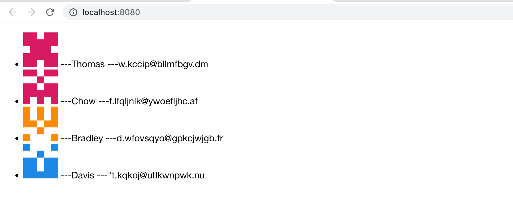
We delete the original sample code and replace it with a simple point of contact list:
|
|
35
35
|
|
|
36
36
|
```tsx title="src/routes/page.tsx"
|
|
37
37
|
const getAvatar = (users: Array<{ name: string; email: string }>) =>
|
|
@@ -64,21 +64,21 @@ function App() {
|
|
|
64
64
|
export default App;
|
|
65
65
|
```
|
|
66
66
|
|
|
67
|
-
|
|
67
|
+
Remove redundant css files and keep the directory free of redundant files:
|
|
68
68
|
|
|
69
69
|
```bash
|
|
70
70
|
rm src/routes/index.css
|
|
71
71
|
```
|
|
72
72
|
|
|
73
|
-
|
|
73
|
+
Since the framework supports [HMR](https://webpack.js.org/concepts/hot-module-replacement/) by default, you can see that the content in http://localhost:8080/ is automatically updated to:
|
|
74
74
|
|
|
75
75
|
|
|
76
76
|
|
|
77
|
-
|
|
77
|
+
The page has no styles at the moment. The next chapter will expand on this section.
|
|
78
78
|
|
|
79
|
-
##
|
|
79
|
+
## Enable SSR
|
|
80
80
|
|
|
81
|
-
|
|
81
|
+
Next, we modify the `modern.config.ts` in the project to enable the SSR capability:
|
|
82
82
|
|
|
83
83
|
```ts
|
|
84
84
|
import AppToolsPlugin, { defineConfig } from '@modern-js/app-tools';
|
|
@@ -96,4 +96,4 @@ export default defineConfig({
|
|
|
96
96
|
});
|
|
97
97
|
```
|
|
98
98
|
|
|
99
|
-
|
|
99
|
+
Re-execute `pnpm run dev` to find that the project has completed page rendering at the server level.
|
|
@@ -1,24 +1,24 @@
|
|
|
1
1
|
---
|
|
2
|
-
title:
|
|
2
|
+
title: Add UI Components
|
|
3
3
|
---
|
|
4
4
|
|
|
5
|
-
|
|
5
|
+
In the previous chapter, we learned how to initialize a project and use configuration to modify the default behavior of Modern.js.
|
|
6
6
|
|
|
7
|
-
|
|
7
|
+
In this chapter, we continue to use the project code of the previous chapter and continue to improve the point of contact list.
|
|
8
8
|
|
|
9
|
-
|
|
9
|
+
In order to do better UI display and interaction, we introduce the component library [Antd](https://ant.design/index-cn) to develop, and use the `<List>` component instead of the primitive list. Add dependency first:
|
|
10
10
|
|
|
11
11
|
```bash
|
|
12
12
|
pnpm add antd
|
|
13
13
|
```
|
|
14
14
|
|
|
15
|
-
|
|
15
|
+
Modify `src/routes/page.tsx` to import components at the top:
|
|
16
16
|
|
|
17
17
|
```ts
|
|
18
18
|
import { List } from 'antd';
|
|
19
19
|
```
|
|
20
20
|
|
|
21
|
-
|
|
21
|
+
Modify the implementation of the `<App>` component:
|
|
22
22
|
|
|
23
23
|
```tsx
|
|
24
24
|
function App() {
|
|
@@ -41,16 +41,16 @@ function App() {
|
|
|
41
41
|
}
|
|
42
42
|
```
|
|
43
43
|
|
|
44
|
-
|
|
44
|
+
Execute `pnpm run dev` to see the running results:
|
|
45
45
|
|
|
46
46
|
|
|
47
47
|
|
|
48
|
-
|
|
48
|
+
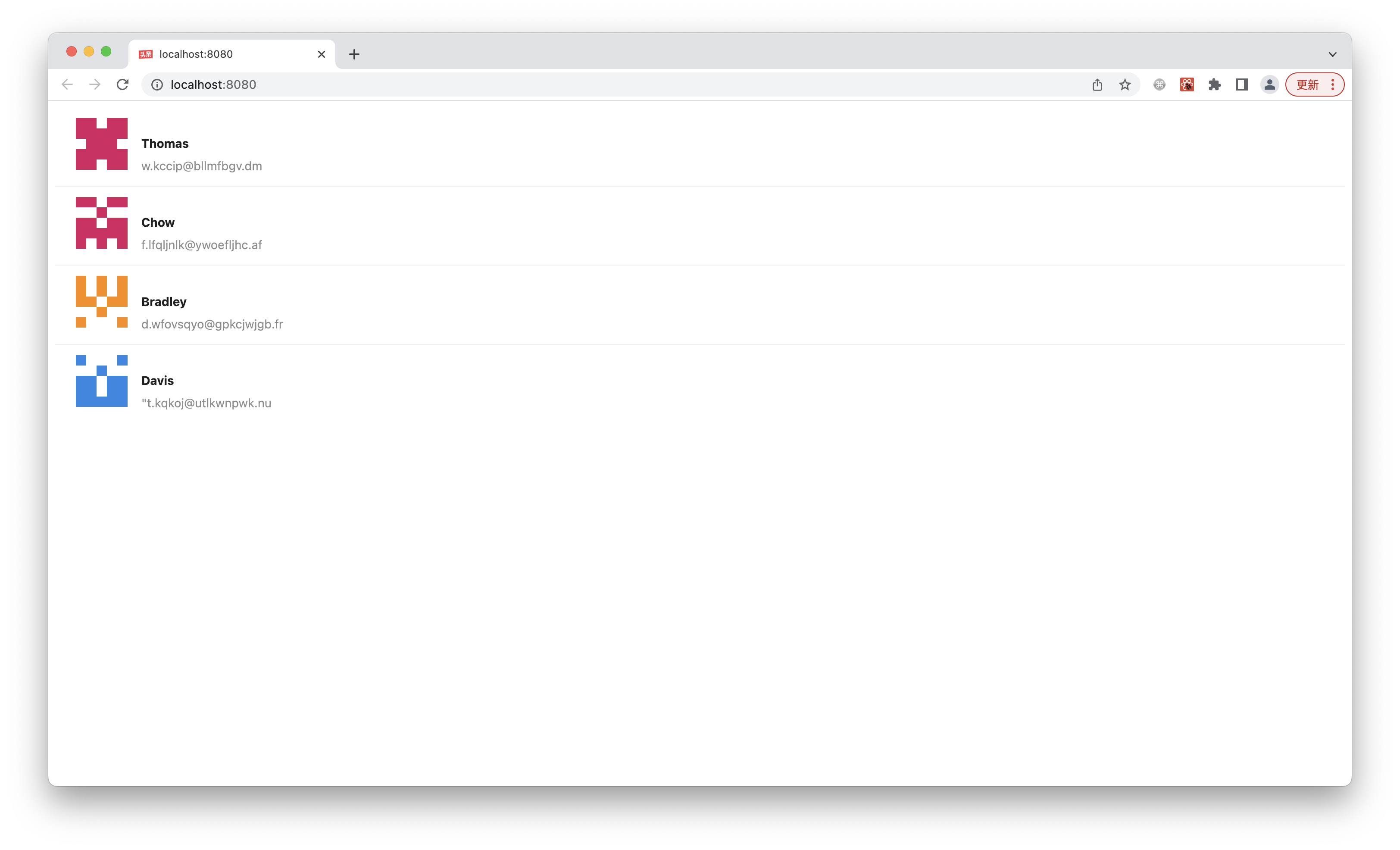
You can see that the components exported by Ant Design already have complete styles.
|
|
49
49
|
|
|
50
|
-
:::info
|
|
51
|
-
Modern.js
|
|
50
|
+
:::info note
|
|
51
|
+
Modern.js [Automatically import CSS required by Ant Design component on demand](https://github.com/ant-design/babel-plugin-import).
|
|
52
52
|
:::
|
|
53
53
|
|
|
54
54
|
:::note
|
|
55
|
-
|
|
55
|
+
We can also use other component libraries to implement the same functionality, such as [Arco Design](https://arco.design/).
|
|
56
56
|
:::
|
|
@@ -1,31 +1,31 @@
|
|
|
1
1
|
---
|
|
2
|
-
title:
|
|
2
|
+
title: Add Style
|
|
3
3
|
---
|
|
4
4
|
|
|
5
5
|
import Tabs from '@theme/Tabs';
|
|
6
6
|
import TabItem from '@theme/TabItem';
|
|
7
7
|
|
|
8
|
-
|
|
8
|
+
In the previous chapter, we learned how to use components from the three-way library.
|
|
9
9
|
|
|
10
|
-
|
|
10
|
+
In this chapter, we will learn how to implement UI components.
|
|
11
11
|
|
|
12
|
-
##
|
|
12
|
+
## JS components using CSS
|
|
13
13
|
|
|
14
|
-
|
|
14
|
+
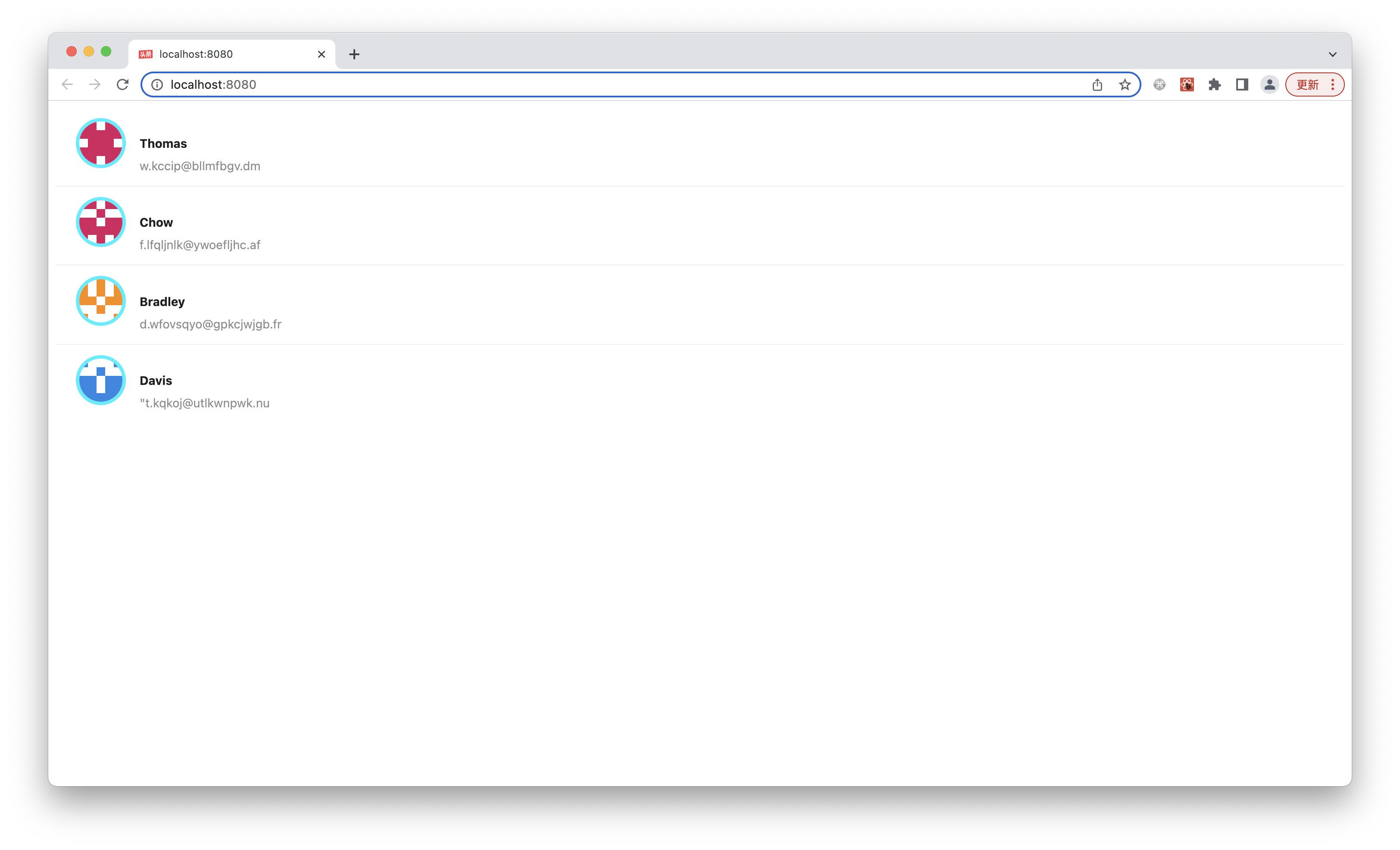
First of all, we want to control the display of contact avatars by ourselves, and implement this design draft:
|
|
15
15
|
|
|
16
16
|

|
|
17
17
|
|
|
18
|
-
|
|
18
|
+
Hypothesis has no ready-made components to implement, so you need to write some CSS yourself. Here we use [styled-components] (https://styled-components.com/) to implement similar requirements. Modern.js out of the box supports styled-components, which requires neither dependency nor configuration.
|
|
19
19
|
|
|
20
|
-
|
|
20
|
+
Style-components avoids many problems of traditional CSS writing through modularization. For example, writing styles directly on the style attribute of elements, the visual details of UI will also be mixed with the details of UI structure and business logic. Or classname needs to avoid global space renaming, which requires the use of naming conventions.
|
|
21
21
|
|
|
22
|
-
|
|
22
|
+
Modify the code at the top in `src/routes/page.tsx`:
|
|
23
23
|
|
|
24
24
|
```js
|
|
25
25
|
import styled from '@modern-js/runtime/styled';
|
|
26
26
|
```
|
|
27
27
|
|
|
28
|
-
|
|
28
|
+
Add the following code:
|
|
29
29
|
|
|
30
30
|
```js
|
|
31
31
|
const Avatar = styled.img`
|
|
@@ -36,7 +36,7 @@ const Avatar = styled.img`
|
|
|
36
36
|
`;
|
|
37
37
|
```
|
|
38
38
|
|
|
39
|
-
|
|
39
|
+
Modify the code of `List.Item.Meta`:
|
|
40
40
|
|
|
41
41
|
```tsx
|
|
42
42
|
<List.Item.Meta
|
|
@@ -46,11 +46,12 @@ const Avatar = styled.img`
|
|
|
46
46
|
/>
|
|
47
47
|
```
|
|
48
48
|
|
|
49
|
-
|
|
49
|
+
Execute `pnpm run dev` to see the expected running result:
|
|
50
50
|
|
|
51
51
|
|
|
52
52
|
|
|
53
|
-
|
|
53
|
+
Next we do a little refactoring. To enhance legibility and make the code easier to maintain, we can split the Avatar component. We execute the following command at the end point to create a new file:
|
|
54
|
+
|
|
54
55
|
|
|
55
56
|
<Tabs>
|
|
56
57
|
<TabItem value="macOS" label="macOS" default>
|
|
@@ -71,13 +72,13 @@ ni src/components/Avatar/index.tsx
|
|
|
71
72
|
</TabItem>
|
|
72
73
|
</Tabs>
|
|
73
74
|
|
|
74
|
-
|
|
75
|
+
Delete the `<Avatar>` implementation in `src/routes/page.tsx` and change it to:
|
|
75
76
|
|
|
76
77
|
```ts
|
|
77
78
|
import Avatar from '../components/Avatar';
|
|
78
79
|
```
|
|
79
80
|
|
|
80
|
-
`src/components/Avatar/index.tsx`
|
|
81
|
+
The content of `src/components/Avatar/index.tsx` is modified to:
|
|
81
82
|
|
|
82
83
|
```ts
|
|
83
84
|
import styled from '@modern-js/runtime/styled';
|
|
@@ -92,33 +93,32 @@ const Avatar = styled.img`
|
|
|
92
93
|
export default Avatar;
|
|
93
94
|
```
|
|
94
95
|
|
|
95
|
-
|
|
96
|
+
Execute `pnpm run dev`, the result should be the same.
|
|
96
97
|
|
|
97
|
-
:::info
|
|
98
|
-
|
|
98
|
+
:::info note
|
|
99
|
+
The reason for using the directory form `Avatar/index.tsx` instead of the single-file form `Avatar.tsx` is that you can easily add sub-files inside the directory later, including dedicated resources (pictures, etc.), dedicated sub-components, CSS files, etc.
|
|
99
100
|
:::
|
|
100
101
|
|
|
102
|
+
## Utility
|
|
101
103
|
|
|
102
|
-
|
|
103
|
-
|
|
104
|
-
我们已经使用 style-components 实现 `<Avatar>` 组件,但当前的 UI 仍然不能让人满意,缺乏专业感,例如列表项内部的布局有点粗糙,很多地方没对齐。
|
|
104
|
+
We have used the style-components implementation `<Avatar>` component, but the current UI is still unsatisfactory and lacks professionalism, such as the list item inhouse layout is a bit rough and misaligned in many places.
|
|
105
105
|
|
|
106
|
-
|
|
106
|
+
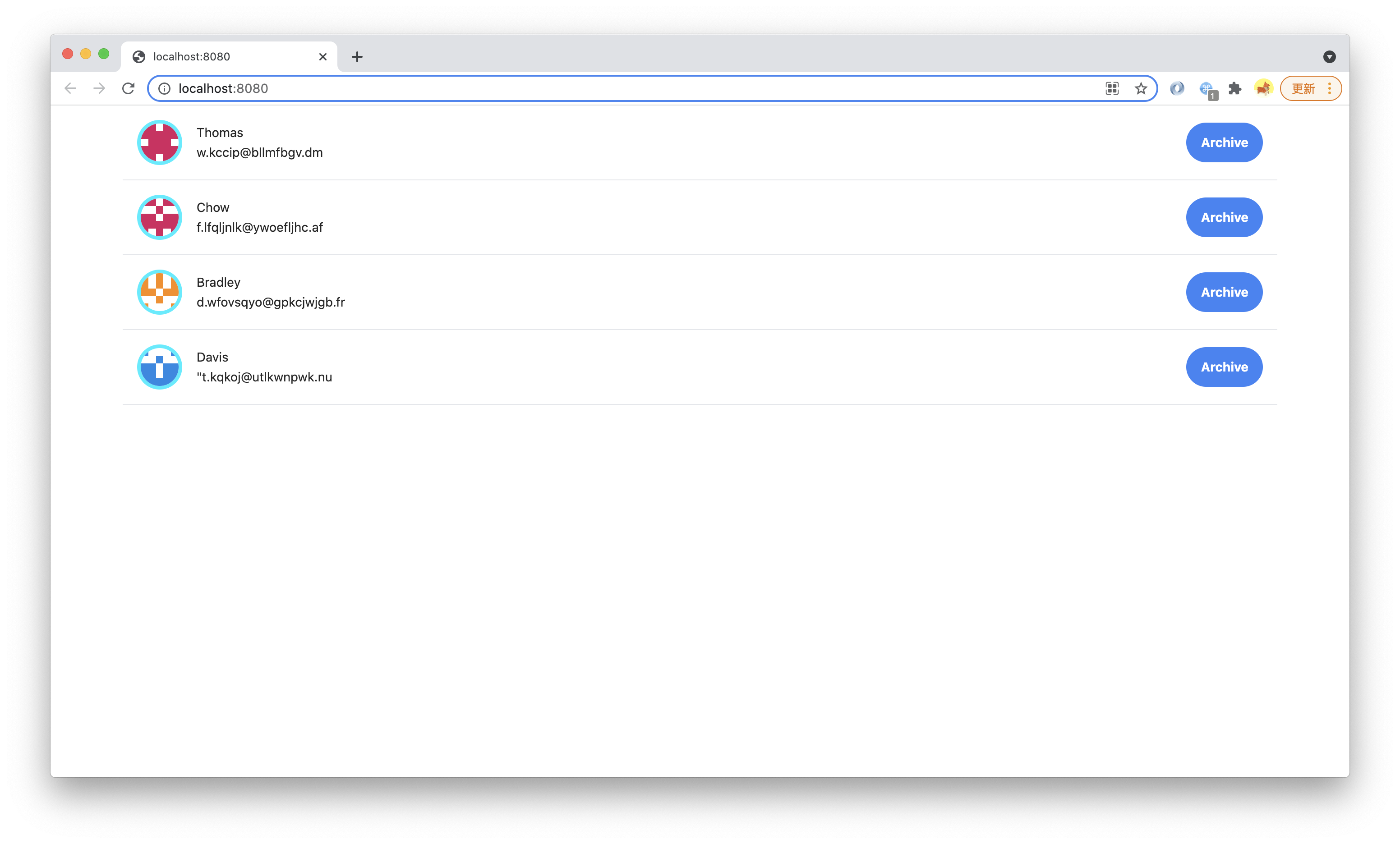
Now, let's implement a better `Item` component ourselves, implementing a design draft like this:
|
|
107
107
|
|
|
108
108
|

|
|
109
109
|
|
|
110
|
-
|
|
110
|
+
The UI to be implemented this time is more complex and has an internal structure, but on the other hand, there is no very thick bright blue border of the `<Avatar>` component such a very special UI, which is a very conventional horizontal and vertical layout, centering, font style, etc. In this case, there is actually no need to write CSS at all. There is a more efficient implementation method that complements styled-components: **Utility Class**.
|
|
111
111
|
|
|
112
|
-
Modern.js
|
|
112
|
+
Modern.js integrates the mainstream, light, general-purpose Utility Class library [Tailwind CSS](https://tailwindcss.com/).
|
|
113
113
|
|
|
114
|
-
|
|
114
|
+
Execute `pnpm run new` and select the following to start Tailwind CSS:
|
|
115
115
|
|
|
116
116
|
```bash
|
|
117
|
-
?
|
|
118
|
-
?
|
|
117
|
+
? Action: Enable features
|
|
118
|
+
? Enable features: Enable Tailwind CSS
|
|
119
119
|
```
|
|
120
120
|
|
|
121
|
-
|
|
121
|
+
Register the Tailwind plugin in `modern.config.ts`:
|
|
122
122
|
|
|
123
123
|
```ts title="modern.config.ts"
|
|
124
124
|
import AppToolsPlugin, { defineConfig } from '@modern-js/app-tools';
|
|
@@ -137,7 +137,7 @@ export default defineConfig({
|
|
|
137
137
|
});
|
|
138
138
|
```
|
|
139
139
|
|
|
140
|
-
|
|
140
|
+
Import the Tailwind CSS css file at the top of `src/routes/page.tsx` to start a quick implementation of the professional UI:
|
|
141
141
|
|
|
142
142
|
```js
|
|
143
143
|
import 'tailwindcss/base.css';
|
|
@@ -145,7 +145,7 @@ import 'tailwindcss/components.css';
|
|
|
145
145
|
import 'tailwindcss/utilities.css';
|
|
146
146
|
```
|
|
147
147
|
|
|
148
|
-
|
|
148
|
+
Create the Item component first:
|
|
149
149
|
|
|
150
150
|
<Tabs>
|
|
151
151
|
<TabItem value="macOS" label="macOS" default>
|
|
@@ -166,7 +166,7 @@ ni src/components/Item/index.tsx
|
|
|
166
166
|
</TabItem>
|
|
167
167
|
</Tabs>
|
|
168
168
|
|
|
169
|
-
|
|
169
|
+
Modify `src/routes/page.tsx` to pass the `render` implementation of `List` to `Item` component:
|
|
170
170
|
|
|
171
171
|
```js
|
|
172
172
|
import { List } from 'antd';
|
|
@@ -202,9 +202,9 @@ function Index() {
|
|
|
202
202
|
export default Index;
|
|
203
203
|
```
|
|
204
204
|
|
|
205
|
-
|
|
205
|
+
Utility Class(https://tailwindcss.com/docs/container) is used on the parent container for a quick implementation of the most basic maximum width, center, and other styles.
|
|
206
206
|
|
|
207
|
-
|
|
207
|
+
Next implementation `src/components/Item/index.tsx`:
|
|
208
208
|
|
|
209
209
|
```tsx
|
|
210
210
|
import Avatar from '../Avatar';
|
|
@@ -242,20 +242,19 @@ const Item = ({ info }: { info: InfoProps }) => {
|
|
|
242
242
|
export default Item;
|
|
243
243
|
```
|
|
244
244
|
|
|
245
|
-
|
|
245
|
+
Execute `pnpm run dev` to see the expected running result:
|
|
246
246
|
|
|
247
247
|
|
|
248
248
|
|
|
249
|
-
|
|
250
|
-
|
|
249
|
+
We only use a few Utility Classes, such as [Flex](https://tailwindcss.com/docs/display/), [Padding](https://tailwindcss.com/docs/padding/), [Margin](https://tailwindcss.com/docs/margin/), [Text](https://tailwindcss.com/docs/text-color/), [Font](https://tailwindcss.com/docs/font-weight/), [Border](https://tailwindcss.com/docs/border-width), without writing a single CSS implementation Professional UI that conforms to the design draft.
|
|
251
250
|
|
|
252
|
-
##
|
|
251
|
+
## Customized Utility Class
|
|
253
252
|
|
|
254
|
-
|
|
253
|
+
We can also implement the new Utility Class ourselves to facilitate reuse between codes.
|
|
255
254
|
|
|
256
|
-
Utility Class
|
|
255
|
+
Utility Class itself is also a **component-oriented** technology (using different classes on a component is equivalent to setting some attributes from the base class for this component), but the classname of Utility Class is global (because it is used on arbitrary components/elements), it is very suitable for implementation with separate CSS files.
|
|
257
256
|
|
|
258
|
-
|
|
257
|
+
Create a new CSS file:
|
|
259
258
|
|
|
260
259
|
<Tabs>
|
|
261
260
|
<TabItem value="macOS" label="macOS" default>
|
|
@@ -282,7 +281,7 @@ ni src/styles/utils.css
|
|
|
282
281
|
import '../styles/utils.css';
|
|
283
282
|
```
|
|
284
283
|
|
|
285
|
-
|
|
284
|
+
A Utility Class named `custom-text-gray` is implemented in `src/routes/styles/utils.css`.
|
|
286
285
|
|
|
287
286
|
```css
|
|
288
287
|
:root {
|
|
@@ -294,31 +293,31 @@ import '../styles/utils.css';
|
|
|
294
293
|
}
|
|
295
294
|
```
|
|
296
295
|
|
|
297
|
-
:::info
|
|
298
|
-
Modern.js
|
|
296
|
+
:::info note
|
|
297
|
+
Modern.js integrates with [PostCSS](/docs/guides/basic-features/css/postcss) and supports modern CSS syntax features such as [custom properties](https://developer.mozilla.org/en-US/docs/Web/CSS/-- *).
|
|
299
298
|
:::
|
|
300
299
|
|
|
301
|
-
|
|
300
|
+
Use in `src/routes/components/Item/index.tsx`:
|
|
302
301
|
|
|
303
302
|
```js
|
|
304
303
|
<div className="ml-4 flex-1 flex justify-between">
|
|
305
304
|
```
|
|
306
305
|
|
|
307
|
-
|
|
306
|
+
Change to:
|
|
308
307
|
|
|
309
308
|
```js
|
|
310
309
|
<div className="ml-4 custom-text-gray flex-1 flex justify-between">
|
|
311
310
|
```
|
|
312
311
|
|
|
313
|
-
|
|
312
|
+
Execute `pnpm run dev`, you can see that the font color has changed:
|
|
314
313
|
|
|
315
314
|
|
|
316
315
|
|
|
317
|
-
:::info
|
|
318
|
-
|
|
316
|
+
:::info note
|
|
317
|
+
This is just to demonstrate Utility Class usage. In a real project, with Tailwind CSS, this Utility Class is of little value and should be added to the font color through the [**theme**](https://tailwindcss.com/docs/customizing-colors) of the configuration Design System.
|
|
319
318
|
|
|
320
|
-
`utils.css`
|
|
319
|
+
`utils.css` can also be written as `utils.scss` or `utils.less`, Modern.js out of the box support for SCSS and Less.
|
|
321
320
|
|
|
322
|
-
|
|
321
|
+
However, with the support of PostCSS, modern CSS should be sufficient to meet these development needs, and the performance is also better than that of the preprocessor. It is recommended to use `.css` files first.
|
|
323
322
|
:::
|
|
324
323
|
|
|
@@ -1,17 +1,17 @@
|
|
|
1
1
|
---
|
|
2
|
-
title:
|
|
2
|
+
title: Add Client Route
|
|
3
3
|
---
|
|
4
4
|
|
|
5
5
|
import Tabs from '@theme/Tabs';
|
|
6
6
|
import TabItem from '@theme/TabItem';
|
|
7
7
|
|
|
8
|
-
|
|
8
|
+
In the previous chapter, we learned how to create UI components and add styles.
|
|
9
9
|
|
|
10
|
-
|
|
10
|
+
In this chapter, we will learn how to add **Client Route**.
|
|
11
11
|
|
|
12
|
-
|
|
12
|
+
Previously we have added the Archive button to the point of contact list, next we add a route `/archives`, when accessing this route, only the point of contact of the saved file is displayed, while the original `/` continues to display all points of contact.
|
|
13
13
|
|
|
14
|
-
|
|
14
|
+
Create a new `src/routes/archives/page.tsx` file:
|
|
15
15
|
|
|
16
16
|
<Tabs>
|
|
17
17
|
<TabItem value="macOS" label="macOS" default>
|
|
@@ -32,7 +32,7 @@ ni src/routes/archives/page.tsx
|
|
|
32
32
|
</TabItem>
|
|
33
33
|
</Tabs>
|
|
34
34
|
|
|
35
|
-
|
|
35
|
+
Add the following code:
|
|
36
36
|
|
|
37
37
|
```tsx title="src/archives/page.tsx"
|
|
38
38
|
import { List } from 'antd';
|
|
@@ -67,7 +67,7 @@ function Index() {
|
|
|
67
67
|
export default Index;
|
|
68
68
|
```
|
|
69
69
|
|
|
70
|
-
|
|
70
|
+
The `Helmet` component of [React Helmet](https://github.com/nfl/react-helmet) is used here, and the Helmet component is also added in `src/routes/page.tsx`:
|
|
71
71
|
|
|
72
72
|
```tsx
|
|
73
73
|
import { Helmet } from '@modern-js/runtime/head';
|
|
@@ -84,11 +84,11 @@ function Index() {
|
|
|
84
84
|
}
|
|
85
85
|
```
|
|
86
86
|
|
|
87
|
-
:::info
|
|
88
|
-
Modern.js
|
|
87
|
+
:::info note
|
|
88
|
+
Modern.js integrates react-helmet by default, and can also be used in conjunction with SSR to meet SEO needs.
|
|
89
89
|
:::
|
|
90
90
|
|
|
91
|
-
|
|
91
|
+
Since there are multiple pages now, all of which need to use the previous Utility Class, we need to move the style file to `src/routes/layout.tsx`:
|
|
92
92
|
|
|
93
93
|
```tsx
|
|
94
94
|
import 'tailwindcss/base.css';
|
|
@@ -97,25 +97,25 @@ import 'tailwindcss/utilities.css';
|
|
|
97
97
|
import '../styles/utils.css';
|
|
98
98
|
```
|
|
99
99
|
|
|
100
|
-
|
|
100
|
+
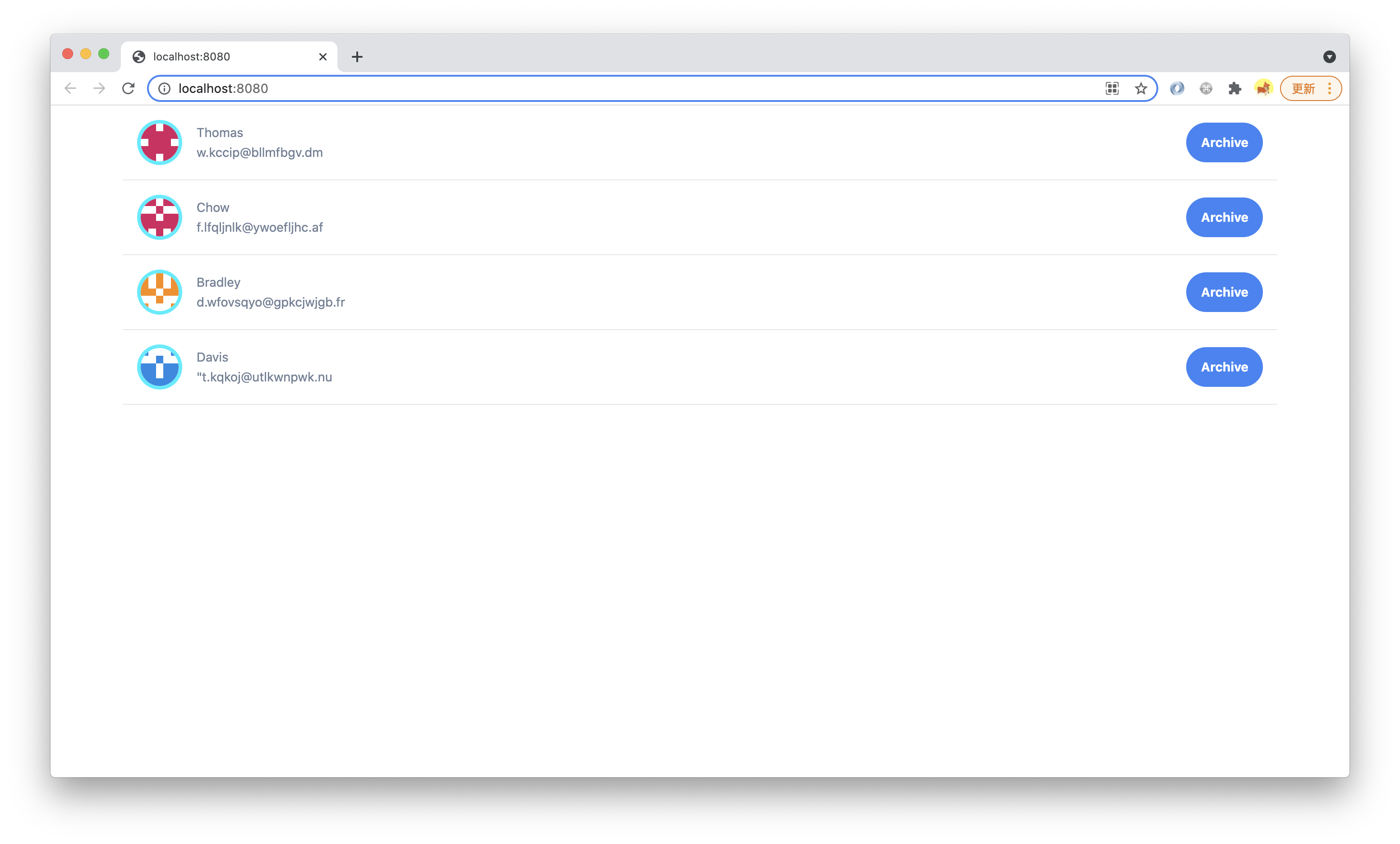
Execute `pnpm run dev`, visit `http://localhost:8080`, you can see the full point of contact, the title of the page is All:
|
|
101
101
|
|
|
102
102
|
|
|
103
103
|
|
|
104
|
-
|
|
104
|
+
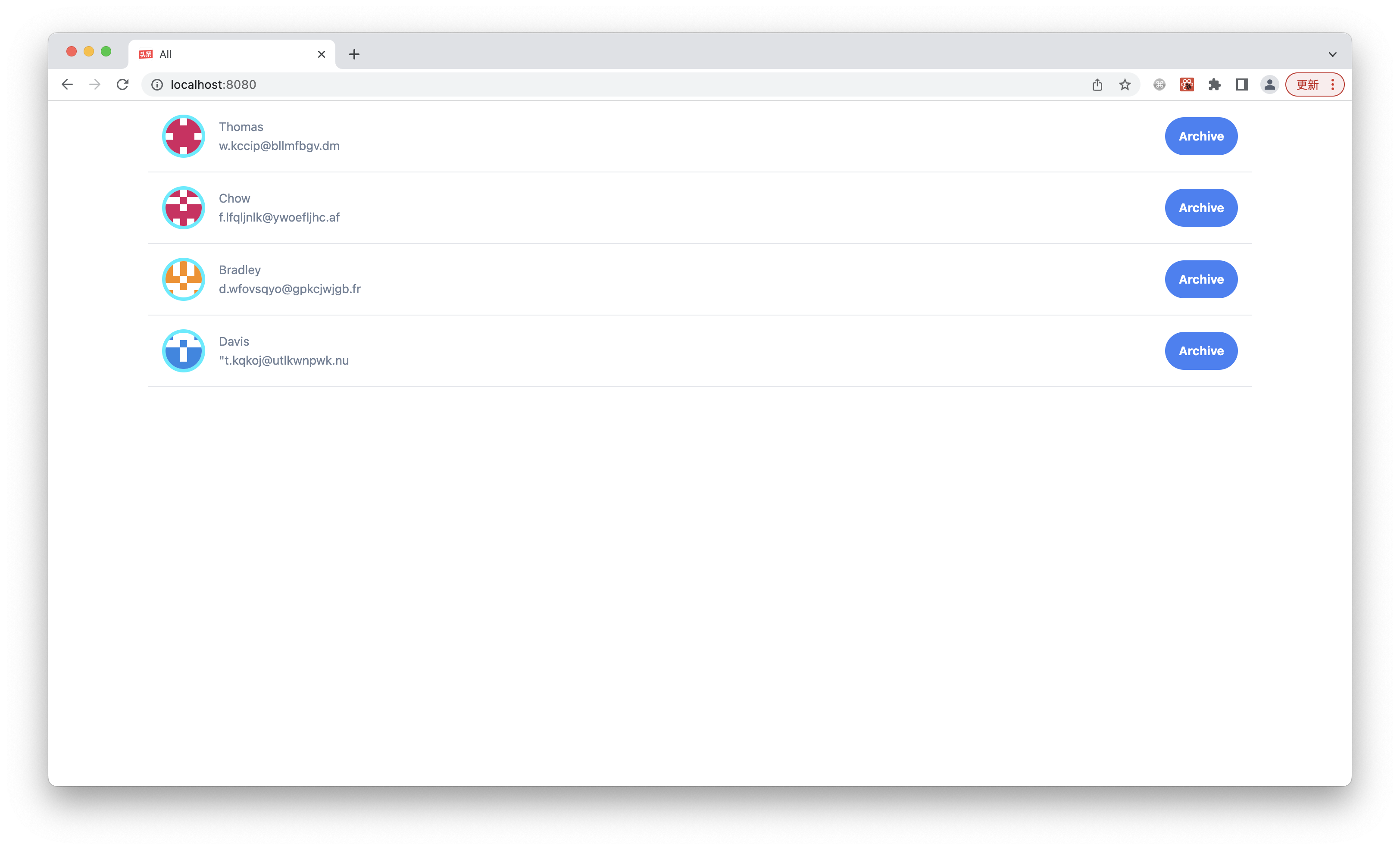
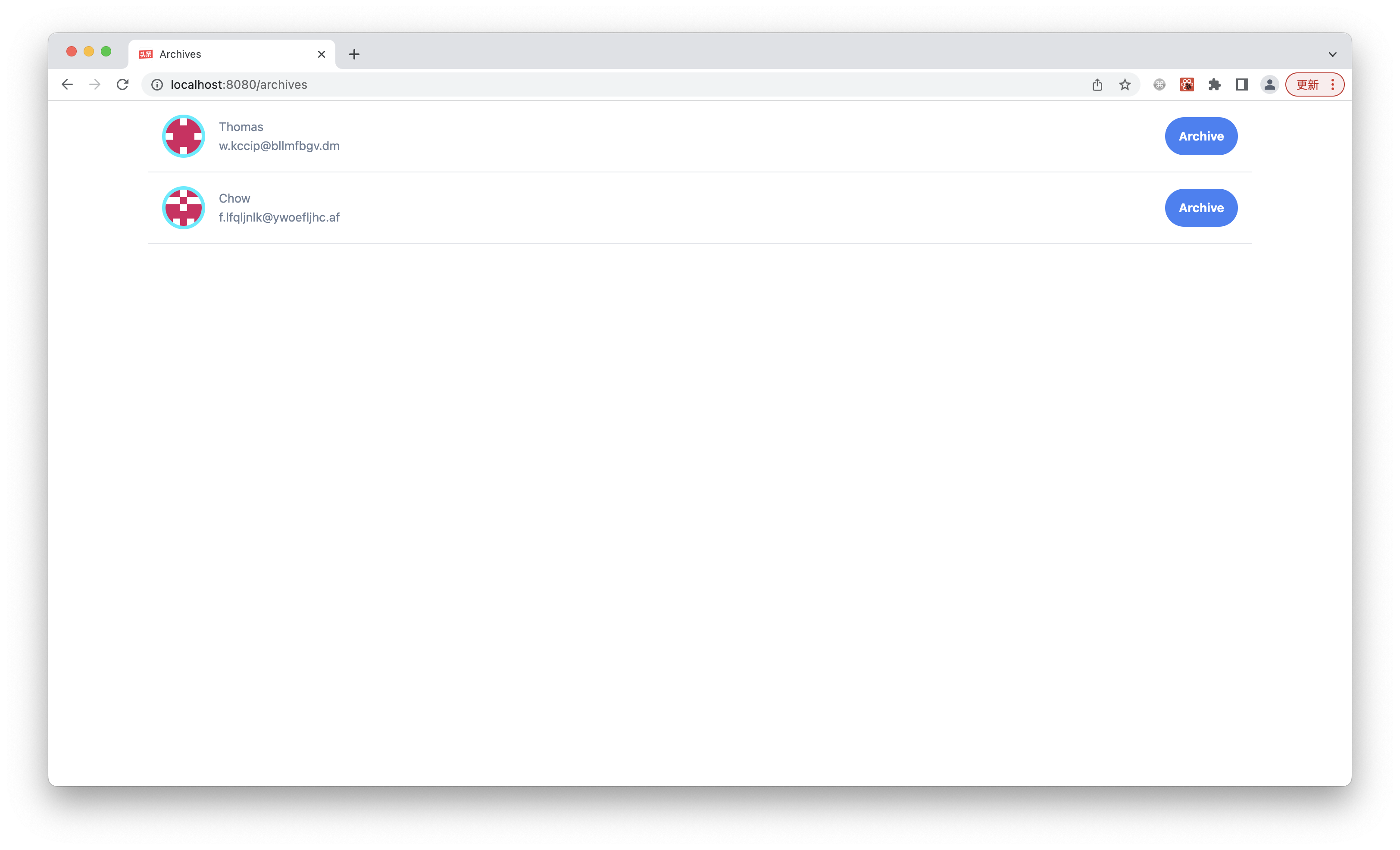
Visit `http://localhost:8080/archives` and you will only see the point of contact of the saved file with the title Archives:
|
|
105
105
|
|
|
106
106
|
|
|
107
107
|
|
|
108
|
-
|
|
108
|
+
Looking at the HTML source code of the page, you can see that the content of the two pages is the same, and different content is rendered for different URLs.
|
|
109
109
|
|
|
110
|
-
|
|
110
|
+
**Next we add a simple navigation bar that allows the user to toggle between the two lists**.
|
|
111
111
|
|
|
112
|
-
|
|
112
|
+
Open `src/routes/layout.tsx` and import the Radio component at the top:
|
|
113
113
|
|
|
114
114
|
```tsx
|
|
115
115
|
import { Radio } from 'antd';
|
|
116
116
|
```
|
|
117
117
|
|
|
118
|
-
|
|
118
|
+
Then modify the top of the UI to add a set of radio group:
|
|
119
119
|
|
|
120
120
|
```tsx {4-9}
|
|
121
121
|
export default function Layout() {
|
|
@@ -133,9 +133,9 @@ export default function Layout() {
|
|
|
133
133
|
}
|
|
134
134
|
```
|
|
135
135
|
|
|
136
|
-
|
|
136
|
+
Then we come to the implementation of `currentList` and `handleSetList`.
|
|
137
137
|
|
|
138
|
-
|
|
138
|
+
Introducing three React Hooks: `useState` and `useNavigate` and `useParams`, as well as Ant Design's event type definition:
|
|
139
139
|
|
|
140
140
|
```js
|
|
141
141
|
import { useState } from 'react';
|
|
@@ -143,7 +143,7 @@ import { Radio, RadioChangeEvent } from 'antd';
|
|
|
143
143
|
import { Outlet, useLocation, useNavigate } from "@modern-js/runtime/router";
|
|
144
144
|
```
|
|
145
145
|
|
|
146
|
-
|
|
146
|
+
Finally, add local state and related logic to the Layout component:
|
|
147
147
|
|
|
148
148
|
```tsx {2-9}
|
|
149
149
|
export default function Layout() {
|
|
@@ -160,10 +160,10 @@ export default function Layout() {
|
|
|
160
160
|
}
|
|
161
161
|
```
|
|
162
162
|
|
|
163
|
-
|
|
163
|
+
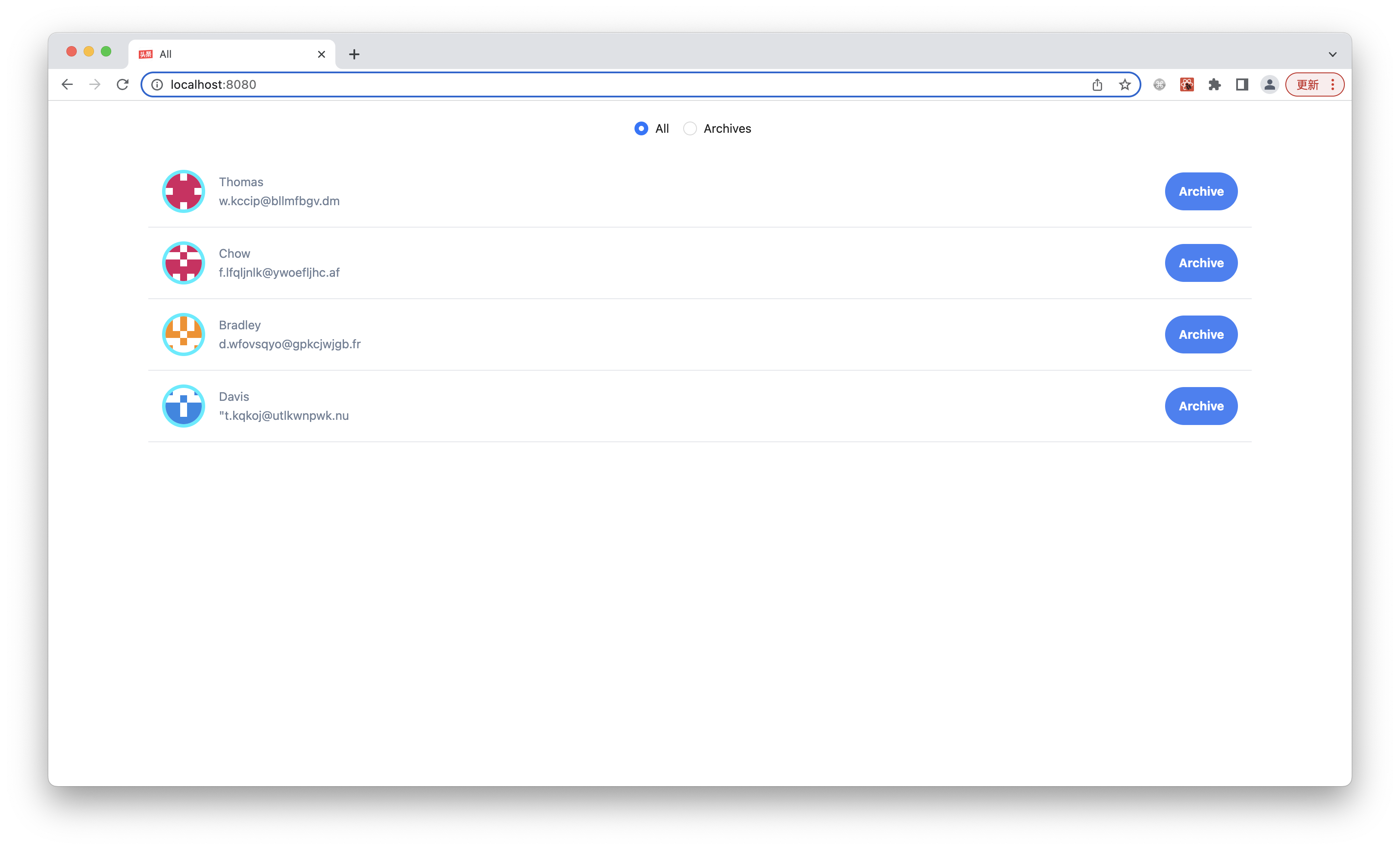
At this point, the page navigation bar implementation has been completed, and execute `pnpm run dev` to see the effect:
|
|
164
164
|
|
|
165
165
|
|
|
166
166
|
|
|
167
|
-
|
|
167
|
+
Click Archives in the navigation bar, you can see that the selected state and URL of the radio box will change, the page is not refreshed, only CSR occurs.
|
|
168
168
|
|
|
169
|
-
|
|
169
|
+
Accessing the two pages through the URL, you can see that the HTML content is different, because the page executes the logic of client routing in the SSR stage, and the HTML already contains the final render result.
|