@modern-js/main-doc 0.0.0-next-20230227112244 → 0.0.0-next-20230228053934
This diff represents the content of publicly available package versions that have been released to one of the supported registries. The information contained in this diff is provided for informational purposes only and reflects changes between package versions as they appear in their respective public registries.
- package/CHANGELOG.md +2 -2
- package/en/apis/app/hooks/config/upload.mdx +10 -0
- package/en/guides/{css/tailwindcss.mdx → basic-features/css.mdx} +60 -3
- package/en/guides/basic-features/env-vars.mdx +4 -0
- package/en/tutorials/first-app/c03-css.mdx +1 -1
- package/package.json +3 -3
- package/zh/apis/app/hooks/config/upload.mdx +12 -2
- package/zh/guides/{css/tailwindcss.mdx → basic-features/css.mdx} +60 -3
- package/zh/guides/basic-features/env-vars.mdx +4 -0
- package/zh/tutorials/first-app/c03-css.mdx +1 -1
- package/en/guides/css/_category_.json +0 -5
- package/en/guides/css/css-in-js.mdx +0 -40
- package/en/guides/css/css-modules.mdx +0 -87
- package/en/guides/css/less-sass.mdx +0 -17
- package/en/guides/css/postcss.mdx +0 -79
- package/zh/guides/css/_category_.json +0 -5
- package/zh/guides/css/css-in-js.mdx +0 -40
- package/zh/guides/css/css-modules.mdx +0 -87
- package/zh/guides/css/less-sass.mdx +0 -17
- package/zh/guides/css/postcss.mdx +0 -80
package/CHANGELOG.md
CHANGED
|
@@ -26,6 +26,16 @@ If the file ends with `.min.js`, it will not compression.
|
|
|
26
26
|
|
|
27
27
|
## More Usage
|
|
28
28
|
|
|
29
|
+
In React components, this prefix can be added via [built-in environment variables](/guides/basic-features/env-vars.html#asset_prefix):
|
|
30
|
+
|
|
31
|
+
```tsx
|
|
32
|
+
export default () => {
|
|
33
|
+
return (
|
|
34
|
+
<img src={`${process.env.ASSET_PREFIX}/upload/banner.png`}></img>
|
|
35
|
+
);
|
|
36
|
+
};
|
|
37
|
+
```
|
|
38
|
+
|
|
29
39
|
Whether in [custom HTML](/guides/basic-features/html), or in any HTML file under ['config/public/'](/apis/app/hooks/config/public), you can directly use the HTML tag to refer to the resources in the `config/upload/`:
|
|
30
40
|
|
|
31
41
|
```html
|
|
@@ -2,7 +2,64 @@
|
|
|
2
2
|
sidebar_position: 2
|
|
3
3
|
---
|
|
4
4
|
|
|
5
|
-
#
|
|
5
|
+
# CSS Solutions
|
|
6
|
+
|
|
7
|
+
Modern.js has built-in multiple CSS solutions, including Less / Sass / Stylus preprocessor, PostCSS, CSS Modules, CSS-in-JS and Tailwind CSS.
|
|
8
|
+
|
|
9
|
+
## Using Less, Sass and Stylus
|
|
10
|
+
|
|
11
|
+
Modern.js has built-in community popular CSS preprocessors such as Less, Sass.
|
|
12
|
+
|
|
13
|
+
By default, you don't need to configure anything for Less and Sass. If you need to customize loader config, you can configure [tools.less](/configure/app/tools/less), [tools.sass](/configure/app/tools/sass) to set it up.
|
|
14
|
+
|
|
15
|
+
You can also use Stylus in Modern.js, just install the Stylus plugin provided by Modern.js Builder, please refer to [Stylus Plugin](https://modernjs.dev/builder/en/plugins/plugin-stylus.html) for usage.
|
|
16
|
+
|
|
17
|
+
## Using PostCSS
|
|
18
|
+
|
|
19
|
+
Modern.js has built-in [PostCSS](https://postcss.org/) to transform the CSS code.
|
|
20
|
+
|
|
21
|
+
Please refer to [Modern.js Builder - Using PostCSS](https://modernjs.dev/builder/en/guide/basic/css-usage.html#using-postcss) for detailed usage.
|
|
22
|
+
|
|
23
|
+
## Using CSS Modules
|
|
24
|
+
|
|
25
|
+
Please read the [Using CSS Modules](https://modernjs.dev/builder/en/guide/basic/css-modules.html) chapter for a complete usage of CSS Modules.
|
|
26
|
+
|
|
27
|
+
## Using CSS-in-JS
|
|
28
|
+
|
|
29
|
+
CSS-in-JS is a technology that can write CSS styles in JS files.
|
|
30
|
+
|
|
31
|
+
Modern.js integrates the CSS-in-JS library [styled-components](https://styled-components.com/) commonly used in the community, which uses the new feature of JavaScript [Tagged template](https://developer.mozilla.org/en-US/docs/Web/JavaScript/Reference/Template_literals#tagged_templates) to write CSS styles for components. You can use the [styled-components](https://styled-components.com/) API directly from `@modern-js/runtime/styled`.
|
|
32
|
+
|
|
33
|
+
When you need to write a `div` component with an internal font in red, you can do the following implementation:
|
|
34
|
+
|
|
35
|
+
```js
|
|
36
|
+
import styled from '@modern-js/runtime/styled';
|
|
37
|
+
|
|
38
|
+
const RedDiv = styled.div`
|
|
39
|
+
color: red;
|
|
40
|
+
`;
|
|
41
|
+
```
|
|
42
|
+
|
|
43
|
+
When you need to dynamically set the component style according to the `props` of the component, for example, when the attribute `primary` of `props` is `true`, the color of the button is white, and otherwise it is red. The implementation code is as follows:
|
|
44
|
+
|
|
45
|
+
```js
|
|
46
|
+
import styled from '@modern-js/runtime/styled';
|
|
47
|
+
|
|
48
|
+
const Button = styled.button`
|
|
49
|
+
color: ${props => (props.primary ? 'white' : 'red')};
|
|
50
|
+
font-size: 1em;
|
|
51
|
+
`;
|
|
52
|
+
```
|
|
53
|
+
|
|
54
|
+
For more usage of styled-components, please refer to [[styled-components official website](https://styled-components.com/) ].
|
|
55
|
+
|
|
56
|
+
Modern.js uses the Babel plugin [babel-plugin-styled-components](https://github.com/styled-components/babel-plugin-styled-components) internally, and the plugin can be configured through [tools.styledComponents](/configure/app/tools/styled-components).
|
|
57
|
+
|
|
58
|
+
:::tip
|
|
59
|
+
If you need to use [styled-jsx](https://www.npmjs.com/package/styled-jsx), [Emotion](https://emotion.sh/) and other CSS-in-JS libraries, you need to install the dependency of the corresponding library first. For specific usage, please refer to the official website of the corresponding library.
|
|
60
|
+
:::
|
|
61
|
+
|
|
62
|
+
## Using Tailwind CSS
|
|
6
63
|
|
|
7
64
|
[Tailwind CSS](https://tailwindcss.com/) is a CSS framework and design system based on Utility Class, which can quickly add common styles to components, and support flexible extension of theme styles. To use [Tailwind CSS](https://tailwindcss.com/) in the Modern.js, just execute `pnpm run new` in the project root directory and turn it on.
|
|
8
65
|
|
|
@@ -36,7 +93,7 @@ According to different needs, you can optionally import the CSS files provided b
|
|
|
36
93
|
|
|
37
94
|
:::
|
|
38
95
|
|
|
39
|
-
|
|
96
|
+
### Tailwind CSS version
|
|
40
97
|
|
|
41
98
|
Modern.js supports both Tailwind CSS v2 and v3. The framework will recognize the version of `tailwindcss` in the project `package.json` and apply the corresponding configuration. By default, we install Tailwind CSS v3 for you.
|
|
42
99
|
|
|
@@ -54,7 +111,7 @@ Both Tailwind CSS v2 and v3 do not support IE 11 browsers. For background, pleas
|
|
|
54
111
|
|
|
55
112
|
If you use Tailwind CSS on IE 11 browser, some styles may not be available, please pay attention.
|
|
56
113
|
|
|
57
|
-
|
|
114
|
+
### Theme config
|
|
58
115
|
|
|
59
116
|
When you need to customize the [theme](https://tailwindcss.com/docs/theme) configuration of Tailwind CSS, you can modify it in the configuration [`source.designSystem`](/configure/app/source/design-system), for example, add a color theme `primary`:
|
|
60
117
|
|
|
@@ -8,6 +8,10 @@ Modern.js provides support for environment variables, including built-in environ
|
|
|
8
8
|
|
|
9
9
|
## Built-in Environment
|
|
10
10
|
|
|
11
|
+
### ASSET_PREFIX
|
|
12
|
+
|
|
13
|
+
The current path prefix of resource file, which is a **read-only** environment variable.
|
|
14
|
+
|
|
11
15
|
### NODE_ENV
|
|
12
16
|
|
|
13
17
|
The current execution environment and is a **read-only** environment variable whose have different values under different execution commands:
|
|
@@ -293,7 +293,7 @@ A Utility Class named `custom-text-gray` is implemented in `src/routes/styles/ut
|
|
|
293
293
|
```
|
|
294
294
|
|
|
295
295
|
:::info note
|
|
296
|
-
Modern.js integrates with [PostCSS](/guides/css
|
|
296
|
+
Modern.js integrates with [PostCSS](/guides/basic-features/css) and supports modern CSS syntax features such as [custom properties](https://developer.mozilla.org/en-US/docs/Web/CSS/Using_CSS_custom_properties).
|
|
297
297
|
|
|
298
298
|
:::
|
|
299
299
|
|
package/package.json
CHANGED
|
@@ -11,13 +11,13 @@
|
|
|
11
11
|
"modern",
|
|
12
12
|
"modern.js"
|
|
13
13
|
],
|
|
14
|
-
"version": "0.0.0-next-
|
|
14
|
+
"version": "0.0.0-next-20230228053934",
|
|
15
15
|
"publishConfig": {
|
|
16
16
|
"registry": "https://registry.npmjs.org/",
|
|
17
17
|
"access": "public"
|
|
18
18
|
},
|
|
19
19
|
"peerDependencies": {
|
|
20
|
-
"@modern-js/builder-doc": "0.0.0-next-
|
|
20
|
+
"@modern-js/builder-doc": "0.0.0-next-20230228053934"
|
|
21
21
|
},
|
|
22
22
|
"devDependencies": {
|
|
23
23
|
"ts-node": "^10",
|
|
@@ -25,7 +25,7 @@
|
|
|
25
25
|
"fs-extra": "^10",
|
|
26
26
|
"@types/node": "^16",
|
|
27
27
|
"@types/fs-extra": "^9",
|
|
28
|
-
"@modern-js/builder-doc": "0.0.0-next-
|
|
28
|
+
"@modern-js/builder-doc": "0.0.0-next-20230228053934"
|
|
29
29
|
},
|
|
30
30
|
"scripts": {
|
|
31
31
|
"build": "npx ts-node ./scripts/sync.ts"
|
|
@@ -26,13 +26,23 @@ sidebar_position: 4
|
|
|
26
26
|
|
|
27
27
|
## 更多用法
|
|
28
28
|
|
|
29
|
-
|
|
29
|
+
在 React 组件中,可以通过[内置环境变量](/guides/basic-features/env-vars.html#asset_prefix)来添加该前缀:
|
|
30
|
+
|
|
31
|
+
```tsx
|
|
32
|
+
export default () => {
|
|
33
|
+
return (
|
|
34
|
+
<img src={`${process.env.ASSET_PREFIX}/upload/banner.png`}></img>
|
|
35
|
+
);
|
|
36
|
+
};
|
|
37
|
+
```
|
|
38
|
+
|
|
39
|
+
另外,不论是在[自定义 HTML](/guides/basic-features/html) 中,或是在 [`config/public/`](/apis/app/hooks/config/public) 下的任意 HTML 文件中,都可以直接使用 HTML 标签引用 `config/upload/` 目录下的资源:
|
|
30
40
|
|
|
31
41
|
```html
|
|
32
42
|
<script src="/upload/index.js"></script>
|
|
33
43
|
```
|
|
34
44
|
|
|
35
|
-
如果设置了 [`output.assetPrefix`](/configure/app/output/asset-prefix) 前缀,也可以直接使用模板语法添加该前缀:
|
|
45
|
+
如果设置了 [`dev.assetPrefix`](/configure/app/dev/asset-prefix) 或 [`output.assetPrefix`](/configure/app/output/asset-prefix) 前缀,也可以直接使用模板语法添加该前缀:
|
|
36
46
|
|
|
37
47
|
```html
|
|
38
48
|
<script src="<%=assetPrefix %>/upload/index.js"></script>
|
|
@@ -2,7 +2,64 @@
|
|
|
2
2
|
sidebar_position: 2
|
|
3
3
|
---
|
|
4
4
|
|
|
5
|
-
#
|
|
5
|
+
# CSS 开发方案
|
|
6
|
+
|
|
7
|
+
Modern.js 内置多种常用的 CSS 开发方案,包括 Less / Sass / Stylus 预处理器、PostCSS、CSS Modules、CSS-in-JS 和 Tailwind CSS。
|
|
8
|
+
|
|
9
|
+
## 使用 Less、Sass 和 Stylus
|
|
10
|
+
|
|
11
|
+
Modern.js 内置了社区流行的 CSS 预处理器,包括 Less 和 Sass。
|
|
12
|
+
|
|
13
|
+
默认情况下,你不需要对 Less 和 Sass 进行任何配置。如果你有自定义 loader 配置的需求,可以通过配置 [tools.less](/configure/app/tools/less)、[tools.sass](/configure/app/tools/sass) 来进行设置。
|
|
14
|
+
|
|
15
|
+
你也可以在 Modern.js 中使用 Stylus,只需要安装 Modern.js Builder 提供的 Stylus 插件即可,使用方式请参考 [Stylus 插件](https://modernjs.dev/builder/plugins/plugin-stylus.html)。
|
|
16
|
+
|
|
17
|
+
## 使用 PostCSS
|
|
18
|
+
|
|
19
|
+
Modern.js 内置了 [PostCSS](https://postcss.org/) 来转换 CSS 代码。
|
|
20
|
+
|
|
21
|
+
请阅读 [Modern.js Builder - 使用 PostCSS](https://modernjs.dev/builder/guide/basic/css-usage.html#%E4%BD%BF%E7%94%A8-postcss) 了解更多用法。
|
|
22
|
+
|
|
23
|
+
## 使用 CSS Modules
|
|
24
|
+
|
|
25
|
+
请阅读 [使用 CSS Modules](https://modernjs.dev/builder/guide/basic/css-modules.html) 章节来了解 CSS Modules 的完整用法。
|
|
26
|
+
|
|
27
|
+
## 使用 CSS-in-JS
|
|
28
|
+
|
|
29
|
+
CSS-in-JS 是一种可以将 CSS 样式写在 JS 文件里的技术。
|
|
30
|
+
|
|
31
|
+
Modern.js 集成了社区常用的 CSS-in-JS 实现库 [styled-components](https://styled-components.com/),它使用 JavaScript 的新特性 [Tagged template](https://developer.mozilla.org/en-US/docs/Web/JavaScript/Reference/Template_literals#tagged_templates) 编写组件的 CSS 样式。可以直接从 `@modern-js/runtime/styled` 引入 [styled-components](https://styled-components.com/) 的 API 进行使用。
|
|
32
|
+
|
|
33
|
+
当需要编写一个内部字体为红色的 `div` 组件时,可以如下实现:
|
|
34
|
+
|
|
35
|
+
```js
|
|
36
|
+
import styled from '@modern-js/runtime/styled';
|
|
37
|
+
|
|
38
|
+
const RedDiv = styled.div`
|
|
39
|
+
color: red;
|
|
40
|
+
`;
|
|
41
|
+
```
|
|
42
|
+
|
|
43
|
+
当需要根据组件的 `props` 动态设置组件样式时,例如 `props` 的属性 `primary` 为 `true` 时,按钮的颜色为白色,其他情况为红色,实现代码如下:
|
|
44
|
+
|
|
45
|
+
```js
|
|
46
|
+
import styled from '@modern-js/runtime/styled';
|
|
47
|
+
|
|
48
|
+
const Button = styled.button`
|
|
49
|
+
color: ${props => (props.primary ? 'white' : 'red')};
|
|
50
|
+
font-size: 1em;
|
|
51
|
+
`;
|
|
52
|
+
```
|
|
53
|
+
|
|
54
|
+
关于 styled-components 的更多用法,请参考 [styled-components 官网](https://styled-components.com/)。
|
|
55
|
+
|
|
56
|
+
Modern.js 内部集成了 Babel 的 [babel-plugin-styled-components](https://github.com/styled-components/babel-plugin-styled-components) 插件,你可以通过 [tools.styledComponents](/configure/app/tools/styled-components) 对插件进行配置。
|
|
57
|
+
|
|
58
|
+
:::tip 提示
|
|
59
|
+
如果需要使用 [styled-jsx](https://www.npmjs.com/package/styled-jsx)、[Emotion](https://emotion.sh/) 等其他 CSS-in-JS 库,需要先安装对应库的依赖。具体使用方式请参考对应库的官网。
|
|
60
|
+
:::
|
|
61
|
+
|
|
62
|
+
## 使用 Tailwind CSS
|
|
6
63
|
|
|
7
64
|
[Tailwind CSS](https://tailwindcss.com/) 是一个以 Utility Class 为基础的 CSS 框架和设计系统,可以快速地为组件添加常用样式,同时支持主题样式的灵活扩展。在 Modern.js 中使用 [Tailwind CSS](https://tailwindcss.com/),只需要在项目根目录下执行 `pnpm run new` 并开启。
|
|
8
65
|
|
|
@@ -46,7 +103,7 @@ const App = () => (
|
|
|
46
103
|
|
|
47
104
|
:::
|
|
48
105
|
|
|
49
|
-
|
|
106
|
+
### Tailwind CSS 版本
|
|
50
107
|
|
|
51
108
|
Modern.js 同时支持 Tailwind CSS v2 和 v3 版本,框架会识别项目 `package.json` 中的 `tailwindcss` 依赖版本,并启用相应的配置。默认情况下,我们会为你安装 Tailwind CSS v3 版本。
|
|
52
109
|
|
|
@@ -64,7 +121,7 @@ Tailwind CSS v2 和 v3 均不支持 IE 11 浏览器,相关背景请参考:
|
|
|
64
121
|
|
|
65
122
|
如果你在 IE 11 浏览器上使用 Tailwind CSS,可能会出现部分样式不可用的现象,请谨慎使用。
|
|
66
123
|
|
|
67
|
-
|
|
124
|
+
### Theme 配置
|
|
68
125
|
|
|
69
126
|
当需要自定义 Tailwind CSS 的 [theme](https://tailwindcss.com/docs/theme) 配置的时候,可以在配置 [`source.designSystem`](/configure/app/source/design-system) 中修改,例如,颜色主题中增加一个 `primary`:
|
|
70
127
|
|
|
@@ -293,7 +293,7 @@ import '../styles/utils.css';
|
|
|
293
293
|
```
|
|
294
294
|
|
|
295
295
|
:::info
|
|
296
|
-
Modern.js 集成了 [PostCSS](/guides/css
|
|
296
|
+
Modern.js 集成了 [PostCSS](/guides/basic-features/css),支持现代 CSS 语法特性,比如 [custom properties](https://developer.mozilla.org/en-US/docs/Web/CSS/Using_CSS_custom_properties)。
|
|
297
297
|
|
|
298
298
|
:::
|
|
299
299
|
|
|
@@ -1,40 +0,0 @@
|
|
|
1
|
-
---
|
|
2
|
-
sidebar_position: 1
|
|
3
|
-
---
|
|
4
|
-
|
|
5
|
-
# CSS-in-JS
|
|
6
|
-
|
|
7
|
-
CSS-in-JS is a technology that can write CSS styles in JS files. Modern.js integrates the CSS-in-JS library [styled-components](https://styled-components.com/) commonly used in the community, which uses the new feature of JavaScript [Tagged template](https://developer.mozilla.org/en-US/docs/Web/JavaScript/Reference/Template_literals#tagged_templates) to write CSS styles for components. You can use the [styled-components](https://styled-components.com/) API directly from `@modern-js/runtime/styled`.
|
|
8
|
-
|
|
9
|
-
When you need to write a `div` component with an internal font in red, you can do the following implementation:
|
|
10
|
-
|
|
11
|
-
```js
|
|
12
|
-
import styled from '@modern-js/runtime/styled';
|
|
13
|
-
|
|
14
|
-
const RedDiv = styled.div`
|
|
15
|
-
color: red;
|
|
16
|
-
`;
|
|
17
|
-
```
|
|
18
|
-
|
|
19
|
-
When you need to dynamically set the component style according to the `props` of the component, for example, when the attribute `primary` of `props` is `true`, the color of the button is white, and otherwise it is red. The implementation code is as follows:
|
|
20
|
-
|
|
21
|
-
```js
|
|
22
|
-
import styled from '@modern-js/runtime/styled';
|
|
23
|
-
|
|
24
|
-
const Button = styled.button`
|
|
25
|
-
color: ${props => (props.primary ? 'white' : 'red')};
|
|
26
|
-
font-size: 1em;
|
|
27
|
-
`;
|
|
28
|
-
```
|
|
29
|
-
|
|
30
|
-
For more usage of styled-components, please refer to [[styled-components official website](https://styled-components.com/) ].
|
|
31
|
-
|
|
32
|
-
:::info Additional
|
|
33
|
-
Modern.js uses the Babel plugin [babel-plugin-styled-components](https://github.com/styled-components/babel-plugin-styled-components) internally, and the plugin can be configured through [`tools.styled Components`](/configure/app/tools/styled-components).
|
|
34
|
-
|
|
35
|
-
:::
|
|
36
|
-
|
|
37
|
-
:::tip
|
|
38
|
-
If you need to use [styled-jsx](https://www.npmjs.com/package/styled-jsx), [Emotion](https://emotion.sh/) and other CSS-in-JS libraries, you need to install the dependency of the corresponding library first. For specific usage, please refer to the official website of the corresponding library.
|
|
39
|
-
|
|
40
|
-
:::
|
|
@@ -1,87 +0,0 @@
|
|
|
1
|
-
---
|
|
2
|
-
sidebar_position: 5
|
|
3
|
-
---
|
|
4
|
-
|
|
5
|
-
# CSS Modules
|
|
6
|
-
|
|
7
|
-
Modern.js out of the box support for [CSS Modules](https://github.com/css-modules/css-modules).
|
|
8
|
-
|
|
9
|
-
## File Suffix Form CSS Modules
|
|
10
|
-
|
|
11
|
-
By default, files ending in `.module.(css|scss|sass|less)` are treated as CSS Modules files, for example:
|
|
12
|
-
|
|
13
|
-
```css title="button.module.css"
|
|
14
|
-
.redColor {
|
|
15
|
-
color: red;
|
|
16
|
-
}
|
|
17
|
-
```
|
|
18
|
-
|
|
19
|
-
```js title="Button.jsx"
|
|
20
|
-
import styles from './button.module.css';
|
|
21
|
-
|
|
22
|
-
export default function Button() {
|
|
23
|
-
return (
|
|
24
|
-
<button type="button" className={styles.redColor}>
|
|
25
|
-
red button
|
|
26
|
-
</button>
|
|
27
|
-
);
|
|
28
|
-
}
|
|
29
|
-
```
|
|
30
|
-
|
|
31
|
-
Will eventually be compiled as:
|
|
32
|
-
|
|
33
|
-
```js
|
|
34
|
-
<button type="button" className="button_redColor__1-RBg">
|
|
35
|
-
red button
|
|
36
|
-
</button>
|
|
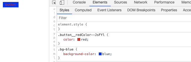
37
|
-
```
|
|
38
|
-
|
|
39
|
-
## Global CSS Modules
|
|
40
|
-
|
|
41
|
-
If you want to remove the `.module` suffix from the filename, you can set [`output.disable CssModuleExtension`](/configure/app/output/disable-css-module-extension).
|
|
42
|
-
|
|
43
|
-
After setting, all style files except the style files in the `node_modules/` directory and the file name format of `[name].global.(css|scss|sass|less)` will be processed as CSS Modules.
|
|
44
|
-
|
|
45
|
-
If you need global styles at this point, you can solve it by creating a style file with the filename format `[name].global.(css|scss|sass|less)`, for example:
|
|
46
|
-
|
|
47
|
-
```css title="app.global.css"
|
|
48
|
-
.bg-blue {
|
|
49
|
-
background-color: blue;
|
|
50
|
-
}
|
|
51
|
-
```
|
|
52
|
-
|
|
53
|
-
```css title="button.css"
|
|
54
|
-
.redColor {
|
|
55
|
-
color: red;
|
|
56
|
-
}
|
|
57
|
-
```
|
|
58
|
-
|
|
59
|
-
```js title="App.jsx"
|
|
60
|
-
import './app.global.css';
|
|
61
|
-
import styles from './button.css';
|
|
62
|
-
|
|
63
|
-
export default function Button() {
|
|
64
|
-
return (
|
|
65
|
-
<button type="button" className={`${styles.redColor} bg-blue`}>
|
|
66
|
-
button
|
|
67
|
-
</button>
|
|
68
|
-
);
|
|
69
|
-
}
|
|
70
|
-
```
|
|
71
|
-
|
|
72
|
-
Will eventually be compiled as:
|
|
73
|
-
|
|
74
|
-
```js
|
|
75
|
-
<button type="button" className="button__redColor--JsFYl bg-blue">
|
|
76
|
-
button
|
|
77
|
-
</button>
|
|
78
|
-
```
|
|
79
|
-
|
|
80
|
-
The final effect is as follows:
|
|
81
|
-
|
|
82
|
-
|
|
83
|
-
|
|
84
|
-
:::tip
|
|
85
|
-
When using [babel-plugin-react-css-modules](https://github.com/gajus/babel-plugin-react-css-modules), it is important to note that the configuration option `generateScopedName` of this plugin needs to be the same as [`output.css ModuleLocalIdentName`](/configure/app/output/css-module-local-ident-name).
|
|
86
|
-
|
|
87
|
-
:::
|
|
@@ -1,17 +0,0 @@
|
|
|
1
|
-
---
|
|
2
|
-
sidebar_position: 4
|
|
3
|
-
---
|
|
4
|
-
|
|
5
|
-
# Less and Sass
|
|
6
|
-
|
|
7
|
-
[Less](https://lesscss.org/) and [Sass](https://sass-lang.com/) are two commonly used CSS preprocessors that Modern.js built-in support for the Less and Sass compile capabilities.
|
|
8
|
-
|
|
9
|
-
## Customized Configuration
|
|
10
|
-
|
|
11
|
-
- If you need to customize the configuration of [less-loader](https://github.com/webpack-contrib/less-loader), please refer to the [tools.less](/configure/app/tools/less).
|
|
12
|
-
- If you need to customize the configuration of [sass-loader](https://github.com/webpack-contrib/sass-loader), please refer to the [tools.less](/configure/app/tools/sass).
|
|
13
|
-
|
|
14
|
-
:::tip
|
|
15
|
-
CSS files pre-compiled by Less and Sass will still undergo Modern.js build-in [PostCSS](https://postcss.org/) conversion, which has good browser compatibility. For related content, please refer to [[PostCSS](/guides/css/postcss)].
|
|
16
|
-
|
|
17
|
-
:::
|
|
@@ -1,79 +0,0 @@
|
|
|
1
|
-
---
|
|
2
|
-
sidebar_position: 3
|
|
3
|
-
---
|
|
4
|
-
|
|
5
|
-
# PostCSS
|
|
6
|
-
|
|
7
|
-
[PostCSS](https://postcss.org/) is a tool for converting CSS code with JavaScript tools and plugins. Modern.js built-in PostCSS and integrates common PostCSS plugins such as [Autoprefixer](https://github.com/postcss/autoprefixer) to meet the style development needs of most projects.
|
|
8
|
-
|
|
9
|
-
By default, Modern.js compile and transform CSS as follows:
|
|
10
|
-
|
|
11
|
-
1. [Autoprefixer](https://github.com/postcss/autoprefixer) Automatically add the required browser vendor prefix to CSS rules according to the required browser range. Modern.js default supported browser ranges are: `['> 0.01%', 'not dead', 'not op_mini all']`.
|
|
12
|
-
|
|
13
|
-
:::info Note
|
|
14
|
-
- [Supported browser range: `> 0.01%`] means that the browser market share is greater than 0.01%.
|
|
15
|
-
- `Not dead` means excluding browsers that are no longer officially supported and browsers that have not been updated in the past 24 months.
|
|
16
|
-
- `not op_mini all` means exclude Opera Mini.
|
|
17
|
-
|
|
18
|
-
:::
|
|
19
|
-
|
|
20
|
-
:::info Additional
|
|
21
|
-
If you need to modify the default browser support range, you can configure `browserslist` in the project's `package.json` file, and set the rule to refer to the use of [Browserslist](https://github.com/browserslist/browserslist). The following is an example:
|
|
22
|
-
`json title ="package.json" { "Browserslist": [ "The last 1 versions", "> 1%", "IE 10" ] } `
|
|
23
|
-
|
|
24
|
-
:::
|
|
25
|
-
|
|
26
|
-
2. Provide [CSS custom properties](https://www.w3.org/TR/css-variables-1/) support, you can define and use custom variables in CSS, such as:
|
|
27
|
-
|
|
28
|
-
```css
|
|
29
|
-
:root {
|
|
30
|
-
--main-bg-color: pink;
|
|
31
|
-
}
|
|
32
|
-
|
|
33
|
-
body {
|
|
34
|
-
background-color: var(--main-bg-color);
|
|
35
|
-
}
|
|
36
|
-
```
|
|
37
|
-
|
|
38
|
-
3. Provide [CSS Nesting](https://drafts.csswg.org/css-nesting-1/) support, you can use nested writing in CSS, such as:
|
|
39
|
-
|
|
40
|
-
```css
|
|
41
|
-
table.colortable td {
|
|
42
|
-
text-align: center;
|
|
43
|
-
}
|
|
44
|
-
table.colortable td.c {
|
|
45
|
-
text-transform: uppercase;
|
|
46
|
-
}
|
|
47
|
-
```
|
|
48
|
-
|
|
49
|
-
It can also be rewritten as CSS nested:
|
|
50
|
-
|
|
51
|
-
```css
|
|
52
|
-
table.colortable {
|
|
53
|
-
& td {
|
|
54
|
-
text-align: center;
|
|
55
|
-
&.c {
|
|
56
|
-
text-transform: uppercase;
|
|
57
|
-
}
|
|
58
|
-
}
|
|
59
|
-
}
|
|
60
|
-
```
|
|
61
|
-
|
|
62
|
-
4. Fix known [Flexbugs](https://github.com/philipwalton/flexbugs).
|
|
63
|
-
5. Provide compatibility with the following CSS features:
|
|
64
|
-
- [`initial` attribute value](https://developer.mozilla.org/en-US/docs/Web/CSS/initial_value)
|
|
65
|
-
- [`break-` attribute](https://developer.mozilla.org/en-US/docs/Web/CSS/break-after)
|
|
66
|
-
- [`font-variant`](https://developer.mozilla.org/en-US/docs/Web/CSS/font-variant)
|
|
67
|
-
- [Media Query Ranges](https://developer.mozilla.org/en-US/docs/Web/CSS/Media_Queries/Using_media_queries#syntax_improvements_in_level_4)
|
|
68
|
-
|
|
69
|
-
When you need to modify the PostCSS configuration, you can implement it through the underlying configuration [`tools.postcss`](/configure/app/tools/postcss), here is an example:
|
|
70
|
-
|
|
71
|
-
```ts title="modern.config.ts"
|
|
72
|
-
export default defineConfig({
|
|
73
|
-
tools: {
|
|
74
|
-
postcss: {
|
|
75
|
-
plugins: ['autoprefixer', ('postcss-flexbugs-fixes': {})],
|
|
76
|
-
},
|
|
77
|
-
},
|
|
78
|
-
});
|
|
79
|
-
```
|
|
@@ -1,40 +0,0 @@
|
|
|
1
|
-
---
|
|
2
|
-
sidebar_position: 1
|
|
3
|
-
---
|
|
4
|
-
|
|
5
|
-
# CSS-in-JS
|
|
6
|
-
|
|
7
|
-
CSS-in-JS 是一种可以将 CSS 样式写在 JS 文件里的技术。Modern.js 集成了社区常用的 CSS-in-JS 实现库 [styled-components](https://styled-components.com/),它使用 JavaScript 的新特性 [Tagged template](https://developer.mozilla.org/en-US/docs/Web/JavaScript/Reference/Template_literals#tagged_templates) 编写组件的 CSS 样式。可以直接从 `@modern-js/runtime/styled` 引入 [styled-components](https://styled-components.com/) 的 API 进行使用。
|
|
8
|
-
|
|
9
|
-
当需要编写一个内部字体为红色的 `div` 组件时,可以如下实现:
|
|
10
|
-
|
|
11
|
-
```js
|
|
12
|
-
import styled from '@modern-js/runtime/styled';
|
|
13
|
-
|
|
14
|
-
const RedDiv = styled.div`
|
|
15
|
-
color: red;
|
|
16
|
-
`;
|
|
17
|
-
```
|
|
18
|
-
|
|
19
|
-
当需要根据组件的 `props` 动态设置组件样式时,例如 `props` 的属性 `primary` 为 `true` 时,按钮的颜色为白色,其他情况为红色,实现代码如下:
|
|
20
|
-
|
|
21
|
-
```js
|
|
22
|
-
import styled from '@modern-js/runtime/styled';
|
|
23
|
-
|
|
24
|
-
const Button = styled.button`
|
|
25
|
-
color: ${props => (props.primary ? 'white' : 'red')};
|
|
26
|
-
font-size: 1em;
|
|
27
|
-
`;
|
|
28
|
-
```
|
|
29
|
-
|
|
30
|
-
关于 styled-components 的更多用法,请参考【[styled-components 官网](https://styled-components.com/)】。
|
|
31
|
-
|
|
32
|
-
:::info 补充信息
|
|
33
|
-
Modern.js 内部使用了 Babel 插件 [babel-plugin-styled-components](https://github.com/styled-components/babel-plugin-styled-components),可以通过 [`tools.styledComponents`](/configure/app/tools/styled-components) 对插件进行配置。
|
|
34
|
-
|
|
35
|
-
:::
|
|
36
|
-
|
|
37
|
-
:::tip 提示
|
|
38
|
-
如果需要使用 [styled-jsx](https://www.npmjs.com/package/styled-jsx)、[Emotion](https://emotion.sh/) 等其他 CSS-in-JS 库,需要先安装对应库的依赖。具体使用方式请参考对应库的官网。
|
|
39
|
-
|
|
40
|
-
:::
|
|
@@ -1,87 +0,0 @@
|
|
|
1
|
-
---
|
|
2
|
-
sidebar_position: 5
|
|
3
|
-
---
|
|
4
|
-
|
|
5
|
-
# CSS Modules
|
|
6
|
-
|
|
7
|
-
Modern.js 为 [CSS Modules](https://github.com/css-modules/css-modules) 提供了开箱即用的支持。
|
|
8
|
-
|
|
9
|
-
## 文件后缀形式 CSS Modules
|
|
10
|
-
|
|
11
|
-
默认情况下,以 `.module.(css|scss|sass|less)` 结尾的文件会作为 CSS Modules 文件处理,例如:
|
|
12
|
-
|
|
13
|
-
```css title="button.module.css"
|
|
14
|
-
.redColor {
|
|
15
|
-
color: red;
|
|
16
|
-
}
|
|
17
|
-
```
|
|
18
|
-
|
|
19
|
-
```js title="Button.jsx"
|
|
20
|
-
import styles from './button.module.css';
|
|
21
|
-
|
|
22
|
-
export default function Button() {
|
|
23
|
-
return (
|
|
24
|
-
<button type="button" className={styles.redColor}>
|
|
25
|
-
red button
|
|
26
|
-
</button>
|
|
27
|
-
);
|
|
28
|
-
}
|
|
29
|
-
```
|
|
30
|
-
|
|
31
|
-
最终将被编译为
|
|
32
|
-
|
|
33
|
-
```js
|
|
34
|
-
<button type="button" className="button_redColor__1-RBg">
|
|
35
|
-
red button
|
|
36
|
-
</button>
|
|
37
|
-
```
|
|
38
|
-
|
|
39
|
-
## 全面启用 CSS Modules
|
|
40
|
-
|
|
41
|
-
如果想去掉文件名中 `.module` 后缀,可以设置 [`output.disableCssModuleExtension`](/configure/app/output/disable-css-module-extension)。
|
|
42
|
-
|
|
43
|
-
设置后,除了 `node_modules/` 目录下的样式文件和文件名称格式为 `[name].global.(css|scss|sass|less)` 之外的所有样式文件,都会作为 CSS Modules 处理。
|
|
44
|
-
|
|
45
|
-
如果此时需要全局样式,可以通过创建文件名称格式为 `[name].global.(css|less|scss|sass)` 的样式文件来解决, 例如:
|
|
46
|
-
|
|
47
|
-
```css title="app.global.css"
|
|
48
|
-
.bg-blue {
|
|
49
|
-
background-color: blue;
|
|
50
|
-
}
|
|
51
|
-
```
|
|
52
|
-
|
|
53
|
-
```css title="button.css"
|
|
54
|
-
.redColor {
|
|
55
|
-
color: red;
|
|
56
|
-
}
|
|
57
|
-
```
|
|
58
|
-
|
|
59
|
-
```js title="App.jsx"
|
|
60
|
-
import './app.global.css';
|
|
61
|
-
import styles from './button.css';
|
|
62
|
-
|
|
63
|
-
export default function Button() {
|
|
64
|
-
return (
|
|
65
|
-
<button type="button" className={`${styles.redColor} bg-blue`}>
|
|
66
|
-
button
|
|
67
|
-
</button>
|
|
68
|
-
);
|
|
69
|
-
}
|
|
70
|
-
```
|
|
71
|
-
|
|
72
|
-
最终将被编译为:
|
|
73
|
-
|
|
74
|
-
```js
|
|
75
|
-
<button type="button" className="button__redColor--JsFYl bg-blue">
|
|
76
|
-
button
|
|
77
|
-
</button>
|
|
78
|
-
```
|
|
79
|
-
|
|
80
|
-
最终效果如下:
|
|
81
|
-
|
|
82
|
-

|
|
83
|
-
|
|
84
|
-
:::tip 提示
|
|
85
|
-
使用 [babel-plugin-react-css-modules](https://github.com/gajus/babel-plugin-react-css-modules) 时需要注意,该插件的配置选项 `generateScopedName` 需要和 [`output.cssModuleLocalIdentName`](/configure/app/output/css-module-local-ident-name) 保持一致。
|
|
86
|
-
|
|
87
|
-
:::
|
|
@@ -1,17 +0,0 @@
|
|
|
1
|
-
---
|
|
2
|
-
sidebar_position: 4
|
|
3
|
-
---
|
|
4
|
-
|
|
5
|
-
# Less 和 Sass
|
|
6
|
-
|
|
7
|
-
[Less](https://lesscss.org/) 和 [Sass](https://sass-lang.com/) 是常用的两种 CSS 预处理器,Modern.js 内置了 Less 和 Sass 编译能力的支持。
|
|
8
|
-
|
|
9
|
-
## 自定义配置
|
|
10
|
-
|
|
11
|
-
- 如果需要自定义 [less-loader](https://github.com/webpack-contrib/less-loader) 的配置,请参考 [tools.less](/configure/app/tools/less) 配置项。
|
|
12
|
-
- 如果需要自定义 [sass-loader](https://github.com/webpack-contrib/sass-loader) 的配置,请参考 [tools.less](/configure/app/tools/sass) 配置项。
|
|
13
|
-
|
|
14
|
-
:::tip 提示
|
|
15
|
-
经过 Less 和 Sass 预编译后的 CSS 文件,仍然会经过 Modern.js 内置的 [PostCSS](https://postcss.org/) 的转换,具备良好的浏览器兼容性。相关内容请参考【[PostCSS](/guides/css/postcss)】。
|
|
16
|
-
|
|
17
|
-
:::
|
|
@@ -1,80 +0,0 @@
|
|
|
1
|
-
---
|
|
2
|
-
sidebar_position: 3
|
|
3
|
-
---
|
|
4
|
-
|
|
5
|
-
# PostCSS
|
|
6
|
-
|
|
7
|
-
[PostCSS](https://postcss.org/) 是一个用 JavaScript 工具和插件转换 CSS 代码的工具。Modern.js 内置 PostCSS,并集成 [Autoprefixer](https://github.com/postcss/autoprefixer) 等常用的 PostCSS 插件,能够满足大多数项目的样式开发需求。
|
|
8
|
-
|
|
9
|
-
默认情况下,Modern.js 会对 CSS 进行以下编译和转换:
|
|
10
|
-
|
|
11
|
-
1. [Autoprefixer](https://github.com/postcss/autoprefixer) 根据需要支持的浏览器范围,会自动为 CSS 规则添加需要的浏览器厂商前缀。Modern.js 默认支持的浏览器范围为:`['> 0.01%', 'not dead', 'not op_mini all']`。
|
|
12
|
-
|
|
13
|
-
:::info 注意
|
|
14
|
-
|
|
15
|
-
- 【支持的浏览器范围为:`> 0.01%`】是指浏览器市场份额大于 0.01%。
|
|
16
|
-
- `not dead` 是指不包含官方不再支持的浏览器和过去 24 个月没有更新的浏览器。
|
|
17
|
-
- `not op_mini all` 是指不包含 Opera Mini。
|
|
18
|
-
|
|
19
|
-
:::
|
|
20
|
-
|
|
21
|
-
:::info 补充信息
|
|
22
|
-
如果需要修改默认浏览器支持范围,可以在项目的 `package.json` 文件中配置 `browserslist`,设置规则参考 [Browserslist](https://github.com/browserslist/browserslist) 的使用,下面是一个示例:
|
|
23
|
-
`json title="package.json" { "browserslist": [ "last 1 version", "> 1%", "IE 10" ] } `
|
|
24
|
-
|
|
25
|
-
:::
|
|
26
|
-
|
|
27
|
-
2. 提供 [CSS custom properties](https://www.w3.org/TR/css-variables-1/) 支持,可以在 CSS 中定义和使用自定义变量,如:
|
|
28
|
-
|
|
29
|
-
```css
|
|
30
|
-
:root {
|
|
31
|
-
--main-bg-color: pink;
|
|
32
|
-
}
|
|
33
|
-
|
|
34
|
-
body {
|
|
35
|
-
background-color: var(--main-bg-color);
|
|
36
|
-
}
|
|
37
|
-
```
|
|
38
|
-
|
|
39
|
-
3. 提供 [CSS Nesting](https://drafts.csswg.org/css-nesting-1/) 支持,可以在 CSS 中使用嵌套写法,如:
|
|
40
|
-
|
|
41
|
-
```css
|
|
42
|
-
table.colortable td {
|
|
43
|
-
text-align: center;
|
|
44
|
-
}
|
|
45
|
-
table.colortable td.c {
|
|
46
|
-
text-transform: uppercase;
|
|
47
|
-
}
|
|
48
|
-
```
|
|
49
|
-
|
|
50
|
-
也可以改写成 CSS 嵌套写法:
|
|
51
|
-
|
|
52
|
-
```css
|
|
53
|
-
table.colortable {
|
|
54
|
-
& td {
|
|
55
|
-
text-align: center;
|
|
56
|
-
&.c {
|
|
57
|
-
text-transform: uppercase;
|
|
58
|
-
}
|
|
59
|
-
}
|
|
60
|
-
}
|
|
61
|
-
```
|
|
62
|
-
|
|
63
|
-
4. 修复已知的 [Flexbugs](https://github.com/philipwalton/flexbugs) 。
|
|
64
|
-
5. 对以下 CSS 特性提供兼容:
|
|
65
|
-
- [`initial` 属性值](https://developer.mozilla.org/en-US/docs/Web/CSS/initial_value)
|
|
66
|
-
- [`break-` 属性](https://developer.mozilla.org/en-US/docs/Web/CSS/break-after)
|
|
67
|
-
- [`font-variant`](https://developer.mozilla.org/en-US/docs/Web/CSS/font-variant)
|
|
68
|
-
- [Media Query Ranges](https://developer.mozilla.org/en-US/docs/Web/CSS/Media_Queries/Using_media_queries#syntax_improvements_in_level_4)
|
|
69
|
-
|
|
70
|
-
当需要修改 PostCSS 配置时,可以通过底层配置 [`tools.postcss`](/configure/app/tools/postcss) 来实现,下面是一个示例:
|
|
71
|
-
|
|
72
|
-
```ts title="modern.config.ts"
|
|
73
|
-
export default defineConfig({
|
|
74
|
-
tools: {
|
|
75
|
-
postcss: {
|
|
76
|
-
plugins: ['autoprefixer', ('postcss-flexbugs-fixes': {})],
|
|
77
|
-
},
|
|
78
|
-
},
|
|
79
|
-
});
|
|
80
|
-
```
|