@marco.colia/react-fast-scheduler 2.1.0 → 2.2.0
This diff represents the content of publicly available package versions that have been released to one of the supported registries. The information contained in this diff is provided for informational purposes only and reflects changes between package versions as they appear in their respective public registries.
- package/README.md +144 -67
- package/dist/index.cjs +883 -261
- package/dist/index.cjs.map +1 -1
- package/dist/index.d.cts +17 -3
- package/dist/index.d.ts +17 -3
- package/dist/index.js +885 -263
- package/dist/index.js.map +1 -1
- package/dist/styles.css +1 -1
- package/package.json +11 -4
package/README.md
CHANGED
|
@@ -2,7 +2,7 @@
|
|
|
2
2
|
|
|
3
3
|
A lightweight React scheduling library scaffold with CI/CD publishing.
|
|
4
4
|
|
|
5
|
-
|
|
6
6
|
|
|
7
7
|
## Install
|
|
8
8
|
|
|
@@ -13,7 +13,7 @@ npm i @marco.colia/react-fast-scheduler
|
|
|
13
13
|
## Usage
|
|
14
14
|
|
|
15
15
|
```tsx
|
|
16
|
-
import { useState } from "react";
|
|
16
|
+
import { useEffect, useState } from "react";
|
|
17
17
|
import { Scheduler } from "@marco.colia/react-fast-scheduler";
|
|
18
18
|
import "@marco.colia/react-fast-scheduler/styles.css";
|
|
19
19
|
import type { BaseSchedulerResource } from "@marco.colia/react-fast-scheduler";
|
|
@@ -33,30 +33,70 @@ type Appointment = {
|
|
|
33
33
|
end: string; // ISO string
|
|
34
34
|
};
|
|
35
35
|
|
|
36
|
-
const initialStaff: Staff[] = [
|
|
37
|
-
{ id: 1, label: "Room A", firstName: "Anna", lastName: "Rossi" },
|
|
38
|
-
{ id: 2, label: "Room B", firstName: "Luca", lastName: "Bianchi" }
|
|
39
|
-
];
|
|
40
|
-
|
|
41
|
-
const initialAppointments: Appointment[] = [
|
|
42
|
-
{
|
|
43
|
-
id: 100,
|
|
44
|
-
staffId: 1,
|
|
45
|
-
description: "First consultation",
|
|
46
|
-
customerName: "Mario Rossi",
|
|
47
|
-
title: "Consultation",
|
|
48
|
-
start: "2026-03-20T09:00:00.000Z",
|
|
49
|
-
end: "2026-03-20T09:30:00.000Z"
|
|
50
|
-
}
|
|
51
|
-
];
|
|
52
|
-
|
|
53
36
|
export function SchedulerExample() {
|
|
37
|
+
const [staff, setStaff] = useState<Staff[]>([]);
|
|
54
38
|
const [selectedDate, setSelectedDate] = useState(new Date("2026-03-20T00:00:00.000Z"));
|
|
55
|
-
const [appointments, setAppointments] = useState<Appointment[]>(
|
|
39
|
+
const [appointments, setAppointments] = useState<Appointment[]>([]);
|
|
40
|
+
|
|
41
|
+
const loadStaff = async () => {
|
|
42
|
+
const response = await fetch("/api/staff");
|
|
43
|
+
const data = (await response.json()) as Staff[];
|
|
44
|
+
setStaff(data);
|
|
45
|
+
};
|
|
46
|
+
|
|
47
|
+
const loadAppointments = async (date: Date) => {
|
|
48
|
+
const isoDate = date.toISOString().slice(0, 10);
|
|
49
|
+
const response = await fetch(`/api/appointments?date=${isoDate}`);
|
|
50
|
+
const data = (await response.json()) as Appointment[];
|
|
51
|
+
setAppointments(data);
|
|
52
|
+
};
|
|
53
|
+
|
|
54
|
+
const persistAppointmentChange = async (appointmentId: number, next: Appointment) => {
|
|
55
|
+
await fetch(`/api/appointments/${appointmentId}`, {
|
|
56
|
+
method: "PATCH",
|
|
57
|
+
headers: { "Content-Type": "application/json" },
|
|
58
|
+
body: JSON.stringify(next),
|
|
59
|
+
});
|
|
60
|
+
};
|
|
61
|
+
|
|
62
|
+
const handleAppointmentChange = async ({ appointment, previous, next }) => {
|
|
63
|
+
const nextAppointment = {
|
|
64
|
+
...appointment,
|
|
65
|
+
staffId: next.resourceId,
|
|
66
|
+
start: next.start.toISOString(),
|
|
67
|
+
end: next.end.toISOString(),
|
|
68
|
+
};
|
|
69
|
+
|
|
70
|
+
try {
|
|
71
|
+
await persistAppointmentChange(appointment.id, nextAppointment);
|
|
72
|
+
await loadAppointments(selectedDate);
|
|
73
|
+
} catch {
|
|
74
|
+
setAppointments((current) =>
|
|
75
|
+
current.map((item) =>
|
|
76
|
+
item.id === appointment.id
|
|
77
|
+
? {
|
|
78
|
+
...item,
|
|
79
|
+
staffId: previous.resourceId,
|
|
80
|
+
start: previous.start.toISOString(),
|
|
81
|
+
end: previous.end.toISOString(),
|
|
82
|
+
}
|
|
83
|
+
: item
|
|
84
|
+
)
|
|
85
|
+
);
|
|
86
|
+
}
|
|
87
|
+
};
|
|
88
|
+
|
|
89
|
+
useEffect(() => {
|
|
90
|
+
void loadStaff();
|
|
91
|
+
}, []);
|
|
92
|
+
|
|
93
|
+
useEffect(() => {
|
|
94
|
+
void loadAppointments(selectedDate);
|
|
95
|
+
}, [selectedDate]);
|
|
56
96
|
|
|
57
97
|
return (
|
|
58
98
|
<Scheduler<Appointment, Staff, number>
|
|
59
|
-
resources={
|
|
99
|
+
resources={staff}
|
|
60
100
|
appointments={appointments}
|
|
61
101
|
selectedDate={selectedDate}
|
|
62
102
|
onSelectedDateChange={setSelectedDate}
|
|
@@ -67,20 +107,12 @@ export function SchedulerExample() {
|
|
|
67
107
|
getResourceId: (a) => a.staffId,
|
|
68
108
|
getStart: (a) => a.start,
|
|
69
109
|
getEnd: (a) => a.end,
|
|
70
|
-
getTitle: (a) => `${a.customerName} - ${a.title}
|
|
71
|
-
}}
|
|
72
|
-
onAppointmentChange={async ({ appointment, next }) => {
|
|
73
|
-
setAppointments((prev) =>
|
|
74
|
-
prev.map((a) =>
|
|
75
|
-
a.id === appointment.id
|
|
76
|
-
? { ...a, staffId: next.resourceId, start: next.start.toISOString(), end: next.end.toISOString() }
|
|
77
|
-
: a
|
|
78
|
-
)
|
|
79
|
-
);
|
|
110
|
+
getTitle: (a) => `${a.customerName} - ${a.title}`,
|
|
80
111
|
}}
|
|
112
|
+
onAppointmentChange={handleAppointmentChange}
|
|
81
113
|
resourceAppointmentClassMap={{
|
|
82
114
|
"1": "bg-amber-100 dark:bg-amber-950/40",
|
|
83
|
-
"2": "bg-blue-100 dark:bg-blue-950/40"
|
|
115
|
+
"2": "bg-blue-100 dark:bg-blue-950/40",
|
|
84
116
|
}}
|
|
85
117
|
dayStart="09:00"
|
|
86
118
|
dayEnd="18:00"
|
|
@@ -90,10 +122,13 @@ export function SchedulerExample() {
|
|
|
90
122
|
```
|
|
91
123
|
|
|
92
124
|
`renderAppointment` is optional. If you omit it, the scheduler uses the built-in appointment card with light/dark mode support.
|
|
93
|
-
|
|
94
|
-
`
|
|
125
|
+
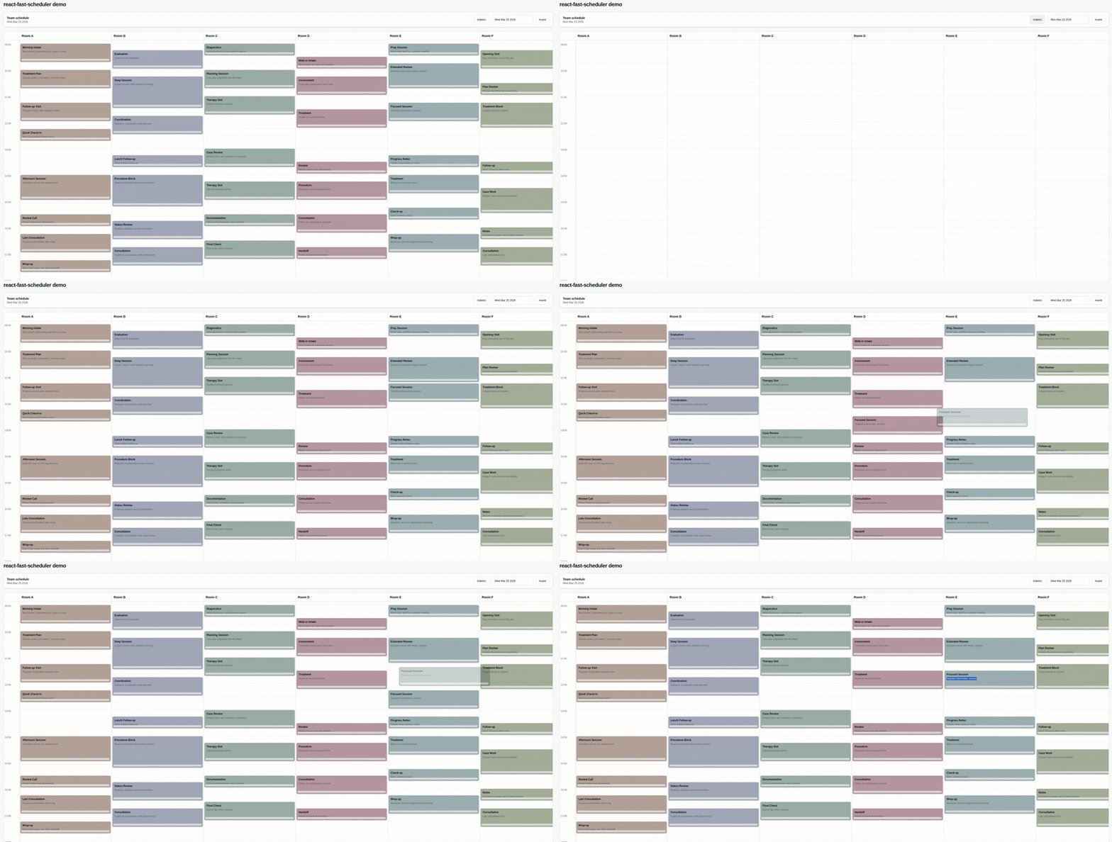
During move drag, the scheduler keeps the original card in place and renders a floating ghost preview by default.
|
|
126
|
+
`renderToolbar` is optional. If you omit it, the scheduler uses a built-in shadcn-style toolbar with prev/next buttons and a calendar popover date picker.
|
|
127
|
+
`renderDatePicker` is optional. If you omit it, the default toolbar uses the built-in calendar popover date picker.
|
|
128
|
+
`onAppointmentChange` is the main integration point for state updates and API persistence.
|
|
95
129
|
|
|
96
130
|
Main props you need to pass:
|
|
131
|
+
|
|
97
132
|
- `resources`: your columns (staff, rooms, etc), each with at least `{ id, label }`.
|
|
98
133
|
- `appointments`: raw items from your backend.
|
|
99
134
|
- `adapter`: functions that map your raw appointment shape to scheduler fields.
|
|
@@ -104,11 +139,21 @@ Main props you need to pass:
|
|
|
104
139
|
- `appointmentColorTokenClassMap`: optional map to override token -> class resolution.
|
|
105
140
|
- `getResourceAppointmentAppearance`: optional low-level function to provide appointment `className` per resource.
|
|
106
141
|
- `getResourceAppointmentBackground`: legacy optional function to provide appointment background as a string.
|
|
142
|
+
- `renderToolbar`: optional render hook to replace the entire scheduler toolbar/header controls.
|
|
107
143
|
- `prevButtonLabel` and `nextButtonLabel`: custom labels for toolbar navigation buttons.
|
|
108
|
-
- `renderDatePicker`: optional render hook for
|
|
144
|
+
- `renderDatePicker`: optional render hook for the date picker slot used by the default toolbar.
|
|
109
145
|
- `renderResourceHeader`: optional render hook for resource column headers.
|
|
110
146
|
- `renderAppointment`: optional render hook to fully customize appointment cards.
|
|
111
147
|
|
|
148
|
+
If you provide `renderAppointment`, the `appointment` argument also includes:
|
|
149
|
+
|
|
150
|
+
- `visualState`: `"normal" | "ghost" | "dragging"` so custom renderers can react to drag previews.
|
|
151
|
+
- `renderKey`: an internal stable render key for presentation-layer rendering.
|
|
152
|
+
|
|
153
|
+
The `renderAppointment` args also include:
|
|
154
|
+
|
|
155
|
+
- `isDropInvalid`: `true` while the current drag position overlaps another appointment, so custom renderers can show invalid drop feedback.
|
|
156
|
+
|
|
112
157
|
### Resource classes by id (recommended)
|
|
113
158
|
|
|
114
159
|
```tsx
|
|
@@ -116,7 +161,7 @@ Main props you need to pass:
|
|
|
116
161
|
// ...other props
|
|
117
162
|
resourceAppointmentClassMap={{
|
|
118
163
|
"room-a": "bg-yellow-100 dark:bg-yellow-950/40",
|
|
119
|
-
"room-b": "bg-rose-100 dark:bg-rose-950/40"
|
|
164
|
+
"room-b": "bg-rose-100 dark:bg-rose-950/40",
|
|
120
165
|
}}
|
|
121
166
|
/>
|
|
122
167
|
```
|
|
@@ -129,7 +174,7 @@ Main props you need to pass:
|
|
|
129
174
|
getResourceAppointmentColorToken={(resource) => resource.category}
|
|
130
175
|
appointmentColorTokenClassMap={{
|
|
131
176
|
vip: "bg-yellow-100 dark:bg-yellow-950/40",
|
|
132
|
-
urgent: "bg-rose-100 dark:bg-rose-950/40"
|
|
177
|
+
urgent: "bg-rose-100 dark:bg-rose-950/40",
|
|
133
178
|
}}
|
|
134
179
|
/>
|
|
135
180
|
```
|
|
@@ -139,21 +184,48 @@ Main props you need to pass:
|
|
|
139
184
|
```tsx
|
|
140
185
|
<Scheduler
|
|
141
186
|
// ...other props
|
|
142
|
-
renderAppointment={({
|
|
187
|
+
renderAppointment={({
|
|
188
|
+
appointment,
|
|
189
|
+
isDropInvalid,
|
|
190
|
+
onPointerDown,
|
|
191
|
+
onResizePointerDown,
|
|
192
|
+
appointmentAppearance,
|
|
193
|
+
appointmentBackgroundColor,
|
|
194
|
+
}) => (
|
|
143
195
|
<div
|
|
144
196
|
onPointerDown={onPointerDown}
|
|
145
|
-
className={`relative h-full
|
|
146
|
-
|
|
197
|
+
className={`relative h-full overflow-hidden rounded-md border p-2 pb-5 ${
|
|
198
|
+
appointment.visualState === "ghost"
|
|
199
|
+
? "cursor-grab border-dashed opacity-55"
|
|
200
|
+
: appointment.visualState === "dragging"
|
|
201
|
+
? "cursor-grabbing opacity-55"
|
|
202
|
+
: "cursor-grab"
|
|
203
|
+
} ${
|
|
204
|
+
isDropInvalid
|
|
205
|
+
? "border-red-500 bg-red-100/80 text-red-950 ring-1 ring-red-500/60"
|
|
206
|
+
: `border-slate-300 ${
|
|
207
|
+
appointmentAppearance?.className ?? appointmentBackgroundColor ?? "bg-slate-100"
|
|
208
|
+
}`
|
|
147
209
|
}`}
|
|
148
210
|
>
|
|
211
|
+
{isDropInvalid ? (
|
|
212
|
+
<div className="absolute right-1 top-1 flex h-4 w-4 items-center justify-center rounded-full bg-red-600 text-[10px] font-bold text-white">
|
|
213
|
+
X
|
|
214
|
+
</div>
|
|
215
|
+
) : null}
|
|
149
216
|
<div className="text-xs font-semibold">{appointment.title}</div>
|
|
150
217
|
{appointment.raw.description ? (
|
|
151
|
-
<div className="mt-1 text-[10px] font-medium text-slate-500">
|
|
218
|
+
<div className="mt-1 text-[10px] font-medium text-slate-500">
|
|
219
|
+
{appointment.raw.description}
|
|
220
|
+
</div>
|
|
152
221
|
) : null}
|
|
153
222
|
<div
|
|
154
223
|
role="button"
|
|
155
224
|
aria-label="Resize appointment"
|
|
156
225
|
onPointerDown={(e) => {
|
|
226
|
+
if (appointment.visualState === "ghost") {
|
|
227
|
+
return;
|
|
228
|
+
}
|
|
157
229
|
e.stopPropagation();
|
|
158
230
|
onResizePointerDown(e);
|
|
159
231
|
}}
|
|
@@ -164,7 +236,36 @@ Main props you need to pass:
|
|
|
164
236
|
/>
|
|
165
237
|
```
|
|
166
238
|
|
|
167
|
-
###
|
|
239
|
+
### Custom toolbar
|
|
240
|
+
|
|
241
|
+
```tsx
|
|
242
|
+
<Scheduler
|
|
243
|
+
// ...other props
|
|
244
|
+
renderToolbar={({ selectedDate, goToPreviousDay, goToNextDay, defaultDatePicker }) => (
|
|
245
|
+
<div className="mb-4 flex items-center justify-between gap-3 rounded-xl border border-border bg-card px-4 py-3">
|
|
246
|
+
<div>
|
|
247
|
+
<div className="text-sm font-medium">{selectedDate.toDateString()}</div>
|
|
248
|
+
<div className="text-xs text-muted-foreground">Team schedule</div>
|
|
249
|
+
</div>
|
|
250
|
+
<div className="flex items-center gap-2">
|
|
251
|
+
<button
|
|
252
|
+
className="rounded-md border px-3 py-2 text-sm"
|
|
253
|
+
type="button"
|
|
254
|
+
onClick={goToPreviousDay}
|
|
255
|
+
>
|
|
256
|
+
Previous
|
|
257
|
+
</button>
|
|
258
|
+
{defaultDatePicker}
|
|
259
|
+
<button className="rounded-md border px-3 py-2 text-sm" type="button" onClick={goToNextDay}>
|
|
260
|
+
Next
|
|
261
|
+
</button>
|
|
262
|
+
</div>
|
|
263
|
+
</div>
|
|
264
|
+
)}
|
|
265
|
+
/>
|
|
266
|
+
```
|
|
267
|
+
|
|
268
|
+
### Custom date picker slot
|
|
168
269
|
|
|
169
270
|
```tsx
|
|
170
271
|
import { Button } from "@/components/ui/button";
|
|
@@ -210,12 +311,6 @@ import "@marco.colia/react-fast-scheduler/styles.css";
|
|
|
210
311
|
ReactDOM.createRoot(document.getElementById("root")!).render(<SchedulerExample />);
|
|
211
312
|
```
|
|
212
313
|
|
|
213
|
-
If you work inside this library repo (local demo), import the Tailwind v4 source entry:
|
|
214
|
-
|
|
215
|
-
```tsx
|
|
216
|
-
import "../src/global.css";
|
|
217
|
-
```
|
|
218
|
-
|
|
219
314
|
You can override tokens in your app:
|
|
220
315
|
|
|
221
316
|
```css
|
|
@@ -230,22 +325,4 @@ You can override tokens in your app:
|
|
|
230
325
|
|
|
231
326
|
## Development
|
|
232
327
|
|
|
233
|
-
|
|
234
|
-
npm install
|
|
235
|
-
npm run dev:demo
|
|
236
|
-
npm run lint
|
|
237
|
-
npm run test
|
|
238
|
-
npm run build
|
|
239
|
-
```
|
|
240
|
-
|
|
241
|
-
`dev/main.tsx` contains a minimal runnable scheduler demo used by `npm run dev:demo`.
|
|
242
|
-
Tailwind v4 source styles are in `src/global.css`, and the demo imports them from `dev/main.tsx`.
|
|
243
|
-
|
|
244
|
-
## Releasing
|
|
245
|
-
|
|
246
|
-
This repo uses [Changesets](https://github.com/changesets/changesets) and GitHub Actions.
|
|
247
|
-
|
|
248
|
-
1. Create a changeset: `npx changeset`
|
|
249
|
-
2. Merge to `main`
|
|
250
|
-
3. The `Release` workflow opens/updates a release PR
|
|
251
|
-
4. Merging that PR publishes to npm (via npm Trusted Publishing/OIDC, or `NPM_TOKEN` if configured)
|
|
328
|
+
Repo-specific development notes, local demo usage, quality checks, and release workflow are in [DEVELOPMENT.md](./DEVELOPMENT.md).
|